Category Archives: Sector Trends
Oops a whipsaw
I tend to focus on risk management in these occasional observations I share.
My focus is on risk management because that’s my edge.
If I can direct and control my possibility of loss through tactical trading decisions, then I’m left to focus on the upside of profits.
I pinned that on my wall twenty years ago when I was testing asymmetric trading systems for asymmetric risk/reward and asymmetric investment returns.
As I intensely studied the mathematical expectation of trading systems, I concluded the downside drawdown is the part I have the potential to control.
If a position is trending down, I can exit, and reduce my exposure to zero.
I could also use exchange-traded options for defined risk. ie. if I buy a call option for $5 that’s all I can lose if the position doesn’t become profitable.
I could instead place a stop loss exit $5 below the entry price for a similar effect, but the position could gap down $10, and the loss would be larger than the limited call option would have been.
These are the kind of portfolio management decisions we get to choose from as investment portfolio managers.
I discuss this more in How is trend following with a stop loss optionality similar to a call option?
Our issue at hand today is the trendline whipsaw of the stock market index.
In Stock Market Resumes Downtrend I shared the observation the U.S. stock market as measured by the S&P 500 stock index, has trended down from a lower high.
Here’s the chart:

I went on to point out the stock index wasn’t yet oversold, and the number of stocks in the 500 in an uptrend was trending down.
Trend lines aren’t magic; they’re just a general trend guide.
I wasn’t seeing heavy selling pressure, so I thought “we’ll see.”
Here’s an update. See below for the context of the numbers.

- The downtrend line for the S&P 500 is now negated as the stock market has reversed back up and the index easily trended above the trendline and broke out to the upside. This will likely drive some to call the bear market over and suggest a new bull market has begun.
- Momentum, as measured by 14-day relative strength, indicates the SPX isn’t yet overbought at 62, and I’d only consider it so above 80. Read: there’s still room to run if it wants. There will be little resistance from velocity moving too far too fast.
- The percent of SPX 500 stocks trending above their 200-day moving averages is at 67%, so 33% of the stocks could still trend up, and 67% isn’t a level I consider resistance. That is, if it were at 80% it would indicate most stocks have already trended up, so the desire to buy may be getting exhausted.
- The average true range of the past 15 days shows a visual representation that realized volatility is declining. In fact, realized vol has declined to the August 2022 level.
I’ll stop there to keep this succinct.
The bottom line is the stock market was trending down, and it’s now reversed back up into a notable uptrend.
I started with observations of risk management because no indicator is ever perfect, they’ll all imperfect.
When every new moment is unique, and we’ve never been “here” before, anything can happen.
The best we can do is define the direction of the trend and follow it, until it reaches an extreme, or reverses down.
Ironically, as the realized volatility is now as low as it was in August 2022, that’s also when I shared Whipsaw and warned I have a hunch we’re going to hear the word “whipsaw” a lot in the coming months.
For the past year, we’ve survived and thrived through a prolonged bear market that may be much longer and deeper if the U.S. economy enters a recession.
Only time will tell if the U.S. is in a recession, or if we’ll instead see the soft landing our friends at Goldman Sachs expect.
But for now, the U.S. equities trend is back up again, and the Fed’s interest rate decision next week will likely be the driver of what happens next.
I expect 2023 to be a very challenging year for macro economics, and it’ll be fun to watch.
At Shell Capital, we just want to repeat another profitable year like last year, or better.
Mike Shell is the founder and Chief Investment Officer of Shell Capital Management, LLC, and the portfolio manager of ASYMMETRY® Managed Portfolios. Mike Shell and Shell Capital Management, LLC is a registered investment advisor focused on asymmetric risk-reward and absolute return strategies and provides investment advice and portfolio management only to clients with a signed and executed investment management agreement. The observations shared on this website are for general information only and should not be construed as investment advice to buy or sell any security. This information does not suggest in any way that any graph, chart, or formula offered can solely guide an investor as to which securities to buy or sell, or when to buy or sell them. Securities reflected are not intended to represent any client holdings or recommendations made by the firm. In the event any past specific recommendations are referred to inadvertently, a list of all recommendations made by the company within at least the prior one-year period may be furnished upon request. It should not be assumed that recommendations made in the future will be profitable or will equal the performance of the securities on the list. Any opinions expressed may change as subsequent conditions change. Please do not make any investment decisions based on such information, as it is not advice and is subject to change without notice. Investing involves risk, including the potential loss of principal an investor must be willing to bear. Past performance is no guarantee of future results. All information and data are deemed reliable but are not guaranteed and should be independently verified. The presence of this website on the Internet shall in no direct or indirect way raise an implication that Shell Capital Management, LLC is offering to sell or soliciting to sell advisory services to residents of any state in which the firm is not registered as an investment advisor. The views and opinions expressed in ASYMMETRY® Observations are those of the authors and do not necessarily reflect the position of Shell Capital Management, LLC. The use of this website is subject to its terms and conditions.
U.S. Sector Trend, Momentum, and Breadth Through October 2022
Our objective is asymmetric risk/reward for asymmetric investment returns; we are unconstrained as to strategy or market.
A skillful trend follower wants to catch a trend early in its stage and capitalize on it until it ends, so if we want to identify them early, we must necessarily focus on short-term trends to see if they can become longer-term trends and asymmetric profits.
With that said, in the month of October 2022, eight of the eleven sectors tracked by S&P sector indices are in the green, and three are in the red.
To read the complete observation, see U.S. Sector Trend, Momentum, and Breadth Through October 2022
The stock market trend is being tested
The stock market is now reaching its first short-term higher probability of a countertrend pullback.
The S&P 500 stock index tapped its 200-day average and reached a short-term overbought level based on relative strength and volatility and is now stalling.

The S&P 500 Equal Weight, which gives an equal weighting to all 500 stocks instead of more exposure to the largest companies based on capitalization, crossed above its 200-day average but was reaching an overbought level at the same time.

So, it’s not surprising to see these market proxies roll over at this level.
Two weeks ago I pointed out in The stock market is at an inflection point the S&P 500 was stalling as if there is resistance at this price level, and there’s a lot of potential supply for those in a loss trap, and it was getting overbought as measured by the relative strength index. The index trended up a few more percent before pulling back today.
I don’t normally trade the S&P 500 index, I just use it as a proxy for the overall stock market.
For portfolio management, I get more granular into the sectors inside, and the stocks.
I also include global markets like commodities, bonds, and other alternatives, to provide a global unconstrained opportunity set to find potentially profitable trends.
Trend systems just want to be fed some trends, so the system can extract the parts it wants from the parts it doesn’t want. It’s best to provide a wide range of uncorrelated price trends for trend systems to create a unique return stream from them.
From the broad index like the S&P 500 it’s useful to look inside to see the percentage of stocks that are trending above their 50-day and 200-day averages to gauge the strength of participation in the uptrend.
The percent of S&P 500 stocks trending above the 50-day average has quickly trended up to the red zone.

The breadth thrusts we’ve seen are typical of a new uptrend — unless* it’s a prolonged bear market. *IF this is the early stage of a prolonged bear market that is likely accompanied by a recession, then we’ll see many swings like this as it unfolds along the way.
However, once most stocks are already in uptrends, the enthusiasm to buy may have run out, so I consider the level above 80% to be a higher risk zone. If we are looking for a lower risk entry, it’s below 30%. A strong breadth thrust like this is bullish when it starts and is typical off the lows after stocks have already trended down as much as they have.
At this point, despite the S&P 500 being down 1.5% today, it appears to be a normal pullback from overbought levels. Our relative strength index signals the index was moving up with such velocity it was a little too far, too fast, which is good in the longer term but increased the odds of a retrench in the short term.
I reduced exposure earlier this week, and the price action next week will determine if we reduce further or buy the dip at lower prices.
In the big picture, we’re strolling into the seasonally weakest month for the stock market after a big rally and no shortage of risks to the short-term uptrend, so it’s essential to determine an exit, hedge, or reduce exposure.
On the positive side, the recent decline in volatility and new uptrends suggest systematic trend-following investment programs could provide inflows of several billion dollars a day in stocks for the next few months if it continues.
While everyone else is trying to figure out what’s going to happen next with inflation, rates, and other global macro issues, we focus on keeping our hard-earned capital invested in the direction of the trend.
If the trends change, so will we.
Mike Shell is the Founder and Chief Investment Officer of Shell Capital Management, LLC, and the portfolio manager of ASYMMETRY® Managed Portfolios. Mike Shell and Shell Capital Management, LLC is a registered investment advisor focused on asymmetric risk-reward and absolute return strategies and provides investment advice and portfolio management only to clients with a signed and executed investment management agreement. The observations shared on this website are for general information only and should not be construed as investment advice to buy or sell any security. This information does not suggest in any way that any graph, chart, or formula offered can solely guide an investor as to which securities to buy or sell, or when to buy or sell them. Securities reflected are not intended to represent any client holdings or recommendations made by the firm. In the event any past specific recommendations are referred to inadvertently, a list of all recommendations made by the company within at least the prior one-year period may be furnished upon request. It should not be assumed that recommendations made in the future will be profitable or will equal the performance of the securities on the list. Any opinions expressed may change as subsequent conditions change. Please do not make any investment decisions based on such information, as it is not advice and is subject to change without notice. Investing involves risk, including the potential loss of principal an investor must be willing to bear. Past performance is no guarantee of future results. All information and data are deemed reliable but are not guaranteed and should be independently verified. The presence of this website on the Internet shall in no direct or indirect way raise an implication that Shell Capital Management, LLC is offering to sell or soliciting to sell advisory services to residents of any state in which the firm is not registered as an investment advisor. The views and opinions expressed in ASYMMETRY® Observations are those of the authors and do not necessarily reflect the position of Shell Capital Management, LLC. The use of this website is subject to its terms and conditions.
The stock market is at an inflection point
The S&P 500 is stalling as if there is resistance at this price level, and there’s a lot of potential supply for those in a loss trap.
It’s also getting overbought as measured by the relative strength index.
The yellow horizontal highlight denotes the price range with the most volume, which you can see in the Volume by Price bars on the right which show the volume at each price level that could be support or resistence.

At the current price level, you can see the yellow highlighted area is the price range of the highest volume of the past three months.
In February, the SPY declined and found support, or buying demand, at this level. Afterward, it trended up before trending down to this level again and once again was met with enough buying enthusiasm to hold it for several days, then the support failed and the S&P 500 Index ETF declined.
At that point, those who bought earlier at higher prices around the price level or higher carried a loss.
In May the stock market trended up against but selling pressure dominated and the index once again trended sideways for several days of indecision before finally breaking down in a waterfall decline for several days.
The stock market finally got oversold again and investor sentiment was extremely bearish, and it’s since climbed a wall or worry.
Now the price has trended up to this price level again that has been both support and resistance in the past three months and it seems to be stalling.
Today started off strong, up 1% or more, only to fade by the end of the day.
The stock market is at an inflection point.
If the stock market gets enough buying demand to keep prices trending up this bear market could be over sooner than later. However, with the Federal Reserve increasing interest rates because the annual inflation rate in the US has accelerated to 9.1% and economic growth is slowing, if the US is in a recession, as noted in “Bear Markets with an Economic Recession Last Longer and are More Severe” bear markets typically last much longer and trend down more.
Investors should be cautious this may not be over yet, and far from it.
We’ll see, and probably sooner than later.
The inflation report this week may be a market mover.
Mike Shell is the Founder and Chief Investment Officer of Shell Capital Management, LLC, and the portfolio manager of ASYMMETRY® Managed Portfolios. Mike Shell and Shell Capital Management, LLC is a registered investment advisor focused on asymmetric risk-reward and absolute return strategies and provides investment advice and portfolio management only to clients with a signed and executed investment management agreement. The observations shared on this website are for general information only and should not be construed as investment advice to buy or sell any security. This information does not suggest in any way that any graph, chart, or formula offered can solely guide an investor as to which securities to buy or sell, or when to buy or sell them. Securities reflected are not intended to represent any client holdings or recommendations made by the firm. In the event any past specific recommendations are referred to inadvertently, a list of all recommendations made by the company within at least the prior one-year period may be furnished upon request. It should not be assumed that recommendations made in the future will be profitable or will equal the performance of the securities on the list. Any opinions expressed may change as subsequent conditions change. Please do not make any investment decisions based on such information, as it is not advice and is subject to change without notice. Investing involves risk, including the potential loss of principal an investor must be willing to bear. Past performance is no guarantee of future results. All information and data are deemed reliable but are not guaranteed and should be independently verified. The presence of this website on the Internet shall in no direct or indirect way raise an implication that Shell Capital Management, LLC is offering to sell or soliciting to sell advisory services to residents of any state in which the firm is not registered as an investment advisor. The views and opinions expressed in ASYMMETRY® Observations are those of the authors and do not necessarily reflect the position of Shell Capital Management, LLC. The use of this website is subject to its terms and conditions.
Every new price trend begins with a countertrend
Every new price trend begins with a countertrend, and that’s true for uptrends that roll over into downtrends and downtrends that reverse into uptrends, so trend following starts with a countertrend.
Technology-weighted Nasdaq 100 changed the short-term trend, breaking out above its 50-day average, now in a short-term uptrend.

Past performance is never a guarantee of future performance, but if the Nasdaq uptrend follows through, it’ll need to trend up more than 12% to trade above the longer-term 200-day average.

Nasdaq meets first overhead supply as potential resistant around 13,000.

All the areas above current prices are the hurdle of a trend trying to recover from losses.
Why?
Because many investors and traders may be trapped in losses around those prior lows and highs, the price levels attracted much historical trading.
Many tactical traders mistakenly claim resistance “is” at these levels, but we don’t know if there is resistance to further prices trending up until the price range is reached.
If a price trend reaches a level and reverses back, then we know there was “resistance” to that price level, which means there was selling pressure once the price got to that higher level.
Only time will tell if that is the case here, but we’ll be watching to see if new uptrends are met with selling prior price levels of interest, then we’ll know how much trouble these trends will have trending up into areas investors may have wished they had sold before taking on heavy losses.
To see what I mean, the Nasdaq 100 index was down -33% year to date a few weeks ago, and after a series of higher lows and higher highs (an uptrend) it’s still down -25%.

If you were invested in the Nasdaq type investment this year, or a portfolio of similar stocks, you’ve been in a loss trap.
As prices trend back up, trapped holders may start to tap out, although others may hold on until they get back to breakeven.
This is the kind of price action we’ll observe unfold from here to see which market dynamics are more dominant.
Overhead supply of shares wanting to be sold becoming at least some pressure as resistance is why price trends look so rough and volatile after a downtrend.
At every level the trend reaches, other investors and traders are deciding to buy, hold, or sell.
It’s what makes a market.
For now, we have an uptrend in enough of the high-growth stocks as measured by the Nasdaq 100 index to clear the 50-day average, so no resistance there.
Every new price trends begin with a countertrend and a follow-through.
Let’s see how it goes from here.
Giddy up!
Mike Shell is the Founder and Chief Investment Officer of Shell Capital Management, LLC, and the portfolio manager of ASYMMETRY® Managed Portfolios. Mike Shell and Shell Capital Management, LLC is a registered investment advisor focused on asymmetric risk-reward and absolute return strategies and provides investment advice and portfolio management only to clients with a signed and executed investment management agreement. The observations shared on this website are for general information only and should not be construed as investment advice to buy or sell any security. This information does not suggest in any way that any graph, chart, or formula offered can solely guide an investor as to which securities to buy or sell, or when to buy or sell them. Securities reflected are not intended to represent any client holdings or recommendations made by the firm. In the event any past specific recommendations are referred to inadvertently, a list of all recommendations made by the company within at least the prior one-year period may be furnished upon request. It should not be assumed that recommendations made in the future will be profitable or will equal the performance of the securities on the list. Any opinions expressed may change as subsequent conditions change. Please do not make any investment decisions based on such information, as it is not advice and is subject to change without notice. Investing involves risk, including the potential loss of principal an investor must be willing to bear. Past performance is no guarantee of future results. All information and data are deemed reliable but are not guaranteed and should be independently verified. The presence of this website on the Internet shall in no direct or indirect way raise an implication that Shell Capital Management, LLC is offering to sell or soliciting to sell advisory services to residents of any state in which the firm is not registered as an investment advisor. The views and opinions expressed in ASYMMETRY® Observations are those of the authors and do not necessarily reflect the position of Shell Capital Management, LLC. The use of this website is subject to its terms and conditions.
Inflation is Declining According to this Trend Analysis of Commodities
In economics, inflation is an increase in the prices of goods and services in an economy.
When the general price level rises, each unit of currency buys fewer goods and services; consequently, inflation corresponds to a reduction in the purchasing power of money.
You may not see the value of your money change online like you do with your investment fund values changing daily, but it’s changing.
Inflation is a real risk for everyone, but it’s worse for people who have their money earning a low rate of interest at a bank or another low-yield fixed asset.
If someone believes they are being a “conservative investor” by investing money in an interest-bearing bank account, it’s only because the bank statement doesn’t show the real value of money after inflation.
The latest inflation report shows U.S. Inflation is 9%, three times higher than the long-term average of 3.25%, so if someone is only earning 3% on a CD, the value of their money is 6% less than it was.
That is, they “lost” 6% of buying power.

But that’s not the main point of this observation, it’s just one of many reasons the trend in prices is important.
The US Inflation Rate is the percentage a chosen basket of goods and services purchased in the US increases in price over a year. Inflation is one of the metrics used by the US Federal Reserve to gauge the health of the economy. Since 2012, the Federal Reserve has targeted a 2% inflation rate for the US economy and may make changes to monetary policy if inflation is not within that range. A notable time for inflation was the early 1980’s during the recession. Inflation rates went as high as 14.93%, causing the Federal Reserve led by Paul Volcker to take dramatic actions.
As an investment manager applying trend systems to global markets, I see it much more granular. I’m applying computerized trend systems to a wide range of global currencies, commodities, stocks, and bond markets, so I see the directional trend changes and shifts in momentum. Although I’ve automated the process of monitoring all these global markets, I still like to review the pictures as charts to see what is going on.
I ranked the S&P GSCI Indices by short-term momentum to see which are trending up the most, so we’ll start there.
I think it’s well known that many commodities markets had been trending up this year, but as we’ll see, many of these markets are now in downtrends.
I’ll share these trends in a way that makes it obvious that commodities aren’t just tradable markets, but they impact all of us, and commodities are interconnected. For example, the price of soybeans impacts livestock.
The S&P GSCI Feeder Cattle Index provides investors with a reliable and publicly available benchmark for investment performance in the feeder cattle market. S&P GSCI Feeder Cattle Index is in an uptrend as defined by above the 50 and 200-day moving averages. In fact, in the lower two frames, I include the percent above or below the 50 and 200-day average, and Feeder Cattle is about 5% above its 50-day average and 8% above its 200-day average price.
Feeder Cattle is the strongest uptrend over the past three months. It only gets worse from here.

S&P GSCI All Cattle Index is a broader basket of cattle, and it too is in an uptrend after breaking out of a multi-month base.

Live Cattle represented by S&P GSCI Live Cattle Index looks very similar, and is an uptrend, but not an all-time new high as it’s still below the February high.

Here’s where the weakness in these commodities trends begins. The S&P GSCI Gas Oil Index is in an intermediate-term uptrend; It’s 20% above the 200-day average. But the recent decline pushed it 6% below the 50-day average. The Gas & Oil index is in a primary uptrend, but short-term pullback. Longer-term trends begin with a shorter-term trend, so we’ll see how it trends from here.
Heating oil is represented by the S&P GSCI Heating Oil Index. Like gas and oil, it’s in a primary uptrend, but a short-term downtrend.

Now we’re getting into commodities with a negative price momentum over the past 3 months.
S&P GSCI Sugar Index is in a non-trending, volatile period over the past year, and it’s right at the 50 and 200-day average.

The S&P GSCI Livestock Index, a sub-index of the S&P GSCI, provides investors with a reliable and publicly available benchmark for investment performance in the livestock commodity market. Livestock is another market that’s lost its upward momentum over the past three months, and one to watch for a breakout.

S&P GSCI Natural Gas Index is in a primary uptrend, but recent downtrend in the short term. It tapped its 200-day average and is trending back up, but nearly 7% below where it was three months ago.

I ranked these trends by three-month momentum, so all of the commodities up to this point were outperforming the broad commodity index we know as S&P GSCI Total Return Index. My three-month momentum ranking is completely arbitrary, but it signaled many of these trends had changed recently.
The S&P GSCI Total Return Index is in a primary uptrend as defined by a level above its 200-day average, but it’s in a downtrend since it peaked in June.

S&P GSCI Total Return Index is what many global macro asset managers managing global macro hedge funds use as a benchmark for commodities, so the rest of these trends are more granular looking inside this broader index made up of these other indices.
S&P GSCI Energy Index is in a primary uptrend but has declined materially over the past month.

S&P GSCI Unleaded Gasoline Index is a big one that impacts Americans and our personal economy. S&P GSCI Unleaded Gasoline Index is in a primary uptrend but has corrected a lot these past five weeks. Once again, we see a commodity trend tapping the 200-day moving average, so a breakout below it will signal a changing primary trend.

Coffee is in a downtrend. S&P GSCI Coffee Index is below the 50 and 200 average, signaling it’s in both a short-term and intermediate-term downtrend. This may help explain why Latin American countries like Brazil’s stock index is down, too. Latin America makes a lot of the world’s coffee.

Unless you’re a long/short commodity trader like a CTA trend follower who aims to capitalize on these downtrends as much as the uptrends, this is one of the rare times downtrends are something to cheer on.
S&P GSCI Crude Oil Index is in a short-term downtrend, but a primary uptrend.

Meanwhile, S&P GSCI Cocoa Index is in a downtrend across both time frames.

Hey Crude, as in Brent Crude. We have a downtrend in S&P GSCI Brent Crude Index over the short run after a volatile non-trending period.

An interesting Intermarket analysis this year has been the trend in Gold. Gold is seen by many market participants as a store of value and a safe haven, but S&P GSCI Gold Index is in a downtrend after a sharp uptrend around March. You can probably see how applying multiple time frames can be useful in observing these trends.

By and large, the metals like precision metals are in downtrends.
S&P GSCI Platinum Index is in a downtrend.

Soft commodities, or softs, are commodities such as coffee, cocoa, sugar, corn, wheat, soybean, fruit and livestock. The term generally refers to commodities that are grown, rather than mined. You can see how some of the commodity markets tracked by indices are very granular focused on one single market trend, and others are a basket of commodities within a sector.
S&P GSCI Softs Index has shifted from a quiet uptrend to a volatile downtrend.

A biofuel is any fuel that is derived from biomass, that is, plant or algae material or animal waste.
After an uptrend breakout around March, S&P GSCI Biofuel Index has trended back to the same level it started.

Some of the most common products produced with soybeans are tofu, soy milk, soy sauce, and soy flour. Approximately 85% of soybeans grown around the world are used to make vegetable oils that are either sold to consumers or used commercially according to The Spruce Eats. The USDA says “Just over 70 percent of the soybeans grown in the United States are used for animal feed, with poultry being the number one livestock sector consuming soybeans, followed by hogs, dairy, beef and aquaculture.”
You can probably see how interconnected all this stuff is.
S&P GSCI Soybeans Index is in a downtrend after an uptrend started at the beginning of this year. Hopefully, this lower animal feed cost will help lower the prices of the livestock that are in uptrends.

Lead is still widely used for car batteries, pigments, ammunition, cable sheathing, weights for lifting, weight belts for diving, lead crystal glass, radiation protection and in some solders, according to RSC.org.
S&P GSCI Lead Index is in a downtrend, so I guess we’ll eventually see the price of ammo and car batteries decline, too. Overall, lead has been a non-trending volatile market the past year, but it’s now more decisively in a dowtrend.

Lean Hog is a type of hog (pork) futures contract that can be used to hedge and to speculate on pork prices.
S&P GSCI Lean Hogs Index has trended into a downtrend, so your bacon price may improve.

Palladium is one of a number of metals starting to be used in the fuel cells to power things like cars and buses as well as in jewelry and in dental fillings and crowns.
S&P GSCI Palladium Index is in a downtrend.


Grains are used around the world and are also called cereals, and are the most important staple food. According to NatGeo, humans get an average of 48 percent of their calories, or food energy, from grains. Grains are also used to feed livestock and to manufacture some cooking oils, fuels, cosmetics, and alcohols.
S&P GSCI Grains Index is in a downtrend after it broke up with momentum going into this year. If you like to eat and drink alcohol, this is great news as it seems the prices should drift back to where they were.

Wheat is used for white bread, pastries, pasta, and pizza, so this downtrend in S&P GSCI Wheat Index is a welcome change.

Dr. Copper is market lingo for the base metal that is reputed to have a “Ph. D. in economics” because of its ability to predict turning points in the global economy.
S&P GSCI Copper Index is in a strong downtrend, so if its reputation holds true, the Ph. D. in economics suggests a global economic slowdown is ahead.

The Royal Society of Chemistry says aluminum is used in a huge variety of products including cans, foils, kitchen utensils, window frames, beer kegs and airplane parts.
If the trend in S&P GSCI Aluminum Index is a guide, the price of your next beer keg or airplane should drift lower. Aluminum is in a downtrend.

Industrial Metal alloys are known for their strength, durability, and corrosion resistance, so engineers, architects, and others in the industrial field use these alloys to construct buildings, wires, pipes, bridges, machines, and much more according to Wieland.
S&P GSCI Industrial Metals Index shows industrial metals are in a downtrend with great momentum.

Industrial metals are down so much I’ll show a two-year chart to see the price is back to 2020 levels.

Last but not least is cotton. I think we all know what cotton is used for. The price of clothes should see some decline with S&P GSCI Cotton Index in such a downtrend.

What we’ve observed is many commodity markets were in uptrends, but have more recently trended down. Not all of these necessarily impact the Consumer Price Index, but we certainly use most if not all of them one way or another.
Commodities are real “stuff”, and the prices of much of this stuff are no longer as elevated as it was. If this flows into lowering prices of the stuff we buy, then we’ll see inflation fall from here.
If inflation trends down from here, it’ll be positive for stocks and bonds and may result in the Federal Reserve pausing its aggressive interest rate hikes.
Now you know why we aren’t long commodities at this point.
Investor sentiment (about stocks) is so negative right now, that any slight improvement in inflation may spark an uptrend, then the extremely bearish positioning may drive short covering to keep the trend going a while.
Let’s see how it all unfolds.
Mike Shell is the Founder and Chief Investment Officer of Shell Capital Management, LLC, and the portfolio manager of ASYMMETRY® Managed Portfolios. Mike Shell and Shell Capital Management, LLC is a registered investment advisor focused on asymmetric risk-reward and absolute return strategies and provides investment advice and portfolio management only to clients with a signed and executed investment management agreement. The observations shared on this website are for general information only and should not be construed as investment advice to buy or sell any security. This information does not suggest in any way that any graph, chart, or formula offered can solely guide an investor as to which securities to buy or sell, or when to buy or sell them. Securities reflected are not intended to represent any client holdings or recommendations made by the firm. In the event any past specific recommendations are referred to inadvertently, a list of all recommendations made by the company within at least the prior one-year period may be furnished upon request. It should not be assumed that recommendations made in the future will be profitable or will equal the performance of the securities on the list. Any opinions expressed may change as subsequent conditions change. Please do not make any investment decisions based on such information, as it is not advice and is subject to change without notice. Investing involves risk, including the potential loss of principal an investor must be willing to bear. Past performance is no guarantee of future results. All information and data are deemed reliable but are not guaranteed and should be independently verified. The presence of this website on the Internet shall in no direct or indirect way raise an implication that Shell Capital Management, LLC is offering to sell or soliciting to sell advisory services to residents of any state in which the firm is not registered as an investment advisor. The views and opinions expressed in ASYMMETRY® Observations are those of the authors and do not necessarily reflect the position of Shell Capital Management, LLC. The use of this website is subject to its terms and conditions.
Are Growth Sectors Technology, Consumer Cyclicals, and Communication Services more Undervalued than Value?
Growth sectors like technology, consumer cyclical, and communications have seen the brunt of the selling this year, and growth is now more “undervalued” than value sectors per CFRA.
According to CFRA: Stocks are ranked in accordance with the following ranking methodologies. Qualitative STARS recommendations are determined and assigned by equity analysts, with 5 being the highest rating.

But as stated in Fundamental Valuation: Is the Stock Market Cheap or Expensive? undervalued stocks can get much more undervalued (prices fall more) in a recessionary bear market.
Risk management is essential in bear markets.
For example, the S&P 500 is down about -23% so far and needs a 30% gain to get back to the prior high.
Mike Shell is the Founder and Chief Investment Officer of Shell Capital Management, LLC, and the portfolio manager of ASYMMETRY® Managed Portfolios. Mike Shell and Shell Capital Management, LLC is a registered investment advisor focused on asymmetric risk-reward and absolute return strategies and provides investment advice and portfolio management only to clients with a signed and executed investment management agreement. The observations shared on this website are for general information only and should not be construed as investment advice to buy or sell any security. This information does not suggest in any way that any graph, chart, or formula offered can solely guide an investor as to which securities to buy or sell, or when to buy or sell them. Securities reflected are not intended to represent any client holdings or recommendations made by the firm. In the event any past specific recommendations are referred to inadvertently, a list of all recommendations made by the company within at least the prior one-year period may be furnished upon request. It should not be assumed that recommendations made in the future will be profitable or will equal the performance of the securities on the list. Any opinions expressed may change as subsequent conditions change. Please do not make any investment decisions based on such information, as it is not advice and is subject to change without notice. Investing involves risk, including the potential loss of principal an investor must be willing to bear. Past performance is no guarantee of future results. All information and data are deemed reliable but are not guaranteed and should be independently verified. The presence of this website on the Internet shall in no direct or indirect way raise an implication that Shell Capital Management, LLC is offering to sell or soliciting to sell advisory services to residents of any state in which the firm is not registered as an investment advisor. The views and opinions expressed in ASYMMETRY® Observations are those of the authors and do not necessarily reflect the position of Shell Capital Management, LLC. The use of this website is subject to its terms and conditions.
Following the Trend of Inflation and Risk of Bonds
In How We’ll Know if a Recession is Imminent I said if the 10-2 Year Treasury Yield Spread crosses below zero, and the yield curve becomes inverted, that’s what will signal a recession is probably imminent, but a recession may not be identified until 6 – 24 months later.
We can’t wait until a recession is called to manage our investment risks; the stock market has historically been the leading indicator, declining well in advance.
After U. S. inflation was reported today that inflation accelerated last month to a 7.5% annual rate to a 40-year high, U.S. Treasury Yields trended up to 2%.
Since the 10-2 Year Treasury Yield Spread is the difference between the 2 year U. S. Treasury and the 10 year U. S. Treasury, the spread will tighten as the shorter-term interest rate converges with the longer-term rate.
Recently both yields have been increasing, but the 10-2 Year Treasury Yield Spread is still falling.

The U.S. inflation momentum is driven by rising price trends for autos, household furniture, appliances, as well as for other long-lasting goods we buy.
For example, here is the U. S. Consumer Price Index for used cars and trucks.

It is well known certain consumer prices have been trending up since the pandemic, so the question for the second-level thinker is whether or not these rising inflation trends are already reflected in the prices of stocks and bonds.
So far this year, 2022 has started off with stock markets trending down.
For example, the S&P 500 declined nearly -10% in the few weeks before retracing about half the loss over the past two weeks.

Longer downtrends often retrace about half of their decline before turning down again, so we’ll soon see if this is the early stage of a deeper decline for stocks or a continuation of the primary uptrend.
The Nasdaq 100, which is weighted heavier in large-cap growth stocks and the technology sector, has reacted to more selling pressure down -14% before retracing some of the decline.

Emerging country stocks as measured by the MSCI Emerging Markets Index have finally shown some relative strength against U. S. stocks.
The MSCI Emerging Markets Index trended up at first, then only declined about -3%, and is now positive YTD.

Rising interest rates have a direct negative impact on bond prices, and that is especially true for longer-term bonds.
For example, the ICE U.S. Treasury 20+ Year Bond Index shows the bond price is down over -6% already in 2022.

If you buy and hold bonds, you’re going to learn the risks of bonds and bond funds in a rising rate regime.
Many investors today haven’t invested long enough to have experienced the possible losses that can be driven by this kind of rising inflation, rising interest rates, regime.
Investing involves risks you must be willing to bear, and if you aren’t willing and able to take the risk, you may consider reducing or hedging your risks.
For information about our proactive investment management, active risk management, hedging your risks, and ASYMMETRY® Managed Portfolios, contact us.
Mike Shell is the Founder and Chief Investment Officer of Shell Capital Management, LLC, and the portfolio manager of ASYMMETRY® Managed Portfolios. Mike Shell and Shell Capital Management, LLC is a registered investment advisor focused on asymmetric risk-reward and absolute return strategies and provides investment advice and portfolio management only to clients with a signed and executed investment management agreement. The observations shared on this website are for general information only and should not be construed as advice to buy or sell any security. Securities reflected are not intended to represent any client holdings or any recommendations made by the firm. Any opinions expressed may change as subsequent conditions change. Please do not make any investment decisions based on such information, as it is subject to change. Investing involves risk, including the potential loss of principal an investor must be willing to bear. Past performance is no guarantee of future results. All information and data are deemed reliable but are not guaranteed and should be independently verified. The presence of this website on the Internet shall in no direct or indirect way raise an implication that Shell Capital Management, LLC is offering to sell or soliciting to sell advisory services to residents of any state in which the firm is not registered as an investment advisor. The views and opinions expressed in ASYMMETRY® Observations are those of the authors and do not necessarily reflect a position of Shell Capital Management, LLC. The use of this website is subject to its terms and conditions.
Breadth of the Stock Market Indicates Internal Weakness and a Stealth Bear Market
I focus most of my attention on my own positions or those on my lists for portfolio management.
Nothing is more telling than what the stocks on my lists that meet certain fundamental earnings growth and technical criteria are doing.
Nothing is more important than the trend, momentum, and volatility of our actual positions.
However, it doesn’t mean we don’t also observe all the other stocks, bonds, commodities, and currencies for signs of strength or weakness.
Even though it may not impact my exposures or drive any change in our positions, I still enjoy taking the time to see what “the market” is doing, overall, in the big picture. That’s what I mostly share here, for informational purposes only.
Below is a chart of the percent of U. S. stocks trending about the 50-day moving average, an intermediate-term trend signal.

A few observations of asymmetry are:
- Only 30% of stocks are trending above the 50 day moving average.
- As we can see in the charge giong back 20 years, its at the low end of its historical range.
- In signficant stock market declines, it gets much worse. For example, in March 2020, more than 90% of stocks were in downtrends, the worst in two decades, including 2008.
- About 8 times this Market Breadth indicator stopped at this level before trending back up, as stocks trended back up.
- About 13 times this Market Breadth indicator didn’t stop here at this level, but instead kept trending loweer as stocks trended lower.
Overall, my observation from this asymmetry (imbalance) is many stocks have already entered downtrends.
Overall, stock market participation started showing weakness after the May 2020 advance, then improved into late 2010 before reaching a peak, and it’s been trending down since.

We may start to hear some call it a “Stealth Bear Market,” a phrase used to describe stock market conditions when the overall indexes are by and large trending higher, but many stocks are trending lower.
A “Stealth Bear Market” may define a trend like this because the S&P 500 stock index has been trending up, as the percent of stocks participating in the uptrend has declined.

Regardless of what we call it, the bottom line is most stocks are already in downtrends, so we’ve been stalking to see when they start trending back up again.
I think it’s essential to actively manage risk and adapt to changing market trends. If you need help, contact us. We manage accounts titled in your own name at an independent custodian of Goldman Sachs.
Mike Shell is the Founder and Chief Investment Officer of Shell Capital Management, LLC, and the portfolio manager of ASYMMETRY® Global Tactical. Mike Shell and Shell Capital Management, LLC is a registered investment advisor focused on asymmetric risk-reward and absolute return strategies and provides investment advice and portfolio management only to clients with a signed and executed investment management agreement. The observations shared on this website are for general information only and should not be construed as advice to buy or sell any security. Securities reflected are not intended to represent any client holdings or any recommendations made by the firm. Any opinions expressed may change as subsequent conditions change. Do not make any investment decisions based on such information, as it is subject to change. Investing involves risk, including the potential loss of principal an investor must be willing to bear. Past performance is no guarantee of future results. All information and data are deemed reliable but are not guaranteed and should be independently verified. The presence of this website on the Internet shall in no direct or indirect way raise an implication that Shell Capital Management, LLC is offering to sell or soliciting to sell advisory services to residents of any state in which the firm is not registered as an investment advisor. The views and opinions expressed in ASYMMETRY® Observations are those of the authors and do not necessarily reflect a position of Shell Capital Management, LLC. The use of this website is subject to its terms and conditions.
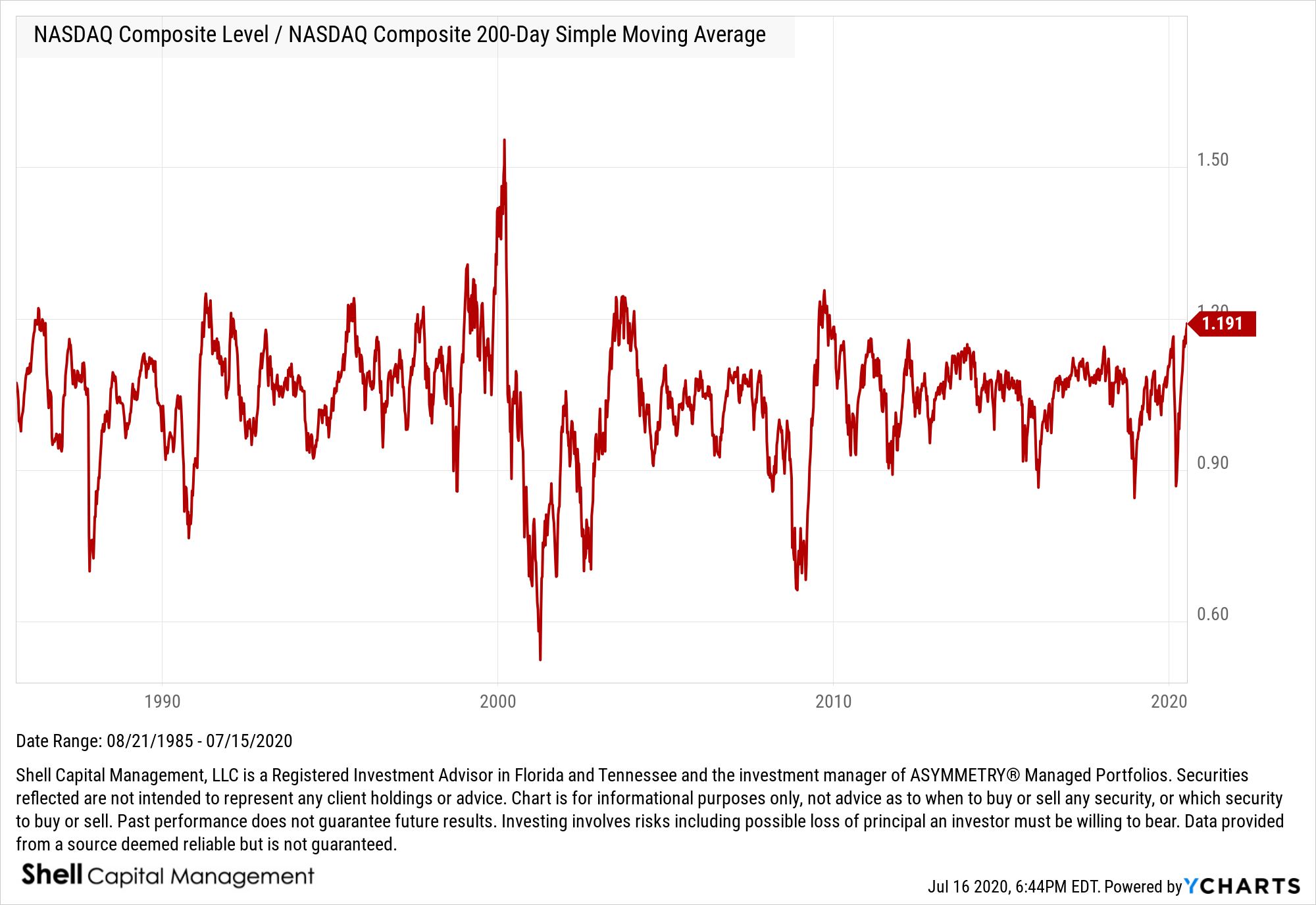
A lot of talk about the NASDAQ being 21% above its 200 day moving average
There’s a lot of talk about the NASDAQ being 21% above its 200 day moving average, so… here’s my 2 cents on the matter.
Yes indeed, the NASDAQ is over 21% above its 200 day moving average. So, if the 200 SMA is your exit, you’d endure a 21% drawdown waiting to sell. I’ve got a ratio chart for it, too. The 1.216 = 21.6% variation. Also note, it’s higher than it was in February.
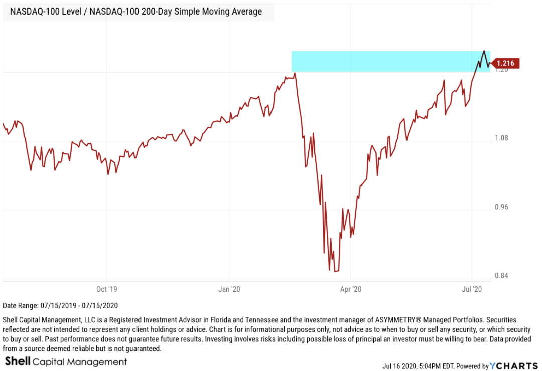
At a ratio of 1.20 it was high in February, since 1.20 = the level of the NASDAQ was 20% higher than its own 200 day SMA. How high is that?
It’s a decade high!
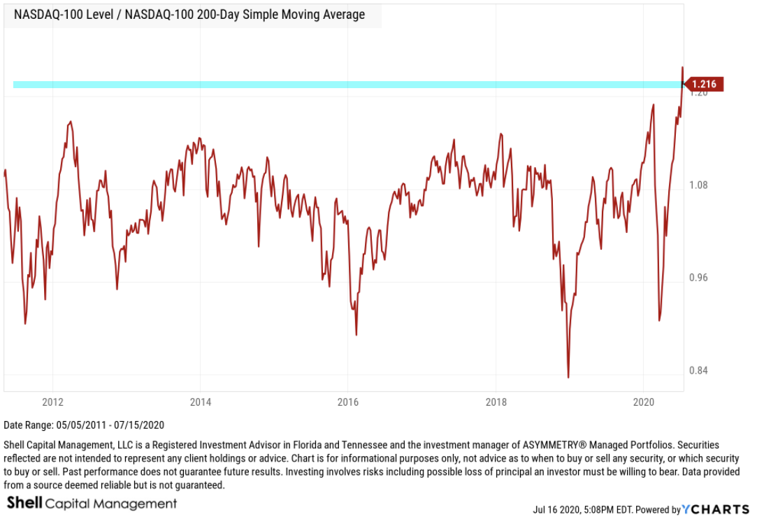
So, yeah, the NASDAQ seems stretched…
Like the CBOE Put/Call Ratio I shared in Here’s what the equity options put call ratio is telling us, and what it isn’t, the % above a moving average is another indication of sentiment.
When it’s as high as it is now, the market very enthusiastic.
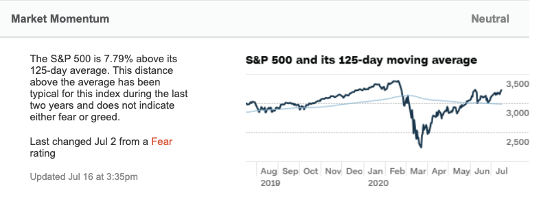
For example, the Fear & Greed Index calls it market momentum and uses the 125 on the S&P 500 as a measure of investor sentiment.
Chatting with some friends on Twitter, someone asked about the relative comparison to the 2000 stock market bubble.
The current period is no comparison to 1999-2000 when the NASDAQ was 50% above its 200 day SMA.
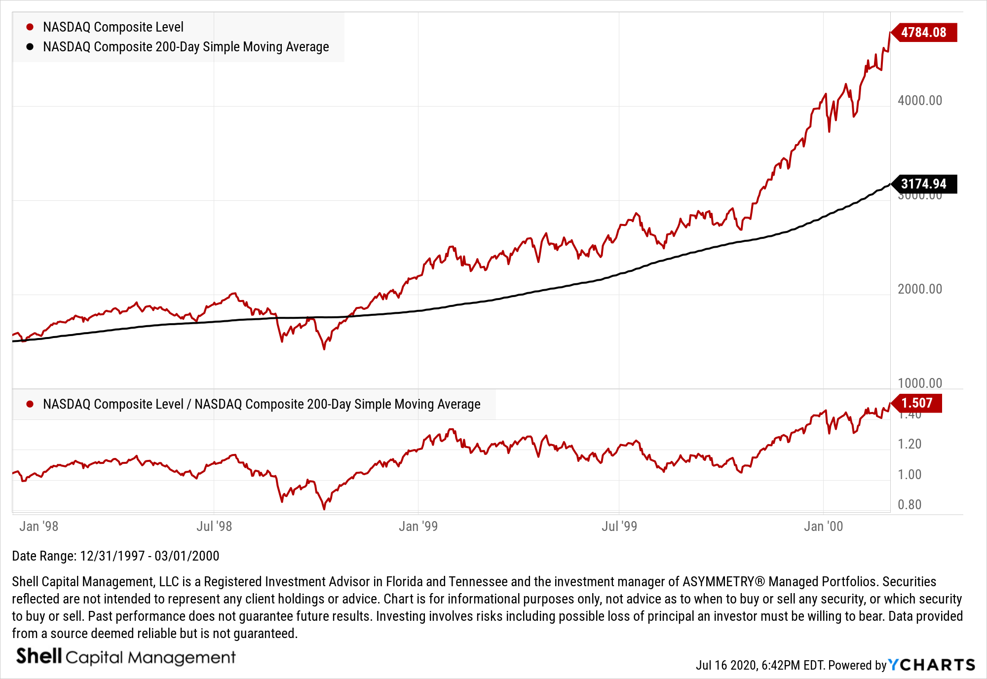
Here is the ratio between the NASDAQ and its own 200-day moving average back to 1985. The relative ratio level the NASDAQ got in 1999 was the highest ever seen.
Interestingly, I first started observing to get trading signals from relative strength ratio charts in the late 90s, and by the time 1999-2000 rolled around, I was comparing not only stocks to other stocks and their sector index, but also a cross section of global markets. For example, stocks vs. bonds, etc.
The NASDAQ was all the craze around 1999, and I had a t-shirt that said “NASDAQ; the world puts its stock in us.”
With technology leading with momentum, the tech heavy nas is seeing some popularity again.
Don’t miss out, get the email:
Join 520 other subscribers
Mike Shell is the Founder and Chief Investment Officer of Shell Capital Management, LLC, and the portfolio manager of ASYMMETRY® Global Tactical. Mike Shell and Shell Capital Management, LLC is a registered investment advisor focused on asymmetric risk-reward and absolute return strategies and provides investment advice and portfolio management only to clients with a signed and executed investment management agreement. The observations shared on this website are for general information only and should not be construed as advice to buy or sell any security. Securities reflected are not intended to represent any client holdings or any recommendations made by the firm. Any opinions expressed may change as subsequent conditions change. Do not make any investment decisions based on such information as it is subject to change. Investing involves risk, including the potential loss of principal an investor must be willing to bear. Past performance is no guarantee of future results. All information and data are deemed reliable but is not guaranteed and should be independently verified. The presence of this website on the Internet shall in no direct or indirect way raise an implication that Shell Capital Management, LLC is offering to sell or soliciting to sell advisory services to residents of any state in which the firm is not registered as an investment advisor. The views and opinions expressed in ASYMMETRY® Observations are those of the authors and do not necessarily reflect a position of Shell Capital Management, LLC. The use of this website is subject to its terms and conditions.
Should we care the S&P 500 closed above its 200-day simple moving average?
As the U.S. unemployment rate in April 2020 was 14.7%, the highest since the Great Depression, the U.S. stock market is trending up.

And May’s unemployment number may be higher when it’s announced on June 5.
The stock market is said to be a discounting mechanism. The largest stock market investors who drive price trends don’t look back, they look forward.
It’s an auction market and operates on the proposition that investors and traders gaze into the future and discounts all known information about the present moment and expectations for what’s expected to happen next. So, when unexpected events happen, the market takes into account this new information very rapidly.
It certainly seems to be happening now.
Either the market is factoring in a quick recovery, or something else is driving it up.
The Efficient Markets Hypothesis (EMH) is based on the theory that the stock market is a very efficient discounting system, so it factors in expectations of the future. The Efficient Markets Hypothesis suggests the stock market generally moves in the same direction as the economy.
Yeah, I know. If there ever was a time that sounds silly it’s now. Well, and every other market crash and bubble. I’ve seen my fair share of those in the past two decades.
One of the most interesting paradoxes in investment management is the market discounts everything is also the first premise of Technical Analysis.
The three premises on which the technical approach is based:
- Market action discounts everything.
- Prices move in trends.
- History repeats itself.
That both the Efficient Markets Hypothesis and Technical Analysis is based on the belief the market discounts everything known and expected about the future is logically self-contradictory, because EMH doesn’t believe prices move in trends. EMH certainly doesn’t believe Technical Analysis, including trend identification systems for trend following and pattern recognition, is useful. Yet, trend systems and pattern recognition are some of the very strategies that I’ve seen to achieve asymmetric risk-reward.
I consider most trend identification systems to be pattern recognition. Pattern recognition is the systematic recognition of patterns in data. For example, the first action in trading breakouts is to identify current price trend patterns along with potential support and resistance levels in order to signal entry and exit points.
So, here we are. The S&P 500 is now trading above its 200 day moving average again after trending below it on February 27th.

It has been shocking to most that the stock index is now only down about -10% from its February high after a -36% waterfall decline over just 23 trading sessions.
It the fastest waterfall we’ve seen of this magnitude, so maybe we shouldn’t be surprised to see it swing back up to recover 2/3rds of the decline.
But no, it’s not a surprise. I tactically traded through the last two most radical bear markets since the Great Depression and they both included many swings up and down along the way.
The swings are the danger.
If you wait too long and enter after prices have already trended up sharply, you may get invested in stocks just in time for the next trend down.
The same goes for the downside. If you wait until your losses are so large they become intolerable and tap out at the lows, you risk missing out on the price trend recovery like we just saw.
At what point do you feel good about geting back in?
After prices have trended back up as they have now? The S&P 500 is above the 200 day moving average, so it’s a sign of an uptrend.
Is this the time to buy?
Or, do you feel better about investing in stocks after the price trend falls more?
What if it doesn’t?
These are tactical trading decisions. Most investors are not good at it, but some of us are better.
The market is people who trade and invest in the market. People are always looking forward, gazing into the future that doesn’t yet exist, so prices are always adjusting according to people’s beliefs about what’s going to happen next. This includes all signals. All signals are necessarily predictions of the future.
As the SPX is now trending above its 200-day average, trend followers who use the SMA will buy here. We may indeed see some buying interest come in because of it. Only time will tell if its enough buying pressure to drive prices up more. I’ve been operating trend systems for decision-making for over two decades and I don’t know of any money manager who actually trades off a 200-day moving average signal, except one. I’m going to save it for another observation, but until then, I’ll simply share this.
The S&P Trend Allocator Index is designed to track the performance of a systematic trend-following strategy allocating between the S&P 500 and cash, based on price trends. If the S&P 500 is observed to be in a positive trend, then the index is allocated to the S&P 500, otherwise, it is allocated to cash.
Here is the S&P Trend Allocator Index relative to the S&P 500 stock index which is fully invested, all the time.

Oops.
Prior to the waterfall decline, the S&P 500 was trending 11% higher than its 200 day moving average. So, it was going to have at least a -11% drawdown with perfect execution. That’s a nice thing about it. It’s a predefined exit, so at the February high, you knew if the stock market falls, you’ll lose at least -11% before you exit. When we know our defined risk, we can decide to accept it, or not. If you were trading off the 200 SMA and believed a -11% drawdown was unacceptable, you could have raised your stop above it.
But then, if you sold earlier, how would you know when to get back in?
Ok, I just wanted to drive home the point: tactical trading decisions aren’t easy. No indicator works perfectly.
I don’t use the 200 SMA, but the S&P Trend Allocator index does. However, you may notice it didn’t sell at the price trend break below the 200 SMA. Instead, it sold later, and down much more. The S&P Trend Allocator Index sold later because it waits until five days after a crossover to sell. I marked on the chart the point on the price trend it actually sold.

S&P Trend Allocator Index Construction
“At the close of each business day, a trend signal is calculated based on the closing value of the S&P 500 Total Return Index (the “Allocation Indicator Index”) compared to its prior 200-day Simple Moving Average (SMA). The SMA is defined as the average of the last 200 closing values of the S&P 500 Total Return index. The trend signal is positive if the last five consecutive closing values of the S&P 500 Total Return index are equal to or greater than the SMA. The trend is negative if the last five consecutive closing index values are below the SMA. The trend signal does not change from its current status until there have been five consecutive days of index values indicating a signal change.”
I’m not going to get any deeper on this right now, but I will in a later observation, but the drawdown in the S&P Trend Allocator Index was about -27%.

Keep in mind; an index does not include any transaction cost or fees and may not be invested indirectly. If we were applying this trend following method with real money, there would have been transition costs, fund fees, advisory fees, and slippage to account for which would have negatively impacted the return profile. With that said…
Should we care that the S&P 500 is above its 200-day simple moving average?

Since the index was operated in real-time, above is the total return relative to its S&P 500 stock index which is fully invested in stocks all the time.
Here is the drawdowns for a complete picture of its risk-reward profile.

As you see, the S&P Trend Allocator applying the 200-day moving average to the S&P 500 had a drawdown of -27% vs. the -34% drawdown of the S&P 500.
So, the risk management method of the S&P Trend Allocator provided a drawdown control edge of about 7% relative to the fully invested stock index that is exposed to the risk and reward of the stocks all the time.
However, the total return is materially less at this point. Although the S&P Trend Allocator 200 day SMA exit signal exits with a lag and then reenters with a lag, it has participated in most of the stock market drawdowns and then misses out on the early part of its gains off the lows when the rate of change is highest.
It will take a larger downtrend for the 200 day SMA to show its value. The magnitude of the March decline was tremendous, but it happened so fast the lag was exposed as a risk to the strategy.
Now, just imagine how the risk/reward profile will be impacted if it enters the stock market right now, and then the market trends down again. This is one of the risks to be aware of with any trend-following or tactical trading system or method.
No investment strategy is ever perfect, but we gain an edge when we are aware of their weaknesses. I have spent more time trying to break my systems and methods to discover weaknesses than I did creating them.
Join 520 other subscribers
Mike Shell is the Founder and Chief Investment Officer of Shell Capital Management, LLC, and the portfolio manager of ASYMMETRY® Global Tactical. Mike Shell and Shell Capital Management, LLC is a registered investment advisor focused on asymmetric risk-reward and absolute return strategies and provides investment advice and portfolio management only to clients with a signed and executed investment management agreement. The observations shared on this website are for general information only and should not be construed as advice to buy or sell any security. Securities reflected are not intended to represent any client holdings or any recommendations made by the firm. Any opinions expressed may change as subsequent conditions change. Do not make any investment decisions based on such information as it is subject to change. Investing involves risk, including the potential loss of principal an investor must be willing to bear. Past performance is no guarantee of future results. All information and data are deemed reliable but is not guaranteed and should be independently verified. The presence of this website on the Internet shall in no direct or indirect way raise an implication that Shell Capital Management, LLC is offering to sell or soliciting to sell advisory services to residents of any state in which the firm is not registered as an investment advisor. The views and opinions expressed in ASYMMETRY® Observations are those of the authors and do not necessarily reflect a position of Shell Capital Management, LLC. The use of this website is subject to its terms and conditions.
Panic selling drove a waterfall decline and washout for the stock market
Growing up in East Tennessee and the Great Smoky Mountains, I observed a lot of waterfalls.
Wiki says a fall of water is an area where water flows over a vertical drop or a series of steep declines in the course of a stream or river.
According to National Geographic, a waterfall is a river or other body of water’s steep fall over a rocky ledge into a plunge pool below. Waterfalls are also called cascades. The process of erosion, the wearing away of earth, plays an essential part in the formation of waterfalls.

What we have witnessed in the global equity markets is a waterfall decline, the question now is if the plunge pool has developed.
 An overhang in a waterfall can sometimes protrude out enough to form a base, or even drive the water to flow upward for a while, but the waterfall isn’t over until the plunge pool develops.

Using the S&P 500 stock index as a proxy, it’s pretty clear there wasn’t much of an overhang along the way. For example, in the middle of this 3-year chart, we see how the decline in late 2018 played out. It had a lot of overhangs as the stock market was swinging up and down for several weeks. Now, compare that to this time…

What we have here is panic selling.
Investors tend to underreact and overreact to new information.
Underreaction: Trends begin to drift in a direction as people initially underreact to change, so the price trend unfolds gradually.
Overreaction: Sometimes, investors overreact to new information, so the price is driven too far, too fast. When the market overreacts, prices overshoot too high, or too low.
At the bottom of a waterfall is a plunge pool, where the water settles. What does the plunge pool look like as it develops? It’s a floor that has enough support the water stays were it is.
The trouble is, in the market, we don’t physically see the rock bottom. Unlike in physical science, an exchange market is a social science because it’s human behavior. Don’t think this is humans? Maybe it’s the computer algorithms? They are created and operated by humans.
I apply quantitative tools to get a read on how extreme investor sentiment is.
In analyzing market trends and price action, we can see what is going on with market internals, such as breadth. The NYSE Bullish Percent was developed by Abe Cohen was the first breadth indicator. Abe Cohen was an early pioneer of Point & Figure charting and created the NYSE BP in the mid-1950s. The NYSE Bullish Percent is a market risk barometer that measures the percent of stocks listed on the New York Stock Exchange that have a Point & Figure buy signal, so they making higher highs, so they are in uptrends. The NYSE Bullish Percent is washed out. It hasn’t been this low since the waterfall decline in October 2008.

The challenge with countertrends is they can also trend farther than you would ever believe is possible. It’s because markets don’t follow a normal distribution. Instead, market trends have fat tails, meaning some gains and losses exceed an otherwise normal distribution, as we see in physical science. As such, the overreactions can overshoot and just keep overshooting. We never know for sure when a trend has stopped. What we can do, however, is apply quantitative tools to gauge and guide. I use these as a guide and barometer for overall market risk.
The percent of the S&P 500 stocks above the 50-day moving average is washed out to 1%. In fact, only 7 of the 505 stocks in the S&P 500 are in a short term uptrend. While in a big bear market such as 2008-09, these conditions can continue for a long time, historically, this lower level of risk eventually offers the potential for asymmetric risk/reward. That is, the possibility for reward is greater than the risk it takes the achieve it. Or, the magnitude for a reward is greater than the downside risk, which can be predetermined with options or an exit (i.e., stop-loss.)

A material change that has occurred the past week is the percent of S&P 500 stocks above their 200 day moving average, or longer-term uptrends have washed out. Only 5% of the stocks are in uptrends now, so 95% of them are in long term downtrends. That doesn’t sound good, but when it reaches an extreme, it suggests to me the selling pressure is intense and could eventually dry up.

This is about as oversold the stock market gets, both internally looking at the individual stocks and the indexes. Sure, it can get more oversold and stay there for as long as sellers have the desire to sell, but it has reached the point the odds of a short term reversal is increasing the lower it goes.
Yesterday I asked: where do you think we are in the cycle of market emotions?

Clearly, when stock indexes drop 8-10% in a single day after already well off their highs, it is driven by emotional panic.
The US Investor Sentiment poll from AAII is released on a few day’s time lag, but Bearish % of those polled is another measure up to 2008-09 levels.

To no surprise, the Fear & Greed Index was penned all the way back to 1 after yesterday’s close.

What we have here is a washout. A washout is an event or period that is spoiled by constant or heavy rain. We may see more rain, but it’s a washout nonetheless. A washout in the stock market is when prices have been flooding down so hard, so broad, it seems like a washout of rain.
As you can imagine, with a waterfall, heavy rains increase the volume and speed of water flow. A washout pushes the river to its limits.
The desire to sell has been overwhelming any buying interest that remains for a few weeks now. This has been the fastest decline in US stock market history. I guess we shouldn’t be so surprised if we believe a trend stretched far in one direction is more prone to snap back harder and faster. That’s what we’ve seen here.
This is the end of the longest bear market in US history, and it has indeed ended with a bang. That also means this is the beginning of a bear market. What we don’t know in advance is how long it will last or how low it will go. If we knew it would be -50%, we could simply sell short and profit from the fall. If we knew this was “the bottom,” we could use leverage to maximize gains on the upside. But, none of us know the outcome in advance, not the biggest banks, not the largest asset managers, and neither you nor I. The edge I do have is accepting this reality and embracing it to the point I drove me to create risk management systems to limit the downside when I’m wrong and focus on the things I can control. I’ve operated tactically through periods like this many times before in the last two decades, so I’ll just do what I do, which means I’ll execute many entries and exits until we find the trend. In conditions like we’ve seen this year, they’ll be countertrends. Once trends do develop, they’ll be trend following.
What I’ve typically seen in past bear markets is many cycles up and down along the way. That isn’t what we’ve seen this time, so far. This reminds me more of September 11, 2001, after the World Trade Center was attacked. The difference is, the S&P 500 was already down about -17%, and since the planes hit the World Trade Center in New York, the NYSE was closed. The New York Stock Exchange remained closed until the following Monday. This was the third time in history that the NYSE experienced prolonged closure, the first time being in the early months of World War I[2][3] and the second being March 1933 during the Great Depression.
It may not play out this way this time, but countertrends should be expected. Here is what the stock market did after the exchange opened after September 11. The SPX dropped -12% quickly, but then investors become patriotic, and it recovered a few weeks later. Of course, this happened inside a bear market that started in 2000 and didn’t end until 2003.

Is this so different than 9/11? Of course, it is. Every new moment is always different. But, we’ve experienced these things before. I was much more of a rookie 20 years ago when I walked into my investment firm office to see the planes hit. It was an incredibly emotional and panicked time in American history. At the time, it wasn’t just the one attack, we wondered what would be next. It was the Pentagon, and another plane was hijacked. We didn’t know what to expect, it was uncertain. When would we be attacked again? Where? Would it wipe us out?
We didn’t know.
Portfolio managers and tactical traders must be here, now, in the present moment, not dwelling on the recent past, there will be time for that later when things are calm and quiet. But even then, we can’t do anything in the past, we can only do it now.
I hope this helps.
Mike Shell is the Founder and Chief Investment Officer of Shell Capital Management, LLC, and the portfolio manager of ASYMMETRY® Global Tactical. Mike Shell and Shell Capital Management, LLC is a registered investment advisor in Florida, Tennessee, and Texas. Shell Capital is focused on asymmetric risk-reward and absolute return strategies and provides investment advice and portfolio management only to clients with a signed and executed investment management agreement. The observations shared on this website are for general information only and should not be construed as advice to buy or sell any security. Securities reflected are not intended to represent any client holdings or any recommendations made by the firm. I observe the charts and graphs to visually see what is going on with price trends and volatility, it is not intended to be used in making any determination as to when to buy or sell any security, or which security to buy or sell. Instead, these are observations of the data as a visual representation of what is going on with the trend and its volatility for situational awareness. I do not necessarily make any buy or sell decisions based on it. Any opinions expressed may change as subsequent conditions change. Do not make any investment decisions based on such information as it is subject to change. Investing involves risk, including the potential loss of principal an investor must be willing to bear. Past performance is no guarantee of future results. All information and data are deemed reliable but is not guaranteed and should be independently verified. The presence of this website on the Internet shall in no direct or indirect way raise an implication that Shell Capital Management, LLC is offering to sell or soliciting to sell advisory services to residents of any state in which the firm is not registered as an investment advisor. The views and opinions expressed in ASYMMETRY® Observations are those of the authors and do not necessarily reflect a position of Shell Capital Management, LLC. The use of this website is subject to its terms and conditions.
Employment, Coronavirus, it’s just the market, doing what it does…
It seems most people probably believe the news drives the stock market.
I can see why, since the news headlines want to tell a story.
We like a great story. We want to hear the narrative. We definitely want to believe we know the causation of things going on around us.
Do you believe the news drives stock price trends?
“Coronavirus Live Updates: Trump Praises China’s Response to Outbreak as Death Toll Passes 600“ – New York Times
The Coronavirus outbreak in Wuhan China has grown exponentially as asymmetric uncertainties usually do. According to Worldometer, there are now 31,535 of which 4,826 (15%) in critical condition 638 deaths and 1,778 have recovered.

The Coronavirus outbreak only started less than a month ago, but its rate is exponential.

This is not the kind of asymmetry we want to observe. I hope a cure is found soon to save these human lives.
How has the stock market reacted?
The S&P 500 gained over 3% the past 5 days anyway…

It’s just the market… doing what it does…
This morning, in the U.S. we get great news on employment data.
The US Unemployment Rate measures the percentage of total employees in the United States that are a part of the labor force but are without a job. It’s one of the most widely followed indicators of the health of the US labor market and the US economy as a whole. Historically, the US Unemployment Rate reached as high as 10.80% in 1982 during a notable recessionary period.
The low Unemployment Rate has been a bright spot for the U.S. economy since unemployment trended up sharply in 2008 and peaked at 10.10% in November 2009, the highest level since ’82. A picture is worth a thousand words, so here the trend. from January 2007 to November 2009 as Unemployment Rate increased sharply from 4.4% to 10.10% in about two years.

Looking at the US Unemployment Rate in the bigger picture, below are the trends and cycles going back over sixty years. US Unemployment Rate is at 3.60%, compared to 3.50% last month and 4.00% last year. This is lower than the long term average of 5.73%. The last recession was the second-highest unemployment and it has recovered even smoother than before.

The headlines today:
“January adds a much stronger-than-expected 225,000 jobs, with a boost from warm weather” – CNBC
The stock indexes are down over -0.50% anyway…
I say: It’s just the market, doing what it does…
I believe investors underreact and overreact to new information “news.”
An overreaction is when price trends become overbought or oversold driven by psychological and investor sentiment reasons rather than fundamentals. It’s why we see crashes and bubbles, over short term and long term periods.
An underreaction is when investors initially underreact to new information such as earnings announcements, which leads to a predictable price drift. In other words, underreaction drives price trends!
Prices drift up or down over time when investors underreact to information.
Prices overshoot, trade up or down too far, too fast, when investors overreact to information.
This why my focus is on the direction of price trends, along with volatility, investor sentiment, and multiple time frame momentum.
My directional trend following systems are designed to catch the trends that drift from underreaction.
My countertrend systems signaled by momentum, extreme investor sentiment, and volatility analysis, are engineered to capitalize on overreactions.
Mike Shell is the Founder and Chief Investment Officer of Shell Capital Management, LLC, and the portfolio manager of ASYMMETRY® Global Tactical. Mike Shell and Shell Capital Management, LLC is a registered investment advisor in Florida, Tennessee, and Texas focused on asymmetric risk-reward and absolute return strategies and provides investment advice and portfolio management only to clients with a signed and executed investment management agreement. The observations shared on this website are for general information only and should not be construed as advice to buy or sell any security. Securities reflected are not intended to represent any client holdings or any recommendations made by the firm. Any opinions expressed may change as subsequent conditions change. Do not make any investment decisions based on such information as it is subject to change. Investing involves risk, including the potential loss of principal an investor must be willing to bear. Past performance is no guarantee of future results. All information and data are deemed reliable but is not guaranteed and should be independently verified. The presence of this website on the Internet shall in no direct or indirect way raise an implication that Shell Capital Management, LLC is offering to sell or soliciting to sell advisory services to residents of any state in which the firm is not registered as an investment advisor. The views and opinions expressed in ASYMMETRY® Observations are those of the authors and do not necessarily reflect a position of Shell Capital Management, LLC. The use of this website is subject to its terms and conditions.
Energy and MLP’s are the most oversold sector
The energy sector is the most oversold so far.
By oversold, I mean a condition where there has been enough selling pressure to drive prices down to low enough levels which overextended or excessive on a short-term basis, suggesting the downtrend could be an overreaction. When price trends overreact in the short-term by moving potentially too far, too fast, the trend becomes likely to reverse back up, at least temporarily. Afterward a countertrend back up, however, a short-term oversold trend may later reverse down again in continuation of a downtrend. So, observing a short-term oversold condition may not result in a long-term trend reversal up, but instead, my increase the odds of a short-term retracement. In the chart below of the energy sector index, we see an overall downtrend since the price on the left side is higher than the right a year later, however, we also observe the price swings along the way, which are shorter-term overbought/oversold countertrends.
Energy sector is -43% from its early 2014 high.
Energy sector is almost near its 2016 low.
Energy implied volatility is relatively low and below average.
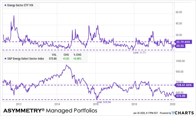
Alerian MLP energy index is at a new low
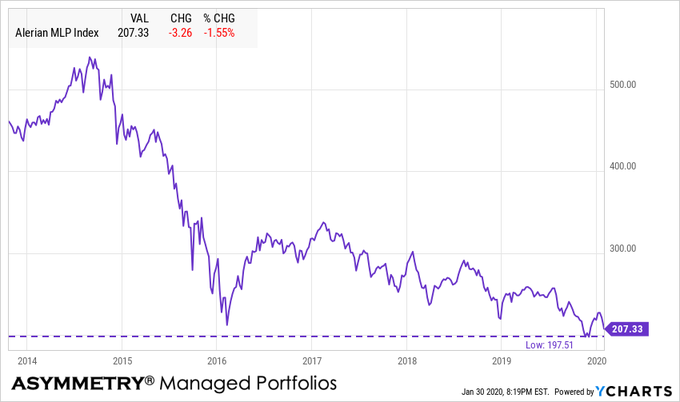
With the energy sector momentum signaling its price trend may have dropped too far, too fast, the dividend yield on the MLP index is at its high post-2016 at over 9%.

As the price falls, the dividend rises from that starting point, so it’s the one time we apply countertrend systems to capture future income from dividends. I wouldn’t be surprised to see the energy sector catch some buying enthusiasm soon if the overall stock market can hold up. Sometimes the weakest sectors show strength even as other sectors fall. Of course, the risk of a falling trend is it may keep falling and they can trend down far more than expected. The trouble is, when a trend does fall more than expected, it results in serial correlation; prices keep falling because, well, prices are falling! Waterfall declines are contagious, so you can probably see the ‘risk premium’ involved in this high dividend yield. There is no free lunch and nothing is without risks. I deal with risks by managing them through predefined exits, drawdown controls, and hedging.
So, I probably enter and exit a more global opportunity set of markets than most do since the risk for me is how I define it and how the position is structured, not the security itself.
I’m off to the Super Bowl in the morning! Unfortunately, my Tennessee Titans didn’t make it and my Tampa Bay Bucs didn’t come close, but I’ll be there anyway.
Mike Shell is the Founder and Chief Investment Officer of Shell Capital Management, LLC, and the portfolio manager of ASYMMETRY® Global Tactical. Mike Shell and Shell Capital Management, LLC is a registered investment advisor in Florida, Tennessee, and Texas focused on asymmetric risk-reward and absolute return strategies and provides investment advice and portfolio management only to clients with a signed and executed investment management agreement. The observations shared on this website are for general information only and should not be construed as advice to buy or sell any security. Securities reflected are not intended to represent any client holdings or any recommendations made by the firm. Any opinions expressed may change as subsequent conditions change. Do not make any investment decisions based on such information as it is subject to change. Investing involves risk, including the potential loss of principal an investor must be willing to bear. Past performance is no guarantee of future results. All information and data are deemed reliable but is not guaranteed and should be independently verified. The presence of this website on the Internet shall in no direct or indirect way raise an implication that Shell Capital Management, LLC is offering to sell or soliciting to sell advisory services to residents of any state in which the firm is not registered as an investment advisor. The views and opinions expressed in ASYMMETRY® Observations are those of the authors and do not necessarily reflect a position of Shell Capital Management, LLC. The use of this website is subject to its terms and conditions.
What’s the stock market going to do next?
Last week, I ended “You probably want to invest in stocks” with: Is it a good time to buy stocks? That’s my next observation as I’ll share the big picture.
As promised, here is my observation and insight on the big picture as well as the short term possibilities.
THE BIG PICTURE
First, I start with the big picture.
The S&P 500 is trading at 31.8 x earnings per share according to the Shiller PE Ratio which is the second-highest valuation level it has been in 150 years. Only in 1999 did the stock index trade at a higher multiple times earnings.

This price-earnings ratio is based on average inflation-adjusted earnings from the previous 10 years, known as the Cyclically Adjusted PE Ratio (CAPE Ratio), Shiller PE Ratio, or PE 10.
What is the P/E 10 and how is it calculated?
- Look at the yearly earning of the S&P 500 for each of the past ten years.
- Adjust these earnings for inflation, using the CPI (ie: quote each earnings figure in 2020 dollars)
- Average these values (ie: add them up and divide by ten), giving us e10.
- Then take the current Price of the S&P 500 and divide by e10.
The bottom line is, the stock market valuation has been expensive for a while now. The only time I factor in the price-earnings ratio is in the big picture. Although it isn’t a good timing indicator, it is considered a measure of the margin of safety for many investors and at this elevated level, there is no margin of safety by this measure.
As such, risk seems high in the big picture, which suggests investors should access their exposure to the possibility of loss in stocks and stock funds to be prepared for a trend reversal.
WHY MANAGE THE POSSIBILITY OF LOSS? WHY NOW?
That’s about as far as I go with “fundamental valuation” as quantitatively, I know to focus more on the direction of trends, momentum, and volatility.
So, let’s take a look.
STOCK MARKET MOMENTUM SEEMS STRETCHED.
I love me some up trends and momentum, but… sometimes all the gains come in a short period… and that’s what we’ve seen the past three months.

Just for fun, I included the average level of the S&P 500 (SPX) in the chart to show what level would be “mean reversion” if it happened. I don’t expect it to drop the low, but it’s interesting to see, nevertheless.
Next, I include the relative strength of SPX which measures the velocity of the price trend recently.

I highlighted the upper area red because when relative strength is really high, it often results in a price decline. Think of it as a “too far, too fast” indicator, but like all signals, it’s imperfect.
I highlighted the lower level as green because when prices fall so far, so fast that its relative strength is this low, the trend eventually reverses back up. It’s a measure of selling exhaustion.
Looking at the same data, but from a different angle, here you can see the correlation between the higher and lower relative strength levels and what happened next with the price trend.

In observing relative strength daily for over two decades now, in my observations, this level of relative strength suggests this is in the high-risk zone.
But, quantitative analysis of price trends is best observed through different confirming indicators.
THE WEIGHT OF THE EVIDENCE
For the sake of brevity, I’ll skip too much of a detailed definition, but the percent of S&P 500 stocks trading above their 200 day moving average is a measure of market breadth. Market breadth shows us what percent of stocks are participating in the trend. Right now, 87% of the S&P 500 stocks are trading in longer-term uptrends as defined by the 200-day moving average.

The high participation in the trend is a good thing until it reaches higher levels and extremes, then I start wondering where the next buying enthusiasm is going to come from. I start looking for the buying pressure to dry up. The red line I drew marks the three peak levels over the past year for reference.
In case you are wondering, here is how high the current level is relative to the past fifteen years.

It’s up there.
I analyze markets as to the direction of the trends, momentum, volaltity and investor sentiment.
VOLATILITY LEVEL AND DIRECTION
When it comes to volatility, I look at both the direction and rate of change in volatility, but also the level. I also split volatility into two completely different parts: implied (expected) volatility and realized (historical) volatility.
Starting with implied volatility, the VIX is extremely low again at 12.19. As we see in this long term chart, volatility cycles up and down over time, but it doesn’t really “revert to the mean.” To illustrate it, I included the long term average of 19.

The bottom line is, implied volatility, which is the expected volatility as implied by options prices shows a very low expected range of prices over the next 30 days. That’s positive until it isn’t.
At such low levels in implied volatility, we should expect to see another volatility expansion.
Next is the historical volatility on the S&P 500 index, which is the 30 Day Rolling Volatility. Here we calculate 30 Day Rolling Volatility as Standard Deviation of the last 30 percentage changes in Total Return Price * Square-root of 252 then multiplying the standard deviation by the square root of 252 to return an annualized measure. 252 is the number of trading days in a year.
I’m sure you needed to hear that. I won’t do it again.

I drew a red line over its history to highlight the current level. Historically, it’s on the low end. Volatility is commonly used as a measure of a security’s riskiness. Typically investors view a high volatility as high risk.
However, the opposite is true.
Volatility decreases over time as price trends up and by the time the price peaks, investors so confident the trend will continue they become very complacent. When volatility is extremely low as it is now, it’s when the risk of a price decline increases.
The opposite is also true. When volatile expands to a high level, it does so because prices have fallen and investors are indecisive, causing the range of stock prices to spread out. Prices spreading out is volatility and we see it spike at stock market lows.
What’s going to happen next?
The trend is up, it’s a quiet uptrend as volatility is contracting, and most stocks are trending up.
Everything is good until it isn’t.
KNOW YOUR RISK LEVEL AND RISK TOLERANCE.
Everything is impermanent, nothing lasts forever, so this too shall pass and by my measures, it’s getting closer.
So, I implemented my drawdown control and took profits on stocks today.
Mike Shell is the Founder and Chief Investment Officer of Shell Capital Management, LLC, and the portfolio manager of ASYMMETRY® Global Tactical. Mike Shell and Shell Capital Management, LLC is a registered investment advisor focused on asymmetric risk-reward and absolute return strategies and provides investment advice and portfolio management only to clients with a signed and executed investment management agreement. The observations shared on this website are for general information only and should not be construed as advice to buy or sell any security. Securities reflected are not intended to represent any client holdings or any recommendations made by the firm. Any opinions expressed may change as subsequent conditions change. Do not make any investment decisions based on such information as it is subject to change. Investing involves risk, including the potential loss of principal an investor must be willing to bear. Past performance is no guarantee of future results. All information and data are deemed reliable but is not guaranteed and should be independently verified. The presence of this website on the Internet shall in no direct or indirect way raise an implication that Shell Capital Management, LLC is offering to sell or soliciting to sell advisory services to residents of any state in which the firm is not registered as an investment advisor. The views and opinions expressed in ASYMMETRY® Observations are those of the authors and do not necessarily reflect a position of Shell Capital Management, LLC. The use of this website is subject to its terms and conditions.
Is Santa Claus coming to town?
A Santa Claus Rally refers to the tendency for the stock market to trend up in the last week of December into the New Year. Several theories exist for its existence, including holiday shopping, enthusiasm fueled by the holiday spirit, and professional investment managers adjusting portfolios before going on vacation.
From the look of today’s price action, Santa came early. For me, it’s all about math and the status of the trend. U.S. stocks continue their uptrend with a volatility expansion.

How much more momentum the uptrend will have may be near exhaustion.
Considering the price trend of the stock index is already trended above the top end of the range, it will take a strong thrust of buying enthusiasm to drive it more than 1-2% higher from here.
So, this may be about it for 2019 gains for this broad index.
Only time will tell…
Mike Shell is the Founder and Chief Investment Officer of Shell Capital Management, LLC, and the portfolio manager of ASYMMETRY® Global Tactical.
Mike Shell and Shell Capital Management, LLC is a registered investment advisor focused on asymmetric risk-reward and absolute return strategies and provides investment advice and portfolio management only to clients with a signed and executed investment management agreement. The observations shared on this website are for general information only and should not be construed as advice to buy or sell any security. Securities reflected are not intended to represent any client holdings or any recommendations made by the firm. Any opinions expressed may change as subsequent conditions change. Do not make any investment decisions based on such information as it is subject to change. Investing involves risk, including the potential loss of principal an investor must be willing to bear. Past performance is no guarantee of future results. All information and data are deemed reliable but is not guaranteed and should be independently verified. The presence of this website on the Internet shall in no direct or indirect way raise an implication that Shell Capital Management, LLC is offering to sell or soliciting to sell advisory services to residents of any state in which the firm is not registered as an investment advisor. The views and opinions expressed in ASYMMETRY® Observations are those of the authors and do not necessarily reflect a position of Shell Capital Management, LLC. The use of this website is subject to its terms and conditions.
The stock market has made little progress in the past two years which is a hostile condition for trend following
Until the recent breakout to new highs, the stock and bond markets have made little progress in the past two years. Below are the price trend and total return chart of the S&P 500 stock index (SPX). The price trend of SPX has trended in a range of 20% to 30% since the first of 2018, but until this month, it had made very little progress.

The price return through today is 7.45%, and the total return, including dividends, is 11.38%. At the end of October, it was only 5.73% and 9.5%.
So, this has been a long non-trending volatile period similar to 2015 and 2016. From January 2015 to November 2016, the percent change of the SPX was near zero. Finally, in December, it trended up and broke out to a new uptrend. Still, over two years, the price trend change was only 8.74%.

I define market trends as volatile and non-volatile, trending, and non-trending. When we understand the current condition, it helps with tactical decisions of which type of system to focus on.
When markets are trending, and quiet, directional trend following systems enjoy the ride.
When a market gets choppy and volatile, the trend following systems have difficulty as they may exit the lows only to miss out on the price trend reversal back up. Then, by the time they reenter, the trend reverses back own again. A straightforward observation is the 200-day moving average, which got whipsawed several times in the 2015 to 2016 period.

I don’t trade moving averages. But, if we did over this period by entering the signal above the moving average and entered/exited at the close the day it was crossed, we’d have experienced these whipsaws. Of course, just thinking back to the past isn’t nearly as exciting as experiencing market action in real-time.
But, applying the moving average would have resulted in approximately -2.2% in 2015 vs. a small gain of 1.25% in the SPX.
In 2016 executing the signals resulted in a gain of 8% vs. 12 for the SPX.
Only looking at the upside leaves out the downside we have to experience to achieve it. Below are the drawdowns of this method applied to the stock index (blue line) vs. the stock index itself (red line.) This simplified example using a moving average for trend following missed most of the first decline with a drawdown of only -3% when the SPX dropped -8%, but then it participated in the next decline. Also notice it took a while to regain exposure, so it “missed out” of the sharp uptrend reversal April 2016 to July.

When it’s one sharp declined after an uptrend, trend following methods usually exit and avoid some loss. It’s when the price swings up and down over a period we see the whipsaws of non-profitable entries and exits.
Over the past two decades, I’ve spent a lot more time and resources studying what causes entry and exit systems to fail than data mining for those that were historically successful. My heavy emphasis on what doesn’t work helped me to discover what does. Of course, this isn’t an example of a method that doesn’t work just because it didn’t achieve a perfect result of a hostile period. The other side of its results over this period was the smaller drawdown. To many investors, it’s worth missing some upside if the downside is limited.
If we want to manage the downside loss, we must be willing to miss some upside gain as there is no free lunch in active risk management.
These periods that are hostile for some methods signaled for me to have other weapons in the arsenal. For example, while trend following methods can do well in trending, non-volatile markets by catching the trend and riding it to the end, my countertrend systems are shorter-term and aim to enter and exit the swings. So, my countertrend systems actually consider the swings a friendly condition as they want to enter the shorter term countertrends down and exit to take a profit after it trends up.
Applying both of these systems is a bit of a shell game. But hey, that’s my name, so it may as well be my game. I say it’s a shell game because trend following and countertrend systems are in direct conflict with each other, so we necessarily need to decide which to use, when. It’s another tactical decision. It requires me to determine which market condition we’re observing and then apply the method that seems to best fit the situation. Nothing is ever perfect, and it’s far from easy, but when executed well, we have the potential to take advantage of different conditions. Or, more importantly, to avoid the hostile conditions of the single strategy.
It’s all easier said than done.
I have spent much effort in developing systems and skills for the execution of them. I am well aware of the challenges I face. But, I embrace the challenges, accept them, and deal with them.
By the way, the same 200-day moving average trend following method once again had its share of whipsaws since the beginning of 2018.

So, anyone applying trend following like this is happy to see the new breakout and hoping it will continue. If it doesn’t, the moving average exit signal is about -6% below the current price, so it would result in a -6% drawdown if the price falls from this point.
My countertrend systems, on the other hand, are signaling a short-term exit for this same stock index and entries on sectors like Utilities and Real Estate. You can see why in the chart.

They are in an overall uptrend, but their prices have dropped recently, offering a potentially asymmetric risk/reward if the uptrend resumes back up. That is, the downside is limited by predefining an exit if they continue to fall, but it’s more probable they may reverse back up and continue their uptrends. If they do, it becomes a trend-following trade. Of course, the indexes cannot be invested in directly, and this isn’t advice, but an example of how a countertrend system may look.
So, the bottom line is this has been a non-trending, very volatile two years for U.S. stocks and it’s a state that is hostile for simple directional trend following methods. If the recent breakout to the upside continues, the market state shifts to trending and maybe less volatile, but as I pointed out in Quantitative trend and technical analysis indicators signal strong U.S. equity participation in the uptrend but it may be nearing exhaustion it seems more likely we’ll see some countertrend or at least a stall even though this is a historically seasonably strong period.
The trick is to be prepared for whatever may happen next, and I am.
Mike Shell is the Founder and Chief Investment Officer of Shell Capital Management, LLC, and the portfolio manager of ASYMMETRY® Global Tactical.
Mike Shell and Shell Capital Management, LLC is a registered investment advisor focused on asymmetric risk-reward and absolute return strategies and provides investment advice and portfolio management only to clients with a signed and executed investment management agreement. The observations shared on this website are for general information only and should not be construed as advice to buy or sell any security. Securities reflected are not intended to represent any client holdings or any recommendations made by the firm. Any opinions expressed may change as subsequent conditions change. Do not make any investment decisions based on such information as it is subject to change. Investing involves risk, including the potential loss of principal an investor must be willing to bear. Past performance is no guarantee of future results. All information and data are deemed reliable but is not guaranteed and should be independently verified. The presence of this website on the Internet shall in no direct or indirect way raise an implication that Shell Capital Management, LLC is offering to sell or soliciting to sell advisory services to residents of any state in which the firm is not registered as an investment advisor. The use of this website is subject to its terms and conditions.
Divergence between Value, Growth, and Momentum.
There is an interesting divergence today between Momentum, Growth, and Value.

Up until now, Value has lagged Growth and Momentum, as seen in this 5-year chart.

The underperformance of Value has been a topic of conversation of hedge fund managers I know who are Value investors.
Three-month momentum shows Value is trending up.

I believe styles like Growth vs. Value are largely driven by sectors, which is why I tend to focus more on the more granular sectors rather than broader styles. Today we see the relative strength is in Energy and Financials, which have been the lagging sectors lately.

So, this may not be enough to say the trend is changing to a period where Value outperformance growth for years, but it’s at least enough to be aware.
At some point, Value will take over leadership and when it does, it may continue for years.
For now, exposure to Value, including high dividend-paying stocks like we have, is having a good day while other factors are not.
Mike Shell is the Founder and Chief Investment Officer of Shell Capital Management, LLC, and the portfolio manager of ASYMMETRY® Global Tactical.
Mike Shell and Shell Capital Management, LLC is a registered investment advisor focused on asymmetric risk-reward and absolute return strategies and provides investment advice and portfolio management only to clients with a signed and executed investment management agreement. The observations shared on this website are for general information only and should not be construed as advice to buy or sell any security. Securities reflected are not intended to represent any client holdings or any recommendations made by the firm. Any opinions expressed may change as subsequent conditions change. Do not make any investment decisions based on such information as it is subject to change. Investing involves risk, including the potential loss of principal an investor must be willing to bear. Past performance is no guarantee of future results. All information and data is deemed reliable, but is not guaranteed and should be independently verified. The presence of this website on the Internet shall in no direct or indirect way raise an implication that Shell Capital Management, LLC is offering to sell or soliciting to sell advisory services to residents of any state in which the firm is not registered as an investment advisor. Use of this website is subject to its terms and conditions.
Sector SPDRs are subject to risk similar to those of stocks including those regarding short selling and margin account maintenance. All ETFs are subject to risk, including possible loss of principal. Sector ETF products are also subject to sector risk and non-diversified risk, which will result in greater price fluctuations than the overall market.
The S&P 500 stock market index is holding the line
The stock index is holding the line so far.

You can see the percent of S&P 500 stocks trading above their 50 day moving average closed at 30% last week. It’s also testing a low trend, not it is a real trend where buying/selling pressure exists, it’s just a line showing the percent of stocks in short term uptrends are where they were at the May low.

Next, we see the percent of stocks above the longer-term trend closed at 55% last week, the same level as the March and May lows.

CBOE S&P 500 Volatility Index $VIX only dropped -2.77%, which is light, considering the S&P 500 closed up 1.1%.

The options market last Friday showed asymmetry between put buying and call buying with the market favoring puts 144%. Index options seem to be mostly used for hedging.

Individual equity options are more traded for speculation. Put buying was high on individual stocks last Friday, too. You can see the typical range is much lower.

This isn’t advice for anyone as this index cannot be traded directly, but I want to make a point that if I wanted to take a position here to increase explore, I would place my exit just below the red line. The red line is the May and March lows, so if the price trend falls below that, the trend changes from up to down. Lower highs and lower lows is a simple example of a downtrend. I just wanted to point that out as a very simple example of a tactical trade based on the price trend.

We’ll see how it all unfolds from here.
Mike Shell is the Founder and Chief Investment Officer of Shell Capital Management, LLC, and the portfolio manager of ASYMMETRY® Global Tactical.
Mike Shell and Shell Capital Management, LLC is a registered investment advisor focused on asymmetric risk-reward and absolute return strategies and provides investment advice and portfolio management only to clients with a signed and executed investment management agreement. The observations shared on this website are for general information only and should not be construed as advice to buy or sell any security. Securities reflected are not intended to represent any client holdings or any recommendations made by the firm. Any opinions expressed may change as subsequent conditions change. Do not make any investment decisions based on such information as it is subject to change. Investing involves risk, including the potential loss of principal an investor must be willing to bear. Past performance is no guarantee of future results. All information and data is deemed reliable, but is not guaranteed and should be independently verified. The presence of this website on the Internet shall in no direct or indirect way raise an implication that Shell Capital Management, LLC is offering to sell or soliciting to sell advisory services to residents of any state in which the firm is not registered as an investment advisor. Use of this website is subject to its terms and conditions.
Technical analysis of the stock trend and volatility
Just yesterday I shared the observation in The value of technical analysis of stock market trends that the stock indexes were in a tight range the past month and we’d likely see a breakout, up or down.
I didn’t mention possible macroeconomic or geopolitical factors, I just pointed it out saying the market does what it does., and something or someone gets the blame.
Today, the stock market has shifted from being positive after the open, shaking off news of China imposing new tariffs on the U.S., to a waterfall decline down -2% at this point. Below is the up-close trend of today’s action so far.

Some probably believe the stock market is falling because of the new China Tariffs on the U.S, Trump Tweet about China, Jackson Hole Comments, or The Federal Reserve.
The reality is, it’s just the market, doing what it does.
I focus on that. The price trend and volatility.
Here is the trend looking at the tight range I observed yesterday. As you can see, the price is still within the range, but it’s trending toward the lower range.

In the meantime, the CBOE S&P 500 Volatility Index (VIX) has spiked up 25% today on the new enthusiasm for expected future volatility.

Wikipedia defines Technical Analysis as:
In finance, technical analysis is an analysis methodology for forecasting the direction of prices through the study of past market data, primarily price and volume.
By that definition, what I’m sharing here isn’t Technical Analysis, I guess.
Investopedia defines it as:
Technical analysis is a popular trading method that analyzes past price action, usually on charts, to help predict future price movements in financial markets.
But, I am analyzing past price action on charts, but not necessarily to predict future price movements.
I’ll just call it charting.
I hope you find it helpful.
Let’s see how it closes.
Mike Shell is the Founder and Chief Investment Officer of Shell Capital Management, LLC, and the portfolio manager of ASYMMETRY® Global Tactical.
Mike Shell and Shell Capital Management, LLC is a registered investment advisor and provides investment advice and portfolio management exclusively to clients with a signed and executed investment management agreement. The observations shared on this website are for general information only and should not be construed as advice to buy or sell any security. Securities reflected are not intended to represent any client holdings or any recommendations made by the firm. Investing involves risk, including the potential loss of principal an investor must be willing to bear. Past performance is no guarantee of future results. All information and data is deemed reliable, but is not guaranteed and should be independently verified. The presence of this website on the Internet shall in no direct or indirect way raise an implication that Shell Capital Management, LLC is offering to sell or soliciting to sell advisory services to residents of any state in which the firm is not registered as an investment advisor. Use of this website is subject to its terms and conditions.
Small stocks are still lagging
The chart is the price trend of the Russell 2000 Index, which is a small-cap stock market index compared to the S&P 500, the stock market index based on the market capitalizations of 500 large companies. Small-cap stocks have been lagging over the past year.

Smaller stocks lagging behind larger companies is more typical in the late stage of a bull market and economic expansion.
Looking back over three years, we see smaller stocks were leading on the upside during the uptrend. That hasn’t been the case recently.

This divergence may be an early sign of a regime change.
Mike Shell is the Founder and Chief Investment Officer of Shell Capital Management, LLC, and the portfolio manager of ASYMMETRY® Global Tactical.
Mike Shell and Shell Capital Management, LLC is a registered investment advisor and provides investment advice and portfolio management exclusively to clients with a signed and executed investment management agreement. The observations shared on this website are for general information only and should not be construed as advice to buy or sell any security. Securities reflected are not intended to represent any client holdings or any recommendations made by the firm. Investing involves risk including the potential loss of principal an investor must be willing to bear. Past performance is no guarantee of future results. All information and data is deemed reliable, but is not guaranteed and should be independently verified. The presence of this website on the Internet shall in no direct or indirect way raise an implication that Shell Capital Management, LLC is offering to sell or soliciting to sell advisory services to residents of any state in which the firm is not registered as an investment advisor. Use of this website is subject to its terms and conditions.
Will the stock market hold the line? or do we keep hedging risk? and opportunity for high income yield
The U.S. stock indexes declined -6.84% for the large-cap S&500, -11% for mid caps, and about -19% for small-cap stocks mostly in the single month of May.

Since June 1st, however, these same stock indexes have started to trend back up.

Over the past 3 months, momentum has turned negative for the stock indexes.

My strategy was to hedge off some of this downside risk. I then removed my hedges for a profit. It doesn’t always work out that way. A hedge position isn’t necessarily intended to be profitable through the entry and exit, but instead, the objective is to hedge off some of the downsides of long positions. Sometimes I hold them too long and lose their gains, other times I exit and realize a profit, and then there are times I exit them too soon with a profit but miss an even large profit. It ain’t perfect, nor does it need to be, and I’m okay with it.
My stock market observation yesterday, which I shared on Twitter, was:
This double bottom could be a likely short-term low if the
#SPX$SPY holds the line… my guess is it’s more likely than not. If it breaks down further from here, though, it probably gets ugly like when it didn’t hold last December…

So far, so good… as marked with a simple trend line.
 A week ago the AAII Sentiment Survey showed an unusually high level of Pessimism and optimism at an unusually low level… signals to stalk the market for good risk/reward setups on the buy side.

I exited my hedges a few days ago and increase my exposure to stocks. However, I did this at the same time my momentum and systematic trend following systems shifted from stocks to bonds or cash. So, my entries are based on signals from my countertrend and high-income yield systems. As prices fall in high yielding ETFs, their dividend yield increases.
Global X SuperDividend™ US ETF (DIV) is an interesting example. This is not investment advice for anyone to buy this ETF as I only provide advice and portfolio management to clients via an executed contract. It is useless to know what I would buy if you don’t know how much I would buy and when I would sell. With that said, the chart of Global X SuperDividend™ US ETF (DIV) shows as the price (blue line) declined to a double bottom, the dividend yield has increased to 7.6%. So, if I entered it here, it would be expected to yield 7.6% going forward. I am only using this for informational purposes, so I’m not including all the variables and risks it may not which can be found here.
The point is, you can see how as price falls in a high yielding asset, it’s yield rises.

I have recently made my ASYMMETRY® High Income Yield Portfolio available to clients who seek high income from their portfolio and are willing to accept fluctuation in the balance. Up until now, I had been testing this strategy with my own capital. The portfolio focuses on asymmetric risk/reward opportunities for high-income yield and also adds an asymmetric hedging system to help with downside risk management. For more information on the strategy, contact me.
Mike Shell is the Founder and Chief Investment Officer of Shell Capital Management, LLC, and the portfolio manager of ASYMMETRY® Global Tactical.
Mike Shell and Shell Capital Management, LLC is a registered investment advisor and provides investment advice and portfolio management exclusively to clients with a signed and executed investment management agreement. The observations shared on this website are for general information only and are not specific advice, research, or buy or sell recommendations for any individual. Investing involves risk including the potential loss of principal an investor must be willing to bear. Past performance is no guarantee of future results. All information provided is deemed reliable, but is not guaranteed and should be independently verified. The presence of this website on the Internet shall in no direct or indirect way raise an implication that Shell Capital Management, LLC is offering to sell or soliciting to sell advisory services to residents of any state in which the firm is not registered as an investment advisor. Use of this website is subject to its terms and conditions.
The normal noise of the market?
We shouldn’t be surprised to see stock prices pull back closer to their average true range in the days ahead. Such a pullback or stall would be normal.
Below I highlight the strong momentum Technology sector XLK ETF as an example of stock prices in some sectors finally reaching their prior highs. In addition to the price trend reaching a point of potential overhead resistance at the prior high, we observe this trend is also outside the upper volatility band of average true range.

Most of the time, we should expect to see a price trend stay within this range. If a price trend breaks out of the range higher or lower, it can be evidence of a trend change. In this case, the short term trend has been up since January, the intermediate trend has been sideways, non-trending and volatile since last September. Sine the short term trend has been an uptrend since January, I view the upside breakout above the volatility band a signal the trend may be more likely to pull back within the channel range.
The broad stock market S&P 500 index ETF SPY doesn’t look a lot different than the Technology sector, except it’s about -2% away from reaching its September 2018 high.

The bottom line is, looking at the directional price trends they are up in the short term but reaching a point they could see some resistance from the prior highs. At the same time, my momentum systems suggest the trends are reaching an overbought level and the price and expanded outside their average true range channel.
A small short-term pullback in stock prices from here would be within the range I consider normal noise of the market.
Mike Shell is the Founder and Chief Investment Officer of Shell Capital Management, LLC, and the portfolio manager of ASYMMETRY® Global Tactical.
Mike Shell and Shell Capital Management, LLC is a registered investment advisor and provides investment advice and portfolio management exclusively to clients with a signed and executed investment management agreement. The observations shared on this website are for general information only and are not specific advice, research, or buy or sell recommendations for any individual. Investing involves risk including the potential loss of principal an investor must be willing to bear. Past performance is no guarantee of future results. All information provided is deemed reliable, but is not guaranteed and should be independently verified. The presence of this website on the Internet shall in no direct or indirect way raise an implication that Shell Capital Management, LLC is offering to sell or soliciting to sell advisory services to residents of any state in which the firm is not registered as an investment advisor. Use of this website is subject to its terms and conditions.
Giddy up…
As expected, the U.S. stock market declined briefly, then found enough buying enthusiasm to drive prices to a new breakout above the March high.
As I concluded in Strong stock market momentum was accompanied by broad participation:
“…though we shouldn’t be surprised to see short term weakness, we could suppose the longer term trend still has room to run.”
As we see in the chart below, while the U.S. stock market is trending with absolute momentum, the strongest relative momentum has been in other countries around the globe.

Though my short term momentum systems signaled weeks ago the current uptrend may become exhausted and it did, the reversal back up and continuation since then appears bullish.
At this point, it appears some global stock markets are in uptrends and may have more room to run. For asymmetric risk/reward, I cut my losses short and let the winners run on.
Giddy up…
Mike Shell is the Founder and Chief Investment Officer of Shell Capital Management, LLC, and the portfolio manager of ASYMMETRY® Global Tactical.
Mike Shell and Shell Capital Management, LLC is a registered investment advisor and provides investment advice and portfolio management exclusively to clients with a signed and executed investment management agreement. The observations shared on this website are for general information only and are not specific advice, research, or buy or sell recommendations for any individual. Investing involves risk including the potential loss of principal an investor must be willing to bear. Past performance is no guarantee of future results. All information provided is deemed reliable, but is not guaranteed and should be independently verified. The presence of this website on the Internet shall in no direct or indirect way raise an implication that Shell Capital Management, LLC is offering to sell or soliciting to sell advisory services to residents of any state in which the firm is not registered as an investment advisor. Use of this website is subject to its terms and conditions.
Strong stock market momentum was accompanied by broad participation
Not only has the broad stock market indexes like the S&P 500 advanced sharply with great momentum since late December 2018, but its breadth has also been impressive.
The percent of stocks trading above their 50 day moving averages shows about 92% of stocks are in short term uptrends. This advance not only confirmed the price trend momentum but suggests participation has been broad. More stocks are above their 50-day moving averages that late 2017.

The downside is we are necessarily observing only the past and the past doesn’t assure future performance. In fact, once 92% of stocks are already in shorter-term uptrends, we can start to wonder at what point the buying enthusiasm is exhausted. That is, indicators like this may be observed for signs of an inflection point.

However, the percent of stocks above their 200 day moving averages is at 63%. So applying that same line of thinking, though we shouldn’t be surprised to see short term weakness, we could suppose the longer term trend still has room to run.
We’ll see…
Mike Shell is the Founder and Chief Investment Officer of Shell Capital Management, LLC, and the portfolio manager of ASYMMETRY® Global Tactical.
Mike Shell and Shell Capital Management, LLC is a registered investment advisor and provides investment advice and portfolio management exclusively to clients with a signed and executed investment management agreement. The observations shared on this website are for general information only and are not specific advice, research, or buy or sell recommendations for any individual. Investing involves risk including the potential loss of principal an investor must be willing to bear. Past performance is no guarantee of future results. All information provided is deemed reliable, but is not guaranteed and should be independently verified. The presence of this website on the Internet shall in no direct or indirect way raise an implication that Shell Capital Management, LLC is offering to sell or soliciting to sell advisory services to residents of any state in which the firm is not registered as an investment advisor. Use of this website is subject to its terms and conditions.
Putting my short-term technical analysis tactician hat on and hedging off equity risk
I’m dialing in to look at shorter-term technical analysis as my risk management systems are suggesting a risk of a stock market decline is becoming elevated.

Zooming in to shorter time frames, the U.S. stock market advance appears to be becoming exhausted.
The chart below is the SPDR® S&P® 500 ETF, yesterday on a 5-minute chart. Now that’s zooming in! I’m not a day trader, but I’m monitoring the trend for signs of buying exhaustion and/or selling pressure to potentially take over. Yesterday this index ETF was up nearly .75% in the morning, then you can see it drifted down to close well below its VWAP for the day.

The next chart shows the SPY trend going back for about six months. The recent stock advance has been impressive and I’m sure glad we participated in it, but I’m now applying some situational awareness. The strong momentum since the late December 2018 low could be becoming exhausted and may find some resistance for higher prices, at least temporarily.

As a tactician, since we had heavy exposure to stocks, I’ve been gradually reducing exposure and today started hedged off some equity risk to offset some of my market risks. I did that as opposed to taking large profits and realizing taxable gains. Fortunately, we took advantage of last years volaltity and made the best of it by executing significant tax loss harvesting. This time I decided to hedge some of our gains rather than realize them.
I may be wrong, but my risk management systems are elevated for at least a short term exhaustion, so I expect we’ll see some selling pressure overwhelm buying at some point from here. If it doesn’t, then it’s a good sign the momentum may be here to stay a while, but I’ll probably still wait for a reversal down to add more exposure in my tactically managed portfolio. My objective is asymmetric risk/reward, and from this starting point, I see more potential for downside than upside for stocks. My systems aren’t always right, but the magnitude of the gains are larger than the losses when it’s wrong. I call it ASYMMETRY®.
Mike Shell is the Founder and Chief Investment Officer of Shell Capital Management, LLC, and the portfolio manager of ASYMMETRY® Global Tactical.
Mike Shell and Shell Capital Management, LLC is a registered investment advisor and provides investment advice and portfolio management solely to clients with a signed and executed investment management agreement. The observations shared on this website are for general information only and are not specific advice, research, or buy or sell recommendations for any individual. Investing involves risk including the potential loss of principal an investor must be willing to bear. Past performance is no guarantee of future results. All information provided is deemed reliable, but is not guaranteed and should be independently verified. The presence of this website on the Internet shall in no direct or indirect way raise an implication that Shell Capital Management, LLC is offering to sell or soliciting to sell advisory services to residents of any state in which the firm is not registered as an investment advisor. Use of this website is subject to its terms and conditions.
If fund flow doesn’t show up in price, does it really matter?
“If a tree falls in a forest and no one is around to hear it, does it make a sound?”
It’s a philosophical thought experiment that raises questions about perception and observation.
Is sound only sound if someone hears it?
Can something exist without being perceived?
Some investment managers focus on fund flows to understand how large institutional investors are positioning their capital. If I paid attention to it, I would probably focus more on the trend for extremes rather than the level or direction of flows. I believe the crowd does the wrong thing at the wrong time and that includes most professional investors and portfolio managers. So, I expect it would be a contrary indicator that I could quantify to be true. After money flows out of funds at an extreme, it’s probably a good time to buy their shares.
Fund flow is the net of all the cash inflows and outflows in and out of a fund or asset class. In the last few months of 2018, we heard a lot about capital flowing out of high yield bonds.
Below is the fund flows of high yield funds tracked by Lipper.

We can see how it matches the price trend of the SPDR® Bloomberg Barclays High Yield Bond ETF.

We don’t have to look at an actual fund flow calculation to understand the supply and demand of the fund.
If something doesn’t show up in price, does it really matter?
Would the fund flow matter if it wasn’t enough to drive the price trend?
My answer is “No.” So, I skip the fund flow and focus on the price trend.
The price trend is ultimately all that matters and I don’t need to follow fund flows to see the asymmetry in supply and demand.
If enough money is flowing into a fund or group of funds, it’s going to drive the price up. If it doesn’t eventually drive the price up, why would we buy it?
Eventually, all strategies are trend following. To earn a profit, we need the price to rise.
Well, when it comes to high yielding markets like high yield bonds there is the exception. Since it pays a yield, the price could stay flat for years and we would still earn a return. In fact, I like to tactically buy yield when it’s high and that necessarily means when the price has fallen. For example, as the High Yield ETF declined in price, its yield increased to 6%.

If we had bought it at the lower price, we would expect to earn about 6% from that point forward. Now its price has trended up, the yield if we invested today is down to 5.65%.
However, since my focus is on Total Return (Price + Yield) I could say there is still some element of trend following.
We see it when we compare the three-year price only chart to the Total Return. When we observe based on price alone, the trend is down. When we factor in the dividend yield, it’s an uptrend.

It’s all a matter of perception and observation.
For useful insight, perception and observation need to be complete.
Mike Shell is the Founder and Chief Investment Officer of Shell Capital Management, LLC, and the portfolio manager of ASYMMETRY® Global Tactical.
The observations shared on this website are for general information only and are not specific advice, research, or buy or sell recommendations for any individual. Investing involves risk including the potential loss of principal an investor must be willing to bear. Past performance is no guarantee of future results. The presence of this website on the Internet shall in no direct or indirect way raise an implication that Shell Capital Management, LLC is offering to sell or soliciting to sell advisory services to residents of any state in which the firm is not registered as an investment advisor. Use of this website is subject to its terms and conditions.
FAANG Stocks and Momentum Trends
Markets trend in cycles and trends come and go like seasons from spring to summer to fall to winter. I like to observe a range of price trends and behavioral trends from short term to very long term secular trends.
In the 1960s and 1970s, it was the Nifty 50. The Nifty 50 were 50 stocks institutional investors admired.
The Nifty 50 stocks got their reputation during the bull market of the 1960s and early 1970s. They were considered “one-decision” stocks because investors were told they could buy and hold the shares forever. Nifty 50 stocks included IBM, General Electric (GE), and Coca-Cola (KO). Some of the Nifty 50 have had problems the past decade, like Xerox and Polaroid. More recently, we can add General Electric to not so nifty list.
The secular bear market of the 1970s started with the 1973–74 stock market crash and lasted until 1982. Valuations of the Nifty 50 fell to low levels along with the rest of the stock market. Most of the Nifty 50 lagged the stock market indexes and then they weren’t so popular afterward. Trends can be fads and come and go, but the one thing we see driving fads in the stock market is their actual price trend. Stocks are loved at all-time highs, not so much after they decline.
Below are three of the better Nifty Fifty stocks. Buying and holding the stocks would require tremendous patience and acceptance of volatility and large drawdowns. Coca-Cola had the best momentum overall. But, who could have held through the drawdown from the late 1990s that lasted a decade? How about Xerox?

Below are the % off high drawedowns of these “Blue Chips.” A -50% more decline that lasts for years is something an investor would have to tolerate more than once to own the stocks long term. This is why buy and hold investing doesn’t work for most investors.

Then in the 1990s, it was the tech stocks especially those involved in the Internet. More specifically, the “.com” stocks was a whole new level of popularity and euphoria. The overall stock market reached its highest valuation levels, ever. Most of the .com stocks no longer exist. Some of the technology stocks involved in building the infrastructure still do, like Cisco (CSCO), Microsoft (MSFT), Oracle (ORCL), and Qualcomm (QCOM). But, many of the momentum stocks of the 1990s aren’t around to see their charts.

If investors only focused on is the right side of the chart, those several thousand percent gains look exciting. But, in the real world, even a -20% decline in the stock indexes as we saw in 2018 causes investor fear and panic selling. The investors holding the above stocks would probably need to be asleep at the wheel to have held them long term.
Looking at the total return alone isn’t sufficient, so I like to observe what I call the ASYMMETRY® Ratio, which is the total return chart above along with the drawdown. The ASYMMETRY® Ratio gives us a full picture of the asymmetric risk-reward if there is one. Clearly, the downside drawdowns were brutal by any measure. Maybe even more brutal than the Nifty 50.

Those are the momentum trends of the past.
Today we have the FAANG stocks. It stated as FANG and has since extended to FAANG. The FAANG stocks are Facebook (FB), Apple (AAPL), Amazon (AMZN), Netflix (NFLX), and Google (GOOG). They have been some of the most popular momentum stocks and for good reason. These are some of todays greatest companies. Who can imagine Netflix going away today? Who could have imaged online Netflix taking out Blockbuster? Who can imagine Amazon eventually taking out Netflix? What if Walmart (WMT) or Target (TGT) figure out a way to compete with both? The reality is, there is probably some small company out there we don’t know about that will be the next big winner. We don’t have to attempt to find the needle in the haystack, we can just focus on the price trends and they’ll show up eventually.
I shared my observations in FANG Stocks were the Leaders but now the Laggards so I won’t rehash it. My mission here is a short term update.
So far in 2019, all of the FAANG stocks are trending up except for Apple (AAPL). Only one of the FAANG stocks have had stronger momentum than the First Trust Dow Jones Internet ETF (FDN) which is a more diversified version of FAANG type internet industry stocks. The clear leader has been Netflix (NFLX). Here is a chart over the past month:

The ASYMMETRY® Ratio looking at the total return vs. % off high drawdown gives us a better picture of asymmetric risk-reward. Below is their total returns over the past year.

The FAANG stocks clearly have their downside risks and all of them are in drawdowns as we see below. However, they are recovering and the diversification of the ETF helped reduce its drawdown relative to the individual stocks.

We’ll see if the FAANG stocks resume their prior momentum we’ve seen over the past several years.
Mike Shell is the Founder and Chief Investment Officer of Shell Capital Management, LLC, and the portfolio manager of ASYMMETRY® Global Tactical.
The observations shared on this website are for general information only and are not specific advice, research, or buy or sell recommendations for any individual. Investing involves risk including the potential loss of principal an investor must be willing to bear. Past performance is no guarantee of future results. The presence of this website on the Internet shall in no direct or indirect way raise an implication that Shell Capital Management, LLC is offering to sell or soliciting to sell advisory services to residents of any state in which the firm is not registered as an investment advisor. Use of this website is subject to its terms and conditions.
To Know Where You’re Going, Look at Where You’ve Been: The 2018 Year in Review
I write my observations of trends and market conditions every day, though I only share some of them on ASYMMETRY® Observations. The advantage of writing observations as we see them is we can go back and read what we observed in real time.
The best “year in review” is to reread these observations in the order they were written to see how global directional trends and volatility expansions and contractions unfolded in real time. Reviewing our actual observations removes the hindsight bias we have today, looking back with perfect hindsight of what happened only after the fact.
It’s one thing to think back and write about what you observed over the past year, it’s another to revisit what you observed as you saw it. It’s even another to review what you actually did in response to what you observed.
Mark Twain’s mother once said:
“I only wish Mark had spent more time making money rather than just writing about it.”
I don’t take the time to share every observation I have because I am no Mark Twain. I am fully committed to doing it, not just writing about it. Writing about observations of directional trends and volatility is secondary to making tactical trading decisions and active risk management for me. I see no use in observing markets and writing about it if I do nothing about it.
The first observation I shared this year was on January 18th. The topic may sound familiar today. From there, I observed conditions to suggested we could have been seeing the final stages of a bull market, a trend change to a non-trending indecisive period, and a volatility expansion. If you want to understand what in the world is going on, I encourage you to read these observations and think about how it all played out over the year.
JANUARY 2018
All Eyes are Now on the Potential Government Shutdown
In remembrance of euphoria: Whatever happened to Stuart and Mr. P?
FEBRUARY 2018
In the final stages of a bull market
Asset Class Returns are Driven by Sector Exposure
Stock Market Analysis of the S&P 500
Stock market indexes lost some buying enthusiasm for the day
The most important rule of trading is to play great defense, not great offense.
Selling pressure overcomes buying demand for the second day in U.S. stock market
Selling pressure overwhelms buying demand for stocks for the third day in a row
Buying demand dominated selling pressure in the stock market
MARCH 2018
Stock pickers market? Sector rotation with stocks for asymmetric reward to risk
Investment management can take many years of cycles and regimes to understand an edge.
Asymmetric force direction and size determines trend
Asymmetric force was with the buyers
My Introduction to Trend Following
When I apply different trend systems to ETFs
The enthusiasm to sell overwhelmed the desire to buy March 19, 2018
Apparently there was more enthusiasm to sell
What’s going to happen next? continued
APRIL 2018
Is this correction and volatility normal?
MAY 2018
JUNE 2018
Growth Stocks have Stronger Momentum than Value in 2018
Sector Trends are Driving Equity Returns
Trend Analysis of the Stock Market
Trend of the International Stock Market
Interest Rate Trend and Rate Sensitive Sector Stocks
Expected Volatility Stays Elevated in 2018
Sector ETF Changes: Indexes aren’t so passive
Commodities are trending with better momentum than stocks
Investor sentiment gets more bearish
JULY 2018
2nd Quarter 2018 Global Investment Markets Review
Global Stock and Bond Market Trends 2Q 2018
Stock market investor optimism rises above historical average
Trend following applied to stocks
Asymmetry of Loss: Why Manage Risk?
Earnings season is tricky for momentum growth stocks
Front-running S&P 500 Resistance
The week in review shows some shifts
AUGUST 2018
Global Market Trends, U.S. Dollar, Emerging Markets, Commodities, and Their Changing Correlations
The Big Picture Stock and Bond Market Valuation and Outlook
SEPTEMBER 2018
The U.S. stock market was strong in August, but…
Emerging Markets Reached a Bear Market Level, or is it a Continuation of a Secular Bear Market?
What trends are driving emerging markets into a bear market?
VIX level shows market’s expectation of future volatility
Rising Interest Rate Impact on Real Estate and Home Construction
The Trend in Interest Rates and the Impact on the Economy and Stock Market
OCTOBER 2018
Stanley Druckenmiller on his use of Technical Analysis and Instinct
Here comes the volatility expansion
Intermarket trends change over the past two weeks
The volatility expansion continues like tropical storm Michael that could become a hurricane
Divergence in Global Asset Allocation
Observations of the stock market decline and volatility expansion
The stock market trends up with momentum
Observations of the stock market downtrend
NOVEMBER 2018
The stock market is swinging its way to an inflection point
Divergence in the Advance-Decline Line May be Bullish
Pattern Recognition: Is the S&P 500 Forming a Head and Shoulders Bottom?
Momentum stocks need to find some buying interest
Will the stock market hold the line?
The Death Cross on the S&P 500
DECEMBER 2018
What’s going to happen next for the stock market?
Global asset allocation takes a beating in 2018
The stock market has reached a short-term extreme as investor sentiment indicates fear
An exhaustive analysis of the U.S. stock market
An exhaustive stock market analysis… continued
Keep in mind, even if I see what could be the final stages of a bull market unfold, it doesn’t mean I try to just exit near the stock market peak and sit in cash for years. For me, it isn’t a simple ON/OFF switch. The highlight of my performance history has probably been my execution through bear markets. I’ve historically operated through them by being a tactical risk manager/risk taker, which means I increase and decrease exposure to the possibility of risk/reward with an objective of asymmetric risk/reward. I can’t assure anyone I’ll do as well in the future as I’ve done in the past, but I do know I’m even better prepared now than I was then. Being as prepared as possible and well-honed on situational awareness is the best I can do.
I’m looking forward to sharing more observations as we enter 2019 as global market conditions appear to be setting up for some trends to avoid, some to participate in, and some interesting trends to write about. To follow along, enter your email address on the top right of this website and follow me on Twitter.
HAPPY NEW YEAR!
Mike Shell is the Founder and Chief Investment Officer of Shell Capital Management, LLC, and the portfolio manager of ASYMMETRY® Global Tactical.
The observations shared on this website are for general information only and are not specific advice, research, or buy or sell recommendations for any individual. Investing involves risk including the potential loss of principal an investor must be willing to bear. Past performance is no guarantee of future results. The presence of this website on the Internet shall in no direct or indirect way raise an implication that Shell Capital Management, LLC is offering to sell or soliciting to sell advisory services to residents of any state in which the firm is not registered as an investment advisor. Use of this website is subject to its terms and conditions.
An exhaustive stock market analysis… continued
I guess An exhaustive analysis of the U.S. stock market wasn’t exhaustive enough, because I now have a few things to add.
First, since the financial news media, as well as social media like Twitter, is so bearish with all kinds of narratives about why the stock market is falling, I’ll go ahead and discuss it here. This observation will not be complete without first reading An exhaustive analysis of the U.S. stock market so you know where I am coming from. If you haven’t read it already, I would before continuing so you understand the full context.
It is the financial news media’s business to report new information. We all know that if they want to get people to tune in, the fastest way is to provide provocative and alarming headlines and commentary. So, we shouldn’t be surprised to see distressing news.
There are always many reasons for the stock market to trend up or down. It isn’t hard to write some narrative attempting to explain it. The reality is, there are all kinds of causes that create an effect. None of them alone drive price trends. Ultimately, what drives price trends is behavior and sentiment which drives supply and demand. Behavior and investor sentiment may be impacted by the news and what people decide to believe.
I often say “what you believe is true, for you” even if it isn’t actually true. A person’s beliefs could be completely wrong and could be scientifically disproven, but if they still believe it, it’s their truth, so it’s true – for them. So, whatever you choose to believe is going to be your truth, so I suggest weighing the evidence to determine the truth if you want it to be more accurate. In science, we can’t prove the truth to be true, we can only disprove it as untrue.
Let’s look at some truths that I believe to be true based on empirical observation of facts.
The biggest news headline is probably the government shutdown. There have been twenty U.S. government shutdowns over the budget since 1976 by both political parties. Half of the time it was followed by stock gains and half the time declines. The average result is -0.40% and the median is 0%. So, historically a government shutdown hasn’t seemed to drive prices. Below is the table. It is what it is.

Yesterday evening Steven Mnuchin, the 77th Secretary of the Treasury, tweeted a note that he had called the nations six largest banks to confirm they have ample liquidy for consumer and business lending and other market operations. The words “Plunge Protection Team” started trending in social media. Much of the response has been negative, which seems odd to me.
Since when was doing “channel checks” not a good idea?
It seems not doing it would be imprudent…
There are many things going on all over the world all the time, so we can always find narratives to fit the price trend and believe it’s the driver. Narratives and news also seem to drive more emotional responses since people like to hear a story. I focus on the data, which is the price action. Whatever is driving the markets is reflected in the price trend. The price trend is the final arbiter. Nothing else matters.
The Morningstar table of index performance shows the 2018 total return of large, mid, small cap stocks along with growth, value, and blend.

The most popular broad-based indexes like the S&P 500 and Dow Jones Industrial Average show 2018 is ending just the opposite of the way it started.

Let’s look at some price trends.
Yesterday I shared the Bullish Percent measures on the broad stock market indexes and each individual sector. We observed the percent of stocks in all sectors except for the Utility sector was already at historical lows after previous market declines. After today’s price action, we have some updated observations to explore.
The S&P 500 is in a bear market, commonly defined as a -20% decline from a prior price peak. What is most interesting is how fast it reached -20%. In the chart below, I included the S&P 500 Total Return Index (including dividends), the S&P 500 Index price only, and the S&P 500 ETF (SPY). On a total return basis, the S&P 500 Total Return Index that includes no costs or fees didn’t quite close down -20% from its high, but the rest did. It’s close enough.

Though the stock indexes had declined -10% earlier this year, they had recovered to new highs by September and it appeared the primary uptrend would resume. Starting in October, the stock market declined again and attempted to recover twice in November. What came next was probably most shocking to those who follow market seasonality; the stock indexes are down over -15% in the month of December, which is historically one of the strongest months of the year. It seems this decline happening so fast and at the end of a calendar year is going to make it seem more significant. Because it’s at year end it results in a “down year” instead of having time to recover during the normally seasonally strong period after October. The period from November to April historically has stronger stock market gains on average than the other months. Not this year.
The Utility sector reverses down to participation in the market decline.
Yesterday I had highlighted the top range of the Bullish Percent chart in yellow to mark the high-risk zone above 70%. After today, the Utilities sector has declined below that range. Individual Utility stocks are now participating in the stock market decline.

The Utilities sector ETF declined over -4% today and is now slightly down for the year.

During significant market declines, diversification sometimes isn’t the crutch it is promoted to be by most of the investment industry. Broad asset allocation and diversification do not assure a profit or protect against a loss in a declining market. In declining markets, we often see price trends cluster more as serial correlation. That is, prices begin to fall more just because they are falling. Investors sell because prices are falling. So, stocks, sectors, and markets can all become highly correlated to the downside. By the end of a market decline, all stocks, sectors, and markets are often participating.
The upside is, this panic selling is capitulation as the final weak holders stop resisting and begin to “sell everything!” We eventually see the selling dry up and buyers step in with enthusiasm at lower prices.
In the big picture, as I said in An exhaustive analysis of the U.S. stock market I guess we shouldn’t be surprised to see prices falling with greater velocity since this is an aged bull market at high valuations and the same Fed actions that probably drove it up are probably going to reverse it in a similar fashion. I started this year warning of complacency from the 2017 low volatility uptrend and the potential for a volatility expansion. I also pointed out during the stock market peak in September that volatility had contracted to a historically very low level in VIX shows the market’s expectation of future volatility. Specifically, on September 25th I wrote,
“Looking at the current level of 12 compared to history going back to its inception in 1993, we observe its level is indeed near its lowest historical low.”
I ended it with;
“When the market expects volatility to be low in the next 30 days, I know it could be right for some time. But, when it gets to its historically lowest levels, it raises situational awareness that a countertrend could be near. It’s just a warning shot across the bow suggesting we hedge what we want to hedge and be sure our risk levels are appropriate.”
Well, that has turned out to be an understatement I guess.
What’s more important is what I actually did. On August 23th as the stock market began to appear overbought on a short-term basis, I took partial profits on our leading momentum stock positions. In hindsight, it would have been better to sell them all. By September 26th (when I wrote the above) I had reduced our exposure to only around 30% stocks and the rest in Treasury bonds. It still didn’t turn out perfectly as the stocks we did hold declined, too, and in many cases even more than the stock indexes. As we entered October, I shared a new observation “Here comes the volatility expansion” as stock prices fell and volatility increased. As prices fell to lower and lower levels, I started adding more exposure. At this point, prices have broadly become more and more extremely “oversold” and sentiment has become more negative. This has been a hostile period for every strategy, but I’ve been here before.
By the way, I have been a tactical portfolio manager for over twenty years now. The highlight of my performance history has been the bear markets. I executed especially well in the October 2007 to March 2009 period when the S&P fell -56%. My worst peak to trough drawdown during that period was only -14.3% and I recovered from it about six months or so later. That was compared to a -56% drop in the stock index that took several years to recover. In fact, I did so well at a time when very few did that it was almost unbelievable, so I had my performance verified by a third party accountant. I have considered writing about it and sharing the commentaries I wrote during the period and the tactical decisions I made. Make no mistake, it wasn’t easy nor was it pleasant. I didn’t lose the money others did, so I was in a position of strength, but it was still a challenging time. What I will tell you is I entered and exited various positions about seven or eight times over that two year period. We never know in advance when the low is in, or when a trend will reverse back down. Buy and hold investors just take the beating, I entered and exited hoping the average gain exceeds the average losses. The swings are the challenge. It takes great discipline to do what needs to be done. Most people had very poor results, for me to create good results, I necessarily had to feel and do the opposite of most people. The market analysis I’m sharing here as observations aren’t necessarily the exact signals I used to enter and exit, but they are part of the indicators I monitored during the crash. Every trend is unique. We have no assurance my methods will do as well as in the past. But, the one thing I feel confident in is I’ve been here before. This ain’t my first rodeo. I know what I’m doing and I’m disciplined in my execution. That’s all I can do. I’m dealing with the certainty of uncertainty, so I can’t guarantee I’ll do as well the next time around, but I am better prepared now than I was then.
So bring it. Get some. I’m ready.
Yesterday I shared the extreme levels of Bullish Percent indicators for the broad market and sectors as well as other indicators like the Put/Call Ratios. I want to add to these observations with more indicators reaching an extreme. I’ve not seen these extremes since 2008 and 2009.
The Nasdaq has declined the most which is no surprise since it’s mostly emerging companies and heavily weighted in Technology. Market conditions have pushed the number of Nasdaq stocks hitting new lows to over 1,100 as of last week. Since the total number of Nasdaq issues is about 3,200 that has caused the value, in percentage terms, to jump to over 30% of the total. As you can see, the last time this many Nasdaq stocks hit new lows was the October 2008 low and the March 2009 low. The current level has exceeded other corrections since then and even the “Tech Wreck” after 2000. At this point, it becomes a contrarian indicator.

To no surprise, the same trend is true for NYSE stocks. As of last week, the percent of stocks listed on the New York Stock Exchange at new lows has reached the levels of past correction lows, but not as high as the 2008 period.

From here, I’ll share my observations of the relative strength and momentum of the sectors and stocks within them so we can see how oversold they have become. We already looked at the Bullish Percent of each sector yesterday, this is just more weight of the evidence.
First, I applied the Relative Strength Index to the S&P 500 daily chart. This RSI is only 14 days, so it’s a short-term momentum indicator that measures the magnitude of recent price changes to estimate overbought or oversold conditions. RSI oscillates between zero and 100, so it’s range bound and I consider it overbought above 70 and oversold below 30. Below we see the current level of 19 is very low over the past twenty years and is at or below the low level reached during past shorter-term market bottoms. However, we also see during prolonged bear markets like 2000 to 2003 and 2007 to 2009 it reached oversold conditions two to three times as the market cycles up and down to a lower low.

Zooming out from the daily chart to the weekly chart, we see the extremes more clearly and this is one of them. On a weekly basis, this oversold indicator is as low as it’s been only at the low points of the last two major bear markets.
s
Zooming out one more time from the weekly to the monthly chart, we observe a monthly data point only highlights the most extreme lows. It’s the same data but ignores the intra-month data. On a monthly basis, the current measure isn’t as low as it reached at the bear market lows in March 2009 or October 2002. For it to reach that level, I expect the green area I highlighted in the price chart to be filled. In other words, this suggests to me if this is a big bear market, we could ultimately see the price trend decline to at least the 2015 high. It only takes about -10% to reach that level. However, as we saw in the shorter term readings, if history is a guide, it would most likely cycle back up before it would trend back down.

You can probably see why I stress that longer-term price trends swing up and down as they unfold. Within a big move of 50%, we see swings around 10 – 20% along the way.
Let’s continue with this same concept to see how each sector looks. The broader indexes are made of the sectors, so if we want an idea of the internal condition of the broader market it is useful to look at each sector as I did yesterday with the Bullish Percent indexes.
Since we just had a -15% correction in August 2015 and January 2016, we’ll just focus on the daily RSI looking back four years to cover that period. Keep in mind, none of this is advice to buy or sell any of these sectors or markets. We only provide advice and investment management to clients with an executed investment management agreement. This observation is for informational and educational purposes only.
The Consumer Discretionary sector is as oversold as it’s been at historically low price points. A trend can always continue down more and stay down longer than expected, but by this measure, it has reached a point I expect to see a reversal up.

The price trend of Consumer Staples that is considered to be a defensive sector initially held up, but then the selling pressure got to it. It’s oversold as it’s been at historical lows.

The Energy sector has declined the most in 2018 and is oversold similar to prior price trend lows. We can see the indicator isn’t perfect as a falling trend sometimes reverses up temporarily, then trends back down to a lower low only to get oversold again. We’ll observe this same behavior at different times in each sector or market.

The Financial sector is deeply oversold to the point it has reached at prior lows. Any market could always crash down more, but Financials have reached a point we should expect to see at least a temporary reversal up.

Healthcare is a sector that isn’t expected to be impacted by the economy, but it has participated in the downtrend. It’s also reached the oversold point today. You can see what happened historically after it reached this level. If history is a guide, we should watch for a reversal.

The Industrial sector is trending down but has now reached a point we could see a reversal back up.

Clearly, the market decline has been broad as every sector has participated. The Materials sector reached the oversold level today.

Real Estate has not been spared during the selloff. It has now reached an oversold level normally seen at lows, but historically it’s cycled up and down a few times before reversing up meaningfully. That can be the case for any of them.

The Technology sector had been one of the best-looking uptrends the past few years. It’s now oversold after today’s action.

Up until today, the Utility sector was the lone survivor, but it was one of todays biggest losers. It’s falling so sharply so fast it’s now oversold with the other sectors.

After prices have declined, I look for indications that selling pressure may be getting more exhausted and driving prices to a low enough point to attract buying demand. That’s what it takes to reverse the trend.
I’ve been here before. I’ve executed through these hostile conditions as a tactical operator. The more hostile it gets, the more focused in the zone I get. After the stock market has already declined, I start looking for this kind of panic selling and extreme levels for a countertrend. We’re seeing those levels now. Sure, it could get worse, but we have reached a point that lower prices are more and more likely to result in a reversal back up.
I’m just going to do what I do.
Have a Merry Christmas!
Mike Shell is the Founder and Chief Investment Officer of Shell Capital Management, LLC, and the portfolio manager of ASYMMETRY® Global Tactical.
The observations shared on this website are for general information only and are not specific advice, research, or buy or sell recommendations for any individual. Investing involves risk including the potential loss of principal an investor must be willing to bear. Past performance is no guarantee of future results. The presence of this website on the Internet shall in no direct or indirect way raise an implication that Shell Capital Management, LLC is offering to sell or soliciting to sell advisory services to residents of any state in which the firm is not registered as an investment advisor. Use of this website is subject to its terms and conditions.
An exhaustive analysis of the U.S. stock market
It’s a big task for me to use the word exhaustive when it comes to stock market analysis. Exhaustive is examining, including, or considering all elements or aspects; fully comprehensive. There is no way to consider all elements, but we can focus on how the price trends are actually trending and the behavior and sentiment that is driving the trend.
Many years ago a friend of mine once tried to debate me about what trend following is or is not. He argued that trend following is all lagging moving averages or breakouts. The more we discussed it, the more we both realized that isn’t true. What made us realize it was when I said:
A skillful trend follower wants to catch a trend early in its stage and capitalize on it until it ends.
That’s hard to argue against. Who would rather enter a trend later in its stage? Who wants to catch less of the trend? My point is: we should want to capture as much of a trend as possible and for me, that necessarily means I want to not only determine the direction of a trend but also observe when trends are likely to change direction.
I want to share this with you so you know where I’m coming from. My objective is all about ASYMMETRY®. For me, it’s all about asymmetric risk/reward. Asymmetric risk/reward is an expectation of average gains larger than average losses. It could be as simple as risking a loss of 10% for the potential to earn a gain of 20%. That’s an asymmetric payoff. If I did that with just a 50% probability, I would earn 5% on average. How much total return we would achieve over time would be controlled by how much capital I risk in each position. How much I risk in each position across the portfolio dictates my portfolio drawdown. The portfolio drawdowns relative to total return since inception creates an asymmetric risk/reward profile. So, everything I do involves ASYMMETRY® and that’s why it’s my trademark. As you read my observations you can probably see how I’m looking for exposure at lower risk levels and less exposure at higher risk levels and that can be counterintuitive. It can certainly go against investor sentiment and emotions at times.
Every decision we make is in the present moment. We can do nothing in the past. We can do nothing in the future. The only time we can do something is now, or not.
To get an understanding of an asymmetric risk/reward let’s look at an idealized situation. The chart below, unnamed because it doesn’t matter, is a price trend that gained over 100%. If your objective is an asymmetric payoff and you have perfect hindsight, what would be your best entry point?

Clearly, the price is trending from the lower left to the upper right, so the answer is the lowest price possible. As I said, in the real world we don’t know in advance the trend will continue, so we have to be willing to place our bet and let it unfold. When I enter a trend, I determine how much capital I’ll risk to see if it becomes an asymmetric payoff. If we were looking at the trend in 2016 with perfect hindsight, where would be the very best entry? Of course if would be the -15% dips in 2015 and 2016. The trouble is, as the price is falling sharply, it never seems there will be a catalyst to make the market trend back up. The news is always bad. Investor sentiment is very bearish. The sky is falling and all people want to do is duck for cover.
After trends have moved, I find it more productive to look for a change of trend.
After price trends up, I start looking for signs of a potential countertrend back down.
After prices have fallen, I start looking for signs of a potential countertrend back up.
What I do as a tactical portfolio manager is systematic rules-based. Although, it isn’t so mechanical that my computers are doing it all and executing trades. I am Man + Machine, not Machine – Man. I make no bones about it. I ultimately make tactical decisions that are informed by all of the proprietary systems I’ve developed over the past two decades. Some of my systems are more automated than others, but ultimately I am the portfolio manager.
So, when I share market analysis observations, this is something different than specific trading signals to enter and exit. Market analysis is something I do to gain insights from my observations.
Observations are the action or process of observing something carefully in order to gain information.
Insights are the capacity to gain an accurate and deep intuitive understanding of something.
Observations are “what is going on” and insights are “understanding what is going on.”
I can share my observations of what is going on, but I can’t necessarily give you the insight to understand it. Understanding is up to you. To gain an accurate and deep intuitive understanding of something you have to study it closely.
So, you can probably see why I believe it’s useful to do market analysis to get an understanding of the probabilities and possibilities. I do it by looking at the current price trend and where it’s been and more likely to go next.
Here we go.
I said this is going to be exhaustive, so I’m going to share my top down macro view of the U.S. stock market. I also do this for International stock markets, bonds, commodities, etc. but this is going to be focused on the U.S. stock market. However, I may throw in some relative comparisons of other markets to make a point. The top-down macro view is going to be in this order;
- Broad stock market index price trends and breadth
- Sectors within the stock market price trends and breadth
- Stocks within those sectors price trends and momentum
THE BIG PICTURE
The big picture is the overall long-term secular situation. In April I presented my big picture observations to a group of advisors. The two things I shared are:
- This is the longest bull market in history. At 9 years old, it’s very aged. The average length of a bull market is 4 to 5 years. Twice the average is aged by any measure.
- The Shiller PE Ratio was the second highest, ever. Only the 1999 bubble was higher. When the stock market is trading so expensive, we have to be prepared for the trend to reverse the other direction.
Below is a 20-year monthly chart of the S&P 500. I added the green highlight to show the current price is only -35% from the October 2007 high eleven years ago. Losses are asymmetric as they compound exponentially. Losses erode gains asymmetrically. For example, the price gain from the 2007 high to the current price is 56%, but it only takes -35% to decline back to that point. You may also consider the stock index is only 56% higher than its 2000 peak eighteen years ago.

In The REAL Length of the Average Bull Market I wrote: “Whether you believe the average bull market lasts 39 months, 50 months, or 68 months, it seems the current one is likely late in its stage at 54 months as of September 2013.” Yes, I was saying 5 years ago the trend seemed late stage – and it was. It just continued anyway, though was interrupted by two declines in the range of -15% in 2015 and 2016.
At the same time in late 2013, the Shiller PE Ratio was increasing to a very overvalued level. It only kept going higher. By January of this year, it reached 33x earnings, the second highest ever. In fact, the only two times it reached this extreme the stock market followed with the Great Depression crash and the -46% decline after 2000. After the current -18% decline in the S&P it is now down to 26.74. The median is around 15, secular bear markets often begin at 20 or higher, secular bull markets begin below 10.
The bottom line is:

I’m guessing the unprecedented Quantitative Easing of the Federal Reserve helped to push the valuations to an extreme. The Fed is now unwinding the QE and raising interest rates, which may be partly why we are seeing prices fall. So, we certainly can’t overlook the situational awareness that this could eventually become a much worse bear market to the -50% level. However, if it does, it will usually unfold with many swings up and down along the way. Falling prices are eventually followed by sharp countertrend moves up. It’s when we see lower highs and lower lows over time that it becomes more evident it’s a big bear market.
One thing that’s been talked about a lot lately is the risk of an inverted yield curve. An inverted yield curve is when the short-term 3-month interest rate is higher than the long-term 30-year interest rate. The yield curve hasn’t inverted like it did in December 2006 and August 2000. The yield curve doesn’t suggest a recession anytime soon.
Here’s what an inverted yield curve looks like… when it inverted December 2006. A year later, the stock market started its decline of over -56%.

Here is the inverted yield curve in August 2000. In 2000, the yield curve was more accurate as to timing. The broad stock market declined -50%.

The normal yield curve, 3 month vs 30 year, has not inverted. The long-term interest rate is higher than the short-term rate. For the yield curve to invert, the short-term interest rate will have to increase higher than the longer-term interest rate. Or, the long-term interest rate decrease below the short term. Either way, that hasn’t happened yet.

How big are the stock market losses in 2018?
Starting with a top-down view. First, the broad asset classes and styles like large, mid, small and value, growth, and blend using Morningstar Small Value is down the most at -19% YTD. Small Cap stocks are down the most. Large Growth and Large Cap generally have declined the least. The average U.S. Market index is down -8.58%. Keep in mind that index performance does not include any costs or fees and may not be invested in directly.

The table above also includes sectors. Energy and Basic Materials are down over -20%, so any tactical system that avoided them had an advantage.
Most investors don’t necessarily invest all of their money in the stock market all the time. Many instead do global asset allocation like I wrote about in Global asset allocation takes a beating in 2018. Fewer have an objective like mine; a global tactical strategy that shifts between markets by increasing and decreasing exposure aiming for asymmetric risk/reward. Here are iShares asset allocation ETFs YTD as a proxy for low-cost exposure to a global asset allocation of stocks and bonds all the time with no active risk management or tactical decisions. Each “risk level” has a different exposure to stocks/bonds. Even the most conservative allocation which is mostly invested in bonds is down -4% in 2018.

I shared more detailed observations of global asset allocation Global asset allocation takes a beating in 2018.
For a more exhaustive observation of GAA trends, here I included some of the more popular active global allocation funds along with the iShares ETFs that track allocation indexes. Clearly, 2018 has been a hostile year for most every strategy; static, balanced, or tactical.

So, that’s the big picture. From there, let’s zoom in for a closer look for a shorter term observation.
The downside very quickly erodes the progress. However, the asymmetric nature of losses starts to really compound against capital after -20%. At this point, the S&P 500 is down -18%. It’s a little lower than 2016 and about the same as the decline in 2011.

Though this has been a very long bull market, it has been interrupted by deeper “corrections” of more than -10%.

In comparison, the 2003 to 2007 bull market corrections were less than -10%.

When does the bleeding stop?
After prices have already fallen, I start looking for signs of a potential countertrend and divergence.
The price trend itself is the final arbiter. It is what it is. A price that is trending down is going to continue to trend down until the desire to sell has been exhausted and drives prices low enough until the enthusiasm to buy takes over. After sharp selling pressure like we’ve seen since September, we’ll likely see some similarly sharp countertrend reversals up. Market trends don’t usually drift in a direction until it’s over, instead, we observe swings up and down as the price trend cycles. Short term cycles develop the longer term cycles.
Though the price trend itself is the final arbiter, the best way I have identified when trends are most likely to change direction at extremes is to observe extremes in investor sentiment and breadth. Ultimately, investor sentiment and the breadth is evident in the price, but at extremes, these measures can be a warning shot across the bow at high levels and indicate panic selling exhaustion at lows. From here, we’ll look at investor sentiment measures. We’ll also look at breadth indicators that quantitatively tell us the breadth of participation in the decline. The thinking is at some point these measures reach an extreme, suggesting the selling may be becoming exhausted and to prepare for a potential reversal. Since asymmetric risk/reward is my objective, I’m looking for lower-risk entries that have the potential for greater payoff than the amount I risk.
Investor Sentiment: Fear is Driving the Stock Market
A simple way to quickly observe overall investor sentiment is the Fear & Greed index, which tracks seven different indicators.
 It’s the lowest level I’ve seen it, suggesting we’ve observed panic level selling. If you read my observations from the beginning of this year, you’ll see the opposite was true at the start of 2018.

We’ve observed a round trip this year from Extreme Greed to Extreme Fear. Investor sentiment obviously swings up and down over time. As sentiment oscillates, it drives price tends to cycle, too. Even in bull markets, there are declines and in bear markets, we’ll see sharp upswings.
When investor sentiment is so bearish we see a spike in the words “bear market.” Google Trends shows the bear market talk on the Internet has spiked to the highest level in five years, even higher than 2015-16 and February this year.

I’m also hearing the typical talk about a 1987 type crash. The October 1987 -20% single day crash was 32 years ago but it’s still talked about today when prices fall. Markets are risky, so a crash is something we risk when we invest our money. The risk is partially why markets generate a return. We have to be willing to have exposure to risks that can come when no one expects it. Has modern market regulation and technology created any prevention of an ’87 type crash? Around 2012 circuit breakers were created to theoretically prevent a single day crash.
Circuit breaker thresholds: trading is halted market-wide for single-day declines in the S&P 500. Circuit breakers halt trading on the stock market during dramatic drops and are set at 7%, 13%, and 20% of the closing price for the previous day. There are also single stock limits and halts by the exchanges
Buy and hold, long-only asset allocation investors may take comfort in knowing there is some limit, but for those of us who actively manage our risk we prefer to deal with risk sooner if we can, but there is no assurance any strategy will always do as intended. You can read more about circuit breakers in Measures to Address Market Volatility. The bottom line is these circuit breakers are intended to limit a single day waterfall decline, they do not control overall drawdowns.
How many stocks are participating in the decline?
Another way to say it; How “washed out” is the stock market? To understand the internal condition, I look inside the indexes at the sectors and stocks. We’ll start with Breadth indicators, which quantitatively measure the percent of stocks in uptrends vs. downtrends.
- When 70% of stocks are already in uptrends it signals a strong market trend but also suggests as most stocks have caught up and participated, buying enthusiasm may be getting exhausted.
- When less than 30% of stocks are in uptrends, 70% of them are in downtrends, so the market trend is bearish. However, after most of the stocks have already fallen, at some point, it suggests we look for the exhaustion of selling pressure that could reverse the downtrend.
The percent of the S&P 500 stocks above their moving averages tells us how many of the 500 stocks are in an uptrend vs. a downtrend. When it’s declining, the market is bearish so we can see how many stocks are participating in the decline. When it reaches an extreme low, it may be an indication selling could be becoming exhausted. As we see, it has reached the low levels of past stock market lows with the exception of the low in March 2009.

Notice the low was reached October 2008 and stayed down until late March 2009. In the massive crash when stocks fell over -50%, it stayed “oversold” for over 6 months. It’s an example of the limitations of countertrend signals in outlier events.
For a view of the short-term trends, I do the same for the 50 day moving average. Only 6% of the S&P 500 stocks are in uptrends, so 94% are in short-term downtrends. That’s the bad news for stock investors. The good news is, it’s reached the low range where we have historically seen a reversal up. A reversal up from here would be bullish, at least temporarily.

The S&P 500 Bullish Percent Index is the number of stocks in the S&P that are trading on a Point & Figure buy signal. By this measure, only 17% of the 500 stocks are in uptrends. I highlighted the top are in red to note the contrary indicator of breadth and green on the bottom to mark the contrarian bullish zone where downtrends may reverse to uptrends when selling gets exhausted. The S&P 500 Bullish Percent Index is below 2011, 2015 and 2016 stock market correction lows. BPI is considered overbought when above 70% and oversold when below 30%. Once it reaches the green zone, I start looking for a reversal up from a low level, which is a bullish signal.

Notice the current level is below the 2011 and 2015-16 decline, but not as low as the 2008-09 bear market when the stock index fell -56%.
We see the same scenario in the NYSE Bullish Percent, which applies the same method to the stocks trading on the NYSE.

We’re not seeing any divergence in the breadth indicators, they are all down as most stocks have fallen. These are now at the level to look for countertrend signals.
The High-Low Index is a 10-day moving average of new highs vs. new lows. This breadth indicator shows when new highs outnumber new lows and when new highs are expanding. In general, new highs outnumber new lows when the indicator is above 50. New highs are expanding when the indicator is above 50 and rising. As with most range bound oscillator indicators, high is over 70 and low is below 30. Here we see it’s about as low as it has been. We also see how it can swing around for a year or two in a bear market. Since it can take time for prices to reach all-time highs and lows, the High-Low Index is more lagging than similar indicators.

Before we look inside the sectors, we’ll look at some other indicators of sentiment. This week, the CBOE Total Put/Call Ratio spiked to 1.82, which is its highest put volume over call volume ratio ever. We have data going back to 1995. As you can see in the chart, we normally see this ratio less than one as more calls trade than puts. A reading over 1 is usually a signal of pessimism as options traders appear to buy buying put options for protection or to speculate the stock market will fall. We’ve never seen put volume so high. Options traders appear to be very bearish, which has historically been a contrarian indicator at some point.

By the way, big bear markets unfold in cycles as the trend swings up and down. In the last bear market, the stock indexes fell -15%, then gained 10%, then fell 20%, then gained 15%, along the way you never know in advance which direction it is going to trend next. Many tactical traders had trouble with the 2007 to 2009 period because of whipsaws. By the time they exited, the market trended up without them, then they reentered just in time for the next fall. This is the risk of tactical trading, whether the method is breakouts, momentum, relative strength, or any other rotation style. I know this because I’ve known over 100 other tactical traders for over two decades. The price swings are the challenge. For example, below is the 2008 – 2009 -56% decline. As you can see, the Equity Put/Call Ratio is on top. I drew green lines at its peaks to show they typically indicate a short-term price low, but probably not as well as it would in a correction within a primary bull market. The point is, sometimes signals work out well, other times they don’t. They don’t have to be perfect and none are. The key is asymmetry: higher average profits than losses over full market cycles.

One indicator showing some divergence is the VIX CBOE Volatility Index. Although the S&P 500 is about -5% lower than its February low when the VIX spiked up to nearly 40, the VIX is only at 30 this time. However, I point out it did the same thing in the lower low in January 2016. The VIX initially spiked more in the first decline in August 2015 but remained less evaluated at the lower low in January 2016. It appears the options market expects elevated volatility, but not as much as an expansion as before. We’ll see.

Drilling down, what about sectors? Below are the individual sectors YTD. Energy and Materials are down the most. Ironically, they are tied to inflation. Where is the rising prices (inflation) the Fed is supposed to be fighting?

Sector Trends and Breadth
To get an underatnding of the individual stock trends within a sector, I look at the bullish percent of the sectors.
First, we’ll observe the bullish percent of the Energy sector. Energy is down the most and only 3% of stocks in the index is an uptrend as measured by a point & figure buy signal. It’s as low as its been in 20 years. Though it could stay at this low level in a bear market as it did around 2008, it still swings up and down for those willing to trade it.

The next biggest loser sector is Basic Materials, another commodity-related sector. I highlighted the current low level in green, which is nearly as low as it’s ever been in 20 years. These indicators are range bound, so they can only fall to 0% and as high as 100%.

The Financial sector is the third largest weight in the S&P 500 stock index at 13%. It’s down -18%, making it one of the biggest laggards. Banks, brokers, etc. are leading the market down and that isn’t a good sign for the economy of the market. Financials often lead in bear markets. However, as we see below, their participation in the fall is about as high as it’s ever been. On the other hand, we see how volatile and weak Financials were in 2007 to 2009. During that “Financial Crisis”, they were among the worst.

The industrials sector, down about -18%, continues the trend of broad participation in the sell-off. It’s also reached the lowest it did in 2008 and 2011.

Consumer Staples is a sector that is supposed to hold up in market declines, but the index is down -12% year to date, which is more than the S&P. Staples stocks have participated as much as they did in prior corrections in 2011 and 2016, but not as much as around 2008.

The Technology sector is a big one because at 20% it has the largest weighting in the S&P 500. The Technology sector is down about -7% YTD. The Technolgy sector bullish percent is down below its lows in prior corrections and nearing the 2008 and 2009 lows. Keep in mind, once prices have moved to a low point, they eventually attract buying demand and reverse the other direction. These indicators help us see the levels it is more likely to happen and a reversal in these indicators increases the potential even more.

Consumer Discretionary is 10% of the S&P and down -5% YTD. Its bullish percent is as about as low as it’s been.

Another major sector is Healthcare, it’s the second largest weighting at 16% of the S&P 500. It’s flat for the year, but its bullish percent is very washed out.

The Utility sector is the lone survivor so far in 2018. Like Consumer Staples, Utilities are considered “defensive.” That expectation hasn’t held true for Consumer Staples down -12% this year, but the Utility sector is up 2% YTD. The first half of the year, Utilities were laggard as they are sensitive to rising interest rates, but the last half they’ve found some buying interest. As we see, the Utility sector momentum has been strong enough to keep its stocks in uptrends and into the higher risk zone. However, notice they tend to stay at higher bullish percent levels over time. Utilities don’t usually have strong momentum against other sectors, but they do tend to have less volatility. Of course, in the last big bear market that wasn’t the case as everything fell.

The bottom line is the stock market could certainly be entering another big bear market. It’s long overdue as this bull is very aged and overvalued. Even if it is, it will include swings up and down along the way. That’s the challenge for all strategies that trade or invest in stocks. For buy and hold investors, it’s a challenge as stocks swing up and down and they have full exposure all the time and unlimited downside risk. For tactical traders, the swings are a challenge as we increase and decrease our exposure to risk and reward and none of our methods are perfect. The key, for me, in dealing with it is to hold the lowest risk, highest potential reward exposure. Barring we don’t see some waterfall decline, most of the market is at a point we should see a countertrend move up at least temporarily. If prices keep trending down, I’m guessing the upswing that does come will be just as sharp.
After prices have fallen, I start looking for signs of a potential countertrend and it could come at any time.
Someday in the future, stock investors will be giddy again and completely forget about how they feel right now. But for now, the trend is down, but the sentiment and breadth are at such extremes we should be alert to see at least a short-term reversal in the days ahead.
I hope you find this market analysis helpful. If you don’t believe it is exhaustive enough, I encourage you to read some of the other recent observations since they cover more detail on some of the topics above.
Have a Merry Christmas!
Mike Shell is the Founder and Chief Investment Officer of Shell Capital Management, LLC, and the portfolio manager of ASYMMETRY® Global Tactical.
The observations shared on this website are for general information only and are not specific advice, research, or buy or sell recommendations for any individual. Investing involves risk including the potential loss of principal an investor must be willing to bear. Past performance is no guarantee of future results. The presence of this website on the Internet shall in no direct or indirect way raise an implication that Shell Capital Management, LLC is offering to sell or soliciting to sell advisory services to residents of any state in which the firm is not registered as an investment advisor. Use of this website is subject to its terms and conditions.
What’s going to happen next for the stock market?
The popular stock indexes are now down about -5% year to date.

The popular stock indexes are now about -13% off their highs.

I don’t normally include the NASDAQ since it’s so overweight the Technology sector, but it’s down -17% off its high and the Russell 2000 small-cap index is down -19%. The year started off very strong and is ending with weakness so far.

I pointed out earlier this year that Emerging Markets and Developed countries stock markets were already in a bear market if we define it as -20% off highs. Here we see they are down even more than the U.S. stocks year to date.

I warned before that with interest rates rising, bonds may not provide the crutch they have in past stock market declines. That has been the case in 2018. Even with the long-term Treasury gaining recently from being down -12%, it’s still down -6% year to date.

Many investors are probably wondering what’s going to happen next. I said a week ago in Stock Market Observations that stocks have fallen far enough that “We would expect to see some potential buying support at these levels again.” For these popular stock indexes, they are now at the point of the February and April lows and reaching an oversold level by my momentum measures.
We are looking for signs that selling pressure is drying up as those who want to sell have been exhausted and new buying demand increases to take over. Some signs of stock prices reaching a low enough point to attract more buying than selling are observed in investor sentiment measures and breadth indicators.
A simple easy to follow gauge of investor sentiment is the Fear & Greed Index, which is a composite of seven Investor sentiment measures. The investor sentiment reached an “Extreme Fear” zone again.

Investor fear by this measure has been high for the past few months. At some point, we would expect to see those who want to sell have sold. However, if this stock trend becomes a bear market we would expect to see this gauge remain low for a long time. Although, the stock indexes will swing up and down along the way.

Another observation of investor sentiment reaching an extreme was last week’s AAII Investor Sentiment Survey. Last week pessimism spiked to its highest level since April 2013, while optimism fell to an unusually low level.

For some historical context, the % of bearish investors has reached the high level it did at the 2016 stock market low. When investor fear reaches such extremes, it’s a contrary indicator.

A bear market is a process, not an event. At -13% it’s hard to say if this will become a bear market, though there are some potential drivers that could cause stocks to fall more over time.
The first warning sign for the big picture is earlier this year the Shiller PE ratio for the S&P 500 reached the second highest level ever, with data going back before 1880.

The only two times the Shiller PE ratio for the S&P 500 had reached this “overvalued” level was 1929 and 1999. Of course, 1929 was followed by The Great Depression and 1999 was followed by the Tech Bubble Burst. The only time I pay attention to the PE ratio is for a big picture assessment of valuation when it reaches extreme highs or lows. At such a high level of valuation, we shouldn’t be surprised to see volatility and stocks decline. The unknown is if it keeps declining much more to reach an “undervalued” level at some point. So far, with -13% decline, the Shiller PE ratio for the S&P 500 has declined from 33 at the beginning of the year to 28 now. Twenty or higher is considered high, 10 or less is considered low. It is what it is.
A bear market is a process, not an event, which means the stock market will swing up and down along the way. For example, historical bear markets are made up of swings of -10%, +8%, -14%, +10%, each swing doesn’t make a higher high, but instead prints a lower high and lower lows. The good news is, the swings are potentially tradable. However, for those tactical traders who attempt to trade them, it isn’t easy and it doesn’t always feel good. These kind of periods are volatile, so a skilled tactical trader has to increase and decrease exposure to the possibility of gain and loss. For me, predefining risk is essential, but so is holding the predetermined exposure to give a trend room to play out.
Some potentially positive news is the breadth indicators suggest most stocks are participating in the downtrend. That doesn’t sound positive unless you realize as stocks get washed out on the downside the selling pressure is eventually exhausted, at least temporarily. Below is one indicator we observe to see what is going on inside S&P 500 stock index. It’s the percent of the 500 stocks in the index that are trending above their 50-day moving average. When this indicator is low, it signals stocks may be nearing a level of selling exhaustion as most of them are already in downtrends. However, if this does become an actual bear market of -20% or more, we’ll see this indicator swing up and down along with the price trend. At this point, it’s in the green zone, suggesting the stocks may be near the “washed out” area so we could see some demand take over supply in the days or weeks ahead.
As you can see below, the percent of stocks above their 50 day moving average has now reached the low level it did in February and back in August 2015 and January 2016 that preceded a reversal back up.

I shared my observations of this breadth indicator back in February when I explained it in more detail if you want to read it Stock Market Analysis of the S&P 500. I also shared it in October when the current downtrend started. In October, the percent of stocks above their 200 day moving average was still high and hadn’t declined much. That isn’t the case now. As you can see, even this longer term breadth indicator is now entering the green zone. As more stocks have already declined, it becomes more and more likely we’ll see selling exhausted and shift to buying demand as prices reach lower more attractive levels for institutional investors.
As you can see below, the percent of stocks above their 200 day moving average has now reached the low level much below February and now down to the levels reached in August 2015 and January 2016 that preceded a reversal back up in stocks.

Another indicator that measures the participation in the trend is the S&P 500 Bullish Percent index that I have been observing for over two decades. This is the percent of stocks on a Point & Figure buy signal, which often traces a pattern something similar to the 50 day and 200-day moving averages as it has the past four years. As we see below, this indicator is reaching the low level not seen since August 2015 and January 2016 that preceded a reversal back up.

At this point, we haven’t yet seen enough buying enthusiasm to overwhelm the desire to sell. But, many of these indicators I’ve been monitoring for nearly two decades are reaching a level we should see some shift at some point. If we don’t, the stock market may enter into a more prolonged and deeper bear market. However, historically lower lows are made up of cycle swings along the way, so we should still see at least some shorter-term uptrends.
I’m starting to hear a lot of “bear market” talk in the news and on social media, so I thought I would put the current decline into context. My mission isn’t to take up for the stock market, but instead to present the facts of the trends as they are. I was defensive at the beginning of the year and then added more exposure after prices fell. I predefine my risk by predefining my exits in all of my positions, so any exposure I have has a relatively short leash on how low I’ll allow it to go before I cut my loss short, rather than let the loss get large. I am never a market cheerleader, but because I was already defensive near the peaks, I may have the potential to take advantage of the lower prices. I’m almost always going to be a little too early or a little too late and that is fine. It’s never been perfect but has still achieved the results I want the past two decades.
To put the current decline into historical contacts, we can simply compare it to the last decline of -10% or more, which was around August 2015 and January 2016. For nearly two years, the stock index was range bound with no upside breakout.

Looking closer at the % off highs, we see the late 2015 decline was -12% and the first few months of 2016 was about -15%.

Here is 2018. So far, it isn’t actually as much of a decline.

Another interesting observation I’ll share is the trend in the CBOE S&P 500 Volatility Index (VIX). Below is the 2015 to 2016 period again with the S&P 500 in the top panel and VIX volatility index in the bottom panel. We see the VIX spiked up sharply around August 2015 when the stock market decline. However, when the stock market recovered the loss and then declined again to a lower low, the VIX index didn’t reach the same high level the second time. The volatility expansion wasn’t nearly as high even though the stock index reached an even lower low.

We are observing that same divergence in volatility this year. The VIX spiked over 100% when stocks fell -12% around February this year. The stock market recovered and printed a new high in September, then has since fallen -13% from that high. This time, however, the implied volatility VIX index hasn’t spiked up nearly as high.

What could it mean? When the VIX increases it is an indication of expected future 30-day volatility implied by the options on the stocks in the S&P 500. When the VIX increases, it means options traders are probably using options to hedge against market declines. I’m guessing it could signal that hedging and possible selling enthusiasm could be drying up. That seems to be what it suggested in 2015 to 2016 when it did the same, then the stock market trended up into 2017.
We’ll see how it all unfolds from here, but the stock market has clearly reached an inflection point. Stocks have trended down to a low enough level we should see some buying demand if it’s there. You can probably see why I believe markets require me to actively manage my risk through predefined exits and hedging to extract from it the asymmetric risk-reward I want.
Mike Shell is the Founder and Chief Investment Officer of Shell Capital Management, LLC, and the portfolio manager of ASYMMETRY® Global Tactical.
The observations shared on this website are for general information only and are not specific advice, research, or buy or sell recommendations for any individual. Investing involves risk including the potential loss of principal an investor must be willing to bear. Past performance is no guarantee of future results. The presence of this website on the Internet shall in no direct or indirect way raise an implication that Shell Capital Management, LLC is offering to sell or soliciting to sell advisory services to residents of any state in which the firm is not registered as an investment advisor. Use of this website is subject to its terms and conditions.
Stock Market Observations
The S&P 500 stock index retests October low for the third time. It is only 1.2% above the February and April low, but so far holding the line.

We would expect to see some potential buying support at these levels again. In fact, we’ve already observed some positive reversal today from lower levels. At one point the S&P 500 was down nearly -2% and has reversed back up to near positive. If the lower prices continue to attract buying interest and the current intraday trend continues it could close positive.

I pointed out earlier in the year the rising implied volatility indicated by the CBOE S&P 500 Volatility Index was expecting a volatility expansion. The VIX correctly predicted a volatility expansion in 2018.

At this point, the Technology, Communication Services, and Materials sectors have turned positive for the day.

Three sectors that have trended above their April lows are Technolgy, Healthcare, and Consumer Discretionary.

The bottom line is when stocks reach a low enough point to attract new buying demand that overwhelms selling pressure, we’ll see the stock market trend back up. We should soon see if the stock market trends down well below its prior lows into a potential bear market level or reverses back up to continue its longer-term uptrend.
The direction of the trend conveys the truth.
Mike Shell is the Founder and Chief Investment Officer of Shell Capital Management, LLC, and the portfolio manager of ASYMMETRY® Global Tactical.
The observations shared on this website are for general information only and are not specific advice, research, or buy or sell recommendations for any individual. Investing involves risk including the potential loss of principal an investor must be willing to bear. Past performance is no guarantee of future results. The presence of this website on the Internet shall in no direct or indirect way raise an implication that Shell Capital Management, LLC is offering to sell or soliciting to sell advisory services to residents of any state in which the firm is not registered as an investment advisor. Use of this website is subject to its terms and conditions.
Momentum stocks need to find some buying interest
The U.S. stock indexes were down nearly -2% today.

Prior to today, it appeared more likely the stock market would attempt to trend higher. The only positive about today’s price action was the volume was lighter. The S&P 500 stock index is now 2% above its October low and 5.4% above its February low.

To reverse the downtrend, selling pressure must be exhausted as buying demand becomes dominant. If we don’t see selling exhausted and buying interest in the coming days, it appears we may see the October lows revisited in the large-cap stock index. It’s only 2% away.
Looking at the bigger picture, a 2-year chart of the S&P 500 stock index shows its primary trend is still up with higher highs and higher lows, despite the volatile trading range in 2018. Nevertheless, the +/- 10% swings we’ve observed this year is a much higher range than we saw last year.
 The stock market is seasonally in its best period of the year. That is especially true for November and December. Although, that hasn’t been the case yet with the S&P 500 down over -4% so far in November. For example, the seasonality chart shows the SPX has closed higher than it opened 70% of the time in November and 74% of the time in December. We’ll see if this matches the favorable odds or if it’s one of the 30% of times it doesn’t close positive.

The technology sector was the weakest today and it broke just below its October low. If its price has trended down low enough to attracting buying demand it could form a double bottom reversal and trend back up. If it continues to trend down enough, it could change its primary trend from up to down. Up until now, the tech sector has been the momentum leader. Technology is also the largest weight in the S&P 500 at 20%.

It could turn out to be positive that the former leading tech sector has lead the downtrend. Reversing leadership doesn’t normally sound like a good thing, except it is one of the main sectors weighing down the overall stock market the past week. Since it’s reached its October low already, we’ll see in the days and weeks ahead if it’s reached a low enough point to attract enough buying to overwhelm the selling.
In fact, momentum stocks have become the laggards recently. The S&P 500® Momentum Index is designed to measure the performance of securities in the S&P 500 universe that exhibit persistence in their relative performance. The momentum index is an index of stocks whose price trend momentum has outperformed other stocks. Indexes can’t be invested in directly, but we can use them to observe their trends. Here we see an index of stocks that were considered the leading momentum stocks have declined nearly -14% off its high, even more than the S&P 500 large-cap stock index. The technology sector overwhelms this momentum index with a 35.4% weighting. Tech had been so strong its weight is more than double the second largest weighted sector (Consumer Discretionary 15.4%).

You can probably see why I prefer to increase and decrease my exposure to the possibility of loss rather than just buying and holding an allocation with no predetermined exit. Because we know there is a point we’ll exit losers rather than let the losses become larger, we won’t wait for losses to get too large and become the panic sellers. We observe many investors believe in buy and hold and passive asset allocation until they realize their losses get much larger than they expected and they respond more emotionally than they thought they would. I call it panic selling when they tap out because of fear rather than a predetermined exit point based on drawdown control.
The U.S. stock market remains in the range of an inflection point and we’ll soon see if it’s going to turn down into more of a downtrend or reverse back up. We’ll see how it all unfolds from here.
Mike Shell is the Founder and Chief Investment Officer of Shell Capital Management, LLC, and the portfolio manager of ASYMMETRY® Global Tactical.
The observations shared on this website are for general information only and are not specific advice, research, or buy or sell recommendations for any individual. Investing involves risk including the potential loss of principal an investor must be willing to bear. Past performance is no guarantee of future results. The presence of this website on the Internet shall in no direct or indirect way raise an implication that Shell Capital Management, LLC is offering to sell or soliciting to sell advisory services to residents of any state in which the firm is not registered as an investment advisor. Use of this website is subject to its terms and conditions.
Divergence in the Advance-Decline Line May be Bullish
With the stock market swinging up and down with the volatility expansion we’ve seen since February many investors are probably wondering which way stocks are going to trend.
Individual investors should be aware of the big picture.
The primary trend has been up since March 2009 with several declines interrupting it along the way. In fact, there have been eight declines more than -10% and three of them were between -15% and -20%. But, none have been over -20%, which is the level most define as a “bear market”. So, this is the longest bull market in U.S. stocks in history.
Many investors may realize that trends cycle up and down and when a trend moves longer or farther than normal, they may be expected to swing the other way longer and farther. For this reason, the intelligent investor is probably on alert for signs of the beginning of a change in the primary trend from a bull market to a bear market.
Market cycles aren’t just the longer primary trends, they are made up of many smaller trends that may be tradeable swings up and down. Avoiding a large bear market isn’t as simple as predicting it and then exiting the stock market until it’s over. We never know for sure in advance when a primary trend shifts from positive to negative and back to positive. In the real world, we focus on shorter time frames and have to deal with the short-term price swings that happen as a trend unfolds.
Despite the recent volatility and the down days, at this point, the U.S. stock market primary trend remains up. We say that because this two-year chart shows higher highs and higher lows. For that to change, we would need to see the stock index decline and stay below the prior lows. Of course, that is a possibility, but those who are following the trends respond to the actual change of trend.

One positive confirming indicator is improving breadth during the recent swing up from the October low.
The Advance-Decline Line is a breadth indicator that indicates the level participation of the stocks in an index like the S&P 500. For example, a broad advance shows the internal strength that is lifting most boats, which is bullish. A narrow advance would show a mixed market that is selective instead of broad participation. So far, we’ve seen the S&P 500 Advance-Decline Line make a higher high in the upswing, even though the S&P 500 index itself has declined the past few days.

One of the characteristics of the Advance-Decline Line is that it treats all 500 stocks the same, giving them equal weight. The standard S&P 500 stock index that investors track is a capitalization-weighted index that weights the largest stocks in the index much more heavily. Since the Advance-Decline Line gives each of the 500 stocks equal power, it emphasizes small and mid-cap stocks more. To get a more accurate view of the Advance-Decline Line relative to the stock index, we can use the S&P 500 Equal Weighted Index. I included it below. As we see, the equal-weighted stock index has trended up more similar to the Advance-Decline Line – and both of them made a higher high.

We continue to observe a much more volatile market condition than we saw in 2017. That should be no surprise since the CBOE Volatility Index indicates implied volatility has been elevated as we’ve seen this volatility expansion. However, it’s at 20 today, which is its long-term average.

Looking back over two years, the next chart shows how much more elevated implied volatility was over last year.

Volatility is mean reverting, which means volatility tends to swing from higher states to lower states. Although the VIX long-term average is 20, it rarely stays at that level. Instead, it swings up and down.
2018 has been a volatile year for stocks by any measure, but it may seem even more volatile since 2017 was so quiet.
So far in 2018, the S&P 500 stock index has been down -1% or more on 21 days.
In 2017, stocks only had a -1% or more down day 4 days the whole year.
By that measure, does it make 2018 a volatile year? Or 2017 a calm year?
2016 had 22 days the S&P 500 stock index was down over -1%
2015 had 32 days the S&P 500 stock index was down over -1%
By this measure, 2017 was an unusually calm year for U.S. stocks. 2018 isn’t a lot different than 2015 and 2016.
Individual down days don’t make a trend unless you are a day trader, which we are not. We measure market risk by actual drawdown. Below is a chart of the drawdowns for the stock index year to date. The S&P 500 has declined -10% twice. A -10% within a year is normal, along with a couple of -5% drops. But, two -10% declines in a 12 month period isn’t all that abnormal, either.

One thing that may make the price trend swings and volatility seem unusual this year was the lack of it last year. Below is last year, when we didn’t see any drops more than -4%.

On January 24, 2018, I said:
I tell ya what… we haven’t seen a drawdown in the popular stock indexes in nearly a year and a half. We would normally see three or four. Those who don’t think that is important will probably be the investors who are dazed when we do see one.
#KnowYourRisk
Markets cycle and swing up and down over time, and so does volatility. At this point, we are observing an overall primary uptrend in U.S. stocks but the shorter-trend trend this year has shown us broader swings of +/- 10% or so as volatility has expanded and price swings have spread out.
Despite the down days Friday and today, the short term trend is relatively positive with positive participation as measured by the Advance-Decline Line. Only time will tell how it all plays out from here.
Mike Shell is the Founder and Chief Investment Officer of Shell Capital Management, LLC, and the portfolio manager of ASYMMETRY® Global Tactical.
The observations shared on this website are for general information only and are not specific advice, research, or buy or sell recommendations for any individual. Investing involves risk including the potential loss of principal an investor must be willing to bear. Past performance is no guarantee of future results. The presence of this website on the Internet shall in no direct or indirect way raise an implication that Shell Capital Management, LLC is offering to sell or soliciting to sell advisory services to residents of any state in which the firm is not registered as an investment advisor. Use of this website is subject to its terms and conditions.
Observations of the stock market downtrend

In the last observation I shared about the stock market, “The stock market trends up with momentum,” we saw the stock market reverse back up with strong momentum. The S&P 500 stock index had declined about -7% from its high, then reversed back up 3%. I discussed how investor behavior and sentiment drives market prices. Many investor sentiment measures signaled investor fear seemed to be in control, driving down prices. Volatility had spiked and then started to settle back down. Many individual stocks in the S&P 500 had declined enough to signal shorter-term downtrends, but then they reversed up. I closed by saying:
In summary, today was a strong upward momentum day for the stock market and most stocks participated in the uptrend. After sharp declines like we’ve seen this month, the stock market sometimes reverses up like this into an uptrend only to reverse back down to test the low. After the test, we then find out if it breaks down or breaks out.
One day doesn’t make a trend, but for those who are in risk taker mode with stocks, so far, so good.
The part I bolded with italics has turned out to be the situation this time.
Below is a year to date price trend of the S&P 500 stock index. As of today, my observation “the stock market sometimes reverses up like this into an uptrend only to reverse back down to test the low” is what we are seeing now.

I’ve always believed investment management is about probability and possibilities, it’s never a sure thing. The only certainty is uncertainty, so all we can do is stack the odds in our favor. As I said before, “After the test, we then find out if it breaks down or breaks out.”
The positive news is, investor sentiment measures are reaching levels that often precede short-term trend reversals back up.
The bad news is if the current trend becomes a bigger downtrend these indicators will just stay at extremes as long as they want. We have to actively manage our exposure to loss if we want to avoid large losses, like those -20% or more that are harder to overcome.
Down -10% is one thing, down -20% is another. Any investor should be willing to bear -10% because they will see them many times over the years. Only the most passive buy and hold investors are willing to bear the big losses, which I define as -20% or more.
Nevertheless, I see some good news and bad, so here it is. I’ll share my observations of the weight of the evidence by looking at relatively simple market indicators. I don’t necessarily make my tactical decisions based on this, but it is instead “market analysis” to get an idea of what is going on. Observations like this are intended to view the conditions of the markets.
Fear is the dominant driver.
The Fear & Greed Index tracks seven indicators of investor sentiment. When I included it a week ago, it was at 15, which is still in the “Extreme Fear” zone. The theory is, the weighting of these seven indicators of investor sentiment signals when fear or greed is driving the market. Clearly, fear is the dominant driver right now.

At this point, we can see investor sentiment by this measure has now reached the low level of its historical range. In this chart, we can see how investor sentiment oscillates between fear and greed over time in cycles much like the stock market cycles up and down.

I believe investor behavior is both a driver of price trends, but investors also respond to price trends.
- After prices rise, investors get more optimistic as they extrapolate the recent gains into the future expecting the gains to continue.
- After prices fall, investors fear losing more money as they extrapolate the recent losses into the future expecting them to get worse.
Investor sentiment and price trends can overreact to the upside and downside and the herd of investors seems to get it wrong when they reach an extreme. We observe when these kinds of indicators reach extremes, these cycles are more likely to reverse. It is never a sure thing, but the probabilities increase the possibility of a reversal. But, since there is always a chance of a trend continuing longer in time and more in magnitude, it is certainly uncertain. Since there is always a chance of a bad outcome, I have my limits on our exposure to risk with predetermined exits or a hedge.
Speaking of a hedge.
I started pointing out my observation several weeks ago of a potential volatility expansion. If you want to read about it, most of the past few weeks observations have included comments about the VIX volatility index. Over the past few days, we’ve observed a continuation in the volatility expansion.

Implied volatility has expanded nearly 100% over in the past 30 days.

As a tactical portfolio manager, my first focus is risk management. When I believe I have defined my risk of loss, I become willing to shift from risk manager to risk taker. I share that because I want to point out the potential for hedging with volatility. Rather than a detailed exhaustive rigorous 50-page paper, I’m going to keep it succinct.
My day job isn’t to write or talk about the markets. I’m a professional portfolio manager, so my priority is to make trading and investment decisions as a tactical investment manager. I’m a risk manager and risk taker. If I never take any risk, I wouldn’t have any to manage. The observations I share here are just educational, for those who want to follow along and get an idea of how I see things. I hope you find it helpful or at least interesting. It’s always fun when it starts new conversations.
To keep the concept of hedging short and to the point for my purpose today, I’ll just share a simple chart of the price trend of the stock index and the volatility index over the past 30 days. The stock index has declined -8.3% as the implied volatility index expanded over 95%. You can probably see the potential for a hedge. However, it isn’t so simple, because these are just indexes and we can’t buy or sell the VIX index.

The purpose of a hedge is to shift the risk of loss from one thing to another. The surest way to reduce the possibility of loss is to simply sell to reduce exposure in the thing that is the risk. That’s what I do most of the time. For example, when I observed a potential volatility expansion, I reduced my exposure to positions that had the possibility of loss due to increased volatility. Once prices fall and volatility contracts, maybe we increase exposure again to shift back to risk-taking. If we take no risk at all, we would have no potential for a capital gain. So, tactical portfolio management is about increasing and decreasing exposure to the possibility of gain and loss. If we do it well, we create the kind of asymmetric risk/reward I aim for.
So, any hedging we may do is really just shifting from one risk to another, hoping to offset the original risk. Keep in mind, as I see it, a risk is the possibility of loss. I’ll share more on hedging soon. I have some observations about hedging and hedge systems you may find interesting.
Most stocks are participating in the downtrend. Below is an updated chart of the percent of the stocks in the S&P 500 that are above their 50-day moving average. If you want to know more about what it is, read the last observations. The simple observation here is that most stocks are declining.

Much like how we saw investor sentiment cycle and swing up and down, we also see this breadth indicator oscillate from higher risk levels to lower risk levels.
- After most stocks are already in uptrends, I believe the risk is higher that we’ll see it reverse.
- After most stocks have already declined into downtrends, it increases the possibility that selling pressure may be getting closer to exhaustion.
The good news is, at some point selling pressure does get exhausted as those who want to sell have sold and prices reach a low enough level to bring in new buying demand.
That’s what stock investors are waiting for now.
These are my observations. I don’t have a crystal ball, nor does anyone. I just predetermine my risk levels in advance and monitor, direct, and control risk through my exits/hedging how much I’m willing to risk, or not. We’ll just have to see how it all unfolds in the days and weeks ahead.
Only time will tell if this is the early stage of a bigger deeper downtrend or just another correction within the primary trend.
I hope you find my observations interesting and informative.
Mike Shell is the Founder and Chief Investment Officer of Shell Capital Management, LLC, and the portfolio manager of ASYMMETRY® Global Tactical.
The observations shared on this website are for general information only and are not specific advice, research, or buy or sell recommendations for any individual. Investing involves risk including the potential loss of principal an investor must be willing to bear. Past performance is no guarantee of future results. The presence of this website on the Internet shall in no direct or indirect way raise an implication that Shell Capital Management, LLC is offering to sell or soliciting to sell advisory services to residents of any state in which the firm is not registered as an investment advisor. Use of this website is subject to its terms and conditions.
The stock market trends up with momentum
When the stock market indexes swing up or down 1% or more I try to share my observations of the directional trend and changes in volatility. Continuing from my observation yesterday in Observations of the stock market decline and volatility expansion when I shared:
The good news is, we’ve now experienced some volatility expansion, stocks have now pivoted down to the lower end of their cycles, so maybe volatility will contract and stock prices resume their uptrend.
We’ll see.
Well, today we saw.
The U. S. stock market gains were broad across all sectors. Communication Services, Consumer Discretionary, Healthcare, and Technology were the relative momentum leaders.

Continuing with the % of S&P 500 stocks above their 50 day moving average as breadth indicator was another indication of broad upward momentum. 86% more stocks are trading above their shorter-term trend, an expansion from a low level. For those of us who like to enter trends early in their stage, this is a positive sign of improvement for the stock market.

We observe the same in the percent of stocks trending back above their longer-term trends. There was a 16% expansion in the stocks in the S&P 500 index trending above their 200 day moving average. The longer-term trend indicators are slower to respond, but this is more evidence of positive directional movement.

This is happening at a time when many investor sentiment indicators suggest fear has been driving stocks recently. A simple example is the Fear & Greed Index, which reached “Extreme Fear” a week ago.

As a portfolio manager for the past two decades, I have observed investor sentiment oscillate between fear and greed, but as a contrarian pendulum. Most investors feel the wrong feeling at the wrong time.
- After prices rise, investors get more optimistic as they extrapolate the recent gains into the future expecting the gains to continue.
- After prices fall, investors fear losing more money as they extrapolate the recent losses into the future expecting them to get worse.
What happens, though, is market trends move in multiple time frames of cycles up and down. Prices can overreact to the upside and downside and the majority of investors seem to get it wrong.
The level and direction of implied volatility is an indication of investor sentiment. I’ve shared my observations of the volatility expansion and noted some volatility contraction yesterday. So far, the volatility expansion has reversed to contraction, so the expected volatility as implied by options prices now suggests the market expects lower volatility in the weeks ahead.

But, just as I pointed out on September 25th in VIX level shows market’s expectation of future volatility implied volatility can get it wrong. I pointed out then the implied volatility was very low signaling to me the market may have been wrong to expect such low future volatility, so it can reverse back up again.
In summary, today was a strong upward momentum day for the stock market and most stocks participated in the uptrend. After sharp declines like we’ve seen this month, the stock market sometimes reverses up like this into an uptrend only to reverse back down to test the low. After the test, we then find out if it breaks down or breaks out.
One day doesn’t make a trend, but for those who are in risk taker mode with stocks, so far, so good.
Mike Shell is the Founder and Chief Investment Officer of Shell Capital Management, LLC, and the portfolio manager of ASYMMETRY® Global Tactical.
The observations shared on this website are for general information only and are not specific advice, research, or buy or sell recommendations for any individual. Investing involves risk including the potential loss of principal an investor must be willing to bear. Past performance is no guarantee of future results. The presence of this website on the Internet shall in no direct or indirect way raise an implication that Shell Capital Management, LLC is offering to sell or soliciting to sell advisory services to residents of any state in which the firm is not registered as an investment advisor. Use of this website is subject to its terms and conditions.
U. S. Sector Trends
Yesterday I shared my observations of the overall stock market in The Stock Market Trend. Here are my observations of U. S. Sector trends to see which sectors are trending, which sectors have experienced declining momentum, and where they are year-to-date. Keep in mind, I use the actual index ETFs for observations since they represent real-world price trends including expenses, none of this is advice to buy or sell any of them for anyone.
Below are the sector trends year-to-date.

Ok, I know that looks like a hurricane spaghetti chart to show potential cyclone paths, so here is a table showing the year-to-date price trends using the Select Sector SPDRs. In 2018, Healthcare, Consumer Discretionary, and Technology are still the leading sectors. I’ll point out the divergence with sectors like Basic Materials and Consumer Staples lagging in relative momentum.

A more interesting view is a visual observation of drawdowns year to date and recently. Here, we see that Basic Materials, Communication Services, Financials, and Consumer Staples are down over -10% from their highs.

For a stock market decline to stop and reverse, it has to reach a low enough point to attract enough buying demand to support higher prices.
The good news is the stock indexes, and many of these sectors are testing their longer-term trend lines. At the same time, they are reaching a point we could see at least a short-term reversal up from here.
Only time will tell if the recent price declines are just a correction in an ongoing uptrend in the U. S. stock market or the beginning of a more significant downtrend.
As a portfolio manager, I am a risk manager and risk taker.
The only way to create gains is to take some risk. The way to manage risk is to predefine how much I’m willing to lose in advance. My focus is on asymmetric risk/return. So, my objective is to take a risk when it is more likely to result in positive asymmetry.
The essential parts necessary to create asymmetric risk/return are:
Risk manager: decide in advance at what price to exit as a declining trend to manage the size of the loss. Determine how much of our portfolio we are willing to lose to see if price trends will become profitable.
Risk taker: decide when to enter a position to take that predefined risk to see if the potentially profitable trend unfolds in our favor to become a profit.
You can probably see how these market cycles and trends create both the potential for risks and rewards and we can decide how to tactically operate with them.
Mike Shell is the Founder and Chief Investment Officer of Shell Capital Management, LLC, and the portfolio manager of ASYMMETRY® Global Tactical.
The observations shared on this website are for general information only and are not specific advice, research, or buy or sell recommendations for any individual. Investing involves risk including the potential loss of principal an investor must be willing to bear. Past performance is no guarantee of future results. The presence of this website on the Internet shall in no direct or indirect way raise an implication that Shell Capital Management, LLC is offering to sell or soliciting to sell advisory services to residents of any state in which the firm is not registered as an investment advisor. Use of this website is subject to its terms and conditions.
The Stock Market Trend
The stock market declined with heavy selling pressure on a major stock market anniversary that I haven’t heard anyone mention.
October 10, 2018, is the 10-year anniversary of the waterfall decline of 2008.
Below is the S&P 500 stock index from October 9, 2007 to October 10, 2008. I remember it very well. It was the first part of the waterfall decline up to this day 10 years ago.

But, as a reminder, while this bear market is often called the “2008 Financial Crisis” and misquoted as being only about the year 2008, it actually continued through March 9, 2009.

With stock indexes only about -5% or so off their all-time highs, we are far from that today. But, the stock market decline today was impressive in magnitude and broad across all sectors.

The breadth of the decline was unmistakable by the 50% decline in the % of stocks in the S&P 500 trading above their 50 day moving average. The percentage of stocks trading above the moving average is a breadth indicator that measures internal strength or weakness in the stocks in the index and the index itself. We say that breadth is strong when the majority of stocks in an index are trading above their moving average. Since the 50-day moving average is used to measure the short-medium term trend, it reveals that only 24% of the 500 stocks in the S&P 500 index are above their short-term trend.

I colored the top red and the bottom green because the extreme highs and extreme lows can signal overbought and oversold levels.
The indicator is an oscillator that cycles between 0% and 100%.
After most stocks have trended up, we say an uptrend has broad participation, which is positive. However, markets cycle and oscillate up and down, so once most stocks have already been in uptrends at some point they reverse back down.
After most stocks have trended down, we say a downtrend becomes washed out. As selling eventually gets exhausted because those who want to sell have already sold.
Next, we observe the % of stocks in the S&P 500 index that are trending above their 200 day, which a longer term trend signal. 19% of the stocks declined below their 200 day moving average today leaving about half of the stocks still in a longer-term uptrend.

Since we are talking about moving averages and the S&P 500, below is the index itself with the 50 and 200 day moving average. Notice the 50 day moving average has been too tight to contain the uptrend. In other words, entering and exiting it would lead to many buys and sells and whipsaws like in June. The 200 day has better contained the trend since April, but notice if it were used as an exit it would have resulted in selling at the low. This observation is just using these moving averages as a very simple way to define uptrend vs. downtrend, it is not a complete trading system. Such measures are never perfect, and they don’t have to be.

Today’s decline was impressive because the stock indexes declined over -3% in a single day. One day doesn’t make a trend, but it was enough to erase most of the year to date gains for the stock index.

The Dow Jones Industrial Average of 30 of America’s largest companies declined even more than the S&P 500. There was even more weakness in small companies, momentum stocks, and an ETF tracking the top-ranked growth and momentum stocks by Investor’s Business Daily declined nearly -6%. As a proxy for leading growth and momentum stocks, this is an indication the leaders declined the most today.

You can probably see why I believe it’s essential to actively manage risk by knowing in advance when to exit a loser to cut losses short as well as understanding the market risk level. For those of us who weren’t fully exposed to the decline who have the capital to eventually buy at lower prices, we get to take advantage of a falling trend.
Over the past week, I shared observations of volatility expansion as the implied volatility index has been trending up. Below is its year to date trend.

Here it is over the past week since I mentioned it. I included the S&P 500 stock index to illustrate as the stock market declined about -5% the past week, implied volatility expanded 98%.

We’ll see in the days and weeks ahead if this is the beginning of a more significant downtrend that becomes a waterfall decline or if it was enough to exhaust the selling pressure of those who wanted to sell.
Mike Shell is the Founder and Chief Investment Officer of Shell Capital Management, LLC, and the portfolio manager of ASYMMETRY® Global Tactical.
The observations shared on this website are for general information only and are not specific advice, research, or buy or sell recommendations for any individual. Investing involves risk including the potential loss of principal an investor must be willing to bear. Past performance is no guarantee of future results. The presence of this website on the Internet shall in no direct or indirect way raise an implication that Shell Capital Management, LLC is offering to sell or soliciting to sell advisory services to residents of any state in which the firm is not registered as an investment advisor. Use of this website is subject to its terms and conditions.
Rising Interest Rate Impact on Real Estate and Home Construction
The Federal Reserve raised interest rates today and raised expectations for a fourth rate hike in December. They unanimously agreed to raise the federal funds rate a quarter percentage point, to a range of 2% to 2.25%. The rate helps drive interest rates for mortgages, consumer loans, and credit cards. In 2019, the Fed expects at least three more rate hikes.
The rising trend in interest rates impacts many things beyond consumer credit. Ultimately, when the cost of borrowing increases it can impact real estate, homebuilders, and home construction.
The price trend of homebuilders and home construction stocks is down. The ETF of home builders and home construction stocks is down about -20% from their highs in January.

The price trends in Homebuilders stock ETF (XHB) and Home Construction ETF (ITB) show they really haven’t recovered from the fall that started in 2007.

Below we add the 10-year treasury rate. Rising interest rates may be having some impact on real estate home builders and construction.

Rising interest rates are supposed to boost the profit margins of financials like banks and insurance. However, so far we observe the bank stocks and insurance stocks ETFs are trending mostly sideways since interest rates moved higher.

Another real estate sector is represented by the Real Estate sector ETF (XLRE), which seeks to provide precise exposure to companies from real estate management and development and REITs, excluding mortgage REITs. I shared some observations about the overall real esate sector earlier this year in Interest Rate Trend and Rate Sensitive Sector Stocks. The impact of rising rates has continued.

A clearer observation is seen in the chart of homebuilders stocks along with the trend in the 15-year and 30-year mortgage rate.

Clearly, there seems to be some correlation between rising rates and falling real estate sector and industry groups like homebuilders and home construction stocks.
This is why I shift between markets and sectors based on their price trends instead of just allocating capital to them regardless of their directional trend. It’s also why we manage our risk in absolute terms with our intention of avoiding large losses created by significant down-trending price trends. I rotate between world markets rather than allocate to them.
Mike Shell is the Founder and Chief Investment Officer of Shell Capital Management, LLC, and the portfolio manager of ASYMMETRY® Global Tactical.
You can follow ASYMMETRY® Observations by click on on “Get Updates by Email” on the top right or follow us on Twitter.
The observations shared in this material are for general information only and are not intended to provide specific advice or recommendations for any individual. Investing involves risk including the potential loss of principal an investor must be willing to bear. Past performance is no guarantee of future results.
The U.S. stock market was strong in August, but…
August was a strong month for the U.S. stock market, but the broad S&P 500 stock index and leading sectors have reached short-term overbought extremes that often indicate short-term elevated risk.
My focus is to position capital in the primary direction of trends across different time frames, but trends can reach short-term extremes within the primary trend. We can focus only on the bigger trend, or we can try to take advantage of the short-term moves.
To understand where I am coming from for this observation, let’s define trend and extreme.
Trend is a direction that a price is moving, developing, evolving, or changing. A trend is a directional drift, one way or another. When we speak of price trends, the directional drift of a price trend can be up, down, or sideways. When I say a price is trending, it’s drifting up or down. I call sideways oscillation non-trending.
Extreme is reaching a high or the highest degree; very great, furthest from the center or a given point.
Tactical traders can be either directional traders or non-directional. For example, all investors are necessarily directional: they invest in a thing and want its price to go up.
A tactical trader can be directional: buying a stock, bond, commodity, or currency, hoping it will go up with them or they can sell it short hoping it will trend directionally down. They are directional traders, so they necessarily need to define the direction of the trend. Which way is it drifting?
However, not all traders are directional. Volatility traders who trade volatility through listed options or futures are trading movement itself, so when we trade volatility we aren’t concerned at all with the direction of the trend – we just want movement. Volatility traders may have no bias at all regarding the direction, we focus on volatility expansion or volatility contraction.
Trend Following is a directional strategy that requires the portfolio manager to determine the direction of the trend and enters that trend expecting inertia and momentum to continue in that direction. There are more than 300 published academic studies alone that prove that the most recent 3 to 12-month price momentum tends to continue rather than reverse. That doesn’t include the vast research and testing conducted by actual trading firms and hedge fund managers (like mine) that are not published to the public. These methods rely on directional trends to exploit for profit.
Countertrend is another directional strategy that requires the portfolio manager to determine the directional trend. However, my counter-trend system is designed to identify trends that are more likely to reverse and change direction than to continue. It may seem this strategy is the opposite of trend following, and in some ways it is, but countertrend systems are based on different time frames when executed correctly.
For example, a trend-following strategy that has been profitable has necessarily identified existing trends that have continued and trend following profits from the magnitude of those gains.
A counter trend can also be profitable and even combined with a trend following system. A counter trend system identifies reversals when the trend has changed or likely to change. The time frame, then, is different.
For example, while research shows that directional momentum over the recent 3 – 12 months tends to continue for another 12 months or longer, we also observe that trends have lasted 4-5 years tend to reverse and change trend.
You may notice stock market uptrends (bull markets) last about 4-5 years before they reverse into a downtrend (bear market). You may also notice investors and their advisers have a tendency to buy funds with the highest 5-year returns, only to catch the end of the excellent performance. You can probably see how they are “trend following” but using the wrong time frame. We find that trends actually reverse around the time those performance tables look appealing to investors. Counter trend systems aim to get positioned for big reversals in trend to profit from their directional change. Skilled counter trend portfolio managers develop and operate countertrend systems that are proven and quantified to identify and profit from such changes in trend.
We also observe short-term countertrends within the 30-day time frame. Sometimes short-term extremes result in at least a temporary countertrend move in the opposite direction. These are shorter trend countertrends within an overall primary trend. Of course, countertrend reversals can also become longer trend changes, too.
Back to August, it was a strong month for U.S. stocks, but the broad indexes and leading sectors have reached higher risk levels in the short term.
 The Technology sector reached a short-term overbought extreme in June and again in July and declined about -4% before resuming an uptrend.
The Consumer Discretionary sector where Amazon (AMZN) has a 25.5% weighting reached an overbought extreme in June and declined about -4% before resuming an uptrend.
The Healthcare sector has also shown strong momentum in its trend. It also reached a short-term overbought level, but only declined about -3%. However, by my measure, the Healthcare sector is more overbought than others.
These shorter trend trends are partly driven by investor sentiment. So, investor sentiment measures can be useful secondary confirming indicators to understand the condition of trends. At this point, most investor sentiment readings are only modestly elevated to levels that suggest greed is driving the market trend. Price could keep trending until enthusiasm is exhausted and sellers become dominant.
This is a very short-term observation of current trends. It’s just a near-term insight that we shouldn’t be surprised to see stocks decline at least a few percents in the weeks ahead.
And… it’s September… for those who follow seasonality, September has historically been one of the weakest months for stocks. I don’t make decisions based on seasonality. If stocks decline this month, the cause will be what I highlighted, not because which month it happens to be.
The bottom line is the broad stock indexes are trending up and led by a few strong sectors, but they’ve reached levels that my countertrend momentum systems suggest the risk of at least a temporary decline is elevated.
Mike Shell is the Founder, and Chief Investment Officer of Shell Capital Management, LLC, and the portfolio manager of ASYMMETRY® Managed Portfolios and ASYMMETRY® Global Tactical.
You can follow ASYMMETRY® Observations by click on on “Get Updates by Email” on the top right or follow us on Twitter.
The observations shared in this material are for general information only and are not intended to provide specific advice or recommendations for any individual. Investing involves risk including the potential loss of principal an investor must be willing to bear. Past performance is no guarantee of future results.
Earnings season is tricky for momentum growth stocks
Momentum stocks are stocks that show high upside momentum in their price trend. Momentum stocks are trending not only regarding their absolute price gains but also relative strength vs. other stocks or the stock market index.
Momentum stocks are usually high growth stocks. Since momentum stocks are the strongest trending stocks, their trends are often driven by growth in sales and earnings. Growth stocks are companies that are growing earnings at a rate significantly above average. Growth stocks have high increases in earnings per share quarter over quarter, year over year, and may not pay dividends since these companies usually reinvest their strong earnings to accelerate growth.
Now that we have defined what I mean by “momentum stocks,” we can take a look at some examples of momentum stocks and their characteristics like how their prices trend.
Grubhub Inc. ($GRUB) is an online and mobile food-ordering company that connects diners with local restaurants. GrubHub is a great example today of a high momentum growth stock. GrubHub stock has gained 24% today after smashing Wall Street’s expectations. Earnings grew 92% to 50 cents a share, marking the fifth quarter in a row of accelerating EPS growth. Revenue soared 51% to $239.7 million, a quarterly best.

Before today, GrubHub stock was in a positive trend that developed a flat base since April (highlighted on the chart). GRUB had already gained 60% year to date, but after such as explosive uptrend in momentum, it trended sideways for a while.
It is earnings season, which can be tricky for the highest momentum stocks. Once a stock has already made a big move, it could already have a lot of good news expectations priced in. That concerns some momentum stock traders. In fact, I know some momentum stock traders who exit their stocks before their quarterly earnings announcements. If they had exited GrubHub, they would have missed today’s continuation of its momentum. However, they would avoid the downside of those that trend in the other direction.
I’ve been trading momentum stocks for over two decades. Over the years I’ve observed different regimes of how they act regarding trend strength and volatility. There are periods of volatility expansion and contraction and other periods when momentum is much stronger.
Volatility is how quickly and how far the price spreads out. When price trends are volatile, it’s harder to stick with them because they can move against us. We like upside volatility, but smart investors are loss averse enough to dislike downside volatility that leads to drawdowns. To understand why the smart money is loss averse, read: “Asymmetry of Loss: Why Manage Risk?“.
Strong upward trending stocks are sometimes accompanied by volatility. That’s to be expected because momentum is a kind of volatility expansion. Upward momentum, the kind we like, is an upward expansion in the range of the price – volatility.
That’s good vol.
But, strong trending momentum stocks necessarily may include some bad volatility, too. Bad volatility is the kind investors don’t like – it’s when the price drops, especially if it’s a sharp decline.
I mentioned GrubHub had gained 60% YTD. I like to point out, observe, and understand asymmetries. The asymmetry is the good and the bad, the positive and the negative, I prefer to skew them positively. What I call the Asymmetry® Ratio is a chart of the upside total return vs. the chart of the downside % off high. To achieve the gain for GrubHub, investors would have had to endure its price declines to get it. For GrubHub, the stock has declined -10% to -15% many times over the past year. It has spent much of the time off its high. To have realized all of the gains, investors had to be willing to experience the drawdowns.

I point this out because yesterday I wrote “Asymmetry of Loss: Why Manage Risk?” where I discussed the mathematical basis behind the need for me to actively manage the downside risk. To achieve the significant gain, we often have to endure at least some of the drawdowns along the way. The trick is how much, and for me, that depends on many system factors.
Earnings season, when companies are reporting their quarterly earnings, is especially tricky for high momentum stocks because stocks that may be “priced for perfection” may be even more volatile than normal. Accelerating profit growth is attractive to investment managers and institutional investors because increasing profit growth means a company is doing something right and delivering exceptional value to customers. I’m more focused on the direction of the price trend – I like positive momentum. But, earnings are a driver of the price trend for stocks.
Earnings can trend in the other direction, too, or things can happen to cause concern. This information is released in quarterly reports.
Another example of a momentum stock is NetFlix. By my measures, GrubHub is a leading stock in its sector and NetFlix (NFLX) is the leader in its industry group, too, based on its positive momentum and earnings growth. As we see in the chart below, NFLX has gained 88% year to date. That’s astonishing momentum considering the broad stock market measured by the S&P 500 has gained around 5%, and its Consumer Services Sector ETF has gained 11%.

However, NetFlix stock regularly declines as much as -15% as a regular part of its trend. It has fallen over -10% five times in the past year on its way to making huge gains. The latest reason for the decline was information that was released during its quarterly earnings announcement. The stock dropped sharply afterward.

But, as we see in the chart, it’s still within its normal decline that has happened five times the past year.
While some of my other momentum stock trader friends may exit their stocks during the earnings season, I instead focus more on the price trend itself. I predefine my risk in every position, so I determine how much I’ll allow a stock to trend to the downside before I exit. When a stock trends down too far, it’s no longer in a positive trend with the side of momentum we want. To cut losses short, I exit before the damage gets too large.
How much is too much?
A hint is in the above charts.
If we want to experience a positive trend of a momentum stock, we necessarily have to give it enough room to let it do what it does. When it trends beyond that, it’s time to exit and move on. We can always re-enter it again it if trends back to the right side.
Sure, earnings season can be tricky, but for me, it’s designed into my system. I’m looking for positive Asymmetry® – an asymmetric risk/reward. What we’ve seen above are stocks that may decline as much as -15% as a normal part of their trend when they fall, but have gained over 50% over the same period.
You can probably see how I may be able to create a potentially positive asymmetric risk/reward payoff from such a trend.
Mike Shell is the Founder, and Chief Investment Officer of Shell Capital Management, LLC, and the portfolio manager of ASYMMETRY® Managed Portfolios and ASYMMETRY® Global Tactical.
You can follow ASYMMETRY® Observations by click on on “Get Updates by Email” on the top right or follow us on Twitter.
The observations shared in this material are for general information only and are not intended to provide specific advice or recommendations for any individual. Investing involves risk including the potential loss of principal an investor must be willing to bear. Past performance is no guarantee of future results.
Is it a stock pickers market?

Sometimes the stock market is trending so strongly that the rising tide lifts all boats. No matter what stocks or stock fund you invest in, it goes up. That was the case much of 2017.
Then, there are periods when we see more divergence.
When we observe more divergence, it means stocks, sectors, size, or style has become uncorrelated and are trending apart from each other.
I pointed out in Sector Trends are Driving Equity Returns; there is a notable divergence in sector performance, and that is driving divergence in size and style. Growth stocks have been outperformance value, and it’s driven by strong momentum in Technology and Consumer Discretionary sectors.
When specific sectors are showing stronger relative momentum, we can either focus more on those sectors rather than broad stock index exposure. Or, we can look inside the industry to find the leading individual stocks.
For example, Consumer Discretionary includes industries like automobiles and components, consumer durables, apparel, hotels, restaurants, leisure, media, and retailing are primarily represented in this group. The Index includes Amazon, Home Depot, Walt Disney, and Comcast. Consumer Discretionary is the momentum leader having trended up 9.7% so far this year as the S&P 500 has only gained just under 1%.

If we take a look inside the sector, we see the leaders are diverging farther away from the sector ETF and far beyond the stock market index.

In fact, all the sectors 80 stock holdings are positive in 2018.
The Consumer Discretionary sector is about 13% of the S&P 500. As you can see, if these top four or five sectors in the S&P 500 aren’t trending up it is a drag on the broad stock index.

So, Is it a stock pickers market?
When we see more divergence, it seems to be a better market for “stock pickers” to separate the winners from the losers.
Another way to measure participation in the market is through quantitative breadth indicators. Breadth indicators are a measure of trend direction “participation” of the stocks. For example, the percent of the S&P 500 stocks above or below a moving average is an indication of the momentum of participation.
Below is the percent of stocks above their 50 day moving average tells us how many stocks are trending above their moving average (an uptrend). Right now, the participation is symmetrical; 52% of the stocks in the S&P 500 are in a positive trend as defined by the 50 day moving average. We can also see where that level stands relative to the stock market lows in February and April and the all-time high in January when over 85% of stocks were in an uptrend. By this measure, only half are trending up on a shorter term basis.

The 200-day moving average looks back nearly a year to define the direction of a trend, so it takes a greater move in momentum to get the price above or below it. At this point, the participation is symmetrical; 55% of stocks are above their 200-day moving average and by this time frame, it hasn’t recovered as well from the lows. The percent of stocks above their 200-day moving average is materially below the 85% of stocks that were participating in the uptrend last year. That is, 30% fewer stocks are in longer trend uptrends.

In the above charts, I only showed a one-year look back of the trend. Next, we’ll take a step back to view the current level relative to the past three years.
The percent of stocks above their 50 day moving average is still at the upper range of the past three years. The significant stock market declines in August-September 2015 and December-January hammered the stocks down to a very washed out point. During those market declines, the participation was very asymmetric: 90% of the stocks were in downtrends and only about 10% remained in shorter-term uptrends.

The percent of stocks above their 200 day moving average also shows a much more asymmetrical situation during the declines in 2015 and 2016 when the stock index dropped around -15% or more. Only 20% of stocks remained in a positive trend.

Is it a stock pickers market?
Only about half of the stocks in the index are in uptrends, so the other half isn’t. So, if we avoid the half that are in downtrends and only maintains exposure to stocks in uptrends and the trends continue, we can create alpha.
But, keep in mind, that doesn’t necessarily mean we should have any exposure at all in the S&P 500 stock index because happens to have the highest sector exposure in the leading sectors.
But, for those who want to engage in “stock picking”, the timing has a higher probability now to diverge from the stock index than last year because so fewer stocks are in uptrends and more are in downtrends.
For individual stocks traders willing to look inside the box, this is a good thing.
Mike Shell is the Founder and Chief Investment Officer of Shell Capital Management, LLC, and the portfolio manager of ASYMMETRY® Global Tactical.
You can follow ASYMMETRY® Observations by click on on “Get Updates by Email” on the top right or follow us on Twitter.
The observations shared in this material are for general information only and are not intended to provide specific advice or recommendations for any individual. Investing involves risk including the potential loss of principal an investor must be willing to bear. Past performance is no guarantee of future results.
Interest Rate Trend and Rate Sensitive Sector Stocks

The interest rate on the 10 Year Treasury has gained over 20% so far in 2018, but I noticed it’s more recently settled down a little.

One of my ASYMMETRY® systems generated a short-term momentum signal today for the Utility and Real Estate Sectors. This signal indicated the short term trend is up, but it may have reached the point they may pull back before they continue the trend.
We see in the chart below, Utility and Real Estate Sectors are down so far in 2018, but they are gradually covering.

I find it useful to understand return drivers and how markets interact with each other. The direction of interest rates, the Dollar, inflation, etc. all drive returns for markets.
In the chart below, I drew the black arrow to show where interest rates started declining this month and Utility and Real Estate Sectors trended up.

Utility and Real Estate Sectors are sensitive to interest rates. These sectors use leverage, so as interest rates rise, it increases their cost of capital. Another impact is higher interest rates on bonds compete with them as investments. Utility and Real Estate Sectors are high dividends paying sectors, so as bond yields trend higher investors may start to choose bonds over these equities.
Below is a 1-year chart. You can see how interest rates increasing over 30% over the past year has had some impact on the price trend of the Utility and Real Estate sectors.

But, at the moment, these sectors have trended up, as interest rates have settled down.
Mike Shell is the Founder and Chief Investment Officer of Shell Capital Management, LLC, and the portfolio manager of ASYMMETRY® Global Tactical.
You can follow ASYMMETRY® Observations by click on on “Get Updates by Email” on the top right or follow us on Twitter.
The observations shared in this material are for general information only and are not intended to provide specific advice or recommendations for any individual. Investing involves risk including the potential loss of principal an investor must be willing to bear. Past performance is no guarantee of future results.
Sector Trends are Driving Equity Returns

In Growth Stocks have Stronger Momentum than Value in 2018 I explained the divergence between the return of the two styles of Growth and Value. I suggest the real return driver between size and style is primarily the index or ETF sector exposure. To be sure, we’ll take a look inside.
As I said before, the reason I care about such divergence is when return streams spread out and become distinctive, we have more opportunity to carve out the parts we want from the piece I don’t. When a difference between price trends is present, it provides more opportunity to capture the positive trend and avoid the negative trend if it continues.
Continuing with the prior observation, I am going to use the same Morningstar size and style ETFs.
Recall the year-to-date price trends are distinctive. Large, mid, and small growth is notably exhibiting positive momentum over large, mid, and small value.

To understand how these factors interact, let’s look at their sector exposure. But first, let’s determine the sector relative momentum leaders and laggards for 2018.
The leaders are Consumer Discretionary (stocks like Netflix $NFLX and Amazon $AMZN), Information Technology (Nvidia $NVDA and Google $GOOG). In third place is Energy and then Healthcare. The laggards are Consumer Staples, Industrials, Materials, and Utilities, which are actually down for the year. Clearly, exposure to Consumer Discretionary and Information Technolgy and avoiding most of the rest would lead to more positive asymmetry.

Below we see strongest momentum Large Growth is heavily weighted (41%) in Technology. The second highest sector weight is Consumer Discretionary, and then Healthcare is third. Large-Cap Growth is the leader just because it has the most exposure in the top sectors.

On the other hand, Large Value, which is down -3% YTD, has its main exposure in the lagging Financial and Consumer Staples sectors.

Dropping down to the Mid-Cap Growth style and size, similar to Large-Cap Growth, we see Information Technology and Healthcare are half of the ETFs exposure.

We are starting to see a trend here. Much like Large-Cap Value, the Mid-Cap Value has top holdings in Financials, Consumer Discretionary, and Utilities sectors.

Can you guess the top sectors of Small-Cap Growth? Like both Large and Mid Growth, Small-Cap Growth top sector exposures are Information Technology, Healthcare, and Consumer Discretionary.

And to no surprise, the Financial sector 26% of Small-Cap Value.

So, Information Technology, Healthcare, and most Consumer Discretionary tend to be more growth-oriented sectors. Financials, Consumer Staples, Utilities, Real Estate, that is, the higher yielding dividend paying types, tend to be classified as Value. Each sector has both Growth and Value stocks within them, but on average, some sectors tend to include more Growth stocks or more Value stocks.
Value stocks are generally defined as shares of undervalued companies with lower prospects for growth.
A growth stock has higher earnings per share and often trade at a higher multiple since the expectation of future earnings is high. Growth stocks usually don’t pay a dividend, as the company would prefer to reinvest retained earnings back into the company to grow.
The Information Technology sector includes companies that are engaged in the creation, storage, and exchange of digital information. The Information Technology sector offers potential exposure to growth with the emergence of cloud computing, mobile computing, and big data.
Another Growth sector is Consumer Discretionary sector manufactures things or provides services that people want but don’t necessarily need, such as high-definition televisions, new cars, and family vacations. Consumer Discretionary sector performance is closely tied to the strength of the overall economy. Consumer Discretionary tends to perform well at the beginning of a recovery when interest rates are low but can lag during economic slowdowns
The Health Care sector is a Growth sector involved in the production and delivery of medicine and health care-related goods and services. Healthcare companies typically have more stable demand, so they are less sensitive to the economic cycle, though it tends to perform best in the later stages of the economic cycle.
It turns out, the three primary Growth sectors that tend to best strongest at the late stage of an economic cycle have been the recent leaders.
Consumer Staples sector consists of companies that provide goods and services that people use on a daily basis, like food, clothing, or other personal products.
The Financial sector is businesses such as banking and brokerage, mortgage finance, and insurance which are sensitive to changes in the economy and interest rates. They tent to perform best at the beginning of a business cycle.
This is why I prefer to focus my U. S. equity exposure on sectors and maybe the strongest momentum stocks within those sectors. Many traditional asset allocations use style and size to get their exposure to the stock market, but as a tactical portfolio manager, I prefer to get more specific into the trending sectors and their individual stocks.
Mike Shell is the Founder and Chief Investment Officer of Shell Capital Management, LLC, and the portfolio manager of ASYMMETRY® Global Tactical.
You can follow ASYMMETRY® Observations by click on on “Get Updates by Email” on the top right or follow us on Twitter.
The observations shared in this material are for general information only and are not intended to provide specific advice or recommendations for any individual. Investing involves risk including the potential loss of principal an investor must be willing to bear. Past performance is no guarantee of future results.
Growth Stocks have Stronger Momentum than Value in 2018

After a sharp decline in stock prices in February that seemed to shock many investors who had become complacent, the stock market indexes have been trying to recover.
At this point, the popular S&P 500 has gained 1.75% year-to-date and the Dow Jones Industrial Average is down -2.56%. I also included the Total Stock Market ETF, which tracks an index that represents approximately 98% of the investable US equity market. Though it holds over five times more stocks than the 500 in the S&P 500 SPY, it is tracking it closely.

The Dow Jones Industrial Average was the momentum leader last year, but the recent price action has driven it to converge with the other stock indexes. Past performance doesn’t always persist into the future.

What is more interesting, however, is the divergence at the size, style, and sector level.
The research firm Morningstar created the equity “Style Box.” The Morningstar Style Box is a nine-square grid that provides a graphical representation of the “investment style” of stocks and mutual funds. For stocks and stock funds, it classifies securities according to market capitalization (the vertical axis) and growth and value factors (the horizontal axis).

- The vertical axis of the style box graphs market capitalization and is divided into three company-size indicators: large, medium and small.
- The horizontal axis seeks to represent stock funds/indexes by value, growth, and blend which represents a combination of both value and growth.
Looking at their distinct trends, we observe a material divergence this year. As we see below, the S&P 500 Growth Index ETF has gained 16.45% % over the past 12 months, which is triple the S&P 500 Value ETF. So, Growth is clearly exhibiting stronger momentum than value over the past year. But, notice that wasn’t the case before the February decline when Growth, Value, and Blend were all tracking close to each other.

Year to date, the divergence is more clear. Growth is positive, the blended S&P 500 stock index is flat, and Value is negative.

Showing only the price trend change over the period isn’t complete without observing the path it took to get there, so I’ve included the drawdown chart below. Here, we see these indexes declined about -10% to as much as -12% for the Value index.

The Value index declined the most, which requires more of a gain to make up for the decline. The Value ETF hasn’t recovered as well as the others.
To look even closer, we can get more specific into the style and size categories. Below we show the individual Morningstar ETFs that separate the stock market into the Large, Mid, and Small size stocks and then into Growth vs. Value.

All three at the top are Growth. The three at the bottom are Value. So, the divergence this year isn’t so much Large vs. Small cap, it’s Growth vs. Value.
Clearly, Growth stocks are leading the stock market so far in 2018.
Why do we care about such divergence?
When there exists more difference between price trends, it provides more opportunity to capture the positive direction and avoid the negative trend if it continues.
In part 2, we’ll discuss how sector exposure is the primary driver of style/size returns.
Mike Shell is the Founder and Chief Investment Officer of Shell Capital Management, LLC, and the portfolio manager of ASYMMETRY® Global Tactical.
You can follow ASYMMETRY® Observations by click on on “Get Updates by Email” on the top right or follow us on Twitter.
The observations shared in this material are for general information only and are not intended to provide specific advice or recommendations for any individual. Investing involves risk including the potential loss of principal an investor must be willing to bear. Past performance is no guarantee of future results.
Is this correction and volatility normal?
With perfect hindsight, we now all know that January 26th was the recent price peak in the U.S. stock market. Since then, the S&P 500 has declined about -10% and the Dow Jones Industrial Average about -12%. For simplicity, I’m going to focus on U.S. stock market here.
I wasn’t surprised to see the decline and am not surprised to see “more volatility,” because it would be getting back to “normal.”
But I see recent price action has sure gotten the attention of many on social media. Some even seem dazed and confused.
I’m not surprised about that, either.
On January 11, before stock market declined prices started swinging up and down (volatility), I shared an observation with my friends on Twitter and a warning:
On January 24th, I again warned of complacency. The message was clear:
At this point, this is a normal and expected “correction” of what was an upside overreaction in the prior months. The stock index has declined about -10%, regained some of the loss in March and more recently retested the February 8th low. As long as the lows hold, I consider this a normal correction.

Sure, the decline was sharp and fast, but that’s no surprise for me after such an upside move. I said it was “expected” because, as I pointed out above, 2017 was very abnormal because it lacked the typical -5% to -10% declines we normally see over most 12 month periods in the stock indexes.
Another way I define a “normal correction” is a simple trend line drawn under the price over the past 12 months. Without adding a lot of complicated looking indicators to express it, below we see the stock index has just “reverted to its trend.” The peak in December and January was an abnormal overreaction on the upside, which I pointed out as it was happening. The recent -10% decline has simply put the trend back in a more normal range.

What is normal, typical, or expected?
I’m observing a lot of commentaries as if this correction and volatility isn’t normal. The fact is, many people often include their emotions and feelings along with price action.
Investors perceive what they believe is driving a price trend and what they believe is always true for them.
The February decline was commonly blamed on “the machines,” which got a little silly.
This time, it’s geopolitics.
I believe it’s just the market, doing what it does, and there are so many drivers at the same time I don’t bother to attempt such a narrative. My narrative is simple; the force of sellers took control and outweighed the enthusiasm of buyers. It is just the market, doing what it does.
I’ve been seeing and experiencing these trends so closely for so long and I remember the regime shifts. I want to share with you my observations of what have been “normal” corrections in terms of drawdowns. A drawdown is the % decline from a prior price high to its low. I show only the period of the past 9 years, which is one of the longest bull markets in history (without a -20% decline).

As you can see, since April 2009, we’ve seen four declines of -15% or more and it took them several months to recover.
These declines of -15% or more are why many people have been unable to hold on to the stock market since the March 2009 low with any meaningful allocation to stocks. When prices fall -10%, investor sentiment shifts from greed to extreme fear. Some of them may even begin to tap out by selling their stock holdings for fear of more losses.
To be sure, here is an investor sentiment indicator at the February 8, 2018 low.

In fact, investment managers like me who have dynamic risk management systems may even sell to reduce exposure to loss as an intentional drawdown control. But this time, as I pointed out, the stock market was already at risk of a reversal before this decline. So, a robust risk management system may have reduced exposure before the decline, not after.
We find that declines over -10% get more attention, especially when they get down to -15%. Those can also be more hostile conditions for trend systems, too, as risk management systems cause us to exit and later re-enter.
The point is, over the past 9 years a -15% decline has been a “normal” occurrence and there are many -5% (or more) declines too.
It is only at a -10%, so far, and that’s not unusual.
I intentionally used the last 9 years. Not to show an arbitrary 9 year period, but instead to intentionally leave off March 2009. I did that because the first three months of 2009 was a -24% decline, a continuation of the 2008 waterfall decline. The stock market was still in the bear market that began October 2007. So, this wouldn’t be complete without a reminder of what that period looked like before I go on to show the pre-2008 period.
All bear markets do necessarily begin with declines of -10%, -15%, -20% . They are actually made of many swings up and down along the way. We often hear people speak of the last bear market as “2008” as though the only loss was the -37% decline in the S&P 500 in 2008.
That is far from reality.
The decline was -56%.

The drawdowns we’ve seen since 2008 are more than twice what we saw in the bull market from 2003 to 2008 after the “tech wreck.” Below we see the typical decline then was closer to -5% with only a few getting into the -7% or more range. 
Clearly, it was a lot easier to hold a larger allocation of stocks, then.
What is normal and what has changed?
The last 9 years has been more hostile for passive asset allocation investors to hold on to their stock positions because the declines were -15% or so and take months to recover. It’s also been more challenging for active risk managers since a drawdown control system necessarily reduces exposure as prices fall with the intent to control drawdown.
But, to define what is normal today, a -10% to -15% decline is within a normal corrective drawdown.
The recent past matters simply because that’s what investors and traders anchor to. Most people put more emphasis on the recent past. Our experience and how much we’ve studied and observed the trends determine how much we can recall easily. I’ve been an investment manager most of my life, over two decades now. For me, it hasn’t been a hobby or part-time venture, it’s what I do and who I am. So, my memory of these trends and intuitions about what is normal, or not, is what it is.
If you are wondering, here are the drawdowns for the S&P 500 going back about 70 years. I highlighted the -15% declines or more, which obviously gets investors attention.

Clearly, there are a lot of -15% or greater declines. In fact, there are several -30% and three in the -45% or larger drawdowns.
Knowing this, it’s why I say:
We believe world markets require active risk management to avoid large losses and directional trend systems to position capital in profitable price trends.
And, I also say:
It doesn’t matter how much the return is if the downside risk is so high you tap out before it’s achieved.
But at this point, you can probably see that the current -10% decline is so far within a “normal correction.”
Though, as I shared in The enthusiasm to sell overwhelmed the desire to buy March 19, 2018, I expect to see more swings (volatility) than last year, and that would be “normal” too.
I define this as a non-trending market. When I factor in how the range of price movement has spread out more than double what it was, I call it a non-trending volatile condition.
Markets decline to a low enough point to attract buying demand. Only time will tell how it all plays out from here.
If you enjoyed this, I encourage you to read “What About the Stock Market Has Changed? A Look at Ten Years of Volatility”
Mike Shell is the Founder and Chief Investment Officer of Shell Capital Management, LLC, and the portfolio manager of ASYMMETRY® Global Tactical.
You can follow ASYMMETRY® Observations by click on on “Get Updates by Email” on the top right or follow us on Twitter.
The observations shared in this material are for general information only and are not intended to provide specific advice or recommendations for any individual. Investing involves risk including the potential loss of principal an investor must be willing to bear. Past performance is no guarantee of future results.
Asymmetric force was with the buyers
In Asymmetric force direction and size determines a trend, I explained how the net force of all the forces acting on a trend is the force that determines the direction. The force must be asymmetric as to direction and size to change the price and drive a directional trend.
The asymmetric force was with buyers as they dominated the directional trend on Friday.

Friday’s gain helped to push the stock market to a strong week and every sector gained.

The S&P 500 stock index is about -3% from it’s January high and closed slightly above the prior high last week. I consider this a short-term uptrend that will resume it’s longer-term uptrend if it can break into a new high above the January peak.

After declining sharply -10% to -12%, global equity markets are recovering. The good news for U.S. stocks is the Russell 2000 small company index is closest to its prior high. Small company leadership is considered bullish because it suggests equity investors are taking a risk on the smaller more nimble stocks.

As you can see in the chart, the Dow Jones Industrial Average and International Developed Countries (MSCI EAFE Europe, Australasia and Far East) are lagging so far off their lows but still recovering.
So far, so good, but only time will tell if these markets can exceed their old highs and breakout into new highs, or if they discover some resistance force at those levels and reverse back down. As we discussed in Asymmetric force direction and size determines a trend it’s going to depend on the direction and size of the buyers vs. sellers.
Mike Shell is the Founder and Chief Investment Officer of Shell Capital Management, LLC, and the portfolio manager of ASYMMETRY® Global Tactical.
You can follow ASYMMETRY® Observations by click on on “Get Updates by Email” on the top right or follow us on Twitter.
The observations shared in this material are for general information only and are not intended to provide specific advice or recommendations for any individual. Investing involves risk including the potential loss of principal an investor must be willing to bear. Past performance is no guarantee of future results.
Betting on price momentum
“Don’t fight the tape.”
“Make the trend your friend.”
“Cut your losses and let your winners run.”

“These Wall Street maxims all mean the same thing—bet on price momentum. Of all the beliefs on Wall Street, price momentum makes efficient market theorists howl the loudest. The defining principle of their theory is that you cannot use past prices to predict future prices. A stock may triple in a year, but according to efficient market theory, that will not affect next year. Efficient market theorists also hate price momentum because it is independent of all accounting variables. If buying winning stocks works, then stock prices have “memories” and carry useful information about the future direction of a stock.”
You must be logged in to post a comment.