Technical indicators get a bad rap among some groups in the quantitative trading profession, but many of the most famous profitable investment managers apply technical indicators to global markets.
Category Archives: Technical Analysis
Technical analysis is the analysis of human mass psychology, so it’s also called behavioral finance
What is technical analysis?
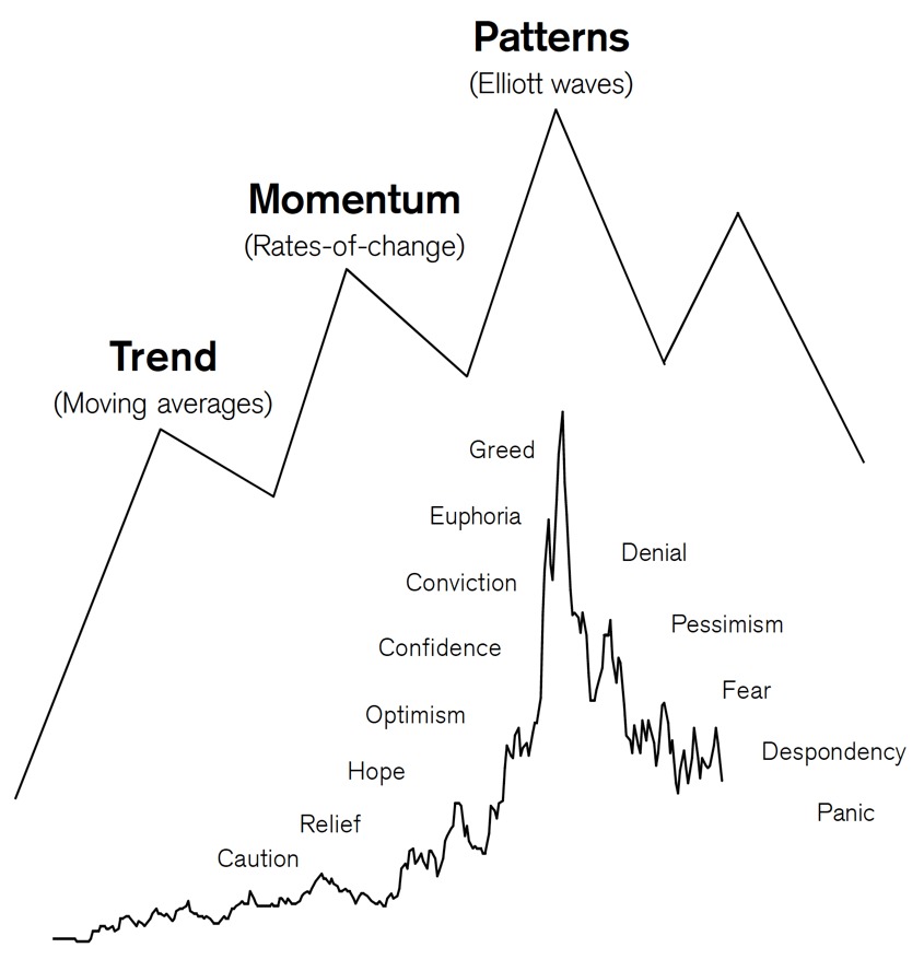
Technical analysis is the study of financial market action.
The technician looks at price changes that occur on a day-to-day or week-to-week basis or over any other constant time period displayed in graphic form, called charts. Hence the name chart analysis.
A chartist analyzes price charts only, while the technical analyst studies technical indicators derived from price changes in addition to the price charts.
Technical analysts examine the price action of the financial markets instead of the fundamental factors that (seem to) effect market prices. Technicians believe that even if all relevant information of a particular market or stock was available, you still could not predict a precise market “response” to that information.
There are so many factors interacting at any one time that it is easy for important ones to be ignored in favor of those that are considered as the “flavor of the day.”
The technical analyst believes that all the relevant market information is reflected (or discounted) in the price with the exception of shocking news such as natural disasters or acts of God. These factors, however, are discounted very quickly.
Watching financial markets, it becomes obvious that there are trends, momentum and patterns that repeat over time, not exactly the same way but similar. Charts are self-similar as they show the same fractal structure (a fractal is a tiny pattern; self-similar means the overall pattern is made up of smaller versions of the same pattern) whether in stocks, commodities, currencies, bonds.
A chart is a mirror of the mood of the crowd and not the fundamental factors.
Thus, technical analysis of human mass psychology. Therefore, it is also called behavioral finance.
Source: Technical Analysis Explained
Point & Figure Charting the NASDAQ Trend
Point and Figure charting is one of the four primary forms of charting used to observe price trends.
I started studying Point & Figure charting myself in the late 1990s when I was interested in a more precise way to determine my exits. P&F charts make the exit based of a price trend more obvious. For example, without knowing anything about these charts you can probably see the area I highlighted in red was a price range this stock found buying interest (support) a few times in the past, but then it broke down. When it did, it fell a lot. On the bullish side, the stock has found selling pressure (resistance) at the price level I highlighted green until it finally broke out to the upside.
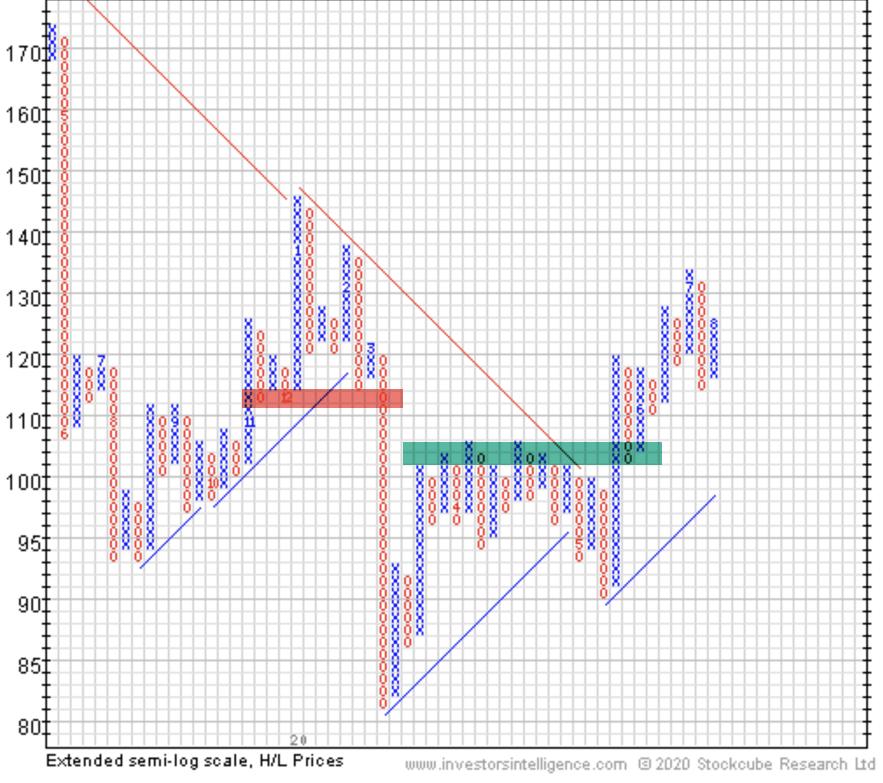
When I first started researching and trading high growth momentum stocks, I wanted a more precise way to define these price trends, so I became what they called a Point & Figure Craftsman. I later wanted to test these breakouts and patterns, so I ended up quantifying them into algorithms. But, I still look at all forms of charts from time to time to get a “feel” for the trends unfolding.
The last time I spoke at a non-client conference was in September 2008 for the National Association of Active Money Managers. I did a two-hour presentation on “exits” and used P&F charts as a great visual example to see trend changes.
The presentation, just days before what would become the start of the “Global Financial Crisis”, highlighted:
“When to sell a loser, laggard or winner is the heart of Mike Shell’s presentation on combining point and figure charting with relative strength to trade ETFs. “It’s the exit, not the entry, that determines your result at the position level. The exit determines whether or not you make or lose money, and how much you make or lose,” explains Mike.”

The topic of exits turned out to be very timely, as it was the beginning of the infamous waterfall decline that began in October 2008.
The history of Point & Figure charting is over 100 years old. “Hoyle” was the first to write about it and showed charts in his 1898 book, The Game in Wall Street. The first book/manual dedicated to Point and Figure was written by Victor Devilliers in 1933. Chartcraft Inc, in the USA, popularized the system in the 1940s. Cohen founded Chartcraft and wrote on point and figure charting in 1947. Chartcraft published further pioneering books on P&F charting, namely those by Burke, Aby and Zieg. Chartcraft Inc is still running today, providing daily point and figure services for the US market under the name of Investors Intelligence. Mike Burke still works for Chartcraft, having started back in 1962 under the guidance of Cohen. Burke went on to train other point and figure gurus, such as Thomas Dorsey who would go on to write authoritative texts on the subject.A detailed history can be found in Jeremy du Plessis’ ‘The Definitive Guide to Point and Figure’ where many references and examples are cited.
Point & Figure charts offer a well-defined methodology to identify current trends and emerging trends as they develop.
In fact, Point & Figure charts are all about price, not time.
Point & Figure charting doesn’t plot price against time as time-based charts do. Instead, P&F plots price against changes in direction by plotting a column of Xs as the price rises and a column of Os as the price falls.
So, Point and Figure charts are a way to visualize price trends in stock, bond, commodity, or currency, without regard to the amount of time that passes.
For example, here is the P&F chart of the NASDAQ.
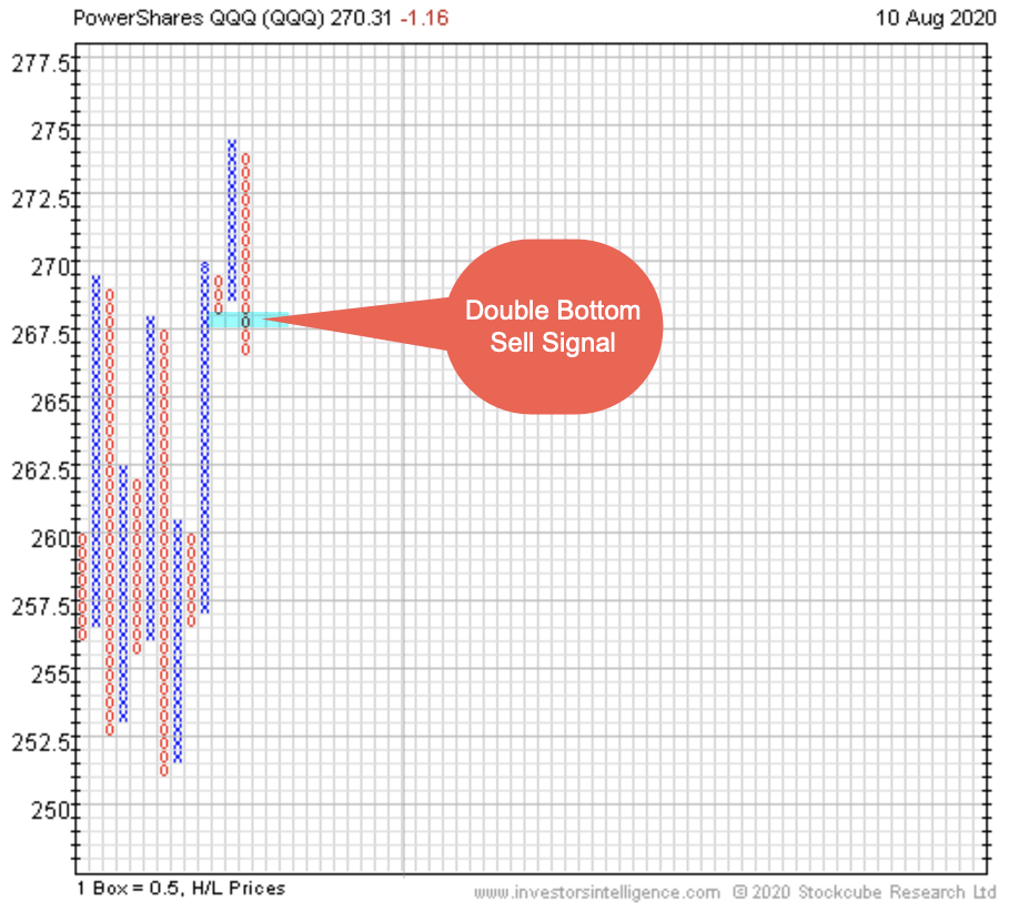
When a column of Os declines below a prior column of Os, it’s a sell signal.
If there was one prior column of Os, it’s a “double bottom” sell signal.
We say supply is in control over demand for the shares.
P&F charts basically allows us to analyze supply and demand.
If enough buying enthusiasm pushes the price up into a column of Xs, the stock, commodity, or whatever market is being accumulated.
Demand exceeds supply.
If the desire to sell exceeds the desire to buy, the selling (supply) pushes the price down into a column of Os, which is what we’re seeing in the NASDAQ at the moment.
Up until now, the NASDAQ has been the dominant of the popular indexes investors follow. It’s heavily weighted in tech stocks, which have been where the momentum has been since the March crash.
But now we are seeing some trend changes.
Another example, again using P&F, is the Percent of NASDAQ 100 stocks in a bullish trend. A bullish trend, again, is a column of Xs above the prior peak, which is an uptrend. When a high percentage of the stocks in the index are trending up, the bullish percent is in a column of Xs and rising to mark the strength. Below, we see a macro indication that enough stocks in the index are falling to signal a bearish trend.
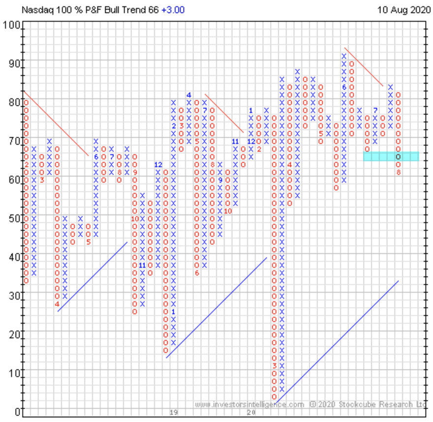
In fact, in P&F methodology terms, the above pattern is “Bear Confirmed” since July 29th. A Bear Confirmed signal is when chart is falling (a column Os) below the 70% level and has generated a P&F sell signal. I highlighted the sell signal on the chart.
The bullish percent charts are a measure of the internal breadth of the stock index. That is, when stocks inside the index start trending down enough to generate P&F sell signals, enough of them generates a sell signal in this breadth index.
So, we say the breath is weakening, which is a warning shot across the bow.
If we hadn’t already seen the emerging weakness develop in the individual stock charts, an indicator like this can alert us to the emerging weakness and prompt us to look inside.
Let’s do that.
Here’s a table of the stocks in the NASDAQ 100 from Investors Intelligence that have been trending down into bearish trends. For better understanding, I also include the breakout date it trended down to illustrate how an emerging trend unfolds.
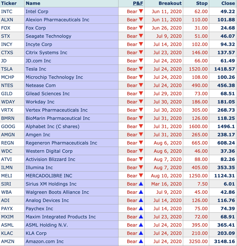
As you glance over the dates, you can probably see how the price trends of these stocks begin to roll over from bullish to bearish directional trends, which shows up in the bullish percent composite.
The bullish percent composites usually point to internal weakness or strength earlier than the price trend of the index. For example, the NASDAQ ETF just generated a P&F sell signal yesterday, but the bullish percent signaled a Bearish Confirmed pattern on July 29th.
I consider it a warning shot across the bow.
For me, the trend of my individual positions is my focus. But, risk signals like this can draw my attention for a closer look at what is going on internally.
I consider charting and technical analysis to simply be market analysis, which isn’t the same thing as deciding what or when to buy or sell. Market analysis is the ongoing research I do to gain perspective of the underlying trends, momentum, sentiment, and volatility. None of it may drive my individual position buys and sells.
Another bearish development the P&F method alerts us to is the relative trend. The relative trend monitors the relative trend of stocks against their index. In this case, the NASDAQ 100 is compared to the S&P 500. The formal P&F pattern here is “Bull Correction” since July 23rd, as the column of Os show it lagging the SPX.
Point & Figure charting is just another form of trend following. It focuses completely on the price trend itself, not volume or even time. It just prints the price change, only when it’s enough to add another X or O. If there isn’t enough price change to add an X or O, it’s ignored as irrelevant.
You can’t probably see how this form of charting may be helpful to focus on the real trend.
There’s a lot more to Point & Figure charting, but I’ll stop there.
Let’s see how the NASDAQ unfolds from here.
Mike Shell is the Founder and Chief Investment Officer of Shell Capital Management, LLC, and the portfolio manager of ASYMMETRY® Global Tactical. Mike Shell and Shell Capital Management, LLC is a registered investment advisor focused on asymmetric risk-reward and absolute return strategies and provides investment advice and portfolio management only to clients with a signed and executed investment management agreement. The observations shared on this website are for general information only and should not be construed as advice to buy or sell any security. Securities reflected are not intended to represent any client holdings or any recommendations made by the firm. Any opinions expressed may change as subsequent conditions change. Do not make any investment decisions based on such information as it is subject to change. Investing involves risk, including the potential loss of principal an investor must be willing to bear. Past performance is no guarantee of future results. All information and data are deemed reliable but is not guaranteed and should be independently verified. The presence of this website on the Internet shall in no direct or indirect way raise an implication that Shell Capital Management, LLC is offering to sell or soliciting to sell advisory services to residents of any state in which the firm is not registered as an investment advisor. The views and opinions expressed in ASYMMETRY® Observations are those of the authors and do not necessarily reflect a position of Shell Capital Management, LLC. The use of this website is subject to its terms and conditions.
If we’re going to see selling pressure become resistance, this is where it starts
Technical analysis is the study of financial market price trends.
What’s funny is that technical analysis has evolved into now being called quantitative analysis.
Technical analysis has long been a method of much debate, until the academics determined that past price performance may have an impact on future performance.
I’ve been a chartist and technician for over twenty years now, and I make no bones about it.
I’m also called an independent thinker, because I don’t care what others think of it. I do me, and you do you.
Academics previously didn’t think the study and measurement of past price trends had any edge to be gained. It’s probably because Eugene Fama said “markets are efficient.” So, if it comes from the ivy tower of university, it must be true?
It isn’t.
The efficient-market hypothesis is a hypothesis in financial economics that states that asset prices reflect all available information.
If markets are efficient, then all known information is already factored into prices, and so there is no way to “beat” the market because there are no undervalued or overvalued securities available.
That’s far from reality.
If the markets reflect all known information, and are efficient, then how could we explain a -34% decline in the S&P 500? and a -37% decline in the Dow Jones Industrial Average in just three weeks?
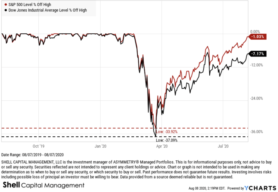
No, that’s gotta be an under-reaction or an overreaction, or both at different times.
It’s the under-reaction and overreaction to new information that causes prices to drift, or trend, directionally over time rather than just always spiking up or down. It’s always what drives momentum, which is know even accepted by academics who didn’t want to believe that past performance had any impact on the current or future price.
I know, it was a silly proposition. Who wouldn’t look at the past price history for perspective of its historical direction, momentum, and volatility.
I was attracted to charting early on in my career. As I earned an advanced accounting degree, including all the advanced accounting courses on top of the standard ones, which would qualify me for the CPA exam in Tennessee. I don’t know about other states, but Tennessee required 150 credit hours and at least five advanced accounting classes on top of the core accounting degree. It is basically a Master’s degree, since I think a B.S. is about 124 hours.
Anyway, I did it, and the more I learned accounting, the more I realized it wasn’t of much use in an auction market.
In theory, the price of a stock trades at some multiple of earnings and such. If it were so simple, we could easily determine with high probability what a stock should trade at, and it would be accurate.
But it isn’t.
I say that anything other than the price trend itself has the potential to lead you astray from its reality.
That includes fundamental valuation measures.
I know accounting and finance about as well as anyone, and as a student who was trading stocks, it didn’t take long to realize the above statement. If a stock is undervalued, there’s a reason the market doesn’t like it. You may not know the reason yet, but some large institutional investors may.
I prefer to follow the big money that moves the price trend. They aren’t always right, either, but all the really matters is the direction they drive the price.
Does it really matter why?
or who?
So I’m a realist. I’ve got a lot of stereotypes I guess.
As I show you the following charts, I like to also include what may be wrong about them. For example, I’m about to show you the price trend of the S&P 500 index, which includes in it about 500 stocks. So, when we look at the index price trend, we have to realize what it represents. If we make a judgment based on the trend of an index, we’re doing it with an understanding there are about 500 different company stocks moving around inside it that have an impact on the outcome.
It isn’t perfect, but neither is fundamental analysis.
Here we go. What we have here is the popular stock index rubbing up on the top end of a range that represents the prior (February) high.
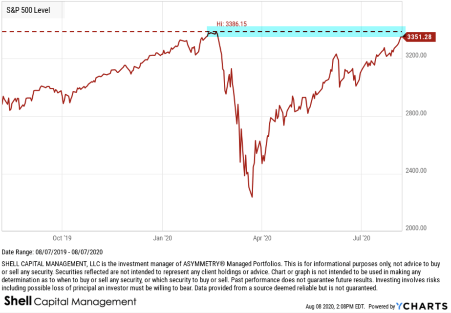
Technicians, or technical analysts, call this area “resistance”, but I disagree.
I call it potential resistance.
You see, it isn’t resistance until it is.
Resistance is an area on the chart where selling pressure overwhelms buying pressure enough to drive the price lower. A resistance level is identified by a previous price high or peak on price trend chart as I did above.
However, if resistance is where selling overwhelms buying, that hasn’t happened yet. So, it can’t yet be “resistance.”
All analysis requires some common sense and plain critical thinking.
Now, here is the problem. People always want to know of a catalyst that could cause a prevailing price trend to change.
People love a good story.
The reason I believe we’ll see some resistance here, if we’re going to, is because of my momentum measures are signaling the trend is entering the upper end of its range.
The last time the S&P 500 got into this zone was the first week of June.
The S&P 500 declined about -7% afterward.
So, if we’re going to see some pull back, I expect it will come soon.
Afterwards, we’ll then see if it eventually trends back up to a new all time high, or if it instead reverses down into more of a downtrend.
This is how it works. It’s a Bayesian probability, where we update the possibilities as we go.
At each new stage of a trend, the expected value changes.
Let’s see how it unfolds from here.
Mike Shell is the Founder and Chief Investment Officer of Shell Capital Management, LLC, and the portfolio manager of ASYMMETRY® Global Tactical. Mike Shell and Shell Capital Management, LLC is a registered investment advisor focused on asymmetric risk-reward and absolute return strategies and provides investment advice and portfolio management only to clients with a signed and executed investment management agreement. The observations shared on this website are for general information only and should not be construed as advice to buy or sell any security. Securities reflected are not intended to represent any client holdings or any recommendations made by the firm. Any opinions expressed may change as subsequent conditions change. Do not make any investment decisions based on such information as it is subject to change. Investing involves risk, including the potential loss of principal an investor must be willing to bear. Past performance is no guarantee of future results. All information and data are deemed reliable but is not guaranteed and should be independently verified. The presence of this website on the Internet shall in no direct or indirect way raise an implication that Shell Capital Management, LLC is offering to sell or soliciting to sell advisory services to residents of any state in which the firm is not registered as an investment advisor. The views and opinions expressed in ASYMMETRY® Observations are those of the authors and do not necessarily reflect a position of Shell Capital Management, LLC. The use of this website is subject to its terms and conditions.
Technical analysis of the stock trend and volatility
Just yesterday I shared the observation in The value of technical analysis of stock market trends that the stock indexes were in a tight range the past month and we’d likely see a breakout, up or down.
I didn’t mention possible macroeconomic or geopolitical factors, I just pointed it out saying the market does what it does., and something or someone gets the blame.
Today, the stock market has shifted from being positive after the open, shaking off news of China imposing new tariffs on the U.S., to a waterfall decline down -2% at this point. Below is the up-close trend of today’s action so far.

Some probably believe the stock market is falling because of the new China Tariffs on the U.S, Trump Tweet about China, Jackson Hole Comments, or The Federal Reserve.
The reality is, it’s just the market, doing what it does.
I focus on that. The price trend and volatility.
Here is the trend looking at the tight range I observed yesterday. As you can see, the price is still within the range, but it’s trending toward the lower range.
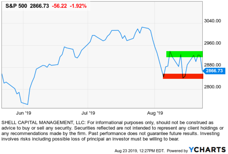
In the meantime, the CBOE S&P 500 Volatility Index (VIX) has spiked up 25% today on the new enthusiasm for expected future volatility.

Wikipedia defines Technical Analysis as:
In finance, technical analysis is an analysis methodology for forecasting the direction of prices through the study of past market data, primarily price and volume.
By that definition, what I’m sharing here isn’t Technical Analysis, I guess.
Investopedia defines it as:
Technical analysis is a popular trading method that analyzes past price action, usually on charts, to help predict future price movements in financial markets.
But, I am analyzing past price action on charts, but not necessarily to predict future price movements.
I’ll just call it charting.
I hope you find it helpful.
Let’s see how it closes.
Mike Shell is the Founder and Chief Investment Officer of Shell Capital Management, LLC, and the portfolio manager of ASYMMETRY® Global Tactical.
Mike Shell and Shell Capital Management, LLC is a registered investment advisor and provides investment advice and portfolio management exclusively to clients with a signed and executed investment management agreement. The observations shared on this website are for general information only and should not be construed as advice to buy or sell any security. Securities reflected are not intended to represent any client holdings or any recommendations made by the firm. Investing involves risk, including the potential loss of principal an investor must be willing to bear. Past performance is no guarantee of future results. All information and data is deemed reliable, but is not guaranteed and should be independently verified. The presence of this website on the Internet shall in no direct or indirect way raise an implication that Shell Capital Management, LLC is offering to sell or soliciting to sell advisory services to residents of any state in which the firm is not registered as an investment advisor. Use of this website is subject to its terms and conditions.
The value of technical analysis of stock market trends
Someone asked; how do you use technical analysis (charting) as an investment manager?
I’ll share a simple and succinct example.
Below is a chart of a popular stock market index. What do you see when you look at it?

I see an overall uptrend based on this time frame, which is only year-to-date.
I see it’s experiencing a normal-looking interruption in the short term, so far.
As such, I’m looking for signs of which direction it’s going to move, by observing which direction it does move.
Without adding a single “technical indicator” for statistical or quantitative analysis, I see the stock market using this proxy has been drifting generally sideways since February.
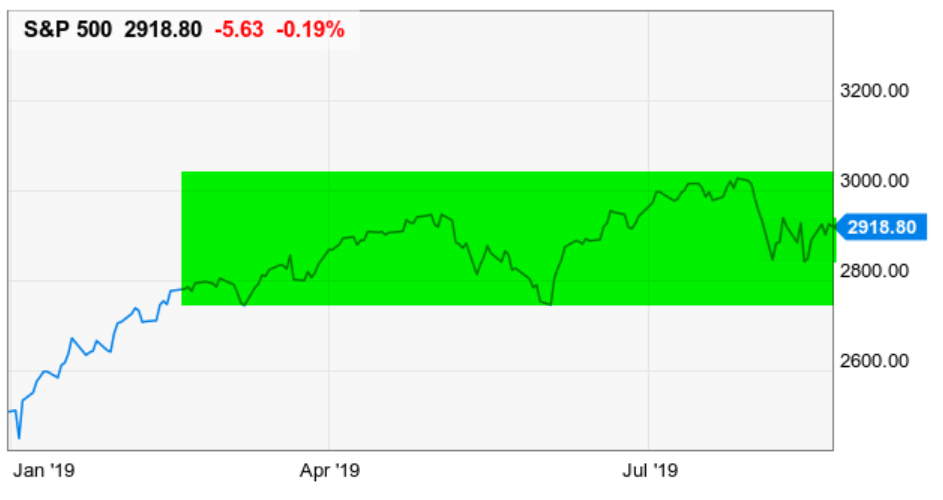
However, it has made higher highs and higher lows, so it’s a confirmed uptrend.
Looking closer, are shorter term, I see the green highlighted area is also in a non-trending state, bound by a range. I’m looking for it to break out; up or down.
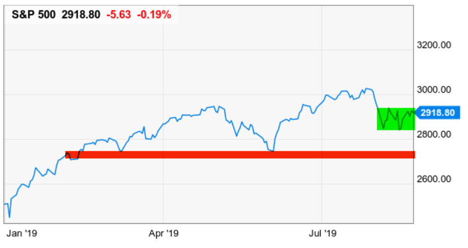
If it breaks down, I will look for it to pause around the red line I drew, because it’s the prior low as well as an area of trading before that. I would expect to see some support here, where buyer demand could overcome selling pressure.
If it doesn’t, I’d say:
Look out below!
Do I trade-off this? Nope.
Am I telling you to? Nope.
But, if I wanted to trade off it, I could. This is an index and the index is an unmanaged index and cannot be invested in directly. But, for educational purposes, assume I could enter here. Before I did, I would decide my exit would be at least a break below the red line. Using that area as an exit to say “the trend has changed from higher lows to lower lows, which is down, I’ll exit if it stays below the line.
Of course, the same strategy can be applied quantitatively into a computerized trading system. I could create an algorithm that defines the red line as an equation and create a computer program that would alert me to its penetration.
This is a succinct and simple glimpse into concepts of how I created my systems.
I hope you find it useful.
I developed skills at charting before I created quantitative systems. If someone doesn’t believe in either method, they probably lack the knowledge and skill to know better.
Let me know if we can help!
Mike Shell is the Founder and Chief Investment Officer of Shell Capital Management, LLC, and the portfolio manager of ASYMMETRY® Global Tactical.
Mike Shell and Shell Capital Management, LLC is a registered investment advisor and provides investment advice and portfolio management exclusively to clients with a signed and executed investment management agreement. The observations shared on this website are for general information only and should not be construed as advice to buy or sell any security. Securities reflected are not intended to represent any client holdings or any recommendations made by the firm. Investing involves risk, including the potential loss of principal an investor must be willing to bear. Past performance is no guarantee of future results. All information and data is deemed reliable, but is not guaranteed and should be independently verified. The presence of this website on the Internet shall in no direct or indirect way raise an implication that Shell Capital Management, LLC is offering to sell or soliciting to sell advisory services to residents of any state in which the firm is not registered as an investment advisor. Use of this website is subject to its terms and conditions.
Your technical analysis is no match for Trump Tweets!
Someone texted me this image this morning.
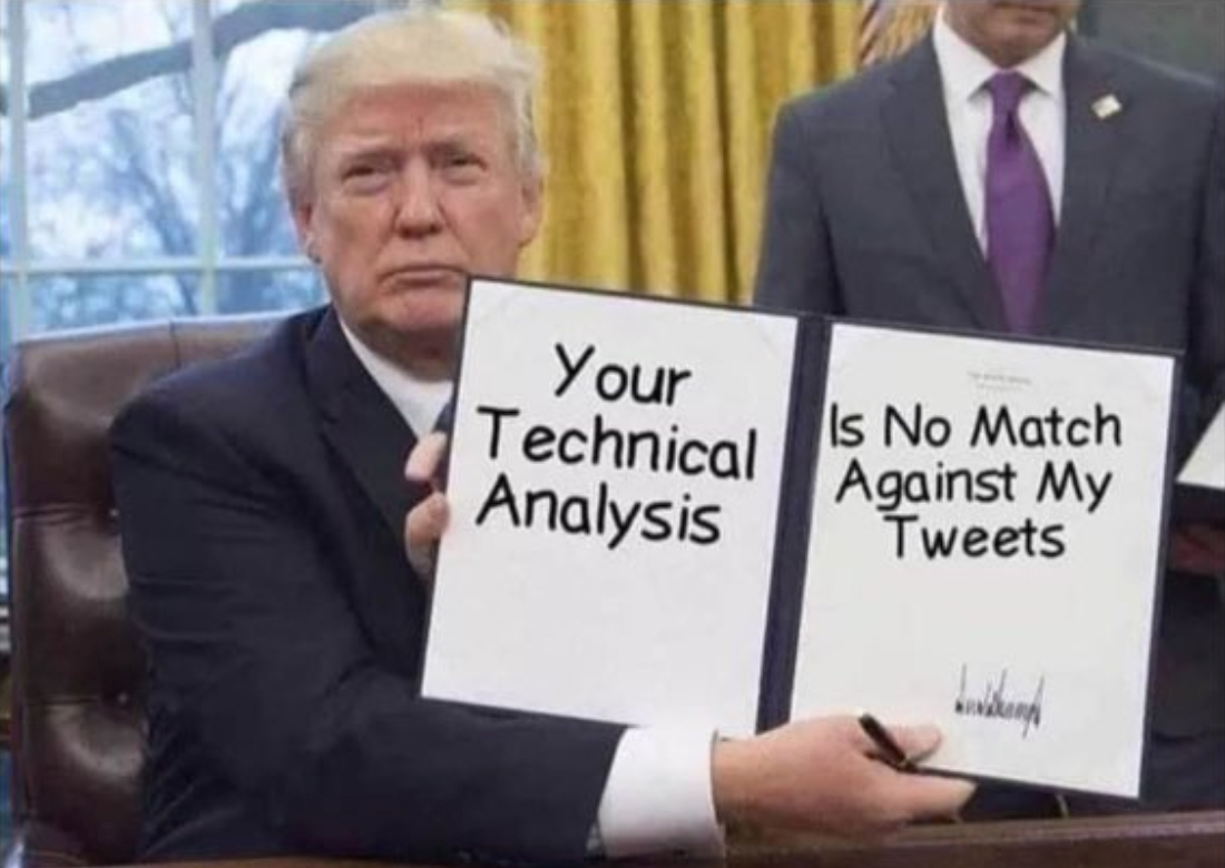
Now that’s funny right there; I don’t care who you are!
But seriously though, many people like to blame others for their reality. Most of the time, the market does what it does, and something or someone always gets the blame for it – besides them.
It’s an easy way for them to be right. It wasn’t them and their risk exposure that was wrong, it was someone else like the President, or the Fed, or the machines.
I ignore the nonsense and focus on price trends. I focus on the facts.
Yes, I call it technical analysis of price trends, as it has been called for decades.
But, just like we are now seeing trading firms call computerized quantitative trading systems more trendy names like “artificial intelligence” and “machine learning” or “pattern recognition”, others have renamed technical analysis “quantitative analysis”
The trend seems to be driven by those who write research papers, books, and such.
To be sure, an example is a disclosure I saw in an SEC Form ADV registration document. In Methods of Analysis, Investment Strategies, and Risk of Investment Loss, the first lists: Quantitative analysis and Fundamental analysis, but not Technical analysis. I’m going to fictitiously call this firm “QUANT”.
QUANT will primarily utilize Quantitative analysis but may also use other analysis methods, including Fundamental analysis as needed.
Quantitative analysis involves the analysis of past market data; primarily price and volume.
Fundamental analysis involves the analysis of financial statements, the general financial health of companies, and/or the analysis of management or competitive advantages.
Investment Strategies QUANT will utilize long term trading and short term trading strategies.
Under Material Risks Involved, it goes on to say:
Methods of Analysis
Quantitative analysis attempts to predict a future stock price or direction based on market trends. The assumption is that the market follows discernible patterns and if these patterns can be identified then a prediction can be made. The risk is that markets do not always follow patterns and relying solely on this method may not work long term.
Fundamental analysis (I’m skipping this irrelevant part for brevity)
Investment Strategies
Long term trading is designed to capture market rates of both return and risk. Frequent trading, when done, can affect investment performance, particularly through increased brokerage and other transaction costs and taxes.
Short term trading generally holds greater risk and clients should be aware that there is a material risk of loss using any of those strategies.
Investing in securities involves a risk of loss clients should be prepared to bear.
What’s the big deal?
It isn’t a big deal, but, let’s change a single word to see what happens.
Let’s replace “Quantitative” with “Technical” and see if it fits the same.
Technical analysis attempts to predict a future stock price or direction based on market trends. The assumption is that the market follows discernible patterns and if these patterns can be identified then a prediction can be made. The risk is that markets do not always follow patterns and relying solely on this method may not work long term.
Yes, that’s the definition used for Technical analysis.
The point is, they just didn’t want to call it “Technical analysis” because “Quantitative analysis is more trendy in modern times.
But, it’s the same.
I don’t debate others hoping to change their minds, but instead, I do mull over what others believe to see how it may be in conflict with what I believe. By doing that, it allows me to question my own beliefs to see if there is enough evidence to change what I believe. I do that to combat what we are all more prone to do, which is seek out information that confirms what we already believe and ignore information that says it isn’t true. Humans have the tendency to interpret new evidence as confirmation of one’s existing beliefs or theories. If we want to gain new knowledge, we have to consider we may be wrong and apply a scientific approach to discover new knowledge.
Confirmation bias is the tendency to search for, interpret, favor, and recall information in a way that affirms one’s prior beliefs or hypotheses. It is a type of cognitive bias and a systematic error of inductive reasoning.
We have to be careful of looking for information that reinforces what we already believe, without considering what could be wrong about our beliefs.
It’s reverse-engineering.
I try to break it to see if it will break and what makes it break.
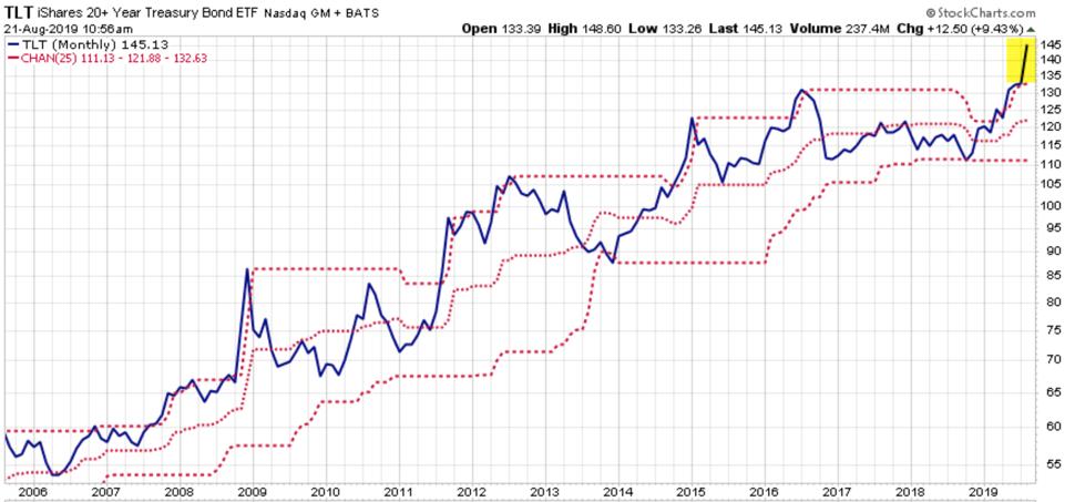
…and speaking of Technical Analysis, Long Term U.S. Treasury Bond ETF TLT has been in a volatility expansion, on the upside. Demand has driven its price momentum up to levels historically seen during larger stock market declines. The price is now outside the upper price channel. You can probably observe what it typically does afterward.
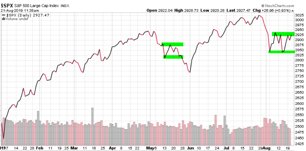
Technical Analysis of the S&P 500 index price trend: it looks to me like we’re about to observe a breakout in one direction or the other. The last time, in May, the breakout was to the downside. This time may be different. See the first image above for risk disclosure of what may go wrong — or at least who may be blamed for it 🙂
Technical Analysis of VIX: the volatility expansion has now contracted from 25 to 15. So, the options market now expects the range to be within 15% instead of 25%.
We’ll see if vol expectations continue to drift down, or spike back up.
Ps. I didn’t provide any evidence of my political beliefs. If anyone took anything from the above as a sway one way of the other, they are joking themselves as I am joking with them. I focus on the facts. We can’t blame any single thing or any one person on the direction of stock market trends and if anyone does so, they are joking themselves.
We can say the same for calling Technical analysis Quantitative analysis, believing by changing the word, it means something different.
It doesn’t.
I say believe and do whatever creates asymmetric investment returns for you.
But as Larry the Cable Guy says:
Now that’s funny right there; I don’t care who you are!
Mike Shell is the Founder and Chief Investment Officer of Shell Capital Management, LLC, and the portfolio manager of ASYMMETRY® Global Tactical.
Mike Shell and Shell Capital Management, LLC is a registered investment advisor and provides investment advice and portfolio management exclusively to clients with a signed and executed investment management agreement. The observations shared on this website are for general information only and should not be construed as advice to buy or sell any security. Securities reflected are not intended to represent any client holdings or any recommendations made by the firm. Investing involves risk, including the potential loss of principal an investor must be willing to bear. Past performance is no guarantee of future results. All information and data is deemed reliable, but is not guaranteed and should be independently verified. The presence of this website on the Internet shall in no direct or indirect way raise an implication that Shell Capital Management, LLC is offering to sell or soliciting to sell advisory services to residents of any state in which the firm is not registered as an investment advisor. Use of this website is subject to its terms and conditions.
Strong stock market momentum was accompanied by broad participation
Not only has the broad stock market indexes like the S&P 500 advanced sharply with great momentum since late December 2018, but its breadth has also been impressive.
The percent of stocks trading above their 50 day moving averages shows about 92% of stocks are in short term uptrends. This advance not only confirmed the price trend momentum but suggests participation has been broad. More stocks are above their 50-day moving averages that late 2017.
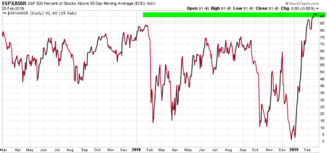
The downside is we are necessarily observing only the past and the past doesn’t assure future performance. In fact, once 92% of stocks are already in shorter-term uptrends, we can start to wonder at what point the buying enthusiasm is exhausted. That is, indicators like this may be observed for signs of an inflection point.
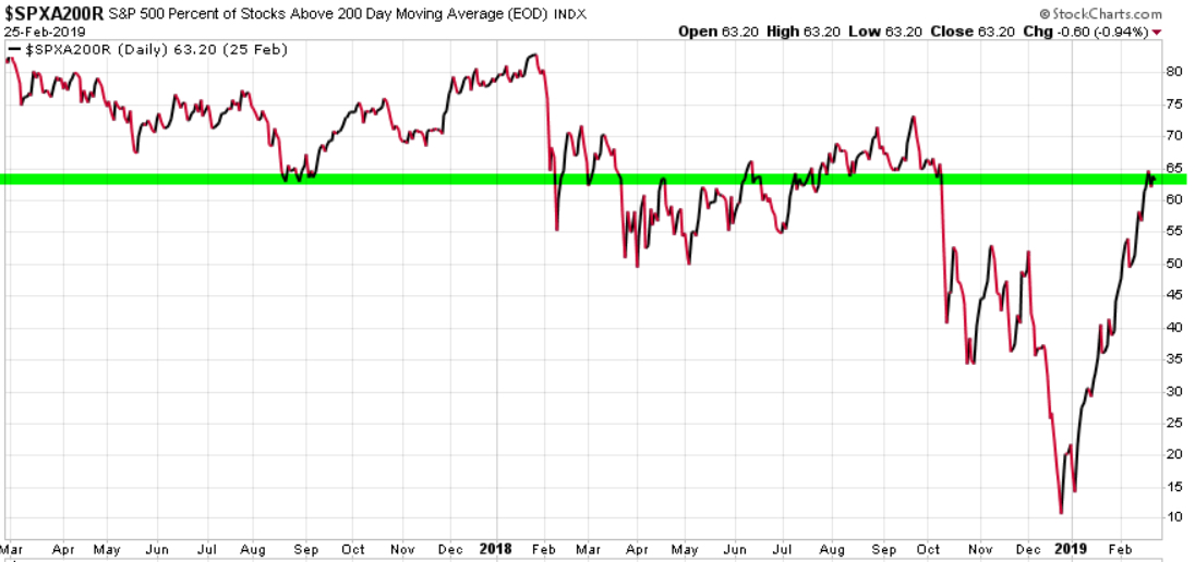
However, the percent of stocks above their 200 day moving averages is at 63%. So applying that same line of thinking, though we shouldn’t be surprised to see short term weakness, we could suppose the longer term trend still has room to run.
We’ll see…
Mike Shell is the Founder and Chief Investment Officer of Shell Capital Management, LLC, and the portfolio manager of ASYMMETRY® Global Tactical.
Mike Shell and Shell Capital Management, LLC is a registered investment advisor and provides investment advice and portfolio management exclusively to clients with a signed and executed investment management agreement. The observations shared on this website are for general information only and are not specific advice, research, or buy or sell recommendations for any individual. Investing involves risk including the potential loss of principal an investor must be willing to bear. Past performance is no guarantee of future results. All information provided is deemed reliable, but is not guaranteed and should be independently verified. The presence of this website on the Internet shall in no direct or indirect way raise an implication that Shell Capital Management, LLC is offering to sell or soliciting to sell advisory services to residents of any state in which the firm is not registered as an investment advisor. Use of this website is subject to its terms and conditions.
Stanley Druckenmiller on his use of Technical Analysis and Instinct
Stanley Druckenmiller has a 30-year track record that is considered “unrivaled” by many. From 1988 to 2000, Druckenmiller was a portfolio manager for George Soros as the lead portfolio manager for Quantum Fund. He founded Duquesne Capital to manage a hedge fund in 1981 and closed the fund in August 2010.
Kiril Sokoloff of Real Vision interviewed him recently and shared parts of the interview on YouTube.
I watched the full 90-minute interview and noted some observations I’ll share.
Speaking of dealing with “algo trading” and “the machines,” Kiril Sokoloff asks Stan Druckenmiller:
“Let’s talk about the algos. We haven’t seen the algos sell, we’ve only seen them buy. We saw a little bit of it in February when there was some concentrated selling. We saw it in China in 2015, which was scary. Most people weren’t focused on that but I was and I think you were, too.
They (algos/machines) are programmed to sell when the market is down -2%. The machines are running and can’t be stopped and a huge amount of trading and money is managed that way. We’ve been operating in a bull market and a strong economy.
What happens when it’s a bear market and a bad economy, will things get out of hand?”
So, knowing that and knowing we’re at risk of that any moment… what are you watching for? …. how are you protecting yourself? What are you watching for?
Stanley Druckenmiller answers:
“I’m going to trust my instincts and technical analysis to pick up this stuff up.
But what I will say… the minute the risk reward gets a little dodgy I get more cautious than I probably would have been without this in the background.”
What was most fascinating about the rare interview of Stanley Druckenmiller is that some of us have figured out a successful tactical trading global macro strategy using the common elements of price trends, relative strength, risk management, and momentum combined with a dose of instinct all applied to global markets.
You can see for yourself at:
This wasn’t the first time Stan Druckenmiller spoke of his use of technical analysis and charts. In Part IV “Fund Managers and Timers” of The New Market Wizards in 1992, Jack Schwager included an interview with Stanley Druckenmiller titled “THE ART OF TOP-DOWN INVESTING.”
When asked what methods he used, he spoke of earnings, and then:
“Another discipline I learned that helped me determine whether a stock would go up or down is technical analysis. Drelles was very technically oriented, and I was probably more receptive to technical analysis than anyone else in the department. Even though Drelles was the boss, a lot of people thought he was a kook because of all the chart books he kept. However, I found that technical analysis could be very effective.”
Then, he was asked about his experiences during the 1987 stock market crash:
Jack Schwager: What determined the timing of your shift from bullish to bearish?
Stanley Druckenmiller: It was a combination of a number of factors. Valuations had gotten extremely overdone: The dividend yield was down to 2.6 percent and the price/book value ratio was at an all-time high. Also, the Fed had been tightening for a period of time. Finally, my technical analysis showed that the breadth wasn’t there—that is, the market’s strength was primarily concentrated in the high capitalization stocks, with the broad spectrum of issues lagging well behind. This factor made the rally look like a blow-off.
Jack Schwager: How can you use valuation for timing? Hadn’t the market been overdone in terms of valuation for some time before you reversed from short to long?
Stanley Druckenmiller: I never use valuation to time the market. I use liquidity considerations and technical analysis for timing. Valuation only tells me how far the market can go once a catalyst enters the picture to change the market direction.
Jack Schwager: The catalyst being what?
Stanley Druckenmiller: The catalyst is liquidity, and hopefully my technical analysis will pick it up.
Well, that sounds familiar.
What is most fascinating to me is that I’ve come to the same conclusions through my own experience over more than two decades without knowing Stanley Druckenmiller or others similar to him beforehand. I have to admit that I didn’t remember having so much in common with his strategy because I read The New Markets Wizards so long ago.
Some of us have discovered very similar beliefs and strategies through independent thinking and our own experiences. When I discover that others have found success I see the common characteristics and that confirms what drives an edge.
Mike Shell is the Founder and Chief Investment Officer of Shell Capital Management, LLC, and the portfolio manager of ASYMMETRY® Global Tactical.
You can follow ASYMMETRY® Observations by click on on “Get Updates by Email” on the top right or follow us on Twitter.
The observations shared in this material are for general information only and are not intended to provide specific advice or recommendations for any individual. Investing involves risk including the potential loss of principal an investor must be willing to bear. Past performance is no guarantee of future results.
Global Market ETF Trends
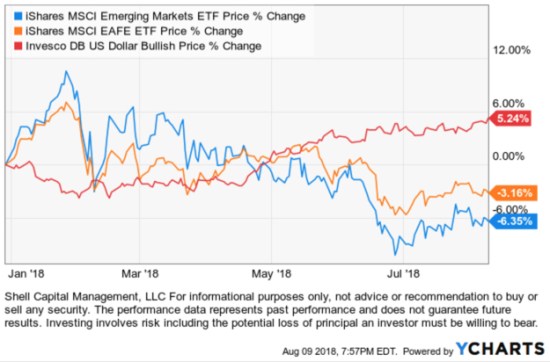
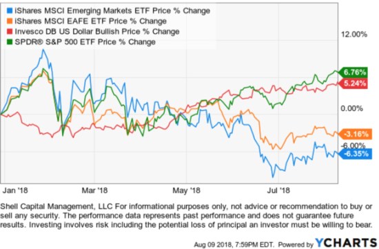
Looking at the broad global markets, U.S. stocks are in a positive trend along with the U.S. Dollar. International stocks, commodities, and foreign currency are trending down.
With the directional trends and momentum being in U.S. stocks, though not without volatility, that has been our focus this year.
International stocks including both developed countries $EFA and emerging markets $EEM are trending down so far in 2018 as the U.S. Dollar $UUP is trending up.
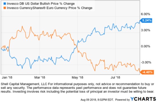
The U.S. Dollar $UUP is trending similar to U.S. stocks $SPY in April.
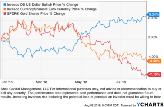
The dollar has an inverse correlation with foreign currency like the Euro.
With the rising dollar $USD, gold $GLD is trending down even more than the Euro currency $FXE.
So, the overall broad observation of global macro picture is clearly a rising U.S. Dollar and U.S. stocks that are diverging from other markets.
Mike Shell is the Founder, and Chief Investment Officer of Shell Capital Management, LLC, and the portfolio manager of ASYMMETRY® Managed Portfolios and ASYMMETRY® Global Tactical.
You can follow ASYMMETRY® Observations by click on on “Get Updates by Email” on the top right or follow us on Twitter.
The observations shared in this material are for general information only and are not intended to provide specific advice or recommendations for any individual. Investing involves risk including the potential loss of principal an investor must be willing to bear. Past performance is no guarantee of future results.
Front-running S&P 500 Resistance
The S&P 500 stock index closed just -1% from its all-time high it reached on January 26, 2018, and hasn’t been that high since. It’s been in a drawdown that was as much as -10% and it has taken six months to get back near its high point to break even.
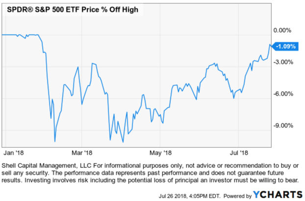
Before the madness begins saying “The S&P 500 is at resistance,” I want to point out an observation of the truth. It is one thing to draw a trend line on an index to indicate its direction, quite another to speak of “support” and “resistance” at those levels.
Is the S&P 500 at resistance?
Depending on which stock charting service or data provider you use, it may appear the S&P 500 ETF (SPY) closed at its prior high. Many market technicians would draw a line like I did below in green and say “the S&P 500 is at resistance.”
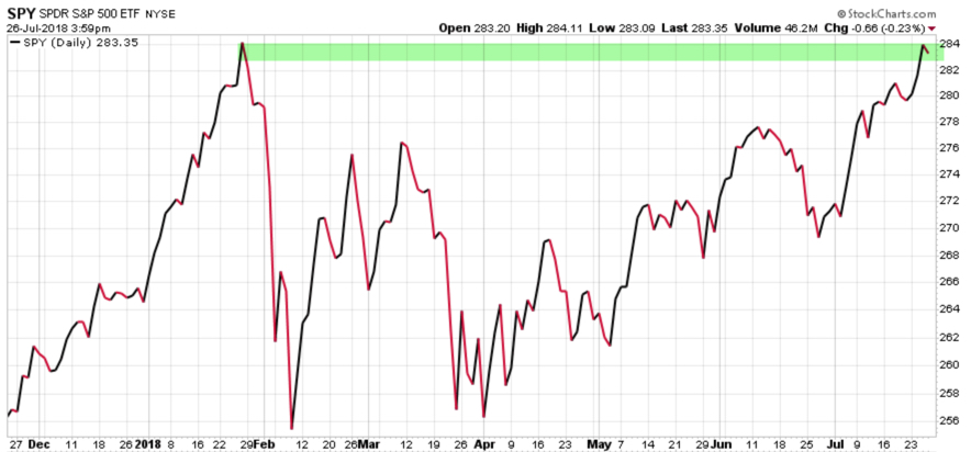
In technical analysis applied to stock market trends, support and resistance is a concept that the movement of the price of a security will tend to stop and reverse at certain predetermined price levels.
Support is when a price trends down and stalls at a prior low. The reasoning is that investors and traders who didn’t buy the low before (or wish they’d bought more) may have buying interest at that prior low price if it reaches it again.
Resistance is when a price trends up and stalls at a prior high. The reasoning is that investors and traders who didn’t sell the high before (or wish they’d sold short to profit from a price decline) may have the desire to sell at that prior high price if it reaches it again.
Whether everyone trades this way or not, enough may that it becomes a self-fulling prophecy. I believe it works this way on stocks and other securities or markets driven by supply and demand, but an index of stocks?
To assume a market or stock will have support or resistance at some price level (or a derivative of price like a moving average) that hasn’t been reached yet is just a predictive assumption. Support and resistance don’t exist unless it is, which is only known after the fact.
One of the most fascinating logical inconsistencies I see by some technical analysts is the assumption that “support” from buying interest and “resistance” from selling pressure “is” there, already exists, before a price is even reached. Like “SPY will have resistance at $292.” We simply don’t know until the price does indeed reverse after that point is reached.
But, it gets worse.
To believe an index of 500 stocks is hindered by selling pressure at a certain price requires one to believe the price trend is controlled by the index instead of the 500 stocks in it.
Think about that for a moment. Let it sink in.
- Do you believe trading the stock index drives the 500 stocks inside the index?
or
- Do you believe the 500 stocks in the index drive the price of the index?
What you believe is true for you. But, to believe an index of 500 stocks is hindered by selling pressure or buying interest at a certain price requires you believe the price trend is controlled by the index instead of the 500 stocks in it. That’s a significant belief.
To complicate it more. If we want to know the truth, we have to look a little closer.
Is the S&P 500 at resistance?
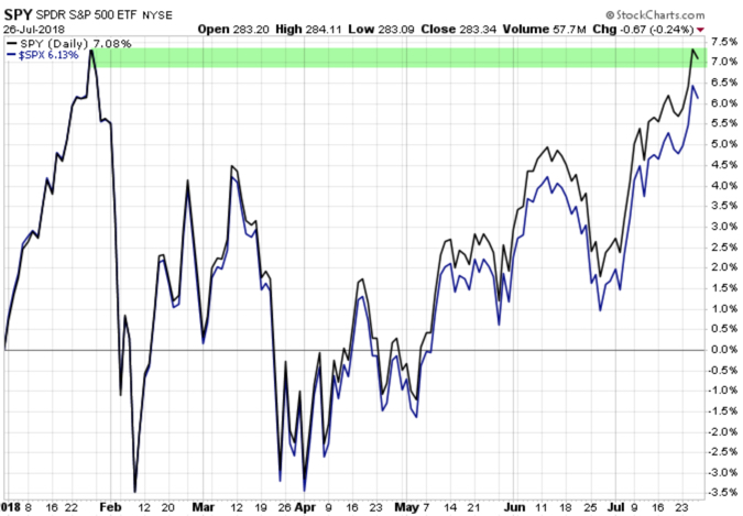
As I said, it depends on which stock charting service or data provider we use and how we calculate the data to draw the chart. Recall in the prior chart, I used the SPDRs S&P 500 ETF (SPY) which shows the ETF closed near its prior high. I used Stockcharts.com as the data provider to draw the chart. I’ve been a subscriber of their charting program for 14 years so I can tell you the chart is based on Total Return as the default. That means it includes dividends. But, when we draw the same chart using the S&P 500 index ($SPX) it’s based on the price trend. Below is what a difference that makes. The index isn’t yet at the prior high, the SPY ETF is because the charting service includes dividends.
Here is another charting service where I’m showing the S&P 500 ETF (SPY) price return, total return, and the S&P 500 stock index. Only one is at the January high.
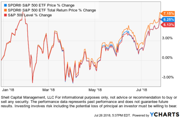
So, we don’t know if the S&P 500 is at resistance and we won’t know if there exists any “resistance” there at all unless the price does pause and reverse down. It so happens, it just may pause and reverse at this point. Not because more tactical traders are looking at the total return chart of SPY or because the index or ETF drives the 500 stocks in it, but because momentum measures indicate its potentially reaching an “overbought” level. So, a pause or reversal, at least some, temporarily, would be reasonable.
Some may call this charting, others call it technical analysis, statistical analysis, or quantitative analysis. We could even say there is some behavioral finance included since it involves investor behavior and biases like anchoring. Whatever we choose to call it, it’s a visual representation of supply and demand and like most things, it’s based on what we believe to be true.
I’ve been applying charting, pattern recognition, technical analysis, statistical analysis, and quantitative analysis for over twenty years. Before I started developing computerized programs based on quantitative trend systems that apply evidence-based scientific methods, I was able to trade successfully using visual charts. I believe all of it has its usefulness. I’m neither anti-quant or anti-charting. I use both, but for different reasons. I can argue for and against both because neither is perfect. But, combining the skills together has made all the difference for me.
Is the S&P 500 at resistance?
We’ll see…
Mike Shell is the Founder and Chief Investment Officer of Shell Capital Management, LLC, and the portfolio manager of ASYMMETRY® Global Tactical.
You can follow ASYMMETRY® Observations by click on on “Get Updates by Email” on the top right or follow us on Twitter.
The observations shared in this material are for general information only and are not intended to provide specific advice or recommendations for any individual. Investing involves risk including the potential loss of principal an investor must be willing to bear. Past performance is no guarantee of future results.
You must be logged in to post a comment.