Uncharted Territory from the Fed Buying Stocks

I remember sometime after 2013 I told someone “The Fed is buying stocks and that’s partly why stocks have risen so surprisingly for so long”. He looked puzzled and didn’t seem to agree, or understand.

The U.S. Federal Reserve (the “Fed”) has been applying “quantitative easing” since the 2007 to 2009 “global financial crisis”. Quantitative easing (QE) is a type of monetary policy used by central banks to stimulate the economy when standard monetary policy has become ineffective. The Fed implements quantitative easing by buying financial assets from banks and other financial institutions. That raises the prices of those financial assets and lowers their interest rate or yield. It also increases the amount of money available in the economy. The magnitude they’ve done this over the past seven years has never been experience before. They are in uncharted territory.

I was reminded of what I said, “the Fed is buying stocks” when I read comments from Bill Gross in “Gross: Fed Slowly Recognizing ZIRP Has Downside Consequences”. He says companies are using easy money to buy their own stock:

Low interest rates have enabled Corporate America to borrow hundreds of billions of dollars “but instead of deploying the funds into the real economy,they have used the proceeds for stock buybacks. Corporate authorizations to buy back their own stock are running at an annual rate of $1.02 trillion so far in 2015, 18 percent above 2007’s record total of $863 billion, Gross said.

You see, if we want to know the truth about market dynamics; we necessarily have to think more deeply about how markets interact. Market dynamics aren’t always simple and obvious. I said, “The Fed is buying stocks” because their actions is driving the behavior of others. By taking actions to increase money supply in the economy and keep extremely low borrowing rates, the Fed has been driving demand for stocks.

But, it isn’t just companies buying their own stock back. It’s also investors buying stocks on margin. Margin is borrowed money that is used to purchase securities. At a brokerage firm it is referred to as “buying on margin”. For example, if we have $1 million in a brokerage account, we could borrow another $1 million “on margin” and invest twice as much. We would pay interest on the “margin loan”, but those rates have been very low for years. Margin interest rates have been 1 – 2%. You can probably see the attraction. If we invested in lower risk bonds earning 5% with $1 million, we would normally earn 5%, or $50,000 annually. If we borrowed another $1 million at 2% interest and invested the full $2 million at 5%, we would earn another 3%, or $30,000. The leverage of margin increased the return to 8%, or $80,000. Of course, when the price falls, the loss is also magnified. When the interest rate goes up, it reduces the profit. But rates have stayed low for so long this has driven margin demand.

While those who have their money sitting in in bank accounts and CDs have been brutally punished by near zero interest rates for many years, aggressive investors have borrowed at those low rates to magnify their return and risk in their investments. The Fed has kept borrowing costs extremely low and that is an incentive for margin.

In the chart below, the blue line is the S&P 500 stock index. The red line is NYSE Margin Debt. You may see the correlation. You may also notice that recessions (the grey area) occur after stock market peaks and high margin debt balances. That’s the downside: margin rates are at new highs, so when stocks do fall those investors will either have to exit their stocks to reduce risk or they’ll be forced to exit due to losses. If they don’t have a predefined exit, their broker has one for them: “a margin call”.

Current Margin Debt Stock MarginSource: http://www.advisorperspectives.com/dshort/charts/markets/nyse-margin-debt.html?NYSE-margin-debt-SPX-since-1995.gif

If you noticed, I said, “They are in uncharted territory”. I am not. I am always in uncharted territory, so I never am. I believe every new moment is unique, so I believe everyone is always in uncharted territory. Because I believe that, I embrace it. I embrace uncertainty and prepare for anything that can happen. It’s like watching a great movie. It would be no fun if we knew the outcome in advance.


The Volatility Index (VIX) is Getting Interesting Again

In the last observation I shared on the CBOE Volatlity index (the VIX) I had been pointing out last year the VIX was at a low level and then later started trending up. At that time, many volatility traders seemed to think it was going to stay low and keep going lower – I disagreed. Since then, the VIX has remained at a higher average than it had been – up until now. You can read that in VIX® gained 140%: Investors were too complacent.

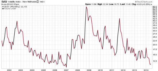
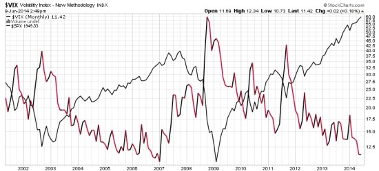
Here it is again, closing at 12.45 yesterday, a relatively low level for expected volatility of the S&P 500 stocks. Investors get complacent after trends drift up, so they don’t price in so much fear in options. Below we observe a monthly view to see the bigger picture. The VIX is getting down to levels near the end of the last bull market (2007). It could go lower, but if you look closely, you’ll get my drift.

Chart created by Shell Capital with: http://www.stockcharts.com

Next, we zoom in to the weekly chart to get a loser look.

Chart created by Shell Capital with: http://www.stockcharts.com

Finally, the daily chart zooms in even more.

Chart created by Shell Capital with: http://www.stockcharts.com

The observation?

Options traders have priced in low implied volatility – they expect volatility to be low over the next month. That is happening as headlines are talking about stock indexes hitting all time highs. I think it’s a sign of complacency. That’s often when things change at some point.

It also means that options premiums are generally a good deal (though that is best determined on an individual security basis). Rather than selling premium, it may be a better time to buy it.

Let’s see what happens from here…

My 2 Cents on the Dollar

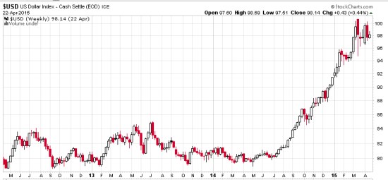
The U.S. Dollar ($USD) has gained about 20% in less than a year. We observe it first in the weekly below. The U.S. Dollar is a significant driver of returns of other markets. For example, when the U.S. Dollar is rising, commodities like gold, oil, and foreign currencies like the Euro are usually falling. A rising U.S. Dollar also impacts international stocks priced in U.S. Dollar. When the U.S. Dollar trends up, many international markets priced in U.S. Dollars may trend down (reflecting the exchange rate). The U.S. Dollar may be trending up in anticipation of rising interest rates.

dollar trend weekly 2015-04-23_16-04-40

Chart created by Shell Capital with: http://www.stockcharts.com

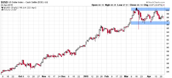
Now, let’s observe a shorter time frame- the daily chart. Here we see an impressive uptrend and since March a non-trending indecisive period. Many trend followers and global macro traders are likely “long the U.S. Dollar” by being long and short other markets like commodities, international stocks, or currencies.

dollar trend daily 2015-04-23_16-05-04

Chart created by Shell Capital with: http://www.stockcharts.com

This is a good example of understanding what drives returns and risk/reward. I consider how long the U.S. Dollar I am and how that may impact my positions if this uptrend were to reverse. It’s a good time to pay attention to it to see if it breaks back out to the upside to resume the uptrend, or if it instead breaks down to end it. Such a continuation or reversal often occurs from a point like the blue areas I highlighted above.

That’s my two cents on the Dollar…

How long are you? Do you know?

Asymmetric Nature of Losses and Loss Aversion

Loss Aversion:

“In prospect theory, loss aversion refers to the tendency for people to strongly prefer avoiding losses than acquiring gains. Some studies suggest that losses are as much as twice as psychologically powerful as gains. Loss aversion was first convincingly demonstrated by Amos Tversky and Daniel Kahneman.”

For most people, losing $100 is not the same as not winning $100. From a rational point of view are the two things the same or different?

Most economists say the two are the same. They are symmetrical. But I think that ignores some key issues.

If we have only $10 to eat on today and that’s all we have, if we lose it, we’ll be in trouble: hungry.

But if we have $10 to eat on and flip a coin in a bet and double it to $20, we may just eat a little better. We’ll still eat. The base rate: survival.

They say rationally the two are the same, but that isn’t true. They aren’t the same. The loss makes us worse off than we started and it may be totally rational to feel worse when we go backward than we feel good about getting better off. I don’t like to go backward, I prefer to move forward to stay the same.

Prospect Theory, which found people experience a loss more than 2 X greater than an equal gain, discovered the experience of losses are asymmetric.

Actually, the math agrees.

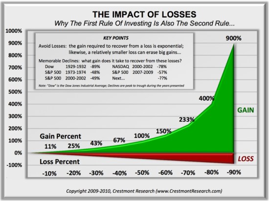
You see, losing 50% requires a 100% gain to get it back. Losing it all is even worse. Losses are indeed asymmetric and exponential on the downside so it may be completely rational and logical to feel the pain of losses asymmetrically. Experience the feeling of loss aversions seems to be the reason a few of us manage investment risk and generate a smoother return stream rather than blow up.

To see what the actual application of asymmetry to portfolio management looks like, see: Shell Capital Management, LLC.


asymmetry impact of loss

“There is always a disposition in people’s minds to think that existing conditions will be permanent …

“There is always a disposition in people’s minds to think the existing conditions will be permanent,” Dow wrote, and went on to say: “When the market is down and dull, it is hard to make people believe that this is the prelude to a period of activity and advance. When the prices are up and the country is prosperous, it is always said that while preceding booms have not lasted, there are circumstances connected with this one, which make it unlike its predecessors and give assurance of permanency. The fact pertaining to all conditions is that they will change.”  – Charles Dow, 1900

Source: Lo, Andrew W.; Hasanhodzic, Jasmina (2010-08-26). The Evolution of Technical Analysis: Financial Prediction from Babylonian Tablets to Bloomberg Terminals (Kindle Locations 1419-1423). Wiley. Kindle Edition.

You can probably see from Dow’s quote how trends do tend to continue, just because enough people think they will. However, price trends can continue into an extreme or a “bubble” just because people think they will continue forever. I like to ride a trend to the end when it bends and then be prepared to exit when it does finally reverse, or maybe reduce or hedge off some risk when the probability seems high of a change.

idowcha001p1

Image source: Wikipedia

Charles Henry Dow; November 6, 1851 – December 4, 1902) was an American journalist who co-founded Dow Jones & Company. Dow also founded The Wall Street Journal, which has become one of the most respected financial publications in the world. He also invented the Dow Jones Industrial Average as part of his research into market movements. He developed a series of principles for understanding and analyzing market behavior which later became known as Dow theory, the groundwork for technical analysis.

Are investors getting overly optimistic again?

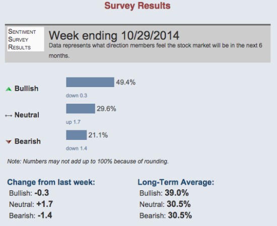
Just as I was observing U.S. stocks getting to a point that I would expect to see stock indexes pull back at least a little or drift sideways, I noticed that investor sentiment readings last week were unusually bullish. 49.4% of investors polled by AAII last week believe stocks will rise in the next 6 months. Only 21.1% were bearish, believing stocks would fall.

That’s an unusual asymmetry between the percent of individual investors believing stocks will rise over those who believe they will fall. You can see the historical averages below.

AAII investor sentiment survey

source: http://www.aaii.com/sentimentsurvey?adv=yes

Investors tend to get more bullish about stocks after they have risen recently (and they have). They tend to get more bearish after stocks have fallen and they are losing money – and fear losing more.

It isn’t a perfect indicator, but the majority tends to feel the wrong feelings at the wrong timeThat presents an advantage for those of us who don’t, and are aware of how behavior signals trends, but a challenge for advisers and individual investors as they try to modify their behavior to avoid it.

VIX® gained 140%: Investors were too complacent

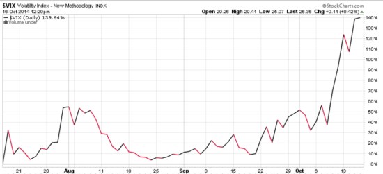
Several months ago I started sharing some of my observations about the VIX ( CBOE Volatility Index). The VIX had gotten to a level I considered low, which implied to me that investors were too complacent, were expecting too low future volatility, and option premiums were generally cheap. After the VIX got down to levels around 11 and 12 and then started to move up, I pointed out the VIX seemed to be changing from a downward longer term trend to a rising trend.

As I was sharing my observations of the directional trend and volatility of VIX that I believed was more likely to eventually go up than down, it seemed that most others were writing just the opposite. I know that many volatility traders mostly sell volatility (options premium), so they prefer to see it fall.

As you can see in the chart below, The VIX has increased about 140% in just a few weeks.

VIX october

Chart courtesy of http://www.stockcharts.com

For those who haven’t been following along, you may consider reading the previous observations:

A VIX Pop Then Back to Zzzzzzzz? We’ll see

Asymmetric VIX

VIX Shows Volatility Still Low, But Trending

VIX Back to Low

The VIX is Asymmetric, making its derivatives an interesting hedge

Is the VIX an indication of fear and complacency?

What does a VIX below 11 mean?

What does the VIX really represent?

The VIX, my point of view

The VIX, as I see it…

Volatility Risk Premium

Declining (Low) Volatility = Rising (High) Complacency

Investors are Complacent


Fear is Driving Stocks Down, or is Declining Stocks Driving Fear?

The last time I pointed out a short-term measure of extreme investor sentiment was August 4, see “Extreme Fear is Now the Return Driver“. At that time, popular stock indexes had declined -3% or more and as prices fell, investor fear measures increased.

As stocks rise, investors get complacent and brag about their profits. After prices fall, investor fear measures start to rise.

Since I pointed out “Extreme Fear is Now the Return Driver”, the Dow Jones Industrial Average went on to trend back up 5% by mid September. Below is a price chart for the Dow year to date. I marked August 4th with a red arrow. You can see how the price trend had declined sharply, driving fear of even lower prices, then it reversed back up. Fear increases after a decline and when fear gets high enough, stocks often reverse back up in the short term. They get complacent and greedy after prices rise to the point there are no buyers left to keep bidding prices up, then prices fall. Investors oscillate between the fear of missing out and the fear of losing money.

dow jones stock index year to date

Source: http://www.stockcharts.com

Since mid September, the price trend has drifted back down over 4% from the peak. As you can see, the Dow has made no gain for the year 2014. It is no surprise that investor sentiment readings are now at “Extreme Fear” levels, as measured by the Fear & Greed Index below.

Fear and Greed Index

Source: Fear & Greed Index CNN Money

So, the last time investor fear levels got this high, stocks reversed back up in the weeks ahead. However, it doesn’t always work out that way. These indicators are best used with other indications of trend direction and strength to understand potential changes or a continuation. For example, we commonly observe 4% to 5% swings in stock prices a few times a year. That is a normal range and should be expected. However, eventually prices will decline and investors will continue to fear even more losses. As prices fall, investors sell just because they’re losing money. Some sell earlier in the decline, some much later. You may know people who sold after they were down -50% in 2008 or 2002.  The trouble with selling out of fear is: when would they ever get back in? That’s why I manage risk with predefined exit points and I know at what point I would reenter.

My point is: fear always has the potential to become panic selling leading to waterfall declines. Panic selling can take weeks or months to drive prices low enough that those who sold earlier (and avoided the large losses and have cash available) are willing to step in to start buying again. Those who stay fully invested all the time don’t have the cash for new buying after prices fall. It’s those buy and hold (or re-balance) investors who also participate fully in the largest market losses.  It’s those of us who exit our losers soon enough, before a large decline, that have the cash required to end the decline in prices.

Selling pressure starts declines, new buying ends them.

We’ll see in the weeks ahead if fear has driven prices to a low enough point that brings in new buying like it has before or if it continues into panic selling. There is a chance we are seeing the early stages of a bear market in global stocks, but they don’t fall straight down. Instead, declines of 20% or more are made up of many cycles of 5 – 10% up and down along the way. So, we shouldn’t be surprised to see stock prices drift up 5% again, maybe even before another -10% decline.

Declining stocks drive fear, but fear also drives stocks down.

Let’s see how it all unfolds…

The VIX is Asymmetric, making its derivatives an interesting hedge

Asymmetric payoff VIX

The VIX is asymmetric, its distribution is non-symmetrical, it is skewed because it has very wide swings. The volatility of volatility is very volatile. There is an asymmetric relationship between stock index returns and the VIX. This asymmetric relationship is what initially makes the VIX interesting for hedging against S&P 500 volatility and losses.

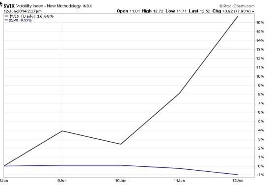
Since I started the series about the extremely low VIX level Monday, like The VIX, as I see it…, The VIX has gained 17% while the S&P 500 stock index has lost about 1%. The VIX is asymmetric. While the VIX isn’t always a perfect opposite movement to the stock indexes, it most often does correlate negatively to stocks. When stocks fall, the implied (expected) volatility increases, so the VIX increases. Asymmetry is imbalance: more of one thing, less of the other. For example, more profit potential, less loss or more upside, less downside.

An advantage of the VIX for hedging is that it is asymmetric: it increases more than stocks fall. For example, when we look at historical declines in the stock index we find the VIX normally gains much more than the stock index falls. For example, if the stock index declined 5% the VIX may have gained 30% over the same period. That ratio of asymmetry of 6 times more drift would allow us to tie up less cash for a hedge position. Of course, the ratio is different each time. Sometimes it moves less, sometimes more.

When the VIX is at a low enough level as it’s been recently, the asymmetric nature of the VIX makes it an interesting hedge for an equity portfolio. The best way to truly hedge a portfolio is to hedge its actual holdings. That’s the only true hedge. If we make a bet against an index and that index doesn’t move like our positions, we still have the risk our positions fall and our hedge does too or doesn’t rise to offset the loss. I always say: anything other than the price itself has the potential to stray far from the price. But the asymmetry of VIX, its potential asymmetric payoff, makes it another option if we are willing to accept it isn’t a direct hedge. And, that its derivatives don’t exactly track the VIX index, either. None of the things we deal with is a sure thing; it’s always probabilistic.

This week has been a fine example of VIX asymmetry. The chart below shows it well.

The VIX is Asymmetric

Note: The VIX is an unmanaged index, not a security so it cannot be invested in directly. We can gain exposure to the VIX through derivatives futures, options, or ETNs that invest in VIX futures or options. This is not a recommendation to buy or sell VIX derivatives. To determine whether or not to take a long or short position in the VIX requires significantly more analysis than just making observations about its current level and direction. For example, we would consider the term structure and implied volatility vs. historical volatility and the risk/reward of any options combinations.

The VIX, as I see it…

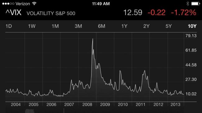
The CBOE Volatility Index (VIX) reached a low point last week not seen since 2007 as evidenced by the chart below.

CBOE VOLATILITY INDEX HISTORY

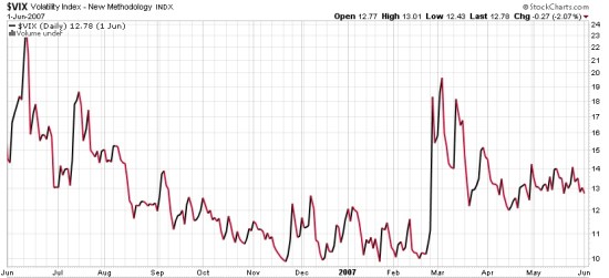
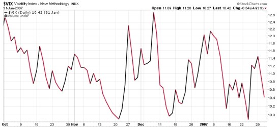
To see a closer view of the last period, below I included the last time the VIX was at such a low value. I show this to point out that the VIX oscillated between 9% and 12% for about 4 months before it finally spiked up to 20. Such a trend reversal (or mean reversion if you prefer) can take time. Imagine if the VIX stays this low for the next 4 months before a spike. Or, it could happen very soon. You may notice the VIX reached the level it is now at its lowest level in early 2007. If we believed these trends repeat perfectly, that absolute level would matter. Trends are more like snowflakes: no two are exactly the same. But in relative terms, the fact that today’s level is as low as the lowest point in early 2007 is meaningful if you care about the risk level in stocks and the stage of the market cycle.

CBOE VOLATILITY INDEX VIX Low levels

The best way to examine a trend is to zoom in. Start with a broader view to see the big picture, then zoom in closer and closer. When people focus too much on the short-term, they miss the forest for the trees. Below is the last time the VIX was below 12. You may notice that is does oscillate up and down in a range.

VIX BELOW 12

The level and directional trend of the VIX matters because of the next chart. You may see a trend if you look closely. The black line is the S&P 500 stock index. The black and red line is the VIX CBOE Volatility Index. You may notice the two tend to drift in opposite directions. Not necessarily on a daily basis, but overall they are “negatively correlated”. When the stock index is rising, the volatility is often falling or already at a low level. When the stock index is falling, volatility rises sharply. It isn’t a perfect opposite, but it’s there.

VIX and S&P 500 correlation and trend

If you are interested in stock trends and the trend in volatility, and specifically the current state of those cycles,  you may want to follow along in the coming days. I plan to publish a series on this topic about the VIX, as I see it. Over the last week or so I have written several ideas that I intended to publish as one large piece. Since I haven’t had time to tie it together that way, I thought I would instead publish a series.

When a trend reaches an extreme level like this, it may be useful to spend some time with it.

Stay tuned…

if you haven’t already, you may want to click on “Follow” to the right to get updates by email to follow along. This will likely be several informal notes in the coming days.


Investors are Complacent

Implied volatility, the amount of “insurance premium” implied by the price of options, continues to suggest that investors are becoming very complacent. When the VIX is high or rising, it says the market expects the S&P to move up or down more. When the VIX is low or declining, it says the market expects the S&P 500 will not move up or down as much in the future. That is, the “insurance premium” priced into options on the S&P 500 stocks is low. That isn’t necessarily directional – it is an indication of the expected range, not necessarily direction. However, what I know about directional price trends is that after a price has been trending directionally for some time, as the S&P 500 stock index has, investors become more and more complacent as they expect that trend to continue. The mind naturally wants to extrapolate the recent past into the future and it keeps doing it until it changes. When we see that in the stock market, it usually occurs as a directional trend is peaking. Investors are caught off guard as they expected a tight range. If the range in prices widens, they probably widen even more because they are – and it wasn’t expected. Interestingly, people actually expect inertia and that is one of the very reasons momentum persists as it does. Yet, momentum may eventually move prices to a point (up or down) that it may move too far and actually reverse the other way.

Image

If we believe the market is right, we would believe the current level accurately reflects the correct expecation for volatility the next 30 days. That is, we would expect today’s implied volatility of about 12 – 13% will match the actual historical volatility 30 days from now. In other words, 30 days from now the historical (backward looking) volatility is match the current implied volatility of 12.6%. If we believe the current volatility implied by option premiums is inaccurate, then we have a position trade opportunity. For example, we may believe that volatility gets to extremes, high or low, and then reverses. That belief may be based on empirical observation and quantitatively studying the historical data to determine that volatility is mean reverting – it may oscillate in a range but also swing from between one extreme to another. If we believe that volatility may reach extremes and then reverse, we may believe the market’s implied volatility is inaccurate at times and aim to exploit it through counter-trend systems. For example, in my world, volatility may oscillate in a range much of the time much like other markets, except it doesn’t necessarily have a bias up or down like stocks. There are times when I want to be short volatility (earning premium from selling insurance) and long volatility (paying premium to buy insurance). I may even do both at the same time, but across different time frames.

The point is, the market’s expectation about the future may be right most of the time and accurately reflect today what will be later. But, what if it’s wrong? If we identify periods when it may be more likely wrong, such as become too complacent, then it sets up a position opportunity to take advantage of an eventual reversal.

Of course, if you believe the market is always priced accurately, then you would never take an option position at all. You would instead believe that options are priced right and if you believe they are, you believe there is no advantage in being long or short them. I believe the market may have it right most of the time, but at points it doesn’t, so convergence trades applying complex trade structures with options to exploit the positive asymmetry between the probability and payoff offers the potential for an edge with positive expectation.

My INVESTOR’S BUSINESS DAILY® Interview and Portfolio Management

Portfolio Management is about buying and selling many different positions over time, not just one “pick”. I often say it’s like flipping 10 coins at the same time with each having a different payoff and profit or loss. It could be a completely random process (like flipping a coin), but if we can positively skew the payoffs (asymmetric payoffs) we end up with more profit than loss (asymmetric returns). And, as a portfolio manager I may flip that coin 100 or 500 times a year. The fact is: if the expectation for profit is positive we want to do it as often as possible.

Picking just one position is like flipping the coin just once. Its outcome may have an expected probability and payoff that is positive, but will be determined by how it all unfolds. We can never control the outcome at the point of entry. It’s the exit that always determines the outcome. We can say that same whether we are speaking of stocks, bonds, commodities, and currencies or buying and selling private businesses: if you actually knew for sure the outcome would be positive you would only need to do it once – but you don’t. So deciding what to buy is a small part of my complete portfolio management process. It’s what I do after I’m in a position that makes it “management”. To manage is to direct and control. If all you do is “buy” or “invest” in a position, you have no position “management”.

But when Trang Ho at INVESTOR’S BUSINESS DAILY®recently asked me “What ‘s the one position you would choose over the next several months and why”, I gave her the first position I thought of – and the most recent position I had taken. I primarily get positioned with the current direction of the trend and stay with it until it changes. That may be labeled “trend following”. I define the direction of the trend (up, down, sideways) and then get in that direction until it changes. Trends don’t last forever. There is a point when the probability becomes higher and higher of a reversal. I call that a “counter-trend”. I developed systems that define these directional trends more than a decade ago and have operated them for-profit since. What I can tell you from my experience, expertise, and empirical evidence is that stock market trends, like many other market trends, cycle up and down over time. So, portfolio management is a daily routine of position management that includes predefining risk at the point of entry, taking profits, and knowing when to exit to keep losses small. That exit, not the entry, determines the outcome.

You may consider these things as you read my recent interview in Investors Business Daily titled: Market Strategists: 5 Contrarian ETF Investing Ideas.

Read More At Investor’s Business Daily: http://news.investors.com/investing-etfs/090613-670234-contrarian-etf-investing-ideas-stock-market-strategists.htm#ixzz2gNp8bWUT