Point and Figure charting is one of the four primary forms of charting used to observe price trends.
I started studying Point & Figure charting myself in the late 1990s when I was interested in a more precise way to determine my exits. P&F charts make the exit based of a price trend more obvious. For example, without knowing anything about these charts you can probably see the area I highlighted in red was a price range this stock found buying interest (support) a few times in the past, but then it broke down. When it did, it fell a lot. On the bullish side, the stock has found selling pressure (resistance) at the price level I highlighted green until it finally broke out to the upside.
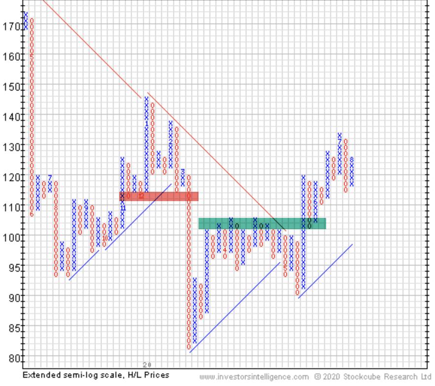
When I first started researching and trading high growth momentum stocks, I wanted a more precise way to define these price trends, so I became what they called a Point & Figure Craftsman. I later wanted to test these breakouts and patterns, so I ended up quantifying them into algorithms. But, I still look at all forms of charts from time to time to get a “feel” for the trends unfolding.
The last time I spoke at a non-client conference was in September 2008 for the National Association of Active Money Managers. I did a two-hour presentation on “exits” and used P&F charts as a great visual example to see trend changes.
The presentation, just days before what would become the start of the “Global Financial Crisis”, highlighted:
“When to sell a loser, laggard or winner is the heart of Mike Shell’s presentation on combining point and figure charting with relative strength to trade ETFs. “It’s the exit, not the entry, that determines your result at the position level. The exit determines whether or not you make or lose money, and how much you make or lose,” explains Mike.”

The topic of exits turned out to be very timely, as it was the beginning of the infamous waterfall decline that began in October 2008.
The history of Point & Figure charting is over 100 years old. “Hoyle” was the first to write about it and showed charts in his 1898 book, The Game in Wall Street. The first book/manual dedicated to Point and Figure was written by Victor Devilliers in 1933. Chartcraft Inc, in the USA, popularized the system in the 1940s. Cohen founded Chartcraft and wrote on point and figure charting in 1947. Chartcraft published further pioneering books on P&F charting, namely those by Burke, Aby and Zieg. Chartcraft Inc is still running today, providing daily point and figure services for the US market under the name of Investors Intelligence. Mike Burke still works for Chartcraft, having started back in 1962 under the guidance of Cohen. Burke went on to train other point and figure gurus, such as Thomas Dorsey who would go on to write authoritative texts on the subject.A detailed history can be found in Jeremy du Plessis’ ‘The Definitive Guide to Point and Figure’ where many references and examples are cited.
Point & Figure charts offer a well-defined methodology to identify current trends and emerging trends as they develop.
In fact, Point & Figure charts are all about price, not time.
Point & Figure charting doesn’t plot price against time as time-based charts do. Instead, P&F plots price against changes in direction by plotting a column of Xs as the price rises and a column of Os as the price falls.
So, Point and Figure charts are a way to visualize price trends in stock, bond, commodity, or currency, without regard to the amount of time that passes.
For example, here is the P&F chart of the NASDAQ.
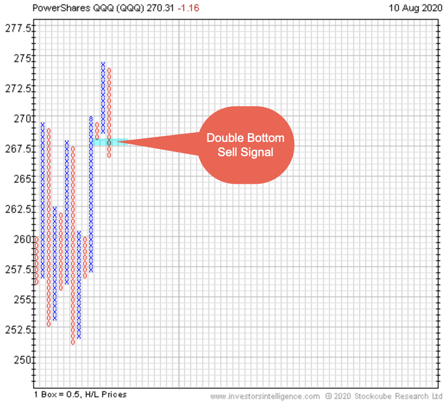
When a column of Os declines below a prior column of Os, it’s a sell signal.
If there was one prior column of Os, it’s a “double bottom” sell signal.
We say supply is in control over demand for the shares.
P&F charts basically allows us to analyze supply and demand.
If enough buying enthusiasm pushes the price up into a column of Xs, the stock, commodity, or whatever market is being accumulated.
Demand exceeds supply.
If the desire to sell exceeds the desire to buy, the selling (supply) pushes the price down into a column of Os, which is what we’re seeing in the NASDAQ at the moment.
Up until now, the NASDAQ has been the dominant of the popular indexes investors follow. It’s heavily weighted in tech stocks, which have been where the momentum has been since the March crash.
But now we are seeing some trend changes.
Another example, again using P&F, is the Percent of NASDAQ 100 stocks in a bullish trend. A bullish trend, again, is a column of Xs above the prior peak, which is an uptrend. When a high percentage of the stocks in the index are trending up, the bullish percent is in a column of Xs and rising to mark the strength. Below, we see a macro indication that enough stocks in the index are falling to signal a bearish trend.
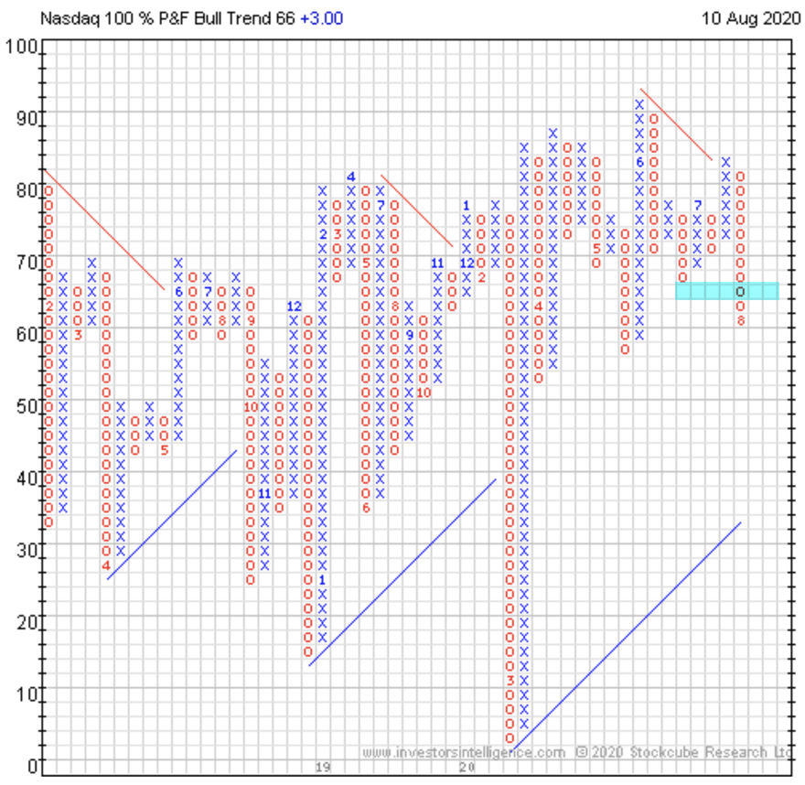
In fact, in P&F methodology terms, the above pattern is “Bear Confirmed” since July 29th. A Bear Confirmed signal is when chart is falling (a column Os) below the 70% level and has generated a P&F sell signal. I highlighted the sell signal on the chart.
The bullish percent charts are a measure of the internal breadth of the stock index. That is, when stocks inside the index start trending down enough to generate P&F sell signals, enough of them generates a sell signal in this breadth index.
So, we say the breath is weakening, which is a warning shot across the bow.
If we hadn’t already seen the emerging weakness develop in the individual stock charts, an indicator like this can alert us to the emerging weakness and prompt us to look inside.
Let’s do that.
Here’s a table of the stocks in the NASDAQ 100 from Investors Intelligence that have been trending down into bearish trends. For better understanding, I also include the breakout date it trended down to illustrate how an emerging trend unfolds.
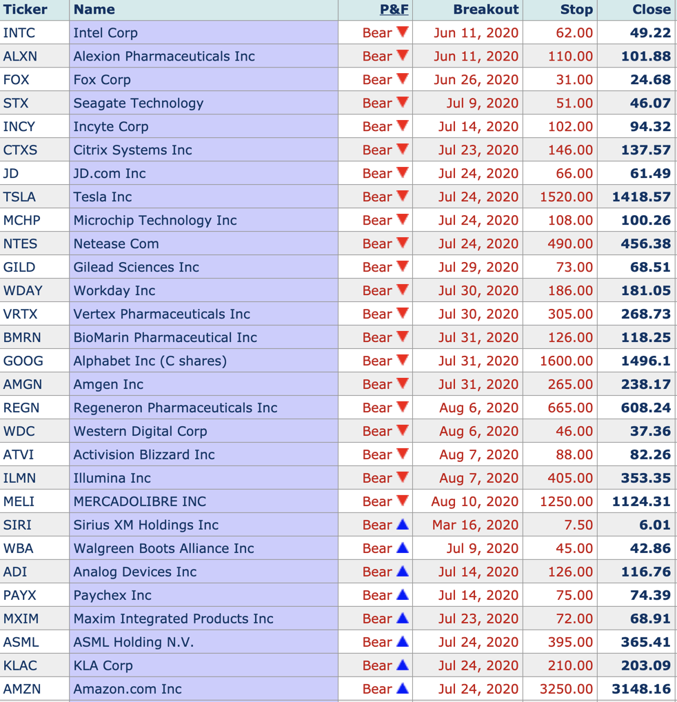
As you glance over the dates, you can probably see how the price trends of these stocks begin to roll over from bullish to bearish directional trends, which shows up in the bullish percent composite.
The bullish percent composites usually point to internal weakness or strength earlier than the price trend of the index. For example, the NASDAQ ETF just generated a P&F sell signal yesterday, but the bullish percent signaled a Bearish Confirmed pattern on July 29th.
I consider it a warning shot across the bow.
For me, the trend of my individual positions is my focus. But, risk signals like this can draw my attention for a closer look at what is going on internally.
I consider charting and technical analysis to simply be market analysis, which isn’t the same thing as deciding what or when to buy or sell. Market analysis is the ongoing research I do to gain perspective of the underlying trends, momentum, sentiment, and volatility. None of it may drive my individual position buys and sells.
Another bearish development the P&F method alerts us to is the relative trend. The relative trend monitors the relative trend of stocks against their index. In this case, the NASDAQ 100 is compared to the S&P 500. The formal P&F pattern here is “Bull Correction” since July 23rd, as the column of Os show it lagging the SPX.
Point & Figure charting is just another form of trend following. It focuses completely on the price trend itself, not volume or even time. It just prints the price change, only when it’s enough to add another X or O. If there isn’t enough price change to add an X or O, it’s ignored as irrelevant.
You can’t probably see how this form of charting may be helpful to focus on the real trend.
There’s a lot more to Point & Figure charting, but I’ll stop there.
Let’s see how the NASDAQ unfolds from here.
Mike Shell is the Founder and Chief Investment Officer of Shell Capital Management, LLC, and the portfolio manager of ASYMMETRY® Global Tactical. Mike Shell and Shell Capital Management, LLC is a registered investment advisor focused on asymmetric risk-reward and absolute return strategies and provides investment advice and portfolio management only to clients with a signed and executed investment management agreement. The observations shared on this website are for general information only and should not be construed as advice to buy or sell any security. Securities reflected are not intended to represent any client holdings or any recommendations made by the firm. Any opinions expressed may change as subsequent conditions change. Do not make any investment decisions based on such information as it is subject to change. Investing involves risk, including the potential loss of principal an investor must be willing to bear. Past performance is no guarantee of future results. All information and data are deemed reliable but is not guaranteed and should be independently verified. The presence of this website on the Internet shall in no direct or indirect way raise an implication that Shell Capital Management, LLC is offering to sell or soliciting to sell advisory services to residents of any state in which the firm is not registered as an investment advisor. The views and opinions expressed in ASYMMETRY® Observations are those of the authors and do not necessarily reflect a position of Shell Capital Management, LLC. The use of this website is subject to its terms and conditions.
You must be logged in to post a comment.