Gold Isn’t Always A Hedge or Safe Haven: Gold Stock Trends Have Been Even Worse

For several years we often heard investors suggesting to “buy gold”. We could throw in Silver here, too. They provide many theories about how gold bullion or gold stocks are a “safe haven”. I’ve written about the same assumption in Why Dividend Stocks are Not Always a Safe Haven.

In fact, the Market Vectors Gold Miners ETF website specifically says about the gold stock sector:

“A sector that has historically provided a hedge against extreme volatility in the general financial markets”.

Source: http://www.vaneck.com/gdx/

When investors have expectations about an outcome, or expect some cause and effect relationship, they expose themselves in the possibility of a loss trap. I will suggest the only true “safe haven” is cash. 

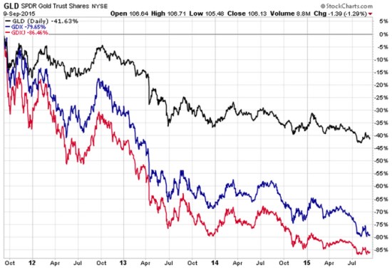
Below is a 4 year chart of two gold stock ETFs relative to the Gold ETF. First, let’s examine the index ETFs we are looking at. Of course, the nice thing about ETFs in general is they are liquid (traded like a stock) and transparent (we know what they hold).

GLD: SPDR Gold “Shares offer investors an innovative, relatively cost efficient and secure way to access the gold market. SPDR Gold Shares are intended to offer investors a means of participating in the gold bullion market without the necessity of taking physical delivery of gold, and to buy and sell that interest through the trading of a security on a regulated stock exchange.”

GDX: Market Vectors Gold Miners ETF: “The investment seeks to replicate as closely as possible, before fees and expenses, the price and yield performance of the NYSE Arca Gold Miners Index. The fund normally invests at least 80% of its total assets in securities that comprise the Gold Miners Index. The Gold Miners Index is a modified market-capitalization weighted index primarily comprised of publicly traded companies involved in the mining for gold and silver.”

GDXJ: Market Vectors Junior Gold Miners ETF seeks to replicate as closely as possible, before fees and expenses, the price and yield performance of the Market Vectors Global Junior Gold Miners Index. The Index is intended to track the overall performance of the gold mining industry, which may include micro- and small capitalization companies.

Gold stocks vs Gold

Source: Shell Capital Management, LLC created with http://www.stockcharts.com

Clearly, gold has not been a “safe haven” or “provided a hedge against extreme volatility in the general financial markets”. It has instead demonstrated its own extreme volatility within an extreme downward price trend.

Further, gold mining stocks have significantly lagged the gold bullion index itself.

These ETFs have allowed for the trading of gold and gold stocks, SPDR Gold explains it well:

“SPDR Gold Shares represent fractional, undivided beneficial ownership interests in the Trust, the sole assets of which are gold bullion, and, from time to time, cash. SPDR Gold Shares are intended to lower a large number of the barriers preventing investors from using gold as an asset allocation and trading tool. These barriers have included the logistics of buying, storing and insuring gold.”

However, this is a reminder that markets do not always play out as expected. The expectation of a “safe haven” or “hedge against extreme volatility” is not a sure thing. Markets may end up much worst that you imagined they could.  As many global and U.S. markets have been declining, you can probably see why I think it’s important to manage, direct, limit, and control exposure to loss. Though, not everyone does it well. It isn’t a sure thing…

______

For informational and educational purposes only, not a recommendation to buy or sell and security, fund, or strategy. Past performance and does not guarantee future results. Please click the links provide for specific risk information about the ETFs mentioned. Please visit this link for important disclosures, terms, and conditions.
Bonds Aren’t Providing a Crutch for Stock Market Losses

In Allocation to Stocks and Bonds is Unlikely to Give us What We Want and What You Need to Know About Long Term Bond Trends I suggested that bonds may not provide a crutch in the next bear market.

It seems we are already observing that. So far this year, bond indexes have declined along with other markets like stocks and commodities.

Below is a chart of 4 different bond index ETFs year-to-date. I use actual ETFs since they are tradable and present real-world price trends (though none of this is a suggestion to buy or sell). I drew the chart as “% off high” to show the drawdown – how much they have declined off their previous highest price.

Bond ETF market returns 2015

The long-term U.S. Treasury bonds are down the most, but even the others have declined over -3%. That’s certainly not a large loss over a 9 month period, but bond investors typically expect safety and stability. Asset allocation investors expect bonds to help offset their losses in other market allocations like stocks, commodities, or REITs.

Keep in mind: the Fed hasn’t even started to increase interest rates yet. If you are an asset allocation investor, you have to consider:

What may happen if interest rates do start to increase sharply and that drives down bond prices?

What if both stocks and bonds fall in the next bear market?

Bonds haven’t provided much of a crutch this year for fixed asset allocators…

I believe world markets require active risk management and defining directional trends. For me, that means predefining my risk in advance in each position and across the portfolio.

The person who says it cannot be done should not interrupt the person doing it.

– Chinese Proverb

The person who says it cannot be done Should not interupt the person doing it

Source: https://www.pinterest.com/explore/chinese-proverbs/

Warren Buffett’s Berkshire Hathaway Hasn’t Managed Downside Risk

 shares an interesting observation in Fortune ” Warren Buffett’s Berkshire lost $11 billion in market selloff“. He points out that Buffett’s Berkshire Hathaway (BRK.A or BRK.B) is tracking the U.S. stock indexes on the downside. He says:

“…during the worst of the downturn from mid-July to the end of August. That represents a 10.3% drop. The good news for Buffett: His, and his investment team’s, performance was likely not much worse than everyone else’s. During the same time, the S&P 500 fell 10.1%.”

Comparing performance to others or “benchmark” indexes is a what I call a “relative return” objective. Comparing performance vs. our own risk tolerance and total return objectives is an “absolute return” objective. The two are very different as what I call “relativity” is more concerned about how others are doing comparatively, while “absolute” is more focused on our own situation.

The article also said:

“If you are invested in an index fund, you may have outperformed the Oracle of Omaha, slightly.”

Let’s see just how true that is. Since the topic is how much Warren Buffett’s Berkshire Hathaway has lost during this stock market decline, I’ll share a closer look.

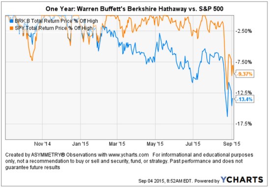
A picture speaks a thousand words. As it turns out, the guru stock picker is actually down -13.4% off it’s high looking back over the past year. That’s about -4% worse than the SPDR® S&P 500® ETF (SPY) that seeks to provide investment results that, before expenses, correspond generally to the price and yield performance of the S&P 500® Index. I am using actual securities here to present an investable comparison: SPY vs. BRK.B.

Warren Buffett's Berkshire Lost compared to stock index

As we observe in the chart, Warren Buffett’s Berkshire Hathaway began to decline off it’s high at the end of last year while the S&P 500® Index started last month. I have observed more and more stocks declining over the past several months. At the same time, more and more International markets have entered into their own bear markets. So, it is no surprise to see a focused stock portfolio diverge from a broader stock index.  points out some of the individual stock positions in ” Warren Buffett’s Berkshire lost $11 billion in market selloff

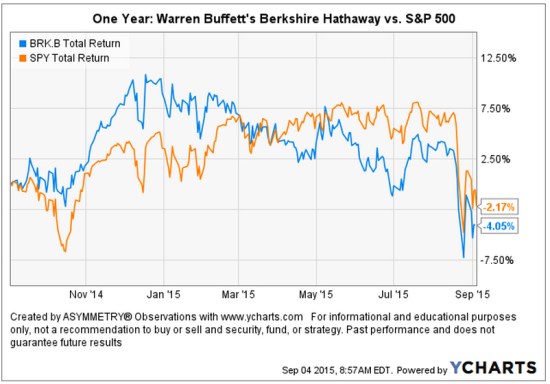
Below is the total return of the two over the past year. We can see the high in Warren Buffett’s Berkshire Hathaway BRK.B was in December 2014.

Warren Buffett's Berkshire Lost compared to stock index total return

I believe world markets require active risk management and defining directional trends. For me, that means predefining my risk in advance in each position and across the portfolio.

Chart source: http://www.ycharts.com

Read the full Fortune article here: ” Warren Buffett’s Berkshire lost $11 billion in market selloff

Stock Market Decline is Broad

We typically expect to see small company stocks decline first and decline the most. The theory is that smaller companies, especially micro companies, are more risky so their value may disappear faster.  Below, we view the recent price trends of four market capitalization indexes: micro, small, mid, and mega. We’ll use the following index ETFs.

Vanguard ETFs small mid large micro cap

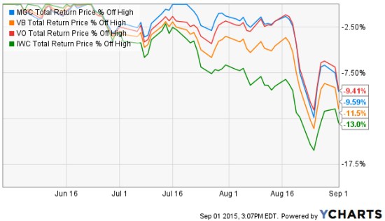
Since we are focused on the downside move, we’ll only observe the % off high chart. This shows what percentage the index ETF had declined off its recent highest price (the drawdown). We’ll also observe different look-back periods.

We first look back 3 months, which captures the full extent of the biggest loser: as expected, the micro cap index. The iShares Micro-Cap ETF (IWC: Green Line) seeks to track the investment results of an index composed of micro-capitalization U.S. equities. Over the past 3 months (or anytime frame we look) it is -13% below its prior high. The second largest decline is indeed the small cap index. The Vanguard Small-Cap ETF (VB: Orange Line) seeks to track the performance of the CRSP US Small Cap Index, which measures the investment return of small-capitalization stocks. The small cap index has declined -11.5%. The Vanguard Mega Cap ETF (MGC) seeks to track the performance of a benchmark index that measures the investment return of the largest-capitalization stocks in the United States and has declined -9.65%. The Vanguard Mid-Cap ETF (VO) seeks to track the performance of a benchmark index that measures the investment return of mid-capitalization stocks and has declined -9.41%. So, the smaller stocks have declined a little more than larger stocks.

Small and Micro caps lead down

Source: Shell Capital Management, LLC created with http://www.ycharts.com

Many active or tactical strategies may shift from smaller to large company stocks, hoping they don’t fall as much. For example, in a declining market relative strength strategies would rotate from those that declined the most to those that didn’t. The trouble with that is they may still end up losing capital and may end up positioned in the laggards long after a low is reached. They do that even though we may often observe the smallest company stocks rebound the most off a low. Such a strategy is focused on “relative returns” rather than “absolute returns“. An absolute return strategy will instead exit falling trends early in the decline with the intention of avoiding more loss. We call that “trend following” which has the objective of “cutting your losses short”. Some trend followers may allow more losses than others. You can probably see how there is a big difference between relative strength (focusing on relative trends and relative returns)  and trend following (focusing on actual price trends and absolute returns).

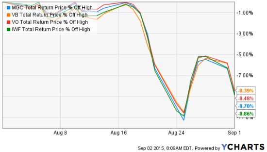
So, what if we look at the these stock market indexes over just the past month instead of the three months above? The losses are the same and they are very correlated. So much for diversification. Diversification across many different stocks, even difference sizes, doesn’t seem to help in declining markets on a short-term basis. These indexes combined represent thousands of stocks; micro, small, medium, and large. All of them declined over -11%, rebounded together, and are trending down together again.

stock market returns august 2015

Source: Shell Capital Management, LLC created with http://www.ycharts.com

If a portfolio manager is trying to “beat the market” index, he or she may focus on relative strength or even relative value (buy the largest loser) as they are hoping for relative returns compared to an index. But a portfolio manager who is focused on absolute returns may pay more attention to the actual downside loss and therefore focuses on the actual direction of the price trend itself. And, a key part is predefining risk with exits.

You can probably see how different investment managers do different things based on our objectives. We have to decide what we want, and focus on tactics for getting that.

On Actively Managing Risk… and Persistence

Don't beg anyone to get on the ark just keep building and let everyone know the rain is coming

Source: https://image-store.slidesharecdn.com/c3d3d5ae-e2eb-4e80-9d4c-88e2344b5572-original.jpeg

I just keep doing what I do…

Why So Stock Market Focused?

Most investors and their advisors seem to speak mostly about the stock market. When they mention “the market” and I ask “what market?” they always reply “the stock market”.

Why so stock market centric?

It must be that it gets the most media attention or stocks seem more exciting?. After all, other markets like bonds may seem boring and few know much about the many commodities markets or the foreign exchange markets. There are many different markets and two sides to them all.

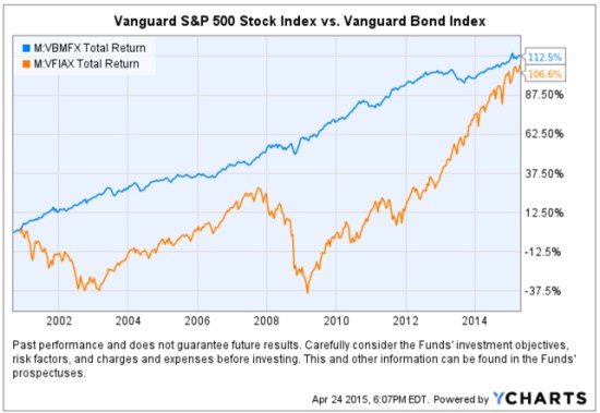
If it’s risk-adjusted returns you want, you may be surprised to find where you should have invested your money the past 15 years. To make the point, below is a comparison of the total return of the Vanguard S&P 500 stock index (the orange line) compared to the Vanguard Bond Index (the blue line). Yes, you are seeing that correctly. Using these simple index funds as a proxy, bonds have achieved the same total return as stocks, but with significantly less volatility and drawdowns. This is why we never look at just “average” return data without considering the path it took to get there. A total return percentage gain chart like this one presents a far more telling story. Take a close look at the path they took.

stocks vs. bonds

Created with http://www.ycharts.com

I showed the chart to one investment advisor who commented “It looks like the stock market is catching up”. If that’s what you think of when you view the chart, you may have a bias blind spot: ignoring the vast difference in the risk between the two markets.

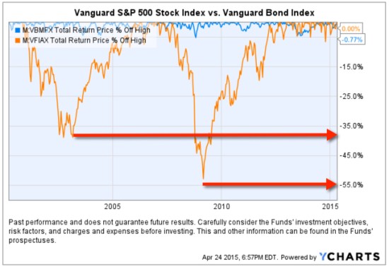
Looking at the total return over the period identifies the obvious difference in the path the two return streams took to achieve their results, but below we see the true risk difference. Drawdowns are declines from a higher value to a low value and a visual representation of how long it took to recover the lose of capital. When we observe a drawdown chart like the one below, it’s like a lake. These charts together also help illustrate the flaw of averages. The average return of the stock and bond index have ended at about the same level and have the same average return, but the bond index achieved it with much less drawdown. You wouldn’t know that if you only looked at average returns. If you tried to walk across the stock market lake, you may have drowned if you couldn’t handle swimming in 40′ of water for so long. If that one didn’t get you, the 55′ may have. The stock index declined about -40% from 2000 – 2002 and took years to recover before it declined -55%.

stock and bond market risk historical drawdowns

Created with http://www.ycharts.com

You have to be wondering: why didn’t you just invest in bonds 15 years ago? Maybe you were focused on the prior period huge average returns in stocks?

Before I continue, let me place a very bold disclaimer here: PAST PERFORMANCE DOES NOT GUARANTEE FUTURE RESULTS. Another way that is stated is that PAST PERFORMANCE IS NO ASSURANCE OF FUTURE RESULTS. One more version is PAST PERFORMANCE MAY NOT BE AN INDICATION OF FUTURE RESULTS. If you remember, the 1990’s were a roaring bull market in stocks. People focus on the past expecting it to continue. That’s probably why you never thought to invest in bonds instead of stocks.

Some of the largest and most successful hedge funds in the world have done that very thing over this period and longer. But, they didn’t just invest in bonds. They leveraged bonds. We’ve seen in this example that a bond index fund has achieved just as much total return as stocks. If you are a stock market centric investor: one that likes the stock market and makes it your focus, then you necessarily had to be willing to endure those -40% to -55% declines and wait many years to recover from the losses. If you are really willing to accept such risk, imagine if you had used margin to leverage bonds. The bond index rarely declined -10% or more. It was generally a falling interest rate period, so bonds gained value. If you were willing to accept -40% to -55% declines in stocks, you could have instead leveraged the bonds 400% or 500%. If you had done that, your return would be 4 or 5 times more with a downside more equal to that of stocks.

Why so stock centric?

Of course, at this stage, the PAST PERFORMANCE IS HIGHLY UNLIKELY TO REPEAT INTO THE FUTURE. Just as the roaring stocks of the 1990’s didn’t repeat. To see why, read Stage and Valuation of the U.S. Stock Market and Bonds: The Final Bubble Frontier?.

From my observations of investors performance and their advisors, most people seem to have poor results the past decade or so, even after this recent bull market. An investment management consultant told me recently that investors and their advisors who are aware of the current stage of stocks and bonds feel there is no place to turn. I believe it’s a very important time to prepare to row, not sail. For me, that means focus on actively managing risk and look for potentially profitable trends across a very global universe of markets; currency, bonds, stocks, commodities, and alternatives like volatility, inverse, etc . That’s my focus in ASYMMETRY® | Managed Accounts.

The Volatility Index (VIX) is Getting Interesting Again

In the last observation I shared on the CBOE Volatlity index (the VIX) I had been pointing out last year the VIX was at a low level and then later started trending up. At that time, many volatility traders seemed to think it was going to stay low and keep going lower – I disagreed. Since then, the VIX has remained at a higher average than it had been – up until now. You can read that in VIX® gained 140%: Investors were too complacent.

Here it is again, closing at 12.45 yesterday, a relatively low level for expected volatility of the S&P 500 stocks. Investors get complacent after trends drift up, so they don’t price in so much fear in options. Below we observe a monthly view to see the bigger picture. The VIX is getting down to levels near the end of the last bull market (2007). It could go lower, but if you look closely, you’ll get my drift.

Chart created by Shell Capital with: http://www.stockcharts.com

Next, we zoom in to the weekly chart to get a loser look.

Chart created by Shell Capital with: http://www.stockcharts.com

Finally, the daily chart zooms in even more.

Chart created by Shell Capital with: http://www.stockcharts.com

The observation?

Options traders have priced in low implied volatility – they expect volatility to be low over the next month. That is happening as headlines are talking about stock indexes hitting all time highs. I think it’s a sign of complacency. That’s often when things change at some point.

It also means that options premiums are generally a good deal (though that is best determined on an individual security basis). Rather than selling premium, it may be a better time to buy it.

Let’s see what happens from here…

Asymmetric Nature of Losses and Loss Aversion

Loss Aversion:

“In prospect theory, loss aversion refers to the tendency for people to strongly prefer avoiding losses than acquiring gains. Some studies suggest that losses are as much as twice as psychologically powerful as gains. Loss aversion was first convincingly demonstrated by Amos Tversky and Daniel Kahneman.”

For most people, losing $100 is not the same as not winning $100. From a rational point of view are the two things the same or different?

Most economists say the two are the same. They are symmetrical. But I think that ignores some key issues.

If we have only $10 to eat on today and that’s all we have, if we lose it, we’ll be in trouble: hungry.

But if we have $10 to eat on and flip a coin in a bet and double it to $20, we may just eat a little better. We’ll still eat. The base rate: survival.

They say rationally the two are the same, but that isn’t true. They aren’t the same. The loss makes us worse off than we started and it may be totally rational to feel worse when we go backward than we feel good about getting better off. I don’t like to go backward, I prefer to move forward to stay the same.

Prospect Theory, which found people experience a loss more than 2 X greater than an equal gain, discovered the experience of losses are asymmetric.

Actually, the math agrees.

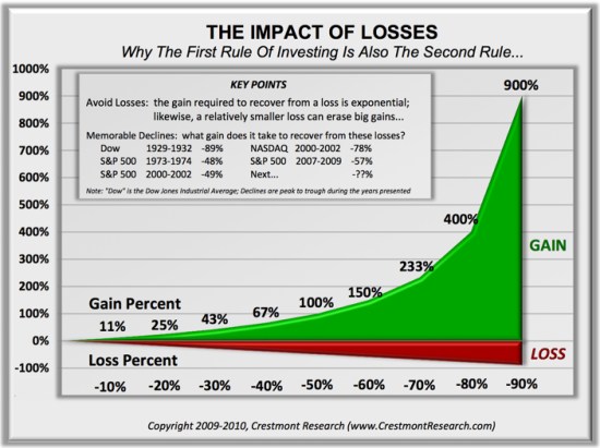
You see, losing 50% requires a 100% gain to get it back. Losing it all is even worse. Losses are indeed asymmetric and exponential on the downside so it may be completely rational and logical to feel the pain of losses asymmetrically. Experience the feeling of loss aversions seems to be the reason a few of us manage investment risk and generate a smoother return stream rather than blow up.

To see what the actual application of asymmetry to portfolio management looks like, see: Shell Capital Management, LLC.


asymmetry impact of loss

A Tale of Two Conditions for U.S. and International Stocks: Before and After 2008

In recent conversations with investment advisors, I notice their sentiment has shifted from “cautious and concerned” about world equity markets to “why have they underperformed”. Prior to 2013, most investors and investment advisors were concerned about another 2007 to 2009 level bear market. Now, it seems that caution has faded. Today, many of them seem to be focused on the strong trend of U.S. stocks since mid-2013 and comparing everything else to it.

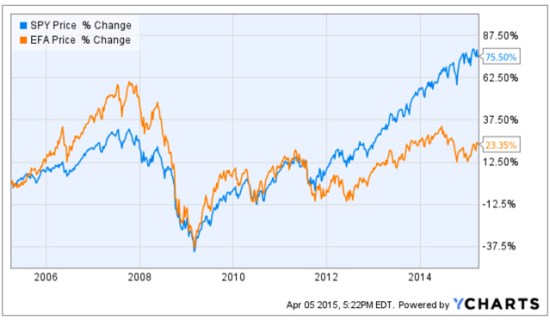
Prior to October 2007, International stocks were in significantly stronger positive directional trends than U.S. Stocks. I’ll compare the S&P 500 stock index (SPY) to Developed International Countries (EFA). We can visually observe a material change between these markets before 2008 and after, but especially after 2013. That one large divergence since 2013 has changed sentiment.

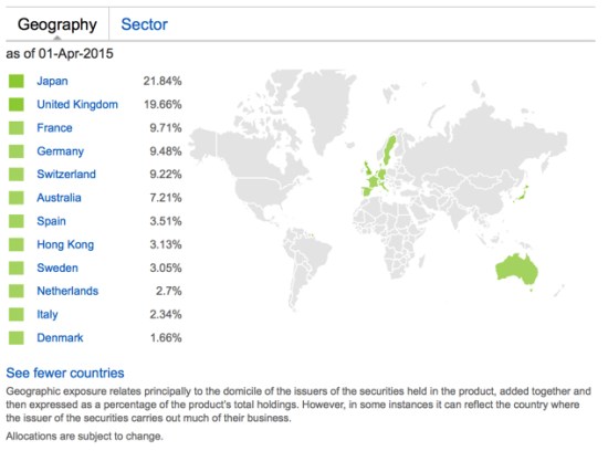
The MSCI EAFE Index is recognized as the pre-eminent benchmark in the United States to measure international equity performance. It comprises the MSCI country indices that represent developed markets outside of North America: Europe, Australasia and the Far East. For a “real life” example of its price trend, I use the iShares MSCI EAFE ETF (EFA). Below are the country holdings, to get an idea of what is considered “developed markets”.

iShares MSCI EAFE ETF Developed Markets exposure 2015-04-05_17-14-43

Source: https://www.ishares.com/us/products/239623/EFA

Below are the price trends of the popular S&P 500 U.S. stock index and the MSCI Developed Countries Index over the past 10 years. Many investors may have forgotten how strong international markets were prior to 2008. Starting around 2012, the U.S. stock market continued to trend up stronger than international stocks. It’s a tale of two markets, pre-2008 and post-2008.

Developed Markets International stocks trend 2015-04-05_17-22-22

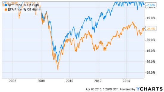
No analysis of a trend % change is complete without also examining its drawdowns along the way. A drawdown measures a drop from peak to bottom in the value of a market or portfolio (before a new peak is achieved). The chart below shows these indexes % off their prior highs to understand their historical losses over the period. For example, these indexes declined -55% or more. The International stock index nearly declined -65%. The S&P 500 U.S. stock index didn’t recover from its decline that started in October 2007 until mid-2012, 5 years later. The MSCI Developed Countries index is still in a drawdown! As you can see, EFA is -24% off it’s high reached in 2007. Including these international countries in a global portfolio is important as such exposure has historically provided greater potential for profits than just U.S. stocks, but more recently they have been a drag.

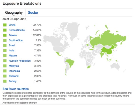
international markets drawdown 2015-04-05_17-30-00The International stock markets are divided broadly into Developed Markets we just reviewed and Emerging Countries. The iShares MSCI Emerging Markets ETF (EEM) tracks this index. To get an idea of which countries are considered “Emerging Markets’, you can see the actual exposure below.

emerging countries markets 2015-04-05_17-13-31

https://www.ishares.com/us/products/239637/EEM?referrer=tickerSearch

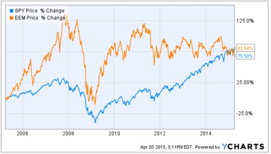
The Emerging Countries index has reached the same % change over the past decade, but they have clearly taken very different paths to get there. Prior to the “global crisis” that started late 2007, many investors may have forgotten that Emerging Markets countries like China and Brazil were in very strong uptrends. I remember this very well; as a global tactical trader I had exposure to these countries which lead to even stronger profits than U.S. markets during that period. Since 2009, however, Emerging Markets recovered sharply but as with U.S. stocks: they have trended up with great volatility. Since Emerging Markets peaked around 2011 they have traded in a range since. However, keep in mind, these are 10-year charts, so those swings up and down are 3 to 6 months. We’ll call that “choppy”. Or, 4 years of a non-trending and volatile state.

Emerging Markets trend 10 years 2015-04-05_17-21-06

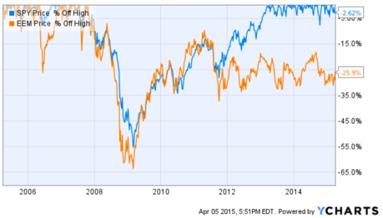
Once again, no analysis of a trend % change is complete without also examining its drawdowns along the way. A drawdown measures a drop from peak to bottom in the value of a market or portfolio (before a new peak is achieved). The chart below shows these indexes % off their prior highs to understand their historical losses over the period. For example, these indexes declined -55% or more. The Emerging Market stock index declined -65%. The S&P 500 U.S. stock index didn’t recover from its decline that started in October 2007 until mid-2012, 5 years later. The MSCI Emerging Countries index is still in a drawdown! As you can see, EFA is -26% off it’s high reached in 2007. As I mentioned before, it recovered sharply up to 2011 but has been unable to move higher in 4 years. Including these Emerging Markets countries in a global portfolio is important as such exposure has historically provided greater potential for profits than just U.S. stocks, but more recently they have been a drag.

emerging markets drawdown 2015-04-05_17-52-19

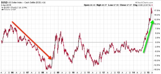
Wondering why the tale of two markets before and after 2008? The are many reasons and return drivers. One of them can be seen visually in the trend of the U.S. Dollar. Below is a 10-year price chart of the U.S. Dollar index. Before 2008, the U.S. Dollar was falling, so foreign currencies were rising as were foreign stocks priced in Dollars. As with most world markets, even the U.S. Dollar was very volatile from 2008 through 2011. After 2011 it drifted in a tighter range through last year and has since increased sharply.

Dollar impact on international stocks 2015-04-05_18-05-02

The funny thing is, I’ve noticed there are a lot of inflows into currency-hedged ETFs recently. Investors seem to do the wrong thing at the wrong time. For example, they’ll want to hedge their currency risk after it already happened, not before… It’s just like with options hedging: Investors want protection after a loss, not before it happens. Or, people will buy that 20 KW generator for their home after they lose power a few days, not before, and may not need it again for 5 years after they’ve stopped servicing it. So, it doesn’t start when they need it again.

You can probably see why I think it’s an advantage to understand how world markets interact with each other and it’s an edge for me.

Mike Shell is the Founder and Chief Investment Officer of Shell Capital Management, LLC, and the portfolio manager of ASYMMETRY® Global Tactical.

The observations shared on this website are for general information only and are not specific advice, research, or buy or sell recommendations for any individual. Investing involves risk including the potential loss of principal an investor must be willing to bear. Past performance is no guarantee of future results. The presence of this website on the Internet shall in no direct or indirect way raise an implication that Shell Capital Management, LLC is offering to sell or soliciting to sell advisory services to residents of any state in which the firm is not registered as an investment advisor. Use of this website is subject to its terms and conditions.

“It is impossible to produce a superior performance unless…

Sir John Templeton

source: http://www.templeton.org

A great quote from my fellow Tennessean, Sir John Templeton:

“It is impossible to produce a superior performance unless you do something different from the majority.”

Sir John Templeton

Absolute Return as an Investment Strategy

Absolute Return Investment Strategy Fund Manager

In “Absolute Return: The Basic Definition”, I explained an absolute return is the return that an asset achieves over a certain period of time. To me, absolute return is also an investment objective.

In “Absolute Return as an Investment Objective” I explained that absolute return is an investment objective is one that does not try to track or beat an arbitrary benchmark or index, but instead seeks to generate real profits over a complete market cycle regardless of market conditions. That is, it is focused on the actual total return the investor wants to achieve and how much risk the investor will willing to take, rather than a focus on what arbitrary market indexes do.
Absolute return as a strategy: absolute return is sometimes used to define an investment strategy. An absolute return strategy is a plan, method, or series of maneuvers aiming to compound capital positively and to avoid big losses to capital in difficult market conditions. Whereas Relative Return strategies typically measure their success in terms of whether they track or outperform a market benchmark or index, absolute return investment strategies aim to achieve positive returns irrespective of whether the prices of stocks, bonds, or commodities rise or fall over the market cycle.
Whether you think of absolute return as an objective or a strategy, it is a skill-based rather than market-based. That is, the absolute return manager creates his or her results through tactical decision-making as opposed to taking what the market is giving. One can employ a wide range of approaches toward an absolute return objective, from price-based trend following to fundamental analysis. In the ASYMMETRY® Managed Accounts, I believe price-based methods are more robust and lead to a higher probability of a positive expectation. Through my historical precedence, testing, and experience, I find that any fundamental type method that is based on something other than price has the capability to stray far enough from price to put the odds against absolute returns. That is, a manager buying what he or she believes is undervalued and selling short what he believes is overvalued can go very wrong if the position is on the wrong side of the trend. But price cannot deviate from itself. Price is the judge and the jury.

Of course, absolute return and the “All Weather” type portfolio sound great and seem to be what most investors want, but it requires incredible skill to execute. Most investors and advisors seem to underestimate the required skills and experience and most absolute return strategies and funds have very limited and unproven track records. There is no guarantee that these strategies and processes will produce the intended results and no guarantee that an absolute return strategy will achieve its investment objective.

For an example of the application of an absolute return objective, strategy, and return-risk profile,  visit http://www.asymmetrymanagedaccounts.com/

Trends, Countertrends, in the U.S. Dollar, Gold, Currencies

Trend is a direction that something is moving, developing, evolving, or changing. A trend is a directional drift, one way or another. When I speak of price trends, the directional drift of a price trend can be up, down, or sideways.

Trends trend to continue and are even more likely to continue than to reverse, because of inertia. Inertia is the resistance to change, including a resistance to change in direction. It’s an important physics concept to understand to understand price trends because inertia relates to momentum and velocity. A directional price trend that continues, or doesn’t change or reverse, has inertia. To understand directional price trends, we necessarily need to understand how a trend in motion is affected by external forces. For example, if a price trend is up and continues even with negative external news, in inertia or momentum is even more significant. Inertia is the amount of resistance to change in velocity. We can say that a directional price trend will continue moving at its current velocity until some force causes its speed or direction to change. A directional trend follower, then, wants keep exposure to that trend until its speed or direction does change. When a change happens, we call it a countertrend. A countertrend is a move against the prior or prevailing trend. A countertrend strategy tries to profit from a trend reversal in a directional trend that has moved to such a magnitude it comes more likely to reverse, at least briefly, than to continent. Even the best long-term trends have smaller reversals along the way, so countertrend systems try to profit from the shorter time frame oscillations.

“The one fact pertaining to all conditions is that they will change.”

                                    —Charles Dow, 1900

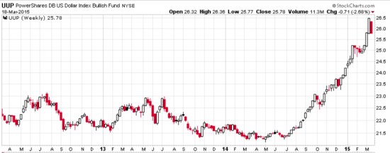
One significant global macro trend I noticed that did show some “change” yesterday is the U.S. Dollar. The U.S. Dollar has been in a smooth drift up for nearly a year. I use the PowerShares DB US Dollar Index Bullish (UUP). Below, I start with a weekly chart showing a few years so you can see it was non-trending up until last summer. Clearly, the U.S. Dollar has been trending strongly since.

u.s. dollar longer trend UPP

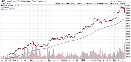
Next, we zoom in for a closer look. The the PowerShares DB US Dollar Index Bullish (UUP) was down about -2% yesterday after the Fed Decision. Notice that I included a 50 day moving average, just to smooth out the price data to help illustrate its path. One day isn’t nearly enough to change a trend, but that one day red bar is greater in magnitude and had heavy volume. On the one hand, it could be the emotional reaction to non trend following traders. On the other, we’ll see over time if that markets a real change that becomes a reversal of this fine trend. The U.S. Dollar may move right back up and resume it’s trend…

U.S. Dollar Trend 2015-03-19_08-21-35

chart source for the following charts: http://www.stockcharts.com

I am using actual ETFs only to illustrate their trends. One unique note about  PowerShares DB US Dollar Index Bullish Fund (Symbol: UUP) is the tax implications for currency limited partnership ETFs are subject to a 60 percent/40 percent blend, regardless of how long the shares are held. They also report on a K-1 instead of a 1099.

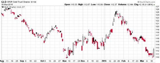
Why does the direction of the U.S. Dollar matter? It drives other markets. Understanding how global markets interact is an edge in global tactical trading. Below is a chart of Gold. I used the SPDR Gold Trust ETF as a proxy. Gold tends to trade the opposite of the U.S. Dollar.

gold trend 2015-03-19_08-22-41

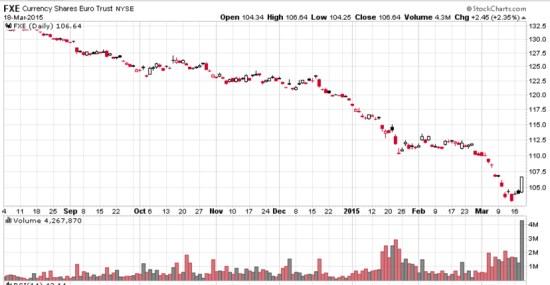
When the U.S. Dollar is trending up, it also has an inverse correlation to foreign currencies priced in dollars. Below is the CurrencyShares Euro ETF.

Euro currency trend 2015-03-19_08-23-03

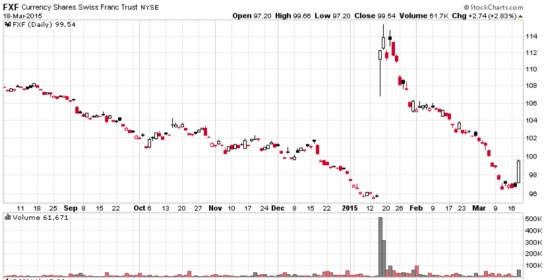
Foreign currencies can have some risk. In January, the Swiss Franc gaped up sharply, but has since drifted back to where it was. Maybe that was an over-reaction? Markets aren’t so efficient. Below is a chart of the CurrencyShares Swiss Franc to illustrate its trend and countertrend moves.

swiss franc trend 2015-03-19_08-23-23

None of this is a suggestion to buy or sell any of these, just an observation about directional trends, how they interact with each other, and countertrend moves (whether short term or long term). Clearly, there are trends…

To see how tactical decisions and understand how markets interacts results in my real performance, visit : ASYMMETRY® Managed Accounts

Sectors Showing Some Divergence…

So far, U.S. sector directional price trends are showing some divergence in 2015.

Rather than all things rising, such divergence may give hints to new return drivers unfolding as well as opportunity for directional trend systems to create some asymmetry by avoiding the trends I don’t want and get exposure to those I do.

Sector ETF Divergence 2015-03-04_11-24-54

For more information about ASYMMETRY®, visit: http://www.asymmetrymanagedaccounts.com/global-tactical/


Chart source: http://www.finviz.com/groups.ashx


What is the Alternative?

Alternative Investment Strategy

Anything beyond buying and holding stocks and bonds is called “alternative” investments,  alternative investment strategies, or alternative trading strategies.

What is “alternative”?

  • offering or expressing a choice
  • not usual or traditional
  • existing or functioning outside of the established society
  • different from the usual or conventional

Source: http://www.merriam-webster.com/dictionary/alternative

I like it.

%d bloggers like this: