The S&P 500 stock market index is holding the line

The stock index is holding the line so far.

spx spy technical analysis trend following asymmetric risk reward retrun

You can see the percent of S&P 500 stocks trading above their 50 day moving average closed at 30% last week. It’s also testing a low trend, not it is a real trend where buying/selling pressure exists, it’s just a line showing the percent of stocks in short term uptrends are where they were at the May low.

spx percent of stocks above 50 day moving average $SPXA50R

Next, we see the percent of stocks above the longer-term trend closed at 55% last week, the same level as the March and May lows.

$SPXA200R spx percent of stocks above 200 day moving average trend following breadth

CBOE S&P 500 Volatility Index $VIX only dropped -2.77%, which is light, considering the S&P 500 closed up 1.1%.

The options market last Friday showed asymmetry between put buying and call buying with the market favoring puts 144%. Index options seem to be mostly used for hedging.

Individual equity options are more traded for speculation. Put buying was high on individual stocks last Friday, too. You can see the typical range is much lower.

This isn’t advice for anyone as this index cannot be traded directly, but I want to make a point that if I wanted to take a position here to increase explore, I would place my exit just below the red line. The red line is the May and March lows, so if the price trend falls below that, the trend changes from up to down. Lower highs and lower lows is a simple example of a downtrend. I just wanted to point that out as a very simple example of a tactical trade based on the price trend.

spx stop loss

We’ll see how it all unfolds from here.

Mike Shell is the Founder and Chief Investment Officer of Shell Capital Management, LLC, and the portfolio manager of ASYMMETRY® Global Tactical.

Mike Shell and Shell Capital Management, LLC is a registered investment advisor focused on asymmetric risk-reward and absolute return strategies and provides investment advice and portfolio management only to clients with a signed and executed investment management agreement. The observations shared on this website are for general information only and should not be construed as advice to buy or sell any security. Securities reflected are not intended to represent any client holdings or any recommendations made by the firm. Any opinions expressed may change as subsequent conditions change.  Do not make any investment decisions based on such information as it is subject to change. Investing involves risk, including the potential loss of principal an investor must be willing to bear. Past performance is no guarantee of future results. All information and data is deemed reliable, but is not guaranteed and should be independently verified. The presence of this website on the Internet shall in no direct or indirect way raise an implication that Shell Capital Management, LLC is offering to sell or soliciting to sell advisory services to residents of any state in which the firm is not registered as an investment advisor. Use of this website is subject to its terms and conditions.


What’s going to happen next?

S&P 500 has declined to the 200-day moving average. I don’t trade the moving average, but include it as a reference for the chart. More importantly, the stock index is also near its low in February.

By my measures, it’s also reached the point of short-term oversold and at the lower price range that I consider is within a “normal” correction.

I know many traders and investors were expecting to see a retest of that low and now they have it. So, I expect to see buying interest next week. If not, look out below… who knows how low it will need to go to attract buying demand.


Mike Shell is the founder and Chief Investment Officer of Shell Capital Management, LLC, and the portfolio manager of ASYMMETRY® Global Tactical.

You can follow ASYMMETRY® Observations by click on on “Get Updates by Email” on the top right.

The is no guarantee that any strategy will meet its objective.  Past performance is no guarantee of future results. The observations shared are for general information only and are not intended to provide specific advice or recommendations for any individual.

Asymmetric force was with the buyers

In Asymmetric force direction and size determines a trend, I explained how the net force of all the forces acting on a trend is the force that determines the direction. The force must be asymmetric as to direction and size to change the price and drive a directional trend.

The asymmetric force was with buyers as they dominated the directional trend on Friday.

Friday’s gain helped to push the stock market to a strong week and every sector gained.

The S&P 500 stock index is about -3% from it’s January high and closed slightly above the prior high last week. I consider this a short-term uptrend that will resume it’s longer-term uptrend if it can break into a new high above the January peak.

After declining sharply -10% to -12%, global equity markets are recovering. The good news for U.S. stocks is the Russell 2000 small company index is closest to its prior high. Small company leadership is considered bullish because it suggests equity investors are taking a risk on the smaller more nimble stocks.

As you can see in the chart, the Dow Jones Industrial Average and International Developed Countries (MSCI EAFE Europe, Australasia and Far East) are lagging so far off their lows but still recovering.

So far, so good, but only time will tell if these markets can exceed their old highs and breakout into new highs, or if they discover some resistance force at those levels and reverse back down. As we discussed in Asymmetric force direction and size determines a trend it’s going to depend on the direction and size of the buyers vs. sellers.

Mike Shell is the Founder and Chief Investment Officer of Shell Capital Management, LLC, and the portfolio manager of ASYMMETRY® Global Tactical.

You can follow ASYMMETRY® Observations by click on on “Get Updates by Email” on the top right or follow us on Twitter.

The observations shared in this material are for general information only and are not intended to provide specific advice or recommendations for any individual. Investing involves risk including the potential loss of principal an investor must be willing to bear. Past performance is no guarantee of future results.

Stock pickers market? Sector rotation with stocks for asymmetric reward to risk

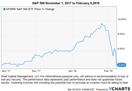
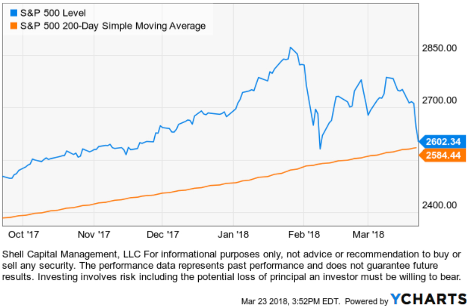
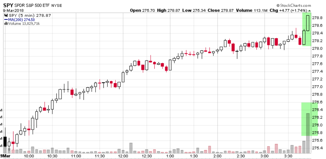
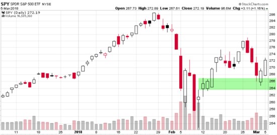
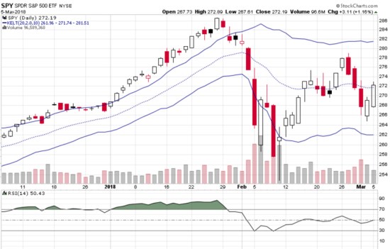
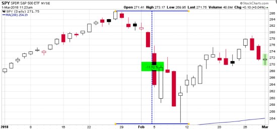
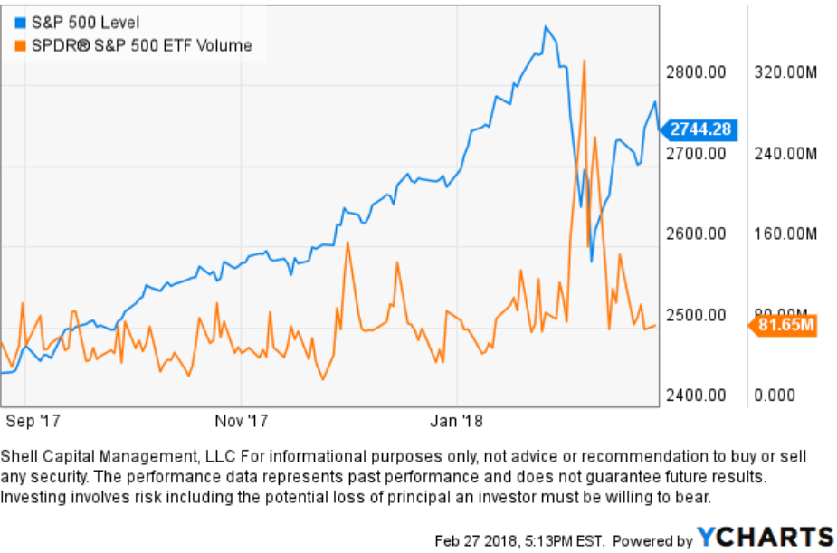
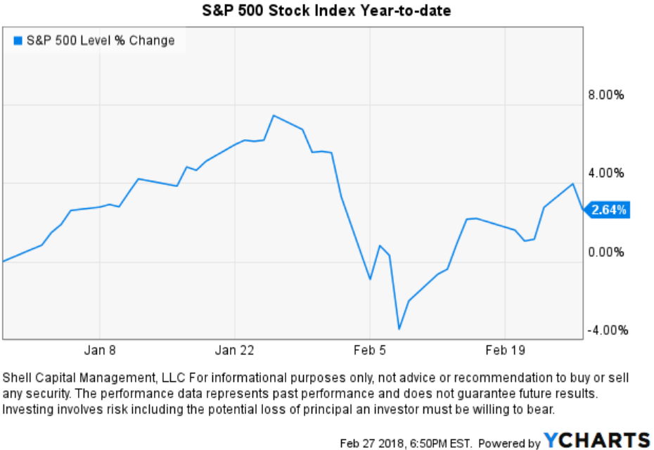
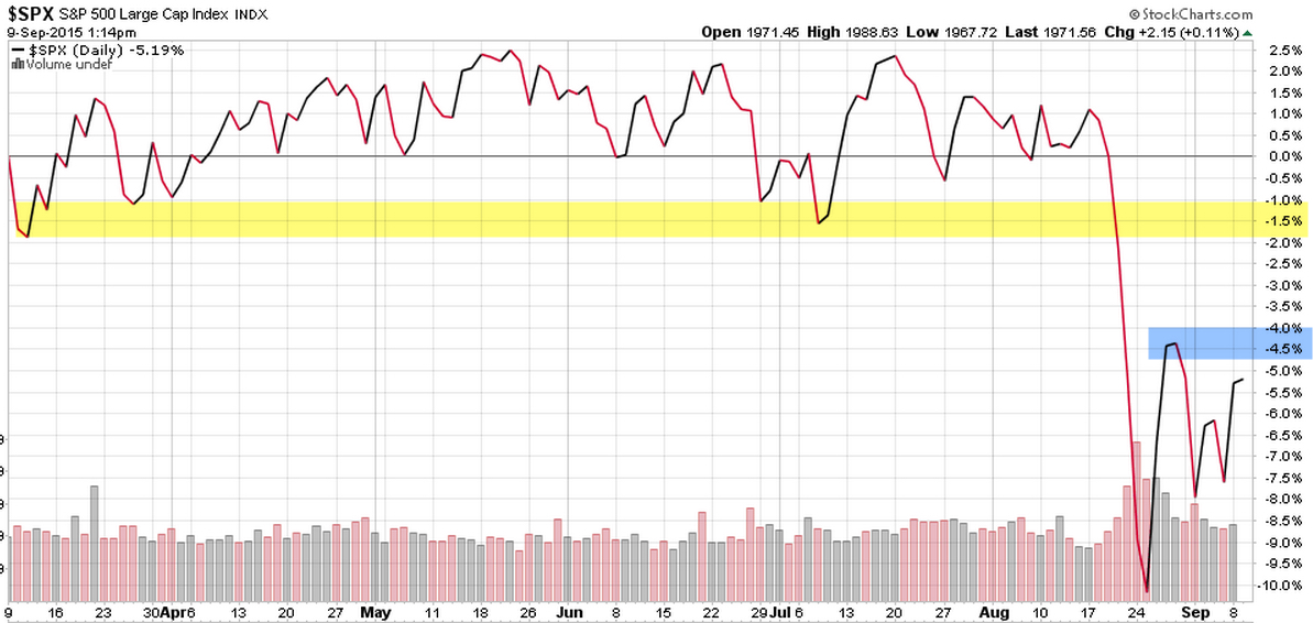
After yesterdays 1.1% gain for the S&P 500, it is back in positive territory for the year. It’s been a very volatile start for 2018 with an abnormally strong trend in U.S. stocks late 2017 continued in January only to be wiped out in February. Below is a visual representation, showing the period November 2017 to the low last month. I point that out to show how quickly a trend can change and prior gains of 12% in just a three-month time frame and be erased in a -10% decline over 9 days. Most of the decline was in two days over that period.

With that said, as the broad stock market is lagging in its third month of the year so far, two sectors are leading. Consumer Discretionary (XLY)  and Technology (XLK). At Shell Capital, we monitor global market trends at the broad market level like the S&P 500 which is diversified across 500 stocks that are a part of 10 sectors. These sectors are tradable via ETFs. We can quickly get broad exposure to the overall stock market, or we can get more granular and get exposure to a sector in a low-cost structure with Sector ETFs.  I also monitor the individual stocks inside the sector ETF. When the overall market is in a positive trend, most of the stocks in a sector should be trending up. But, when the overall market has struggled to trend up, like this year-to-date, fewer stocks are trending up inside a sector.

The popular narrative becomes “it’s a stock pickers market.”

I don’t say that myself, I just observe when it is “a stock pickers market” naturally through my daily quantitative research. Here are some examples of my observation.

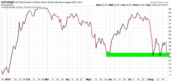
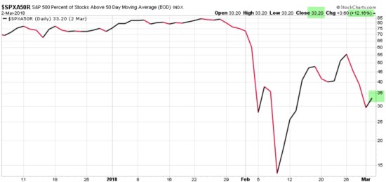
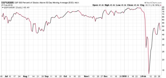
I pointed out yesterday in Buying demand dominated selling pressure in the stock market that only 32% of the 500 stocks in the S&P 500 are above their 50-day moving average. After yesterdays stock market gain, the participation increased to 40%. The 50-day moving average is a short-term trend indicator, so if 60% of the stocks are below that trend line, we can infer “most stocks are in short-term downtrends.” As of yesterdays close, only 203 (40%) of the S&P 500 are above their 50-day moving average, which means 297 are below it. You can probably see if the price trend continues up, we should see more and more stocks participate in the trend. In fact, if we don’t see more stocks participate, it necessarily means only a few stocks are driving the broad index trend up. I would consider that “a stock pickers market.” Of course, the trick is to see this in advance, or early enough in the stage to capitalize on it. We don’t have to know in advance what’s going to happen next, and we don’t, we just need to observe it soon enough to capture some positive asymmetry (P>L).

I like a visual representation, so here is the chart of the S&P 500 Percent of Stocks Above 50 Day Moving Average. I colored the top part of the chart red and labeled it “Higher Risk Zone” and the lower part green with the label “Lower Risk Zone”. The observation is when 80% of stocks are already trending positive that momentum is a good thing, but as a skilled risk manager, I begin to prepare for change. After most stocks are already trending up, the stock market has been trending up, so a skilled risk manager prepares for a countertrend reversal that is inevitable at some point. As I shared in my observation near the low, Stock Market Analysis of the S&P 500  when nearly all the stocks were already in negative trends as a skilled risk-taker, I look for that to reverse, too.


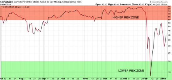
This is only a small glimpse at what I look at for illustration purposes to make the point how I can quantify a “stock pickers market.” After 83% of stocks were already in downtrends I shifted from a risk manager stance to risk-taker mode looking. That is, shifting from a reversal down in January after prices had already trended up to an extreme, to preparing for the decline to end after the stock index quickly dropped -10% and my many indicators were signaling me when and where to pay attention. I shared this to represent that I was not surprised to see certain stocks lead a trend direction when so many had shifted from positive trends to negative trends in a short-term time frame.

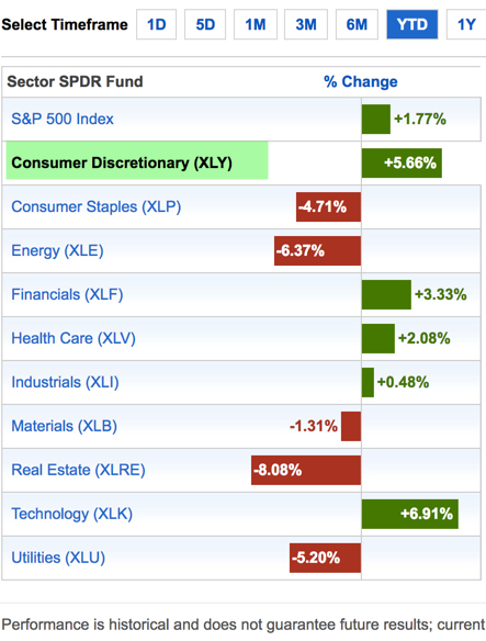
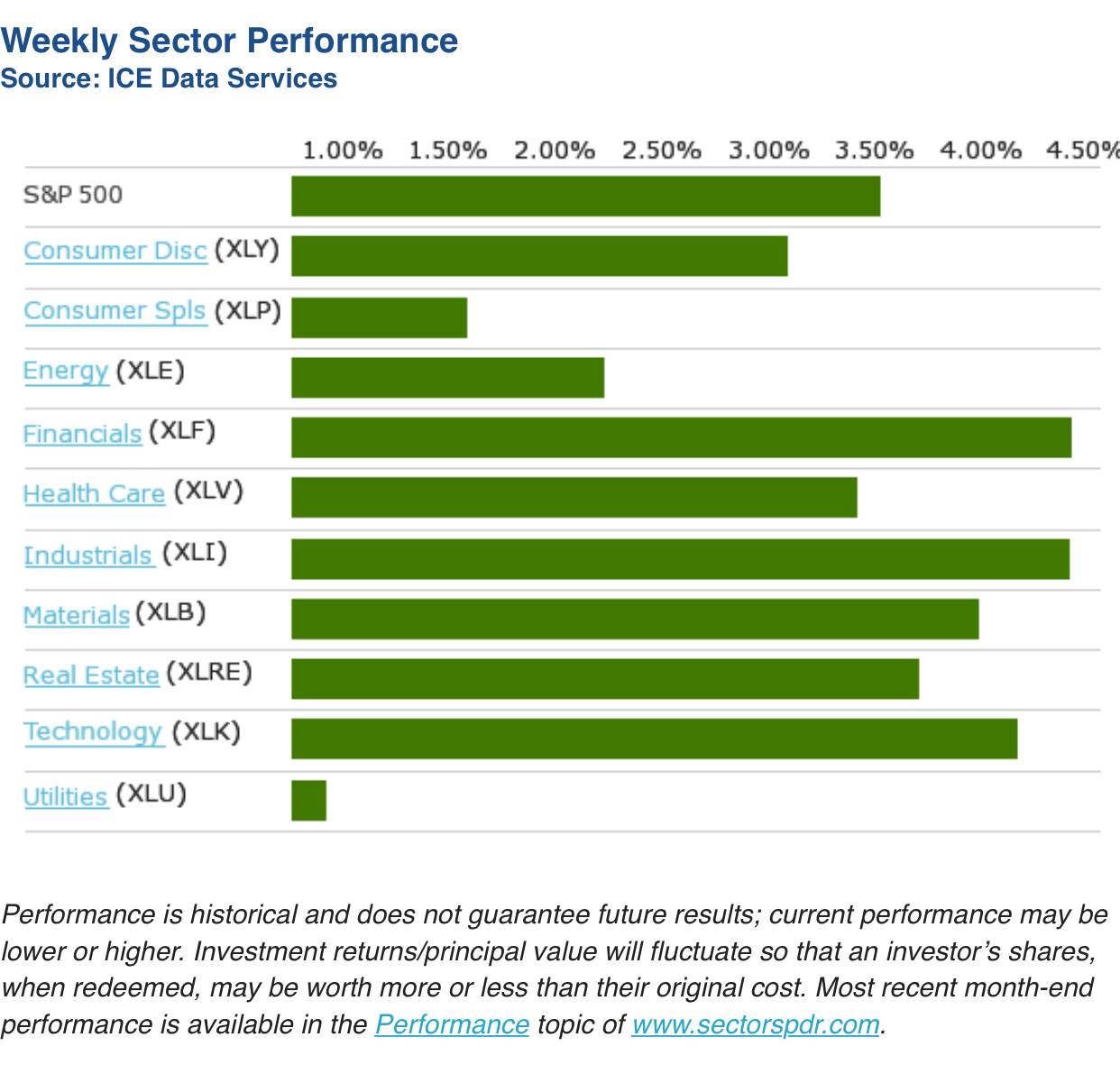
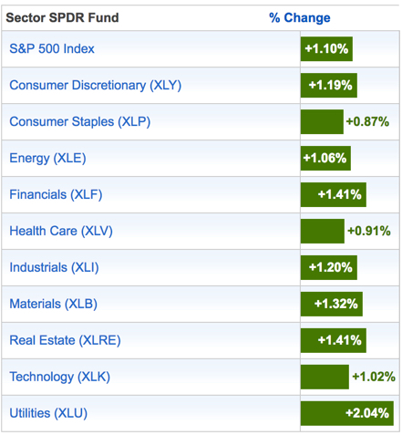
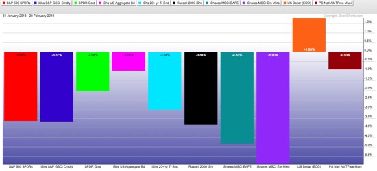
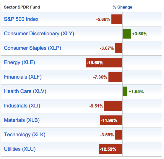
This leads me to my main point, which is very simple. A simple way to observe a “stock pickers market” is to see that certain stocks are leading the trend. Because so may stocks were in short-term downtrends, it isn’t a surprise to see a few strong relative strength leaders inside a sector. For example, in the Sector ETF performance table below, two leading sectors are Consumer Discretionary (XLY)  and Technology (XLK). They are up about 6-7% as the broad stock index is up 1.77%. Let’s see what is driving their stronger relative momentum.

Looking inside the Sector for the Leading Stocks 

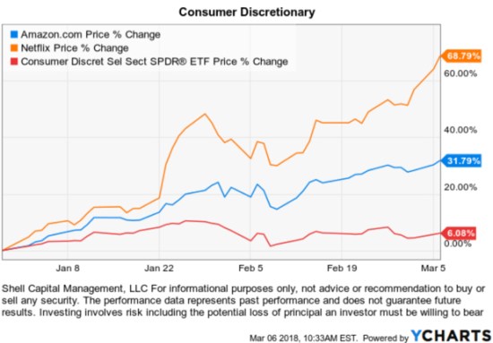
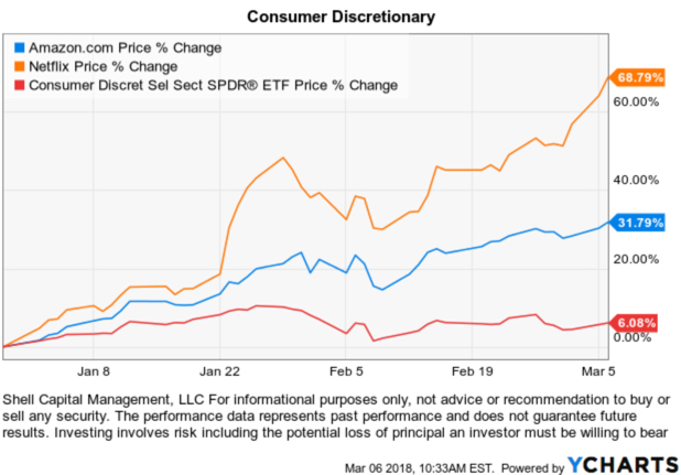
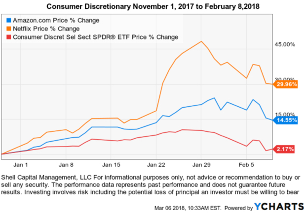
Reviewing the holdings of the Consumer Discretionary $XLY ETF,  Amazon.com Inc $AMZN is 20.69% of the Consumer Discretionary Sector and has gained +30.28% for the year. A 20% weighting of a stock that has gained 30% results in a 6% contribution to the portfolio return. That is, this one large position has contributed 100% of the sectors return year-to-date. There are 84 stocks in the ETF. This doesn’t mean the other 83 stocks are flat with no price change. Instead, some of them were also positive for the year and some are negative. So far this year, they have offset each other. Some stocks in the sector have gained more than Amazon, but it makes the simple example because it’s exposure is the largest at 20%. Netflix $NFLX, for example, is the sector ETFs biggest gainer up 64%, but it’s 4.63% of the portfolio. However, because it’s gain is so strong this year its contribution at the portfolio level is still significant at 3% of the 5.66% YTD gain in the sector ETF. That is an extreme example. Why is it extreme? Let’s look at price charts of the year-to-date price trend, then the drawdown, which expresses the ASYMMETRY® ratio. The ASYMMETRY® ratio is a ratio between profit and loss, upside vs. downside, or drawdown vs. total return.

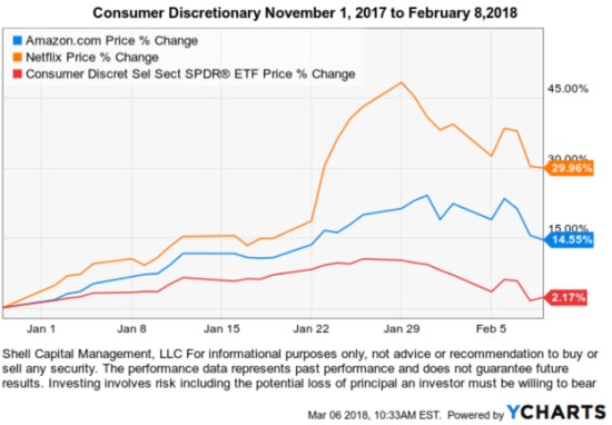
First, we observe the price trend for 2018 of the Consumer Discretionary Sector ETF $XLY, Netflix $NFLX, and Amazon $AMZN. The divergence is clear. But, you may notice they all had a drawdown a few weeks ago. All to often I see the upside presented, but not enough about the path we would have to endure to achieve it. To get a complete picture of asymmetric reward to risk, we want to see the drawdown, too, so we understand the ASYMMETRY® ratio.

Those are some big impressive short-term gains in those stocks. Clearly, this past performance may not be an indication of future results.  Too bad we can’t just know for sure in advance which is going to trend up with such velocity.  We can’t catch every trend, but if we look in the right way we may find some. In order to take a position in them, we’d have to be willing to experience some downside risk, too. As a portfolio manager, I decide how much my risk is in my positions and at the portfolio level by predefining when I’ll exit a losing position. But, to understand how much downside is possible in stocks like this and the sector ETF, I can examine the historical drawdown. We’ve seen a drawdown in the stock market already this year. Below we see the Consumer Sector ETF drawdown was about -8% a few weeks ago. Amazon wasn’t more, even though it’s gain is much more than the sector. That’s what I’m calling positive asymmetry and good looking asymmetric reward to risk in regard to the trend dynamics. Netflix declined -13%, but its gain is much higher. This is what leading stocks are supposed to look like. They have their risk and they could decline a lot more than the market if investors lose their enthusiasm for them, but we can manage that risk with our exit and drawdown controls.

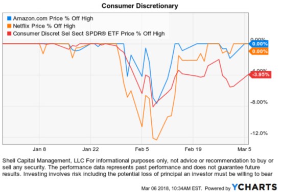
I often say that it doesn’t matter how much the return is if the risk and volatility are so high you tap out before it is achieved. To better understand that, I want to show two more charts of these stocks. Below is what the YTD price change looked like at the February low. If investors watch their holdings closely and have emotional reactions, you can see how this would be viewed as “I was up 45% and now only 30%.” Many investors (and professional advisors) have difficulty holding on to strong trends when they experience every move.

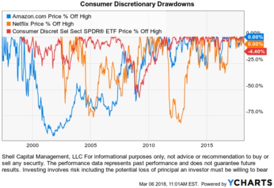
One more chart to illustrate how it doesn’t matter how much the return is if the risk and volatility are so high you tap out before it is achieved. I don’t believe we can just buy and hold and reach our objective of asymmetric reward to risk. I believe risk must be managed, directed and controlled. To make the point, below are the historical drawdowns that have been -60% to -90% in these three. It doesn’t matter how much the return is if the risk and volatility are so high you tap out before it is achieved! To extract positive asymmetric reward to risk, we must necessarily do something different than buy and hold.

This may make you wonder: Why buy a sector ETF if you can buy the strongest stocks?

The divergence isn’t normally this wide. In a trending market, more of the other stocks would normally be participating in a trend. This is why I first explained that in an upward trending market we normally see the majority of stocks eventually trending together. When that is true, the sector ETF provides good exposure and limits the selection risk of just one or two stocks. Make no mistake, individual stocks are riskier. Individual stocks are more subject to negative news like disappointing earnings reports, negative product outlook, or key executives leaving the company, etc. So, individual stocks are more volatile and subject to trend in much wider swings both up and down. But for me, I apply the same risk management systems to predefine my risk at the point of entry drawdown controls as the trend unfolds in the stock, up or down.

Yes, it’s been a “stock pickers market” so far and that trend may continue. It just means that fewer stocks are leading the way for now and in a healthy trend more stocks will participate if the short-term uptrend continues to make higher highs and higher lows. As a tactical portfolio manager, my focus is on what seems to offer the positive ASYMMETRY® of a positive asymmetric reward to risk.


Mike Shell is the Founder and Chief Investment Officer of Shell Capital Management, LLC, and the portfolio manager of ASYMMETRY® Global Tactical.

You can follow ASYMMETRY® Observations by click on on “Get Updates by Email” on the top right or follow us on Twitter.

Investment results are probabilistic, never a sure thing. Past performance is no guarantee of future results.

Buying demand dominated selling pressure in the stock market

Past performance is no guarantee of future results and that was the case today. After last weeks Selling pressure overwhelms buying demand for stocks for the third day in a row the enthusiasm to buy overwhelmed the desire to sell. Market prices are driven by simple Economics 101: when buying enthusiasm overwhelms sellers, prices rise. The S&P 500 gained 1.16% today and seems to have found some buying interest at the prior range I highlighted in green.

stock market florida investment advisor

Sector breadth was strong with Utilities, Real Estate, and Financials leading the way.

Sector rotation trend following

We don’t just invest and trade in U.S. stocks and sectors, I look for trends globally across the world. Though the Global ETF Trends monitor below shows many international countries were in the green, the good ole USA was one of the biggest gainers today.

global tactical asset allocation trend following global tactical rotation

Back to the U.S. stock market, in the chart below, I added Kelner Channels to illustrate a few things.

Keltner Channels are volatility-based envelopes set above and below an exponential moving average. This indicator is similar to Bollinger Bands, which use the standard deviation to set the bands. Instead of using the standard deviation, Keltner Channels use the Average True Range (ATR) to set channel distance.

Kelner Channels show the range of volatility has spread out and got wider since the stock market price trend trended above the upper channel in January, suggesting its uptrend was abnormal.  Since then, the trend reversed down and again traded outside the range of the Kelner Channel on the downside. It’s a good example of how the market can overreact on both the upside and downside.

stock market trading range ATR

In the chart above, I also include the Relative Strength Index, which is on its 50-yard line. You can see how it was reading “overbought” in January (and had been for months), then after that extreme it became oversold. This kind of price action presented us with an opportunity to turn on the swing trading systems. My countertrend systems signaled short-term entries in several stocks and ETFs very near the low prices.

I pointed out in Stock Market Analysis of the S&P 500 on February 9th near the lows the breadth of the stock market was oversold at a lower risk. Market analysis is best used as a weight of the evidence. You can probably see how these different indicators signaled a countertrend move was possible and this time that has happened so far. I say this time because it’s always probabilistic, never a sure thing. If the stock market were going to trend down -50% over a two year period it would start off this way being “oversold” and look “washed out”, only to get worse as it swings up and down on it’s way to a lower low. During times like this, a skilled swing trader or countertrend systems can help to generate profits as price trends swing up and down.

Below is an updated chart of the percent of stocks in the S&P 500 that are trading above their 50-day moving average. 12% more stocks are trading above their 50-day moving average after today, bringing it to 32%. I point this out because it gives us an idea of how many stocks are still left to trend back up. That is, based on this breadth indicator, there is room for stocks to keep trending up if buyers continue their enthusiasm. This is the opposite of the condition in the last months of 2017 and January when 80% or more stocks were already in positive trends. To revisit this concept I encourage you to read Stock Market Analysis of the S&P 500. 

SPX S&P 500 stocks above the 50 day moving average SPY

The bottom line is, the supply and demand for the stock market seems to be shifting back in control of buyers for now. Only time will tell if it continues in the days and weeks ahead. This is just a quick market analysis to look at what is going on, not investment advice. Our investment management and advice are only offered through an investment management agreement. If you want investment management or advice, contact us.


Mike Shell is the Founder and Chief Investment Officer of Shell Capital Management, LLC, and the portfolio manager of ASYMMETRY® Global Tactical.

You can follow ASYMMETRY® Observations by click on on “Get Updates by Email” on the top right or follow us on Twitter.

Investment results are probabilistic, never a sure thing. Past performance is no guarantee of future results.

February Global Market Trends

After a very positive January for U.S. and international stocks, in February it only took 10 days for the S&P 500 to decline -12% intraday and a -10% drawdown based on closing price.

stock market decline drawdown februrary 2018

Yet, February ended with the S&P 500 only down -3.5% after that -12% intra-month drawdown.  For the month, International (MSCI EAFE) and Emerging Markets declined the most viewing the below board based indexes. The U.S. Dollar gained 1.8%.

global market returns february 2018 loss drawdown

Next, we view February global market returns relative to the S&P 500 stock index by holding it constant. This visual shows us how much markets gained/lost net of the S&P 500, Though in the absolute trend table above I showed bonds declined in absolute return, they gained relative to the S&P 500,

global market trend returns relative to spx spy S&P 500

Of course, one month isn’t a trend. In fact, I’m going to explain how this is an intentional logical inconsistency. Speaking of one time period in isolation, be it a month, year, or series of years is just an arbitrary time frame. What’s worse is viewing just the result over a time frame, like the month of February above, in just a table format.

A return stream is precisely that; a stream. A return stream is a continuous price trend in a continuous specified direction. Continuous is forming an unbroken whole; without interruption. So, I like to view return streams as price trends on a chart so I can see how the trend really unfolded over the period. Observed as a visual price trend, we see both the good and the bad of the price action along the way. You can probably see how it does that better than a simple performance table, monthly return % of the period or the bar chart above.

stock market decline februrary 2018

In the chart above, we see how much the price trends of those markets declined along the way before closing the month yesterday. I wrote about the short-term risk reversal in Stock Market Analysis of the S&P 500 suggesting it may reverse back up at least temporarily and retrace some loss and it did.

Now, what is essential about looking at performance data and trends is what the investor experiences. Investors experience what they choose to experience. For example, suppose and the investor is fully invested in the stock market, they could experience the month one of three ways.

  • If the investor only looks at his or her month-end statement, they would experience either the month end “-3.5%”.
  • If the investor watches their account or market indexes closely every day, they experienced every daily move and the full -12% decline and then some recovery.
  • Some may not pay any attention at all either because they are disinterested or they have an investment manager they trust to manage their risk-taking and risk management for them.

Investors and traders get to choose what time frame they watch things. I’ve always observed that “watching it too closely” can lead to emotional mistakes for many. For me, I’m paying attention and may zoom in and pay more attention when trends get more volatile or seem to reach an extreme. But, I’m a tactical portfolio manager, it’s what I do. I can view short term or long term trends alike with self-discipline. I have an edge that has been quantified by a long track record of 14 years in the current portfolio I manage.

I said this recently on Twitter:

If the investor doesn’t like to see such losses like those experienced in many markets in February, they may choose to instead not be fully invested in stocks all the time. That’s what I do. I’m not invested in any specific market all the time. My exposure to risk and return increases and decreases over time based on trends and my risk systems. I intentionally increase and decrease my exposure to the possibility of loss and gain. I’m also unconstrained so I can do it across any global market like bonds, currency, stocks, commodities, or alternatives like REITs, inverse (shorting), or volatility.

According to the American Association of Individual Investors, the decline was so quick most individual investors didn’t seem to respond:

Majority of Investors Avoided Taking Action in Recent Market Correction

“This week’s Sentiment Survey special question asked AAII members what portfolio action, if any, they took in response to the recent market correction. The majority of respondents (62%) said they didn’t make any change or only made a small change. Many of these respondents described themselves as being focused on the long term, viewing this month’s correction as being only temporary in nature or not severe enough to warrant any action. A few of these respondents described the correction as lasting too short of a time for them to take advantage of it. Nearly 33% respondents said they took advantage of the decline to buy stocks or funds. Some said they took advantage of the reduced prices to either add to current positions or buy new holdings. Just 7% of respondents said they sold stocks during the correction. A small number of respondents said they sold some positions and then bought new positions.”

I say investors should find and do what helps them, not make it worse. Know yourself, know your risk, and know your risk tolerance. That’s what we do.

So, that is what happened during the month of February, and a little asymmetric observation to go with it.


Mike Shell is the Founder and Chief Investment Officer of Shell Capital Management, LLC, and the portfolio manager of ASYMMETRY® Global Tactical.

You can follow ASYMMETRY® Observations by click on on “Get Updates by Email” on the top right or follow us on Twitter.

Investment results are probabilistic, never a sure thing. Past performance is no guarantee of future results.

Selling pressure overcomes buying demand for second day in U.S. stock market

When popular market indexes gain or lose 1% or more in a day, we’ll try to take the time to comment on it here. Go figure I said that yesterday, now I’m writing about it two days in a row.

Much like yesterday in Stock market indexes lost some buying enthusiasm for the day the S&P 500 stock index closed down 1.01% today. The SPY traded most of the day above yesterdays close, then broke below that level after 3PM. Like yesterday, the last trades were downside volume, which is selling pressure.

But, the above chart is the intraday price trend of what happened in a single day, today. We aren’t making decisions for such a short time frame. I only show the day to discuss today’s action. So far, it isn’t anything too unusual, but that could change.

What’s more important is a bigger picture. The chart below is still only two months, so not the big picture, but since the stock indexes are in a correction the last several weeks, I’m zooming in to see the detail. Two down days of -1% or more is evidence of some selling pressure and distribution, but so far it isn’t a change or trend direction. If the trend declines below the prior low, which I marked with the black line, then I wouldn’t be surprised to see if fall further. In other words, it should get some buying demand (support) at that level. If it doesn’t, we may see further downside. The reversal back up from the February 9th low could be coming to an end and set the stage for a retest of the low. Only time will tell. We’ll see. I don’t have a position in this, but the S&P 500 is a widely followed index we use as a market proxy.

I predefine my risk by knowing in advance when I’ll exit my positions if they decline. I do it to control my risk in each position and for drawdown control at the portfolio level.

Mike Shell is the Founder and Chief Investment Officer of Shell Capital Management, LLC, and the portfolio manager of ASYMMETRY® Global Tactical.

You can follow ASYMMETRY® Observations by click on on “Get Updates by Email” on the top right or follow us on Twitter.

Investment results are probabilistic, never a sure thing. Past performance is no guarantee of future results.


Stock market indexes lost some buying enthusiasm for the day

Buying enthusiasm reversed from positive to selling pressure today after the first hour. I observed notable selling volume at the close, which was the opposite of what I pointed out last Thursday.The S&P 500 Stock Index was down -1.27% for the day.


I’ll also share that volume increased sharply during the -10% decline in the S&P 500 Stock Index earlier this month. No surprise, it was selling pressure after many months of buying enthusiasm, just an observation…


So far, the S&P 500 Stock Index has regained approximately half of its -10% loss earlier this month and is now up 2.64% for the year.

Since I pointed out that the stocks inside the S&P 500 has dropped to a much lower risk zone in Stock Market Analysis of the S&P 500, the % of stocks in the index above their 50 day moving average increased from only 14% in a positive trend to 55%. Today, 18% fewer stocks are above their 50-day moving averages.

S&P 500 percent of stocks above 50 day moving average Feb 2018

None of this is yet suggesting a change of trend, but when stock popular stock indexes gain or lose more than 1% or so my plan is to update it here.


Mike Shell is the Founder and Chief Investment Officer of Shell Capital Management, LLC, and the portfolio manager of ASYMMETRY® Global Tactical.

You can follow ASYMMETRY® Observations by click on on “Get Updates by Email” on the top right or follow us on Twitter.

Investment results are probabilistic, never a sure thing. Past performance is no guarantee of future results.

The Stock Market Trend: What’s in Your Boat?

The stock market trend as measured by the S&P 500 stock index (the black line) has had a difficult time making any gains in 2015. SPY in the chart below is the SPDR S&P 500 ETF seeks to track the investment results of an index composed of large-capitalization U.S. equities. It’s the stock index most people talk about.

But, what is more interesting is the smaller companies are even worse.

The red line is the iShares Russell 2000 ETF (IWM), which seeks to track the investment results of an index composed of small-capitalization U.S. equities.

The blue line is the iShares Micro-Cap ETF (IWC), which seeks to track the investment results of an index composed of micro-capitalization U.S. equities. This index provides exposure to very small public U.S. companies.

Small Cap Laggards

Clearly, smaller companies are having an even more difficult time attracting enough demand to create a positive trend lately. This may be the result of a very aged bull market in U.S. stocks. It could be the very early stages of a change in the longer term direction.

We’ll see…

I don’t worry about what I can’t control. I instead focus only on what I can control. My focus is on my own individual positions risk/reward. I defined my risk/reward.  If I want to make a profit I have to take some risk. I decide when to take a risk and when to increase and decrease the possibility of a loss.

Successful investment managers focus less on what’s “outside their boat” and focus on what’s “inside their boat.”

The Trend of the U.S. Stock Market and Sectors Year-to-Date

As of today, the below table illustrates the year-to-date gains and losses for the S&P 500® Index (SPY) and the 9 Sector SPDRs in the S&P 500®. We observe the current and historical performance to see how the U.S. Sectors match up against the S&P 500 Index.

So far, the S&P 500 Index is down -5.68% year-to-date. Only the Consumer Discretionary (XLY) and Health Care (XLV) are barely positive for the year. Energy (XLE) has entered into its own bear market. Materials (XLB) and Utilities (XLU) are in double-digit declines.

year to date S&P 500 and sector returns 2015-09-10_11-31-05

Source: http://www.sectorspdr.com/sectorspdr/tools/sector-tracker

The trouble with a table like the one above is it fails to show us the path the return streams took along the way. To see that. below we observe the actual price trends of each sector. Not necessarily to point out any individual trend, but we can clearly see Energy (XLE) has been a bear market. I also drew a red line marking the 0% year-to-date so point out that much of this year the sectors have oscillated above and below it and most are well below it now.

year to date stock market sector trends 2015-09-10_11-32-40

Source: http://www.sectorspdr.com/sectorspdr/tools/sector-tracker

Speaking of directional price trends is always in the past, never the future. There are no future trends, today. We can only observe past trends. In fact, a trend is today or some time in the past vs. some other time in the past. In this case, we are looking at today vs. the beginning of 2015. It’s an arbitrary time frame, but still interesting to stop and look to see what is going on.

As many global and U.S. markets have been declining, you can probably see why I think it’s important to manage, direct, limit, and control exposure to loss. Though, not everyone does it well as it isn’t a sure thing…

The Trend of the U.S. Stock Market

When I say “The Trend” that could mean an infinite number of “trends“. The general definition of “trend” is a general tendency or course of events.

But when I speak of “The Trend” I mean a direction that something is moving, developing, evolving, or changing. A trend, to me, is a directional drift, one way or another. When I speak of price trends, I mean the directional drift of a price trend that can be up, down, or sideways.

Many investors are probably wondering about the current trend of the U.S. stock market. So, I will share a quick observation since one of the most popular U.S. stock indexes seems to be right at a potential turning point.

Below is a 6 month price chart of the S&P 500 stock index. The S&P 500® is widely regarded as a gauge of large-cap U.S. equities. Clearly, prior to late August the stock index was drifting sideways. It was oscillating up and down in a range of 3% to 4% swings, but overall it wasn’t making material higher highs or lower lows. That is, until late August when it dropped about -12% below its prior high. Now, we see with today’s action the stock index is attempting reach or breach it’s very recent peak reached on August 27th. If the index moves above this level, we may consider it a short-term uptrend. We can already observe the index has made a higher low.

S&P 500 stock trend

Source: Shell Capital Management, LLC created with http://www.stockcharts.com

You can probably see how the next swing will determine the direction of the trend. If it breaks to the upside, it will be an uptrend as defined by “higher highs and higher lows”. Although, that is a very short-term trend, since it will happen within a more intermediate downtrend.

My point is to observe how trends drift and unfold over time, not to predict which way they will go, but instead to understand and define the direction of “the trend”. And, there are many different time frames we can consider.

If this trend keeps going up, supply and demand will determine for how long and how far. If it keeps drifting up, I would expect it may keep going up until some inertia changes it. Inertia is the resistance to change, including a resistance to change in direction.

But if it instead goes back down to a new low, I bet we’ll see some panic selling driving it even lower.

The real challenge of directional price trends is if this is the early stage of a larger downward trend (like a bear market), there will be many swings along the way. In the last bear market, there were 13 swings that ranged from 10% to 27% as this stock index took about 18 months to decline -56%.

Below is the same stock index charted with a percentage chart to better show the percent changes over the past 6 months. You can probably see how it gives a little different perspective.

S&P 500 stock index percent chart average length of bear markets

Source: Shell Capital Management, LLC created with http://www.stockcharts.com

I don’t necessarily make my tactical decisions based on any of this. I enjoy watching it all unfold and I necessarily need to define the trend and understand it as it all plays out. I want to know what the direction of the trend is based on my time frame, and know when that changes.

I believe world markets require active risk management and defining directional trends. For me, that means predefining my risk in advance in each position and across the portfolio.

______

For informational and educational purposes only, not a recommendation to buy or sell and security, fund, or strategy. Past performance and does not guarantee future results. The S&P 500 index is an unmanaged index and cannot be invested into directly. Please visit this link for important disclosures, terms, and conditions.