It’s a big task for me to use the word exhaustive when it comes to stock market analysis. Exhaustive is examining, including, or considering all elements or aspects; fully comprehensive. There is no way to consider all elements, but we can focus on how the price trends are actually trending and the behavior and sentiment that is driving the trend.
Many years ago a friend of mine once tried to debate me about what trend following is or is not. He argued that trend following is all lagging moving averages or breakouts. The more we discussed it, the more we both realized that isn’t true. What made us realize it was when I said:
A skillful trend follower wants to catch a trend early in its stage and capitalize on it until it ends.
That’s hard to argue against. Who would rather enter a trend later in its stage? Who wants to catch less of the trend? My point is: we should want to capture as much of a trend as possible and for me, that necessarily means I want to not only determine the direction of a trend but also observe when trends are likely to change direction.
I want to share this with you so you know where I’m coming from. My objective is all about ASYMMETRY®. For me, it’s all about asymmetric risk/reward. Asymmetric risk/reward is an expectation of average gains larger than average losses. It could be as simple as risking a loss of 10% for the potential to earn a gain of 20%. That’s an asymmetric payoff. If I did that with just a 50% probability, I would earn 5% on average. How much total return we would achieve over time would be controlled by how much capital I risk in each position. How much I risk in each position across the portfolio dictates my portfolio drawdown. The portfolio drawdowns relative to total return since inception creates an asymmetric risk/reward profile. So, everything I do involves ASYMMETRY® and that’s why it’s my trademark. As you read my observations you can probably see how I’m looking for exposure at lower risk levels and less exposure at higher risk levels and that can be counterintuitive. It can certainly go against investor sentiment and emotions at times.
Every decision we make is in the present moment. We can do nothing in the past. We can do nothing in the future. The only time we can do something is now, or not.
To get an understanding of an asymmetric risk/reward let’s look at an idealized situation. The chart below, unnamed because it doesn’t matter, is a price trend that gained over 100%. If your objective is an asymmetric payoff and you have perfect hindsight, what would be your best entry point?

Clearly, the price is trending from the lower left to the upper right, so the answer is the lowest price possible. As I said, in the real world we don’t know in advance the trend will continue, so we have to be willing to place our bet and let it unfold. When I enter a trend, I determine how much capital I’ll risk to see if it becomes an asymmetric payoff. If we were looking at the trend in 2016 with perfect hindsight, where would be the very best entry? Of course if would be the -15% dips in 2015 and 2016. The trouble is, as the price is falling sharply, it never seems there will be a catalyst to make the market trend back up. The news is always bad. Investor sentiment is very bearish. The sky is falling and all people want to do is duck for cover.
After trends have moved, I find it more productive to look for a change of trend.
After price trends up, I start looking for signs of a potential countertrend back down.
After prices have fallen, I start looking for signs of a potential countertrend back up.
What I do as a tactical portfolio manager is systematic rules-based. Although, it isn’t so mechanical that my computers are doing it all and executing trades. I am Man + Machine, not Machine – Man. I make no bones about it. I ultimately make tactical decisions that are informed by all of the proprietary systems I’ve developed over the past two decades. Some of my systems are more automated than others, but ultimately I am the portfolio manager.
So, when I share market analysis observations, this is something different than specific trading signals to enter and exit. Market analysis is something I do to gain insights from my observations.
Observations are the action or process of observing something carefully in order to gain information.
Insights are the capacity to gain an accurate and deep intuitive understanding of something.
Observations are “what is going on” and insights are “understanding what is going on.”
I can share my observations of what is going on, but I can’t necessarily give you the insight to understand it. Understanding is up to you. To gain an accurate and deep intuitive understanding of something you have to study it closely.
So, you can probably see why I believe it’s useful to do market analysis to get an understanding of the probabilities and possibilities. I do it by looking at the current price trend and where it’s been and more likely to go next.
Here we go.
I said this is going to be exhaustive, so I’m going to share my top down macro view of the U.S. stock market. I also do this for International stock markets, bonds, commodities, etc. but this is going to be focused on the U.S. stock market. However, I may throw in some relative comparisons of other markets to make a point. The top-down macro view is going to be in this order;
- Broad stock market index price trends and breadth
- Sectors within the stock market price trends and breadth
- Stocks within those sectors price trends and momentum
THE BIG PICTURE
The big picture is the overall long-term secular situation. In April I presented my big picture observations to a group of advisors. The two things I shared are:
- This is the longest bull market in history. At 9 years old, it’s very aged. The average length of a bull market is 4 to 5 years. Twice the average is aged by any measure.
- The Shiller PE Ratio was the second highest, ever. Only the 1999 bubble was higher. When the stock market is trading so expensive, we have to be prepared for the trend to reverse the other direction.
Below is a 20-year monthly chart of the S&P 500. I added the green highlight to show the current price is only -35% from the October 2007 high eleven years ago. Losses are asymmetric as they compound exponentially. Losses erode gains asymmetrically. For example, the price gain from the 2007 high to the current price is 56%, but it only takes -35% to decline back to that point. You may also consider the stock index is only 56% higher than its 2000 peak eighteen years ago.

In The REAL Length of the Average Bull Market I wrote: “Whether you believe the average bull market lasts 39 months, 50 months, or 68 months, it seems the current one is likely late in its stage at 54 months as of September 2013.” Yes, I was saying 5 years ago the trend seemed late stage – and it was. It just continued anyway, though was interrupted by two declines in the range of -15% in 2015 and 2016.
At the same time in late 2013, the Shiller PE Ratio was increasing to a very overvalued level. It only kept going higher. By January of this year, it reached 33x earnings, the second highest ever. In fact, the only two times it reached this extreme the stock market followed with the Great Depression crash and the -46% decline after 2000. After the current -18% decline in the S&P it is now down to 26.74. The median is around 15, secular bear markets often begin at 20 or higher, secular bull markets begin below 10.
The bottom line is:

I’m guessing the unprecedented Quantitative Easing of the Federal Reserve helped to push the valuations to an extreme. The Fed is now unwinding the QE and raising interest rates, which may be partly why we are seeing prices fall. So, we certainly can’t overlook the situational awareness that this could eventually become a much worse bear market to the -50% level. However, if it does, it will usually unfold with many swings up and down along the way. Falling prices are eventually followed by sharp countertrend moves up. It’s when we see lower highs and lower lows over time that it becomes more evident it’s a big bear market.
One thing that’s been talked about a lot lately is the risk of an inverted yield curve. An inverted yield curve is when the short-term 3-month interest rate is higher than the long-term 30-year interest rate. The yield curve hasn’t inverted like it did in December 2006 and August 2000. The yield curve doesn’t suggest a recession anytime soon.
How big are the stock market losses in 2018?
Starting with a top-down view. First, the broad asset classes and styles like large, mid, small and value, growth, and blend using Morningstar Small Value is down the most at -19% YTD. Small Cap stocks are down the most. Large Growth and Large Cap generally have declined the least. The average U.S. Market index is down -8.58%. Keep in mind that index performance does not include any costs or fees and may not be invested in directly.

The table above also includes sectors. Energy and Basic Materials are down over -20%, so any tactical system that avoided them had an advantage.
Most investors don’t necessarily invest all of their money in the stock market all the time. Many instead do global asset allocation like I wrote about in Global asset allocation takes a beating in 2018. Fewer have an objective like mine; a global tactical strategy that shifts between markets by increasing and decreasing exposure aiming for asymmetric risk/reward. Here are iShares asset allocation ETFs YTD as a proxy for low-cost exposure to a global asset allocation of stocks and bonds all the time with no active risk management or tactical decisions. Each “risk level” has a different exposure to stocks/bonds. Even the most conservative allocation which is mostly invested in bonds is down -4% in 2018.

I shared more detailed observations of global asset allocation Global asset allocation takes a beating in 2018.
For a more exhaustive observation of GAA trends, here I included some of the more popular active global allocation funds along with the iShares ETFs that track allocation indexes. Clearly, 2018 has been a hostile year for most every strategy; static, balanced, or tactical.

So, that’s the big picture. From there, let’s zoom in for a closer look for a shorter term observation.
The downside very quickly erodes the progress. However, the asymmetric nature of losses starts to really compound against capital after -20%. At this point, the S&P 500 is down -18%. It’s a little lower than 2016 and about the same as the decline in 2011.

Though this has been a very long bull market, it has been interrupted by deeper “corrections” of more than -10%.

In comparison, the 2003 to 2007 bull market corrections were less than -10%.

When does the bleeding stop?
After prices have already fallen, I start looking for signs of a potential countertrend and divergence.
The price trend itself is the final arbiter. It is what it is. A price that is trending down is going to continue to trend down until the desire to sell has been exhausted and drives prices low enough until the enthusiasm to buy takes over. After sharp selling pressure like we’ve seen since September, we’ll likely see some similarly sharp countertrend reversals up. Market trends don’t usually drift in a direction until it’s over, instead, we observe swings up and down as the price trend cycles. Short term cycles develop the longer term cycles.
Though the price trend itself is the final arbiter, the best way I have identified when trends are most likely to change direction at extremes is to observe extremes in investor sentiment and breadth. Ultimately, investor sentiment and the breadth is evident in the price, but at extremes, these measures can be a warning shot across the bow at high levels and indicate panic selling exhaustion at lows. From here, we’ll look at investor sentiment measures. We’ll also look at breadth indicators that quantitatively tell us the breadth of participation in the decline. The thinking is at some point these measures reach an extreme, suggesting the selling may be becoming exhausted and to prepare for a potential reversal. Since asymmetric risk/reward is my objective, I’m looking for lower-risk entries that have the potential for greater payoff than the amount I risk.
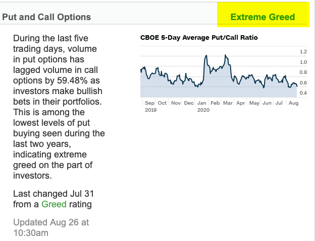
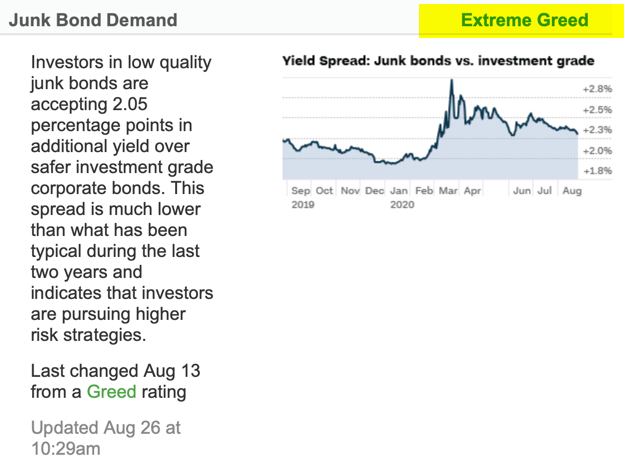
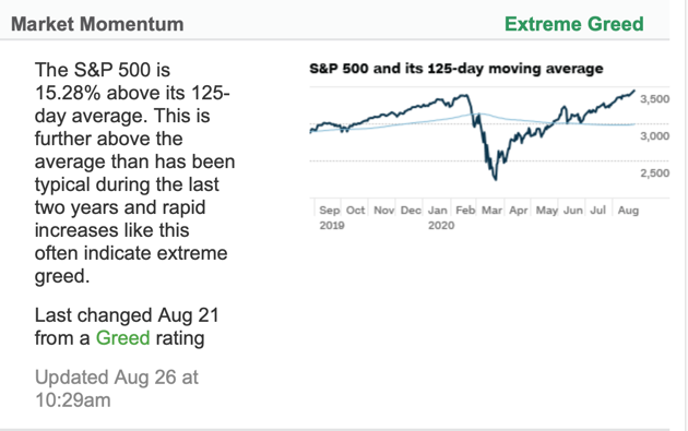
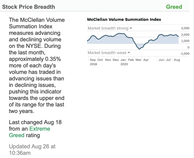
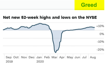
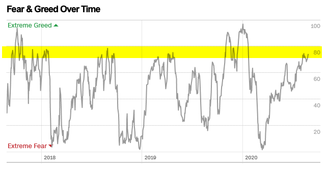
Investor Sentiment: Fear is Driving the Stock Market
A simple way to quickly observe overall investor sentiment is the Fear & Greed index, which tracks seven different indicators.
 It’s the lowest level I’ve seen it, suggesting we’ve observed panic level selling. If you read my observations from the beginning of this year, you’ll see the opposite was true at the start of 2018.

We’ve observed a round trip this year from Extreme Greed to Extreme Fear. Investor sentiment obviously swings up and down over time. As sentiment oscillates, it drives price tends to cycle, too. Even in bull markets, there are declines and in bear markets, we’ll see sharp upswings.
When investor sentiment is so bearish we see a spike in the words “bear market.” Google Trends shows the bear market talk on the Internet has spiked to the highest level in five years, even higher than 2015-16 and February this year.

I’m also hearing the typical talk about a 1987 type crash. The October 1987 -20% single day crash was 32 years ago but it’s still talked about today when prices fall. Markets are risky, so a crash is something we risk when we invest our money. The risk is partially why markets generate a return. We have to be willing to have exposure to risks that can come when no one expects it. Has modern market regulation and technology created any prevention of an ’87 type crash? Around 2012 circuit breakers were created to theoretically prevent a single day crash.
Circuit breaker thresholds: trading is halted market-wide for single-day declines in the S&P 500. Circuit breakers halt trading on the stock market during dramatic drops and are set at 7%, 13%, and 20% of the closing price for the previous day. There are also single stock limits and halts by the exchanges
Buy and hold, long-only asset allocation investors may take comfort in knowing there is some limit, but for those of us who actively manage our risk we prefer to deal with risk sooner if we can, but there is no assurance any strategy will always do as intended. You can read more about circuit breakers in Measures to Address Market Volatility. The bottom line is these circuit breakers are intended to limit a single day waterfall decline, they do not control overall drawdowns.
How many stocks are participating in the decline?
Another way to say it; How “washed out” is the stock market? To understand the internal condition, I look inside the indexes at the sectors and stocks. We’ll start with Breadth indicators, which quantitatively measure the percent of stocks in uptrends vs. downtrends.
- When 70% of stocks are already in uptrends it signals a strong market trend but also suggests as most stocks have caught up and participated, buying enthusiasm may be getting exhausted.
- When less than 30% of stocks are in uptrends, 70% of them are in downtrends, so the market trend is bearish. However, after most of the stocks have already fallen, at some point, it suggests we look for the exhaustion of selling pressure that could reverse the downtrend.
The percent of the S&P 500 stocks above their moving averages tells us how many of the 500 stocks are in an uptrend vs. a downtrend. When it’s declining, the market is bearish so we can see how many stocks are participating in the decline. When it reaches an extreme low, it may be an indication selling could be becoming exhausted. As we see, it has reached the low levels of past stock market lows with the exception of the low in March 2009.

Notice the low was reached October 2008 and stayed down until late March 2009. In the massive crash when stocks fell over -50%, it stayed “oversold” for over 6 months. It’s an example of the limitations of countertrend signals in outlier events.
For a view of the short-term trends, I do the same for the 50 day moving average. Only 6% of the S&P 500 stocks are in uptrends, so 94% are in short-term downtrends. That’s the bad news for stock investors. The good news is, it’s reached the low range where we have historically seen a reversal up. A reversal up from here would be bullish, at least temporarily.

The S&P 500 Bullish Percent Index is the number of stocks in the S&P that are trading on a Point & Figure buy signal. By this measure, only 17% of the 500 stocks are in uptrends. I highlighted the top are in red to note the contrary indicator of breadth and green on the bottom to mark the contrarian bullish zone where downtrends may reverse to uptrends when selling gets exhausted. The S&P 500 Bullish Percent Index is below 2011, 2015 and 2016 stock market correction lows. BPI is considered overbought when above 70% and oversold when below 30%. Once it reaches the green zone, I start looking for a reversal up from a low level, which is a bullish signal.

Notice the current level is below the 2011 and 2015-16 decline, but not as low as the 2008-09 bear market when the stock index fell -56%.
We see the same scenario in the NYSE Bullish Percent, which applies the same method to the stocks trading on the NYSE.

We’re not seeing any divergence in the breadth indicators, they are all down as most stocks have fallen. These are now at the level to look for countertrend signals.
The High-Low Index is a 10-day moving average of new highs vs. new lows. This breadth indicator shows when new highs outnumber new lows and when new highs are expanding. In general, new highs outnumber new lows when the indicator is above 50. New highs are expanding when the indicator is above 50 and rising. As with most range bound oscillator indicators, high is over 70 and low is below 30. Here we see it’s about as low as it has been. We also see how it can swing around for a year or two in a bear market. Since it can take time for prices to reach all-time highs and lows, the High-Low Index is more lagging than similar indicators.

Before we look inside the sectors, we’ll look at some other indicators of sentiment. This week, the CBOE Total Put/Call Ratio spiked to 1.82, which is its highest put volume over call volume ratio ever. We have data going back to 1995. As you can see in the chart, we normally see this ratio less than one as more calls trade than puts. A reading over 1 is usually a signal of pessimism as options traders appear to buy buying put options for protection or to speculate the stock market will fall. We’ve never seen put volume so high. Options traders appear to be very bearish, which has historically been a contrarian indicator at some point.

By the way, big bear markets unfold in cycles as the trend swings up and down. In the last bear market, the stock indexes fell -15%, then gained 10%, then fell 20%, then gained 15%, along the way you never know in advance which direction it is going to trend next. Many tactical traders had trouble with the 2007 to 2009 period because of whipsaws. By the time they exited, the market trended up without them, then they reentered just in time for the next fall. This is the risk of tactical trading, whether the method is breakouts, momentum, relative strength, or any other rotation style. I know this because I’ve known over 100 other tactical traders for over two decades. The price swings are the challenge. For example, below is the 2008 – 2009 -56% decline. As you can see, the Equity Put/Call Ratio is on top. I drew green lines at its peaks to show they typically indicate a short-term price low, but probably not as well as it would in a correction within a primary bull market. The point is, sometimes signals work out well, other times they don’t. They don’t have to be perfect and none are. The key is asymmetry: higher average profits than losses over full market cycles.

One indicator showing some divergence is the VIX CBOE Volatility Index. Although the S&P 500 is about -5% lower than its February low when the VIX spiked up to nearly 40, the VIX is only at 30 this time. However, I point out it did the same thing in the lower low in January 2016. The VIX initially spiked more in the first decline in August 2015 but remained less evaluated at the lower low in January 2016. It appears the options market expects elevated volatility, but not as much as an expansion as before. We’ll see.

Drilling down, what about sectors? Below are the individual sectors YTD. Energy and Materials are down the most. Ironically, they are tied to inflation. Where is the rising prices (inflation) the Fed is supposed to be fighting?

Sector Trends and Breadth
To get an underatnding of the individual stock trends within a sector, I look at the bullish percent of the sectors.
First, we’ll observe the bullish percent of the Energy sector. Energy is down the most and only 3% of stocks in the index is an uptrend as measured by a point & figure buy signal. It’s as low as its been in 20 years. Though it could stay at this low level in a bear market as it did around 2008, it still swings up and down for those willing to trade it.

The next biggest loser sector is Basic Materials, another commodity-related sector. I highlighted the current low level in green, which is nearly as low as it’s ever been in 20 years. These indicators are range bound, so they can only fall to 0% and as high as 100%.

The Financial sector is the third largest weight in the S&P 500 stock index at 13%. It’s down -18%, making it one of the biggest laggards. Banks, brokers, etc. are leading the market down and that isn’t a good sign for the economy of the market. Financials often lead in bear markets. However, as we see below, their participation in the fall is about as high as it’s ever been. On the other hand, we see how volatile and weak Financials were in 2007 to 2009. During that “Financial Crisis”, they were among the worst.

The industrials sector, down about -18%, continues the trend of broad participation in the sell-off. It’s also reached the lowest it did in 2008 and 2011.

Consumer Staples is a sector that is supposed to hold up in market declines, but the index is down -12% year to date, which is more than the S&P. Staples stocks have participated as much as they did in prior corrections in 2011 and 2016, but not as much as around 2008.

The Technology sector is a big one because at 20% it has the largest weighting in the S&P 500. The Technology sector is down about -7% YTD. The Technolgy sector bullish percent is down below its lows in prior corrections and nearing the 2008 and 2009 lows. Keep in mind, once prices have moved to a low point, they eventually attract buying demand and reverse the other direction. These indicators help us see the levels it is more likely to happen and a reversal in these indicators increases the potential even more.

Consumer Discretionary is 10% of the S&P and down -5% YTD. Its bullish percent is as about as low as it’s been.

Another major sector is Healthcare, it’s the second largest weighting at 16% of the S&P 500. It’s flat for the year, but its bullish percent is very washed out.

The Utility sector is the lone survivor so far in 2018. Like Consumer Staples, Utilities are considered “defensive.” That expectation hasn’t held true for Consumer Staples down -12% this year, but the Utility sector is up 2% YTD. The first half of the year, Utilities were laggard as they are sensitive to rising interest rates, but the last half they’ve found some buying interest. As we see, the Utility sector momentum has been strong enough to keep its stocks in uptrends and into the higher risk zone. However, notice they tend to stay at higher bullish percent levels over time. Utilities don’t usually have strong momentum against other sectors, but they do tend to have less volatility. Of course, in the last big bear market that wasn’t the case as everything fell.

The bottom line is the stock market could certainly be entering another big bear market. It’s long overdue as this bull is very aged and overvalued. Even if it is, it will include swings up and down along the way. That’s the challenge for all strategies that trade or invest in stocks. For buy and hold investors, it’s a challenge as stocks swing up and down and they have full exposure all the time and unlimited downside risk. For tactical traders, the swings are a challenge as we increase and decrease our exposure to risk and reward and none of our methods are perfect. The key, for me, in dealing with it is to hold the lowest risk, highest potential reward exposure. Barring we don’t see some waterfall decline, most of the market is at a point we should see a countertrend move up at least temporarily. If prices keep trending down, I’m guessing the upswing that does come will be just as sharp.
After prices have fallen, I start looking for signs of a potential countertrend and it could come at any time.
Someday in the future, stock investors will be giddy again and completely forget about how they feel right now. But for now, the trend is down, but the sentiment and breadth are at such extremes we should be alert to see at least a short-term reversal in the days ahead.
I hope you find this market analysis helpful. If you don’t believe it is exhaustive enough, I encourage you to read some of the other recent observations since they cover more detail on some of the topics above.
Have a Merry Christmas!
Mike Shell is the Founder and Chief Investment Officer of Shell Capital Management, LLC, and the portfolio manager of ASYMMETRY® Global Tactical.
The observations shared on this website are for general information only and are not specific advice, research, or buy or sell recommendations for any individual. Investing involves risk including the potential loss of principal an investor must be willing to bear. Past performance is no guarantee of future results. The presence of this website on the Internet shall in no direct or indirect way raise an implication that Shell Capital Management, LLC is offering to sell or soliciting to sell advisory services to residents of any state in which the firm is not registered as an investment advisor. Use of this website is subject to its terms and conditions.


 An overhang in a waterfall can sometimes protrude out enough to form a base, or even drive the water to flow upward for a while, but the waterfall isn’t over until the plunge pool develops.


You must be logged in to post a comment.