Last week, I ended “You probably want to invest in stocks” with: Is it a good time to buy stocks? That’s my next observation as I’ll share the big picture.
As promised, here is my observation and insight on the big picture as well as the short term possibilities.
THE BIG PICTURE
First, I start with the big picture.
The S&P 500 is trading at 31.8 x earnings per share according to the Shiller PE Ratio which is the second-highest valuation level it has been in 150 years. Only in 1999 did the stock index trade at a higher multiple times earnings.
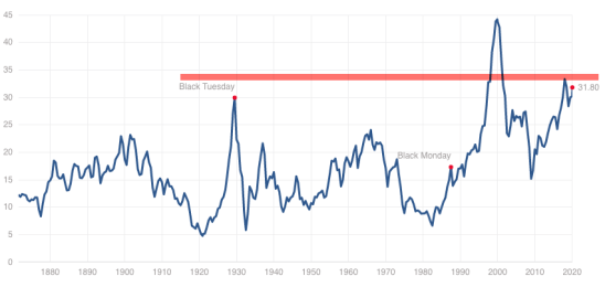
This price-earnings ratio is based on average inflation-adjusted earnings from the previous 10 years, known as the Cyclically Adjusted PE Ratio (CAPE Ratio), Shiller PE Ratio, or PE 10.
What is the P/E 10 and how is it calculated?
- Look at the yearly earning of the S&P 500 for each of the past ten years.
- Adjust these earnings for inflation, using the CPI (ie: quote each earnings figure in 2020 dollars)
- Average these values (ie: add them up and divide by ten), giving us e10.
- Then take the current Price of the S&P 500 and divide by e10.
The bottom line is, the stock market valuation has been expensive for a while now. The only time I factor in the price-earnings ratio is in the big picture. Although it isn’t a good timing indicator, it is considered a measure of the margin of safety for many investors and at this elevated level, there is no margin of safety by this measure.
As such, risk seems high in the big picture, which suggests investors should access their exposure to the possibility of loss in stocks and stock funds to be prepared for a trend reversal.
WHY MANAGE THE POSSIBILITY OF LOSS? WHY NOW?
That’s about as far as I go with “fundamental valuation” as quantitatively, I know to focus more on the direction of trends, momentum, and volatility.
So, let’s take a look.
STOCK MARKET MOMENTUM SEEMS STRETCHED.
I love me some up trends and momentum, but… sometimes all the gains come in a short period… and that’s what we’ve seen the past three months.
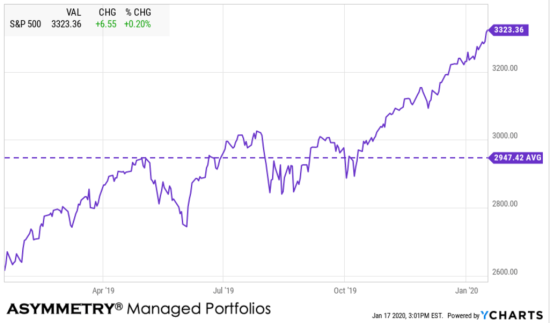
Just for fun, I included the average level of the S&P 500 (SPX) in the chart to show what level would be “mean reversion” if it happened. I don’t expect it to drop the low, but it’s interesting to see, nevertheless.
Next, I include the relative strength of SPX which measures the velocity of the price trend recently.
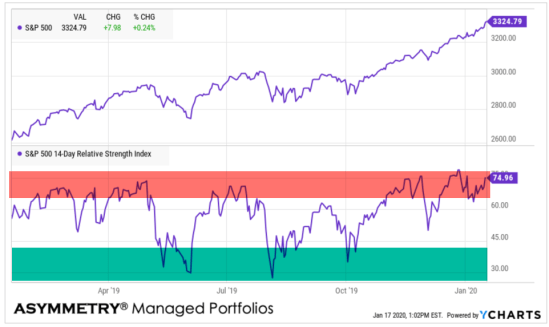
I highlighted the upper area red because when relative strength is really high, it often results in a price decline. Think of it as a “too far, too fast” indicator, but like all signals, it’s imperfect.
I highlighted the lower level as green because when prices fall so far, so fast that its relative strength is this low, the trend eventually reverses back up. It’s a measure of selling exhaustion.
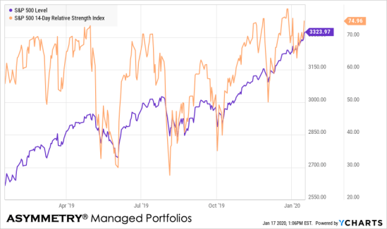
Looking at the same data, but from a different angle, here you can see the correlation between the higher and lower relative strength levels and what happened next with the price trend.
In observing relative strength daily for over two decades now, in my observations, this level of relative strength suggests this is in the high-risk zone.
But, quantitative analysis of price trends is best observed through different confirming indicators.
THE WEIGHT OF THE EVIDENCE
For the sake of brevity, I’ll skip too much of a detailed definition, but the percent of S&P 500 stocks trading above their 200 day moving average is a measure of market breadth. Market breadth shows us what percent of stocks are participating in the trend. Right now, 87% of the S&P 500 stocks are trading in longer-term uptrends as defined by the 200-day moving average.
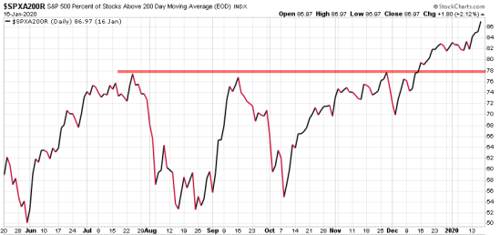
The high participation in the trend is a good thing until it reaches higher levels and extremes, then I start wondering where the next buying enthusiasm is going to come from. I start looking for the buying pressure to dry up. The red line I drew marks the three peak levels over the past year for reference.
In case you are wondering, here is how high the current level is relative to the past fifteen years.
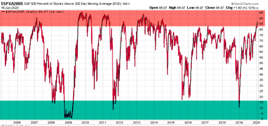
It’s up there.
I analyze markets as to the direction of the trends, momentum, volaltity and investor sentiment.
VOLATILITY LEVEL AND DIRECTION
When it comes to volatility, I look at both the direction and rate of change in volatility, but also the level. I also split volatility into two completely different parts: implied (expected) volatility and realized (historical) volatility.
Starting with implied volatility, the VIX is extremely low again at 12.19. As we see in this long term chart, volatility cycles up and down over time, but it doesn’t really “revert to the mean.” To illustrate it, I included the long term average of 19.
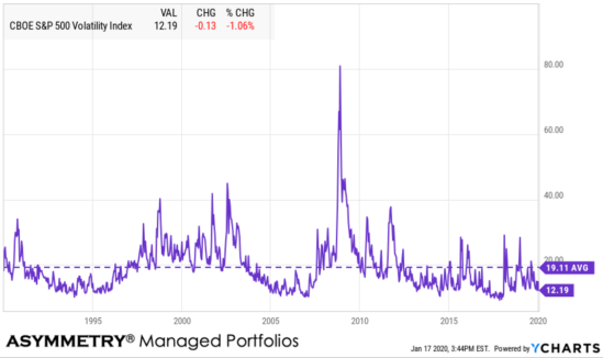
The bottom line is, implied volatility, which is the expected volatility as implied by options prices shows a very low expected range of prices over the next 30 days. That’s positive until it isn’t.
At such low levels in implied volatility, we should expect to see another volatility expansion.
Next is the historical volatility on the S&P 500 index, which is the 30 Day Rolling Volatility. Here we calculate 30 Day Rolling Volatility as Standard Deviation of the last 30 percentage changes in Total Return Price * Square-root of 252 then multiplying the standard deviation by the square root of 252 to return an annualized measure. 252 is the number of trading days in a year.
I’m sure you needed to hear that. I won’t do it again.
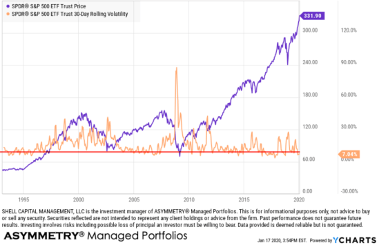
I drew a red line over its history to highlight the current level. Historically, it’s on the low end. Volatility is commonly used as a measure of a security’s riskiness. Typically investors view a high volatility as high risk.
However, the opposite is true.
Volatility decreases over time as price trends up and by the time the price peaks, investors so confident the trend will continue they become very complacent. When volatility is extremely low as it is now, it’s when the risk of a price decline increases.
The opposite is also true. When volatile expands to a high level, it does so because prices have fallen and investors are indecisive, causing the range of stock prices to spread out. Prices spreading out is volatility and we see it spike at stock market lows.
What’s going to happen next?
The trend is up, it’s a quiet uptrend as volatility is contracting, and most stocks are trending up.
Everything is good until it isn’t.
KNOW YOUR RISK LEVEL AND RISK TOLERANCE.
Everything is impermanent, nothing lasts forever, so this too shall pass and by my measures, it’s getting closer.
So, I implemented my drawdown control and took profits on stocks today.
Mike Shell is the Founder and Chief Investment Officer of Shell Capital Management, LLC, and the portfolio manager of ASYMMETRY® Global Tactical. Mike Shell and Shell Capital Management, LLC is a registered investment advisor focused on asymmetric risk-reward and absolute return strategies and provides investment advice and portfolio management only to clients with a signed and executed investment management agreement. The observations shared on this website are for general information only and should not be construed as advice to buy or sell any security. Securities reflected are not intended to represent any client holdings or any recommendations made by the firm. Any opinions expressed may change as subsequent conditions change. Do not make any investment decisions based on such information as it is subject to change. Investing involves risk, including the potential loss of principal an investor must be willing to bear. Past performance is no guarantee of future results. All information and data are deemed reliable but is not guaranteed and should be independently verified. The presence of this website on the Internet shall in no direct or indirect way raise an implication that Shell Capital Management, LLC is offering to sell or soliciting to sell advisory services to residents of any state in which the firm is not registered as an investment advisor. The views and opinions expressed in ASYMMETRY® Observations are those of the authors and do not necessarily reflect a position of Shell Capital Management, LLC. The use of this website is subject to its terms and conditions.

You must be logged in to post a comment.