Global Stock and Bond Market Trends 2Q 2018

Yesterday we shared the 2nd Quarter 2018 Global Investment Markets Review, which used a broad range of indexes on performance tables to present the year-to-date progress of world markets. The issue with a table that simply shows a return number on it is it doesn’t properly present the path it took to get there. In the real world, investors and portfolio managers have to live with the path of the trend and we can see that only in the price trend itself. So, today we’ll look at the price trends of stocks, bonds, commodities, real estate, sectors, and other alternatives like volatility. I don’t just look for potentially profitable price trends in stocks and bonds, I scan the world.

How is the market doing this year? Which market?

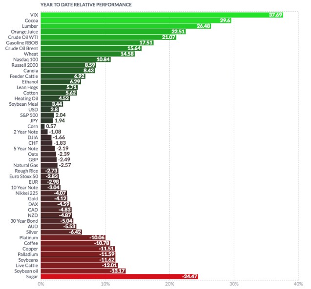
First, a quick glance at global markets including commodities, stock indexes, volatility, ranked by year-to-date momentum. We wee the CBOE Volatility Index $VIX has gained the most. One clear theme about 2018 is that volatility has increased and this includes implied or expected volatility. Overall, we see some asymmetry since the markets in the green are more positive than the markets in the red. The popular S&P 500 stock index most investors point to is in the middle with only a 2% gain for the year. Commodities like Cocoa, Lumber, Orange Juice, and Crude Oil are leaders while sugar, live cattle, and soybeans are the laggards. Most investors probably don’t have exposure to these markets, unless they get it through a commodities ETF.


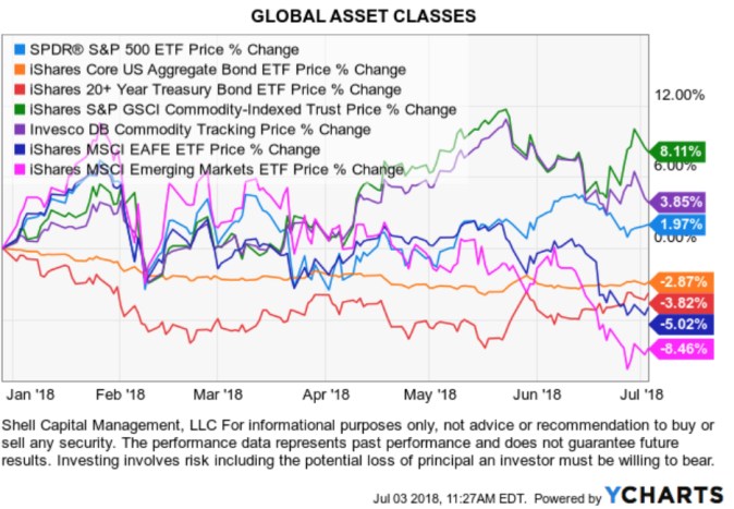
Most investors probably limit themselves to the broad asset classes, since that’s what most financial advisors do. So, we’ll start there. Below are the trends of broad market ETFs like the S&P 500, Aggregate Bond, Long-Term Treasury. For the year, Emerging Markets has the weakest trend – down nearly -6%. Developed Markets countries are the second weakest. The rising U.S. Dollar is helping to put pressure on International stocks. The leader this year is Commodities, as we also saw above. The Commodity index has gained 8% YTD.

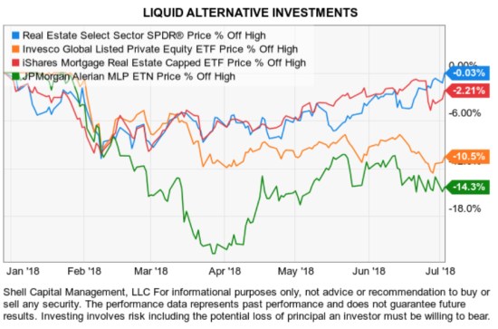
What about alternative investments? We’ll use liquid alternative investments as an example since these are publicly available ETFs. I’ve included markets like Real Estate, Private Equity, Mortgage REITs, and the Energy MLP. Not a lot of progress from buying and holding these alternative investments. This is why I prefer to shift between markets trying to keep capital only in those markets trending up and out of those trending down.
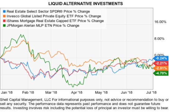
liquid alternative investments

The Volatility VXX ETF/ETN that is similar to the VIX index has gained so much early in the year I left it off the following chart because it distorted the trends of the other markets. It’s one of the most complex securities to trade, but we can see it spike up to 90% when global markets fell in February.
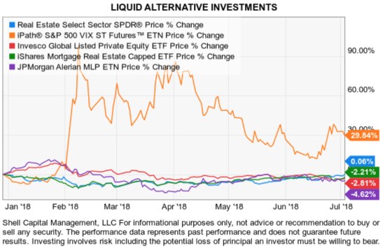
VIX VXX

Looking at the price trend alone isn’t enough. It would be incomplete without also considering their drawdowns. That is, how much the market declined off its prior high over the period. Analyzing the drawdown is essential because investors have to live with the inevitable periods their holdings decline in value. It’s when we observe these decline we realize the need for actively managing risk. For me, actively managing risk means I have a predetermined exit point at all times in my positions. I know when I’ll exit a loser before it becomes a significant loss. Many say they do it, I’ve actually done it for two decades.

The alternative investments are in drawdowns YTD and Energy MLP, and Mortgage REIT is down over -10% from their prior highs. The Energy MLP is actually down -51% from its 2014 high, which I don’t show here.
alternative investment drawdowns risk management

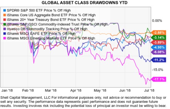
Next, we go back to the global asset class ETFs to see their drawdowns year-to-date. We don’t just experience the gains, we also have to be willing to live with their declines along the way. It isn’t enough to provide an excellent investment management program, we also have to offer one that fits with investors objectives for risk and return. The most notable declines have been in Emerging Market and developed international countries. However, all of these assets are down off their prior highs.
GLOBAL ASSET CLASS RISK MANAGEMENT TREND FOLLOWING 2018

Clearly, markets don’t always go up. The trends so far in the first six months of 2018 haven’t offered many opportunities for global asset allocation to make upward progress.

This is why I rotate, rather than allocate, to shift between markets rather than allocate to them. We also trade in more markets than we covered here, like leading individual stocks. The magnitude of these drawdowns also shows why I believe it is essential to direct and control risk and drawdown.


Mike Shell is the Founder and Chief Investment Officer of Shell Capital Management, LLC, and the portfolio manager of ASYMMETRY® Global Tactical.

You can follow ASYMMETRY® Observations by click on on “Get Updates by Email” on the top right or follow us on Twitter.

The observations shared in this material are for general information only and are not intended to provide specific advice or recommendations for any individual. Investing involves risk including the potential loss of principal an investor must be willing to bear. Past performance is no guarantee of future results.


Is this correction and volatility normal?

With perfect hindsight, we now all know that January 26th was the recent price peak in the U.S. stock market. Since then, the S&P 500 has declined about -10% and the Dow Jones Industrial Average about -12%. For simplicity, I’m going to focus on U.S. stock market here.

I wasn’t surprised to see the decline and am not surprised to see “more volatility,” because it would be getting back to “normal.”

But I see recent price action has sure gotten the attention of many on social media. Some even seem dazed and confused.

I’m not surprised about that, either.

On January 11, before stock market declined prices started swinging up and down (volatility), I shared an observation with my friends on Twitter and a warning:

On January 24th, I again warned of complacency. The message was clear:

At this point, this is a normal and expected “correction” of what was an upside overreaction in the prior months. The stock index has declined about -10%, regained some of the loss in March and more recently retested the February 8th low. As long as the lows hold, I consider this a normal correction.

stock market spx

Sure, the decline was sharp and fast, but that’s no surprise for me after such an upside move. I said it was “expected” because, as I pointed out above, 2017 was very abnormal because it lacked the typical -5% to -10% declines we normally see over most 12 month periods in the stock indexes.

Another way I define a “normal correction” is a simple trend line drawn under the price over the past 12 months. Without adding a lot of complicated looking indicators to express it, below we see the stock index has just “reverted to its trend.” The peak in December and January was an abnormal overreaction on the upside, which I pointed out as it was happening. The recent -10% decline has simply put the trend back in a more normal range.

stock market normal correction trend

What is normal, typical, or expected? 

I’m observing a lot of commentaries as if this correction and volatility isn’t normal.  The fact is, many people often include their emotions and feelings along with price action.

Investors perceive what they believe is driving a price trend and what they believe is always true for them.

The February decline was commonly blamed on “the machines,” which got a little silly.

This time, it’s geopolitics.

I believe it’s just the market, doing what it does, and there are so many drivers at the same time I don’t bother to attempt such a narrative. My narrative is simple; the force of sellers took control and outweighed the enthusiasm of buyers.  It is just the market, doing what it does.

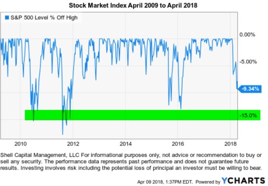
I’ve been seeing and experiencing these trends so closely for so long and I remember the regime shifts. I want to share with you my observations of what have been “normal” corrections in terms of drawdowns. A drawdown is the % decline from a prior price high to its low. I show only the period of the past 9 years, which is one of the longest bull markets in history (without a -20% decline).

stock market historical bear market length drawdowns

As you can see, since April 2009, we’ve seen four declines of -15% or more and it took them several months to recover.

These declines of -15% or more are why many people have been unable to hold on to the stock market since the March 2009 low with any meaningful allocation to stocks. When prices fall -10%, investor sentiment shifts from greed to extreme fear. Some of them may even begin to tap out by selling their stock holdings for fear of more losses.

To be sure, here is an investor sentiment indicator at the February 8, 2018 low.

Investor sentiment Februrary 8 2018

In fact, investment managers like me who have dynamic risk management systems may even sell to reduce exposure to loss as an intentional drawdown control. But this time, as I pointed out, the stock market was already at risk of a reversal before this decline. So, a robust risk management system may have reduced exposure before the decline, not after.

We find that declines over -10% get more attention, especially when they get down to -15%. Those can also be more hostile conditions for trend systems, too, as risk management systems cause us to exit and later re-enter.

The point is, over the past 9 years a -15% decline has been a “normal” occurrence and there are many -5% (or more) declines too.

It is only at a -10%, so far, and that’s not unusual.

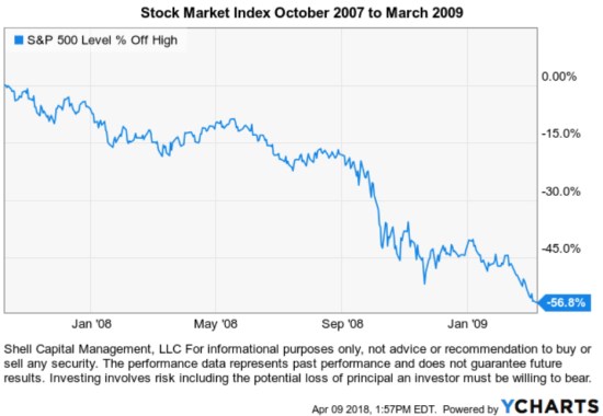
I intentionally used the last 9 years. Not to show an arbitrary 9 year period, but instead to intentionally leave off March 2009. I did that because the first three months of 2009 was a -24% decline, a continuation of the 2008 waterfall decline. The stock market was still in the bear market that began October 2007. So, this wouldn’t be complete without a reminder of what that period looked like before I go on to show the pre-2008 period.

All bear markets do necessarily begin with declines of  -10%, -15%, -20% . They are actually made of many swings up and down along the way. We often hear people speak of the last bear market as “2008” as though the only loss was the -37% decline in the S&P 500 in 2008.

That is far from reality.

The decline was -56%.

2008 stock market drawdown length of bear market

The drawdowns we’ve seen since 2008 are more than twice what we saw in the bull market from 2003 to 2008 after the “tech wreck.” Below we see the typical decline then was closer to -5% with only a few getting into the -7% or more range. 2004 to 2008 bull market low volatility

Clearly, it was a lot easier to hold a larger allocation of stocks, then.

What is normal and what has changed?

The last 9 years has been more hostile for passive asset allocation investors to hold on to their stock positions because the declines were -15% or so and take months to recover. It’s also been more challenging for active risk managers since a drawdown control system necessarily reduces exposure as prices fall with the intent to control drawdown.

But, to define what is normal today, a -10% to -15% decline is within a normal corrective drawdown.

The recent past matters simply because that’s what investors and traders anchor to. Most people put more emphasis on the recent past. Our experience and how much we’ve studied and observed the trends determine how much we can recall easily. I’ve been an investment manager most of my life, over two decades now. For me, it hasn’t been a hobby or part-time venture, it’s what I do and who I am. So, my memory of these trends and intuitions about what is normal, or not, is what it is.

If you are wondering, here are the drawdowns for the S&P 500 going back about 70 years. I highlighted the -15% declines or more, which obviously gets investors attention.

stock market bear market length and dradowns

Clearly, there are a lot of -15% or greater declines. In fact, there are several -30% and three in the -45% or larger drawdowns.

Knowing this, it’s why I say:

We believe world markets require active risk management to avoid large losses and directional trend systems to position capital in profitable price trends.

And, I also say:

It doesn’t matter how much the return is if the downside risk is so high you tap out before it’s achieved.

But at this point, you can probably see that the current -10% decline is so far within a “normal correction.”

Though, as I shared in The enthusiasm to sell overwhelmed the desire to buy March 19, 2018, I expect to see more swings (volatility) than last year, and that would be “normal” too.

I define this as a non-trending market. When I factor in how the range of price movement has spread out more than double what it was, I call it a non-trending volatile condition.

Markets decline to a low enough point to attract buying demand. Only time will tell how it all plays out from here.

If you enjoyed this, I encourage you to read “What About the Stock Market Has Changed? A Look at Ten Years of Volatility” 

Mike Shell is the Founder and Chief Investment Officer of Shell Capital Management, LLC, and the portfolio manager of ASYMMETRY® Global Tactical.

You can follow ASYMMETRY® Observations by click on on “Get Updates by Email” on the top right or follow us on Twitter.

The observations shared in this material are for general information only and are not intended to provide specific advice or recommendations for any individual. Investing involves risk including the potential loss of principal an investor must be willing to bear. Past performance is no guarantee of future results.
 

The enthusiasm to sell overwhelmed the desire to buy March 19, 2018

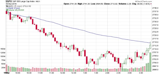
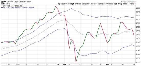
The enthusiasm to sell overwhelmed the desire to buy. The S&P 500 stock index closed down -1.42% today. Stocks trended down most of the day and at 2:35pm it was down -2%. As you can see on the chart, it reversed up in the last 90 minutes and closed with positive directional movement. It almost closed above its Volume Weighted Average Price (VWAP).

There are many notable economic reports out this week, so maybe investors are concerned about to the jobs report and the Fed FOMC Meeting. The options market has priced in a 94% chance of a rate hike, so it shouldn’t be a surprise. But, this week is the first FOMC meeting for the new Chairman Powell.

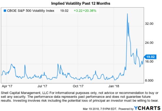
Implied volatility in recent weeks is one of many signals that suggest a volatility regime change. The CBOE Volatility Index® (VIX® Index®) is a key measure of market expectations of near-term volatility conveyed by S&P 500 stock index option prices. The VIX® doesn’t seem to want to go back to those prior low levels, so the expectation is higher volatlity.

At this point, the decline today was nothing too abnormal. The stock index is -3.% off it’s high a few weeks ago and -5.4% off its all-time high. However, as you can see below it is within a normal trading range. Speaking of trading range, notice the bands of realized volatility I added to the chart are drifting sideways rather than trending up or down. I see higher lows, but equal highs in the most recent trend and lower highs looking back to January. The VIX is expected volatility, the blue bands are realized volatility.

My systems define this as a non-trending market. When I factor in how the range of price movement has spread out more than double what it was, I call it a non-trending volatile condition. It is useful for me to identify the market regime because different trend systems have different results based on the situation. For example, non-trending volatile market conditions can be hostile situations for both passive and trend following strategies. However, countertrend systems like the swings of a non-trending volatile market.

Trend following systems thrive in markets that are trending and smooth. When a market is trending and smooth, the trend following system can earn gains without having to deal with significant adverse price action. When a market trend shifts to non-trending and volatile, the trend following signals can result in whipsaws. A whipsaw is when the price was moving in one direction (and the trend follower buys) but then quickly reverses in the opposite direction (and maybe the trend follower exits with a loss). Even if the trend following system doesn’t enter and exit with a loss, in a non-trending volatile market the trend follower has to deal with the same hostile conditions as a passive investor as the market swings up and down.

My U. S. equity exposure since early February has come from my shorter term countertrend systems. My focus and the focus of my systems isn’t to predict the direction of markets but instead to identify when a market is undergoing a regime change or shifts to a distinct environment. I don’t analyze the markets to try to predict what it will do next. I look at what the market is actually doing and react to it.


Mike Shell is the founder and Chief Investment Officer of Shell Capital Management, LLC, and the portfolio manager of ASYMMETRY® Global Tactical.

You can follow ASYMMETRY® Observations by click on on “Get Updates by Email” on the top right or follow us on Twitter @MikeWShell

The is no guarantee that any strategy will meet its objective.  Past performance is no guarantee of future results.


Investment management can take many years of cycles and regimes to understand an edge.

It takes at minimum a full market cycle including both bull/bear markets to declare an edge in an investment management track record.

But we also have different regimes. For example, each bull market can be different as they are driven by unique return drivers. Some are more inflationary from real economic expansion driving up prices. Others are driven by external manipulation, like the Fed intervention.

I’ve been managing ASYMMETRY® Global Tactical for fourteen years. It’s an unconstrained, flexible, adaptable, go-anywhere global tactical program without the limitations of a fixed benchmark. I pursue absolute returns applying dynamic risk management and unconstrained tactical trading decisions across a broad universe of global currency, bonds, stocks, and commodities.

So, I can tell you the bull market 2003-07 was a regime of rising commodities, foreign currency, and international producers of commodities. In this bull market, U.S. equities have dominated. We can see that in the chart below. If your exposure up until 2008 was only U.S. stocks, you would be disappointed as Emerging Markets countries like China and Brazil were much stronger as was commodities. We can also see how those markets have lagged since the low in 2009.

Everything is impermanent, nothing lasts forever, so this too shall change eventually.  Those who believe the next decade will be like the past do not understand the starting point matters, the return drivers, and how markets interact with each other. Past performance is never a guarantee of future results.

Mike Shell is the Founder and Chief Investment Officer of Shell Capital Management, LLC, and the portfolio manager of ASYMMETRY® Global Tactical.

You can follow ASYMMETRY® Observations by click on on “Get Updates by Email” on the top right or follow us on Twitter.

Investment results are probabilistic, never a sure thing. Past performance is no guarantee of future results.


February Global Market Trends

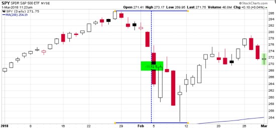
After a very positive January for U.S. and international stocks, in February it only took 10 days for the S&P 500 to decline -12% intraday and a -10% drawdown based on closing price.

stock market decline drawdown februrary 2018

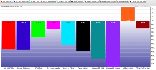
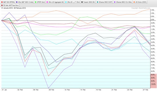
Yet, February ended with the S&P 500 only down -3.5% after that -12% intra-month drawdown.  For the month, International (MSCI EAFE) and Emerging Markets declined the most viewing the below board based indexes. The U.S. Dollar gained 1.8%.

global market returns february 2018 loss drawdown

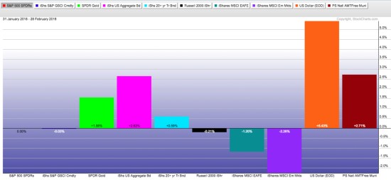
Next, we view February global market returns relative to the S&P 500 stock index by holding it constant. This visual shows us how much markets gained/lost net of the S&P 500, Though in the absolute trend table above I showed bonds declined in absolute return, they gained relative to the S&P 500,

global market trend returns relative to spx spy S&P 500

Of course, one month isn’t a trend. In fact, I’m going to explain how this is an intentional logical inconsistency. Speaking of one time period in isolation, be it a month, year, or series of years is just an arbitrary time frame. What’s worse is viewing just the result over a time frame, like the month of February above, in just a table format.

A return stream is precisely that; a stream. A return stream is a continuous price trend in a continuous specified direction. Continuous is forming an unbroken whole; without interruption. So, I like to view return streams as price trends on a chart so I can see how the trend really unfolded over the period. Observed as a visual price trend, we see both the good and the bad of the price action along the way. You can probably see how it does that better than a simple performance table, monthly return % of the period or the bar chart above.

stock market decline februrary 2018

In the chart above, we see how much the price trends of those markets declined along the way before closing the month yesterday. I wrote about the short-term risk reversal in Stock Market Analysis of the S&P 500 suggesting it may reverse back up at least temporarily and retrace some loss and it did.

Now, what is essential about looking at performance data and trends is what the investor experiences. Investors experience what they choose to experience. For example, suppose and the investor is fully invested in the stock market, they could experience the month one of three ways.

  • If the investor only looks at his or her month-end statement, they would experience either the month end “-3.5%”.
  • If the investor watches their account or market indexes closely every day, they experienced every daily move and the full -12% decline and then some recovery.
  • Some may not pay any attention at all either because they are disinterested or they have an investment manager they trust to manage their risk-taking and risk management for them.

Investors and traders get to choose what time frame they watch things. I’ve always observed that “watching it too closely” can lead to emotional mistakes for many. For me, I’m paying attention and may zoom in and pay more attention when trends get more volatile or seem to reach an extreme. But, I’m a tactical portfolio manager, it’s what I do. I can view short term or long term trends alike with self-discipline. I have an edge that has been quantified by a long track record of 14 years in the current portfolio I manage.

I said this recently on Twitter:

If the investor doesn’t like to see such losses like those experienced in many markets in February, they may choose to instead not be fully invested in stocks all the time. That’s what I do. I’m not invested in any specific market all the time. My exposure to risk and return increases and decreases over time based on trends and my risk systems. I intentionally increase and decrease my exposure to the possibility of loss and gain. I’m also unconstrained so I can do it across any global market like bonds, currency, stocks, commodities, or alternatives like REITs, inverse (shorting), or volatility.

According to the American Association of Individual Investors, the decline was so quick most individual investors didn’t seem to respond:

Majority of Investors Avoided Taking Action in Recent Market Correction

“This week’s Sentiment Survey special question asked AAII members what portfolio action, if any, they took in response to the recent market correction. The majority of respondents (62%) said they didn’t make any change or only made a small change. Many of these respondents described themselves as being focused on the long term, viewing this month’s correction as being only temporary in nature or not severe enough to warrant any action. A few of these respondents described the correction as lasting too short of a time for them to take advantage of it. Nearly 33% respondents said they took advantage of the decline to buy stocks or funds. Some said they took advantage of the reduced prices to either add to current positions or buy new holdings. Just 7% of respondents said they sold stocks during the correction. A small number of respondents said they sold some positions and then bought new positions.”

I say investors should find and do what helps them, not make it worse. Know yourself, know your risk, and know your risk tolerance. That’s what we do.

So, that is what happened during the month of February, and a little asymmetric observation to go with it.


Mike Shell is the Founder and Chief Investment Officer of Shell Capital Management, LLC, and the portfolio manager of ASYMMETRY® Global Tactical.

You can follow ASYMMETRY® Observations by click on on “Get Updates by Email” on the top right or follow us on Twitter.

Investment results are probabilistic, never a sure thing. Past performance is no guarantee of future results.

VIX Trends Up 9th Biggest 1-day Move

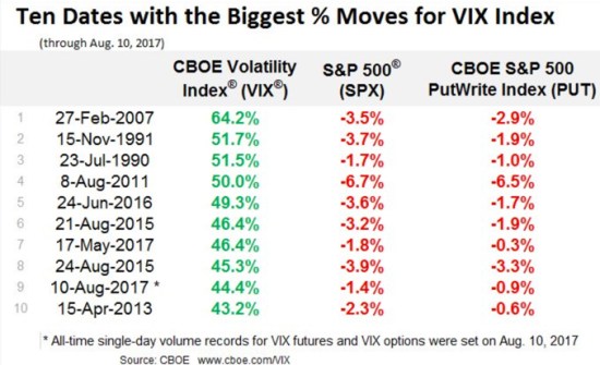
About a week after a hedge fund manager who is popular with the media but has a poor track record of managing risk said “please stop talking about the low VIX”, it gains 44.4% in a single day – its 9th biggest 1-day move. He was suggesting the low VIX wasn’t an indication of high risk. If you have followed my observations, you know that I disagree. I’m one who has been talking about the low VIX and suggesting it is one of many indications of complacency among investors. That is, investors hear “all time new highs” and get overly optimistic instead of reducing their risk or being prepared to manage downside loss.

VIX biggest moves

I point out the hedge fund manager’s comment because I believe a low VIX is an indication of complacency because it measures expected implied volatility for options on the S&P 500 stocks. When implied volatility gets to historical low points, it means options traders aren’t paying high premiums for hedging “protection”. Others can believe what they want to believe. I don’t just point out observations at extremes. I actually do something.

As I pointed out recently in “No Inflection Point Yet, But… ” the VIX was at an extreme low. About a week later this other fund manager implies it may not be meaningful. That’s exactly what we expect to hear when the expected volatility gets to such an extreme low. We expect to see it shift the other direction at some point. I like to follow trends until they reach an extreme – and reverse.

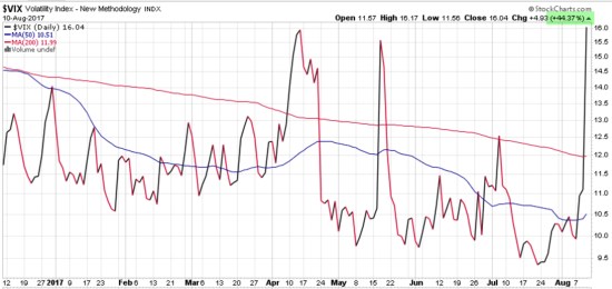
Here is what it looked like.

VIX 9th biggest one day move

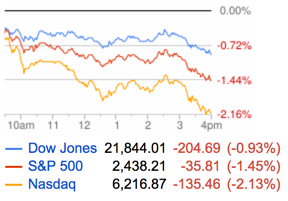
More importantly, here is what the stock indexes looked like on Google Finance after the close:

Stock market down Korea

Another observation I shared in “No Inflection Point Yet, But…” is that leading stocks can sometimes be more volatile and yesterday was no exception. While the stock indexes were down around -1.5% some of the most popular stocks were down about twice as much:

FANG stocks downSource: Google Finance

Of course, this is all just one day. We’ll see if it continues into a longer trend.

It’s always a good time to manage risk, but sometimes it’s more obvious than others.

Investors feel and do the wrong thing at the wrong time…

Investors feel and do the wrong thing at the wrong time…

Many studies show that investors have poor results over the long haul including both bull and bear markets. For example, DALBAR has been conducting their annual Quantitative Analysis Of Investor Behavior study for 22 years now.

DALBAR’s Quantitative Analysis of Investor Behavior (QAIB) has been measuring the effects of investor decisions to buy, sell and switch into and out of mutual funds over both short and long-term time frames. The results consistently show that the average investor earns less – in many cases, much less – than mutual fund performance reports would suggest.

Their goal of QAIB is to improve investor performance by pointing out the factors that influence behaviors that determine the outcome of investment or savings strategies. They conclude individuals have poor results for two primary reasons:

  1. Lack of capital investment.
  2. Investor Psychology.

If someone doesn’t save and invest some of their money, they’ll never have a chance to have good long-term results. However, they find the biggest reason for poor results by investors who do invest in the markets over time is investor psychology. Investors tend to do the wrong thing at the wrong time, especially at market extremes.

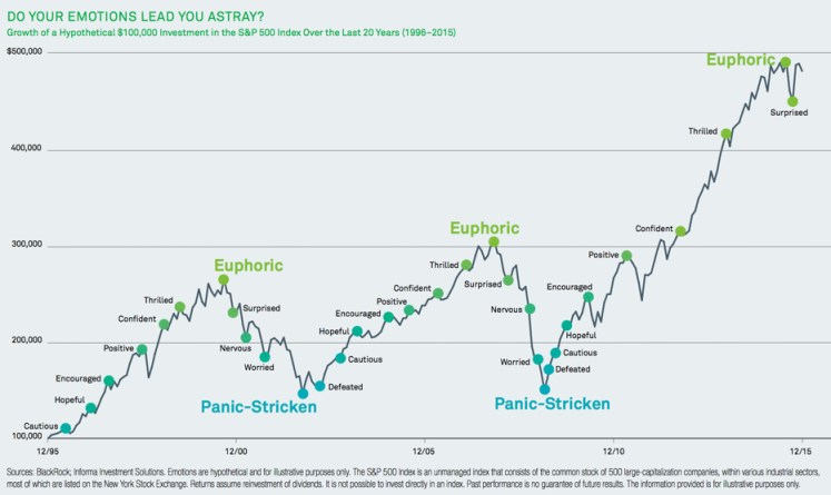
The chart below illustrates how investors tend to let their emotions lead them astray. The typical “bull market” for stocks may last four or five years. After investors keep hearing of rising market prices and headlines of “new highs” they want to invest more and more – they become euphoric. The may get more “aggressive”. However, those gains are in the past. Market trends are a good thing, but they can move to an extreme high (or low) and then reverse. Investors feel euphoria just as the stock market is getting “overvalued” at the end of a market cycle.

Look at that chart: what big trend do you think happens next? 

do-your-emotions-lead-you-astraySource: Investing and Emotions

On the downside, investors panic after large losses. There are many ways that investors get caught in this loss trap. For example, some are told to “stay in the market” so they hold on beyond their uncle point and then tap out. After they sell at much lower prices, they are too afraid to “get back in.”  They are “Panic-Stricken.” They don’t discover the actual risk of their passive asset allocation until it’s too late and their losses are larger than they expected.

Investors need to know their real tolerance for loss before the loss happens. Then, they need to invest in a program that offers a matching level of risk management, so they don’t lose so much they tap out and lock in significant losses. If they reach their uncle point and tap out, they have an even more difficult challenge to get back on track.

You want to be greedy when others are fearful. You want to be fearful when others are greedy. It’s that simple. – Warren Buffett

The chart above shows twenty-one years of the historical return of the S&P 500 stock index. Look at the graph above to see the points this happens. It shows an idealized example of investor emotions as prices trend up and down. As prices trend up, investors initially feel cautious, then hopeful, encouraged, positive, and as prices move higher and higher, they feel confident and thrilled to the point of euphoric. That’s when they want to get “more aggressive” when they should be doing the opposite. The worst investors actually do get more aggressive as they become euphoric at new highs, and then they get caught in those “more aggressive” holdings as the markets decline -20%, -30%, -40%, or more than -50%.

After such investment losses investors first feel surprised, then as their losses mount they feel nervous, then worried, then panic-stricken. But this doesn’t happen so quickly. You see, larger market declines often take a year or two to play out. The most significant declines don’t fall in just a few months then recover. The significant declines we point out above are -50% declines that took 3 – 5 years or more to get back to where they started. So, they are made up of many swings up and down along the way. If you look close at the chart, you’ll see those swings. It’s a long process – not an event. So few investors notice what is happening until it’s well in the past. They are watching the daily moves (the leaf on a tree) rather than the bigger picture (the forest).

So, investors get caught in a loss trap because the swings along the way lead them astray.  Their emotions make them oscillate between the fear missing out and the fear of losing money and that’s why investors have poor results over a full market cycle. A full market cycle includes a major peak like the Euphoric points on the chart and major lows like the Panic-Stricken points. Some investors make their mistakes by getting euphoric at the tops, and others make them by holding on to falling positions too long and then panicking after the losses are too large for them.

At Shell Capital, I manage an investment program that intends to avoid these mistakes. I prefer to avoid the massive losses, so I don’t have panicked investors. And, we don’t have to dig out of large holes. That also necessarily means we don’t want to get euphoric at the tops. I want to do the opposite of what DALBAR finds most people do. To do that, I must necessarily be believing and doing things different than most people – a requirement for good long term results. But, creating exceptional investment performance over an extended period of ten years or more isn’t enough. We also have to help our investor clients avoid the same mistakes most people make. You see, if I am doing things very differently than most people, then I’m also doing it at nearly the opposite of what they feel should be done. Our investors have to be able to deal with that, too.

If you are like-minded, believe what we believe, and want investment managementcontact us. This is not investment advice. If you need individualized advice, please contact us  


Source for the chart: BlackRock; Informa Investment Solutions. Emotions are hypothetical and for illustrative purposes only. The S&P 500 Index is an unmanaged index that consists of the common stock of 500 large-capitalization companies, within various industrial sectors, most of which are listed on the New York Stock Exchange. Returns assume reinvestment of dividends. It is not possible to invest directly in an index. Past performance is no guarantee of future results. The information provided is for illustrative purposes only.

Systems trading is ultimately discretionary. The manager still has to decide how much risk to accept, which markets to play, and how aggressively to increase and decrease the trading base as a function of equity change. These decisions are quite important – often more important than trade timing.”

Ed Seykota in Market Wizards: Interviews with Top Traders By Jack D. Schwager

Market Wizards Interviews with Top Traders

Extreme Fear is Now Driving Markets

On October 27th I wrote in Fear and Greed is Shifting and Models Don’t Avoid the Feelings that:

The CNN Fear & Greed Index shows investor fear and greed shifted to Extreme Fear a month ago as the popular U.S. stock indexes dropped about -12% or more. Many sectors and other markets were worse. Since then, as prices have been trending back up, Greed is now the driver again. I believe fear and greed both drives market prices but also follows price trends. As prices move lower and lower, investors who are losing money get more and more afraid of losing more. As prices move higher and higher, investors get more and more greedy. If they have reduced exposure to avoid loss, they may fear missing out.

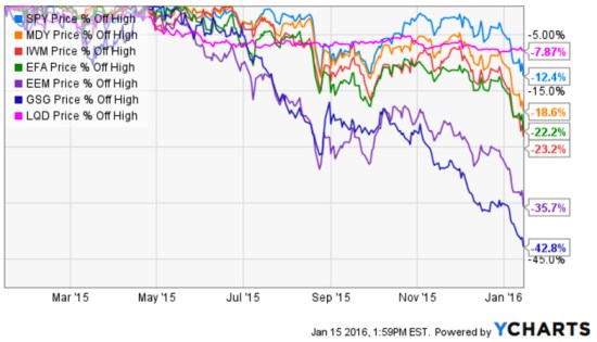
Since global markets declined around August and some markets recovered much of their losses by November, global markets have declined again. Below are charts of U.S. stocks, International stocks, U.S. bonds, and commodities. Even the iShares iBoxx $ Investment Grade Corporate Bond ETF that seeks to track the investment results of an index composed of U.S. investment grade corporate bonds is near -8% from its peak. Small and mid companies U.S. stocks are down more than -20% from their peak. Commodities and emerging countries are down the most.

global markets 2016-01-15_13-59-45.jpg

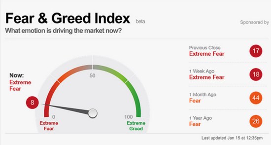
This all started with investors being optimistic in late October as I mentioned in Fear and Greed is Shifting and Models Don’t Avoid the Feelings. So, it is no surprise that today is just the opposite. As markets have declined investors become more and more fearful. As of now, Extreme Fear is the driver of the market.  Below is the current reading of the CNN Fear & Greed Index.

Fear and Greed Index

Source: CNN Fear & Greed Index 

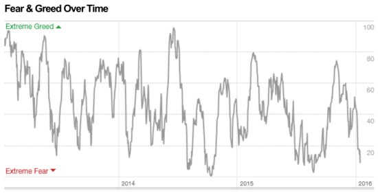
As you see in the chart below, it’s now getting close to the Extreme Fear levels that often signal at least a short-term low.

Fear and Greed Over Time

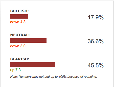
Another publicly available measure of investor sentiment is the AAII Investor Sentiment Survey. The AAII Investor Sentiment Survey measures the percentage of individual investors who are bullish, bearish, and neutral on the stock market for the next six months; individuals are polled from the ranks of the AAII membership on a weekly basis. The most recent weekly survey shows investors are very bearish and again, such pessimism occurs after price declines and at such extremes sometimes precedes a reversal back up.

Survey Results for Week Ending 1/13/2016

AAII Investor Sentiment January 2016

Source: AAII Investor Sentiment Survey

I say again what I said in October: This is the challenge in bear markets. In a bear market, market prices swing up and down along the way. It’s these swings that lead to mistakes. Above was a chart of how the Fear and Greed Index oscillates to high and low points over time. Investors who experience these extremes in emotion have the most trouble and need to modify their behavior so they feel the right feeling at the right time. Or, hire a manager with a real track record who can do it for them and go do something more enjoyable.

Good traders have a special talent for trading just as good musicians and good athletes have talents for their fields. Great traders are ones who are absorbed by the talent. They don’t have the talent — the talent has them. – Ed Seykota

Fear and Greed is Shifting and Models Don’t Avoid the Feelings

Investors are driven by fear and greed. That same fear and greed drives market prices. It’s Economics 101 “Supply and Demand”. Greed drives demand, fear drives selling pressure. In fact, investors are driven by the fear of losing more money when their account is falling and fear missing out if they have cash when markets go up. Most investors tend to experience a stronger feeling from losing money than they do missing out. Some of the most emotional investors oscillate between the fear of missing out and the fear of losing money. These investors have to modify their behavior to avoid making mistakes. Quantitive rules-based systematic models don’t remove the emotion.

Amateur portfolio managers who lack experience sometimes claim things like: “our quantitive rules-based systematic models removes the emotion”. That couldn’t be further from the truth. Those who believe that will eventually find themselves experiencing feelings from their signals they’ve never felt before. I believe it’s a sign of high expectations and those expectations often lead to even stronger reactions. It seems it’s the portfolio managers with very little actual performance beyond a backtest that make these statements. They must believe a backtested model will act to medicate their feelings, but it doesn’t actually work that way. I believe these are the very people who over optimize a backtest to make it perfectly fit historical data. We call it “curve-fitting” or “over-fitting”, but it’s always “data mining”. When we backtest systems to see how they would have acted in the past, it’s always mining the data retroactively with perfect hindsight. I’ve never had anyone show me a bad backtest. If someone backtests entry and exit signals intended to be sold as a managed portfolio you can probably see how they may be motivated to show the one that is most optimized to past data. But, what if the future is very different? When it doesn’t work out so perfectly, I think they’ll experience the very feelings they wish to avoid. I thought I would point this out, since many global markets have been swinging up and down. I’m guessing some may be feeling their feelings.

The CNN Fear & Greed Index shows investor fear and greed shifted to Extreme Fear a month ago as the popular U.S. stock indexes dropped about -12% or more. Many sectors and other markets were worse. Since then, as prices have been trending back up, Greed is now the driver again. I believe fear and greed both drives market prices but also follows price trends. As prices move lower and lower, investors who are losing money get more and more afraid of losing more. As prices move higher and higher, investors get more and more greedy. If they have reduced exposure to avoid loss, they may fear missing out.

CNN Fear and Greed IndexSource: http://money.cnn.com/data/fear-and-greed/

This is the challenge in bear markets. In a bear market, market prices swing up and down along the way. It’s these swings that lead to mistakes. Below is a chart of how the Fear and Greed Index oscillates to high and low points over time. Investors who experience these extremes in emotion have the most trouble and need to modify their behavior so they feel the right feeling at the right time. Or, hire a manager with a real track record who can do it for them and go do something more enjoyable.

Fear and Greed Over time investor sentiment

Source: http://money.cnn.com/data/fear-and-greed/

Actively Managing Investment Risk

The global market declines in early August offered a fine example of the kind of conditions that cause me to exit my long positions and end up in cash. For me, this is a normal part of my process. I predefine my risk in each position, so I know my risk across the portfolio. For example, I know at what point I’ll sell each position if it falls below a certain point in which I would consider it a negative trend. Since I know my exit in advance for each position, I knew in advance how much I would lose in the portfolio if all of those exits were reached due to market price movements trending against me. That allowed me to control how much my portfolio would lose from its prior peak by limiting it to my predefined amount. I have to take ‘some’ risk in order to have a chance for profits. If I took no risk at all, there could be no profit. The key for me is to take my risk when the reward to risk is asymmetric. That is, when the probability for a gain is much higher than the probability for a loss.

The concept seems simple, but actually doing it isn’t. All of it is probabilistic, never a sure thing.  For example, prices sometimes move beyond the exit point, so a risk control system has to account for that possibility.  More importantly, the portfolio manager has to be able to actually do it. I am a trigger puller. To see the results of over 10 years of my actually doing this, you can visit ASYMMETRY® Managed Accounts.


The person who says it cannot be done should not interrupt the person doing it.

– Chinese Proverb

The person who says it cannot be done Should not interupt the person doing it

Source: https://www.pinterest.com/explore/chinese-proverbs/

Warren Buffett’s Berkshire Hathaway Hasn’t Managed Downside Risk

 shares an interesting observation in Fortune ” Warren Buffett’s Berkshire lost $11 billion in market selloff“. He points out that Buffett’s Berkshire Hathaway (BRK.A or BRK.B) is tracking the U.S. stock indexes on the downside. He says:

“…during the worst of the downturn from mid-July to the end of August. That represents a 10.3% drop. The good news for Buffett: His, and his investment team’s, performance was likely not much worse than everyone else’s. During the same time, the S&P 500 fell 10.1%.”

Comparing performance to others or “benchmark” indexes is a what I call a “relative return” objective. Comparing performance vs. our own risk tolerance and total return objectives is an “absolute return” objective. The two are very different as what I call “relativity” is more concerned about how others are doing comparatively, while “absolute” is more focused on our own situation.

The article also said:

“If you are invested in an index fund, you may have outperformed the Oracle of Omaha, slightly.”

Let’s see just how true that is. Since the topic is how much Warren Buffett’s Berkshire Hathaway has lost during this stock market decline, I’ll share a closer look.

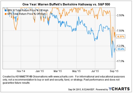
A picture speaks a thousand words. As it turns out, the guru stock picker is actually down -13.4% off it’s high looking back over the past year. That’s about -4% worse than the SPDR® S&P 500® ETF (SPY) that seeks to provide investment results that, before expenses, correspond generally to the price and yield performance of the S&P 500® Index. I am using actual securities here to present an investable comparison: SPY vs. BRK.B.

Warren Buffett's Berkshire Lost compared to stock index

As we observe in the chart, Warren Buffett’s Berkshire Hathaway began to decline off it’s high at the end of last year while the S&P 500® Index started last month. I have observed more and more stocks declining over the past several months. At the same time, more and more International markets have entered into their own bear markets. So, it is no surprise to see a focused stock portfolio diverge from a broader stock index.  points out some of the individual stock positions in ” Warren Buffett’s Berkshire lost $11 billion in market selloff

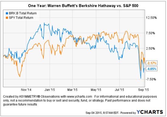
Below is the total return of the two over the past year. We can see the high in Warren Buffett’s Berkshire Hathaway BRK.B was in December 2014.

Warren Buffett's Berkshire Lost compared to stock index total return

I believe world markets require active risk management and defining directional trends. For me, that means predefining my risk in advance in each position and across the portfolio.

Chart source: http://www.ycharts.com

Read the full Fortune article here: ” Warren Buffett’s Berkshire lost $11 billion in market selloff

Stock Market Decline is Broad

We typically expect to see small company stocks decline first and decline the most. The theory is that smaller companies, especially micro companies, are more risky so their value may disappear faster.  Below, we view the recent price trends of four market capitalization indexes: micro, small, mid, and mega. We’ll use the following index ETFs.

Vanguard ETFs small mid large micro cap

Since we are focused on the downside move, we’ll only observe the % off high chart. This shows what percentage the index ETF had declined off its recent highest price (the drawdown). We’ll also observe different look-back periods.

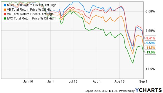
We first look back 3 months, which captures the full extent of the biggest loser: as expected, the micro cap index. The iShares Micro-Cap ETF (IWC: Green Line) seeks to track the investment results of an index composed of micro-capitalization U.S. equities. Over the past 3 months (or anytime frame we look) it is -13% below its prior high. The second largest decline is indeed the small cap index. The Vanguard Small-Cap ETF (VB: Orange Line) seeks to track the performance of the CRSP US Small Cap Index, which measures the investment return of small-capitalization stocks. The small cap index has declined -11.5%. The Vanguard Mega Cap ETF (MGC) seeks to track the performance of a benchmark index that measures the investment return of the largest-capitalization stocks in the United States and has declined -9.65%. The Vanguard Mid-Cap ETF (VO) seeks to track the performance of a benchmark index that measures the investment return of mid-capitalization stocks and has declined -9.41%. So, the smaller stocks have declined a little more than larger stocks.

Small and Micro caps lead down

Source: Shell Capital Management, LLC created with http://www.ycharts.com

Many active or tactical strategies may shift from smaller to large company stocks, hoping they don’t fall as much. For example, in a declining market relative strength strategies would rotate from those that declined the most to those that didn’t. The trouble with that is they may still end up losing capital and may end up positioned in the laggards long after a low is reached. They do that even though we may often observe the smallest company stocks rebound the most off a low. Such a strategy is focused on “relative returns” rather than “absolute returns“. An absolute return strategy will instead exit falling trends early in the decline with the intention of avoiding more loss. We call that “trend following” which has the objective of “cutting your losses short”. Some trend followers may allow more losses than others. You can probably see how there is a big difference between relative strength (focusing on relative trends and relative returns)  and trend following (focusing on actual price trends and absolute returns).

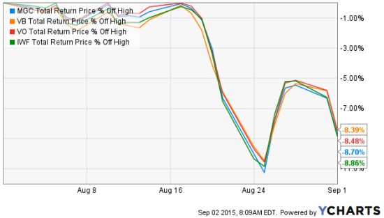
So, what if we look at the these stock market indexes over just the past month instead of the three months above? The losses are the same and they are very correlated. So much for diversification. Diversification across many different stocks, even difference sizes, doesn’t seem to help in declining markets on a short-term basis. These indexes combined represent thousands of stocks; micro, small, medium, and large. All of them declined over -11%, rebounded together, and are trending down together again.

stock market returns august 2015

Source: Shell Capital Management, LLC created with http://www.ycharts.com

If a portfolio manager is trying to “beat the market” index, he or she may focus on relative strength or even relative value (buy the largest loser) as they are hoping for relative returns compared to an index. But a portfolio manager who is focused on absolute returns may pay more attention to the actual downside loss and therefore focuses on the actual direction of the price trend itself. And, a key part is predefining risk with exits.

You can probably see how different investment managers do different things based on our objectives. We have to decide what we want, and focus on tactics for getting that.

What You Need to Know About Long Term Bond Trends

There is a lot of talk about interest rates and bonds these days – for good reason. You see, interest rates have been in a downtrend for decades (as you’ll see later). When interest rates are falling, the price of bonds go up. I wrote in “Why So Stock Market Focused?” that you would have actually been better off investing in bonds the past 15 years over the S&P 500 stock index.

However, the risk for bond investors who have a fixed bond allocation is that interest rates eventually trend up for a long time and their bonds fall.

This year we see the impact of rising rates and the impact of falling bond prices in the chart below of the 20+ year Treasury bond. It’s down -15% off its high and since the yield is only around 2.5% the interest only adds about 1% over this period for a total return of -14.1%. Up until now, this long term Treasury index has been a good crutch for a global allocation portfolio. Now it’s more like a broken leg.

But, that’s not my main point today. Let’s look at the bigger picture. Below is the yield (interest rate) on the 10-Year U.S. government bond. Notice that the interest rate was as high as 9.5% in 1990 and has declined to as low as 1.5%. Just recently, it’s risen to 2.62%. If you were going to buy a bond for future interest income payments, would you rather invest in one at 9.5% or 1.5%? If you were going to lend money to someone, which rate would you prefer to receive? What is a “good deal” for you, the lender?

I like trends and being positioned in their direction since trends are more likely to continue than reverse, but they usually do eventually reverse when inertia comes along (like the Fed). If you care about managing downside risk you have to wonder: How much could this trend reverse and what could its impact be on fixed bond holdings? Well, we see below that the yield has declined about -70%. If we want to manage risk, we have to at least expect it could swing the other way.

One more observation. Germany is one of the largest countries in the world. Since April, the 10-year German bond interest rate has reversed up very sharp. What if U.S bonds did the same?

As I detailed in “Allocation to Stocks and Bonds is Unlikely to Give us What We Want” bonds are often considered a crutch for a global asset allocation portfolio. If you care about managing risk, you may consider that negative correlations don’t last forever. All trends change, eventually. You may also consider your risk of any fixed positions you have. I prefer to actively manage risk and shift between global markets based on their directional trends rather than a fixed allocation to them.

The good news is: by my measures, many bond markets have declined in the short term to a point they should at least reserve back up at least temporarily. What happens after that will determine if the longer trend continues or begins to reverse. The point is to avoid complacency and know in advance at what point you’ll exit to cut losses short…

As they say: “Past performance is no guarantee of the future“.

Why So Stock Market Focused?

Most investors and their advisors seem to speak mostly about the stock market. When they mention “the market” and I ask “what market?” they always reply “the stock market”.

Why so stock market centric?

It must be that it gets the most media attention or stocks seem more exciting?. After all, other markets like bonds may seem boring and few know much about the many commodities markets or the foreign exchange markets. There are many different markets and two sides to them all.

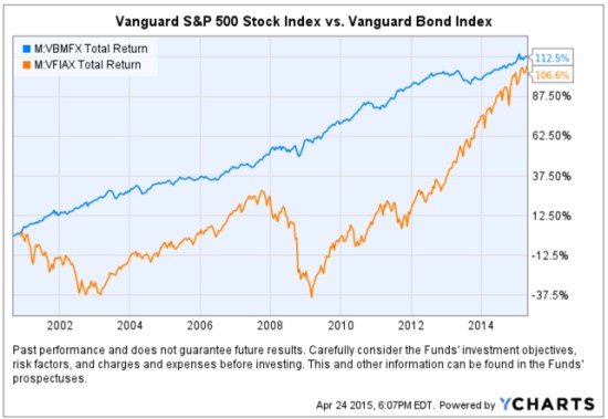
If it’s risk-adjusted returns you want, you may be surprised to find where you should have invested your money the past 15 years. To make the point, below is a comparison of the total return of the Vanguard S&P 500 stock index (the orange line) compared to the Vanguard Bond Index (the blue line). Yes, you are seeing that correctly. Using these simple index funds as a proxy, bonds have achieved the same total return as stocks, but with significantly less volatility and drawdowns. This is why we never look at just “average” return data without considering the path it took to get there. A total return percentage gain chart like this one presents a far more telling story. Take a close look at the path they took.

stocks vs. bonds

Created with http://www.ycharts.com

I showed the chart to one investment advisor who commented “It looks like the stock market is catching up”. If that’s what you think of when you view the chart, you may have a bias blind spot: ignoring the vast difference in the risk between the two markets.

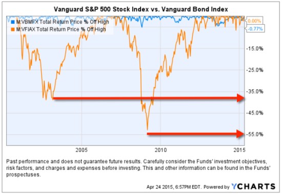
Looking at the total return over the period identifies the obvious difference in the path the two return streams took to achieve their results, but below we see the true risk difference. Drawdowns are declines from a higher value to a low value and a visual representation of how long it took to recover the lose of capital. When we observe a drawdown chart like the one below, it’s like a lake. These charts together also help illustrate the flaw of averages. The average return of the stock and bond index have ended at about the same level and have the same average return, but the bond index achieved it with much less drawdown. You wouldn’t know that if you only looked at average returns. If you tried to walk across the stock market lake, you may have drowned if you couldn’t handle swimming in 40′ of water for so long. If that one didn’t get you, the 55′ may have. The stock index declined about -40% from 2000 – 2002 and took years to recover before it declined -55%.

stock and bond market risk historical drawdowns

Created with http://www.ycharts.com

You have to be wondering: why didn’t you just invest in bonds 15 years ago? Maybe you were focused on the prior period huge average returns in stocks?

Before I continue, let me place a very bold disclaimer here: PAST PERFORMANCE DOES NOT GUARANTEE FUTURE RESULTS. Another way that is stated is that PAST PERFORMANCE IS NO ASSURANCE OF FUTURE RESULTS. One more version is PAST PERFORMANCE MAY NOT BE AN INDICATION OF FUTURE RESULTS. If you remember, the 1990’s were a roaring bull market in stocks. People focus on the past expecting it to continue. That’s probably why you never thought to invest in bonds instead of stocks.

Some of the largest and most successful hedge funds in the world have done that very thing over this period and longer. But, they didn’t just invest in bonds. They leveraged bonds. We’ve seen in this example that a bond index fund has achieved just as much total return as stocks. If you are a stock market centric investor: one that likes the stock market and makes it your focus, then you necessarily had to be willing to endure those -40% to -55% declines and wait many years to recover from the losses. If you are really willing to accept such risk, imagine if you had used margin to leverage bonds. The bond index rarely declined -10% or more. It was generally a falling interest rate period, so bonds gained value. If you were willing to accept -40% to -55% declines in stocks, you could have instead leveraged the bonds 400% or 500%. If you had done that, your return would be 4 or 5 times more with a downside more equal to that of stocks.

Why so stock centric?

Of course, at this stage, the PAST PERFORMANCE IS HIGHLY UNLIKELY TO REPEAT INTO THE FUTURE. Just as the roaring stocks of the 1990’s didn’t repeat. To see why, read Stage and Valuation of the U.S. Stock Market and Bonds: The Final Bubble Frontier?.

From my observations of investors performance and their advisors, most people seem to have poor results the past decade or so, even after this recent bull market. An investment management consultant told me recently that investors and their advisors who are aware of the current stage of stocks and bonds feel there is no place to turn. I believe it’s a very important time to prepare to row, not sail. For me, that means focus on actively managing risk and look for potentially profitable trends across a very global universe of markets; currency, bonds, stocks, commodities, and alternatives like volatility, inverse, etc . That’s my focus in ASYMMETRY® | Managed Accounts.

The Volatility Index (VIX) is Getting Interesting Again

In the last observation I shared on the CBOE Volatlity index (the VIX) I had been pointing out last year the VIX was at a low level and then later started trending up. At that time, many volatility traders seemed to think it was going to stay low and keep going lower – I disagreed. Since then, the VIX has remained at a higher average than it had been – up until now. You can read that in VIX® gained 140%: Investors were too complacent.

Here it is again, closing at 12.45 yesterday, a relatively low level for expected volatility of the S&P 500 stocks. Investors get complacent after trends drift up, so they don’t price in so much fear in options. Below we observe a monthly view to see the bigger picture. The VIX is getting down to levels near the end of the last bull market (2007). It could go lower, but if you look closely, you’ll get my drift.

Chart created by Shell Capital with: http://www.stockcharts.com

Next, we zoom in to the weekly chart to get a loser look.

Chart created by Shell Capital with: http://www.stockcharts.com

Finally, the daily chart zooms in even more.

Chart created by Shell Capital with: http://www.stockcharts.com

The observation?

Options traders have priced in low implied volatility – they expect volatility to be low over the next month. That is happening as headlines are talking about stock indexes hitting all time highs. I think it’s a sign of complacency. That’s often when things change at some point.

It also means that options premiums are generally a good deal (though that is best determined on an individual security basis). Rather than selling premium, it may be a better time to buy it.

Let’s see what happens from here…

My 2 Cents on the Dollar

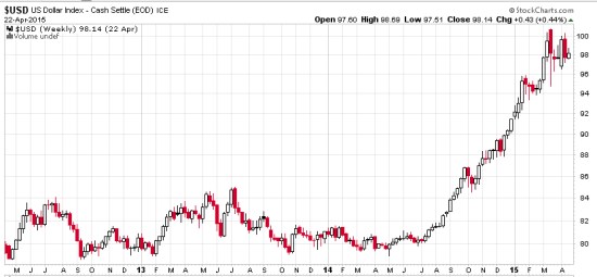
The U.S. Dollar ($USD) has gained about 20% in less than a year. We observe it first in the weekly below. The U.S. Dollar is a significant driver of returns of other markets. For example, when the U.S. Dollar is rising, commodities like gold, oil, and foreign currencies like the Euro are usually falling. A rising U.S. Dollar also impacts international stocks priced in U.S. Dollar. When the U.S. Dollar trends up, many international markets priced in U.S. Dollars may trend down (reflecting the exchange rate). The U.S. Dollar may be trending up in anticipation of rising interest rates.

dollar trend weekly 2015-04-23_16-04-40

Chart created by Shell Capital with: http://www.stockcharts.com

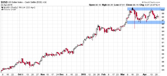
Now, let’s observe a shorter time frame- the daily chart. Here we see an impressive uptrend and since March a non-trending indecisive period. Many trend followers and global macro traders are likely “long the U.S. Dollar” by being long and short other markets like commodities, international stocks, or currencies.

dollar trend daily 2015-04-23_16-05-04

Chart created by Shell Capital with: http://www.stockcharts.com

This is a good example of understanding what drives returns and risk/reward. I consider how long the U.S. Dollar I am and how that may impact my positions if this uptrend were to reverse. It’s a good time to pay attention to it to see if it breaks back out to the upside to resume the uptrend, or if it instead breaks down to end it. Such a continuation or reversal often occurs from a point like the blue areas I highlighted above.

That’s my two cents on the Dollar…

How long are you? Do you know?

Conflicted News

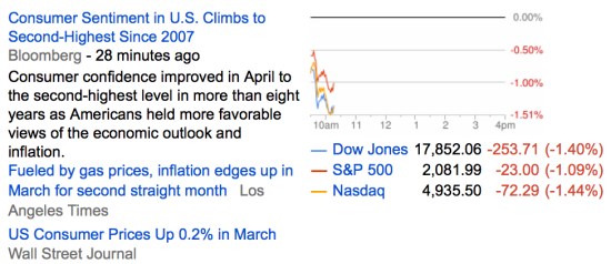
This is a great example of conflicted news. Which news headline is driving down stock prices today?

Below is a snapshot from Google Finance::

conflicted news 2015-04-17_10-21-43

Trying to make decisions based on news seems a very conflicted way, which is why I instead focus on the absolute direction of price trends.

Asymmetric Nature of Losses and Loss Aversion

Loss Aversion:

“In prospect theory, loss aversion refers to the tendency for people to strongly prefer avoiding losses than acquiring gains. Some studies suggest that losses are as much as twice as psychologically powerful as gains. Loss aversion was first convincingly demonstrated by Amos Tversky and Daniel Kahneman.”

For most people, losing $100 is not the same as not winning $100. From a rational point of view are the two things the same or different?

Most economists say the two are the same. They are symmetrical. But I think that ignores some key issues.

If we have only $10 to eat on today and that’s all we have, if we lose it, we’ll be in trouble: hungry.

But if we have $10 to eat on and flip a coin in a bet and double it to $20, we may just eat a little better. We’ll still eat. The base rate: survival.

They say rationally the two are the same, but that isn’t true. They aren’t the same. The loss makes us worse off than we started and it may be totally rational to feel worse when we go backward than we feel good about getting better off. I don’t like to go backward, I prefer to move forward to stay the same.

Prospect Theory, which found people experience a loss more than 2 X greater than an equal gain, discovered the experience of losses are asymmetric.

Actually, the math agrees.

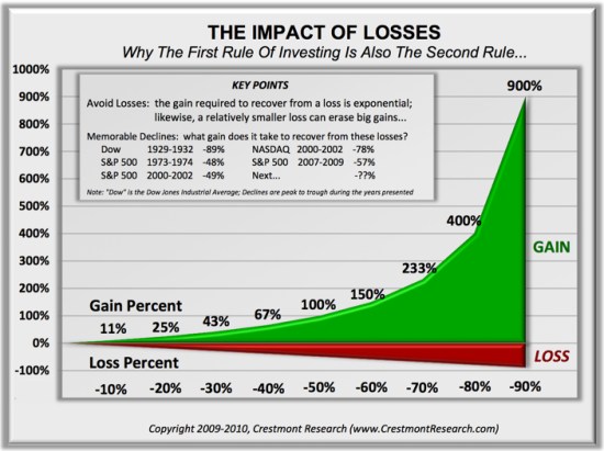
You see, losing 50% requires a 100% gain to get it back. Losing it all is even worse. Losses are indeed asymmetric and exponential on the downside so it may be completely rational and logical to feel the pain of losses asymmetrically. Experience the feeling of loss aversions seems to be the reason a few of us manage investment risk and generate a smoother return stream rather than blow up.

To see what the actual application of asymmetry to portfolio management looks like, see: Shell Capital Management, LLC.


asymmetry impact of loss

Absolute Return: an investment objective and strategy

Absolute returns investment strategy fund

Absolute Return in its basic definition is the return that an asset achieves over a certain period of time. This measure looks at the appreciation or depreciation (expressed as a dollar amount or a percentage). For example, a $50 stock drifts to $100 is a 100% absolute return. If that same stock drifts back from $100 to $50, its absolute return is -50%.

Absolute Return as an investment objective is one that does not try to track or beat an arbitrary benchmark or index, but instead seeks to generate real profits over a complete market cycle regardless of market conditions. That is, an absolute return objective of positive returns on investment over a market cycle of both bull and bear market periods irrespective of the direction of stock, commodity, or bond markets. Since the U.S. stock market has been generally in a uptrend for 6 years now, other than the -20% decline in the middle of 2011, we’ll now have to expand our time frame for a full market cycle to a longer period. That is, a full market cycle includes both a bull and a bear market.

The investor who has an absolute return objective is concerned about his or her own objectives for total return over a period and tolerance for loss and drawdowns. That is a very different objective than the investor who just wants whatever risk and return a benchmark, allocation, or index provides. Absolute returns require skill and active management of risk and exposure to markets.

Absolute return as a strategy: absolute return is sometimes used to define an investment strategy. An absolute return strategy is a plan, method, or series of maneuvers aiming to compound capital positively and to avoid big losses to capital in difficult market conditions. Whereas Relative Return strategies typically measure their success in terms of whether they track or outperform a market benchmark or index, absolute return investment strategies aim to achieve positive returns irrespective of whether the prices of stocks, bonds, or commodities rise or fall over the market cycle.

Absolute Return Investment Manager

Whether you think of absolute return as an objective or a strategy, it is a skill-based rather than market-based. That is, the absolute return manager creates his or her results through tactical decision-making as opposed to taking what the market is giving. One can employ a wide range of approaches toward an absolute return objective, from price-based trend following to fundamental analysis. In the ASYMMETRY® Managed Accounts, I believe price-based methods are more robust and lead to a higher probability of a positive expectation. Through my historical precedence, testing, and experience, I find that any fundamental type method that is based on something other than price has the capability to stray far enough from price to put the odds against absolute returns. That is, a manager buying what he or she believes is undervalued and selling short what he believes is overvalued can go very wrong if the position is on the wrong side of the trend. But price cannot deviate from itself. Price is the judge and the jury.

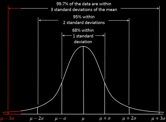
To create absolute returns, I necessarily focus on absolute price direction. Not relative strength, which is a rate of change relative to another moving trend. And, I focus on actual risk, not some average risk or an equation that oversimplifies risk like standard deviation.

Of course, absolute return and the “All Weather” type portfolio sound great and seem to be what most investors want, but it requires incredible skill to execute. Most investors and advisors seem to underestimate the required skills and experience and most absolute return strategies and funds have very limited and unproven track records. There is no guarantee that these strategies and processes will produce the intended results and no guarantee that an absolute return strategy will achieve its investment objective.

For an example of the application of an absolute return objective, strategy, and return-risk profile, visit http://www.asymmetrymanagedaccounts.com/

Absolute Return as an Investment Strategy

Absolute Return Investment Strategy Fund Manager

In “Absolute Return: The Basic Definition”, I explained an absolute return is the return that an asset achieves over a certain period of time. To me, absolute return is also an investment objective.

In “Absolute Return as an Investment Objective” I explained that absolute return is an investment objective is one that does not try to track or beat an arbitrary benchmark or index, but instead seeks to generate real profits over a complete market cycle regardless of market conditions. That is, it is focused on the actual total return the investor wants to achieve and how much risk the investor will willing to take, rather than a focus on what arbitrary market indexes do.

Absolute return as a strategy: absolute return is sometimes used to define an investment strategy. An absolute return strategy is a plan, method, or series of maneuvers aiming to compound capital positively and to avoid big losses to capital in difficult market conditions. Whereas Relative Return strategies typically measure their success in terms of whether they track or outperform a market benchmark or index, absolute return investment strategies aim to achieve positive returns irrespective of whether the prices of stocks, bonds, or commodities rise or fall over the market cycle.

Whether you think of absolute return as an objective or a strategy, it is a skill-based rather than market-based. That is, the absolute return manager creates his or her results through tactical decision-making as opposed to taking what the market is giving. One can employ a wide range of approaches toward an absolute return objective, from price-based trend following to fundamental analysis. In the ASYMMETRY® Managed Accounts, I believe price-based methods are more robust and lead to a higher probability of a positive expectation. Through my historical precedence, testing, and experience, I find that any fundamental type method that is based on something other than price has the capability to stray far enough from price to put the odds against absolute returns. That is, a manager buying what he or she believes is undervalued and selling short what he believes is overvalued can go very wrong if the position is on the wrong side of the trend. But price cannot deviate from itself. Price is the judge and the jury.

Of course, absolute return and the “All Weather” type portfolio sound great and seem to be what most investors want, but it requires incredible skill to execute. Most investors and advisors seem to underestimate the required skills and experience and most absolute return strategies and funds have very limited and unproven track records. There is no guarantee that these strategies and processes will produce the intended results and no guarantee that an absolute return strategy will achieve its investment objective.

For an example of the application of an absolute return objective, strategy, and return-risk profile,  visit http://www.asymmetrymanagedaccounts.com/

Absolute Return as an Investment Objective

Absolute Return objective fund strategy

In Absolute Return: The Basic Definition, I explained an absolute return is the return that an asset achieves over a certain period of time. To me, absolute return is also an investment objective.

Absolute Return as an investment objective is one that does not try to track or beat an arbitrary benchmark or index, but instead seeks to generate real profits over a complete market cycle regardless of market conditions. That is, an absolute return objective of positive returns on investment over a market cycle of both bull and bear market periods irrespective of the direction of stock, commodity, or bond markets.

Since the U.S. stock market has been generally in a uptrend for 6 years now, other than the -20% decline in the middle of 2011, we’ll now have to expand our time frame for a full market cycle to a longer period. That is, a full market cycle includes both a bull and a bear market.

The investor who has an absolute return objective is concerned about his or her own objectives for total return over a period and tolerance for loss and drawdowns. That is a very different objective than the investor who just wants whatever risk and return a benchmark, allocation, or index provides. Absolute returns require skill and active management of risk and exposure to markets.

Rather than a long article, this is going to be a series of smaller parts, building up to what absolute return really means.

For an example of the application of an absolute return objective, strategy, and return-risk profile,  visit http://www.asymmetrymanagedaccounts.com/

Diversification Alone is No Longer Sufficient to Temper Risk…

That was the lesson you learned the last time stocks became overvalued and the stock market entered into a bear market.

In a Kiplinger article by Fred W. Frailey interviewed Mohamed El-Erian, the PIMCO’s boss, (PIMCO is one of the largest mutual fund companies in the world) he says “he tells how to reduce risk and reap rewards in a fast-changing world.” This article “Shaking up the Investment Mix” was written in March 2009, which turned out the be “the low” of the global market collapse.

It is useful to revisit such writing and thoughts, especially since the U.S. stock market has since been overall rising for 5 years and 10 months. It’s one of the longest uptrends recorded and the S&P 500 stock index is well in “overvalued” territory at 27 times EPS. At the same time, bonds have also been rising in value, which could change quickly when rates eventually rise. At this stage of a trend, asset allocation investors could need a reminder. I can’t think of a better one that this:

Why are you telling investors they need to diversify differently these days?

The traditional approach to diversification, which served us very well, went like this: Adopt a diversified portfolio, be disciplined about rebalancing the asset mix, own very well-defined types of asset classes and favor the home team because the minute you invest outside the U.S., you take on additional risk. A typical mix would then be 60% stocks and 40% bonds, and most of the stocks would be part of Standard & Poor’s 500-stock index.

This approach is fatigued for several reasons. First of all, diversification alone is no longer sufficient to temper risk. In the past year, we saw virtually every asset class hammered. You need something more to manage risk well.

But, you know, they say a picture is worth a thousand words.

Since we are talking about downside risk, something that is commonly hidden when only “average returns” are presented, below is a drawdown chart. I created the drawdown chart using YCharts which uses total return data and the “% off high”. The decline you see from late 2007 to 2010 is a dradown: it’s when the investment value is under water. Think of this like a lake. You can see how the average of the data wouldn’t properly inform you of what happens in between.

First, I show PIMCO’s own allocation fund: PALCX: Allianz Global Allocation Fund. I include an actively managed asset allocation that is very large and popular with $55 billion invested in it: MALOX: BlackRock Global Allocation. Since there are many who instead believe in passive indexing and allocation, I have also included DGSIX: DFA Global Allocation 60/40 and VBINX: Vanguard Balanced Fund. As you can see, they have all done about the same thing. They declined about -30% to -40% from October 2007 to March 2009. They also declined up to -15% in 2011.

Vanguard DFA BlackRock PIMCO Asset Allcation

Charts are courtesy of http://ycharts.com/ drawn by Mike Shell

Going forward, the next bear market may be very different. Historically, investors consider bond holdings to be a buffer or an anchor to a portfolio. When stock prices fall, bonds haven’t been falling nearly as much. To be sure, I show below a “drawdown chart” for the famous actively managed bond fund PIMCO Total Return and for the passive crowd I have included the Vanguard Total Bond Market fund. Keep in mind, about 40% of the allocation of the funds above are invested in bonds. As you see, bonds dropped about -5% to -7% in the past 10 years.

PIMCO Total Return Bond Vanguard Total Bond

Charts are courtesy of http://ycharts.com/ drawn by Mike Shell

You may have noticed the end of the chart is a drop of nearly -2%. Based on the past 10 years, that’s just a minor decline. The trouble going forward is that interest rates have been in an overall downtrend for 30 years, so bond values have been rising. If you rely on bonds being a crutch, as on diversification alone, I agree with Mohamed El-Erian the Chief of the worlds largest bond manager:

“…diversification alone is no longer sufficient to temper risk. In the past year, we saw virtually every asset class hammered. You need something more to manage risk well.”

But, don’t wait until AFTER markets have fallen to believe it.

Instead, I apply active risk management and directional trend systems to a global universe of exchange traded securities (like ETFs). To see what that looks like, click: ASYMMETRY® Managed Accounts

This is When MPT and VaR Get Asset Allocation and Risk Measurement Wrong

This is When MPT and VaR Get Asset Allocation and Risk Measurement Wrong

I was talking to an investment analyst at an investment advisory firm about my ASYMMETRY® Global Tactical and he asked me what the standard deviation was for the portfolio. I thought I would share with you how the industry gets “asset allocation” and risk measurement and management wrong.

Most people have poor results over a full market cycle that includes both rising and falling price trends, like global bull and bear markets, recessions, and expansions. Quantitative Analysis of Investor Behavior, SPIVA, Morningstar and many academic papers have provided empirical evidence that most investors (including professionals) have poor results over the long periods. For example, they may earn gains in rising conditions but lose their gains when prices decline. I believe one reason is they get too aggressive at peaks and then sell in panic after losses get too large, rather than properly predefine and manage risk.

You may consider, then, to have good results over a long period, I necessarily have to believe and do things very differently than most people.

On the “risk measurement” topic, I will share with you a very important concept that is absolutely essential for truly actively controlling loss. The worst drawdown “is” the only risk metric that really matters. The risk is not the loss itself. Once we have a loss, it’s a loss. It’s beyond the realm of risk. Since risk is the possibility of a loss, how often it has happened in the past and the magnitude of the historical loss is the expectation. Beyond that, we must assume it could be even worse some day. For example, if the S&P 500 stock index price decline was -56% from 2007 to 2009, then we should expect -56% is the loss potential (or worse). When something has happened before, it suggests it is possible again, and we may have not yet observed the worst decline in the past that we will see in the future.

The use of standard deviation is one of the very serious flaws of investors attempting to measure, direct, and control risk. The problem with standard deviation is that the equation was intentionally created to simplify data. The way it is used draws a straight line through a group of data points, which necessarily ignores how far the data actually spreads out. That is, the standard deviation is intended to measure how far the data spreads out, but it actually fails to absolutely highlight the true high point and low point. Instead, it’s more of an average of those points. However, for risk management, it’s the worst-case loss that we really need to focus on. I believe in order to direct and control risk, I must focus on “how bad can it really get”. Not just “on average” how bad it can get. The risk in any investment position is at least how much it has declined in the past. And realizing it could be even worse some day. Standard deviation fails to reflect that in the way it is used.

Consider that as prices trend up for years, investors become more and more complacent. As investors become complacent, they also become less indecisive as they believe the recent past upward trend will continue, making them feel more confident. On the other hand, when investors feel unsure about the future, their fear and indecisiveness is reflected as volatility as the price swings up and down more. We are always unsure about the future, but investors feel more confident the past will continue after trends have been rising and volatility gets lower and lower. That is what the peak of a market looks like. As it turns out, that’s just when asset allocation models like Modern Portfolio Theory (MPT) and portfolio risk measures like Value at Risk (VaR) tell them to invest more in that market – right as it reaches its peak. They invest more, complacently, because their allocation model and risk measures tell them to. An example of a period like this was October 2007 as global stock markets had been rising since 2003. At that peak, the standard deviation was low and the historical return was at its highest point, so their expected return was high and their expected risk (improperly measured as historical volatility) was low. Volatility reverses the other way at some point

What happens next is that the market eventually peaks and then begins to decline. At the lowest point of the decline, like March 2009, the global stock markets had declined over -50%. My expertise is directional price trends and volatility so I can tell you from empirical observation that prices drift up slowly, but crash down quickly. The below chart of the S&P 500 is an example of this asymmetric risk.

stock index asymmetric distribution and losses

At the lowest point after prices had fallen over -50%, in March 2009, the standard deviation was dramatically higher than it was in 2007 after prices had been drifting up. At the lowest point, volatility is very high and past return is very low, telling MPT and VaR to invest less in that asset. This is a form of volatility targeting: investing more at lower levels or historical volatility and less at higher levels.

In the 2007 – 2009 decline in global markets, you may recall some advisors calling it a “6 sigma event”. That’s because the market index losses were much larger than predicted by a standard deviation. For example, if an advisors growth allocation had an average return of 10% in 2007 based on its past returns looking back from the peak and a standard deviation of 12% expected volatility, they only expected the portfolio would decline -26% (3 standard deviations) within a 99.7% confidence level – but the allocation actually lost -40 or -50%. Even if that advisor properly informed his or her client the allocation could decline -26% worse case and the client provided informed consent and acceptance of that risk, their loss was likely much greater than their risk tolerance. When they reach their risk tolerance, they “tap out”. Once they tap out, when do they ever get back in? do they feel better after it falls another -20%? or after it rises 20%? There is no good answer. I want to avoid that situation. I prefer to reduce my exposure to loss in well advance.

You can see in the chart below, 3 standard deviations is supposed to capture 99.7% of all of the data if the data is a normal distribution. The trouble is, market returns are not a normal distribution. Instead, stock market gains and losses present an asymmetrical return distribution. Market returns experience much larger gains and losses than expected from a normal distribution – the outliers are critical. However, those outliers don’t occur very often: historically it’s maybe every 4 or 5 years, so people have time to forget about the last one and become complacent.

symmetry normal distribution bell curve black

Source: http://en.wikipedia.org/wiki/68%E2%80%9395%E2%80%9399.7_rule

My friends, this is where traditional asset allocation like Modern Portfolio Theory (MPT) and risk measures like Value at Risk (VaR) get it wrong.

These methods are the most widely believed and used . You can probably see why most investors do poorly and only a very few do well – an anomaly.

I can tell you that I measure risk by how much I can lose and I control my risk by predefining my absolute risk at the point of entry and my exit point evolves as the positions are held. That is an absolute price point, not some equation that intentionally ignores the outlier losses.

As the stock indexes have now been overall trending up for 5 years and 9 months, the trend is getting aged. In fact, according to my friend Ed Easterling at Crestmont Research, at around 27 times EPS the stock index seems to be in the range of overvalued. In his latest report, he says:

“The stock market surged over the past quarter, adding to gains during 2014 that far exceed underlying economic growth. As a result, normalized P/E increased to 27.2—well above the levels justified by low inflation and interest rates. The current status is approaching “significantly overvalued.”

At the same time, we shouldn’t be surprised to eventually see rising interest rates drive down bond values at some point. It seems from this starting point that simply allocating to stocks and bonds doesn’t have an attractive expected return.

I believe a different strategy is needed, especially form this point forward.

In ASYMMETRY® Global Tactical, I actively manage risk and shift between markets to find profitable directional price trends rather than just allocate to them.


Mike Shell is the Founder and Chief Investment Officer of Shell Capital Management, LLC, and the portfolio manager of ASYMMETRY® Global Tactical.

The observations shared on this website are for general information only and are not specific advice, research, or buy or sell recommendations for any individual. Investing involves risk including the potential loss of principal an investor must be willing to bear. Past performance is no guarantee of future results. The presence of this website on the Internet shall in no direct or indirect way raise an implication that Shell Capital Management, LLC is offering to sell or soliciting to sell advisory services to residents of any state in which the firm is not registered as an investment advisor. Use of this website is subject to its terms and conditions.
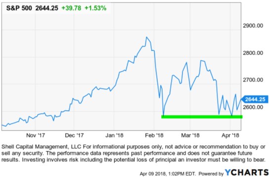
 

On Finding Your Passion…


The two most important days in your life are the day you are born and the day you find out why  Mark Twain

Mark Twain

Source: http://www.goodreads.com/author/show/1244.Mark_Twain
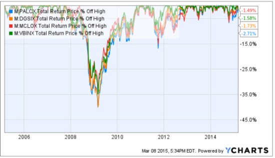
The One Thing: The Surprisingly Simple Truth Behind Extraordinary Results

I had a two-hour interview with someone yesterday (that will be available soon) about my firm and investment programs and found myself sharing a few of the same thoughts, over and over.

“Managing the ASYMMETRY® investment programs is all we do. I am fully committed and focused on this one thing: buying, selling, and managing risk in global markets to generate the positive asymmetry needed to compound capital positively within our risk tolerance”.

In a recent letter to our investors to reflect on the 10-year anniversary of my founding Shell Capital Management, LLC, I described the evolution of the firm, ASYMMETRY®, and myself over 10 pages. I called it “10 years of Shell Capital Management”; Christi called it “10 pages of 10 years of Shell Capital Management”! (When talking about these things, I have no short version!)

That’s because I’m fully committed and focused on this one thing we do. In that letter, I went so far as to say: it’s all I have, all I am, and all I ever will be. As I reflected on the past 10 years, it occurred to me that my whole life has revolved around this one thing. Without it, none of the other things, the lifestyle we enjoy, would exist. I believe my priorities are in line with reality. That has been a tremendous advantage for us.

Then this morning, I get an email from getAbstract: “Top 10 Summaries”, the 10 most downloaded getAbstract summaries in 2014.

The first on the list?

“Achieving great success in all aspects of your life calls for devotion to one single thing.”

The One Thing
The Surprisingly Simple Truth Behind Extraordinary Results

Gary Keller and Jay Papasan
Bard Press, 2013

the one thing The Surprisingly Simple Truth Behind Extraordinary Results

getAbstract goes on to describe it: (I highlighted a key part in bold)

“Gary Keller, co-founder of Keller Williams Realty and a best-selling author, overcame his own issues about focus, which makes his claims about cultivating better habits even more compelling. Multitasking isn’t fruitful, he says, since success requires long periods of laser-like concentration, not scattershot swats. If you find your “ONE Thing,” Keller says, everything else will fall into place. Keller, writing with co-author Jay Papasan, breaks his approach down into manageable steps based on research and experience. With an engaging writing style and plenty of bullet points, this reads much faster than its 200-plus pages”

It says the ONE Thing will bring your life and your work into focus. I obviously don’t need a book to tell me that, but it may help me understand myself better. I’ll be reading the abstract, but also listening to the audiobook version on Audible during my long walks in sunny Florida.

The Mistake is Not Taking the Loss: Cut Your Losses and Move on

One of the keys to managing investment risk is cutting losers before they become large losses. Many people have difficulty selling at a loss because they believe it’s admitting a mistake. The mistake isn’t taking a loss, the mistake is to NOT take the loss. I cut losses short all the time, that’s why I don’t have large ones. I’ve never taken a loss that was a mistake. I predetermine my risk by determining before I even buy something at what point I’ll get out if I am wrong. If I enter at $50, my methods may determine if it falls to $45 that trend I wanted to get in is no longer in place and I should get out. So when I enter a position in any market, I know how I’ll cut my loss short before I even get in. It’s the exit, not the entry, that determines the outcome. I don’t know in advance which will be a winner or loser or how much it will gain or lose. For me, not taking the loss, would be the mistake.

I thought of this when a self-proclaimed old-timer admitted to me he still holds some of the popular stocks he bought the late 90’s. Many of those stocks are no longer in business, but below we revisit the price trend and total return of some of the largest and most popular stocks promoted in the late 90’s. The black line is Cisco Systems (CSC), Blue is AT&T (T), Red is Pfizer (PFE), and green is Microsoft (MSFT). AT&T’s roots stretch back to 1875, with founder Alexander Graham Bell’s invention of the telephone. Pfizer started in 1849 “With $2,500 borrowed from Charles Pfizer’s father, cousins Charles Pfizer and Charles Erhart, young entrepreneurs from Germany, opened Charles Pfizer & Company as a fine-chemicals business”. At one point during the late 90’s “tech bubble” Microsoft and Cisco Systems were valued more than many countries. But the chart below shows if you did buy and held these stocks nearly 20 years later you would have held losses for many years and many of them are just now showing a profit.

tech bubble leaders 2014-11-15_07-04-53

chart courtesy of http://www.stockcharts.com

The lesson to cut losses short rather than allow them to become large losses came from a book published in 1923.

“Money does not give a trader more comfort, because, rich or poor, he can make mistakes and it is never comfortable to be wrong. And when a millionaire is right his money is merely one of his several servants. Losing money is the least of my troubles. A loss never bothers me after I take it. I forget it overnight. But being wrong – not taking the loss – that is what does the damage to the pocketbook and to the soul.”

-Reminiscences of a Stock Operator (1923)

If you are unfamiliar with the classic, according to Amazon:

Reminiscences of a Stock Operator is a fictionalized account of the life of the securities trader Jesse Livermore. Despite the book’s age, it continues to offer insights into the art of trading and speculation. In Jack Schwagers Market Wizards, Reminiscences was quoted as a major source of stock trading learning material for experienced and new traders by many of the traders who Schwager interviewed. The book tells the story of Livermore’s progression from day trading in the then so-called “New England bucket shops,” to market speculator, market maker, and market manipulator, and finally to Wall Street where he made and lost his fortune several times over. Along the way, Livermore learns many lessons, which he happily shares with the reader.


Small vs. Large Stocks: A Tale of Two Markets (Continued)

A quick follow up to my recent comments about the down trend in smaller company stocks in Playing with Relative Strength and Stock Market Peak? A Tale of Two Markets below is a chart and a few observations:

Rusell 2000 Small Caps vs S&P 500 large caps

Source: Bloomberg/KCG
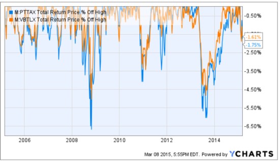
A few observations of the trend direction, momentum, and relative strength.

  • The S&P 500 index (the orange line) of large company stocks has been  in a rising trend of higher highs and higher lows (though that will not continue forever).
  • The white line is the Russell 2000 small company index has been in a downtrend of lower highs and lower lows, though just recently you may observe in the price chart that it is at least slightly higher than its August high. But it remains below the prior two peaks over the past year. From the time frame in the chart, we could also consider it a “non-trending” and volatile period, but its the lower highs make it a downtrend.
  • The green chart at the bottom shows the relative strength between S&P 500 index of large company stocks and the Russell 2000 small company index. Clearly, it hasn’t taken all year to figure out which was trending up and the stronger trend.
  • Such periods take different tactical trading skills to be able to shift profitability. When markets get choppy, you find out who really knows what they’re doing and has an edge. I shared this changing trend back in May in Stock Market Peak? A Tale of Two Markets.

If you are unsure about the relevance of the big picture regarding these things, read Playing with Relative Strength and Stock Market Trend: reverse back down or continuation? and Stock Market Peak? A Tale of Two Markets.


Madoff wasn’t a hedge fund

Bernie Madoff is back in the news lately as it’s now been 5 years since he was arrested for the largest Ponzi Scheme. For some reason, the name is commonly linked to “hedge funds”. Yet, the Bernie Madoff scam wasn’t a hedge fund, his company was a registered and regulated brokerage firm called Bernard L. Madoff Investment Securities. Madoff founded the Wall Street brokerage firm Bernard L. Madoff Investment Securities LLC in 1960. Some large hedge funds lost money because they had invested in Madoff’s managed account. They had Madoff managing some of their funds money. But Madoff Investment Securities LLC wasn’t a hedge fund.

If you had an account managed by Bernie Madoff at Madoff Investment Securities LLC  you would have had an account owned and titled in your own name. You would have gotten trade confirmations from Madoff Investment Securities LLC when he bought or sold. You don’t get that in a fund. You don’t know when a fund buys or sells. His investment program, then, offered the appearance of transparency – you could see what he was doing at any time.

As it turned out, the appearance of transparency enabled the thief to defrauded customers of approximately $20 billion over several decades. You see, Madoff’s investment program was a fraud, and the reason he was able to do it is that:

1. He was the portfolio manager: he made the trading decisions.
2. He owned the broker that executed the trades (as it turned out, they were fake; he didn’t do trades).
3. He owned the custodian: the custodian and broker was the same company.

Since Madoff Investment Securities LLC was the portfolio manager, broker, and the custodian, that allowed him to pretend to do trades and print trade confirmations and statements with fake information on them. Madoff Investment Securities LLC was regulated and registered as a brokerage firm, just like Wells Fargo Advisors, Edward Jones, Schwab, Morgan Stanley, and other brokers. You can probably see how the real issue was that his program was a fraud and he was able to do it because he controlled the trading decisions, trade confirms, account statements, and custody, because his company did it all. What if he had been required to custody an another company independent of his? he would have had to convince the other company to participate in his scheme which would likely have gotten him busted sooner. Most investment companies aren’t a fraud, so they would likely report him. Madoff was large and respected – but don’t think that made it any safer.

Whether you invest in a separately managed account or a private investment partnership, require that they use multiple service providers that are independent of each other instead of all one company. For example, your portfolio manager is an asset management firm, the broker is a different company that executes the trades and the custodian is a separate company that holds the securities and handles the cash in and out. Then, require it be audited by even another independent company. For example, if you enter into an investment management agreement with ABC Capital Management, LLC that firm is the portfolio manager and the agreement gives it authority to buy and sell in your account. Your account should then be held at a financial institution registered as a broker or bank like Folio Institutional, Trust Company of America, or JP Morgan. You deposit money to that financial institution that holds your money and they send you statements. ABC Capital Management, LLC is just trading the account independently and shouldn’t have custody of the money. If the investment program is a “hedge fund” instead of a separately managed account then it’s typically structured as a private investment partnership, say: ABC Fund, LP. A private fund is operated like a business – the business is trading for profit. You review a Private Placement Memorandum that explains every detail of ABC Fund, LP. When you invest, you sign a “Subscription Agreement” instead of an investment management agreement. You wire the deposit to the bank account of ABC Fund, LP and that money is then wired to the funds brokerage account. It’s best to require the fund to have a “third party administrator” who acts as the funds controller and accountant. That third party administrator is who accounts for your investment and sends you statements showing the value of your investment. You can probably see why you want the administrator to be a third party – independent from the fund manager. Then, the fund is audited annually to verify the administrators accounting is accurate. When ABC Fund, LP is a private investment partnership, it should be operated like any other major business with multiple investors. It has a bank account that sends/receives wires, a custodian that holds securities, a broker that executes trades, a third party administrator that does the accounting and creates profit and loss statements, and an independent accountant that audits all of it. Those should be separate companies independent of each other, not one.

Unfortunately, most of the smaller scams we hear about are even worse than the Madoff scheme. The investors write a check to “John A. Doe” which isn’t even a company at all. I don’t think any legitimate investment program has you writing a check to the individual portfolio manager. Deposits should be made to an independent bank or custodian and statements should come from that custodian. In fact, it’s even better to wire the funds rather than write a check. But “You can’t fix stupid”. There will always be Madoff-like scams and people stupid enough to write them a check. If you simply require that all the service providers be separate companies you won’t be one of them.

How a Family Office Selects an Investment Manager

The topic of selecting an investment manager is an important one. Many investors, including professional financial planners and advisors admit they have little skill at selecting asset managers. In fact, some admit they do such a poor job at it they don’t even try. But if you understand the value in alternative investment strategies from private equity to absolute return focused investment programs, then you need to know what to look for in an investment manager. These alternative investment strategies are most often offered privately in a private hedge fund format and sometimes offered as a separate managed account (SMA). Whether you are a private individual investor, an allocator for a family office or institution, or a portfolio manager, the video below is an outstanding example of how a sophisticated investor analyzes a money manager. It’s an interview with the Chief Investment Officer of a family office. He explains why a family who sold a large business may be interested in alternative investments or alternative investment strategies rather than conventional public investments and investment programs like mutual funds.  His family office has allocated 80% to alternative investment managers (like hedge funds and the Asymmetry Investment Program™). He offers some insight about:

  • Why family offices (and other wealthy investors) are attracted to alternative investment strategies commonly offered as a private hedge fund.
  • What they specifically look for in selecting a portfolio manager.
  • How allocators filter managers post crisis:  What exactly did you do in 2008?
  • Are they looking at younger emerging hedge fund/money managers?

On how they select hedge funds:  (begins around 4:07/9:57)

“We are looking for opportunities with managers were we can get comfortable as to their strategy and what will generate returns for them and what the risks might be? We haven’t been very active with emerging or start-up managers. I think a lot of that has to do with where we are in terms of time.

2008 was an awesome and an awful market experience it’s helpful to look at managers who actually were in existence during that period of time to gain some understanding of how they manage their portfolios are the most difficult. Someone doesn’t have a 08 track record is much harder to get a sense of how they’re going to do a difficult markets. 09 was a pretty easy market to make money if you were long.”

How are you evaluating the 2008 period what are you looking at specifically, the drawdown?

“We obviously start with performance but  I also want to see exposure in the portfolio. How did the manager navigate those markets? Did he keep his portfolio fully invested in a market environment for his strategy was not allowing it to make money was actually causing losses? Did he trim exposure? When did he put exposure back into the market place?  is something that we look at it. It’s really it’s a number of different factors we try and I can understand how the manager managed during that period of time and try to gain some insight on his style. Conviction doesn’t automatically mean that you stay fully invested at all times. Although we certainly saw a number of managers who waited FAR too long to trim their exposure. So,  it’s a combination of all those factors we try and consider. But I would say one of the things that are most important to me is trying to follow a managers gross and net exposures during that period trying to understand. That leads to conversations of what the manager was thinking at the time.”

He goes on to say: 

“I like analogies. And one of the analogies in 2008 brings to me it’s like a sailor setting his course on a sea. He’s got a great sonar system, he’s got great maps and charts and he’s perhaps got a great GPS so he knows exactly where he is. He knows what’s ahead of him in the ocean but his heads down and he’s not seeing these awesomely black storm clouds building up on the horizon are about to come over top of him. Some of those managers we did not stay with. Managers who saw that, who changed course, trimmed their exposure, or sailed to safer territory. One, they survived; they truly preserved capital in difficult times and my benchmark for preserving capital is you had less than a double-digit loss in 08, you get to claim you preserved capital. I’ve heard people who’ve lost as much is 25% of investor capital argue that they preserved capital… but I don’t believe you can claim that. Understanding how a manager managed and was nimble during a period of time it gives me great comfort, a higher level of comfort, on what a manager may do in the next difficult period. So again it’s a it’s a very qualitative sort of trying to come to an understanding of what happened… and then make our best guess what we anticipate may happen next time.”

I can tell you he’s spot on. Those whose jobs are that of the asset allocator, who allocates capital to investment programs, often rely too much on Modern Portfolio Theory statistics and not enough on looking very closely under the hood. As a quantitative trading system developer and operator, we are focusing on far different things and I can tell you: it’s the things that matter. It’s critical that the investor or allocator take a close look at the downside: how was their drawdown from peak to trough? What were the actual holdings during that time? Like he said: do they stay in the market even when it’s not working for them? Or, do they reduce their exposure to the possibility of loss (risk management) by selling positions or dynamic hedging?
I very much agree with his comments about experience. Today there are many people selling hypothetical backtests who have no real experience executing during difficult conditions. After such a radical waterfall occurred in 2008 – 2009, more investors and professionals have now figured out the state of the market. In a secular bear market, such waterfalls occur and it can happen again. After the fact, many investment professionals have scrambled to come up with solutions and naturally they’ll be attracted to what actually worked in the past: like some forms of Global Tactical Asset Allocation, Trend Following, and other so-called “alternative” investment strategies like we run. We now have new people interested in active portfolio management that seek an absolute return, rather than a relative return. But like he said: they lack the actual experience. You really don’t know how they’ll react in the heat of the battle. But you can be assured of this: back-testing a system is one thing, and executing is another.

Click below to view:

Family Office Management, Investment Management, Hedge Funds, Absolute Returns, Active Risk Management

%d bloggers like this: