I focus on the directional price trend of my individual positions for my entry and exit signals. However, I also systematically monitor a range of indicators like investor sentiment and breadth that measures the participation of individual stocks in uptrends and downtrends. These quantitative indicators look at the directional movement of the stocks inside an index. The price trend is the final arbiter, but we can get a better observation of what is really going on by looking at the rate of change in the participation of stocks.
Another advantage of these indicators is they are not capitalization-weighted like the stock index. For example, the S&P 500 stock index weighs the larger company stocks more than smaller company stocks. The index includes 500 leading companies and covers approximately 80% of available market capitalization. The cap weighting methodology results in asymmetry between the sector and stock weighting. Out of 500 stocks, the top 10 are 22% of the S&P 500. So, exposure from only 0.01% of the stocks in the index drives 22% of the index trend. They are the largest companies in America.
| Apple Inc. | 4.30 % |
| Microsoft Corporation | 4.30 % |
| Amazon.com Inc. | 2.90 % |
| Facebook Inc. Class A | 1.79 % |
| Berkshire Hathaway Inc. Class B | 1.70 % |
| JPMorgan Chase & Co. | 1.62 % |
| Alphabet Inc. Class C | 1.54 % |
| Alphabet Inc. Class A | 1.53 % |
| Johnson & Johnson | 1.35 % |
| Exxon Mobil Corporation | 1.21 % |
Why does it matter?
See for yourself. The equally weighted S&P 500 index has gained significantly more since inception, although there have been long periods when it lags. Of course, the performance divergence is driven by the smaller company stocks that get more weighting in the S&P 500 Equal Weight Index. When small stocks are trending strong, the equal weight wins.

As always, looking at a historical price isn’t complete without observation of the ASYMMETRY® Ratio. The drawdowns between both indexes are similar, except for a notable divergence from 2000 to 2005. The large cap-weighted index actually declined more. The divergence was driven by heavier weighting in the large-cap growth stocks which were mostly technology.

So, you can probably see how an equal weighting of stocks may be a better guide for the quality and participation of a market trend.
That leads us to the indicators, which are also size agnostic. One stock is one vote.
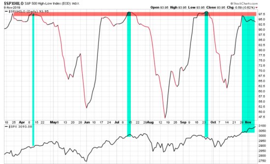
The High-Low Index is a 10-day moving average of Record High Percent, which equals new 52-week highs divided by the sum of new 52-week highs plus new 52-week lows. This breadth indicator shows when new highs outnumber new lows and when new highs are expanding. So, new highs outnumber new lows when the indicator is above 50. We can also say new highs are expanding when the indicator is above 50 and rising, or contracting when it’s falling. Many stocks in the S&P 500 have been reaching new highs and it’s reached the high level that, in my opinion, suggests the market could become exhausted. I say that because after most stocks have already reached a new high, the enthusiasm to buy may have run its course. At this point, we start to monitor for a trend reversal. When individual stocks start to break down, we’ll see them in their individual price trend charts, but also in indicators like the High-Low Index. In the chart below I marked the extreme level in red and the peaks are also colored. Below the indicator, I include the stock index. The signal is not perfect, none are, but we can observe how it tends to interact with the price trend. This is admittedly a small sample size, but you probably see the point.

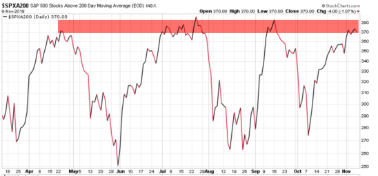
Next is the S&P 500 number of stocks above their 200-day moving average. It is of no use to apply too many indicators if they reach the same conclusion or drive the same signal. The percent of stocks indexes are based on the status of price trends in the stocks, not the number making all-time new highs or lows. My observation here is once again, the number of stocks trending above their 200-day moving average is on the high end right now. This indicator cycles up and down as the stocks trend up and down. It’s at a peak, so we shouldn’t be surprised to see some exhaustion in buying pressure and the price trends stall or turn down at least briefly. Of course, it’s an imperfect indicator, so the stocks can remain in uptrends for months after this high level of participation has been reached. We see an example in the middle of the chart.

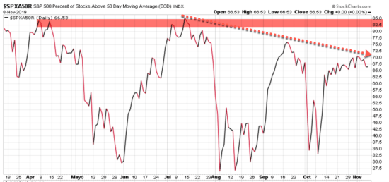
Next, we zoom in to the shorter-term trend, using the 50-day moving average. For no reason whatsoever, I’m also showing his chart as the percent of stocks above their 50-day moving average, rather than the number. Here we see something interesting. As 74% of stocks are in a longer-term uptrend as measured by the 200-day moving average, the percent of stocks in shorter trend uptrends is only 66%. The trend is also down, showing less participation in the shorter-term trend.

My interpretation is the stocks inside the index seem to be getting weaker looking at 50-day trends. It signals about 35% of stocks are presently in 50-day downtrends and we may see that number expand.
It’s also concerning to observe fewer and fewer stocks have participated in uptrends since July.
I could go deeper and look at the breadth of the individual sectors. The short version is, the Financial, Industrial, and Utilities are participating most in uptrends and Energy, Consumer Staples, and Telecom are not.

I enjoy looking at charts for visual observation of what is going on but don’t have to sit around watching these indicators as I have developed systems that alert me when they reached extreme points of interest.
At this level, we may see some enthusiasm exhaustion because once stocks have already trended up, it takes a boost in optimism to continue to drive the momentum.
Looking at the already high levels of sentiment I shared last week in Investor sentiment signals greed is driving stocks as the U.S. stock market reaches short term risk of a pullback, it seems less likely we will see prices move a lot higher from here without a pause or dip. I consider this a higher risk level for stocks.
We’ll see…
Why does any of this matter? read Why we row, not sail.
Mike Shell is the Founder and Chief Investment Officer of Shell Capital Management, LLC, and the portfolio manager of ASYMMETRY® Global Tactical.
Mike Shell and Shell Capital Management, LLC is a registered investment advisor focused on asymmetric risk-reward and absolute return strategies and provides investment advice and portfolio management only to clients with a signed and executed investment management agreement. The observations shared on this website are for general information only and should not be construed as advice to buy or sell any security. Securities reflected are not intended to represent any client holdings or any recommendations made by the firm. Any opinions expressed may change as subsequent conditions change. Do not make any investment decisions based on such information as it is subject to change. Investing involves risk, including the potential loss of principal an investor must be willing to bear. Past performance is no guarantee of future results. All information and data are deemed reliable but is not guaranteed and should be independently verified. The presence of this website on the Internet shall in no direct or indirect way raise an implication that Shell Capital Management, LLC is offering to sell or soliciting to sell advisory services to residents of any state in which the firm is not registered as an investment advisor. The use of this website is subject to its terms and conditions.
You must be logged in to post a comment.