I don’t always share when I observe stock market patterns unfold, but when I do, it’s usually to inform (or aggravate) my friends who don’t understand (or want to understand) technical analysis.
Long before I started developing computerized trading systems based on quantitative signals I learned and applied chart patterns and trend lines to determine if a trend was up, down, or sideways. Said another way, up until 15 years ago I identified the direction of price trends visually looking at a price trend on a chart. I later defined up, down, and sideways with mathematical equations that help to systematize the process of trend identification. I believe my starting out learning trends by hand and visual representation helped me to develop better quantitative trend systems. The two go hand in hand.
We can define the direction of a trend with an equation as simple as momentum. For example, I have 14 different definitions of momentum and equations that define it. A simple one is X period rate of change. If it’s positive, the trend is up. If it’s negative, the trend is down. The factor that determines the trend direction is the time frame. Many academic types like using simple time series momentum methods like this because it’s easy to backtest. Pattern recognition is more difficult, so fewer have developed systems to automate pattern recognition and make it testable.
Chart patterns have historically been more visual. Chartists or technical analysts look at the chart of a price trend to determine if there is a pattern. The pattern we are looking for tells the story of supply and demand. The chart of a price trend shows us what has been going on with the battle between supply and demand from buyers and sellers. We may get an idea of who may be winning the battle and position our capital in that direction. For example, when prices are rising the buyers are in control and when prices all falling selling pressure is dominant. So, pattern recognition is just another form of trend following. Instead of using X-day breakouts, moving average, or channel breakouts, it’s using a pattern that is believed to tell the story of price action. We don’t make decisions based on a pattern, but the underlying asymmetry between buyers and sellers that caused the pattern and the direction of the price trend.
Simple > Complex
To me, it’s a much more simple way to determine if buyers or sellers are in control of the price trend than trying to find a fundamental narrative. There are so many different reasons for buying demand and selling pressure we could never really know why one is dominating the other. The news attempts to explain it, but the truth is, investors could be buying or selling based on perceived fundamentals, trend lines, moving averages, stop losses, buy stops, fear of missing out, fear of losing money, or tax reasons. Rather than trying to figure out what the majority is thinking, the pattern of the price trend tells the net result of all the buying and selling. It fits the idea of simple beats complex and if we simply stay with the direction of the trend we can’t be too wrong for too long. Someone making decisions based on things other than the price trend itself has the potential to stray far away from the reality of the price.
To me, chart patterns are really just a little more elaborate versions of trend lines. A trend line is just a line marking a chart such as how I marked the higher highs and higher lows yesterday in Divergence in the Advance-Decline Line May be Bullish.
I observed today the S&P 500 seems to be forming a head and shoulders bottom pattern. The head and shoulders pattern happens when a market trend is in the process of reversal either from a bullish or bearish trend. There are two kinds of head and shoulders.
- A head and shoulders top is a pattern that forms after an uptrend. After it is completed, it signals a reversal of the trend from up to down.
- A head and shoulders bottom is an inverse of the head and shoulders top. The head and shoulders bottom forms after a downtrend and signals a change of trend from down to up.
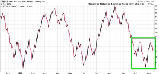
Below is the chart of a theoretical index used to represent an idealized head and shoulders. It includes both head and shoulders tops and head and shoulders bottoms. Stockcharts offers this index for educational purposes to see what idealized head and shoulders look like. You may notice each top and bottom are a little different – they aren’t perfect.
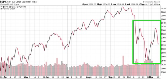
I put the green box around a head and shoulders bottom. You can see why when you look at the S&P 500 stock index chart below.
An inverse head and shoulders pattern is simply a downtrend caused by selling pressure, interrupted by a brief reversal (left shoulder), a selling climax (head), an interruption again (right shoulder), then it would move on to new highs. Moving on to new highs will determine if it is completed as a reversal bottom, or not. To reverse the downtrend, selling pressure must be exhausted as buying demand becomes dominant.
Many patterns like the head and shoulders rely on volume as confirmation, so chartists can make it as complicated as they want, or keep it simple by looking at the pattern. For my purpose, I’m going to keep it simple and say we’ll know if this is indeed a head and shoulders bottom reversal pattern if it follows through on the upside. If it does, we would expect the price trend of this index to at least reach its old highs. If the price doesn’t hold and it doesn’t follow through to the upside, it’s probably going to at least test the prior low again.
Either way, patterns are never completely accurate. It’s probabilistic, never a sure thing. The head and shoulders is simply a pattern formation commonly seen after a downtrend that, if completed, may signal the end of the downtrend and reversal into a new uptrend. It’s based on the visual representation of the battle between supply (selling pressure) and demand (buying interest). For example, when the head and shoulders bottom completes the low point in the (inverse) head, it marks the point when those who wanted to sell have sold. So, the right (inverse) shoulder signals selling has dried up and buyers are taking over. It is completely normal to observe profit-taking after an advance, so the last few days is normal even if this is a reversal up. You can probably see how volume gets involved to confirm the pattern. In the case recently, the volume was high at the lows signaling selling pressure. The volume is declining on the right shoulder. The good news is, the volume didn’t expand on these recent down days.
Let’s see how it all unfolds.
Mike Shell is the Founder and Chief Investment Officer of Shell Capital Management, LLC, and the portfolio manager of ASYMMETRY® Global Tactical.
The observations shared on this website are for general information only and are not specific advice, research, or buy or sell recommendations for any individual. Investing involves risk including the potential loss of principal an investor must be willing to bear. Past performance is no guarantee of future results. The presence of this website on the Internet shall in no direct or indirect way raise an implication that Shell Capital Management, LLC is offering to sell or soliciting to sell advisory services to residents of any state in which the firm is not registered as an investment advisor. Use of this website is subject to its terms and conditions.

Pingback: To Know Where You’re Going, Look at Where You’ve Been: The 2018 Year in Review « ASYMMETRY® Observations