We Could Strangle the VIX!

According to Cboe, the objective of a  strangle is to capture the volatility premium inbedded in option prices, but with less risk than in a straddle, another established premium capture strategy. 

We shared this observation on Asymmetric Investment ReturnsWe Could Strangle the VIX

Global Macro observations and the period of indecision ends with an upside breakout in stocks

In the last observation, The stock market is in a period of indecision that it will break out of I shared:

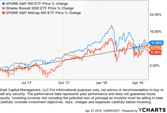
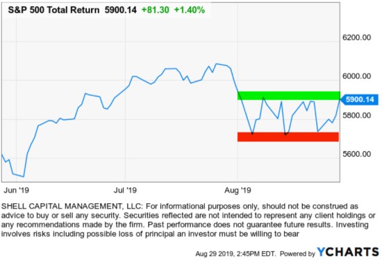
Looking at the price trend of the S&P 500 index over the past six months, today’s 1.4% move so far has the trend tapping the upper end of the range. I encluded this chart last Thursday:

asymmetric risk reward return stocks

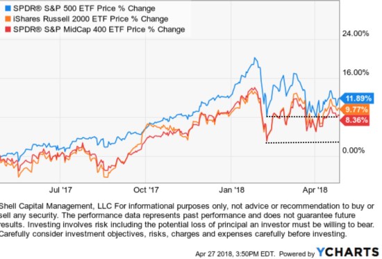
Here we are a week later, and sure enough, this stock index broke out of the range.

stock market spx spy trend

Of course, past performance doesn’t assure future results, so while this upside breakout is positive, it isn’t without some risks and potential headwinds.

I hedged off some of my market risks, based on pattern recognition hedging the price trend could once again fall back to the lower red line. Of course, my exits on these hedges are predefined, as always, so none of the following global macro observations have any real tactical decision-making authority.

When I enter a position, I predetermine at what price I’ll exit if it becomes a loser or overtime, a laggard.

I’m no economist, so I rarely mention any economic data trends as they don’t lead to actionable tactical signals to buy or sell. However, one of the economy’s strongest segments may be showing signs of weakening: job growth, and it seems important enough to mention. On the global macro front, it seems like the market wasn’t concerned about employment data, and for now, it was right. 

In the big picture from a global macro perspective, the probabilities of a recession are trending higher, earnings growth is lagging, and business and manufacturing sentiment are trending lower. These may be necessary issues the U.S. has to deal with to get through the trade war with China.

On the other hand consumer confidence, spending, and employment have been able to withstand difficult conditions and recover. Up until now, the consumer and employment has been the bright spot. From this point forward, any weaknesss in consumer spending, confidence, and employment is a risk. Momentum in job growth has turned down from a cyclical peak this year, so I’m guessing it’s something that may become an issue eventually. When it comes to global macro data, there’s always something to worry about, so I don’t make my decisions with it.

Today’s employment data was a little better than expected, so it’s a driver of today’s stock market upside breakout. As past performance never guarantees the future, it may be different next time.

Until then, the stock market has indeed broken out of its coil and is sprung up.


Mike Shell is the Founder and Chief Investment Officer of Shell Capital Management, LLC, and the portfolio manager of ASYMMETRY® Global Tactical.

Mike Shell and Shell Capital Management, LLC is a registered investment advisor focused on asymmetric risk-reward and absolute return strategies and provides investment advice and portfolio management only to clients with a signed and executed investment management agreement. The observations shared on this website are for general information only and should not be construed as advice to buy or sell any security. Securities reflected are not intended to represent any client holdings or any recommendations made by the firm. Any opinions expressed may change as subsequent conditions change.  Do not make any investment decisions based on such information as it is subject to change. Investing involves risk, including the potential loss of principal an investor must be willing to bear. Past performance is no guarantee of future results. All information and data is deemed reliable, but is not guaranteed and should be independently verified. The presence of this website on the Internet shall in no direct or indirect way raise an implication that Shell Capital Management, LLC is offering to sell or soliciting to sell advisory services to residents of any state in which the firm is not registered as an investment advisor. Use of this website is subject to its terms and conditions.


Earnings season is tricky for momentum growth stocks

Momentum stocks are stocks that show high upside momentum in their price trend. Momentum stocks are trending not only regarding their absolute price gains but also relative strength vs. other stocks or the stock market index.

Momentum stocks are usually high growth stocks. Since momentum stocks are the strongest trending stocks, their trends are often driven by growth in sales and earnings. Growth stocks are companies that are growing earnings at a rate significantly above average. Growth stocks have high increases in earnings per share quarter over quarter, year over year, and may not pay dividends since these companies usually reinvest their strong earnings to accelerate growth.

Now that we have defined what I mean by “momentum stocks,” we can take a look at some examples of momentum stocks and their characteristics like how their prices trend.

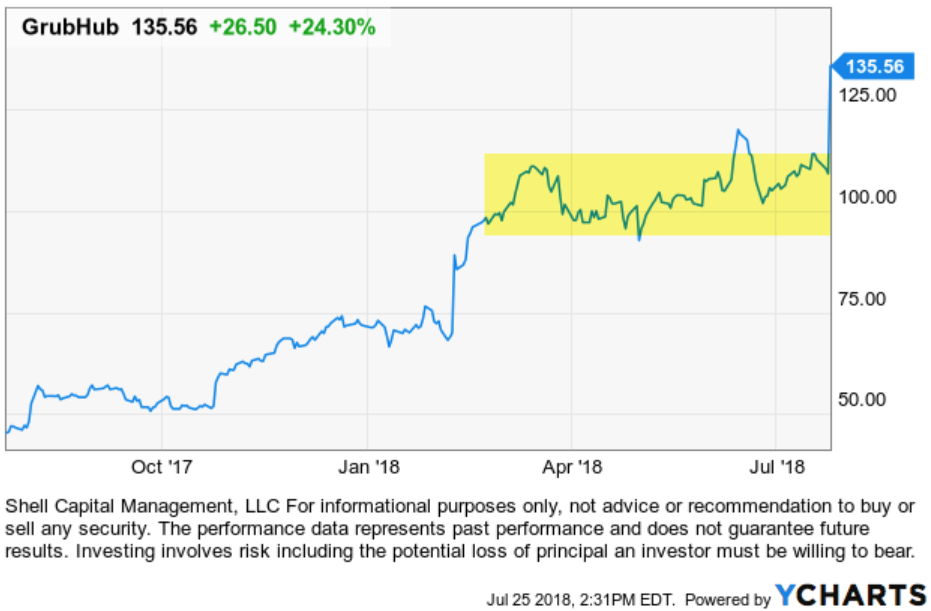
Grubhub Inc. ($GRUB) is an online and mobile food-ordering company that connects diners with local restaurants. GrubHub is a great example today of a high momentum growth stock.  GrubHub stock has gained 24% today after smashing Wall Street’s expectations. Earnings grew 92% to 50 cents a share, marking the fifth quarter in a row of accelerating EPS growth. Revenue soared 51% to $239.7 million, a quarterly best.
Grubhub $GRUB GRUB

Before today, GrubHub stock was in a positive trend that developed a flat base since April (highlighted on the chart). GRUB had already gained 60% year to date, but after such as explosive uptrend in momentum, it trended sideways for a while.

It is earnings season, which can be tricky for the highest momentum stocks. Once a stock has already made a big move, it could already have a lot of good news expectations priced in. That concerns some momentum stock traders. In fact, I know some momentum stock traders who exit their stocks before their quarterly earnings announcements. If they had exited GrubHub, they would have missed today’s continuation of its momentum. However, they would avoid the downside of those that trend in the other direction.

I’ve been trading momentum stocks for over two decades. Over the years I’ve observed different regimes of how they act regarding trend strength and volatility. There are periods of volatility expansion and contraction and other periods when momentum is much stronger.

Volatility is how quickly and how far the price spreads out. When price trends are volatile, it’s harder to stick with them because they can move against us. We like upside volatility, but smart investors are loss averse enough to dislike downside volatility that leads to drawdowns. To understand why the smart money is loss averse, read: “Asymmetry of Loss: Why Manage Risk?“.

Strong upward trending stocks are sometimes accompanied by volatility. That’s to be expected because momentum is a kind of volatility expansion. Upward momentum, the kind we like, is an upward expansion in the range of the price – volatility.

That’s good vol.

But, strong trending momentum stocks necessarily may include some bad volatility, too. Bad volatility is the kind investors don’t like – it’s when the price drops, especially if it’s a sharp decline.

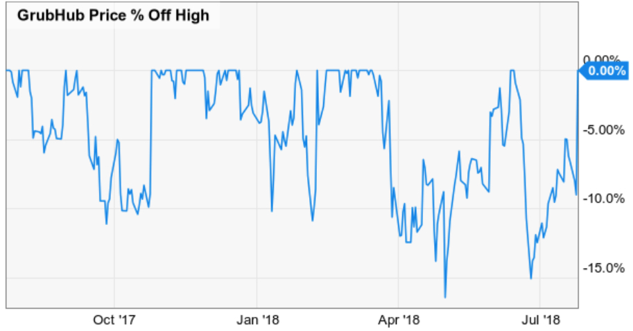
I mentioned GrubHub had gained 60% YTD. I like to point out, observe, and understand asymmetries. The asymmetry is the good and the bad, the positive and the negative, I prefer to skew them positively. What I call the Asymmetry® Ratio is a chart of the upside total return vs. the chart of the downside % off high. To achieve the gain for GrubHub, investors would have had to endure its price declines to get it. For GrubHub, the stock has declined -10% to -15% many times over the past year. It has spent much of the time off its high. To have realized all of the gains, investors had to be willing to experience the drawdowns.
grubhub stock GRUB

I point this out because yesterday I wrote “Asymmetry of Loss: Why Manage Risk?” where I discussed the mathematical basis behind the need for me to actively manage the downside risk. To achieve the significant gain, we often have to endure at least some of the drawdowns along the way. The trick is how much, and for me, that depends on many system factors.

Earnings season, when companies are reporting their quarterly earnings, is especially tricky for high momentum stocks because stocks that may be “priced for perfection” may be even more volatile than normal. Accelerating profit growth is attractive to investment managers and institutional investors because increasing profit growth means a company is doing something right and delivering exceptional value to customers. I’m more focused on the direction of the price trend – I like positive momentum. But, earnings are a driver of the price trend for stocks.

Earnings can trend in the other direction, too, or things can happen to cause concern. This information is released in quarterly reports.

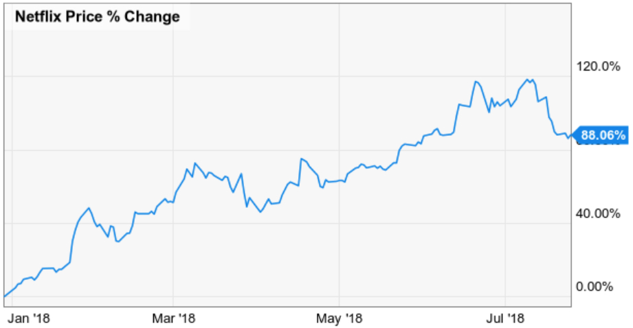
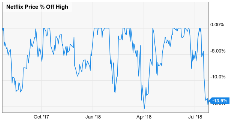
Another example of a momentum stock is NetFlix. By my measures, GrubHub is a leading stock in its sector and NetFlix (NFLX) is the leader in its industry group, too, based on its positive momentum and earnings growth. As we see in the chart below, NFLX has gained 88% year to date. That’s astonishing momentum considering the broad stock market measured by the S&P 500 has gained around 5%, and its Consumer Services Sector ETF has gained 11%.
NetFlix NFLX $NFLX

However, NetFlix stock regularly declines as much as -15% as a regular part of its trend. It has fallen over -10% five times in the past year on its way to making huge gains. The latest reason for the decline was information that was released during its quarterly earnings announcement. The stock dropped sharply afterward.
netflix stock risk downside loss

But, as we see in the chart, it’s still within its normal decline that has happened five times the past year.

While some of my other momentum stock trader friends may exit their stocks during the earnings season, I instead focus more on the price trend itself. I predefine my risk in every position, so I determine how much I’ll allow a stock to trend to the downside before I exit. When a stock trends down too far, it’s no longer in a positive trend with the side of momentum we want. To cut losses short, I exit before the damage gets too large.

How much is too much? 

A hint is in the above charts.

If we want to experience a positive trend of a momentum stock, we necessarily have to give it enough room to let it do what it does. When it trends beyond that, it’s time to exit and move on. We can always re-enter it again it if trends back to the right side.

Sure, earnings season can be tricky, but for me, it’s designed into my system. I’m looking for positive Asymmetry® – an asymmetric risk/reward. What we’ve seen above are stocks that may decline as much as -15% as a normal part of their trend when they fall, but have gained over 50% over the same period.

You can probably see how I may be able to create a potentially positive asymmetric risk/reward payoff from such a trend.


Mike Shell is the Founder, and Chief Investment Officer of Shell Capital Management, LLC, and the portfolio manager of ASYMMETRY® Managed Portfolios and ASYMMETRY® Global Tactical.

You can follow ASYMMETRY® Observations by click on on “Get Updates by Email” on the top right or follow us on Twitter.

The observations shared in this material are for general information only and are not intended to provide specific advice or recommendations for any individual. Investing involves risk including the potential loss of principal an investor must be willing to bear. Past performance is no guarantee of future results.


Global Market Trends

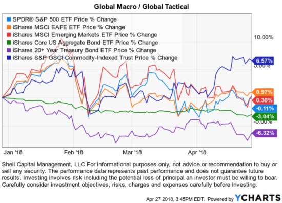
Looking at broad indexes for global macro trends, global stocks are flat for the year, bonds are down as much as 6%, commodities are recently trending up.

At this point, U.S. stocks continue to look like a normal “correction” within ongoing higher highs and higher lows (a bull market). In this case, a correction is just a countertrend of “mean reversion” that has “corrected” the prior upside overreaction.

What would change the trend? changing from a normal “correction” within ongoing higher highs and higher lows (a bull market) to lower lows and lower highs. In that scenario, it would be a change in the dominant trend.

Only time will tell how it all plays out.


Mike Shell is the founder and Chief Investment Officer of Shell Capital Management, LLC, and the portfolio manager of ASYMMETRY® Global Tactical.

The is no guarantee that any strategy will meet its objective.  Past performance is no guarantee of future results. The observations shared are for general information only and are not intended to provide specific advice or recommendations for any individual.

What’s going to happen next? continued

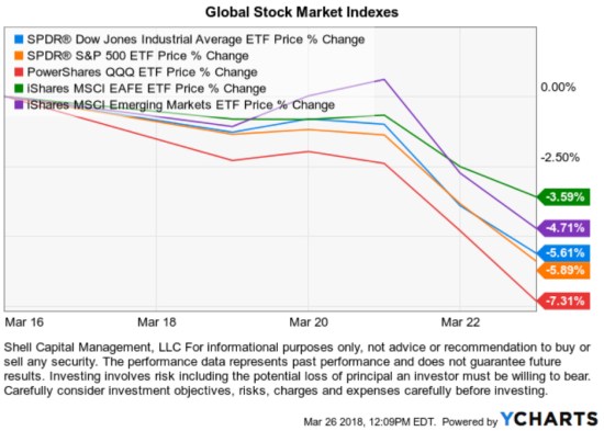
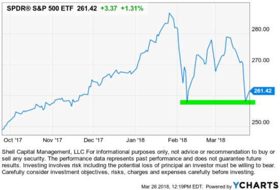
The stock market is getting a lot of attention this past week since the global stock market indexes were down as much as -4% for the MSCI EAFE Developed Countries index to the most significant decliner in the U.S. was the NASDAQ (represented below by PowerShares QQQ), which declined over -7%.

I said in What’s going to happen next? on Friday, the most important factor is the stock index is near its prior low in February when it declined -10% sharply. To reemphasize the rest of what I said:

“By my measures, it’s also reached the point of short-term oversold and at the lower price range that I consider is within a “normal” correction.

I know many traders and investors were expecting to see a retest of that low and now they have it. So, I expect to see buying interest next week. If not, look out below… who knows how low it will need to go to attract buying demand.”

As expected, so far today stocks have indeed found some buying demand at the prior low as we see in the chart below. As I suggested, this second low could bring in buyers who were waiting for this retest of the low in February.

Only time will tell how much buying enthusiasm we see from here. It could be enough to eventually drive prices to new highs, and this -10% correction forms a “W” pattern and the correction quickly forgotten.

Or, the buying interest we see now may not be enough to continue a sustainable upward trend.

Ultimately, the price trend of our individual positions is the final arbiter. My decisions are made based on what the price trend is actually doing.

But, I have other quantitative and technical measures that can be a useful guide to update expectations as trends unfold. I look at these trends because I enjoy it and share my observations, so you get a glimpse of how I see trends unfold over time.

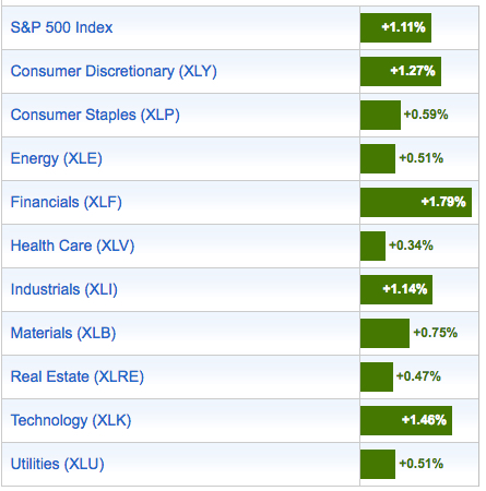
This could change any moment, but at this point, I see today’s gains are relatively broad as all the U.S. sectors are positive with Financials, Consumer Discretion, and Technology leading the way. Past performance does not guarantee future results, but Sector strength in the more cyclical Financials, Consumer Discretionary, and Technology leading the way is a good sign.

Getting more technical and quantitative,  I want to update the breadth indicators I shared at the lows on February 9th in Stock Market Analysis of the S&P 500 

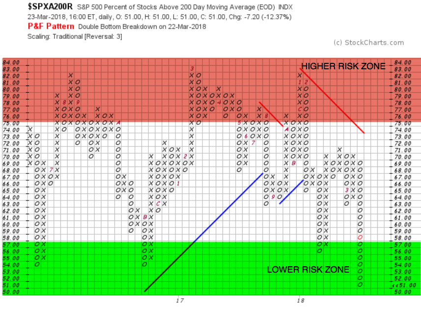
At the lows, in February I pointed out the % of stocks in the S&P 500 had shifted from what I consider the “Higher Risk Zone” to the “Lower Risk Zone.” Though that could have been the early stage of a bear market because it could have got much worse, but those stocks instead reversed up from that point. Last weeks downtrend pushed them even deeper in what I consider the “Lower Risk Zone.”

S&P 500 STOCKS BULLISH PERCENT ABOVE MOVING AVERAGE

As we see in the chart above, half of the 500 stocks in the S&P 500 stock index are trending below their own 200 day moving average and half are trending above it. I used the Point & Figure method to clearly express the % of stocks in the S&P 500 that are above their 200 day moving average.

If you think about how long 200 trading days is, it’s about 10 months. If a price is trading above its moving average, it’s considered to be in a positive trend, if it’s trending below the average it is trending down. My trend signals are generated from more robust proprietary systems, so I do not trade using this moving average, but it can be a simple guide to illustrate a trend.

To be precise, at the February low 56% of the 500 stocks were trading in a positive trend after they had reached what I consider a “Higher Risk Zone” in January when most of the stocks, 82%, were in a positive trend. After many stocks trended down, they reversed up to the point that 71% were above their 200-day average during the countertrend. Now that prices have fallen again, even more stocks are in a downtrend.

It may seem a contradiction for this to be potentially bullish because it shows half the stocks have been trending down (and it is), but I’ve been observing this indicator for two decades and what I see in the most simple terms is:

  • When most stocks had already trended up as they had in January when 82% were in positive trends, we are likely to see a countertrend and mean reversion at some point.
  • When most stocks have already trended down to negative trends, we are likely to see a countertrend and mean reversion.

Guess what mean reversion is?

About halfway…

For those who aren’t as mathematically inclined, that would be the 50-yard line. The 50% on the chart above…

Now, keep in mind, it’s only at 51% down from 82% in January. It could go to 5 or 10%, which would take a significant decline from here. But, so far, the ball is on the 50. Which end zone it reaches next will depend on who is stronger; the buyers or the sellers.

If you want more detail and to better understand where I am coming from, revisit what I wrote in February: Stock Market Analysis of the S&P 500.

Risk management is the common characteristic among all the best traders/investors who have lasted over the many significant up and down market cycles of the past decades. I decided I was going to be one of them over two decades ago. No matter how you choose what and when to buy, it is essential to control the size of your potential loss. If you want to learn what I mean by that, read the previous ten or twenty observations I’ve shared here. This is not individual investment advice. The only individuals who get our advice are clients who have an investment management agreement with us. If you have any questions, contact us.

Mike Shell is the Founder and Chief Investment Officer of Shell Capital Management, LLC, and the portfolio manager of ASYMMETRY® Global Tactical.

You can follow ASYMMETRY® Observations by click on on “Get Updates by Email” on the top right or follow us on Twitter.

The is no guarantee that any strategy will meet its objective.  Past performance is no guarantee of future results. The observations shared are for general information only and are not intended to provide specific advice or recommendations for any individual.


In remembrance of euphoria: Whatever happened to Stuart and Mr. P?

I have recently found myself reminiscing about the late 1990’s – specifically the grand euphoric year of 1999. If you aren’t sure why then maybe you aren’t paying attention. Sometimes not paying attention is a good thing if it prevents you from following a herd off a cliff.

The four most expensive words in the English language are “this time it’s different.” – John Templeton

Lately, I’ve been reminiscing about the tech stock bubble, the .com’s, and how the Nasdaq QQQ replaced the Dow Jones Industrial Average as the favorite index by 1999. Then there were all the infamous statements like “you don’t understand the New Economy”. We’ve been talking about the funny commercials from the baby trader to the college-age guy helping the mature executive start trading online, to “Be Bullish”.

Do you remember Stuart and Mr. P? Back in 1999, there were traditional “stockbrokers” who were registered with a brokerage firm, who bought and sold stocks, bonds, and options for individual and institutional clients. If you were a stockbroker back then, like I was, you probably remember it well. Online trading was the beginning of the end for the traditional “stockbroker” firms earning a $200 commission to buy or sell 100 shares. The great thing about the evolution of online trading is it lowered trading costs dramatically. For someone like me who wanted to be a tactical money manager anyway, that was a great thing. I embraced it and went on to start my investment management company. But the point of this observation is the investor sentiment in 1999. The video below is amazing to watch 20 years later. But what fascinates me the most is how it reminds me of today; different subjects, same sentiment.

Watch:


That may remind you of some of the things we hear today.

Those type of commercials flooded the financial news and evening news channels in 1999. To be sure, below is a WSJ article printed about the “Let’s Light This Candle” ad on December 7, 1999. I’ll tell ya what… that’s about as close to the top as you can get.

So, I wondered, what happened to Stuart and Mr. P? 

Stuart was helping Mr. P buy Kmart stock online. Kmart was then one of America’s leading discount retailers. The Kmart Corporation was the second largest U.S. discount retailer and major competitor to Walmart. Kmart filed for Chapter 11 bankruptcy protection in January 2002. Just two years after Stuart helped Mr. P buy shares online it filed for the largest ever retail bankruptcyKmart was later bought by Sears, which is now a failing company. At least Mr. P was wise enough to only buy 100 shares, young Stuart wanted him to buy 500 shares! They had no position size method to determine how much to buy based on risk, which would include a predefined exit. It is unlikely Mr. P had a predefined exit in place to exit the stock to cut the loss short. During that time, investors were only thinking about what to buy. They rarely considered how and when to exit a stock with a small loss to avoid a larger loss. After such a strong bull market, who is thinking about the risk of loss?

For those of us who remember, in the late 1990’s most investors weren’t just buying the largest retailers – they were buying technology. In hindsight, that period is now referred to as the “tech boom” or “tech bubble”. That’s because almost everyone wanted to buy tech stocks. Literally, even the most conservative seniors were cashing out bank CD’s to buy tech stock.  And… I’m not even going to get into the .com stocks, most of which no longer exist from that time.

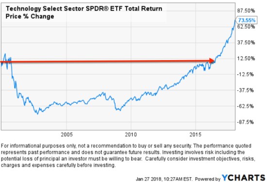
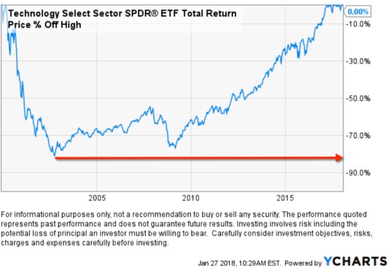
Whether you remember the trend as my friends and I do or not, we can use historical price charts to see what happened. Below is the Technology Select Sector SPDR® ETF  since its inception 12/16/1998 to today. I’m starting with the full history to see the initial gain, before the waterfall decline. The Technology Select Sector SPDR® Fund seeks to:

“Provide precise exposure to companies from technology hardware, storage, and peripherals; software; diversified telecommunication services; communications equipment; semiconductors and semiconductor equipment; internet software and services; IT services; electronic equipment, instruments, and components; and wireless telecommunication services.”

Those were the most popular sectors, aside from the actual Internet stocks.

Below is what happened from December 9, 1999, when WSJ printed the article about the ad because it was so interesting and popular, to now. After nearly 20 years an investor buying the diversified tech sector would have just recently realized a profit, assuming they held on for 19 years.

Here is what that -80% drawdown looked like that lasted 19 years.

“Those who cannot remember the past are condemned to repeat it. “

George Santayana


This is a kickoff of a series of articles on this topic I have in queue on current global market conditions. Stay tuned…

Mike Shell is the founder of Shell Capital Management, LLC, a registered investment manager and portfolio manager of ASYMMETRY® Global Tactical.

March 9th is the Bull Market’s 8-Year Anniversary

I observed many headlines pointing out that March 9th is the 8th anniversary of the current bull market in U.S. stocks.

The rising trend in stocks is becoming one of the longest on record. It is the second longest, ever.

Looking at it another way, March 9, 2009 was the point that stock indexes had fallen over -50% from their prior highs.

Since most of the discussion focuses on the upside over the past 8 years, I’ll instead share the other side so we remember why March 9, 2009 matters.

 ‘Those who cannot remember the past are condemned to repeat it.’

– George Santayana

When investors speak of the last bear market they mostly call it “2008” or “o8”.

However, the end of the last bear market was actually March 9, 2009 and the beginning was October 2007.

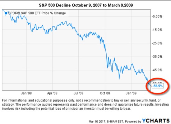
Below is a chart of the S&P 500 stock index from October 9, 2007 to March 9, 2009. The price decline was -56%.

No one knew that March 9, 2009 was the lowest it would go. It could have gotten much worse.

Talking only about the gains since the low leaves out the full story.

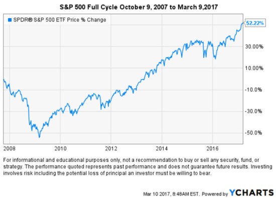
When we research price trends, we must necessarily consider the full market cycle of both rising and falling trends. For example, below is the price trend since the peak nearly 10 years ago on October 9, 2007.  Even after such a large gain, the Risk-to-Reward Ratio isn’t so good if you had to hold through the big loss to achieve it. That is, investors had to experience -56% on the downside for how much gain?

It isn’t the upside that causes so much trouble, it’s the downside.

That’s why we must manage risk to increase and decrease exposure to the possibility of gain and loss.

What is the VIX Suggesting about Investor Complacency and Future Volatility?

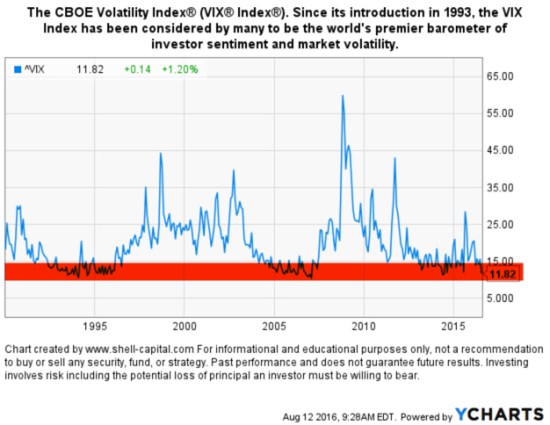
The CBOE Volatility Index® (VIX® Index®) is a key measure of market expectations of near-term volatility conveyed by S&P 500 stock index option prices. Since its introduction in 1993, theVIX® Index has been considered by many to be the world’s premier barometer of investor sentiment and market volatility.

The VIX® historically trends between a long-term range. An extreme level of the VIX® will likely reverse … eventually. The chart below we show the price level of the VIX® since its inception in 1993. We can visually observe its long-term average is around 20, but (I highlighted in red) its low range is around 12 and it has historically spiked as high as 25 or 60.

VIX Since its introduction in 1993, the VIX Index has been considered by many to be the world's premier barometer of investor sentiment and market volatility

The CBOE Volatility Index®  is an index that cannot be invested in directly, however, there are futures, options, and ETN’s that attempt to track it. Its level is commonly used as a gauge of investor sentiment. An extremely high level of the VIX® means that options traders are paying high premiums for options because they are fearful of future volatility and maybe lower stock prices. Options traders and investors are buying options to hedge their portfolios and their demand drives up the “insurance premium”.

Just the opposite is the driver of an extremely low level of the VIX® like we see today. It means that options traders are paying low premiums for options because they are not so fearful of future volatility and lower stock prices. They are unlikely buying options for hedging and their low demand drives down the “insurance premium”. We could also say “investors are complacent” since they aren’t expecting future volatility to increase or be higher.

These levels of complacency often precede falling stock markets and then rising volatility. When stock prices fall, volatility spikes up as investors suddenly react to their losses in value. Or, in the short term volatility could trend even lower and reach an even more extreme low level for a while. But the VIX® isn’t an index that trends for many years in one direction. Instead, as we see in the above chart, the VIX® oscillates between a low and high range so can expect it to eventually trend the other way.

We shouldn’t be surprised to see at least some short-term trend reversals; maybe stocks trend down and the VIX® trends up…

We’ll see…

There is much more to the VIX® , such as it’s term structure, but the scope of this article is to point out its extreme low level could be an indication of future change.

If you are like-minded, believe what we believe, and want investment management, contact us. This is not investment advice. If you need individualized advice please contact us  or your advisor. Please see Terms and Conditions for additional disclosures.

The markets always go back up?

Someone recently said: “the markets always go back up!”.

I replied: “Tell that to the Japanese”.

The chart below speaks for itself. Japan was the leading country up until 1990. The NIKKEI 225, the Japanese stock market index, has been in a “Secular Bear Market” for about 25 years now. I believe all markets require active risk management. I suggest avoiding any strategy that requires a market “always go back up” because it is possible that it may not. Or, it may not in your lifetime

Long Term Japan Stock Market Index NIKKEI

Source: http://www.tradingeconomics.com/japan/stock-market

PAST PERFORMANCE IS NO GUARANTEE OF FUTURE RESULTS. Investing involves risk a client must be willing to bear.

Actively Managing Investment Risk

The global market declines in early August offered a fine example of the kind of conditions that cause me to exit my long positions and end up in cash. For me, this is a normal part of my process. I predefine my risk in each position, so I know my risk across the portfolio. For example, I know at what point I’ll sell each position if it falls below a certain point in which I would consider it a negative trend. Since I know my exit in advance for each position, I knew in advance how much I would lose in the portfolio if all of those exits were reached due to market price movements trending against me. That allowed me to control how much my portfolio would lose from its prior peak by limiting it to my predefined amount. I have to take ‘some’ risk in order to have a chance for profits. If I took no risk at all, there could be no profit. The key for me is to take my risk when the reward to risk is asymmetric. That is, when the probability for a gain is much higher than the probability for a loss.

The concept seems simple, but actually doing it isn’t. All of it is probabilistic, never a sure thing.  For example, prices sometimes move beyond the exit point, so a risk control system has to account for that possibility.  More importantly, the portfolio manager has to be able to actually do it. I am a trigger puller. To see the results of over 10 years of my actually doing this, you can visit ASYMMETRY® Managed Accounts.


Gold Isn’t Always A Hedge or Safe Haven: Gold Stock Trends Have Been Even Worse

For several years we often heard investors suggesting to “buy gold”. We could throw in Silver here, too. They provide many theories about how gold bullion or gold stocks are a “safe haven”. I’ve written about the same assumption in Why Dividend Stocks are Not Always a Safe Haven.

In fact, the Market Vectors Gold Miners ETF website specifically says about the gold stock sector:

“A sector that has historically provided a hedge against extreme volatility in the general financial markets”.

Source: http://www.vaneck.com/gdx/

When investors have expectations about an outcome, or expect some cause and effect relationship, they expose themselves in the possibility of a loss trap. I will suggest the only true “safe haven” is cash. 

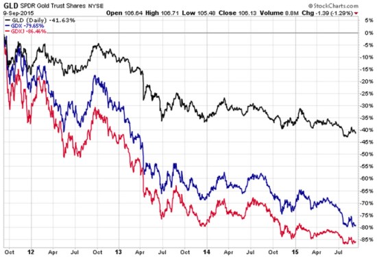
Below is a 4 year chart of two gold stock ETFs relative to the Gold ETF. First, let’s examine the index ETFs we are looking at. Of course, the nice thing about ETFs in general is they are liquid (traded like a stock) and transparent (we know what they hold).

GLD: SPDR Gold “Shares offer investors an innovative, relatively cost efficient and secure way to access the gold market. SPDR Gold Shares are intended to offer investors a means of participating in the gold bullion market without the necessity of taking physical delivery of gold, and to buy and sell that interest through the trading of a security on a regulated stock exchange.”

GDX: Market Vectors Gold Miners ETF: “The investment seeks to replicate as closely as possible, before fees and expenses, the price and yield performance of the NYSE Arca Gold Miners Index. The fund normally invests at least 80% of its total assets in securities that comprise the Gold Miners Index. The Gold Miners Index is a modified market-capitalization weighted index primarily comprised of publicly traded companies involved in the mining for gold and silver.”

GDXJ: Market Vectors Junior Gold Miners ETF seeks to replicate as closely as possible, before fees and expenses, the price and yield performance of the Market Vectors Global Junior Gold Miners Index. The Index is intended to track the overall performance of the gold mining industry, which may include micro- and small capitalization companies.

Gold stocks vs Gold

Source: Shell Capital Management, LLC created with http://www.stockcharts.com

Clearly, gold has not been a “safe haven” or “provided a hedge against extreme volatility in the general financial markets”. It has instead demonstrated its own extreme volatility within an extreme downward price trend.

Further, gold mining stocks have significantly lagged the gold bullion index itself.

These ETFs have allowed for the trading of gold and gold stocks, SPDR Gold explains it well:

“SPDR Gold Shares represent fractional, undivided beneficial ownership interests in the Trust, the sole assets of which are gold bullion, and, from time to time, cash. SPDR Gold Shares are intended to lower a large number of the barriers preventing investors from using gold as an asset allocation and trading tool. These barriers have included the logistics of buying, storing and insuring gold.”

However, this is a reminder that markets do not always play out as expected. The expectation of a “safe haven” or “hedge against extreme volatility” is not a sure thing. Markets may end up much worst that you imagined they could.  As many global and U.S. markets have been declining, you can probably see why I think it’s important to manage, direct, limit, and control exposure to loss. Though, not everyone does it well. It isn’t a sure thing…

______

For informational and educational purposes only, not a recommendation to buy or sell and security, fund, or strategy. Past performance and does not guarantee future results. Please click the links provide for specific risk information about the ETFs mentioned. Please visit this link for important disclosures, terms, and conditions.

The Trend of the U.S. Stock Market and Sectors Year-to-Date

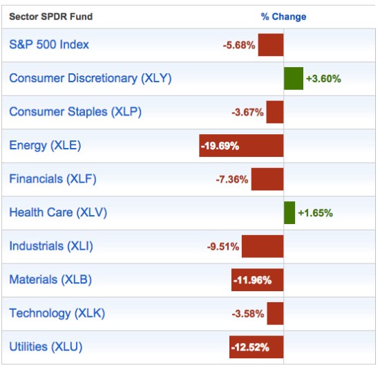
As of today, the below table illustrates the year-to-date gains and losses for the S&P 500® Index (SPY) and the 9 Sector SPDRs in the S&P 500®. We observe the current and historical performance to see how the U.S. Sectors match up against the S&P 500 Index.

So far, the S&P 500 Index is down -5.68% year-to-date. Only the Consumer Discretionary (XLY) and Health Care (XLV) are barely positive for the year. Energy (XLE) has entered into its own bear market. Materials (XLB) and Utilities (XLU) are in double-digit declines.

year to date S&P 500 and sector returns 2015-09-10_11-31-05

Source: http://www.sectorspdr.com/sectorspdr/tools/sector-tracker

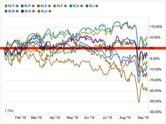
The trouble with a table like the one above is it fails to show us the path the return streams took along the way. To see that. below we observe the actual price trends of each sector. Not necessarily to point out any individual trend, but we can clearly see Energy (XLE) has been a bear market. I also drew a red line marking the 0% year-to-date so point out that much of this year the sectors have oscillated above and below it and most are well below it now.

year to date stock market sector trends 2015-09-10_11-32-40

Source: http://www.sectorspdr.com/sectorspdr/tools/sector-tracker

Speaking of directional price trends is always in the past, never the future. There are no future trends, today. We can only observe past trends. In fact, a trend is today or some time in the past vs. some other time in the past. In this case, we are looking at today vs. the beginning of 2015. It’s an arbitrary time frame, but still interesting to stop and look to see what is going on.

As many global and U.S. markets have been declining, you can probably see why I think it’s important to manage, direct, limit, and control exposure to loss. Though, not everyone does it well as it isn’t a sure thing…

Bonds Aren’t Providing a Crutch for Stock Market Losses

In Allocation to Stocks and Bonds is Unlikely to Give us What We Want and What You Need to Know About Long Term Bond Trends I suggested that bonds may not provide a crutch in the next bear market.

It seems we are already observing that. So far this year, bond indexes have declined along with other markets like stocks and commodities.

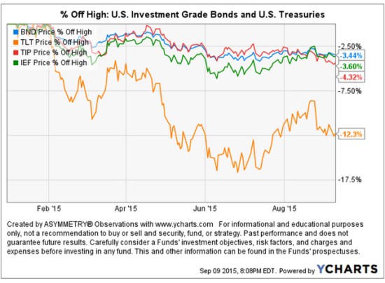
Below is a chart of 4 different bond index ETFs year-to-date. I use actual ETFs since they are tradable and present real-world price trends (though none of this is a suggestion to buy or sell). I drew the chart as “% off high” to show the drawdown – how much they have declined off their previous highest price.

Bond ETF market returns 2015

The long-term U.S. Treasury bonds are down the most, but even the others have declined over -3%. That’s certainly not a large loss over a 9 month period, but bond investors typically expect safety and stability. Asset allocation investors expect bonds to help offset their losses in other market allocations like stocks, commodities, or REITs.

Keep in mind: the Fed hasn’t even started to increase interest rates yet. If you are an asset allocation investor, you have to consider:

What may happen if interest rates do start to increase sharply and that drives down bond prices?

What if both stocks and bonds fall in the next bear market?

Bonds haven’t provided much of a crutch this year for fixed asset allocators…

I believe world markets require active risk management and defining directional trends. For me, that means predefining my risk in advance in each position and across the portfolio.

The person who says it cannot be done should not interrupt the person doing it.

– Chinese Proverb

The person who says it cannot be done Should not interupt the person doing it

Source: https://www.pinterest.com/explore/chinese-proverbs/

Warren Buffett’s Berkshire Hathaway Hasn’t Managed Downside Risk

 shares an interesting observation in Fortune ” Warren Buffett’s Berkshire lost $11 billion in market selloff“. He points out that Buffett’s Berkshire Hathaway (BRK.A or BRK.B) is tracking the U.S. stock indexes on the downside. He says:

“…during the worst of the downturn from mid-July to the end of August. That represents a 10.3% drop. The good news for Buffett: His, and his investment team’s, performance was likely not much worse than everyone else’s. During the same time, the S&P 500 fell 10.1%.”

Comparing performance to others or “benchmark” indexes is a what I call a “relative return” objective. Comparing performance vs. our own risk tolerance and total return objectives is an “absolute return” objective. The two are very different as what I call “relativity” is more concerned about how others are doing comparatively, while “absolute” is more focused on our own situation.

The article also said:

“If you are invested in an index fund, you may have outperformed the Oracle of Omaha, slightly.”

Let’s see just how true that is. Since the topic is how much Warren Buffett’s Berkshire Hathaway has lost during this stock market decline, I’ll share a closer look.

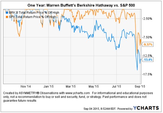
A picture speaks a thousand words. As it turns out, the guru stock picker is actually down -13.4% off it’s high looking back over the past year. That’s about -4% worse than the SPDR® S&P 500® ETF (SPY) that seeks to provide investment results that, before expenses, correspond generally to the price and yield performance of the S&P 500® Index. I am using actual securities here to present an investable comparison: SPY vs. BRK.B.

Warren Buffett's Berkshire Lost compared to stock index

As we observe in the chart, Warren Buffett’s Berkshire Hathaway began to decline off it’s high at the end of last year while the S&P 500® Index started last month. I have observed more and more stocks declining over the past several months. At the same time, more and more International markets have entered into their own bear markets. So, it is no surprise to see a focused stock portfolio diverge from a broader stock index.  points out some of the individual stock positions in ” Warren Buffett’s Berkshire lost $11 billion in market selloff

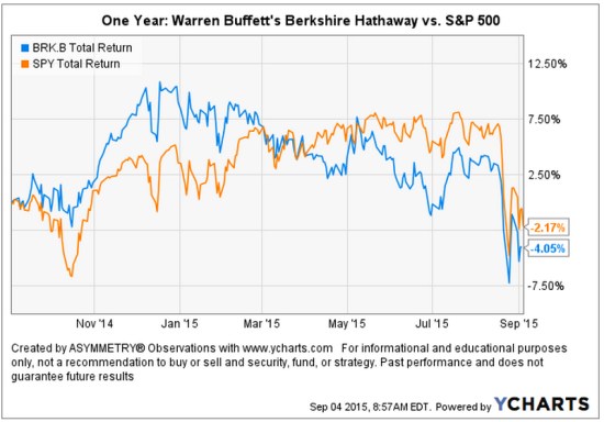
Below is the total return of the two over the past year. We can see the high in Warren Buffett’s Berkshire Hathaway BRK.B was in December 2014.

Warren Buffett's Berkshire Lost compared to stock index total return

I believe world markets require active risk management and defining directional trends. For me, that means predefining my risk in advance in each position and across the portfolio.

Chart source: http://www.ycharts.com

Read the full Fortune article here: ” Warren Buffett’s Berkshire lost $11 billion in market selloff

Stock Market Decline is Broad

We typically expect to see small company stocks decline first and decline the most. The theory is that smaller companies, especially micro companies, are more risky so their value may disappear faster.  Below, we view the recent price trends of four market capitalization indexes: micro, small, mid, and mega. We’ll use the following index ETFs.

Vanguard ETFs small mid large micro cap

Since we are focused on the downside move, we’ll only observe the % off high chart. This shows what percentage the index ETF had declined off its recent highest price (the drawdown). We’ll also observe different look-back periods.

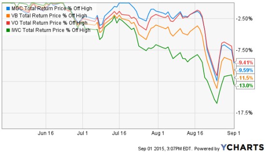
We first look back 3 months, which captures the full extent of the biggest loser: as expected, the micro cap index. The iShares Micro-Cap ETF (IWC: Green Line) seeks to track the investment results of an index composed of micro-capitalization U.S. equities. Over the past 3 months (or anytime frame we look) it is -13% below its prior high. The second largest decline is indeed the small cap index. The Vanguard Small-Cap ETF (VB: Orange Line) seeks to track the performance of the CRSP US Small Cap Index, which measures the investment return of small-capitalization stocks. The small cap index has declined -11.5%. The Vanguard Mega Cap ETF (MGC) seeks to track the performance of a benchmark index that measures the investment return of the largest-capitalization stocks in the United States and has declined -9.65%. The Vanguard Mid-Cap ETF (VO) seeks to track the performance of a benchmark index that measures the investment return of mid-capitalization stocks and has declined -9.41%. So, the smaller stocks have declined a little more than larger stocks.

Small and Micro caps lead down

Source: Shell Capital Management, LLC created with http://www.ycharts.com

Many active or tactical strategies may shift from smaller to large company stocks, hoping they don’t fall as much. For example, in a declining market relative strength strategies would rotate from those that declined the most to those that didn’t. The trouble with that is they may still end up losing capital and may end up positioned in the laggards long after a low is reached. They do that even though we may often observe the smallest company stocks rebound the most off a low. Such a strategy is focused on “relative returns” rather than “absolute returns“. An absolute return strategy will instead exit falling trends early in the decline with the intention of avoiding more loss. We call that “trend following” which has the objective of “cutting your losses short”. Some trend followers may allow more losses than others. You can probably see how there is a big difference between relative strength (focusing on relative trends and relative returns)  and trend following (focusing on actual price trends and absolute returns).

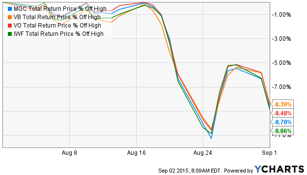
So, what if we look at the these stock market indexes over just the past month instead of the three months above? The losses are the same and they are very correlated. So much for diversification. Diversification across many different stocks, even difference sizes, doesn’t seem to help in declining markets on a short-term basis. These indexes combined represent thousands of stocks; micro, small, medium, and large. All of them declined over -11%, rebounded together, and are trending down together again.

stock market returns august 2015

Source: Shell Capital Management, LLC created with http://www.ycharts.com

If a portfolio manager is trying to “beat the market” index, he or she may focus on relative strength or even relative value (buy the largest loser) as they are hoping for relative returns compared to an index. But a portfolio manager who is focused on absolute returns may pay more attention to the actual downside loss and therefore focuses on the actual direction of the price trend itself. And, a key part is predefining risk with exits.

You can probably see how different investment managers do different things based on our objectives. We have to decide what we want, and focus on tactics for getting that.

Low Volatility Downside was the Same

In Low Volatility and Managed Volatility Smart Beta is Really Just a Shift in Sector Allocation I ended with:

“Though the widening range of prices up and down gets our attention, it isn’t really volatility that investors want to manage so much as it is the downside loss of capital.

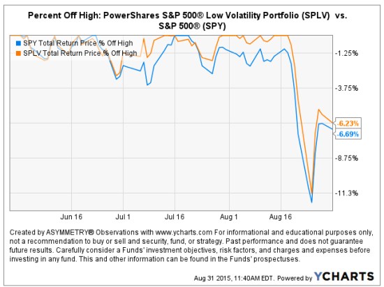
As a follow-up, below we observe the  PowerShares S&P 500® Low Volatility Portfolio declined in value about -12% from its high just as the SPDRs S&P 500® did. So, the lower volatility weighting didn’t help this time as the “downside loss of capital ” was the same.

SPLV PowerShares S&P 500® Low Volatility Portfolio

Source: http://www.ycharts.com

The secret to being successful from a trading perspective is to have an indefatigable and an undying and unquenchable thirst for information and knowledge.

Paul Tudor Jones

Paul Tudor Jones

Source: http://www.newtraderu.com/2015/04/07/paul-tudor-jones-10-trading-principles/

U.S. Sector Observation

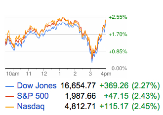
I don’t often comment on a day’s price action in the stock market, but thought I would. The U.S. stock market reversed up somewhat today. Market trends swing up and down on their way to a larger trend. Notice at 3pm the stock indexes almost lost all their gain for the day.

stock market 2015-08-27_16-17-41

Source: https://www.google.com/finance

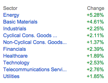
The interesting observation today was the leadership. Energy and Basic Materials have been the biggest losers the past three months and they moved up the most.

sector rotation returns ETF

Source: https://www.google.com/finance

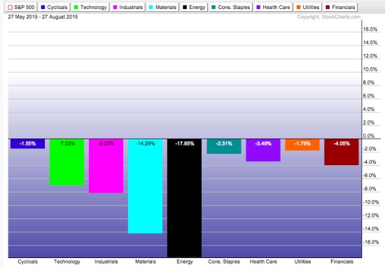
Below are the U.S. sector returns over the past 3 months after todays close. You can see the two biggest losers were today’s winners.

ETF sector rotation

Source: http://www.stockcharts.com

It will be interesting to see if this is an oversold bounce or it reverses to a lower low.

Trends unfold as swings up and down over time. They don’t go straight up or down…

Global Markets Year to Date

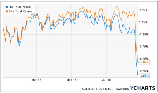
This is a quick year to date observation of some global market trends. First, we start with the popular U.S. stock market indexes. The Dow Jones Industrial Average is down -9.6% YTD. S&P 500 is down about -7%. A simple line chart shows a visual representation of the trend and the path it took to get there.

stock index return year to date

Source of Ycharts in this article: Shell Capital Management, LLC drawn with http://www.ycharts.com

I like to look at the asymmetry ratio of the trend, so I observe both the upside total return and the downside drawdown. Below is a chart of the % off the highest price these indexes reached to define the drawdown from its prior peak. This is how much they’ve declined from their highest point so far this year. The Dow Jones Industrial Average is down -12.8% from it’s high, the S&P 500 is down 10.8%.

stock index drawdown chart

Below are the sectors year to date. Healthcare remains the leader and the only one positive at this point.

sectors year to date

Source:Shell Capital Management, LLC  drawn with  http://finviz.com

Looking at a few more broad based alternatives, below is the iShares S&P GSCI Commodity-Indexed Trust (GSG: blue) which seek to track the results of a fully collateralized investment in futures contracts on an index composed of a diversified group of commodities futures. The red line is Gold (GLD) and the orange line is the iShares Core U.S. Aggregate Bond ETF seeks to track the investment results of an index composed of the total U.S. investment-grade bond market. Bonds are flat (including interest), gold is down -3%, and the commodity index is down -24%.

bonds commodities year to date

We are beginning to observe that a fixed asset allocation to these markets, no matter how diversified, may be very negative this year.

What about International stocks? Below we see some material divergence so far between developed International markets (EFA) and emerging markets (EEM). The iShares MSCI EAFE (EFA) seeks to track the investment results of an index composed of large- and mid-capitalization developed market equities, excluding the U.S. and Canada. Those countries index is down -2.9%. The iShares MSCI Emerging Markets (EEM) seeks to track the investment results of an index composed of large- and mid-capitalization emerging market equities. It is down -18.6%.

international emerging markets year to date

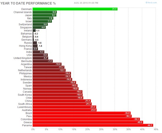
What about global stock markets? A few are positive year to date, most are very negative.

global stock markets year to data

Source:Shell Capital Management, LLC  drawn with  http://finviz.com

What about individual commodities, interest rates, and volatility? The VIX was low most of the year, but now that markets have declined the implied volatility of stocks has spiked.

world markets year to date

Source:Shell Capital Management, LLC  drawn with  http://finviz.com

I believe world markets require active risk management and defining directional trends. For me, that means predefining my risk in all of them, not just a fixed allocation.

Uncharted Territory from the Fed Buying Stocks

I remember sometime after 2013 I told someone “The Fed is buying stocks and that’s partly why stocks have risen so surprisingly for so long”. He looked puzzled and didn’t seem to agree, or understand.

The U.S. Federal Reserve (the “Fed”) has been applying “quantitative easing” since the 2007 to 2009 “global financial crisis”. Quantitative easing (QE) is a type of monetary policy used by central banks to stimulate the economy when standard monetary policy has become ineffective. The Fed implements quantitative easing by buying financial assets from banks and other financial institutions. That raises the prices of those financial assets and lowers their interest rate or yield. It also increases the amount of money available in the economy. The magnitude they’ve done this over the past seven years has never been experience before. They are in uncharted territory.

I was reminded of what I said, “the Fed is buying stocks” when I read comments from Bill Gross in “Gross: Fed Slowly Recognizing ZIRP Has Downside Consequences”. He says companies are using easy money to buy their own stock:

Low interest rates have enabled Corporate America to borrow hundreds of billions of dollars “but instead of deploying the funds into the real economy,they have used the proceeds for stock buybacks. Corporate authorizations to buy back their own stock are running at an annual rate of $1.02 trillion so far in 2015, 18 percent above 2007’s record total of $863 billion, Gross said.

You see, if we want to know the truth about market dynamics; we necessarily have to think more deeply about how markets interact. Market dynamics aren’t always simple and obvious. I said, “The Fed is buying stocks” because their actions is driving the behavior of others. By taking actions to increase money supply in the economy and keep extremely low borrowing rates, the Fed has been driving demand for stocks.

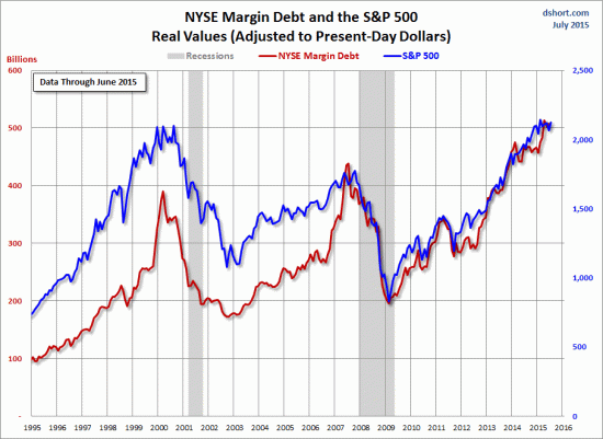
But, it isn’t just companies buying their own stock back. It’s also investors buying stocks on margin. Margin is borrowed money that is used to purchase securities. At a brokerage firm it is referred to as “buying on margin”. For example, if we have $1 million in a brokerage account, we could borrow another $1 million “on margin” and invest twice as much. We would pay interest on the “margin loan”, but those rates have been very low for years. Margin interest rates have been 1 – 2%. You can probably see the attraction. If we invested in lower risk bonds earning 5% with $1 million, we would normally earn 5%, or $50,000 annually. If we borrowed another $1 million at 2% interest and invested the full $2 million at 5%, we would earn another 3%, or $30,000. The leverage of margin increased the return to 8%, or $80,000. Of course, when the price falls, the loss is also magnified. When the interest rate goes up, it reduces the profit. But rates have stayed low for so long this has driven margin demand.

While those who have their money sitting in in bank accounts and CDs have been brutally punished by near zero interest rates for many years, aggressive investors have borrowed at those low rates to magnify their return and risk in their investments. The Fed has kept borrowing costs extremely low and that is an incentive for margin.

In the chart below, the blue line is the S&P 500 stock index. The red line is NYSE Margin Debt. You may see the correlation. You may also notice that recessions (the grey area) occur after stock market peaks and high margin debt balances. That’s the downside: margin rates are at new highs, so when stocks do fall those investors will either have to exit their stocks to reduce risk or they’ll be forced to exit due to losses. If they don’t have a predefined exit, their broker has one for them: “a margin call”.

Current Margin Debt Stock MarginSource: http://www.advisorperspectives.com/dshort/charts/markets/nyse-margin-debt.html?NYSE-margin-debt-SPX-since-1995.gif

If you noticed, I said, “They are in uncharted territory”. I am not. I am always in uncharted territory, so I never am. I believe every new moment is unique, so I believe everyone is always in uncharted territory. Because I believe that, I embrace it. I embrace uncertainty and prepare for anything that can happen. It’s like watching a great movie. It would be no fun if we knew the outcome in advance.


Fear is Driving Stock Trend…

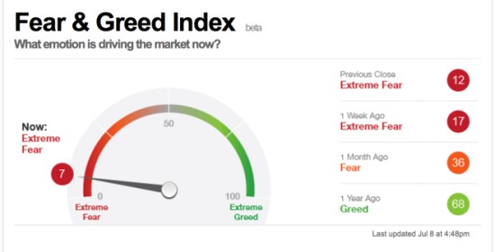
Fear is now driving the stock market. As prices fall, investor sentiment indicators suggest that fear increases as prices fall. When sentiment gets to an extreme it often reverses, or it can become contagion and drive prices even lower as people sell their positions. Now that most sentiment gauges are at short term “Extreme Fear” readings, don’t be surprised to see prices trend back up. If they don’t, then it could be the early stages of a larger decline as fear and greed can always get even more extreme.

A simple gauge for investor sentiment is the CNN Money Fear & Greed Index.

Fear and Greed Index

Source: http://money.cnn.com/data/fear-and-greed/

It’s always a good time to manage, direct, and control risk. I do that by predefining my exits and knowing how much potential loss that represents in each position and across the portfolio.

What You Need to Know About Long Term Bond Trends

There is a lot of talk about interest rates and bonds these days – for good reason. You see, interest rates have been in a downtrend for decades (as you’ll see later). When interest rates are falling, the price of bonds go up. I wrote in “Why So Stock Market Focused?” that you would have actually been better off investing in bonds the past 15 years over the S&P 500 stock index.

However, the risk for bond investors who have a fixed bond allocation is that interest rates eventually trend up for a long time and their bonds fall.

This year we see the impact of rising rates and the impact of falling bond prices in the chart below of the 20+ year Treasury bond. It’s down -15% off its high and since the yield is only around 2.5% the interest only adds about 1% over this period for a total return of -14.1%. Up until now, this long term Treasury index has been a good crutch for a global allocation portfolio. Now it’s more like a broken leg.

But, that’s not my main point today. Let’s look at the bigger picture. Below is the yield (interest rate) on the 10-Year U.S. government bond. Notice that the interest rate was as high as 9.5% in 1990 and has declined to as low as 1.5%. Just recently, it’s risen to 2.62%. If you were going to buy a bond for future interest income payments, would you rather invest in one at 9.5% or 1.5%? If you were going to lend money to someone, which rate would you prefer to receive? What is a “good deal” for you, the lender?

I like trends and being positioned in their direction since trends are more likely to continue than reverse, but they usually do eventually reverse when inertia comes along (like the Fed). If you care about managing downside risk you have to wonder: How much could this trend reverse and what could its impact be on fixed bond holdings? Well, we see below that the yield has declined about -70%. If we want to manage risk, we have to at least expect it could swing the other way.

One more observation. Germany is one of the largest countries in the world. Since April, the 10-year German bond interest rate has reversed up very sharp. What if U.S bonds did the same?

As I detailed in “Allocation to Stocks and Bonds is Unlikely to Give us What We Want” bonds are often considered a crutch for a global asset allocation portfolio. If you care about managing risk, you may consider that negative correlations don’t last forever. All trends change, eventually. You may also consider your risk of any fixed positions you have. I prefer to actively manage risk and shift between global markets based on their directional trends rather than a fixed allocation to them.

The good news is: by my measures, many bond markets have declined in the short term to a point they should at least reserve back up at least temporarily. What happens after that will determine if the longer trend continues or begins to reverse. The point is to avoid complacency and know in advance at what point you’ll exit to cut losses short…

As they say: “Past performance is no guarantee of the future“.

Seasonal Alpha? The Real Probability and Expectation of “Sell in May and Go Away”

Here is the trouble with a seasonal strategy. According to Standard & Poors, the S&P 500 has gained 1.05 % in May, though it was a volatile month. So, “sell in May and go away” just missed out for no other reason other than it was May.

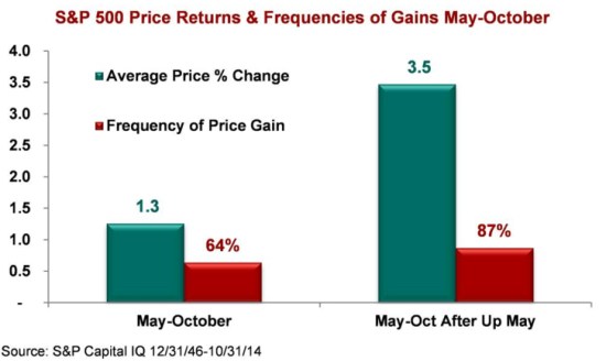
The second problem is best explained in the chart below. According to Standard & Poors, since 1946 (68 years) the S&P 500 has actually been positive during the “sell in May and go away” period May – October 64% of the time with an average gain of 1.3%. So, the expectation for the period is actually a positive return of .83% May to October.

Seasonal Sell in May and Go Away Strategy

Another interesting observation in the chart is after a positive “up” May, the May to October period tends to increase 87% of the time an average of 3.5%. So, the expectation is 3.04%. Based on the probability and expectation, we would expect 2% more through October. Of course, the trouble is this stock index is trading at 27 times EPS which is overvalued territory, so this time could instead be the 13% of the time it declines instead, but the probability and expectation is what it is and we want to invest with it, not against it. I would rather focus on the actual direction of trends rather than what month it is.

One month or series of months is an arbitrary time frame, which is why a strategy based on specific time frames like “Sell in May and Go Away” are arbitrary – no matter what story is told to make it sound good.

This May it turned out it most of the other global markets were down materially in May like the Emerging Markets index -4.1%, Commodity Index -2.17%, and even the iShares iBoxx $ Investment Grade Corporate Bond declined -1.12%. So, anyone who was globally positioned across multiple markets during May did experience declines. Those who shifted from the S&P 500 index to bonds at the beginning of May actually lost what the stock index gained…

I prefer to focus on the actual direction of global price trends, no matter when they are. You can see what that looks like here.

Allocation to Stocks and Bonds is Unlikely to Give us What We Want

That was the lesson you learned the last time stocks became overvalued and the stock market entered into a bear market.

I believe holding and re-balancing markets doesn’t give us the risk-adjusted returns we want. In all I do, I believe in challenging that status quo, I believe in thinking and doing things differently. The way I challenge the status quo is a focus on absolute return, limiting downside risk, and doing it tactically across global markets. Why do I do it?

In a Kiplinger article by Fred W. Frailey interviewed Mohamed El-Erian, the PIMCO’s boss, (PIMCO is one of the largest mutual fund companies in the world) he says “he tells how to reduce risk and reap rewards in a fast-changing world.” This article “Shaking up the Investment Mix” was written in March 2009, which turned out the be “the low” of the global market collapse.

It is useful to revisit such writing and thoughts, especially since the U.S. stock market has since been overall rising for 5 years and 10 months. It’s one of the longest uptrends recorded and the S&P 500 stock index is well in “overvalued” territory at 27 times EPS. At the same time, bonds have also been rising in value, which could change quickly when rates eventually rise. At this stage of a trend, asset allocation investors could need a reminder. I can’t think of a better one that this:

Why are you telling investors they need to diversify differently these days?

The traditional approach to diversification, which served us very well, went like this: Adopt a diversified portfolio, be disciplined about rebalancing the asset mix, own very well-defined types of asset classes and favor the home team because the minute you invest outside the U.S., you take on additional risk. A typical mix would then be 60% stocks and 40% bonds, and most of the stocks would be part of Standard & Poor’s 500-stock index.

This approach is fatigued for several reasons. First of all, diversification alone is no longer sufficient to temper risk. In the past year, we saw virtually every asset class hammered. You need something more to manage risk well.

But, you know, they say a picture is worth a thousand words.

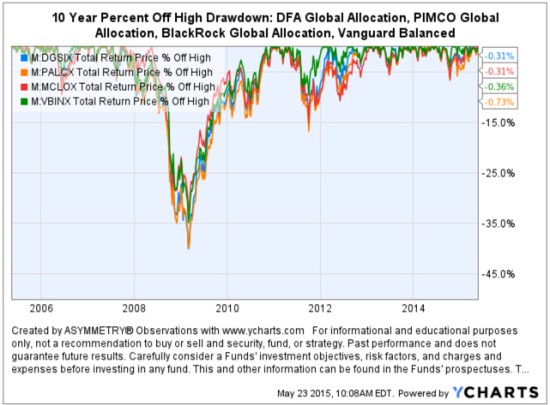
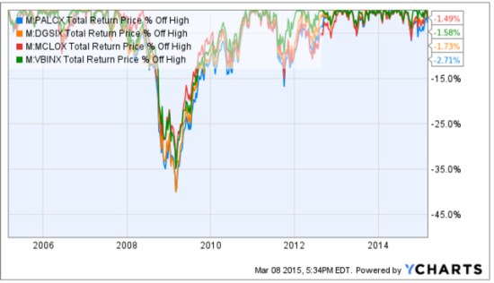
Since we are talking about downside risk, something that is commonly hidden when only “average returns” are presented, below is a drawdown chart. I created the drawdown chart using YCharts which uses total return data and the “% off high”. The decline you see from late 2007 to 2010 is a drawdown: it’s when the investment value is under water. Think of this like a lake. You can see how the average of the data wouldn’t properly inform you of what happens in between.

First, I show PIMCO’s own allocation fund: PALCX: Allianz Global Allocation Fund. I include an actively managed asset allocation that is very large and popular with $55 billion invested in it: MCLOX: BlackRock Global Allocation. Since there are many who instead believe in passive indexing and allocation, I have also included DGSIX: DFA Global Allocation 60/40 and VBINX: Vanguard Balanced Fund. As you can see, they have all done about the same thing. They declined about -30% to -40% from October 2007 to March 2009. They also declined up to -15% in 2011.

Global Allocation Balanced Fund Drawdowns

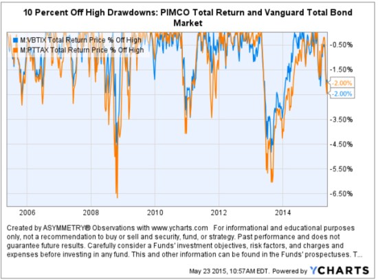
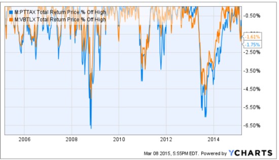
Going forward, the next bear market may be very different. Historically, investors consider bond holdings to be a buffer or an anchor to a portfolio. When stock prices fall, bonds haven’t been falling nearly as much. To be sure, I show below a “drawdown chart” for the famous actively managed bond fund PIMCO Total Return and for the passive crowd I have included the Vanguard Total Bond Market fund. Keep in mind, about 40% of the allocation of the funds above are invested in bonds. As you see, bonds dropped about -5% to -7% in the past 10 years.

Bond market risk drawdowns

You may notice they are recently down -2% from their highs. Based on the past 10 years, that’s just a minor decline. The trouble going forward is that interest rates have been in an overall downtrend for 30 years, so bond values have been rising. If you rely on bonds being a crutch, as on diversification alone, I agree with Mohamed El-Erian the Chief of the worlds largest bond manager:

“…diversification alone is no longer sufficient to temper risk. In the past year, we saw virtually every asset class hammered. You need something more to manage risk well.”

But, don’t wait until AFTER markets have fallen to believe it.

I just don’t believe holding and re-balancing markets is going to give us the risk-adjusted returns we want. In all I do, I believe in challenging that status quo, I believe in thinking and doing things differently. The way I challenge the status quo is a focus on absolute return, limiting downside risk, and doing it tactically across global markets. Want to join us? To see what that looks like, click: ASYMMETRY® Managed Accounts

On Actively Managing Risk… and Persistence

Don't beg anyone to get on the ark just keep building and let everyone know the rain is coming

Source: https://image-store.slidesharecdn.com/c3d3d5ae-e2eb-4e80-9d4c-88e2344b5572-original.jpeg

I just keep doing what I do…

Where is the Inflation?

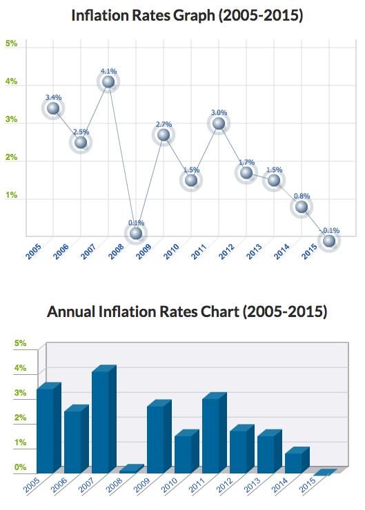
In How does monetary policy influence inflation and employment? and bond prices… I pointed out that even the Fed expected their monetary policy to eventually lead to inflation. The problem with economics and economist is they expect a cause and effect, and often their expectations don’t come true. Remember all those newsletters advising to buy gold the last several years? Gold trended up a while, then down. Applying a good trend system to gold may have made money from it, but buying and holding gold is probably a loser. Inflation was supposed to go up and gold was supposed to be a shelter. However, inflation has instead trended down: The U.S. Inflation Calculator  presents it best:

Current US Inflation Rates: 2005-2015

The latest inflation rate for the United States is -0.1% through the 12 months ended March 2015 as published by the US government on April 17, 2015. The next update is scheduled for release on May 22, 2015 at 8:30 a.m. ET. It will offer the rate of inflation over the 12 months ended April 2015.

The chart, graph and table below displays annual US inflation rates for calendar years 2004-2014. Rates of inflation are calculated using the current Consumer Price Index published monthly by the Bureau of Labor Statistics (BLS). For 2015, the most recent monthly data (12-month based) will be used in the chart and graph.

Historical inflation rates are available from 1914-2015. If you would like to calculate accumulated rates between different dates, the US Inflation Calculator will do that quickly.

Inflation Rate 2015-05-04_19-44-49

Source: http://www.usinflationcalculator.com/inflation/current-inflation-rates/

However, as you can see in the chart, like market prices, economic data trends directionally too. This trend of declining inflation may continue or it may reverse.

How does monetary policy influence inflation and employment? and bond prices…

Straight from the Federal Reserve website titled How does monetary policy influence inflation and employment?

In the short run, monetary policy influences inflation and the economy-wide demand for goods and services–and, therefore, the demand for the employees who produce those goods and services–primarily through its influence on the financial conditions facing households and firms. During normal times, the Federal Reserve has primarily influenced overall financial conditions by adjusting the federal funds rate–the rate that banks charge each other for short-term loans. Movements in the federal funds rate are passed on to other short-term interest rates that influence borrowing costs for firms and households. Movements in short-term interest rates also influence long-term interest rates–such as corporate bond rates and residential mortgage rates–because those rates reflect, among other factors, the current and expected future values of short-term rates. In addition, shifts in long-term interest rates affect other asset prices, most notably equity prices and the foreign exchange value of the dollar. For example, all else being equal, lower interest rates tend to raise equity prices as investors discount the future cash flows associated with equity investments at a lower rate.

In turn, these changes in financial conditions affect economic activity. For example, when short- and long-term interest rates go down, it becomes cheaper to borrow, so households are more willing to buy goods and services and firms are in a better position to purchase items to expand their businesses, such as property and equipment. Firms respond to these increases in total (household and business) spending by hiring more workers and boosting production. As a result of these factors, household wealth increases, which spurs even more spending. These linkages from monetary policy to production and employment don’t show up immediately and are influenced by a range of factors, which makes it difficult to gauge precisely the effect of monetary policy on the economy.

Monetary policy also has an important influence on inflation. When the federal funds rate is reduced, the resulting stronger demand for goods and services tends to push wages and other costs higher, reflecting the greater demand for workers and materials that are necessary for production. In addition, policy actions can influence expectations about how the economy will perform in the future, including expectations for prices and wages, and those expectations can themselves directly influence current inflation.

In 2008, with short-term interest rates essentially at zero and thus unable to fall much further, the Federal Reserve undertook nontraditional monetary policy measures to provide additional support to the economy. Between late 2008 and October 2014, the Federal Reserve purchased longer-term mortgage-backed securities and notes issued by certain government-sponsored enterprises, as well as longer-term Treasury bonds and notes. The primary purpose of these purchases was to help to lower the level of longer-term interest rates, thereby improving financial conditions. Thus, this nontraditional monetary policy measure operated through the same broad channels as traditional policy, despite the differences in implementation of the policy.

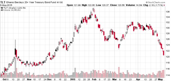
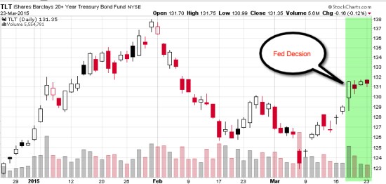
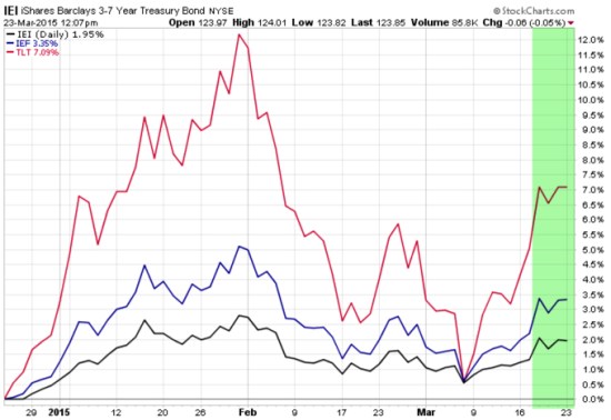
Up until now, the Long Term Treasury bond has typically gained in price on days the U.S. stock market is down. The recent price action may be a sign of changing inter-market dynamics between the Long Term Treasury and U.S. Stocks now that the Fed isn’t buying these bonds as they have for several years. As you can see in the chart below, the iShares Barclays 20+ Year Treasury Bond Index was down -1.7% today as stocks were also down. It’s also in a shorter term downtrend since January. This could be a sign that may not offer the “crutch” for falling stocks they have in the past. In the next bear market, bonds may go down too.

TLT long term treasury

Created with http://www.stockcharts.com


My 2 Cents on the Dollar, Continued…

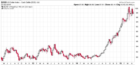
In My 2 Cents on the Dollar I explained how the U.S. Dollar is a significant driver of returns of other markets. For example, when the U.S. Dollar is rising, commodities like gold, oil, and foreign currencies like the Euro are usually falling. A rising U.S. Dollar also impacts international stocks priced in U.S. Dollars. When the U.S. Dollar trends up, many international markets priced in U.S. Dollars may trend down (reflecting the exchange rate). Many trend followers and global macro traders are likely “long the U.S. Dollar” by being long and short other markets like commodities, international stocks, or currencies.

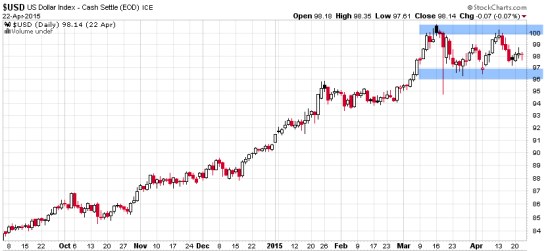
Below was the chart from My 2 Cents on the Dollar last week to show the impressive uptrend and since March a non-trending indecisive period. After such a period, I suggested the next break often determines the next directional trend.

dollar trend daily 2015-04-23_16-05-04

Chart created by Shell Capital with: http://www.stockcharts.com

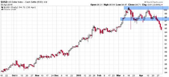
Keep in mind, this is looking closely at a short time frame within a larger trend. Below is the updated chart today, a week later. The U.S. Dollar did break down so far, but by my math, it’s now getting to an even more important point that will distinguish between a continuation of the uptrend or a reversal. This is the point where it should reverse back up, if it’s going to continue the prior uptrend.

U.S. Dollar

Chart created by Shell Capital with: http://www.stockcharts.com

This is a good example of understanding what drives reward/risk. I consider how long the U.S. Dollar I am (by being synthetically long/short other markets) and how that may impact my positions if the trend were to reverse. It’s a good time to pay attention to it to see if it breaks back out to the upside to resume the uptrend, or if it instead breaks down to end it.

That’s my two cents on the Dollar… How long are you?

Why So Stock Market Focused?

Most investors and their advisors seem to speak mostly about the stock market. When they mention “the market” and I ask “what market?” they always reply “the stock market”.

Why so stock market centric?

It must be that it gets the most media attention or stocks seem more exciting?. After all, other markets like bonds may seem boring and few know much about the many commodities markets or the foreign exchange markets. There are many different markets and two sides to them all.

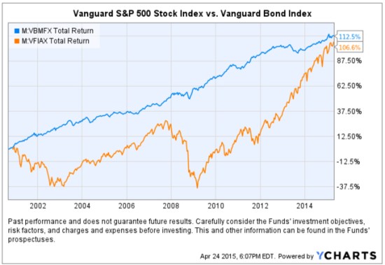
If it’s risk-adjusted returns you want, you may be surprised to find where you should have invested your money the past 15 years. To make the point, below is a comparison of the total return of the Vanguard S&P 500 stock index (the orange line) compared to the Vanguard Bond Index (the blue line). Yes, you are seeing that correctly. Using these simple index funds as a proxy, bonds have achieved the same total return as stocks, but with significantly less volatility and drawdowns. This is why we never look at just “average” return data without considering the path it took to get there. A total return percentage gain chart like this one presents a far more telling story. Take a close look at the path they took.

stocks vs. bonds

Created with http://www.ycharts.com

I showed the chart to one investment advisor who commented “It looks like the stock market is catching up”. If that’s what you think of when you view the chart, you may have a bias blind spot: ignoring the vast difference in the risk between the two markets.

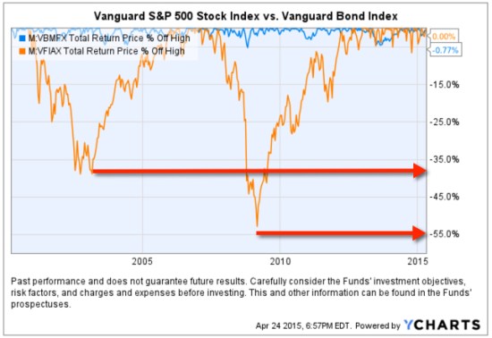
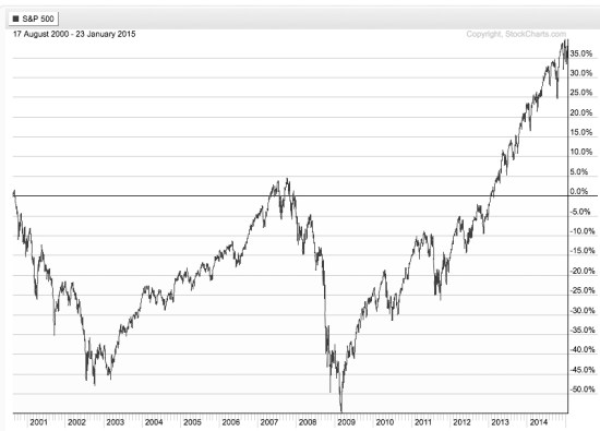
Looking at the total return over the period identifies the obvious difference in the path the two return streams took to achieve their results, but below we see the true risk difference. Drawdowns are declines from a higher value to a low value and a visual representation of how long it took to recover the lose of capital. When we observe a drawdown chart like the one below, it’s like a lake. These charts together also help illustrate the flaw of averages. The average return of the stock and bond index have ended at about the same level and have the same average return, but the bond index achieved it with much less drawdown. You wouldn’t know that if you only looked at average returns. If you tried to walk across the stock market lake, you may have drowned if you couldn’t handle swimming in 40′ of water for so long. If that one didn’t get you, the 55′ may have. The stock index declined about -40% from 2000 – 2002 and took years to recover before it declined -55%.

stock and bond market risk historical drawdowns

Created with http://www.ycharts.com

You have to be wondering: why didn’t you just invest in bonds 15 years ago? Maybe you were focused on the prior period huge average returns in stocks?

Before I continue, let me place a very bold disclaimer here: PAST PERFORMANCE DOES NOT GUARANTEE FUTURE RESULTS. Another way that is stated is that PAST PERFORMANCE IS NO ASSURANCE OF FUTURE RESULTS. One more version is PAST PERFORMANCE MAY NOT BE AN INDICATION OF FUTURE RESULTS. If you remember, the 1990’s were a roaring bull market in stocks. People focus on the past expecting it to continue. That’s probably why you never thought to invest in bonds instead of stocks.

Some of the largest and most successful hedge funds in the world have done that very thing over this period and longer. But, they didn’t just invest in bonds. They leveraged bonds. We’ve seen in this example that a bond index fund has achieved just as much total return as stocks. If you are a stock market centric investor: one that likes the stock market and makes it your focus, then you necessarily had to be willing to endure those -40% to -55% declines and wait many years to recover from the losses. If you are really willing to accept such risk, imagine if you had used margin to leverage bonds. The bond index rarely declined -10% or more. It was generally a falling interest rate period, so bonds gained value. If you were willing to accept -40% to -55% declines in stocks, you could have instead leveraged the bonds 400% or 500%. If you had done that, your return would be 4 or 5 times more with a downside more equal to that of stocks.

Why so stock centric?

Of course, at this stage, the PAST PERFORMANCE IS HIGHLY UNLIKELY TO REPEAT INTO THE FUTURE. Just as the roaring stocks of the 1990’s didn’t repeat. To see why, read Stage and Valuation of the U.S. Stock Market and Bonds: The Final Bubble Frontier?.

From my observations of investors performance and their advisors, most people seem to have poor results the past decade or so, even after this recent bull market. An investment management consultant told me recently that investors and their advisors who are aware of the current stage of stocks and bonds feel there is no place to turn. I believe it’s a very important time to prepare to row, not sail. For me, that means focus on actively managing risk and look for potentially profitable trends across a very global universe of markets; currency, bonds, stocks, commodities, and alternatives like volatility, inverse, etc . That’s my focus in ASYMMETRY® | Managed Accounts.

Stage and Valuation of the U.S. Stock Market

In The REAL Length of the Average Bull Market last year I pointed out different measures used to determine the average length of a bull market. Based on that, whether you believe the average bull market lasts 39 months, 50 months, or 68 months, it seems the current one is likely very late in its stage at 73 months. It’s one of the longest, ever.

I normally don’t consider valuations levels like P/E ratios, but they do matter when it comes to secular bull and bear markets (10 to 20 year trends). That’s because long-term bull markets begin at low valuation levels (10 or below) and have ended at historically high levels (around 20). Currently, the S&P 500 is trading at 27. That, along with the low dividend yield, suggests the expected return for holding that index going forward is low.

Ed Easterling of Crestmont Research explains it best:

The stock market gyrated since the start of the year, ending the first quarter with a minimal gain of 0.4%. As a result, normalized P/E was virtually unchanged at 27.3—well above the levels justified by low inflation and interest rates. The current status remains near “significantly overvalued.”

In addition, the forecast by Standard and Poor’s for 2015 earnings per share (EPS) recently took a nosedive, declining 17% during one week in the first quarter. Volatility remains unusually low in its cycle. The trend in earnings and volatility should be watched closely and investors should remain cognizant of the risks confronting an increasingly vulnerable market.

Source: The P/E Report: Quarterly Review Of The Price/Earnings Ratio By Ed Easterling April 4, 2015 Update

It’s always a good time to actively manage risk and shift between global markets rather than allocate to them. To see what that looks like, visit: http://www.asymmetrymanagedaccounts.com/global-tactical/

Bonds: The Final Bubble Frontier?

No where to turn? This time, it isn’t just that the U.S. stock indexes are very aged in one of the longest bull markets in history and trading in bubble territory at 27 times EPS.

In “Bonds: The Final Bubble Frontier?” Deutsche Bank says:

“We do think bonds are starting to exhibit bubble tendencies with very little value for investors trying to create long-term real returns”

Source: Long – Term Asset Return Study: Bonds: The Final Bubble Frontier?

We’ll see…

It’s always a good time to actively manage risk and shift between global markets rather than allocate to them. To see what that looks like, visit: http://www.asymmetrymanagedaccounts.com/global-tactical/

The Volatility Index (VIX) is Getting Interesting Again

In the last observation I shared on the CBOE Volatlity index (the VIX) I had been pointing out last year the VIX was at a low level and then later started trending up. At that time, many volatility traders seemed to think it was going to stay low and keep going lower – I disagreed. Since then, the VIX has remained at a higher average than it had been – up until now. You can read that in VIX® gained 140%: Investors were too complacent.

Here it is again, closing at 12.45 yesterday, a relatively low level for expected volatility of the S&P 500 stocks. Investors get complacent after trends drift up, so they don’t price in so much fear in options. Below we observe a monthly view to see the bigger picture. The VIX is getting down to levels near the end of the last bull market (2007). It could go lower, but if you look closely, you’ll get my drift.

Chart created by Shell Capital with: http://www.stockcharts.com

Next, we zoom in to the weekly chart to get a loser look.

Chart created by Shell Capital with: http://www.stockcharts.com

Finally, the daily chart zooms in even more.

Chart created by Shell Capital with: http://www.stockcharts.com

The observation?

Options traders have priced in low implied volatility – they expect volatility to be low over the next month. That is happening as headlines are talking about stock indexes hitting all time highs. I think it’s a sign of complacency. That’s often when things change at some point.

It also means that options premiums are generally a good deal (though that is best determined on an individual security basis). Rather than selling premium, it may be a better time to buy it.

Let’s see what happens from here…

My 2 Cents on the Dollar

The U.S. Dollar ($USD) has gained about 20% in less than a year. We observe it first in the weekly below. The U.S. Dollar is a significant driver of returns of other markets. For example, when the U.S. Dollar is rising, commodities like gold, oil, and foreign currencies like the Euro are usually falling. A rising U.S. Dollar also impacts international stocks priced in U.S. Dollar. When the U.S. Dollar trends up, many international markets priced in U.S. Dollars may trend down (reflecting the exchange rate). The U.S. Dollar may be trending up in anticipation of rising interest rates.

dollar trend weekly 2015-04-23_16-04-40

Chart created by Shell Capital with: http://www.stockcharts.com

Now, let’s observe a shorter time frame- the daily chart. Here we see an impressive uptrend and since March a non-trending indecisive period. Many trend followers and global macro traders are likely “long the U.S. Dollar” by being long and short other markets like commodities, international stocks, or currencies.

dollar trend daily 2015-04-23_16-05-04

Chart created by Shell Capital with: http://www.stockcharts.com

This is a good example of understanding what drives returns and risk/reward. I consider how long the U.S. Dollar I am and how that may impact my positions if this uptrend were to reverse. It’s a good time to pay attention to it to see if it breaks back out to the upside to resume the uptrend, or if it instead breaks down to end it. Such a continuation or reversal often occurs from a point like the blue areas I highlighted above.

That’s my two cents on the Dollar…

How long are you? Do you know?

Conflicted News

This is a great example of conflicted news. Which news headline is driving down stock prices today?

Below is a snapshot from Google Finance::

conflicted news 2015-04-17_10-21-43

Trying to make decisions based on news seems a very conflicted way, which is why I instead focus on the absolute direction of price trends.

Absolute Return vs. Relative Return

Absolute Return investment manager fund

Absolute: viewed or existing independently and not in relation to other things; not relative or comparative.

Relative: considered in relation or in proportion to something else.

Return: to go or come back, as to a former place, position, or state.

Oops… we don’t want to “return” do we?

Rate of Return: The gain or loss on an investment over a specified period.

So, an Absolute Rate of Return: is the the gain or loss viewed or existing independently and not in relation to other things; not relative or comparative.

Many people seem to have a problem with what I call “relativity“. For example, they love their home, until someone builds a larger and nicer one across the street. Or, they love their car, until their friend drives up in one that seems even better.

You can probably see how these simple words and their meaning leads to many issues people deal with.

To see an absolute return program applied in real life, visit: http://www.asymmetrymanagedaccounts.com/global-tactical/

Asymmetric Returns of World Markets YTD

As of today, global stock, bond, commodity markets are generating asymmetric returns year to date. The graph below illustrates the asymmetry is negative for those who need these markets to go “up”.

Asymmetric Returns of World Markets 2015-04-10_10-52-47

source: http://finviz.com


Asymmetric Nature of Losses and Loss Aversion

Loss Aversion:

“In prospect theory, loss aversion refers to the tendency for people to strongly prefer avoiding losses than acquiring gains. Some studies suggest that losses are as much as twice as psychologically powerful as gains. Loss aversion was first convincingly demonstrated by Amos Tversky and Daniel Kahneman.”

For most people, losing $100 is not the same as not winning $100. From a rational point of view are the two things the same or different?

Most economists say the two are the same. They are symmetrical. But I think that ignores some key issues.

If we have only $10 to eat on today and that’s all we have, if we lose it, we’ll be in trouble: hungry.

But if we have $10 to eat on and flip a coin in a bet and double it to $20, we may just eat a little better. We’ll still eat. The base rate: survival.

They say rationally the two are the same, but that isn’t true. They aren’t the same. The loss makes us worse off than we started and it may be totally rational to feel worse when we go backward than we feel good about getting better off. I don’t like to go backward, I prefer to move forward to stay the same.

Prospect Theory, which found people experience a loss more than 2 X greater than an equal gain, discovered the experience of losses are asymmetric.

Actually, the math agrees.

You see, losing 50% requires a 100% gain to get it back. Losing it all is even worse. Losses are indeed asymmetric and exponential on the downside so it may be completely rational and logical to feel the pain of losses asymmetrically. Experience the feeling of loss aversions seems to be the reason a few of us manage investment risk and generate a smoother return stream rather than blow up.

To see what the actual application of asymmetry to portfolio management looks like, see: Shell Capital Management, LLC.


asymmetry impact of loss

A Tale of Two Conditions for U.S. and International Stocks: Before and After 2008

In recent conversations with investment advisors, I notice their sentiment has shifted from “cautious and concerned” about world equity markets to “why have they underperformed”. Prior to 2013, most investors and investment advisors were concerned about another 2007 to 2009 level bear market. Now, it seems that caution has faded. Today, many of them seem to be focused on the strong trend of U.S. stocks since mid-2013 and comparing everything else to it.

Prior to October 2007, International stocks were in significantly stronger positive directional trends than U.S. Stocks. I’ll compare the S&P 500 stock index (SPY) to Developed International Countries (EFA). We can visually observe a material change between these markets before 2008 and after, but especially after 2013. That one large divergence since 2013 has changed sentiment.

The MSCI EAFE Index is recognized as the pre-eminent benchmark in the United States to measure international equity performance. It comprises the MSCI country indices that represent developed markets outside of North America: Europe, Australasia and the Far East. For a “real life” example of its price trend, I use the iShares MSCI EAFE ETF (EFA). Below are the country holdings, to get an idea of what is considered “developed markets”.

iShares MSCI EAFE ETF Developed Markets exposure 2015-04-05_17-14-43

Source: https://www.ishares.com/us/products/239623/EFA

Below are the price trends of the popular S&P 500 U.S. stock index and the MSCI Developed Countries Index over the past 10 years. Many investors may have forgotten how strong international markets were prior to 2008. Starting around 2012, the U.S. stock market continued to trend up stronger than international stocks. It’s a tale of two markets, pre-2008 and post-2008.

Developed Markets International stocks trend 2015-04-05_17-22-22

No analysis of a trend % change is complete without also examining its drawdowns along the way. A drawdown measures a drop from peak to bottom in the value of a market or portfolio (before a new peak is achieved). The chart below shows these indexes % off their prior highs to understand their historical losses over the period. For example, these indexes declined -55% or more. The International stock index nearly declined -65%. The S&P 500 U.S. stock index didn’t recover from its decline that started in October 2007 until mid-2012, 5 years later. The MSCI Developed Countries index is still in a drawdown! As you can see, EFA is -24% off it’s high reached in 2007. Including these international countries in a global portfolio is important as such exposure has historically provided greater potential for profits than just U.S. stocks, but more recently they have been a drag.

international markets drawdown 2015-04-05_17-30-00The International stock markets are divided broadly into Developed Markets we just reviewed and Emerging Countries. The iShares MSCI Emerging Markets ETF (EEM) tracks this index. To get an idea of which countries are considered “Emerging Markets’, you can see the actual exposure below.

emerging countries markets 2015-04-05_17-13-31

https://www.ishares.com/us/products/239637/EEM?referrer=tickerSearch

The Emerging Countries index has reached the same % change over the past decade, but they have clearly taken very different paths to get there. Prior to the “global crisis” that started late 2007, many investors may have forgotten that Emerging Markets countries like China and Brazil were in very strong uptrends. I remember this very well; as a global tactical trader I had exposure to these countries which lead to even stronger profits than U.S. markets during that period. Since 2009, however, Emerging Markets recovered sharply but as with U.S. stocks: they have trended up with great volatility. Since Emerging Markets peaked around 2011 they have traded in a range since. However, keep in mind, these are 10-year charts, so those swings up and down are 3 to 6 months. We’ll call that “choppy”. Or, 4 years of a non-trending and volatile state.

Emerging Markets trend 10 years 2015-04-05_17-21-06

Once again, no analysis of a trend % change is complete without also examining its drawdowns along the way. A drawdown measures a drop from peak to bottom in the value of a market or portfolio (before a new peak is achieved). The chart below shows these indexes % off their prior highs to understand their historical losses over the period. For example, these indexes declined -55% or more. The Emerging Market stock index declined -65%. The S&P 500 U.S. stock index didn’t recover from its decline that started in October 2007 until mid-2012, 5 years later. The MSCI Emerging Countries index is still in a drawdown! As you can see, EFA is -26% off it’s high reached in 2007. As I mentioned before, it recovered sharply up to 2011 but has been unable to move higher in 4 years. Including these Emerging Markets countries in a global portfolio is important as such exposure has historically provided greater potential for profits than just U.S. stocks, but more recently they have been a drag.

emerging markets drawdown 2015-04-05_17-52-19

Wondering why the tale of two markets before and after 2008? The are many reasons and return drivers. One of them can be seen visually in the trend of the U.S. Dollar. Below is a 10-year price chart of the U.S. Dollar index. Before 2008, the U.S. Dollar was falling, so foreign currencies were rising as were foreign stocks priced in Dollars. As with most world markets, even the U.S. Dollar was very volatile from 2008 through 2011. After 2011 it drifted in a tighter range through last year and has since increased sharply.

Dollar impact on international stocks 2015-04-05_18-05-02

The funny thing is, I’ve noticed there are a lot of inflows into currency-hedged ETFs recently. Investors seem to do the wrong thing at the wrong time. For example, they’ll want to hedge their currency risk after it already happened, not before… It’s just like with options hedging: Investors want protection after a loss, not before it happens. Or, people will buy that 20 KW generator for their home after they lose power a few days, not before, and may not need it again for 5 years after they’ve stopped servicing it. So, it doesn’t start when they need it again.

You can probably see why I think it’s an advantage to understand how world markets interact with each other and it’s an edge for me.

Mike Shell is the Founder and Chief Investment Officer of Shell Capital Management, LLC, and the portfolio manager of ASYMMETRY® Global Tactical.

The observations shared on this website are for general information only and are not specific advice, research, or buy or sell recommendations for any individual. Investing involves risk including the potential loss of principal an investor must be willing to bear. Past performance is no guarantee of future results. The presence of this website on the Internet shall in no direct or indirect way raise an implication that Shell Capital Management, LLC is offering to sell or soliciting to sell advisory services to residents of any state in which the firm is not registered as an investment advisor. Use of this website is subject to its terms and conditions.
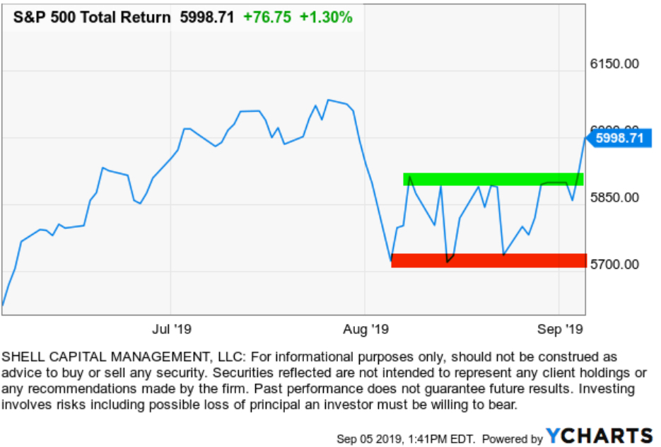
Stock Market Year-to-Date and First Quarter

So far, the U.S. stock market isn’t doing so well. And, the gains and losses over the past quarter have been asymmetric. Consumer Discretionary (12.6% of the S&P 500 index) and Healthcare (14.8% of the S&P 500 index)  have barely offset the losses in four other sectors.

Below are the YTD gain and losses for the popular S&P 500 index and each sector in the index.

stock market first quarter performance 2015-04-02_12-38-10

source: http://www.sectorspdr.com/sectorspdr/tools/sector-tracker

But, that’s just one data point compared to another data point. Such a table would be incomplete without considering the path those gains and losses took to get there.

sector returns 2015 2015-04-02_12-41-15

source: http://www.sectorspdr.com/sectorspdr/tools/sector-tracker/charting

To see the results of asymmetric exposure and risk management in action across a global universe of markets, visit: http://www.asymmetrymanagedaccounts.com/

Performance is historical and does not guarantee future results; current performance may be lower or higher. Investment returns/principal value will fluctuate so that an investor’s shares, when redeemed, may be worth more or less than their original cost. Past performance does not guarantee future results.

“It is impossible to produce a superior performance unless…

Sir John Templeton

source: http://www.templeton.org

A great quote from my fellow Tennessean, Sir John Templeton:

“It is impossible to produce a superior performance unless you do something different from the majority.”

Sir John Templeton

Absolute Return: an investment objective and strategy

Absolute returns investment strategy fund

Absolute Return in its basic definition is the return that an asset achieves over a certain period of time. This measure looks at the appreciation or depreciation (expressed as a dollar amount or a percentage). For example, a $50 stock drifts to $100 is a 100% absolute return. If that same stock drifts back from $100 to $50, its absolute return is -50%.

Absolute Return as an investment objective is one that does not try to track or beat an arbitrary benchmark or index, but instead seeks to generate real profits over a complete market cycle regardless of market conditions. That is, an absolute return objective of positive returns on investment over a market cycle of both bull and bear market periods irrespective of the direction of stock, commodity, or bond markets. Since the U.S. stock market has been generally in a uptrend for 6 years now, other than the -20% decline in the middle of 2011, we’ll now have to expand our time frame for a full market cycle to a longer period. That is, a full market cycle includes both a bull and a bear market.

The investor who has an absolute return objective is concerned about his or her own objectives for total return over a period and tolerance for loss and drawdowns. That is a very different objective than the investor who just wants whatever risk and return a benchmark, allocation, or index provides. Absolute returns require skill and active management of risk and exposure to markets.

Absolute return as a strategy: absolute return is sometimes used to define an investment strategy. An absolute return strategy is a plan, method, or series of maneuvers aiming to compound capital positively and to avoid big losses to capital in difficult market conditions. Whereas Relative Return strategies typically measure their success in terms of whether they track or outperform a market benchmark or index, absolute return investment strategies aim to achieve positive returns irrespective of whether the prices of stocks, bonds, or commodities rise or fall over the market cycle.

Absolute Return Investment Manager

Whether you think of absolute return as an objective or a strategy, it is a skill-based rather than market-based. That is, the absolute return manager creates his or her results through tactical decision-making as opposed to taking what the market is giving. One can employ a wide range of approaches toward an absolute return objective, from price-based trend following to fundamental analysis. In the ASYMMETRY® Managed Accounts, I believe price-based methods are more robust and lead to a higher probability of a positive expectation. Through my historical precedence, testing, and experience, I find that any fundamental type method that is based on something other than price has the capability to stray far enough from price to put the odds against absolute returns. That is, a manager buying what he or she believes is undervalued and selling short what he believes is overvalued can go very wrong if the position is on the wrong side of the trend. But price cannot deviate from itself. Price is the judge and the jury.

To create absolute returns, I necessarily focus on absolute price direction. Not relative strength, which is a rate of change relative to another moving trend. And, I focus on actual risk, not some average risk or an equation that oversimplifies risk like standard deviation.

Of course, absolute return and the “All Weather” type portfolio sound great and seem to be what most investors want, but it requires incredible skill to execute. Most investors and advisors seem to underestimate the required skills and experience and most absolute return strategies and funds have very limited and unproven track records. There is no guarantee that these strategies and processes will produce the intended results and no guarantee that an absolute return strategy will achieve its investment objective.

For an example of the application of an absolute return objective, strategy, and return-risk profile, visit http://www.asymmetrymanagedaccounts.com/

Absolute Return as an Investment Strategy

Absolute Return Investment Strategy Fund Manager

In “Absolute Return: The Basic Definition”, I explained an absolute return is the return that an asset achieves over a certain period of time. To me, absolute return is also an investment objective.

In “Absolute Return as an Investment Objective” I explained that absolute return is an investment objective is one that does not try to track or beat an arbitrary benchmark or index, but instead seeks to generate real profits over a complete market cycle regardless of market conditions. That is, it is focused on the actual total return the investor wants to achieve and how much risk the investor will willing to take, rather than a focus on what arbitrary market indexes do.

Absolute return as a strategy: absolute return is sometimes used to define an investment strategy. An absolute return strategy is a plan, method, or series of maneuvers aiming to compound capital positively and to avoid big losses to capital in difficult market conditions. Whereas Relative Return strategies typically measure their success in terms of whether they track or outperform a market benchmark or index, absolute return investment strategies aim to achieve positive returns irrespective of whether the prices of stocks, bonds, or commodities rise or fall over the market cycle.

Whether you think of absolute return as an objective or a strategy, it is a skill-based rather than market-based. That is, the absolute return manager creates his or her results through tactical decision-making as opposed to taking what the market is giving. One can employ a wide range of approaches toward an absolute return objective, from price-based trend following to fundamental analysis. In the ASYMMETRY® Managed Accounts, I believe price-based methods are more robust and lead to a higher probability of a positive expectation. Through my historical precedence, testing, and experience, I find that any fundamental type method that is based on something other than price has the capability to stray far enough from price to put the odds against absolute returns. That is, a manager buying what he or she believes is undervalued and selling short what he believes is overvalued can go very wrong if the position is on the wrong side of the trend. But price cannot deviate from itself. Price is the judge and the jury.

Of course, absolute return and the “All Weather” type portfolio sound great and seem to be what most investors want, but it requires incredible skill to execute. Most investors and advisors seem to underestimate the required skills and experience and most absolute return strategies and funds have very limited and unproven track records. There is no guarantee that these strategies and processes will produce the intended results and no guarantee that an absolute return strategy will achieve its investment objective.

For an example of the application of an absolute return objective, strategy, and return-risk profile,  visit http://www.asymmetrymanagedaccounts.com/

Absolute Return as an Investment Objective

Absolute Return objective fund strategy

In Absolute Return: The Basic Definition, I explained an absolute return is the return that an asset achieves over a certain period of time. To me, absolute return is also an investment objective.

Absolute Return as an investment objective is one that does not try to track or beat an arbitrary benchmark or index, but instead seeks to generate real profits over a complete market cycle regardless of market conditions. That is, an absolute return objective of positive returns on investment over a market cycle of both bull and bear market periods irrespective of the direction of stock, commodity, or bond markets.

Since the U.S. stock market has been generally in a uptrend for 6 years now, other than the -20% decline in the middle of 2011, we’ll now have to expand our time frame for a full market cycle to a longer period. That is, a full market cycle includes both a bull and a bear market.

The investor who has an absolute return objective is concerned about his or her own objectives for total return over a period and tolerance for loss and drawdowns. That is a very different objective than the investor who just wants whatever risk and return a benchmark, allocation, or index provides. Absolute returns require skill and active management of risk and exposure to markets.

Rather than a long article, this is going to be a series of smaller parts, building up to what absolute return really means.

For an example of the application of an absolute return objective, strategy, and return-risk profile,  visit http://www.asymmetrymanagedaccounts.com/

US Government Bonds Rise on Fed Rate Outlook?

I saw the following headline this morning:

US Government Bonds Rise on Fed Rate Outlook

Wall Street Journal –

“U.S. government bonds strengthened on Monday after posing the biggest price rally in more than three months last week, as investors expect the Federal Reserve to take its time in raising interest rates.”

My focus is on directional price trends, not the news. I focus on what is actually happening, not what people think will happen. Below I drew a 3 month price chart of the 20+ Year Treasury Bond ETF (TLT), I highlighted in green the time period since the Fed decision last week. You may agree that most of price action and directional trend changes happened before that date. In fact, the long-term bond index declined nearly 2 months before the decision, increased a few weeks prior, and has since drifted what I call “sideways”.

fed decision impact on bonds
Charts created with http://www.stockcharts.com

To be sure, in the next chart I included an analog chart including the shorter durations of maturity. iShares 3-7 Year Treasury Bond ETF (IEI) and iShares 7-10 Year Treasury Bond ETF (IEF). Maybe there is some overreaction and under-reaction going on before the big “news”, if anything.

Government bonds Fed decision reaction
Do you still think the Fed news was “new information“?

Dazed and Confused?

Many investors must be dazed and confused by the global markets reaction to the Fed. I’m guessing most people would expect if the Fed signaled they are closer to a rate hike the stock and bond markets would fall. Rising interest rates typically drive down stocks along with bonds. Just the opposite has happened, so far.

Markets seems to have moved opposite of expectations, those people have to get on board (increasing demand).

A few things I wrote before and after the Fed decision:

A One-Chart Preview of Today’s Fed Decision: This is what economists are expecting

Fed Decision and Market Reaction: Stocks and Bonds

Trends, Countertrends, in the U.S. Dollar, Gold, Currencies

Diversification Alone is No Longer Sufficient to Temper Risk…

That was the lesson you learned the last time stocks became overvalued and the stock market entered into a bear market.

In a Kiplinger article by Fred W. Frailey interviewed Mohamed El-Erian, the PIMCO’s boss, (PIMCO is one of the largest mutual fund companies in the world) he says “he tells how to reduce risk and reap rewards in a fast-changing world.” This article “Shaking up the Investment Mix” was written in March 2009, which turned out the be “the low” of the global market collapse.

It is useful to revisit such writing and thoughts, especially since the U.S. stock market has since been overall rising for 5 years and 10 months. It’s one of the longest uptrends recorded and the S&P 500 stock index is well in “overvalued” territory at 27 times EPS. At the same time, bonds have also been rising in value, which could change quickly when rates eventually rise. At this stage of a trend, asset allocation investors could need a reminder. I can’t think of a better one that this:

Why are you telling investors they need to diversify differently these days?

The traditional approach to diversification, which served us very well, went like this: Adopt a diversified portfolio, be disciplined about rebalancing the asset mix, own very well-defined types of asset classes and favor the home team because the minute you invest outside the U.S., you take on additional risk. A typical mix would then be 60% stocks and 40% bonds, and most of the stocks would be part of Standard & Poor’s 500-stock index.

This approach is fatigued for several reasons. First of all, diversification alone is no longer sufficient to temper risk. In the past year, we saw virtually every asset class hammered. You need something more to manage risk well.

But, you know, they say a picture is worth a thousand words.

Since we are talking about downside risk, something that is commonly hidden when only “average returns” are presented, below is a drawdown chart. I created the drawdown chart using YCharts which uses total return data and the “% off high”. The decline you see from late 2007 to 2010 is a dradown: it’s when the investment value is under water. Think of this like a lake. You can see how the average of the data wouldn’t properly inform you of what happens in between.

First, I show PIMCO’s own allocation fund: PALCX: Allianz Global Allocation Fund. I include an actively managed asset allocation that is very large and popular with $55 billion invested in it: MALOX: BlackRock Global Allocation. Since there are many who instead believe in passive indexing and allocation, I have also included DGSIX: DFA Global Allocation 60/40 and VBINX: Vanguard Balanced Fund. As you can see, they have all done about the same thing. They declined about -30% to -40% from October 2007 to March 2009. They also declined up to -15% in 2011.

Vanguard DFA BlackRock PIMCO Asset Allcation

Charts are courtesy of http://ycharts.com/ drawn by Mike Shell

Going forward, the next bear market may be very different. Historically, investors consider bond holdings to be a buffer or an anchor to a portfolio. When stock prices fall, bonds haven’t been falling nearly as much. To be sure, I show below a “drawdown chart” for the famous actively managed bond fund PIMCO Total Return and for the passive crowd I have included the Vanguard Total Bond Market fund. Keep in mind, about 40% of the allocation of the funds above are invested in bonds. As you see, bonds dropped about -5% to -7% in the past 10 years.

PIMCO Total Return Bond Vanguard Total Bond

Charts are courtesy of http://ycharts.com/ drawn by Mike Shell

You may have noticed the end of the chart is a drop of nearly -2%. Based on the past 10 years, that’s just a minor decline. The trouble going forward is that interest rates have been in an overall downtrend for 30 years, so bond values have been rising. If you rely on bonds being a crutch, as on diversification alone, I agree with Mohamed El-Erian the Chief of the worlds largest bond manager:

“…diversification alone is no longer sufficient to temper risk. In the past year, we saw virtually every asset class hammered. You need something more to manage risk well.”

But, don’t wait until AFTER markets have fallen to believe it.

Instead, I apply active risk management and directional trend systems to a global universe of exchange traded securities (like ETFs). To see what that looks like, click: ASYMMETRY® Managed Accounts

This is When MPT and VaR Get Asset Allocation and Risk Measurement Wrong

This is When MPT and VaR Get Asset Allocation and Risk Measurement Wrong

I was talking to an investment analyst at an investment advisory firm about my ASYMMETRY® Global Tactical and he asked me what the standard deviation was for the portfolio. I thought I would share with you how the industry gets “asset allocation” and risk measurement and management wrong.

Most people have poor results over a full market cycle that includes both rising and falling price trends, like global bull and bear markets, recessions, and expansions. Quantitative Analysis of Investor Behavior, SPIVA, Morningstar and many academic papers have provided empirical evidence that most investors (including professionals) have poor results over the long periods. For example, they may earn gains in rising conditions but lose their gains when prices decline. I believe one reason is they get too aggressive at peaks and then sell in panic after losses get too large, rather than properly predefine and manage risk.

You may consider, then, to have good results over a long period, I necessarily have to believe and do things very differently than most people.

On the “risk measurement” topic, I will share with you a very important concept that is absolutely essential for truly actively controlling loss. The worst drawdown “is” the only risk metric that really matters. The risk is not the loss itself. Once we have a loss, it’s a loss. It’s beyond the realm of risk. Since risk is the possibility of a loss, how often it has happened in the past and the magnitude of the historical loss is the expectation. Beyond that, we must assume it could be even worse some day. For example, if the S&P 500 stock index price decline was -56% from 2007 to 2009, then we should expect -56% is the loss potential (or worse). When something has happened before, it suggests it is possible again, and we may have not yet observed the worst decline in the past that we will see in the future.

The use of standard deviation is one of the very serious flaws of investors attempting to measure, direct, and control risk. The problem with standard deviation is that the equation was intentionally created to simplify data. The way it is used draws a straight line through a group of data points, which necessarily ignores how far the data actually spreads out. That is, the standard deviation is intended to measure how far the data spreads out, but it actually fails to absolutely highlight the true high point and low point. Instead, it’s more of an average of those points. However, for risk management, it’s the worst-case loss that we really need to focus on. I believe in order to direct and control risk, I must focus on “how bad can it really get”. Not just “on average” how bad it can get. The risk in any investment position is at least how much it has declined in the past. And realizing it could be even worse some day. Standard deviation fails to reflect that in the way it is used.

Consider that as prices trend up for years, investors become more and more complacent. As investors become complacent, they also become less indecisive as they believe the recent past upward trend will continue, making them feel more confident. On the other hand, when investors feel unsure about the future, their fear and indecisiveness is reflected as volatility as the price swings up and down more. We are always unsure about the future, but investors feel more confident the past will continue after trends have been rising and volatility gets lower and lower. That is what the peak of a market looks like. As it turns out, that’s just when asset allocation models like Modern Portfolio Theory (MPT) and portfolio risk measures like Value at Risk (VaR) tell them to invest more in that market – right as it reaches its peak. They invest more, complacently, because their allocation model and risk measures tell them to. An example of a period like this was October 2007 as global stock markets had been rising since 2003. At that peak, the standard deviation was low and the historical return was at its highest point, so their expected return was high and their expected risk (improperly measured as historical volatility) was low. Volatility reverses the other way at some point

What happens next is that the market eventually peaks and then begins to decline. At the lowest point of the decline, like March 2009, the global stock markets had declined over -50%. My expertise is directional price trends and volatility so I can tell you from empirical observation that prices drift up slowly, but crash down quickly. The below chart of the S&P 500 is an example of this asymmetric risk.

stock index asymmetric distribution and losses

At the lowest point after prices had fallen over -50%, in March 2009, the standard deviation was dramatically higher than it was in 2007 after prices had been drifting up. At the lowest point, volatility is very high and past return is very low, telling MPT and VaR to invest less in that asset. This is a form of volatility targeting: investing more at lower levels or historical volatility and less at higher levels.

In the 2007 – 2009 decline in global markets, you may recall some advisors calling it a “6 sigma event”. That’s because the market index losses were much larger than predicted by a standard deviation. For example, if an advisors growth allocation had an average return of 10% in 2007 based on its past returns looking back from the peak and a standard deviation of 12% expected volatility, they only expected the portfolio would decline -26% (3 standard deviations) within a 99.7% confidence level – but the allocation actually lost -40 or -50%. Even if that advisor properly informed his or her client the allocation could decline -26% worse case and the client provided informed consent and acceptance of that risk, their loss was likely much greater than their risk tolerance. When they reach their risk tolerance, they “tap out”. Once they tap out, when do they ever get back in? do they feel better after it falls another -20%? or after it rises 20%? There is no good answer. I want to avoid that situation. I prefer to reduce my exposure to loss in well advance.

You can see in the chart below, 3 standard deviations is supposed to capture 99.7% of all of the data if the data is a normal distribution. The trouble is, market returns are not a normal distribution. Instead, stock market gains and losses present an asymmetrical return distribution. Market returns experience much larger gains and losses than expected from a normal distribution – the outliers are critical. However, those outliers don’t occur very often: historically it’s maybe every 4 or 5 years, so people have time to forget about the last one and become complacent.

symmetry normal distribution bell curve black

Source: http://en.wikipedia.org/wiki/68%E2%80%9395%E2%80%9399.7_rule

My friends, this is where traditional asset allocation like Modern Portfolio Theory (MPT) and risk measures like Value at Risk (VaR) get it wrong.

These methods are the most widely believed and used . You can probably see why most investors do poorly and only a very few do well – an anomaly.

I can tell you that I measure risk by how much I can lose and I control my risk by predefining my absolute risk at the point of entry and my exit point evolves as the positions are held. That is an absolute price point, not some equation that intentionally ignores the outlier losses.

As the stock indexes have now been overall trending up for 5 years and 9 months, the trend is getting aged. In fact, according to my friend Ed Easterling at Crestmont Research, at around 27 times EPS the stock index seems to be in the range of overvalued. In his latest report, he says:

“The stock market surged over the past quarter, adding to gains during 2014 that far exceed underlying economic growth. As a result, normalized P/E increased to 27.2—well above the levels justified by low inflation and interest rates. The current status is approaching “significantly overvalued.”

At the same time, we shouldn’t be surprised to eventually see rising interest rates drive down bond values at some point. It seems from this starting point that simply allocating to stocks and bonds doesn’t have an attractive expected return.

I believe a different strategy is needed, especially form this point forward.

In ASYMMETRY® Global Tactical, I actively manage risk and shift between markets to find profitable directional price trends rather than just allocate to them.


Mike Shell is the Founder and Chief Investment Officer of Shell Capital Management, LLC, and the portfolio manager of ASYMMETRY® Global Tactical.

The observations shared on this website are for general information only and are not specific advice, research, or buy or sell recommendations for any individual. Investing involves risk including the potential loss of principal an investor must be willing to bear. Past performance is no guarantee of future results. The presence of this website on the Internet shall in no direct or indirect way raise an implication that Shell Capital Management, LLC is offering to sell or soliciting to sell advisory services to residents of any state in which the firm is not registered as an investment advisor. Use of this website is subject to its terms and conditions.


Asymmetric Alpha? Completely Different Measures and Objectives

Asymmetric Alpha

I was talking to an investment advisor about ASYMMETRY® Global Tactical and the objective of asymmetric returns when he mentioned “asymmetric alpha”. I explained the two words don’t go together.

Asymmetric is an imbalance, or unequal. Asymmetric returns. For example, is an asymmetric risk/reward profile: one that is imbalanced or skewed toward the upside than the downside. I believe that some investors prefer to capture more of the upside, less of the downside. Others seem to mistakenly prefer symmetry: to balance their risk and reward. When they balance their risk and reward it results to periods of gains followed by periods off losses that results in no real progress over time. If that has been your experience the past decade or so, you may consider what I mean by ASYMMETRY® .

Alpha is the excess return of the fund relative to the return of the benchmark index or an abnormal rate of return. The term alpha was derived by  the academic theory “Capital Asset Pricing Model (CAPM). I believe CAPM has many flaws and is incapable of actively managing risk as necessary to produce asymmetric returns.

The two terms, asymmetric and alpha, are very different and probably should not be used together. The first is about absolute returns. The later is about relative returns. So, I believe we have to pick one of the other, rather than use them together. Asymmetric returns and alpha are completely different measures and objectives.

For information about the application of absolute and asymmetric returns visit http://www.asymmetrymanagedaccounts.com/