Here comes the volatility expansion

Nine days ago in VIX level shows market’s expectation of future volatility I shared an observation that the implied volatility VIX, a measure of expected future volatility that is implied by option prices, had reached an extremely low point. I explained what that means and how I use it:

When the market expects volatility to be low in the next 30 days, I know it could be right for some time.

But, when it gets to its historically lowest levels, it raises situational awareness that a countertrend could be near.

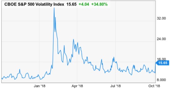
Today we have some volatility expansion.

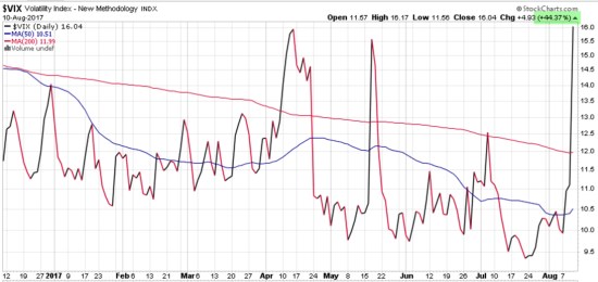
The VIX Volatility Index has gained 35%. It implies the market now expects higher volatility. Specifically, the market expects the range of prices to spread out over 15% instead of 12%.

VIX $VIX Volatility Expansion asymmetry asymmetric convexity divergence

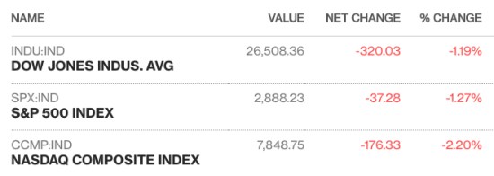
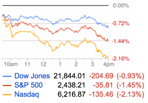
The popular stock indexes are down over -1% for the first time in a while.

stock market asymmetry asymmetric risk

As I said nine days ago, it should be no surprise to see some volatility expansion. Volatility is mean reverting, which means it tends to oscillate in a high and low range and reverse back to an average after its reaches those cycle highs and lows.

Implied volatility had reached its historical low end, so it’s expanding back out. Stock prices are also spreading out and declining so we shouldn’t be surprised to see more movement in prices in the coming weeks.

At around the same time volatility was contracting and calm, my momentum indicators were signaling stock indexes and many individual stocks were reaching short-term extreme levels that often preceded a short-term decline. These systems prompt me tactically reduce exposure to stocks to dynamically manage our risk.

Only time will tell how it all plays out. We’ll see how it unfolds from here.

Mike Shell is the Founder and Chief Investment Officer of Shell Capital Management, LLC, and the portfolio manager of ASYMMETRY® Global Tactical.

The observations shared in this material are for general information only and are not intended to provide specific advice or recommendations for any individual. Investing involves risk including the potential loss of principal an investor must be willing to bear. Past performance is no guarantee of future results. The presence of this website on the Internet shall in no direct or indirect way raise an implication that Shell Capital Management, LLC is offering to sell or soliciting to sell advisory services to residents of any state in which the firm is not registered as an investment advisor. 

The week in review shows some shifts

Much of the observations I shared last week are continuing to be more apparent this week.  So, in case you missed it, this may be a good time to read them.

Earnings season is tricky for momentum growth stocks

I discussed how earnings season can drive a volatility expansion in stocks, especially high growth momentum stocks. The stock market leaders can become priced for perfection, so we never know how investors will react to their earnings reports. To achieve asymmetric returns from momentum stocks, we need a higher magnitude of positive reactions than adverse reactions over time. On a quarterly basis, it can be tricky. The gains and losses as much as 20% or more in the most leading momentum stocks like Facebook ($FB), Google ($GOOGL), Twitter ($TWTR), Grub ($GRUB), and NetFlix ($NFLX) have since provided a few examples.

Front-running S&P 500 Resistance

In Front-running S&P 500 Resistance I shared an observation that many market technicians incorrectly say support and resistance appear before it actually does. We won’t know if resistance to a price breakout exists until the price actually does pause and reverse. I suggested the S&P 500 may indeed pause and reverse, but not because the index drives the 500 stocks in it, but instead because my momentum indicators suggested the $SPY was reaching a short-term overbought range “So, a pause or reversal, at least some, temporarily, would be reasonable.” As of today, the S&P 500 has paused and reversed a little. We’ll see if it turns down or reserves back up to continue an uptrend.

Asymmetry of Loss: Why Manage Risk?

asymmetry of loss losses asymmetric exponential

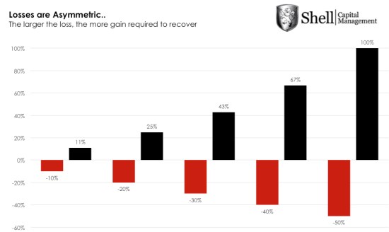
In Asymmetry of Loss: Why Manage Risk? I showed a simple table of how losses compound exponentially. When losses become greater than -20%, it becomes more exponential as the gains required to recover the loss are more and more asymmetric.  This simple concept is essential and a cornerstone to understanding portfolio risk management. Buy and hold type passive investors who hold a fixed allocation of stocks and bonds are always fully exposed to market risk. When the market falls and they lose -20%, -30%, -50% or more of their capital, they then face hoping (and needing) the market to go back up 25%, 43%, or 100% or more just to get back to where they were. This can take years of valuable time. Or, it could take a lifetime, or longer. Just because the markets have rebounded after being down for four or five years from their prior highs doesn’t guarantee they will next time. Past performance is no guarantee of future results.

Trend following applied to stocks

In Trend following applied to stocks, the message was short and sweet: gains are produced by being invested in stocks or markets that are trending up and losses are created by stocks trending against us. Investors prefer to be in rising stocks and out of falling stocks. But, as I showed in Earnings season is tricky for momentum growth stocks the trick is giving the big trends enough room to unfold. In fact, applying trend following and momentum methods to stocks is also tricky. It’s a skill that goes beyond just looking at a chart and it’s not just a quantitative model.

Stock market investor optimism rises above the historical average

About two weeks ago,  the measures of investor sentiment showed a lot of optimism about future stocks prices, so we shouldn’t have been surprised to see some stocks fall. When a lot of enthusiasm is already priced in, investors can respond with disappointment when their stocks don’t live up to high expectations.

Much of the momentum and trend following in stocks is driven by an overreaction to the upside that can be accompanied by an overreaction to the downside. A robust portfolio management system factors these things in.


Mike Shell is the Founder and Chief Investment Officer of Shell Capital Management, LLC, and the portfolio manager of ASYMMETRY® Global Tactical.

You can follow ASYMMETRY® Observations by click on on “Get Updates by Email” on the top right or follow us on Twitter.

The observations shared in this material are for general information only and are not intended to provide specific advice or recommendations for any individual. Investing involves risk including the potential loss of principal an investor must be willing to bear. Past performance is no guarantee of future results.

Stock market indexes lost some buying enthusiasm for the day

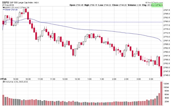
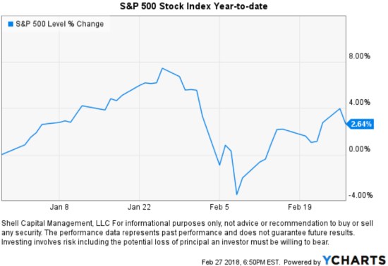
Buying enthusiasm reversed from positive to selling pressure today after the first hour. I observed notable selling volume at the close, which was the opposite of what I pointed out last Thursday.The S&P 500 Stock Index was down -1.27% for the day.


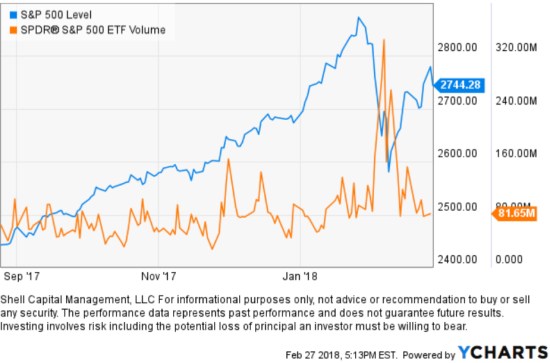
I’ll also share that volume increased sharply during the -10% decline in the S&P 500 Stock Index earlier this month. No surprise, it was selling pressure after many months of buying enthusiasm, just an observation…


So far, the S&P 500 Stock Index has regained approximately half of its -10% loss earlier this month and is now up 2.64% for the year.

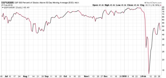
Since I pointed out that the stocks inside the S&P 500 has dropped to a much lower risk zone in Stock Market Analysis of the S&P 500, the % of stocks in the index above their 50 day moving average increased from only 14% in a positive trend to 55%. Today, 18% fewer stocks are above their 50-day moving averages.

S&P 500 percent of stocks above 50 day moving average Feb 2018

None of this is yet suggesting a change of trend, but when stock popular stock indexes gain or lose more than 1% or so my plan is to update it here.


Mike Shell is the Founder and Chief Investment Officer of Shell Capital Management, LLC, and the portfolio manager of ASYMMETRY® Global Tactical.

You can follow ASYMMETRY® Observations by click on on “Get Updates by Email” on the top right or follow us on Twitter.

Investment results are probabilistic, never a sure thing. Past performance is no guarantee of future results.

In the final stages of a bull market

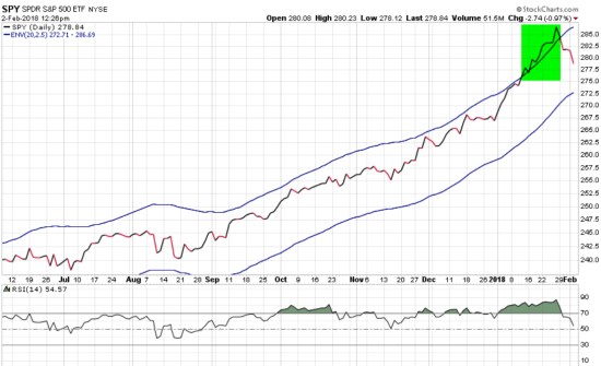
In the final stages of a bull market, we normally see a parabolic move to the upside, a final blowoff that gets in the last investors. Buying demand is the response of investor euphoria like I pointed out last week.

An indication of a parabolic move is seen in price channels and confirmed with momentum oscillators. Only time will tell if this is it, but in the chart, I highlight the S&P 500 stock index broke out above an upper moving average channel.

spy spx trend

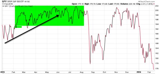
Price trends usually peak with volatile swings up and down before a larger leg down. Some swing tighter than others, but there is normally a period of “indecision” that precedes an intermediate trend change or drawdown. A drawdown is a decline in the value of an investment or market below its all-time high. Below is the period leading up to the -15% drawdown in the stock index late 2015 – 2016. In the green box, I show the price trend entered a period of swings up and down before breaking an upward trend, drifting more sideways, then a-15% decline.

spy eem stock market

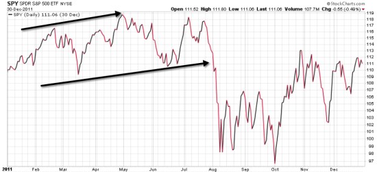
Next is the swings in the S&P 500 entered into what became a -18% decline in 2011. My point here is that larger legs down don’t necessarily happen all at once, there are indecisive swings that eventually fall apart.

spy 2011 decline

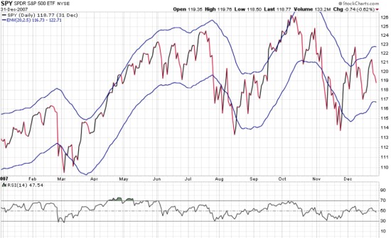
The top in 2007 presented much larger swings and of course ended up declining -56% over nearly two years afterward. I believe these swings up and down before a larger trend unfolds is indecision among traders and investors. Again, my point here is that larger legs down don’t necessarily happen all at once, we instead observe indecisive swings that eventually fall apart.

spy spx 2007 stock market top

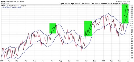
Lastly, here is the 1999 – 2000 peak that also presented wings like the previous peaks. The stock market trend broke above a simple channel a few times before entering a -50% bear market.

stock market top 1999

The current trend just recently stretched above the channel and at the same time, was very overbought for months as measured by the momentum oscillators. This happened at the same time bullish investor sentiment measures was reaching record highs and volatility at historical lows. However, as seen in observations above, the U.S. stock market could just now be entering into a phase of swings up and down that could last for months or years, or it could fall apart sooner. Either way, I make this point for situational awareness.

As a portfolio manager, I don’t need to know for sure what’s going to happen next.  I just know what I’ll do next as trends unfold.

Only time will tell if this is the early stages of an end of an aged bull market or just an interruption of a euphoric “melt up”. We don’t need to know when a major top is in. It doesn’t require an ON/OFF switch. When a big bear market does come, it will be made up of many swings up and down along the way over many months. People will crave to be in, out, in out, in, out, as it all unfolds.  Adaptability is essential: the consistent willingness and ability to alter attitudes, thoughts, and behaviors to appropriately respond to actual or anticipated change in the environment.

Clearly, it’s the swings we have to be prepared for… if we want to avoid a loss trap.  In a loss trap, investors get caught in a loss and have a hard time getting out. When they lose more than they can afford or more than their risk tolerance, they are prone to tap out after large declines. To avoid the loss trap, know your risk tolerance and actively manage risk within that tolerance.

Mike Shell is the Founder and Chief Investment Officer of Shell Capital Management, LLC, and the portfolio manager of ASYMMETRY® Global Tactical.

Investment results are probabilistic, never a sure thing.

Mike Shell is the Founder and Chief Investment Officer of Shell Capital Management, LLC, and the portfolio manager of ASYMMETRY® Global Tactical.

The observations shared on this website are for general information only and are not specific advice, research, or buy or sell recommendations for any individual. Investing involves risk including the potential loss of principal an investor must be willing to bear. Past performance is no guarantee of future results. The presence of this website on the Internet shall in no direct or indirect way raise an implication that Shell Capital Management, LLC is offering to sell or soliciting to sell advisory services to residents of any state in which the firm is not registered as an investment advisor. Use of this website is subject to its terms and conditions.

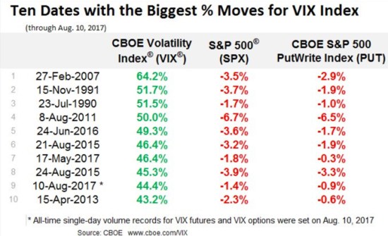
VIX Trends Up 9th Biggest 1-day Move

About a week after a hedge fund manager who is popular with the media but has a poor track record of managing risk said “please stop talking about the low VIX”, it gains 44.4% in a single day – its 9th biggest 1-day move. He was suggesting the low VIX wasn’t an indication of high risk. If you have followed my observations, you know that I disagree. I’m one who has been talking about the low VIX and suggesting it is one of many indications of complacency among investors. That is, investors hear “all time new highs” and get overly optimistic instead of reducing their risk or being prepared to manage downside loss.

VIX biggest moves

I point out the hedge fund manager’s comment because I believe a low VIX is an indication of complacency because it measures expected implied volatility for options on the S&P 500 stocks. When implied volatility gets to historical low points, it means options traders aren’t paying high premiums for hedging “protection”. Others can believe what they want to believe. I don’t just point out observations at extremes. I actually do something.

As I pointed out recently in “No Inflection Point Yet, But… ” the VIX was at an extreme low. About a week later this other fund manager implies it may not be meaningful. That’s exactly what we expect to hear when the expected volatility gets to such an extreme low. We expect to see it shift the other direction at some point. I like to follow trends until they reach an extreme – and reverse.

Here is what it looked like.

VIX 9th biggest one day move

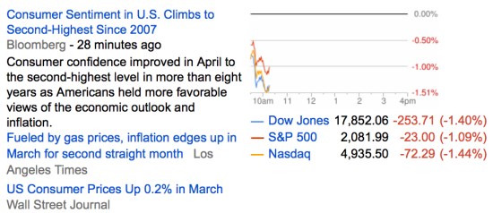
More importantly, here is what the stock indexes looked like on Google Finance after the close:

Stock market down Korea

Another observation I shared in “No Inflection Point Yet, But…” is that leading stocks can sometimes be more volatile and yesterday was no exception. While the stock indexes were down around -1.5% some of the most popular stocks were down about twice as much:

FANG stocks downSource: Google Finance

Of course, this is all just one day. We’ll see if it continues into a longer trend.

It’s always a good time to manage risk, but sometimes it’s more obvious than others.

Is this the Inflection Point for Stocks?

As if the election result wasn’t enough, the U.S. stock market has surprised most people by trending up since last November.

But, it has been stalling since March. The S&P 500 drifted down about -3% into March and April.

The stock market seems to be at an inflection point now.
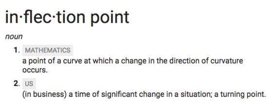
Understanding the market state is an examination of the weight of the evidence.

The weight of the evidence seems to suggest defense.

My first indicator is always the actual price trend itself. If we want to know what is going on, there is no better observation than the actual price trend. The price action tells us what force is in control: supply or demand. And, we can see the potential for the inflection point – when the direction is changing. In the chart below, I highlight a recent point of “resistance”. I call it resistance because the stock index hasn’t broken above the March high and is instead drifting sideways.

average age of bull market top

Investors sometime assume a prior price high will automatically become “resistance” just because it’s the price range they expect to see the price trend stall. Resistance is the price level where selling is expected to be strong enough to prevent the price from rising further. We can see that recently in the chart. As the price advances towards the prior peak, supply may overcome demand and prevent the price from rising above resistance. For example, it may be driven by investors who wished they had sold near the prior peak and had to wait as the price recovered again. They anchor to that prior high. Once it gets back to the prior peak, they exit. Prior highs don’t always become “resistance” as expected. Sometimes demand is strong enough to break through and keep trending up. At this point, we see there has been some resistance at the prior high. I highlighted it in yellow in the chart above. So, we shouldn’t be surprised to see the price decline if this resistance holds for a while. Or, it could be an inflection point.

The S&P 500 stock index is mainly large companies. Smaller companies tend to lead larger companies. Their price trends move in a wider range and they sometimes move faster, so they get to a point sooner. That’s why we say small company stocks “lead” large company stocks. In that case, I highlight below that the small company stock index, the S&P 600 Small Cap ETF, reached its prior, but found resistance and reversed down. The soldiers may lead the way for the Generals.
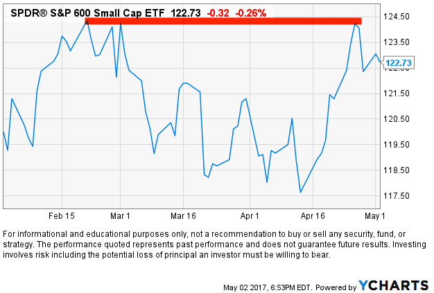
Small Cap

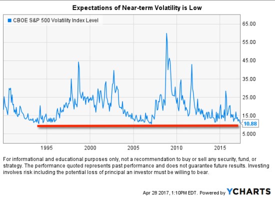
It seems that the stock index is stalling at a time when investors are complacent. When investors are complacent or overly optimistic an inflection point is more likely. The CBOE Volatility Index® (VIX® Index)  is very low. The CBOE Volatility Index® (VIX® Index®) is a key measure of market expectations of near-term volatility conveyed by S&P 500 stock index option prices. The VIX® historically trends between a long-term range. When the VIX® gets to an extreme, it becomes more likely to eventually reverse. In the chart below I show the price level of the VIX® since its inception in 1993. We can see its long-term average is around 20. I highlighted in red its low range is around 12 and it has historically spiked as high as 25 or 60. This means the traders of options are expecting lower volatility in the weeks ahead at a time when other things seem to suggest otherwise.
As I continue sharing some observations, I’m going to get farther away from my main decision maker which is the directional price trend, but you’ll see how these indicators help to quantify the state of the trend and the potential for an inflection point. As we keep going, keep in mind that indicators are a derivative of the price at best or a derivate of something unrelated to the directional price trend. In the case of the VIX® Index index above, it’s a measure of options (a derivative) on the stocks in the S&P 500. When we start looking at things like economic growth and valuations we are necessarily looking at things that are a derivative of price, but not as absolute as the price trend itself. The direction of the price trend is the arbiter.

Another signal of an inflection point is breadth. That is, what percent of stocks are rising or falling. Since I have mentioned the S&P 500 stock index, I’ll show the S&P 500 Bullish Percent Index below. The Bullish Percent is a breadth indicator based on the number of stocks on Point & Figure buy signals. Developed by Abe Cohen in the mid-1950s, the Bullish Percent Index was originally applied to NYSE stocks. Cohen was the first editor of ChartCraft, which later became Investors Intelligence. BP signals were further refined by Earl Blumenthal in the mid 70’s and Mike Burke in the early 80’s. The S&P 500 Bullish Percent shows a composite of the 500 stocks in the S&P 500 index that are in a positive trend. The S&P 500 Bullish Percent recently reversed to a column of O’s from a high point of 80, which means about 80% of the S&P 500 stocks were in a positive trend and about 8% of them are now in a negative trend. In addition to the direction, the level is important because we consider the level above 70% or 80% to be a higher risk (red zone) and the levels below 30% to be lower risk (green zone). So, more and more stocks within the index are starting to decline. This weak “breadth” or participation could be a signal of a change in trend.
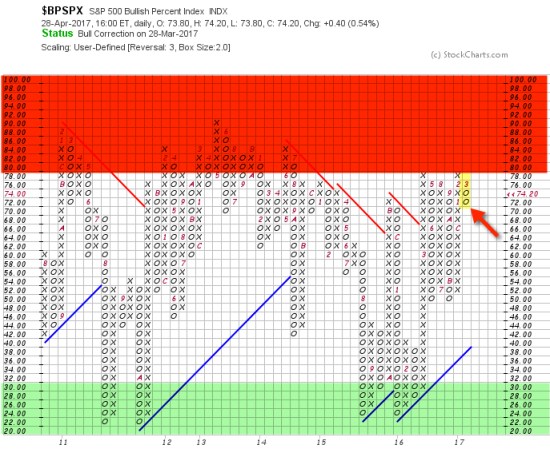
Bullish Percent

I’m not necessarily a big user of economic indicators. I believe the stock indexes are the leading indicator for the economy, so that’s my guide. However, I have a strong sense of situational awareness so I like to understand what in the world is going on. The total return of stocks is a function of three things: earnings growth + dividend yield + P/E ratio expansion or contraction. Since earnings growth has made up nearly 5% of the historical total return of the S&P 500 since 1926, it does matter in the big picture in regard to expected return. Today, we observe the headline in the Wall Street Journal:

GDP Slows to Weakest Growth in Three Years

The U.S. economy’s output grew at the slowest pace in three years during the first quarter, underscoring the challenges facing the Trump administration as it seeks to rev up growth.

The New York Times says:

G.D.P. Report Shows U.S. Economy Off to Slow Start in 2017

■ The economy barely grew, expanding at an annual rate of only 0.7 percent.

■ The growth was a sharp decline from the 2.1 percent annual rate recorded in the final quarter of last year. It was the weakest quarterly showing in three years.

■ Consumption, the component reflecting individual spending, rose by only 0.3 percent, well below the 3.5 percent rate in the previous quarter.

The Takeaway

The first-quarter performance upset expectations for a Trump bump at the start of 2017.

If you want an economic catalyst for why prices could stall or reverse down, there you go. You see, earnings growth of stocks is part of GDP. GDP is the sales of all U.S. companies, private and public. The earnings growth of the S&P 500 is the earnings of those 500 companies. In other words, GDP of the economy is highly connected to EPS of an index of 500 stocks.

This recent stall in the price trend and economic growth along with a dash of complacency comes at a time when stocks are “significantly overvalued”, according to my friend Ed Easterling at Crestmont Research:

“In the first quarter the stock market surged 5.5%, well more than underlying economic growth. As a result, normalized P/E increased to 29.4—significantly above the level justified by low inflation and low interest rates. The current status remains “significantly overvalued.” The level of volatility plunged over the past quarter and is now in the lowest 4% of all periods since 1950. The trend in reported earnings for the S&P 500 Index reflects a repeating pattern of overly-optimistic analysts’ forecasts. Earnings and volatility should be watched closely and investors should heighten their sensitivity to the risks confronting an increasingly vulnerable market.”

Oh, and one more thing: Monday will be May. I’m not a huge fan of using seasonality as an indicator to enter or exit the stock market, but there is some tendency for certain periods to gain or lose value historically. For example, a common seasonality is “Sell in May and go away”. Depending on the historical time frame you look and which index, some periods show a “summer slump”. One theory is many investors and traders go on vacation in the summer, so volume is light. They return after the summer and take more action.

So, maybe this will be a good time to sell in May and go away. Not because it’s May, but instead because the weight of the evidence suggests this could be an inflection point.

We’ll see.
Asymmetric Volatility

Volatility is how quickly and how far data points spread out.

Asymmetric is not identical on both sides, imbalanced, unequal, lacking symmetry.

This time of year we are reminded of asymmetric volatility in the weather. The wide range in the temperature is highlighted in the morning news.

This morning, it’s 72 degrees and sunny down south and below freezing and snowing up north.

asymmetric-volatility

Source: MyRadar

Some of the news media presents the variation in a way that invites relative thinking. Just like the financial news programs that show what has gained and lost the most today, the weather shows the extreme highs and lows.

Those who watch the financial news may feel like they missed out on the stock or market that gained the most, then be glad they weren’t in one that lost the most. Some feelings may be more asymmetric: they feel one more than the other.

Prospect Theory says most of us feel a loss much greater that we do a gain. It’s another asymmetry: losses hurt more than gains feel good (loss aversion).

If you are up north trying to stay warm, you may wish you were down south sitting on the beach.

If you are down south trying to stay cool, you may wish you were up north playing in the snow!

It really doesn’t matter how extreme the difference is (the volatility). The volatility is what it is. Volatility is just a range.

What matters is what we want to experience.

If we want to experience snow we can fly up north.

If we want to experience sunny warmth we can fly down south.

If we want less volatility, we could live down south in the winter and up north in the summer.

We get to decide what we experience.

Investor Optimism is Reaching Extreme

As it often does, the U.S. stock market trended the complete opposite of what market pundits expected after the election.

Clearly, a Presidential election can be the blame for volatility we saw this year before the election. However, instead of crashing down U.S. stocks regained their previous losses quickly. Along with that, investor sentiment shifted from fearful a month ago to much more optimistic as prices trended up. At this point, investors have probably forgotten how volatile markets were the first part of 2016. Once the losses are regained, they eventually forget the stock indexes were down -12% or more in January and February.

Investors tend to get optimistic (or even greedy) after prices have gone up and then fearful after prices go down.

I am not necessarily a contrarian investor. I mainly want to be positioned in the direction of global markets and stay there until they change. But markets sometimes get to an extreme – increasing the probability of a reversal. At this point, a tactical trader can hedge, reduce exposure, realize profits, or wait until an actual reversal to respond.

My purpose of pointing out these extremes in investor sentiment (fear and greed) is to illustrate how investors’ feelings oscillate between the fear of missing out (if global markets have gone up and they aren’t in them) and the fear of losing money (if they are in global markets and they are falling). Fear and greed is a significant driver of price trends. When stock market investor sentiment reaches an extreme, it often reverses trend afterward.

Indicators suggest that investors are pursuing higher risk strategies and that investor optimism has reached a short-term extreme. I like to use the Fear & Greed Index that is a simple snapshot for anyone to see. Below is the reading as of yesterday as it reached “Extreme Greed.”

cnn-fear-greed-index

We shouldn’t be surprised to see the recent upward price trend reverse down, at least temporarily.

Along with that, we could see investor sentiment reverse from “Extreme Greed” to “Fear” as prices fall.

It’s OK to feel and experience your feelings… if you feel the right feeling at the right time.

Indicators like this can help investors observe how they tend to feel the wrong feeling at the wrong time.


To learn more, below are some of my previous observations about sentiment reaching an extreme greed level of optimism.

Investor Optimism Seems Excessive Again

It’s official: extreme greed is driving the stock market

What emotion is driving the market now? Extreme Greed

Essence of Portfolio Management

Essence of Portfolio Management

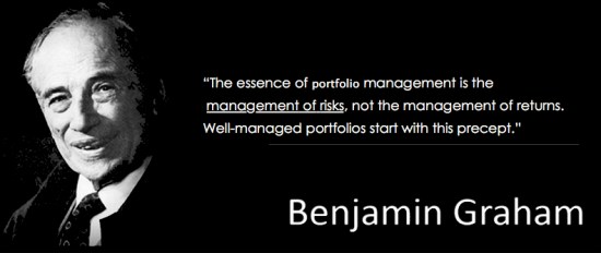
“The essence of investment management is the management of risks, not the management of returns. Well-managed portfolios start with this precept.”

– Benjamin Graham

The problem is many portfolio managers believe they manage risk through their investment selection. That is, they believe their rotation from one seemingly risky position to another they believe is less risk is a reduction in risk. But, the risk is the exposure to the chance of a loss. The exposure is still there. Only the perception has changed: they just believe their risk is less. For example, for the last thirty years, the primary price trend for bonds has been up because interest rates have been falling. If a portfolio manager shifts from stocks to bonds when stocks are falling, bonds would often be rising. It appears that trend may be changing at some point. Portfolio managers who have relied on bonds as their safe haven may rotate out of stocks into bonds and then their bonds lose money too. That’s not risk management.

They don’t know in advance if the position they rotate to will result in a lower possibility of loss. Before 2008, American International Group (AIG) carried the highest rating for an insurance company. What if they rotated to AIG? Or to any of the other banks? Many investors believed those banks were great values as their prices were falling. They instead fell even more. It has taken them a long time to recover some of their losses. Just like tech and telecom stocks in 2000.

All risks cannot be hedged away if you pursue a profit. If you leave no chance at all for a potential profit, you earn nothing for that certainty. The risk is exposure to an unknown outcome that could result in a loss. If there is no exposure or uncertainty, there is no risk. The only way to manage risk is to increase and decrease the exposure to the possibility of loss. That means buying and selling (or hedging).  When you hear someone speaking otherwise, they are not talking of active risk management. For example, asset allocation and Modern Portfolio Theory is not active risk management. The exposure to loss remains. They just shift their risk to more things. Those markets can all fall together, as they do in real bear markets.

It’s required to accomplish what the family office Chief Investment Officer said in “What a family office looks for in a hedge fund portfolio manager” when he said:

“I like analogies. And one of the analogies in 2008 brings to me it’s like a sailor setting his course on a sea. He’s got a great sonar system, he’s got great maps and charts and he’s perhaps got a great GPS so he knows exactly where he is. He knows what’s ahead of him in the ocean but his heads down and he’s not seeing these awesomely black storm clouds building up on the horizon are about to come over top of him. Some of those managers we did not stay with. Managers who saw that, who changed course, trimmed their exposure, or sailed to safer territory. One, they survived; they truly preserved capital in difficult times and my benchmark for preserving capital is you had less than a double-digit loss in 08, you get to claim you preserved capital. I’ve heard people who’ve lost as much as 25% of investor capital argue that they preserved capital… but I don’t believe you can claim that.Understanding how a manager managed and was nimble during a period of time it gives me great comfort, a higher level of comfort, on what a manager may do in the next difficult period. So again it’s a it’s a very qualitative sort of trying to come to an understanding of what happened… and then make our best guess what we anticipate may happen next time.”

I made bold the parts I think are essential.

If you are like-minded and believe what we believe, contact us.

Each of us tends to think we see things as they are, that we are objective. But this is not the case. We see the world, not as it is, but as we are—or, as we are conditioned to see it. When we open our mouths to describe what we see, we in effect describe ourselves, our perceptions, our paradigms.”

– The Seven Habits of Highly Effective People: Powerful Lessons in Personal Change by Stephen R. Covey, Quote Page 28 (2004)

We see the world not as it is but as we are

What would Warren Buffett do?

Few investors have gotten as much media attention than Warren Buffett. He is considered to be the most famous investor in the world. Buffett is the chairman, CEO and largest shareholder of Berkshire Hathaway (BRK.A) and is consistently ranked among the world’s wealthiest people. He earned his money investing. Buffett is often referred to as the “Oracle of Omaha”. Plenty has been said about his performance over the decades.

Below is an interesting view of the Total Return (Price + Dividends) of his Berkshire Hathaway (BRK.A). The chart shows the “% off high” to see its drawdowns. A drawdown is how much a price trend declines from a previous high before it recovers the decline. Berkshire Hathaway (BRK.A) has so far declined -17.2% from its high. During the bear market 2007 to 2009 it declined -50%.

Warren Buffett Berkshire Hathaway

Though -10% declines are fairly common for stocks, 2011 was the last year that stocks declined more than -15% within the year. During 2011, Berkshire Hathaway (BRK.A) dropped about -23% before recovering and eventually trending to new highs.

BERKSHIRE Hathaway 2011

Warren Buffett is 85 years old and has been doing this a very long time. He certainly has some tolerance for stock market declines.

What do you think Warren Buffett is doing right now? 

Extreme Fear is Now Driving Markets

On October 27th I wrote in Fear and Greed is Shifting and Models Don’t Avoid the Feelings that:

The CNN Fear & Greed Index shows investor fear and greed shifted to Extreme Fear a month ago as the popular U.S. stock indexes dropped about -12% or more. Many sectors and other markets were worse. Since then, as prices have been trending back up, Greed is now the driver again. I believe fear and greed both drives market prices but also follows price trends. As prices move lower and lower, investors who are losing money get more and more afraid of losing more. As prices move higher and higher, investors get more and more greedy. If they have reduced exposure to avoid loss, they may fear missing out.

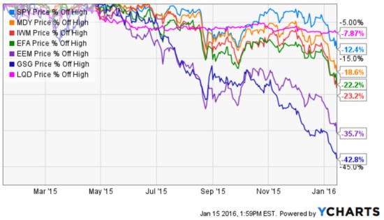
Since global markets declined around August and some markets recovered much of their losses by November, global markets have declined again. Below are charts of U.S. stocks, International stocks, U.S. bonds, and commodities. Even the iShares iBoxx $ Investment Grade Corporate Bond ETF that seeks to track the investment results of an index composed of U.S. investment grade corporate bonds is near -8% from its peak. Small and mid companies U.S. stocks are down more than -20% from their peak. Commodities and emerging countries are down the most.

global markets 2016-01-15_13-59-45.jpg

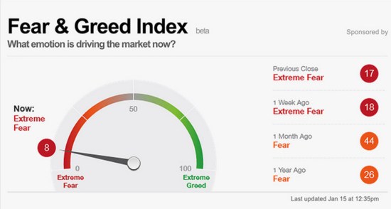
This all started with investors being optimistic in late October as I mentioned in Fear and Greed is Shifting and Models Don’t Avoid the Feelings. So, it is no surprise that today is just the opposite. As markets have declined investors become more and more fearful. As of now, Extreme Fear is the driver of the market.  Below is the current reading of the CNN Fear & Greed Index.

Fear and Greed Index

Source: CNN Fear & Greed Index 

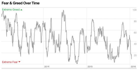
As you see in the chart below, it’s now getting close to the Extreme Fear levels that often signal at least a short-term low.

Fear and Greed Over Time

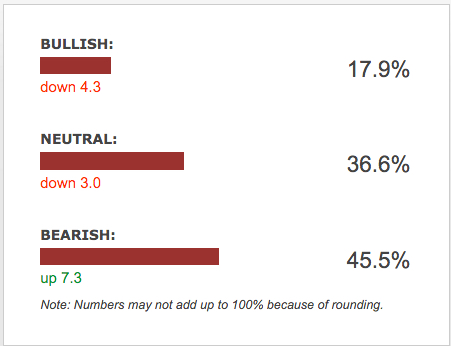
Another publicly available measure of investor sentiment is the AAII Investor Sentiment Survey. The AAII Investor Sentiment Survey measures the percentage of individual investors who are bullish, bearish, and neutral on the stock market for the next six months; individuals are polled from the ranks of the AAII membership on a weekly basis. The most recent weekly survey shows investors are very bearish and again, such pessimism occurs after price declines and at such extremes sometimes precedes a reversal back up.

Survey Results for Week Ending 1/13/2016

AAII Investor Sentiment January 2016

Source: AAII Investor Sentiment Survey

I say again what I said in October: This is the challenge in bear markets. In a bear market, market prices swing up and down along the way. It’s these swings that lead to mistakes. Above was a chart of how the Fear and Greed Index oscillates to high and low points over time. Investors who experience these extremes in emotion have the most trouble and need to modify their behavior so they feel the right feeling at the right time. Or, hire a manager with a real track record who can do it for them and go do something more enjoyable.

Here’s to the crazy ones. The misfits. The rebels. The troublemakers. The round pegs in the square holes. The ones who see things differently. They’re not fond of rules. And they have no respect for the status quo. You can quote them, disagree with them, glorify or vilify them. About the only thing you can’t do is ignore them. Because they change things. They push the human race forward. And while some may see them as the crazy ones, we see genius. Because the people who are crazy enough to think they can change the world, are the ones who do.”

Steve Jobs

Steve Jobs

Gold Isn’t Always A Hedge or Safe Haven: Gold Stock Trends Have Been Even Worse

For several years we often heard investors suggesting to “buy gold”. We could throw in Silver here, too. They provide many theories about how gold bullion or gold stocks are a “safe haven”. I’ve written about the same assumption in Why Dividend Stocks are Not Always a Safe Haven.

In fact, the Market Vectors Gold Miners ETF website specifically says about the gold stock sector:

“A sector that has historically provided a hedge against extreme volatility in the general financial markets”.

Source: http://www.vaneck.com/gdx/

When investors have expectations about an outcome, or expect some cause and effect relationship, they expose themselves in the possibility of a loss trap. I will suggest the only true “safe haven” is cash. 

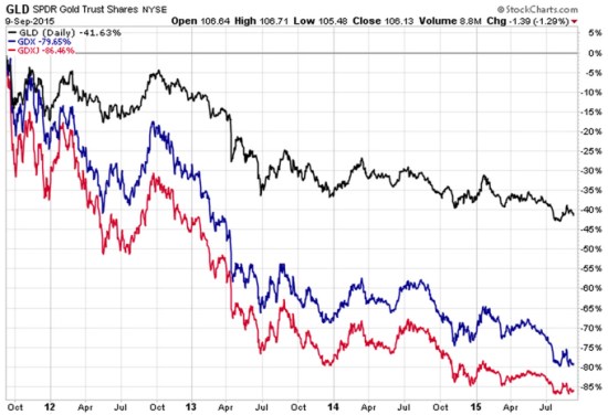
Below is a 4 year chart of two gold stock ETFs relative to the Gold ETF. First, let’s examine the index ETFs we are looking at. Of course, the nice thing about ETFs in general is they are liquid (traded like a stock) and transparent (we know what they hold).

GLD: SPDR Gold “Shares offer investors an innovative, relatively cost efficient and secure way to access the gold market. SPDR Gold Shares are intended to offer investors a means of participating in the gold bullion market without the necessity of taking physical delivery of gold, and to buy and sell that interest through the trading of a security on a regulated stock exchange.”

GDX: Market Vectors Gold Miners ETF: “The investment seeks to replicate as closely as possible, before fees and expenses, the price and yield performance of the NYSE Arca Gold Miners Index. The fund normally invests at least 80% of its total assets in securities that comprise the Gold Miners Index. The Gold Miners Index is a modified market-capitalization weighted index primarily comprised of publicly traded companies involved in the mining for gold and silver.”

GDXJ: Market Vectors Junior Gold Miners ETF seeks to replicate as closely as possible, before fees and expenses, the price and yield performance of the Market Vectors Global Junior Gold Miners Index. The Index is intended to track the overall performance of the gold mining industry, which may include micro- and small capitalization companies.

Gold stocks vs Gold

Source: Shell Capital Management, LLC created with http://www.stockcharts.com

Clearly, gold has not been a “safe haven” or “provided a hedge against extreme volatility in the general financial markets”. It has instead demonstrated its own extreme volatility within an extreme downward price trend.

Further, gold mining stocks have significantly lagged the gold bullion index itself.

These ETFs have allowed for the trading of gold and gold stocks, SPDR Gold explains it well:

“SPDR Gold Shares represent fractional, undivided beneficial ownership interests in the Trust, the sole assets of which are gold bullion, and, from time to time, cash. SPDR Gold Shares are intended to lower a large number of the barriers preventing investors from using gold as an asset allocation and trading tool. These barriers have included the logistics of buying, storing and insuring gold.”

However, this is a reminder that markets do not always play out as expected. The expectation of a “safe haven” or “hedge against extreme volatility” is not a sure thing. Markets may end up much worst that you imagined they could.  As many global and U.S. markets have been declining, you can probably see why I think it’s important to manage, direct, limit, and control exposure to loss. Though, not everyone does it well. It isn’t a sure thing…

______

For informational and educational purposes only, not a recommendation to buy or sell and security, fund, or strategy. Past performance and does not guarantee future results. Please click the links provide for specific risk information about the ETFs mentioned. Please visit this link for important disclosures, terms, and conditions.

The Southern Voice: What You Don’t Know About the South and the Southern Accent

Asymmetric Information is when someone has superior or more knowledge than others about a topic. The Illusion of Asymmetric Insight occurs when people perceive their knowledge of others to surpass other people’s knowledge of themselves. An asymmetric advantage goes beyond a normal advantage of knowledge into the realm of having asymmetric information and knowing things others do not.

Over the past few weeks, there has been much in the media about the Confederate Battle flag and misinformation about the South. As it turns out, it seems many people may be more ignorant about these things than they believe they are. So you think the “Southern Accent” is bad English? Au contraire.

In Southern American English, Wikipedia says:

“The Southern U.S. dialects make up the largest accent group in the United States”

Wikipedia cites PBS as the source: “Do You Speak American: What Lies Ahead.” Specifically, that article says: 

  • Due to a huge migration to the South and Southwest and the national appeal of country music, Southern speech is now the largest accent group in the United States.
  • The dominant form is what linguists call Inland Southern…

As a Southerner myself, I have always known my Southern dialect is derived from my European ancestors. If you aren’t from the South or weren’t taught its history, you may not realize that. Most of the settlers in Appalachia and the South came from Scotland, Ireland, the British Isles. If you know anything about those areas and their people, you can probably see how they may have been attracted to the mountains of Tennessee, north Georgia, and North Carolina. Its geography is similar to their motherland. Oh, and they made whiskey and moonshine.

Researchers have noted that the dialect retains a lot of vocabulary with roots in Scottish “Elizabethan English” owing to the make-up of the early European settlers to the area.

Source: “The Dialect of the Appalachian People.” Wvculture.org. Retrieved 2012-11-08.

Oh, and they sang fiddle songs like Rocky Top! This is the origin of what has evolved today as “country music.” They blended popular songs, Irish and Celtic fiddle tunes, and various musical traditions from European immigrant communities.

That leads to this very interesting video clip from the History Channel “You Don’t Know Dixie” explaining the many versions of the Southern Accent:

Want to learn more about the South? Search for the History Channel show “You Don’t Know Dixie” at your cable provider. I found it on Verizon and recorded it. Or, it’s available at Amazon.


Mike Shell is the Founder and Chief Investment Officer of Shell Capital Management, LLC, and the portfolio manager of ASYMMETRY® Global Tactical.

Mike Shell and Shell Capital Management, LLC is a registered investment advisor and provides investment advice and portfolio management exclusively to clients with a signed and executed investment management agreement. The observations shared on this website are for general information only and should not be construed as advice to buy or sell any security. Securities reflected are not intended to represent any client holdings or any recommendations made by the firm. Investing involves risk including the potential loss of principal an investor must be willing to bear. Past performance is no guarantee of future results. All information and data is deemed reliable, but is not guaranteed and should be independently verified. The presence of this website on the Internet shall in no direct or indirect way raise an implication that Shell Capital Management, LLC is offering to sell or soliciting to sell advisory services to residents of any state in which the firm is not registered as an investment advisor. Use of this website is subject to its terms and conditions.

Uncharted Territory from the Fed Buying Stocks

I remember sometime after 2013 I told someone “The Fed is buying stocks and that’s partly why stocks have risen so surprisingly for so long”. He looked puzzled and didn’t seem to agree, or understand.

The U.S. Federal Reserve (the “Fed”) has been applying “quantitative easing” since the 2007 to 2009 “global financial crisis”. Quantitative easing (QE) is a type of monetary policy used by central banks to stimulate the economy when standard monetary policy has become ineffective. The Fed implements quantitative easing by buying financial assets from banks and other financial institutions. That raises the prices of those financial assets and lowers their interest rate or yield. It also increases the amount of money available in the economy. The magnitude they’ve done this over the past seven years has never been experience before. They are in uncharted territory.

I was reminded of what I said, “the Fed is buying stocks” when I read comments from Bill Gross in “Gross: Fed Slowly Recognizing ZIRP Has Downside Consequences”. He says companies are using easy money to buy their own stock:

Low interest rates have enabled Corporate America to borrow hundreds of billions of dollars “but instead of deploying the funds into the real economy,they have used the proceeds for stock buybacks. Corporate authorizations to buy back their own stock are running at an annual rate of $1.02 trillion so far in 2015, 18 percent above 2007’s record total of $863 billion, Gross said.

You see, if we want to know the truth about market dynamics; we necessarily have to think more deeply about how markets interact. Market dynamics aren’t always simple and obvious. I said, “The Fed is buying stocks” because their actions is driving the behavior of others. By taking actions to increase money supply in the economy and keep extremely low borrowing rates, the Fed has been driving demand for stocks.

But, it isn’t just companies buying their own stock back. It’s also investors buying stocks on margin. Margin is borrowed money that is used to purchase securities. At a brokerage firm it is referred to as “buying on margin”. For example, if we have $1 million in a brokerage account, we could borrow another $1 million “on margin” and invest twice as much. We would pay interest on the “margin loan”, but those rates have been very low for years. Margin interest rates have been 1 – 2%. You can probably see the attraction. If we invested in lower risk bonds earning 5% with $1 million, we would normally earn 5%, or $50,000 annually. If we borrowed another $1 million at 2% interest and invested the full $2 million at 5%, we would earn another 3%, or $30,000. The leverage of margin increased the return to 8%, or $80,000. Of course, when the price falls, the loss is also magnified. When the interest rate goes up, it reduces the profit. But rates have stayed low for so long this has driven margin demand.

While those who have their money sitting in in bank accounts and CDs have been brutally punished by near zero interest rates for many years, aggressive investors have borrowed at those low rates to magnify their return and risk in their investments. The Fed has kept borrowing costs extremely low and that is an incentive for margin.

In the chart below, the blue line is the S&P 500 stock index. The red line is NYSE Margin Debt. You may see the correlation. You may also notice that recessions (the grey area) occur after stock market peaks and high margin debt balances. That’s the downside: margin rates are at new highs, so when stocks do fall those investors will either have to exit their stocks to reduce risk or they’ll be forced to exit due to losses. If they don’t have a predefined exit, their broker has one for them: “a margin call”.

Current Margin Debt Stock MarginSource: http://www.advisorperspectives.com/dshort/charts/markets/nyse-margin-debt.html?NYSE-margin-debt-SPX-since-1995.gif

If you noticed, I said, “They are in uncharted territory”. I am not. I am always in uncharted territory, so I never am. I believe every new moment is unique, so I believe everyone is always in uncharted territory. Because I believe that, I embrace it. I embrace uncertainty and prepare for anything that can happen. It’s like watching a great movie. It would be no fun if we knew the outcome in advance.


Conflicted News

This is a great example of conflicted news. Which news headline is driving down stock prices today?

Below is a snapshot from Google Finance::

conflicted news 2015-04-17_10-21-43

Trying to make decisions based on news seems a very conflicted way, which is why I instead focus on the absolute direction of price trends.

US Government Bonds Rise on Fed Rate Outlook?

I saw the following headline this morning:

US Government Bonds Rise on Fed Rate Outlook

Wall Street Journal –

“U.S. government bonds strengthened on Monday after posing the biggest price rally in more than three months last week, as investors expect the Federal Reserve to take its time in raising interest rates.”

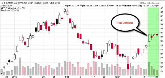
My focus is on directional price trends, not the news. I focus on what is actually happening, not what people think will happen. Below I drew a 3 month price chart of the 20+ Year Treasury Bond ETF (TLT), I highlighted in green the time period since the Fed decision last week. You may agree that most of price action and directional trend changes happened before that date. In fact, the long-term bond index declined nearly 2 months before the decision, increased a few weeks prior, and has since drifted what I call “sideways”.

fed decision impact on bonds
Charts created with http://www.stockcharts.com

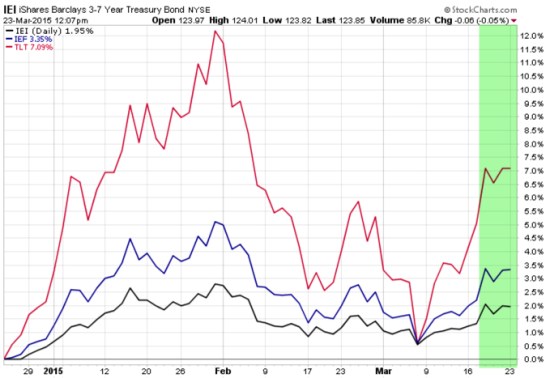
To be sure, in the next chart I included an analog chart including the shorter durations of maturity. iShares 3-7 Year Treasury Bond ETF (IEI) and iShares 7-10 Year Treasury Bond ETF (IEF). Maybe there is some overreaction and under-reaction going on before the big “news”, if anything.

Government bonds Fed decision reaction
Do you still think the Fed news was “new information“?

Fed Decision and Market Reaction: Stocks and Bonds

So, I’m guessing most people would expect if the Fed signaled they are closer to a rate hike the stock and bond markets would fall. Rising interest rates typically drive down stocks along with bonds. Not the case as of 3pm today. Stocks were down about -1% prior to the announcement, reversed, and are now positive 1%. Even bonds are positive. Even the iShares Barclays 20+ Yr Treas.Bond (ETF) is up 1.4% today.

So much for expectations…

Below is snapshot of the headlines and stock price charts from Google Finance:

Fed Decision and Reaction March 18 2015

Source: https://www.google.com/finance?authuser=2

A One-Chart Preview of Today’s Fed Decision: This is what economists are expecting

I can’t image what it must be like sitting around watching and reading the news trying to figure out what the Fed is going to do next. Even if they could know, they still don’t know how the markets will react. New information may under-react to the news or overreact. Who believed there would be no inflation? bonds would have gained so much? the U.S. dollar would be so strong? Gold and oil would be so low? Expectations like that are a tough way to manage a portfolio. I instead predefine my risk and identify the actual direction and go with it. Others believe it comes down to a single word…

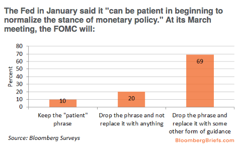
Bloomberg says: Here’s a One-Chart Preview of Today’s Fed Decision: This is what economists are expecting

By far the biggest question is whether the Fed will drop the word “patient” from its statement. If it does drop the word, it creates the possibility of a June rate hike, and it will mark the first time since the financial crisis that the Fed is offering no specific forward guidance as to when rate hikes will come.

About 90 percent of economists surveyed by Bloomberg expect the Federal Reserve to drop the word “patience” in today’s announcement.

fed decision interest rates

source:http://www.bloomberg.com/news/articles/2015-03-18/here-s-a-one-chart-preview-of-today-s-fed-decision

Illusion of Control

illusion_of_control

“The illusion of control is the tendency for people to overestimate their ability to control events; for example, it occurs when someone feels a sense of control over outcomes that they demonstrably do not influence.”

Source: http://en.wikipedia.org/wiki/Illusion_of_control

“There is always a disposition in people’s minds to think that existing conditions will be permanent …

“There is always a disposition in people’s minds to think the existing conditions will be permanent,” Dow wrote, and went on to say: “When the market is down and dull, it is hard to make people believe that this is the prelude to a period of activity and advance. When the prices are up and the country is prosperous, it is always said that while preceding booms have not lasted, there are circumstances connected with this one, which make it unlike its predecessors and give assurance of permanency. The fact pertaining to all conditions is that they will change.”  – Charles Dow, 1900

Source: Lo, Andrew W.; Hasanhodzic, Jasmina (2010-08-26). The Evolution of Technical Analysis: Financial Prediction from Babylonian Tablets to Bloomberg Terminals (Kindle Locations 1419-1423). Wiley. Kindle Edition.

You can probably see from Dow’s quote how trends do tend to continue, just because enough people think they will. However, price trends can continue into an extreme or a “bubble” just because people think they will continue forever. I like to ride a trend to the end when it bends and then be prepared to exit when it does finally reverse, or maybe reduce or hedge off some risk when the probability seems high of a change.

idowcha001p1

Image source: Wikipedia

Charles Henry Dow; November 6, 1851 – December 4, 1902) was an American journalist who co-founded Dow Jones & Company. Dow also founded The Wall Street Journal, which has become one of the most respected financial publications in the world. He also invented the Dow Jones Industrial Average as part of his research into market movements. He developed a series of principles for understanding and analyzing market behavior which later became known as Dow theory, the groundwork for technical analysis.

Are investors getting overly optimistic again?

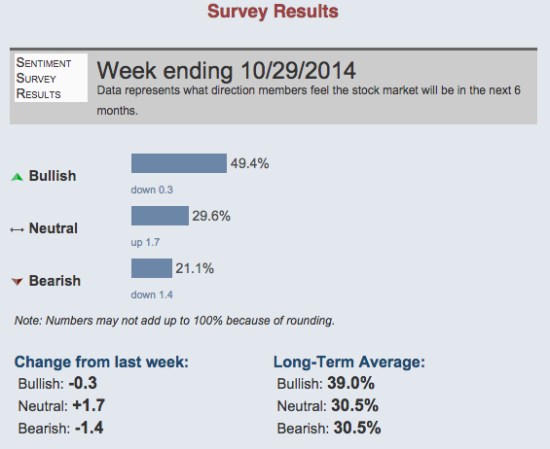
Just as I was observing U.S. stocks getting to a point that I would expect to see stock indexes pull back at least a little or drift sideways, I noticed that investor sentiment readings last week were unusually bullish. 49.4% of investors polled by AAII last week believe stocks will rise in the next 6 months. Only 21.1% were bearish, believing stocks would fall.

That’s an unusual asymmetry between the percent of individual investors believing stocks will rise over those who believe they will fall. You can see the historical averages below.

AAII investor sentiment survey

source: http://www.aaii.com/sentimentsurvey?adv=yes

Investors tend to get more bullish about stocks after they have risen recently (and they have). They tend to get more bearish after stocks have fallen and they are losing money – and fear losing more.

It isn’t a perfect indicator, but the majority tends to feel the wrong feelings at the wrong timeThat presents an advantage for those of us who don’t, and are aware of how behavior signals trends, but a challenge for advisers and individual investors as they try to modify their behavior to avoid it.

Markets don’t always react the way investors expect, so I focus on what is actually happening

hedge fund market wizards

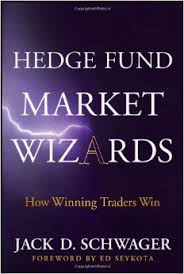
I noted the below question and answer between Jack Schwager and Ray Dalio in Jack’s book “Hedge Fund Market Wizards: How Winning Traders Win” (2012). Ray Dalio is the founder of Bridgewater, the largest hedge fund in the world and one of the most successful. I saved it when I read the book as a fine example that markets don’t always react the way people expect, and that is why I focus instead on what is actually happening rather than what could or should happen – but may not. Everything is very transient, coming and going, and it’s funny how some of the same kinds of things happen over and over again. As you read comments below you’ll hear it’s always a similar story, different day. 1982 was the end of a 20 year secular bear market made up of huge swings similar to the past decade and the beginning of the largest bull market on record up to 2000.

Below is Jack Schwager asking a question to Ray Dalio:

Any other early experiences stand out where the market behaved very differently from what you expected?

In 1982, we had worse economic conditions than we do right now. The unemployment rate was over 11 percent. It also seemed clear to me that Latin America was going to default on its debt. Since I knew that the money center banks had large amounts of their capital in Latin American debt, I assumed that a default would be terrible for the stock market. Then boom—in August, Mexico defaulted. The market responded with a big rally. In fact, that was the exact bottom of the stock market and the beginning of an 18-year bull market. That is certainly not what I would have expected to happen. That rally occurred because the Fed eased massively. I learned not to fight the Fed unless I had very good reasons to believe that their moves wouldn’t work. The Fed and other central banks have tremendous power. In both the abandonment of the gold standard in 1971 and in the Mexico default in 1982, I learned that a crisis development that leads to central banks easing and coming to the rescue can swamp the impact of the crisis itself.

Source: Schwager, Jack D. (2012-04-25). Hedge Fund Market Wizards (pp. 54-55). John Wiley and Sons. Kindle Edition.

All of this, everything that is happening and expected to happen, will be reflected in the directional trend and volatility of price. The directional price and range of prices (volatility) will overreact at times and under-react at others, but it will reflect what is actually going on. Because the direction and volatility of price “is” what matters.

VIX® gained 140%: Investors were too complacent

Several months ago I started sharing some of my observations about the VIX ( CBOE Volatility Index). The VIX had gotten to a level I considered low, which implied to me that investors were too complacent, were expecting too low future volatility, and option premiums were generally cheap. After the VIX got down to levels around 11 and 12 and then started to move up, I pointed out the VIX seemed to be changing from a downward longer term trend to a rising trend.

As I was sharing my observations of the directional trend and volatility of VIX that I believed was more likely to eventually go up than down, it seemed that most others were writing just the opposite. I know that many volatility traders mostly sell volatility (options premium), so they prefer to see it fall.

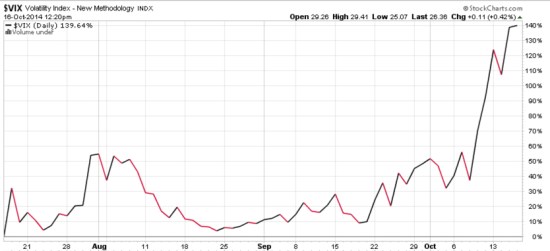
As you can see in the chart below, The VIX has increased about 140% in just a few weeks.

VIX october

Chart courtesy of http://www.stockcharts.com

For those who haven’t been following along, you may consider reading the previous observations:

A VIX Pop Then Back to Zzzzzzzz? We’ll see

Asymmetric VIX

VIX Shows Volatility Still Low, But Trending

VIX Back to Low

The VIX is Asymmetric, making its derivatives an interesting hedge

Is the VIX an indication of fear and complacency?

What does a VIX below 11 mean?

What does the VIX really represent?

The VIX, my point of view

The VIX, as I see it…

Volatility Risk Premium

Declining (Low) Volatility = Rising (High) Complacency

Investors are Complacent


Trend Following Doesn’t Always Mean Crowd Following

“Trading has taught me not to take the conventional wisdom for granted. What money I made in trading is testimony to the fact that the majority is wrong a lot of the time. The vast majority is wrong even more of the time. I’ve learned that markets, which are often just mad crowds, are often irrational; when emotionally overwrought, they’re almost always wrong.”

Richard Dennis  (Famous Trend Follower)


Richard J. Dennis, a commodities speculator once known as the “Prince of the Pit,”. In the early 1970s, he borrowed $1,600 and reportedly made $200 million in about ten years.


Volatility Risk Premium

Following up from “VIX Back to Low” I wrote last week, sure enough: the volatility index has gained 20%. Since last week it has been a good time to be long volatility and a bad time to be short volatility. Many professionals who trade volatility as their primary strategy mostly sell it to collect the Volatility Risk Premium. To do that, they have to be willing to experience gaps like this.

VIX CBOE VOLATILTY INDEX JULY


5th Year Anniversary of the Bull Market

This week marked the 5th anniversary since the March 9, 2009 low in stock market. While much of the talk and writing about it seems to be focused mainly on the upside gains since the low point, it is more important to view it within the context of the big picture.

If you knew on March 9, 2009 that was the low point and could handle the 5 – 10% daily swings that were occurring during that time, then you could have made a lot of money. But, the fact is, many people have emotional reactions after a -10% decline over any period, even more it happens in a day or a week. But even if you don’t, in order to have made a lot of money you would have needed to have exited prior to the large loss before then. You needed cash to invest at the low. I heard some are bragging about their gains since the low, but they left out how much they had lost over the full cycle. It doesn’t mean anything to earn 100% over one period if you lose -50% the next period that wipes it out.

It doesn’t actually matter how much the stock index gained from its low point. What matters is its trend over a full market cycle. People sometimes have trouble seeing and understanding the bigger picture, which is one reason they get caught in traps in the short run.

Below is the price trend of the S&P 500 stock index over the most recent full market cycle. I define a full market cycle as a complete cycle from a peak to low to a new peak. That is, it includes both a “bull market” and a “bear market”. To get an accurate picture, I have used the SPDRs S&P 500 ETF and a total return chart, so it does include dividends. After more than 7 years, the stock index has only gained 35%. Yet, it declined -56% along the way. That isn’t the kind of asymmetry® investors seem to want. If you think about risk reward, 20% is great upside if the downside is only -10%; that is positive asymmetry®. We want to imbalance risk and reward, more of one, less the other.

S&P 500 full market cycle 2014-03-14_10-34-31

If you look closely, it took 5 years after the October 2007 peak to get back to break even. Though it has taken a long time to recover from the cascade decline, the recovery was impressive in terms of its gains, but extremely volatile for investors to endure.

When looking at a period of over 7 years, the swings don’t seem so significant. To put them into context, there were about 9 declines around 10% or more with the one in 2011 about -20%. This has kept many investors from buying and holding stocks.

If you are good at visual intuition, you may notice the price swings on the left of the chart are much wider than those more recently. This is a visualization of higher volatility as the trend was down and continued volatility caused by indecision between buying pressure and selling pressure.

After prices have trended down, such as the 2008 and 2009 period, the range of prices is wide and investors who held on too long panic, yet buyers aren’t willing to buy at their price.

After a price trend has been drifting up for several years and investors hear about how much it has gained, they become more and more complacent and more optimistic. They do this near a peak.

You can probably see how most investors who lost a lot of money before are likely to do it again. Unless something like the observations I have shared here helps to change their behavior, they are likely to do the same thing they did before.