Valuation is the wrong frame.
Not because it doesn’t matter. Because it doesn’t tell you what the market is depending on. Read it here.
Valuation is the wrong frame.
Not because it doesn’t matter. Because it doesn’t tell you what the market is depending on. Read it here.
Someone asked, “From a sentiment perspective, is this what 2017 felt like?”
My observation:
I tend to focus on risk management in these occasional observations I share.
My focus is on risk management because that’s my edge.
If I can direct and control my possibility of loss through tactical trading decisions, then I’m left to focus on the upside of profits.
I pinned that on my wall twenty years ago when I was testing asymmetric trading systems for asymmetric risk/reward and asymmetric investment returns.
As I intensely studied the mathematical expectation of trading systems, I concluded the downside drawdown is the part I have the potential to control.
If a position is trending down, I can exit, and reduce my exposure to zero.
I could also use exchange-traded options for defined risk. ie. if I buy a call option for $5 that’s all I can lose if the position doesn’t become profitable.
I could instead place a stop loss exit $5 below the entry price for a similar effect, but the position could gap down $10, and the loss would be larger than the limited call option would have been.
These are the kind of portfolio management decisions we get to choose from as investment portfolio managers.
I discuss this more in How is trend following with a stop loss optionality similar to a call option?
Our issue at hand today is the trendline whipsaw of the stock market index.
In Stock Market Resumes Downtrend I shared the observation the U.S. stock market as measured by the S&P 500 stock index, has trended down from a lower high.
Here’s the chart:

I went on to point out the stock index wasn’t yet oversold, and the number of stocks in the 500 in an uptrend was trending down.
Trend lines aren’t magic; they’re just a general trend guide.
I wasn’t seeing heavy selling pressure, so I thought “we’ll see.”
Here’s an update. See below for the context of the numbers.

I’ll stop there to keep this succinct.
The bottom line is the stock market was trending down, and it’s now reversed back up into a notable uptrend.
I started with observations of risk management because no indicator is ever perfect, they’ll all imperfect.
When every new moment is unique, and we’ve never been “here” before, anything can happen.
The best we can do is define the direction of the trend and follow it, until it reaches an extreme, or reverses down.
Ironically, as the realized volatility is now as low as it was in August 2022, that’s also when I shared Whipsaw and warned I have a hunch we’re going to hear the word “whipsaw” a lot in the coming months.
For the past year, we’ve survived and thrived through a prolonged bear market that may be much longer and deeper if the U.S. economy enters a recession.
Only time will tell if the U.S. is in a recession, or if we’ll instead see the soft landing our friends at Goldman Sachs expect.
But for now, the U.S. equities trend is back up again, and the Fed’s interest rate decision next week will likely be the driver of what happens next.
I expect 2023 to be a very challenging year for macro economics, and it’ll be fun to watch.
At Shell Capital, we just want to repeat another profitable year like last year, or better.
Mike Shell is the founder and Chief Investment Officer of Shell Capital Management, LLC, and the portfolio manager of ASYMMETRY® Managed Portfolios. Mike Shell and Shell Capital Management, LLC is a registered investment advisor focused on asymmetric risk-reward and absolute return strategies and provides investment advice and portfolio management only to clients with a signed and executed investment management agreement. The observations shared on this website are for general information only and should not be construed as investment advice to buy or sell any security. This information does not suggest in any way that any graph, chart, or formula offered can solely guide an investor as to which securities to buy or sell, or when to buy or sell them. Securities reflected are not intended to represent any client holdings or recommendations made by the firm. In the event any past specific recommendations are referred to inadvertently, a list of all recommendations made by the company within at least the prior one-year period may be furnished upon request. It should not be assumed that recommendations made in the future will be profitable or will equal the performance of the securities on the list. Any opinions expressed may change as subsequent conditions change. Please do not make any investment decisions based on such information, as it is not advice and is subject to change without notice. Investing involves risk, including the potential loss of principal an investor must be willing to bear. Past performance is no guarantee of future results. All information and data are deemed reliable but are not guaranteed and should be independently verified. The presence of this website on the Internet shall in no direct or indirect way raise an implication that Shell Capital Management, LLC is offering to sell or soliciting to sell advisory services to residents of any state in which the firm is not registered as an investment advisor. The views and opinions expressed in ASYMMETRY® Observations are those of the authors and do not necessarily reflect the position of Shell Capital Management, LLC. The use of this website is subject to its terms and conditions.
It is widely accepted that a portfolio diversified across a number of stocks will provide an inherent return over time, that buying and holding stocks for the long term is virtuous and pragmatic, and that the longer your perspective, the lower your investment risk.
This strategy is flawed because it is based on a single set of baseline conditions and return drivers, and there is no guarantee that the future will not deviate significantly from the past.
In fact, “past performance is no guarantee of future results” is a required regulatory statement for registered investment advisors like my firm.
Year to date the widely followed S&P 500 stock index that tracks 500 stocks, fully invested, all the time, is down -25% for 2022.

In the chart, we show the index is about 9% below its 50-day average and 14% below the 200-day average. These simple trend-following indicators have signaled defense most of the year, and you can see the red when they’re underwater.
Though it’s oversold on a short-term basis and could see some countertrend follow-through from yesterday’s radical swing, the primary trend is clearly down. So, we declined to participate in its descent like a passive investor does.
Investments and markets require active risk management to avoid larger losses and to create the positive risk-adjusted investment returns people want.
Active risk management and hedging aren’t a sure thing, either, but for me, it’s far better than just sitting there doing nothing.
You can probably see why I’ve preached active risk management and dynamic hedging for drawdown control for over two decades.
More importantly, I’ve done it.
Investing involves risks of loss you must be willing to bear, or actively manage and hedge.
All our endeavors involve some degree of risk, but we all get to tactically decide which risks we want, and which we prefer to hedge off.
Check out our new website, which is a work in progress. We’ll eventually transfer these observations to the new site. https://shell-capital.com/
Mike Shell is the Founder and Chief Investment Officer of Shell Capital Management, LLC, and the portfolio manager of ASYMMETRY® Managed Portfolios. Mike Shell and Shell Capital Management, LLC is a registered investment advisor focused on asymmetric risk-reward and absolute return strategies and provides investment advice and portfolio management only to clients with a signed and executed investment management agreement. The observations shared on this website are for general information only and should not be construed as investment advice to buy or sell any security. This information does not suggest in any way that any graph, chart, or formula offered can solely guide an investor as to which securities to buy or sell, or when to buy or sell them. Securities reflected are not intended to represent any client holdings or recommendations made by the firm. In the event any past specific recommendations are referred to inadvertently, a list of all recommendations made by the company within at least the prior one-year period may be furnished upon request. It should not be assumed that recommendations made in the future will be profitable or will equal the performance of the securities on the list. Any opinions expressed may change as subsequent conditions change. Please do not make any investment decisions based on such information, as it is not advice and is subject to change without notice. Investing involves risk, including the potential loss of principal an investor must be willing to bear. Past performance is no guarantee of future results. All information and data are deemed reliable but are not guaranteed and should be independently verified. The presence of this website on the Internet shall in no direct or indirect way raise an implication that Shell Capital Management, LLC is offering to sell or soliciting to sell advisory services to residents of any state in which the firm is not registered as an investment advisor. The views and opinions expressed in ASYMMETRY® Observations are those of the authors and do not necessarily reflect the position of Shell Capital Management, LLC. The use of this website is subject to its terms and conditions.
The stock market is now reaching its first short-term higher probability of a countertrend pullback.
The S&P 500 stock index tapped its 200-day average and reached a short-term overbought level based on relative strength and volatility and is now stalling.

The S&P 500 Equal Weight, which gives an equal weighting to all 500 stocks instead of more exposure to the largest companies based on capitalization, crossed above its 200-day average but was reaching an overbought level at the same time.

So, it’s not surprising to see these market proxies roll over at this level.
Two weeks ago I pointed out in The stock market is at an inflection point the S&P 500 was stalling as if there is resistance at this price level, and there’s a lot of potential supply for those in a loss trap, and it was getting overbought as measured by the relative strength index. The index trended up a few more percent before pulling back today.
I don’t normally trade the S&P 500 index, I just use it as a proxy for the overall stock market.
For portfolio management, I get more granular into the sectors inside, and the stocks.
I also include global markets like commodities, bonds, and other alternatives, to provide a global unconstrained opportunity set to find potentially profitable trends.
Trend systems just want to be fed some trends, so the system can extract the parts it wants from the parts it doesn’t want. It’s best to provide a wide range of uncorrelated price trends for trend systems to create a unique return stream from them.
From the broad index like the S&P 500 it’s useful to look inside to see the percentage of stocks that are trending above their 50-day and 200-day averages to gauge the strength of participation in the uptrend.
The percent of S&P 500 stocks trending above the 50-day average has quickly trended up to the red zone.

On the positive side, the recent decline in volatility and new uptrends suggest systematic trend-following investment programs could provide inflows of several billion dollars a day in stocks for the next few months if it continues.
While everyone else is trying to figure out what’s going to happen next with inflation, rates, and other global macro issues, we focus on keeping our hard-earned capital invested in the direction of the trend.
If the trends change, so will we.
Mike Shell is the Founder and Chief Investment Officer of Shell Capital Management, LLC, and the portfolio manager of ASYMMETRY® Managed Portfolios. Mike Shell and Shell Capital Management, LLC is a registered investment advisor focused on asymmetric risk-reward and absolute return strategies and provides investment advice and portfolio management only to clients with a signed and executed investment management agreement. The observations shared on this website are for general information only and should not be construed as investment advice to buy or sell any security. This information does not suggest in any way that any graph, chart, or formula offered can solely guide an investor as to which securities to buy or sell, or when to buy or sell them. Securities reflected are not intended to represent any client holdings or recommendations made by the firm. In the event any past specific recommendations are referred to inadvertently, a list of all recommendations made by the company within at least the prior one-year period may be furnished upon request. It should not be assumed that recommendations made in the future will be profitable or will equal the performance of the securities on the list. Any opinions expressed may change as subsequent conditions change. Please do not make any investment decisions based on such information, as it is not advice and is subject to change without notice. Investing involves risk, including the potential loss of principal an investor must be willing to bear. Past performance is no guarantee of future results. All information and data are deemed reliable but are not guaranteed and should be independently verified. The presence of this website on the Internet shall in no direct or indirect way raise an implication that Shell Capital Management, LLC is offering to sell or soliciting to sell advisory services to residents of any state in which the firm is not registered as an investment advisor. The views and opinions expressed in ASYMMETRY® Observations are those of the authors and do not necessarily reflect the position of Shell Capital Management, LLC. The use of this website is subject to its terms and conditions.
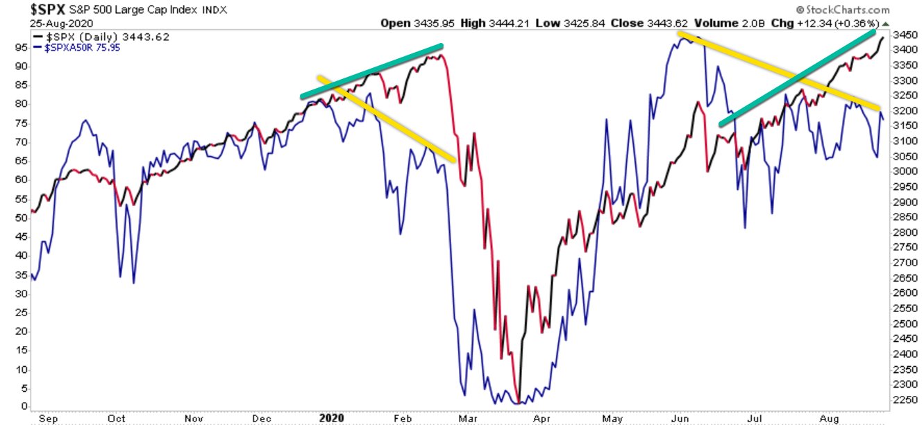
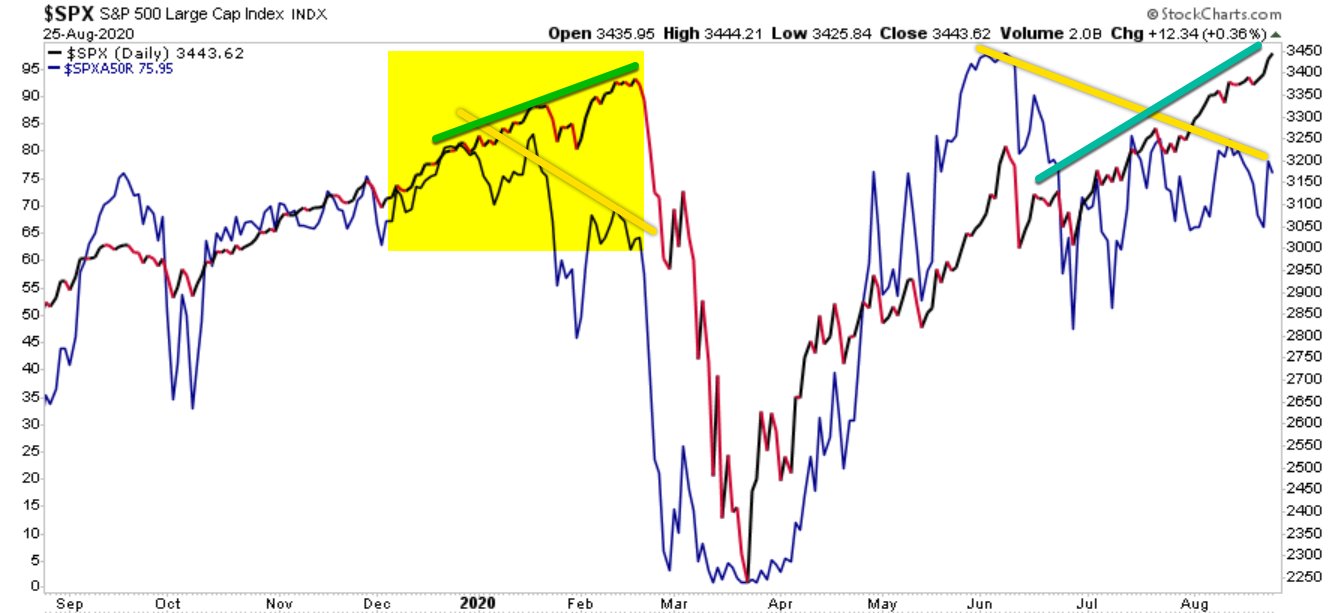
The S&P 500 is stalling as if there is resistance at this price level, and there’s a lot of potential supply for those in a loss trap.
It’s also getting overbought as measured by the relative strength index.
The yellow horizontal highlight denotes the price range with the most volume, which you can see in the Volume by Price bars on the right which show the volume at each price level that could be support or resistence.

At the current price level, you can see the yellow highlighted area is the price range of the highest volume of the past three months.
In February, the SPY declined and found support, or buying demand, at this level. Afterward, it trended up before trending down to this level again and once again was met with enough buying enthusiasm to hold it for several days, then the support failed and the S&P 500 Index ETF declined.
At that point, those who bought earlier at higher prices around the price level or higher carried a loss.
In May the stock market trended up against but selling pressure dominated and the index once again trended sideways for several days of indecision before finally breaking down in a waterfall decline for several days.
The stock market finally got oversold again and investor sentiment was extremely bearish, and it’s since climbed a wall or worry.
Now the price has trended up to this price level again that has been both support and resistance in the past three months and it seems to be stalling.
Today started off strong, up 1% or more, only to fade by the end of the day.
The stock market is at an inflection point.
If the stock market gets enough buying demand to keep prices trending up this bear market could be over sooner than later. However, with the Federal Reserve increasing interest rates because the annual inflation rate in the US has accelerated to 9.1% and economic growth is slowing, if the US is in a recession, as noted in “Bear Markets with an Economic Recession Last Longer and are More Severe” bear markets typically last much longer and trend down more.
Investors should be cautious this may not be over yet, and far from it.
We’ll see, and probably sooner than later.
The inflation report this week may be a market mover.
Mike Shell is the Founder and Chief Investment Officer of Shell Capital Management, LLC, and the portfolio manager of ASYMMETRY® Managed Portfolios. Mike Shell and Shell Capital Management, LLC is a registered investment advisor focused on asymmetric risk-reward and absolute return strategies and provides investment advice and portfolio management only to clients with a signed and executed investment management agreement. The observations shared on this website are for general information only and should not be construed as investment advice to buy or sell any security. This information does not suggest in any way that any graph, chart, or formula offered can solely guide an investor as to which securities to buy or sell, or when to buy or sell them. Securities reflected are not intended to represent any client holdings or recommendations made by the firm. In the event any past specific recommendations are referred to inadvertently, a list of all recommendations made by the company within at least the prior one-year period may be furnished upon request. It should not be assumed that recommendations made in the future will be profitable or will equal the performance of the securities on the list. Any opinions expressed may change as subsequent conditions change. Please do not make any investment decisions based on such information, as it is not advice and is subject to change without notice. Investing involves risk, including the potential loss of principal an investor must be willing to bear. Past performance is no guarantee of future results. All information and data are deemed reliable but are not guaranteed and should be independently verified. The presence of this website on the Internet shall in no direct or indirect way raise an implication that Shell Capital Management, LLC is offering to sell or soliciting to sell advisory services to residents of any state in which the firm is not registered as an investment advisor. The views and opinions expressed in ASYMMETRY® Observations are those of the authors and do not necessarily reflect the position of Shell Capital Management, LLC. The use of this website is subject to its terms and conditions.
Once the stock market catches a break and trends up enough, we’ll probably see short covering keep it going for a while.
The percent of stocks trading above their 50 and 200 day averages is a useful signal of market breadth to gauge the participation in uptrends and downtrends.
I’ve been monitoring these statistical measures of trend and momentum for more than two decades, and long concluded after most stock prices have already trended up, I start to wonder where the next demand will come from to keep the uptrend going.
After prices have already fallen to an extremely low level, it starts to signal those who want to sell may have already sold.
But, it takes falling prices to drive the downtrend to a low enough point to attract long-term value investors as stock prices get cheaper and cheaper, to them.
At this point, below is the percent of S&P 500 stocks trading above their past 200-day average. We see only about 19% of the stocks in the S&P 500 are in intermediate-term to longer-term uptrends.

Can it get worse? Can stocks trend lower? and more stocks trend lower?
Yes, it can.
A visual of the same chart above in logarithmic scale helps to highlight the lower end of the range.
In October and November 2008 only 7% of stocks were in uptrends.
In March 2020 only 10% of the S&P 500 stocks were in uptrends.

Keeping in mind the stock index has some exposure to sectors considered to be defensive like utilities, REITs, and consumer staples, it took a serious waterfall decline like -56% in 2008 to shift most of the 500 stocks into downtrends.
The point now is, that about 80% of stocks in the S&P 500 index are already in downtrends and at some point, the selling will dry up and new buying demand will take over.
I’m seeing other evidence that correlates with these price trends.
According to the investment bank Deutsche Bank, there’s a record short in equity futures positioning of asset managers. That means investment managers have high short exposure, hoping to profit from falling prices, or at least hoping to hedge off their risk in stocks they hold.

Goldman Sachs is the prime broker for many hedge funds and investment managers, including my firm, and Goldman Sachs reports long positioning aiming to profit from uptrends in stocks is off the chart.

Once the stock market catches a break and trends up enough, we’ll probably see short covering keep it going for a while.
This doesn’t suggest we buy and hold passively, but it suggests stocks have already declined into downtrends and big institutional money is positioned for further declines, so we have to wonder who is going to keep selling stocks?
Economics 101 is what drives prices, and that’s supply and demand.
There’s been a supply of stock selling that has been dominant over the desire to buy, so prices are in downtrends.
This is when I am looking for the negative sentiment to change.
Last week I shared my observations of fundamentals in Fundamental Valuation: Is the Stock Market Cheap or Expensive? and more granular that some important sectors have reached undervalued status according to CRFA in Are Growth Sectors Technology, Consumer Cyclicals, and Communication Services more Undervalued than Value?.
But the big risk for long-term investors who passively hold stocks, index funds, or mutual funds is I showed in Bear Markets with an Economic Recession Last Longer and are More Severe that if we are in a recession, this bear market will likely eventually get much deeper.
You can probably see why are Shell Capital, we row, not sail, when the wind stops blowing in our preferred direction.
Mike Shell is the Founder and Chief Investment Officer of Shell Capital Management, LLC, and the portfolio manager of ASYMMETRY® Managed Portfolios. Mike Shell and Shell Capital Management, LLC is a registered investment advisor focused on asymmetric risk-reward and absolute return strategies and provides investment advice and portfolio management only to clients with a signed and executed investment management agreement. The observations shared on this website are for general information only and should not be construed as investment advice to buy or sell any security. This information does not suggest in any way that any graph, chart, or formula offered can solely guide an investor as to which securities to buy or sell, or when to buy or sell them. Securities reflected are not intended to represent any client holdings or recommendations made by the firm. In the event any past specific recommendations are referred to inadvertently, a list of all recommendations made by the company within at least the prior one-year period may be furnished upon request. It should not be assumed that recommendations made in the future will be profitable or will equal the performance of the securities on the list. Any opinions expressed may change as subsequent conditions change. Please do not make any investment decisions based on such information, as it is not advice and is subject to change without notice. Investing involves risk, including the potential loss of principal an investor must be willing to bear. Past performance is no guarantee of future results. All information and data are deemed reliable but are not guaranteed and should be independently verified. The presence of this website on the Internet shall in no direct or indirect way raise an implication that Shell Capital Management, LLC is offering to sell or soliciting to sell advisory services to residents of any state in which the firm is not registered as an investment advisor. The views and opinions expressed in ASYMMETRY® Observations are those of the authors and do not necessarily reflect the position of Shell Capital Management, LLC. The use of this website is subject to its terms and conditions.
In economics, inflation is an increase in the prices of goods and services in an economy.
When the general price level rises, each unit of currency buys fewer goods and services; consequently, inflation corresponds to a reduction in the purchasing power of money.
You may not see the value of your money change online like you do with your investment fund values changing daily, but it’s changing.
Inflation is a real risk for everyone, but it’s worse for people who have their money earning a low rate of interest at a bank or another low-yield fixed asset.
If someone believes they are being a “conservative investor” by investing money in an interest-bearing bank account, it’s only because the bank statement doesn’t show the real value of money after inflation.
The latest inflation report shows U.S. Inflation is 9%, three times higher than the long-term average of 3.25%, so if someone is only earning 3% on a CD, the value of their money is 6% less than it was.
That is, they “lost” 6% of buying power.

But that’s not the main point of this observation, it’s just one of many reasons the trend in prices is important.
The US Inflation Rate is the percentage a chosen basket of goods and services purchased in the US increases in price over a year. Inflation is one of the metrics used by the US Federal Reserve to gauge the health of the economy. Since 2012, the Federal Reserve has targeted a 2% inflation rate for the US economy and may make changes to monetary policy if inflation is not within that range. A notable time for inflation was the early 1980’s during the recession. Inflation rates went as high as 14.93%, causing the Federal Reserve led by Paul Volcker to take dramatic actions.
As an investment manager applying trend systems to global markets, I see it much more granular. I’m applying computerized trend systems to a wide range of global currencies, commodities, stocks, and bond markets, so I see the directional trend changes and shifts in momentum. Although I’ve automated the process of monitoring all these global markets, I still like to review the pictures as charts to see what is going on.
I ranked the S&P GSCI Indices by short-term momentum to see which are trending up the most, so we’ll start there.
I think it’s well known that many commodities markets had been trending up this year, but as we’ll see, many of these markets are now in downtrends.
I’ll share these trends in a way that makes it obvious that commodities aren’t just tradable markets, but they impact all of us, and commodities are interconnected. For example, the price of soybeans impacts livestock.
The S&P GSCI Feeder Cattle Index provides investors with a reliable and publicly available benchmark for investment performance in the feeder cattle market. S&P GSCI Feeder Cattle Index is in an uptrend as defined by above the 50 and 200-day moving averages. In fact, in the lower two frames, I include the percent above or below the 50 and 200-day average, and Feeder Cattle is about 5% above its 50-day average and 8% above its 200-day average price.
Feeder Cattle is the strongest uptrend over the past three months. It only gets worse from here.

S&P GSCI All Cattle Index is a broader basket of cattle, and it too is in an uptrend after breaking out of a multi-month base.


Here’s where the weakness in these commodities trends begins. The S&P GSCI Gas Oil Index is in an intermediate-term uptrend; It’s 20% above the 200-day average. But the recent decline pushed it 6% below the 50-day average. The Gas & Oil index is in a primary uptrend, but short-term pullback. Longer-term trends begin with a shorter-term trend, so we’ll see how it trends from here.
Heating oil is represented by the S&P GSCI Heating Oil Index. Like gas and oil, it’s in a primary uptrend, but a short-term downtrend.

Now we’re getting into commodities with a negative price momentum over the past 3 months.
S&P GSCI Sugar Index is in a non-trending, volatile period over the past year, and it’s right at the 50 and 200-day average.

The S&P GSCI Livestock Index, a sub-index of the S&P GSCI, provides investors with a reliable and publicly available benchmark for investment performance in the livestock commodity market. Livestock is another market that’s lost its upward momentum over the past three months, and one to watch for a breakout.

S&P GSCI Natural Gas Index is in a primary uptrend, but recent downtrend in the short term. It tapped its 200-day average and is trending back up, but nearly 7% below where it was three months ago.

I ranked these trends by three-month momentum, so all of the commodities up to this point were outperforming the broad commodity index we know as S&P GSCI Total Return Index. My three-month momentum ranking is completely arbitrary, but it signaled many of these trends had changed recently.
The S&P GSCI Total Return Index is in a primary uptrend as defined by a level above its 200-day average, but it’s in a downtrend since it peaked in June.

S&P GSCI Total Return Index is what many global macro asset managers managing global macro hedge funds use as a benchmark for commodities, so the rest of these trends are more granular looking inside this broader index made up of these other indices.
S&P GSCI Energy Index is in a primary uptrend but has declined materially over the past month.

S&P GSCI Unleaded Gasoline Index is a big one that impacts Americans and our personal economy. S&P GSCI Unleaded Gasoline Index is in a primary uptrend but has corrected a lot these past five weeks. Once again, we see a commodity trend tapping the 200-day moving average, so a breakout below it will signal a changing primary trend.

Coffee is in a downtrend. S&P GSCI Coffee Index is below the 50 and 200 average, signaling it’s in both a short-term and intermediate-term downtrend. This may help explain why Latin American countries like Brazil’s stock index is down, too. Latin America makes a lot of the world’s coffee.

Unless you’re a long/short commodity trader like a CTA trend follower who aims to capitalize on these downtrends as much as the uptrends, this is one of the rare times downtrends are something to cheer on.
S&P GSCI Crude Oil Index is in a short-term downtrend, but a primary uptrend.

Meanwhile, S&P GSCI Cocoa Index is in a downtrend across both time frames.

Hey Crude, as in Brent Crude. We have a downtrend in S&P GSCI Brent Crude Index over the short run after a volatile non-trending period.

An interesting Intermarket analysis this year has been the trend in Gold. Gold is seen by many market participants as a store of value and a safe haven, but S&P GSCI Gold Index is in a downtrend after a sharp uptrend around March. You can probably see how applying multiple time frames can be useful in observing these trends.

By and large, the metals like precision metals are in downtrends.
S&P GSCI Platinum Index is in a downtrend.

Soft commodities, or softs, are commodities such as coffee, cocoa, sugar, corn, wheat, soybean, fruit and livestock. The term generally refers to commodities that are grown, rather than mined. You can see how some of the commodity markets tracked by indices are very granular focused on one single market trend, and others are a basket of commodities within a sector.
S&P GSCI Softs Index has shifted from a quiet uptrend to a volatile downtrend.

A biofuel is any fuel that is derived from biomass, that is, plant or algae material or animal waste.
After an uptrend breakout around March, S&P GSCI Biofuel Index has trended back to the same level it started.

Some of the most common products produced with soybeans are tofu, soy milk, soy sauce, and soy flour. Approximately 85% of soybeans grown around the world are used to make vegetable oils that are either sold to consumers or used commercially according to The Spruce Eats. The USDA says “Just over 70 percent of the soybeans grown in the United States are used for animal feed, with poultry being the number one livestock sector consuming soybeans, followed by hogs, dairy, beef and aquaculture.”
You can probably see how interconnected all this stuff is.
S&P GSCI Soybeans Index is in a downtrend after an uptrend started at the beginning of this year. Hopefully, this lower animal feed cost will help lower the prices of the livestock that are in uptrends.

Lead is still widely used for car batteries, pigments, ammunition, cable sheathing, weights for lifting, weight belts for diving, lead crystal glass, radiation protection and in some solders, according to RSC.org.
S&P GSCI Lead Index is in a downtrend, so I guess we’ll eventually see the price of ammo and car batteries decline, too. Overall, lead has been a non-trending volatile market the past year, but it’s now more decisively in a dowtrend.

Lean Hog is a type of hog (pork) futures contract that can be used to hedge and to speculate on pork prices.
S&P GSCI Lean Hogs Index has trended into a downtrend, so your bacon price may improve.

Palladium is one of a number of metals starting to be used in the fuel cells to power things like cars and buses as well as in jewelry and in dental fillings and crowns.
S&P GSCI Palladium Index is in a downtrend.


Grains are used around the world and are also called cereals, and are the most important staple food. According to NatGeo, humans get an average of 48 percent of their calories, or food energy, from grains. Grains are also used to feed livestock and to manufacture some cooking oils, fuels, cosmetics, and alcohols.
S&P GSCI Grains Index is in a downtrend after it broke up with momentum going into this year. If you like to eat and drink alcohol, this is great news as it seems the prices should drift back to where they were.

Wheat is used for white bread, pastries, pasta, and pizza, so this downtrend in S&P GSCI Wheat Index is a welcome change.

Dr. Copper is market lingo for the base metal that is reputed to have a “Ph. D. in economics” because of its ability to predict turning points in the global economy.
S&P GSCI Copper Index is in a strong downtrend, so if its reputation holds true, the Ph. D. in economics suggests a global economic slowdown is ahead.

The Royal Society of Chemistry says aluminum is used in a huge variety of products including cans, foils, kitchen utensils, window frames, beer kegs and airplane parts.
If the trend in S&P GSCI Aluminum Index is a guide, the price of your next beer keg or airplane should drift lower. Aluminum is in a downtrend.

Industrial Metal alloys are known for their strength, durability, and corrosion resistance, so engineers, architects, and others in the industrial field use these alloys to construct buildings, wires, pipes, bridges, machines, and much more according to Wieland.
S&P GSCI Industrial Metals Index shows industrial metals are in a downtrend with great momentum.

Industrial metals are down so much I’ll show a two-year chart to see the price is back to 2020 levels.

Last but not least is cotton. I think we all know what cotton is used for. The price of clothes should see some decline with S&P GSCI Cotton Index in such a downtrend.

What we’ve observed is many commodity markets were in uptrends, but have more recently trended down. Not all of these necessarily impact the Consumer Price Index, but we certainly use most if not all of them one way or another.
Commodities are real “stuff”, and the prices of much of this stuff are no longer as elevated as it was. If this flows into lowering prices of the stuff we buy, then we’ll see inflation fall from here.
If inflation trends down from here, it’ll be positive for stocks and bonds and may result in the Federal Reserve pausing its aggressive interest rate hikes.
Now you know why we aren’t long commodities at this point.
Investor sentiment (about stocks) is so negative right now, that any slight improvement in inflation may spark an uptrend, then the extremely bearish positioning may drive short covering to keep the trend going a while.
Let’s see how it all unfolds.
Mike Shell is the Founder and Chief Investment Officer of Shell Capital Management, LLC, and the portfolio manager of ASYMMETRY® Managed Portfolios. Mike Shell and Shell Capital Management, LLC is a registered investment advisor focused on asymmetric risk-reward and absolute return strategies and provides investment advice and portfolio management only to clients with a signed and executed investment management agreement. The observations shared on this website are for general information only and should not be construed as investment advice to buy or sell any security. This information does not suggest in any way that any graph, chart, or formula offered can solely guide an investor as to which securities to buy or sell, or when to buy or sell them. Securities reflected are not intended to represent any client holdings or recommendations made by the firm. In the event any past specific recommendations are referred to inadvertently, a list of all recommendations made by the company within at least the prior one-year period may be furnished upon request. It should not be assumed that recommendations made in the future will be profitable or will equal the performance of the securities on the list. Any opinions expressed may change as subsequent conditions change. Please do not make any investment decisions based on such information, as it is not advice and is subject to change without notice. Investing involves risk, including the potential loss of principal an investor must be willing to bear. Past performance is no guarantee of future results. All information and data are deemed reliable but are not guaranteed and should be independently verified. The presence of this website on the Internet shall in no direct or indirect way raise an implication that Shell Capital Management, LLC is offering to sell or soliciting to sell advisory services to residents of any state in which the firm is not registered as an investment advisor. The views and opinions expressed in ASYMMETRY® Observations are those of the authors and do not necessarily reflect the position of Shell Capital Management, LLC. The use of this website is subject to its terms and conditions.
During the waterfall decline in March 2020, the Cboe S&P 500 5% Put Protection IndexSM (PPUT) successfully hedged off stock market beta, but it hasn’t done the same in 2022.
The green highlight shows the Cboe S&P 500 5% Put Protection IndexSM in black and S&P 500 stock index in red. Clearly, the systematic put protection index helped to hedge off downside risk in the SPX during the waterfall decline of March 2020, but that same hedge hasn’t protected long beta portfolios in 2022.

Cboe S&P 500 5% Put Protection IndexSM (PPUT) tracks the value of a hypothetical portfolio of securities (PPUT portfolio) designed to protect an investor from negative S&P 500 returns. The PPUT portfolio is composed of S&P 500® stocks and of a long position in a one-month 5% out-of-the-money put option on the S&P 500 (SPX put).
Let’s see what happened over these two very different outcomes, and I’ll share my observations of what changed that impacted the outcomes.
Using data from YCharts, we see the full year 2020 in the chart comparing the S&P 500 Total Return Index (SPX) to the Cboe S&P 500 5% Put Protection IndexSM (PPUT) which is long the SPX, but adds one-month 5% out-of-the-money put option on the S&P 500 (SPX puts) options to hedge.

For the systematic put hedge strategy, 2020 was a fine example of risk management resulting in not only drawdown control, but also how avoiding large losses can increase the portfolio return in some conditions.
The S&P 500 declined over -30% around March 2020 as COVID spread, but the 5% SPX put lowered the drawdown to -16.52%.
That’s asymmetry and a key part of creating asymmetric investment returns.
The 5% put hedging strategy limited the downside by 50%, then went on to allow the long-only exposure to the S&P 500 to nearly double the stock index.
This is what I look for in the pursuit of asymmetric payoffs to produce asymmetric returns.
Naturally, the incredible performance of this very simple systematic hedging strategy tracked by PPUT got some attention after it performed so well. But, no method is perfect, and all strategies are fallible.
Fast forward to 2022, and the outcome has been completely different. Investors and traders who relied on a 5% monthly put option have fully participated in the downside of the SPX this year.

This phenomenon has driven many to ask, why such a radically different outcome?
I’ll attempt to explain my observations as succinctly as possible because understanding derivatives like options is the most complex task in the capital markets for most people.
For more than two decades, I’ve focused on alternative trading strategies in pursuit of asymmetric payoffs that lead to asymmetric investment returns.
Asymmetry isn’t just about finding low-risk positions that offer a higher expected payoff, like a 2-to-1 reward to risk.
Instead, asymmetry is even more focused on limiting the downside in hopes to avoid the negative asymmetry of loss.
Losses compound against us exponentially the deeper we allow losses to get.
So, my focus has been actively trading momentum growth stocks, tactically trading more systematically a global universe of ETFs, and volatility trading/hedging, all of which are unconstrained in my primary portfolio.
So, I have a unique perspective on this topic.
The short and sweet answer to why this time was so different than 2020 is a function of these issues.
The bottom line is the asymmetric volatility phenomenon has impacted the put option hedging strategy.
The asymmetric volatility phenomenon suggests that prices trend down faster and sharper than they trend up, which can be an advantage of put option hedging, or a disadvantage when it’s calmer like this year.
All of the above has also kept the VIX below 40 this year.
Mike Shell is the Founder and Chief Investment Officer of Shell Capital Management, LLC, and the portfolio manager of ASYMMETRY® Managed Portfolios. Mike Shell and Shell Capital Management, LLC is a registered investment advisor focused on asymmetric risk-reward and absolute return strategies and provides investment advice and portfolio management only to clients with a signed and executed investment management agreement. The observations shared on this website are for general information only and should not be construed as investment advice to buy or sell any security. This information does not suggest in any way that any graph, chart, or formula offered can solely guide an investor as to which securities to buy or sell, or when to buy or sell them. Securities reflected are not intended to represent any client holdings or recommendations made by the firm. In the event any past specific recommendations are referred to inadvertently, a list of all recommendations made by the company within at least the prior one-year period may be furnished upon request. It should not be assumed that recommendations made in the future will be profitable or will equal the performance of the securities on the list. Any opinions expressed may change as subsequent conditions change. Please do not make any investment decisions based on such information, as it is not advice and is subject to change without notice. Investing involves risk, including the potential loss of principal an investor must be willing to bear. Past performance is no guarantee of future results. All information and data are deemed reliable but are not guaranteed and should be independently verified. The presence of this website on the Internet shall in no direct or indirect way raise an implication that Shell Capital Management, LLC is offering to sell or soliciting to sell advisory services to residents of any state in which the firm is not registered as an investment advisor. The views and opinions expressed in ASYMMETRY® Observations are those of the authors and do not necessarily reflect the position of Shell Capital Management, LLC. The use of this website is subject to its terms and conditions.
For me, and everyone else even if they don’t realize it, the price trend is the final arbiter.
For more than two decades, I’ve focused my efforts on developing systems to identify trends early in their stage to capitalize on trends as they continue and exit a trend if it reverses.
It all started in business school, where I earned a Bachelor of Applied Science degree in advanced accounting. It was “advanced” because I took the extra advanced classes above a typical accounting major required to sit for the CPA exam in Tennessee. It basically results in a master’s in accounting, but not really, but it’s just the same 150 credit hours.
I rarely speak of my formal college simply because I haven’t considered it a source of edge for investment management.
But maybe it has.
In some conversations recently, people have asked about my background and how I got started as an investment manager and founder of an investment firm. After further review, I’ve come to realize the knowledge I have of financial statements, and the vast details and fundamental information that make them up, is what drove me to observe very little of it really drives the market price in an auction market.
That’s something I’ve always believed, but it occurred to me during business school.
To be succinct; I very quickly discovered undervalued stocks are trading at a cheap multiple of earnings for a reason, and that’s more likely to continue than to reverse.
I didn’t have a lot of capital to play with, and it was hard earned capital. I worked as a Sheriffs’ Officer full time through college fully time, so it took me a few extra years to complete. I wasn’t about to lose too much of what I had in the stock market, so I aimed to cut my losses short early on.
I’ve focused on cutting my losses short ever since, so now I have about 25 years experience as a tactical trader with an emphasis on the one thing I believe I can best limit or control; the downside of my losers.
When I focus on limiting the downside of loss, I am left to enjoy the upside of gains.
But we can’t do that with fundamentals and valuation. Risk can only be directed, limited, managed, and controlled, by focusing on the price trend.
The price trend is more likely to continue than to reverse, as evidenced even by vast academic studies of momentum.
Because a price trend is more likely to continue than to reverse, it’s essential to realize if you attempt to buy stocks that are in downtrends, you’ll likely experience more downtrend.
So, buying what you perceive are “undervalued” stocks is like catching a falling knife they say.
I’d rather wait for the knife to fall, stab the ground or someone’s foot, then pick it up safely.
Knives a dangerous, and up close, even more dangerous than a gun, so govern yourself accordingly.
Nevertheless, the valuation of stocks and overall valuation of the market by and large can be useful to observe at the extremes in valuation.
The chart below tells the story based on Morningstar’s fair value estimates for individual stocks.

The chart shows the ratio price to fair value for the median stock in Morningstar’s selected coverage universe over time.
It shows stocks are as undervalued as they were at the low in 2011, nearly as undervalued stocks were March 2020, but not as undervalued as stocks reached in the 2008 stock market crash when the S&P 500 lost -56% from October 2007 to March 2009.
If I were to overall a drawdown chart of the stock index it would mirror the undervalued readings in the chart.
As prices fall, stocks become more undervalued by this measure.
My observation is by and large stocks are relatively undervalued, but they can get much more undervalued if they haven’t yet reached a low enough point to attract institutional buying demand.
To be sure, in 2011 when stocks were as undervalued as Morningstar suggests they are now, the stock index had declined about -19%, similar to the current drawdown of -23%.

The waterfall decline in stock prices March 2020 was -34%, although it recovered quickly in a v-shaped reversal, so it didn’t get as much attention as the current bear market which is down 10% less, but has lasted for seven months without a quick recovery.

Time allows the losses to sink in for those who are holding their stocks.
This time the average stock is down much more than the stock indexes, too, so if you’re holding the weakest stocks your drawdown is worse than the index.
In that case, you’re probably wondering how low it can go.
If stock prices haven’t yet be driven down to a low enough level to attract big institutional capital to buy these lower prices, stocks can certainly trend down a lot lower from here.
For example, in the 2007 – 2009 bear market known as the 2008 Financial Crisis, one I successfully operated through as a tactical trader and risk manager, the stock index dropped -56% over 16 grueling months.
The infamous 2008 crash included many swings up and down on its way to printing a -56% decline from its high in October 2007.
That’s how bad it could get.
It’s also largely the cause of the situation the U.S. finds itself in today.
Since the 2008 Global Financial Crisis, the U.S. Treasury and Federal Reserve Open Market Committee have provided unprecedented support for the equity market and the bond market.
Passive investors and asset allocators have been provided a windfall from the Fed and Treasury, but it’s time to pay the debt.
For passive investors, they’ve been hammered with large losses this year and risk losing more if stock and bond prices keep trending down.
Stocks are already undervalued, but they can get much more undervalued.
Even worse, as my experience tactically operating through many declines like this since the 1990s reflects, are the paranna bites along with the shark bites.
The shark bite is from a passive asset allocator holding on through a prolonged deep bear market in stock prices as they fall -20%, -30%, -40%, -50% or more.
Because losses are so asymemtric and geometically compound aginast you, these capital losses become harder and harder to recover from.
If you lose -50%, it takes a 100% gain to get it back.
Stock market trends are asymmetric; they trend up much lower than they crash down, so that larger gain needed often takes longer, too.
So your emotional capital is at risk.
When you’re down a lot, you’re thinking and decision-making becomes cloudy and stressed because you[‘re under pressure like a pressure cooker.
You don’t know how low it can go.
If you are a buy and hold asset allocator, your loss is unlimited, as there is not point in which you would exit but zero.
Zero may be unlikely, but -50% or more isn’t, as evidenced by history.
And you’ve not been here before.
You’ve not seen this before.
The Fed has never stretched its open market operations this far before.
We just don’t know what’s going to happen next.
But, I’m prepared to tactically execute through whatever unfolds.
I’m having a great year relatively speaking. I’ve been positive most of the year and haven’t ventured far below our all-time new high.
Times like these are when my skillset is designed to show an edge.
Like many tactical investment managers like trend followers, hedge funds, global macro, I too had a period of relative underperformance of the long-only stock indexes. I held my ground but learned some new tricks during the many swings the past decade, and sharpened my countertrend axe to chip away some of the bad parts we don’t want.
But relative outperformance has never been my objective, especially not against a stock index for stock fund that’s fully invested in stocks all the time.
My objective has always been absolute return, not relative return.
My absolute return objective is what drives me to actively manage risk for drawdown control.
Like a good doctor, I aim to first do no harm… as best I can as a risk taker.
Looking at the Shiller PE ratio for the S&P 500, a long-term observation, the U.S. stock market is still grossly overvalued.
The S&P 500 was the second-highest most expensive valuation in 140 years, and even after the decline this year, the stock index is still twice the valuation of Black Monday in October 1987 and
only down to its extremely overvalued level it was on Black Monday Oct. 19, 1987, when the Dow Jones Industrial Average fell -22% in a single day and just now down to the valuation level the stock index was on Black Tuesday in the 1929 crash.

If you believe in fundamental valuation as a gauge and a guide, anything can happen, so please govern yourself accordingly.
If you need help or have questions, contact us here.
Mike Shell is the Founder and Chief Investment Officer of Shell Capital Management, LLC, and the portfolio manager of ASYMMETRY® Managed Portfolios. Mike Shell and Shell Capital Management, LLC is a registered investment advisor focused on asymmetric risk-reward and absolute return strategies and provides investment advice and portfolio management only to clients with a signed and executed investment management agreement. The observations shared on this website are for general information only and should not be construed as investment advice to buy or sell any security. This information does not suggest in any way that any graph, chart, or formula offered can solely guide an investor as to which securities to buy or sell, or when to buy or sell them. Securities reflected are not intended to represent any client holdings or recommendations made by the firm. In the event any past specific recommendations are referred to inadvertently, a list of all recommendations made by the company within at least the prior one-year period may be furnished upon request. It should not be assumed that recommendations made in the future will be profitable or will equal the performance of the securities on the list. Any opinions expressed may change as subsequent conditions change. Please do not make any investment decisions based on such information, as it is not advice and is subject to change without notice. Investing involves risk, including the potential loss of principal an investor must be willing to bear. Past performance is no guarantee of future results. All information and data are deemed reliable but are not guaranteed and should be independently verified. The presence of this website on the Internet shall in no direct or indirect way raise an implication that Shell Capital Management, LLC is offering to sell or soliciting to sell advisory services to residents of any state in which the firm is not registered as an investment advisor. The views and opinions expressed in ASYMMETRY® Observations are those of the authors and do not necessarily reflect the position of Shell Capital Management, LLC. The use of this website is subject to its terms and conditions.
In Following the Trend of Inflation and Risk of Bonds I mentioned we are closely monitoring the 10-2 Year Treasury Yield Spread because an inverted yield curve has a track record of predicting future recessions 6 – 24 months in advance.
The 10-2 Year Treasury Yield Spread is declining fast and has now trended to 0.24%, meaning the 2 Year U.S. Treasury Yield is nearly the same yield as the Year 10 U.S. Treasury Yield.

For more context, read: How We’ll Know if a Recession is Imminent.
For information about our proactive investment management, active risk management, hedging your risks, and ASYMMETRY® Managed Portfolios, contact us.
Mike Shell is the Founder and Chief Investment Officer of Shell Capital Management, LLC, and the portfolio manager of ASYMMETRY® Managed Portfolios. Mike Shell and Shell Capital Management, LLC is a registered investment advisor focused on asymmetric risk-reward and absolute return strategies and provides investment advice and portfolio management only to clients with a signed and executed investment management agreement. The observations shared on this website are for general information only and should not be construed as advice to buy or sell any security. Securities reflected are not intended to represent any client holdings or any recommendations made by the firm. Any opinions expressed may change as subsequent conditions change. Please do not make any investment decisions based on such information, as it is subject to change. Investing involves risk, including the potential loss of principal an investor must be willing to bear. Past performance is no guarantee of future results. All information and data are deemed reliable but are not guaranteed and should be independently verified. The presence of this website on the Internet shall in no direct or indirect way raise an implication that Shell Capital Management, LLC is offering to sell or soliciting to sell advisory services to residents of any state in which the firm is not registered as an investment advisor. The views and opinions expressed in ASYMMETRY® Observations are those of the authors and do not necessarily reflect a position of Shell Capital Management, LLC. The use of this website is subject to its terms and conditions.
Recessions are officially announced long after they begin.
It usually takes nine to twelve months before the National Bureau of Economic Research (NBER) to announce when a recession started.
For example, on June 8, 2020, the National Bureau of Economic Research announced the U.S. economy was officially in a recession. The COVID lockdown-driven recession was so obvious NBER’s Business Cycle Dating Committee didn’t need the typical time frame to decide.
Here’s the Unemployment Rate with NBER-dated recessions in gray, for an example of business cycle dating.

Who is the National Bureau of Economic Research and its Business Cycle Dating Committee?
The NBER’s Business Cycle Dating Committee maintains a chronology of US business cycles. The chronology identifies the dates of peaks and troughs that frame economic recessions and expansions. A recession is the period between a peak of economic activity and its subsequent trough, or lowest point. Between trough and peak, the economy is in an expansion. Expansion is the normal state of the economy; most recessions are brief. However, the time that it takes for the economy to return to its previous peak level of activity or its previous trend path may be quite extended.
According to the NBER chronology, the most recent peak occurred in February 2020. The most recent trough occurred in April 2020.
That was quick!
But the NBER’s Business Cycle Dating Committee maintains a chronology of US business cycles in the past, which tells us nothing about here, now.
I follow the 10-2 Treasury Yield Spread as an early warning signal of an imminent recession.
The 10-2 Treasury Yield Spread is the difference between the 10 year treasury rate and the 2 year treasury rate. This yield spread is commonly used as the main indicator of the steepness of the yield curve.
A yield curve is a visual representation of yields (interest rates) on U. S. Treasury bonds across a range of different maturities. In normal circumstances, the shape of the trend is upward; short-term rates are lower than long-term rates. It makes sense because if we are investing in bonds to earn interest, we should expect a higher rate for investing for a longer period. Another reason is a risk premium longer-term bonds as longer term durations are exposed to a greater probability interest rates will change over its remaining duration, causing the price to fluctuate.
If you invest in a bond that doesn’t mature for 10 or 20 years and rates of new bonds being issued increase, as they are now, the price of the bonds you hold will decline in price so their yield matches about what the market is paying now. This is a risk for bond holders in a rising interest rate environment as we are in now, driving by rising inflation.
As the 10-2 Treasury spread approaches zero it signals a “flattening” of the yield curve. Here is the spread today, and it’s history over the past few decades. I shaded in gray the historical recessions to see how the 10-2 Treasury spread preceded historical recessions several months in advance. I also highlighted the area below zero where the signal occurs as the yield curve is flat. Right now, because short term interest rates are trending up driven by the U. S. Federal Reserve, the yield curve is trending toward flattening.

Only time will tell if the yield curve goes flat, where the short term (2 year) rate is the same as the longer term (10 year) yield, but we see its the directional trend at this point.
But what’s the 10-2 Treasury spread signal?
A negative 10-2 yield spread has historically been considered a precursor to a recessionary period.
A negative 10-2 spread has predicted every recession from 1955 to 2020, but has inverted 6 – 24 months before the recession occurring, so it is a far-leading indicator.
The 10-2 spread reached a high of 2.91% in 2011, and went as low as -2.41% in 1980.
10-2 Year Treasury Yield Spread is currently at 0.62%, compared to 1.01% last year, and its lower than the long term average of 0.93%.
If the 10-2 Year Treasury Yield Spread crosses below zero, and the yield curve becomes inverted, that’s what will signal a recession is probably imminent, but a recession may not be identified until 6 – 24 months later.
Or, it could be very fast, like 2020.
Until then, I’m systematically monitoring the 10-2 Year Treasury Yield Spread for the advance warning.
For information about our proactive investment management, active risk management, hedging your risks, and ASYMMETRY® Managed Portfolios, contact us.
Mike Shell is the Founder and Chief Investment Officer of Shell Capital Management, LLC, and the portfolio manager of ASYMMETRY® Managed Portfolios. Mike Shell and Shell Capital Management, LLC is a registered investment advisor focused on asymmetric risk-reward and absolute return strategies and provides investment advice and portfolio management only to clients with a signed and executed investment management agreement. The observations shared on this website are for general information only and should not be construed as advice to buy or sell any security. Securities reflected are not intended to represent any client holdings or any recommendations made by the firm. Any opinions expressed may change as subsequent conditions change. Please do not make any investment decisions based on such information, as it is subject to change. Investing involves risk, including the potential loss of principal an investor must be willing to bear. Past performance is no guarantee of future results. All information and data are deemed reliable but are not guaranteed and should be independently verified. The presence of this website on the Internet shall in no direct or indirect way raise an implication that Shell Capital Management, LLC is offering to sell or soliciting to sell advisory services to residents of any state in which the firm is not registered as an investment advisor. The views and opinions expressed in ASYMMETRY® Observations are those of the authors and do not necessarily reflect a position of Shell Capital Management, LLC. The use of this website is subject to its terms and conditions.
“I found that the relationship between the Average and my individual stocks was confined within certain principles, but they could not be measured exactly. From then on I made up my mind to keep watching the Dow Jones Industrial Average, but only in order to determine whether I was in a strong or a weak market. This I did because I realized that a general market cycle influences almost every stock. The main cycles like a bear or bull market usual creep into the majority of them.”
-Nicolas Darvas, Nicolas . How I made 2,000,000 in the stock Market. Larchmont, NY: American Research Council, 1960.
The year 2020 has been quite a ride for most of us.
It started out with the stock indexes trending up, then collapsing over -30% in March. Now, the stock market proxies are reaching new highs.

Clearly, the trend is up recently, and we’re in this trend.
Overall, these volatile conditions has been hostile for both active and passive strategies.
I’m about as active, tactical, as it gets, and even I’m not thrilled with 2020.
I normally enjoy volatility expansions and such, but this one has presented unprecedented risks from the uncertainty of the global pandemic, but also the risk of price shocks as we saw in March.
Oh, and then there was a contentious Presidential Election.
The risk now is a price shock driven by the enormous stimulus because of the uncertainty of how it will all unfold.
It’s all part of it, and I do embrace uncertainty. I enjoy watching how a movie unfolds, and don’t like to know in advance, even if I could.
I just keep doing what I do; adapt, improvise, and overcome.
It is what it is.
Speaking of volatility: the CBOE S&P 500 Volatility Index (VIX) signals expected volatility is evaporating. The VIX has contracted back down to near 20 again, the same range it reached in August. So, the demand for the protection of options is declining. Sometimes it’s a good sign, and the volatility contraction could continue. Notice in January and February the VIX was at 12, today it’s nearly 22, so it’s elevated.

I’m on guard to protect my profits, so I actively monitor risk and sentiment indicators to see when the potential for a price trend reversal is more likely.
I think we’re starting to get there, but we’ve got aggressive stimulus acting as a put option.
It could keep going.
But, the percent of stocks in the S&P 500 above their 200 day moving averages measures the breadth of participation in the uptrend. Right now, 90% of the 500 or so stocks are in longer term uptrends. That means only 10% are not in uptrends. This strong breadth is a positive sign for momentum, but once it reaches such a high level I begin to wonder when the buying enthusiasm may dry up.

After most of the stocks have already been driven up, we have to wonder when the bullish sentiment reverses to selling pressure.
If you want to realize profits, we have to take them at some point.
Unrealized profits are just the markets money, and can fade away quickly, and even become a loss.
That’s all I’ll share for now. I’m just seeing some signs of what may be becoming an inflection point.
I’m usually more early than I am late, so we’ll see how it unfolds from here.
Investors who are inclined to actively manage risk may start considering reducing exposure or hedging off the risk of loss.
Have a Happy Thanksgiving!
Mike Shell is the Founder and Chief Investment Officer of Shell Capital Management, LLC, and the portfolio manager of ASYMMETRY® Global Tactical. Mike Shell and Shell Capital Management, LLC is a registered investment advisor focused on asymmetric risk-reward and absolute return strategies and provides investment advice and portfolio management only to clients with a signed and executed investment management agreement. The observations shared on this website are for general information only and should not be construed as advice to buy or sell any security. Securities reflected are not intended to represent any client holdings or any recommendations made by the firm. Any opinions expressed may change as subsequent conditions change. Do not make any investment decisions based on such information as it is subject to change. Investing involves risk, including the potential loss of principal an investor must be willing to bear. Past performance is no guarantee of future results. All information and data are deemed reliable but is not guaranteed and should be independently verified. The presence of this website on the Internet shall in no direct or indirect way raise an implication that Shell Capital Management, LLC is offering to sell or soliciting to sell advisory services to residents of any state in which the firm is not registered as an investment advisor. The views and opinions expressed in ASYMMETRY® Observations are those of the authors and do not necessarily reflect a position of Shell Capital Management, LLC. The use of this website is subject to its terms and conditions.
There was enough buying climaxes in stocks this week to signal a short term top in the stock market.
This week 596 stocks printed a buying climax, which is the most since Feb 2018.
A buying climax is when a stock trends up to a 52 week high, then closes the week with a loss, which is a sign of distribution shifting from strong to weak hands.
A buying (or selling) climax is the result of surge in supply and demand.
The key theory of a buying climax is the exhaustion of demand as the last buyers enter the market.
The final surge of buying typically leads to p
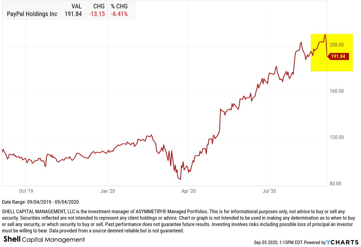
For example, PayPal printed a buying climax this week. Shares of PYPL trended up to a new 52 week high, then closed down on the week. It’s a sign of distribution, as shares of shifting from strong holders to weak. Stocks like PayPal have benefited from people staying at home and buying things online. It was a leading stock with strong relative strength, until now.
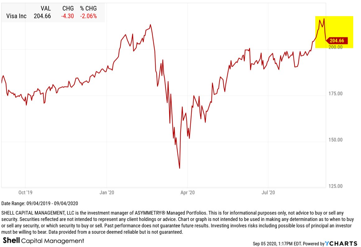
Visa (V) is another example of a BUYING CLIMAX. Visa has been a leading stock with strong momentum and earnings growth, but it trended to a new high, then closed down.
UPS is another example of a BUYING CLIMAX from a leading stock as it printed a new 52 week high, but closed down this week. Not as strong of an example as above, but a buying climax nonetheless.
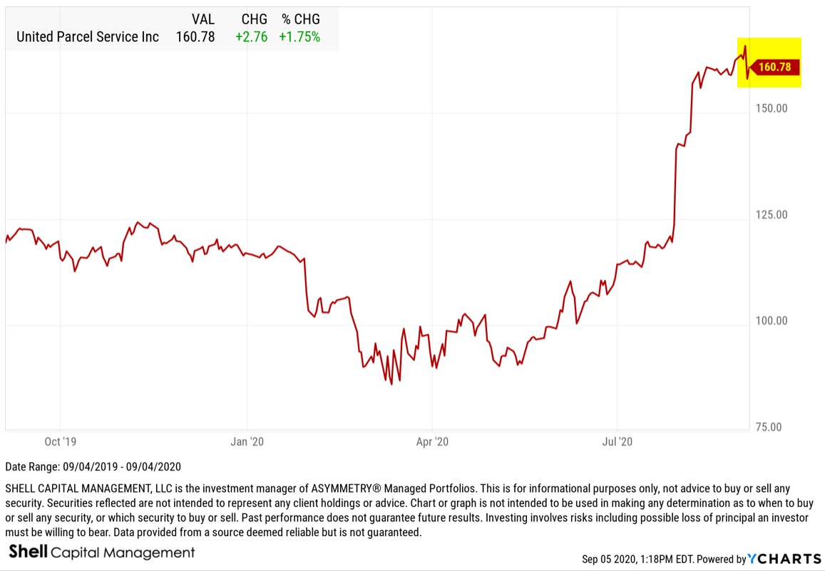
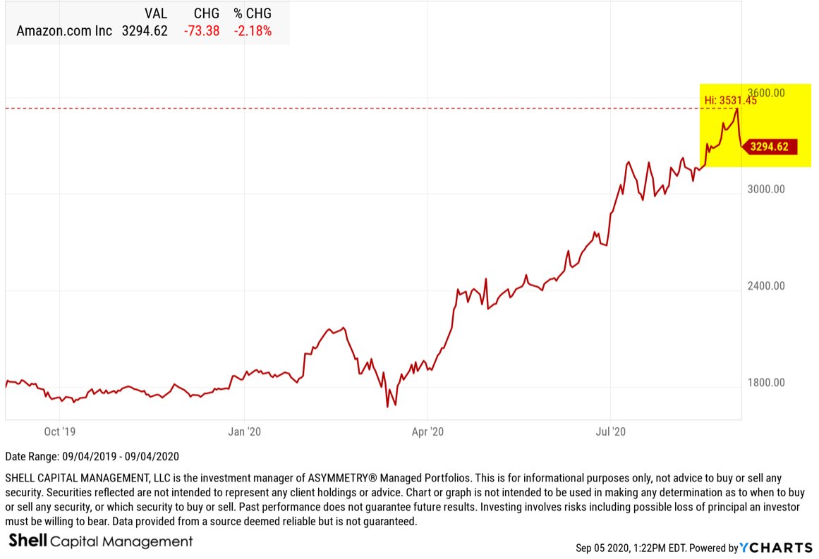
As stocks like UPS have benefited from the stay at home climate of rising deliveries, it’s obviously driven by companies like Amazon (AMZN), which happens to be another BUYING CLIMAX example.
Amazon trended to a new high, then closed down this week.
Costco (COST) is another example of a big winning stock that printed a new high during the recent euphoria for stocks that closed down this weak to print a buying climax.

Nvidia has been one of the most explosive momentum stocks this year. NVDA printed a new high, then closed -12% off its high this week.

The list of 596 stocks that printed a Buying Climax includes most of the recent leading momentum technology stocks like Apple, Adobe, Microsoft, but also financials like asset manager BlackRock.

The bottom line is: we’ve seen a period of euphoria, as measured by investor sentiment indicators like the Citigroup Panic/Euphoria Model, and now we’re seeing some blow off tops shift to buying climaxes.
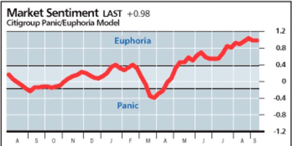
I shared my observations of investor sentiment getting silly the week before in “The weight of evidence is becoming increasingly bearish for the US stock market.”
These quantitative indicators have a long history of signaling a shift in supply and demand, which suggests the risk level is elevated for the stock market.
We typically see a buying climax at the end of a bull market cycle.
Investors confidence the trend will continue results in complacency as to market risk. Their confidence the uptrend will continue drives them to ignore the risk of loss, so they don’t manage their risk or hedge exposure to loss.
Complacent investors believe the current trend isn’t going to reverse anytime soon, so they get caught off guard when it does.
Once they start taking on heavy losses, they may panic sell, adding to the selling pressure that pushes prices down even lower.
Risk averse investors should prepare themselves for an increasing probably of a downtrend in stocks.
This may be just a warning shot across the bow of what may be more selling pressure to come.
Mike Shell is the Founder and Chief Investment Officer of Shell Capital Management, LLC, and the portfolio manager of ASYMMETRY® Global Tactical. Mike Shell and Shell Capital Management, LLC is a registered investment advisor focused on asymmetric risk-reward and absolute return strategies and provides investment advice and portfolio management only to clients with a signed and executed investment management agreement. The observations shared on this website are for general information only and should not be construed as advice to buy or sell any security. Securities reflected are not intended to represent any client holdings or any recommendations made by the firm. Any opinions expressed may change as subsequent conditions change. Do not make any investment decisions based on such information as it is subject to change. Investing involves risk, including the potential loss of principal an investor must be willing to bear. Past performance is no guarantee of future results. All information and data are deemed reliable but is not guaranteed and should be independently verified. The presence of this website on the Internet shall in no direct or indirect way raise an implication that Shell Capital Management, LLC is offering to sell or soliciting to sell advisory services to residents of any state in which the firm is not registered as an investment advisor. The views and opinions expressed in ASYMMETRY® Observations are those of the authors and do not necessarily reflect a position of Shell Capital Management, LLC. The use of this website is subject to its terms and conditions.
“The trend is your friend, until the end when it bends.”
Stock indexes making higher highs and higher lows is a good thing – until it isn’t.
I run a combination of systems. Most of them are trend following in nature, meaning the objective is to enter a trend early in its stage to capitalize on it until it changes.
But when trends reach an extreme it’s time to take note.
For me, what follows is what I consider market analysis, which doesn’t necessarily result in an specific trades, per se, but instead, it’s my intellectual exercise to understand what’s going on. And it’s nice to have an idea of when a trend may be ready to change.
In law, weight of evidence “refers to the measure of credible proof on one side of a dispute as compared with the credible proof on the other.
It is the probative evidence considered by a judge or jury during a trial.
In this case, the jury are active investors in the market.
Probative evidence is having the effect of proof, tending to prove, or actually proving. So, when a legal controversy goes to trial, the parties seek to prove their cases by the introduction of evidence. If so, the evidence is deemed probative.
Probative evidence establishes or contributes to proof.
The weight of evidence, then, is based on the believability or persuasiveness of evidence.
Since we never know the future in advance, when we engage in market analysis, we necessarily have to apply the weight of the evidence to establish the probability.
After monitoring price trends and a range of indicators intended to measure the strength of a trend for more than two decades, I’ve got a feel for the weight of the evidence. So, my confidence in these observations has increased over time, even as imperfect as it is.
Let’s see some evidence to weight.
By the first of June, 98% of the S&P 500 stocks were trending up, above their short term trend 50 day moving average. Since then, we’ve seen some divergence between the stocks in an uptrend and the stock index.
It tells us fewer stocks are participating in the uptrend.
The advantage of monitoring breadth measures like % of stocks above a moving average or bullish percent is it’s a high level barometer that may highlight what is changing. Sometimes, it’s what is diverging.
In this case, the price trend of the stock index is diverging with the percent of stocks in a positive trend.
One of the warning signs in January and February was this same divergence between the uptrend in $SPY and the breadth of participation of the individual stocks in the index.
When I see divergence, it reminds me to look inside to see what has changed.
It’s usually explained by sector rotation.
For example, over the past month, Technology and Communications have shown relative strength, but the momentum in Consumer Discretionary and Utilities are the laggards.

As a new trend gets underway, some of the component sectors within the S&P 500 diverge, so we also see it show up in the percent of stocks trending up vs. down.
After watching quantitive technical indicators like this since the 90s, I can also tell you we commonly see a breadth thrust in the early stages of a new uptrend. We did in January to February 2019 after the waterfall decline at the end of 2018.

A breadth thrust is bullish confirmation.
How long the trend may last, well, we’ve always preferred to see more stocks parts-cation in an uptrend than less. The theory is a broad uptrend that lifts all boats has more true momentum. An example of elevated breadth was 2017, when the stock index trended up with very little volatility or setbacks.

But if you look real close, that yellow highlight of 2017 also shows the percent of stocks above their 50 day moving average oscillated between the 50 and 95% zone throughout the year. It’s an oscillator, so it swings between 0% and 100%, but the fact it stayed above 50% in 2017 was a signal of internal strength. It often swings wider in a typical year, but 2017 was far from typical.
The bottom line is, what we have here, now, is fewer of the S&P 500 stocks trending up, which means more are crossing down below their intermediate trend trend line.
So, my interpretation is the trends are weakening, and it’s likely to be more reflected in the stock index eventually.
Investor sentiment is another essential measure.
Nothing drives investor sentiment like a price trend. As prices trend up, people get more bullish (or greedy) and as prices trend down, they feel more fear (of losing more money.)
The Fear & Greed Index tracks seven indicators of investor sentiment. It’s gradually dialing back up to Greed, but not yet Extreme Greed.

But when we take a look inside, and understand how it works, I see the main holdout is VIX . At around 22, the VIX still indicates a moderate level of FEAR, but we have to consider VIX is fading from its highest level, ever, so its absolute level may not be as indicative.
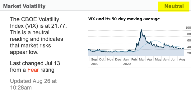
On the other hand, the level of the Put/Call Ratio is among the lowest levels of put buying seen during the last two years, indicating EXTREME GREED on the part of investors.
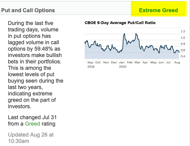
Junk Bond Demand has reached EXTREME GREED. Investors in junk bonds are accepting 2.05% in additional yield over safer investment grade bonds. This spread is much lower than what has been typical during the last two years and indicates that investors are pursuing higher risk strategies.
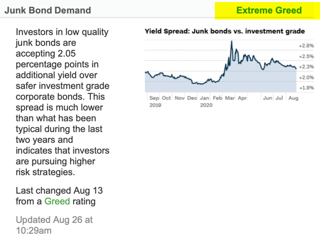
The 3rd EXTREME GREED indicator is the S&P 500 is 15.28% above its 125-day average. This is further above the average than has been typical during the last two years and rapid increases like this often indicate extreme greed, according to the Fear & Greed Indicator.
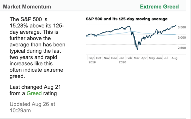
Aside from neutral $VIX, some other moderate hold outs of the 7 indicators include breadth. The Fear & Greed Indicator uses the McClellan Volume Summation Index, which measures advancing and declining volume on the NYSE. It has fallen from EXTREME GREED just over a week ago.
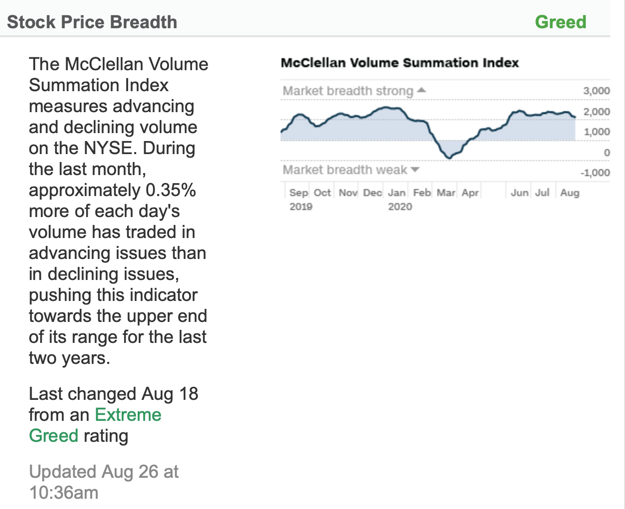
Stock Price Strength is another moderate GREED level. It says the number of stocks hitting 52-week highs exceeds the number hitting lows and is at the upper end of its range, indicating greed.
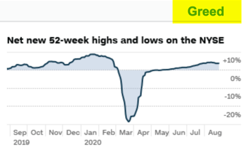
Safe Haven Demand is at a bullish investor sentiment level. Stocks have outperformed bonds by 6.87% during the last 20 trading days, close to the strongest performance for stocks/bonds in the past 2 years – investors are rotating into stocks from the relative safety of bonds.
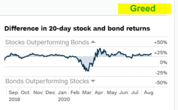
THE BOTTOM LINE IS: The seven indications of investor sentiment are dialing up to a very optimistic level, signaling investors are bullish on stocks.
Though some of it isn’t yet extreme, when we put it in context, anything can happen from here, but its now at a higher risk zone.
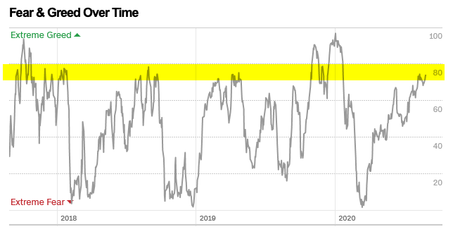
Another measure of investor sentiment is put volume. Puts are listed options on stocks and indexes that may be used to hedge the downside. The CBOE Total Put Volume is at the lowest level this year, which suggests there isn’t a lot of hedging taking place.

The NAAIM Exposure Index represents the average exposure to US Equity markets reported by the members of the National Association of Active Investment Managers. They are fully invested for the first time since December. Their exposure to the stock market has followed the trend of the stock index.

Another sentiment poll is the Advisors Sentiment, which was devised by Abe Cohen of Chartcraft in 1963 and is still operated by Chartcraft, now under their brand name of Investors Intelligence. This survey has been widely adopted by the investment community as a contrarian indicator. They say since its inception in 1963, the indicator has a consistent record for predicting the major market turning points. It has reached that point.

Speaking of Abe Cohen, another indicator he developed in the mid 1950s is the Bullish Percent Index. He originally applied it to stocks listed on the NYSE, but we have been doing the same for other listed stocks and sectors since. The NYSE Bullish Percent is an example of another gauge of overall market risk. A common analogy applied to the NYSE Bullish Percent is that of a football game: level of the bullish % represents the current field position and the “end-zones” are above 70% and below 30%.
Currently, at 70%, it has entered the higher risk zone, suggesting it’s time to put the defensive team on the field.

Many of these indicators are measuring the same thing; investor sentiment.
After everyone has already gotten bullish and put their money to work in stocks, we have to wonder where future demand for shares will come from.
It’s been a nice run, but stars are aligning to look more and more bearish in my opinion. Uptrends are great, but all good things eventually come to an end.
If we want to protect our profits, it is probably time to reduce expose or hedge.
And that’s likely right about the time most people are excited about their stocks and wanting to buy more.
What could go wrong?
As of this writing, we have a CAT 4 hurricane just hours from hitting Texas and Louisiana, the Fed meeting tomorrow, and China firing missiles into disputed sea.
That’s the weight of the evidence as I see it.
You can be the judge if the evidence is believable and persuasiveness enough, but the final arbiter will be the price trend in the coming weeks.
Mike Shell is the Founder and Chief Investment Officer of Shell Capital Management, LLC, and the portfolio manager of ASYMMETRY® Global Tactical. Mike Shell and Shell Capital Management, LLC is a registered investment advisor focused on asymmetric risk-reward and absolute return strategies and provides investment advice and portfolio management only to clients with a signed and executed investment management agreement. The observations shared on this website are for general information only and should not be construed as advice to buy or sell any security. Securities reflected are not intended to represent any client holdings or any recommendations made by the firm. Any opinions expressed may change as subsequent conditions change. Do not make any investment decisions based on such information as it is subject to change. Investing involves risk, including the potential loss of principal an investor must be willing to bear. Past performance is no guarantee of future results. All information and data are deemed reliable but is not guaranteed and should be independently verified. The presence of this website on the Internet shall in no direct or indirect way raise an implication that Shell Capital Management, LLC is offering to sell or soliciting to sell advisory services to residents of any state in which the firm is not registered as an investment advisor. The views and opinions expressed in ASYMMETRY® Observations are those of the authors and do not necessarily reflect a position of Shell Capital Management, LLC. The use of this website is subject to its terms and conditions.
Point and Figure charting is one of the four primary forms of charting used to observe price trends.
I started studying Point & Figure charting myself in the late 1990s when I was interested in a more precise way to determine my exits. P&F charts make the exit based of a price trend more obvious. For example, without knowing anything about these charts you can probably see the area I highlighted in red was a price range this stock found buying interest (support) a few times in the past, but then it broke down. When it did, it fell a lot. On the bullish side, the stock has found selling pressure (resistance) at the price level I highlighted green until it finally broke out to the upside.

When I first started researching and trading high growth momentum stocks, I wanted a more precise way to define these price trends, so I became what they called a Point & Figure Craftsman. I later wanted to test these breakouts and patterns, so I ended up quantifying them into algorithms. But, I still look at all forms of charts from time to time to get a “feel” for the trends unfolding.
The last time I spoke at a non-client conference was in September 2008 for the National Association of Active Money Managers. I did a two-hour presentation on “exits” and used P&F charts as a great visual example to see trend changes.
The presentation, just days before what would become the start of the “Global Financial Crisis”, highlighted:
“When to sell a loser, laggard or winner is the heart of Mike Shell’s presentation on combining point and figure charting with relative strength to trade ETFs. “It’s the exit, not the entry, that determines your result at the position level. The exit determines whether or not you make or lose money, and how much you make or lose,” explains Mike.”

The topic of exits turned out to be very timely, as it was the beginning of the infamous waterfall decline that began in October 2008.
The history of Point & Figure charting is over 100 years old. “Hoyle” was the first to write about it and showed charts in his 1898 book, The Game in Wall Street. The first book/manual dedicated to Point and Figure was written by Victor Devilliers in 1933. Chartcraft Inc, in the USA, popularized the system in the 1940s. Cohen founded Chartcraft and wrote on point and figure charting in 1947. Chartcraft published further pioneering books on P&F charting, namely those by Burke, Aby and Zieg. Chartcraft Inc is still running today, providing daily point and figure services for the US market under the name of Investors Intelligence. Mike Burke still works for Chartcraft, having started back in 1962 under the guidance of Cohen. Burke went on to train other point and figure gurus, such as Thomas Dorsey who would go on to write authoritative texts on the subject.A detailed history can be found in Jeremy du Plessis’ ‘The Definitive Guide to Point and Figure’ where many references and examples are cited.
Point & Figure charts offer a well-defined methodology to identify current trends and emerging trends as they develop.
In fact, Point & Figure charts are all about price, not time.
Point & Figure charting doesn’t plot price against time as time-based charts do. Instead, P&F plots price against changes in direction by plotting a column of Xs as the price rises and a column of Os as the price falls.
So, Point and Figure charts are a way to visualize price trends in stock, bond, commodity, or currency, without regard to the amount of time that passes.
For example, here is the P&F chart of the NASDAQ.

When a column of Os declines below a prior column of Os, it’s a sell signal.
If there was one prior column of Os, it’s a “double bottom” sell signal.
We say supply is in control over demand for the shares.
P&F charts basically allows us to analyze supply and demand.
If enough buying enthusiasm pushes the price up into a column of Xs, the stock, commodity, or whatever market is being accumulated.
Demand exceeds supply.
If the desire to sell exceeds the desire to buy, the selling (supply) pushes the price down into a column of Os, which is what we’re seeing in the NASDAQ at the moment.
Up until now, the NASDAQ has been the dominant of the popular indexes investors follow. It’s heavily weighted in tech stocks, which have been where the momentum has been since the March crash.
But now we are seeing some trend changes.
Another example, again using P&F, is the Percent of NASDAQ 100 stocks in a bullish trend. A bullish trend, again, is a column of Xs above the prior peak, which is an uptrend. When a high percentage of the stocks in the index are trending up, the bullish percent is in a column of Xs and rising to mark the strength. Below, we see a macro indication that enough stocks in the index are falling to signal a bearish trend.

In fact, in P&F methodology terms, the above pattern is “Bear Confirmed” since July 29th. A Bear Confirmed signal is when chart is falling (a column Os) below the 70% level and has generated a P&F sell signal. I highlighted the sell signal on the chart.
The bullish percent charts are a measure of the internal breadth of the stock index. That is, when stocks inside the index start trending down enough to generate P&F sell signals, enough of them generates a sell signal in this breadth index.
So, we say the breath is weakening, which is a warning shot across the bow.
If we hadn’t already seen the emerging weakness develop in the individual stock charts, an indicator like this can alert us to the emerging weakness and prompt us to look inside.
Let’s do that.
Here’s a table of the stocks in the NASDAQ 100 from Investors Intelligence that have been trending down into bearish trends. For better understanding, I also include the breakout date it trended down to illustrate how an emerging trend unfolds.

As you glance over the dates, you can probably see how the price trends of these stocks begin to roll over from bullish to bearish directional trends, which shows up in the bullish percent composite.
The bullish percent composites usually point to internal weakness or strength earlier than the price trend of the index. For example, the NASDAQ ETF just generated a P&F sell signal yesterday, but the bullish percent signaled a Bearish Confirmed pattern on July 29th.
I consider it a warning shot across the bow.
For me, the trend of my individual positions is my focus. But, risk signals like this can draw my attention for a closer look at what is going on internally.
I consider charting and technical analysis to simply be market analysis, which isn’t the same thing as deciding what or when to buy or sell. Market analysis is the ongoing research I do to gain perspective of the underlying trends, momentum, sentiment, and volatility. None of it may drive my individual position buys and sells.
Another bearish development the P&F method alerts us to is the relative trend. The relative trend monitors the relative trend of stocks against their index. In this case, the NASDAQ 100 is compared to the S&P 500. The formal P&F pattern here is “Bull Correction” since July 23rd, as the column of Os show it lagging the SPX.
Point & Figure charting is just another form of trend following. It focuses completely on the price trend itself, not volume or even time. It just prints the price change, only when it’s enough to add another X or O. If there isn’t enough price change to add an X or O, it’s ignored as irrelevant.
You can’t probably see how this form of charting may be helpful to focus on the real trend.
There’s a lot more to Point & Figure charting, but I’ll stop there.
Let’s see how the NASDAQ unfolds from here.
Mike Shell is the Founder and Chief Investment Officer of Shell Capital Management, LLC, and the portfolio manager of ASYMMETRY® Global Tactical. Mike Shell and Shell Capital Management, LLC is a registered investment advisor focused on asymmetric risk-reward and absolute return strategies and provides investment advice and portfolio management only to clients with a signed and executed investment management agreement. The observations shared on this website are for general information only and should not be construed as advice to buy or sell any security. Securities reflected are not intended to represent any client holdings or any recommendations made by the firm. Any opinions expressed may change as subsequent conditions change. Do not make any investment decisions based on such information as it is subject to change. Investing involves risk, including the potential loss of principal an investor must be willing to bear. Past performance is no guarantee of future results. All information and data are deemed reliable but is not guaranteed and should be independently verified. The presence of this website on the Internet shall in no direct or indirect way raise an implication that Shell Capital Management, LLC is offering to sell or soliciting to sell advisory services to residents of any state in which the firm is not registered as an investment advisor. The views and opinions expressed in ASYMMETRY® Observations are those of the authors and do not necessarily reflect a position of Shell Capital Management, LLC. The use of this website is subject to its terms and conditions.
I pay more attention to macroeconomic trends when we are in a recession.
Though my tactical investment decisions are driven by the direction of price trends, momentum, sentiment, and volatility, it’s useful to take a moment to see what in the world is going on.
Clearly, employment and payrolls seem to be one of the main macroeconomic risks right now.
The July ADP employment report showed private employment increased by 167,000, far less than the expectations of the street of 1.2 million. It’s a big disappointment.

Today, we see the US Continuing Claims for Unemployment Insurance is at a current level of 16.11 million, down from 16.95 million last week, which is a change of -4.98% from last week and -35% from the peak in May.

For a long term perspective, here is US Continuing Claims for Unemployment Insurance going back to 1967, the past 53 years. It averaged 2.8 million over the period, reached 10 times higher than average, and is still 5 times higher than the long term average.

Of course, the average over 53 years doesn’t mean much when such an outlier is present, but maybe it helps put the trend into perspective.
Prior to now, the highest continuing claims for unemployment insurance from the Department of Labor was 6.6 million. That’s 10 million less than now. So, for perspective, todays level is nearly three times what it was at the peak in 2009. Said another way, the worst claims for unemployment insurance in 2009 was only 1/3 of today.

But hey, today’s 16.1 million is better than the peak at 25 million just a few months ago.
By the way, that 25 million was more than four times the highest level it reached in 2009.
So yeah, employment is an issue that certainly has my attention as a macroeconomic trend guy.
Next up is US Initial Claims for Unemployment Insurance. US Initial Jobless Claims, as tracked and reported by the US Department of Labor, provides data on how many new people have filed for unemployment benefits in the previous week. It allows us to gauge economic conditions in regard to employment.
As more new people file for unemployment benefits, fewer people in the economy have jobs. Of course, initial jobless claims tended to peak at the end of recessionary periods such as the last cycle peak on March 21, 2009 when it reached 661,000 new filings.
US Initial Claims for Unemployment Insurance is at a current level of 1.186 million, which is nearly double the 2009 peak, but it’s -83% below the stunning March 2020 high of 6.8 million.

I know I just shared some of these numbers a few days ago, but these are updated data this morning.
The next big issue I think we’ll see comes tomorrow.
If tomorrows payroll numbers are similar to these ADP numbers, the job growth will be way below Wall Street expectations of 1.5 million.
We’ll see how it unfolds in the morning.
In the meantime, the resiliency of US stock market has been remarkable. Though anyone paying attention knows the driver is the US government intervention, the S&P 500 has now recovered from its -34% loss in March.
The Dow Jones Industrial Average remains about -5% from the February peak.
The equal weight S&P 500, which gives far more weighting to the smaller and mid size stocks, is about -6.4% from its prior high.

To the layman, it would seem the stock market has all but recovered.
If we didn’t know better, the bear market is over.
Do we know better? or is it over?
Will 2020 go down as the sharpest decline in modern history and the fastest recovery?
We’ll see.
But, over the long run, the stock market is driven by fundamentals. The challenge with fundaments like earnings growth, dividend yield, and the price-to-earnings multiple (optimism) they trade at.
Here is a chart of the rate of change of the S&P 500 price trend normalized with the Shiller S&P 500 CAPE Ratio, which is a measure of valuation. I’ve pointed out many times the valuation level was extremely high, though it has been since 2013. Look when it peaked in the relative chart compared to the SPX at the start of 2018.

What’s happened since then?
Swings.
Massive swings.
And sharp sudden drawdowns.

While the S&P 500 Shiller CAPE Ratio is now down to about 30, which is -10% below where it was at the start of 2018, the valuation level is still as high as it was before the Great Depression.

The markets are going to swing up and down and motivate a lot of mistakes along the way, but if history is a guide, we may be in for a much longer bear market and recession than is currently reflected.
You can probably see why my investment strategy is unconstrained, so I can go anywhere, including cash and treasuries, and apply different tactics for tactical decisions in pursuit of asymmetric risk/reward.
It’s never perfect, but I just keep doing what I do.
In hindsight, I’ve been underinvested in stocks the past few weeks, but we’ll see how it plays out from here.
Mike Shell is the Founder and Chief Investment Officer of Shell Capital Management, LLC, and the portfolio manager of ASYMMETRY® Global Tactical. Mike Shell and Shell Capital Management, LLC is a registered investment advisor focused on asymmetric risk-reward and absolute return strategies and provides investment advice and portfolio management only to clients with a signed and executed investment management agreement. The observations shared on this website are for general information only and should not be construed as advice to buy or sell any security. Securities reflected are not intended to represent any client holdings or any recommendations made by the firm. Any opinions expressed may change as subsequent conditions change. Do not make any investment decisions based on such information as it is subject to change. Investing involves risk, including the potential loss of principal an investor must be willing to bear. Past performance is no guarantee of future results. All information and data are deemed reliable but is not guaranteed and should be independently verified. The presence of this website on the Internet shall in no direct or indirect way raise an implication that Shell Capital Management, LLC is offering to sell or soliciting to sell advisory services to residents of any state in which the firm is not registered as an investment advisor. The views and opinions expressed in ASYMMETRY® Observations are those of the authors and do not necessarily reflect a position of Shell Capital Management, LLC. The use of this website is subject to its terms and conditions.
I see some hedging demand in the options market.
The ratio between Index puts and calls doesn’t get much higher than this. The CBOE Index Put/Call Ratio is elevated at 1.86, indicating probable hedging in the options market.

To be sure, here is the index put volume compared to index call volume.

Total options volume is relatively low for 2020, however.

But, right at its long term average.

The CBOE Equity Put/Call Ratio shows us the relative volume of individual stock puts and calls. Equity call volume was extremely high on June 8th, and has since mean reverted. I considered it to be very speculative, since call options are mostly traded for upside speculation in the underlying stock.

I pointed out before that speculative call volume reached an extreme high level, which was a contrary indicator.

Indeed, the S&P 500 index peaked with the peak in speculative call buying.

The decline in the S&P 500 so far has only been -7%, and it started June 8th. It remains about -6% from its high.

The options market doesn’t see a lot of hedging near the stock market peaks, but it sure does after the market trends down.

The S&P 500 tapped the 200 day moving average last week, but is trying to trend above it. Today was a good start, if it can hold the line.

For those who like the concept of mean reversion, here’s your sign.

This market has impressive resilience, but we never know the next -5% or larger down day is coming.
Well, I may not know for sure, but I know when the odds are stack in our favor as I showed in “If we’re going to see a second leg down, this is where I think it will start.”
For now, expected volatility contracted nearly -9% today, so the options market believes we’ll see less range over the next 30 days.

We’ll see…
Mike Shell is the Founder and Chief Investment Officer of Shell Capital Management, LLC, and the portfolio manager of ASYMMETRY® Global Tactical. Mike Shell and Shell Capital Management, LLC is a registered investment advisor focused on asymmetric risk-reward and absolute return strategies and provides investment advice and portfolio management only to clients with a signed and executed investment management agreement. The observations shared on this website are for general information only and should not be construed as advice to buy or sell any security. Securities reflected are not intended to represent any client holdings or any recommendations made by the firm. Any opinions expressed may change as subsequent conditions change. Do not make any investment decisions based on such information as it is subject to change. Investing involves risk, including the potential loss of principal an investor must be willing to bear. Past performance is no guarantee of future results. All information and data are deemed reliable but is not guaranteed and should be independently verified. The presence of this website on the Internet shall in no direct or indirect way raise an implication that Shell Capital Management, LLC is offering to sell or soliciting to sell advisory services to residents of any state in which the firm is not registered as an investment advisor. The views and opinions expressed in ASYMMETRY® Observations are those of the authors and do not necessarily reflect a position of Shell Capital Management, LLC. The use of this website is subject to its terms and conditions.
Macroeconomics is a branch of economics dealing with the performance, structure, behavior, and decision-making of an economy as a whole.
Macroeconomics is the part of economics focused on the big picture: analyzing economic phenomena such as interest rates, growth, unemployment, and inflation. Macro is in contrast with microeconomics, the study of the behavior of individual markets, workers, households, and firms. Macroeconomic phenomena are the product of all the microeconomic activity in an economy.
Global is related to, or involving, the whole world, not just one country or state.
Global Macroeconomics, or Global Macro, then, is looking at the whole world for trends and behavior of big picture trends.
US Total Vehicle Sales measures the total number of auto, light truck, and heavy truck sales in the US and helps gauge how consumers are spending their discretionary income. In the chart, we can visually see the trends in car and truck sales going back 43 years.
US Total Vehicle Sales bottomed at prior lows, and is now trending back up.

US Light Truck Sales is part of total sales and at a current level of 9.6 million, it’s up from 6.7 million last month and down from 12.57 million one year ago.
US Light Truck Sales has been in an overall uptrend the past four decades, and it reverted to the long term average, but is recovering. US Light Truck Sales is up 41.68% from last month, and -23.96% from one year ago.

Personal Consumption Expenditures Price Index (PCE) is a measure of the prices that people living in the United States, or those buying on their behalf, pay for goods and services. The PCE price index is known for capturing inflation (or deflation) across a wide range of consumer expenses and reflecting changes in consumer behavior. The PCE price index, released each month in the Personal Income and Outlays report, reflects changes in the prices of goods and services purchased by consumers in the United States. Quarterly and annual data are included in the GDP release.
Personal Consumption Expenditures Price Index (PCE) Year over Year is is at 0.55%, compared to and 1.38% last year (a decline of 60%) and is materially lower than the long term average of 3.25%.

US Personal Spending Month over Month is at 8.17%, compared to -12.62% last month and 0.44% last year. US Personal Spending is now higher than the long term average of 0.52%. The chart shows this data was historically more stable, but we’ve observe some extreme outlier trends this year never seen in the last 60 years.

The US Inflation Rate is the percentage in which a chosen basket of goods and services purchased in the US increases in price over a year. Inflation is one of the metrics used by the US Federal Reserve to gauge the health of the economy. Since 2012, the Federal Reserve has targeted a 2% inflation rate for the US economy and may make changes to monetary policy if inflation is not within that range. A notable time for inflation was the early 1980’s during the recession. Inflation rates went as high as 14.93%, causing the Federal Reserve led by Paul Volcker to take dramatic actions.
US Inflation Rate is at 0.12%, compared to 0.33% last month and 1.79% last year. This is disinflation, which is a decrease in the rate of inflation. Disinflation is a slowdown in the rate of increase of the general price level of goods and services in a nation’s gross domestic product over time. Inflation has mostly trended below the long term average of 3.23% for years, but is extremely low at 0.12%. We could be a risk of deflation, which occurs when the inflation rate falls below 0%.

Inflation reduces the value of a currency over time, but sudden deflation increases it. As inflation is declining, the US Dollar is trending up.

When we think of macroeconomics trends like inflation and the US Dollar, we also think of gold. Here is Gold, priced in US Dollars. The Gold Price in US Dollars measures the cost in US Dollars for a Troy Ounce of gold. Gold can be seen as a “safe haven” investment since it is a tangible investment. Gold is also believed to be a hedge against inflation, which is why it reached as high as $1,895 per troy ounce in 2011 when inflation trended higher.
Gold is in an uptrend.

Inflation and interest rates are the primary return driver of stocks and bonds as well as some commodities and currencies.
The 10 Year Treasury Rate is the yield earned by investing in a US government issued treasury security that has a maturity of 10 years. The 10 year treasury yield is the longer end of the yield curve. Many analysts use the 10 year yield as the “risk free” rate when valuing the markets or an individual security. Historically, the 10 Year treasury rate reached as high as 15.84% in 1981 as the Fed raised benchmark rates in an effort to contain inflation.
10 Year Treasury Rate is the lowest it has been the past 30 years, currently at 0.64%, compared to 2.01% last year, and is significantly lower than the long term average of 4.45%.

We all know that past performance is no guarantee of future results, and the bond market expected return is a fine example. One thing that is essential for investors to understand is the long term bond returns will not repeat their past performance over the long term.
The directional trend of interest rates like the 10 Year Treasury Rate are a driver of other rates, such as mortgage rates.
The 30 Year Mortgage Rate is the fixed interest rate that US home-buyers would pay for a 30 year mortgage. Historically, the 30-year mortgage rate has trended as high as 18.6% in 1981, and up until now has trended down as low as 3.3% in 2012.
The 30 Year Mortgage Rate is at 3.13%, the lowest in 48 years, compared to 3.82% last year, and less than half of its 7.97% long term average.

The 15 Year Mortgage Rate is trending down low enough to double tap its all time low at 2.59% reached in May 2013, which is significantly lower than the long term average of 5.36%.

That’s all for now.
Don’t miss out! Stay informed and sign up for an email of new ASYMMETRY® Observations, including some that may not be posted here.
Mike Shell is the Founder and Chief Investment Officer of Shell Capital Management, LLC, and the portfolio manager of ASYMMETRY® Global Tactical. Mike Shell and Shell Capital Management, LLC is a registered investment advisor focused on asymmetric risk-reward and absolute return strategies and provides investment advice and portfolio management only to clients with a signed and executed investment management agreement. The observations shared on this website are for general information only and should not be construed as advice to buy or sell any security. Securities reflected are not intended to represent any client holdings or any recommendations made by the firm. Any opinions expressed may change as subsequent conditions change. Do not make any investment decisions based on such information as it is subject to change. Investing involves risk, including the potential loss of principal an investor must be willing to bear. Past performance is no guarantee of future results. All information and data are deemed reliable but is not guaranteed and should be independently verified. The presence of this website on the Internet shall in no direct or indirect way raise an implication that Shell Capital Management, LLC is offering to sell or soliciting to sell advisory services to residents of any state in which the firm is not registered as an investment advisor. The views and opinions expressed in ASYMMETRY® Observations are those of the authors and do not necessarily reflect a position of Shell Capital Management, LLC. The use of this website is subject to its terms and conditions.
Macroeconomics is a branch of economics dealing with the performance, structure, behavior, and decision-making of an economy as a whole. Macroeconomics is the part of economics focused on the big picture: analyzing economic phenomena such as interest rates, growth, unemployment, and inflation. Macro is in contrast with microeconomics, the study of the behavior of individual markets, workers, households, and firms. Macroeconomic phenomena are the product of all the microeconomic activity in an economy.
Global is relating to, or involving, the whole world, not just one country or state.
Global Macroeconomics, or Global Macro, then, is looking at the whole world for trends and behavior of big picture trends.
US Existing Home Sales reflects the total unit sales of US homes that are already built. It is a lagging indicator tracking the US housing market, which is impacted by changes in mortgage rates. Historically, US Existing Home Sales declined to a trough of 3.77 million units sold in November 2008 as foreclosures increased and home values fell during the US Housing Crisis.
US Existing Home Sales is at a current level of 3.91M, down from 4.33M last month and down from 5.33M one year ago. This is a change of -9.70% from last month and -26.64% from one year ago.

The US Retail Gas Price is the average price that retail consumers pay per gallon, for all grades of gasoline. Retail gas prices are important to view in regards to how the energy industry is performing. Additionally, retail gas prices can give a good overview of how much discretionary income consumers might have to spend.
US Retail Gas Price is at a current level of 2.185, up from 2.123 last week and down from 2.821 one year ago. This is a change of 2.92% from last week and -22.55% from one year ago. US Retail Gas Price is trending up from its recent low, which was around the same level of support gas had at prior lows of the past decade.

China Imports YoY is down -16.69%, compared to -14.19% last month and -8.22% last year. This is lower than the long term average of -3.83%.

China Trade Balance is at a high of 62.93B, up from 45.33B last month and up from 41.20B one year ago. This is a change of 38.82% from last month and 52.73% from one year ago.

US Continuing Claims for Unemployment Insurance is at a current level of 20.54M, down from 20.61M last week and up from 1.70M one year ago. This is a change of -0.30% from last week and 1.11K% from one year ago.

US Initial Jobless Claims, provided by the US Department of Labor, provides underlying data on how many new people have filed for unemployment benefits in the previous week. We can gauge market conditions in the US economy with respect to employment; as more new individuals file for unemployment benefits, fewer individuals in the economy have jobs. Historically, initial jobless claims tended to reach peaks towards the end of recessionary periods such as on March 21, 2009 with a value of 661,000 new filings.
US Initial Claims for Unemployment Insurance is at a current level of 1.508M, down from 1.566M last week and up from 222,000 one year ago. This is a change of -3.70% from last week and still up 579.3% from one year ago.

Equity option demand continues to be focused on call buying relative to put options.

The CBOE Equity Put/Call Ratio had reached a very low level, indicating options traders were mostly operating in speculative call options over put options for hedging.

I pointed out in “Volatility contractions are eventually followed by volatility expansions” on May 27th:
“CBOE Equity Put/Call Ratio is trending toward the low level was saw before the waterfall decline in March. A falling put-call ratio, or a ratio less than 1, means that traders are buying fewer puts than calls. It suggests that bullish sentiment is building in the market.”
Shortly after, we saw a -7% decline in the stock indexes.

However, I’m seeing evidence of hedging now. The CBOE Index Put/Call Ratio shows a relatively high degree of hedging with put options.

Implied volatility as measured by the CBOE Volatility Index (VIX) remains very elevated, even though it declined nearly 10% today. In fact, it has mean reversed, as it does. The VIX is at its one year average.

Global Macro trends are all over the place.
Mike Shell is the Founder and Chief Investment Officer of Shell Capital Management, LLC, and the portfolio manager of ASYMMETRY® Global Tactical. Mike Shell and Shell Capital Management, LLC is a registered investment advisor focused on asymmetric risk-reward and absolute return strategies and provides investment advice and portfolio management only to clients with a signed and executed investment management agreement. The observations shared on this website are for general information only and should not be construed as advice to buy or sell any security. Securities reflected are not intended to represent any client holdings or any recommendations made by the firm. Any opinions expressed may change as subsequent conditions change. Do not make any investment decisions based on such information as it is subject to change. Investing involves risk, including the potential loss of principal an investor must be willing to bear. Past performance is no guarantee of future results. All information and data are deemed reliable but is not guaranteed and should be independently verified. The presence of this website on the Internet shall in no direct or indirect way raise an implication that Shell Capital Management, LLC is offering to sell or soliciting to sell advisory services to residents of any state in which the firm is not registered as an investment advisor. The views and opinions expressed in ASYMMETRY® Observations are those of the authors and do not necessarily reflect a position of Shell Capital Management, LLC. The use of this website is subject to its terms and conditions.
Implied volatility, as measured by the CBOE Volatility Index (VIX) has trended up about 50% since the most recent low on June 5th. I’ll call it a moderate volatility expansion. Normally a volatility expansion from 23 to 40 would be considered a material event, but relative to the highest spike we’ve seen in March, it doesn’t seem huge for 2020.

The Bank of America Bull & Bear Indicator is at 0.90 vs. 0.40 last week. It is used as contrarian indicator to identify market extremes in investor sentiment. Currently, their measure of investor sentiment is very bearish, which is bullish for the stock market.

Bank of America Private Client Sentiment shows bearishness, and here is a line chart showing its history.

On the topic of investor sentiment, and the Bank of America Bull & Bear Indicator, here is a chart of its history going back to 2002. As marked on the chart, it was backtested pre-2013.

I share the CNN Fear & Greed Index a lot, because it’s easily assessable, so anyone can view it. The Fear & Greed Index is neutral right now.

Within the Fear & Greed Index are seven different investor sentiment indicators. Unlike the Bank of America Private Client Bull & Bear Indicator, which is a survey of their clients, the Fear & Greed Index is derived from quantitative technical indicators.
Stock price breadth, or how well stocks are participating in the uptrend, is the leading driver on the Greed side. They use the McClellan Volume Summation Index, which measures advancing and declining volume on the NYSE. It shows during the last month, approximately 8.08% more of each day’s volume has traded in advancing issues than in declining issues, pushing this indicator towards the upper end of its range for the last two years, which is extremely bullish.

The only other of the seven indicators showing bullish investor sentiment is safe haven demand. That is, the demand for bonds over stocks. They measure it by the difference between the past 20 day stock and bond returns. Stocks have outperformed bonds by 6.99% during the last 20 trading days. This is close to the strongest performance for stocks relative to bonds in the past two years and indicates investors are rotating into stocks from the relative safety of bonds. Of course, this bullish investor sentiment is a sign that greed is driving the market. Notwithstanding these two extremes, overall, the Fear & Greed Index remains neutral.

Value is a Value
The dispersion of stock valuation multiples between the lowest and highest valuations has narrowed. But, despite the recent relative strength in value, it is still wide relative to history. So, value stocks remain a relative value.
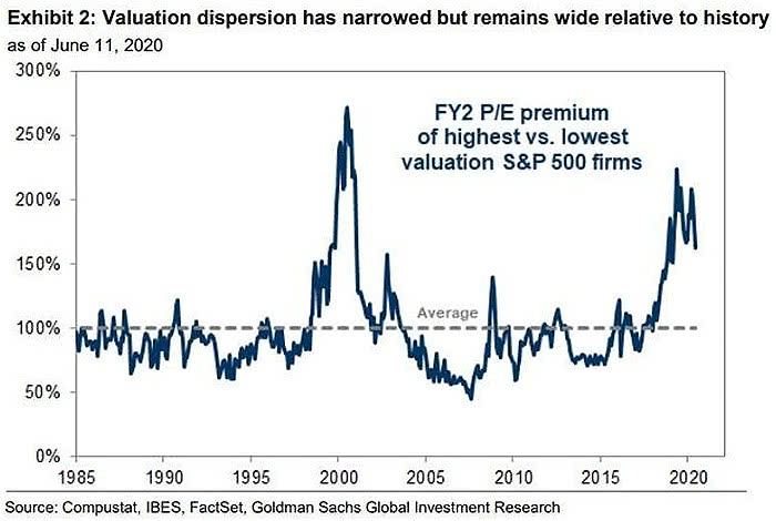
Hot Momentum Stocks are Showing Relative Strength
According to Goldman Sachs, the most popular retail trading stocks have materially outperformed the S&P 500, so far.
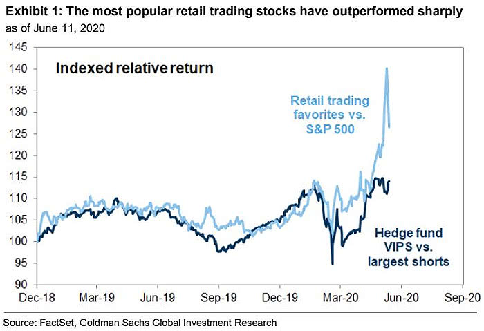
Cross-Asset Realized Volatility has been Extreme
Another sign of dispersion is the number of 3 standard deviation prices moves. We’ve already seen more extreme trends across asset classes in 22 years.

Despite the impressive V shaped rally from what is so far the low on March 23rd, I continue to notice the mean reversion year to date and over the past year. Here is year to date, and I marked the high, low, and average percentage.

At the low, the S&P 500 was down about -31% YTD. With the help of a very aggressive Federal Reserve proving liquidity, it has recovered most of the decline in one of the fastest in history.
It ain’t over till it’s over, and this ain’t over.
Asymmetry is about the upside vs. the downside in terms of asymmetric risk/reward. No observation of the price trend is complete without also noting the downside drawdown it took to achieve it. The drawdown for the S&P 500 was an astonishing -34% in just 23 days. It’s a reminder of risk.

I believe risk must be measured, directed, and controlled if we are to compound capital positively.
It doesn’t matter how much the return is if the downside risk is so high you tap out before it’s achieved.
Clearly, in 2020, we’ve surely seen some of the finest examples of risk, divergence, and volatility.
Mike Shell is the Founder and Chief Investment Officer of Shell Capital Management, LLC, and the portfolio manager of ASYMMETRY® Global Tactical. Mike Shell and Shell Capital Management, LLC is a registered investment advisor focused on asymmetric risk-reward and absolute return strategies and provides investment advice and portfolio management only to clients with a signed and executed investment management agreement. The observations shared on this website are for general information only and should not be construed as advice to buy or sell any security. Securities reflected are not intended to represent any client holdings or any recommendations made by the firm. Any opinions expressed may change as subsequent conditions change. Do not make any investment decisions based on such information as it is subject to change. Investing involves risk, including the potential loss of principal an investor must be willing to bear. Past performance is no guarantee of future results. All information and data are deemed reliable but is not guaranteed and should be independently verified. The presence of this website on the Internet shall in no direct or indirect way raise an implication that Shell Capital Management, LLC is offering to sell or soliciting to sell advisory services to residents of any state in which the firm is not registered as an investment advisor. The views and opinions expressed in ASYMMETRY® Observations are those of the authors and do not necessarily reflect a position of Shell Capital Management, LLC. The use of this website is subject to its terms and conditions.
And just like that, we have another volatility expansion.
Yesterday, in Global Macro: Volatility expands and divergence between sectors I suggested “It is likely we’ll see a volatility expansion from here.” Indeed, with the VIX and VVIX (volatility of volatility) both up 10% today, we are entering a volatility expansion.

Implied volatility had settled down gradually since it peaked in March, but it now looks like we may see prices spread out into a wider range.
As of this moment, the S&P 500 is down -2.34% and it is reversing down from the average of its price trend year to date, so I’ll call it “mean reversion.”

In fact, it’s mean reversion from the 1 year price trend, too.

It’s a negative sign that small and mid size stocks are trending down even more, down nearly -4%. They’ve been laggards in this rally from the March low. In the early stage of a new bullish trend, smaller companies should trend up faster. Smaller companies are more nimble than large companies, so we expect to see them recover quicker from declines. When they don’t, we consider it a bearish divergence.

I can’t say I’m surprised. This is likely the early stage of a deeper bear market as I’ve operated through 2000-03 and 2007-09.
But, nothing is ever a sure thing. It’s probabilistic and probably necessarily implies uncertainty.
Managing money though a big bear market isn’t as simple as an ON/OFF switch, whereby we get out near the peak and then reenter near the low. I’ve traded through a lot of nasty market conditions, the nastiest aside from the Great Depression, and that isn’t how it has worked for me. I didn’t just get out and then back in a year or two later. There are opportunities in between for skilled tactical traders who are able to direct and control risk and manage drawdowns.
There’s a good chance this becomes a prolonged bear market similar to what we’ve seen twice over the past two decades I’ve been a professional money manager.
I wrote yesterday;
“It’s probably a good time for individual investors who don’t have tight risk management systems to shift to defense to preserve capital, but it’s not a guarantee, and yes, we’ll see.”
I’ll just leave it at that, today.
Mike Shell is the Founder and Chief Investment Officer of Shell Capital Management, LLC, and the portfolio manager of ASYMMETRY® Global Tactical. Mike Shell and Shell Capital Management, LLC is a registered investment advisor focused on asymmetric risk-reward and absolute return strategies and provides investment advice and portfolio management only to clients with a signed and executed investment management agreement. The observations shared on this website are for general information only and should not be construed as advice to buy or sell any security. Securities reflected are not intended to represent any client holdings or any recommendations made by the firm. Any opinions expressed may change as subsequent conditions change. Do not make any investment decisions based on such information as it is subject to change. Investing involves risk, including the potential loss of principal an investor must be willing to bear. Past performance is no guarantee of future results. All information and data are deemed reliable but is not guaranteed and should be independently verified. The presence of this website on the Internet shall in no direct or indirect way raise an implication that Shell Capital Management, LLC is offering to sell or soliciting to sell advisory services to residents of any state in which the firm is not registered as an investment advisor. The views and opinions expressed in ASYMMETRY® Observations are those of the authors and do not necessarily reflect a position of Shell Capital Management, LLC. The use of this website is subject to its terms and conditions.
Implied volatility is mean revering in some ways. Volatility expands and contracts, so it oscillates between a higher level an a lower range.
I was monitoring various measures of volatility, such as the CBOE Implied Volatility Index as my systems were indicating a potential short term trend change.
Sure enough, at the end of the trading day, VIX expanded 20%.

Over the year to date time frame, VIX has reverted to its mean.
It is likely we’ll see a volatility expansion from here.
The VIX is implied volatility, which is its the expected vol over the next 30 days for the S&P 500 stocks. More specifically, a VIX of 33 implies a 2% range over the next 30 days. That’s less than half what it was in March with the VIX at 80, it implied a 5% range in prices. Still, investors have gotten used to a VIX around 12 or lower in recent years, except for the occasional volatility expansions. Over the past decade, the bull market presented an average VIX of 17.45, which is materially lower than the long term average of 19.36. At a 17 vol, the implied vol is around 1% a month.

The VIX isn’t always right. Implied vol is calculated based on the options prices of the S&P 500 stocks. It’s a forward looking expectation, as opposed to a rear view looking historical actual volatility, such as standard deviation.
The VIX of VIX (VVIX) is a measure of the volatility of the VIX. The CBOE’s VIX measures the short-term volatility of the S&P 500, and the VVIX measures the volatility of the price of the VIX. So, we call it the VIX of VIX, or the vol of vol.
VVIX gained 10% today, too, signaling a vol expansion.

All of this is coming at at time when my systems are showing a declining rate of change over the past month. The initial thrust off the March 23rd low had momentum, but since then the rate of change has been slowing. It’s running out of steam, or velocity.
Don’t fight the Fed
My systems monitor thousands of macroeconomic data and programmed to let me know what has changed. Macroeconomics is an observation of the entire economy, including the growth rate, money and credit, exchange rates, the total amount of goods and services produced, total income earned, the level of employment of productive resources, and the general behavior of prices.
I know, sounds exhausting. It is, unless you have a computerized quantitate systems to do it with perfection.
Looking at global macroeconomics, the Fed balance sheet is a key right now.
The H.4.1 from the Federal Reserve is a weekly report which presents a balance sheet for each Federal Reserve Bank, a consolidated balance sheet for all 12 Reserve Banks, an associated statement that lists the factors affecting reserve balances of depository institutions, and several other tables presenting information on the assets, liabilities, and commitments of the Federal Reserve Banks.
US Total Assets Held by All Federal Reserve Banks is the total value of assets held by all the the Federal Reserve banks. This can include treasuries, mortgage-backed securities, federal agency debt and and so forth. During the Great Recession, having already lowered the target interest rate to 0%, the Federal Reserve further attempted to stimulate the US economy by buying and holding trillions of dollars worth of US treasuries and mortgage-backed securities, a process known as Quantitative Easing or QE.
US Total Assets Held by All Federal Reserve Banks is at a current level of 6.721 TRILLION, up from 6.656 TRILLION last week and up from 3.890 TRILLION one year ago. This is a change of 72.80% a year ago.
The chart shows the last 15 years. I marked the last recession in grey.

It’s really high.
The Fed seems much more concerned this time as they have rolled out a much larger helicopter to drop over the cash.
I’m seeing a lot of divergence between sectors as a smaller number of stocks The chart is year to date. Only Technology is positive, by 1.86%. Otherwise, it’s a relative notable range of divergence.

The sector divergence is more obvious over the past month. Barely half of the sectors are positive, the rest and down.

This is just a simple illustration of what appears to be some weakness. The rate of change is slowing and I’m guessing it’s been driven by the massive Fed action.
Now, America is opening for business, but some research I’ve been doing shows it may be a bigger problem that I thought.
I’ll share that shortly.
I’ve also got an important piece I’m going to share about my experience trading the last two big bear markets.
It seems inevitable we’ll get to flow through another one and this one may be bigger and badder, we’ll see.
I think skill and experience is going to be an edge and make all the difference as it did in the past, we’ll see.
But, nothing is ever a sure thing. It’s probabilistic, but probably necessarily implies uncertainty.
It’s probably a good time for individual investors who don’t have tight risk management systems to shift to defense to preserve capital, but it’s not a guarantee, and yes, we’ll see.
Mike Shell is the Founder and Chief Investment Officer of Shell Capital Management, LLC, and the portfolio manager of ASYMMETRY® Global Tactical. Mike Shell and Shell Capital Management, LLC is a registered investment advisor focused on asymmetric risk-reward and absolute return strategies and provides investment advice and portfolio management only to clients with a signed and executed investment management agreement. The observations shared on this website are for general information only and should not be construed as advice to buy or sell any security. Securities reflected are not intended to represent any client holdings or any recommendations made by the firm. Any opinions expressed may change as subsequent conditions change. Do not make any investment decisions based on such information as it is subject to change. Investing involves risk, including the potential loss of principal an investor must be willing to bear. Past performance is no guarantee of future results. All information and data are deemed reliable but is not guaranteed and should be independently verified. The presence of this website on the Internet shall in no direct or indirect way raise an implication that Shell Capital Management, LLC is offering to sell or soliciting to sell advisory services to residents of any state in which the firm is not registered as an investment advisor. The views and opinions expressed in ASYMMETRY® Observations are those of the authors and do not necessarily reflect a position of Shell Capital Management, LLC. The use of this website is subject to its terms and conditions.
The 2 Year U.S. Treasury has never been this low before.
2 Year Treasury Rate is at 0.13%, compared to 0.17% the previous market day and 2.30% last year. This is lower than the long term average of 3.32%.
2 Year Treasury Rate is the yield received for investing in a US government issued treasury security that has a maturity of 2 years. The 2 year treasury yield is included on the shorter end of the yield curve and is important when looking at the overall US economy. Historically, the 2 year treasury yield trended as low as 0.16% in the low rate environment after the Great Recession post 2008. Here is the chart.

This is uncharted territory.
Here is the trend in the interest rate since 1990.

The 10 year treasury remains at an all time low.

On December 29, 2019, I shared my observations of the yield spread in “Asymmetry in yield spreads, inverted yield curve warning shot, and unemployment” when I said:
“A 10-2 treasury spread that approaches zero indicates a “flattening” yield curve. A flattening yield curve is when the shorter-term interest rate (2 years) is the same as longer-term interest rate (10 year).”
With the 2 year reaching an all time low, it’s a good time to revisit the yield curve.
10-2 Year Treasury Yield Spread is at 0.50%, compared to 0.55% the previous market day and 0.19% last year. This is lower than the long term average of 0.93%. But, it isn’t zero. Instead, the yield spread is trending up some. I labeled recessions in grey. The current recession hasn’t been called one yet by the historian economist, but it will be.

The 10-2 Treasury Yield Spread is the difference between the 10 year treasury rate and the 2 year treasury rate. A 10-2 treasury spread that approaches zero signifies a “flattening” yield curve. A negative 10-2 yield spread has historically been viewed as a precursor to a recessionary period. A negative 10-2 spread has predicted every recession from 1955 to 2018, but has occurred 6-24 months before the recession occurring, and is thus seen as a far-leading indicator. The 10-2 spread reached a high of 2.91% in 2011, and went as low as -2.41% in 1980.
Interest rates in the U.S. are trending toward zero.
Effective Federal Funds Rate is at 0.05%, compared to 2.40% last year. This is lower than the long term average of 4.75%. The Effective Federal Funds Rate is as low as its ever been.

The Effective Federal Funds Rate is the rate set by the FOMC (Federal Open Market Committee) for banks to borrow funds from each other. The Federal Funds Rate is important because it can act as the benchmark to set other rates. Historically, the Federal Funds Rate reached as high as 22.36% in 1981 during the recession. Additionally, after the financial crisis in 2008-2009, the Federal Funds rate nearly reached zero when quantitative easing was put into effect.
Here is the Effective Federal Funds Rate going back to 1976.

Interest rates can’t be lowered in depressions.
They are already at or near zero.
Operating through the years ahead is going to require rowing, not sailing. It’s going to require rotating, rather than allocating. It’s going to require actively directing and controlling risk, rather than a passive buy and hope approach. We are entering a cycle that is long overdue, but it’s here, now, and I’m looking forward to operating through it tactically.
This is going to be big boy stuff here.*
You better git your mind right.
*Sorry ladies, saying big girl stuff wouldn’t be right.
Mike Shell is the Founder and Chief Investment Officer of Shell Capital Management, LLC, and the portfolio manager of ASYMMETRY® Global Tactical. Mike Shell and Shell Capital Management, LLC is a registered investment advisor focused on asymmetric risk-reward and absolute return strategies and provides investment advice and portfolio management only to clients with a signed and executed investment management agreement. The observations shared on this website are for general information only and should not be construed as advice to buy or sell any security. Securities reflected are not intended to represent any client holdings or any recommendations made by the firm. Any opinions expressed may change as subsequent conditions change. Do not make any investment decisions based on such information as it is subject to change. Investing involves risk, including the potential loss of principal an investor must be willing to bear. Past performance is no guarantee of future results. All information and data are deemed reliable but is not guaranteed and should be independently verified. The presence of this website on the Internet shall in no direct or indirect way raise an implication that Shell Capital Management, LLC is offering to sell or soliciting to sell advisory services to residents of any state in which the firm is not registered as an investment advisor. The views and opinions expressed in ASYMMETRY® Observations are those of the authors and do not necessarily reflect a position of Shell Capital Management, LLC. The use of this website is subject to its terms and conditions.
We tend to find information that confirms our existing beliefs.
We’re seeing it more than ever, if we pay attention and recognize it.
If you feel we should stay on lock down and maintain the quarantine, you find news and opinions that support yours.
If you feel it’s all just a hoax and the quarantine has been a disaster, you find news and opinions that support yours.
If you feel the lock down has been necessary, but now the curve has flattened, so it’s time to open the United States for business, you find news and opinions that support yours.
Yes, I said “we”, because I do it, too, but the difference may be; I know it do, so I’m aware of it.
Awareness allows us to recognize it, then we get to decide if we want to do it, or not.
In other words, we decide if we want it, or not.
Confirmation bias is the tendency to search for, interpret, favor, and recall information in a way that confirms or strengthens one’s prior personal beliefs or hypotheses. It is a type of cognitive bias.
One says about cognitive bias:
A cognitive bias is a systematic error in thinking that affects the decisions and judgments that people make. Some of these biases are related to memory. The way you remember an event may be biased for a number of reasons and that in turn can lead to biased thinking and decision-making.
Another defines it as:
A cognitive bias is a systematic pattern of deviation from norm or rationality in judgment. Individuals create their own “subjective reality” from their perception of the input. An individual’s construction of reality, not the objective input, may dictate their behavior in the world.
I like the “subjective reality” part.
We aren’t objective, unless we want to be.
Wikipedia says;
Objectivity is a philosophical concept of being true independently from individual subjectivity caused by perception, emotions, or imagination. A proposition is considered to have objective truth when its truth conditions are met without bias caused by a sentient subject.
Simply put, objectivity is when our judgment isn’t influenced by personal feelings or opinions in considering and representing facts.
Yeah, tell me how often you are objective about things, leaving out your feelings and opinions, or considering the facts as you see them.
So, to be objective is not being influenced by personal feelings, interpretations, or prejudice; based on facts; and unbiased.
An objective opinion is an intention of dealing with things without taking into considering our own beliefs, thoughts, opinions, and feelings.
Who does that?
I think we’re going to feel our feelings, experience them, one way or another.
I also think it’s hard to ignore our own judgement and perceptions.
And then there’s feelings. If the topic drives our emotions, it makes us scared, mad, or happy, then it’s hard to get past it, unless we really want to.

We sometimes get lazy, and we just don’t want to pay attention anymore, so we just take those mental shortcuts. The easy way it is so, easy.
When it comes to the lockdown, Physicians who are concerned about their hospitals being overwhelmed may prefer it this way, so they’ll find information that supports their own individual motivations.
Other Physicians may earn their living doing surgeries that aren’t labeled a necessity, so their motivation is to get back to work. They may be more biased toward finding information that supports opening for business.
What is wrong with having your own opinion or personal motivations?
Nothing.
It’s useful to pay attention and know we have it.
It’s an example of how we find ways to get what we want.
We decide what we get.
Our cognitive biases influence how we think and act, so it’s useful to be aware of what it is we want, because we’re going to find information that supports what we want.
Sometimes we just don’t have time to think for ourselves, so we just find information from trusted people and go with it. My observations here is an example, especially when it comes to market trends and such.
We have to be selective in how we pay attention to what’s going on the world around us because we simply don’t have time to observe it all. I realized this two decades ago, so I developed systems for monitoring what has changed, systematically. I don’t have to sit around and look for it manually, I get alerts. When something has changed enough to send me a signal, then I look to see if I believe it matters.
Should you listen to others?
Only if they’re better at it than you are, and have more focus. Concentration is key, to me. My track record speaks for itself, especially during bear markets and volatility expansions. I’ve now operated through three major bear markets and a hundred volatility expansion. This isn’t new for me.
More importantly, I didn’t just “hunker down” and buy and hold through market crashes like 2000-03 or 2007-09. I tactically traded through them, successfully, and managed my drawdowns within a tolerable level. Past performance is never a guarantee of future results, but I’d rather drive my own boat through this storm than ride with anyone else. I’ve learned many lessons that should add to my skill and experience, so I’m likely to get what I want, but likely isn’t a sure thing.
What we believe about the virus and the lockdown depends on our personal beliefs, and we probably find things that support what we already believe. Nothing I write is guaranteed change your mind. You’ll instead compare it to the observations and opinions of others, but most importantly, you own.
That is, unless you intentionally look at the data with determination to be objective.
I know, it’s hard. Who does that?
A simple equation: Intentions = results.
In Market Wizards: Interviews with Top Traders, Ed Seykota, one of the famous traders interviewed, said:
“Win or lose, everyone gets what they want from the market.”
It means our intentions equals our results. Our intentions create our results.
For example, you have an opinion about the stock market right now. You have a feeling about it. You have beliefs. You may draw from the beliefs and opinions of others. You’re certainly focused on finding what confirms what you already believe, if you recognize it.
If you believe the stock market can’t possibly trend higher, you look for confirming information and opinions. If the market trends down and you avoided the loss, you got what you wanted. If the market trends up and you missed out, you got what you wanted. You wanted to avoid the downtrend you believe should happen. It doesn’t matter if it does, or not.
If you believe the stock market will go to the moon again because the Fed is intent on it, you’ll expose your portfolio to your belief. If the market trends up and you participate in its profits, you got what you wanted. If the market instead trends up and you participate in its losses, you got what you wanted. You believed it should trend up and you wanted exposure to what you believe should happen. It doesn’t matter if it does, or not.
What you believe is true, for you.
It’s how we get what we want.
We decide what we get. So, if we want to be empowered, create our own outcomes, we must necessarily take responsibility for them. When we take responsibility for our outcomes, we get the results we want.
Knowing what I know, having operate through times like this before, you’re going to need it. That is, unless you choose to be a victim. But I just made you aware that’s a choice, too.
I want to use my skills and experience to make the best of what is going to happen next.
Mike Shell is the Founder and Chief Investment Officer of Shell Capital Management, LLC, and the portfolio manager of ASYMMETRY® Global Tactical. Mike Shell and Shell Capital Management, LLC is a registered investment advisor focused on asymmetric risk-reward and absolute return strategies and provides investment advice and portfolio management only to clients with a signed and executed investment management agreement. The observations shared on this website are for general information only and should not be construed as advice to buy or sell any security. Securities reflected are not intended to represent any client holdings or any recommendations made by the firm. Any opinions expressed may change as subsequent conditions change. Do not make any investment decisions based on such information as it is subject to change. Investing involves risk, including the potential loss of principal an investor must be willing to bear. Past performance is no guarantee of future results. All information and data are deemed reliable but is not guaranteed and should be independently verified. The presence of this website on the Internet shall in no direct or indirect way raise an implication that Shell Capital Management, LLC is offering to sell or soliciting to sell advisory services to residents of any state in which the firm is not registered as an investment advisor. The views and opinions expressed in ASYMMETRY® Observations are those of the authors and do not necessarily reflect a position of Shell Capital Management, LLC. The use of this website is subject to its terms and conditions.
Let’s get right to it.
Which do you prefer?

What you see in the chart is The S&P 500 stock index, which is an unmanaged index of 500 or so stocks, weighted by their capitalization (size of company) and it’s long-only, fully invested, and therefore fully exposed to the risk/reward of the stocks. The S&P 500 is often considered a proxy for “the stock market”, like the Dow Jones. The risk of the S&P 500 is unlimited, although all 500 stocks would have to fall to zero to lose all your money. It hasn’t done that before, but it has declined -56% just a decade ago. See the red arrow.

Before that period 2008-09, the S&P 500 declined -50% from 2000 to 2003. If something has declined this much before, it should be assumed it can and will again.
So, it’s risky.
And that’s the true risk. The worst historical drawdown is the real measure of risk. If some advisor is telling you risk is two or three standard deviations, run, don’t walk, out that door.
Since being fully invested in the stock market all the time is so risky, real investors with real money tend to want real risk management.
That is, not just “diversification”, which is often touted as “risk management.” Buying 500 stocks isn’t true diversification. Niether is buying 1,000 or 3,000 stocks.
To be sure, the Vanguard Total Stock Market ETF holds 3,542 stocks. The next chart is the Vanguard Total Stock Market fund vs. the S&P 500 ETF. We don’t own either of them, so this doesn’t represent anything we’re doing at my investment company. It’s just an example, that yeah, the stock market is risky, not matter who you are, or how many you hold. Even with over 3,000 more stocks than the S&P 500, it falls the same.

But, to their credit, Vanguard does a good job saying their funds are risky. When I visited their website to see the number of holdings, it says:
An investment in the fund could lose money over short or even long periods. You should expect the fund’s share price and total return to fluctuate within a wide range, like the fluctuations of the overall stock market. The fund’s performance could be hurt by:
Vanguard funds classified as moderate to aggressive are broadly diversified but are subject to wide fluctuations in share price because they hold virtually all of their assets in common stocks. In general, such funds are appropriate for investors who have a long-term investment horizon (ten years or longer), who are seeking growth in capital as a primary objective, and who are prepared to endure the sharp and sometimes prolonged declines in share prices that occur from time to time in the stock market. This price volatility is the trade-off for the potentially high returns that common stocks can provide. The level of current income produced by funds in this category ranges from moderate to very low.
Ok, so we’ve established that the stock market is risky and even a fund invested in thousands of stocks can decline over -50% and take years to recover.
So, we just answered: Why risk management?
It doesn’t matter how much the return is if downside drawdowns are so high you tap out before the gains are acheived.
It also doesn’t’ matter how big the gains are if you give it all up before selling and realizing a profit.
I digress.
I specialize in active dynamic management strategies. I’ve been developing and operating investment risk management systems for the past two decades. Since my focus is on managing the downside, within our risk tolerance, I’m left to let the horses run. If we can direct and control our drawdowns, within reason, it’s never a sure thing, then we are left to focus on the upside of profits.
To illustrate two different methods of risk management, I’m going to use the most simple examples possible. I’m also going to use indexes managed by others, instead of my own. It’s all about keeping it simple to make a point.
So, here we go. I explained the orange line is the S&P 500, fully invested in stocks, all the time, no risk management beyond the diversification of investing in 500 stocks across 10 sectors like financial, healthcare, and tech.
The blue line in the chart is the S&P Trend Allocator Index. The S&P 500® Trend Allocator index is designed to track the performance of a systematic trend-following strategy allocating between the S&P 500 and cash, based on price trends. If the S&P 500 is observed to be in a positive trend, then the index is allocated to the S&P 500, otherwise, it is allocated to cash. It’s a very simple form of trend following applied to stocks. When the S&P 500 is above its 200 day simple moving average, it invests in stocks. When it trends below the 200 day for more than 5 days, it shifts to cash.

The purple trend line, which has achieved the highest return, is the CBOE S&P 500 5% Put Protection Index. The CBOE S&P 500 5% Put Protection Index is designed to track the performance of a hypothetical strategy that holds a long position indexed to the S&P 500® Index and buys a monthly 5% out-of-the-money S&P 500 Index (SPX) put option as a hedge. It’s a defined risk strategy, using put options for dynamic hedging.
Trend Following vs. Hedging with Options
Which worked better?
For a closer look, here is the year to date return streams.

Clearly, hedging with 5% out of the money put options has achieved the better asymmetric risk/reward this time. Applying the simple trend following strategy of selling after the stock index declines below its 200 day moving average exited before the low of the S&P 500, but it remains uninvested, missing out on the upside. The trend following streastgy is down -23% year to date, which is worse than the S&P 500. The hedged index is actually positive for 2020. The hedge paid off, according to this index.
Let’s take a closer look at the downside via a drawdown chart, the % off highs. As expected, the S&P 500 stock index had the worst drawdown, so far. It declined -34%.

The strategy of buying 5% out of the money put options had a drawdown of -20%, which is about half of the S&P 500. The systematic trend following strategy was able to cut the drawdown a little short at -27%. The trend following strategy is currently still in its drawdown.

It’s out of the stock market, so it has also missed out on the recent uptrend. Although, it the stock market enters another waterfall decline, that may turn out better. But, to catch up with the fully invested stock index, that’s what would have to occur. The stock market would have to fall a lot, then the strategy reenter at a better point. However, trend following never enters the lows, and never sells the highs, either. Instead, it enters and exits on a lag and the 200 day moving average is a significant lag. For example, I new this trend following strategy would have at least a -11% drawdown, because when the stock market was at its high in February, the 200 day moving average sell signal was -11% lower.

However, this simple system also requires the index to remain below the 200 day average for 5 days, which is intended to reduce whipsaws. That’s why it didn’t initially sell on the first leg down. Instead, it sold after the second leg down. Since the S&P 500 is still below its 200 day moving average, this trend following system hasn’t invested in the stock market yet. In fact, it would have to stay above the 200 day for 5 days. It’s a symmetric trading system. It applies the same signal for the entry and the exit. I know that price trends drift up and crash down, so my version of this is an asymmetric trading system. I apply a different exit than the entry to account for the unique behavior of price trends since they drift up, but crash down.
How has systematic trend following worked on stocks over a longer period?
It’s had some challenges. Volatile periods, when a market swings up and down over shorter time frames, are hostile conditions for trend following methods. This index has only gained 7% the past 5 years after this recent drawdown. While it does cut the losses short, which is what trend following is known for, it has struggled due to market conditions.

I marked up the next chart, where I include its trend relative to the S&P 500 index. I labeled when it sold, which was three times. The first two times, selling with the trend following sell signal of a 200 day SMA avoided a little of the downside. This time it hasn’t helped so much. Overall, the trend following applied to stocks had lower relative strength than the fully invested stock index with no risk management. But, it avoided some downside. Over this short time frame, the downside loss mitigation probably isn’t deemed enough to account for the difference in the outcomes.

With risk management systems, we never expect them to achieve the same or better return than a fully invested stock index that is always exposed to the risk/reward of stocks. The stock index also doesn’t include expenses and it may not be invested in directly. Investors demand risk management because they don’t want the -50% declines they would endure being invested in the stock market with no exit and no hedge.
Speaking of hedge.
Neither of these risk management indexes I’m using for this example have been around long. The CBOE CBOE S&P 500 5% Put Protection Index started in 2015.
The CBOE S&P 500 5% Put Protection Index is designed to track the performance of a hypothetical risk-management strategy that consists of a long position indexed to the S&P 500 Index (SPX Index) and a rolling long position in monthly 5% Out-of-the-Money (OTM) SPX Put options. This is a relatively simple example, though executing it well isn’t so simple. The protective put strategy has achieved better asymmetry, this time. I say this time, because it doesn’t always work as well as it did this time. But, here it is.

As you can see, it lagged the stock index in the uptrend, until now. Lagging in the uptrend is expected. Buying a put option gives us the right to sell our stock below a certain price. It’s similar to buying home or car insurance. When we buy a protective put option, we literally pay a “premium” for a time period to expiration, like insurance. Some call it portfolio insurance. If we pay an insurance premium for years, it reduces our personal profit and loss statement. The protection is an expense. We’re willing to pay it to avoid large drawdowns. A skilled options trader can potentially execute it better, if an edge can be gained with timing the relative value of the options.
Asymmetric hedging beat the simple following strategy this time. I call it asymmetric hedging, because when we buy a put option, we have limited downside risk (the premium paid) but we have a maximum gain of the Strike price – premium paid. To learn more about a Long Put option, here is a video from the OIC.
The protective put strategy has achieved better risk/reward. I say this time, because it doesn’t always work as well as it did this time. Also, I said the Long Put protection strategy is an “asymmetric hedge” because it has a larger potential profit than the cost for the exposure. There are much better examples of what I call an asymmetric hedge, for example, going long volatility can have a substantial asymmetric payoff. Just look at the VIX. It spiked up more than ever in history, so even a small option position to be long volatility would have a tremendous payoff. Imagine if we spent just 1% of a portfolio but the payoff was 10% at the portfolio level. Yeah, that’s asymmetry.
Back to the comparison of trend following to hedging with options, here is the return streams over the past five years. I consider both of these risk management methods to be basic asymmetric risk/reward payoffs. The trend following system didn’t do so well this time, at least so far, but it still has limited downside risk and unlimited upside gain potential. If the stock market keeps going up and never trends down below its 200 day average, it would keep gaining.

But, if we believed that was what it will do, we wouldn’t care about risk management. Some people actually do put their money in stocks and stock funds and don’t consider limiting their downside. To each their own. Before this bear market is over, they may be crying about their large losses, as they did last time. But I’m guessing this time, if they do it again, they may learn the lesson. The stock market is risky, all investing involves risks as do all strategies. No strategy is perfect. We have to be willing to accept the imperfections and settle with a C sometimes, if we want to A over the long run. This isn’t college. Money compounds.
This leads me to one more thought to share. I was watching this video from Ray Dalio, the founder of the largest hedge fund in the world. Dalio was speaking of this chart in his presentation. He calls it “The Holy Grail.”

In an ideal world, we could invest in 15-20 different assets that are uncorrelated and because one trends up with others are trending down, similar to the hedging strategy, we would achieve an edge from pure diversification. He says The Holy Grail is combining these unique returns streams, which has gains and losses at different times, but overall, the portfolio trends up to the upper right corner.
That’s in an idealized world.
You may know better. Shit happens in the real world. A joke going around is:
Started the year off January 1st: THIS IS MY YEAR!
By April, wiping my …. with coffee filters.
Now that’s funny right there! I don’t care who you are!
Yeah, I said it. It’s a sign of the times. We need to lighten up and laugh as much as we can, especially about the simple things in life, like running out of tp.
In bear markets, correlations go to one. That is, most everything falls. Why? Even if you have gains in some uncorrelated markets, if you have big losses in others, as a fund manger, you take the profits to help deal with the losses. It eventually pushes down the leaders, too. That’s just one of many examples. Here’s an old chart I’ve used for years to illustrate how diversification along can fail.

There is no free lunch, but Dalio is right, if we could combined 15 or so unique return streams, it could be an edge. The trouble is, what markets can you simply invest in that are truly disconnected from the others?
No many. Maybe long term US Treasuries along with stocks, but going forward, it’s not going to look like the past. US Treasuries will be tradable, but with the interest rate down to 1%, the upside in price is very limited, so is the interest income.
Uncorrelated Return Streams
I did both of this type of strategy, and more, in Asymmetry Global Tactical Fund, LP which was a private managed by another company I founded in 2012, Asymmetry Fund Management, LLC. What I believe is more of “The Holy Grail” isn’t making simple investment allocations into different funds or markets hoping for diversification from non-correlation, but instead, combining asymmetric trading systems that have unique return drivers and asymmetric risk/reward profiles. My different trading systems have different return drivers. Instead of market factors and conditions driving the return stream, the buy, sell, and risk management system extracts from the market a unique return stream. It’s a return stream we can’t get from just investing in some funds with different managers. They are mostly correlated, multiple asymmetric trading systems may be very uncorrelated from each other. For example, one system may trend follow longer term trends. Another may trend follow short term trends. Then, they are applied to difference markets, say stocks, bonds, currency, and commodities. Another complete different system may be volatility trading, aiming to gain from a volatility expansion. Add in some countertrend systems, that buys short term oversold and sell short term overbought, and it’s going to produce a unique return stream from everything else. What if the countertrend system is applied to different markets, then, each extracting a unique return stream.
That’s real diversification.
It can’t be achieved by just investing in different markets, or investing in a bunch of funds. But, someone like Dalio, or me, who has multiple trading systems and strategies, we may benefit from the edge of combining them, o even shifting between them.
But I have an edge, and a very big one, over Dalio. He’s got to move around billions. He can’t trade nimble as I can. My flexibility and nimbleness is an edge. I’m not ever going to manage 50 billion or 100 billion and would never want to. I already have what I want. I have enough. It allows me to focus, and be dynamic. I’m happier with little to no distraction.
Now, this is an overly simplified idealized example I’ve used here with the trend following and put buying hedging strategy, but just thing about how this would look if we combine them along with 15-20 others. The larger the money we manage, the more we need to just allocate capital into something rather than trading.
You can probably how these three trends are correlated in uptrends, then disconnect in downtrends. Some combination of them can smooth the ride. In this overly simple example, it would mean some exposer to long-only fully invested in stocks, all the time, no matter how far they fall. Another is always hedged, so it will lag on the upside, but limit the risk on the downside. Then, the trend following system absolutely exits in downtrends and waits for an uptrend. When the market is crashing, nothing looks better in our account that FDIC insured cash deposits.

But, I rotate, instead of allocate.
I would rather shift between markets to be exposed when I believe the risk/reward is asymmetric and avoid it when it isn’t.
Then, imagine if each of these have its own risk management to predefine risk in advance and a portfolio level drawdown control to limit overall drawdowns to less than the -30% of more than is common with the stock market.
So, there you go, a trend following system relative to a options hedging system, and a hint at how we see it. I’m an unconstrained tactical money manager. I don’t constrain myself to a box. I never liked being put in a box and I don’t fit well in any box. I’ll go were the money is treated best. Flexible, adaptable, nimble, unconstrained, and unbiased.
That’s just how I roll.
Mike Shell is the Founder and Chief Investment Officer of Shell Capital Management, LLC, and the portfolio manager of ASYMMETRY® Global Tactical. Mike Shell and Shell Capital Management, LLC is a registered investment advisor focused on asymmetric risk-reward and absolute return strategies and provides investment advice and portfolio management only to clients with a signed and executed investment management agreement. The observations shared on this website are for general information only and should not be construed as advice to buy or sell any security. Securities reflected are not intended to represent any client holdings or any recommendations made by the firm. Any opinions expressed may change as subsequent conditions change. Do not make any investment decisions based on such information as it is subject to change. Investing involves risk, including the potential loss of principal an investor must be willing to bear. Past performance is no guarantee of future results. All information and data are deemed reliable but is not guaranteed and should be independently verified. The presence of this website on the Internet shall in no direct or indirect way raise an implication that Shell Capital Management, LLC is offering to sell or soliciting to sell advisory services to residents of any state in which the firm is not registered as an investment advisor. The views and opinions expressed in ASYMMETRY® Observations are those of the authors and do not necessarily reflect a position of Shell Capital Management, LLC. The use of this website is subject to its terms and conditions.
On February 6th, I shared and observation in “19 is the new 20, but is this a new low volatility regime?” the lower level of implied (expected) volatility at the time may be driven by two factors that may have been resulting in less concern for volatility. I wrote:
The current bull market that started in March 2009 is the longest bull market in history. It exceeded the bull market of the 1990s that lasted 113 months in terms of time, though still not as much gain as the 90s.
The U.S. is in its longest economic expansion in history, breaking the record of 120 months of economic growth from March 1991 to March 2001, according to the National Bureau of Economic Research. However, this record-setting run observed GDP growth far slower than previous expansions.
The aged bull market and economic expansion can naturally lead to some level of complacency and expectation for less downside and tighter price trends. When investors are uncertain, their indecision shows up in a wide range of prices. When investors are smugger and confident, they are less indecisive and it’s usually after a smooth uptrend they expect to continue.
Well, so much for that.
Here we are, the bull market was interrupted by a -37% in the Dow Jones. So, any higher highs from here will be labeled a new bull market.

The US is now in a recession. The longest economic expansion is over, interrupted by a -4.8% GDP, as discussed in “The longest economic expansion in U.S. history is over, but…”

What about volatlity?
I shared several observations of volatility and
Back in December, I wrote “A volatility expansion seems imminent” which was a follow up to November 16th, “Periods of low volatility are often followed by volatility expansions”.
Don’t say I didn’t tell so, in advance.
I also wrote:
Is the volatility expansion over? in December.
On January 27th, published “Here comes the volatility expansion, but is the coronavirus outbreak in China to blame?”
January 30th “Global Macro: is the coronavirus outbreak crushing the China ETF and causing the volatility expansion?”
February 26th was “What volatility expansions tell us about expectations for stock market trends”
March 3rd was pretty clear “Expect wider price swings in a volatility expansion”
Then, on March 10th I wrote again about the volatility expansion “
Why I’m not surprised to see such a volatility expansion”
This chart was featured in the Wall Street Journal by one of the few outside research I read; The Daily Shot.

Oh yes, did that chart reverse trend as expected.
Now there’s this. The CBOE Volatility Index (VIX) spiked to 82, the highest level of implied vol on record.

But since then, it is gradually trending down.

The options market is pricing in less expected volatility for the S&P 500 stocks over the next 30 days.
It’s a volatility contraction.
Will it continue?
It will as long as expected vol keeps declining. I know; captain obvious.
VIX is trending down, but it’s still at 31, and still a wider than average range of prices spreading out.
If we see a reversal down in stocks, then we’ll see volatility spike again. But for now, it’s a volatility contraction, so I’ll take it.
The Fear & Greed Index is only dialed half way up.


Only two of the Fear & Greed Index indicators are showing greed. Safe haven demand is the biggest, which is the difference between the 20-day stock and bond returns. Stocks have outperformed bonds by 16.29% the last 20 trading days. This is close to the strongest performance for stocks relative to bonds in the past two years and suggests investors are rotating into stocks from the relative safety of bonds.

The other is the Put/Call Ratio. During the last five trading days, volume in put options has lagged volume in call options by 44.87% as investors make bullish bets in their portfolios. However, this among the lowest levels of put buying seen during the last two years, indicating greed on the part of investors.

By my measures, the stock market is just now entering the overbought range, technically, on a short term basis.
For example, the percent of S&P 500 stocks above their 50 day moving average is now up to 74% after todays close. It’s the higher risk zone.

As a testiment to the internal damage done, I present the percent of S&P 500 stocks above their 200 day moving average, which is only at 30%. It tells us most stocks are still in a longer term downtrend after reaching a low of only 3% of stocks above their trend line on March 20th.

And yes, it was very near the March 23rd low only three days later.
Most stocks are participating in the uptrend, as measured by 70% of them above their average of the past 50 days.
Volatiltiy is contracting.
Investor sentiment is gradually shifting. Nothing drives sentiment like the price trend. The price trend is the leading indicator, investors enthusiasm follows it.
All while we just saw the largest drop in economic growth since 2008.
Mike Shell is the Founder and Chief Investment Officer of Shell Capital Management, LLC, and the portfolio manager of ASYMMETRY® Global Tactical. Mike Shell and Shell Capital Management, LLC is a registered investment advisor focused on asymmetric risk-reward and absolute return strategies and provides investment advice and portfolio management only to clients with a signed and executed investment management agreement. The observations shared on this website are for general information only and should not be construed as advice to buy or sell any security. Securities reflected are not intended to represent any client holdings or any recommendations made by the firm. Any opinions expressed may change as subsequent conditions change. Do not make any investment decisions based on such information as it is subject to change. Investing involves risk, including the potential loss of principal an investor must be willing to bear. Past performance is no guarantee of future results. All information and data are deemed reliable but is not guaranteed and should be independently verified. The presence of this website on the Internet shall in no direct or indirect way raise an implication that Shell Capital Management, LLC is offering to sell or soliciting to sell advisory services to residents of any state in which the firm is not registered as an investment advisor. The views and opinions expressed in ASYMMETRY® Observations are those of the authors and do not necessarily reflect a position of Shell Capital Management, LLC. The use of this website is subject to its terms and conditions.
Last week, the US investor sentiment, an indicator that is a part of the AAII Sentiment Survey, indicated the percentage of investors surveyed that had a bearish outlook for the stock market. An investor that is bearish believes the stock market will head lower in the next six months.
US Investor Sentiment, % Bearish was at 50.00% for the week ending April 23rd, compared to 42.75% the prior week.

Considering the number of global macroeconomic indicators in uncharted territory, it’s expected to see many investors bearish. But, the stock market is climbing the wall of worry.
When an uptrend in the stock market includes a lot of uncertainty about its sustainability, we say the market is climbing a wall of worry.
That’s exactly what we’re seeing now.
I’m guessing investors who sold their stocks at lower prices are feeling the fear of missing out about now.
I’ve always said that everyone has an exit point, it can be predefined like mine is, or it can be your uncle point. If you reach the point you tap-out to avoid more loss, it’s probably at much lower prices. I prefer to exit before losses get too large, but also exit based on logical price levels that suggest a change of trend. Or, portfolio level exits designed for drawdown control to limit loss.
If you tapped out at lower prices last month because you felt afraid, I don’t know when you would feel better about buying again?
Suppose the chart below represents what you invest in. At what point do you get bullish again and invest?

If you say at the lower level, you may be fooling yourself.
You don’t know it doesn’t go down another -20% from there. But, I know if you tapped out before it was down so much, it is highly unlikely you’ll feel more positive at lower prices. Instead, you’ll extrapolate the recent past into the future.
Just like you are, now.
Except now, prices are trending up, and if you tapped out at the low, you’re feeling the fear of missing out.
So, do you feel better now that prices have risen?
Using the same price series, let’s pretend you sold at the first low.

Then, a few weeks later, the price is trending up and you get excited and buy.

Oops. What you didn’t know, and never will know, is the trend reversed down to an even lower low. What do you do then?

Maybe you sell at the same price level you did before. The market is falling and you just want out, again.

Once if falls a lot more, do you ever get to feeling like buying again? You’ve already created two losses of around -20%, each trip. You first lost -20%, then bought the high, then lost about -20% again in the same price range. Now, here you are, the market is down over -60% and you’re supposed to feel good?
I doubt it.
The headlines are blood red.
It seems everyone is taking on heavy losses and the waterfall has been so deep and long it doesn’t seem it will ever end.
Then, there it goes.

You want to buy every time it moves up 10% and you feel like you’re really missing out on the opportunity of a lifetime when it trends up 20%, without you.
But you’re stuck. So afraid of “another leg down” as everyone is worried about.
Every decline seems to be the beginning of a new leg down, but it isn’t, until it is, but even then, it’s “only” -30%.

I used the trend as an example, but it’s a real trend. I successfully made tactical trading decisions through it, so I know the mindset and behavioral challenges. It wasn’t an ON/OFF switch, either. I entered and exited many times, trading the swings along the way, never sure if it would trend higher, or reverse back down, but applying systems that account for the unknowable outcome.
The market climbs a wall of worry. Fortunately, we’re participating in this uptrend.
It doesn’t do what we expect it to sometimes.
Some investors seem to oscillate between the fear of missing out and the fear of losing money.
Some of them tend to be more afraid, so they are oriented toward the fear of losing money.
Others are optimists, so while they may panic out, they quickly get optimistic after prices trend back up.
Regardless of the behavioral tendency, if you tap out at the lows, I don’t know when you’ll ever get back in. I have no answer for it.
If you buy now, you may exposure yourself to the possibility of loss just as it reverses back down again.
If you wait for the next leg down, what if it never comes?
To me, the solution is to avoid investment programs that may result in your tapping out to start with. That is, know your true risk tolerance. Know at what % loss you are prone to tap out, and invest with a manager who has drawdown controls to help manage the risk.
If you are sitting there in cash, waiting to reinvest, there will never be a perfect time to do it.
Invest with someone who can hedge and manage risk, then let it rip.
The next AAII investor sentiment survey is out tomorrow. It will show fewer bearish investors, now that price has trended up.
Nothing changes investor sentiment the a price trend.
Mike Shell is the Founder and Chief Investment Officer of Shell Capital Management, LLC, and the portfolio manager of ASYMMETRY® Global Tactical. Mike Shell and Shell Capital Management, LLC is a registered investment advisor focused on asymmetric risk-reward and absolute return strategies and provides investment advice and portfolio management only to clients with a signed and executed investment management agreement. The observations shared on this website are for general information only and should not be construed as advice to buy or sell any security. Securities reflected are not intended to represent any client holdings or any recommendations made by the firm. Any opinions expressed may change as subsequent conditions change. Do not make any investment decisions based on such information as it is subject to change. Investing involves risk, including the potential loss of principal an investor must be willing to bear. Past performance is no guarantee of future results. All information and data are deemed reliable but is not guaranteed and should be independently verified. The presence of this website on the Internet shall in no direct or indirect way raise an implication that Shell Capital Management, LLC is offering to sell or soliciting to sell advisory services to residents of any state in which the firm is not registered as an investment advisor. The views and opinions expressed in ASYMMETRY® Observations are those of the authors and do not necessarily reflect a position of Shell Capital Management, LLC. The use of this website is subject to its terms and conditions.
As the US and and global economies are entering a recession, this is when I start actively monitoring global macro-economic trends.
My investment and tactical trading decisions are informed by directional price trends, momentum, volatility, and investor sentiment. So, this quantitative data is my primary focus as a global macro/tactical investment manager.
That is, until economic trends shift outside their range and reach extremes.
Then I start observing these global macro trends to observe what has changed. We monitor thousands and data streams and time series, daily, with quantitative alerts that signal when these trends change, or when their rate of change shifts. For example, we monitor 4,136 global Gross Domestic Product (GDP) indicators alone.
US GDP Growth released today indicates the longest U.S. economic expansion in history is over.
The Bureau of Economic Analysis releases quarterly figures for US Gross Domestic Product. In addition to the Real GDP, the report also includes data for income, sales, inventories, and corporate profits. It is one of the most important parts of the National Income and Product Accounts.
US Real GDP Growth is measured as the year over year change in the Gross Domestic Product in the US as adjusted for inflation. Gross Domestic Product is the total value of goods produced and services provided in a the US. Real GDP Growth is a vital indicator to analyze the health of the economy. Two quarters of consecutive negative real GDP growth officially signifies a recession. Additionally, GDP is used by the Fed (FOMC) as a gauge to make their interest rate decisions. In the post World War II boom years, US Real GDP grew as high as 12.8% in a year, but in the late 20th century 0-5% growth was more the norm.
US Real GDP Growth is now at -4.80%, compared to 2.10% last quarter and 3.10% last year, which is materially below the long term average of 3.18%. This GDP is sharpest drop since 2008 as governments and consumers responded to the new coronavirus.

I expect the second quarter will be worse.
I’ve been pointing out a few years now that this is the longest economic expansion in U.S. history as well as the longest bull market for stocks that was very aged.
But, after a -37% decline in the popular market proxy, the Dow Jones Industrial Average, the stock market is climbing a wall of worry.

Despite the negative GDP, the Dow Jones is up 2.7% today.

And the Dow Jones is now just -13.28% year to date, after starting 2020 up 3.55% and then crashing down -35% just a few weeks ago.

I have tactically operated through bear markets, so investors should be prepared for many significant swings along the way, but for now, it seems on March 24th stock prices reached a low enough point to attract buying enthusiasm that exceeds the desire to sell.
Of course, the buying enthusiasm may be mostly the Federal Reserve, but notwithstanding who is driving up prices, the trend is up for now.
The stock market is forward-looking, so what is, is.
Giddy up.
Mike Shell is the Founder and Chief Investment Officer of Shell Capital Management, LLC, and the portfolio manager of ASYMMETRY® Global Tactical. Mike Shell and Shell Capital Management, LLC is a registered investment advisor focused on asymmetric risk-reward and absolute return strategies and provides investment advice and portfolio management only to clients with a signed and executed investment management agreement. The observations shared on this website are for general information only and should not be construed as advice to buy or sell any security. Securities reflected are not intended to represent any client holdings or any recommendations made by the firm. Any opinions expressed may change as subsequent conditions change. Do not make any investment decisions based on such information as it is subject to change. Investing involves risk, including the potential loss of principal an investor must be willing to bear. Past performance is no guarantee of future results. All information and data are deemed reliable but is not guaranteed and should be independently verified. The presence of this website on the Internet shall in no direct or indirect way raise an implication that Shell Capital Management, LLC is offering to sell or soliciting to sell advisory services to residents of any state in which the firm is not registered as an investment advisor. The views and opinions expressed in ASYMMETRY® Observations are those of the authors and do not necessarily reflect a position of Shell Capital Management, LLC. The use of this website is subject to its terms and conditions.
I primarily focus on directional price trends, momentum, volatility, and investor sentiment. That is, until economic trends trend to extremes. Then I start observing these global macro trends.
We monitor thousands and data streams and time series with quantitative alerts that signal when these trends change. We are seeing many economic trends in uncharted territory.
US Retail Gas
The US Retail Gas Price is the average price that retail consumers pay per gallon, for all grades and formulations. Retail gas prices are important to view in regards to how the energy industry is performing. Additionally, retail gas prices can give a good overview of how much discretionary income consumers might have to spend. The current price is $1.87 which is below the average of $2.21 and near the prior lows in 2016 and 2009. In the late 1990s gas was around $1 and traded as high as $4 in 2007-08.

Texas Manufacturing Outlook Survey
The Dallas Fed conducts the Texas Manufacturing Outlook Survey monthly to obtain a timely assessment of the state’s factory activity. Companies are asked whether output, employment, orders, prices and other indicators increased, decreased or remained unchanged over the previous month. Responses are aggregated into balance indexes where positive values generally indicate growth while negative values generally indicate contraction. It’s at a new low, so the Texas Manufacturing Outlook Survey is in uncharted territory.

Richmond Fed Survey of Manufacturing Activity
The Survey of Manufacturing Activity is sent electronically to manufacturing firms that are selected for participation according to their type of business, location, and firm size. About 200 contacts receive questionnaires and approximately 90 to 95 of those surveyed respond in a typical month. Respondents report on various aspects of their business, such as shipments, new orders, order backlogs, inventories, and expectations for business activity during the next six months. It fell to a new low, so another has reached uncharted territory.

US Index of Consumer Sentiment
US Index of Consumer Sentiment is at a current level of 71.80, a decrease of 17.30 or 19.42% from last month. This is a decrease of 25.40 or 26.13% from last year and is lower than the long term average of 86.69. The US Index of Consumer Sentiment (ICS), as provided by University of Michigan, tracks consumer sentiment in the US, based on surveys on random samples of US households. The index aids in measuring consumer sentiments in personal finances, business conditions, among other topics. Historically, the index displays pessimism in consumers’ confidence during recessionary periods, and increased consumer confidence in expansionary periods. Consumer sentiment is materially below its long term average.

Since the index shows pessimism in consumers’ confidence during recessionary periods, in the next chart I highlight historical recessions in gray to illustrate.

Hey Crude… WTI Crude Oil Spot Price trended negative. WTI Crude Oil Spot Price is at a current level of -36.98, down from 18.31 the previous market day and down from 64.02 one year ago. Clearly, WTI Crude has reached uncharted territory.

WTI Crude Oil Spot Price is the price for immediate delivery of West Texas Intermediate grade oil, also known as Texas light sweet. It, along with Brent Spot Price, is one of the major benchmarks used in pricing oil. WTI in particular is useful for pricing any oil produce in the Americas. One of the most notable times for the WTI Crude Oil Spot Price was in 2008 when prices for WTI Crude reached as high as $145.31/barrel because of large cuts in production. However, because of the financial crisis and an abrupt loss of demand for oil globally, the price of WTI Crude fell as much at 70% off highs in January of 2009.
US Inflation Rate
The US Inflation Rate is the percentage in which a chosen basket of goods and services purchased in the US increases in price over a year. Inflation is one of the metrics used by the US Federal Reserve to gauge the health of the economy. Since 2012, the Federal Reserve has targeted a 2% inflation rate for the US economy and may make changes to monetary policy if inflation is not within that range. A notable time for inflation was the early 1980’s during the recession. Inflation rates went as high as 14.93%, causing the Federal Reserve led by Paul Volcker to take dramatic actions.

With commodities like gasoline and crude falling, it should be no surprise to see inflation trend down. US Inflation Rate is at 1.54%, compared to 2.33% last month and 1.86% last year. This is lower than the long term average of 3.23%.
10 Year Treasury Rate
10 Year Treasury Rate is at 0.67%, compared to 2.51% last year. The 10 Year Treasury Rate is the yield received for investing in a US government issued treasury security that has a maturity of 10 year. The 10 year treasury yield is included on the longer end of the yield curve. Many analysts will use the 10 year yield as the “risk free” rate when valuing the markets or an individual security. Historically, the 10 Year treasury rate reached 15.84% in 1981 as the Fed raised benchmark rates in an effort to contain inflation. The 10 Year Treasury Rate is in uncharted territory.

US Initial Jobless Claims has trended up with such magnitude I almost hate to show it.

US Initial Jobless Claims is at a current level of 4.427 million last week, a decrease of 810,000 or 15.47% from last week. US Initial Jobless Claims, provided by the US Department of Labor, provides underlying data on how many new people have filed for unemployment benefits in the previous week. Given this, one can gauge market conditions in the US economy with respect to employment; as more new individuals file for unemployment benefits, fewer individuals in the economy have jobs. Historically, initial jobless claims tended to reach peaks towards the end of recessionary periods such as on March 21, 2009 with a value of 661,000 new filings.
US Continuing Jobless Claims
US Continuing Jobless Claims is at a current level of 15.98M, up from 11.91M last week and up from 1.654 million one year ago. This is a change of 34.12% from last week and 865.9% from one year ago. I marked historical recessions in gray to show continuing jobless claims trend up in recession.

US Federal Reserve is in uncharted territory
The US Federal Reserve is taking massive action in attempt to fend off a crisis. We had seen unprecedented quantitative easing the past decade, but it was wimpy compared to what we are seeing now.
US Total Assets Held by All Federal Reserve Banks is the total value of assets held by all the the Federal Reserve banks. This can include treasuries, mortgage-backed securities, federal agency debt and and so forth. During the Great Recession, having already lowered the target interest rate to 0%, the Federal Reserve further attempted to stimulate the US economy by buying and holding trillions of dollars worth of US treasuries and mortgage-backed securities, a process known as Quantitative Easing or QE. This time, they are doing anything necessary.

US Total Assets Held by All Federal Reserve Banks is at a current level of 6.573 TRILLION, up from 6.368 TRILLION last week and up from 3.932 TRILLION one year ago. This is a change of 3.22% from last week and 67.18% from one year ago.
Federal Reserve Easing: Traditional Security Holdings is at a current level of 1.118T, up from 1.074T last week and up from 724.75B one year ago. This is a change of 4.07% from last week and 54.25% from one year ago.

So, you want to know if things are going back to normal anytime soon?
Maybe not.
But, the Dow Jones Industrial average declined -37% in a month and has retraced about half of the loss this past month.

The market climbs a wall of worry and during extreme times like this, markets do what you least expect.
We’ve been invested in stocks again the past few weeks, but only time will tell if we see the stock market trend back down, or reaches a new high.
Big bear markets swing up and down along the way to lower lows, so that’s what I expect is likely here. I operated successfully through both of the last two bear markets and trade the swings. It’s not as simple as an ON/OFF switch of existing at the peak, as we did in February, and then reentering at “the” low. Instead, for me, it’s a lots of entries and exits as it all unfolds.
We’ll probably see a reversal back down at some point, but we may not. If there’s anything I’ve learned the hard way, it’s don’t fight the Fed. But, Fed interference isn’t a sure thing, either. It doesn’t matter, for me, my process doesn’t require me to figure out what’s going to happen next. Instead, I know how I’ll take risks and when the risk/reward is more likely asymmetric. If the risks don’t pan out, I’ll cut my loss short and try again.
I’ve done it over and over and over again, which discipline.
I’ve been here before, many times. This is when I do things very different from the crowd and it has historically made all the difference. There is never any guarantee of the future, but I’m as ready as I’ve ever been. With the past experiences, I’m more prepared than ever.
I’m looking forward to it.
Let’s roll.
Mike Shell is the Founder and Chief Investment Officer of Shell Capital Management, LLC, and the portfolio manager of ASYMMETRY® Global Tactical. Mike Shell and Shell Capital Management, LLC is a registered investment advisor focused on asymmetric risk-reward and absolute return strategies and provides investment advice and portfolio management only to clients with a signed and executed investment management agreement. The observations shared on this website are for general information only and should not be construed as advice to buy or sell any security. Securities reflected are not intended to represent any client holdings or any recommendations made by the firm. Any opinions expressed may change as subsequent conditions change. Do not make any investment decisions based on such information as it is subject to change. Investing involves risk, including the potential loss of principal an investor must be willing to bear. Past performance is no guarantee of future results. All information and data are deemed reliable but is not guaranteed and should be independently verified. The presence of this website on the Internet shall in no direct or indirect way raise an implication that Shell Capital Management, LLC is offering to sell or soliciting to sell advisory services to residents of any state in which the firm is not registered as an investment advisor. The views and opinions expressed in ASYMMETRY® Observations are those of the authors and do not necessarily reflect a position of Shell Capital Management, LLC. The use of this website is subject to its terms and conditions.
I respect history. The past is no guarantee of future results, but it’s all we have to draw statistical inference from, so we need to understand its risks and rewards. We use past data to determine future possibilities. If we don’t know where we’ve been, we unlikely know where we’re going. It’s essential to have a deep understanding of time, the past, the present, and the future that doesn’t exist. I have great respect for the past, but I’m always here, now, at this moment. As a professional decision-maker, I can only do something now or not now. I can’t do anything in the past. I can’t do anything in the future. It’s now, or not. This alone has removed a lot of behavioral issues for decision making. I review historical trends and my decisions, but I don’t get stuck there at a time I can’t actually do anything. It is what it is, so I accept it and learn from it. If we want to learn from the past, we necessarily must know what it was. That’s why I observe charts of price trends, investor sentiment, global macroeconomic trends, volaltity, and momentum.
A global macro strategy is a hedge fund style investment and trading strategy typically focused on the overall economic and political views of various countries or their macroeconomic principles. Positions in a global macro portfolio may include long and short positions in various equity, fixed income, currency, commodities, and other alternatives like volatility. Although most global macro hedge fund strategies may be focused on views of macroeconomic trends, my focus is on directional price trends.
The price trend is the final arbiter, if you keep disagreeing with the trend, you’ll lose.
The longer you disagree with the trend, the more you lose.
Other indicators like sentiment, rate of change (momentum/relative strength), and volatility are confirming indicators for the price trend. For me, they signal when a trend may be reaching an extreme, becoming more likely to reverse. I like to be positioned in the direction of the price trend, but I’m situational aware of when the trends may be reaching an extreme and likely to result in a countertrend.
So, let’s see what in the world is going on. I concentrate on what has changed. If a trend or level hasn’t changed, it doesn’t warrant the attention, so my systems signal when something has changed. I then examine the rate of change, which is why I speak of momentum, velocity, and relative strength. The trend tells us the direction of change, but the rate of change indicates how fast it’s changing.
Investor Sentiment: are investors bullish, feeling positive about the future direction of stock price trends? or bearish, feeling stock prices will fall?
US Investor Sentiment, % Bullish is an indicator that is a part of the AAII Sentiment Survey. It indicates the percentage of investors surveyed that had a bullish outlook on the market. An investor that is bullish believes the stock market will trend higher. The AAII Sentiment Survey is a weekly survey of its members which asks if they are “Bullish,” “Bearish,” or “Neutral” on the stock market over the next six months. The percent of bullish investors is slightly below average, so the bullish individual investors haven’t really changed much.

US Investor Sentiment, % Bearish is at 49.73%, compared to 52.07% last week and 27.20% last year. Pessimistic investor sentiment materially higher than the long term average of 30.4%, so this is a change. Individual investors are generally more bearish than they were. When their bearishness reaches a historical extreme, they’ll likely be wrong. As you see in the chart, investors are abnormally negative on the future of stock price trends right now.

The stock market will reverse its current trend when prices are pushed down to a low enough point to attract new buying demand.
Stock prices will also reach their bottom when investors who want to sell have sold, so there is no overhead resistance.
Nothing tells us more about market dynamics better than the price trend itself, but investor sentiment measures like AAII Investor Sentiment Survey indicates if do-it-yourself individual investors are capitulating. When their bearishness is at a historical high it may confirm with the price trend those who want to sell have probably already sold. So, their desire to sell has less impact on an uptrend.
If most of the investors with a desire to sell have already sold they won’t be selling as prices trend up, so the market will have less resistance as it trends up. For example, the S&P 500 stock index had gained nearly 5% in the first two months this year. It peaked on February 19th. then all hell broke loose. The S&P 500 dropped -34% in just three weeks, so the S&P 500 was down -31% for the year at that point.

Some of the selling pressure was driven by systematic trading, such as trend following and momentum. As rules-based systematic trading pushed prices lower and lower, other investors were panic selling to avoid more losses. The trouble is, individual investors tend to sell into the bloodbath when prices reach their lowest points. Emotional reactions are driven by falling prices. People sell because prices are falling and they are losing money. Systmatic rules-based systems also sell to avoid more loss, but do so based on predefined exits to manage risk and drawdown controls.
What I observed in the early stage of this waterfall decline is what seemed to be an overreaction from an initial under-reaction.
At the peak on February 19th, here is what the stock index looked like as it trended to an all-time high. This is three months of history. What I noticed, then, was the relative strength indicator didn’t follow it up. This was a very negative divergence.

At the same time, I was seeing other bearish signs of a major market top. To be sure, here are the observations I shared in January and February.
I was a little early with my boldest statement on January 18th: Now, THIS is what a stock market top looks like! Stock Market Risk is Elevated.
But, fortunately, I acted on it. Seeing a very bullish cover of one of my favorite investment publications was the final straw, along with all the other things I observed that seemed to signal a major top in stock prices.
I don’t always sell my stocks because the market risk seems elevated, but when I do it’s because the weight of the evidence is overwhelming.
But, it didn’t work out perfectly and it never does, so I don’t have an expectation of perfection. If I did, I could have never created the asymmetric risk/reward return profile I have, especially the downside risk management and drawdown control. It’s an imperfect science with a dash of art.
I’m okay with that.
Asymmetric investment returns are created from a positive mathematical expectation, not being right more often than wrong, but instead losing less when I’m wrong and earning more when I’m right. The rest of you are simply focused on the wrong thing. You want to be right, and it ain’t happin’. I’m not right all the time, either. But when I’m wrong, I cut it short. I don’t let the wrong become really wrong. I take the loss. I love taking losses. I do it all the time. It’s how and why I have smaller losses, rather than large ones. It’s the only Holy Grail that exists. The Holy Grail is asymmetry: larger average gains than losses. This positive mathematical expectation doesn’t require me to know the future and be right all the time. Instead, I focus on what I can actually control, and that’s mainly the size of my losses. If I limit the size of my losses, I’m left to focus on the upside of profits. That’s my edge, and it isn’t just a mathematical edge, it’s a psychological edge, a behavioral edge. It’s not easy to execute for most people because you want to be right, so you’ll hold those losses hoping they’ll recover. If they do and the price trends back up, then you may sell, if you remember you wish you had before at those higher prices, before you saw a -30% loss.
That’s resistance.
If you wait to sell when the price trends back up some, you’re selling creates resistance if there are enough of you driving the volume of selling pressure. If you instead feel more bullish now that prices trended up some, you may hold on, hoping it continues up. In that case, you’re not the overhead resistance at higher prices causing the halt that prevents the price from trending higher. If enough volume is like you, prices will keep trending up because the rising prices aren’t met with a stronger desire to sell than the enthusiasm to buy.
Here is the full -34% downtrend. It was the fastest downtrend of this magnitude in history.

What in the world was going on? The first leg down, which we only know in hindsight it was the “first”, was a sharp downtrend of -13%. The stock market falls so far, so fast, it becomes deeply oversold with the relative strength index at only 19. The relative strength of 30 is low. Below 30 is oversold and below 20 is extremely oversold. Under normal circumstances, this results in a short term bounce at a minimum, and when I say normal, I’m talking about looking at over a century of history.

To make the point clear, using a simple measure of relative strength as an indicator in the lower section of the chart below, the last times it reached such an oversold level were the lows in late 2018.

But, if you notice, the second time the SPX got so oversold in 2018, the price trend was significantly lower. So, the risk of a countertrend signal like this is even after the price trend reverses back up, it may later reverse back down to an even lower low. It did then, and it did it again this time.
To illustrate what happened from there, I’ve marked up the next chart pretty well. Keep in mind, I don’t necessarily trade the S&P 500 index. I’m simply using it as a proxy for the overall market. I focus more on more granular ETFs like sectors and individual equities. To see the trends play out, walking through time, the first part is the red vertical arrow to point out the first level of extreme oversold conditions as the stock market dropped -13%. My managed portfolio was in short term US Treasuries during this because I hold sold weeks ago.

So, because of my risk management from elevated risk levels, we were in a position of strength, as I call it. I mean we were not participating in the -13% waterfall decline, so as others (who are losing money quickly) are getting more and more bearish, I’m getting bullish. Once stocks got oversold, however, I invested in stocks again. Of course, you can see what happened afterward. The next leg down was even worse and we got caught in it. Like I said, my tactical trading decisions are never perfect timing, nor does it have to be. I just need my average profits to be larger than my average losses to create positive asymmetry. I eventually reduce risk exposure again to zero and then I’m back to looking to buy again, which I have. This is for educational purposes, so I’m leaving out all the other things going on, too, such as buying US Treasuries, etc. The point is, this is what in the world was going on.
Looking at the chart again, a few more points to make. Notice the two red horizontal lines I drew are showing a price range that could be resistance. I say that because of 1. it’s the first area of a prior high, so those who wish they’d sold there may sell now. 2. the relative strength is now at its halfway point and specifically, its average level, so we may see some mean reversion. We’ll see.

On the bullish side, however, just as individual investors are really bearish, I’m seeing some divergence again in the price momentum. The green arrow shows it. As the stock market reached a low, down -34% off its high, the momentum didn’t make a new low. It didn’t even reach the prior low or even close to it. Instead, it’s making a higher low and higher high.
If I claim the February divergence was bearish because the relative strength didn’t confirm the all-time new high, then I’ll also claim the opposite is true: this is a bullish divergence.
What’s going to happen next with the US stock market?
We’re about to find out!
Only time will tell, but from what I’m seeing, the crowd is expecting a retest of the lows or even lower lows, and that seems reasonable. A global recessional is imminent at this point. But, the stock market has already fallen -34% from its high, so anything is possible. This could be it, for all we know. If most people believe it will get worse, the capital markets have a funny way of proving the crowd wrong. At least temporarily, as it’s doing right now. But, the big picture isn’t real positive.
We now have unprecedented jobless claims and unemployment. American’s are going to be hurting without jobs. That chart is so ugly I don’t want to show it.
We also have unprecedented intervention from the federal government and the Federal Reserve. So have central banks around the world responded.
I believe the last five years of this bull market and economic expansion were driven by the Federal Reserve Zero Interest Rates Policy and other forms of quantitative easing. What was then unprecedented Fed action drove the longest bull market and economic expansion in US history. It also drove the stock index to its second-highest price to earnings valuation in 140 years. I’ve pointed out many times before the Shiller PE Ratio for the S&P 500 was over 30 and the only time it was “more expensive” was the late 1990s. That didn’t end well. It was higher than 1929 just before the Great Depression.

The S&P 500 Shiller CAPE Ratio, also known as the Cyclically Adjusted Price-Earnings Ratio, is defined as the ratio of the S&P 500’s current price divided by the 10-year moving average of inflation-adjusted earnings. The metric was invented by American economist Robert Shiller and has become a popular way to understand long-term stock market valuations. It is used as a valuation metric to forecast future returns, where a higher CAPE ratio could reflect lower returns over the next couple of decades, whereas a lower CAPE ratio could reflect higher returns over the next couple of decades, as the ratio reverts back to the mean.
The S&P 500 Shiller CAPE Ratio was at a high level of 33, which was higher than the long term average of about 17. Today is has declined to 25.42, while still well above an “overvalued” level, it could be justified by the low inflation we are seeing. Right now, we are looking at deflation as prices of stuff are falling.
I don’t have to correctly predict with the direction the stock market will trend next. I instead increase and decrease exposure to the possibility of risk/reward aiming for asymmetric risk-reward. I tactically trade the cycles and swings as I’ve done many times before. We achieve an asymmetric risk-reward when the downside potential is less than the upside. We achieve asymmetric investment returns when our average profits exceed our average losses. I call it ASYMMETRY® and everything I do centers around it.
Do you really want to know the harsh reality of what the stock market is going to do next?
Most likely the opposite of what you think.
Contact us here if we can help.
Mike Shell is the Founder and Chief Investment Officer of Shell Capital Management, LLC, and the portfolio manager of ASYMMETRY® Global Tactical. Mike Shell and Shell Capital Management, LLC is a registered investment advisor focused on asymmetric risk-reward and absolute return strategies and provides investment advice and portfolio management only to clients with a signed and executed investment management agreement. The observations shared on this website are for general information only and should not be construed as advice to buy or sell any security. Securities reflected are not intended to represent any client holdings or any recommendations made by the firm. Any opinions expressed may change as subsequent conditions change. Do not make any investment decisions based on such information as it is subject to change. Investing involves risk, including the potential loss of principal an investor must be willing to bear. Past performance is no guarantee of future results. All information and data are deemed reliable but is not guaranteed and should be independently verified. The presence of this website on the Internet shall in no direct or indirect way raise an implication that Shell Capital Management, LLC is offering to sell or soliciting to sell advisory services to residents of any state in which the firm is not registered as an investment advisor. The views and opinions expressed in ASYMMETRY® Observations are those of the authors and do not necessarily reflect a position of Shell Capital Management, LLC. The use of this website is subject to its terms and conditions.
Prior to the volatility expansion that started a month ago, my mantra was:
Periods of low volatility are followed by volatility expansions.
The other side to it is:
Periods of high volatility are followed by volatility contractions.
Yes, indeed, after the CBOE S&P 500 Volatility Index (VIX) shattered it’s former all-time high when implied volatility spiked to 83, it is now settling down retracing about half of what it gained. For now, it’s a volatility contraction.

For a closer look, here is the trend zoomed in to the one year chart.

The stock market as measured by the S&P 500 made a solid advance today by any measure. According to Walter Deemer, today was a 90.3% upside day with 2732 advances and 276 declines. So far, March 23rd was the lowest point and the stock market is trying to recover some of the losses. The day after the low was March 24 was a 93.9% upside day with 2791 up and 244 down, which was even stronger. So, the advance off the low is showing some thrust, but only time will tell if it can continue, or if this is just an oversold bounce.

Getting more technical with the charting, the candlesticks show some bullish patterns. However, the S&P 500 has already reached the mid way point in my momentum measures were I expect if it’s going to stall, this is where it happens.

Many people believe the news headlines drive stocks prices, but today is yet another example that it isn’t necessarily that case. The news was bad today, with headlines like “U.S. Death Toll From Coronavirus Tops 10,000” and “U.K. Prime Minister Boris Johnson Moved to Intensive Care” and then “Virus Puts a Prison Under Siege.”
US Initial Jobless Claims last week was off the charts. Provided by the US Department of Labor, US Initial Jobless Claim provides underlying data on how many new people have filed for unemployment benefits in the previous week. Given this, one can gauge market conditions in the US economy with respect to employment; as more new individuals file for unemployment benefits, fewer individuals in the economy have jobs. Historically, initial jobless claims tended to reach peaks towards the end of recessionary periods such as on March 21, 2009, with a value of 661,000 new filings.
US Initial Jobless Claims is at a current level of 6.648M, an increase of 3.341M or 101.0% from last week. This is an increase of 6.436M or 3,004% from last year and is higher than the long term average of 353698.

If there was anything we learned from the last 11 years is the truth behind the axiom “don’t fight the Fed.” Fed intervention and the passage of a record-breaking $2.3 trillion US fiscal stimulus has supported fragile consolidation across many markets, including Treasuries, agency mortgage-backed securities and money markets.
A global recession is now imminent.
They won’t call it for another year or two, but I will now. We’ll see negative GDP growth across the world, although it may well recover as sharply as it fell. Once restaurants, etc. finally open back up, they will be in high demand. So, if restaurants can hang in there, there will be brighter days ahead. Right now, we just don’t know how long it may take.
As for the Coronavirus and data, we’ve discovered many issues with the data being reported by states. I’ve been monitoring it waiting for some improvements before sharing any more quantitative analysis.
This ain’t my first rodeo riding a bucking bear. I operated successfully through the 2008-09 bear market as well as the 2000-03 bear market. Both of them included ugly recessions with people losing their jobs, etc.
This one will be worse. But, again, there’s also a good chance the recovery is just as stunning as the waterfall decline.
So, stay tuned.
Periods of high volatility are often followed by volatility contractions and that’s what we’re seeing now. However, it is highly likely we won’t be seeing a VIX at 12 anytime soon as I expect elevated implied volatility for a long time, driven by demand for hedging with options. It’s likely to be similar to post 1987 when the risk of a price shock remains price into options.
I’ve got a lot more to share, but timing is everything.
Don’t miss out, we’ll automatically send you an email of new ASYMMETRY® Observations by entering your email below.
Mike Shell is the Founder and Chief Investment Officer of Shell Capital Management, LLC, and the portfolio manager of ASYMMETRY® Global Tactical. Mike Shell and Shell Capital Management, LLC is a registered investment advisor focused on asymmetric risk-reward and absolute return strategies and provides investment advice and portfolio management only to clients with a signed and executed investment management agreement. The observations shared on this website are for general information only and should not be construed as advice to buy or sell any security. Securities reflected are not intended to represent any client holdings or any recommendations made by the firm. Any opinions expressed may change as subsequent conditions change. Do not make any investment decisions based on such information as it is subject to change. Investing involves risk, including the potential loss of principal an investor must be willing to bear. Past performance is no guarantee of future results. All information and data are deemed reliable but is not guaranteed and should be independently verified. The presence of this website on the Internet shall in no direct or indirect way raise an implication that Shell Capital Management, LLC is offering to sell or soliciting to sell advisory services to residents of any state in which the firm is not registered as an investment advisor. The views and opinions expressed in ASYMMETRY® Observations are those of the authors and do not necessarily reflect a position of Shell Capital Management, LLC. The use of this website is subject to its terms and conditions.
As you know, I do quantitative research of trends, trend changes, and such, which are usually applied to global market trends. I have been studying some quantitative data that appears to front-run COVID – 19 by about a week.
In other words, it appears to have predictive value.
Most of what I’ve seen reported suggests the increase in hospital cases will peak in the next few weeks. Based on what I’m seeing, we may instead observe peak in hospital cases much sooner, as in the next few days.
First, the Observed Illnesses is an index of how severely the population in this area is being affected by influenza-like illness, according to Kinsa Insights.

The next map is The U.S. Health Weather Map, which is a visualization of seasonal illness linked to fever – specifically influenza-like illness, according to Kinsa. What they are calling “atypical illness”, may in some cases be connected to the COVID-19 pandemic. “The aggregate, anonymized data visualized here is a product of Kinsa’s network of Smart Thermometers and the accompanying mobile applications. Kinsa is providing this map and associated charts as a public service.

Kinsa explains on the website:
This chart allows us to compare Kinsa’s observations of the influenza-like illness level in the U.S., in orange and red, against where Kinsa expects them to be, in blue Based on their data, influenza-like illness levels in the U.S. are higher than what we’d expect at this time of year, according to the website.
They go on to explain:
The map shows two key data points:
(1) the illness levels we’re currently observing, and
(2) the degree to which those levels are higher than the typical levels we expect to see at this point in the flu season.
Please note: We are not stating that this data represents COVID-19 activity. However, we would expect to pick up higher-than-anticipated levels of flu-like symptoms in our data in areas where the pandemic is affecting large numbers of people. Taken together with other data points, we believe this data may be a helpful early indicator of where and how quickly the virus is spreading.
Notice in the map above, California is gray now, it was red before. They note:
Due to widespread social distancing, school closures, stay-at-home orders, etc. influenza-related illness levels are dropping in many regions. In some regions (e.g. CA) they’re dropping below the expected range for this time of year — which reduces the level of atypical illness to zero on our map
I believe this is fascinating and seems to suggest it is likely we’ll see a peak in hospital cases much sooner, as in the next several days. If so, it may also mean Coronavirus passes through faster than many expect. In that case, it would be an unexpected improvement for the economy and stock market, if we aren’t shut down as long.
I like the direction of this trend.

Check out the incredible US Health Weather Map powered by Kinsa Insights. Also see Can Smart Thermometers Track the Spread of the Coronavirus? from The New York Times, which is where I first learned of it.
Let’s see how it trends from here.
I’m going to be sharing some very interesting observations in the weeks ahead, so I encourage you to follow along by entering your email below for notifications.
Mike Shell is the Founder and Chief Investment Officer of Shell Capital Management, LLC, and the portfolio manager of ASYMMETRY® Global Tactical. Mike Shell and Shell Capital Management, LLC is a registered investment advisor focused on asymmetric risk-reward and absolute return strategies and provides investment advice and portfolio management only to clients with a signed and executed investment management agreement. The observations shared on this website are for general information only and should not be construed as advice to buy or sell any security. Securities reflected are not intended to represent any client holdings or any recommendations made by the firm. Any opinions expressed may change as subsequent conditions change. Do not make any investment decisions based on such information as it is subject to change. Investing involves risk, including the potential loss of principal an investor must be willing to bear. Past performance is no guarantee of future results. All information and data are deemed reliable but is not guaranteed and should be independently verified. The presence of this website on the Internet shall in no direct or indirect way raise an implication that Shell Capital Management, LLC is offering to sell or soliciting to sell advisory services to residents of any state in which the firm is not registered as an investment advisor. The views and opinions expressed in ASYMMETRY® Observations are those of the authors and do not necessarily reflect a position of Shell Capital Management, LLC. The use of this website is subject to its terms and conditions.
Something we have warned about for a while now is the elevated valuation level of stocks in general.
To be sure, I search for “Shiller PE” here on ASYMMETRY® Observations to mention the most recent times.
I promise I’m not just tooting my own horn here. The intent is to make the point that these things were present before this market crash and it’s starting to get cleared up. The same person who wrote about it then is now looking for the trend to change. But, to fully understand, we have to go back and see where we are coming from to know where we are now.
February 6, 2020 19 is the new 20, but is this a new low volatility regime?
I wrote:
The aged bull market and economic expansion can naturally lead to some level of complacency and expectation for less downside and tighter price trends. When investors are uncertain, their indecision shows up in a wide range of prices. When investors are smugger and confident, they are less indecisive and it’s usually after a smooth uptrend they expect to continue.
Is it another regime of irrational exuberance?
“Irrational exuberance” was the expression used by the former Federal Reserve Board chairman, Alan Greenspan, in a speech given during the dot-com bubble of the 1990s. The expression was interpreted as a warning that the stock market may have been overvalued. It was.
Irrational exuberance suggests investor enthusiasm drives asset prices up to levels that aren’t supported by fundamental financial conditions. The 90s ended with a Shiller PE Ratio over 40, far more than any other time in more than a century.
Is the stock market at a level of irrational exuberance?
Maybe so, as this is the second-highest valuation in the past 150 years according to the Shiller PE.

Before that, on January 17, 2020 in
The aged bull market and economic expansion can naturally lead to some level of complacency and expectation for less downside and tighter price trends. When investors are uncertain, their indecision shows up in a wide range of prices. When investors are smugger and confident, they are less indecisive and it’s usually after a smooth uptrend they expect to continue.
Is it another regime of irrational exuberance?
“Irrational exuberance” was the expression used by the former Federal Reserve Board chairman, Alan Greenspan, in a speech given during the dot-com bubble of the 1990s. The expression was interpreted as a warning that the stock market may have been overvalued. It was.
Irrational exuberance suggests investor enthusiasm drives asset prices up to levels that aren’t supported by fundamental financial conditions. The 90s ended with a Shiller PE Ratio over 40, far more than any other time in more than a century.
Is the stock market at a level of irrational exuberance?
Maybe so, as this is the second-highest valuation in the past 150 years according to the Shiller PE.
Before that, on January 17, 2020 in What’s the stock market going to do next? I included:
THE BIG PICTURE
First, I start with the big picture.
The S&P 500 is trading at 31.8 x earnings per share according to the Shiller PE Ratio which is the second-highest valuation level it has been in 150 years. Only in 1999 did the stock index trade at a higher multiple times earnings.

This price-earnings ratio is based on average inflation-adjusted earnings from the previous 10 years, known as the Cyclically Adjusted PE Ratio (CAPE Ratio), Shiller PE Ratio, or PE 10.
What is the P/E 10 and how is it calculated?
The bottom line is, the stock market valuation has been expensive for a while now. The only time I factor in the price-earnings ratio is in the big picture. Although it isn’t a good timing indicator, it is considered a measure of the margin of safety for many investors and at this elevated level, there is no margin of safety by this measure.
As such, risk seems high in the big picture, which suggests investors should access their exposure to the possibility of loss in stocks and stock funds to be prepared for a trend reversal.
As a matter of fact, I was quoted three times in Barron’s and MarketWatch in November 2019 and January 2020 warning of the elevated risk level in stocks because of their valuation, the length of the bull market that is 11 years old, and what was a very low level of volatility.

I’m a true independent thinker, and have evidence of that as well. I’m sure my friends at Barron’s may not have liked it when I poke a little fun at the cover on January 18th and made it as clear as it could be! Here is what I wrote in Now, THIS is what a stock market top looks like!

To be fair, I also included how Barron’s had been right before on their cover, but I was just using this as a confirming sign along with many other things I was already seeing.
I followed with;
My observations this week seem especially important because risk levels have become more elevated, yet individual investor sentiment is extremely optimistic.
As I’ve had very high exposure to stocks, I have now taken profits in our managed portfolios.
It’s a good time to evaluate portfolio risk levels for exposure to the possibility of loss and determine if you are comfortable with it.
Here is the good news. After more than a -30% decline, the S&P 500 Shiller PE is down to 21, which is now within a more normal range, especially if we can assume low inflation. It’s still highly valued, but not the extremely overvalued 32 I warned about several times this year.

At 32 times earnings, it was the second most expensive time for stocks in American history. Second only to the late 1990’s and above Black Tuesday, just before the Great Depression.
The S&P 500 Shiller CAPE Ratio, also known as the Cyclically Adjusted Price-Earnings ratio, is defined as the ratio the the S&P 500’s current price divided by the 10-year moving average of inflation-adjusted earnings. Shiller PE was invented by Yale economist Robert Shiller and has become a popular way to understand long-term stock market valuations. It is used as a valuation metric to forecast future returns, where a higher CAPE ratio could reflect lower returns over the next couple of decades, whereas a lower CAPE ratio could reflect higher returns over the next couple of decades, as the ratio reverts back to the mean.
The mean is 16.70, so it still has a way to go for mean reversion.

The only good thing about falling stock prices is, if you have a lot of cash, as we’ve had, you get to buy stocks and equity ETFs at lower risk entry points. I’m not often a value investor, but I am when prices actually become fairly valued to undervalued.
Another way to observe valuations of the big picture is the S&P 500 PE Ratio. The S&P 500 PE Ratio is the price to earnings ratio of the constituents of the S&P 500. The S&P 500 includes the 500 largest companies in the United States and can be viewed as a gauge for how the US stock market is performing. The price to earnings ratio is a valuation metric that gives a general idea of how a company’s stock is priced in comparison to their earnings per share. Historically, the S&P 500 PE Ratio peaked above 120 during the financial crisis in 2009 and was at its lowest in 1988. I marketed the high, low, and average in the chart.

The trouble is, this PE metric did skyrocket in the last bear market. It’s because in recessions and bear markets, earnings decline. A picture is worth a thousand words, so here is the S&P earnings over the last twenty years with the recessionals in gray.

It all makes more sense when we see all three of the stock market return drivers in one chart. Earnings fall, price falls, dividend increases as the price decrease, and PE spikes up.

Next I show all four; price trend, PE trend, earnings cycle, and dividend yield.

So, the good news is, the US stock market is becoming less overvalued. The downside is, a recession seems imminent as earnings was already expected to slow. This is at least one less risk in the big picture, but we’ll see how it all unfolds from here.
Bear markets are difficult and with all the negative headlines right now, I know it’s hard for people to see light at the end of the tunnel. I don’t see it, either, but as a tactical investment manager, I increase and decrease exposure to the risk/reward and in a volatility expansion, I expect wider swings.
These are fascinating times and past bear markets have been the highlight of my professional investment management career, so sign up if you want to follow along with email notifications of new observations.
Let us know if we can help.
Mike Shell is the Founder and Chief Investment Officer of Shell Capital Management, LLC, and the portfolio manager of ASYMMETRY® Global Tactical. Mike Shell and Shell Capital Management, LLC is a registered investment advisor focused on asymmetric risk-reward and absolute return strategies and provides investment advice and portfolio management only to clients with a signed and executed investment management agreement. The observations shared on this website are for general information only and should not be construed as advice to buy or sell any security. Securities reflected are not intended to represent any client holdings or any recommendations made by the firm. Any opinions expressed may change as subsequent conditions change. Do not make any investment decisions based on such information as it is subject to change. Investing involves risk, including the potential loss of principal an investor must be willing to bear. Past performance is no guarantee of future results. All information and data are deemed reliable but is not guaranteed and should be independently verified. The presence of this website on the Internet shall in no direct or indirect way raise an implication that Shell Capital Management, LLC is offering to sell or soliciting to sell advisory services to residents of any state in which the firm is not registered as an investment advisor. The views and opinions expressed in ASYMMETRY® Observations are those of the authors and do not necessarily reflect a position of Shell Capital Management, LLC. The use of this website is subject to its terms and conditions.
Mark Twain’s mother said:
“I only wish Mark had spent more time making money rather than just writing about it”.
I am no Mark Twain.
I’m a tactical trader, so that’s my first purpose.
I’m not always going to take the time to write it out in a format I can share here.
I’ve been bolted to the chair this week but didn’t spend any time sharing my observations.
Instead, I encourage you to do what I did. I went back and reread some observations from January to see what I was seeing and thinking then.
I think about:
What has changed?
How has sentiment changed?
How has the trend direction changed?
Has volatility changed?
Has momentum changed?
Has the narrative changed?
What didn’t we know then we do today?
Is what we believe today congruent with what we believed then?
Here’s what I read:
If you do this, you’ll see why.
Today was just a reversal of Friday’s late-day surge.

The stock market is even more washed out.
With the Federal Reserve lowering interest rates and buying back bonds, the long term US Treasury Index reversed back up.

The stock indexes are down to their 2018 lows and if the selling doesn’t dry up, we may see a mean reversion of the last 10 years. It wouldn’t be surprising for many reasons, especially when we see it happens to be the area of trouble in 2015-16. Keep in mind, the Fed has been a key return driver for the last several years. It doesn’t seem to be working anymore.

I’m a risk manager, risk-taker, so I increase and decrease exposure to asymmetric risk/reward as conditions change over time. When I see signs of the selling pressure drying up or buying enthusiasm overwhelming the selling pressure, I’ll be looking to buy stocks again.
That is all.
Let me know if we can help.
Mike Shell is the Founder and Chief Investment Officer of Shell Capital Management, LLC, and the portfolio manager of ASYMMETRY® Global Tactical. Mike Shell and Shell Capital Management, LLC is a registered investment advisor in Florida, Tennessee, and Texas. Shell Capital is focused on asymmetric risk-reward and absolute return strategies and provides investment advice and portfolio management only to clients with a signed and executed investment management agreement. The observations shared on this website are for general information only and should not be construed as advice to buy or sell any security. Securities reflected are not intended to represent any client holdings or any recommendations made by the firm. I observe the charts and graphs to visually see what is going on with price trends and volatility, it is not intended to be used in making any determination as to when to buy or sell any security, or which security to buy or sell. Instead, these are observations of the data as a visual representation of what is going on with the trend and its volatility for situational awareness. I do not necessarily make any buy or sell decisions based on it. Any opinions expressed may change as subsequent conditions change. Do not make any investment decisions based on such information as it is subject to change. Investing involves risk, including the potential loss of principal an investor must be willing to bear. Past performance is no guarantee of future results. All information and data are deemed reliable but is not guaranteed and should be independently verified. The presence of this website on the Internet shall in no direct or indirect way raise an implication that Shell Capital Management, LLC is offering to sell or soliciting to sell advisory services to residents of any state in which the firm is not registered as an investment advisor. The views and opinions expressed in ASYMMETRY® Observations are those of the authors and do not necessarily reflect a position of Shell Capital Management, LLC. The use of this website is subject to its terms and conditions.
At the moment, the popular US stock market indexes are down over 25% from their years year-to-date.

Looking at the Cycle of Market Emotions, where do you think we are at this moment?

The magnitude and speed of the decline are impressive by any measure. For example, below I charted two different historical (realized) volatility measures around the stock index. The green area is a channel of average true range, which I used to define the normal noise of the market. The waterfall decline has been anything but normal, as it has exceeded two times its average true range several times. We can say the same for the standard deviation, which is the red line.

This price action is a “black swan” outside anything ‘normal’, so this is an extreme level of panic selling.
Looking at the Cycle of Market Emotions, this is the panic phase
Based on price action across global markets including many alternative assets like Real Estate, Energy MLPs, and investor sentiment measures, this is the panic, capitulation, and despondency phase. The reality of a bear market has to the fore and investors are panicking. Many panic and tap-out from the market from of fear of further losses. Those who stay in and endure the decline may become despondent and wonder whether the markets are ever going to recover. They’ll start to think “this time is different” and we’ve never seen anything like this before.
We haven’t, and this time is necessarily different, as it’s a new moment that never before existed. All market trends are unique because all new momentums are unique – never existed before. But, that doesn’t mean we can use the past to understand future possibilities. History is all we have as a guide and our past experience is essential at times like this. As my focus is on investor behavior and how it drives market trends, momentum, and volatility, I’ll be sharing my beliefs on this in the days ahead.
Ironically, it’s times like this investors fail to realize markets also reach the point of maximum asymmetric risk/reward after such a radical waterfall decline. We never know in advance if it will keep trending down or reverse. This downtrend has been a fine example as it wasn’t interrupted my much of a countertrend back up. But in the big picture, the more extreme a price move, the higher the likelihood of a swing the other way – at least short term. I said the same about the uptrend. I like uptrends, but sometimes when it comes to momentum; the higher they go, the lower they fall. That’s what we’re seeing now. Investors should also be prepared for the opposite; the speed and magnitude of this decline may result in correspondingly strong countertrend reversals.

This is panic level selling.
This is a volatility expansion, so expect prices to swing up and down.
This price trend will reverse when the selling pressure has exhausted and has driven prices down to a low enough point to attract the enthusiasm to buy.
Surely the trend is nearing that level at least on a short term basis. Market trends are a process, not an event, but this one has been a much faster and deeper process – and it feels like an event.
At times like this, it’s essential to be stoic. For me, as a professional investment manager who has tactically operated through many times like this before, a stoic is being calm, emotionally intelligent, focus on the things I can control and let go of those I can’t and most of all self-discipline.
Self-discipline is the ability to control one’s feelings and overcome one’s weaknesses; the ability to pursue what one thinks is right despite temptations to abandon it.
I started increasing exposure to stocks after they fell because my managed portfolio was in a position of strength. I was in US Treasuries at the January stock market high, so we missed the first big leg down. We’re participating now as I increased exposure the last two weeks, so my tactical decisions are never perfect and never a sure thing. I don’t have to get it perfectly right every time, which is impossible. I just keep doing what I do, over and over, with great self-discipline and the calm of a stoic.
Hang in there friends, this too shall pass.
Mike Shell is the Founder and Chief Investment Officer of Shell Capital Management, LLC, and the portfolio manager of ASYMMETRY® Global Tactical. Mike Shell and Shell Capital Management, LLC is a registered investment advisor in Florida, Tennessee, and Texas. Shell Capital is focused on asymmetric risk-reward and absolute return strategies and provides investment advice and portfolio management only to clients with a signed and executed investment management agreement. The observations shared on this website are for general information only and should not be construed as advice to buy or sell any security. Securities reflected are not intended to represent any client holdings or any recommendations made by the firm. I observe the charts and graphs to visually see what is going on with price trends and volatility, it is not intended to be used in making any determination as to when to buy or sell any security, or which security to buy or sell. Instead, these are observations of the data as a visual representation of what is going on with the trend and its volatility for situational awareness. I do not necessarily make any buy or sell decisions based on it. Any opinions expressed may change as subsequent conditions change. Do not make any investment decisions based on such information as it is subject to change. Investing involves risk, including the potential loss of principal an investor must be willing to bear. Past performance is no guarantee of future results. All information and data are deemed reliable but is not guaranteed and should be independently verified. The presence of this website on the Internet shall in no direct or indirect way raise an implication that Shell Capital Management, LLC is offering to sell or soliciting to sell advisory services to residents of any state in which the firm is not registered as an investment advisor. The views and opinions expressed in ASYMMETRY® Observations are those of the authors and do not necessarily reflect a position of Shell Capital Management, LLC. The use of this website is subject to its terms and conditions.
On November 15, 2019, I published “Periods of low volatility are often followed by volatility expansions” and included the below chart.
The point is just as the title said, when stock prices trend up quietly, they are eventually interrupted by the loud bang of falling prices.

In this case, it took a few months to see it play out.
Below, I updated the chart so it still has the same starting date, but shows us what happened after I posted it. The 11/15/19 day is labeled on the chart. It had a small decline shortly after, but then resumed the uptrend.

In fact, the stock index went on to gain 9% from that point and was interrupted by only two small countertrend declines of 3-4%.
That is, until February 19th.
Since the peak, the stock index has declined -19% and volatility has exploded.
The volatility measure I used in the chart is an average of the true range, which accounts for a full price range of the period. The average true range is also what I used to draw the channels above and below the price trend to define “normal” price action.
The average true range of the price trend has increased by 420% since December, from 17 to 97. I know it shocked most people in the market and while I didn’t expect a -19% waterfall in just three weeks, I expected a volatility expansion and mean reversion. As I exited stocks a little early, we see now it didn’t matter this time as the stock market has given up far more upside than we missed out on over those few weeks.
Next, let’s look at a chart of implied volatility as indicated by the VIX based on how the market is pricing options. Implied vol spiked over 200%. I also included the 30-Day rolling volatility of the S&P 500 ETF. Implied volatility lead realized, historical, volatility to the upside.

So, the condition of the US stock market is volatile one as prices and swinging up and down, and only December 2008 in the middle of the Financial Crisis was it higher.

If the VIX is a fear gauge, it’s signaling a lot of fear.
Again, “Periods of low volatility are often followed by volatility expansions” and that’s what we got. This time it got stretched on the upside so far it has snapped back to very quickly and violently correct it.
The good news is, the opposite is also true; periods of high volaltity are eventually followed by volatility contractions.
But, just as before, as it took time for the volatility contraction to become a volatility expansion, we’ll probably see a continuation of price swings and elevated volatility for a while.
Eventually, this too shall pass.
Mike Shell is the Founder and Chief Investment Officer of Shell Capital Management, LLC, and the portfolio manager of ASYMMETRY® Global Tactical. Mike Shell and Shell Capital Management, LLC is a registered investment advisor in Florida, Tennessee, and Texas. Shell Capital is focused on asymmetric risk-reward and absolute return strategies and provides investment advice and portfolio management only to clients with a signed and executed investment management agreement. The observations shared on this website are for general information only and should not be construed as advice to buy or sell any security. Securities reflected are not intended to represent any client holdings or any recommendations made by the firm. I observe the charts and graphs to visually see what is going on with price trends and volatility, it is not intended to be used in making any determination as to when to buy or sell any security, or which security to buy or sell. Instead, these are observations of the data as a visual representation of what is going on with the trend and its volatility for situational awareness. I do not necessarily make any buy or sell decisions based on it. Any opinions expressed may change as subsequent conditions change. Do not make any investment decisions based on such information as it is subject to change. Investing involves risk, including the potential loss of principal an investor must be willing to bear. Past performance is no guarantee of future results. All information and data are deemed reliable but is not guaranteed and should be independently verified. The presence of this website on the Internet shall in no direct or indirect way raise an implication that Shell Capital Management, LLC is offering to sell or soliciting to sell advisory services to residents of any state in which the firm is not registered as an investment advisor. The views and opinions expressed in ASYMMETRY® Observations are those of the authors and do not necessarily reflect a position of Shell Capital Management, LLC. The use of this website is subject to its terms and conditions.
If we want to profit from the madness of crowds, we necessarily need to believe and do different things than the crowd at the extremes.
You may have heard the stock market was down a lot yesterday. I consider yesterday’s price action a black swan event. The -8% one-day decline was the worst day for S&P500 since 2008 and the 19th worst day since 1928.
The popular S&P 500 stock index dropped -7.6%, which was enough to trigger a circuit breaker to halt trading for the first time in 23 years. Circuit breakers are the thresholds when, if reached during a single-day decline in the S&P 500, trading is halted. Circuit breakers halt trading on US stock markets during dramatic price declines and are set at 7%, 13%, and 20% of the closing price for the previous day.
After yesterday’s waterfall decline, the price trend of the S&P 500 lost the 24% gain it had achieved a month ago.

Interestingly, we’re seeing “mean reversion” as the SPX is now all the way back to the same level it reached in January 2018. In investment management, mean reversion is the theory that a stock’s price will tend to move to the average price over time. This time it did.

US equity investors would have been better off believing the market was too overvalued then and shifting to short term Treasuries. But, who would have been able to do that? Who wouldn’t have had the urge to jump back in on some of the enormous up days the past two years? There’s the real challenge: investor behavior. And yes, some may even look back and say they knew then but didn’t do anything. If we believed it then, we can go back and read out notes we made at the time. But, it wouldn’t matter if a belief isn’t acted on. I’m a trigger puller, I pull the trigger and do what I believe I should do in pursuit of asymmetric risk/reward for asymmetry.
Dow Jones is down -16.4% YTD at this point.

The Dow Jones has also experienced some “mean reversion” over the 3-year time frame.

Mid-cap stocks, as measured by the S&P 400, are down, even more, this year, in the bear market territory.

Small-cap stocks, considered even riskier, are now down -23% in 2020.

Clearly, the speed and magnitude of this waterfall decline have been impressive since the February 19th top just three weeks ago. Decreases in these broad stock indexes of -20% are indications of a strong desire to sell and yesterday, panic selling.
So, -20% from peak, the stock market decline has reached bear market territory and is now nearly in-line with the typical market-sell off since 1928 that preceded an upcoming recession.
Global Equity Market Decline
And by the way, it wasn’t just US equities, the selling pressure was global with some markets like Russia, Australia, Germany, Italy, and Brazil down much more.

Extreme Investors Fear is Driving the Stock Market
Indeed, after Extreme Fear is driving the stock market according to investor sentiment measures. A simple gauge anyone can use is the Fear & Greed Index, which measures seven different indicators.
As of today, it shows the appetite for risk is dialed back about as close to zero it can get.

In the next chart, we can observe the relative level of the gauge to see where it is comparable to the past. While this extreme level of fear can stay elevated for some time, it has now reached the lowest levels of 2018. It’s important to note this isn’t a market timing indicator, and it does not always provide a timely signal. As you can see, at prior extreme lows such as this, the fear remained extreme for some time as the indicator oscillated around for a while. It’s a process, not an event. Investor sentiment measures like this tell us investors are about as scared as they get at their extreme level of fear is an indication those who wanted to sell may have sold.

Monitoring Market Conditions
My objective is asymmetric investment returns, so I look to find an asymmetric risk-reward in a new position. An asymmetric return profile is created by a portfolio of asymmetric risk-reward payoffs. For me, these asymmetric payoffs are about low-risk entries created through predefined exits and how I size the positions at the portfolio level. As such, I’ve been entering what I consider to be lower risk points when I believe there is potentila for an asymmetric payoff. Sometimes these positions are entering a trend that is already underway and showing momentum. The market is right most of the time, but they get it wrong at extremes on both ends. I saw that because of my own personal observations for more than two decades of professional money management, which is confirmed, markets and behavior really haven’t changed.
Humphrey B. Neill, the legendary contrarian whose book “The Art of Contrary Thinking,” published in 1954, including the same observations nearly seventy years ago.
“The public is right more of the time than not ” … but “the crowd is right during the trends but wrong at both ends.”
As market trends reverse and develop, we see a lot of indecision about if it will keep falling or reverse back up, which results in volatility as prices spread out wider driven by this indecisiveness. Eventually, the crowd gets settled on once side and drives the price to trend more in one direction as the majority of capital shifts enough demand to overwhelm the other side.
Risk Manager, Risk Taker
At these extremes, I have the flexibility to shift from a trend following strategy to a countertrend contrarian investment strategy. My ability to change along with conditions is why I am considered an “unconstrained” investment manager. I have the flexibility to go anywhere, do anything, within exchange-traded securities. By “go anywhere,” I mean cash, bonds, stocks, commodities, and alternatives like volatility, shorting/inverse, real estate, energy MLPs, etc. I give myself as broad of an opportunity set as possible to find potentially profitable price trends. So, as prices have been falling so sharply to extremes, I was entering new positions aiming for asymmetric risk/reward. I was able to buy at lower prices because I had also reduced exposure at prior higher prices. As trends became oversold as measured by my systems, I started increasing exposure for a potential countertrend.
On ASYMMETRY® Observations, I’m writing for a broad audience. Most of our clients read these observations as do many other investment managers. My objective isn’t to express any detail about my specific buying and selling, but instead overall observations of market conditions to help you see the bigger picture as I do. As long time readers know, I mostly use the S&P 500 stock index for illustration, even though I primarily trade sectors, stocks, countries; an unconstrained list of global markets. I also share my observations on volatility, mostly using the VIX index to demonstrate volatility expansions/contractions. At the extremes, I focus a lot of my observations on extremes in investor sentiment and breadth indicators to get an idea of buying and selling pressure that may be drying up.
Market Risk Measurement
One of my favorite indicators to understand what is going on inside the stock market is breadth. To me, breadth indicators are an overall market risk measurement system. Here on ASYMMETRY® Observations, I try to show these indicators as simple as possible so that anyone can understand.
If we want to profit from the madness of crowds, we necessarily need to believe and do different things than the group at the extremes.
One of my favorite charts to show how the market has de-risked or dialed up risk is the percent of S&P 500 stocks above the moving average. As you see in the chart, I labeled the high range with red to signal a “higher risk” zone and the lower level in green to indicate the “lower risk” zone.

I consider these extremes “risk” levels because it suggests to me after most of the stocks are already in long term uptrends, the buying enthusiasm may be nearing its cycle peak. And yes, it does cycle up and down, as evidenced by the chart. As of yesterday’s close, only 17% of the S&P 500 stocks are trending above their 200-day moving average, so most stocks are in a downtrend. That’s not good until it reaches an extreme level, then it suggests we may be able to profit from the madness of crowds as they tend to overreact at extremes. The percent of S&P 500 stocks above the longer-term moving average has now declined into the green zone seen in late 2018, the 2015-16 period, 2011, but not as radical as 2008 into 2009. If this is the early stage of a big bear market, we can expect to see it look more like the 2008-09 period.
We can’t expect to ever know if equities will enter a bear market in advance. If you base your trading and investment decisions on the need to predict what’s going to happen next, you already have a failed system. You are never going to know. What I do, instead, is focus on the likelihood. More importantly, I predefined the amount of risk I’m willing to take and let it rip when the odds seem in my favor. After that, I let it all unfold. I know I’ll exit if it falls to X, and my dynamic risk management system updates this exit as the price moves up to eventually take profits.
Zooming in to the shorter trend, the percent of stocks above their 50 day moving average has fallen all the way down to only 5% in an uptrend. This means 95% of the S&P 500 stocks are in shorter-term downtrends. We can interpret is as nearly everyone who wants to sell in the short term may have already sold.

I can always get worse. There is no magical barrier at this extreme level that prevents it from going to zero stocks in an uptrend and staying there a long time as prices fall much more. But, as you see in the charts, market breadth cycles up and down as prices trend up and down.
If we are in the early stage of a big bear market, I expect there will be countertrends along the way if history is a guide. I’ve tactically traded through bear markets before, and the highlight of my career was my performance through the 2007-09 period. I didn’t just exit the stock market and sit there, I traded the short term price trends up and down. If someone just exited the stock market and sit there, that may have been luck. If we entered and exited 8 or 10 different times throughout the period with a positive asymmetry of more significant profits than losses, it may have required more skill. I like my managed portfolio to be in synch with the current risk/reward characteristics of the market. If that is what we are achieving, we may have less (or hedged) exposure at the peak and more exposure after prices fall. I believe we should always be aware of the potential risk/reward the market itself is providing, and our investment strategy should dynamically adapt to meet these conditions.
If we want to profit from the madness of crowds, it means we have some cash or the equivalent near trend highs and reenter after prices fall. It may also be achieved by hedging near highs and using profits from the hedge to increase exposure after prices have dropped. It sounds like a contrarian investor. To be a contrarian investor at extremes to profit from a countertrend, we study crowd behavior in the stock market and aim to benefit from conditions where other investors/traders act on their emotions. These extremes of fear and greed are seen at major market turning points, presenting the disciplined contrarian with opportunities to both enter and exit the market.
This crowd psychology has been observed for many decades, and unfortunately, investors and traders are excellent lab rates to study the behavior.
Believe it or not, 179 years ago, in 1841, Charles Mackay published his book “Extraordinary Popular Delusions and the Madness of Crowds” in which discussing the South Sea Bubble and Dutch Tulip Mania as examples of this mass investment hysteria. People haven’t changed. As a crowd, we the people still underreact to initial information and then overreact at the extremes.
As Mackay observed nearly two centuries ago:
“Men, it has been well said, think in herds; it will be seen that they go mad in herds, while they only recover their senses slowly, and one by one.”
Once people begin to go with the crowd, their thinking can become irrational and driven by the emotional impulses of the crowd rather than on their own individual situation.
According to studies like DALBAR’s Quantitative Analysis of Investor Behavior (QAIB), individual investors have poor results over the long haul. QAIB has measured the effects of investor decisions to buy, sell and switch into and out of mutual funds over short and long-term timeframes since 1994 and finds people tend to do the wrong things at the wrong time. If we want to create different results from the majority, we must necessarily believe and do things differently.
At this point, we’ve seen fund flows from stocks to bonds reach extreme levels across multiple time frames as panic selling set in. I’m glad to say, while imperfect as to timing, I have done the opposite by shifting to short term US Treasuries at the prior high stock prices and then started rebuying stocks last week. Of course, I have predetermined points I’ll exit them if they fall, so I remain flexible and may change direction quickly, at any time.
I’m seeing a lot of studies showing that history suggests single-day waterfall declines like yesterday were followed by gains over the next few weeks. Rather than hoping past performance like that simply repeats, I prefer to measure the current risk level and factor in existing conditions.
It’s important to understand, as. I have pointed out many times before, that the US stock market has been in a very aged bull market that has been running 11 years now. And the longest on record. The US is also in the longest economic expansion in history, so we should be aware these trends will eventually change. But, when it comes to the stock market, longer trends are a process, not an event. Longer trends unfold as many smaller swings up and down along the way that may offer the potential for flexible tactical traders to find some asymmetry from the asymmetric risk/reward payoffs these conditions may create.
It’s also important to be aware the volatility expansion and waterfall decline the past three weeks seems to indicate a fragile market structure with a higher range of prices, so we’re likely to observe turbulence for some time. These conditions can result in amplified downtrends and uptrends.
Falling prices create forced selling by systematic investment managers similar to what we saw in the December 2018 market crash. As I’ve seen signals from my own systematic trend following and momentum systems shift, it’s no surprise to see some increased selling pressure that may be helped by more money in these programs.
We are in another period of extremes driven by the “madness of crowds,” and my plan is to apply my skills and experience with the discipline to tactically operate through whatever unfolds.
Mike Shell is the Founder and Chief Investment Officer of Shell Capital Management, LLC, and the portfolio manager of ASYMMETRY® Global Tactical. Mike Shell and Shell Capital Management, LLC is a registered investment advisor in Florida, Tennessee, and Texas. Shell Capital is focused on asymmetric risk-reward and absolute return strategies and provides investment advice and portfolio management only to clients with a signed and executed investment management agreement. The observations shared on this website are for general information only and should not be construed as advice to buy or sell any security. Securities reflected are not intended to represent any client holdings or any recommendations made by the firm. I observe the charts and graphs to visually see what is going on with price trends and volatility, it is not intended to be used in making any determination as to when to buy or sell any security, or which security to buy or sell. Instead, these are observations of the data as a visual representation of what is going on with the trend and its volatility for situational awareness. I do not necessarily make any buy or sell decisions based on it. Any opinions expressed may change as subsequent conditions change. Do not make any investment decisions based on such information as it is subject to change. Investing involves risk, including the potential loss of principal an investor must be willing to bear. Past performance is no guarantee of future results. All information and data are deemed reliable but is not guaranteed and should be independently verified. The presence of this website on the Internet shall in no direct or indirect way raise an implication that Shell Capital Management, LLC is offering to sell or soliciting to sell advisory services to residents of any state in which the firm is not registered as an investment advisor. The views and opinions expressed in ASYMMETRY® Observations are those of the authors and do not necessarily reflect a position of Shell Capital Management, LLC. The use of this website is subject to its terms and conditions.
Yesterday, after the “emergency” interest rate cut by the Federal Reserve, the US stock market trended down to close -2.8%.
Top news headlines looked like this:

They were rather alarming, the largest since the financial crisis, and “emergency cut” and “to combat virus fear.”
What if much of the selling pressure in the stock market has been more by “Fear the Bern” more than coronavirus? Stock index futures are up about as much as they fell yesterday after Joe Biden beat Bernie Sanders on Super Tuesday.

Prior to last night, Sanders appeared highly likely to secure the nomination; the odds plunged from 65% to 16% now.
You may consider the possibility large stock market investors were more concerned about the recent Bernie Sanders lead over Joe Biden than coronavirus.
Feeling the Bern of socialism may have been even scarier.
Mike Shell is the Founder and Chief Investment Officer of Shell Capital Management, LLC, and the portfolio manager of ASYMMETRY® Global Tactical. Mike Shell and Shell Capital Management, LLC is a registered investment advisor in Florida, Tennessee, and Texas. Shell Capital is focused on asymmetric risk-reward and absolute return strategies and provides investment advice and portfolio management only to clients with a signed and executed investment management agreement. The observations shared on this website are for general information only and should not be construed as advice to buy or sell any security. Securities reflected are not intended to represent any client holdings or any recommendations made by the firm. I observe the charts and graphs to visually see what is going on with price trends and volatility, it is not intended to be used in making any determination as to when to buy or sell any security, or which security to buy or sell. Instead, these are observations of the data as a visual representation of what is going on with the trend and its volatility for situational awareness. I do not necessarily make any buy or sell decisions based on it. Any opinions expressed may change as subsequent conditions change. Do not make any investment decisions based on such information as it is subject to change. Investing involves risk, including the potential loss of principal an investor must be willing to bear. Past performance is no guarantee of future results. All information and data are deemed reliable but is not guaranteed and should be independently verified. The presence of this website on the Internet shall in no direct or indirect way raise an implication that Shell Capital Management, LLC is offering to sell or soliciting to sell advisory services to residents of any state in which the firm is not registered as an investment advisor. The views and opinions expressed in ASYMMETRY® Observations are those of the authors and do not necessarily reflect a position of Shell Capital Management, LLC. The use of this website is subject to its terms and conditions.
At 10 AM yesterday morning, the Fed cut rates.
The actual statement is worth reading.
March 03, 2020
Federal Reserve issues FOMC statement
For release at 10:00 a.m. EST
The fundamentals of the U.S. economy remain strong. However, the coronavirus poses evolving risks to economic activity. In light of these risks and in support of achieving its maximum employment and price stability goals, the Federal Open Market Committee decided today to lower the target range for the federal funds rate by 1/2 percentage point, to 1 to 1‑1/4 percent. The Committee is closely monitoring developments and their implications for the economic outlook and will use its tools and act as appropriate to support the economy.
Voting for the monetary policy action were Jerome H. Powell, Chair; John C. Williams, Vice Chair; Michelle W. Bowman; Lael Brainard; Richard H. Clarida; Patrick Harker; Robert S. Kaplan; Neel Kashkari; Loretta J. Mester; and Randal K. Quarles.
I highlighted in green the 10 AM spike up in the S&P 500 stock index. Then, after the initial reaction, the stock market trended down to close -2.8%.

Normally, an interest rate cut is positive for stocks. But, this time it was considered an “emergency” rate cut (the media term for it today) “In light of these risks and in support of achieving its maximum employment and price stability goals.”
The headlines were negative.
Every new bear markets need a catalyst to get the blame. If this decline were to unfold into a material bear market, down -20% or more, it would be because of its valuation level of this aged bull market in stocks. As stated before, this economic expansion and the bear market is the longest ever in history in terms of time. At elevated valuation levels, we can expect higher volaltity expansion and deeper price swings. Although, these swings can also produce potential tactical trading proprieties.
According to the CME Fed Funds Futures Probability Tree, the futures market seems to expect rates are going much lower, like zero.

FOMC meetings probabilities are determined from the corresponding CME Group Fed Fund futures contracts. Probabilities of possible Fed Funds target rates are based on Fed Fund futures contract prices assuming that the rate hike is 0.25% (25 basis points) and assumes the Fed Funds Effective Rate (FFER) will react by a like amount. The probability of a rate hike is calculated by adding the probabilities of all target rate levels above the current target rate.
The Effective Fed Funds Rate long term historical trends are in the next chart.

The US 10 Year Treasury Rate has fallen to its lowest level, ever, so it’s not in uncharted territory. With the 10 Year Treasury Rate at about 1%, it was 2.72% a year ago, and the long term average is 4.5%.

The 10-year treasury is the benchmark used to determine mortgage rates and the most liquid and most traded bond in the world. Financial analyst use the 10-year yield as their “risk-free” rate when valuing a stock, bond, or markets.
Low-interest rates are great for borrowers, but not savers. The continuation of the downtrend in interest rates will continue to punish those who save their money in the bank rather than invest it in stocks, bonds, etc.
Mike Shell is the Founder and Chief Investment Officer of Shell Capital Management, LLC, and the portfolio manager of ASYMMETRY® Global Tactical. Mike Shell and Shell Capital Management, LLC is a registered investment advisor in Florida, Tennessee, and Texas. Shell Capital is focused on asymmetric risk-reward and absolute return strategies and provides investment advice and portfolio management only to clients with a signed and executed investment management agreement. The observations shared on this website are for general information only and should not be construed as advice to buy or sell any security. Securities reflected are not intended to represent any client holdings or any recommendations made by the firm. I observe the charts and graphs to visually see what is going on with price trends and volatility, it is not intended to be used in making any determination as to when to buy or sell any security, or which security to buy or sell. Instead, these are observations of the data as a visual representation of what is going on with the trend and its volatility for situational awareness. I do not necessarily make any buy or sell decisions based on it. Any opinions expressed may change as subsequent conditions change. Do not make any investment decisions based on such information as it is subject to change. Investing involves risk, including the potential loss of principal an investor must be willing to bear. Past performance is no guarantee of future results. All information and data are deemed reliable but is not guaranteed and should be independently verified. The presence of this website on the Internet shall in no direct or indirect way raise an implication that Shell Capital Management, LLC is offering to sell or soliciting to sell advisory services to residents of any state in which the firm is not registered as an investment advisor. The views and opinions expressed in ASYMMETRY® Observations are those of the authors and do not necessarily reflect a position of Shell Capital Management, LLC. The use of this website is subject to its terms and conditions.
I know, it sounds obvious, but yeah, expect wider price swings in a volatility expansion.
The CBOE S&P 500 Volatility Index (VIX) is a popular measure of the stock market’s expectation of volatility based on S&P 500 index options. The VIX Index is a calculation designed to produce a measure of a constant, 30-day expected volatility of the US stock market, derived from real-time, mid-quote prices of the S&P 500® Index (SPXSM) call and put options.
The VIX index shows us the 30-day expected volatility increased 200% during the February 2020 volatility expansion. I may have to define this rate of change as a volatility explosion. Expansion is the act or process of expanding to become or make larger or more extensive. An explosion is a rapid increase in volume and release of energy in an extreme manner. This looks explosive.

Viewing it over a wide range of the past 10 years, the 30-day expected volatility is elevated to the second-highest level seen since the 2007-09 stock market crash. In 2011, the VIX spiked to 48.

Putting it into an even broader perspective with the larger sample size of 26 years of historical data, the recent 40 level is about as elevated as 30-day expected volatility gets.

I observe volatility from a perspective of both implied (expected) volatility and historical (realized) volatility. Implied volatility a measured by the VIX Index, is typically priced at a premium since options trading sentiment tends to have more of a hedging tilt. In theory, the VIX at 40 suggested expected 30-day volatility of 40%, which is much higher than the 21.5% realized vol as measured by 30-day Rolling Volatility derived from the actual past 30 days of price action. This is just an idealized, overly simplified example, but the point is both realized and expected vol is elevated.

Asymmetric volatility is what we see when equities fall sharply. The asymmetric volatility phenomenon is the observed tendency of equity market volatility to be higher in declining markets than in rising markets. Volatility tends to decrease after prices have trended up as investors and traders (the market) become more and more complacent, expecting a smooth uptrend will continue. Then, after prices decline, complacent investors and traders are caught off guard and surprised when prices trend down, and the more prices fall, the more they fear losing more money. The fear of losing money, then, is another driver of asymmetric volatility; Investors experience the pain of loss twice as much as the joy of gains. Nobel Prize-winning behavioral research finds that losses loom larger than gains and that people are loss averse. So, after prices have fallen, investors and traders sell simply because prices are falling, to cut their losses, and avoid larger losses. This selling pressure becomes a serial correlation, contagion, and prices keep falling until the desire to sell has dried up. It’s what I believe, at least, after studying and observing price trends in real-time professionally over two decades.
We saw asymmetric volatility expansion after the astonishingly smooth uptrend in 2017. In the chart, I overlay the 30 Day Rolling Volatility to visualize how the realized vol declined as the S&P 500 trended up quietly. But lower and falling volatility periods tend to be followed by periods of rising volatility.

US equities went on to recover two major price shocks and asymmetric volatility expansions in 2018, but here we are in 2020 seeing another smooth uptrend with great momentum interrupted by volatility expansion driven by a waterfall decline in stocks.

Asymmetric volatility is when prices drift (trend) up and then crash down.
When realized and implied volatility is elevated, we should expect to see price swings both up and down. Recovery from a downtrend like this is a process, not an event. We’ll probably see many swings up and down along the way, which is especially true if this unfolds into a bigger bear market level downtrend. Although anything can happen, bear markets don’t just happen all at once. The worst bear markets like 2007 to 2009 unfolded with price swings over many years, not just in 2008.
Only time will tell if this is the early stage of a bigger move, but in the meantime, expect larger price swings as prices spread out and the weight of investors decide which direction to lean.
Mike Shell is the Founder and Chief Investment Officer of Shell Capital Management, LLC, and the portfolio manager of ASYMMETRY® Global Tactical. Mike Shell and Shell Capital Management, LLC is a registered investment advisor in Florida, Tennessee, and Texas. Shell Capital is focused on asymmetric risk-reward and absolute return strategies and provides investment advice and portfolio management only to clients with a signed and executed investment management agreement. The observations shared on this website are for general information only and should not be construed as advice to buy or sell any security. Securities reflected are not intended to represent any client holdings or any recommendations made by the firm. I observe the charts and graphs to visually see what is going on with price trends and volatility, it is not intended to be used in making any determination as to when to buy or sell any security, or which security to buy or sell. Instead, these are observations of the data as a visual representation of what is going on with the trend and its volatility for situational awareness. I do not necessarily make any buy or sell decisions based on it. Any opinions expressed may change as subsequent conditions change. Do not make any investment decisions based on such information as it is subject to change. Investing involves risk, including the potential loss of principal an investor must be willing to bear. Past performance is no guarantee of future results. All information and data are deemed reliable but is not guaranteed and should be independently verified. The presence of this website on the Internet shall in no direct or indirect way raise an implication that Shell Capital Management, LLC is offering to sell or soliciting to sell advisory services to residents of any state in which the firm is not registered as an investment advisor. The views and opinions expressed in ASYMMETRY® Observations are those of the authors and do not necessarily reflect a position of Shell Capital Management, LLC. The use of this website is subject to its terms and conditions.
I don’t believe I know anyone who invests all of their money in the stock market, all the time.
In order to invest all of your money in the stock market all the time, you’d have to be willing and able to accept a downside loss (drawdown) of -50% or worse. I say that because it’s the historical drawdown.

In the S&P 500 Stock Index Historical Drawdowns chart below, we see -20% several times, -30% a few times, and -45% or more three times. It happens, it can happen, and it will happen again. It’s why I prefer to instead actively manage my risk for drawdown control.
Losses are exponential the deeper they get and too hard to overcome.
To truly understand the risk, I think we have to know if a market has fallen -50% in the past, it could certainly do it again in the future, or even worse. So, the risk isn’t some multiple times a volatility measure like Value at Risk, but instead, the possible loss is at least the worst historical drawdown. Past performance doesn’t guarantee future returns, so it could be worse next time, for all we know.
Since most people probably don’t have the risk tolerance, risk capacity, or financial ability to take that much risk, most investors invest in some fixed allocation of cash, bonds, and stocks. If they use an advisor, they most likely are further diversified into International markets to make it a diversified portfolio of Global Asset Allocation (GAA). To track Global Asset Allocation, I use the S&P Target Risk Indexes for Global Asset Allocation.
The short story is, S&P allocates between equities and fixed income.

How has a Global Asset Allocation performed so far in 2020 through February?
To answer, I look at these S&P Target Risk Index. But, keep in mind, these indexes do not include fees such as advisory fees or trading costs. Clearly, more risk is not always compensated with more return. All of them are down, but the more aggressive allocation to stocks hasn’t resulted in more return, but less, so far.

In fact, the % off high shows the drawdown for each of the Target Risk Indexes. You can probably see why “growth” and “aggressive” isn’t always as it sounds.

Risk and reward isn’t a knob we get to turn to get what we want.
I prefer to rotate, rather than allocation, and actively increase and decrease my exposure to the possibility of risk and reward. It’s the only way I know that has the potential for my objective of asymmetric risk-reward.
Mike Shell is the Founder and Chief Investment Officer of Shell Capital Management, LLC, and the portfolio manager of ASYMMETRY® Global Tactical. Mike Shell and Shell Capital Management, LLC is a registered investment advisor in Florida, Tennessee, and Texas. Shell Capital is focused on asymmetric risk-reward and absolute return strategies and provides investment advice and portfolio management only to clients with a signed and executed investment management agreement. The observations shared on this website are for general information only and should not be construed as advice to buy or sell any security. Securities reflected are not intended to represent any client holdings or any recommendations made by the firm. I observe the charts and graphs to visually see what is going on with price trends and volatility, it is not intended to be used in making any determination as to when to buy or sell any security, or which security to buy or sell. Instead, these are observations of the data as a visual representation of what is going on with the trend and its volatility for situational awareness. I do not necessarily make any buy or sell decisions based on it. Any opinions expressed may change as subsequent conditions change. Do not make any investment decisions based on such information as it is subject to change. Investing involves risk, including the potential loss of principal an investor must be willing to bear. Past performance is no guarantee of future results. All information and data are deemed reliable but is not guaranteed and should be independently verified. The presence of this website on the Internet shall in no direct or indirect way raise an implication that Shell Capital Management, LLC is offering to sell or soliciting to sell advisory services to residents of any state in which the firm is not registered as an investment advisor. The views and opinions expressed in ASYMMETRY® Observations are those of the authors and do not necessarily reflect a position of Shell Capital Management, LLC. The use of this website is subject to its terms and conditions.
Based on breadth and short term momentum indicators, the U.S. stock market is entering what I consider to be the green zone. The green zone is the lower risk area, which is the opposite of the higher risk red zone. As I pursue asymmetric risk-reward by structuring trades with asymmetric payoffs, I’d rather lower my risk in the red zone and increase it in the green zone. Said another way, to structure trades with an asymmetric payoff, I believe the positive asymmetry comes from increasing exposure in the green zone and reducing exposure in the red zone. However, it isn’t a buy or sell signal for me, but instead a risk indicator. My buying and selling is an individual position decision, but my stock portfolio is probably going to be in synch with these overall market risk analysis at extremes.
S&P 500 Percent of Stocks Above 50 Day Moving Average is an indicator showing the percentage of stocks in the S&P 500 that closed at a higher price than the 50-day simple moving average. The chart below was updated after Friday’s close. Only 3% of the stocks in the S&P 500 Index are trading above their 50-day moving average, a short term trend line.

If you want to see how I applied it in the last big stock market decline, read “An exhaustive analysis of the U.S. stock market” late December 2018 when I suggested the probability was in favor of reversal back up was high. The next day, on December 24, 2018, in “An exhaustive stock market analysis… continued,” I shared:
After prices have declined, I look for indications that selling pressure may be getting more exhausted and driving prices to a low enough point to attract buying demand. That’s what it takes to reverse the trend.
I’ve been here before.
I’m seeing similar signals now, as you can see in the above chart, the participation in the downtrend has now reached the same level as the price lows of 2018.
Now, make no mistake, trends downtrends can continue. Price trends can unfold unlike anything ever seen in the past as every new moment is unique, having never existed before – so past performance is no guarantee of future results. I have never actually been here before, no one has, but I’ve experienced this kind of condition many times before.
I’ve shared many times, my indicators measure buying and selling demand, so when most stocks are already participating in uptrends, it signals those who wanted to buy have already. I believe the same is true for downtrends; aftermost stocks are already in downtrends, those who wanted to sell may have already sold, their selling becomes exhausted, and when prices are pushed down low enough, it attracts buyers to buy. It’s all probabilistic, never a sure thing. It seems many investors were shocked by the speed and magnitude of his waterfall decline – I was not. If you’ve followed my observations, you’ve read enough to know anything is possible.
The S&P 500 Percent of Stocks Above 500 Day Moving Average is also entering what I considered the green zone.

As such, the stock market looks deeply oversold to me. Since I already reducted exposure before this decline, we view this period from a position of strength. It doesn’t always work out so well, it’s always imperfect, but I’m not sitting here down -13% from two weeks ago taking a beating hoping the losses stop.

Managing risk when it’s at a high level for drawdown control offers the potential to be in a position of strength at times like this, and it’s my preference. Portfolio managers with cash or profits from hedging now can enter stocks and markets at lower-risk entry points with a more favorable asymmetric risk-reward profile than before.
Although, as John Galt shared with me this next chart this morning on Twitter and said, “These are the pros & they were blindsided,” not all professionals are in a position of strength. The chart shows the net exposure to stock index futures at a high level.

Everyone gets what we want from the market; as we decide what we get.
If we want to avoid drawdowns, we reduce the risk of drawdown.
If we want to avoid missing out on gains, we stay invested to avoid missing out on gains.
Regardless of choice, it’s never going to be perfect. Those who expect it to be are always disappointed and unable to execute as a tactical operator. This is a human performance that prefers the “C” students. If we weren’t included to get perfect “A,” we have an edge for this skill. I focus my perfection on execution, but not on the individual outcomes.
I accept losses, so I’m able to cut them short. I’ve never taken a loss that was a mistake.
For me, not taking the loss as I had predetermined would be the mistake.
I love taking losses.
It’s why I have smaller ones. I prefer to cut my losses short, rather than let them become big losses.
If I didn’t love taking losses, I would have large losses like others do. Most investors hold on to their losses, hoping to recover from them. Sometimes it works, but when the big one comes, it doesn’t. I prefer more control, so I make active decisions and manage accordingly. Never expecting it to be perfect, accepting the imperfections.
My energy goes into my focus and discipline. For me, it’s all about mindset. I’m a perfectionist on how I execute my tactical trading decisions, which is the activity within my control.
When I enter a position, I can’t control what it will do afterward, but my exit will determine the result every time.
When I exit a position, I can’t control what the security does afterward, but I can re-enter it again if I want, or be glad I got out. Or, I may imperfectly not re-enter and later notice it trended up more. I still didn’t miss out, I made my choice.
So, yeah, I’ve been here before, in this kind of situation. All new moments are always unique. This time has never existed yet, so it’s necessarily unknowable and uncertain. When we accept it and embrace it, we can make decisions and go with the flow. The good news is, this seems like a lower risk level, and though it may make an even lower low at some point and yet unfold into a major bear market, it’s an asymmetric trading opportunity for me.
I enter my positions with predetermined exits in case I’m wrong, and let it rip.
Oh, and I glance at headlines and make note of them at extremes.

I’ll just leave this right here for later reference.

I hope this helps.
Have questions? Need help? Get in touch here.
Mike Shell is the Founder and Chief Investment Officer of Shell Capital Management, LLC, and the portfolio manager of ASYMMETRY® Global Tactical. Mike Shell and Shell Capital Management, LLC is a registered investment advisor in Florida, Tennessee, and Texas. Shell Capital is focused on asymmetric risk-reward and absolute return strategies and provides investment advice and portfolio management only to clients with a signed and executed investment management agreement. The observations shared on this website are for general information only and should not be construed as advice to buy or sell any security. Securities reflected are not intended to represent any client holdings or any recommendations made by the firm. I observe the charts and graphs to visually see what is going on with price trends and volatility, it is not intended to be used in making any determination as to when to buy or sell any security, or which security to buy or sell. Instead, these are observations of the data as a visual representation of what is going on with the trend and its volatility for situational awareness. I do not necessarily make any buy or sell decisions based on it. Any opinions expressed may change as subsequent conditions change. Do not make any investment decisions based on such information as it is subject to change. Investing involves risk, including the potential loss of principal an investor must be willing to bear. Past performance is no guarantee of future results. All information and data are deemed reliable but is not guaranteed and should be independently verified. The presence of this website on the Internet shall in no direct or indirect way raise an implication that Shell Capital Management, LLC is offering to sell or soliciting to sell advisory services to residents of any state in which the firm is not registered as an investment advisor. The views and opinions expressed in ASYMMETRY® Observations are those of the authors and do not necessarily reflect a position of Shell Capital Management, LLC. The use of this website is subject to its terms and conditions.
I love music, so it plays in the background in my office, instead of financial news. Sure, I have Bloomberg playing on a TV, but with the volume down. I rarely turn it up, unless someone I know is speaking of something I’m interested in. My day is filled with music, a wide range of music, so when I thought “delight” and typed out “permabear delight,” I heard three different songs.
A permabear is an investment manager or investor who is always negative about the future direction of the markets and the economy in general, no matter what. The parts of the word help us understand its meaning: “Perma,” which means permanent and “bear,” which is someone who believes the market will fall (a “bear” market.)
I’ve never been called a permabear in my 20+ year investment management career. But recently, a new follower asked if I am a permabear. It’s understandable because all he’d read was the past few months of my observations, and I have indeed been increasingly bearish. I got utterly bearish late January as my tactical trading signals, risk management, and drawdown control systems guided me to remove our stock market exposure to zero. The signals from my signals drive any “feeling” of bearishness I may have. Additional factors are extreme investor bullishness, implied volatility at extremes, and people wanting to get more aggressive. This is the part I often share here, hoping to help people observe how they feel the wrong feeling at the wrong time, and by doing so, they may eventually learn to feel the right feeling at the right time.
I tend to feel the right feeling at the right time. It’s something I’ve intentionally worked on, daily, for over two decades now, and with repetition comes increased skill and experience. For long term readers of my observations, I hope you’ve observed that. For our investment management clients, they’ve seen it in action in real-time. So, I become increasingly bearish as my quantitative systems signal risk levels are elevated. But, I also become bullish when the algorithms signal a price trend and volatility may have moved too far, too fast. When price trends move too far, too fast, I consider it an overreaction to information. I’ve discussed it a few times lately, especially regarding the coronavirus outbreak. I believe we witnessed an initial underreaction to how investors may eventually react, and then what appears to be an overreaction. At least in the short term.
So, now, I’m far from a permabear myself. I have investment manager friends who are permabears, and their performance reflects it. I also have friends who are permabears and have been unable to invest their money outside an FDIC insured bank account. That has been a big risk to them over the decades, but they may not know it, but to each their own. Banks need CD savers so they can lend the money out to borrowers at higher rates. It all seems to work out as everyone gets what they want.
At this point, the widely followed stock indexes have declined sharply with speed. The S&P 500 is down -14% from its recent all-time high, and the Dow is down over -15%. The chart below is the % off high to put these drawdowns into context. It still isn’t as deep as late 2018, but it is now very close and happened much faster.

While this may be a buying opportunity for those of us who had cash to increase exposure at these lower prices, it’s always possible it could trend lower. What seems more likely at this point is prices get low enough to attract buying enthusiasm, and if it’s enough, it reverses this waterfall decline, at least temporarily. After that, this may well be the bigging of the next big bear market. It’s a process, not an event, although this decline does look much more like an event than usual since it was so far, so fast.
I’ve now become short term bullish on the stock market. My systems which have been quantified and scientifically tested for robustness are now signaling prices are now at a level we consider oversold and a countertrend back up, at least retracing some of the recent waterfall declines that appear to be an overreaction. For example, below is the current chart of the S&P 500, which is down another -3% today. Below the price trend is a simple 14-day measure of relative strength, a momentum indicator measuring the magnitude of recent price changes to evaluate overbought or oversold conditions. Today it has reached 20, which is the point I consider oversold. In fact, it’s now as low as it was during the late 2018 -19% waterfall decline.

Of course, after prices fall, so does investor enthusiasm to invest in stocks. It is no surprise to see the Fear & Greed Index made up of seven different sentiment measures reach the “Extreme Fear” level.
 Warren Buffett said when it comes to investing in stocks, it is smart to be “Fearful when others are greedy and greedy when others are fearful.” Although I do a lot more tactical strategies that he does, at these extremes we have something in common.
We don’t invest our grocery money in stocks, but this may eventually prove to be a positive asymmetric risk-reward opportunity when risk is defined with a predetermined exit (stop loss) or positions structured in a way that define or limit downside risk.
A permabear, on the other hand, are maybe singing “Don’t go chasing waterfalls” by TLC, I’m hearing a diversified genre of some Rapper’s Delight by The Sugar Hill Gang, Afternoon Delight by Starland Vocal Band, and Dixieland Delight by Alabama if you want to follow along.
I’m about to take the longest trip to Florida to Tennessee of my life. I hope you have a great weekend. As always, next week will be fascinating. Investors will either fear losing more money or fear missing out if they tapped out at low prices. I have bypassed both in our managed portfolios as we avoided the waterfall decline, so we’re in a position of strength to increase exposure to risk and reward. If you sell higher, you can buy lower. At this point, we can tolerate some downside from any new exposure from here as we know its mathematically becoming less likely, and we are now positioned to not have any fear of missing out if the trend reverses up.
I hope this helps!
Have questions? Need help? Contact us here.
Mike Shell is the Founder and Chief Investment Officer of Shell Capital Management, LLC, and the portfolio manager of ASYMMETRY® Global Tactical. Mike Shell and Shell Capital Management, LLC is a registered investment advisor in Florida, Tennessee, and Texas. Shell Capital is focused on asymmetric risk-reward and absolute return strategies and provides investment advice and portfolio management only to clients with a signed and executed investment management agreement. The observations shared on this website are for general information only and should not be construed as advice to buy or sell any security. Securities reflected are not intended to represent any client holdings or any recommendations made by the firm. I observe the charts and graphs to visually see what is going on with price trends and volatility, it is not intended to be used in making any determination as to when to buy or sell any security, or which security to buy or sell. Instead, these are observations of the data as a visual representation of what is going on with the trend and its volatility for situational awareness. I do not necessarily make any buy or sell decisions based on it. Any opinions expressed may change as subsequent conditions change. Do not make any investment decisions based on such information as it is subject to change. Investing involves risk, including the potential loss of principal an investor must be willing to bear. Past performance is no guarantee of future results. All information and data are deemed reliable but is not guaranteed and should be independently verified. The presence of this website on the Internet shall in no direct or indirect way raise an implication that Shell Capital Management, LLC is offering to sell or soliciting to sell advisory services to residents of any state in which the firm is not registered as an investment advisor. The views and opinions expressed in ASYMMETRY® Observations are those of the authors and do not necessarily reflect a position of Shell Capital Management, LLC. The use of this website is subject to its terms and conditions.
After yesterday’s continued selling pressure, only 7% of the S&P 500 stocks remain in uptrends as measured by the 50-day moving average.

As most stocks are participating in the downtrend, this breadth measure is about as low as it was in December 2018.
In case you are wondering, here are some of the few stocks in the index that are still above their trend line. I don’t consider this a buy list and we don’t own any of them directly.

Another sign of a strong desire to sell is the new highs-new lows as a percentage. It’s as low as it’s been the past year, as new lows are dominating.

As expected, a chart of advance – declining stocks as a percentage is at the low end of its range and about as low as it can get as declining stocks are dominant.

When investors are panic selling, prices can always trend lower, but this data shows mathematically prices have reached an extreme level on the downside that now appears to be an overreaction. We should be close to seeing this panic selling dry up as selling becomes exhausted and these lower prices attract buyers. After that, we’ll see if any countertrend back up continues, or eventually reverses back down. As I’ve said recently, given this bull market is very aged and we’ve seen the longest economic expansion in history, I believe the years ahead will require tactical trading and risk management.
I hope this helps!
Mike Shell is the Founder and Chief Investment Officer of Shell Capital Management, LLC, and the portfolio manager of ASYMMETRY® Global Tactical. Mike Shell and Shell Capital Management, LLC is a registered investment advisor in Florida, Tennessee, and Texas focused on asymmetric risk-reward and absolute return strategies and provides investment advice and portfolio management only to clients with a signed and executed investment management agreement. The observations shared on this website are for general information only and should not be construed as advice to buy or sell any security. Securities reflected are not intended to represent any client holdings or any recommendations made by the firm. I observe the charts and graphs to visually see what is going on with price trends and volatility, it is not intended to be used in making any determination as to when to buy or sell any security, or which security to buy or sell. Instead, these are observations of the data as a visual representation of what is going on with the trend and its volatility for situational awareness. I do not necessarily make any buy or sell decisions based on it. Any opinions expressed may change as subsequent conditions change. Do not make any investment decisions based on such information as it is subject to change. Investing involves risk, including the potential loss of principal an investor must be willing to bear. Past performance is no guarantee of future results. All information and data are deemed reliable but is not guaranteed and should be independently verified. The presence of this website on the Internet shall in no direct or indirect way raise an implication that Shell Capital Management, LLC is offering to sell or soliciting to sell advisory services to residents of any state in which the firm is not registered as an investment advisor. The views and opinions expressed in ASYMMETRY® Observations are those of the authors and do not necessarily reflect a position of Shell Capital Management, LLC. The use of this website is subject to its terms and conditions.
The stock index falls below its long-term trend, but just as stocks are getting oversold. The 200-day moving average was about 11% below the high February 19th, just eight days ago.

As you can see in the chart, this has been a sharp waterfall decline and one I’m glad we avoided so far. For those of us in a position of strength, we stalk the market actively looking for a lower-risk entry point that offers the potential for asymmetric risk-reward payoff. An asymmetric payoff is when we structure our positions so our potential for downside loss is limited to much less than the potential for capital gains.
The stock market is now getting more oversold on a short term basis.
Only 21% of S&P 500 stocks are above their 50 day moving average. That’s a lot of broken uptrend lines shifting into downtrends.

In the chart, I colored the “buy zone” in green. As you can see, it’s now down to a level I consider an indication that selling pressure may become exhausted as long as prices have been sold down to a low enough level to attract buying demand.
The stock market, and stock prices, are driven by supply and demand. It’s that simple. Measuring supply and demand isn’t so simple for most investors.
In the bigger picture, the longer-term trend lines are still at the 50-yard line, which is where all but one of the past five declines stopped. Of course, the one time stocks really got sold down was late 2018. Only time will tell if this becomes another period like that, but right now, those of us who had reduced or removed exposure to the market losses are probably looking to buy.

The longer-term trend lines are holding better, which is no surprise because stocks had trended up well above their longer trend lines. For example, the S&P 500 index was trading about 11% above its own 200 day moving average and it just now crossed below it. When many stocks are trending that far above their trend line, it takes more of a price decline to trigger the percent of stocks to fall.

Stocks market declines to tend to be asymmetric. Prices trend down faster than they trend up. After prices trend down, contagion sets in the lower prices fall. Prices then get driven down even more simply because investors are selling to avoid further loss. But, someone has to be on the other side of their panic selling. It’s those who had the cash to buy.
If you sell higher, you can buy lower.
Need help? Contact us here.
Mike Shell is the Founder and Chief Investment Officer of Shell Capital Management, LLC, and the portfolio manager of ASYMMETRY® Global Tactical. Mike Shell and Shell Capital Management, LLC is a registered investment advisor in Florida, Tennessee, and Texas focused on asymmetric risk-reward and absolute return strategies and provides investment advice and portfolio management only to clients with a signed and executed investment management agreement. The observations shared on this website are for general information only and should not be construed as advice to buy or sell any security. Securities reflected are not intended to represent any client holdings or any recommendations made by the firm. I observe the charts and graphs to visually see what is going on with price trends and volatility, it is not intended to be used in making any determination as to when to buy or sell any security, or which security to buy or sell. Instead, these are observations of the data as a visual representation of what is going on with the trend and its volatility for situational awareness. I do not necessarily make any buy or sell decisions based on it. Any opinions expressed may change as subsequent conditions change. Do not make any investment decisions based on such information as it is subject to change. Investing involves risk, including the potential loss of principal an investor must be willing to bear. Past performance is no guarantee of future results. All information and data are deemed reliable but is not guaranteed and should be independently verified. The presence of this website on the Internet shall in no direct or indirect way raise an implication that Shell Capital Management, LLC is offering to sell or soliciting to sell advisory services to residents of any state in which the firm is not registered as an investment advisor. The views and opinions expressed in ASYMMETRY® Observations are those of the authors and do not necessarily reflect a position of Shell Capital Management, LLC. The use of this website is subject to its terms and conditions.
Dow Jones is down -10% off its high. I don’t pay much attention to the Dow Jones Industrial Average as it’s a price-weighted index of 30 stocks. But, the S&P 500 capitalization-weighted index of approximately 500 stocks seems a better proxy for “the market,” and it’s not far behind.
Here is the percent off high (drawdown) chart year to date.

We don’t own either of these ETFs, they are for illustration only. In fact, our portfolio is was 85% U.S. Treasuries, and 15% invested in high dividend-yielding positions. One of them has a dividend yield of 9.8% and the other 11.9%, so while their prices may be falling with the stock market, we have some margin of safety from the high yield. In fact, as the prices fall, the yield rises from that starting point.
Speaking of dividend yield below is a visual of the dividend yield of the S&P 500 (1.84’%) and the Dow (2.27%), which are relatively low historically. But, as prices fall, the yields will rise, assuming the stocks in the index keep paying dividends.

In the above chart, I’m using the ETF dividend yields as they are real-time. Since the ETFs have only been trading for two or three decades, to see what I mean by “long term” I look at the S&P 500 Stock Index dividend yield (calculated as 12-month dividend per share)/price) to see how low the yield has been the past twenty years.

So, the future expected return from dividend yields on these stocks indexes is relatively low, looking back 150 years. The spikes you see are after stock market crashes as the price falls, the yield rises, as with bonds. Low dividend yield also suggests the stock market is overvalued. A higher dividend yield indicates the stock market is undervalued, and if nothing else, investors earn a higher income from the dividends from a lower starting price.
Back to the year to date, the short term, the S&P 500 is now down -5% in 2020, and the Dow Jones is down -7%.

I believe this may be the fastest -10% decline in the history of the Dow Jones Industrial average.
I’m just glad we aren’t in it.
This is when drawdown controls and risk management pays. More importantly, it’s when discipline pays. While some investment managers want to manage risk to limit their drawdowns, they don’t always excel at doing it. Discipline is a personal edge. It doesn’t matter how good our scientifically tested quantitative models with a mathematical basis for believing in them are if we lack the discipline to execute them with precision. I can also say it isn’t enough for me to have all the discipline either, as we must necessarily help our investment management clients stick with it, too. So, investor behavior modification is part of our wealth management services. It’s why Christi Shell is not only a Certified Wealth Strategist® with over twenty-six years of experience helping high net worth families with the overall management of assets but also a certified Behavioral Financial Advisor® (BFA®) to help them manage themselves.
It’s what we do.
Need help? Contact us here.
Mike Shell is the Founder and Chief Investment Officer of Shell Capital Management, LLC, and the portfolio manager of ASYMMETRY® Global Tactical. Mike Shell and Shell Capital Management, LLC is a registered investment advisor in Florida, Tennessee, and Texas focused on asymmetric risk-reward and absolute return strategies and provides investment advice and portfolio management only to clients with a signed and executed investment management agreement. The observations shared on this website are for general information only and should not be construed as advice to buy or sell any security. Securities reflected are not intended to represent any client holdings or any recommendations made by the firm. I observe the charts and graphs to visually see what is going on with price trends and volatility, it is not intended to be used in making any determination as to when to buy or sell any security, or which security to buy or sell. Instead, these are observations of the data as a visual representation of what is going on with the trend and its volatility for situational awareness. I do not necessarily make any buy or sell decisions based on it. Any opinions expressed may change as subsequent conditions change. Do not make any investment decisions based on such information as it is subject to change. Investing involves risk, including the potential loss of principal an investor must be willing to bear. Past performance is no guarantee of future results. All information and data are deemed reliable but is not guaranteed and should be independently verified. The presence of this website on the Internet shall in no direct or indirect way raise an implication that Shell Capital Management, LLC is offering to sell or soliciting to sell advisory services to residents of any state in which the firm is not registered as an investment advisor. The views and opinions expressed in ASYMMETRY® Observations are those of the authors and do not necessarily reflect a position of Shell Capital Management, LLC. The use of this website is subject to its terms and conditions.
After yesterday’s close, the popular stock market indexes, including the S&P 500, Dow Jones Industrial Average, and NASDAQ were down around -3% for the day.

Adding volatility bands around the price trend and its 20 day moving average illustrates a volatility expansion as prices have spread out to a wider trading range. The S&P 500 stock index traded below its lower volatility band, which expands as the price action becomes volatile. Volatility bands and channels help to answer: Are prices high or low on a short term relative basis? The recent price action is relatively high at the upper band and low at the lower band. By the way, I observe the charts and graphs to visually see what is going on with price trends and volatility, it is not intended to be used in making any determination as to when to buy or sell any security, or which security to buy or sell. Instead, these are observations of the data as a visual representation of what is going on with the trend and its volatility for situational awareness. I do not necessarily make any buy or sell decisions based on it.

At this point, the stock index has traded below its band, demonstrating panic level selling pressure outside what I consider a normal range of price action.
Volatility channels are even more useful when combined with other indicators for confirmation. Next, I add a momentum measure for confirmation the index is oversold on a short-term basis. It can get more oversold, but a short term reversal now becomes likely if the desire to sell has become exhausted.

The potential good news for those with exposure to loss, in the short term, we may see a countertrend move back up to retrace some of the stock market losses. However, this will be the test to see if selling pressure has been exhausted or if prices have been driven down low enough to attract sufficient buying interest to push the price trends back up.
Another observation I’ll share is after the close, we recalculated the percent of S&P 500 stocks above their 200 day moving average using the end of day prices. The percent of stocks above their 200 day moving average is now at the 50-yard line, whit bout half of the SPX stocks in a longer-term uptrend and a half in a downtrend. Obviously, that’s more stocks now below the trend line than when I shared it yesterday.

A more significant decline is seen in the percent of stocks above their 50-day moving averages, which fell 38% to only 23% of S&P 500 stocks trading above their shorter-term moving average trend line.

So, at least on a short term basis, selling pressure has pushed stocks down to the point more are in downtrends than uptrends.
Next, we’ll see if sellers have pushed prices low enough to attract significant buying demand. I expect to see at least a short term countertrend back up, as investors overreacted to the downside, but only time will tell if any countertrend up is sustainable long term. My longer-term indicators are neutral at this point, so there could be more selling if investors and traders anchor to prior highs wishing they’d sold previously and sell into an uptrend.
My objective is asymmetric returns, so I focus on asymmetric risk-reward. After prices seem to trend up too far, too fast, by my quantitative mathematical calculations, the asymmetric returns from future prices are limited, and the asymmetric risk is increased. After prices seem to fall too far, too fast, by my quantitative mathematical calculations, the asymmetric risk-reward profile becomes more positive. And, all of it is probabilistic, none of it is ever a sure thing.
It’s a process, not an event.
As I shared yesterday; Stock prices may not be finished falling, but some opportunities for asymmetric risk-reward may be present for those willing to take risks.
Need help? Contact us here.
Mike Shell is the Founder and Chief Investment Officer of Shell Capital Management, LLC, and the portfolio manager of ASYMMETRY® Global Tactical. Mike Shell and Shell Capital Management, LLC is a registered investment advisor in Florida, Tennessee, and Texas focused on asymmetric risk-reward and absolute return strategies and provides investment advice and portfolio management only to clients with a signed and executed investment management agreement. The observations shared on this website are for general information only and should not be construed as advice to buy or sell any security. Securities reflected are not intended to represent any client holdings or any recommendations made by the firm. I observe the charts and graphs to visually see what is going on with price trends and volatility, it is not intended to be used in making any determination as to when to buy or sell any security, or which security to buy or sell. Instead, these are observations of the data as a visual representation of what is going on with the trend and its volatility for situational awareness. I do not necessarily make any buy or sell decisions based on it. Any opinions expressed may change as subsequent conditions change. Do not make any investment decisions based on such information as it is subject to change. Investing involves risk, including the potential loss of principal an investor must be willing to bear. Past performance is no guarantee of future results. All information and data are deemed reliable but is not guaranteed and should be independently verified. The presence of this website on the Internet shall in no direct or indirect way raise an implication that Shell Capital Management, LLC is offering to sell or soliciting to sell advisory services to residents of any state in which the firm is not registered as an investment advisor. The views and opinions expressed in ASYMMETRY® Observations are those of the authors and do not necessarily reflect a position of Shell Capital Management, LLC. The use of this website is subject to its terms and conditions.


You must be logged in to post a comment.