Authorities should use data science tools to be precise in QUARANTINE mandates

As I was writing this follow up to the Kinsa data US Health Weather Map, my conclusion is it seems Authorities should use all the data science they can to be as precise as possible for any government-mandated quarantines. I thought so because I believe, although social distancing is essential to slow the spread of COVID – 19,  a government-mandated quarantine is a very big step. A government-mandated quarantine, especially one mandated at the federal level, has its risks. I’m thinking in terms of the impact on the individual mental and physical health of Americans, our communities, and the economy. At the federal level, their duty is to make decisions in the best interest of the overall situation.
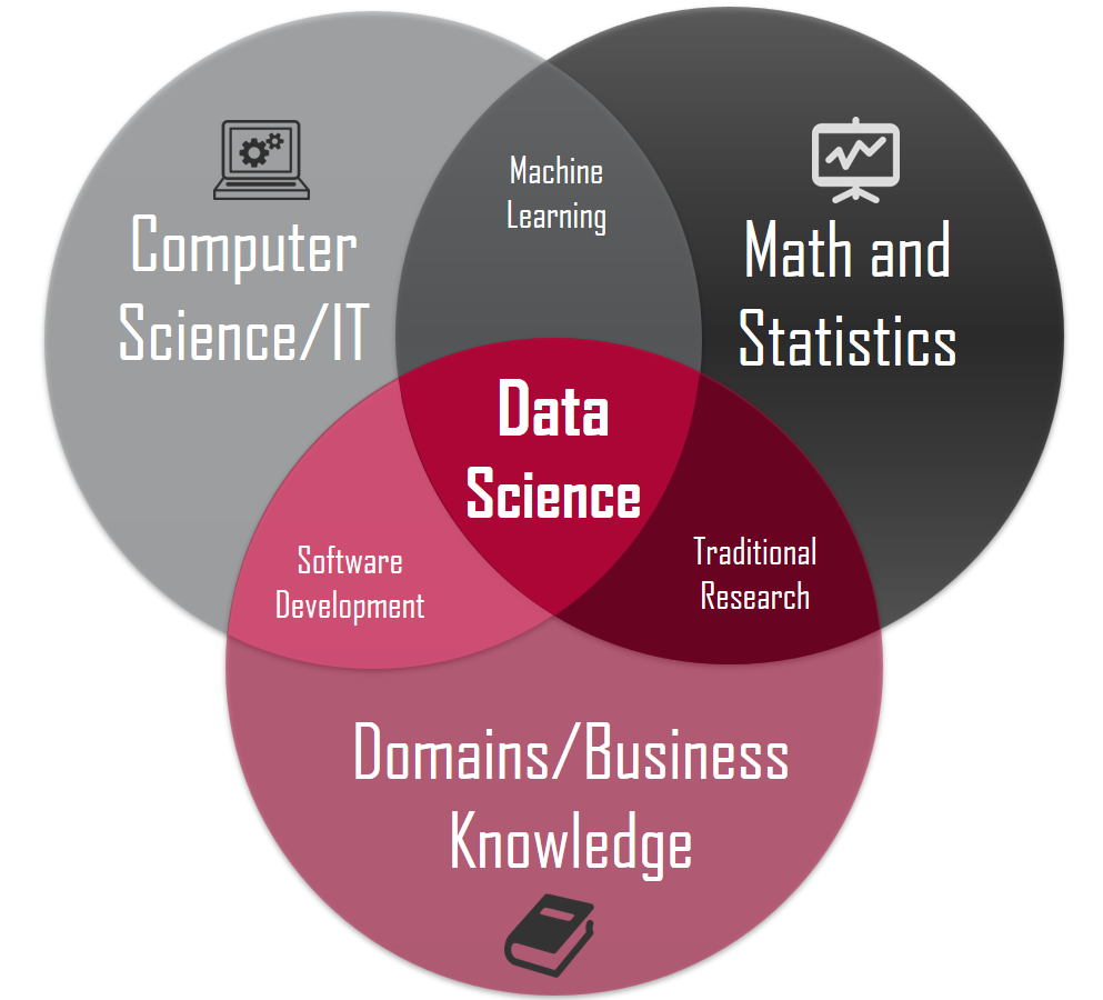
Data Science

Data science is an interdisciplinary field that uses scientific methods, processes, algorithms, and systems to extract knowledge and insights from many structural and unstructured data. Data science is related to data mining and big data.

I’m doing a Twitter poll that asks: Do you believe a broad quarantine worth the cost to the individual mental/physical health, community, and the economy? As of this writing, here are the results so far.
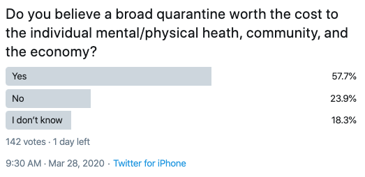
Twitter Poll Q

Polls such as Twitter polling is crowdsourcing. Crowdsourcing is a form of data science in that it gives us an idea of the opinions and observations of a large group of people. It also starts a conversation around the topic if it’s thought-provoking.

As I said in Increasing evidence social distancing policies at the state level are causing decreases in the viral transmission of Coronavirus COVID 19 the exponential trend in new cases in the US is already underway, so I’m now focusing on the inflection point. I’m concerned many Americans will be more panicked when they see how fast the spread compounds in the weeks ahead, so you should be prepared for it. However, as the trend is adrift, I’m thinking of inertia such as social distancing and how we can potentially find any signals in the noise.

I shared in Increasing evidence social distancing policies at the state level are causing decreases in the viral transmission of Coronavirus COVID 19 the best tool I’ve seen so far that may have some useful predictive ability is the Health Weather Map by Kinsa.

The U.S. Health Weather Map is a visualization of seasonal illness linked to fever – specifically influenza-like illness. The aggregate, anonymized data visualized on the map is a product of Kinsa’s network of Smart Thermometers and accompanying mobile applications, and Kinsa is providing this map and associated charts as a public service.

Kinsa has updated its atypical Illness map to reflect the cumulative amount of atypical illnesses we’ve observed since March 1.  Previously the Health Weather Map reflected only new atypical illness, updated daily. Kinsa says:

As widespread social distancing measures take effect, feverish illness levels are dropping, and we feel this way of looking at the data gives a more accurate and comprehensive view of what’s happening. Change is effective as of March 27.

Here is the chart today. Since we are in Tampa Bay in Florida, I especially notice the red here in south Florida. The Miami-Dade area has especially active atypical data from their thermometers. The map above shows us how much influenza-like illness above the normal expected levels Kinsa has detected since March 1.
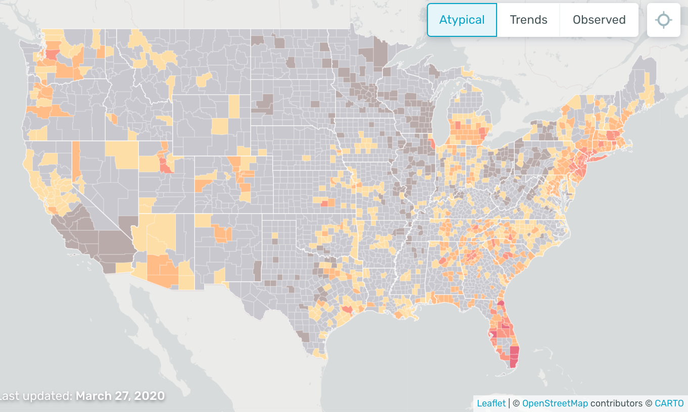
HEALTH WEATHER MAP KINSA

The time series chart allows us to compare Kinsa’s observations of the influenza-like illness level in the U.S., in orange and red, against where we’d expect them to be, in blue, and see how that relationship has changed over the past few weeks,
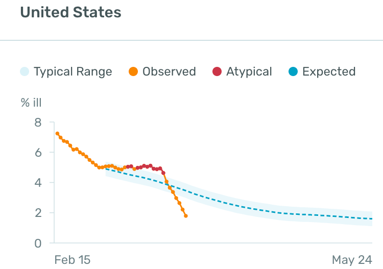
time series chart allows you to compare Kinsa observations

I made a gif video of the map taking a closer look around south Florida including Tampa Bay and Miami-Dade to show the level of detail.

kinsa health weather map

I’m thinking this data is likely to have predictive power and may help authorities to monitor, track, and make decisions about quarantines and such.

Just imagine the ability to electronically monitor certain health measures of thousands or millions of people around the country. That’s essentially what we have here, and it’s a  visualization of seasonal illness linked to fever, specifically influenza-like illness, which is a common characteristic of Coronavirus COVID – 19.

The CDC says:

“People may be sick with the virus for 1 to 14 days before developing symptoms. The most common symptoms of coronavirus disease (COVID-19) are fever, tiredness, and dry cough.”

So, it seems identifying and tracking the trend as soon as possible is essential.

Aside from a concern, Americans will start to panic more when they see a very fast accelerating growth of new cases, I’m now concerned about how they may react to a government-mandated lockdown. We are seeing evidence the social distancing is working and needs to continue, but a government-mandated quarantine may have more mental trama to it.

As I was writing this, I saw the President tweeted he is considering a more targeted quarantine:

It seems the more precise they can be in deciding areas to lock down the better. I believe it because when we look at the map of confirmed cases, the red areas are distinct. Much of the US doesn’t have any cases at all. So, I can see why the federal authorities hesitate to quarantine the entire country.
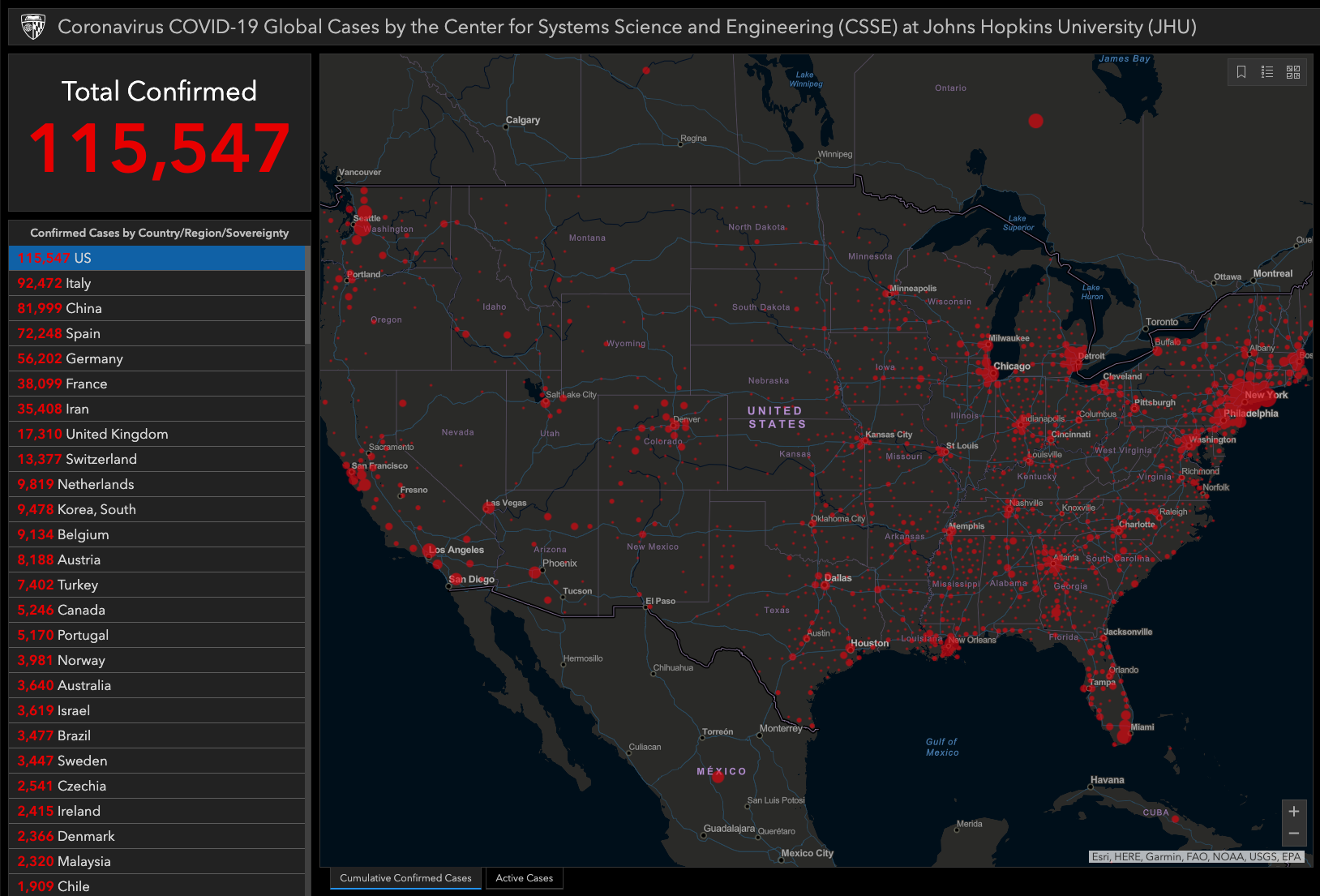
COVID 19 CASES US

But, if they can more precisely define the risk areas using the tools available, the data from the map from Kinsa’s network of Smart Thermometers and accompanying mobile applications may help them to see early warning signs in new areas. 

As a libertarian myself, I’m not an enthusiast of the federal government mandating a shutdown, and I prefer to at least let the state, county, and city make their own decisions. I’m also one to try to be a part of the solution rather than part of the problem, so we are self-quarantined to the extent we can and I support a more precise government-mandated quarantine.

The reality is, we don’t know if the cost of a broad quarantine is worth the cost to the individual mental/physical health, community, and the economy, so the best thing is to be as precise as possible about managing the risks.

I believe tools like the US Health Weather Map can be part of the solution.

We are working on a report of the COVID – 19 trends I’ll be sharing shortly. I’m going to start analyzing the trends quantitatively. Don’t miss out, sign up to get the email:

Join 39.5K other subscribers

Mike Shell is the Founder and Chief Investment Officer of Shell Capital Management, LLC, and the portfolio manager of ASYMMETRY® Global TacticalMike Shell and Shell Capital Management, LLC is a registered investment advisor focused on asymmetric risk-reward and absolute return strategies and provides investment advice and portfolio management only to clients with a signed and executed investment management agreement. The observations shared on this website are for general information only and should not be construed as advice to buy or sell any security. Securities reflected are not intended to represent any client holdings or any recommendations made by the firm. Any opinions expressed may change as subsequent conditions change.  Do not make any investment decisions based on such information as it is subject to change. Investing involves risk, including the potential loss of principal an investor must be willing to bear. Past performance is no guarantee of future results. All information and data are deemed reliable but is not guaranteed and should be independently verified. The presence of this website on the Internet shall in no direct or indirect way raise an implication that Shell Capital Management, LLC is offering to sell or soliciting to sell advisory services to residents of any state in which the firm is not registered as an investment advisor. The views and opinions expressed in ASYMMETRY® Observations are those of the authors and do not necessarily reflect a position of  Shell Capital Management, LLC. The use of this website is subject to its terms and conditions.

The trend in Coronavirus, underreactions, and overreactions

Investor sentiment oscillates between the fear of missing out and the fear of losing money.

Investor enthusiasm typically follows the recent trend.

After prices fall, enthusiasm wains as investors fear losing more money.

After prices trend up, investors fear missing out.

Some may literally oscillate between these feelings intraday, daily, or weekly, depending on how closely they watch.

I also believe investors underreact and overreact to new information, such as the “news.”

An overreaction is when price trends become overbought or oversold, driven by positive or negative investor sentiment. It’s why we see price trends crash down or rise into bubbles.

Overreactions can drive prices up or down too far, too fast.

An underreaction is when investors initially underreact to new information, so the price trend drifts up or down over time, rather than an immediate gap up or down. This underreaction drives price trends!

All of this is why my focus is on the direction of price trends, along with volatility, investor sentiment, and multiple time frame momentum.

I’ve also recently pointed out the news isn’t necessary to cause, or driver, of daily price action or price trends (directional drifts), even though most people probably believe it is.

We see an excellent example lately with Coronavirus.

Below is the latest chart from Google Trends, showing an interest in Coronavirus over time. The numbers represent search interest relative to the highest point on the chart for the given region and time.

  • A value of 100 is the peak popularity for the term.
  • A value of 50 means that the term is half as popular.
  • A score of 0 means there was not enough data for this term.

According to the data, it started January 19, 2019, and interest peaked January 28 at 100. Since then, interest in Coronavirus has trended down to a current level of 44, suggesting the term is less than half as popular as it was just three weeks ago.

coronavirus trend interest chart

It seems that news gets tiring, and people lose interest.

Or, maybe people initially overreact and spend a lot of time researching the topic, and then their enthusiasm drifts down from the peak. So perhaps they underreact later?

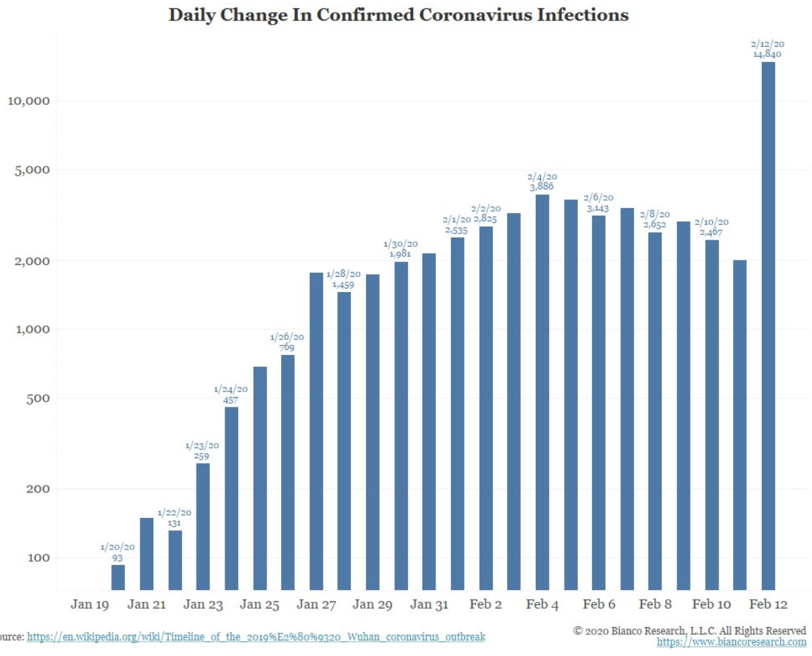
Or, maybe in the case of Coronavirus, the waning interest was helped by understated data?

coronavirus infections trend

Other global macro fund managers I know were relieved, but then a few of us noticed China had changed in their diagnostic criteria. We now see the spike in the above table.

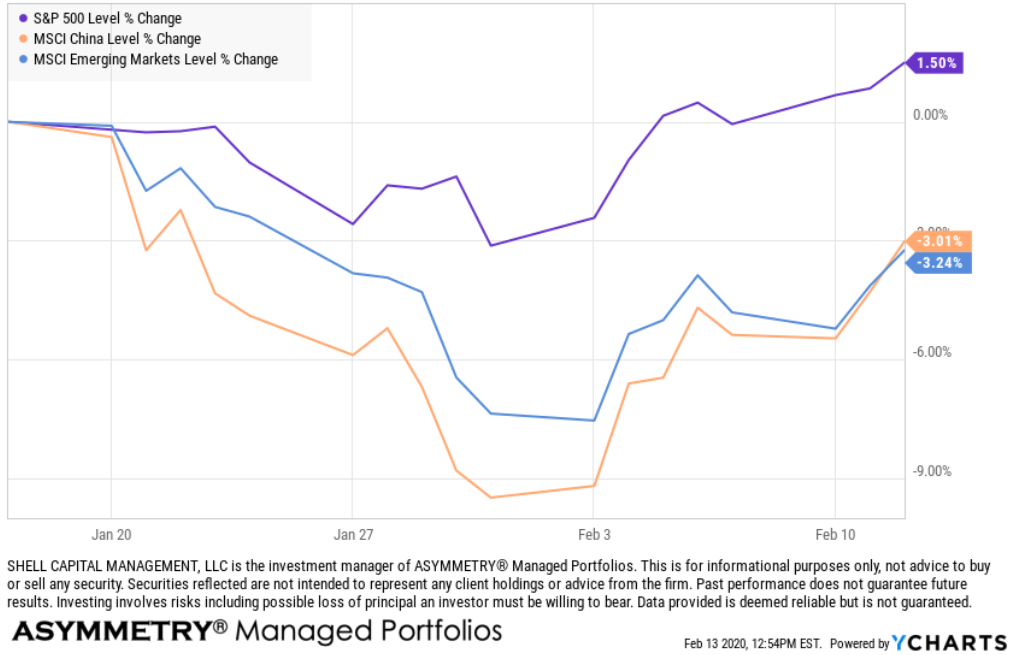
Yet, the U.S. stock market blows it off. Since the first talk of Coronavirus, the U.S. equity market declined about -3% but has gained 1.5% in total. The China MSCI Index, on the other hand, dropped -10% priced in U.S. Dollars and is down about -3%. The Emerging Markets Index, including China and other emerging countries, has trended a similar path.

stock market performance since coronavirus china emerging markets

It doesn’t seem to be a terrible reaction to me. Especially when we consider much of China is shut down as they attempt to stop the spread.

I believe the small decline we saw in the U.S. was just the market, doing what it does, as the U.S. stock index was extended on the upside, and volaltity was contracted. I was expecting to see some volatility expansion and a price drop based on the mathematics of momentum, velocity, and volatility. We saw it.

At this point, the trend is your friend until the end when it bends, but after that small correction, it seems we’ll soon find out if the upward momentum can continue. It comes at a time when there doesn’t seem to be an end in sight for the slowing and stopping the Coronavirus, so direct yourself accordingly. In the meantime, the headlines have turned much more cynical.

Yahoo Finance:

At the moment, the forward volatility expected by the options market as implied by the cost of options is just below its average over the past year. It’s far below the high of 24 when it spiked in August, and well above the low of 11.54 several weeks ago.

vix volatility coronavirus impact

It will also be interesting to see if the interest in the term “Coronavirus” trends back up as the cases crow asymmetrically, or if it stays the same, or drifts down.

Either way, I believe there is a lot of asymmetric information going on here with China. Asymmetric information is a situation when one person or group has more or better information compared to another. It appears the Communist Party of China may be applying some strategic ambiguity in how they share their data. Another asymmetry is the illusion of asymmetric insight, a cognitive bias whereby people perceive their knowledge of others to surpass other people’s knowledge of them.

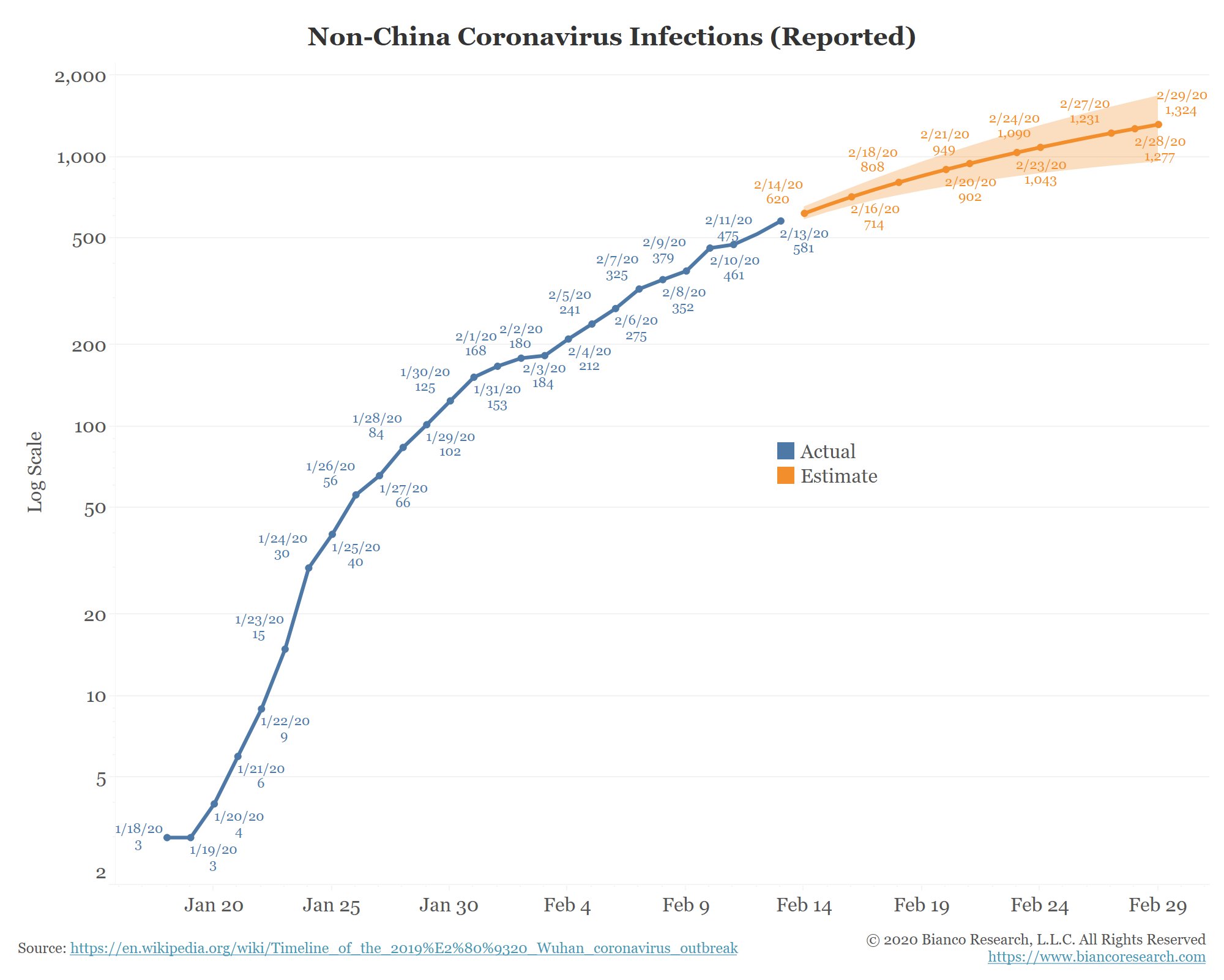
The below chart is the latest rest of world count with a trend line forecast through the end of the month.

coronavirus trend

I’m guessing we will find out soon if the market has underreacted to the news of rising confirmed cases and if investors then overreact on Monday after more data is released over the weekend.

Mike Shell is the Founder and Chief Investment Officer of Shell Capital Management, LLC, and the portfolio manager of ASYMMETRY® Global TacticalMike Shell and Shell Capital Management, LLC is a registered investment advisor in Florida, Tennessee, and Texas focused on asymmetric risk-reward and absolute return strategies and provides investment advice and portfolio management only to clients with a signed and executed investment management agreement. The observations shared on this website are for general information only and should not be construed as advice to buy or sell any security. Securities reflected are not intended to represent any client holdings or any recommendations made by the firm. Any opinions expressed may change as subsequent conditions change.  Do not make any investment decisions based on such information as it is subject to change. Investing involves risk, including the potential loss of principal an investor must be willing to bear. Past performance is no guarantee of future results. All information and data are deemed reliable but is not guaranteed and should be independently verified. The presence of this website on the Internet shall in no direct or indirect way raise an implication that Shell Capital Management, LLC is offering to sell or soliciting to sell advisory services to residents of any state in which the firm is not registered as an investment advisor. The views and opinions expressed in ASYMMETRY® Observations are those of the authors and do not necessarily reflect a position of  Shell Capital Management, LLC. The use of this website is subject to its terms and conditions.
Front-running S&P 500 Resistance

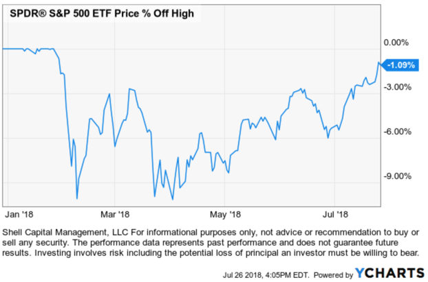
The S&P 500 stock index closed just -1% from its all-time high it reached on January 26, 2018, and hasn’t been that high since. It’s been in a drawdown that was as much as -10% and it has taken six months to get back near its high point to break even.

SPY SPX $SPX $SPY S&P 500 STOCK INDEX

Before the madness begins saying “The S&P 500 is at resistance,” I want to point out an observation of the truth. It is one thing to draw a trend line on an index to indicate its direction, quite another to speak of “support” and “resistance” at those levels.

Is the S&P 500 at resistance? 

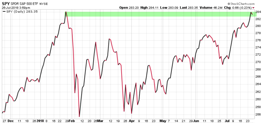
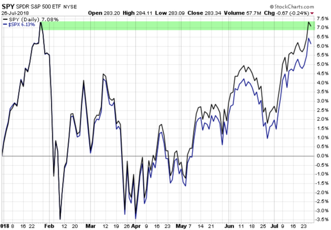
Depending on which stock charting service or data provider you use, it may appear the S&P 500 ETF (SPY) closed at its prior high. Many market technicians would draw a line like I did below in green and say “the S&P 500 is at resistance.”

S&P 500 stock index at resitance SPY SPX

In technical analysis applied to stock market trends, support and resistance is a concept that the movement of the price of a security will tend to stop and reverse at certain predetermined price levels.

Support is when a price trends down and stalls at a prior low. The reasoning is that investors and traders who didn’t buy the low before (or wish they’d bought more) may have buying interest at that prior low price if it reaches it again.

Resistance is when a price trends up and stalls at a prior high. The reasoning is that investors and traders who didn’t sell the high before (or wish they’d sold short to profit from a price decline) may have the desire to sell at that prior high price if it reaches it again.

Whether everyone trades this way or not, enough may that it becomes a self-fulling prophecy. I believe it works this way on stocks and other securities or markets driven by supply and demand, but an index of stocks?

To assume a market or stock will have support or resistance at some price level (or a derivative of price like a moving average) that hasn’t been reached yet is just a predictive assumption. Support and resistance don’t exist unless it is, which is only known after the fact.

One of the most fascinating logical inconsistencies I see by some technical analysts is the assumption that “support” from buying interest and “resistance” from selling pressure “is” there, already exists, before a price is even reached. Like “SPY will have resistance at $292.” We simply don’t know until the price does indeed reverse after that point is reached.

But, it gets worse.

To believe an index of 500 stocks is hindered by selling pressure at a certain price requires one to believe the price trend is controlled by the index instead of the 500 stocks in it.

Think about that for a moment. Let it sink in. 

  • Do you believe trading the stock index drives the 500 stocks inside the index?

or

  • Do you believe the 500 stocks in the index drive the price of the index?

What you believe is true for you. But, to believe an index of 500 stocks is hindered by selling pressure or buying interest at a certain price requires you believe the price trend is controlled by the index instead of the 500 stocks in it. That’s a significant belief.

To complicate it more. If we want to know the truth, we have to look a little closer.

Is the S&P 500 at resistance? 

As I said, it depends on which stock charting service or data provider we use and how we calculate the data to draw the chart. Recall in the prior chart, I used the SPDRs S&P 500 ETF (SPY) which shows the ETF closed near its prior high. I used Stockcharts.com as the data provider to draw the chart. I’ve been a subscriber of their charting program for 14 years so I can tell you the chart is based on Total Return as the default. That means it includes dividends. But, when we draw the same chart using the S&P 500 index ($SPX) it’s based on the price trend. Below is what a difference that makes. The index isn’t yet at the prior high, the SPY ETF is because the charting service includes dividends.

SPY SPX TOTAL RETURN RESISTANCE

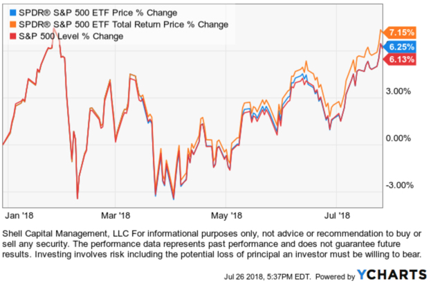
Here is another charting service where I’m showing the S&P 500 ETF (SPY) price return, total return, and the S&P 500 stock index. Only one is at the January high.

spy spx S&P 500 resistance

So, we don’t know if the S&P 500 is at resistance and we won’t know if there exists any “resistance” there at all unless the price does pause and reverse down. It so happens, it just may pause and reverse at this point. Not because more tactical traders are looking at the total return chart of SPY or because the index or ETF drives the 500 stocks in it, but because momentum measures indicate its potentially reaching an “overbought” level. So, a pause or reversal, at least some, temporarily, would be reasonable.

Some may call this charting, others call it technical analysis, statistical analysis, or quantitative analysis. We could even say there is some behavioral finance included since it involves investor behavior and biases like anchoring. Whatever we choose to call it, it’s a visual representation of supply and demand and like most things, it’s based on what we believe to be true.

I’ve been applying charting, pattern recognition, technical analysis, statistical analysis, and quantitative analysis for over twenty years. Before I started developing computerized programs based on quantitative trend systems that apply evidence-based scientific methods, I was able to trade successfully using visual charts. I believe all of it has its usefulness. I’m neither anti-quant or anti-charting. I use both, but for different reasons. I can argue for and against both because neither is perfect. But, combining the skills together has made all the difference for me.

Is the S&P 500 at resistance? 

We’ll see…


Mike Shell is the Founder and Chief Investment Officer of Shell Capital Management, LLC, and the portfolio manager of ASYMMETRY® Global Tactical.

You can follow ASYMMETRY® Observations by click on on “Get Updates by Email” on the top right or follow us on Twitter.

The observations shared in this material are for general information only and are not intended to provide specific advice or recommendations for any individual. Investing involves risk including the potential loss of principal an investor must be willing to bear. Past performance is no guarantee of future results.

Sector Trends are Driving Equity Returns

Sector Trends are Driving Equity Returns

In Growth Stocks have Stronger Momentum than Value in 2018 I explained the divergence between the return of the two styles of Growth and Value. I suggest the real return driver between size and style is primarily the index or ETF sector exposure. To be sure, we’ll take a look inside.

As I said before, the reason I care about such divergence is when return streams spread out and become distinctive, we have more opportunity to carve out the parts we want from the piece I don’t. When a difference between price trends is present, it provides more opportunity to capture the positive trend and avoid the negative trend if it continues.

Continuing with the prior observation, I am going to use the same Morningstar size and style ETFs.

Recall the year-to-date price trends are distinctive. Large, mid, and small growth is notably exhibiting positive momentum over large, mid, and small value.

growth stock momentum over value morningtar small mid large cap

To understand how these factors interact, let’s look at their sector exposure. But first, let’s determine the sector relative momentum leaders and laggards for 2018.

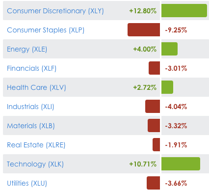
The leaders are Consumer Discretionary (stocks like Netflix $NFLX and Amazon $AMZN), Information Technology (Nvidia $NVDA and Google $GOOG). In third place is Energy and then Healthcare. The laggards are Consumer Staples, Industrials, Materials, and Utilities, which are actually down for the year. Clearly, exposure to Consumer Discretionary and Information Technolgy and avoiding most of the rest would lead to more positive asymmetry.

sector trend returns 2018

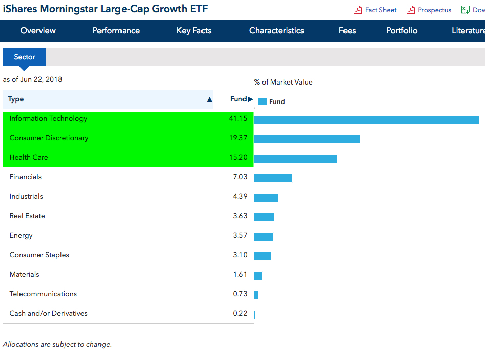
Below we see strongest momentum Large Growth is heavily weighted (41%) in Technology. The second highest sector weight is Consumer Discretionary, and then Healthcare is third. Large-Cap Growth is the leader just because it has the most exposure in the top sectors.

iShares Morningstar Large-Cap Growth ETF

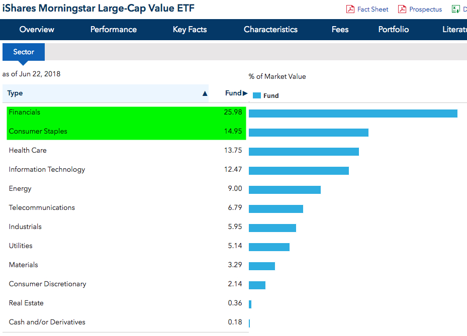
On the other hand, Large Value, which is down -3% YTD, has its main exposure in the lagging Financial and Consumer Staples sectors.

iShares Morningstar Large-Cap Value ETF

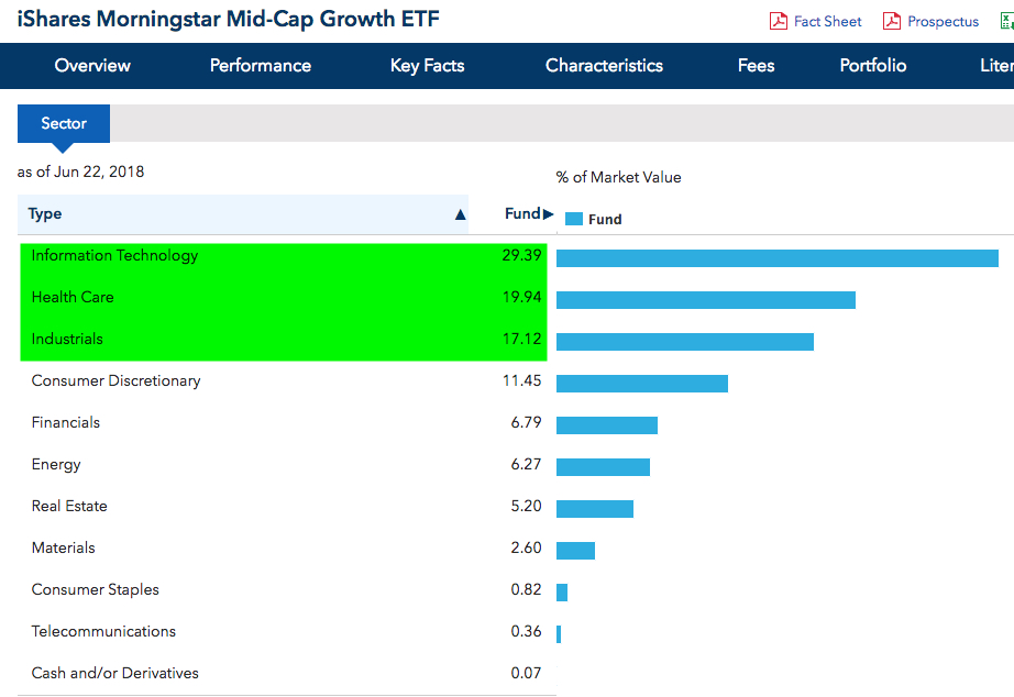
Dropping down to the Mid-Cap Growth style and size, similar to Large-Cap Growth, we see Information Technology and Healthcare are half of the ETFs exposure.

iShares Morningstar Mid-Cap Growth ETF

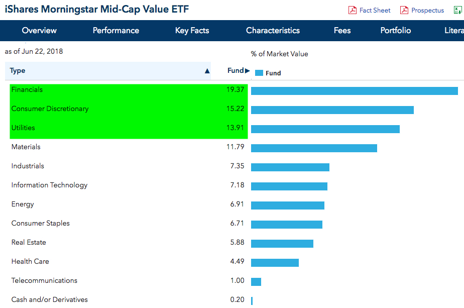
We are starting to see a trend here. Much like Large-Cap Value, the Mid-Cap Value has top holdings in Financials, Consumer Discretionary, and Utilities sectors.


iShares Morningstar Mid-Cap Value ETF

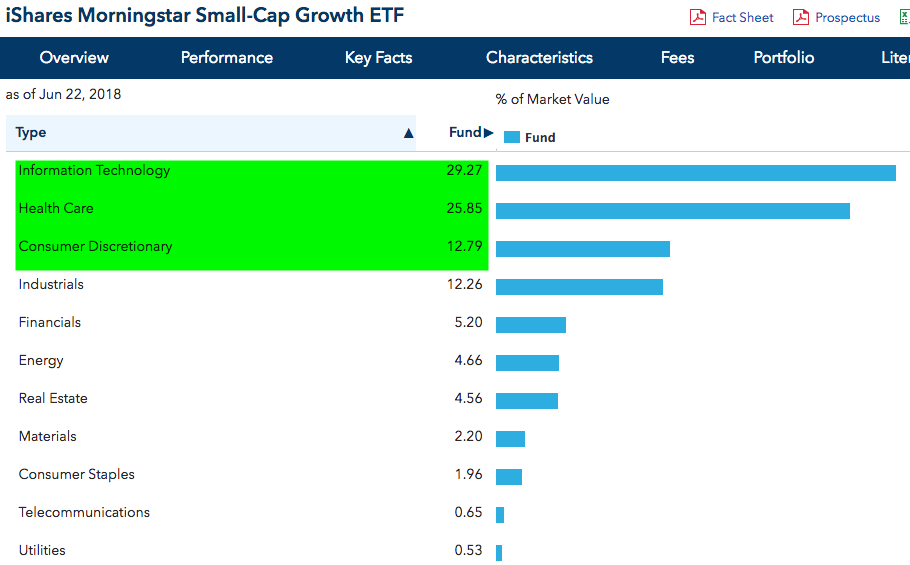
Can you guess the top sectors of Small-Cap Growth? Like both Large and Mid Growth, Small-Cap Growth top sector exposures are Information Technology, Healthcare, and Consumer Discretionary.

iShares Morningstar Small-Cap Growth ETF

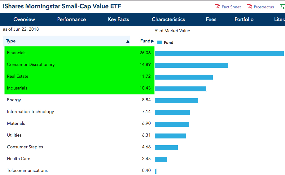
And to no surprise, the Financial sector 26% of Small-Cap Value.

iShares Morningstar Small-Cap Value ETF

So, Information Technology, Healthcare, and most Consumer Discretionary tend to be more growth-oriented sectors. Financials, Consumer Staples, Utilities, Real Estate, that is, the higher yielding dividend paying types, tend to be classified as Value. Each sector has both Growth and Value stocks within them, but on average, some sectors tend to include more Growth stocks or more Value stocks.

Value stocks are generally defined as shares of undervalued companies with lower prospects for growth.

A growth stock has higher earnings per share and often trade at a higher multiple since the expectation of future earnings is high. Growth stocks usually don’t pay a dividend, as the company would prefer to reinvest retained earnings back into the company to grow.

The Information Technology sector includes companies that are engaged in the creation, storage, and exchange of digital information. The Information Technology sector offers potential exposure to growth with the emergence of cloud computing, mobile computing, and big data.

Another Growth sector is Consumer Discretionary sector manufactures things or provides services that people want but don’t necessarily need, such as high-definition televisions, new cars, and family vacations. Consumer Discretionary sector performance is closely tied to the strength of the overall economy. Consumer Discretionary tends to perform well at the beginning of a recovery when interest rates are low but can lag during economic slowdowns

The Health Care sector is a Growth sector involved in the production and delivery of medicine and health care-related goods and services. Healthcare companies typically have more stable demand, so they are less sensitive to the economic cycle, though it tends to perform best in the later stages of the economic cycle.

It turns out, the three primary Growth sectors that tend to best strongest at the late stage of an economic cycle have been the recent leaders.

Consumer Staples sector consists of companies that provide goods and services that people use on a daily basis, like food, clothing, or other personal products.

The Financial sector is businesses such as banking and brokerage, mortgage finance, and insurance which are sensitive to changes in the economy and interest rates. They tent to perform best at the beginning of a business cycle.

This is why I prefer to focus my U. S. equity exposure on sectors and maybe the strongest momentum stocks within those sectors. Many traditional asset allocations use style and size to get their exposure to the stock market, but as a tactical portfolio manager, I prefer to get more specific into the trending sectors and their individual stocks.


Mike Shell is the Founder and Chief Investment Officer of Shell Capital Management, LLC, and the portfolio manager of ASYMMETRY® Global Tactical.

You can follow ASYMMETRY® Observations by click on on “Get Updates by Email” on the top right or follow us on Twitter.

The observations shared in this material are for general information only and are not intended to provide specific advice or recommendations for any individual. Investing involves risk including the potential loss of principal an investor must be willing to bear. Past performance is no guarantee of future results.


Asymmetric force direction and size determines trend

In physical science, force is used to describe the motion of a push or pull. Newton’s first law of motion – sometimes referred to as the law of inertia. Newton’s first law of motion is stated as:

“An object at rest stays at rest and an object in motion stays in motion with the same speed and in the same direction unless acted upon by an unbalanced force.” —Newton’s First Law of Motion

Unbalanced force? well well, there’s another asymmetry.

A push or pull is a force. To define a force, we must know its direction and size. It works similar to supply and demand on market prices. If there is enough size in a direction, a price will move in that direction. If there isn’t enough price size in a direction, the price will stay the same.

There are two kinds of forces:

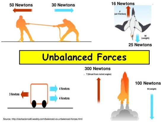
Symmetrical (balanced) forces are equal in size, but opposite in direction. Symmetric forces are balanced, so they lack the direction and size to cause a change a motion. The push and pull are equal and offsets each other. Applying the concept of force to price trends in the market, when balanced forces act on a market price at rest, the market price will not move. When buying enthusiasm and selling pressure are the same, the price will stay the same.

Asymmetrical (unbalanced) forces are not equal and are opposite in direction, so they cause a change in the motion. The size of one directional force is greater than the other, so it’s going to trend in that direction. Some examples of these unbalanced forces can be observed in physical science.

More than one force can be acting at the same time, so the forces are combined into the net force. The net force is the combination of all the forces acting on a trend. The net force determines the direction. If forces are trending in opposite directions, then the net force is the difference between the forces, and it will trend in the direction of the larger force. You can probably see how that is visible in a chart of a price trend.

If buyers are willing to buy more than sellers are willing to sell, the buying pressure is a force that forces up the price until it gets high enough to push sellers to sell.

If sellers are ready to sell more than buyers are willing to buy, the selling pressure is a force that pulls down the price until it gets low enough to pull in buyers to buy.

So, Newton’s first law of motion and inertia is related to Economics 101: When the size of the force of buyers or sellers is larger in one direction, the price will trend. We can observe who is more dominant by simply looking at a price trend chart or quantifying it in a trading system.


Mike Shell is the Founder and Chief Investment Officer of Shell Capital Management, LLC, and the portfolio manager of ASYMMETRY® Global Tactical.

You can follow ASYMMETRY® Observations by click on on “Get Updates by Email” on the top right or follow us on Twitter.

Investment results are probabilistic, never a sure thing. Past performance is no guarantee of future results.


Each of us tends to think we see things as they are, that we are objective. But this is not the case. We see the world, not as it is, but as we are—or, as we are conditioned to see it. When we open our mouths to describe what we see, we in effect describe ourselves, our perceptions, our paradigms.”

–  The Seven Habits of Highly Effective People: Powerful Lessons in Personal Change by Stephen R. Covey, Quote Page 28 (2004)

Low Volatility Downside was the Same

In Low Volatility and Managed Volatility Smart Beta is Really Just a Shift in Sector Allocation I ended with:

“Though the widening range of prices up and down gets our attention, it isn’t really volatility that investors want to manage so much as it is the downside loss of capital.

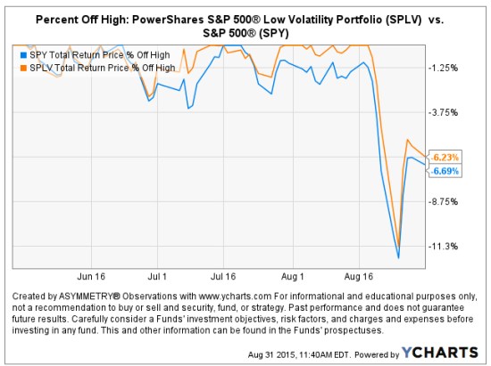
As a follow-up, below we observe the  PowerShares S&P 500® Low Volatility Portfolio declined in value about -12% from its high just as the SPDRs S&P 500® did. So, the lower volatility weighting didn’t help this time as the “downside loss of capital ” was the same.

SPLV PowerShares S&P 500® Low Volatility Portfolio

Source: http://www.ycharts.com

The Southern Voice: What You Don’t Know About the South and the Southern Accent

Asymmetric Information is when someone has superior or more knowledge than others about a topic. The Illusion of Asymmetric Insight occurs when people perceive their knowledge of others to surpass other people’s knowledge of themselves. An asymmetric advantage goes beyond a normal advantage of knowledge into the realm of having asymmetric information and knowing things others do not.

Over the past few weeks, there has been much in the media about the Confederate Battle flag and misinformation about the South. As it turns out, it seems many people may be more ignorant about these things than they believe they are. So you think the “Southern Accent” is bad English? Au contraire.

In Southern American English, Wikipedia says:

“The Southern U.S. dialects make up the largest accent group in the United States”

Wikipedia cites PBS as the source: “Do You Speak American: What Lies Ahead.” Specifically, that article says: 

  • Due to a huge migration to the South and Southwest and the national appeal of country music, Southern speech is now the largest accent group in the United States.
  • The dominant form is what linguists call Inland Southern…

As a Southerner myself, I have always known my Southern dialect is derived from my European ancestors. If you aren’t from the South or weren’t taught its history, you may not realize that. Most of the settlers in Appalachia and the South came from Scotland, Ireland, the British Isles. If you know anything about those areas and their people, you can probably see how they may have been attracted to the mountains of Tennessee, north Georgia, and North Carolina. Its geography is similar to their motherland. Oh, and they made whiskey and moonshine.

Researchers have noted that the dialect retains a lot of vocabulary with roots in Scottish “Elizabethan English” owing to the make-up of the early European settlers to the area.

Source: “The Dialect of the Appalachian People.” Wvculture.org. Retrieved 2012-11-08.

Oh, and they sang fiddle songs like Rocky Top! This is the origin of what has evolved today as “country music.” They blended popular songs, Irish and Celtic fiddle tunes, and various musical traditions from European immigrant communities.

That leads to this very interesting video clip from the History Channel “You Don’t Know Dixie” explaining the many versions of the Southern Accent:

Want to learn more about the South? Search for the History Channel show “You Don’t Know Dixie” at your cable provider. I found it on Verizon and recorded it. Or, it’s available at Amazon.


Mike Shell is the Founder and Chief Investment Officer of Shell Capital Management, LLC, and the portfolio manager of ASYMMETRY® Global Tactical.

Mike Shell and Shell Capital Management, LLC is a registered investment advisor and provides investment advice and portfolio management exclusively to clients with a signed and executed investment management agreement. The observations shared on this website are for general information only and should not be construed as advice to buy or sell any security. Securities reflected are not intended to represent any client holdings or any recommendations made by the firm. Investing involves risk including the potential loss of principal an investor must be willing to bear. Past performance is no guarantee of future results. All information and data is deemed reliable, but is not guaranteed and should be independently verified. The presence of this website on the Internet shall in no direct or indirect way raise an implication that Shell Capital Management, LLC is offering to sell or soliciting to sell advisory services to residents of any state in which the firm is not registered as an investment advisor. Use of this website is subject to its terms and conditions.