ASYMMETRY® Observations are Mike Shell’s observations of investor behavior causing directional price trends, global macro, tactical ETF trading, momentum stock trading, hedging, volatility trading, and risk management that creates asymmetric investment returns. An asymmetric return profile is a risk/reward profile with a positive asymmetry between profit and loss. Mike Shell is the founder of Shell Capital Management, LLC and the portfolio manager of ASYMMETRY® Global Tactical
Bridgewater Associates, Inc.Co-CIO Karen Karniol-Tambour joins Positive Sum CEO Patrick O’Shaughnessy at the 2023 Sohn Investment Conference. Below is the interview she says the market is very asymmetric right now because of the asymmetry between the upside vs. the downside, and I agree.
I’ll summarize:
If the economy enters a recession, it’s very bad for stocks, and this time the Fed is unlikely to immediately respond by lowering rates since inflation is a problem. So, the downside risk is large. It’s already priced-in to the stock market, so it won’t be a big surprise. Not a lot of upside potential.
If the economy doesn’t enter a recession, the Fed will be in a tough decision point, because inflation is unlikely to come down without a recession. If the Fed doesn’t ease like it’s already price-in, the market is going to be disappointed.
It’s asymmetric because the downside potential is greater than the upside.
The interview:
Patrick O’Shaughnessy:
What do you think that prevailing valuations, let’s say, just on like the big asset classes tell us about what the market thinks is going on? Like, what does it seem like is in prices right now, if you will, as you look at S&P 500 you know, multiples or something very basic like that?
Bridgewater Co-CIO Karen Karniol-Tambour:
WellI think the stock market is telling you that there’s going to be a modest economic slowdown, a pretty contained economic slowdown, nothing like you know a significant recession or anything like that, With that slowdown alone, the Federal Reserve is going to find that sufficient to go ease from you know, 5% to 3% extremely quickly, and that its going to do that despite where inflation is today because inflation is going to go back to totally reasonable levels that they want very very quickly. You see that kind of across stock and bond pricing you know bond pricing is telling you in places to be fine we’re not there’s no inflation from anything like resembling long term and the Fed’s about to ease pretty significantly without a significant slowdown.
Where that sort of leaves you is if the market I believe is asymmetric it’s very asymmetric because it you actually get an economic slowdown; that’s obviously very bad for stocks. I don’t have to tell you that that would be you know pretty bad for stocks. But there’s really not much of a recession priced into them it would be pretty bad. Usually the way you get out of that (as I was saying) is that every time there’s a slowdown the Central Bank just comes and eases right away. Now, not only will it be much harder for them to ease because inflation’s been more a problem. Tension is there, but that easing is already priced in and so even if they do kind of bite the bullet and say “I’m not going to worry about inflation” and ease, it’s already in the market prices it’s not going to surprise the market so much.
Then, on the other hand, if the market doesn’t slow, if the economy doesn’t slow so much, if we don’t get that kind of recession if the equity prices are right that you’re not going to get a big recession and the fed’s going to be a tough spot because I don’t really see why inflation’s going to come down with no recession. You have a very very strong labor market if nothing slows and so if they don’t ease like it’s already price they’re going to be disappointing. So, every day once we hit summer the Federal Reserve doesn’t pivot and ease that’s effectively a tightening relative to what’s priced in that’s also disappointing.
That’s a lot of room for disappointment that can happen whether the economy is strong or weak.
Patrick O’Shaughnessy:
That’s all sort of like what I’ll call you know relatively near to intermediate term future how do you think about portfolio positioning in light of that general view when you know like you for a long time it’s paid to just be long risk and have a very simple portfolio because of everything you’ve discussed. How’s that different today like how would you how do you think about positioning against this asymmetric setup that you described
Karen Karniol-Tambour:
I think it’s one of the toughest times to be an investor in many years because you know as you’re saying risk assets has been so good and I think risk assets are about as unattractive as we’ve seen a very long time and they’ve and that’s we’re seeing that come to fruition they don’t just bounce back you don’t just get kind of automatic rallies no matter what so it’s a hard time to be an investor I think as an investor you have to think about diversification in a different way diversification just wasn’t that important because the one asset people hold “equities” was just the strongest outperformer and the different places investors can kind of look they can look at geographically so they can look at geographies that have less of this tension places like Japan or China where you’re in a different situation you’re not about to hit a big Central Bank tension Japanese Central Bankers are pretty excited about getting higher inflation they’ve won for a long time and it’s far from, you know, out of control.
She basically suggests U.S. stocks are overrated and Japan stocks, Emerging Markets stocks, and Gold, are underrated.
Take a close look at this map and think about each of these states.
What you see on TV, in the news, doesn’t necessarily reflect the beliefs of all of us.
Do you think they have the same concerns in Montana as New York City?
Do Tennesseans really care what they think in Los Angeles?
Does someone living in the Florida Keys need to be told by people in Minnesota how to live their life?
Successful people, especially wealthy people who we advise, focus on what’s inside their own boat.
Where are you getting the information you feed your mind?
Because the algorithm is very simple;
Garbage in, garbage out.
That is all.
Make it a great day.
Don’t miss out! Stay informed and sign up for an email of new ASYMMETRY® Observations, including some that may not be posted here.
Join 519 other subscribers
Mike Shell is the Founder and Chief Investment Officer of Shell Capital Management, LLC, and the portfolio manager of ASYMMETRY® Global Tactical. Mike Shell and Shell Capital Management, LLC is a registered investment advisor focused on asymmetric risk-reward and absolute return strategies and provides investment advice and portfolio management only to clients with a signed and executed investment management agreement. The observations shared on this website are for general information only and should not be construed as advice to buy or sell any security. Securities reflected are not intended to represent any client holdings or any recommendations made by the firm. Any opinions expressed may change as subsequent conditions change. Do not make any investment decisions based on such information as it is subject to change. Investing involves risk, including the potential loss of principal an investor must be willing to bear. Past performance is no guarantee of future results. All information and data are deemed reliable but is not guaranteed and should be independently verified. The presence of this website on the Internet shall in no direct or indirect way raise an implication that Shell Capital Management, LLC is offering to sell or soliciting to sell advisory services to residents of any state in which the firm is not registered as an investment advisor. The views and opinions expressed in ASYMMETRY® Observations are those of the authors and do not necessarily reflect a position of Shell Capital Management, LLC. The use of this website is subject to its terms and conditions.
“It doesn’t matter what we think about a trend, it matters what the crowd thinks about it, but more importantly, how they will respond to it.”
– Mike Shell
For a quick update on the Coronavirus COVID – 19 trend, I’ll use my home state of Florida as the example.
The first cases of Coronavirus (COVID-19) were confirmed on March 1st, 2020, which occurred in Manatee and Hillsborough County. During the initial outbreak of Coronavirus in the United States, Florida’s public beaches and theme parks were under scrutiny as being areas of large crowds. Some in the news media criticized Florida for being relatively late in issuing a “Shelter-At-Home” order, finally putting it in place beginning April 3rd, 2020. Cases ramped quickly from 2 on March 4th, to over 5000 by the end of the month. Since then, however, the number of cases in Florida has leveled off, slowing the rate of change.
I focus on the direction of the trend and its rate of change.
The COVID Tracking Project has now tracked 85,826 cumulative Florida Coronavirus cases , up from 82,719 Thursday. This is a change of 3.88%. Here, I show the standard arithmetic scale on the chart.
The concern I see in the above chart is it seems to be forming a rough S-shaped curve. That is, cases trended up though April and May around the same pace, but this month the rate of change is notably stronger in the linear price scale of an arithmetic chart. The arithmetic or linear chart doesn’t illustrate or scale movements in relation to their percent change, but instead, the linear price scale plots price level changes with each unit change according to a constant unit value. So, there is an equal distance between the data points as each unit of a change on the chart is represented by the same movement up the scale, vertical distance, regardless of what the level when the change happened. The arithmetic chart is the standard basic chart, especially over shorter time series, and it shows absolute trends.
To see how the time series unfolds with a focus on percentage of change, we changed the scale to logarithmic. The logarithmic chart is plotted so that two equal percent changes are plotted as the same vertical distance on the scale. Logarithmic scales are better than linear scales for normalizing less severe increases or decreases. Applying a logarithmic scale, the vertical distance between the data on the scale the percent change, so we can better identify changes in rates of change. Here, we see a strong uptrend in March, then the rate of change has since leveled off. The trouble, however, is it is still trending up and at its high.
Florida Coronavirus Tests Administered is at a current level of 1.5 million, which up from 1.486 million the day before, an increase of 1.72%.
COIVD – 19 Deaths have increased 1.4% since Thursday. Deaths are obviously an essential factor to track. Florida Coronavirus Deaths is at a current level of 3,154.00, up from 3,110.00 yesterday.
The steep uptrend in deaths is scary looking using the arithmetic scale showing the absolute trend in cumulative deaths. In the next chart, we observe the same trend as a log scale, which shows the rate of change is in an uptend, but has been slowing. I labeled the highest high (now) and the average over the period for reference.
Florida Coronavirus Hospitalizations is at 12,862, up from 12,673 the prior day, which is a change of 1.49%. To focus on the rate of change, here is the log scale chart.
Keep in mind, my objective here isn’t to rehash the research of others, but instead to share what I see in the trends and rates of change. As such, this isn’t a complete analysis of the virus. It’s my observations, as a quant and trend system developer and operator. The data source is The COVID Tracking Project which can only report the data as provided by the states.
The uptrend in Florida Coronavirus cases per day has indeed continued and with a notable new high.
I don’t like to see an uptrend like this because it’s a virus, and viruses are contagious, so they spread. In the case of Coronavirus, we can get an idea of the speed and rate of spread by the reproductive number (R0), or ‘R-naught’, represents the number of new infections estimated to stem from a single case. The reproductive number (R0) is relatively high, according to a research paper on the CDC: Assuming a serial interval of 6–9 days, we calculated a median R0 value of 5.7 (95% CI 3.8–8.9).
I’m not going into the details here, but, with a reproductive value of 5.7, an increase in new cases is material in my opinion. That is, once it trends up as we are seeing now, it seems more likely to continue.
Are new cases a function of increased testing?
Some say the increase in new cases per day is a result of more testing. That doesn’t seem to be the case. Below is a charge of cases per day with a time series of tests administered per day under it. Visually, we see no correlation. However, there are many caveats to the data. So, anyone who wants to make a cased leaning one way or another can find ways to skew it, but it is what it is. We have a material increase in cases in Florida.
QUANTIATIVE ANALYTICS
Now, we’ll take a deeper dive and apply some analytics to the trends by observing some ratios.
The Florida COVID – 19 Death Rate has been gradually trending down. Florida Coronavirus Death Rate is at 3.67%.
In the past two weeks of May, the death rate was 4.6%, so it is falling.
In our investment management, I’ve been drawing ratio charts for over two decades to determine which market or stocks has greater trend momentum than another. When the numerator (top) is trending stronger than the denominator (bottom value) we say it has stronger relative strength or momentum. In this case, I have used Florida Coronavirus Cases Per Day as the numerator (top value) and Florida Coronavirus Tests Per Day as the denominator (bottom value), which shows a clear uptrend in the cases per day relative to the tests per day. This concerns me because of the rate of spread. As you look at the ratio chart, consider that a value of 0 would mean new cases per day is the same as new tests per day. Instead, new cases is currently trending higher than testing.
Florida cumulative cases relative to tests administered is also showing some change in trend. the past few weeks. Again, not of the date collected is perfect, but it’s still representative of a statistically significant sample of the population.
My objective for trend following is to identify a trend early in its stage to capitalize on it until it changes.
Comparing per day cases to other states doesn’t mean a lot, since the data needs to be normalized. For example, what President Trump said a few weeks ago is a true statement: the number of cases are a function of testing. If we didn’t test and didn’t categorize a case as COVID, there would be no “COVID cases.” Some people, politically motivated, seem to have difficult understanding that simple statement. I’m not politically motivated, so I just say it like it is. With that said, California is winning the match of the most cases per day followed by Texas. Florida is above Arizona.
Again, this doesn’t tell us anything aside from the absolute number. A relative comparison is often necessary and this is an example. For example, we could first calculate per day cases relative to tests or population, then compare them. That’s beyond the scope of my objective today.
Here are the states that reported over 500 new cases. We are seeing some large bubbles in the southwestern United States right now.
The bottom line is, we want to see these levels drifting down, not up. We want to see this trend down.
People who are at high risk should continue to operate according to the risks, but also keep it in perspective that at this point, it isn’t yet so wide spread.
In the big picture, the population in Florida is 22 million and about 86 thousand cases have been labeled COVID 19. 86,0000 out of 22 million is about 4 tenths of a percent, or 0.40%.
That’s 40 cents of $100.
Our changes of contracting COVID 19 in Florida, then, is less than half of 1% at this point.
Everything is relative.
Join 519 other subscribers
Mike Shell is the Founder and Chief Investment Officer of Shell Capital Management, LLC, and the portfolio manager of ASYMMETRY® Global Tactical. Mike Shell and Shell Capital Management, LLC is a registered investment advisor focused on asymmetric risk-reward and absolute return strategies and provides investment advice and portfolio management only to clients with a signed and executed investment management agreement. The observations shared on this website are for general information only and should not be construed as advice to buy or sell any security. Securities reflected are not intended to represent any client holdings or any recommendations made by the firm. Any opinions expressed may change as subsequent conditions change. Do not make any investment decisions based on such information as it is subject to change. Investing involves risk, including the potential loss of principal an investor must be willing to bear. Past performance is no guarantee of future results. All information and data are deemed reliable but is not guaranteed and should be independently verified. The presence of this website on the Internet shall in no direct or indirect way raise an implication that Shell Capital Management, LLC is offering to sell or soliciting to sell advisory services to residents of any state in which the firm is not registered as an investment advisor. The views and opinions expressed in ASYMMETRY® Observations are those of the authors and do not necessarily reflect a position of Shell Capital Management, LLC. The use of this website is subject to its terms and conditions.
My expertise is the quantitative and technical analysis of trends, momentum, countertrends, and volatility as well as tactical risk management and hedging. As the investment manager of ASYMMETRY® Global Tactical and ASYMMETRY® Managed Portfolios, professionally, I apply it to global market price trends for portfolio management. The methods and systems are robust, so the skills can be applied to understand trends of a pandemic, too.
Since I expect to see the speed of new Coronavirus COVID – 19 cases to increase exponentially, I’m going to start sharing my observations on it from the lens of a “quant” and a technical chartist.
I’m concerned many American’s will become overwhelmed at the sheer speed of growth.
It’s going to happen, but we have to put it into perspective. I’m going to help.
It’s essential to look for the logical fallacy of the herd and consider how they may be wrong. A logical fallacy is a flaw in reasoning. Logical fallacies are like tricks or illusions.
The herd gets trends wrong at extremes, then become shocked by the staggering swing the other way. The trend and momentum of this virus isn’t a lot different than capital markets as it contains a fundamental, in this case, physical science element, and a whole lot of human emotion and behavior.
Just like capital markets.
People initially underreact, then they panic because they underreacted, then they overreact.
We’re seeing it now. I know people who initially laughed it off, now those same people have swung to the extreme on the other side. If you underreact, you’re likely to overreact and panic.
This pandemic is spreading at an exponential rate with no significant risk management or drawdown control tools to apply except for social distancing. For example, in investment management, we can hedge our positions or exit early to avoid more losses. Here, the risk management is to avoid contact with other people. Why? because this is an ASYMMETRIC UNCERTAINTY, as there are many parts of it we are unsure about such as whether contagious asymptomatic carriers exist. Asymptomatic carries are those not yet showing symptoms who are infected and don’t know it yet. In “Authorities should use data science tools to be precise in QUARANTINE mandates” I discuss how we can use asymptomatic data from digital thermometers as an early warning sign.
If someone has it and doesn’t show symptoms, they spread it unknowingly. So, we don’t know if taking temperatures at airports and such has any impact at this time.
It seems the most critical issue right now is N95 masks and protective supplies for our Physicians and medical professionals. This is their time and we need to support them. The next issue seems to be a ventilator shortage, and that’s a big one. If hospitals reach their capacity, especially with a limited number of ventilators, the death rate will increase, with nothing else to slow or stop it but social distancing.
The key, right now, is to slow down the spread of Coronavirus affording more time for more testing, spread out the hospital/ventilator use, and find a vaccine. Read: Social distancing. Stay home, hunker down, it’s simple.
With that said, the next trend, then, will be the overall impact on the country and the world from shutting down for so long. All of which are asymmetric uncertainty and unknowable, just like the future of global capital markets I deal with every day.
So, here we are, at the longest economic expansion in American history and the longest bull market in stocks and bonds, and we now have a catalyst for the cycles and trends to swing the other way.
INTRODUCING: A Quantitative Technical Analysis of the Coronavirus COVID – 19 Trend
First, all of the information provided is deemed reliable but is not guaranteed. So, we immediately realize there are limits to the data, since we can’t independently verify if a country, state, or county is reporting accurately.
Now that we have enough data from which to begin to draw inference, or charting trends, we us the data from Johns Hopkins Center for Systems Science and Engineering. The Center for Systems Science and Engineering takes a multidisciplinary approach to modeling, understanding, and optimizing systems of local, national, and global importance.
First shared on January 22, 2020, the Coronavirus Tracker tracks the progression of Coronavirus (also known as 2019-nCoV or COVID 19) across the world. COVID 19 was first detected in Wuhan, China in December 2019. On January 13, 2020 Thailand reported the first international case outside China, while the first cases within China, but outside of Wuhan were reported on January 19, in Guangdong and Beijing. Since then, the virus spread across the world.
As any good chartist, we’ll start at the top and work our way down into more granular observations. This is just my first observation, so later I’ll add more detail and analysis of the trends and momentum over time.
Coronavirus (COVID-19) is a global pandemic that originated in Wuhan, China in 2019. The virus has sparked a global economic slowdown because countries including China, Italy, and Iran having more than 1000 deaths within the first few months of the virus emerging. The virus also caused many countries to provide fiscal and monetary stimulus. For example, in the United States, the Federal Reserve conducted two surprise rates cuts to lower the Federal Funds rate to nearly 0%. Additionally, parts of the world implemented a complete lockdown of cities to prevent the spread of the virus. The Coronavirus pandemic eclipsed 10,000 cases on February 1, 2020, and 100,000 cases on March 6, 2020.
World Coronavirus Cases is at a current level of 691,867, up from 660,706.0 yesterday, which is a change of 4.72% from yesterday. This first chart can be somewhat misleading, so here is lesson one. This is a linear chart, so each level on the y-axis (horizontal axis) is the spacing is equal between the number of cases.
In comparison, below is the logarithmic chart. Logarithmic scales use percentage moves for spacing, rather than number of cases, so a log scale emphasizes the rate of change in a way that linear scales do not.
Notice how different looking the trend is for the same data. The top chart, linear, is an equally spaced grid of the number of cases. The linear chart plots the number of cases exactly as they are in person terms. For example, in the beginning there wasn’t nearly as many cases as now, so it’s at a lower level. So, when there was only 1,000 cases and now there are nearly 700,000 cases, the grid spacing on the chart doesn’t change. So, the earlier cases seem small on the chart because as a fixed number it is much smaller than more recent larger numbers.
The logarithmic chart corrects this issue and instead shows us the trend of the rate of change based on percentage moves. So, when the number of cases changes from 100 to 200, it’s a 100% change and it gets the same spacing as a change from 30,000 to 60,000, which is also a 100% change. A log chart helps us to normalize the data and see the trend in rate of change terms. The log chart is unique in that it shows a very fast uptrend early on that has sense slowed its rate of change.
Which scale is right? They both are. They just show the data in different ways. We primarily us logarithmic scales for price trends, especially longer time frames. We use linear charts with short term trends, when the data doesn’t spread out that much, or when we view an oscillator like breath indicators showing the percent of stocks in uptrends vs. downtrends.
One more example of the difference between the two, but this time with less words, more the picture. This is the World Coronavirus Cases Per Day on a linear chart, which makes me wonder if all the data is in, or it is really dropped that much. It’s possible it did, as the number of cases per day should decline at some point, so we’ll see tomorrow.
Here is the same date in the logarithmic chart. Applying the rate of change, it doesn’t look so strange because the percentage change isn’t as much as it appears in number form.
Next we look at the worst part: World Coronavirus Deaths, Death Rate, and Deaths per day. For now, I’ve put them on one chart for quick observation of the trend. The death rate at the world level is high at 4.77%, which may not be a predictor of the US death rate.
US CORONAVIRUS COVID – 19 CASES
In later observations, I’ll start analyzing the trends including ratios between them, correlations, spreads, and such, to see if we can find any signals in the noise. Next is a overall summary of US Coronavirus Cases, Deaths, Death Rate, and Cases Per Day, and Deaths Per Day. These trends are up, except the death rate, which was initially greater and has since declined. The general older age of some of the early infected on a cruise ship may have driven the higher rate initially.
The US Death Rate is an important number as it normalizes the number of deaths as a rate of change we can use to compare to other areas.
Speaking of comparison to other areas, I have other countries data, too, and also the US States. Since our clients are in the US, I’ll focus mainly here and within our states. We may eventually get more granular into county level data.
US States: Florida, Tennessee, Texas, North Carolina, California, New York
Since most of our clients are in these states, here is the percentage change to normalize the growth to compare.
I’m in Tampa Bay, so here’s a look at Florida. As the number of tests administered is increasing, so is are the number of cases.
As we get more data over time, the number of hospitalizations will be more and more telling. At this point, it’s 526 out of 3,763 cases, or about 14%. This percentage will become much more accurate as the sample size increases.
The death rate for Coronavirus in Florida is declining, but it’s too early and we don’t have a large enough sample size to draw a statistical inference from it just yet. We hope to see the death rate stay this low.
I’m going to monitor this data once a day, just as I monitor global market trends around the world. When I observe something asymmetric or useful, I’ll share it. In addition to viewing the trends and rate of change (momentum), I’ll also do some studies of ratios, correlations, and spreads to see if we can spot any patterns. If you have any questions for charting requests, contact me at the top of the page.
Don’t miss out, sign up to get an email when I post a new observation.
Join 519 other subscribers
Mike Shell is the Founder and Chief Investment Officer of Shell Capital Management, LLC, and the portfolio manager of ASYMMETRY® Global Tactical. Mike Shell and Shell Capital Management, LLC is a registered investment advisor focused on asymmetric risk-reward and absolute return strategies and provides investment advice and portfolio management only to clients with a signed and executed investment management agreement. The observations shared on this website are for general information only and should not be construed as advice to buy or sell any security. Securities reflected are not intended to represent any client holdings or any recommendations made by the firm. Any opinions expressed may change as subsequent conditions change. Do not make any investment decisions based on such information as it is subject to change. Investing involves risk, including the potential loss of principal an investor must be willing to bear. Past performance is no guarantee of future results. All information and data are deemed reliable but is not guaranteed and should be independently verified. The presence of this website on the Internet shall in no direct or indirect way raise an implication that Shell Capital Management, LLC is offering to sell or soliciting to sell advisory services to residents of any state in which the firm is not registered as an investment advisor. The views and opinions expressed in ASYMMETRY® Observations are those of the authors and do not necessarily reflect a position of Shell Capital Management, LLC. The use of this website is subject to its terms and conditions.
The Coronavirus outbreak is the current headline scare. I focus on data, data mining, analyzing trends, momentum (rate of change), and volatility. I like my information succinct and factual, so when I look at Coronavirus COVID-19, I’m not reading opinions and other nonsense, I’ve focused on the facts in the data, its trend, and rate of change. I took some time today to get my head around what is going on. Here, I share the best resources we found.
Only time will tell. But, there are things we can do in advance to be pro-active and situationally aware.
The single best resource I’ve found is the map from Johns Hopkins University’s Center for Systems Science and Engineering. It draws data from global disease control agencies on Coronavirus cases for a worldwide view of coronavirus cases in real-time. You can zoom in on the map and get detail to monitor an area.
Here is what the Coronavirus around the world looks like.
Here is the Coronavirus map of the US.
I’m in the Tampa, Florida area, so here is how we can zoom in to see the details.
In the bottom right, we can observe a chart of the mainland China cases, other locations, and total recovered.
At this time, the orange line represents China, and the rate of change has shifted from exponential growth to leveling off. However, there is a risk of a pandemic, according to the CDC. In the CDC Risk Assessment, they say two of the factors have been met for a pandemic, and; “As community spread is detected in more and more countries, the world moves closer toward meeting the third criteria, worldwide spread of the new virus.”
I’m watching for a new virus since it will trigger the label “pandemic.”
Specifically, here is a useful passage from the CDC to know: (the bold is mine)
Risk Assessment
Outbreaks of novel virus infections among people are always of public health concern. The risk to the general public from these outbreaks depends on characteristics of the virus, including how well it spreads between people; the severity of resulting illness; and the medical or other measures available to control the impact of the virus (for example, vaccines or medications that can treat the illness). That this disease has caused severe illness, including illness resulting in death is concerning, especially since it has also shown sustained person-to-person spread in several places. These factors meet two of the criteria of a pandemic. As community spread is detected in more and more countries, the world moves closer toward meeting the third criteria, worldwide spread of the new virus.
It is important to note that current circumstances suggest it is likely that this virus will cause a pandemic. This is a rapidly evolving situation and CDC’s risk assessment will be updated as needed.
Current risk assessment:
For most people, the immediate risk of being exposed to the virus that causes COVID-19 is thought to be low. This virus is not currently widespread in the United States.
People in places where ongoing community spread of the virus that causes COVID-19 has been reported are at elevated risk of exposure, with increase in risk dependent on the location.
Healthcare workers caring for patients with COVID-19 are at elevated risk of exposure.
Close contacts of persons with COVID-19 also are at elevated risk of exposure.
Travelers returning from affected international locations where community spread is occurring also are at elevated risk of exposure, with increase in risk dependent on the location.
More cases of COVID-19 are likely to be identified in the coming days, including more cases in the United States. It’s also likely that sustained person-to-person spread will continue to occur, including throughout communities in the United States. It’s likely that at some point, widespread transmission of COVID-19 in the United States will occur.
Widespread transmission of COVID-19 would translate into large numbers of people needing medical care at the same time. Schools, childcare centers, and workplaces, may experience more absenteeism. Mass gatherings may be sparsely attended or postponed. Public health and healthcare systems may become overloaded, with elevated rates of hospitalizations and deaths. Other critical infrastructure, such as law enforcement, emergency medical services, and sectors of the transportation industry may also be affected. Healthcare providers and hospitals may be overwhelmed. At this time, there is no vaccine to protect against COVID-19 and no medications approved to treat it. Nonpharmaceutical interventions would be the most important response strategy.
According to the data from Johns Hopkins CSSE, a peak was reached on February 13, 2020, when the number of cases spiked. February 14 was also a big day of new cased reporting. However, just looking at the downtrend in the data before the spike, it seems like China may have underreported leading up to the 13th.
Coronavirus is getting the blame for the stock market decline. If you’ve been reading my observations here the past few months, you know I don’t believe news drives the stock market as much as people think. To be sure, we can simply look back over past observations, and it may surprise you.
So, February 19 was the peak price for the stock market index, which I labeled on the chart as well as the February 13 spike. If the news of Coronavirus is causing the stock market to fall, it underreacted.
I’m not downplaying Cornonviris COVID-19 as the risks are real and it’s an asymmetric uncertainty. If we get it wrong, the risk of loss is substantial, and we just don’t know how it will unfold. What I do know is what I can control. Be prepared with situational awareness. What if it does become a pandemic? Prepare for the possibility as best you can, then let it all unfold.
I glance over headlines to see what the herd is thinking and doing, but I prefer analyzing the data myself, directly. So, I’ll continue monitoring the interactive web-based dashboard to track COVID-19 in real-time with the exceptional resource Coronavirus COVID-19 Global Cases by Johns Hopkins CSSE.
So, those are the resources. It seems the essential thing to do is be prepared with supplies and monitor the number of outbreaks, its trend, and momentum. But, maybe more important is the possibility of it becoming a pandemic, which will be called if a new virus. It’s worth reading again from the CDC:
That this disease has caused severe illness, including illness resulting in death is concerning, especially since it has also shown sustained person-to-person spread in several places. These factors meet two of the criteria of a pandemic. As community spread is detected in more and more countries, the world moves closer toward meeting the third criteria, worldwide spread of the new virus.
It is important to note that current circumstances suggest it is likely that this virus will cause a pandemic. This is a rapidly evolving situation and CDC’s risk assessment will be updated as needed.
Is this really driving the stock market?
Go back and read my observations for the past few months and decide for yourself. I believe it was initially just the market, doing what it does. However, if this does spread rapidly in the US and cannot be contained as well in the US as they supposedly have in China, and is a pandemic, it could be just enough catalyst to tip over what is already a slowing economy.
Beyond that, I encourage you to learn from the past, as I do, by reading what was just a few weeks ago.
At the time, you have thought I was early, but… it wasn’t raining when Noah build the ark.
Mike Shell is the Founder and Chief Investment Officer of Shell Capital Management, LLC, and the portfolio manager of ASYMMETRY® Global Tactical. Mike Shell and Shell Capital Management, LLC is a registered investment advisor in Florida, Tennessee, and Texas. Shell Capital is focused on asymmetric risk-reward and absolute return strategies and provides investment advice and portfolio management only to clients with a signed and executed investment management agreement. The observations shared on this website are for general information only and should not be construed as advice to buy or sell any security. Securities reflected are not intended to represent any client holdings or any recommendations made by the firm. I observe the charts and graphs to visually see what is going on with price trends and volatility, it is not intended to be used in making any determination as to when to buy or sell any security, or which security to buy or sell. Instead, these are observations of the data as a visual representation of what is going on with the trend and its volatility for situational awareness. I do not necessarily make any buy or sell decisions based on it. Any opinions expressed may change as subsequent conditions change. Do not make any investment decisions based on such information as it is subject to change. Investing involves risk, including the potential loss of principal an investor must be willing to bear. Past performance is no guarantee of future results. All information and data are deemed reliable but is not guaranteed and should be independently verified. The presence of this website on the Internet shall in no direct or indirect way raise an implication that Shell Capital Management, LLC is offering to sell or soliciting to sell advisory services to residents of any state in which the firm is not registered as an investment advisor. The views and opinions expressed in ASYMMETRY® Observations are those of the authors and do not necessarily reflect a position of Shell Capital Management, LLC. The use of this website is subject to its terms and conditions.
Investor sentiment oscillates between the fear of missing out and the fear of losing money.
Investor enthusiasm typically follows the recent trend.
After prices fall, enthusiasm wains as investors fear losing more money.
After prices trend up, investors fear missing out.
Some may literally oscillate between these feelings intraday, daily, or weekly, depending on how closely they watch.
I also believe investors underreact and overreact to new information, such as the “news.”
An overreaction is when price trends become overbought or oversold, driven by positive or negative investor sentiment. It’s why we see price trends crash down or rise into bubbles.
Overreactions can drive prices up or down too far, too fast.
An underreaction is when investors initially underreact to new information, so the price trend drifts up or down over time, rather than an immediate gap up or down. This underreaction drives price trends!
All of this is why my focus is on the direction of price trends, along with volatility, investor sentiment, and multiple time frame momentum.
I’ve also recently pointed out the news isn’t necessary to cause, or driver, of daily price action or price trends (directional drifts), even though most people probably believe it is.
We see an excellent example lately with Coronavirus.
Below is the latest chart from Google Trends, showing an interest in Coronavirus over time. The numbers represent search interest relative to the highest point on the chart for the given region and time.
A value of 100 is the peak popularity for the term.
A value of 50 means that the term is half as popular.
A score of 0 means there was not enough data for this term.
According to the data, it started January 19, 2019, and interest peaked January 28 at 100. Since then, interest in Coronavirus has trended down to a current level of 44, suggesting the term is less than half as popular as it was just three weeks ago.
It seems that news gets tiring, and people lose interest.
Or, maybe people initially overreact and spend a lot of time researching the topic, and then their enthusiasm drifts down from the peak. So perhaps they underreact later?
Or, maybe in the case of Coronavirus, the waning interest was helped by understated data?
Other global macro fund managers I know were relieved, but then a few of us noticed China had changed in their diagnostic criteria. We now see the spike in the above table.
Yet, the U.S. stock market blows it off. Since the first talk of Coronavirus, the U.S. equity market declined about -3% but has gained 1.5% in total. The China MSCI Index, on the other hand, dropped -10% priced in U.S. Dollars and is down about -3%. The Emerging Markets Index, including China and other emerging countries, has trended a similar path.
It doesn’t seem to be a terrible reaction to me. Especially when we consider much of China is shut down as they attempt to stop the spread.
I believe the small decline we saw in the U.S. was just the market, doing what it does, as the U.S. stock index was extended on the upside, and volaltity was contracted. I was expecting to see some volatility expansion and a price drop based on the mathematics of momentum, velocity, and volatility. We saw it.
At this point, the trend is your friend until the end when it bends, but after that small correction, it seems we’ll soon find out if the upward momentum can continue. It comes at a time when there doesn’t seem to be an end in sight for the slowing and stopping the Coronavirus, so direct yourself accordingly. In the meantime, the headlines have turned much more cynical.
At the moment, the forward volatility expected by the options market as implied by the cost of options is just below its average over the past year. It’s far below the high of 24 when it spiked in August, and well above the low of 11.54 several weeks ago.
It will also be interesting to see if the interest in the term “Coronavirus” trends back up as the cases crow asymmetrically, or if it stays the same, or drifts down.
Either way, I believe there is a lot of asymmetric information going on here with China. Asymmetric information is a situation when one person or group has more or better information compared to another. It appears the Communist Party of China may be applying some strategic ambiguity in how they share their data. Another asymmetry is the illusion of asymmetric insight, a cognitive bias whereby people perceive their knowledge of others to surpass other people’s knowledge of them.
The below chart is the latest rest of world count with a trend line forecast through the end of the month.
I’m guessing we will find out soon if the market has underreacted to the news of rising confirmed cases and if investors then overreact on Monday after more data is released over the weekend.
Mike Shell is the Founder and Chief Investment Officer of Shell Capital Management, LLC, and the portfolio manager of ASYMMETRY® Global Tactical. Mike Shell and Shell Capital Management, LLC is a registered investment advisor in Florida, Tennessee, and Texas focused on asymmetric risk-reward and absolute return strategies and provides investment advice and portfolio management only to clients with a signed and executed investment management agreement. The observations shared on this website are for general information only and should not be construed as advice to buy or sell any security. Securities reflected are not intended to represent any client holdings or any recommendations made by the firm. Any opinions expressed may change as subsequent conditions change. Do not make any investment decisions based on such information as it is subject to change. Investing involves risk, including the potential loss of principal an investor must be willing to bear. Past performance is no guarantee of future results. All information and data are deemed reliable but is not guaranteed and should be independently verified. The presence of this website on the Internet shall in no direct or indirect way raise an implication that Shell Capital Management, LLC is offering to sell or soliciting to sell advisory services to residents of any state in which the firm is not registered as an investment advisor. The views and opinions expressed in ASYMMETRY® Observations are those of the authors and do not necessarily reflect a position of Shell Capital Management, LLC. The use of this website is subject to its terms and conditions.
On Tuesday morning, Iraqi supporters of Kataib Hezbollah begin storming the U.S. embassy in Baghdad. The violence escalates, with militia members attempting to enter the embassy, starting fires and damaging the outside and a reception area of the embassy.
Iran killed an American contractor, wounding many. We strongly responded, and always will. Now Iran is orchestrating an attack on the U.S. Embassy in Iraq. They will be held fully responsible. In addition, we expect Iraq to use its forces to protect the Embassy, and so notified!— Donald J. Trump (@realDonaldTrump) December 31, 2019
Esper gives a statement emphasizing that the U.S. “will not accept continued attacks against our personnel & forces in the region.” He also sends a message to U.S. allies to “stand together” against Iran.
A Navy amphibious assault ship with thousands of Marines on board will skip a planned training exercise in Africa to instead head toward the Middle East as tensions there spike.
It’s never a good sign when the Marines are deployed.
Just like that, we go from a relatively peaceful time to what may become another war in the middle east if Iran doesn’t stand down.For some of us, these things hit closer to home when we know those being deployed. But, you don’t sign up to be a U.S. Marine or Army Ranger expecting to get through your tour without deployment and the possibility of combat. As Americans, we are fortunate for our Sheepdogs yearning for a righteous battle: On Sheep, Wolves and Sheepdogs.
How will the conflict with Iran impact U.S. and global equity markets?
I don’t know.
Neither does anyone else.
But I do have an idea, and it’s pretty obvious it isn’t positive news, though we never know for sure how the world markets will react to any news.
Although I am regarded as a “global macro” investment manager, I don’t focus so much on the “macro” as in “macroeconomics” as I do the direction of price trends and their volatility.
Economic indicators, as well as fundamental evaluations, have the potential to be very wrong and stay wrong. If you believe ABC stock is cheap at $50, you really believe it cheap as it falls -50% to $25 and then what if it drops to $5? Not my cup of tea.
That dog don’t hunt.
I focus instead on directional price trends.
The concept is very simple:
If I’m long an asset that is trending up, it’s good.
If I’m out of assets that are trending down, it’s good.
Or, if I’m short assets that are trending down with the potential to earn a profit from the downtrend, it’s good.
It’s easier said than done, so it isn’t so simple to operate. For example, what time frame is a trend? Why one time frame over another? It all has to be quantified to determine what is most robust.
And you know what? that changes, too.
It’s not as simple as running a backtest to determine the best signals, parameters, and time frame to apply them to and then expecting the future will be just like the past. Past performance doesn’t always indicate future results. So, this requires work. It also requires me to keep it real.
I’ve been pointing out for a few weeks that a volatility expansion seems imminent. Since I first observed it, the S&P 500 index had a minor decline of 2-4% before continuing its uptrend. The U.S. equity market has been bullish. But, here we are again. The price trend has drifted above its average true range channel. A price trending above its average true range is positive, but when it stays above it, it can also result in mean reversion. That is, the price may drift back toward the middle of the volatility channel like it did early December.
So, on a short term basis, the stock indexes have had a nice uptrend since October with low volatility, so we shouldn’t be surprised to see it reverse to a short term downtrend and a volatility expansion.
For those who were looking for a “catalyst” to drive a volatility expansion, now they have it.
We don’t know what’s going to happen next in Iran, but what I do know is exactly how I’ll respond to changing price trends.
I predetermine my exits in advance to cut losses short.
I predefined my risk and know how much risk exposure I have at any time.
Since I do this for all of my positions, I know how much risk I have accepted in each individual position, but I also know how much portfolio risk I have for drawdown control.
As a simple example, if I had 15 positions across global markets and each of them has their own individual exit points where I would sell to reduce exposure, then I can use the summation of that risk at the portfolio level to predetermine a drawdown limit. Of course, any hedging positions such as a short S&P position, reduce the portfolio risk of the longs, too. And, not all of these global positions are necessarily driven by the same return drivers, so they may not all be correlated. So, they may not all trend up or down together. For example, when the S&P 500 stock index has had a down day of -1% or more the past fifteen years, the Long Term U.S. Treasury has gained an average of 0.80% on the same day. An even more asymmetric example is on the same day the stock index fell -1% or more, the long volatility index-based ETFs may have gained 5% to 15% on the same day.
It’s times like this when my process and systems become more obviously necessary.
For everyone else, there’s buy and hold with no limit to their downside loss.
That dog don’t hunt, for me.
Let’s hope for peace in the middle east, but if they don’t want peace, Godspeed to our Troops as they enter and embrace the unknowable.
Semper Fidelis.
Mike Shell is the Founder and Chief Investment Officer of Shell Capital Management, LLC, and the portfolio manager of ASYMMETRY® Global Tactical.Mike Shell and Shell Capital Management, LLC is a registered investment advisor focused on asymmetric risk-reward and absolute return strategies and provides investment advice and portfolio management only to clients with a signed and executed investment management agreement. The observations shared on this website are for general information only and should not be construed as advice to buy or sell any security. Securities reflected are not intended to represent any client holdings or any recommendations made by the firm. Any opinions expressed may change as subsequent conditions change. Do not make any investment decisions based on such information as it is subject to change. Investing involves risk, including the potential loss of principal an investor must be willing to bear. Past performance is no guarantee of future results. All information and data are deemed reliable but is not guaranteed and should be independently verified. The presence of this website on the Internet shall in no direct or indirect way raise an implication that Shell Capital Management, LLC is offering to sell or soliciting to sell advisory services to residents of any state in which the firm is not registered as an investment advisor. The views and opinions expressed in ASYMMETRY® Observations are those of the authors and do not necessarily reflect a position of Shell Capital Management, LLC. The use of this website is subject to its terms and conditions.
It sparked some inbound questions, so I’m sharing the full interview below. I don’t always do interviews, but when I do, I prefer them in writing, so my words aren’t misinterpreted or taken out of context. Barbara asked some great questions. She also did a great job getting straight to the point and picking out what is probably the most important part for her audience of an otherwise much more broad conversation. For those who want more information and have questions, I hope you enjoy it and find it helpful.
Can you briefly explain an asymmetric portfolio, and how that has helped your clients ride out major stock market corrections?
I’ve been managing ASYMMETRY® Global Tactical for fifteen years now. I designed it to be a complete portfolio, all in one account. That is, I actively trade a global universe of stocks, bonds, and alternatives like volatility. The investment objective is a positive asymmetric return profile that fits within our client’s tolerance for risk and the desired return over a full market cycle. An asymmetric return profile means I want to actively control my downside risk while trying to capture as much of the upside I can. I believe traditional asset allocation and diversification is not enough; a smoother return profile for clients requires drawdown controls such as risk management and hedging. The hallmark of my track record has been how we got through the 2008-09 period and overall consistency. By focusing on asymmetric risk-reward, which is mainly a focus on cutting losses short and managing portfolio risk, we’ve been able to provide risk-adjusted returns to fit clients’ sensitivity for risk. So, my focus is providing asymmetric, risk-adjusted returns over full market cycles of uptrends and downtrends.
What is your biggest market call right now? How do you make money in 2020?
Periods of low volatility are followed by volatility expansions. In the short run, investor sentiment is very optimistic, which has helped drive the stock market a higher risk level of correction. I like uptrends, until the end when they bend, so I apply trend following systems. However, even an upward price trend has counter swings up and down along the way that can reach extremes. So, I also monitor for these potential countertrend signals to help smooth out the risk-reward more asymmetrically. At the moment, I’m prepared for a possible downswing that seems likely in the months ahead. As for 2020, I think we’ll see a volatility expansion off the recent calm state. The driver of a volatility expansion may be the U.S. election and other geological issues. I’ll trade the price swings and volatility.
You talk about how the stock market hasn’t made any progress in the last two years? Why is that and what will change it?
In the last two years, the stock index dropped -5 to -10% three times, which is normal, but also -20% this time last year. Until recently, when stocks started trending up, and volatility contracting, the stock indexes made little progress going back to the end of 2017. I define the period as counter trending and volatile. I believe the stock market made little upward progress because 2017 was an abnormally smooth uptrend with a 20% gain in the S&P 500 index with no drawdowns of more than 3-4%. Investors became euphoric as prices trended up and drove it to an extreme overbought level on the upside. Since then, I think we’ve seen all that excessive optimism get worked off as extreme cycles tend to swing the other way. I warned about this extensively two years ago. As to what may change it from a counter trending state to an uptrend, we see it try to trend up now, but it seems there are some headwinds such as slow earnings, relatively high valuation, and political issues. Although the market can climb a wall of worry, I’m prepared for the worst.
If we can call this the longest bull market ever, what stops it?
Yes, this is the longest bull market in American history. In 2007 I was warning of a 73-74 type bear market, and that’s what we saw. As I said in 2007, before the waterfall decline, something will get the blame for it, but it will just be the market, doing what it does. I believed the stock market was at a cyclical peak within a long term secular bear market that started in 2000. Currently, this is a very aged old bull market. It reached the second-highest valuation level in 150 years measured by Shiller PE Ratio. The only two times it was this high was Black Tuesday in October 1929 what is now known as The Wall Street Crash of 1929 and the Great Crash. In 2017 Shiller PE was higher at 33 than its 1929 peak of 30. The second period was when it hit 44 in December 1999. More experienced investors today may remember what happened next. It’s now known as the dot-com bubble, and it popped with stock indexes dropping over -50%. I don’t use PE ratios for trading or investment decisions, but my understanding of it has helped me be aware of the big picture. I’m not suggesting we will see another big crash like those that followed these high valuation periods, but instead, investors need to be aware of the risk that it could unfold the same.
What’s the biggest risk investors are ignoring right now? Do you feel that they rely too much on ETFs?
The biggest risk investors seem to be ignoring right now is the high valuation and age of this bull market and the risks it poses for the long run. It doesn’t have to fall just because it’s been trending up over a decade, but the valuation and expected return from this starting point are pretty simple. For example, the current dividend yield is now less than 2%, the PE is 30, and earnings growth is lower than decades ago. The long term expected return is a summation of these, so when we add it up, it’s maybe 4-5% from this starting point. That’s half the 10% historical return investors are told to expect, which is the average since 1924 commonly seen on a brokers wall. In 1924, the dividend yield was 5%, PE was only 10 allowing a lot of room to expand, and earnings growth was higher than it has been recently. This is the one thing I think investors need to be aware of. It’s also why I do what I do. I think we need to row, not sail, to get the results we want.
I don’t believe investors necessarily rely too much on ETFs, and I was an early ETF investor myself. I started trading ETFs two decades ago, when there were just a few, such as sectors. Passive indexing may become a market risk and lead to less price discovery, but overall, I view ETFs as a great way to gain efficient exposure to return streams. Now, if all investors do is buy and hold them, I think that will be a significant risk eventually as it was before.
What’s your favorite chart right now and why?
My favorite chart right now is the VIX, because it has trended down to the 12 range. As you can see in the chart, when implied volatility gets this low, we eventually see a volatility expansion.
So, I’m prepared for it as it both signals to me the opportunity for a lower cost asymmetric hedge and maybe profit from rising volatility. Asymmetric risk-reward is achieved by a lower-risk entry where the risk is predefined and limited, but the payoff is higher. An asymmetric payoff, for example, is when I risk $1 and earn $2. Asymmetric risk-reward, for me, is defined by how I structure to trade, not what I invest in. But some things have a higher likelihood of trending, which can create asymmetry. Of course, as with all indexes, the VIX is not something you can invest in directly. In fact, since the VIX is a mathematical calculation, you can’t even buy a basket of the securities inside the index to mimic the VIX. Instead, the only way investors can access the VIX is through futures contracts, options, or exchange-traded funds. So, we can go “long volatility” in several different ways.
Another chart I think is worth a mention is the Alerian MLP Index. The Alerian MLP Index is a gauge of energy infrastructure Master Limited Partnerships (MLPs) whose constituents earn the majority of their cash flow from midstream activities involving energy commodities.
An asymmetric global macro trend been noticing recently it has trended down to a lower low that 2016 while WTI Crude Oil Spot Price is much higher than it was then. It’s an interesting divergence. Alerian MLP Index is an index, so it cannot be invested in directly but its price chart itself an example of an asymmetric risk-reward if it reverses back up. But, the current downtrend could keep trending down much lower than anyone believes it can. As such, it is essential to predetermine risk in advance. There are many things that could drive MLP prices lower, including trade deals, or lack thereof.
Mike Shell and Shell Capital Management, LLC is a registered investment advisor focused on asymmetric risk-reward and absolute return strategies and provides investment advice and portfolio management only to clients with a signed and executed investment management agreement. The observations shared on this website are for general information only and should not be construed as advice to buy or sell any security. Securities reflected are not intended to represent any client holdings or any recommendations made by the firm. Any opinions expressed may change as subsequent conditions change. Do not make any investment decisions based on such information as it is subject to change. Investing involves risk, including the potential loss of principal an investor must be willing to bear. Past performance is no guarantee of future results. All information and data are deemed reliable but is not guaranteed and should be independently verified. The presence of this website on the Internet shall in no direct or indirect way raise an implication that Shell Capital Management, LLC is offering to sell or soliciting to sell advisory services to residents of any state in which the firm is not registered as an investment advisor. The use of this website is subject to its terms and conditions.
I write my observations of trends and market conditions every day, though I only share some of them on ASYMMETRY® Observations. The advantage of writing observations as we see them is we can go back and read what we observed in real time.
The best “year in review” is to reread these observations in the order they were written to see how global directional trends and volatility expansions and contractions unfolded in real time. Reviewing our actual observations removes the hindsight bias we have today, looking back with perfect hindsight of what happened only after the fact.
It’s one thing to think back and write about what you observed over the past year, it’s another to revisit what you observed as you saw it. It’s even another to review what you actually did in response to what you observed.
Mark Twain’s mother once said:
“I only wish Mark had spent more time making money rather than just writing about it.”
I don’t take the time to share every observation I have because I am no Mark Twain. I am fully committed to doing it, not just writing about it. Writing about observations of directional trends and volatility is secondary to making tactical trading decisions and active risk management for me. I see no use in observing markets and writing about it if I do nothing about it.
The first observation I shared this year was on January 18th. The topic may sound familiar today. From there, I observed conditions to suggested we could have been seeing the final stages of a bull market, a trend change to a non-trending indecisive period, and a volatility expansion. If you want to understand what in the world is going on, I encourage you to read these observations and think about how it all played out over the year.
Keep in mind, even if I see what could be the final stages of a bull market unfold, it doesn’t mean I try to just exit near the stock market peak and sit in cash for years. For me, it isn’t a simple ON/OFF switch. The highlight of my performance history has probably been my execution through bear markets. I’ve historically operated through them by being a tactical risk manager/risk taker, which means I increase and decrease exposure to the possibility of risk/reward with an objective of asymmetric risk/reward. I can’t assure anyone I’ll do as well in the future as I’ve done in the past, but I do know I’m even better prepared now than I was then. Being as prepared as possible and well-honed on situational awareness is the best I can do.
I’m looking forward to sharing more observations as we enter 2019 as global market conditions appear to be setting up for some trends to avoid, some to participate in, and some interesting trends to write about. To follow along, enter your email address on the top right of this website and follow me on Twitter.
The observations shared on this website are for general information only and are not specific advice, research, or buy or sell recommendations for any individual. Investing involves risk including the potential loss of principal an investor must be willing to bear. Past performance is no guarantee of future results. The presence of this website on the Internet shall in no direct or indirect way raise an implication that Shell Capital Management, LLC is offering to sell or soliciting to sell advisory services to residents of any state in which the firm is not registered as an investment advisor. Use of this website is subject to its terms and conditions.
The S&P 500 stock index closed just -1% from its all-time high it reached on January 26, 2018, and hasn’t been that high since. It’s been in a drawdown that was as much as -10% and it has taken six months to get back near its high point to break even.
Before the madness begins saying “The S&P 500 is at resistance,” I want to point out an observation of the truth. It is one thing to draw a trend line on an index to indicate its direction, quite another to speak of “support” and “resistance” at those levels.
Is the S&P 500 at resistance?
Depending on which stock charting service or data provider you use, it may appear the S&P 500 ETF (SPY) closed at its prior high. Many market technicians would draw a line like I did below in green and say “the S&P 500 is at resistance.”
In technical analysis applied to stock market trends, support and resistance is a concept that the movement of the price of a security will tend to stop and reverse at certain predetermined price levels.
Support is when a price trends down and stalls at a prior low. The reasoning is that investors and traders who didn’t buy the low before (or wish they’d bought more) may have buying interest at that prior low price if it reaches it again.
Resistance is when a price trends up and stalls at a prior high. The reasoning is that investors and traders who didn’t sell the high before (or wish they’d sold short to profit from a price decline) may have the desire to sell at that prior high price if it reaches it again.
Whether everyone trades this way or not, enough may that it becomes a self-fulling prophecy. I believe it works this way on stocks and other securities or markets driven by supply and demand, but an index of stocks?
To assume a market or stock will have support or resistance at some price level (or a derivative of price like a moving average) that hasn’t been reached yet is just a predictive assumption. Support and resistance don’t exist unless it is, which is only known after the fact.
One of the most fascinating logical inconsistencies I see by some technical analysts is the assumption that “support” from buying interest and “resistance” from selling pressure “is” there, already exists, before a price is even reached. Like “SPY will have resistance at $292.” We simply don’t know until the price does indeed reverse after that point is reached.
But, it gets worse.
To believe an index of 500 stocks is hindered by selling pressure at a certain price requires one to believe the price trend is controlled by the index instead of the 500 stocks in it.
Think about that for a moment. Let it sink in.
Do you believe trading the stock index drives the 500 stocks inside the index?
or
Do you believe the 500 stocks in the index drive the price of the index?
What you believe is true for you. But, to believe an index of 500 stocks is hindered by selling pressure or buying interest at a certain price requires you believe the price trend is controlled by the index instead of the 500 stocks in it. That’s a significant belief.
To complicate it more. If we want to know the truth, we have to look a little closer.
Is the S&P 500 at resistance?
As I said, it depends on which stock charting service or data provider we use and how we calculate the data to draw the chart. Recall in the prior chart, I used the SPDRs S&P 500 ETF (SPY) which shows the ETF closed near its prior high. I used Stockcharts.com as the data provider to draw the chart. I’ve been a subscriber of their charting program for 14 years so I can tell you the chart is based on Total Return as the default. That means it includes dividends. But, when we draw the same chart using the S&P 500 index ($SPX) it’s based on the price trend. Below is what a difference that makes. The index isn’t yet at the prior high, the SPY ETF is because the charting service includes dividends.
Here is another charting service where I’m showing the S&P 500 ETF (SPY) price return, total return, and the S&P 500 stock index. Only one is at the January high.
So, we don’t know if the S&P 500 is at resistance and we won’t know if there exists any “resistance” there at all unless the price does pause and reverse down. It so happens, it just may pause and reverse at this point. Not because more tactical traders are looking at the total return chart of SPY or because the index or ETF drives the 500 stocks in it, but because momentum measures indicate its potentially reaching an “overbought” level. So, a pause or reversal, at least some, temporarily, would be reasonable.
Some may call this charting, others call it technical analysis, statistical analysis, or quantitative analysis. We could even say there is some behavioral finance included since it involves investor behavior and biases like anchoring. Whatever we choose to call it, it’s a visual representation of supply and demand and like most things, it’s based on what we believe to be true.
I’ve been applying charting, pattern recognition, technical analysis, statistical analysis, and quantitative analysis for over twenty years. Before I started developing computerized programs based on quantitative trend systems that apply evidence-based scientific methods, I was able to trade successfully using visual charts. I believe all of it has its usefulness. I’m neither anti-quant or anti-charting. I use both, but for different reasons. I can argue for and against both because neither is perfect. But, combining the skills together has made all the difference for me.
You can follow ASYMMETRY® Observations by click on on “Get Updates by Email” on the top right or follow us on Twitter.
The observations shared in this material are for general information only and are not intended to provide specific advice or recommendations for any individual. Investing involves risk including the potential loss of principal an investor must be willing to bear. Past performance is no guarantee of future results.
Sometimes the stock market is trending so strongly that the rising tide lifts all boats. No matter what stocks or stock fund you invest in, it goes up. That was the case much of 2017.
Then, there are periods when we see more divergence.
When we observe more divergence, it means stocks, sectors, size, or style has become uncorrelated and are trending apart from each other.
I pointed out in Sector Trends are Driving Equity Returns; there is a notable divergence in sector performance, and that is driving divergence in size and style. Growth stocks have been outperformance value, and it’s driven by strong momentum in Technology and Consumer Discretionary sectors.
When specific sectors are showing stronger relative momentum, we can either focus more on those sectors rather than broad stock index exposure. Or, we can look inside the industry to find the leading individual stocks.
For example, Consumer Discretionary includes industries like automobiles and components, consumer durables, apparel, hotels, restaurants, leisure, media, and retailing are primarily represented in this group. The Index includes Amazon, Home Depot, Walt Disney, and Comcast. Consumer Discretionary is the momentum leader having trended up 9.7% so far this year as the S&P 500 has only gained just under 1%.
If we take a look inside the sector, we see the leaders are diverging farther away from the sector ETF and far beyond the stock market index.
In fact, all the sectors 80 stock holdings are positive in 2018.
The Consumer Discretionary sector is about 13% of the S&P 500. As you can see, if these top four or five sectors in the S&P 500 aren’t trending up it is a drag on the broad stock index.
So, Is it a stock pickers market?
When we see more divergence, it seems to be a better market for “stock pickers” to separate the winners from the losers.
Another way to measure participation in the market is through quantitative breadth indicators. Breadth indicators are a measure of trend direction “participation” of the stocks. For example, the percent of the S&P 500 stocks above or below a moving average is an indication of the momentum of participation.
Below is the percent of stocks above their 50 day moving average tells us how many stocks are trending above their moving average (an uptrend). Right now, the participation is symmetrical; 52% of the stocks in the S&P 500 are in a positive trend as defined by the 50 day moving average. We can also see where that level stands relative to the stock market lows in February and April and the all-time high in January when over 85% of stocks were in an uptrend. By this measure, only half are trending up on a shorter term basis.
The 200-day moving average looks back nearly a year to define the direction of a trend, so it takes a greater move in momentum to get the price above or below it. At this point, the participation is symmetrical; 55% of stocks are above their 200-day moving average and by this time frame, it hasn’t recovered as well from the lows. The percent of stocks above their 200-day moving average is materially below the 85% of stocks that were participating in the uptrend last year. That is, 30% fewer stocks are in longer trend uptrends.
In the above charts, I only showed a one-year look back of the trend. Next, we’ll take a step back to view the current level relative to the past three years.
The percent of stocks above their 50 day moving average is still at the upper range of the past three years. The significant stock market declines in August-September 2015 and December-January hammered the stocks down to a very washed out point. During those market declines, the participation was very asymmetric: 90% of the stocks were in downtrends and only about 10% remained in shorter-term uptrends.
The percent of stocks above their 200 day moving average also shows a much more asymmetrical situation during the declines in 2015 and 2016 when the stock index dropped around -15% or more. Only 20% of stocks remained in a positive trend.
Is it a stock pickers market?
Only about half of the stocks in the index are in uptrends, so the other half isn’t. So, if we avoid the half that are in downtrends and only maintains exposure to stocks in uptrends and the trends continue, we can create alpha.
But, keep in mind, that doesn’t necessarily mean we should have any exposure at all in the S&P 500 stock index because happens to have the highest sector exposure in the leading sectors.
But, for those who want to engage in “stock picking”, the timing has a higher probability now to diverge from the stock index than last year because so fewer stocks are in uptrends and more are in downtrends.
For individual stocks traders willing to look inside the box, this is a good thing.
You can follow ASYMMETRY® Observations by click on on “Get Updates by Email” on the top right or follow us on Twitter.
The observations shared in this material are for general information only and are not intended to provide specific advice or recommendations for any individual. Investing involves risk including the potential loss of principal an investor must be willing to bear. Past performance is no guarantee of future results.
In physical science, force is used to describe the motion of a push or pull. Newton’s first law of motion – sometimes referred to as the law of inertia. Newton’s first lawof motion is stated as:
“An object at rest stays at rest and an object in motion stays in motion with the same speed and in the same direction unless acted upon by an unbalanced force.” —Newton’s First Law of Motion
Unbalanced force? well well, there’s another asymmetry.
A push or pull is a force. To define a force, we must know its direction and size. It works similar to supply and demand on market prices. If there is enough size in a direction, a price will move in that direction. If there isn’t enough price size in a direction, the price will stay the same.
There are two kinds of forces:
Symmetrical (balanced) forces are equal in size, but opposite in direction. Symmetric forces are balanced, so they lack the direction and size to cause a change a motion. The push and pull are equal and offsets each other. Applying the concept of force to price trends in the market, when balanced forces act on a market price at rest, the market price will not move. When buying enthusiasm and selling pressure are the same, the price will stay the same.
Asymmetrical (unbalanced) forces are not equal and are opposite in direction, so they cause a change in the motion. The size of one directional force is greater than the other, so it’s going to trend in that direction. Some examples of these unbalanced forces can be observed in physical science.
More than one force can be acting at the same time, so the forces are combined into the net force. The net force is the combination of all the forces acting on a trend. The net force determines the direction. If forces are trending in opposite directions, then the net force is the difference between the forces, and it will trend in the direction of the larger force. You can probably see how that is visible in a chart of a price trend.
If buyers are willing to buy more than sellers are willing to sell, the buying pressure is a force that forces up the price until it gets high enough to push sellers to sell.
If sellers are ready to sell more than buyers are willing to buy, the selling pressure is a force that pulls down the price until it gets low enough to pull in buyers to buy.
So, Newton’s first lawof motion and inertia is related to Economics 101: When the size of the force of buyers or sellers is larger in one direction, the price will trend. We can observe who is more dominant by simply looking at a price trend chart or quantifying it in a trading system.
Volatility is how quickly and how far data points spread out.
Asymmetric is not identical on both sides, imbalanced, unequal, lacking symmetry.
This time of year we are reminded of asymmetric volatility in the weather. The wide range in the temperature is highlighted in the morning news.
This morning, it’s 72 degrees and sunny down south and below freezing and snowing up north.
Source: MyRadar
Some of the news media presents the variation in a way that invites relative thinking. Just like the financial news programs that show what has gained and lost the most today, the weather shows the extreme highs and lows.
Those who watch the financial news may feel like they missed out on the stock or market that gained the most, then be glad they weren’t in one that lost the most. Some feelings may be more asymmetric: they feel one more than the other.
Prospect Theory says most of us feel a loss much greater that we do a gain. It’s another asymmetry: losses hurt more than gains feel good (loss aversion).
If you are up north trying to stay warm, you may wish you were down south sitting on the beach.
If you are down south trying to stay cool, you may wish you were up north playing in the snow!
It really doesn’t matter how extreme the difference is (the volatility). The volatility is what it is. Volatility is just a range.
What matters is what we want to experience.
If we want to experience snow we can fly up north.
If we want to experience sunny warmth we can fly down south.
If we want less volatility, we could live down south in the winter and up north in the summer.
Each of us tends to think we see things as they are, that we are objective. But this is not the case. We see the world, not as it is, but as we are—or, as we are conditioned to see it. When we open our mouths to describe what we see, we in effect describe ourselves, our perceptions, our paradigms.”
“Though the widening range of prices up and down gets our attention, it isn’t really volatility that investors want to manage so much as it is the downside loss of capital.“
As a follow-up, below we observe the PowerShares S&P 500® Low Volatility Portfolio declined in value about -12% from its high just as the SPDRs S&P 500® did. So, the lower volatility weighting didn’t help this time as the “downside loss of capital ” was the same.
Asymmetric Information is when someone has superior or more knowledge than others about a topic. The Illusion of Asymmetric Insight occurs when people perceive their knowledge of others to surpass other people’s knowledge of themselves. An asymmetric advantage goes beyond a normal advantage of knowledge into the realm of having asymmetric information and knowing things others do not.
Over the past few weeks, there has been much in the media about the Confederate Battle flag and misinformation about the South. As it turns out, it seems many people may be more ignorant about these things than they believe they are. So you think the “Southern Accent” is bad English? Au contraire.
“The Southern U.S. dialects make up the largest accent group in the United States”
Wikipedia cites PBS as the source: “Do You Speak American: What Lies Ahead.” Specifically, that article says:
Due to a huge migration to the South and Southwest and the national appeal of country music, Southern speech is now the largest accent group in the United States.
The dominant form is what linguists call Inland Southern…
As a Southerner myself, I have always known my Southern dialect is derived from my European ancestors. If you aren’t from the South or weren’t taught its history, you may not realize that. Most of the settlers in Appalachia and the South came from Scotland, Ireland, the British Isles. If you know anything about those areas and their people, you can probably see how they may have been attracted to the mountains of Tennessee, north Georgia, and North Carolina. Its geography is similar to their motherland. Oh, and they made whiskey and moonshine.
Researchers have noted that the dialect retains a lot of vocabulary with roots in Scottish “Elizabethan English” owing to the make-up of the early European settlers to the area.
Source: “The Dialect of the Appalachian People.” Wvculture.org. Retrieved 2012-11-08.
Oh, and they sang fiddle songs like Rocky Top! This is the origin of what has evolved today as “country music.” They blended popular songs, Irish and Celtic fiddle tunes, and various musical traditions from European immigrant communities.
Mike Shell and Shell Capital Management, LLC is a registered investment advisor and provides investment advice and portfolio management exclusively to clients with a signed and executed investment management agreement. The observations shared on this website are for general information only and should not be construed as advice to buy or sell any security. Securities reflected are not intended to represent any client holdings or any recommendations made by the firm. Investing involves risk including the potential loss of principal an investor must be willing to bear. Past performance is no guarantee of future results. All information and data is deemed reliable, but is not guaranteed and should be independently verified. The presence of this website on the Internet shall in no direct or indirect way raise an implication that Shell Capital Management, LLC is offering to sell or soliciting to sell advisory services to residents of any state in which the firm is not registered as an investment advisor. Use of this website is subject to its terms and conditions.
In the last observation I shared on the CBOE Volatlity index (the VIX) I had been pointing out last year the VIX was at a low level and then later started trending up. At that time, many volatility traders seemed to think it was going to stay low and keep going lower – I disagreed. Since then, the VIX has remained at a higher average than it had been – up until now. You can read that in VIX® gained 140%: Investors were too complacent.
Here it is again, closing at 12.45 yesterday, a relatively low level for expected volatility of the S&P 500 stocks. Investors get complacent after trends drift up, so they don’t price in so much fear in options. Below we observe a monthly view to see the bigger picture. The VIX is getting down to levels near the end of the last bull market (2007). It could go lower, but if you look closely, you’ll get my drift.
Options traders have priced in low implied volatility – they expect volatility to be low over the next month. That is happening as headlines are talking about stock indexes hitting all time highs. I think it’s a sign of complacency. That’s often when things change at some point.
It also means that options premiums are generally a good deal (though that is best determined on an individual security basis). Rather than selling premium, it may be a better time to buy it.
“In prospect theory, loss aversion refers to the tendency for people to strongly prefer avoiding losses than acquiring gains. Some studies suggest that losses are as much as twice as psychologically powerful as gains. Loss aversion was first convincingly demonstrated by Amos Tversky and Daniel Kahneman.”
For most people, losing $100 is not the same as not winning $100. From a rational point of view are the two things the same or different?
Most economists say the two are the same. They are symmetrical. But I think that ignores some key issues.
If we have only $10 to eat on today and that’s all we have, if we lose it, we’ll be in trouble: hungry.
But if we have $10 to eat on and flip a coin in a bet and double it to $20, we may just eat a little better. We’ll still eat. The base rate: survival.
They say rationally the two are the same, but that isn’t true. They aren’t the same. The loss makes us worse off than we started and it may be totally rational to feel worse when we go backward than we feel good about getting better off. I don’t like to go backward, I prefer to move forward to stay the same.
Prospect Theory, which found people experience a loss more than 2 X greater than an equal gain, discovered the experience of losses are asymmetric.
Actually, the math agrees.
You see, losing 50% requires a 100% gain to get it back. Losing it all is even worse. Losses are indeed asymmetric and exponential on the downside so it may be completely rational and logical to feel the pain of losses asymmetrically. Experience the feeling of loss aversions seems to be the reason a few of us manage investment risk and generate a smoother return stream rather than blow up.
When you look at the table below and see the sector exposure percents, what do you observe? Do these allocations make sense?
That is the sector exposure of the S&P 500 stock index: I used the iShares S&P 500 ETF for a real-world proxy. The source of each image is the index website on iShares, which you can see by clicking on the name of the index ETF.
Asymmetric is an imbalance. That is, more of one thing, less of another.
A sector is a specific industry, like Energy (Exxon Mobil) or Telecom (Verizon).
Exposure is the amount of the position size or allocation.
Most of the sector exposure in the S&P 500 large company stock index is Technology, Financials, Healthcare, and Consumer Discretionary. Consumer Staples, Energy, Materials, Utilities, and Telecommunications have less than 10% exposure each. Exposure to Materials, Utilities, and Telecommunications are almost non-existent. Combined, those three sectors are less than 10% of the index. Industrial has 10% exposure by itself. But this index is 500 large companies, what about mid size and small companies?
We see this same asymmetric sector exposure theme repeat in the iShares S&P Small Cap index. Half of the sectors are make up most of the exposure, the other very little.
This is just another asymmetric observation… the next time you hear someone speak of the return of a stock index, consider they are really speaking about the return profile of certain sectors. And, these sector weightings may change over time.
Many investors must be dazed and confused by the global markets reaction to the Fed. I’m guessing most people would expect if the Fed signaled they are closer to a rate hike the stock and bond markets would fall. Rising interest rates typically drive down stocks along with bonds. Just the opposite has happened, so far.
Markets seems to have moved opposite of expectations, those people have to get on board (increasing demand).
A few things I wrote before and after the Fed decision:
That was the lesson you learned the last time stocks became overvalued and the stock market entered into a bear market.
In a Kiplinger article by Fred W. Frailey interviewed Mohamed El-Erian, the PIMCO’s boss, (PIMCO is one of the largest mutual fund companies in the world) he says “he tells how to reduce risk and reap rewards in a fast-changing world.” This article “Shaking up the Investment Mix” was written in March 2009, which turned out the be “the low” of the global market collapse.
It is useful to revisit such writing and thoughts, especially since the U.S. stock market has since been overall rising for 5 years and 10 months. It’s one of the longest uptrends recorded and the S&P 500 stock index is well in “overvalued” territory at 27 times EPS. At the same time, bonds have also been rising in value, which could change quickly when rates eventually rise. At this stage of a trend, asset allocation investors could need a reminder. I can’t think of a better one that this:
Why are you telling investors they need to diversify differently these days?
The traditional approach to diversification, which served us very well, went like this: Adopt a diversified portfolio, be disciplined about rebalancing the asset mix, own very well-defined types of asset classes and favor the home team because the minute you invest outside the U.S., you take on additional risk. A typical mix would then be 60% stocks and 40% bonds, and most of the stocks would be part of Standard & Poor’s 500-stock index.
This approach is fatigued for several reasons. First of all, diversification alone is no longer sufficient to temper risk. In the past year, we saw virtually every asset class hammered. You need something more to manage risk well.
But, you know, they say a picture is worth a thousand words.
Since we are talking about downside risk, something that is commonly hidden when only “average returns” are presented, below is a drawdown chart. I created the drawdown chart using YCharts which uses total return data and the “% off high”. The decline you see from late 2007 to 2010 is a dradown: it’s when the investment value is under water. Think of this like a lake. You can see how the average of the data wouldn’t properly inform you of what happens in between.
First, I show PIMCO’s own allocation fund: PALCX: Allianz Global Allocation Fund. I include an actively managed asset allocation that is very large and popular with $55 billion invested in it: MALOX: BlackRock Global Allocation. Since there are many who instead believe in passive indexing and allocation, I have also included DGSIX: DFA Global Allocation 60/40 and VBINX: Vanguard Balanced Fund. As you can see, they have all done about the same thing. They declined about -30% to -40% from October 2007 to March 2009. They also declined up to -15% in 2011.
Going forward, the next bear market may be very different. Historically, investors consider bond holdings to be a buffer or an anchor to a portfolio. When stock prices fall, bonds haven’t been falling nearly as much. To be sure, I show below a “drawdown chart” for the famous actively managed bond fund PIMCO Total Return and for the passive crowd I have included the Vanguard Total Bond Market fund. Keep in mind, about 40% of the allocation of the funds above are invested in bonds. As you see, bonds dropped about -5% to -7% in the past 10 years.
You may have noticed the end of the chart is a drop of nearly -2%. Based on the past 10 years, that’s just a minor decline. The trouble going forward is that interest rates have been in an overall downtrend for 30 years, so bond values have been rising. If you rely on bonds being a crutch, as on diversification alone, I agree with Mohamed El-Erian the Chief of the worlds largest bond manager:
“…diversification alone is no longer sufficient to temper risk. In the past year, we saw virtually every asset class hammered. You need something more to manage risk well.”
But, don’t wait until AFTER markets have fallen to believe it.
Instead, I apply active risk management and directional trend systems to a global universe of exchange traded securities (like ETFs). To see what that looks like, click: ASYMMETRY® Managed Accounts
So far, U.S. sector directional price trends are showing some divergence in 2015.
Rather than all things rising, such divergence may give hints to new return drivers unfolding as well as opportunity for directional trend systems to create some asymmetry by avoiding the trends I don’t want and get exposure to those I do.
I was talking to an investment analyst at an investment advisory firm about my ASYMMETRY® Global Tactical and he asked me what the standard deviation was for the portfolio. I thought I would share with you how the industry gets “asset allocation” and risk measurement and management wrong.
Most people have poor results over a full market cycle that includes both rising and falling price trends, like global bull and bear markets, recessions, and expansions. Quantitative Analysis of Investor Behavior, SPIVA, Morningstar and many academic papers have provided empirical evidence that most investors (including professionals) have poor results over the long periods. For example, they may earn gains in rising conditions but lose their gains when prices decline. I believe one reason is they get too aggressive at peaks and then sell in panic after losses get too large, rather than properly predefine and manage risk.
You may consider, then, to have good results over a long period, I necessarily have to believe and do things very differently than most people.
On the “risk measurement” topic, I will share with you a very important concept that is absolutely essential for truly actively controlling loss. The worst drawdown “is” the only risk metric that really matters. The risk is not the loss itself. Once we have a loss, it’s a loss. It’s beyond the realm of risk. Since risk is the possibility of a loss, how often it has happened in the past and the magnitude of the historical loss is the expectation. Beyond that, we must assume it could be even worse some day. For example, if the S&P 500 stock index price decline was -56% from 2007 to 2009, then we should expect -56% is the loss potential (or worse). When something has happened before, it suggests it is possible again, and we may have not yet observed the worst decline in the past that we will see in the future.
The use of standard deviation is one of the very serious flaws of investors attempting to measure, direct, and control risk. The problem with standard deviation is that the equation was intentionally created to simplify data. The way it is used draws a straight line through a group of data points, which necessarily ignores how far the data actually spreads out. That is, the standard deviation is intended to measure how far the data spreads out, but it actually fails to absolutely highlight the true high point and low point. Instead, it’s more of an average of those points. However, for risk management, it’s the worst-case loss that we really need to focus on. I believe in order to direct and control risk, I must focus on “how bad can it really get”. Not just “on average” how bad it can get. The risk in any investment position is at least how much it has declined in the past. And realizing it could be even worse some day. Standard deviation fails to reflect that in the way it is used.
Consider that as prices trend up for years, investors become more and more complacent. As investors become complacent, they also become less indecisive as they believe the recent past upward trend will continue, making them feel more confident. On the other hand, when investors feel unsure about the future, their fear and indecisiveness is reflected as volatility as the price swings up and down more. We are always unsure about the future, but investors feel more confident the past will continue after trends have been rising and volatility gets lower and lower. That is what the peak of a market looks like. As it turns out, that’s just when asset allocation models like Modern Portfolio Theory (MPT) and portfolio risk measures like Value at Risk (VaR) tell them to invest more in that market – right as it reaches its peak. They invest more, complacently, because their allocation model and risk measures tell them to. An example of a period like this was October 2007 as global stock markets had been rising since 2003. At that peak, the standard deviation was low and the historical return was at its highest point, so their expected return was high and their expected risk (improperly measured as historical volatility) was low. Volatility reverses the other way at some point
What happens next is that the market eventually peaks and then begins to decline. At the lowest point of the decline, like March 2009, the global stock markets had declined over -50%. My expertise is directional price trends and volatility so I can tell you from empirical observation that prices drift up slowly, but crash down quickly. The below chart of the S&P 500 is an example of this asymmetric risk.
At the lowest point after prices had fallen over -50%, in March 2009, the standard deviation was dramatically higher than it was in 2007 after prices had been drifting up. At the lowest point, volatility is very high and past return is very low, telling MPT and VaR to invest less in that asset. This is a form of volatility targeting: investing more at lower levels or historical volatility and less at higher levels.
In the 2007 – 2009 decline in global markets, you may recall some advisors calling it a “6 sigma event”. That’s because the market index losses were much larger than predicted by a standard deviation. For example, if an advisors growth allocation had an average return of 10% in 2007 based on its past returns looking back from the peak and a standard deviation of 12% expected volatility, they only expected the portfolio would decline -26% (3 standard deviations) within a 99.7% confidence level – but the allocation actually lost -40 or -50%. Even if that advisor properly informed his or her client the allocation could decline -26% worse case and the client provided informed consent and acceptance of that risk, their loss was likely much greater than their risk tolerance. When they reach their risk tolerance, they “tap out”. Once they tap out, when do they ever get back in? do they feel better after it falls another -20%? or after it rises 20%? There is no good answer. I want to avoid that situation. I prefer to reduce my exposure to loss in well advance.
You can see in the chart below, 3 standard deviations is supposed to capture 99.7% of all of the data if the data is a normal distribution. The trouble is, market returns are not a normal distribution. Instead, stock market gains and losses present an asymmetrical return distribution. Market returns experience much larger gains and losses than expected from a normal distribution – the outliers are critical. However, those outliers don’t occur very often: historically it’s maybe every 4 or 5 years, so people have time to forget about the last one and become complacent.
My friends, this is where traditional asset allocation like Modern Portfolio Theory (MPT) and risk measures like Value at Risk (VaR) get it wrong.
These methods are the most widely believed and used . You can probably see why most investors do poorly and only a very few do well – an anomaly.
I can tell you that I measure risk by how much I can lose and I control my risk by predefining my absolute risk at the point of entry and my exit point evolves as the positions are held. That is an absolute price point, not some equation that intentionally ignores the outlier losses.
As the stock indexes have now been overall trending up for 5 years and 9 months, the trend is getting aged. In fact, according to my friend Ed Easterling at Crestmont Research, at around 27 times EPS the stock index seems to be in the range of overvalued. In his latest report, he says:
“The stock market surged over the past quarter, adding to gains during 2014 that far exceed underlying economic growth. As a result, normalized P/E increased to 27.2—well above the levels justified by low inflation and interest rates. The current status is approaching “significantly overvalued.”
At the same time, we shouldn’t be surprised to eventually see rising interest rates drive down bond values at some point. It seems from this starting point that simply allocating to stocks and bonds doesn’t have an attractive expected return.
I believe a different strategy is needed, especially form this point forward.
In ASYMMETRY® Global Tactical, I actively manage risk and shift between markets to find profitable directional price trends rather than just allocate to them.
The observations shared on this website are for general information only and are not specific advice, research, or buy or sell recommendations for any individual. Investing involves risk including the potential loss of principal an investor must be willing to bear. Past performance is no guarantee of future results. The presence of this website on the Internet shall in no direct or indirect way raise an implication that Shell Capital Management, LLC is offering to sell or soliciting to sell advisory services to residents of any state in which the firm is not registered as an investment advisor. Use of this website is subject to its terms and conditions.
I was talking to an investment advisor about ASYMMETRY® Global Tactical and the objective of asymmetric returns when he mentioned “asymmetric alpha”. I explained the two words don’t go together.
Asymmetric is an imbalance, or unequal. Asymmetric returns. For example, is an asymmetric risk/reward profile: one that is imbalanced or skewed toward the upside than the downside. I believe that some investors prefer to capture more of the upside, less of the downside. Others seem to mistakenly prefer symmetry: to balance their risk and reward. When they balance their risk and reward it results to periods of gains followed by periods off losses that results in no real progress over time. If that has been your experience the past decade or so, you may consider what I mean by ASYMMETRY® .
Alpha is the excess return of the fund relative to the return of the benchmark index or an abnormal rate of return. The term alpha was derived by the academic theory “Capital Asset Pricing Model (CAPM). I believe CAPM has many flaws and is incapable of actively managing risk as necessary to produce asymmetric returns.
The two terms, asymmetric and alpha, are very different and probably should not be used together. The first is about absolute returns. The later is about relative returns. So, I believe we have to pick one of the other, rather than use them together. Asymmetric returns and alpha are completely different measures and objectives.
I keep hearing of symptoms of this awful virus going around. I’ll spare you of the details, but it involves both ends around the porcelain bowl. We’ve all been there, done that, and probably consider it a “bad outcome”.
Then, we have all these holiday party plans to spend time with friends and family, knowing this ‘bug’ is contagious and spreading. Hearing about it, the natural mindset of the active risk manager is to ask:
“Has anyone at the party had the flu recently?”
You wonder if you’re entering into a high risk of a bad outcome. Most people may not even consider it, and it’s those people who will probably be there spreading it around! I know people who never consider the possibility of a bad outcome; they tend to be the ones who have the worst outcomes, more often. Others may be overly afraid of things that may never happen, so they miss out on life. Some even worry about things they fear so much they experience those things, even when they don’t happen.
The active risk manager internally thinks of risk.
Let’s first use the dictionary to better understand the meaning of “active”:
1. engaged in action; characterized by energetic work, participation, etc.; busy: an active life.
2. being in a state of existence, progress, or motion:
3. involving physical effort and action :active sports.
4. having the power of quick motion; nimble: active as a gazelle.
5. characterized by action, motion, volume, use, participation, etc.
So, let’s say that to be active is to be engaged in action, participate, an active life, progress, nimble, motion, and even a state of existence.
Risk is exposure to the possibility of a bad outcome. When we are speaking of money, risk is the exposure to the possibility of loss. If we incur a loss, that isn’t a risk, that’s an actual loss. Some people believe that uncertainty is risk, but we always have uncertainty. So, risk is the exposure to a chance or possibility of loss. It’s the exposure that is the risk, the chance or possibility is always there. So, your risk of loss is your choice. We decide it in advance.
To manage is to take charge of, handle,direct,govern,orcontrol through action.
A bad outcome in money management may be losing money, or in life it may be anything we perceive as unwanted. We can’t be certain about an outcome. Uncertainty is something we live with every day and in all things, so we may as well embrace it and enjoy not knowing the outcome of things in advance. So, risk is the exposure to a chance or possibility of loss. It’s the exposure that is the risk, the chance or possibility is always there. So, your risk of loss is your choice. We decide it in advance.
So, an active risk manager, like me, is someone who engages in the action of actively and intentionally directing and controlling the exposure to a bad outcome. Because I actively management my risks, I am able to trade and invest in things other people perceive as risky, but they aren’t to me because I define my risk exposure and control it. Because active risk management is not only a learned skill I have advanced for myself but also something that is a natural part of me and who I am, I am also able to live my life enjoying and even embracing change and uncertainty. Yet, I do that initially and naturally thinking of what my risk is. Once I understand my risk, I manage it, and then accept it for what I’ve decided it will be, and then I let it all unfold as it will. I control what I can and let the rest do what it’s going to do.
You see, it’s also a big risk to not experience life. Studies show that happiness is more driven by new experiences than any other thing. Hedonic Adaptation means that we tend to get used to things and adapt, good or bad. Broadening our horizons makes and keeps us happy, doing the same old things leads to a dull and less happy life. Much of our happiness comes from new experiences and change, because we get used to even the finest and fastest new car and eventually it becomes our new normal.
Although I feel a strong obligation to keep myself well, I’m not going to miss spending time with people I enjoy. Instead, I’ll take my chances and deal with, and actively manage, any bad outcome that arises from it. So, consider your risks, then get out there and enjoy yourself with new experiences. Even if you get sick for a few days, that too shall eventually pass.
Below is a piece of the interview of Robbins explaining he learned about asymmetric risk reward, which used a link to ASYMMETRY® Observations for the definition of asymmetrical risk reward.
“You’ve gotta be obsessed because you know when you lose 50%, you have to make 100% to get even.
[Warren Buffett’s advice mentioned in the book] came from Ben [Graham], his teacher. It’s, “What’s rule number one in investing? Never lose money. What’s rule number two? Don’t forget rule number one.”
That would be boring if that was the only universal piece besides the other one, which I find fascinating, was that they’re not giant risk takers, most of them. They believe in asymmetrical risk reward. It simply means they take the smallest risk possible for the largest return possible.
The average person goes out and invests a dollar hoping to make 10% or 20%, if they’re lucky — so if they’re wrong they’re in the hole majorly. Paul Tudor Jones [had a principle he used to use] called 5:1. And 5:1 is this: If he invests a dollar, he doesn’t part with that dollar he’s investing unless he feels certain he’s going to make five. He knows — he’s not stupid — he knows he’s going to be wrong [sometimes] so if he loses a dollar and has to spend another dollar, spending two to make five, he’s still up $3. He can be wrong four out of five times and still be in great shape.
Most everybody thinks that if I want to get big rewards I need to take huge risks. But if you keep thinking that, you’re gonna be broke.”
Asymmetric is imbalance, uneven, or not the same on both sides.
Risk is the possibility of losing something of value, or a bad outcome. The risk is the chance or potential for a loss, not the loss itself. Once we have a loss, the risk has shifted beyond a possibility to a real loss. The investment or position itself isn’t the risk either, risk is the possibility we may lose money in how we manage and deal with it.
Asymmetrical Risk, then, is the potential for gains and losses on an investment or trade are uneven.
When I speak of asymmetric risk, I may also refer to the probability for gains and losses that are imbalanced, for those of us who can determine probability. If the probability of losing something or a bad outcome is asymmetric, it means the risk isn’t the same as the reward.
Asymmetric risk can also refer to the outcome for profits and losses that are imbalanced, after we have sold a position, asset, or investment.
Some examples:
If we risk $10, but earn $10, the risk was symmetrical.
We risked $10
We earned $10 – we just broke even (symmetry).
Symmetry is the outcome when you balance risk and reward.
If we risk $10, but earn $20, the risk was positively asymmetric.
We risked $10
We earned $20
If we risk $10, but lose $10, the risk was symmetrical.
We risked $10
We lost $10 – we lost the same as we risked.
If we risk $10, but lose $20, the risk was an asymmetric risk.
We risked $10
We lost $20 – we lost even more than we though we risked.
Strangely, I often hear investment advisers say they want to balance risk and reward through their asset allocation.
Do you?
It was when I noticed my objective of imbalancing profit and loss, risk and reward, was so different from others that I knew I have a unique understanding and perception of the math and I could apply it to portfolio management.
You can probably see how some investors earn gains for years, then lose those gains in the following years, then earn gains again, then lose them again.
That’s a result of symmetry and its uncontrolled asymmetrical risk.
You can probably see why my focus is ASYMMETRY® so deeply that the word is my trademark.
I normally don’t comment here on my daily observations of very short-term directional trends, though as a fund manager I’m monitoring them every day. The current bull market in stocks is aged, it’s lasted much longer than normal, and it’s been largely driven by actions of the Fed. I can say the same for the upward trend in bond prices. As the Fed has kept interest rates low, that’s kept bond prices higher.
Some day all of that will end.
But that’s the big picture. We may be witnessing the peaking process now, but it may take months for it all to play out. The only thing for certain is that we will only know after it has happened. Until then, we can only assess the probabilities. Some of us have been, and will be, much better at identifying the trend changes early than others.
With that said, I thought I would share my observations of the very short-term directional trends in the stock market since I’ve had several inquiring about it.
First, the large company stock index, the S&P 500, is now at a point where it likely stalls for maybe a few days before it either continues to trend up or it reverses back down. In “Today Was the Kind of Panic Selling I Was Looking For” I pointed out that the magnitude of selling that day may be enough panic selling to put in at least a short-term low. In other words, prices may have fallen down enough to bring in some buying interest. As we can see in the chart below, that was the case: the day I wrote that was the low point in October so far. We’ve since seen a few positive days in the stock index.
Larger declines don’t trend straight down. Instead, large declines move down maybe -10%, then go up 5%, then they go down another -10%, and then back up 7%, etc. That’s what makes tactical trading very challenging and it’s what causes most tactical traders to create poor results. Only the most experienced and skilled tactical decision makers know this. Today there are many more people trying to make tactical decisions to manage risk and capture profits, so they’ll figure this out the hard way. There isn’t a perfect ON/OFF switch, it instead requires assessing the probabilities, trends, and controlling risk.
Right now, the index above is at the point, statistically, that it will either stall for maybe a few days before it either continues to trend up or it reverses back down. As it all unfolds over time, my observations and understanding of the “current trend” will evolve based on the price action. If it consolidates by moving up and down a little for a few days and then drifts back up sharply one day, it is likely to continue up and may eventually make a new high. If it reversed down sharply from here, it will likely decline to at least the price low of last week. If it does drift back to last weeks low, it will be at another big crossroads. It may reverse up again, or it may trend down. Either way, if it does decline below low of last week, I think we’ll probably see even lower prices in the weeks and months ahead.
Though I wouldn’t be surprised if the stock index does make a new high in the coming months, one of my empirical observations that I think is most concerning about the stage of the general direction of the stock market is that small company stocks are already in a downtrend. Below is a chart of the Russell 2000 Small Cap Stock Index over the same time frame as the S&P 500 Large Cap Stock Index above. Clearly, smaller companies have already made a lower low and lower highs. That’s a downtrend.
Smaller company stocks usually lead in the early stage of bear markets. There is a basic economic explanation for why that may be. In the early stage of an economic expansion when the economy is growing strong, it makes sense that smaller companies realize it first. The new business growth probably impacts them in a more quickly and noticeable way. When things slow down, they may also be the first to notice the decline in their earnings and income. I’m not saying that economic growth is the only direct driver of price trends, it isn’t, but price trends unfold the same way. As stocks become full valued at the end of a bull market, skilled investors begin to sell them or stop investing their cash in those same stocks. Smaller companies tend to be the first. That isn’t always the case, but you can see in the chart below, it was so during the early states of the stock market peak in 2007 as prices drifted down into mid 2008. Below is a comparison of the two indexes above. The blue line is the small stock index. In October 2007, it didn’t exceed its prior high in June. Instead, it started drifting down into a series of lower lows and lower highs. It did that as the S&P 500 stock index did make a prior high.
But as you see, both indexes eventually trended down together.
As a reminder to those who may have forgotten, I drew the chart below to show how both of these indexes eventually went on to lower lows and lower highs all the way down to losses greater than -50%. I’m not suggesting that will happen again (though it could) but instead I am pointing out how these things look in the early stages of their decline.
If you don’t have a real track record evidencing your own skill and experience dealing with these things, right now is a great time to get in touch. By “real”, I’m talking about an actual performance history, not a model, hypothetical, or backtest. I’m not going to be telling you how I’m trading on this website. The only people who will experience that are our investors.
I originally wrote this is a few years ago on another forum. It’s a concept that is so important to understand I wanted to share it here. The term “Independent Thinker” comes up in conversations a lot. I’m so often accused of being one. I search for a good definition and bold the parts that resonates the most with me. I find a useful explanation at iPersonic:
Independent Thinkers are analytical and witty persons. They are normally self-confident and do not let themselves get worked up by conflicts and criticism. They are very much aware of their own strengths and have no doubts about their abilities. People of this personality type are often very successful in their career as they have both competence and purposefulness. Independent Thinkers are excellent strategists; logic, systematics and theoretical considerations are their world. They are eager for knowledge and always endeavor to expand and perfect their knowledge in any area which is interesting for them. Abstract thinking comes naturally to them; scientists and computer specialists are often of this type.
Independent Thinkers are specialists in their area. The development of their ideas and visions is important to them; they love being as flexible as possible and, ideally, of being able to work alone because they often find it a strain having to make their complex trains of thought understandable to other people. Independent Thinkers cannot stand routine. Once they consider an idea to be good it is difficult to make them give it up; they pursue the implementation of that idea obstinately and persistently, also in the face of external opposition.
Referencing some of the parts I made bold, I will add a few comments. Independent Thinkers are analytical and self-confident and do not get worked up by conflicts and criticism. Independent Thinkers are open to debate topics they are interested in and are well prepared to compare and contrast beliefs with logic and empirical evidence. By virtue of “independence” the Independent Thinker is able to consider many different views to determine which is based on truth and facts. As an Independent Thinker myself, I can tell you that I have learned as much from people whose views are opposite mine, but not because they influence or control my beliefs but instead because they often confirm them. If you’re on to something, something that has a strong logic and mathematical reasoning behind it, then your next step is to figure out what may be wrong or go wrong rather than learning it the hard way. Outcomes are always uncertain, never a sure bet, so the best we can do is stack the math for dealing with uncertainty in our favor and figuring out in advance what may shift it against us. Once we’ve done this, then we have no reason to worry about things that haven’t even happened. If you want to discover any potential issues with your ideas, you’ll learn more by sharing them with people who are more likely to disagree with you than those who will probably just agree without any critical thinking or testing. But if you find you mostly follow along with what others believe, then you may not be thinking independently. When we speak of “independent”, we necessarily speak of the various things listed by dictionary.com:
1. not influenced or controlled by others in matters of opinion, conduct, etc.; thinking or acting for oneself: an independent thinker.
2. not subject to another’s authority or jurisdiction; autonomous; free: an independent businessman.
3. not influenced by the thought or action of others: independent research.
4. not dependent; not depending or contingent upon something else for existence, operation, etc.
5. not relying on another or others for aid or support.
6. rejecting others’ aid or support; refusing to be under obligation to others.
7. possessing a competency: to be financially independent.
8. sufficient to support a person without his having to work: an independent income.
9. executed or originating outside a given unit, agency, business, etc.; external: an independent inquiry.
10. working for oneself or for a small, privately owned business.
11. expressive of a spirit of independence; self-confident; unconstrained: a free and independent citizen.
12. free from party commitments in voting: the independent voter.
13. Mathematics . (of a quantity or function) not depending upon another for its value.
I’ll leave it for you to decide what independence or independent thinking is not, but to offer a head start in this intellectual exercise I’ll suggest that it isn’t any of the above…
And finally, when I am thinking deeply about a meaning I like to look at other words of similar meaning to get a full picture. in the image below we view “independent” in the Visual Thesaurus, an interesting way to discover connections between words by revealing the way words and meanings relate to each other.
If you have a question or comment to me directly, contact me. If you want to reply for everyone to share, reply below. If you like this post and want to share it with others, click on the Twitter, Linkedin, below.


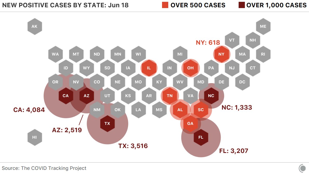


You must be logged in to post a comment.