See the note:
Category Archives: Global Macro
Inflation is Declining According to this Trend Analysis of Commodities
In economics, inflation is an increase in the prices of goods and services in an economy.
When the general price level rises, each unit of currency buys fewer goods and services; consequently, inflation corresponds to a reduction in the purchasing power of money.
You may not see the value of your money change online like you do with your investment fund values changing daily, but it’s changing.
Inflation is a real risk for everyone, but it’s worse for people who have their money earning a low rate of interest at a bank or another low-yield fixed asset.
If someone believes they are being a “conservative investor” by investing money in an interest-bearing bank account, it’s only because the bank statement doesn’t show the real value of money after inflation.
The latest inflation report shows U.S. Inflation is 9%, three times higher than the long-term average of 3.25%, so if someone is only earning 3% on a CD, the value of their money is 6% less than it was.
That is, they “lost” 6% of buying power.

But that’s not the main point of this observation, it’s just one of many reasons the trend in prices is important.
The US Inflation Rate is the percentage a chosen basket of goods and services purchased in the US increases in price over a year. Inflation is one of the metrics used by the US Federal Reserve to gauge the health of the economy. Since 2012, the Federal Reserve has targeted a 2% inflation rate for the US economy and may make changes to monetary policy if inflation is not within that range. A notable time for inflation was the early 1980’s during the recession. Inflation rates went as high as 14.93%, causing the Federal Reserve led by Paul Volcker to take dramatic actions.
As an investment manager applying trend systems to global markets, I see it much more granular. I’m applying computerized trend systems to a wide range of global currencies, commodities, stocks, and bond markets, so I see the directional trend changes and shifts in momentum. Although I’ve automated the process of monitoring all these global markets, I still like to review the pictures as charts to see what is going on.
I ranked the S&P GSCI Indices by short-term momentum to see which are trending up the most, so we’ll start there.
I think it’s well known that many commodities markets had been trending up this year, but as we’ll see, many of these markets are now in downtrends.
I’ll share these trends in a way that makes it obvious that commodities aren’t just tradable markets, but they impact all of us, and commodities are interconnected. For example, the price of soybeans impacts livestock.
The S&P GSCI Feeder Cattle Index provides investors with a reliable and publicly available benchmark for investment performance in the feeder cattle market. S&P GSCI Feeder Cattle Index is in an uptrend as defined by above the 50 and 200-day moving averages. In fact, in the lower two frames, I include the percent above or below the 50 and 200-day average, and Feeder Cattle is about 5% above its 50-day average and 8% above its 200-day average price.
Feeder Cattle is the strongest uptrend over the past three months. It only gets worse from here.

S&P GSCI All Cattle Index is a broader basket of cattle, and it too is in an uptrend after breaking out of a multi-month base.

Live Cattle represented by S&P GSCI Live Cattle Index looks very similar, and is an uptrend, but not an all-time new high as it’s still below the February high.

Here’s where the weakness in these commodities trends begins. The S&P GSCI Gas Oil Index is in an intermediate-term uptrend; It’s 20% above the 200-day average. But the recent decline pushed it 6% below the 50-day average. The Gas & Oil index is in a primary uptrend, but short-term pullback. Longer-term trends begin with a shorter-term trend, so we’ll see how it trends from here.
Heating oil is represented by the S&P GSCI Heating Oil Index. Like gas and oil, it’s in a primary uptrend, but a short-term downtrend.

Now we’re getting into commodities with a negative price momentum over the past 3 months.
S&P GSCI Sugar Index is in a non-trending, volatile period over the past year, and it’s right at the 50 and 200-day average.

The S&P GSCI Livestock Index, a sub-index of the S&P GSCI, provides investors with a reliable and publicly available benchmark for investment performance in the livestock commodity market. Livestock is another market that’s lost its upward momentum over the past three months, and one to watch for a breakout.

S&P GSCI Natural Gas Index is in a primary uptrend, but recent downtrend in the short term. It tapped its 200-day average and is trending back up, but nearly 7% below where it was three months ago.

I ranked these trends by three-month momentum, so all of the commodities up to this point were outperforming the broad commodity index we know as S&P GSCI Total Return Index. My three-month momentum ranking is completely arbitrary, but it signaled many of these trends had changed recently.
The S&P GSCI Total Return Index is in a primary uptrend as defined by a level above its 200-day average, but it’s in a downtrend since it peaked in June.

S&P GSCI Total Return Index is what many global macro asset managers managing global macro hedge funds use as a benchmark for commodities, so the rest of these trends are more granular looking inside this broader index made up of these other indices.
S&P GSCI Energy Index is in a primary uptrend but has declined materially over the past month.

S&P GSCI Unleaded Gasoline Index is a big one that impacts Americans and our personal economy. S&P GSCI Unleaded Gasoline Index is in a primary uptrend but has corrected a lot these past five weeks. Once again, we see a commodity trend tapping the 200-day moving average, so a breakout below it will signal a changing primary trend.

Coffee is in a downtrend. S&P GSCI Coffee Index is below the 50 and 200 average, signaling it’s in both a short-term and intermediate-term downtrend. This may help explain why Latin American countries like Brazil’s stock index is down, too. Latin America makes a lot of the world’s coffee.

Unless you’re a long/short commodity trader like a CTA trend follower who aims to capitalize on these downtrends as much as the uptrends, this is one of the rare times downtrends are something to cheer on.
S&P GSCI Crude Oil Index is in a short-term downtrend, but a primary uptrend.

Meanwhile, S&P GSCI Cocoa Index is in a downtrend across both time frames.

Hey Crude, as in Brent Crude. We have a downtrend in S&P GSCI Brent Crude Index over the short run after a volatile non-trending period.

An interesting Intermarket analysis this year has been the trend in Gold. Gold is seen by many market participants as a store of value and a safe haven, but S&P GSCI Gold Index is in a downtrend after a sharp uptrend around March. You can probably see how applying multiple time frames can be useful in observing these trends.

By and large, the metals like precision metals are in downtrends.
S&P GSCI Platinum Index is in a downtrend.

Soft commodities, or softs, are commodities such as coffee, cocoa, sugar, corn, wheat, soybean, fruit and livestock. The term generally refers to commodities that are grown, rather than mined. You can see how some of the commodity markets tracked by indices are very granular focused on one single market trend, and others are a basket of commodities within a sector.
S&P GSCI Softs Index has shifted from a quiet uptrend to a volatile downtrend.

A biofuel is any fuel that is derived from biomass, that is, plant or algae material or animal waste.
After an uptrend breakout around March, S&P GSCI Biofuel Index has trended back to the same level it started.

Some of the most common products produced with soybeans are tofu, soy milk, soy sauce, and soy flour. Approximately 85% of soybeans grown around the world are used to make vegetable oils that are either sold to consumers or used commercially according to The Spruce Eats. The USDA says “Just over 70 percent of the soybeans grown in the United States are used for animal feed, with poultry being the number one livestock sector consuming soybeans, followed by hogs, dairy, beef and aquaculture.”
You can probably see how interconnected all this stuff is.
S&P GSCI Soybeans Index is in a downtrend after an uptrend started at the beginning of this year. Hopefully, this lower animal feed cost will help lower the prices of the livestock that are in uptrends.

Lead is still widely used for car batteries, pigments, ammunition, cable sheathing, weights for lifting, weight belts for diving, lead crystal glass, radiation protection and in some solders, according to RSC.org.
S&P GSCI Lead Index is in a downtrend, so I guess we’ll eventually see the price of ammo and car batteries decline, too. Overall, lead has been a non-trending volatile market the past year, but it’s now more decisively in a dowtrend.

Lean Hog is a type of hog (pork) futures contract that can be used to hedge and to speculate on pork prices.
S&P GSCI Lean Hogs Index has trended into a downtrend, so your bacon price may improve.

Palladium is one of a number of metals starting to be used in the fuel cells to power things like cars and buses as well as in jewelry and in dental fillings and crowns.
S&P GSCI Palladium Index is in a downtrend.


Grains are used around the world and are also called cereals, and are the most important staple food. According to NatGeo, humans get an average of 48 percent of their calories, or food energy, from grains. Grains are also used to feed livestock and to manufacture some cooking oils, fuels, cosmetics, and alcohols.
S&P GSCI Grains Index is in a downtrend after it broke up with momentum going into this year. If you like to eat and drink alcohol, this is great news as it seems the prices should drift back to where they were.

Wheat is used for white bread, pastries, pasta, and pizza, so this downtrend in S&P GSCI Wheat Index is a welcome change.

Dr. Copper is market lingo for the base metal that is reputed to have a “Ph. D. in economics” because of its ability to predict turning points in the global economy.
S&P GSCI Copper Index is in a strong downtrend, so if its reputation holds true, the Ph. D. in economics suggests a global economic slowdown is ahead.

The Royal Society of Chemistry says aluminum is used in a huge variety of products including cans, foils, kitchen utensils, window frames, beer kegs and airplane parts.
If the trend in S&P GSCI Aluminum Index is a guide, the price of your next beer keg or airplane should drift lower. Aluminum is in a downtrend.

Industrial Metal alloys are known for their strength, durability, and corrosion resistance, so engineers, architects, and others in the industrial field use these alloys to construct buildings, wires, pipes, bridges, machines, and much more according to Wieland.
S&P GSCI Industrial Metals Index shows industrial metals are in a downtrend with great momentum.

Industrial metals are down so much I’ll show a two-year chart to see the price is back to 2020 levels.

Last but not least is cotton. I think we all know what cotton is used for. The price of clothes should see some decline with S&P GSCI Cotton Index in such a downtrend.

What we’ve observed is many commodity markets were in uptrends, but have more recently trended down. Not all of these necessarily impact the Consumer Price Index, but we certainly use most if not all of them one way or another.
Commodities are real “stuff”, and the prices of much of this stuff are no longer as elevated as it was. If this flows into lowering prices of the stuff we buy, then we’ll see inflation fall from here.
If inflation trends down from here, it’ll be positive for stocks and bonds and may result in the Federal Reserve pausing its aggressive interest rate hikes.
Now you know why we aren’t long commodities at this point.
Investor sentiment (about stocks) is so negative right now, that any slight improvement in inflation may spark an uptrend, then the extremely bearish positioning may drive short covering to keep the trend going a while.
Let’s see how it all unfolds.
Mike Shell is the Founder and Chief Investment Officer of Shell Capital Management, LLC, and the portfolio manager of ASYMMETRY® Managed Portfolios. Mike Shell and Shell Capital Management, LLC is a registered investment advisor focused on asymmetric risk-reward and absolute return strategies and provides investment advice and portfolio management only to clients with a signed and executed investment management agreement. The observations shared on this website are for general information only and should not be construed as investment advice to buy or sell any security. This information does not suggest in any way that any graph, chart, or formula offered can solely guide an investor as to which securities to buy or sell, or when to buy or sell them. Securities reflected are not intended to represent any client holdings or recommendations made by the firm. In the event any past specific recommendations are referred to inadvertently, a list of all recommendations made by the company within at least the prior one-year period may be furnished upon request. It should not be assumed that recommendations made in the future will be profitable or will equal the performance of the securities on the list. Any opinions expressed may change as subsequent conditions change. Please do not make any investment decisions based on such information, as it is not advice and is subject to change without notice. Investing involves risk, including the potential loss of principal an investor must be willing to bear. Past performance is no guarantee of future results. All information and data are deemed reliable but are not guaranteed and should be independently verified. The presence of this website on the Internet shall in no direct or indirect way raise an implication that Shell Capital Management, LLC is offering to sell or soliciting to sell advisory services to residents of any state in which the firm is not registered as an investment advisor. The views and opinions expressed in ASYMMETRY® Observations are those of the authors and do not necessarily reflect the position of Shell Capital Management, LLC. The use of this website is subject to its terms and conditions.
Bear Markets with an Economic Recession Last Longer and are More Severe
Bear markets that occur in economic recessions last longer and are more severe than bear markets without an economic recession.
The non-recession bears are clustered in the upper left quadrant (lower decline, recovered sooner) and the big bear markets with recession are red dots.

Source: NDR
Mike Shell is the Founder and Chief Investment Officer of Shell Capital Management, LLC, and the portfolio manager of ASYMMETRY® Managed Portfolios. Mike Shell and Shell Capital Management, LLC is a registered investment advisor focused on asymmetric risk-reward and absolute return strategies and provides investment advice and portfolio management only to clients with a signed and executed investment management agreement. The observations shared on this website are for general information only and should not be construed as investment advice to buy or sell any security. This information does not suggest in any way that any graph, chart, or formula offered can solely guide an investor as to which securities to buy or sell, or when to buy or sell them. Securities reflected are not intended to represent any client holdings or recommendations made by the firm. In the event any past specific recommendations are referred to inadvertently, a list of all recommendations made by the company within at least the prior one-year period may be furnished upon request. It should not be assumed that recommendations made in the future will be profitable or will equal the performance of the securities on the list. Any opinions expressed may change as subsequent conditions change. Please do not make any investment decisions based on such information, as it is not advice and is subject to change without notice. Investing involves risk, including the potential loss of principal an investor must be willing to bear. Past performance is no guarantee of future results. All information and data are deemed reliable but are not guaranteed and should be independently verified. The presence of this website on the Internet shall in no direct or indirect way raise an implication that Shell Capital Management, LLC is offering to sell or soliciting to sell advisory services to residents of any state in which the firm is not registered as an investment advisor. The views and opinions expressed in ASYMMETRY® Observations are those of the authors and do not necessarily reflect the position of Shell Capital Management, LLC. The use of this website is subject to its terms and conditions.
Fundamental Valuation: Is the Stock Market Cheap or Expensive?
For me, and everyone else even if they don’t realize it, the price trend is the final arbiter.
For more than two decades, I’ve focused my efforts on developing systems to identify trends early in their stage to capitalize on trends as they continue and exit a trend if it reverses.
It all started in business school, where I earned a Bachelor of Applied Science degree in advanced accounting. It was “advanced” because I took the extra advanced classes above a typical accounting major required to sit for the CPA exam in Tennessee. It basically results in a master’s in accounting, but not really, but it’s just the same 150 credit hours.
I rarely speak of my formal college simply because I haven’t considered it a source of edge for investment management.
But maybe it has.
In some conversations recently, people have asked about my background and how I got started as an investment manager and founder of an investment firm. After further review, I’ve come to realize the knowledge I have of financial statements, and the vast details and fundamental information that make them up, is what drove me to observe very little of it really drives the market price in an auction market.
That’s something I’ve always believed, but it occurred to me during business school.
To be succinct; I very quickly discovered undervalued stocks are trading at a cheap multiple of earnings for a reason, and that’s more likely to continue than to reverse.
I didn’t have a lot of capital to play with, and it was hard earned capital. I worked as a Sheriffs’ Officer full time through college fully time, so it took me a few extra years to complete. I wasn’t about to lose too much of what I had in the stock market, so I aimed to cut my losses short early on.
I’ve focused on cutting my losses short ever since, so now I have about 25 years experience as a tactical trader with an emphasis on the one thing I believe I can best limit or control; the downside of my losers.
When I focus on limiting the downside of loss, I am left to enjoy the upside of gains.
But we can’t do that with fundamentals and valuation. Risk can only be directed, limited, managed, and controlled, by focusing on the price trend.
The price trend is more likely to continue than to reverse, as evidenced even by vast academic studies of momentum.
Because a price trend is more likely to continue than to reverse, it’s essential to realize if you attempt to buy stocks that are in downtrends, you’ll likely experience more downtrend.
So, buying what you perceive are “undervalued” stocks is like catching a falling knife they say.
I’d rather wait for the knife to fall, stab the ground or someone’s foot, then pick it up safely.
Knives a dangerous, and up close, even more dangerous than a gun, so govern yourself accordingly.
Nevertheless, the valuation of stocks and overall valuation of the market by and large can be useful to observe at the extremes in valuation.
The chart below tells the story based on Morningstar’s fair value estimates for individual stocks.

The chart shows the ratio price to fair value for the median stock in Morningstar’s selected coverage universe over time.
- A ratio above 1.00 indicates that the stock’s price is higher than Morningstar’s estimate of its fair value.
- The further the price/fair value ratio rises above 1.00, the more the median stock is overvalued.
- A ratio below 1.00 indicates that the stock’s price is lower than our estimate of its fair value.
- The further it moves below 1.00, the more the median stock is undervalued.
It shows stocks are as undervalued as they were at the low in 2011, nearly as undervalued stocks were March 2020, but not as undervalued as stocks reached in the 2008 stock market crash when the S&P 500 lost -56% from October 2007 to March 2009.
If I were to overall a drawdown chart of the stock index it would mirror the undervalued readings in the chart.
As prices fall, stocks become more undervalued by this measure.
My observation is by and large stocks are relatively undervalued, but they can get much more undervalued if they haven’t yet reached a low enough point to attract institutional buying demand.
To be sure, in 2011 when stocks were as undervalued as Morningstar suggests they are now, the stock index had declined about -19%, similar to the current drawdown of -23%.

The waterfall decline in stock prices March 2020 was -34%, although it recovered quickly in a v-shaped reversal, so it didn’t get as much attention as the current bear market which is down 10% less, but has lasted for seven months without a quick recovery.

Time allows the losses to sink in for those who are holding their stocks.
This time the average stock is down much more than the stock indexes, too, so if you’re holding the weakest stocks your drawdown is worse than the index.
In that case, you’re probably wondering how low it can go.
If stock prices haven’t yet be driven down to a low enough level to attract big institutional capital to buy these lower prices, stocks can certainly trend down a lot lower from here.
For example, in the 2007 – 2009 bear market known as the 2008 Financial Crisis, one I successfully operated through as a tactical trader and risk manager, the stock index dropped -56% over 16 grueling months.
The infamous 2008 crash included many swings up and down on its way to printing a -56% decline from its high in October 2007.
That’s how bad it could get.
It’s also largely the cause of the situation the U.S. finds itself in today.
Since the 2008 Global Financial Crisis, the U.S. Treasury and Federal Reserve Open Market Committee have provided unprecedented support for the equity market and the bond market.
Passive investors and asset allocators have been provided a windfall from the Fed and Treasury, but it’s time to pay the debt.
For passive investors, they’ve been hammered with large losses this year and risk losing more if stock and bond prices keep trending down.
Stocks are already undervalued, but they can get much more undervalued.
Even worse, as my experience tactically operating through many declines like this since the 1990s reflects, are the paranna bites along with the shark bites.
The shark bite is from a passive asset allocator holding on through a prolonged deep bear market in stock prices as they fall -20%, -30%, -40%, -50% or more.
Because losses are so asymemtric and geometically compound aginast you, these capital losses become harder and harder to recover from.
If you lose -50%, it takes a 100% gain to get it back.
Stock market trends are asymmetric; they trend up much lower than they crash down, so that larger gain needed often takes longer, too.
So your emotional capital is at risk.
When you’re down a lot, you’re thinking and decision-making becomes cloudy and stressed because you[‘re under pressure like a pressure cooker.
You don’t know how low it can go.
If you are a buy and hold asset allocator, your loss is unlimited, as there is not point in which you would exit but zero.
Zero may be unlikely, but -50% or more isn’t, as evidenced by history.
And you’ve not been here before.
You’ve not seen this before.
The Fed has never stretched its open market operations this far before.
We just don’t know what’s going to happen next.
But, I’m prepared to tactically execute through whatever unfolds.
I’m having a great year relatively speaking. I’ve been positive most of the year and haven’t ventured far below our all-time new high.
Times like these are when my skillset is designed to show an edge.
Like many tactical investment managers like trend followers, hedge funds, global macro, I too had a period of relative underperformance of the long-only stock indexes. I held my ground but learned some new tricks during the many swings the past decade, and sharpened my countertrend axe to chip away some of the bad parts we don’t want.
But relative outperformance has never been my objective, especially not against a stock index for stock fund that’s fully invested in stocks all the time.
My objective has always been absolute return, not relative return.
My absolute return objective is what drives me to actively manage risk for drawdown control.
Like a good doctor, I aim to first do no harm… as best I can as a risk taker.
Looking at the Shiller PE ratio for the S&P 500, a long-term observation, the U.S. stock market is still grossly overvalued.
The S&P 500 was the second-highest most expensive valuation in 140 years, and even after the decline this year, the stock index is still twice the valuation of Black Monday in October 1987 and
only down to its extremely overvalued level it was on Black Monday Oct. 19, 1987, when the Dow Jones Industrial Average fell -22% in a single day and just now down to the valuation level the stock index was on Black Tuesday in the 1929 crash.

If you believe in fundamental valuation as a gauge and a guide, anything can happen, so please govern yourself accordingly.
If you need help or have questions, contact us here.
Mike Shell is the Founder and Chief Investment Officer of Shell Capital Management, LLC, and the portfolio manager of ASYMMETRY® Managed Portfolios. Mike Shell and Shell Capital Management, LLC is a registered investment advisor focused on asymmetric risk-reward and absolute return strategies and provides investment advice and portfolio management only to clients with a signed and executed investment management agreement. The observations shared on this website are for general information only and should not be construed as investment advice to buy or sell any security. This information does not suggest in any way that any graph, chart, or formula offered can solely guide an investor as to which securities to buy or sell, or when to buy or sell them. Securities reflected are not intended to represent any client holdings or recommendations made by the firm. In the event any past specific recommendations are referred to inadvertently, a list of all recommendations made by the company within at least the prior one-year period may be furnished upon request. It should not be assumed that recommendations made in the future will be profitable or will equal the performance of the securities on the list. Any opinions expressed may change as subsequent conditions change. Please do not make any investment decisions based on such information, as it is not advice and is subject to change without notice. Investing involves risk, including the potential loss of principal an investor must be willing to bear. Past performance is no guarantee of future results. All information and data are deemed reliable but are not guaranteed and should be independently verified. The presence of this website on the Internet shall in no direct or indirect way raise an implication that Shell Capital Management, LLC is offering to sell or soliciting to sell advisory services to residents of any state in which the firm is not registered as an investment advisor. The views and opinions expressed in ASYMMETRY® Observations are those of the authors and do not necessarily reflect the position of Shell Capital Management, LLC. The use of this website is subject to its terms and conditions.
The 10-2 Year Treasury Yield Spread Continues to Indicate a Warning of a Possible Recession
In Following the Trend of Inflation and Risk of Bonds I mentioned we are closely monitoring the 10-2 Year Treasury Yield Spread because an inverted yield curve has a track record of predicting future recessions 6 – 24 months in advance.
The 10-2 Year Treasury Yield Spread is declining fast and has now trended to 0.24%, meaning the 2 Year U.S. Treasury Yield is nearly the same yield as the Year 10 U.S. Treasury Yield.

For more context, read: How We’ll Know if a Recession is Imminent.
For information about our proactive investment management, active risk management, hedging your risks, and ASYMMETRY® Managed Portfolios, contact us.
Mike Shell is the Founder and Chief Investment Officer of Shell Capital Management, LLC, and the portfolio manager of ASYMMETRY® Managed Portfolios. Mike Shell and Shell Capital Management, LLC is a registered investment advisor focused on asymmetric risk-reward and absolute return strategies and provides investment advice and portfolio management only to clients with a signed and executed investment management agreement. The observations shared on this website are for general information only and should not be construed as advice to buy or sell any security. Securities reflected are not intended to represent any client holdings or any recommendations made by the firm. Any opinions expressed may change as subsequent conditions change. Please do not make any investment decisions based on such information, as it is subject to change. Investing involves risk, including the potential loss of principal an investor must be willing to bear. Past performance is no guarantee of future results. All information and data are deemed reliable but are not guaranteed and should be independently verified. The presence of this website on the Internet shall in no direct or indirect way raise an implication that Shell Capital Management, LLC is offering to sell or soliciting to sell advisory services to residents of any state in which the firm is not registered as an investment advisor. The views and opinions expressed in ASYMMETRY® Observations are those of the authors and do not necessarily reflect a position of Shell Capital Management, LLC. The use of this website is subject to its terms and conditions.
Observations of the Unemployment Trend
The US Unemployment Rate measures the percentage of total employees in the United States that are a part of the labor force, but are without a job. It’s one of the most widely followed indicators of the health of the US labor market and the US economy as a whole.
Historically, the US Unemployment Rate reached as high as 10.80% in 1982 and 9.9% in November of 2009, which were recessionary periods.
The US Unemployment Rate is at 8.40%, compared to 10.20% last month and 3.70% this time last year.
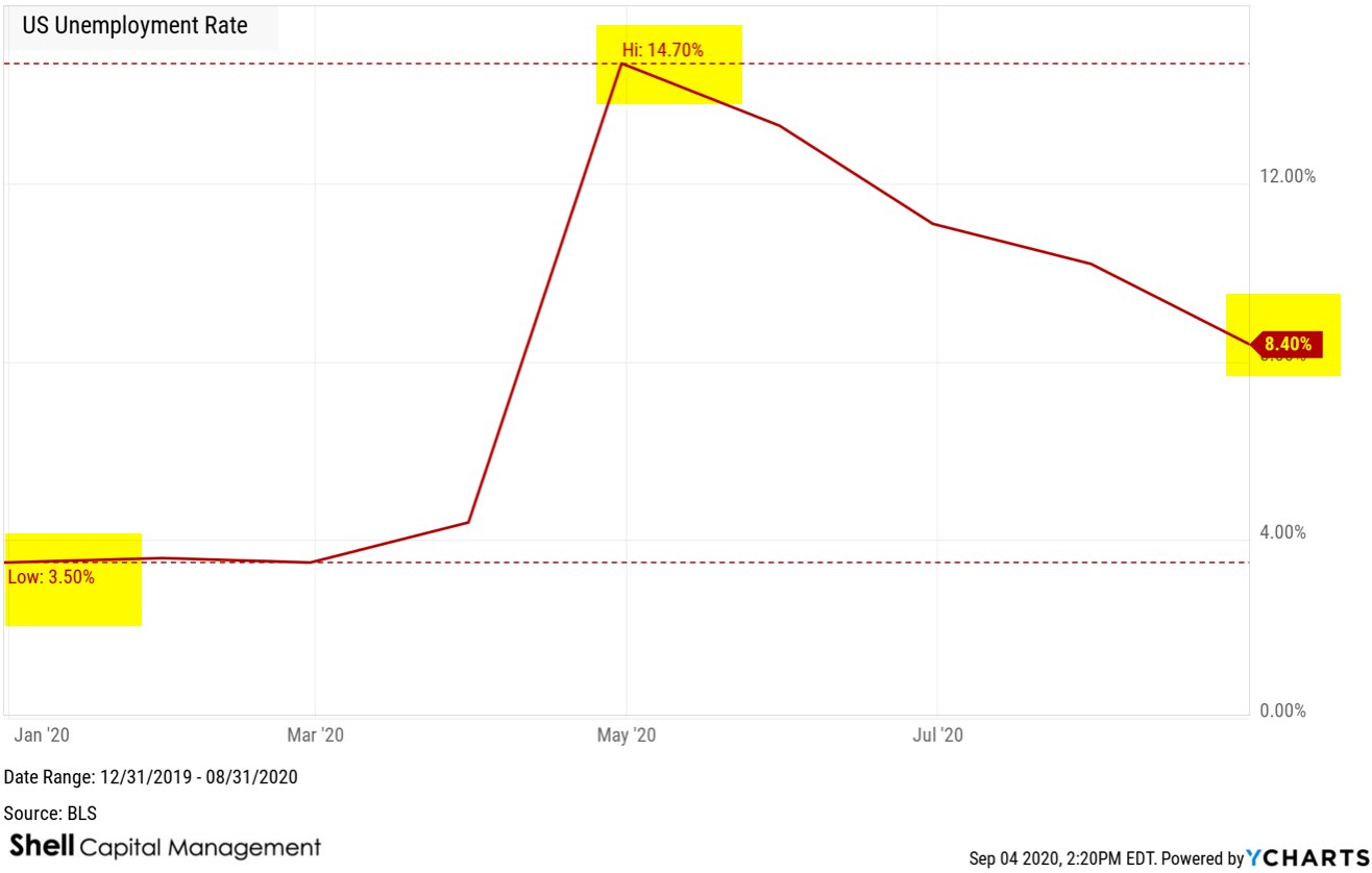
US Unemployment Rate remains significantly higher than the long term average of 5.76%.
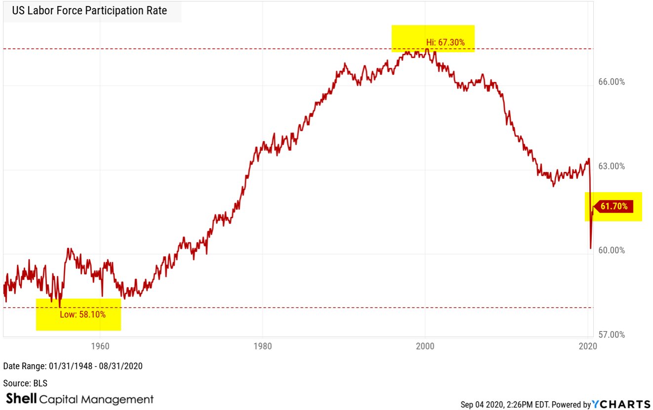
The US Labor Force Participation Rate from the Bureau of Labor Statistics is the sum of total number of employed persons and unemployed persons looking for work in the United States as a percentage of the working age population.
US Labor Force Participation Rate is at 61.70%, compared to 61.40% last month and 63.20% this time last year.
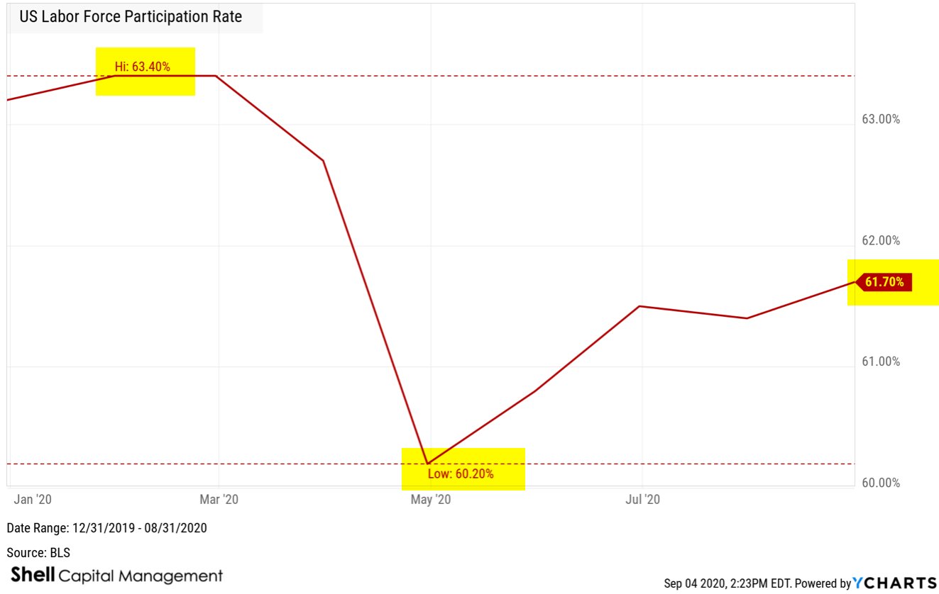
Looking at the bigger picture over a longer time frame, there has been a negative trend from the 2000s of 67.10% participation to the 2010s 62.50% participation as the boomer generation has begun shifting out of the working age population.
In bad economic conditions, the labor force participation rate may actually fall as people eventually give up looking for a job.
So, the employment situation seems to be improving, but we’re likely to see some of these job losses become permanent.
Mike Shell is the Founder and Chief Investment Officer of Shell Capital Management, LLC, and the portfolio manager of ASYMMETRY® Global Tactical. Mike Shell and Shell Capital Management, LLC is a registered investment advisor focused on asymmetric risk-reward and absolute return strategies and provides investment advice and portfolio management only to clients with a signed and executed investment management agreement. The observations shared on this website are for general information only and should not be construed as advice to buy or sell any security. Securities reflected are not intended to represent any client holdings or any recommendations made by the firm. Any opinions expressed may change as subsequent conditions change. Do not make any investment decisions based on such information as it is subject to change. Investing involves risk, including the potential loss of principal an investor must be willing to bear. Past performance is no guarantee of future results. All information and data are deemed reliable but is not guaranteed and should be independently verified. The presence of this website on the Internet shall in no direct or indirect way raise an implication that Shell Capital Management, LLC is offering to sell or soliciting to sell advisory services to residents of any state in which the firm is not registered as an investment advisor. The views and opinions expressed in ASYMMETRY® Observations are those of the authors and do not necessarily reflect a position of Shell Capital Management, LLC. The use of this website is subject to its terms and conditions.
Has the economy lost momentum?
I pay more attention to macroeconomic trends when we are in a recession.
Though my tactical investment decisions are driven by the direction of price trends, momentum, sentiment, and volatility, it’s useful to take a moment to see what in the world is going on.
Clearly, employment and payrolls seem to be one of the main macroeconomic risks right now.
The July ADP employment report showed private employment increased by 167,000, far less than the expectations of the street of 1.2 million. It’s a big disappointment.

Today, we see the US Continuing Claims for Unemployment Insurance is at a current level of 16.11 million, down from 16.95 million last week, which is a change of -4.98% from last week and -35% from the peak in May.

For a long term perspective, here is US Continuing Claims for Unemployment Insurance going back to 1967, the past 53 years. It averaged 2.8 million over the period, reached 10 times higher than average, and is still 5 times higher than the long term average.

Of course, the average over 53 years doesn’t mean much when such an outlier is present, but maybe it helps put the trend into perspective.
Prior to now, the highest continuing claims for unemployment insurance from the Department of Labor was 6.6 million. That’s 10 million less than now. So, for perspective, todays level is nearly three times what it was at the peak in 2009. Said another way, the worst claims for unemployment insurance in 2009 was only 1/3 of today.

But hey, today’s 16.1 million is better than the peak at 25 million just a few months ago.
By the way, that 25 million was more than four times the highest level it reached in 2009.
So yeah, employment is an issue that certainly has my attention as a macroeconomic trend guy.
Next up is US Initial Claims for Unemployment Insurance. US Initial Jobless Claims, as tracked and reported by the US Department of Labor, provides data on how many new people have filed for unemployment benefits in the previous week. It allows us to gauge economic conditions in regard to employment.
As more new people file for unemployment benefits, fewer people in the economy have jobs. Of course, initial jobless claims tended to peak at the end of recessionary periods such as the last cycle peak on March 21, 2009 when it reached 661,000 new filings.
US Initial Claims for Unemployment Insurance is at a current level of 1.186 million, which is nearly double the 2009 peak, but it’s -83% below the stunning March 2020 high of 6.8 million.

I know I just shared some of these numbers a few days ago, but these are updated data this morning.
The next big issue I think we’ll see comes tomorrow.
If tomorrows payroll numbers are similar to these ADP numbers, the job growth will be way below Wall Street expectations of 1.5 million.
We’ll see how it unfolds in the morning.
In the meantime, the resiliency of US stock market has been remarkable. Though anyone paying attention knows the driver is the US government intervention, the S&P 500 has now recovered from its -34% loss in March.
The Dow Jones Industrial Average remains about -5% from the February peak.
The equal weight S&P 500, which gives far more weighting to the smaller and mid size stocks, is about -6.4% from its prior high.

To the layman, it would seem the stock market has all but recovered.
If we didn’t know better, the bear market is over.
Do we know better? or is it over?
Will 2020 go down as the sharpest decline in modern history and the fastest recovery?
We’ll see.
But, over the long run, the stock market is driven by fundamentals. The challenge with fundaments like earnings growth, dividend yield, and the price-to-earnings multiple (optimism) they trade at.
Here is a chart of the rate of change of the S&P 500 price trend normalized with the Shiller S&P 500 CAPE Ratio, which is a measure of valuation. I’ve pointed out many times the valuation level was extremely high, though it has been since 2013. Look when it peaked in the relative chart compared to the SPX at the start of 2018.

What’s happened since then?
Swings.
Massive swings.
And sharp sudden drawdowns.

While the S&P 500 Shiller CAPE Ratio is now down to about 30, which is -10% below where it was at the start of 2018, the valuation level is still as high as it was before the Great Depression.

The markets are going to swing up and down and motivate a lot of mistakes along the way, but if history is a guide, we may be in for a much longer bear market and recession than is currently reflected.
You can probably see why my investment strategy is unconstrained, so I can go anywhere, including cash and treasuries, and apply different tactics for tactical decisions in pursuit of asymmetric risk/reward.
It’s never perfect, but I just keep doing what I do.
In hindsight, I’ve been underinvested in stocks the past few weeks, but we’ll see how it plays out from here.
Mike Shell is the Founder and Chief Investment Officer of Shell Capital Management, LLC, and the portfolio manager of ASYMMETRY® Global Tactical. Mike Shell and Shell Capital Management, LLC is a registered investment advisor focused on asymmetric risk-reward and absolute return strategies and provides investment advice and portfolio management only to clients with a signed and executed investment management agreement. The observations shared on this website are for general information only and should not be construed as advice to buy or sell any security. Securities reflected are not intended to represent any client holdings or any recommendations made by the firm. Any opinions expressed may change as subsequent conditions change. Do not make any investment decisions based on such information as it is subject to change. Investing involves risk, including the potential loss of principal an investor must be willing to bear. Past performance is no guarantee of future results. All information and data are deemed reliable but is not guaranteed and should be independently verified. The presence of this website on the Internet shall in no direct or indirect way raise an implication that Shell Capital Management, LLC is offering to sell or soliciting to sell advisory services to residents of any state in which the firm is not registered as an investment advisor. The views and opinions expressed in ASYMMETRY® Observations are those of the authors and do not necessarily reflect a position of Shell Capital Management, LLC. The use of this website is subject to its terms and conditions.
The US Unemployment Situation is Stunning
US Initial Jobless Claims, provided by the US Department of Labor, provides underlying data on how many new people have filed for unemployment benefits in the previous week.
We can gauge economic conditions with respect to employment.
As more new individuals file for unemployment benefits, fewer individuals in the economy have jobs.
For example, initial jobless claims have tended to reach a cycle peak at the end of recessionary periods. For example, near the end of the last recession, on March 21, 2009 there were 661,000 new filings.
US Initial Claims for Unemployment Insurance is at a current level of US Initial Claims for Unemployment Insurance is at a current level of 1.434 million, which is an increase 592.8% from one year ago.

But, if it makes you feel any better, US Initial Claims for Unemployment Insurance are down -79% from its March 2020 high.

So, US Initial Claims for Unemployment Insurance is up 576% from the beginning of 2020, though it was up over 3,000% in March.

The US Unemployment Rate measures the percentage of total employees in the United States that are a part of the labor force, but are without a job.
The US Unemployment Rate is one of the most widely followed indicators of the health of the US labor market and the US economy as a whole.
Historically, the US Unemployment Rate has reached as high as 10.80% in 1982 and 9.9% in November of 2009.
Both periods were significant recessionary periods.
US Unemployment Rate is at 11.10%, compared to 13.30% last month and 3.70% last year. It is much higher than the long term average of 5.75%.

The US Unemployment Rate at 14.7% was by far the highest it has been in 72 years according the the Bureau of Labor Statistics.

At 11.10% the US Unemployment Rate is still higher than the prior peak in 1982.
I know most people were shocked by this spike in unemployment, and of course, much of it was driven by the Coronavirus pandemic, but it’s also just the market, doing what it does.
For example, I shared in an observation here on December 29, 2019 in “Asymmetry in yield spreads, inverted yield curve warning shot, and unemployment” when I shared the following in regard to what was then an extremely low unemployment rate.
“The yield curve inversion doesn’t automatically mean a recession is in the near future.
Employment is essential, too. The U.S. Unemployment Rate is about as low as it’s ever been.”

“As with all cycles, it isn’t the extremely low level of the cycle we should focus on, but what’s more likely to happen next. It should be no surprise that low unemployment precedes recessions.”
But, I’ll close this observation with the same one I did this one last December.
For me, the directional trend of the stock market will be my primary guide for the economy but I monitor many trends for situational awareness of what is going on.
I hope all is well with all of you and you are avoiding COVID-19 like the plague.
Mike Shell is the Founder and Chief Investment Officer of Shell Capital Management, LLC, and the portfolio manager of ASYMMETRY® Global Tactical. Mike Shell and Shell Capital Management, LLC is a registered investment advisor focused on asymmetric risk-reward and absolute return strategies and provides investment advice and portfolio management only to clients with a signed and executed investment management agreement. The observations shared on this website are for general information only and should not be construed as advice to buy or sell any security. Securities reflected are not intended to represent any client holdings or any recommendations made by the firm. Any opinions expressed may change as subsequent conditions change. Do not make any investment decisions based on such information as it is subject to change. Investing involves risk, including the potential loss of principal an investor must be willing to bear. Past performance is no guarantee of future results. All information and data are deemed reliable but is not guaranteed and should be independently verified. The presence of this website on the Internet shall in no direct or indirect way raise an implication that Shell Capital Management, LLC is offering to sell or soliciting to sell advisory services to residents of any state in which the firm is not registered as an investment advisor. The views and opinions expressed in ASYMMETRY® Observations are those of the authors and do not necessarily reflect a position of Shell Capital Management, LLC. The use of this website is subject to its terms and conditions.
Global Macro Trends: Eurozone Economic Sentiment, US Home Sales, Texas Manufacturing Business Activity, and Retail Gas Price
Eurozone Economic Sentiment Indicator is reversing back up off its lowest level ever at a current level of 75.70, up 12.15% from last month and -26.43% from one year ago. It’s way below average, but at least a countertrend from the extreme low reached this year.

Eurozone Consumer Confidence Indicator is at a current level of -14.70, up from -18.80 last month as it has almost reverted back to its long term average.

US Pending Home Sales Month over Month is at -21.77%, compared to -20.83% last month and -1.14% last year, which is lower than the long term average of -0.03%. Pending home sales mounted a record comeback in May, seeing encouraging contract activity after two previous months of declines brought on by the coronavirus pandemic, according to the National Association of Realtors®. Every major region recorded an increase in month-over-month pending home sales transactions, while the South also experienced a year-over-year increase in pending transactions.

The Pending Home Sales Index (PHS), a leading indicator of housing activity, measures housing contract activity, and is based on signed real estate contracts for existing single-family homes, condos, and co-ops. Because a home goes under contract a month or two before it is sold, the Pending Home Sales Index generally leads Existing-Home Sales by a month or two.
Here is the Year over year relative to Month over Month.

Meanwhile, in Texas… the outlook has recovered after an epic decline.
The Dallas Fed conducts the Texas Manufacturing Outlook Survey monthly to obtain a timely assessment of the state’s factory activity. Firms are asked whether output, employment, orders, prices and other indicators increased, decreased or remained unchanged over the previous month. Responses are aggregated into balance indexes where positive values generally indicate growth while negative values generally indicate contraction.
Texas Manufacturing Business Activity Index is at a current level of -6.10, UP from -49.20 last month and even UP from -12.60 one year ago.

We’ll see if Texas can keep up the recovery with an uptrend in new COVID-19 cases, especially in Houston. The number currently hospitalized is at an all time high.

And the new uptrend in cases doesn’t seem to be driven by more testing in Texas. Although testing has trended up, it was above average about five weeks before cases were, and about eight weeks before the escalating uptrend.

To be sure, we can apply the same relative ratio we would to a stock vs. its index. For example, Apple, Inc. (AAPL) is a top technology stock, so if we want to determine when it’s outperforming the tech sector, we compare it to the sector index. Here we see the relative momentum between them as a ratio. When the line is trending up, Apple has relative strength over the tech sector.

Below I did the same with Texas cases relative to tests administered, which shows cases have momentum over tests. Up until now, the percent of positive cases was trending down.

The US Retail Gas Price is the average price that retail consumers pay per gallon. Retail gas prices is good to observe to see how the energy industry is performing. Retail gas prices can give a good observation of how much discretionary income consumers might have to spend.
US Retail Gas Price is at a current level of 2.216, up 1.42% from last week and down -19.68% from one year ago. Gas reached a peak in July 2008 and then trended back up to the $4 range the summer of 2011 to the summer of 2014 before trending down again.
Gas has now reverted to its long term average price, which has remained elevated since 2005.

If you wondered why electric cars are still popular, it’s because the average price of gas is elevated to a new higher level. Over the past decade, gas had oscillated between $4 and $2, for an average price around $3 a gallon.

Don’t miss out! Sign up for an email of new ASYMMETRY® Observations, including some that may not be posted here.
Join 520 other subscribers
Mike Shell is the Founder and Chief Investment Officer of Shell Capital Management, LLC, and the portfolio manager of ASYMMETRY® Global Tactical. Mike Shell and Shell Capital Management, LLC is a registered investment advisor focused on asymmetric risk-reward and absolute return strategies and provides investment advice and portfolio management only to clients with a signed and executed investment management agreement. The observations shared on this website are for general information only and should not be construed as advice to buy or sell any security. Securities reflected are not intended to represent any client holdings or any recommendations made by the firm. Any opinions expressed may change as subsequent conditions change. Do not make any investment decisions based on such information as it is subject to change. Investing involves risk, including the potential loss of principal an investor must be willing to bear. Past performance is no guarantee of future results. All information and data are deemed reliable but is not guaranteed and should be independently verified. The presence of this website on the Internet shall in no direct or indirect way raise an implication that Shell Capital Management, LLC is offering to sell or soliciting to sell advisory services to residents of any state in which the firm is not registered as an investment advisor. The views and opinions expressed in ASYMMETRY® Observations are those of the authors and do not necessarily reflect a position of Shell Capital Management, LLC. The use of this website is subject to its terms and conditions.
Global Macro: Signs of bullish sentiment across the globe
In some cases, the recovery of economic and market trends are as impressive as the rate in which they fell.
The so-called “panic button” indicator, TED Spread, is back down to low levels. The chart tracks the daily TED Spread (3 Month LIBOR relative to the 3 Month Treasury Bill) as a measure of the perceived credit risk in the U.S. economy. It tends to widen during times of economic uncertainty. The TED Spread spiked up briefly in March, but has since settled back down.

The TED Spread spiked up briefly in March, but has since settled back down.

German economic sentiment snapped back fast.
The ZEW Indicator of Economic Sentiment is a leading indicator for the German economy. It reflects the expectations in six months of 300 financial experts on inflation rates, interest rates, stock markets, exchange rates, and oil prices for leading global economies. A value greater than 0 reflects more optimism than pessimism and a value less than 0 reflects more pessimism than optimism with respect to economic sentiment.
ZEW Indicator of Economic Sentiment for Germany is at a current level of 63.40, which is right at the high it reached in 2014.

ZEW Indicator of Economic Sentiment for Germany and the Eurozone updates will be released tomorrow, so we’ll see how they have trended through June.
US Consumer Sentiment has trended up off its low. We’ll see if it can continue this uptrend with the COVID cases trending up again.

The Sabrient Insider Sentiment Index is designed to identify companies with potentially superior risk-return profiles that also are;
(1) reflecting favorable corporate insider buying trends (determined via the public filings of such corporate insiders) and/or
(2) have recent earnings estimate increases published by Wall Street analysts.
The Sabrient Insider Sentiment Index declined with the stock indexes in March and has recovered in similar fashion. As with investor sentiment measures, it seems to follow price. Nothing drives sentiment like the price trend.

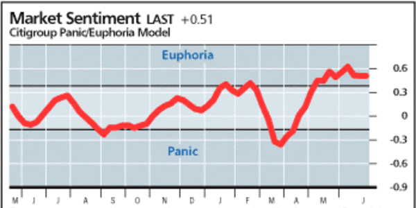
Speaking of sentiment, the Citigroup Panic/Euphoria model is a gauge of investor sentiment. It identifies “Panic” and “Euphoria” levels which are statistically driven buy and sell signals for the broader market. Historically, a reading below panic supports a better than 95% likelihood that stock prices will be higher one year later, while euphoria levels generate a better than 80% probability of stock prices being lower one year later.
The current reading of the Citigroup Panic/Euphoria model at 0.41 indicates euphoria and anything at or below -0.17 indicates panic.
The S&P 500 EQUAL WEIGHT is probably the best measure of the U.S. stock market. Here, I charted both the standard capitalization weighted index along with its Equal Weight counterpart. The cap-weighted S&P 500 is heavily driven by its top holdings, whereas the equal-weighted index holds about .20% in the 500 or so stocks in the index.

The S&P 500 Equal Weight Index declined -40% in March, which is more than the -34% of the S&P 500 weighted based on company size. The equal-weighted index also remains in a -17% drawdown off its highs, which is more than the standard SPX index, which is more weighted to the largest stocks.
For example, below are the top 25 stocks in the cap weighted S&P 500 everyone follows. As these top stocks have as much weighting in the index as 5%, the equal weight only holds about 0.20% in these same stocks.
| Symbol | Name | % Weight |
| MSFT | Microsoft Corp | 5.94% |
| AAPL | Apple Inc | 5.81% |
| AMZN | Amazon.com Inc | 4.51% |
| FB | Facebook Inc A | 2.22% |
| GOOGL | Alphabet Inc A | 1.69% |
| GOOG | Alphabet Inc Class C | 1.65% |
| JNJ | Johnson & Johnson | 1.44% |
| BRK.B | Berkshire Hathaway Inc Class B | 1.36% |
| V | Visa Inc Class A | 1.28% |
| JPM | JPMorgan Chase & Co | 1.17% |
| PG | Procter & Gamble Co | 1.14% |
| UNH | UnitedHealth Group Inc | 1.10% |
| HD | The Home Depot Inc | 1.03% |
| MA | Mastercard Inc A | 1.03% |
| INTC | Intel Corp | 0.97% |
| NVDA | NVIDIA Corp | 0.91% |
| VZ | Verizon Communications Inc | 0.88% |
| T | AT&T Inc | 0.83% |
| ADBE | Adobe Inc | 0.82% |
| NFLX | Netflix Inc | 0.80% |
| PYPL | PayPal Holdings Inc | 0.79% |
| DIS | The Walt Disney Co | 0.79% |
| MRK | Merck & Co Inc | 0.76% |
| BAC | Bank of America Corp | 0.75% |
| CSCO | Cisco Systems Inc | 0.75% |
The price trend for Emerging Markets stocks has been dismal since the 2007 peak, which has had some negative impact on global macro. That is, considering the killer trend from 2003 to 2007 has a strong return driver for us, it hasn’t been the case since then. So, we’ve not had much exposure to EM, even though it’s now considered undervalued relative to the rest of the world, for me, it has to be trending up with some momentum. This tend is non-trending and volatile.

Zooming in to the year to date, at least the MSCI Emerging Markets Index only declined about the same as US stocks.

Looking inside the EM Index we see the top country exposures are China, Taiwan, South Korea, India, and Brazil, all of which we can gain portfolio exposure via ETFs.

Looking at these individual emerging countries, Brazil has been hammered the most, Taiwan, Korea, and China have been relatively resilient.

In fact, the trend in China is probably surprising to investors, especially considering it’s where the COVID-19 Coronavirus started. China only had a -18.4% drawdown priced in US Dollars.

Brazil has some of the worse COVID trends in the world right now, which isn’t helping their stock market trend either.

Here’s a view of the global stock market trends. Though they are down from their February 2020 highs, they are well above their March 2020 lows.

Gold has had one of the most asymmetric risk/reward profiles YTD. In 2020, Gold has only only down about -3% and a drawdown from its peak of -11%, but it has gained 16%. That’s relatively strong asymmetry.

Gold is no contest against the long term US Treasury Index in 2020. Long Term US Treasuries have the strongest momentum and asymmetric risk/reward year to date, which is why I have exposure. Gold has still been a good asymmetric risk/reward, though.

We remain on defense and invested in bonds for now as they seem to exhibit the most asymmetric risk reward.
Join 520 other subscribers
Mike Shell is the Founder and Chief Investment Officer of Shell Capital Management, LLC, and the portfolio manager of ASYMMETRY® Global Tactical. Mike Shell and Shell Capital Management, LLC is a registered investment advisor focused on asymmetric risk-reward and absolute return strategies and provides investment advice and portfolio management only to clients with a signed and executed investment management agreement. The observations shared on this website are for general information only and should not be construed as advice to buy or sell any security. Securities reflected are not intended to represent any client holdings or any recommendations made by the firm. Any opinions expressed may change as subsequent conditions change. Do not make any investment decisions based on such information as it is subject to change. Investing involves risk, including the potential loss of principal an investor must be willing to bear. Past performance is no guarantee of future results. All information and data are deemed reliable but is not guaranteed and should be independently verified. The presence of this website on the Internet shall in no direct or indirect way raise an implication that Shell Capital Management, LLC is offering to sell or soliciting to sell advisory services to residents of any state in which the firm is not registered as an investment advisor. The views and opinions expressed in ASYMMETRY® Observations are those of the authors and do not necessarily reflect a position of Shell Capital Management, LLC. The use of this website is subject to its terms and conditions.
Global Macro Trends: Extreme asymmetric observations and changes
Macroeconomics is a branch of economics dealing with the performance, structure, behavior, and decision-making of an economy as a whole.
Macroeconomics is the part of economics focused on the big picture: analyzing economic phenomena such as interest rates, growth, unemployment, and inflation. Macro is in contrast with microeconomics, the study of the behavior of individual markets, workers, households, and firms. Macroeconomic phenomena are the product of all the microeconomic activity in an economy.
Global is related to, or involving, the whole world, not just one country or state.
Global Macroeconomics, or Global Macro, then, is looking at the whole world for trends and behavior of big picture trends.
US Total Vehicle Sales measures the total number of auto, light truck, and heavy truck sales in the US and helps gauge how consumers are spending their discretionary income. In the chart, we can visually see the trends in car and truck sales going back 43 years.
US Total Vehicle Sales bottomed at prior lows, and is now trending back up.

US Light Truck Sales is part of total sales and at a current level of 9.6 million, it’s up from 6.7 million last month and down from 12.57 million one year ago.
US Light Truck Sales has been in an overall uptrend the past four decades, and it reverted to the long term average, but is recovering. US Light Truck Sales is up 41.68% from last month, and -23.96% from one year ago.

Personal Consumption Expenditures Price Index (PCE) is a measure of the prices that people living in the United States, or those buying on their behalf, pay for goods and services. The PCE price index is known for capturing inflation (or deflation) across a wide range of consumer expenses and reflecting changes in consumer behavior. The PCE price index, released each month in the Personal Income and Outlays report, reflects changes in the prices of goods and services purchased by consumers in the United States. Quarterly and annual data are included in the GDP release.
Personal Consumption Expenditures Price Index (PCE) Year over Year is is at 0.55%, compared to and 1.38% last year (a decline of 60%) and is materially lower than the long term average of 3.25%.

US Personal Spending Month over Month is at 8.17%, compared to -12.62% last month and 0.44% last year. US Personal Spending is now higher than the long term average of 0.52%. The chart shows this data was historically more stable, but we’ve observe some extreme outlier trends this year never seen in the last 60 years.

The US Inflation Rate is the percentage in which a chosen basket of goods and services purchased in the US increases in price over a year. Inflation is one of the metrics used by the US Federal Reserve to gauge the health of the economy. Since 2012, the Federal Reserve has targeted a 2% inflation rate for the US economy and may make changes to monetary policy if inflation is not within that range. A notable time for inflation was the early 1980’s during the recession. Inflation rates went as high as 14.93%, causing the Federal Reserve led by Paul Volcker to take dramatic actions.
US Inflation Rate is at 0.12%, compared to 0.33% last month and 1.79% last year. This is disinflation, which is a decrease in the rate of inflation. Disinflation is a slowdown in the rate of increase of the general price level of goods and services in a nation’s gross domestic product over time. Inflation has mostly trended below the long term average of 3.23% for years, but is extremely low at 0.12%. We could be a risk of deflation, which occurs when the inflation rate falls below 0%.

Inflation reduces the value of a currency over time, but sudden deflation increases it. As inflation is declining, the US Dollar is trending up.

When we think of macroeconomics trends like inflation and the US Dollar, we also think of gold. Here is Gold, priced in US Dollars. The Gold Price in US Dollars measures the cost in US Dollars for a Troy Ounce of gold. Gold can be seen as a “safe haven” investment since it is a tangible investment. Gold is also believed to be a hedge against inflation, which is why it reached as high as $1,895 per troy ounce in 2011 when inflation trended higher.
Gold is in an uptrend.

Inflation and interest rates are the primary return driver of stocks and bonds as well as some commodities and currencies.
The 10 Year Treasury Rate is the yield earned by investing in a US government issued treasury security that has a maturity of 10 years. The 10 year treasury yield is the longer end of the yield curve. Many analysts use the 10 year yield as the “risk free” rate when valuing the markets or an individual security. Historically, the 10 Year treasury rate reached as high as 15.84% in 1981 as the Fed raised benchmark rates in an effort to contain inflation.
10 Year Treasury Rate is the lowest it has been the past 30 years, currently at 0.64%, compared to 2.01% last year, and is significantly lower than the long term average of 4.45%.

We all know that past performance is no guarantee of future results, and the bond market expected return is a fine example. One thing that is essential for investors to understand is the long term bond returns will not repeat their past performance over the long term.
The directional trend of interest rates like the 10 Year Treasury Rate are a driver of other rates, such as mortgage rates.
The 30 Year Mortgage Rate is the fixed interest rate that US home-buyers would pay for a 30 year mortgage. Historically, the 30-year mortgage rate has trended as high as 18.6% in 1981, and up until now has trended down as low as 3.3% in 2012.
The 30 Year Mortgage Rate is at 3.13%, the lowest in 48 years, compared to 3.82% last year, and less than half of its 7.97% long term average.

The 15 Year Mortgage Rate is trending down low enough to double tap its all time low at 2.59% reached in May 2013, which is significantly lower than the long term average of 5.36%.

That’s all for now.
Don’t miss out! Stay informed and sign up for an email of new ASYMMETRY® Observations, including some that may not be posted here.
Join 520 other subscribers
Mike Shell is the Founder and Chief Investment Officer of Shell Capital Management, LLC, and the portfolio manager of ASYMMETRY® Global Tactical. Mike Shell and Shell Capital Management, LLC is a registered investment advisor focused on asymmetric risk-reward and absolute return strategies and provides investment advice and portfolio management only to clients with a signed and executed investment management agreement. The observations shared on this website are for general information only and should not be construed as advice to buy or sell any security. Securities reflected are not intended to represent any client holdings or any recommendations made by the firm. Any opinions expressed may change as subsequent conditions change. Do not make any investment decisions based on such information as it is subject to change. Investing involves risk, including the potential loss of principal an investor must be willing to bear. Past performance is no guarantee of future results. All information and data are deemed reliable but is not guaranteed and should be independently verified. The presence of this website on the Internet shall in no direct or indirect way raise an implication that Shell Capital Management, LLC is offering to sell or soliciting to sell advisory services to residents of any state in which the firm is not registered as an investment advisor. The views and opinions expressed in ASYMMETRY® Observations are those of the authors and do not necessarily reflect a position of Shell Capital Management, LLC. The use of this website is subject to its terms and conditions.
Global Macro trends are all over the place
Macroeconomics is a branch of economics dealing with the performance, structure, behavior, and decision-making of an economy as a whole. Macroeconomics is the part of economics focused on the big picture: analyzing economic phenomena such as interest rates, growth, unemployment, and inflation. Macro is in contrast with microeconomics, the study of the behavior of individual markets, workers, households, and firms. Macroeconomic phenomena are the product of all the microeconomic activity in an economy.
Global is relating to, or involving, the whole world, not just one country or state.
Global Macroeconomics, or Global Macro, then, is looking at the whole world for trends and behavior of big picture trends.
US Existing Home Sales reflects the total unit sales of US homes that are already built. It is a lagging indicator tracking the US housing market, which is impacted by changes in mortgage rates. Historically, US Existing Home Sales declined to a trough of 3.77 million units sold in November 2008 as foreclosures increased and home values fell during the US Housing Crisis.
US Existing Home Sales is at a current level of 3.91M, down from 4.33M last month and down from 5.33M one year ago. This is a change of -9.70% from last month and -26.64% from one year ago.

The US Retail Gas Price is the average price that retail consumers pay per gallon, for all grades of gasoline. Retail gas prices are important to view in regards to how the energy industry is performing. Additionally, retail gas prices can give a good overview of how much discretionary income consumers might have to spend.
US Retail Gas Price is at a current level of 2.185, up from 2.123 last week and down from 2.821 one year ago. This is a change of 2.92% from last week and -22.55% from one year ago. US Retail Gas Price is trending up from its recent low, which was around the same level of support gas had at prior lows of the past decade.

China Imports YoY is down -16.69%, compared to -14.19% last month and -8.22% last year. This is lower than the long term average of -3.83%.

China Trade Balance is at a high of 62.93B, up from 45.33B last month and up from 41.20B one year ago. This is a change of 38.82% from last month and 52.73% from one year ago.

US Continuing Claims for Unemployment Insurance is at a current level of 20.54M, down from 20.61M last week and up from 1.70M one year ago. This is a change of -0.30% from last week and 1.11K% from one year ago.

US Initial Jobless Claims, provided by the US Department of Labor, provides underlying data on how many new people have filed for unemployment benefits in the previous week. We can gauge market conditions in the US economy with respect to employment; as more new individuals file for unemployment benefits, fewer individuals in the economy have jobs. Historically, initial jobless claims tended to reach peaks towards the end of recessionary periods such as on March 21, 2009 with a value of 661,000 new filings.
US Initial Claims for Unemployment Insurance is at a current level of 1.508M, down from 1.566M last week and up from 222,000 one year ago. This is a change of -3.70% from last week and still up 579.3% from one year ago.

Equity option demand continues to be focused on call buying relative to put options.

The CBOE Equity Put/Call Ratio had reached a very low level, indicating options traders were mostly operating in speculative call options over put options for hedging.

I pointed out in “Volatility contractions are eventually followed by volatility expansions” on May 27th:
“CBOE Equity Put/Call Ratio is trending toward the low level was saw before the waterfall decline in March. A falling put-call ratio, or a ratio less than 1, means that traders are buying fewer puts than calls. It suggests that bullish sentiment is building in the market.”
Shortly after, we saw a -7% decline in the stock indexes.

However, I’m seeing evidence of hedging now. The CBOE Index Put/Call Ratio shows a relatively high degree of hedging with put options.

Implied volatility as measured by the CBOE Volatility Index (VIX) remains very elevated, even though it declined nearly 10% today. In fact, it has mean reversed, as it does. The VIX is at its one year average.

Global Macro trends are all over the place.
Join 520 other subscribers
Mike Shell is the Founder and Chief Investment Officer of Shell Capital Management, LLC, and the portfolio manager of ASYMMETRY® Global Tactical. Mike Shell and Shell Capital Management, LLC is a registered investment advisor focused on asymmetric risk-reward and absolute return strategies and provides investment advice and portfolio management only to clients with a signed and executed investment management agreement. The observations shared on this website are for general information only and should not be construed as advice to buy or sell any security. Securities reflected are not intended to represent any client holdings or any recommendations made by the firm. Any opinions expressed may change as subsequent conditions change. Do not make any investment decisions based on such information as it is subject to change. Investing involves risk, including the potential loss of principal an investor must be willing to bear. Past performance is no guarantee of future results. All information and data are deemed reliable but is not guaranteed and should be independently verified. The presence of this website on the Internet shall in no direct or indirect way raise an implication that Shell Capital Management, LLC is offering to sell or soliciting to sell advisory services to residents of any state in which the firm is not registered as an investment advisor. The views and opinions expressed in ASYMMETRY® Observations are those of the authors and do not necessarily reflect a position of Shell Capital Management, LLC. The use of this website is subject to its terms and conditions.
Global Macro: Unemployment and jobless claims make 2008 look good
US Initial Jobless Claims, provided by the US Department of Labor, provides data on how many new people have filed for unemployment benefits in the previous week.
We can use initial jobless claims to gauge the economy with respect to employment. As more new people file for unemployment benefits, fewer individuals in the economy have jobs.
Historically, initial jobless claims tended to reach peaks towards the end of recessionary periods such as on March 21, 2009 with a value of 661,000 new filings.
The initial jobless claims at the end of the “global financial crisis” is nothing compared to what we are seeing today.
US Initial Jobless Claims is at a current level of 3.839 million, down from 4.442 million last week and up from 230,000.0 one year ago. Over 30 million Americans have no filed for unemployment.

Continued jobless claims is about 18 million.

It’s in uncharted territory. We’ve never seen job losses to this magnitude.
Join 520 other subscribers
Mike Shell is the Founder and Chief Investment Officer of Shell Capital Management, LLC, and the portfolio manager of ASYMMETRY® Global Tactical. Mike Shell and Shell Capital Management, LLC is a registered investment advisor focused on asymmetric risk-reward and absolute return strategies and provides investment advice and portfolio management only to clients with a signed and executed investment management agreement. The observations shared on this website are for general information only and should not be construed as advice to buy or sell any security. Securities reflected are not intended to represent any client holdings or any recommendations made by the firm. Any opinions expressed may change as subsequent conditions change. Do not make any investment decisions based on such information as it is subject to change. Investing involves risk, including the potential loss of principal an investor must be willing to bear. Past performance is no guarantee of future results. All information and data are deemed reliable but is not guaranteed and should be independently verified. The presence of this website on the Internet shall in no direct or indirect way raise an implication that Shell Capital Management, LLC is offering to sell or soliciting to sell advisory services to residents of any state in which the firm is not registered as an investment advisor. The views and opinions expressed in ASYMMETRY® Observations are those of the authors and do not necessarily reflect a position of Shell Capital Management, LLC. The use of this website is subject to its terms and conditions.
The longest economic expansion in U.S. history is over, but…
As the US and and global economies are entering a recession, this is when I start actively monitoring global macro-economic trends.
My investment and tactical trading decisions are informed by directional price trends, momentum, volatility, and investor sentiment. So, this quantitative data is my primary focus as a global macro/tactical investment manager.
That is, until economic trends shift outside their range and reach extremes.
Then I start observing these global macro trends to observe what has changed. We monitor thousands and data streams and time series, daily, with quantitative alerts that signal when these trends change, or when their rate of change shifts. For example, we monitor 4,136 global Gross Domestic Product (GDP) indicators alone.
US GDP Growth released today indicates the longest U.S. economic expansion in history is over.
The Bureau of Economic Analysis releases quarterly figures for US Gross Domestic Product. In addition to the Real GDP, the report also includes data for income, sales, inventories, and corporate profits. It is one of the most important parts of the National Income and Product Accounts.
US Real GDP Growth is measured as the year over year change in the Gross Domestic Product in the US as adjusted for inflation. Gross Domestic Product is the total value of goods produced and services provided in a the US. Real GDP Growth is a vital indicator to analyze the health of the economy. Two quarters of consecutive negative real GDP growth officially signifies a recession. Additionally, GDP is used by the Fed (FOMC) as a gauge to make their interest rate decisions. In the post World War II boom years, US Real GDP grew as high as 12.8% in a year, but in the late 20th century 0-5% growth was more the norm.
US Real GDP Growth is now at -4.80%, compared to 2.10% last quarter and 3.10% last year, which is materially below the long term average of 3.18%. This GDP is sharpest drop since 2008 as governments and consumers responded to the new coronavirus.

I expect the second quarter will be worse.
I’ve been pointing out a few years now that this is the longest economic expansion in U.S. history as well as the longest bull market for stocks that was very aged.
But, after a -37% decline in the popular market proxy, the Dow Jones Industrial Average, the stock market is climbing a wall of worry.

Despite the negative GDP, the Dow Jones is up 2.7% today.

And the Dow Jones is now just -13.28% year to date, after starting 2020 up 3.55% and then crashing down -35% just a few weeks ago.

I have tactically operated through bear markets, so investors should be prepared for many significant swings along the way, but for now, it seems on March 24th stock prices reached a low enough point to attract buying enthusiasm that exceeds the desire to sell.
Of course, the buying enthusiasm may be mostly the Federal Reserve, but notwithstanding who is driving up prices, the trend is up for now.
The stock market is forward-looking, so what is, is.
Giddy up.
Mike Shell is the Founder and Chief Investment Officer of Shell Capital Management, LLC, and the portfolio manager of ASYMMETRY® Global Tactical. Mike Shell and Shell Capital Management, LLC is a registered investment advisor focused on asymmetric risk-reward and absolute return strategies and provides investment advice and portfolio management only to clients with a signed and executed investment management agreement. The observations shared on this website are for general information only and should not be construed as advice to buy or sell any security. Securities reflected are not intended to represent any client holdings or any recommendations made by the firm. Any opinions expressed may change as subsequent conditions change. Do not make any investment decisions based on such information as it is subject to change. Investing involves risk, including the potential loss of principal an investor must be willing to bear. Past performance is no guarantee of future results. All information and data are deemed reliable but is not guaranteed and should be independently verified. The presence of this website on the Internet shall in no direct or indirect way raise an implication that Shell Capital Management, LLC is offering to sell or soliciting to sell advisory services to residents of any state in which the firm is not registered as an investment advisor. The views and opinions expressed in ASYMMETRY® Observations are those of the authors and do not necessarily reflect a position of Shell Capital Management, LLC. The use of this website is subject to its terms and conditions.
Global Macro Trends in Uncharted Territory
I primarily focus on directional price trends, momentum, volatility, and investor sentiment. That is, until economic trends trend to extremes. Then I start observing these global macro trends.
We monitor thousands and data streams and time series with quantitative alerts that signal when these trends change. We are seeing many economic trends in uncharted territory.
US Retail Gas
The US Retail Gas Price is the average price that retail consumers pay per gallon, for all grades and formulations. Retail gas prices are important to view in regards to how the energy industry is performing. Additionally, retail gas prices can give a good overview of how much discretionary income consumers might have to spend. The current price is $1.87 which is below the average of $2.21 and near the prior lows in 2016 and 2009. In the late 1990s gas was around $1 and traded as high as $4 in 2007-08.

Texas Manufacturing Outlook Survey
The Dallas Fed conducts the Texas Manufacturing Outlook Survey monthly to obtain a timely assessment of the state’s factory activity. Companies are asked whether output, employment, orders, prices and other indicators increased, decreased or remained unchanged over the previous month. Responses are aggregated into balance indexes where positive values generally indicate growth while negative values generally indicate contraction. It’s at a new low, so the Texas Manufacturing Outlook Survey is in uncharted territory.

Richmond Fed Survey of Manufacturing Activity
The Survey of Manufacturing Activity is sent electronically to manufacturing firms that are selected for participation according to their type of business, location, and firm size. About 200 contacts receive questionnaires and approximately 90 to 95 of those surveyed respond in a typical month. Respondents report on various aspects of their business, such as shipments, new orders, order backlogs, inventories, and expectations for business activity during the next six months. It fell to a new low, so another has reached uncharted territory.

US Index of Consumer Sentiment
US Index of Consumer Sentiment is at a current level of 71.80, a decrease of 17.30 or 19.42% from last month. This is a decrease of 25.40 or 26.13% from last year and is lower than the long term average of 86.69. The US Index of Consumer Sentiment (ICS), as provided by University of Michigan, tracks consumer sentiment in the US, based on surveys on random samples of US households. The index aids in measuring consumer sentiments in personal finances, business conditions, among other topics. Historically, the index displays pessimism in consumers’ confidence during recessionary periods, and increased consumer confidence in expansionary periods. Consumer sentiment is materially below its long term average.

Since the index shows pessimism in consumers’ confidence during recessionary periods, in the next chart I highlight historical recessions in gray to illustrate.

Hey Crude… WTI Crude Oil Spot Price trended negative. WTI Crude Oil Spot Price is at a current level of -36.98, down from 18.31 the previous market day and down from 64.02 one year ago. Clearly, WTI Crude has reached uncharted territory.

WTI Crude Oil Spot Price is the price for immediate delivery of West Texas Intermediate grade oil, also known as Texas light sweet. It, along with Brent Spot Price, is one of the major benchmarks used in pricing oil. WTI in particular is useful for pricing any oil produce in the Americas. One of the most notable times for the WTI Crude Oil Spot Price was in 2008 when prices for WTI Crude reached as high as $145.31/barrel because of large cuts in production. However, because of the financial crisis and an abrupt loss of demand for oil globally, the price of WTI Crude fell as much at 70% off highs in January of 2009.
US Inflation Rate
The US Inflation Rate is the percentage in which a chosen basket of goods and services purchased in the US increases in price over a year. Inflation is one of the metrics used by the US Federal Reserve to gauge the health of the economy. Since 2012, the Federal Reserve has targeted a 2% inflation rate for the US economy and may make changes to monetary policy if inflation is not within that range. A notable time for inflation was the early 1980’s during the recession. Inflation rates went as high as 14.93%, causing the Federal Reserve led by Paul Volcker to take dramatic actions.

With commodities like gasoline and crude falling, it should be no surprise to see inflation trend down. US Inflation Rate is at 1.54%, compared to 2.33% last month and 1.86% last year. This is lower than the long term average of 3.23%.
10 Year Treasury Rate
10 Year Treasury Rate is at 0.67%, compared to 2.51% last year. The 10 Year Treasury Rate is the yield received for investing in a US government issued treasury security that has a maturity of 10 year. The 10 year treasury yield is included on the longer end of the yield curve. Many analysts will use the 10 year yield as the “risk free” rate when valuing the markets or an individual security. Historically, the 10 Year treasury rate reached 15.84% in 1981 as the Fed raised benchmark rates in an effort to contain inflation. The 10 Year Treasury Rate is in uncharted territory.

US Initial Jobless Claims has trended up with such magnitude I almost hate to show it.

US Initial Jobless Claims is at a current level of 4.427 million last week, a decrease of 810,000 or 15.47% from last week. US Initial Jobless Claims, provided by the US Department of Labor, provides underlying data on how many new people have filed for unemployment benefits in the previous week. Given this, one can gauge market conditions in the US economy with respect to employment; as more new individuals file for unemployment benefits, fewer individuals in the economy have jobs. Historically, initial jobless claims tended to reach peaks towards the end of recessionary periods such as on March 21, 2009 with a value of 661,000 new filings.
US Continuing Jobless Claims
US Continuing Jobless Claims is at a current level of 15.98M, up from 11.91M last week and up from 1.654 million one year ago. This is a change of 34.12% from last week and 865.9% from one year ago. I marked historical recessions in gray to show continuing jobless claims trend up in recession.

US Federal Reserve is in uncharted territory
The US Federal Reserve is taking massive action in attempt to fend off a crisis. We had seen unprecedented quantitative easing the past decade, but it was wimpy compared to what we are seeing now.
US Total Assets Held by All Federal Reserve Banks is the total value of assets held by all the the Federal Reserve banks. This can include treasuries, mortgage-backed securities, federal agency debt and and so forth. During the Great Recession, having already lowered the target interest rate to 0%, the Federal Reserve further attempted to stimulate the US economy by buying and holding trillions of dollars worth of US treasuries and mortgage-backed securities, a process known as Quantitative Easing or QE. This time, they are doing anything necessary.

US Total Assets Held by All Federal Reserve Banks is at a current level of 6.573 TRILLION, up from 6.368 TRILLION last week and up from 3.932 TRILLION one year ago. This is a change of 3.22% from last week and 67.18% from one year ago.
Federal Reserve Easing: Traditional Security Holdings is at a current level of 1.118T, up from 1.074T last week and up from 724.75B one year ago. This is a change of 4.07% from last week and 54.25% from one year ago.

So, you want to know if things are going back to normal anytime soon?
Maybe not.
But, the Dow Jones Industrial average declined -37% in a month and has retraced about half of the loss this past month.

The market climbs a wall of worry and during extreme times like this, markets do what you least expect.
We’ve been invested in stocks again the past few weeks, but only time will tell if we see the stock market trend back down, or reaches a new high.
Big bear markets swing up and down along the way to lower lows, so that’s what I expect is likely here. I operated successfully through both of the last two bear markets and trade the swings. It’s not as simple as an ON/OFF switch of existing at the peak, as we did in February, and then reentering at “the” low. Instead, for me, it’s a lots of entries and exits as it all unfolds.
We’ll probably see a reversal back down at some point, but we may not. If there’s anything I’ve learned the hard way, it’s don’t fight the Fed. But, Fed interference isn’t a sure thing, either. It doesn’t matter, for me, my process doesn’t require me to figure out what’s going to happen next. Instead, I know how I’ll take risks and when the risk/reward is more likely asymmetric. If the risks don’t pan out, I’ll cut my loss short and try again.
I’ve done it over and over and over again, which discipline.
I’ve been here before, many times. This is when I do things very different from the crowd and it has historically made all the difference. There is never any guarantee of the future, but I’m as ready as I’ve ever been. With the past experiences, I’m more prepared than ever.
I’m looking forward to it.
Let’s roll.
Join 520 other subscribers
Mike Shell is the Founder and Chief Investment Officer of Shell Capital Management, LLC, and the portfolio manager of ASYMMETRY® Global Tactical. Mike Shell and Shell Capital Management, LLC is a registered investment advisor focused on asymmetric risk-reward and absolute return strategies and provides investment advice and portfolio management only to clients with a signed and executed investment management agreement. The observations shared on this website are for general information only and should not be construed as advice to buy or sell any security. Securities reflected are not intended to represent any client holdings or any recommendations made by the firm. Any opinions expressed may change as subsequent conditions change. Do not make any investment decisions based on such information as it is subject to change. Investing involves risk, including the potential loss of principal an investor must be willing to bear. Past performance is no guarantee of future results. All information and data are deemed reliable but is not guaranteed and should be independently verified. The presence of this website on the Internet shall in no direct or indirect way raise an implication that Shell Capital Management, LLC is offering to sell or soliciting to sell advisory services to residents of any state in which the firm is not registered as an investment advisor. The views and opinions expressed in ASYMMETRY® Observations are those of the authors and do not necessarily reflect a position of Shell Capital Management, LLC. The use of this website is subject to its terms and conditions.
Global Asset Allocation: Risk and reward isn’t a knob we turn to get what we want.
I don’t believe I know anyone who invests all of their money in the stock market, all the time.
In order to invest all of your money in the stock market all the time, you’d have to be willing and able to accept a downside loss (drawdown) of -50% or worse. I say that because it’s the historical drawdown.

In the S&P 500 Stock Index Historical Drawdowns chart below, we see -20% several times, -30% a few times, and -45% or more three times. It happens, it can happen, and it will happen again. It’s why I prefer to instead actively manage my risk for drawdown control.
Losses are exponential the deeper they get and too hard to overcome.
To truly understand the risk, I think we have to know if a market has fallen -50% in the past, it could certainly do it again in the future, or even worse. So, the risk isn’t some multiple times a volatility measure like Value at Risk, but instead, the possible loss is at least the worst historical drawdown. Past performance doesn’t guarantee future returns, so it could be worse next time, for all we know.
Since most people probably don’t have the risk tolerance, risk capacity, or financial ability to take that much risk, most investors invest in some fixed allocation of cash, bonds, and stocks. If they use an advisor, they most likely are further diversified into International markets to make it a diversified portfolio of Global Asset Allocation (GAA). To track Global Asset Allocation, I use the S&P Target Risk Indexes for Global Asset Allocation.
The short story is, S&P allocates between equities and fixed income.

How has a Global Asset Allocation performed so far in 2020 through February?
To answer, I look at these S&P Target Risk Index. But, keep in mind, these indexes do not include fees such as advisory fees or trading costs. Clearly, more risk is not always compensated with more return. All of them are down, but the more aggressive allocation to stocks hasn’t resulted in more return, but less, so far.

In fact, the % off high shows the drawdown for each of the Target Risk Indexes. You can probably see why “growth” and “aggressive” isn’t always as it sounds.

Risk and reward isn’t a knob we get to turn to get what we want.
I prefer to rotate, rather than allocation, and actively increase and decrease my exposure to the possibility of risk and reward. It’s the only way I know that has the potential for my objective of asymmetric risk-reward.
Mike Shell is the Founder and Chief Investment Officer of Shell Capital Management, LLC, and the portfolio manager of ASYMMETRY® Global Tactical. Mike Shell and Shell Capital Management, LLC is a registered investment advisor in Florida, Tennessee, and Texas. Shell Capital is focused on asymmetric risk-reward and absolute return strategies and provides investment advice and portfolio management only to clients with a signed and executed investment management agreement. The observations shared on this website are for general information only and should not be construed as advice to buy or sell any security. Securities reflected are not intended to represent any client holdings or any recommendations made by the firm. I observe the charts and graphs to visually see what is going on with price trends and volatility, it is not intended to be used in making any determination as to when to buy or sell any security, or which security to buy or sell. Instead, these are observations of the data as a visual representation of what is going on with the trend and its volatility for situational awareness. I do not necessarily make any buy or sell decisions based on it. Any opinions expressed may change as subsequent conditions change. Do not make any investment decisions based on such information as it is subject to change. Investing involves risk, including the potential loss of principal an investor must be willing to bear. Past performance is no guarantee of future results. All information and data are deemed reliable but is not guaranteed and should be independently verified. The presence of this website on the Internet shall in no direct or indirect way raise an implication that Shell Capital Management, LLC is offering to sell or soliciting to sell advisory services to residents of any state in which the firm is not registered as an investment advisor. The views and opinions expressed in ASYMMETRY® Observations are those of the authors and do not necessarily reflect a position of Shell Capital Management, LLC. The use of this website is subject to its terms and conditions.
Global Macro: is the coronavirus outbreak crushing the China ETF and causing the volatility expansion?
The past five days have been a little choppy in price action.

If you’ve been following my observations, it should be a surprise as a volatility expansion was expected.
The VIX CBOE S&P 500 Volatility Index has gained 34% the past five days, so it’s a volatility expansion indeed. At the 17 level, the VIX now implies a 17% volatility in prices over the next 30 days. So, the options market traders expect more vol.

I’m no day trader, but I monitor global macro trends daily both systematically through my programs as well as manually and visually. For me, the global macro trend includes other countries and over 100 markets including volatility.
Speaking of other countries…
Below is the US equity index drawdown so far relative to the Emerging Markets Index and EAFE which is developed international countries. Emerging Markets EM is the laggard.

Looking deeper, here are the country holdings for EEM. China, Taiwan, South Korea, and India are the main exposures in the EM index.

Here are the price trends of China, Taiwan, South Korea, and India that are the principal exposures in the EM index.

The drawdowns of these emerging markets countries have been notably greater than the US so far. China and Brazil have fallen the most. As we have been positioned in short tern U.S. Treasuries recently, We have no exposure to these markets.

I’m sure many investors believe it’s caused by the Coronavirus spreading across China and now the world. At this point, it may be driving some selling for some, but it’s really the market, doing what it does. To be clear, I’m saying the market would respond similarly regardless of the news headlines, because of the math. For some, that may sound provocative and I hope it is at least thought-provoking because I mean it.
To be sure… my assumption is testable.
The coronavirus was first detected in Wuhan city, Central China, in December 2019. It is believed to have originated from wild animals, passing to humans due to the wildlife trade and wet markets. However, Google Trends doesn’t show any activity until January 17th and then it jumped on January 24th.

Next, I chart the price trend of the MSCI China stock index ETF along with the CBOE China ETF Volatility Index. Cboe Options Exchange (Cboe) now applies its proprietary Cboe Volatility Index® (VIX®) methodology to create indexes that reflect expected volatility for options on select exchange-traded funds (ETFs). Cboe calculates and disseminates the Cboe China ETF Volatility Index (ticker VXFXI), which reflects the implied volatility of the FXI ETF.
Here we see the price trend up to January 17th was up over the past year and the implied volatility was near its low.

And to be sure, here is the chart going back a decade and I marked the lowest point of the China ETF VIX index to show implied volatility had reached an extreme low this month prior to the coronavirus outbreak.

So, here is the price trend of the China ETF and its volatility index over the past 30 days. The low implied volatility was January 17th, so I was expecting a volatility expansion regardless of any news headlines that would suggest the blame for it. Indeed that’s what we’ve seen.

I believe the markets do what they do and some news gets the headline and the blame. Trends trend and then reverse because mathematically, they reach extreme lows and highs in their momentum making them more likely to reverse direction.
We have no way of knowing exactly why there has been enough selling pressure from investors and traders drive down China stocks, but I expected a volaltity expansion anyway, so if I had exposure to the China ETF I would have responded accordingly. I didn’t and still don’t, so this is simply for informational purposes, as always.
I believe my systems and methods are robust because I focus on the actual direction of the price trend and its volatility, and the price trend is the final arbiter. I’ve been doing what I do, over and over, for over two decades now. I’ve just gotten better at it with experience.
I don’t care so much about what news may be driving the trend, I focus on the market overreaction and underreaction and that’s observed in the price and volatility.
Mike Shell is the Founder and Chief Investment Officer of Shell Capital Management, LLC, and the portfolio manager of ASYMMETRY® Global Tactical. Mike Shell and Shell Capital Management, LLC is a registered investment advisor in Florida, Tennessee, and Texas focused on asymmetric risk-reward and absolute return strategies and provides investment advice and portfolio management only to clients with a signed and executed investment management agreement. The observations shared on this website are for general information only and should not be construed as advice to buy or sell any security. Securities reflected are not intended to represent any client holdings or any recommendations made by the firm. Any opinions expressed may change as subsequent conditions change. Do not make any investment decisions based on such information as it is subject to change. Investing involves risk, including the potential loss of principal an investor must be willing to bear. Past performance is no guarantee of future results. All information and data are deemed reliable but is not guaranteed and should be independently verified. The presence of this website on the Internet shall in no direct or indirect way raise an implication that Shell Capital Management, LLC is offering to sell or soliciting to sell advisory services to residents of any state in which the firm is not registered as an investment advisor. The views and opinions expressed in ASYMMETRY® Observations are those of the authors and do not necessarily reflect a position of Shell Capital Management, LLC. The use of this website is subject to its terms and conditions.
What could go wrong
Investors, including millionaires and fund managers, are really bullish.
According to E-Trade Financial:
“In Q4 of last year, even as stocks gained, millionaires were cautious and possibly worried about a repeat of the plunge in the fourth quarter of 2018. Now 76% of these wealthy investors grade the U.S. economy highly, and there has been a 16% increase in investors who expect the market to rise by as much as 5% this quarter, according to an E-Trade Financial quarterly survey provided exclusively to CNBC.”

Then, Bank of America Merrill Lynch’s regular survey of global fund managers:
“The FOMO — fear of missing out — market did not come out of nowhere.
Last November, Bank of America Merrill Lynch’s regular survey of global fund managers found that global fund managers’ cash levels posted their largest decline since President Donald Trump’s 2016 election as investors rushed to take on risk.”
After reading that, I thought: With everyone so bullish, what could go wrong?
Place tongue in cheek image here.
Following up with my reaction over the weekend to Barron’s cover in Now, THIS is what a stock market top looks like!, I finally got around to reading the article “Ready or Not, Here Comes Dow 30,000.”
Barron’s said:
“Investors are responding to a set of conditions- low interest rates, muted inflation, and massive cash returns from U.S. companies – that make putting money into stocks the rational thing they can do.”
So, the reach for yield drives the stock market because:
“Some 80% of companies in the index cash-return yields higher than treasuries.”
Below I compare the S&P 500 stock index ETF dividend yield to the 10 year Treasury rate. By this measure, the 10 year is 1.84%, which is 0.14% more than the SPY.

However, since the Treasury yield curve is relatively flat, the one-month Treasury is 1.54%, so there isn’t much of a spread or premium between the interest rate earned for just one month over 10 years.

Moving on to “What Can Go Wrong” they say rising bond yields are a risk to equities.
Of course, rising prices (inflation) is a driver of rising bond yields.
So, inflation may be the driver of a longer-term downtrend in stocks if these markets interact this way.
Since 2012, the Federal Reserve has targeted a 2% inflation rate for the US economy and may make changes to monetary policy if inflation is not within that range. So far, the FED has been successful ‘on average’, but there have been some uptrends in inflation.

Next, I added the high and low inflation rate since 2012 and highlight above 2% in yellow.

By and large, inflation cycles within a range. With the current inflation rate at 2.29%, which is a little higher than the Fed 2% target, I suppose global macro traders should pay attention to the trend and rate of change of inflation.
What could go wrong?
There are always many things that can cause a market to fall. We’ve got a U.S. Presidential election this year, an impeachment, now a new virus.
A quick glance at headlines shows:
BREAKING NEWS
CDC expected to announce first US case of deadly Wuhan coronavirus
So, there are always many things that could go wrong and be regarded as a catalyst for falling prices, but I focus on the direction of the price trend, momentum, volatility, and sentiment as my guide.
The direction of the price trend is always the final arbiter.
Mike Shell is the Founder and Chief Investment Officer of Shell Capital Management, LLC, and the portfolio manager of ASYMMETRY® Global Tactical. Mike Shell and Shell Capital Management, LLC is a registered investment advisor in Florida, Tennessee, and Texas focused on asymmetric risk-reward and absolute return strategies and provides investment advice and portfolio management only to clients with a signed and executed investment management agreement. The observations shared on this website are for general information only and should not be construed as advice to buy or sell any security. Securities reflected are not intended to represent any client holdings or any recommendations made by the firm. Any opinions expressed may change as subsequent conditions change. Do not make any investment decisions based on such information as it is subject to change. Investing involves risk, including the potential loss of principal an investor must be willing to bear. Past performance is no guarantee of future results. All information and data are deemed reliable but is not guaranteed and should be independently verified. The presence of this website on the Internet shall in no direct or indirect way raise an implication that Shell Capital Management, LLC is offering to sell or soliciting to sell advisory services to residents of any state in which the firm is not registered as an investment advisor. The views and opinions expressed in ASYMMETRY® Observations are those of the authors and do not necessarily reflect a position of Shell Capital Management, LLC. The use of this website is subject to its terms and conditions.
How will the conflict with Iran impact global equity markets?
On December 30th someone tweeted the headline:
IRAN WARNS U.S. ITS MIDDLE EAST DOMINANCE IS OVER AFTER NAVAL DRILLS WITH RUSSIA, CHINA
I replied and shared the link to the Newsweek article about the threat from Iran:
According to the NPR timeline of Iran events, it started a few days sooner.
Friday, Dec. 27: Attack near Kirkuk
Militia group Kataib Hezbollah attacks the K1 military base near the Iraqi city of Kirkuk with rockets, killing an American contractor and wounding several American and Iraqi personnel. Kataib Hezbollah has ties to Iran. It has denied orchestrating the attack.
In response:
Sunday, Dec. 29: Trump orders some airstrikes
Tuesday, Dec. 31: Embassy compound stormed
On Tuesday morning, Iraqi supporters of Kataib Hezbollah begin storming the U.S. embassy in Baghdad. The violence escalates, with militia members attempting to enter the embassy, starting fires and damaging the outside and a reception area of the embassy.
Iran killed an American contractor, wounding many. We strongly responded, and always will. Now Iran is orchestrating an attack on the U.S. Embassy in Iraq. They will be held fully responsible. In addition, we expect Iraq to use its forces to protect the Embassy, and so notified!— Donald J. Trump (@realDonaldTrump) December 31, 2019
The conflict in Iran escalates:
Thursday, Jan. 2: Esper’s warning; Soleimani killed
Esper gives a statement emphasizing that the U.S. “will not accept continued attacks against our personnel & forces in the region.” He also sends a message to U.S. allies to “stand together” against Iran.
U.S. Marines are deployed:
Thousands of Marines Head to Middle East on Navy Ship as Iran Pledges Retaliation
A Navy amphibious assault ship with thousands of Marines on board will skip a planned training exercise in Africa to instead head toward the Middle East as tensions there spike.
It’s never a good sign when the Marines are deployed.
Now, infantry from the U.S. Army:
750 soldiers with 82nd Airborne headed for CENTCOM, additional 4,000 troops expected to deploy as Iran tensions mount“At the direction of the Commander in Chief, I have authorized the deployment of an infantry battalion from the Immediate Response Force (IRF) of the 82nd Airborne Division to the U.S. Central Command area of operations in response to recent events in Iraq,” Secretary of Defense Mark Esper said Tuesday evening in a written statement.
Just like that, we go from a relatively peaceful time to what may become another war in the middle east if Iran doesn’t stand down.For some of us, these things hit closer to home when we know those being deployed. But, you don’t sign up to be a U.S. Marine or Army Ranger expecting to get through your tour without deployment and the possibility of combat. As Americans, we are fortunate for our Sheepdogs yearning for a righteous battle: On Sheep, Wolves and Sheepdogs.
How will the conflict with Iran impact U.S. and global equity markets?
I don’t know.
Neither does anyone else.
But I do have an idea, and it’s pretty obvious it isn’t positive news, though we never know for sure how the world markets will react to any news.
Although I am regarded as a “global macro” investment manager, I don’t focus so much on the “macro” as in “macroeconomics” as I do the direction of price trends and their volatility.
Economic indicators, as well as fundamental evaluations, have the potential to be very wrong and stay wrong. If you believe ABC stock is cheap at $50, you really believe it cheap as it falls -50% to $25 and then what if it drops to $5? Not my cup of tea.
That dog don’t hunt.
I focus instead on directional price trends.
The concept is very simple:
- If I’m long an asset that is trending up, it’s good.
- If I’m out of assets that are trending down, it’s good.
- Or, if I’m short assets that are trending down with the potential to earn a profit from the downtrend, it’s good.
It’s easier said than done, so it isn’t so simple to operate. For example, what time frame is a trend? Why one time frame over another? It all has to be quantified to determine what is most robust.
And you know what? that changes, too.
It’s not as simple as running a backtest to determine the best signals, parameters, and time frame to apply them to and then expecting the future will be just like the past. Past performance doesn’t always indicate future results. So, this requires work. It also requires me to keep it real.
I’ve been pointing out for a few weeks that a volatility expansion seems imminent. Since I first observed it, the S&P 500 index had a minor decline of 2-4% before continuing its uptrend. The U.S. equity market has been bullish. But, here we are again. The price trend has drifted above its average true range channel. A price trending above its average true range is positive, but when it stays above it, it can also result in mean reversion. That is, the price may drift back toward the middle of the volatility channel like it did early December.

So, on a short term basis, the stock indexes have had a nice uptrend since October with low volatility, so we shouldn’t be surprised to see it reverse to a short term downtrend and a volatility expansion.
For those who were looking for a “catalyst” to drive a volatility expansion, now they have it.
We don’t know what’s going to happen next in Iran, but what I do know is exactly how I’ll respond to changing price trends.
I predetermine my exits in advance to cut losses short.
I predefined my risk and know how much risk exposure I have at any time.
Since I do this for all of my positions, I know how much risk I have accepted in each individual position, but I also know how much portfolio risk I have for drawdown control.
As a simple example, if I had 15 positions across global markets and each of them has their own individual exit points where I would sell to reduce exposure, then I can use the summation of that risk at the portfolio level to predetermine a drawdown limit. Of course, any hedging positions such as a short S&P position, reduce the portfolio risk of the longs, too. And, not all of these global positions are necessarily driven by the same return drivers, so they may not all be correlated. So, they may not all trend up or down together. For example, when the S&P 500 stock index has had a down day of -1% or more the past fifteen years, the Long Term U.S. Treasury has gained an average of 0.80% on the same day. An even more asymmetric example is on the same day the stock index fell -1% or more, the long volatility index-based ETFs may have gained 5% to 15% on the same day.
It’s times like this when my process and systems become more obviously necessary.
For everyone else, there’s buy and hold with no limit to their downside loss.
That dog don’t hunt, for me.
Let’s hope for peace in the middle east, but if they don’t want peace, Godspeed to our Troops as they enter and embrace the unknowable.
Semper Fidelis.
Mike Shell is the Founder and Chief Investment Officer of Shell Capital Management, LLC, and the portfolio manager of ASYMMETRY® Global Tactical.Mike Shell and Shell Capital Management, LLC is a registered investment advisor focused on asymmetric risk-reward and absolute return strategies and provides investment advice and portfolio management only to clients with a signed and executed investment management agreement. The observations shared on this website are for general information only and should not be construed as advice to buy or sell any security. Securities reflected are not intended to represent any client holdings or any recommendations made by the firm. Any opinions expressed may change as subsequent conditions change. Do not make any investment decisions based on such information as it is subject to change. Investing involves risk, including the potential loss of principal an investor must be willing to bear. Past performance is no guarantee of future results. All information and data are deemed reliable but is not guaranteed and should be independently verified. The presence of this website on the Internet shall in no direct or indirect way raise an implication that Shell Capital Management, LLC is offering to sell or soliciting to sell advisory services to residents of any state in which the firm is not registered as an investment advisor. The views and opinions expressed in ASYMMETRY® Observations are those of the authors and do not necessarily reflect a position of Shell Capital Management, LLC. The use of this website is subject to its terms and conditions.
Why invest globally?
Why invest in international markets? someone asked.
Go back to 2007 and it was more obvious. I remember just the opposite questioned posed then; why not invest it all in Emerging Markets? Of course, that was after this:

Emerging markets were the dominant trend from 2003 to 2007. As the chart shows, it wasn’t even close: 358% for the MSCI Emerging Markets Index vs. 76% for the S&P 500 U.S. stock index.

The MSCI Emerging Markets Index represents securities that are headquartered in emerging markets countries. An emerging market is considered a country that has not yet become developed because of economic characteristics. These countries tend to present a unique investment opportunity because of the nature of their growth potentials.
However, emerging countries aren’t without risk. MSCI Emerging Markets Index has had three notable drawdowns greater than 50% in 1998, 2001, and 2008.

Back in 2007, when someone asked me “why not invest it all in Emerging Markets” I guessed it was likely the end. Even though the person was born in a foreign country and did business globally, the enthusiasm was a sign. Doing business around the world doesn’t make someone a global investment expert. As this investor did indeed invest their money in Emerging Markets as he confirmed when I saw him a few years later, the timing was terrible. In fact, based on the MSCI Emerging Markets Index chart since 2007 it sill is.

As we see the full history below, although international stock markets like Emerging Markets can have periods of drawdowns and otherwise non-trending times, there are still potentially profitable price trends that may be captured with a robust tactical method. I’ve avoided EM for a while now for obvious reasons.

Then, there are developed international markets. The MSCI EAFE Index tracks large-cap and mid-cap companies in developed countries around the world. The index primarily covers the Europe, Australasia, and the Far East regions. This index is used as an important international benchmark. The index has had large drawdowns in 2003 and 2009, which were largely due to recessionary periods. As you can see in the chart, the performance was similar to Emerging Markets. However, the gains on the upside weren’t as much.

You can probably see why investors aren’t talking about these international stocks the last several years. We won’t hear about it until after they trend up a lot and make headlines and magazine covers. I’m a global tactical manager, but I’ve avoided EM and DM for many years now for obvious reasons, unlike global asset allocation which invests in it all the time.
I’m unconstrained and tactical, so I shift between markets based on trends and countertrends, rather than allocating to them for constant exposure to the risk-reward.
The chart above doesn’t exhibit asymmetric risk-reward by itself, but my special weapons and tactics aim to extract it from what is there.
More recently, I’ve mostly focused in high dividend yield global stocks. But, there will come a time when this market are the place to be and when they do, I have 30 other countries outside the United States in my universe.
Have a question or comment? shoot me an email below:


Mike Shell is the Founder and Chief Investment Officer of Shell Capital Management, LLC, and the portfolio manager of ASYMMETRY® Global Tactical.
Mike Shell and Shell Capital Management, LLC is a registered investment advisor focused on asymmetric risk-reward and absolute return strategies and provides investment advice and portfolio management only to clients with a signed and executed investment management agreement. The observations shared on this website are for general information only and should not be construed as advice to buy or sell any security. Securities reflected are not intended to represent any client holdings or any recommendations made by the firm. Any opinions expressed may change as subsequent conditions change. Do not make any investment decisions based on such information as it is subject to change. Investing involves risk, including the potential loss of principal an investor must be willing to bear. Past performance is no guarantee of future results. All information and data are deemed reliable but is not guaranteed and should be independently verified. The presence of this website on the Internet shall in no direct or indirect way raise an implication that Shell Capital Management, LLC is offering to sell or soliciting to sell advisory services to residents of any state in which the firm is not registered as an investment advisor. The views and opinions expressed in ASYMMETRY® Observations are those of the authors and do not necessarily reflect a position of Shell Capital Management, LLC. The use of this website is subject to its terms and conditions.
Asymmetry in yield spreads, inverted yield curve warning shot, and unemployment
The 10-2 Treasury Yield Spread is the difference between the 10-year treasury rate and the 2-year treasury rate.
A 10-2 treasury spread that approaches zero indicates a “flattening” yield curve. A flattening yield curve is when the shorter-term interest rate (2 years) is the same as longer-term interest rate (10 year).
Although many people mistakenly promote symmetry and balance as a good thing when it comes to investment management, this is another of many instances where asymmetry is preferred over symmetry.
If we balance our profit and loss, we make no progress.
So, I prefer profits over losses and profit greater than loss.
If we balance our risk and reward, we are left with no change.
So, I prefer asymmetry over symmetry: more reward, less risk, or asymmetric risk-reward.
Getting this wrong can be one of the biggest mistakes of your life. If you balance your portfolio, you’ll have periods of gains, but they may be followed by periods of losses and the losses are just enough to remove the gains. Asymmetric returns are achieved by capturing more of the good, less of the bad.
In the chart below, we can see the yield spread went negative in August. Since then, it has trended back up. The Yield Spread has become more asymmetric.

A negative 10-2 yield spread is historically considered a precursor to a recessionary period. So, symmetry is the first signal of an issue, then it turns negative. That’s why we saw these inverted yield curve headlines in August. Since yield curve inversions are scares, they get significant attention in the financial press.

Typically, long-term bonds have higher yields than short-term bonds. An inverted yield curve is seen as an indicator of an impending recession. A negative 10-2 spread predicted every recession from 1955 to 2018 but occurred 6-24 months before the recession happened, so the inverted yield curve is a leading indicator that signals far in advance. The gray area labels recessions. You can see the Yield Spread drops to a low level before the recession.

Although it isn’t currently inverted, we should take note it did invert briefly, and the spread is on the low range of its cycle historically We can see in the chart the inversion doesn’t necessarily stay flat or inverted for long. The signal, then, is the symmetry then the inversion.
The slope of the yield curve oscillates up and down with the state of the economy. The upward-sloping yield curve is observed when the economy is growing. When investors expect a recession, they also expect falling interest rates. The belief of the market that interest rates are going to fall drives the inversion. When the yield curve inverts, it’s because investors have low confidence in the economy over the near term. So, it’s an indicator of investor sentiment and behavior. Here is a visual of the historical rates between the 2 and 10 year. The 10 year should be materially higher as a reward for tying money up longer as is the case most of the time.

The 10-2 spread reached a high of 2.91% in 2011, and went as low as -2.41% in 1980. The good news is the 10-2 spread flattened to zero last September but has since spread back out.
Only time will tell if the inversion in 2019 will precede a recession. All we know now is it’s a warning shot across the bow to pay attention to other leading economic indicators that precede the next stage of the business cycle.
But, the rate of change in interest rates is probably the most important leading indicator. Falling interest rates result in a lower cost of capital and liquidity for both consumers and businesses. When money is cheaper, we’re more likely to spend. We should be more inclined to buy a new $100,000 car at 2% than 4%. When interest rates rise, as they are now, we know the economy will eventually slow down as it costs more to borrow money to fund business projects or personal spending. As interest rates rise, people spend less. Since the cost of the loan literally rises, this happens whether they know what they are doing or not, since rising rates also means people and businesses can afford less debt. When rates rise, payments rise, so the amount they can borrow, which is based on income, reduces spending.
The yield curve inversion doesn’t automatically mean a recession is in the near future.
Employment is essential, too. The U.S. Unemployment Rate is about as low as it’s ever been.
As with all cycles, it isn’t the extremely low level of the cycle we should focus on, but what’s more likely to happen next. It should be no surprise that low unemployment precedes recessions.
For me, the directional trend of the stock market will be my primary guide for the economy but I monitor many trends for situational awareness of what is going on.
Mike Shell is the Founder and Chief Investment Officer of Shell Capital Management, LLC, and the portfolio manager of ASYMMETRY® Global Tactical.
Mike Shell and Shell Capital Management, LLC is a registered investment advisor focused on asymmetric risk-reward and absolute return strategies and provides investment advice and portfolio management only to clients with a signed and executed investment management agreement. The observations shared on this website are for general information only and should not be construed as advice to buy or sell any security. Securities reflected are not intended to represent any client holdings or any recommendations made by the firm. Any opinions expressed may change as subsequent conditions change. Do not make any investment decisions based on such information as it is subject to change. Investing involves risk, including the potential loss of principal an investor must be willing to bear. Past performance is no guarantee of future results. All information and data are deemed reliable but is not guaranteed and should be independently verified. The presence of this website on the Internet shall in no direct or indirect way raise an implication that Shell Capital Management, LLC is offering to sell or soliciting to sell advisory services to residents of any state in which the firm is not registered as an investment advisor. The views and opinions expressed in ASYMMETRY® Observations are those of the authors and do not necessarily reflect a position of Shell Capital Management, LLC. The use of this website is subject to its terms and conditions.
Global Asset Allocation had a strong year in 2019, but…
People don’t usually invest all their money in equities, even though the stock market is mostly what we talk about. Large institutional investors like pensions and endowments don’t invest all their capital in the stock market, either. Instead, they invest in allocation to stocks and bonds globally diversified across world markets.
One of my favorite examples of the stock and bond part of this global asset allocation is the S&P Dow Jones Indices’ Target Risk index series.
S&P Dow Jones Indices’ Target Risk series comprises multi-asset class indices that correspond to a particular risk level. Each index is fully investable, with varying levels of exposure to equities and fixed income and are intended to represent stock and bond allocations across a risk spectrum from conservative to aggressive.

For example, after a positive year for stocks and bonds, most investors will pay more attention to the one that gained the most. After stocks outperform bonds, the best gains are naturally going to be the global allocation that held the most stock exposure.
The S&P Target Risk Aggressive® Index is one of four multi-asset class indices that compose the S&P Target Risk Series. The S&P Target Risk Aggressive Index emphasizes exposure to equities, maximizing opportunities for long-term capital accumulation. It may include small allocations to fixed income to enhance portfolio efficiency. In a positive year like 2019, it was the clear winner on the upside. The aggressive allocation gained 19% so far in 2019. On the other end of the spectrum, even the conservative allocation gained 10%.

But, risk isn’t a knob.
Asset allocators don’t get to dial it up or down, and it always work out the way they want.
The reward isn’t a knob, either.
Just because a portfolio is dialed up with risk to “aggressive” doesn’t mean you get the reward from it.
That’s especially true in the short term. Had you believed risk and reward is a knob you turn to get what you want in January a year ago, you could have experienced the aggressive allocation resulted in the more aggressive loss.

The conservative model lost the least, but that isn’t a sure thing, either. In global asset allocation, conservative means more allocation to bonds for fixed income. If bonds fall and stocks rise, the conservative model could lose money and the more stock weighted aggressive could gain.

Diversification is often presented by advisors as a risk management strategy that mixes a wide variety of investments within a portfolio. But, diversification does not assure a profit or protect against loss. The outcome of asset allocation is driven by the exposure to stocks vs. bonds and their gain and loss.
That’s not what I do.
A global asset allocation of exposures that otherwise remain static is very different from dynamic exposures that change based on asymmetric risk-reward driving tactical decisions.
My outcome is decided by my tactical increase and decreases in exposure to risk-reward as I focus on asymmetric risk-reward. I believe there is a time for offense and a time for defense.
But, for everyone else, there’s global asset allocation. It’s what most people do. They allocate capital, I rotate capital. I rotate, rather than allocate.
If I were going to invest in static, long-only, fully invested all the time global asset allocation, it would look like these S&P Target Risk indexes. When it comes to a simple allocation of capital, who’s going to do it better than S&P? Many advisors are charging their clients 0.50% to 1% for a simple asset allocation like this. I personally believe the risk of a disaster is so high it makes the unmanaged risk imprudent, so we don’t offer fixed, long-only, fully invested all the time global asset allocation at Shell Capital. If we did, we’d probably manage billions because investors want “market returns” until they are big losses. We could also spend our time selling instead of analyzing. But we would constantly be apologizing for market behavior instead of embracing up and downtrends. In my opinion, it’s a difficult business model, but it’s still the easiest for financial advisors. They allocate to the funds, rebalance routinely, maybe do some tax-loss harvesting, and write a commentary about what the market did that lead to their results. Admittedly, it’s a lot easier than tactical portfolio management. When the market doesn’t do what they wanted, it’s the market’s fault. In 2008, they said let’s “hunker down.”
From my perspective, the investment advisory firms with the largest assets under management tend to be asset allocation firms. They advise clients to invest in global asset allocation models similar to these. Since they aren’t doing constant research and making tactical trading decisions, their time is freed up for the golf course, where they meet more and more clients.
Why do I think it’s a challenging advisory business model?
Global asset allocation doesn’t give me what I want, nor does it give our clients what they want. We want active risk management. We want a point in which we’ll reduce our exposure to loss and maybe even reverse it so as prices fall we profit from it. Sure, like global asset allocation, tactical portfolio management does not assure a profit or guarantee protection against a loss, either. But, like any other action in life vs. inaction, it’s an attempt, which to me, is better than no attempt at all.
What I know is this: global markets can and do all fall together in times of crisis when investors who held their losses too long keep tapping out as prices fall.

Even the most respected global allocation funds participated in the waterfall decline enough to tap out most investors I know if they had invested in them – we didn’t.

I know some advisors and media have been criticizing the “hedge fund” side of the investment industry for years now because total returns haven’t been as high as the past. I don’t think passive indexing advisors have all that much to speak about themselves. Even the most aggressive index allocation that assumes no fees is a 26% gain in the past three years. That’s not an average gain, it’s a gain in capital.

More importantly, those numbers haven’t changed over the past 5 years. So, the past 5 years haven’t been so outstanding for anyone, especially factoring in the volatility.

In fact, it’s caused by volaltity. Volatility eats away at compounding capital positively.
Speaking of volatility, it’s the downside volatility we don’t like. Here are the historical drawdowns of these indexes since they launched in 2011.

If you look close, to get the return of global asset allocation, you’d have to hold through declines of -10% to -20% routinely. In a big bear market will be worse, which hasn’t happened since these indexes weRE made available.
That’s why I believe even a passive global asset allocation is a risky business and not an investment model I’m willing to offer. If people we know want global asset allocation, we show them a way to get it without us. We only offer what we believe is of value.
I can’t imagine what it would be like in 2011 when these global allocations were falling and all we can say is “Hopefully it stops falling?”

But, what if it doesn’t?
What if it keeps falling?
I believe everyone has a tap-out point. We can either determine it in advance or find out the hard way. The tap-out point will be tested over and over with global asset allocation.
But, 2019 wasn’t one of those years, so everyone has something to celebrate this year.
When the wind is blowing, we can let out the sail and enjoy the ride.
When the wind stops blowing, we have to row, not sail, or risk sinking.
Mike Shell is the Founder and Chief Investment Officer of Shell Capital Management, LLC, and the portfolio manager of ASYMMETRY® Global Tactical.
Mike Shell and Shell Capital Management, LLC is a registered investment advisor focused on asymmetric risk-reward and absolute return strategies and provides investment advice and portfolio management only to clients with a signed and executed investment management agreement. The observations shared on this website are for general information only and should not be construed as advice to buy or sell any security. Securities reflected are not intended to represent any client holdings or any recommendations made by the firm. Any opinions expressed may change as subsequent conditions change. Do not make any investment decisions based on such information as it is subject to change. Investing involves risk, including the potential loss of principal an investor must be willing to bear. Past performance is no guarantee of future results. All information and data are deemed reliable but is not guaranteed and should be independently verified. The presence of this website on the Internet shall in no direct or indirect way raise an implication that Shell Capital Management, LLC is offering to sell or soliciting to sell advisory services to residents of any state in which the firm is not registered as an investment advisor. The views and opinions expressed in ASYMMETRY® Observations are those of the authors and do not necessarily reflect a position of Shell Capital Management, LLC. The use of this website is subject to its terms and conditions.
Alerian MLP Index is diverging from crude and reaching new lows
The Alerian MLP Index is an interesting trend. It’s down -61% since inception. The Alerian MLP Index is a gauge of energy infrastructure Master Limited Partnerships (MLPs) whose constituents earn the majority of their cash flow from midstream activities involving energy commodities. We’ve been noticing recently it has trended down to a lower low that 2016 while WTI Crude Oil Spot Price is much higher than it was then.

It’s an interesting divergence and may be an example of an asymmetric risk-reward if it reverses back up from this relatively low level. In theory, after such a downtrend further downside could be limited and the potential for upside greater. Of course, The Alerian MLP Index is an index, so it cannot be invested indirectly. I’m using it only as an example. The index could keep trending down much lower than anyone believes it can.
It is always essential to predetermine risk in advance. There are many things that could drive MLP prices lower, including trade deals, or lack thereof.
It will be fascinating to see how this trend unfolds and what it may be signaling about the global macro environment.
Mike Shell is the Founder and Chief Investment Officer of Shell Capital Management, LLC, and the portfolio manager of ASYMMETRY® Global Tactical.
Mike Shell and Shell Capital Management, LLC is a registered investment advisor focused on asymmetric risk-reward and absolute return strategies and provides investment advice and portfolio management only to clients with a signed and executed investment management agreement. The observations shared on this website are for general information only and should not be construed as advice to buy or sell any security. Securities reflected are not intended to represent any client holdings or any recommendations made by the firm. Any opinions expressed may change as subsequent conditions change. Do not make any investment decisions based on such information as it is subject to change. Investing involves risk, including the potential loss of principal an investor must be willing to bear. Past performance is no guarantee of future results. All information and data are deemed reliable but is not guaranteed and should be independently verified. The presence of this website on the Internet shall in no direct or indirect way raise an implication that Shell Capital Management, LLC is offering to sell or soliciting to sell advisory services to residents of any state in which the firm is not registered as an investment advisor. The use of this website is subject to its terms and conditions.
Active management and tactical allocation isn’t the only method with “strategy risk” as global asset allocation can get off track, too
Most investors, individual and institutional, apply some kind of asset allocation method to a portfolio mix of cash, bonds, and stocks. The most diversified also invest internationally, so their portfolio is global. The most common method is strategic asset allocation, which allocates capital to funds that represent different parts of the stock and bond markets based on some prediction of future exected returns or historical returns along with variance. There isn’t much skill to it unless you can predict the future better than others.
That’s Global Asset Allocation and it’s especially what large institutional investors like pensions and endowments do.
Since around 2002, most financial advisors have adopted it as well. I say 2002 because that was when I remember even the large Wall Street brokers like J.P. Morgan and Merrill Lynch starting to teach their financial advisors to use Modern Portfolio Theory to create Global Asset Allocation portfolios. Although in many cases, these investment brokers and banks don’t necessarily allow their brokerage salespeople to create their own models, instead, they sell models the firm creates. After all, financial advisors at a brokerage firm or investment bank aren’t analysts or portfolio managers, their job is to sell the firms’ products and services. So, most individual investors who have a financial advisor at a large brokerage firm probably find themselves in some kind of Global Asset Allocation.
In The stock market has made little progress in the past two years which is a hostile condition for trend following I pointed out the U.S. equity market has made little progress in the past two years. I also showed a simple example of how and why it’s a hostile condition for trend following methods.
The past two years haven’t been any better for allocation to global stocks and bonds, no matter how you sliced it.
To illustrate this observation, we use the S&P Target Risk Index Series. Below is the chart of all four “target risk” allocations between global stocks, bonds, and cash.

An index isn’t a physical basket of securities, but a mathematical construct that describes the market. So, we can’t invest directly in an index. But we can invest in securities like ETFs that track indexes and which provide exposure to the markets they reflect. In the case of S&P Target Risk, BlackRock iShares has ETFs that aim to track each of the four indexes.
The S&P Target Risk series of indices comprises multi asset class indices that correspond to a particular risk level. They measure risk level based on exposure to cash and bonds (for lower expected risk) to stocks for higher risk and expected return. So, the four indices each measure the performance of specific allocations to equities and fixed income. Each index has varying levels of exposure to equities and fixed income and are intended to represent stock and bond allocations across a risk spectrum from conservative to aggressive.
Something unique about these indices is each index is composed of exchange traded funds (ETFs), rather than an index allocation to other mathematical indices.
Again, the indices represent stock-bond allocations across a risk spectrum from conservative to aggressive. The assigned risk level of the index (conservative, moderate, growth, and aggressive) depends on the allocation to fixed income.
S&P Target Risk Conservative Index. The index seeks to emphasize exposure to fixed income, in order to produce a current income stream and avoid excessive volatility of returns. Equities are included to protect long-term purchasing power.
S&P Target Risk Moderate Index. The index seeks to provide significant exposure to fixed income, while also providing increased opportunity for capital growth through equities.
S&P Target Risk Growth Index. The index seeks to provide increased exposure to equities, while also using some fixed income exposure to dampen risk.
S&P Target Risk Aggressive Index. The index seeks to emphasize exposure to equities, maximizing opportunities for long-term capital accumulation.
We can refer to Index Construction for details on each index’s allocation to equity and fixed income.

The short version is there is a 10% to 20% difference between the allocation between bonds and stocks.
So, how has Global Asset Allocation performed in this very volatile two years that’s had a hard time gaining enough momentum to stay at new highs?
S&P Target Risk Conservative Index. The index seeks to emphasize exposure to fixed income, in order to produce a current income stream and avoid excessive volatility of returns. Equities are included to protect long-term purchasing power.
Below is its return stream. Since it’s a relative return long-only fully exposed to the allocation all the time, I’m including the S&P 500 stock index just for reference. We can see the difference in the risk-reward profile for a conservative allocation. It’s bearly earned a gain the past two years at 2.29%.

For conservative investors, the downside avoidance was their main objective. We can see it in the % off high drawdown chart. At least for little return, it also experienced less downside, but at still had a drawdown of nearly -8%, so not exactly an asymmetric risk-reward over this short period.

Working our way toward more risk and expected return from a higher allocation of stocks, below is its return stream of the S&P Target Risk Moderate Index. The index seeks to provide significant exposure to fixed income, while also providing increased opportunity for capital growth through equities. Since it’s a relative return long-only fully exposed to the allocation all the time, I’m including the S&P 500 stock index just for reference. We can see the difference in the risk-reward profile.

The S&P Target Risk Moderate Index had more exposure to stocks than conservative, but it didn’t earn it a better return over the volatile period. However, with a drawdown of -10% compared to -20% for 100% stocks via the S&P 500, it’s “moderate” risk resulted in half the downside.

Continuing to work our way toward more risk and expected return from a higher allocation of stocks, below is its return stream of the S&P Target Risk Growth Index.
The S&P Target Risk Growth index seeks to provide increased exposure to equities, while also using some fixed income exposure to dampen risk. Here are the price trends.

The S&P Target Risk Growth allocation has earned 1.22% for a -13% drawdown.

S&P Target Risk Aggressive Index seeks to emphasize exposure to equities, maximizing opportunities for long-term capital accumulation.

The Aggressive allocation participated in the downside but not the upside.
Active management or tactical allocation isn’t the only method with “strategy risk” as sometimes asset allocation can get off track.

I don’t offer this kind of asset allocation that allocates capital to fixed buckets of stocks and bonds and then rebalances them periodically. As a tactical portfolio manager, instead of allocating to markets, I rotate between them based on asymmetric risk-reward. We don’t want to have too much exposure to falling markets and we prefer to focus on up trending markets. So, I prefer to limit my downside by predefining my risk and the upside takes care of itself as we let profits run. For me and our clients, our portfolio a replacement to this kind of asset allocation. Frankly, if I didn’t think I could achieve a better asymmetric risk-reward profile over full market cycles including drawdown control that we are better willing and able to tolerate, I wouldn’t bother doing what I do. If you can’t beat ’em, join ’em. But, from what I’ve seen so far, many investors in global asset allocation tapped out in the last bear market as both stocks and bonds experienced waterfall declines. Do you know what didn’t? cash and shorts.
To me, that’s tactical.
The bottom line is, all investments and investment strategies involve risk, including the potential loss of principal an investor must be willing to bear. Which one is right anyone is a function of their personal preferences toward someone actively making decisions or passively holding exposure to market risk, their risk tolerance for drawdowns, and their desire to pursue asymmetric risk-reward. None of it is a sure thing.
Mike Shell is the Founder and Chief Investment Officer of Shell Capital Management, LLC, and the portfolio manager of ASYMMETRY® Global Tactical.
Mike Shell and Shell Capital Management, LLC is a registered investment advisor focused on asymmetric risk-reward and absolute return strategies and provides investment advice and portfolio management only to clients with a signed and executed investment management agreement. The observations shared on this website are for general information only and should not be construed as advice to buy or sell any security. Securities reflected are not intended to represent any client holdings or any recommendations made by the firm. Any opinions expressed may change as subsequent conditions change. Do not make any investment decisions based on such information as it is subject to change. Investing involves risk, including the potential loss of principal an investor must be willing to bear. Past performance is no guarantee of future results. All information and data are deemed reliable but is not guaranteed and should be independently verified. The presence of this website on the Internet shall in no direct or indirect way raise an implication that Shell Capital Management, LLC is offering to sell or soliciting to sell advisory services to residents of any state in which the firm is not registered as an investment advisor. The use of this website is subject to its terms and conditions.
Global Macro Observations of Stock and Bond Market Trends and Volatility
The U.S. stock market indices are finally reaching new highs, but momentum indicators show them getting overbought at the same time. Nevertheless, the trend is up and volatility is declining as the trend of the S&P 500, for example, has tightened up with the range of prices not as spread out as it was.

Speaking of volatility, the next chart is an observation of the stock index price trend with the 30 Day Rolling Volatility to see how it interacts. The formula for the 30 Day Rolling Volatility is Standard Deviation of the last 30 percentage changes in Total Return Price x Square-root of 252. YCharts multiplies the standard deviation by the square root of 252 to return an annualized measure. 252 is the number of trading days in a year.
I consider it an observation of realized volatility since it’s a measure of the last 30 percentage changes of price. Here we observe the 30 Day Rolling Volatility has declined recently, though it still isn’t as low as it was a few months ago.

Realized historical volatility is in a contraction, so after it declines we shouldn’t be surprised to see volatility expand again since volaltity is mean-reverting.
It’s an observation that volatility was dynamic, not static, so it’s constantly trending and cycling up and down. Volatility contractions are often followed by volaltity expansions as investors oscillate between the fear of missing out and the fear of losing money.
The CBOE S&P 500 Volatility Index (VIX) on the other hand, is a measure of implied volatility based on options prices of the stocks in the S&P 500. The VIX measures expected volatility. As we see below, the VIX is close to its low around 12 it reached twice this year.

Once again, an indication that we could see a volatility contraction anytime from this starting point. Or, the uptrend in stocks and downtrend in their volatility could continue.
We could look a lot deeper into more measures, such as the VVIX Index, which is an indicator of the expected volatility of the 30-day forward price of the VIX. This volatility drives nearby VIX option prices. CBOE also calculates a term structure of VVIX for different VIX expirations. It’s the vol of implied vol.

At this point, the trend for U.S. stocks is up, and the volaltity is quiet.
At the same time, U.S. stock short term momentum is reaching overbought, long term U.S. treasury bonds are oversold. An example observation is the ICE US Treasury 20+ Year Index. Overall, these bonds are in an uptrend over the past year but have corrected recently. I wouldn’t be surprised to see the long term treasuries find some buying demand here and resume the uptrend. If they don’t, there are prior levels of support for a predefined exit to cut a loss if it doesn’t work out.

Within the U.S. high yielding dividend stocks have shown relative strength and good momentum this year. The trend is seen in the index below.

As seen in the trend of the S&P Global Dividend Opportunities Index, the same is true for global high dividend stocks.

Looking beyond stocks and bonds, the trend of gold has finally turned up after being flat for over five years.

Gold over the past 10 years shows a strong trend post-2010, a downtrend, then a generally non-trending period for years until recently.

You can probably see why a robust trend following system and risk management is useful for markets including gold. If the 10-year chart didn’t make the point, this chart going back to the 1970s probably will.

There is a time for everything under the sun.
There is a time for offense and time for a defense.
The recent trend in gold is more clear over the one-year time frame.

That’s all for now.
Mike Shell is the Founder and Chief Investment Officer of Shell Capital Management, LLC, and the portfolio manager of ASYMMETRY® Global Tactical.
Mike Shell and Shell Capital Management, LLC is a registered investment advisor focused on asymmetric risk-reward and absolute return strategies and provides investment advice and portfolio management only to clients with a signed and executed investment management agreement. The observations shared on this website are for general information only and should not be construed as advice to buy or sell any security. Securities reflected are not intended to represent any client holdings or any recommendations made by the firm. Any opinions expressed may change as subsequent conditions change. Do not make any investment decisions based on such information as it is subject to change. Investing involves risk, including the potential loss of principal an investor must be willing to bear. Past performance is no guarantee of future results. All information and data is deemed reliable, but is not guaranteed and should be independently verified. The presence of this website on the Internet shall in no direct or indirect way raise an implication that Shell Capital Management, LLC is offering to sell or soliciting to sell advisory services to residents of any state in which the firm is not registered as an investment advisor. Use of this website is subject to its terms and conditions.
I don’t always comment on economic indicators, but when I do, it’s a trend like ISM Manufacturing Index
The ISM Manufacturing Index monitors changes in production levels from month to month and is considered an important economic indicator by many global macro investment managers. Some of them consider a level above 50 as an indicator of a growing manufacturing sector.
However, the current level is now down to 47.30, down from 49.50 last month and down from 63.90 one year ago. This is a change of -4.44% from last month and -25.98% from one year ago.
Global Macro traders and investors who rely on economic indicators monitor the ISM Manufacturing Index to observe US economic trends and conditions. When the index is rising, they expect a bullish stock market in reaction to higher corporate earnings. Looking at the past year, the level is in a downtrend. As such, this downtrend may be bearish for the economy and stock market.

In fact, there seems to be a trend here as I broaded out the time horizon to see the bigger picture. ISM Manufacturing Index is also in a downtrend over the past three years.

We can say the same about the past five years. This economic indicator is trending down and in a downtrend.

Next is the 10-year trend. Over the past 10 years, the recent trend is notable.

Looking back over the full period I have data, which is before 1950, the historical trend suggests it could get worse, but it’s also at the lower range it has reached before it does.

So, this economic indicator suggests as investors, we had better be prepared and aware of the situation as tactical risk management is likely to be more obviously necessary for the near future. This is potentially negative for stocks from this point.
What about bonds?
The opposite is the case for bonds. Bonds may fall as the ISM Manufacturing Index rises and in an uptrend because of the sensitivity of bonds to inflation. However, when the ISM Manufacturing Index is declining like it is now and in a downtrend, it can be positive for bonds.
The funny thing is my directional price trend systems already have us meaningful exposure to long term U.S. Treasury bonds.
You see, I don’t have to know about economic indicators or follow them, my systems and methods identify when the trends are actually starting as well as when they reverse. When they do this well, we naturally get in sync with the price trends and what these economic indicators observe.
It looks like there are real signs of a slowing U.S. economy. As such, investors need to be prepared and not be complacent with non-risk managed holdings in their portfolio. I manage our risk at Shell Capital Management by predefining my exits on all of our holdings, hedging, and tactically investing in the direction of trends and sometimes likely countertrends. It’s what our clients pay us for. As this economic expansion is very aged as is the bull market in stocks, the only certainty is the change we’ll see in the future. What has been trending up so long will eventually trend down.
I’m as prepared as I’ve ever been and probably better now than I was in the past when I operated through such conditions.
Mike Shell is the Founder and Chief Investment Officer of Shell Capital Management, LLC, and the portfolio manager of ASYMMETRY® Global Tactical.
Mike Shell and Shell Capital Management, LLC is a registered investment advisor focused on asymmetric risk-reward and absolute return strategies and provides investment advice and portfolio management only to clients with a signed and executed investment management agreement. The observations shared on this website are for general information only and should not be construed as advice to buy or sell any security. Securities reflected are not intended to represent any client holdings or any recommendations made by the firm. Any opinions expressed may change as subsequent conditions change. Do not make any investment decisions based on such information as it is subject to change. Investing involves risk, including the potential loss of principal an investor must be willing to bear. Past performance is no guarantee of future results. All information and data is deemed reliable, but is not guaranteed and should be independently verified. The presence of this website on the Internet shall in no direct or indirect way raise an implication that Shell Capital Management, LLC is offering to sell or soliciting to sell advisory services to residents of any state in which the firm is not registered as an investment advisor. Use of this website is subject to its terms and conditions.
Global Macro observations and the period of indecision ends with an upside breakout in stocks
In the last observation, The stock market is in a period of indecision that it will break out of I shared:
Looking at the price trend of the S&P 500 index over the past six months, today’s 1.4% move so far has the trend tapping the upper end of the range. I encluded this chart last Thursday:

Here we are a week later, and sure enough, this stock index broke out of the range.

Of course, past performance doesn’t assure future results, so while this upside breakout is positive, it isn’t without some risks and potential headwinds.
I hedged off some of my market risks, based on pattern recognition hedging the price trend could once again fall back to the lower red line. Of course, my exits on these hedges are predefined, as always, so none of the following global macro observations have any real tactical decision-making authority.
When I enter a position, I predetermine at what price I’ll exit if it becomes a loser or overtime, a laggard.
I’m no economist, so I rarely mention any economic data trends as they don’t lead to actionable tactical signals to buy or sell. However, one of the economy’s strongest segments may be showing signs of weakening: job growth, and it seems important enough to mention. On the global macro front, it seems like the market wasn’t concerned about employment data, and for now, it was right.
In the big picture from a global macro perspective, the probabilities of a recession are trending higher, earnings growth is lagging, and business and manufacturing sentiment are trending lower. These may be necessary issues the U.S. has to deal with to get through the trade war with China.
On the other hand consumer confidence, spending, and employment have been able to withstand difficult conditions and recover. Up until now, the consumer and employment has been the bright spot. From this point forward, any weaknesss in consumer spending, confidence, and employment is a risk. Momentum in job growth has turned down from a cyclical peak this year, so I’m guessing it’s something that may become an issue eventually. When it comes to global macro data, there’s always something to worry about, so I don’t make my decisions with it.
Today’s employment data was a little better than expected, so it’s a driver of today’s stock market upside breakout. As past performance never guarantees the future, it may be different next time.
Until then, the stock market has indeed broken out of its coil and is sprung up.
Mike Shell is the Founder and Chief Investment Officer of Shell Capital Management, LLC, and the portfolio manager of ASYMMETRY® Global Tactical.
Mike Shell and Shell Capital Management, LLC is a registered investment advisor focused on asymmetric risk-reward and absolute return strategies and provides investment advice and portfolio management only to clients with a signed and executed investment management agreement. The observations shared on this website are for general information only and should not be construed as advice to buy or sell any security. Securities reflected are not intended to represent any client holdings or any recommendations made by the firm. Any opinions expressed may change as subsequent conditions change. Do not make any investment decisions based on such information as it is subject to change. Investing involves risk, including the potential loss of principal an investor must be willing to bear. Past performance is no guarantee of future results. All information and data is deemed reliable, but is not guaranteed and should be independently verified. The presence of this website on the Internet shall in no direct or indirect way raise an implication that Shell Capital Management, LLC is offering to sell or soliciting to sell advisory services to residents of any state in which the firm is not registered as an investment advisor. Use of this website is subject to its terms and conditions.
Argentina stock market loss is a reminder of single country ETF risk
If we looked at the MSCI Argentina ETF on July 4th, its gains year to date were astonishing.
Below is a chart of both iShares MSCI Argentina & Global Exposure ETF (AGT) and Global X MSCI Argentina ETF (ARGT) price trend from January 1st to July 4th.

The Global X MSCI Argentina ETF (ARGT) invests in among the largest and most liquid securities with exposure to Argentina. Both of the ETFs intend to track the MSCI All Argentina 25/50 Index.
On the iShares MSCI Argentina and Global Exposure ETF website, iShares highlights the theme:
Why AGT? Currently, the second-largest economy in South America, Argentina has recently implemented policies to make its market friendlier to foreign investors (World Bank. Based on 2015 GDP)
However, International investing involves risks, including risks related to foreign currency, limited liquidity, less government regulation and the possibility of substantial volatility due to adverse political, economic or other developments. These risks often are heightened for investments in emerging/developing markets or in concentrations of single countries.
Yesterday, the ETF priced in U.S. dollars dropped -24%. Just like that, in a single day, most of its year-to-date gain evaporated.

Sarah Ponczek at Bloomberg reports “Argentina’s 48% Stock Rout Second-Biggest in Past 70 Years” and;
-
Only Sri Lanka has suffered a worse single-day drop since 1950
- South America nation endured similar one-day sell-off in 2002
Single countries can be subject to the possibility of substantial volatility and loss of value due to adverse political events.
Argentina’s peso also fell -15% after a surprising primary election outcome. CNN says It seems investors how populists could replace the country’s current, business-friendly government.
“That marked the second-biggest one-day rout on any of the 94 stock exchanges tracked by Bloomberg going back to 1950. Sri Lanka’s bourse tumbled more than 60% in June 1989 as the nation was engulfed in a civil war.”
The top 5 shows 1-day percent declines from -36% to -62%:

You can probably see why I say we must actively manage the possibility of loss through tactical risk management methods. Tactical risk management methods may include predefined exits, hedging, and position size control. Of the 40 or so single country ETFs I include in my global universe of ETFs, it necessarily requires the realization that any single country can result in a loss like Argentina.
I built my risk management systems with the possibility of these enormous losses in mind, so we can probably be more prepared than those with no plan to direct and control the exposure to the possibility of loss.
Mike Shell is the Founder and Chief Investment Officer of Shell Capital Management, LLC, and the portfolio manager of ASYMMETRY® Global Tactical.
Mike Shell and Shell Capital Management, LLC is a registered investment advisor and provides investment advice and portfolio management exclusively to clients with a signed and executed investment management agreement. The observations shared on this website are for general information only and should not be construed as advice to buy or sell any security. Securities reflected are not intended to represent any client holdings or any recommendations made by the firm. Investing involves risk, including the potential loss of principal an investor must be willing to bear. Past performance is no guarantee of future results. All information and data is deemed reliable, but is not guaranteed and should be independently verified. The presence of this website on the Internet shall in no direct or indirect way raise an implication that Shell Capital Management, LLC is offering to sell or soliciting to sell advisory services to residents of any state in which the firm is not registered as an investment advisor. Use of this website is subject to its terms and conditions.
Measuring the volatility expansion
To no surprise, we are observing a volatility expansion.
I say it isn’t a surprise, because I shared my observation on July 28th in Is volatility setting up for an expansion? the following:
I’m not going to be surprised if we see a VIX volatility expansion this week along with the range of stock prices spreading out.
There are plenty of potential catalysts that could drive volatility and uncertainty higher for those who need a story driving it.
This morning, the CBOE Volatility Index® (VIX® Index®) is trending 20% to 21.20, which is its long term historical average. As I pointed out before, it was at 12 when I pointed out the possibility of a volatility expansion. I didn’t expect to see it just because it was at a low level of 12, but instead because there was no shortage of potential catalyst that could cause prices to spread out into a wide range from indecision.

The CBOE Volatility Index® (VIX® Index®) is a key measure of market expectations of near-term volatility conveyed by S&P 500 stock index option prices. Since its introduction in 1993, theVIX®Index has been considered by many to be the world’s premier barometer of investor sentiment and market volatility.
The VIX has gained 76% since I shared the observation.

Is there a way to trade this volatility? Yes, there is, and it’s easier said than done. Tactical traders can trade VIX options, futures, ETFs, or the ETN. I share the below chart for informational purposes only. It’s the iPath® Series B S&P 500® VIX Short-Term FuturesTMETN charted along with the VIX index and does not necessarily represent any position I have taken. As you can see, it has gained 27% over the past week as the VIX gained 76%, but past performance is not necessarily indicative of future results. In fact, trading the VXX is very tricky and timing is everything.

A deep dive into VXX and long volatility ETFs is beyond the scope of my mission here as I just want to show a simple example of “long volatility” for asymmetric hedging. The succinct reason the VXX didn’t track the VIX index perfectly is because he Index offers exposure to a daily rolling long position in the first and second month VIX futures contracts and reflects market participants’ views of the future direction of the VIX index at the time of expiration of the VIX futures contracts comprising the Index. Owning the ETNs is not the same as owning interests in the index components included in the Index or a security directly linked to the performance of the Index. For additional information including the risks associated with VXX and ETNs, please see the VXX prospectus. The bottom line is, to successfully trade the VXX is beyond simply trading its price trend, it also requires understanding its roll yield issues and the VIX term structure.
While CBOE Volatility Index® (VIX® Index®) is a measure of market expectations of near-term volatility conveyed by S&P 500 stock index option prices, I use other measures to observe actual, realized, historical volatility.
Below is the S&P 500 stock index with bands of standard deviation. As you can see, the red arrow shows the price has spread out below the lower volatility band. These volatility bands normally contain the range of price, until it doesn’t. In this case, the volaltity is measured by the standard deviation, so this is a simple observation of the standard deviation shortfall. A price trend can and does trend beyond its normal range.

In the next chart, I use channels that represent a band of the average true range. In this case, the average true range is adapting more responsive by spreading out faster, so the SPX price trend is still within its lower channel as the price trends down.

The bottom line is, we’re seeing a volatility expansion as I suspected we could.
We’ll see where it goes from here…
Mike Shell is the Founder and Chief Investment Officer of Shell Capital Management, LLC, and the portfolio manager of ASYMMETRY® Global Tactical.
Mike Shell and Shell Capital Management, LLC is a registered investment advisor and provides investment advice and portfolio management exclusively to clients with a signed and executed investment management agreement. The observations shared on this website are for general information only and should not be construed as advice to buy or sell any security. Securities reflected are not intended to represent any client holdings or any recommendations made by the firm. Investing involves risk including the potential loss of principal an investor must be willing to bear. Past performance is no guarantee of future results. All information and data is deemed reliable, but is not guaranteed and should be independently verified. The presence of this website on the Internet shall in no direct or indirect way raise an implication that Shell Capital Management, LLC is offering to sell or soliciting to sell advisory services to residents of any state in which the firm is not registered as an investment advisor. Use of this website is subject to its terms and conditions.
A few observations on Global Macro and Trend Following
A few observations on #GlobalMacro and #TrendFollowing
As I see it, trend following can be global macro and global macro can be trend following. I call my primary strategy “global tactical,” which is an unconstrained, go-anywhere combination of them both and multiple strategies.
There is no way to predict the future direction of the stock market with macroeconomics. There are far too many variables and the variability of those variables change and evolve. The way to deal with it is to simply evolve with the changing trends and direct and control risk.
For me, it’s about Man + Machine. I apply my proprietary tactical trading systems and methods to a global opportunity set of markets to find potentially profitable price trends. Though my computerized trading systems are systematic, I use their signals at my discretion.
I believe my edge in developing my systems and methods began by first developing skill at charting price trends and trading them successfully. If I had started out just testing systems, I’d only have data mined without the understanding I have of trends and how markets interact.
Without the experience of charting market trends starting in the 90’s I probably would have overfitted backtested systems as it seems others have. A healthy dose of charting skill and experience helped me to avoid systems that relied on trends that seemed unlikely to repeat.
For example, if one had developed a backtested system in 2000 without experience charting those prior trends in real-time, they’d have focused on NASDAQ stocks like Technology. The walk forward would have been a disaster. We can say the same for those who backtested post-2008.
All portfolio management investment decision-making is very challenging as we never know for sure what’s going to happen next. The best we can do is apply robust systems and methods based on a positive mathematical expectation and a dose of skilled intuition that comes with experience.
As such, ALL systems and methods are going to have conditions that are hostile to the strategy and periods you aren’t thrilled with the outcome. For me, self-discipline comes with knowledge, skill, and experience. I am fully committed, steadfast, and persistent in what I do.
Mike Shell is the Founder and Chief Investment Officer of Shell Capital Management, LLC, and the portfolio manager of ASYMMETRY® Global Tactical.
Mike Shell and Shell Capital Management, LLC is a registered investment advisor and provides investment advice and portfolio management exclusively to clients with a signed and executed investment management agreement. The observations shared on this website are for general information only and are not specific advice, research, or buy or sell recommendations for any individual. Investing involves risk including the potential loss of principal an investor must be willing to bear. Past performance is no guarantee of future results. All information provided is deemed reliable, but is not guaranteed and should be independently verified. The presence of this website on the Internet shall in no direct or indirect way raise an implication that Shell Capital Management, LLC is offering to sell or soliciting to sell advisory services to residents of any state in which the firm is not registered as an investment advisor. Use of this website is subject to its terms and conditions.
Welcome to March! A review of global asset allocation and global markets
In the first two months of 2019 global asset allocation has gained 4% to 8.6%. I use the iShares Core Global Allocation ETFs as a proxy instead of indexes since the ETFs are real world performance including costs. The four different allocations below represent different exposure to global stocks vs. bonds.

I’m not advising anyone to buy or sell these ETFs, but instead using them as an example for what a broadly diversified global asset allocation portfolio looks like. Most financial advisors build some type of global asset allocation for their clients and try to match it with their risk tolerance. The more aggressive clients get more stocks and the most conservative clients get more bonds. Of course, this is just asset allocation, so the allocations are mostly fixed and do not change based on market risk/reward. This is very different than what I do, which is focus on asymmetric risk/reward by increasing and decreasing exposure to risk/reward based on my calculations of risk levels and the potential for reward. So, my system is global, but it’s tactical rotation rather than fixed allocation.
The iShares Core Allocation Funds track the S&P Target Risk Indexes. So, BlackRock is the portfolio manager managing the ETF and they are tracking S&P Target Risk Indexes. Here is their description:
S&P Dow Jones Indices’ Target Risk series comprises multi-asset class indices that correspond to a particular risk level. Each index is fully investable, with varying levels of exposure to equities and fixed income and are intended to represent stock and bond allocations across a risk spectrum from conservative to aggressive.
In other words, they each provide varying allocations to bonds and stocks. The Conservative model is more bonds, the Aggressive model is more stocks.
S&P Target Risk Conservative Index. The index seeks to emphasize exposure to fixed income, in order to produce a current income stream and avoid excessive volatility of returns. Equities are included to protect long-term purchasing power.
S&P Target Risk Moderate Index. The index seeks to provide significant exposure to fixed income, while also providing increased opportunity for capital growth through equities.
S&P Target Risk Growth Index. The index seeks to provide increased exposure to equities, while also using some fixed income exposure to dampen risk.
S&P Target Risk Aggressive Index. The index seeks to emphasize exposure to equities, maximizing opportunities for long-term capital accumulation. It may include small allocations in fixed income to enhance portfolio efficiency.
Below is an example of the S&P Target Risk Index allocations and the underlying ETFs they invest in. Notice their differences is 10% to 20% allocation between stocks and bonds.

These ETFs offer low-cost exposure to global asset allocation with varying levels of “risk,” which really means varying levels of allocations to bonds. I say they are “low-cost” because these ETFs only charge 0.25% including the ETFs they are invested in. Most financial advisors probably charge 1% for similar global asset allocation, not including trade commissions and the ETF or fund fees they invest in. Even the lowest fee advisors charge at least 0.25% plus the trade commissions and the fund fees they invest in. With these ETFs, investors who want long-only exposure all the time to global stock and bond market risk/return, they can get it in one low-cost ETF. However, they do come with the risks of being fully invested, all the time. These ETFs do not provide any absolute risk management.
As an unconstrained, go-anywhere, absolute return manager who does apply active risk management, I’m unconstrained from a fixed benchmark, so I don’t intend to track or “beat” a benchmark. I operate with the limitations of a fixed benchmark. My objective is to create as much total return I can within a given amount of downside risk so investors don’t tap out trying to achieve it. It doesn’t matter how much the return is if inveestors tap out during drawdowns before it’s achieved. However, I consider global asset allocation that “base rate.” If I didn’t think I could create better asymmetric risk/reward than these ETFs I wouldn’t bother doing what I do. I would just be passive and take the beatings in bear markets. If we can’t tolerate the beatings, we would invest in the more conservative ETF. I intend to create ASYMMETRY® and win by not losing, and that necessarily requires robust risk management systems and tactics.
Now that we know what they are, below are their total returns including dividends looking back over time. (To see the full history in the prospectus click: iShares)
In the chart below, we see the global asset allocation ETFs are attempting to get back to their September 2018 high. While the S&P 500 stock index is still down about -4% from its September 2018 high, the bonds in these ETFs helped reduce their drawdowns, so they have also recovered their losses better.

To be sure, below are the drawdowns. The iShares Core Conservative ETF is only 30% stocks and 70% bonds, so it had a smaller drawdown and has recovered from it already. I added the S&P 500 in this chart with is 100% stocks to show how during this correction, the exposure to bonds helped offset losses in stocks. Diversification does not guarantee a profit or protect against a loss in a declining market. Sometimes diversification and even the broadest global asset allocation fails like it did in 2008.

We can look inside the ETF to see their exposures. Below we see the iShares Core Moderate ETF which is 60% stocks and 40% bonds largest holding is the iShares Core Total USD Bond Market ETF (IUSB) at 50% of the fund.

Below is the 1-year total return chart including dividends for its largest holding. It has gained a total return of 2.9% the past year. All of the gains were this year.

Next, I added the other two largest holdings iShares Core S&P 500 ETF (IVV) and iShares Core MSCI International Developed Markets ETF (IDEV). The weakness was worse in international stocks.

No total return chart is complete without also looking at its drawdowns. The combination of the total return chart and the drawdown is what I call the ASYMMETRY® Ratio. The ASYMMETRY® Ratio is the total return divided by the risk it took to achieve it. I prefer more total return, less downside drawdown.

The point is, global stocks and bonds have recovered much of the losses. As we would expect so has global asset allocation. The only issue now is the short term risk has become elevated by my measures, so we’ll see how the next few weeks unfold.
Mike Shell is the Founder and Chief Investment Officer of Shell Capital Management, LLC, and the portfolio manager of ASYMMETRY® Global Tactical.
Mike Shell and Shell Capital Management, LLC is a registered investment advisor and provides investment advice and portfolio management exclusively to clients with a signed and executed investment management agreement. The observations shared on this website are for general information only and are not specific advice, research, or buy or sell recommendations for any individual. Investing involves risk including the potential loss of principal an investor must be willing to bear. Past performance is no guarantee of future results. All information provided is deemed reliable, but is not guaranteed and should be independently verified. The presence of this website on the Internet shall in no direct or indirect way raise an implication that Shell Capital Management, LLC is offering to sell or soliciting to sell advisory services to residents of any state in which the firm is not registered as an investment advisor. Use of this website is subject to its terms and conditions.
Asymmetry and the inverted yield curve
A global macro indicator that’s been talked about a lot lately is the risk of an inverted yield curve. An inverted yield curve is an asymmetry when the short-term interest rate is higher than the long term interest rate. In normal conditions, the yield on long term bonds should be higher as a premium for the longer maturity. For example, we expect to pay a higher interest rate for a 30-year mortgage than a 15-year mortgage. The same is true for government bonds. In normal conditions, investors should expect to earn a higher yield and return from longer maturities and borrowers should expect to pay more for longer-term loans.
The normal term structure is the 3-month interest rate is much lower than the long-term 30-year interest rate. We plot the term structure on a graph for a visual representation of the trend. A yield curve can be observed in different trends and slopes. For example, an inverted yield curve is a descending slope that is asymmetric as the yield on longer-term maturities declines at a progressively slower rate of change. Inverted yield curves are rare and abnormal, so it signals something is changing. An inverted yield curve may signal a decline in economic activity, inflation, or a recession.
Below is what an inverted yield curve looks like as it inverted December 2006. The horizontal line on the left chart is the yield curve showing the shorter term bond yield on the left was higher than the long bond rate on the right. The chart on the right is the S&P 500 with a red line marking the date of the yield curve inversion. A year later, the stock market started a decline of over -56%.

Next is the inverted yield curve in August 2000 when the yield curve was more accurate as to timing. The broad stock market declined -50% after the yield curve inverted.

So far, the normal yield curve, 3 month vs 30 year, has not inverted. The long-term interest rate is higher than the short-term rate.

Below is the current yield curve compared to August 2000. We see a significant difference in the spread and slope. Short term interest rates like what we earn at the bank or from a money market were over 5% in 2000. Today, they’ve finally increased to over 2%.

Next is the 2006 inverted yield curve compared to now. The arrows show the difference between the current slope and the inverted yield curve then.

For the yield curve to invert and shift to negative asymmetry, the short-term interest rate will have to increase higher than the longer-term interest rate. Or, the long-term interest rate decrease below the short term. Either way that hasn’t happened yet.
What could cause an inverted yield curve? The end of the yield curve could drive it if investors believe interest rates will be lower in the future. If investors believe long term rates will decrease it may increase demand for longer-term bonds, which consequently lowers yields.
We don’t have to know in advance of what may cause the yield curve to become inverted. We only need to observe that it does. If it does, I would expect a recession. However, the U.S. stock market is the leading indicator for a recession, so we’ll know to expect a recession if the stock market trends down lower than the December low.
Next, I’ll share some observations of leading economic indicators. For me, it doesn’t help with tactical investment decisions, but since the economy is a big global macro topic lately, it’s a good time to review its indicators.
The yield curve hasn’t inverted like it did in December 2006 and August 2000. The yield curve doesn’t suggest a recession anytime soon.
Mike Shell is the Founder and Chief Investment Officer of Shell Capital Management, LLC, and the portfolio manager of ASYMMETRY® Global Tactical.
The observations shared on this website are for general information only and are not specific advice, research, or buy or sell recommendations for any individual. Investing involves risk including the potential loss of principal an investor must be willing to bear. Past performance is no guarantee of future results. The presence of this website on the Internet shall in no direct or indirect way raise an implication that Shell Capital Management, LLC is offering to sell or soliciting to sell advisory services to residents of any state in which the firm is not registered as an investment advisor. Use of this website is subject to its terms and conditions.
Global asset allocation takes a beating in 2018
Most financial advisors and financial planners recommend to their clients some type of global asset allocation. Their global asset allocation models usually include a range of bonds, U.S. stocks, and International stocks. Some may include what are considered alternative investments like real estate (REITs), private equity, or tactical trading, but most of them keep it plain vanilla. This asset allocation method is called “strategic asset allocation” since it usually applies some form of portfolio optimization of historical returns and volatility to determine the weight between stocks and bonds.
Who can blame them? asset allocation and diversification is easy to sell and easy to defend. If someone sells their business or retires with a large 401(k), it’s easy to sell them on diversifying their assets. If the markets go down it isn’t their fault, it’s the market that’s doing it. Is it too much drawdown or volatility? They just recommend a change to less stocks and more bonds. Of course, that only works when bonds aren’t falling too.
Since many actively managed mutual funds failed to avoid losses during the last bear market 2007 to 2009, many advisors shifted their strategic asset allocation from actively managed mutual funds to index funds. It’s easy to see why; their clients lost a lot of money, even as much as -40% for a balanced portfolio of 60% stocks and 40% bonds. If they were more invested in stocks, it was as much as -50% or more.
If a mutual fund was supposed to be “active,” I can see how such losses would be unacceptable. If an investor is paying more for portfolio management, they probably expect to have a more asymmetric risk/return profile than what long-only exposure to stock indexes all the time would provide for less cost. Index funds and ETFs are cheap because they simply provide exposure to market risks and rewards. They provide this exposure all the time, so when markets fall as they do in a bear market, they lose value and have no stop loss for risk management.
I also use index ETFs to gain exposure to markets, countries, and sectors, but I don’t just buy and hold them, I increase and decrease my exposure to actively manage my risk/reward. My objective is an asymmetric risk/reward, so I want to avoid the larger losses as I try to capture gains. For me, it starts at the individual position level and flows through to the portfolio level. I’m entering positions we expect to result in an asymmetric risk/reward payoff; positions with a higher expected gain than its potential loss. I do this over and over, and they don’t all have to result in asymmetry. We just need the average gains to exceed the average losses over time to achieve a positive asymmetric risk-return profile. It’s an absolute return objective, meaning our focus is on our own payoffs and risk-reward profile, not trying to track what a stock index is doing. My strategy is unconstrained from the limitations of a fixed benchmark. Our objective is more about making money with a predetermined amount of absolute risk, not relative returns and tracking indexes. As such, the return stream is expected to be unique.
That isn’t what active mutual fund managers do.
The typical active mutual fund has an objective of relative return vs. an index benchmark. As I’ve been an investment manager for over two decades, I’ve seen the relative return comparisons become more and more intense. Brokerage firms and investment advisors have created sophisticated performance reporting programs to compare their performance to chosen benchmarks. Active mutual funds have a mandate to “beat” and index. For example, some of them aim to beat the large growth, mid value, or small growth asset classes. Most of them attempt to beat their benchmark by filtering through the stocks in the index and picking better stocks. If a relative return is their objective, they are not focused on managing downside risk. Instead, they are focused on tracking the benchmark and getting ahead of it. Many of them probably attempt it by holding a more focused portfolio or with a portfolio of the higher momentum stocks relative to the benchmark. Since risk management isn’t their objective, they view any overweight in cash as a risk of underperformance. That’s what traditional “active managers” do. What I do is typically called “tactical management” since my objective is absolute return, not relative return, and I want to actively control my drawdowns through risk management. For example, I could be positioned in all cash in a bear market, hedged, short, or long volatility.
So, there is an important distinction between “active managers” with a relative return benchmark-beating objective and those of us with an unconstrained strategy and focus on absolute returns. Mutual funds are typically relative return managers trying to beat a benchmark, hedge funds are typically absolute return managers creating their own unique return stream. Although, typically means that isn’t always the case.
Ok, so, the headline was about the performance of Global Asset Allocation this year.
Back to global asset allocation.
Some financial advisors and media enjoy disparaging all types of active management. They talk about how relative return managers like most mutual funds don’t beat their benchmarks. They’ll point out how absolute return hedge fund type strategies may manage downside risk, but don’t earn as much return as an all-stock portfolio. Most of the time, it isn’t a reasonable comparison. For example, saying the Barclays Hedge Fund Index underperformed the S&P 500 the past decade isn’t complete without also considering the drawdowns. In the last bear market, the S&P 500 declined -56% while the Barclays Hedge Fund Index that includes a composite of thousands of hedge funds declined only -24%. I will suggest the stock index loss was so large most tapped out while the Barclays Hedge Fund Index was low enough that investors could have held on.
It doesn’t matter how much the return is if the risk is so high you tap out before its achieved.
This year has been a challenging and hostile year for all investment strategies. While those who adhere to a long-only fully invested asset allocation all the time will talk about the performance of active managers, theirs isn’t much to speak of, either. I know a lot of advisors, and we work with some who invest in my portfolio. Most of their global asset allocations are very simple, and now many of them use index funds and charge an advisory fee for the asset allocation and rebalancing.
There are some mutual funds that offer a varying method of asset allocation. I am not recommending any of these funds, this is for educational and informational purposes only. Some popular ones that come to mind are BlackRock Global Allocation (MDLOX), Arrow DWA Balanced. PIMCO All Asset All Authority (PAUAX), DFA Global Allocation 60/40 (DGSIX). BlackRock Global Allocation, Arrow DWA Balanced, and PIMCO All Asset All Authority are active allocation funds while DFA Global Allocation is a passive allocation fund managed by Dimensional Fund Advisors. Below are their year-to-date total returns, including dividends. (To see their full history click on the links in their names above.)

I know financial advisors who are big advocates of large asset managers like Dimensional Fund Advisors (DFA), PIMCO, and BlackRock. Advisors often tout how large they are and how many academics or how many analysts and portfolios managers they have on staff. I included the Arrow DWA Balanced fund because it’s managed by Dorsey Wright, which isn’t as large, but I know advisors use it. Most advisors who offer asset allocation models are doing their own asset allocations for their clients. The above returns are the result of each of these asset managers doing the allocation and investment selection. So, I would expect when it comes to global asset allocation, those funds should be as good as it gets. How is a financial planner who isn’t a portfolio manager going to do better?
Some may say “What about Vanguard? They are some of the cheapest funds you can buy?”. I don’t know of a Vanguard global asset allocation fund like the DFA fund, but they do have a balanced 60/40 fund that doesn’t include exposure to international. Below is their balanced allocation fund along with their International stock fund. Though their fund isn’t down -7% like the global allocation funds, if you added 20% of their International to make it “global,” we can see it would be similar.

Since indexing and ETFs have become more popular than mutual funds, today we have some interesting ETFs that track global asset allocation indexes so we can better understand the return streams of global asset allocation.
iShares is a BlackRock company, the world’s largest asset manager with $6.29 trillion in assets under management. If an investor thinks a large size with many professionals is the key to investment success, they would probably BlackRock is the best. Of course, I don’t agree, since the most skilled portfolio managers I know are small, focused, specialized firms with all their skin in the game. BlackRock’s iShares offers the iShares Core Allocation Funds, which are ETF allocations of ETFs. Each iShares Core Allocation Fund offers exposure to U.S. stocks, international stocks, and bonds at fixed weights and holds an underlying portfolio of iShares Core Funds. Investors can choose the portfolio that aligns with their specific risk considerations like investment time horizon and risk tolerance; for example, those with longer investment time horizons and higher risk tolerance may consider the iShares Core Aggressive Allocation ETF.
More specifically, the iShares Core Allocation Funds track the S&P Target Risk Indexes. So, not only do you have BlackRock’s portfolio management managing the fund, but they are tracking S&P Target Risk Indexes. Here is their description:
S&P Dow Jones Indices’ Target Risk series comprises multi-asset class indices that correspond to a particular risk level. Each index is fully investable, with varying levels of exposure to equities and fixed income and are intended to represent stock and bond allocations across a risk spectrum from conservative to aggressive.
In other words, they each provide varying allocations to bonds and stocks. The Conservative model is more bonds, the Aggressive model is more stocks.
S&P Target Risk Conservative Index. The index seeks to emphasize exposure to fixed income, in order to produce a current income stream and avoid excessive volatility of returns. Equities are included to protect long-term purchasing power.
S&P Target Risk Moderate Index. The index seeks to provide significant exposure to fixed income, while also providing increased opportunity for capital growth through equities.
S&P Target Risk Growth Index. The index seeks to provide increased exposure to equities, while also using some fixed income exposure to dampen risk.
S&P Target Risk Aggressive Index. The index seeks to emphasize exposure to equities, maximizing opportunities for long-term capital accumulation. It may include small allocations in fixed income to enhance portfolio efficiency.
Below is an example of the S&P Target Risk Index allocations and the underlying ETFs they invest in. Notice their differences is the 10% to 20% allocation between stocks and bonds.
These ETFs offer low-cost exposure to global asset allocation with varying levels of “risk,” which really means varying levels of allocations to bonds. I say they are “low-cost” because these ETFs only charge 0.25% including the ETFs they are invested in. Most financial advisors probably charge 1% for global asset allocation, not including trade commissions and the fund fees they invest in. Even the lowest fee advisors charge at least 0.25% plus the trade commissions and the fund fees they invest in. With these funds, investors who want long-only exposure all the time to global stock and bond market risks and returns, they can get it cheap in one fund.
Now that we know what they are, below are their total returns including dividends year to date in 2018. (To see the full history click: iShares)

The % off high chart shows their drawdowns from their price high.

Global asset allocation is having a challenging year in 2018 because U.S. stocks, International stocks, and bonds are all down this year.
Of course, a calendar year doesn’t mean a lot. What we do over 15 or 20 years or more is what matters. But, as low-cost index asset allocation advisors talk about the performance of active managers and hedge fund type managers, 2018 has included conditions that have been hostile for all kinds of strategies.
As I said yesterday if this market volatility and correction develops into a full bear market, the asset allocations that are fully exposed to downside risk will test investors’ tolerance for drawdowns.
How deep can drawdowns be for such a globally diversified portfolio? Looking at the historical % off high of DFA Global Allocation and Vanguard Balanced gives a historical example. Even two of the efficient allocation funds available had drawdowns of around -35% to -40% in the last bear market. If it’s done it before, it can certainly happen again.

Those of us applying active risk management and hedging strategies aim to limit the drawdowns within a tolerable amount rather than allowing them to become too large. For me, more than -20% becomes exponentially more difficult to tolerate and recover from. We have to deal with the -10% or so drawdowns sometimes since we can’t avoid them all. We necessarily have to take some risk to gain exposure to the possibility of gains.
Ok, so my headline was a little exaggerated. Drawdowns of -5% to -12% isn’t exactly a “beating”, but that’s the kind of headline we often see about active management and hedge funds.
You can probably see why I believe it’s essential to actively manage risk and position capital in the direction of price trends.
Mike Shell is the Founder and Chief Investment Officer of Shell Capital Management, LLC, and the portfolio manager of ASYMMETRY® Global Tactical.
The observations shared on this website are for general information only and are not specific advice, research, or buy or sell recommendations for any individual. Investing involves risk including the potential loss of principal an investor must be willing to bear. Past performance is no guarantee of future results. The presence of this website on the Internet shall in no direct or indirect way raise an implication that Shell Capital Management, LLC is offering to sell or soliciting to sell advisory services to residents of any state in which the firm is not registered as an investment advisor. Use of this website is subject to its terms and conditions.
Divergence in Global Asset Allocation
We’ve observed divergence across global markets since September, so those invested in a static global asset allocation probably notice it the most. I focus my U.S. equity portfolio exposures more granularly into individual stocks and sectors rather than these broad asset classes, but I still monitor them all. I’ll share some recent observations.
Since the first of September, I observed small cap stocks started to trend down. In the chart below, up until September, we see small cap stocks (orange) had trended up with the best momentum since the drop in February and April. Large and mid-cap stocks trends converged with each other until recently when mid-cap stocks turned down more than the large stocks index. At this point, the small company stock index year to date trend has declined to converge with the popular S&P 500 stock index of mainly large companies.

To get a better visual of the recent divergence, I draw a chart of the % off high to see each of their drawdowns. Here we see the S&P 500 has barely declined off its high. The weakness is in mid-cap stocks and even more in small-cap stocks. Investors who have the typical asset allocation portfolio hold some static mix of small, mid, and large. They probably notice unusual strength until September, then those gains faded away.

But, the divergence isn’t just in U.S. stocks. In fact, U.S. stocks have been the strongest trends in the world recently. Bonds, for example, have been in a downtrend. Here are three bond index ETFs year to date. The broad U.S. Aggregate Bond index has declined nearly -5%, corporate bonds -7%, and the long-term U. S. Treasury -10% this year alone.

Yes, that is U. S. Treasuries, U.S. government bonds, down over -10% year to date. However, the downtrend in bonds didn’t just start this year. This trend has been going for a while, so here we see the % off high the past three years for a better view of the downside. The long-term U.S. Treasury index is down about -21% from its top three years ago. So, to the extent that static global asset allocation portfolios have a fixed allocation to bonds, you can probably see how they weigh down a portfolio. In fact, to the point of offsetting gains in stocks if their weight is enough.

In May 2015 I warned of this when I shared Allocation to Stocks and Bonds is Unlikely to Give us What We Want and What You Need to Know About Long-Term Bond Trends. I suggested that bonds may not provide a crutch in the next bear market. In fact, in September 2015 I shared that Bonds Aren’t Providing a Crutch for Stock Market Losses.
You can probably see why I prefer to rotate and shift between markets based on trends and tactical decisions rather than a fixed asset allocation to them.
Market trends move in cycles over time. No market price trends up all the time. Even within long-term uptrends, markets cycle up and down along the way with smaller trends within the larger trend. For example, the small-cap divergence at this point is a smaller divergence. Before small stocks declined, they had stronger momentum.
When it comes to bonds or other investments that pay interest or dividend yield, there can be some positive about the price trend falling. As the price trends down, the yield it pays trends up. I discussed this in more detail last spring in When I apply different trend systems to ETFs. But I’ll share an example here.
Since the long-term Treasury is down the most, I’ll use it as an example. First, let’s consider as risk-conscious investors, we should naturally prefer to position our capital in the safest investments possible if we can achieve our return objective with it. In other words, if we can get the capital gains and yield we want from government bonds, we would prefer that over even more risky stocks. All markets and all investments have risks and investors who have held long-term Treasuries (or other bonds) the past few years have certainly experience that even fixed income has risks.
However, for those of who didn’t buy and hold bonds the past few years, their yields are beginning to look more interesting as the price has declined. We can illustrate that very clearly with the chart below showing the declining price trend of the long-term Treasury, but the yield is rising the lower the price falls. Clearly, if we were going to have some exposure to these bonds, we would prefer them now over prior periods because the yield it pays is higher.

So, there is divergence within U.S. stocks and also some divergence within bonds and interest rates. Most investors who have an asset allocation have a global asset allocation, not just U.S. stocks, and bonds. The more “sophisticated” institutional style portfolio like the endowments and pension funds allocate capital to International markets, real estate, and commodities, etc.
In Emerging Markets Reached a Bear Market Level I shared an observation that the emerging markets index has declined -20%. Below is the total return of the emerging markets and developed international stocks markets.

As always, to get the full view of the downside risk we have to observe the drawdown in terms of % off high. Here we see that international developed and emerging markets are still in downtrends. With both of them down between -11% and -21%, you can see how their declines could offset any gains from U.S. stocks in static global asset allocation.

Since our topic is divergence across global markets and we are taking a global macro view for typical global asset allocation, we’ll include real estate (REITs) and private equity. This real estate index ETF seeks to provide precise exposure to companies from real estate management and development and REITs, excluding mortgage REITs. Since private equity, like what some of the pensions and endowments invest in, is actually private companies instead of publically traded company stocks, we’ll use the Global Listed Private Equity index ETF. The Index it tracks includes securities of 40 to 75 private equity companies, including business development companies (BDCs), master limited partnerships (MLPs) and other vehicles whose principal business is to invest in, lend capital to or provide services to privately held companies (collectively, listed private equity companies). Once again, any exposures to these markets aren’t helping global asset allocation in 2018.

I didn’t want to end on a downtrend, so I saved the commodity indexes for last. For a proxy for commodities, we observe trend price trend of index ETFs like the iShares S&P GSCI Commodity-Indexed Trust. It seeks to track the results of a fully collateralized investment in futures contracts on an index composed of a diversified group of commodities futures. Unlike other markets, the price of “stuff” has trended up lately. Only time will tell if the trend continues, but the rising price of commodities can be considered inflation.

You may be wondering, what is the big global macro driver of most of these trends?
As I shared in the observation in The Trend in Interest Rates and the Impact on the Economy and Stock Market and Rising Interest Rate Impact on Real Estate and Home Construction:
Interest rates are rising for the first time in over a decade.

Some divergence isn’t necessarily a bad thing for those of us who are willing and able to tactically shift between global markets and actively manage risk.
Mike Shell is the Founder and Chief Investment Officer of Shell Capital Management, LLC, and the portfolio manager of ASYMMETRY® Global Tactical.
The observations shared in this material are for general information only and are not intended to provide specific advice or recommendations for any individual. Investing involves risk including the potential loss of principal an investor must be willing to bear. Past performance is no guarantee of future results. The presence of this website on the Internet shall in no direct or indirect way raise an implication that Shell Capital Management, LLC is offering to sell or soliciting to sell advisory services to residents of any state in which the firm is not registered as an investment advisor.
Here comes the volatility expansion
Nine days ago in VIX level shows market’s expectation of future volatility I shared an observation that the implied volatility VIX, a measure of expected future volatility that is implied by option prices, had reached an extremely low point. I explained what that means and how I use it:
When the market expects volatility to be low in the next 30 days, I know it could be right for some time.
But, when it gets to its historically lowest levels, it raises situational awareness that a countertrend could be near.
Today we have some volatility expansion.
The VIX Volatility Index has gained 35%. It implies the market now expects higher volatility. Specifically, the market expects the range of prices to spread out over 15% instead of 12%.

The popular stock indexes are down over -1% for the first time in a while.

As I said nine days ago, it should be no surprise to see some volatility expansion. Volatility is mean reverting, which means it tends to oscillate in a high and low range and reverse back to an average after its reaches those cycle highs and lows.
Implied volatility had reached its historical low end, so it’s expanding back out. Stock prices are also spreading out and declining so we shouldn’t be surprised to see more movement in prices in the coming weeks.
At around the same time volatility was contracting and calm, my momentum indicators were signaling stock indexes and many individual stocks were reaching short-term extreme levels that often preceded a short-term decline. These systems prompt me tactically reduce exposure to stocks to dynamically manage our risk.
Only time will tell how it all plays out. We’ll see how it unfolds from here.
Mike Shell is the Founder and Chief Investment Officer of Shell Capital Management, LLC, and the portfolio manager of ASYMMETRY® Global Tactical.
The observations shared in this material are for general information only and are not intended to provide specific advice or recommendations for any individual. Investing involves risk including the potential loss of principal an investor must be willing to bear. Past performance is no guarantee of future results. The presence of this website on the Internet shall in no direct or indirect way raise an implication that Shell Capital Management, LLC is offering to sell or soliciting to sell advisory services to residents of any state in which the firm is not registered as an investment advisor.
Stanley Druckenmiller on his use of Technical Analysis and Instinct
Stanley Druckenmiller has a 30-year track record that is considered “unrivaled” by many. From 1988 to 2000, Druckenmiller was a portfolio manager for George Soros as the lead portfolio manager for Quantum Fund. He founded Duquesne Capital to manage a hedge fund in 1981 and closed the fund in August 2010.
Kiril Sokoloff of Real Vision interviewed him recently and shared parts of the interview on YouTube.
I watched the full 90-minute interview and noted some observations I’ll share.
Speaking of dealing with “algo trading” and “the machines,” Kiril Sokoloff asks Stan Druckenmiller:
“Let’s talk about the algos. We haven’t seen the algos sell, we’ve only seen them buy. We saw a little bit of it in February when there was some concentrated selling. We saw it in China in 2015, which was scary. Most people weren’t focused on that but I was and I think you were, too.
They (algos/machines) are programmed to sell when the market is down -2%. The machines are running and can’t be stopped and a huge amount of trading and money is managed that way. We’ve been operating in a bull market and a strong economy.
What happens when it’s a bear market and a bad economy, will things get out of hand?”
So, knowing that and knowing we’re at risk of that any moment… what are you watching for? …. how are you protecting yourself? What are you watching for?
Stanley Druckenmiller answers:
“I’m going to trust my instincts and technical analysis to pick up this stuff up.
But what I will say… the minute the risk reward gets a little dodgy I get more cautious than I probably would have been without this in the background.”
What was most fascinating about the rare interview of Stanley Druckenmiller is that some of us have figured out a successful tactical trading global macro strategy using the common elements of price trends, relative strength, risk management, and momentum combined with a dose of instinct all applied to global markets.
You can see for yourself at:
This wasn’t the first time Stan Druckenmiller spoke of his use of technical analysis and charts. In Part IV “Fund Managers and Timers” of The New Market Wizards in 1992, Jack Schwager included an interview with Stanley Druckenmiller titled “THE ART OF TOP-DOWN INVESTING.”
When asked what methods he used, he spoke of earnings, and then:
“Another discipline I learned that helped me determine whether a stock would go up or down is technical analysis. Drelles was very technically oriented, and I was probably more receptive to technical analysis than anyone else in the department. Even though Drelles was the boss, a lot of people thought he was a kook because of all the chart books he kept. However, I found that technical analysis could be very effective.”
Then, he was asked about his experiences during the 1987 stock market crash:
Jack Schwager: What determined the timing of your shift from bullish to bearish?
Stanley Druckenmiller: It was a combination of a number of factors. Valuations had gotten extremely overdone: The dividend yield was down to 2.6 percent and the price/book value ratio was at an all-time high. Also, the Fed had been tightening for a period of time. Finally, my technical analysis showed that the breadth wasn’t there—that is, the market’s strength was primarily concentrated in the high capitalization stocks, with the broad spectrum of issues lagging well behind. This factor made the rally look like a blow-off.
Jack Schwager: How can you use valuation for timing? Hadn’t the market been overdone in terms of valuation for some time before you reversed from short to long?
Stanley Druckenmiller: I never use valuation to time the market. I use liquidity considerations and technical analysis for timing. Valuation only tells me how far the market can go once a catalyst enters the picture to change the market direction.
Jack Schwager: The catalyst being what?
Stanley Druckenmiller: The catalyst is liquidity, and hopefully my technical analysis will pick it up.
Well, that sounds familiar.
What is most fascinating to me is that I’ve come to the same conclusions through my own experience over more than two decades without knowing Stanley Druckenmiller or others similar to him beforehand. I have to admit that I didn’t remember having so much in common with his strategy because I read The New Markets Wizards so long ago.
Some of us have discovered very similar beliefs and strategies through independent thinking and our own experiences. When I discover that others have found success I see the common characteristics and that confirms what drives an edge.
Mike Shell is the Founder and Chief Investment Officer of Shell Capital Management, LLC, and the portfolio manager of ASYMMETRY® Global Tactical.
You can follow ASYMMETRY® Observations by click on on “Get Updates by Email” on the top right or follow us on Twitter.
The observations shared in this material are for general information only and are not intended to provide specific advice or recommendations for any individual. Investing involves risk including the potential loss of principal an investor must be willing to bear. Past performance is no guarantee of future results.
What trends are driving emerging markets into a bear market?
In Emerging Markets Reached a Bear Market Level we noted the emerging markets index has declined -20%, which is considered to be in bear market territory. The emerging markets index includes 24 countries classified as emerging countries.
To see the country exposure, we examine the iShares MSCI Emerging Markets ETF holdings. China is about 31%, South Korea is about 15%, Taiwan is over 12%, so the top three countries make up 58% of the country exposure. Add India at 10% and the top four countries is a dominant 68% of the exposure. Clearly, we’d expect the drift of these top holdings to dominate the trend.

Below we see the 2018 price trends of the emerging markets ETF and the top four countries that make up 68% of the emerging markets index ETF exposure. We see that South Korea and China are the primary downtrends that are trending close to the emerging markets index ETF. Taiwan and India have stronger relative momentum.

To get a better understanding of what is driving the downtrend, we draw the % off high charts to see the drawdowns. From this observation, we can see what is really driving the trend. Of the top four countries in the index, the negative momentum of China and South Korea are driving the trend down. China is down -24% over the past year as South Korea is down -17%.

Taiwan and India have stronger relative momentum since they have trended up more recently since July. Prior to July, they were trending closer to China and South Korea.
You can probably see why I include the individual countries in my global universe rather than just the broad emerging markets index ETF that includes 24 countries. I want to find potentially profitable price trends, so I increase my opportunity to find them when I give myself more options.
There are 24 countries represented in the MSCI Emerging Markets Index and we’ve looked at the top 4 because they are given 68% of the exposure. That leaves only 32% in the other 20 countries. So, in regard to understanding what is driving the MSCI Emerging Markets Index, viewing the trend of the top holdings is enough to get an idea of the countries driving returns. But, in wanting to go find potentially profitable price trends, I research all the countries trends.
What about the rest of the emerging markets countries?
Looking at the other 20 countries classified as emerging markets, I’ll divide them into groups. First, we’ll look at the other countries that are down -10% or more year-to-date. Then, I’ll draw a chart of those that are down this year, but not as much. We’ll end with the few that are positive in 2018.
Emerging markets countries down the most year-to-date include Turkey, South Africa, Indonesia, Brazil, Philippines, Chile, Poland, and Peru. Priced in U.S. dollars, these countries are down between -14% and -52%. Turkey is down the most.

Looking at their % off high shows us the drawdown over the past year, which is a different perspective. If you had held one of these ETFs, this is the amount it would be down from its highest price over the past year.

Clearly, these emerging countries are in downtrends and a bear market if we define a bear market as a -20% decline. Keep in mind, these ETFs are foreign stocks priced in U.S. dollars, so to U.S. investors, this is what the trends of these countries look like.
Next, we observe emerging markets countries that are down less than -10% in 2018. Russia, Columbia, Thailand, and Malasia are down between -3% and 8% so far. Their trends are generally down: lower highs and lower lows.

We can see the downtrends in a different perspective when we view their drawdowns as a % off high over the past year.

I saved the best for last. The strongest trending top momentum emerging markets countries so far in 2018 are Mexico, Taiwan, Saudi Arabia, and Qatar. Saudi Arabia was previously classified as a smaller frontier market, but, this summer MSCI announced it will include the MSCI Saudi Arabia Index in the MSCI Emerging Markets Index.

Hearing names like Mexico, Taiwan, Saudi Arabia, and Qatar may highlight home country bias for some investors. Home country bias is the tendency for investors to favor companies from their own countries over those from other countries or regions.
I don’t have a home country bias. I am open to finding potentially profitable price trends in any country around the world. We encourage investors to be open to global trends and not limit their choices, but if our clients don’t want exposure to any specific country, we are able to exclude it in our ASYMMETRY® Managed Portfolios.
While the United States is the single largest economy in the world, according to JP Morgan it accounts for only a small fraction of global GDP and just over 35% of the world’s capital markets. Yet, studies show that U.S. investors have nearly 75% of their investments in U.S.-based assets. As we’ve shown here, there has been a good reason to avoid emerging countries for now, but as we explain in Emerging Markets Reached a Bear Market Level there are times when these countries present strong relative momentum over U.S. stocks.
This is why I tactically shift between global markets based on their directional price trends rather than a fixed buy and hold global asset allocation.
Mike Shell is the Founder and Chief Investment Officer of Shell Capital Management, LLC, and the portfolio manager of ASYMMETRY® Global Tactical.
You can follow ASYMMETRY® Observations by click on on “Get Updates by Email” on the top right or follow us on Twitter.
The observations shared in this material are for general information only and are not intended to provide specific advice or recommendations for any individual. Investing involves risk including the potential loss of principal an investor must be willing to bear. Past performance is no guarantee of future results.
Emerging Markets Reached a Bear Market Level, or is it a Continuation of a Secular Bear Market?

An emerging market is a country that has some characteristics of a developed market but does not satisfy standards to be termed a developed market.
The MSCI Emerging Markets Index covers more than 800 securities across large and mid-cap size segments and across style and sector segments in 24 emerging markets. The 24 countries in the index represent 10% of world market capitalization. The Index is available for a number of regions, market segments/sizes and covers approximately 85% of the free float-adjusted market capitalization in each of the 24 countries.
MSCI uses their MSCI Market Classification Framework to classify countries based on economic development, size and liquidity, and market accessibility criteria.
According to MSCI, it includes countries like Brazil, Chile, Colombia, and Mexico in the Americas. emerging markets in Europe, the Middle East, and Africa are countries like Hungary, Poland, Russia, and Turkey. Asia emerging markets are China, India, Korea, and Taiwan.

Now that we have clarified who the emerging markets countries are, let’s take a look at their price trends.
The MSCI Emerging Markets Index is in a bear market territory, down -20% from its high in January. The investment industry defines a “bear market” as a -20% off its recent high, so we’ll go with it.

This isn’t the first time Emerging Markets have declined -20% or more since 2009. The downtrend 2015 – 2016 was over -30%.

Looking back to 2007, we see the Emerging Markets Index has never recovered to reach its high in September 2007. It’s still down about -24% from the high 11 years ago.

So, if we define a “bear market” as -20% off its high, the Emerging Markets Index was in a bear market until January this year and has since reversed back into a bear market again. A bear market that lasts 11 years as this one did is called a “secular bear market“.

So, we could say: emerging markets have reentered their secular bear market. Or, maybe it’s just a continuation of a secular bear market if we don’t consider the temporary January 2018 breakout above its 2007 high to have ended the ongoing secular bear market.
The bottom line is, emerging markets countries as an index are trending down. They’ve been in a generally non-trending range for the last decade, though there have been many swings up and down along the way.
It is what it is, but you may now wonder; Why? I pointed out in Trend of the International Stock Market one reason International stocks are trending down for U. S. investors is the Dollar has trended up. Currency risk is a significant risk facing investors in International and emerging markets. But that isn’t the only driver of stocks in these emerging markets countries.
My focus is on the direction of the actual price trends. Any guess anyone has about what is driving the trend is just a narrative. Some guesses are better than others as there are specific return drivers that drive trends, but my decisions are made based on what the trend is now and if it’s more probable the direction will continue or reverse.
Why do I care about the trend of emerging markets?
As the portfolio manager of a global tactical investment program, I make tactical trading and investment decisions across world markets including not only U.S. stocks, bonds, commodities, and currencies, but also international stocks and bonds. My global universe includes developed countries as well as frontier markets and emerging markets.
As emerging markets are down -20% off their high, smaller frontier markets are close behind and larger developed countries are also in a downtrend.

Less experienced ETF investors and advisors sometimes ask why I include international markets in my universe, because they’ve only seen these non-trending, weak trending, and down-trending periods the last twelve years.
I include these international markets to make my universe global because there have been periods when these markets provide significantly better trends and momentum over the U.S. stock market. For example, the 2003-2007 bull market.

You can probably see how exposure to these markets added significant alpha to my global tactical portfolio prior to 2008. However, you may also notice their trends weren’t without volatility and declines along the way, so it wasn’t as simple as a buy and hold allocation to them. My Global Tactical Rotation® systems rotate between these markets trying to capture their positive trends rather than a fixed allocation to them.
As seen in the chart above, the relative strength of emerging, frontier, and developed countries were significant over domestic stock indexes in the 2003 to 2007 bull market. It was a trend driven by commodities and countries that produce natural resources.
They will have their opportunity again but for now, this trend isn’t our friend.
Mike Shell is the Founder and Chief Investment Officer of Shell Capital Management, LLC, and the portfolio manager of ASYMMETRY® Global Tactical.
You can follow ASYMMETRY® Observations by click on on “Get Updates by Email” on the top right or follow us on Twitter.
The observations shared in this material are for general information only and are not intended to provide specific advice or recommendations for any individual. Investing involves risk including the potential loss of principal an investor must be willing to bear. Past performance is no guarantee of future results.
Global Market Trends, U.S. Dollar, Emerging Markets, Commodities, and Their Changing Correlations
One of the more interesting global macro market trends right now is the direction of the U.S. Dollar and its impact on other markets.
The chart below is the U.S. Dollar trend year-to-date vs. the Emerging Market Index ETF. Emerging Markets are newly industrialized countries whose economies have not yet reached developed status. As the U.S. Dollar index has gained around 5% in 2018, Emerging Markets have trended down over -7%.

At the bottom of the chart, I included the correlation coefficient of the trends between the U.S. Dollar and Emerging Markets. A high correlation value is +1, non-correlated is 0, and a completely negative correlation is -1. The value of -0.90 is a negative correlation relationship between them. As the Dollar is trending up, Emerging Markets is trending down. We don’t need a correlation coefficient equation to determine that since it’s clear by looking at their price trends, the value shows just how negative the relationship has been.
Since Emerging Markets are growing countries, you can probably see how changing trends in currency rates can have an impact on them. For example, countries like China, South Korea, and Thailand are Emerging Markets. If those countries are selling their products to Americans who buy them in U.S. Dollars, a rising Dollar relative to their currency makes their things more expensive for Americans.
Correlation is the relationship or connection between two or more things. In investment management, we use it to measure the degree to which two or more securities move in relation to each other. Correlation is probably one of the most misused equations because professional investors seem to rely on it too much.
Correlation isn’t necessarily causation.
Correlations are ever evolving – they change over time.
One of the most dangerous investment management mistakes is to assume markets that are supposed to trend independently will always be negatively correlated. A grand example is the failure of diversification among markets that are supposed to trend independent to each other to provide downside risk management in a bear market.
In the chart below, we show the % off high U.S. stocks, Emerging Markets, Developed Countries, and Commodities since June 1999. It shows the drawdowns of these markets from their % off price highs. The October 2007 to March 2009 “Financial Crisis” wasn’t the only time expected non-correlations failed. In the “Tech Wreck” from 2000 to 2003 we also observed international stocks, real estate, and commodities all declined together.
Back to the U.S. Dollar…
An observation is to see something. The action or process of observing something carefully in order to gain information.
Insight is the understanding of a specific cause and effect within a specific context.
What is driving the Dollar up?
Ultimately, supply and demand drives the price trend of everything.
- If there is enough buying enthusiasm – price goes up.
- If selling pressure overwhelms buying demand – prices fall.
Beyond this simple economic principle, I believe we have certain key drivers of global market returns. It’s things like the direction of interest rates and inflation. For example, with the Fed raising our interest rates in America, our Dollars have a higher yield for foreign investors. If foreign investors were only earning .50% on their Dollars a year ago and now it’s 1.5%, that may motivate them to buy more Dollars.
Because supply and demand ultimately drives the price trend, I focus on the direction and change of direction of price trends themselves. Correlations are only a secondary observation for me. In fact, though the year-to-date correlation between Emerging Markets and the Dollar is negative, I show below these correlations do indeed change over time. However, though it’s oscillating in degree, we observe there is generally a negative correlation between the Dollar and Emerging Markets – it stays below .50.

Below we see that an index ETF of Developed Countries like Japan, the United Kingdom, France, and Germany are also demonstrating a negative correlation with the Dollar, but not as much as Emerging Markets. The iShares MSCI EAFE ETF (EFA) is down about -3% year-to-date with a correlation of -63.

Another asset class that typically shows a negative trend vs. the Dollar is commodities. The commodities index correlation was negative up until May and has since become more connected.

Just like price trends, correlations change and evolve over time. Investors shouldn’t expect them to remain intact when they historically show us they don’t.
It’s interesting to observe how markets interact with each other, but their relationships change because there are different return drivers impacting them.
This is why I don’t constrain myself to beliefs that require fixed causations or correlations. I prefer to be more flexible and unconstrained so I can adapt to changing conditions.
Everything is impermanent – nothing lasts forever.
Mike Shell is the Founder, and Chief Investment Officer of Shell Capital Management, LLC, and the portfolio manager of ASYMMETRY® Managed Portfolios and ASYMMETRY® Global Tactical.
You can follow ASYMMETRY® Observations by click on on “Get Updates by Email” on the top right or follow us on Twitter.
The observations shared in this material are for general information only and are not intended to provide specific advice or recommendations for any individual. Investing involves risk including the potential loss of principal an investor must be willing to bear. Past performance is no guarantee of future results.
Global Market ETF Trends
Looking at the broad global markets, U.S. stocks are in a positive trend along with the U.S. Dollar. International stocks, commodities, and foreign currency are trending down.
With the directional trends and momentum being in U.S. stocks, though not without volatility, that has been our focus this year.
International stocks including both developed countries $EFA and emerging markets $EEM are trending down so far in 2018 as the U.S. Dollar $UUP is trending up.

The U.S. Dollar $UUP is trending similar to U.S. stocks $SPY in April.

The dollar has an inverse correlation with foreign currency like the Euro.

With the rising dollar $USD, gold $GLD is trending down even more than the Euro currency $FXE.

So, the overall broad observation of global macro picture is clearly a rising U.S. Dollar and U.S. stocks that are diverging from other markets.
Mike Shell is the Founder, and Chief Investment Officer of Shell Capital Management, LLC, and the portfolio manager of ASYMMETRY® Managed Portfolios and ASYMMETRY® Global Tactical.
You can follow ASYMMETRY® Observations by click on on “Get Updates by Email” on the top right or follow us on Twitter.
The observations shared in this material are for general information only and are not intended to provide specific advice or recommendations for any individual. Investing involves risk including the potential loss of principal an investor must be willing to bear. Past performance is no guarantee of future results.
The week in review shows some shifts
Much of the observations I shared last week are continuing to be more apparent this week. So, in case you missed it, this may be a good time to read them.
Earnings season is tricky for momentum growth stocks
I discussed how earnings season can drive a volatility expansion in stocks, especially high growth momentum stocks. The stock market leaders can become priced for perfection, so we never know how investors will react to their earnings reports. To achieve asymmetric returns from momentum stocks, we need a higher magnitude of positive reactions than adverse reactions over time. On a quarterly basis, it can be tricky. The gains and losses as much as 20% or more in the most leading momentum stocks like Facebook ($FB), Google ($GOOGL), Twitter ($TWTR), Grub ($GRUB), and NetFlix ($NFLX) have since provided a few examples.
Front-running S&P 500 Resistance
In Front-running S&P 500 Resistance I shared an observation that many market technicians incorrectly say support and resistance appear before it actually does. We won’t know if resistance to a price breakout exists until the price actually does pause and reverse. I suggested the S&P 500 may indeed pause and reverse, but not because the index drives the 500 stocks in it, but instead because my momentum indicators suggested the $SPY was reaching a short-term overbought range “So, a pause or reversal, at least some, temporarily, would be reasonable.” As of today, the S&P 500 has paused and reversed a little. We’ll see if it turns down or reserves back up to continue an uptrend.
Asymmetry of Loss: Why Manage Risk?

In Asymmetry of Loss: Why Manage Risk? I showed a simple table of how losses compound exponentially. When losses become greater than -20%, it becomes more exponential as the gains required to recover the loss are more and more asymmetric. This simple concept is essential and a cornerstone to understanding portfolio risk management. Buy and hold type passive investors who hold a fixed allocation of stocks and bonds are always fully exposed to market risk. When the market falls and they lose -20%, -30%, -50% or more of their capital, they then face hoping (and needing) the market to go back up 25%, 43%, or 100% or more just to get back to where they were. This can take years of valuable time. Or, it could take a lifetime, or longer. Just because the markets have rebounded after being down for four or five years from their prior highs doesn’t guarantee they will next time. Past performance is no guarantee of future results.
Trend following applied to stocks
In Trend following applied to stocks, the message was short and sweet: gains are produced by being invested in stocks or markets that are trending up and losses are created by stocks trending against us. Investors prefer to be in rising stocks and out of falling stocks. But, as I showed in Earnings season is tricky for momentum growth stocks the trick is giving the big trends enough room to unfold. In fact, applying trend following and momentum methods to stocks is also tricky. It’s a skill that goes beyond just looking at a chart and it’s not just a quantitative model.
Stock market investor optimism rises above the historical average
About two weeks ago, the measures of investor sentiment showed a lot of optimism about future stocks prices, so we shouldn’t have been surprised to see some stocks fall. When a lot of enthusiasm is already priced in, investors can respond with disappointment when their stocks don’t live up to high expectations.
Much of the momentum and trend following in stocks is driven by an overreaction to the upside that can be accompanied by an overreaction to the downside. A robust portfolio management system factors these things in.
Mike Shell is the Founder and Chief Investment Officer of Shell Capital Management, LLC, and the portfolio manager of ASYMMETRY® Global Tactical.
You can follow ASYMMETRY® Observations by click on on “Get Updates by Email” on the top right or follow us on Twitter.
The observations shared in this material are for general information only and are not intended to provide specific advice or recommendations for any individual. Investing involves risk including the potential loss of principal an investor must be willing to bear. Past performance is no guarantee of future results.
Stock market investor optimism rises above historical average
“Optimism among individual investors about the short-term direction of the stock market rebounded, rising above its historical average.”

The AAII Investor Sentiment Survey is a widely followed measure of the mood of individual investors. The weekly survey results are published in financial publications including Barron’s and Bloomberg and are widely followed by market strategists, investment newsletter writers, and other financial professionals.
It is my observation that investor sentiment is trend following.
Investor sentiment reaches an extreme after a price trend has made a big move. After the stock market reaches a new high, the media is talking about and writing about the new high, which helps to drive up optimism for higher highs.
When they get high, they believe they are going higher.
At the highest high they are at their high point — euphoria.
No, I’m not talking about cannabis stocks, I’m just talking about the stock market. Cannabis stocks are a whole different kind of high and sentiment.
A few years ago, I would have never dreamed of making a joke of cannabis stocks or writing the word marijuana on a public website. Who had ever thought there would be such a thing? But here I am, laughing out loud (without any help from cannabis).
Back to investor sentiment…
Excessive investor sentiment is trend following – it just follows the price trend.
Investor sentiment can also be a useful contrarian indicator to signal a trend is near its end. As such, it can be helpful to investors who tend to experience emotions after big price moves up or down.
- Investor sentiment can be a reminder to check yourself before you wreck yourself.
- Investor sentiment can be a reminder to a portfolio manager like myself to be sure our risk levels are where we want them to be.
Although… rising investor optimism in its early stages can be a driver of future price gains.
Falling optimism and rising pessimism can drive prices down.
So, I believe investor sentiment is both a driver of price trends, but their measures like investor sentiment polls are trend following.
For example, below I charted the S&P 500 stock index along with bullish investor sentiment. We can see the recent spike up to 43% optimistic investors naturally followed the recent rise in the stock price trend. 
However, in January we observed something interesting. Investor sentiment increased sharply above its historical average in December and peaked as the stock market continued to trend up.
Afterward, the stock market dropped sharply and quickly, down around -12% very fast.
Maybe the investor sentiment survey indicated those who wanted to buy stocks had already bought, so there wasn’t a lot of capital left for new buying demand to keep the price momentum going.
The S&P 500 is still about -2.4% from it’s January high, so this has been a non-trending range-bound stock market trend for index investors in 2018. The Dow Jones Industrial Average was last years more gaining index and it is still -6% from its high.

The stock index will need some buying enthusiasm to reach its prior high. We’ll see if the recent increase in optimism above its historical average is enough to drive stocks to new highs, or if it’s a signal of exhaustion.
Only time will tell…
I determine my asymmetric risk/reward by focusing on the individual risk/reward in each of my positions and exposure across the portolio. For me, it’s always been about the individual positions and what they are doing.
Mike Shell is the Founder and Chief Investment Officer of Shell Capital Management, LLC, and the portfolio manager of ASYMMETRY® Global Tactical.
You can follow ASYMMETRY® Observations by click on on “Get Updates by Email” on the top right or follow us on Twitter.
The observations shared in this material are for general information only and are not intended to provide specific advice or recommendations for any individual. Investing involves risk including the potential loss of principal an investor must be willing to bear. Past performance is no guarantee of future results.
Global Stock and Bond Market Trends 2Q 2018
Yesterday we shared the 2nd Quarter 2018 Global Investment Markets Review, which used a broad range of indexes on performance tables to present the year-to-date progress of world markets. The issue with a table that simply shows a return number on it is it doesn’t properly present the path it took to get there. In the real world, investors and portfolio managers have to live with the path of the trend and we can see that only in the price trend itself. So, today we’ll look at the price trends of stocks, bonds, commodities, real estate, sectors, and other alternatives like volatility. I don’t just look for potentially profitable price trends in stocks and bonds, I scan the world.
How is the market doing this year? Which market?
First, a quick glance at global markets including commodities, stock indexes, volatility, ranked by year-to-date momentum. We wee the CBOE Volatility Index $VIX has gained the most. One clear theme about 2018 is that volatility has increased and this includes implied or expected volatility. Overall, we see some asymmetry since the markets in the green are more positive than the markets in the red. The popular S&P 500 stock index most investors point to is in the middle with only a 2% gain for the year. Commodities like Cocoa, Lumber, Orange Juice, and Crude Oil are leaders while sugar, live cattle, and soybeans are the laggards. Most investors probably don’t have exposure to these markets, unless they get it through a commodities ETF.

Most investors probably limit themselves to the broad asset classes, since that’s what most financial advisors do. So, we’ll start there. Below are the trends of broad market ETFs like the S&P 500, Aggregate Bond, Long-Term Treasury. For the year, Emerging Markets has the weakest trend – down nearly -6%. Developed Markets countries are the second weakest. The rising U.S. Dollar is helping to put pressure on International stocks. The leader this year is Commodities, as we also saw above. The Commodity index has gained 8% YTD.

What about alternative investments? We’ll use liquid alternative investments as an example since these are publicly available ETFs. I’ve included markets like Real Estate, Private Equity, Mortgage REITs, and the Energy MLP. Not a lot of progress from buying and holding these alternative investments. This is why I prefer to shift between markets trying to keep capital only in those markets trending up and out of those trending down.

The Volatility VXX ETF/ETN that is similar to the VIX index has gained so much early in the year I left it off the following chart because it distorted the trends of the other markets. It’s one of the most complex securities to trade, but we can see it spike up to 90% when global markets fell in February.

Looking at the price trend alone isn’t enough. It would be incomplete without also considering their drawdowns. That is, how much the market declined off its prior high over the period. Analyzing the drawdown is essential because investors have to live with the inevitable periods their holdings decline in value. It’s when we observe these decline we realize the need for actively managing risk. For me, actively managing risk means I have a predetermined exit point at all times in my positions. I know when I’ll exit a loser before it becomes a significant loss. Many say they do it, I’ve actually done it for two decades.
The alternative investments are in drawdowns YTD and Energy MLP, and Mortgage REIT is down over -10% from their prior highs. The Energy MLP is actually down -51% from its 2014 high, which I don’t show here.

Next, we go back to the global asset class ETFs to see their drawdowns year-to-date. We don’t just experience the gains, we also have to be willing to live with their declines along the way. It isn’t enough to provide an excellent investment management program, we also have to offer one that fits with investors objectives for risk and return. The most notable declines have been in Emerging Market and developed international countries. However, all of these assets are down off their prior highs.

Clearly, markets don’t always go up. The trends so far in the first six months of 2018 haven’t offered many opportunities for global asset allocation to make upward progress.
This is why I rotate, rather than allocate, to shift between markets rather than allocate to them. We also trade in more markets than we covered here, like leading individual stocks. The magnitude of these drawdowns also shows why I believe it is essential to direct and control risk and drawdown.
Mike Shell is the Founder and Chief Investment Officer of Shell Capital Management, LLC, and the portfolio manager of ASYMMETRY® Global Tactical.
You can follow ASYMMETRY® Observations by click on on “Get Updates by Email” on the top right or follow us on Twitter.
The observations shared in this material are for general information only and are not intended to provide specific advice or recommendations for any individual. Investing involves risk including the potential loss of principal an investor must be willing to bear. Past performance is no guarantee of future results.
2nd Quarter 2018 Global Investment Markets Review
It is no surprise to see global equity markets stall after such a positive trend last year. As we will see, the weakness is global and across both bonds and stocks.
Before we review the year-to-date gains and losses for indexes, I want to share some of the most interesting asset allocation indexes I’ve seen.
Keep in mind: we don’t offer this kind of asset allocation that allocates capital to fixed buckets of stocks and bonds and then rebalances them periodically. As a tactical portfolio manager, I don’t allocate to markets, I rotate between them to focus my exposure on markets in a positive trend and avoid (or short) those in a negative trend. I don’t need to have exposure to falling markets. We consider our portfolio a replacement (or at least a compliment) to traditional “asset allocation” offered by most investment advisors.
I want to present some global asset allocation indexes because, in the real world, most investors don’t allocate all of their investment capital to just stocks or just bonds; it’s some combination of them. If they keep their money in cash in the bank, they aren’t investors at all.
To observe what global asset allocation returns look like, we can look at the Morningstar Target Risk Indexes:
The Morningstar Target Risk Index series consists of five asset allocation indexes that span the risk spectrum from conservative to aggressive. The family of asset allocation indexes can serve as benchmarks to help with target-risk mutual fund selection and evaluation by offering an objective yardstick for performance comparison.
All of the indexes are based on a well-established asset allocation methodology from Ibbotson Associates, a Morningstar company and a leader in the field of asset allocation theory.
The family consists of five indexes covering the following equity risk preferences:
- Aggressive Target Risk
- Moderately Aggressive Target Risk
- Moderate Target Risk
- Moderately Conservative Target Risk
- Conservative Target Risk
The securities selected for the asset allocation indexes are driven by the rules-based indexing methodologies that power Morningstar’s comprehensive index family. Morningstar indexes are specifically designed to be seamless, investable building blocks that deliver pure asset-class exposure. Morningstar indexes cover a global set of stocks, bonds, and commodities.
These global asset allocation models are operated by two of the best-known firms in the investment industry and the leaders in asset allocation and indexing. I believe in rotating between markets to gain exposure to the trends we want rather than a fixed allocation to them, but if I all I was going to do is asset allocation, I would use these.
Now that we know what it is, we can see the year-to-date return under the YTD column and other period returns. All five of the risk models are down YTD. So, it’s safe to say the first six months of 2018 has been challenging for even the most advanced asset allocation.

Below are the most popular U.S. stock indexes. The Dow Jones Industrial Average which gained the most last year is down this year. The Tech heavy NASDAQ and small-cap stocks of the Russell 2000 have gained the most.

The well-known bond indexes are mostly down YTD – even municipal bonds. Rising interest rates and the expectation rates will continue to rise is putting pressure on bond prices.

Morningstar has even more indexes that break bonds down into different fixed-income categories. Longer-term bonds, as expected, are responding most negatively to rising rates. The most conservative investors have the more exposure to these bonds and they are down as much as -5% the past six months. That’s a reason I don’t believe in allocating capital to markets on a fixed basis. I prefer to avoid the red.

Next, we observe the Morningstar style and size categories and sectors. As I wrote in Growth has Stronger Momentum than Value and Sector Trends are Driving Equity Returns, sectors like Technology are driving the Growth style.

International stocks seem to be reacting to the rising U.S. Dollar. As the Dollar rises, it reduced the gain of foreign stocks priced in foreign currency. Although, some of these countries are in negative trends, too. Latin America, for example, was one of the strongest trends last year and has since trended down.

At Shell Capital, we often say that our Global Tactical Rotation® portfolios are a replacement for global asset allocation and the so-called “target date” funds. Target date funds are often used in 401(k) plans as an investment option. They haven’t made much progress so far in 2018.

It is no surprise to see most global markets down or flat in 2018 after such a positive 2017.
But, only time will tell how it all unfolds the rest of the year.
Mike Shell is the Founder and Chief Investment Officer of Shell Capital Management, LLC, and the portfolio manager of ASYMMETRY® Global Tactical.
You can follow ASYMMETRY® Observations by click on on “Get Updates by Email” on the top right or follow us on Twitter.
The observations shared in this material are for general information only and are not intended to provide specific advice or recommendations for any individual. Investing involves risk including the potential loss of principal an investor must be willing to bear. Past performance is no guarantee of future results.
Commodities are trending with better momentum than stocks

Commodities are trending with better momentum than stocks over the past year.
A commodity is a raw material or primary agricultural product that can be bought and sold, such as copper or coffee. A commodity is a basic good used in commerce that are usually used as inputs in the production of other goods or services.
Soft commodities are goods that are grown, such as wheat, or rice.
Hard commodities are mined. Examples include gold, helium, and oil.
Energy commodities include electricity, gas, coal, and oil. Electricity has the particular characteristic that it is usually uneconomical to store, and must, therefore, be consumed as soon as it is processed.
The Commodity Trend
At first glance, we see in the chart commodities ETF Invesco DB Commodity Index Tracking ETF has trended meaningfully above the popular S&P 500 index of U. S. stocks. The relative outperformance is clear over this one-year time frame. Commodities, as measured by this ETF, are in an absolute positive trend and registering relative momentum.

Examining a price trend is incomplete without also considering its downside. On the downside, I look at the % off high drawdowns over the period. We see that commodities were more volatile than stocks before 2018 with four dips around -4%. Since the stock market -10% decline that started in February, commodities declined, too, but not as much as U. S. stocks.

Looking back at the trend chart, I added a simple trend line to show that communities are trending directionally better than the popular U. S. stock index. So, my quantitative Global Tactical Rotation® system that ranks an unconstrained global universe of markets including bonds, stocks, commodities, currencies, and other alternatives like real estate signaled this trend has been generating asymmetric risk/return.

What is the that Invesco DB Commodity Index Tracking ETF? (the bold emphasis is mine)
The Invesco DB Commodity Index Tracking Fund seeks to track changes, whether positive or negative, in the level of the DBIQ Optimum Yield Diversified Commodity Index Excess Return™ (DBIQ Opt Yield Diversified Comm Index ER) plus the interest income from the Fund’s holdings of primarily US Treasury securities and money market income less the Fund’s expenses. The Fund is designed for investors who want a cost-effective and convenient way to invest in commodity futures. The Index is a rules-based index composed of futures contracts on 14 of the most heavily traded and important physical commodities in the world. The Fund and the Index are rebalanced and reconstituted annually in November.
This Fund is not suitable for all investors due to the speculative nature of an investment based upon the Fund’s trading which takes place in very volatile markets. Because an investment in futures contracts is volatile, such frequency in the movement in market prices of the underlying futures contracts could cause large losses. Please see “Risk and Other Information” and the Prospectus for additional risk disclosures. Source: Invesco
The challenge for some investors, however, is that Invesco DB Commodity Index Tracking ETF generates a K-1 tax form for tax reporting. That isn’t a terrible issue, but it means instead of receiving the typical 1099 investors receive a K-1. Some investors aren’t familiar with a K-1, and they can obtain them later than a 1099.
Then, there may be other investors who simply prefer not to own futures for the reason in the second paragraph of the above discription: “Because an investment in futures contracts is volatile, such frequency in the movement in market prices of the underlying futures contracts could cause large losses.” In reality, all investments have risk and stocks can have just as much risk of “large losses” as commodity futures, but it’s a matter of investor preference and perception.
Since we have a wide range of investor types who invest in my ASYMMETRY® Investment Program I could gain my exposure to commodities in other ways. For example, the SPDR® S&P® Global Natural Resources ETF often has a similar return stream as ETFs like DBC that track a commodity futures index, except is actually invests in individual stocks instead.
Key features of the SPDR® S&P® Global Natural Resources ETF
-
The SPDR® S&P® Global Natural Resources ETF seeks to provide investment results that, before fees and expenses, correspond generally to the total return performance of the S&P® Global Natural Resources Index (the “Index”)
-
Seeks to provide exposure to a number of the largest market cap securities in three natural resources sectors – agriculture, energy, and metals and mining
-
Maximum weight of each sub-index is capped at one-third of the total weight of the Index
Below we see the price trend of this ETF of global natural resources stocks has been highly correlated to an ETF of commodities futures.

In fact, as we step the time frame out to the common inspection date of each ETF in 2011, the SPDR® S&P® Global Natural Resources ETF has actually outperformed Invesco DB Commodity Index Tracking ETF overall in terms of relative momentum.

ETFs are subject to risk similar to those of stocks including those regarding short-selling and margin account maintenance. Ordinary brokerage commissions apply. In general, ETFs can be expected to move up or down in value with the value of the applicable index. Although ETF shares may be bought and sold on the exchange through any brokerage account, ETF shares are not individually redeemable from the Fund. Investors may acquire ETFs and tender them for redemption through the Fund in Creation Unit Aggregations only. Please see the prospectus for more details. After-tax returns are calculated based on NAV using the historical highest individual federal marginal income tax rates and do not reflect the impact of state and local taxes. Actual after-tax returns depend on the investor’s tax situation and may differ from those shown. The after-tax returns shown are not relevant to investors who hold their fund shares through tax-deferred arrangements such as 401(k) plans or individual retirement accounts. Performance of an index is not illustrative of any particular investment. It is not possible to invest directly in an index. As with all stocks, you may be required to deposit more money or securities into your margin account if the equity, including the amount attributable to your ETF shares, declines. Unless otherwise noted all information contained herein is that of the SPDR S&P Global Natural Resources ETF. S&P – In net total return indices, the dividends are reinvested after the deduction of withholding tax. Tax rates are applied at the country level or at the index level.
The enthusiasm to sell overwhelmed the desire to buy March 19, 2018
The enthusiasm to sell overwhelmed the desire to buy. The S&P 500 stock index closed down -1.42% today. Stocks trended down most of the day and at 2:35pm it was down -2%. As you can see on the chart, it reversed up in the last 90 minutes and closed with positive directional movement. It almost closed above its Volume Weighted Average Price (VWAP).

There are many notable economic reports out this week, so maybe investors are concerned about to the jobs report and the Fed FOMC Meeting. The options market has priced in a 94% chance of a rate hike, so it shouldn’t be a surprise. But, this week is the first FOMC meeting for the new Chairman Powell.
Implied volatility in recent weeks is one of many signals that suggest a volatility regime change. The CBOE Volatility Index® (VIX® Index®) is a key measure of market expectations of near-term volatility conveyed by S&P 500 stock index option prices. The VIX® doesn’t seem to want to go back to those prior low levels, so the expectation is higher volatlity.

At this point, the decline today was nothing too abnormal. The stock index is -3.% off it’s high a few weeks ago and -5.4% off its all-time high. However, as you can see below it is within a normal trading range. Speaking of trading range, notice the bands of realized volatility I added to the chart are drifting sideways rather than trending up or down. I see higher lows, but equal highs in the most recent trend and lower highs looking back to January. The VIX is expected volatility, the blue bands are realized volatility.

My systems define this as a non-trending market. When I factor in how the range of price movement has spread out more than double what it was, I call it a non-trending volatile condition. It is useful for me to identify the market regime because different trend systems have different results based on the situation. For example, non-trending volatile market conditions can be hostile situations for both passive and trend following strategies. However, countertrend systems like the swings of a non-trending volatile market.
Trend following systems thrive in markets that are trending and smooth. When a market is trending and smooth, the trend following system can earn gains without having to deal with significant adverse price action. When a market trend shifts to non-trending and volatile, the trend following signals can result in whipsaws. A whipsaw is when the price was moving in one direction (and the trend follower buys) but then quickly reverses in the opposite direction (and maybe the trend follower exits with a loss). Even if the trend following system doesn’t enter and exit with a loss, in a non-trending volatile market the trend follower has to deal with the same hostile conditions as a passive investor as the market swings up and down.
My U. S. equity exposure since early February has come from my shorter term countertrend systems. My focus and the focus of my systems isn’t to predict the direction of markets but instead to identify when a market is undergoing a regime change or shifts to a distinct environment. I don’t analyze the markets to try to predict what it will do next. I look at what the market is actually doing and react to it.
Mike Shell is the founder and Chief Investment Officer of Shell Capital Management, LLC, and the portfolio manager of ASYMMETRY® Global Tactical.
You can follow ASYMMETRY® Observations by click on on “Get Updates by Email” on the top right or follow us on Twitter @MikeWShell
The is no guarantee that any strategy will meet its objective. Past performance is no guarantee of future results.
Investment management can take many years of cycles and regimes to understand an edge.
It takes at minimum a full market cycle including both bull/bear markets to declare an edge in an investment management track record.
But we also have different regimes. For example, each bull market can be different as they are driven by unique return drivers. Some are more inflationary from real economic expansion driving up prices. Others are driven by external manipulation, like the Fed intervention.
I’ve been managing ASYMMETRY® Global Tactical for fourteen years. It’s an unconstrained, flexible, adaptable, go-anywhere global tactical program without the limitations of a fixed benchmark. I pursue absolute returns applying dynamic risk management and unconstrained tactical trading decisions across a broad universe of global currency, bonds, stocks, and commodities.
So, I can tell you the bull market 2003-07 was a regime of rising commodities, foreign currency, and international producers of commodities. In this bull market, U.S. equities have dominated. We can see that in the chart below. If your exposure up until 2008 was only U.S. stocks, you would be disappointed as Emerging Markets countries like China and Brazil were much stronger as was commodities. We can also see how those markets have lagged since the low in 2009.

Everything is impermanent, nothing lasts forever, so this too shall change eventually. Those who believe the next decade will be like the past do not understand the starting point matters, the return drivers, and how markets interact with each other. Past performance is never a guarantee of future results.
Mike Shell is the Founder and Chief Investment Officer of Shell Capital Management, LLC, and the portfolio manager of ASYMMETRY® Global Tactical.
You can follow ASYMMETRY® Observations by click on on “Get Updates by Email” on the top right or follow us on Twitter.
Investment results are probabilistic, never a sure thing. Past performance is no guarantee of future results.
February Global Market Trends
After a very positive January for U.S. and international stocks, in February it only took 10 days for the S&P 500 to decline -12% intraday and a -10% drawdown based on closing price.

Yet, February ended with the S&P 500 only down -3.5% after that -12% intra-month drawdown. For the month, International (MSCI EAFE) and Emerging Markets declined the most viewing the below board based indexes. The U.S. Dollar gained 1.8%.

Next, we view February global market returns relative to the S&P 500 stock index by holding it constant. This visual shows us how much markets gained/lost net of the S&P 500, Though in the absolute trend table above I showed bonds declined in absolute return, they gained relative to the S&P 500,

Of course, one month isn’t a trend. In fact, I’m going to explain how this is an intentional logical inconsistency. Speaking of one time period in isolation, be it a month, year, or series of years is just an arbitrary time frame. What’s worse is viewing just the result over a time frame, like the month of February above, in just a table format.
A return stream is precisely that; a stream. A return stream is a continuous price trend in a continuous specified direction. Continuous is forming an unbroken whole; without interruption. So, I like to view return streams as price trends on a chart so I can see how the trend really unfolded over the period. Observed as a visual price trend, we see both the good and the bad of the price action along the way. You can probably see how it does that better than a simple performance table, monthly return % of the period or the bar chart above.

In the chart above, we see how much the price trends of those markets declined along the way before closing the month yesterday. I wrote about the short-term risk reversal in Stock Market Analysis of the S&P 500 suggesting it may reverse back up at least temporarily and retrace some loss and it did.
Now, what is essential about looking at performance data and trends is what the investor experiences. Investors experience what they choose to experience. For example, suppose and the investor is fully invested in the stock market, they could experience the month one of three ways.
- If the investor only looks at his or her month-end statement, they would experience either the month end “-3.5%”.
- If the investor watches their account or market indexes closely every day, they experienced every daily move and the full -12% decline and then some recovery.
- Some may not pay any attention at all either because they are disinterested or they have an investment manager they trust to manage their risk-taking and risk management for them.
Investors and traders get to choose what time frame they watch things. I’ve always observed that “watching it too closely” can lead to emotional mistakes for many. For me, I’m paying attention and may zoom in and pay more attention when trends get more volatile or seem to reach an extreme. But, I’m a tactical portfolio manager, it’s what I do. I can view short term or long term trends alike with self-discipline. I have an edge that has been quantified by a long track record of 14 years in the current portfolio I manage.
I said this recently on Twitter:
If the investor doesn’t like to see such losses like those experienced in many markets in February, they may choose to instead not be fully invested in stocks all the time. That’s what I do. I’m not invested in any specific market all the time. My exposure to risk and return increases and decreases over time based on trends and my risk systems. I intentionally increase and decrease my exposure to the possibility of loss and gain. I’m also unconstrained so I can do it across any global market like bonds, currency, stocks, commodities, or alternatives like REITs, inverse (shorting), or volatility.
According to the American Association of Individual Investors, the decline was so quick most individual investors didn’t seem to respond:
Majority of Investors Avoided Taking Action in Recent Market Correction
“This week’s Sentiment Survey special question asked AAII members what portfolio action, if any, they took in response to the recent market correction. The majority of respondents (62%) said they didn’t make any change or only made a small change. Many of these respondents described themselves as being focused on the long term, viewing this month’s correction as being only temporary in nature or not severe enough to warrant any action. A few of these respondents described the correction as lasting too short of a time for them to take advantage of it. Nearly 33% respondents said they took advantage of the decline to buy stocks or funds. Some said they took advantage of the reduced prices to either add to current positions or buy new holdings. Just 7% of respondents said they sold stocks during the correction. A small number of respondents said they sold some positions and then bought new positions.”
I say investors should find and do what helps them, not make it worse. Know yourself, know your risk, and know your risk tolerance. That’s what we do.
So, that is what happened during the month of February, and a little asymmetric observation to go with it.
Mike Shell is the Founder and Chief Investment Officer of Shell Capital Management, LLC, and the portfolio manager of ASYMMETRY® Global Tactical.
You can follow ASYMMETRY® Observations by click on on “Get Updates by Email” on the top right or follow us on Twitter.
Investment results are probabilistic, never a sure thing. Past performance is no guarantee of future results.
Is this the Inflection Point for Stocks?
As if the election result wasn’t enough, the U.S. stock market has surprised most people by trending up since last November.
But, it has been stalling since March. The S&P 500 drifted down about -3% into March and April.
The stock market seems to be at an inflection point now.

Understanding the market state is an examination of the weight of the evidence.
The weight of the evidence seems to suggest defense.
My first indicator is always the actual price trend itself. If we want to know what is going on, there is no better observation than the actual price trend. The price action tells us what force is in control: supply or demand. And, we can see the potential for the inflection point – when the direction is changing. In the chart below, I highlight a recent point of “resistance”. I call it resistance because the stock index hasn’t broken above the March high and is instead drifting sideways.

Investors sometime assume a prior price high will automatically become “resistance” just because it’s the price range they expect to see the price trend stall. Resistance is the price level where selling is expected to be strong enough to prevent the price from rising further. We can see that recently in the chart. As the price advances towards the prior peak, supply may overcome demand and prevent the price from rising above resistance. For example, it may be driven by investors who wished they had sold near the prior peak and had to wait as the price recovered again. They anchor to that prior high. Once it gets back to the prior peak, they exit. Prior highs don’t always become “resistance” as expected. Sometimes demand is strong enough to break through and keep trending up. At this point, we see there has been some resistance at the prior high. I highlighted it in yellow in the chart above. So, we shouldn’t be surprised to see the price decline if this resistance holds for a while. Or, it could be an inflection point.
The S&P 500 stock index is mainly large companies. Smaller companies tend to lead larger companies. Their price trends move in a wider range and they sometimes move faster, so they get to a point sooner. That’s why we say small company stocks “lead” large company stocks. In that case, I highlight below that the small company stock index, the S&P 600 Small Cap ETF, reached its prior, but found resistance and reversed down. The soldiers may lead the way for the Generals.

It seems that the stock index is stalling at a time when investors are complacent. When investors are complacent or overly optimistic an inflection point is more likely. The CBOE Volatility Index® (VIX® Index) is very low. The CBOE Volatility Index® (VIX® Index®) is a key measure of market expectations of near-term volatility conveyed by S&P 500 stock index option prices. The VIX® historically trends between a long-term range. When the VIX® gets to an extreme, it becomes more likely to eventually reverse. In the chart below I show the price level of the VIX® since its inception in 1993. We can see its long-term average is around 20. I highlighted in red its low range is around 12 and it has historically spiked as high as 25 or 60. This means the traders of options are expecting lower volatility in the weeks ahead at a time when other things seem to suggest otherwise.

As I continue sharing some observations, I’m going to get farther away from my main decision maker which is the directional price trend, but you’ll see how these indicators help to quantify the state of the trend and the potential for an inflection point. As we keep going, keep in mind that indicators are a derivative of the price at best or a derivate of something unrelated to the directional price trend. In the case of the VIX® Index index above, it’s a measure of options (a derivative) on the stocks in the S&P 500. When we start looking at things like economic growth and valuations we are necessarily looking at things that are a derivative of price, but not as absolute as the price trend itself. The direction of the price trend is the arbiter.
Another signal of an inflection point is breadth. That is, what percent of stocks are rising or falling. Since I have mentioned the S&P 500 stock index, I’ll show the S&P 500 Bullish Percent Index below. The Bullish Percent is a breadth indicator based on the number of stocks on Point & Figure buy signals. Developed by Abe Cohen in the mid-1950s, the Bullish Percent Index was originally applied to NYSE stocks. Cohen was the first editor of ChartCraft, which later became Investors Intelligence. BP signals were further refined by Earl Blumenthal in the mid 70’s and Mike Burke in the early 80’s. The S&P 500 Bullish Percent shows a composite of the 500 stocks in the S&P 500 index that are in a positive trend. The S&P 500 Bullish Percent recently reversed to a column of O’s from a high point of 80, which means about 80% of the S&P 500 stocks were in a positive trend and about 8% of them are now in a negative trend. In addition to the direction, the level is important because we consider the level above 70% or 80% to be a higher risk (red zone) and the levels below 30% to be lower risk (green zone). So, more and more stocks within the index are starting to decline. This weak “breadth” or participation could be a signal of a change in trend.

I’m not necessarily a big user of economic indicators. I believe the stock indexes are the leading indicator for the economy, so that’s my guide. However, I have a strong sense of situational awareness so I like to understand what in the world is going on. The total return of stocks is a function of three things: earnings growth + dividend yield + P/E ratio expansion or contraction. Since earnings growth has made up nearly 5% of the historical total return of the S&P 500 since 1926, it does matter in the big picture in regard to expected return. Today, we observe the headline in the Wall Street Journal:
GDP Slows to Weakest Growth in Three Years
The U.S. economy’s output grew at the slowest pace in three years during the first quarter, underscoring the challenges facing the Trump administration as it seeks to rev up growth.
The New York Times says:
G.D.P. Report Shows U.S. Economy Off to Slow Start in 2017
■ The economy barely grew, expanding at an annual rate of only 0.7 percent.
■ The growth was a sharp decline from the 2.1 percent annual rate recorded in the final quarter of last year. It was the weakest quarterly showing in three years.
■ Consumption, the component reflecting individual spending, rose by only 0.3 percent, well below the 3.5 percent rate in the previous quarter.
The Takeaway
The first-quarter performance upset expectations for a Trump bump at the start of 2017.
If you want an economic catalyst for why prices could stall or reverse down, there you go. You see, earnings growth of stocks is part of GDP. GDP is the sales of all U.S. companies, private and public. The earnings growth of the S&P 500 is the earnings of those 500 companies. In other words, GDP of the economy is highly connected to EPS of an index of 500 stocks.
This recent stall in the price trend and economic growth along with a dash of complacency comes at a time when stocks are “significantly overvalued”, according to my friend Ed Easterling at Crestmont Research:
“In the first quarter the stock market surged 5.5%, well more than underlying economic growth. As a result, normalized P/E increased to 29.4—significantly above the level justified by low inflation and low interest rates. The current status remains “significantly overvalued.” The level of volatility plunged over the past quarter and is now in the lowest 4% of all periods since 1950. The trend in reported earnings for the S&P 500 Index reflects a repeating pattern of overly-optimistic analysts’ forecasts. Earnings and volatility should be watched closely and investors should heighten their sensitivity to the risks confronting an increasingly vulnerable market.”
Oh, and one more thing: Monday will be May. I’m not a huge fan of using seasonality as an indicator to enter or exit the stock market, but there is some tendency for certain periods to gain or lose value historically. For example, a common seasonality is “Sell in May and go away”. Depending on the historical time frame you look and which index, some periods show a “summer slump”. One theory is many investors and traders go on vacation in the summer, so volume is light. They return after the summer and take more action.
So, maybe this will be a good time to sell in May and go away. Not because it’s May, but instead because the weight of the evidence suggests this could be an inflection point.
We’ll see.
The Stock Market Trend: What’s in Your Boat?
The stock market trend as measured by the S&P 500 stock index (the black line) has had a difficult time making any gains in 2015. SPY in the chart below is the SPDR S&P 500 ETF seeks to track the investment results of an index composed of large-capitalization U.S. equities. It’s the stock index most people talk about.
But, what is more interesting is the smaller companies are even worse.
The red line is the iShares Russell 2000 ETF (IWM), which seeks to track the investment results of an index composed of small-capitalization U.S. equities.
The blue line is the iShares Micro-Cap ETF (IWC), which seeks to track the investment results of an index composed of micro-capitalization U.S. equities. This index provides exposure to very small public U.S. companies.

Clearly, smaller companies are having an even more difficult time attracting enough demand to create a positive trend lately. This may be the result of a very aged bull market in U.S. stocks. It could be the very early stages of a change in the longer term direction.
We’ll see…
I don’t worry about what I can’t control. I instead focus only on what I can control. My focus is on my own individual positions risk/reward. I defined my risk/reward. If I want to make a profit I have to take some risk. I decide when to take a risk and when to increase and decrease the possibility of a loss.
Successful investment managers focus less on what’s “outside their boat” and focus on what’s “inside their boat.”
You must be logged in to post a comment.