ASYMMETRY® Observations are Mike Shell’s observations of investor behavior causing directional price trends, global macro, tactical ETF trading, momentum stock trading, hedging, volatility trading, and risk management that creates asymmetric investment returns. An asymmetric return profile is a risk/reward profile with a positive asymmetry between profit and loss. Mike Shell is the founder of Shell Capital Management, LLC and the portfolio manager of ASYMMETRY® Global Tactical
Most investment frameworks still assume markets are driven by rational actors optimizing long-term averages.
They aren’t.
Markets are driven by how humans perceive gains, losses, and risk in real time—and that perception is systematically distorted under pressure.
This isn’t speculation. It’s formalized in Prospect Theory, the Nobel Prize-winning framework developed by Daniel Kahneman and Amos Tversky that explains how people actually behave when real money is on the line.
The asymmetry is structural
Prospect Theory demonstrates investors are:
Risk-averse when they’re winning
Risk-seeking when they’re losing
Far more sensitive to losses than to equivalent gains
This creates a non-linear value function centered around a reference point—usually “break-even.”
In markets, that behavioral asymmetry shows up as:
Upside trends that persist longer than expected
Downside moves that accelerate faster than models assume
Volatility that clusters rather than distributes smoothly
Averages don’t explain that. Behavior does.
Where wealth gets destroyed
Here’s the problem most investors don’t see coming:
The gap between how portfolios are constructed and how humans actually behave under pressure is where wealth gets destroyed.
Not by market risk. By behavioral risk.
Modern Portfolio Theory assumes you’ll hold through any drawdown. Prospect Theory explains why you won’t—and why trying to force yourself to will likely make things worse.
Loss aversion intensifies as drawdowns deepen. Investors lock in gains too early when winning and hold losses too long trying to “get back to even.” The discipline you think you have evaporates precisely when you need it most.
That’s not a character flaw. It’s human wiring.
From behavior to process
Prospect Theory doesn’t predict what markets will do next. It explains how people react once markets move.
That distinction is critical.
At Shell Capital, we design systems around that reality:
Downside risk is defined in advance, before loss aversion takes over
Exits to limit losses are systematic, not emotional
Upside is allowed to compound when trends persist
Position sizing reflects asymmetry, not averages
We don’t optimize for theoretical means. We manage the path—how returns are experienced over time.
Because the path is what determines whether you stay invested or tap out.
The practical reality
You can’t behavior-modify your way out of loss aversion. You can only design around it.
Markets aren’t driven by averages—they’re driven by how humans perceive gains, losses, and risk under pressure.
Our systems are built to harness that asymmetry while protecting against the behavioral traps that destroy even well-intended investment plans.
That’s where disciplined risk management begins.
Does your portfolio account for behavioral risk?
At best, portfolios may be stress-tested for market scenarios—2008, COVID, rate shocks.
Almost none are stress-tested for the investor.
One of the many parts of ASYMMETRY® is a behavioral risk diagnostic that maps allocations against asymmetries that emerge under pressure:
Where loss aversion is likely to override discipline
Which positions create unintended behavioral exposure
How your exit strategy (or lack of one) amplifies downside risk
Whether your position sizing reflects asymmetry or just diversification
If you want to see how your portfolio holds up under behavioral stress, contact us and we’ll send you the framework and walk you through how we apply it to your current holdings.
Many investors believe they are pursuing asymmetric opportunities when they buy stocks they think are undervalued or have more upside than downside.
But true asymmetry isn’t just about perceived valuation gaps—it’s about structuring risk in a way that limits the downside while allowing for uncapped or asymmetric upside.
The reality is, just buying a stock you think is undervalued doesn’t create asymmetry.
It may offer potential upside, but if there’s no predefined risk management, the downside remains open-ended.
Asymmetry isn’t about hoping you’re right—it’s about ensuring that even if you’re wrong, the damage is controlled, and if you’re right, the reward is exponentially greater.
The Flawed Assumption of “Undervalued” Stocks
Many investors assume they have an asymmetric opportunity when they buy a stock trading below what they believe to be its intrinsic value.
The thinking goes:
The downside is “limited” because the stock is already cheap.
The upside is large because the market will eventually recognize its value.
The problem?
Cheap stocks can get cheaper, and markets don’t always correct “mispricings” in a timely manner—if ever.
Many deep-value stocks stay undervalued for years, and some go to zero.
Buying something just because it “should” go up does nothing to limit risk.
A true asymmetric investment isn’t just about identifying opportunities with more upside than downside—it’s about structuring the position to ensure a capped downside and disproportionate upside.
There are several ways we do this:
Options Strategies: Buying call options allows for defined risk (the premium paid) with unlimited upside potential. Likewise, strategies like risk reversals or spreads can enhance asymmetry.
Stop-Losses & Exit Strategies: Setting a predefined exit point ensures the downside is controlled rather than open-ended.
Hedging & Position Sizing: Using hedges or maintaining proper position sizing ensures that no single position can derail a portfolio.
The Key Difference: Hope vs. Structure
The key distinction is that just buying something undervalued is based on hope, while structuring asymmetric trades is about controlling risk.
Hope is not a strategy—a predefined downside is.
If you enter a trade where: 1. Downside is capped (through predefined exits or contractual limits like options). 2. Upside is uncapped or exponentially larger (through compounding, leverage, or event-driven catalysts). 3. The approach is repeatable (not relying on luck but a systematic framework).
Then you are truly executing an asymmetric strategy.
But the process of creating asymmetric investment returns doesn’t stop there; it continues at the portfolio level.
Conclusion: Asymmetry Is Intentional, Not Accidental
Simply believing a stock has more upside than downside does not create asymmetric risk/reward—it’s just a market opinion. Asymmetry must be structured in advance, not assumed after the fact.
For investors who seek true asymmetric payoffs, the focus shouldn’t just be on finding “cheap” stocks but on structuring trades where the worst-case scenario is predefined and limited while the best-case scenario remains disproportionately large.
That’s the difference between hoping for a high return and engineering an asymmetric edge like we do.
Up until now, the trend S&P 500 index has failed to break above the 4200 level.
I highlighted 4200 in yellow on the chart to point out the SPX has trended around 4200 several times over the last two years, but until this week, these higher levels were met with selling pressure. The selling pressure was enough to provide overhead resistance, selling pressure not allowing the index to move to a higher high.
Such resistance is caused by investors and traders who may have been trapped at lower prices after adding exposure around this level.
Once the index gets back to the level it tapped multiple times, those who wished they’d sold sooner (before the down-trends below 4200) sell to break even.
But that’s just one example of the thinking behind the concept of resistance from selling pressure preventing a new high breakout.
Another resistance has been a large wall of call options.
A Call Wall is the strike with the largest net call option gamma. Market maker (dealer) positioning can create some of the biggest resistance levels and holds a lot of the time when a Call Wall defines the upper boundary of the probable range.
Below is a recent example. The grey bars are a lot of call options on the SPX.
We expect the price to slow down as it reaches the Call Wall level, but it sometimes trends above it, then drifts back below within a few days. So, it takes more than a few days to confirm the wall of calls has increased to a higher level.
No market analysis is ever perfect.
It’s always probabilistic, never a sure thing.
Call Walls can have a sticky gamma effect, making it difficult for the price to break out. When market makers are long gamma, it accelerates their directional exposure favorably as the size of their positions dynamically increases when they are positioned in the right direction creating an open profit. When these designated market makers have a large profit from being positioned on the correct side of the trend, they can sell some of the underlying positions (like SPX) to get their directional exposure closer to neutral and realize a profit. That’s why market makers trade in the opposite direction of the underlying (like SPX) when they are positive gamma, and this suppresses volatility and creates a pin.
So, up until now, the large Call Wall at 4200 was hard to break out of because there are so many calls the dealers were hedging and/or taking profits as the level was reached.
This form of derivatives resistance matched up with the aforementioned technical trend resistance can create a formidable overhead supply of sellers.
The selling pressure has been enough to mute the SPX, for now.
But, looking at the SPX today, up 1.5% to 4286 as of the time of this writing, the index is pushing up and may be enough to clear out all this overhang.
What could go wrong?
There is no shortage of negative macro risks, but that’s beyond the scope of this technical observation.
Interestingly, today I noticed a very bullish flow into VIX options betting on a volatility expansion with VIX down to 14.80 for the first time since 2021.
Meanwhile, the VIX term structure is 11% contango between July and June, so ETFs like VXX are rolling from 16.8 to 18.7 (aka selling low, buying high) which is a headwind even if VIX spikes.
So, the stock market index is trending up and trying to print higher highs and higher lows, and implied (expected) volatility is contracting.
Can the S&P 500 gain enough momentum to keep trending up?
One way to view the directional trend is the price channel the stock index is creating. with higher lows and higher highs.
I see this and wonder if the SPX will reach the 4400 level it’s trending toward.
To see if it has enough momentum left to move up that far, I look at recent velocity.
Its relative strength suggests it could move up enough to tap the 4300 level before it starts to get overbought, but then it will be overbought.
So, 4400 may be a resistance without a flat base or ~5% correction.
Only time will tell if the Call Wall, expirations, and long-vol positioning today has more impact or if there’s enough momentum to drive it higher, but we’ll be watching to see how it all unfolds.
Mike Shell is the founder and Chief Investment Officer of Shell Capital Management, LLC, and the portfolio manager of ASYMMETRY® Managed Portfolios. Mike Shell and Shell Capital Management, LLC is a registered investment advisor focused on asymmetric risk-reward and absolute return strategies and provides investment advice and portfolio management only to clients with a signed and executed investment management agreement. The observations shared on this website are for general information only and should not be construed as investment advice to buy or sell any security. This information does not suggest in any way that any graph, chart, or formula offered can solely guide an investor as to which securities to buy or sell, or when to buy or sell them. Securities reflected are not intended to represent any client holdings or recommendations made by the firm. In the event any past specific recommendations are referred to inadvertently, a list of all recommendations made by the company within at least the prior one-year period may be furnished upon request. It should not be assumed that recommendations made in the future will be profitable or will equal the performance of the securities on the list. Any opinions expressed may change as subsequent conditions change. Please do not make any investment decisions based on such information, as it is not advice and is subject to change without notice. Investing involves risk, including the potential loss of principal an investor must be willing to bear. Past performance is no guarantee of future results. All information and data are deemed reliable but are not guaranteed and should be independently verified. The presence of this website on the Internet shall in no direct or indirect way raise an implication that Shell Capital Management, LLC is offering to sell or soliciting to sell advisory services to residents of any state in which the firm is not registered as an investment advisor. The views and opinions expressed in ASYMMETRY® Observations and Asymmetric Investment Returns are those of the authors and do not necessarily reflect the position of Shell Capital Management, LLC. The use of this website is subject to its terms and conditions.
Bridgewater Associates, Inc.Co-CIO Karen Karniol-Tambour joins Positive Sum CEO Patrick O’Shaughnessy at the 2023 Sohn Investment Conference. Below is the interview she says the market is very asymmetric right now because of the asymmetry between the upside vs. the downside, and I agree.
I’ll summarize:
If the economy enters a recession, it’s very bad for stocks, and this time the Fed is unlikely to immediately respond by lowering rates since inflation is a problem. So, the downside risk is large. It’s already priced-in to the stock market, so it won’t be a big surprise. Not a lot of upside potential.
If the economy doesn’t enter a recession, the Fed will be in a tough decision point, because inflation is unlikely to come down without a recession. If the Fed doesn’t ease like it’s already price-in, the market is going to be disappointed.
It’s asymmetric because the downside potential is greater than the upside.
The interview:
Patrick O’Shaughnessy:
What do you think that prevailing valuations, let’s say, just on like the big asset classes tell us about what the market thinks is going on? Like, what does it seem like is in prices right now, if you will, as you look at S&P 500 you know, multiples or something very basic like that?
Bridgewater Co-CIO Karen Karniol-Tambour:
WellI think the stock market is telling you that there’s going to be a modest economic slowdown, a pretty contained economic slowdown, nothing like you know a significant recession or anything like that, With that slowdown alone, the Federal Reserve is going to find that sufficient to go ease from you know, 5% to 3% extremely quickly, and that its going to do that despite where inflation is today because inflation is going to go back to totally reasonable levels that they want very very quickly. You see that kind of across stock and bond pricing you know bond pricing is telling you in places to be fine we’re not there’s no inflation from anything like resembling long term and the Fed’s about to ease pretty significantly without a significant slowdown.
Where that sort of leaves you is if the market I believe is asymmetric it’s very asymmetric because it you actually get an economic slowdown; that’s obviously very bad for stocks. I don’t have to tell you that that would be you know pretty bad for stocks. But there’s really not much of a recession priced into them it would be pretty bad. Usually the way you get out of that (as I was saying) is that every time there’s a slowdown the Central Bank just comes and eases right away. Now, not only will it be much harder for them to ease because inflation’s been more a problem. Tension is there, but that easing is already priced in and so even if they do kind of bite the bullet and say “I’m not going to worry about inflation” and ease, it’s already in the market prices it’s not going to surprise the market so much.
Then, on the other hand, if the market doesn’t slow, if the economy doesn’t slow so much, if we don’t get that kind of recession if the equity prices are right that you’re not going to get a big recession and the fed’s going to be a tough spot because I don’t really see why inflation’s going to come down with no recession. You have a very very strong labor market if nothing slows and so if they don’t ease like it’s already price they’re going to be disappointing. So, every day once we hit summer the Federal Reserve doesn’t pivot and ease that’s effectively a tightening relative to what’s priced in that’s also disappointing.
That’s a lot of room for disappointment that can happen whether the economy is strong or weak.
Patrick O’Shaughnessy:
That’s all sort of like what I’ll call you know relatively near to intermediate term future how do you think about portfolio positioning in light of that general view when you know like you for a long time it’s paid to just be long risk and have a very simple portfolio because of everything you’ve discussed. How’s that different today like how would you how do you think about positioning against this asymmetric setup that you described
Karen Karniol-Tambour:
I think it’s one of the toughest times to be an investor in many years because you know as you’re saying risk assets has been so good and I think risk assets are about as unattractive as we’ve seen a very long time and they’ve and that’s we’re seeing that come to fruition they don’t just bounce back you don’t just get kind of automatic rallies no matter what so it’s a hard time to be an investor I think as an investor you have to think about diversification in a different way diversification just wasn’t that important because the one asset people hold “equities” was just the strongest outperformer and the different places investors can kind of look they can look at geographically so they can look at geographies that have less of this tension places like Japan or China where you’re in a different situation you’re not about to hit a big Central Bank tension Japanese Central Bankers are pretty excited about getting higher inflation they’ve won for a long time and it’s far from, you know, out of control.
She basically suggests U.S. stocks are overrated and Japan stocks, Emerging Markets stocks, and Gold, are underrated.
According to Cboe, the objective of a strangle is to capture the volatility premium inbedded in option prices, but with less risk than in a straddle, another established premium capture strategy.
The stock market is now reaching its first short-term higher probability of a countertrend pullback.
The S&P 500 stock index tapped its 200-day average and reached a short-term overbought level based on relative strength and volatility and is now stalling.
The S&P 500 Equal Weight, which gives an equal weighting to all 500 stocks instead of more exposure to the largest companies based on capitalization, crossed above its 200-day average but was reaching an overbought level at the same time.
So, it’s not surprising to see these market proxies roll over at this level.
Two weeks ago I pointed out in The stock market is at an inflection point the S&P 500 was stalling as if there is resistance at this price level, and there’s a lot of potential supply for those in a loss trap, and it was getting overbought as measured by the relative strength index. The index trended up a few more percent before pulling back today.
I don’t normally trade the S&P 500 index, I just use it as a proxy for the overall stock market.
For portfolio management, I get more granular into the sectors inside, and the stocks.
I also include global markets like commodities, bonds, and other alternatives, to provide a global unconstrained opportunity set to find potentially profitable trends.
Trend systems just want to be fed some trends, so the system can extract the parts it wants from the parts it doesn’t want. It’s best to provide a wide range of uncorrelated price trends for trend systems to create a unique return stream from them.
From the broad index like the S&P 500 it’s useful to look inside to see the percentage of stocks that are trending above their 50-day and 200-day averages to gauge the strength of participation in the uptrend.
The percent of S&P 500 stocks trending above the 50-day average has quickly trended up to the red zone.
Multiple overbought levels in breadth and relative strength oscillators are a sign of strength, not weakness.
The breadth thrusts we’ve seen are typical of a new uptrend — unless* it’s a prolonged bear market. *IF this is the early stage of a prolonged bear market that is likely accompanied by a recession, then we’ll see many swings like this as it unfolds along the way.
However, once most stocks are already in uptrends, the enthusiasm to buy may have run out, so I consider the level above 80% to be a higher risk zone. If we are looking for a lower risk entry, it’s below 30%. A strong breadth thrust like this is bullish when it starts and is typical off the lows after stocks have already trended down as much as they have.
At this point, despite the S&P 500 being down 1.5% today, it appears to be a normal pullback from overbought levels. Our relative strength index signals the index was moving up with such velocity it was a little too far, too fast, which is good in the longer term but increased the odds of a retrench in the short term.
I reduced exposure earlier this week, and the price action next week will determine if we reduce further or buy the dip at lower prices.
In the big picture, we’re strolling into the seasonally weakest month for the stock market after a big rally and no shortage of risks to the short-term uptrend, so it’s essential to determine an exit, hedge, or reduce exposure.
On the positive side, the recent decline in volatility and new uptrends suggest systematic trend-following investment programs could provide inflows of several billion dollars a day in stocks for the next few months if it continues.
While everyone else is trying to figure out what’s going to happen next with inflation, rates, and other global macro issues, we focus on keeping our hard-earned capital invested in the direction of the trend.
If the trends change, so will we.
Mike Shell is the Founder and Chief Investment Officer of Shell Capital Management, LLC, and the portfolio manager of ASYMMETRY® Managed Portfolios. Mike Shell and Shell Capital Management, LLC is a registered investment advisor focused on asymmetric risk-reward and absolute return strategies and provides investment advice and portfolio management only to clients with a signed and executed investment management agreement. The observations shared on this website are for general information only and should not be construed as investment advice to buy or sell any security. This information does not suggest in any way that any graph, chart, or formula offered can solely guide an investor as to which securities to buy or sell, or when to buy or sell them. Securities reflected are not intended to represent any client holdings or recommendations made by the firm. In the event any past specific recommendations are referred to inadvertently, a list of all recommendations made by the company within at least the prior one-year period may be furnished upon request. It should not be assumed that recommendations made in the future will be profitable or will equal the performance of the securities on the list. Any opinions expressed may change as subsequent conditions change. Please do not make any investment decisions based on such information, as it is not advice and is subject to change without notice. Investing involves risk, including the potential loss of principal an investor must be willing to bear. Past performance is no guarantee of future results. All information and data are deemed reliable but are not guaranteed and should be independently verified. The presence of this website on the Internet shall in no direct or indirect way raise an implication that Shell Capital Management, LLC is offering to sell or soliciting to sell advisory services to residents of any state in which the firm is not registered as an investment advisor. The views and opinions expressed in ASYMMETRY® Observations are those of the authors and do not necessarily reflect the position of Shell Capital Management, LLC. The use of this website is subject to its terms and conditions.
The S&P 500 is stalling as if there is resistance at this price level, and there’s a lot of potential supply for those in a loss trap.
It’s also getting overbought as measured by the relative strength index.
The yellow horizontal highlight denotes the price range with the most volume, which you can see in the Volume by Price bars on the right which show the volume at each price level that could be support or resistence.
At the current price level, you can see the yellow highlighted area is the price range of the highest volume of the past three months.
In February, the SPY declined and found support, or buying demand, at this level. Afterward, it trended up before trending down to this level again and once again was met with enough buying enthusiasm to hold it for several days, then the support failed and the S&P 500 Index ETF declined.
At that point, those who bought earlier at higher prices around the price level or higher carried a loss.
In May the stock market trended up against but selling pressure dominated and the index once again trended sideways for several days of indecision before finally breaking down in a waterfall decline for several days.
The stock market finally got oversold again and investor sentiment was extremely bearish, and it’s since climbed a wall or worry.
Now the price has trended up to this price level again that has been both support and resistance in the past three months and it seems to be stalling.
Today started off strong, up 1% or more, only to fade by the end of the day.
Investors should be cautious this may not be over yet, and far from it.
We’ll see, and probably sooner than later.
The inflation report this week may be a market mover.
Mike Shell is the Founder and Chief Investment Officer of Shell Capital Management, LLC, and the portfolio manager of ASYMMETRY® Managed Portfolios. Mike Shell and Shell Capital Management, LLC is a registered investment advisor focused on asymmetric risk-reward and absolute return strategies and provides investment advice and portfolio management only to clients with a signed and executed investment management agreement. The observations shared on this website are for general information only and should not be construed as investment advice to buy or sell any security. This information does not suggest in any way that any graph, chart, or formula offered can solely guide an investor as to which securities to buy or sell, or when to buy or sell them. Securities reflected are not intended to represent any client holdings or recommendations made by the firm. In the event any past specific recommendations are referred to inadvertently, a list of all recommendations made by the company within at least the prior one-year period may be furnished upon request. It should not be assumed that recommendations made in the future will be profitable or will equal the performance of the securities on the list. Any opinions expressed may change as subsequent conditions change. Please do not make any investment decisions based on such information, as it is not advice and is subject to change without notice. Investing involves risk, including the potential loss of principal an investor must be willing to bear. Past performance is no guarantee of future results. All information and data are deemed reliable but are not guaranteed and should be independently verified. The presence of this website on the Internet shall in no direct or indirect way raise an implication that Shell Capital Management, LLC is offering to sell or soliciting to sell advisory services to residents of any state in which the firm is not registered as an investment advisor. The views and opinions expressed in ASYMMETRY® Observations are those of the authors and do not necessarily reflect the position of Shell Capital Management, LLC. The use of this website is subject to its terms and conditions.
Once the stock market catches a break and trends up enough, we’ll probably see short covering keep it going for a while.
The percent of stocks trading above their 50 and 200 day averages is a useful signal of market breadth to gauge the participation in uptrends and downtrends.
I’ve been monitoring these statistical measures of trend and momentum for more than two decades, and long concluded after most stock prices have already trended up, I start to wonder where the next demand will come from to keep the uptrend going.
After prices have already fallen to an extremely low level, it starts to signal those who want to sell may have already sold.
But, it takes falling prices to drive the downtrend to a low enough point to attract long-term value investors as stock prices get cheaper and cheaper, to them.
At this point, below is the percent of S&P 500 stocks trading above their past 200-day average. We see only about 19% of the stocks in the S&P 500 are in intermediate-term to longer-term uptrends.
Can it get worse? Can stocks trend lower? and more stocks trend lower?
Yes, it can.
A visual of the same chart above in logarithmic scale helps to highlight the lower end of the range.
In October and November 2008 only 7% of stocks were in uptrends.
In March 2020 only 10% of the S&P 500 stocks were in uptrends.
Keeping in mind the stock index has some exposure to sectors considered to be defensive like utilities, REITs, and consumer staples, it took a serious waterfall decline like -56% in 2008 to shift most of the 500 stocks into downtrends.
The point now is, that about 80% of stocks in the S&P 500 index are already in downtrends and at some point, the selling will dry up and new buying demand will take over.
I’m seeing other evidence that correlates with these price trends.
According to the investment bank Deutsche Bank, there’s a record short in equity futures positioning of asset managers. That means investment managers have high short exposure, hoping to profit from falling prices, or at least hoping to hedge off their risk in stocks they hold.
Goldman Sachs is the prime broker for many hedge funds and investment managers, including my firm, and Goldman Sachs reports long positioning aiming to profit from uptrends in stocks is off the chart.
Once the stock market catches a break and trends up enough, we’ll probably see short covering keep it going for a while.
This doesn’t suggest we buy and hold passively, but it suggests stocks have already declined into downtrends and big institutional money is positioned for further declines, so we have to wonder who is going to keep selling stocks?
Economics 101 is what drives prices, and that’s supply and demand.
There’s been a supply of stock selling that has been dominant over the desire to buy, so prices are in downtrends.
This is when I am looking for the negative sentiment to change.
You can probably see why are Shell Capital, we row, not sail, when the wind stops blowing in our preferred direction.
Mike Shell is the Founder and Chief Investment Officer of Shell Capital Management, LLC, and the portfolio manager of ASYMMETRY® Managed Portfolios. Mike Shell and Shell Capital Management, LLC is a registered investment advisor focused on asymmetric risk-reward and absolute return strategies and provides investment advice and portfolio management only to clients with a signed and executed investment management agreement. The observations shared on this website are for general information only and should not be construed as investment advice to buy or sell any security. This information does not suggest in any way that any graph, chart, or formula offered can solely guide an investor as to which securities to buy or sell, or when to buy or sell them. Securities reflected are not intended to represent any client holdings or recommendations made by the firm. In the event any past specific recommendations are referred to inadvertently, a list of all recommendations made by the company within at least the prior one-year period may be furnished upon request. It should not be assumed that recommendations made in the future will be profitable or will equal the performance of the securities on the list. Any opinions expressed may change as subsequent conditions change. Please do not make any investment decisions based on such information, as it is not advice and is subject to change without notice. Investing involves risk, including the potential loss of principal an investor must be willing to bear. Past performance is no guarantee of future results. All information and data are deemed reliable but are not guaranteed and should be independently verified. The presence of this website on the Internet shall in no direct or indirect way raise an implication that Shell Capital Management, LLC is offering to sell or soliciting to sell advisory services to residents of any state in which the firm is not registered as an investment advisor. The views and opinions expressed in ASYMMETRY® Observations are those of the authors and do not necessarily reflect the position of Shell Capital Management, LLC. The use of this website is subject to its terms and conditions.
For me, and everyone else even if they don’t realize it, the price trend is the final arbiter.
For more than two decades, I’ve focused my efforts on developing systems to identify trends early in their stage to capitalize on trends as they continue and exit a trend if it reverses.
It all started in business school, where I earned a Bachelor of Applied Science degree in advanced accounting. It was “advanced” because I took the extra advanced classes above a typical accounting major required to sit for the CPA exam in Tennessee. It basically results in a master’s in accounting, but not really, but it’s just the same 150 credit hours.
I rarely speak of my formal college simply because I haven’t considered it a source of edge for investment management.
But maybe it has.
In some conversations recently, people have asked about my background and how I got started as an investment manager and founder of an investment firm. After further review, I’ve come to realize the knowledge I have of financial statements, and the vast details and fundamental information that make them up, is what drove me to observe very little of it really drives the market price in an auction market.
That’s something I’ve always believed, but it occurred to me during business school.
To be succinct; I very quickly discovered undervalued stocks are trading at a cheap multiple of earnings for a reason, and that’s more likely to continue than to reverse.
I didn’t have a lot of capital to play with, and it was hard earned capital. I worked as a Sheriffs’ Officer full time through college fully time, so it took me a few extra years to complete. I wasn’t about to lose too much of what I had in the stock market, so I aimed to cut my losses short early on.
I’ve focused on cutting my losses short ever since, so now I have about 25 years experience as a tactical trader with an emphasis on the one thing I believe I can best limit or control; the downside of my losers.
When I focus on limiting the downside of loss, I am left to enjoy the upside of gains.
But we can’t do that with fundamentals and valuation. Risk can only be directed, limited, managed, and controlled, by focusing on the price trend.
The price trend is more likely to continue than to reverse, as evidenced even by vast academic studies of momentum.
Because a price trend is more likely to continue than to reverse, it’s essential to realize if you attempt to buy stocks that are in downtrends, you’ll likely experience more downtrend.
So, buying what you perceive are “undervalued” stocks is like catching a falling knife they say.
I’d rather wait for the knife to fall, stab the ground or someone’s foot, then pick it up safely.
Knives a dangerous, and up close, even more dangerous than a gun, so govern yourself accordingly.
Nevertheless, the valuation of stocks and overall valuation of the market by and large can be useful to observe at the extremes in valuation.
The chart below tells the story based on Morningstar’s fair value estimates for individual stocks.
The chart shows the ratio price to fair value for the median stock in Morningstar’s selected coverage universe over time.
A ratio above 1.00 indicates that the stock’s price is higher than Morningstar’s estimate of its fair value.
The further the price/fair value ratio rises above 1.00, the more the median stock is overvalued.
A ratio below 1.00 indicates that the stock’s price is lower than our estimate of its fair value.
The further it moves below 1.00, the more the median stock is undervalued.
It shows stocks are as undervalued as they were at the low in 2011, nearly as undervalued stocks were March 2020, but not as undervalued as stocks reached in the 2008 stock market crash when the S&P 500 lost -56% from October 2007 to March 2009.
If I were to overall a drawdown chart of the stock index it would mirror the undervalued readings in the chart.
As prices fall, stocks become more undervalued by this measure.
My observation is by and large stocks are relatively undervalued, but they can get much more undervalued if they haven’t yet reached a low enough point to attract institutional buying demand.
To be sure, in 2011 when stocks were as undervalued as Morningstar suggests they are now, the stock index had declined about -19%, similar to the current drawdown of -23%.
The waterfall decline in stock prices March 2020 was -34%, although it recovered quickly in a v-shaped reversal, so it didn’t get as much attention as the current bear market which is down 10% less, but has lasted for seven months without a quick recovery.
Time allows the losses to sink in for those who are holding their stocks.
This time the average stock is down much more than the stock indexes, too, so if you’re holding the weakest stocks your drawdown is worse than the index.
In that case, you’re probably wondering how low it can go.
If stock prices haven’t yet be driven down to a low enough level to attract big institutional capital to buy these lower prices, stocks can certainly trend down a lot lower from here.
For example, in the 2007 – 2009 bear market known as the 2008 Financial Crisis, one I successfully operated through as a tactical trader and risk manager, the stock index dropped -56% over 16 grueling months.
The infamous 2008 crash included many swings up and down on its way to printing a -56% decline from its high in October 2007.
That’s how bad it could get.
It’s also largely the cause of the situation the U.S. finds itself in today.
Since the 2008 Global Financial Crisis, the U.S. Treasury and Federal Reserve Open Market Committee have provided unprecedented support for the equity market and the bond market.
Passive investors and asset allocators have been provided a windfall from the Fed and Treasury, but it’s time to pay the debt.
For passive investors, they’ve been hammered with large losses this year and risk losing more if stock and bond prices keep trending down.
Stocks are already undervalued, but they can get much more undervalued.
Even worse, as my experience tactically operating through many declines like this since the 1990s reflects, are the paranna bites along with the shark bites.
The shark bite is from a passive asset allocator holding on through a prolonged deep bear market in stock prices as they fall -20%, -30%, -40%, -50% or more.
Because losses are so asymemtric and geometically compound aginast you, these capital losses become harder and harder to recover from.
If you lose -50%, it takes a 100% gain to get it back.
Stock market trends are asymmetric; they trend up much lower than they crash down, so that larger gain needed often takes longer, too.
So your emotional capital is at risk.
When you’re down a lot, you’re thinking and decision-making becomes cloudy and stressed because you[‘re under pressure like a pressure cooker.
You don’t know how low it can go.
If you are a buy and hold asset allocator, your loss is unlimited, as there is not point in which you would exit but zero.
Zero may be unlikely, but -50% or more isn’t, as evidenced by history.
And you’ve not been here before.
You’ve not seen this before.
The Fed has never stretched its open market operations this far before.
We just don’t know what’s going to happen next.
But, I’m prepared to tactically execute through whatever unfolds.
I’m having a great year relatively speaking. I’ve been positive most of the year and haven’t ventured far below our all-time new high.
Times like these are when my skillset is designed to show an edge.
Like many tactical investment managers like trend followers, hedge funds, global macro, I too had a period of relative underperformance of the long-only stock indexes. I held my ground but learned some new tricks during the many swings the past decade, and sharpened my countertrend axe to chip away some of the bad parts we don’t want.
But relative outperformance has never been my objective, especially not against a stock index for stock fund that’s fully invested in stocks all the time.
My objective has always been absolute return, not relative return.
My absolute return objective is what drives me to actively manage risk for drawdown control.
Like a good doctor, I aim to first do no harm… as best I can as a risk taker.
Looking at the Shiller PE ratio for the S&P 500, a long-term observation, the U.S. stock market is still grossly overvalued.
The S&P 500 was the second-highest most expensive valuation in 140 years, and even after the decline this year, the stock index is still twice the valuation of Black Monday in October 1987 and
only down to its extremely overvalued level it was on Black Monday Oct. 19, 1987, when the Dow Jones Industrial Average fell -22% in a single day and just now down to the valuation level the stock index was on Black Tuesday in the 1929 crash.
If you believe in fundamental valuation as a gauge and a guide, anything can happen, so please govern yourself accordingly.
If you need help or have questions, contact us here.
Mike Shell is the Founder and Chief Investment Officer of Shell Capital Management, LLC, and the portfolio manager of ASYMMETRY® Managed Portfolios. Mike Shell and Shell Capital Management, LLC is a registered investment advisor focused on asymmetric risk-reward and absolute return strategies and provides investment advice and portfolio management only to clients with a signed and executed investment management agreement. The observations shared on this website are for general information only and should not be construed as investment advice to buy or sell any security. This information does not suggest in any way that any graph, chart, or formula offered can solely guide an investor as to which securities to buy or sell, or when to buy or sell them. Securities reflected are not intended to represent any client holdings or recommendations made by the firm. In the event any past specific recommendations are referred to inadvertently, a list of all recommendations made by the company within at least the prior one-year period may be furnished upon request. It should not be assumed that recommendations made in the future will be profitable or will equal the performance of the securities on the list. Any opinions expressed may change as subsequent conditions change. Please do not make any investment decisions based on such information, as it is not advice and is subject to change without notice. Investing involves risk, including the potential loss of principal an investor must be willing to bear. Past performance is no guarantee of future results. All information and data are deemed reliable but are not guaranteed and should be independently verified. The presence of this website on the Internet shall in no direct or indirect way raise an implication that Shell Capital Management, LLC is offering to sell or soliciting to sell advisory services to residents of any state in which the firm is not registered as an investment advisor. The views and opinions expressed in ASYMMETRY® Observations are those of the authors and do not necessarily reflect the position of Shell Capital Management, LLC. The use of this website is subject to its terms and conditions.
Nothing drives investor sentiment like a strong price trend.
The S&P 500 stock index is down over -20% this year, and it was down -24% YTD just two weeks ago.
The stock index peaked at the end of last year and is down about -13% over the past 12 months.
But that’s not all.
This time it’s different.
I’ve been warning here for years all the Fed intervention would eventually have to stop, and it would also drive down bond prices, too.
The ICE US Treasury 20+ Year Index is down -23% this year, so long-term U.S. Treasury bonds are down even more than the stock index.
The ICE US Treasury 20+ Year Index peaked July 27, 2020, and has since declined by -32%, far more than stocks.
As warned, bonds are no longer a crutch for declining stocks.
Bonds have been worse.
The Federal Reserve FOMC and U.S. Treasury are no longer accommodating higher stock and bond prices, or applying the “Fed Put” as we call it.
Since 2008, the Feds have stepped in to support the economy and the markets by providing unpreceded liquidity, which has eased selling pressure in waterfall declines and made the market more optimistic.
Fed intervention has resulted in a windfall for stock and bond investors since.
You can no longer rely on the Fed to step in to support market prices.
The challenge today is we’ve never seen the Fed provide such support for stocks and bonds as it has post-2008, so the windfall stock/bond investors have received has now come due.
I had been warning of it:
It’s eventually going to be payback time for the windfall stock market investors have received over the last decade – if you don’t actively manage risk for drawdown control.
Stocks had reached the second-highest most expensive valuation in 140 years, and as you can see in the above chart, and stayed there for the last decade.
High valuations could previously be justified by low inflation, but clearly, that’s no longer the case.
Nothing drives investor sentiment like a strong price trend.
As prices are trending up, investors and traders get more and more bullish, optimistic, and confident.
As prices fall into downtrends, investors and traders get more and more bearish, pessimistic, unsure, doubtful, and outright scared.
Although we tilt more optimistic or pessimistic as a personality trait, by and large investor behavior changes more in downtrends than uptrends.
The prospect theory says that investors value gains and losses differently, placing more weight on perceived gains versus perceived losses.
Prospect theory is also known as the loss-aversion theory.
With Prospect Theory, the work for which Daniel Kahneman won the Nobel Prize, he proposed a change to the way we think about decisions when facing risk, especially financial. Alongside Tversky, they found that people aren’t first and the optimal utility maximizes, but instead react to changes in terms of gains and losses.
In short, Prospect Theory suggests investors are loss-averse, so our risk reward preferences are asymmetric.
We prefer asymmetric investment returns; we want more of the upside, and less of the downside.
Clearly, want can’t receive asymmetric investment returns from just buying and holding risky markets, bonds included.
I believe asymmetric investment returns are pursued by our focus on asymmetric payoffs and positive mathematical expectation over many trades.
ASYMMETRY® is about more upside than downside, an average, over a period of many buys and sells.
ASYMMETRY® is about producing higher average gains than losses, or a positive expectancy.
Back to investor sentiment.
AAII Investor Sentiment remains very asymmetric, though it has shifted more neutral, it remains BEARISH.
The Fear & Greed IndexFear & Greed Index, which is driven by 7 market indicators instead of a sentiment survey, remains in the EXTREME FEAR zone.
EXTREME levels of FEAR or GREED are usually a contrary indicator, but in a prolonged bear market, bearish sentiment is like a pressure cooker.
Investors who hold their losses too long get caught in a LOSS TRAP.
A loss trap is like the Chinese Finger Pull game.
The harder you pull, the tighter the loss trap.
It’s why I predefined my risk in advance, to cut losses short rather than allow losses to grow large and larger.
The LOSS TRAP is not fun, and can be very costly.
Don’t let smaller losses become larger and larger losses, or you’ll be caught in the trap, and the harder you resist, the tighter it gets.
The Fear & Greed Index peaked on November 9th and has since printed lower highs and lower lows; a downtrend.
At this point, the prolonged trend in investor fear suggests this may be the early stages of a prolonged bear market, so govern yourself accordingly.
It’s why I tactically trade market trends.
It’s why I actively manage my risk in each position and across the entire portfolio for drawdown control.
The windfall buy-and-hold passive investors have received from the U.S. stock market from Fed action is due for payback.
Our ASYMMETRY Managed Portfolio has been positive for the year.
Though past performance is never a guarantee of future results, this is when I’ve historically revealed an edge.
When the wind is blowing, we can cast the sail ride and enjoy the ride.
But when the wind stops blowing, we have to get out the oars or risk sinking.
We are a fiduciary money manager fully committed to guiding our clients.
Mike Shell is the Founder and Chief Investment Officer of Shell Capital Management, LLC, and the portfolio manager of ASYMMETRY® Managed Portfolios. Mike Shell and Shell Capital Management, LLC is a registered investment advisor focused on asymmetric risk-reward and absolute return strategies and provides investment advice and portfolio management only to clients with a signed and executed investment management agreement. The observations shared on this website are for general information only and should not be construed as investment advice to buy or sell any security. This information does not suggest in any way that any graph, chart, or formula offered can solely guide an investor as to which securities to buy or sell, or when to buy or sell them. Securities reflected are not intended to represent any client holdings or recommendations made by the firm. In the event any past specific recommendations are referred to inadvertently, a list of all recommendations made by the company within at least the prior one-year period may be furnished upon request. It should not be assumed that recommendations made in the future will be profitable or will equal the performance of the securities on the list. Any opinions expressed may change as subsequent conditions change. Please do not make any investment decisions based on such information, as it is not advice and is subject to change without notice. Investing involves risk, including the potential loss of principal an investor must be willing to bear. Past performance is no guarantee of future results. All information and data are deemed reliable but are not guaranteed and should be independently verified. The presence of this website on the Internet shall in no direct or indirect way raise an implication that Shell Capital Management, LLC is offering to sell or soliciting to sell advisory services to residents of any state in which the firm is not registered as an investment advisor. The views and opinions expressed in ASYMMETRY® Observations are those of the authors and do not necessarily reflect the position of Shell Capital Management, LLC. The use of this website is subject to its terms and conditions.
Some recent conversations prompted me to revisit some of the return capture and loss avoidance conclusions from the 2005 paper, Does Trend Following Work on Stocks?
Conclusions: The evidence suggests that trend following can work well on stocks. Buying stocks at new all time highs and exiting them after they’ve fallen below a 10 ATR trailing stop would have yielded a significant return on average. The evidence also suggests that such trading would not have resulted in significant tax burdens relative to buy & hold investing. Test results show the potential for diversification exceeding that of the typical mutual fund. The trade results distribution shows significant right skew, indicating that large outlier trades would have been concentrated among winning trades rather than losing trades. At this stage, we are comfortable answering the question “Does trend following work on stocks?” The evidence strongly suggests that it does.
The philosophy and rationale of technical analysis is there are three premises on which the technical approach is based:
Market action discounts everything.
Prices move in trends.
History repeats itself.
“The statement “market action discounts everything” forms what is probably the cornerstone of technical analysis. Unless the full significance of this first premise is fully understood and accepted, nothing else that follows makes much sense. The technician believes that anything that can possibly affect the price—fundamentally, politically, psychologically, or otherwise—is actually reflected in the price of that market. It follows, therefore, that a study of price action is all that is required. While this claim may seem presumptuous, it is hard to disagree with if one takes the time to consider its true meaning.
All the technician is really claiming is that price action should reflect shifts in supply and demand.
If demand exceeds supply, prices should rise.
If supply exceeds demand, prices should fall.
This action is the basis of all economic and fundamental forecasting. The technician then turns this statement around to arrive at the conclusion that if prices are rising, for whatever the specific reasons, demand must exceed supply and the fundamentals must be bullish.If prices fall, the fundamentals must be bearish. If this last comment about fundamentals seems surprising in the context of a discussion of technical analysis, it shouldn’t. After all, the technician is indirectly studying fundamentals. Most technicians would probably agree that it is the underlying forces of supply and demand, the economic fundamentals of a market, that cause bull and bear markets.
The charts do not in themselves cause markets to move up or down. They simply reflect the bullish or bearish psychology of the marketplace.
As a rule, chartists do not concern themselves with the reasons why prices rise or fall. Very often, in the early stages of a price trend or at critical turning points, no one seems to know exactly why a market is performing a certain way. While the technical approach may sometimes seem overly simplistic in its claims, the logic behind this first premise—that markets discount everything—becomes more compelling the more market experience one gains. It follows then that if everything that affects market price is ultimately reflected in market price, then the study of that market price is all that is necessary. By studying price charts and a host of supporting technical indicators, the chartist in effect lets the market tell him or her which way it is most likely to go. The chartist does not necessarily try to outsmart or outguess the market. All of the technical tools discussed later on are simply techniques used to aid the chartist in the process of studying market action.
The chartist knows there are reasons why markets go up or down. He or she just doesn’t believe that knowing what those reasons are is necessary in the forecasting process.
Prices Move in Trends
The concept of trend is absolutely essential to the technical approach.
Here again, unless one accepts the premise that markets do in fact trend, there’s no point in reading any further.
The whole purpose of charting the price action of a market is to identify trends in early stages of their development for the purpose of trading in the direction of those trends. In fact, most of the techniques used in this approach are trend-following in nature, meaning that their intent is to identify and follow existing trends.“
Naturally, when he mentioned “Asymmetric Pay-offs” I have to share the quote:
“ASYMMETRIC PAY-OFFS
My favourite opportunities are those with asymmetric pay-offs. Here there is potential for considerable upside, but not a lot of downside (or vice versa for shorts). Sometimes, a share will have fallen out of favour with the market. It usually takes a catalyst – an event such as a change in management – for the market to become more enthusiastic, and for the share price to factor in the recovery opportunity. Whatever the idea, and wherever the source, this concept of a reward which is not commensurate with the risk is a critical objective.
As a special situation investor, I am drawn to areas where there are unusual rewards. This usually involves a higher element of risk. The trick is to find companies which have asymmetric pay-offs. In these cases, there is an element of downside risk, but the upside is significantly higher and you have a good reason to believe in the positive pay-off, because of a change in a fundamental driver.”
Stephen Clapham. The Smart Money Method (p. 32). Harriman House. November 24, 2020.
“The trend is your friend, until the end when it bends.”
Stock indexes making higher highs and higher lows is a good thing – until it isn’t.
I run a combination of systems. Most of them are trend following in nature, meaning the objective is to enter a trend early in its stage to capitalize on it until it changes.
But when trends reach an extreme it’s time to take note.
For me, what follows is what I consider market analysis, which doesn’t necessarily result in an specific trades, per se, but instead, it’s my intellectual exercise to understand what’s going on. And it’s nice to have an idea of when a trend may be ready to change.
In law,weight of evidence “refers to the measure of credible proof on one side of a dispute as compared with the credible proof on the other.
It is the probative evidence considered by a judge or jury during a trial.
In this case, the jury are active investors in the market.
Probative evidence is having the effect of proof, tending to prove, or actually proving. So, when a legal controversy goes to trial, the parties seek to prove their cases by the introduction of evidence. If so, the evidence is deemed probative.
Probativeevidence establishes or contributes to proof.
The weight of evidence, then, is based on the believability or persuasiveness of evidence.
Since we never know the future in advance, when we engage in market analysis, we necessarily have to apply the weight of the evidence to establish the probability.
After monitoring price trends and a range of indicators intended to measure the strength of a trend for more than two decades, I’ve got a feel for the weight of the evidence. So, my confidence in these observations has increased over time, even as imperfect as it is.
Let’s see some evidence to weight.
By the first of June, 98% of the S&P 500 stocks were trending up, above their short term trend 50 day moving average. Since then, we’ve seen some divergence between the stocks in an uptrend and the stock index.
It tells us fewer stocks are participating in the uptrend.
The advantage of monitoring breadth measures like % of stocks above a moving average or bullish percent is it’s a high level barometer that may highlight what is changing. Sometimes, it’s what is diverging.
In this case, the price trend of the stock index is diverging with the percent of stocks in a positive trend.
One of the warning signs in January and February was this same divergence between the uptrend in $SPY and the breadth of participation of the individual stocks in the index.
When I see divergence, it reminds me to look inside to see what has changed.
It’s usually explained by sector rotation.
For example, over the past month, Technology and Communications have shown relative strength, but the momentum in Consumer Discretionary and Utilities are the laggards.
As a new trend gets underway, some of the component sectors within the S&P 500 diverge, so we also see it show up in the percent of stocks trending up vs. down.
After watching quantitive technical indicators like this since the 90s, I can also tell you we commonly see a breadth thrust in the early stages of a new uptrend. We did in January to February 2019 after the waterfall decline at the end of 2018.
A breadth thrust is bullish confirmation.
How long the trend may last, well, we’ve always preferred to see more stocks parts-cation in an uptrend than less. The theory is a broad uptrend that lifts all boats has more true momentum. An example of elevated breadth was 2017, when the stock index trended up with very little volatility or setbacks.
But if you look real close, that yellow highlight of 2017 also shows the percent of stocks above their 50 day moving average oscillated between the 50 and 95% zone throughout the year. It’s an oscillator, so it swings between 0% and 100%, but the fact it stayed above 50% in 2017 was a signal of internal strength. It often swings wider in a typical year, but 2017 was far from typical.
The bottom line is, what we have here, now, is fewer of the S&P 500 stocks trending up, which means more are crossing down below their intermediate trend trend line.
So, my interpretation is the trends are weakening, and it’s likely to be more reflected in the stock index eventually.
Investor sentiment is another essential measure.
Nothing drives investor sentiment like a price trend. As prices trend up, people get more bullish (or greedy) and as prices trend down, they feel more fear (of losing more money.)
The Fear & Greed Index tracks seven indicators of investor sentiment. It’s gradually dialing back up to Greed, but not yet Extreme Greed.
But when we take a look inside, and understand how it works, I see the main holdout is VIX . At around 22, the VIX still indicates a moderate level of FEAR, but we have to consider VIX is fading from its highest level, ever, so its absolute level may not be as indicative.
On the other hand, the level of the Put/Call Ratio is among the lowest levels of put buying seen during the last two years, indicating EXTREME GREED on the part of investors.
Junk Bond Demand has reached EXTREME GREED. Investors in junk bonds are accepting 2.05% in additional yield over safer investment grade bonds. This spread is much lower than what has been typical during the last two years and indicates that investors are pursuing higher risk strategies.
The 3rd EXTREME GREED indicator is the S&P 500 is 15.28% above its 125-day average. This is further above the average than has been typical during the last two years and rapid increases like this often indicate extreme greed, according to the Fear & Greed Indicator.
Aside from neutral $VIX, some other moderate hold outs of the 7 indicators include breadth. The Fear & Greed Indicator uses the McClellan Volume Summation Index, which measures advancing and declining volume on the NYSE. It has fallen from EXTREME GREED just over a week ago.
Stock Price Strength is another moderate GREED level. It says the number of stocks hitting 52-week highs exceeds the number hitting lows and is at the upper end of its range, indicating greed.
Safe Haven Demand is at a bullish investor sentiment level. Stocks have outperformed bonds by 6.87% during the last 20 trading days, close to the strongest performance for stocks/bonds in the past 2 years – investors are rotating into stocks from the relative safety of bonds.
THE BOTTOM LINE IS: The seven indications of investor sentiment are dialing up to a very optimistic level, signaling investors are bullish on stocks.
Though some of it isn’t yet extreme, when we put it in context, anything can happen from here, but its now at a higher risk zone.
Another measure of investor sentiment is put volume. Puts are listed options on stocks and indexes that may be used to hedge the downside. The CBOE Total Put Volume is at the lowest level this year, which suggests there isn’t a lot of hedging taking place.
The NAAIM Exposure Index represents the average exposure to US Equity markets reported by the members of the National Association of Active Investment Managers. They are fully invested for the first time since December. Their exposure to the stock market has followed the trend of the stock index.
Another sentiment poll is the Advisors Sentiment, which was devised by Abe Cohen of Chartcraft in 1963 and is still operated by Chartcraft, now under their brand name of Investors Intelligence. This survey has been widely adopted by the investment community as a contrarian indicator. They say since its inception in 1963, the indicator has a consistent record for predicting the major market turning points. It has reached that point.
Speaking of Abe Cohen, another indicator he developed in the mid 1950s is the Bullish Percent Index. He originally applied it to stocks listed on the NYSE, but we have been doing the same for other listed stocks and sectors since. The NYSE Bullish Percent is an example of another gauge of overall market risk. A common analogy applied to the NYSE Bullish Percent is that of a football game: level of the bullish % represents the current field position and the “end-zones” are above 70% and below 30%.
Currently, at 70%, it has entered the higher risk zone, suggesting it’s time to put the defensive team on the field.
Many of these indicators are measuring the same thing; investor sentiment.
After everyone has already gotten bullish and put their money to work in stocks, we have to wonder where future demand for shares will come from.
It’s been a nice run, but stars are aligning to look more and more bearish in my opinion. Uptrends are great, but all good things eventually come to an end.
If we want to protect our profits, it is probably time to reduce expose or hedge.
And that’s likely right about the time most people are excited about their stocks and wanting to buy more.
What could go wrong?
As of this writing, we have a CAT 4 hurricane just hours from hitting Texas and Louisiana, the Fed meeting tomorrow, and China firing missiles into disputed sea.
That’s the weight of the evidence as I see it.
You can be the judge if the evidence is believable and persuasiveness enough, but the final arbiter will be the price trend in the coming weeks.
Mike Shell is the Founder and Chief Investment Officer of Shell Capital Management, LLC, and the portfolio manager of ASYMMETRY® Global Tactical. Mike Shell and Shell Capital Management, LLC is a registered investment advisor focused on asymmetric risk-reward and absolute return strategies and provides investment advice and portfolio management only to clients with a signed and executed investment management agreement. The observations shared on this website are for general information only and should not be construed as advice to buy or sell any security. Securities reflected are not intended to represent any client holdings or any recommendations made by the firm. Any opinions expressed may change as subsequent conditions change. Do not make any investment decisions based on such information as it is subject to change. Investing involves risk, including the potential loss of principal an investor must be willing to bear. Past performance is no guarantee of future results. All information and data are deemed reliable but is not guaranteed and should be independently verified. The presence of this website on the Internet shall in no direct or indirect way raise an implication that Shell Capital Management, LLC is offering to sell or soliciting to sell advisory services to residents of any state in which the firm is not registered as an investment advisor. The views and opinions expressed in ASYMMETRY® Observations are those of the authors and do not necessarily reflect a position of Shell Capital Management, LLC. The use of this website is subject to its terms and conditions.
I primarily focus on directional price trends, momentum, volatility, and investor sentiment. That is, until economic trends trend to extremes. Then I start observing these global macro trends.
We monitor thousands and data streams and time series with quantitative alerts that signal when these trends change. We are seeing many economic trends in uncharted territory.
US Retail Gas
The US Retail Gas Price is the average price that retail consumers pay per gallon, for all grades and formulations. Retail gas prices are important to view in regards to how the energy industry is performing. Additionally, retail gas prices can give a good overview of how much discretionary income consumers might have to spend. The current price is $1.87 which is below the average of $2.21 and near the prior lows in 2016 and 2009. In the late 1990s gas was around $1 and traded as high as $4 in 2007-08.
Texas Manufacturing Outlook Survey
The Dallas Fed conducts the Texas Manufacturing Outlook Survey monthly to obtain a timely assessment of the state’s factory activity. Companies are asked whether output, employment, orders, prices and other indicators increased, decreased or remained unchanged over the previous month. Responses are aggregated into balance indexes where positive values generally indicate growth while negative values generally indicate contraction. It’s at a new low, so the Texas Manufacturing Outlook Survey is in uncharted territory.
Richmond Fed Survey of Manufacturing Activity
The Survey of Manufacturing Activity is sent electronically to manufacturing firms that are selected for participation according to their type of business, location, and firm size. About 200 contacts receive questionnaires and approximately 90 to 95 of those surveyed respond in a typical month. Respondents report on various aspects of their business, such as shipments, new orders, order backlogs, inventories, and expectations for business activity during the next six months. It fell to a new low, so another has reached uncharted territory.
US Index of Consumer Sentiment
US Index of Consumer Sentiment is at a current level of 71.80, a decrease of 17.30 or 19.42% from last month. This is a decrease of 25.40 or 26.13% from last year and is lower than the long term average of 86.69. The US Index of Consumer Sentiment (ICS), as provided by University of Michigan, tracks consumer sentiment in the US, based on surveys on random samples of US households. The index aids in measuring consumer sentiments in personal finances, business conditions, among other topics. Historically, the index displays pessimism in consumers’ confidence during recessionary periods, and increased consumer confidence in expansionary periods. Consumer sentiment is materially below its long term average.
Since the index shows pessimism in consumers’ confidence during recessionary periods, in the next chart I highlight historical recessions in gray to illustrate.
Hey Crude… WTI Crude Oil Spot Price trended negative. WTI Crude Oil Spot Price is at a current level of -36.98, down from 18.31 the previous market day and down from 64.02 one year ago. Clearly, WTI Crude has reached uncharted territory.
WTI Crude Oil Spot Price is the price for immediate delivery of West Texas Intermediate grade oil, also known as Texas light sweet. It, along with Brent Spot Price, is one of the major benchmarks used in pricing oil. WTI in particular is useful for pricing any oil produce in the Americas. One of the most notable times for the WTI Crude Oil Spot Price was in 2008 when prices for WTI Crude reached as high as $145.31/barrel because of large cuts in production. However, because of the financial crisis and an abrupt loss of demand for oil globally, the price of WTI Crude fell as much at 70% off highs in January of 2009.
US Inflation Rate
The US Inflation Rate is the percentage in which a chosen basket of goods and services purchased in the US increases in price over a year. Inflation is one of the metrics used by the US Federal Reserve to gauge the health of the economy. Since 2012, the Federal Reserve has targeted a 2% inflation rate for the US economy and may make changes to monetary policy if inflation is not within that range. A notable time for inflation was the early 1980’s during the recession. Inflation rates went as high as 14.93%, causing the Federal Reserve led by Paul Volcker to take dramatic actions.
With commodities like gasoline and crude falling, it should be no surprise to see inflation trend down. US Inflation Rate is at 1.54%, compared to 2.33% last month and 1.86% last year. This is lower than the long term average of 3.23%.
10 Year Treasury Rate
10 Year Treasury Rate is at 0.67%, compared to 2.51% last year. The 10 Year Treasury Rate is the yield received for investing in a US government issued treasury security that has a maturity of 10 year. The 10 year treasury yield is included on the longer end of the yield curve. Many analysts will use the 10 year yield as the “risk free” rate when valuing the markets or an individual security. Historically, the 10 Year treasury rate reached 15.84% in 1981 as the Fed raised benchmark rates in an effort to contain inflation. The 10 Year Treasury Rate is in uncharted territory.
US Initial Jobless Claims has trended up with such magnitude I almost hate to show it.
US Initial Jobless Claims is at a current level of 4.427 million last week, a decrease of 810,000 or 15.47% from last week. US Initial Jobless Claims, provided by the US Department of Labor, provides underlying data on how many new people have filed for unemployment benefits in the previous week. Given this, one can gauge market conditions in the US economy with respect to employment; as more new individuals file for unemployment benefits, fewer individuals in the economy have jobs. Historically, initial jobless claims tended to reach peaks towards the end of recessionary periods such as on March 21, 2009 with a value of 661,000 new filings.
US Continuing Jobless Claims
US Continuing Jobless Claims is at a current level of 15.98M, up from 11.91M last week and up from 1.654 million one year ago. This is a change of 34.12% from last week and 865.9% from one year ago. I marked historical recessions in gray to show continuing jobless claims trend up in recession.
US Federal Reserve is in uncharted territory
The US Federal Reserve is taking massive action in attempt to fend off a crisis. We had seen unprecedented quantitative easing the past decade, but it was wimpy compared to what we are seeing now.
US Total Assets Held by All Federal Reserve Banks is the total value of assets held by all the the Federal Reserve banks. This can include treasuries, mortgage-backed securities, federal agency debt and and so forth. During the Great Recession, having already lowered the target interest rate to 0%, the Federal Reserve further attempted to stimulate the US economy by buying and holding trillions of dollars worth of US treasuries and mortgage-backed securities, a process known as Quantitative Easing or QE. This time, they are doing anything necessary.
US Total Assets Held by All Federal Reserve Banks is at a current level of 6.573 TRILLION, up from 6.368 TRILLION last week and up from 3.932 TRILLION one year ago. This is a change of 3.22% from last week and 67.18% from one year ago.
Federal Reserve Easing: Traditional Security Holdings is at a current level of 1.118T, up from 1.074T last week and up from 724.75B one year ago. This is a change of 4.07% from last week and 54.25% from one year ago.
So, you want to know if things are going back to normal anytime soon?
Maybe not.
But, the Dow Jones Industrial average declined -37% in a month and has retraced about half of the loss this past month.
The market climbs a wall of worry and during extreme times like this, markets do what you least expect.
We’ve been invested in stocks again the past few weeks, but only time will tell if we see the stock market trend back down, or reaches a new high.
Big bear markets swing up and down along the way to lower lows, so that’s what I expect is likely here. I operated successfully through both of the last two bear markets and trade the swings. It’s not as simple as an ON/OFF switch of existing at the peak, as we did in February, and then reentering at “the” low. Instead, for me, it’s a lots of entries and exits as it all unfolds.
We’ll probably see a reversal back down at some point, but we may not. If there’s anything I’ve learned the hard way, it’s don’t fight the Fed. But, Fed interference isn’t a sure thing, either. It doesn’t matter, for me, my process doesn’t require me to figure out what’s going to happen next. Instead, I know how I’ll take risks and when the risk/reward is more likely asymmetric. If the risks don’t pan out, I’ll cut my loss short and try again.
I’ve done it over and over and over again, which discipline.
I’ve been here before, many times. This is when I do things very different from the crowd and it has historically made all the difference. There is never any guarantee of the future, but I’m as ready as I’ve ever been. With the past experiences, I’m more prepared than ever.
I’m looking forward to it.
Let’s roll.
Join 519 other subscribers
Mike Shell is the Founder and Chief Investment Officer of Shell Capital Management, LLC, and the portfolio manager of ASYMMETRY® Global Tactical. Mike Shell and Shell Capital Management, LLC is a registered investment advisor focused on asymmetric risk-reward and absolute return strategies and provides investment advice and portfolio management only to clients with a signed and executed investment management agreement. The observations shared on this website are for general information only and should not be construed as advice to buy or sell any security. Securities reflected are not intended to represent any client holdings or any recommendations made by the firm. Any opinions expressed may change as subsequent conditions change. Do not make any investment decisions based on such information as it is subject to change. Investing involves risk, including the potential loss of principal an investor must be willing to bear. Past performance is no guarantee of future results. All information and data are deemed reliable but is not guaranteed and should be independently verified. The presence of this website on the Internet shall in no direct or indirect way raise an implication that Shell Capital Management, LLC is offering to sell or soliciting to sell advisory services to residents of any state in which the firm is not registered as an investment advisor. The views and opinions expressed in ASYMMETRY® Observations are those of the authors and do not necessarily reflect a position of Shell Capital Management, LLC. The use of this website is subject to its terms and conditions.
I respect history. The past is no guarantee of future results, but it’s all we have to draw statistical inference from, so we need to understand its risks and rewards. We use past data to determine future possibilities. If we don’t know where we’ve been, we unlikely know where we’re going. It’s essential to have a deep understanding of time, the past, the present, and the future that doesn’t exist. I have great respect for the past, but I’m always here, now, at this moment. As a professional decision-maker, I can only do something now or not now. I can’t do anything in the past. I can’t do anything in the future. It’s now, or not. This alone has removed a lot of behavioral issues for decision making. I review historical trends and my decisions, but I don’t get stuck there at a time I can’t actually do anything. It is what it is, so I accept it and learn from it. If we want to learn from the past, we necessarily must know what it was. That’s why I observe charts of price trends, investor sentiment, global macroeconomic trends, volaltity, and momentum.
A global macro strategy is a hedge fund style investment and trading strategy typically focused on the overall economic and political views of various countries or their macroeconomic principles. Positions in a global macro portfolio may include long and short positions in various equity, fixed income, currency, commodities, and other alternatives like volatility. Although most global macro hedge fund strategies may be focused on views of macroeconomic trends, my focus is on directional price trends.
The price trend is the final arbiter, if you keep disagreeing with the trend, you’ll lose.
The longer you disagree with the trend, the more you lose.
Other indicators like sentiment, rate of change (momentum/relative strength), and volatility are confirming indicators for the price trend. For me, they signal when a trend may be reaching an extreme, becoming more likely to reverse. I like to be positioned in the direction of the price trend, but I’m situational aware of when the trends may be reaching an extreme and likely to result in a countertrend.
So, let’s see what in the world is going on. I concentrate on what has changed. If a trend or level hasn’t changed, it doesn’t warrant the attention, so my systems signal when something has changed. I then examine the rate of change, which is why I speak of momentum, velocity, and relative strength. The trend tells us the direction of change, but the rate of change indicates how fast it’s changing.
Investor Sentiment: are investors bullish, feeling positive about the future direction of stock price trends? or bearish, feeling stock prices will fall?
US Investor Sentiment, % Bullish is an indicator that is a part of the AAII Sentiment Survey. It indicates the percentage of investors surveyed that had a bullish outlook on the market. An investor that is bullish believes the stock market will trend higher. The AAII Sentiment Survey is a weekly survey of its members which asks if they are “Bullish,” “Bearish,” or “Neutral” on the stock market over the next six months. The percent of bullish investors is slightly below average, so the bullish individual investors haven’t really changed much.
US Investor Sentiment, % Bearish is at 49.73%, compared to 52.07% last week and 27.20% last year. Pessimistic investor sentiment materially higher than the long term average of 30.4%, so this is a change. Individual investors are generally more bearish than they were. When their bearishness reaches a historical extreme, they’ll likely be wrong. As you see in the chart, investors are abnormally negative on the future of stock price trends right now.
The stock market will reverse its current trend when prices are pushed down to a low enough point to attract new buying demand.
Stock prices will also reach their bottom when investors who want to sell have sold, so there is no overhead resistance.
Nothing tells us more about market dynamics better than the price trend itself, but investor sentiment measures like AAII Investor Sentiment Survey indicates if do-it-yourself individual investors are capitulating. When their bearishness is at a historical high it may confirm with the price trend those who want to sell have probably already sold. So, their desire to sell has less impact on an uptrend.
If most of the investors with a desire to sell have already sold they won’t be selling as prices trend up, so the market will have less resistance as it trends up. For example, the S&P 500 stock index had gained nearly 5% in the first two months this year. It peaked on February 19th. then all hell broke loose. The S&P 500 dropped -34% in just three weeks, so the S&P 500 was down -31% for the year at that point.
Some of the selling pressure was driven by systematic trading, such as trend following and momentum. As rules-based systematic trading pushed prices lower and lower, other investors were panic selling to avoid more losses. The trouble is, individual investors tend to sell into the bloodbath when prices reach their lowest points. Emotional reactions are driven by falling prices. People sell because prices are falling and they are losing money. Systmatic rules-based systems also sell to avoid more loss, but do so based on predefined exits to manage risk and drawdown controls.
What I observed in the early stage of this waterfall decline is what seemed to be an overreaction from an initial under-reaction.
At the peak on February 19th, here is what the stock index looked like as it trended to an all-time high. This is three months of history. What I noticed, then, was the relative strength indicator didn’t follow it up. This was a very negative divergence.
At the same time, I was seeing other bearish signs of a major market top. To be sure, here are the observations I shared in January and February.
But, fortunately, I acted on it. Seeing a very bullish cover of one of my favorite investment publications was the final straw, along with all the other things I observed that seemed to signal a major top in stock prices.
I don’t always sell my stocks because the market risk seems elevated, but when I do it’s because the weight of the evidence is overwhelming.
But, it didn’t work out perfectly and it never does, so I don’t have an expectation of perfection. If I did, I could have never created the asymmetric risk/reward return profile I have, especially the downside risk management and drawdown control. It’s an imperfect science with a dash of art.
I’m okay with that.
Asymmetric investment returns are created from a positive mathematical expectation, not being right more often than wrong, but instead losing less when I’m wrong and earning more when I’m right. The rest of you are simply focused on the wrong thing. You want to be right, and it ain’t happin’. I’m not right all the time, either. But when I’m wrong, I cut it short. I don’t let the wrong become really wrong. I take the loss. I love taking losses. I do it all the time. It’s how and why I have smaller losses, rather than large ones. It’s the only Holy Grail that exists. The Holy Grail is asymmetry: larger average gains than losses. This positive mathematical expectation doesn’t require me to know the future and be right all the time. Instead, I focus on what I can actually control, and that’s mainly the size of my losses. If I limit the size of my losses, I’m left to focus on the upside of profits. That’s my edge, and it isn’t just a mathematical edge, it’s a psychological edge, a behavioral edge. It’s not easy to execute for most people because you want to be right, so you’ll hold those losses hoping they’ll recover. If they do and the price trends back up, then you may sell, if you remember you wish you had before at those higher prices, before you saw a -30% loss.
That’s resistance.
If you wait to sell when the price trends back up some, you’re selling creates resistance if there are enough of you driving the volume of selling pressure. If you instead feel more bullish now that prices trended up some, you may hold on, hoping it continues up. In that case, you’re not the overhead resistance at higher prices causing the halt that prevents the price from trending higher. If enough volume is like you, prices will keep trending up because the rising prices aren’t met with a stronger desire to sell than the enthusiasm to buy.
Here is the full -34% downtrend. It was the fastest downtrend of this magnitude in history.
What in the world was going on? The first leg down, which we only know in hindsight it was the “first”, was a sharp downtrend of -13%. The stock market falls so far, so fast, it becomes deeply oversold with the relative strength index at only 19. The relative strength of 30 is low. Below 30 is oversold and below 20 is extremely oversold. Under normal circumstances, this results in a short term bounce at a minimum, and when I say normal, I’m talking about looking at over a century of history.
To make the point clear, using a simple measure of relative strength as an indicator in the lower section of the chart below, the last times it reached such an oversold level were the lows in late 2018.
But, if you notice, the second time the SPX got so oversold in 2018, the price trend was significantly lower. So, the risk of a countertrend signal like this is even after the price trend reverses back up, it may later reverse back down to an even lower low. It did then, and it did it again this time.
To illustrate what happened from there, I’ve marked up the next chart pretty well. Keep in mind, I don’t necessarily trade the S&P 500 index. I’m simply using it as a proxy for the overall market. I focus more on more granular ETFs like sectors and individual equities. To see the trends play out, walking through time, the first part is the red vertical arrow to point out the first level of extreme oversold conditions as the stock market dropped -13%. My managed portfolio was in short term US Treasuries during this because I hold sold weeks ago.
So, because of my risk management from elevated risk levels, we were in a position of strength, as I call it. I mean we were not participating in the -13% waterfall decline, so as others (who are losing money quickly) are getting more and more bearish, I’m getting bullish. Once stocks got oversold, however, I invested in stocks again. Of course, you can see what happened afterward. The next leg down was even worse and we got caught in it. Like I said, my tactical trading decisions are never perfect timing, nor does it have to be. I just need my average profits to be larger than my average losses to create positive asymmetry. I eventually reduce risk exposure again to zero and then I’m back to looking to buy again, which I have. This is for educational purposes, so I’m leaving out all the other things going on, too, such as buying US Treasuries, etc. The point is, this is what in the world was going on.
Looking at the chart again, a few more points to make. Notice the two red horizontal lines I drew are showing a price range that could be resistance. I say that because of 1. it’s the first area of a prior high, so those who wish they’d sold there may sell now. 2. the relative strength is now at its halfway point and specifically, its average level, so we may see some mean reversion. We’ll see.
On the bullish side, however, just as individual investors are really bearish, I’m seeing some divergence again in the price momentum. The green arrow shows it. As the stock market reached a low, down -34% off its high, the momentum didn’t make a new low. It didn’t even reach the prior low or even close to it. Instead, it’s making a higher low and higher high.
If I claim the February divergence was bearish because the relative strength didn’t confirm the all-time new high, then I’ll also claim the opposite is true: this is a bullish divergence.
What’s going to happen next with the US stock market?
We’re about to find out!
Only time will tell, but from what I’m seeing, the crowd is expecting a retest of the lows or even lower lows, and that seems reasonable. A global recessional is imminent at this point. But, the stock market has already fallen -34% from its high, so anything is possible. This could be it, for all we know. If most people believe it will get worse, the capital markets have a funny way of proving the crowd wrong. At least temporarily, as it’s doing right now. But, the big picture isn’t real positive.
We now have unprecedented jobless claims and unemployment. American’s are going to be hurting without jobs. That chart is so ugly I don’t want to show it.
We also have unprecedented intervention from the federal government and the Federal Reserve. So have central banks around the world responded.
I believe the last five years of this bull market and economic expansion were driven by the Federal Reserve Zero Interest Rates Policy and other forms of quantitative easing. What was then unprecedented Fed action drove the longest bull market and economic expansion in US history. It also drove the stock index to its second-highest price to earnings valuation in 140 years. I’ve pointed out many times before the Shiller PE Ratio for the S&P 500 was over 30 and the only time it was “more expensive” was the late 1990s. That didn’t end well. It was higher than 1929 just before the Great Depression.
The S&P 500 Shiller CAPE Ratio, also known as the Cyclically Adjusted Price-Earnings Ratio, is defined as the ratio of the S&P 500’s current price divided by the 10-year moving average of inflation-adjusted earnings. The metric was invented by American economist Robert Shiller and has become a popular way to understand long-term stock market valuations. It is used as a valuation metric to forecast future returns, where a higher CAPE ratio could reflect lower returns over the next couple of decades, whereas a lower CAPE ratio could reflect higher returns over the next couple of decades, as the ratio reverts back to the mean.
The S&P 500 Shiller CAPE Ratio was at a high level of 33, which was higher than the long term average of about 17. Today is has declined to 25.42, while still well above an “overvalued” level, it could be justified by the low inflation we are seeing. Right now, we are looking at deflation as prices of stuff are falling.
I don’t have to correctly predict with the direction the stock market will trend next. I instead increase and decrease exposure to the possibility of risk/reward aiming for asymmetric risk-reward. I tactically trade the cycles and swings as I’ve done many times before. We achieve an asymmetric risk-reward when the downside potential is less than the upside. We achieve asymmetric investment returns when our average profits exceed our average losses. I call it ASYMMETRY® and everything I do centers around it.
Do you really want to know the harsh reality of what the stock market is going to do next?
Mike Shell is the Founder and Chief Investment Officer of Shell Capital Management, LLC, and the portfolio manager of ASYMMETRY® Global Tactical. Mike Shell and Shell Capital Management, LLC is a registered investment advisor focused on asymmetric risk-reward and absolute return strategies and provides investment advice and portfolio management only to clients with a signed and executed investment management agreement. The observations shared on this website are for general information only and should not be construed as advice to buy or sell any security. Securities reflected are not intended to represent any client holdings or any recommendations made by the firm. Any opinions expressed may change as subsequent conditions change. Do not make any investment decisions based on such information as it is subject to change. Investing involves risk, including the potential loss of principal an investor must be willing to bear. Past performance is no guarantee of future results. All information and data are deemed reliable but is not guaranteed and should be independently verified. The presence of this website on the Internet shall in no direct or indirect way raise an implication that Shell Capital Management, LLC is offering to sell or soliciting to sell advisory services to residents of any state in which the firm is not registered as an investment advisor. The views and opinions expressed in ASYMMETRY® Observations are those of the authors and do not necessarily reflect a position of Shell Capital Management, LLC. The use of this website is subject to its terms and conditions.
Something we have warned about for a while now is the elevated valuation level of stocks in general.
To be sure, I search for “Shiller PE” here on ASYMMETRY® Observations to mention the most recent times.
I promise I’m not just tooting my own horn here. The intent is to make the point that these things were present before this market crash and it’s starting to get cleared up. The same person who wrote about it then is now looking for the trend to change. But, to fully understand, we have to go back and see where we are coming from to know where we are now.
The current bull market that started in March 2009 is thelongest bull market in history. It exceeded the bull market of the 1990s that lasted 113 months in terms of time, though still not as much gain as the 90s.
The U.S. is in its longest economic expansion in history, breaking the record of 120 months of economic growth from March 1991 to March 2001, according to the National Bureau of Economic Research. However, this record-setting run observed GDP growth far slower than previous expansions.
The aged bull market and economic expansion can naturally lead to some level of complacency and expectation for less downside and tighter price trends. When investors are uncertain, their indecision shows up in a wide range of prices. When investors are smugger and confident, they are less indecisive and it’s usually after a smooth uptrend they expect to continue.
Is it another regime of irrational exuberance?
“Irrational exuberance” was the expression used by the former Federal Reserve Board chairman, Alan Greenspan, in a speech given during the dot-com bubble of the 1990s. The expression was interpreted as a warning that the stock market may have been overvalued. It was.
Irrational exuberance suggests investor enthusiasm drives asset prices up to levels that aren’t supported by fundamental financial conditions. The 90s ended with a Shiller PE Ratio over 40, far more than any other time in more than a century.
Is the stock market at a level of irrational exuberance?
Maybe so, as this is the second-highest valuation in the past 150 years according to the Shiller PE.
Before that, on January 17, 2020 in
The aged bull market and economic expansion can naturally lead to some level of complacency and expectation for less downside and tighter price trends. When investors are uncertain, their indecision shows up in a wide range of prices. When investors are smugger and confident, they are less indecisive and it’s usually after a smooth uptrend they expect to continue.
Is it another regime of irrational exuberance?
“Irrational exuberance” was the expression used by the former Federal Reserve Board chairman, Alan Greenspan, in a speech given during the dot-com bubble of the 1990s. The expression was interpreted as a warning that the stock market may have been overvalued. It was.
Irrational exuberance suggests investor enthusiasm drives asset prices up to levels that aren’t supported by fundamental financial conditions. The 90s ended with a Shiller PE Ratio over 40, far more than any other time in more than a century.
Is the stock market at a level of irrational exuberance?
Maybe so, as this is the second-highest valuation in the past 150 years according to the Shiller PE.
The S&P 500 is trading at 31.8 x earnings per share according to the Shiller PE Ratio which is the second-highest valuation level it has been in 150 years. Only in 1999 did the stock index trade at a higher multiple times earnings.
This price-earnings ratio is based on average inflation-adjusted earnings from the previous 10 years, known as the Cyclically Adjusted PE Ratio (CAPE Ratio), Shiller PE Ratio, or PE 10.
Look at the yearly earning of the S&P 500 for each of the past ten years.
Adjust these earnings for inflation, using the CPI (ie: quote each earnings figure in 2020 dollars)
Average these values (ie: add them up and divide by ten), giving us e10.
Then take the current Price of the S&P 500 and divide by e10.
The bottom line is, the stock market valuation has been expensive for a while now. The only time I factor in the price-earnings ratio is in the big picture. Although it isn’t a good timing indicator, it is considered a measure of the margin of safety for many investors and at this elevated level, there is no margin of safety by this measure.
As such, risk seems high in the big picture, which suggests investors should access their exposure to the possibility of loss in stocks and stock funds to be prepared for a trend reversal.
As a matter of fact, I was quoted three times in Barron’s and MarketWatch in November 2019 and January 2020 warning of the elevated risk level in stocks because of their valuation, the length of the bull market that is 11 years old, and what was a very low level of volatility.
I’m a true independent thinker, and have evidence of that as well. I’m sure my friends at Barron’s may not have liked it when I poke a little fun at the cover on January 18th and made it as clear as it could be! Here is what I wrote in Now, THIS is what a stock market top looks like!
To be fair, I also included how Barron’s had been right before on their cover, but I was just using this as a confirming sign along with many other things I was already seeing.
I followed with;
My observations this week seem especially important because risk levels have become more elevated, yet individual investor sentiment is extremely optimistic.
As I’ve had very high exposure to stocks, I have now taken profits in our managed portfolios.
It’s a good time to evaluate portfolio risk levels for exposure to the possibility of loss and determine if you are comfortable with it.
Here is the good news. After more than a -30% decline, the S&P 500 Shiller PE is down to 21, which is now within a more normal range, especially if we can assume low inflation. It’s still highly valued, but not the extremely overvalued 32 I warned about several times this year.
At 32 times earnings, it was the second most expensive time for stocks in American history. Second only to the late 1990’s and above Black Tuesday, just before the Great Depression.
The S&P 500 Shiller CAPE Ratio, also known as the Cyclically Adjusted Price-Earnings ratio, is defined as the ratio the the S&P 500’s current price divided by the 10-year moving average of inflation-adjusted earnings. Shiller PE was invented by Yale economist Robert Shiller and has become a popular way to understand long-term stock market valuations. It is used as a valuation metric to forecast future returns, where a higher CAPE ratio could reflect lower returns over the next couple of decades, whereas a lower CAPE ratio could reflect higher returns over the next couple of decades,as the ratio reverts back to the mean.
The mean is 16.70, so it still has a way to go for mean reversion.
The only good thing about falling stock prices is, if you have a lot of cash, as we’ve had, you get to buy stocks and equity ETFs at lower risk entry points. I’m not often a value investor, but I am when prices actually become fairly valued to undervalued.
Another way to observe valuations of the big picture is the S&P 500 PE Ratio. The S&P 500 PE Ratio is the price to earnings ratio of the constituents of the S&P 500. The S&P 500 includes the 500 largest companies in the United States and can be viewed as a gauge for how the US stock market is performing. The price to earnings ratio is a valuation metric that gives a general idea of how a company’s stock is priced in comparison to their earnings per share. Historically, the S&P 500 PE Ratio peaked above 120 during the financial crisis in 2009 and was at its lowest in 1988. I marketed the high, low, and average in the chart.
The trouble is, this PE metric did skyrocket in the last bear market. It’s because in recessions and bear markets, earnings decline. A picture is worth a thousand words, so here is the S&P earnings over the last twenty years with the recessionals in gray.
It all makes more sense when we see all three of the stock market return drivers in one chart. Earnings fall, price falls, dividend increases as the price decrease, and PE spikes up.
Next I show all four; price trend, PE trend, earnings cycle, and dividend yield.
So, the good news is, the US stock market is becoming less overvalued. The downside is, a recession seems imminent as earnings was already expected to slow. This is at least one less risk in the big picture, but we’ll see how it all unfolds from here.
Bear markets are difficult and with all the negative headlines right now, I know it’s hard for people to see light at the end of the tunnel. I don’t see it, either, but as a tactical investment manager, I increase and decrease exposure to the risk/reward and in a volatility expansion, I expect wider swings.
These are fascinating times and past bear markets have been the highlight of my professional investment management career, so sign up if you want to follow along with email notifications of new observations.
Let us know if we can help.
Mike Shell is the Founder and Chief Investment Officer of Shell Capital Management, LLC, and the portfolio manager of ASYMMETRY® Global Tactical. Mike Shell and Shell Capital Management, LLC is a registered investment advisor focused on asymmetric risk-reward and absolute return strategies and provides investment advice and portfolio management only to clients with a signed and executed investment management agreement. The observations shared on this website are for general information only and should not be construed as advice to buy or sell any security. Securities reflected are not intended to represent any client holdings or any recommendations made by the firm. Any opinions expressed may change as subsequent conditions change. Do not make any investment decisions based on such information as it is subject to change. Investing involves risk, including the potential loss of principal an investor must be willing to bear. Past performance is no guarantee of future results. All information and data are deemed reliable but is not guaranteed and should be independently verified. The presence of this website on the Internet shall in no direct or indirect way raise an implication that Shell Capital Management, LLC is offering to sell or soliciting to sell advisory services to residents of any state in which the firm is not registered as an investment advisor. The views and opinions expressed in ASYMMETRY® Observations are those of the authors and do not necessarily reflect a position of Shell Capital Management, LLC. The use of this website is subject to its terms and conditions.
At the moment, the popular US stock market indexes are down over 25% from their years year-to-date.
Looking at the Cycle of Market Emotions, where do you think we are at this moment?
The magnitude and speed of the decline are impressive by any measure. For example, below I charted two different historical (realized) volatility measures around the stock index. The green area is a channel of average true range, which I used to define the normal noise of the market. The waterfall decline has been anything but normal, as it has exceeded two times its average true range several times. We can say the same for the standard deviation, which is the red line.
This price action is a “black swan” outside anything ‘normal’, so this is an extreme level of panic selling.
Looking at the Cycle of Market Emotions, this is the panic phase
Based on price action across global markets including many alternative assets like Real Estate, Energy MLPs, and investor sentiment measures, this is the panic, capitulation, and despondency phase. The reality of a bear market has to the fore and investors are panicking. Many panic and tap-out from the market from of fear of further losses. Those who stay in and endure the decline may become despondent and wonder whether the markets are ever going to recover. They’ll start to think “this time is different” and we’ve never seen anything like this before.
We haven’t, and this time is necessarily different, as it’s a new moment that never before existed. All market trends are unique because all new momentums are unique – never existed before. But, that doesn’t mean we can use the past to understand future possibilities. History is all we have as a guide and our past experience is essential at times like this. As my focus is on investor behavior and how it drives market trends, momentum, and volatility, I’ll be sharing my beliefs on this in the days ahead.
Ironically, it’s times like this investors fail to realize markets also reach the point of maximum asymmetric risk/reward after such a radical waterfall decline. We never know in advance if it will keep trending down or reverse. This downtrend has been a fine example as it wasn’t interrupted my much of a countertrend back up. But in the big picture, the more extreme a price move, the higher the likelihood of a swing the other way – at least short term. I said the same about the uptrend. I like uptrends, but sometimes when it comes to momentum; the higher they go, the lower they fall. That’s what we’re seeing now. Investors should also be prepared for the opposite; the speed and magnitude of this decline may result in correspondingly strong countertrend reversals.
This is panic level selling.
This is a volatility expansion, so expect prices to swing up and down.
This price trend will reverse when the selling pressure has exhausted and has driven prices down to a low enough point to attract the enthusiasm to buy.
Surely the trend is nearing that level at least on a short term basis. Market trends are a process, not an event, but this one has been a much faster and deeper process – and it feels like an event.
At times like this, it’s essential to be stoic. For me, as a professional investment manager who has tactically operated through many times like this before, a stoic is being calm, emotionally intelligent, focus on the things I can control and let go of those I can’t and most of all self-discipline.
Self-discipline is the ability to control one’s feelings and overcome one’s weaknesses; the ability to pursue what one thinks is right despite temptations to abandon it.
I started increasing exposure to stocks after they fell because my managed portfolio was in a position of strength. I was in US Treasuries at the January stock market high, so we missed the first big leg down. We’re participating now as I increased exposure the last two weeks, so my tactical decisions are never perfect and never a sure thing. I don’t have to get it perfectly right every time, which is impossible. I just keep doing what I do, over and over, with great self-discipline and the calm of a stoic.
Hang in there friends, this too shall pass.
Mike Shell is the Founder and Chief Investment Officer of Shell Capital Management, LLC, and the portfolio manager of ASYMMETRY® Global Tactical. Mike Shell and Shell Capital Management, LLC is a registered investment advisor in Florida, Tennessee, and Texas. Shell Capital is focused on asymmetric risk-reward and absolute return strategies and provides investment advice and portfolio management only to clients with a signed and executed investment management agreement. The observations shared on this website are for general information only and should not be construed as advice to buy or sell any security. Securities reflected are not intended to represent any client holdings or any recommendations made by the firm. I observe the charts and graphs to visually see what is going on with price trends and volatility, it is not intended to be used in making any determination as to when to buy or sell any security, or which security to buy or sell. Instead, these are observations of the data as a visual representation of what is going on with the trend and its volatility for situational awareness. I do not necessarily make any buy or sell decisions based on it. Any opinions expressed may change as subsequent conditions change. Do not make any investment decisions based on such information as it is subject to change. Investing involves risk, including the potential loss of principal an investor must be willing to bear. Past performance is no guarantee of future results. All information and data are deemed reliable but is not guaranteed and should be independently verified. The presence of this website on the Internet shall in no direct or indirect way raise an implication that Shell Capital Management, LLC is offering to sell or soliciting to sell advisory services to residents of any state in which the firm is not registered as an investment advisor. The views and opinions expressed in ASYMMETRY® Observations are those of the authors and do not necessarily reflect a position of Shell Capital Management, LLC. The use of this website is subject to its terms and conditions.
If we want to profit from the madness of crowds, we necessarily need to believe and do different things than the crowd at the extremes.
You may have heard the stock market was down a lot yesterday. I consider yesterday’s price action a black swan event. The -8% one-day decline was the worst day for S&P500 since 2008 and the 19th worst day since 1928.
The popular S&P 500 stock index dropped -7.6%, which was enough to trigger a circuit breaker to halt trading for the first time in 23 years. Circuit breakers are the thresholds when, if reached during a single-day decline in the S&P 500, trading is halted. Circuit breakers halt trading on US stock markets during dramatic price declines and are set at 7%, 13%, and 20% of the closing price for the previous day.
After yesterday’s waterfall decline, the price trend of the S&P 500 lost the 24% gain it had achieved a month ago.
Interestingly, we’re seeing “mean reversion” as the SPX is now all the way back to the same level it reached in January 2018. In investment management, mean reversion is the theory that a stock’s price will tend to move to the average price over time. This time it did.
US equity investors would have been better off believing the market was too overvalued then and shifting to short term Treasuries. But, who would have been able to do that? Who wouldn’t have had the urge to jump back in on some of the enormous up days the past two years? There’s the real challenge: investor behavior. And yes, some may even look back and say they knew then but didn’t do anything. If we believed it then, we can go back and read out notes we made at the time. But, it wouldn’t matter if a belief isn’t acted on. I’m a trigger puller, I pull the trigger and do what I believe I should do in pursuit of asymmetric risk/reward for asymmetry.
Dow Jones is down -16.4% YTD at this point.
The Dow Jones has also experienced some “mean reversion” over the 3-year time frame.
Mid-cap stocks, as measured by the S&P 400, are down, even more, this year, in the bear market territory.
Small-cap stocks, considered even riskier, are now down -23% in 2020.
Clearly, the speed and magnitude of this waterfall decline have been impressive since the February 19th top just three weeks ago. Decreases in these broad stock indexes of -20% are indications of a strong desire to sell and yesterday, panic selling.
So, -20% from peak, the stock market decline has reached bear market territory and is now nearly in-line with the typical market-sell off since 1928 that preceded an upcoming recession.
Global Equity Market Decline
And by the way, it wasn’t just US equities, the selling pressure was global with some markets like Russia, Australia, Germany, Italy, and Brazil down much more.
Extreme Investors Fear is Driving the Stock Market
Indeed, after Extreme Fear is driving the stock market according to investor sentiment measures. A simple gauge anyone can use is the Fear & Greed Index, which measures seven different indicators.
As of today, it shows the appetite for risk is dialed back about as close to zero it can get.
In the next chart, we can observe the relative level of the gauge to see where it is comparable to the past. While this extreme level of fear can stay elevated for some time, it has now reached the lowest levels of 2018. It’s important to note this isn’t a market timing indicator, and it does not always provide a timely signal. As you can see, at prior extreme lows such as this, the fear remained extreme for some time as the indicator oscillated around for a while. It’s a process, not an event. Investor sentiment measures like this tell us investors are about as scared as they get at their extreme level of fear is an indication those who wanted to sell may have sold.
Monitoring Market Conditions
My objective is asymmetric investment returns, so I look to find an asymmetric risk-reward in a new position. An asymmetric return profile is created by a portfolio of asymmetric risk-reward payoffs. For me, these asymmetric payoffs are about low-risk entries created through predefined exits and how I size the positions at the portfolio level. As such, I’ve been entering what I consider to be lower risk points when I believe there is potentila for an asymmetric payoff. Sometimes these positions are entering a trend that is already underway and showing momentum. The market is right most of the time, but they get it wrong at extremes on both ends. I saw that because of my own personal observations for more than two decades of professional money management, which is confirmed, markets and behavior really haven’t changed.
Humphrey B. Neill, the legendary contrarian whose book “The Art of Contrary Thinking,” published in 1954, including the same observations nearly seventy years ago.
“The public is right more of the time than not ” … but “the crowd is right during the trends but wrong at both ends.”
As market trends reverse and develop, we see a lot of indecision about if it will keep falling or reverse back up, which results in volatility as prices spread out wider driven by this indecisiveness. Eventually, the crowd gets settled on once side and drives the price to trend more in one direction as the majority of capital shifts enough demand to overwhelm the other side.
Risk Manager, Risk Taker
At these extremes, I have the flexibility to shift from a trend following strategy to a countertrend contrarian investment strategy. My ability to change along with conditions is why I am considered an “unconstrained” investment manager. I have the flexibility to go anywhere, do anything, within exchange-traded securities. By “go anywhere,” I mean cash, bonds, stocks, commodities, and alternatives like volatility, shorting/inverse, real estate, energy MLPs, etc. I give myself as broad of an opportunity set as possible to find potentially profitable price trends. So, as prices have been falling so sharply to extremes, I was entering new positions aiming for asymmetric risk/reward. I was able to buy at lower prices because I had also reduced exposure at prior higher prices. As trends became oversold as measured by my systems, I started increasing exposure for a potential countertrend.
On ASYMMETRY® Observations, I’m writing for a broad audience. Most of our clients read these observations as do many other investment managers. My objective isn’t to express any detail about my specific buying and selling, but instead overall observations of market conditions to help you see the bigger picture as I do. As long time readers know, I mostly use the S&P 500 stock index for illustration, even though I primarily trade sectors, stocks, countries; an unconstrained list of global markets. I also share my observations on volatility, mostly using the VIX index to demonstrate volatility expansions/contractions. At the extremes, I focus a lot of my observations on extremes in investor sentiment and breadth indicators to get an idea of buying and selling pressure that may be drying up.
Market Risk Measurement
One of my favorite indicators to understand what is going on inside the stock market is breadth. To me, breadth indicators are an overall market risk measurement system. Here on ASYMMETRY® Observations, I try to show these indicators as simple as possible so that anyone can understand.
If we want to profit from the madness of crowds, we necessarily need to believe and do different things than the group at the extremes.
One of my favorite charts to show how the market has de-risked or dialed up risk is the percent of S&P 500 stocks above the moving average. As you see in the chart, I labeled the high range with red to signal a “higher risk” zone and the lower level in green to indicate the “lower risk” zone.
I consider these extremes “risk” levels because it suggests to me after most of the stocks are already in long term uptrends, the buying enthusiasm may be nearing its cycle peak. And yes, it does cycle up and down, as evidenced by the chart. As of yesterday’s close, only 17% of the S&P 500 stocks are trending above their 200-day moving average, so most stocks are in a downtrend. That’s not good until it reaches an extreme level, then it suggests we may be able to profit from the madness of crowds as they tend to overreact at extremes. The percent of S&P 500 stocks above the longer-term moving average has now declined into the green zone seen in late 2018, the 2015-16 period, 2011, but not as radical as 2008 into 2009. If this is the early stage of a big bear market, we can expect to see it look more like the 2008-09 period.
We can’t expect to ever know if equities will enter a bear market in advance. If you base your trading and investment decisions on the need to predict what’s going to happen next, you already have a failed system. You are never going to know. What I do, instead, is focus on the likelihood. More importantly, I predefined the amount of risk I’m willing to take and let it rip when the odds seem in my favor. After that, I let it all unfold. I know I’ll exit if it falls to X, and my dynamic risk management system updates this exit as the price moves up to eventually take profits.
Zooming in to the shorter trend, the percent of stocks above their 50 day moving average has fallen all the way down to only 5% in an uptrend. This means 95% of the S&P 500 stocks are in shorter-term downtrends. We can interpret is as nearly everyone who wants to sell in the short term may have already sold.
I can always get worse. There is no magical barrier at this extreme level that prevents it from going to zero stocks in an uptrend and staying there a long time as prices fall much more. But, as you see in the charts, market breadth cycles up and down as prices trend up and down.
If we are in the early stage of a big bear market, I expect there will be countertrends along the way if history is a guide. I’ve tactically traded through bear markets before, and the highlight of my career was my performance through the 2007-09 period. I didn’t just exit the stock market and sit there, I traded the short term price trends up and down. If someone just exited the stock market and sit there, that may have been luck. If we entered and exited 8 or 10 different times throughout the period with a positive asymmetry of more significant profits than losses, it may have required more skill. I like my managed portfolio to be in synch with the current risk/reward characteristics of the market. If that is what we are achieving, we may have less (or hedged) exposure at the peak and more exposure after prices fall. I believe we should always be aware of the potential risk/reward the market itself is providing, and our investment strategy should dynamically adapt to meet these conditions.
If we want to profit from the madness of crowds, it means we have some cash or the equivalent near trend highs and reenter after prices fall. It may also be achieved by hedging near highs and using profits from the hedge to increase exposure after prices have dropped. It sounds like a contrarian investor. To be a contrarian investor at extremes to profit from a countertrend, we study crowd behavior in the stock market and aim to benefit from conditions where other investors/traders act on their emotions. These extremes of fear and greed are seen at major market turning points, presenting the disciplined contrarian with opportunities to both enter and exit the market.
This crowd psychology has been observed for many decades, and unfortunately, investors and traders are excellent lab rates to study the behavior.
Believe it or not, 179 years ago, in 1841, Charles Mackay published his book “Extraordinary Popular Delusions and the Madness of Crowds” in which discussing the South Sea Bubble and Dutch Tulip Mania as examples of this mass investment hysteria. People haven’t changed. As a crowd, we the people still underreact to initial information and then overreact at the extremes.
As Mackay observed nearly two centuries ago:
“Men, it has been well said, think in herds; it will be seen that they go mad in herds, while they only recover their senses slowly, and one by one.”
Once people begin to go with the crowd, their thinking can become irrational and driven by the emotional impulses of the crowd rather than on their own individual situation.
According to studies like DALBAR’sQuantitative Analysis of Investor Behavior (QAIB), individual investors have poor results over the long haul. QAIB has measured the effects of investor decisions to buy, sell and switch into and out of mutual funds over short and long-term timeframes since 1994 and finds people tend to do the wrong things at the wrong time. If we want to create different results from the majority, we must necessarily believe and do things differently.
At this point, we’ve seen fund flows from stocks to bonds reach extreme levels across multiple time frames as panic selling set in. I’m glad to say, while imperfect as to timing, I have done the opposite by shifting to short term US Treasuries at the prior high stock prices and then started rebuying stocks last week. Of course, I have predetermined points I’ll exit them if they fall, so I remain flexible and may change direction quickly, at any time.
I’m seeing a lot of studies showing that history suggests single-day waterfall declines like yesterday were followed by gains over the next few weeks. Rather than hoping past performance like that simply repeats, I prefer to measure the current risk level and factor in existing conditions.
It’s important to understand, as. I have pointed out many times before, that the US stock market has been in a very aged bull market that has been running 11 years now. And the longest on record. The US is also in the longest economic expansion in history, so we should be aware these trends will eventually change. But, when it comes to the stock market, longer trends are a process, not an event. Longer trends unfold as many smaller swings up and down along the way that may offer the potential for flexible tactical traders to find some asymmetry from the asymmetric risk/reward payoffs these conditions may create.
It’s also important to be aware the volatility expansion and waterfall decline the past three weeks seems to indicate a fragile market structure with a higher range of prices, so we’re likely to observe turbulence for some time. These conditions can result in amplified downtrends and uptrends.
Falling prices create forced selling by systematic investment managers similar to what we saw in the December 2018 market crash. As I’ve seen signals from my own systematic trend following and momentum systems shift, it’s no surprise to see some increased selling pressure that may be helped by more money in these programs.
We are in another period of extremes driven by the “madness of crowds,” and my plan is to apply my skills and experience with the discipline to tactically operate through whatever unfolds.
Mike Shell is the Founder and Chief Investment Officer of Shell Capital Management, LLC, and the portfolio manager of ASYMMETRY® Global Tactical. Mike Shell and Shell Capital Management, LLC is a registered investment advisor in Florida, Tennessee, and Texas. Shell Capital is focused on asymmetric risk-reward and absolute return strategies and provides investment advice and portfolio management only to clients with a signed and executed investment management agreement. The observations shared on this website are for general information only and should not be construed as advice to buy or sell any security. Securities reflected are not intended to represent any client holdings or any recommendations made by the firm. I observe the charts and graphs to visually see what is going on with price trends and volatility, it is not intended to be used in making any determination as to when to buy or sell any security, or which security to buy or sell. Instead, these are observations of the data as a visual representation of what is going on with the trend and its volatility for situational awareness. I do not necessarily make any buy or sell decisions based on it. Any opinions expressed may change as subsequent conditions change. Do not make any investment decisions based on such information as it is subject to change. Investing involves risk, including the potential loss of principal an investor must be willing to bear. Past performance is no guarantee of future results. All information and data are deemed reliable but is not guaranteed and should be independently verified. The presence of this website on the Internet shall in no direct or indirect way raise an implication that Shell Capital Management, LLC is offering to sell or soliciting to sell advisory services to residents of any state in which the firm is not registered as an investment advisor. The views and opinions expressed in ASYMMETRY® Observations are those of the authors and do not necessarily reflect a position of Shell Capital Management, LLC. The use of this website is subject to its terms and conditions.
Based on breadth and short term momentum indicators, the U.S. stock market is entering what I consider to be the green zone. The green zone is the lower risk area, which is the opposite of the higher risk red zone. As I pursue asymmetric risk-reward by structuring trades with asymmetric payoffs, I’d rather lower my risk in the red zone and increase it in the green zone. Said another way, to structure trades with an asymmetric payoff, I believe the positive asymmetry comes from increasing exposure in the green zone and reducing exposure in the red zone. However, it isn’t a buy or sell signal for me, but instead a risk indicator. My buying and selling is an individual position decision, but my stock portfolio is probably going to be in synch with these overall market risk analysis at extremes.
S&P 500 Percent of Stocks Above 50 Day Moving Average is an indicator showing the percentage of stocks in the S&P 500 that closed at a higher price than the 50-day simple moving average. The chart below was updated after Friday’s close. Only 3% of the stocks in the S&P 500 Index are trading above their 50-day moving average, a short term trend line.
After prices have declined, I look for indications that selling pressure may be getting more exhausted and driving prices to a low enough point to attract buying demand. That’s what it takes to reverse the trend.
I’ve been here before.
I’m seeing similar signals now, as you can see in the above chart, the participation in the downtrend has now reached the same level as the price lows of 2018.
Now, make no mistake, trends downtrends can continue. Price trends can unfold unlike anything ever seen in the past as every new moment is unique, having never existed before – so past performance is no guarantee of future results. I have never actually been here before, no one has, but I’ve experienced this kind of condition many times before.
I’ve shared many times, my indicators measure buying and selling demand, so when most stocks are already participating in uptrends, it signals those who wanted to buy have already. I believe the same is true for downtrends; aftermost stocks are already in downtrends, those who wanted to sell may have already sold, their selling becomes exhausted, and when prices are pushed down low enough, it attracts buyers to buy. It’s all probabilistic, never a sure thing. It seems many investors were shocked by the speed and magnitude of his waterfall decline – I was not. If you’ve followed my observations, you’ve read enough to know anything is possible.
The S&P 500 Percent of Stocks Above 500 Day Moving Average is also entering what I considered the green zone.
As such, the stock market looks deeply oversold to me. Since I already reducted exposure before this decline, we view this period from a position of strength. It doesn’t always work out so well, it’s always imperfect, but I’m not sitting here down -13% from two weeks ago taking a beating hoping the losses stop.
Managing risk when it’s at a high level for drawdown control offers the potential to be in a position of strength at times like this, and it’s my preference. Portfolio managers with cash or profits from hedging now can enter stocks and markets at lower-risk entry points with a more favorable asymmetric risk-reward profile than before.
Although, as John Galt shared with me this next chart this morning on Twitter and said, “These are the pros & they were blindsided,” not all professionals are in a position of strength. The chart shows the net exposure to stock index futures at a high level.
Everyone gets what we want from the market; as we decide what we get.
If we want to avoid drawdowns, we reduce the risk of drawdown.
If we want to avoid missing out on gains, we stay invested to avoid missing out on gains.
Regardless of choice, it’s never going to be perfect. Those who expect it to be are always disappointed and unable to execute as a tactical operator. This is a human performance that prefers the “C” students. If we weren’t included to get perfect “A,” we have an edge for this skill. I focus my perfection on execution, but not on the individual outcomes.
I accept losses, so I’m able to cut them short. I’ve never taken a loss that was a mistake.
For me, not taking the loss as I had predetermined would be the mistake.
I love taking losses.
It’s why I have smaller ones. I prefer to cut my losses short, rather than let them become big losses.
If I didn’t love taking losses, I would have large losses like others do. Most investors hold on to their losses, hoping to recover from them. Sometimes it works, but when the big one comes, it doesn’t. I prefer more control, so I make active decisions and manage accordingly. Never expecting it to be perfect, accepting the imperfections.
My energy goes into my focus and discipline. For me, it’s all about mindset. I’m a perfectionist on how I execute my tactical trading decisions, which is the activity within my control.
When I enter a position, I can’t control what it will do afterward, but my exit will determine the result every time.
When I exit a position, I can’t control what the security does afterward, but I can re-enter it again if I want, or be glad I got out. Or, I may imperfectly not re-enter and later notice it trended up more. I still didn’t miss out, I made my choice.
So, yeah, I’ve been here before, in this kind of situation. All new moments are always unique. This time has never existed yet, so it’s necessarily unknowable and uncertain. When we accept it and embrace it, we can make decisions and go with the flow. The good news is, this seems like a lower risk level, and though it may make an even lower low at some point and yet unfold into a major bear market, it’s an asymmetric trading opportunity for me.
I enter my positions with predetermined exits in case I’m wrong, and let it rip.
Oh, and I glance at headlines and make note of them at extremes.
I’ll just leave this right here for later reference.
Mike Shell is the Founder and Chief Investment Officer of Shell Capital Management, LLC, and the portfolio manager of ASYMMETRY® Global Tactical. Mike Shell and Shell Capital Management, LLC is a registered investment advisor in Florida, Tennessee, and Texas. Shell Capital is focused on asymmetric risk-reward and absolute return strategies and provides investment advice and portfolio management only to clients with a signed and executed investment management agreement. The observations shared on this website are for general information only and should not be construed as advice to buy or sell any security. Securities reflected are not intended to represent any client holdings or any recommendations made by the firm. I observe the charts and graphs to visually see what is going on with price trends and volatility, it is not intended to be used in making any determination as to when to buy or sell any security, or which security to buy or sell. Instead, these are observations of the data as a visual representation of what is going on with the trend and its volatility for situational awareness. I do not necessarily make any buy or sell decisions based on it. Any opinions expressed may change as subsequent conditions change. Do not make any investment decisions based on such information as it is subject to change. Investing involves risk, including the potential loss of principal an investor must be willing to bear. Past performance is no guarantee of future results. All information and data are deemed reliable but is not guaranteed and should be independently verified. The presence of this website on the Internet shall in no direct or indirect way raise an implication that Shell Capital Management, LLC is offering to sell or soliciting to sell advisory services to residents of any state in which the firm is not registered as an investment advisor. The views and opinions expressed in ASYMMETRY® Observations are those of the authors and do not necessarily reflect a position of Shell Capital Management, LLC. The use of this website is subject to its terms and conditions.
I believe there are many factors that drive stock prices and one of them is investor sentiment. However, enthusiasm and panic can also reach extremes, which drives the opposite trend.
When investors are extremely bullish they help drives up as long as they keep buying stocks. But, at some point, their buying enthusiasm or capacity to buy gets exhausted and the buying pressure dries up. We saw this in rare form in 2017 as investor sentiment was excessively bullish as prices kept trending up. In the chart below I show the breakout after a very volatile period (yellow) and a smooth uptrend in 2017 (green line), but then it was interpreted sharply early 2018 and then corrected even more by the end of ’18.
In fact, as an example of the challenge of this period, if we had applied a trend following system that entered the breakout above the 2015-16 trading range and but didn’t exit at some point in the uptrend, this stock index declined all the way back to the breakout entry point.
We can say the same for buy and hold; if someone held stocks over this period the end of 2018 they were looking back three years without much capital gain. So, the point in time investors decide to do their lookback makes all the difference.
Back to investor sentiment…
Another observation about investor sentiment is after prices trend up, investors get more and more optimistic about prices trending up, so the trend and momentum itself attract stock buying enthusiasm. At major bull market peaks, like in 1999, it brings out the masses. I remember grandmothers cashing out bank CD’s wanting to buy stocks then.
The same applies on the downside. After prices fall, investors become more and more afraid of deeper losses in their portfolio, which results in more selling pressure.
Everyone has an uncle point, it can either be predefined like mine is, or you can find out the hard day after your losses get large enough you tap out at lower prices.
Since I shared my observations of investor sentiment in You probably want to invest in stocks last week, the CNN Fear & Greed Index, made up of 7 investor sentiment indicators, remains dialed up to “Extreme Greed”, so investors and the market seem to be optimistic about up-trending stock prices.
In fact, based on the historical trend cycle of the CNN Fear & Greed Index the market seems to be as optimistic about up-trending stock prices as it’s been in years. Only late 2017 did we see as much enthusiasm.
Who remembers how that turned out?
On sentiment indicator, I noted last week that wasn’t as bullish as others were the AAII Individual Investor Sentiment Survey. That changed this week.
US Investor Sentiment, % Bull-Bear Spread is at 14.33%, compared to 3.17% last week and 9.09% last year. This is higher than the long term average of 7.72%.
So, individual investors are bullish, according to AAII.
What’s driving all this enthusiasm for the stock market?
The trend is up, and here is a chart of the S&P 500 market capitalization showing the value of the stocks in the index based on the current price.
Most investors follow trends whether they realize it or not. Trend following can be a good thing as long as the trend continues. It’s when the trends change we find out who’s who.
You can probably see why I believe it is essential to actively manage investment risk and apply robust drawdown controls to avoid the bad ending. For me, it’s a combination of predetermined exits to cut losses short and asymmetric hedging.
Mike Shell is the Founder and Chief Investment Officer of Shell Capital Management, LLC, and the portfolio manager of ASYMMETRY® Global Tactical. Mike Shell and Shell Capital Management, LLC is a registered investment advisor focused on asymmetric risk-reward and absolute return strategies and provides investment advice and portfolio management only to clients with a signed and executed investment management agreement. The observations shared on this website are for general information only and should not be construed as advice to buy or sell any security. Securities reflected are not intended to represent any client holdings or any recommendations made by the firm. Any opinions expressed may change as subsequent conditions change. Do not make any investment decisions based on such information as it is subject to change. Investing involves risk, including the potential loss of principal an investor must be willing to bear. Past performance is no guarantee of future results. All information and data are deemed reliable but is not guaranteed and should be independently verified. The presence of this website on the Internet shall in no direct or indirect way raise an implication that Shell Capital Management, LLC is offering to sell or soliciting to sell advisory services to residents of any state in which the firm is not registered as an investment advisor. The views and opinions expressed in ASYMMETRY® Observations are those of the authors and do not necessarily reflect a position of Shell Capital Management, LLC. The use of this website is subject to its terms and conditions.
On Tuesday morning, Iraqi supporters of Kataib Hezbollah begin storming the U.S. embassy in Baghdad. The violence escalates, with militia members attempting to enter the embassy, starting fires and damaging the outside and a reception area of the embassy.
Iran killed an American contractor, wounding many. We strongly responded, and always will. Now Iran is orchestrating an attack on the U.S. Embassy in Iraq. They will be held fully responsible. In addition, we expect Iraq to use its forces to protect the Embassy, and so notified!— Donald J. Trump (@realDonaldTrump) December 31, 2019
Esper gives a statement emphasizing that the U.S. “will not accept continued attacks against our personnel & forces in the region.” He also sends a message to U.S. allies to “stand together” against Iran.
A Navy amphibious assault ship with thousands of Marines on board will skip a planned training exercise in Africa to instead head toward the Middle East as tensions there spike.
It’s never a good sign when the Marines are deployed.
Just like that, we go from a relatively peaceful time to what may become another war in the middle east if Iran doesn’t stand down.For some of us, these things hit closer to home when we know those being deployed. But, you don’t sign up to be a U.S. Marine or Army Ranger expecting to get through your tour without deployment and the possibility of combat. As Americans, we are fortunate for our Sheepdogs yearning for a righteous battle: On Sheep, Wolves and Sheepdogs.
How will the conflict with Iran impact U.S. and global equity markets?
I don’t know.
Neither does anyone else.
But I do have an idea, and it’s pretty obvious it isn’t positive news, though we never know for sure how the world markets will react to any news.
Although I am regarded as a “global macro” investment manager, I don’t focus so much on the “macro” as in “macroeconomics” as I do the direction of price trends and their volatility.
Economic indicators, as well as fundamental evaluations, have the potential to be very wrong and stay wrong. If you believe ABC stock is cheap at $50, you really believe it cheap as it falls -50% to $25 and then what if it drops to $5? Not my cup of tea.
That dog don’t hunt.
I focus instead on directional price trends.
The concept is very simple:
If I’m long an asset that is trending up, it’s good.
If I’m out of assets that are trending down, it’s good.
Or, if I’m short assets that are trending down with the potential to earn a profit from the downtrend, it’s good.
It’s easier said than done, so it isn’t so simple to operate. For example, what time frame is a trend? Why one time frame over another? It all has to be quantified to determine what is most robust.
And you know what? that changes, too.
It’s not as simple as running a backtest to determine the best signals, parameters, and time frame to apply them to and then expecting the future will be just like the past. Past performance doesn’t always indicate future results. So, this requires work. It also requires me to keep it real.
I’ve been pointing out for a few weeks that a volatility expansion seems imminent. Since I first observed it, the S&P 500 index had a minor decline of 2-4% before continuing its uptrend. The U.S. equity market has been bullish. But, here we are again. The price trend has drifted above its average true range channel. A price trending above its average true range is positive, but when it stays above it, it can also result in mean reversion. That is, the price may drift back toward the middle of the volatility channel like it did early December.
So, on a short term basis, the stock indexes have had a nice uptrend since October with low volatility, so we shouldn’t be surprised to see it reverse to a short term downtrend and a volatility expansion.
For those who were looking for a “catalyst” to drive a volatility expansion, now they have it.
We don’t know what’s going to happen next in Iran, but what I do know is exactly how I’ll respond to changing price trends.
I predetermine my exits in advance to cut losses short.
I predefined my risk and know how much risk exposure I have at any time.
Since I do this for all of my positions, I know how much risk I have accepted in each individual position, but I also know how much portfolio risk I have for drawdown control.
As a simple example, if I had 15 positions across global markets and each of them has their own individual exit points where I would sell to reduce exposure, then I can use the summation of that risk at the portfolio level to predetermine a drawdown limit. Of course, any hedging positions such as a short S&P position, reduce the portfolio risk of the longs, too. And, not all of these global positions are necessarily driven by the same return drivers, so they may not all be correlated. So, they may not all trend up or down together. For example, when the S&P 500 stock index has had a down day of -1% or more the past fifteen years, the Long Term U.S. Treasury has gained an average of 0.80% on the same day. An even more asymmetric example is on the same day the stock index fell -1% or more, the long volatility index-based ETFs may have gained 5% to 15% on the same day.
It’s times like this when my process and systems become more obviously necessary.
For everyone else, there’s buy and hold with no limit to their downside loss.
That dog don’t hunt, for me.
Let’s hope for peace in the middle east, but if they don’t want peace, Godspeed to our Troops as they enter and embrace the unknowable.
Semper Fidelis.
Mike Shell is the Founder and Chief Investment Officer of Shell Capital Management, LLC, and the portfolio manager of ASYMMETRY® Global Tactical.Mike Shell and Shell Capital Management, LLC is a registered investment advisor focused on asymmetric risk-reward and absolute return strategies and provides investment advice and portfolio management only to clients with a signed and executed investment management agreement. The observations shared on this website are for general information only and should not be construed as advice to buy or sell any security. Securities reflected are not intended to represent any client holdings or any recommendations made by the firm. Any opinions expressed may change as subsequent conditions change. Do not make any investment decisions based on such information as it is subject to change. Investing involves risk, including the potential loss of principal an investor must be willing to bear. Past performance is no guarantee of future results. All information and data are deemed reliable but is not guaranteed and should be independently verified. The presence of this website on the Internet shall in no direct or indirect way raise an implication that Shell Capital Management, LLC is offering to sell or soliciting to sell advisory services to residents of any state in which the firm is not registered as an investment advisor. The views and opinions expressed in ASYMMETRY® Observations are those of the authors and do not necessarily reflect a position of Shell Capital Management, LLC. The use of this website is subject to its terms and conditions.
Why invest in international markets?someone asked.
Go back to 2007 and it was more obvious. I remember just the opposite questioned posed then; why not invest it all in Emerging Markets? Of course, that was after this:
Emerging markets were the dominant trend from 2003 to 2007. As the chart shows, it wasn’t even close: 358% for the MSCI Emerging Markets Index vs. 76% for the S&P 500 U.S. stock index.
The MSCI Emerging Markets Index represents securities that are headquartered in emerging markets countries. An emerging market is considered a country that has not yet become developed because of economic characteristics. These countries tend to present a unique investment opportunity because of the nature of their growth potentials.
However, emerging countries aren’t without risk. MSCI Emerging Markets Index has had three notable drawdowns greater than 50% in 1998, 2001, and 2008.
Back in 2007, when someone asked me “why not invest it all in Emerging Markets” I guessed it was likely the end. Even though the person was born in a foreign country and did business globally, the enthusiasm was a sign. Doing business around the world doesn’t make someone a global investment expert. As this investor did indeed invest their money in Emerging Markets as he confirmed when I saw him a few years later, the timing was terrible. In fact, based on the MSCI Emerging Markets Index chart since 2007 it sill is.
As we see the full history below, although international stock markets like Emerging Markets can have periods of drawdowns and otherwise non-trending times, there are still potentially profitable price trends that may be captured with a robust tactical method. I’ve avoided EM for a while now for obvious reasons.
Then, there are developed international markets. The MSCI EAFE Index tracks large-cap and mid-cap companies in developed countries around the world. The index primarily covers the Europe, Australasia, and the Far East regions. This index is used as an important international benchmark. The index has had large drawdowns in 2003 and 2009, which were largely due to recessionary periods. As you can see in the chart, the performance was similar to Emerging Markets. However, the gains on the upside weren’t as much.
You can probably see why investors aren’t talking about these international stocks the last several years. We won’t hear about it until after they trend up a lot and make headlines and magazine covers. I’m a global tactical manager, but I’ve avoided EM and DM for many years now for obvious reasons, unlike global asset allocation which invests in it all the time.
I’m unconstrained and tactical, so I shift between markets based on trends and countertrends, rather than allocating to them for constant exposure to the risk-reward.
The chart above doesn’t exhibit asymmetric risk-reward by itself, but my special weapons and tactics aim to extract it from what is there.
More recently, I’ve mostly focused in high dividend yield global stocks. But, there will come a time when this market are the place to be and when they do, I have 30 other countries outside the United States in my universe.
Have a question or comment? shoot me an email below:
Mike Shell and Shell Capital Management, LLC is a registered investment advisor focused on asymmetric risk-reward and absolute return strategies and provides investment advice and portfolio management only to clients with a signed and executed investment management agreement. The observations shared on this website are for general information only and should not be construed as advice to buy or sell any security. Securities reflected are not intended to represent any client holdings or any recommendations made by the firm. Any opinions expressed may change as subsequent conditions change. Do not make any investment decisions based on such information as it is subject to change. Investing involves risk, including the potential loss of principal an investor must be willing to bear. Past performance is no guarantee of future results. All information and data are deemed reliable but is not guaranteed and should be independently verified. The presence of this website on the Internet shall in no direct or indirect way raise an implication that Shell Capital Management, LLC is offering to sell or soliciting to sell advisory services to residents of any state in which the firm is not registered as an investment advisor. The views and opinions expressed in ASYMMETRY® Observations are those of the authors and do not necessarily reflect a position of Shell Capital Management, LLC. The use of this website is subject to its terms and conditions.
I’m going to make this observation a challenge of my brevity because this is a topic I could write a book on if I sat still long enough. So, this is by no means going to be an exhaustive observation on the topic of trading system design, testing, and operation.
There are two kinds of traders; discretionary and systematic. I’m using the word “trading” because it means both buying and selling. To me, an investor is someone who buys and may never sell. For example, our clients are investors because they invest in our investment program and I do the buying and selling (trading.)
Discretionary trading relies on the skill, knowledge, experience, control, emotional intelligence, and discipline of the portfolio manager. If we make a decision as a human instead of operating a computer program that systematizes the decision, it’s discretionary.
Systematic trading is operating methodically according to a fixed plan (algorithm) that is designed to achieve a profit by entering and exiting markets trading on an exchange. Systematic is rules-based, so it’s a “system” for decision making. As such, the portfolio manager doesn’t look at a price trend chart to figure out what to do next but instead runs the computer program to get the buy or sell signal.
Automated, by the way, is an even more systematic program where the program sends the signal to the trade desk or broker for execution automatically without any intervention or supervision from the portfolio manager. So, automated is a more advanced operation of systematic.
Discretionary can be rules-based and systematic, but for this purpose, I draw the binary distinction between the two. A chartist is an example of discretionary and a systematic trader runs a computer program to get the buy and sell signals to execute without interference.
By nature, mathematical, quantitative, systematic, and automatic methods to trading advance themselves to computerized testing. When done correctly, backtesting can add enormous value to an overall trading strategy. A property tested quantitative system can validate a strategy to determine its probability for generating asymmetric risk/reward or even a profit. So, the scientific method of testing makes the system verifiable; would it have worked in the past, or not? I could go on, but I’ll leave it there. The bottom line is, the advantage of applying a scientific systems testing process is to verify what it would have done had we been operating it in the past.
Of course, this is necessarily always done with perfect hindsight! So, we must necessarily be realistic with ourselves. For example, I can create a custom investment program for investment advisors and high net worth families to match their risk/reward objectives. Below is an example of a quantitative trading system applied to a fixed list of securities for an investor whose objective is absolute returns. The blue line is the hypothetical system as tested over the period 2000 – 2007. It may not seem impressive by the minimal profit over the period. but it’s better than the orange line and didn’t decline nearly as much as a stock index from 2000 – 2003. At the time, an absolute return investor would have appreciated its risk management benefit.
Next is the return stream through the end of 2009. The system’s tactical risk management methods worked by reducing the drawdown in comparison to the orange line, an alternative I’m comparing to just for illustration. Absolute return strategy isn’t relative return, so they have no benchmark to play the horse race with.
Once again, over this period of nine years, I’m guessing some may be thinking; my objective is to earn a profit and this isn’t’ much profit at all!
Well, sometimes we do need to consider that everything is relative. To see what I mean, the next chart of the returns streams I made the orange line a U.S. stock index. You can see the drawdowns are much more for the stock index.
To be sure, here is the same period, but a drawdown chart. The stock index declined twice -50% or more. The blue line, which is the system, had drawdowns of around -15% or less.
So, with the stock index, most investors probably tap out near the lows after they are down -40% or -50% and are afraid to ‘get back in’ until well after prices have trended back up.
I don’t know how to handle such a tap out situation. There is no right answer to deal with it; when do you ever get back in?
Do you feel better prices fall another -20%?
Or do you wait for a +20% advance?
If you tap out after fearing more losses, when do you ever reenter? After you fear missing out?
Probably.
It isn’t a situation with a good answer, because we never know what’s going to happen next.
My answer is to avoid the drawdown in the first place.
I instead prefer to actively manage my risk and apply drawdown control systems designed to limit the drawdowns.
By the way, the scenarios I described are discretionary decisions. More than anything, discretionary trading must master themselves to develop skill and discipline.
The inability to execute decisions in the heat of the battle is the basis for the failure of the discretionary trader. Imagine what it would be like in a losing streak when entry and exits result in losses over and over for months or years.
But, systematic isn’t immune. The inability to follow a strategy with discipline is the basis for the failure of the systematic trader.
Some quantitative systems traders mistakingly proclaim their systems and models “remove the emotion from the equation” which is a sign of inexperience or lack of the mindset of a skilled operator. I feel my feelings like everyone else, except I feel the right feeling at the right time. I programmed myself to embrace the emotions and make it an edge.
The blue line is the full return stream of our hypothetical trading system example.
If you compare it to the orange system you probably feel disappointed and unimpressed with the return post-2013.
But the difference is you may have stayed with it with9ut tapping out at the low.
Mic drop … THUMP!
But right now you’re thinking; what have you done for me lately?
If so, you would have never achieved any of this performance as most investors don’t according to studies from agencies like Dalbar. Investors tend to do the wrong thing at the wrong time. If they are real with themselves, they see what they’ve done long term.
In this example, the same system that avoided the tap out level drawdowns is the same one that has obviously taken on less exposure to loss the past five years.
To achieve it’s long term results over these full market cycles, you’d have to stick to the system.
Otherwise, you’d find yourself sitting there in a panic trying to figure out what’s going to happen next, you’ll never know the answer, and you’ll try to figure out what to do.
So, systems trading isn’t necessarily any easier. Systems don’t always work as there are hostile conditions for every system or simply periods when they don’t do as well.
A hint; markets cycle through different types of regimes. What works well with today’s backtest is unlikely to work well into the future. If the future isn’t like the past, the results won’t be the same. What does work best in the next cycle is often what doesn’t’ test so well over the prior four or five years, so investment advisors who sell backtested performance are likely to constantly disappoint. Who would buy a mediocre backtest? The incentive is strong to produce the over-optimized backtests.
Here is an example that looked great during the 2008-2009 crash as it made money, but…
You can probably see why they don’t work out as expected. An over-optimized backtest that’s overfitted to the past can be much worse than the charts above.
At the end of the day, we always create our own results. Even if you invest with an asset manager, you still create your own results. So, be honest with yourself about it.
You decide the outcome one way or another. Be sure you’re confident in what you’re doing. For me, it started with exhaustive quantitative testing and improved with two decades of doing.
Mike Shell and Shell Capital Management, LLC is a registered investment advisor focused on asymmetric risk-reward and absolute return strategies and provides investment advice and portfolio management only to clients with a signed and executed investment management agreement. The observations shared on this website are for general information only and should not be construed as advice to buy or sell any security. Securities reflected are not intended to represent any client holdings or any recommendations made by the firm. Any opinions expressed may change as subsequent conditions change. Do not make any investment decisions based on such information as it is subject to change. Investing involves risk, including the potential loss of principal an investor must be willing to bear. Past performance is no guarantee of future results. All information and data are deemed reliable but is not guaranteed and should be independently verified. The presence of this website on the Internet shall in no direct or indirect way raise an implication that Shell Capital Management, LLC is offering to sell or soliciting to sell advisory services to residents of any state in which the firm is not registered as an investment advisor. The views and opinions expressed in ASYMMETRY® Observations are those of the authors and do not necessarily reflect a position of Shell Capital Management, LLC. The use of this website is subject to its terms and conditions.
Can an optimistic investor sentiment in AAII Investor Sentiment Survey trend higher?
Another commented:
The AAII Investor Sentiment Survey is just over its long term average, so it has room to run.
Of course, bullish investor sentiment can trend higher. That is especially true when looking at just one survey measure like the AAII Investor Sentiment Survey.
Below I charted the Investor Sentiment, % Bearish and % Bullish using the AAII Investor Sentiment Survey data. Looking at the extremes, the end of 2017 was the highest % Bullish and the lowest % Bearish. If you recall, it was a very euphoric period with stocks trending up.
For another less noisy visual of this observation, I then chart the % Bullish – Bearish Spread. When it’s higher, more investors taking the survey are bullish. When it’s lower, more are bearish.
The peak optimism is clearly shown at the end of 2017 after the stock market had trended up with abnormally low volatility.
The peak cycle in pessimism was last December 2018, after stock prices had a waterfall decline.
To be sure, next, we overlay the % Bull-Bear Spread over the S&P 500 stock index. We can see visually the % Bullish reached an extremely high level in the last month of 2017 as the stock index trended up. But, what happened afterward?
We see its lowest level over the period was the end of 2018 as stocks were in a waterfall decline.
The key is; what happened after the extreme level of bullishness?
It continued for a while, but I warned about it on January 24, 2018:
I tell ya what… we haven't seen a drawdown in the popular stock indexes in nearly a year and a half. We would normally see three or four. Those who don't think that is important will probably be the investors who are dazed when we do see one. #KnowYourRiskpic.twitter.com/N6JI3WsGPm
By the way, this past year is vastly different than the low volatility period I highlighted above. I was pointing out the stock index hadn’t dropped more than -4% in over a year and that was an unusually quiet condition. This past year has been more normal-looking from that perspective, with tow -5% – 7% drops after the waterfall.
Below is the trend from 2015 to 2018 to put it into perspective. Preceding 2017 were those two declines in 2015 and 2016. The beginning of which was considered a “flash crash.”
After stocks reached the second low, the trend up became smoother and smoother. Oh yeah, another blast from the past; I pointed that out, too, in November 2017.
Below is the trend from the January 26, 2018 peak through December 2018. The S&P 500 stropped -18% and more like -20% from the recovery high in October 2018 before the waterfall decline.
Here is the trend from January 1, 2017, to December 25, 2018. It’s what happened after the euphoric period. It was all but wiped out just a few months.
Can the investor sentiment get even more optimistic and drive stock prices even higher? Of course, it can! It has before! The Bull-Bear Spread is elevated, but not at its historical extremes.
But the AAII Investor Sentiment Survey isn’t necessarily a timing indicator by itself. It’s just a gauge. But, when combined with other observations I’ve discussed this week, the weight of the evidence suggests it’s a better time to reduce risk and hedge than to take on new risks as these surveys show investors are doing.
Those who forget the past are doomed to repeat it.
Those who learn from the past have the potential to gain an edge from it.
Mike Shell and Shell Capital Management, LLC is a registered investment advisor focused on asymmetric risk-reward and absolute return strategies and provides investment advice and portfolio management only to clients with a signed and executed investment management agreement. The observations shared on this website are for general information only and should not be construed as advice to buy or sell any security. Securities reflected are not intended to represent any client holdings or any recommendations made by the firm. Any opinions expressed may change as subsequent conditions change. Do not make any investment decisions based on such information as it is subject to change. Investing involves risk, including the potential loss of principal an investor must be willing to bear. Past performance is no guarantee of future results. All information and data are deemed reliable but is not guaranteed and should be independently verified. The presence of this website on the Internet shall in no direct or indirect way raise an implication that Shell Capital Management, LLC is offering to sell or soliciting to sell advisory services to residents of any state in which the firm is not registered as an investment advisor. The use of this website is subject to its terms and conditions.
When a market is rising, we can let out the sail and enjoy the ride, but when the wind stops, we row, not sail.
I started using this analogy in 2005 after reading my friend Ed Easterling’s book Unexpected Returns, which is a fine example of the distinction in mindset between tactical and dynamic risk management decisions vs. traditional (passive) asset allocation.
About sailing, he said:
Most investors, especially those with traditional stock and bond portfolios, profit when the market rises, and lose money when the market declines. They are at the mercy of the market, and their portfolios prosper or shrink as the market’s winds blow favorably or unfavorably. They are, in effect, simple sailors in market waters, getting blown wherever the wind takes them…
In sailing with a fixed sail, the boat moves because it grabs the wind; it grabs the environment and advances or retreats because of the environment. Relative return investing corresponds to this fixed-sail approach to sailing. When market winds are favorable, portfolios can increase in value rapidly. When the winds turn unfavorable, losses can accumulate quickly. Bull markets are the friends of relative return sailors, and catching the favorable bull market winds and continuing to ride them are the secrets to making money in a bull market.
About rowing, he said:
Rowing, as an action-based approach to boating, is analogous to the absolute return approach to investing. The progress of the boat occurs because of the action of the person doing the rowing. Similarly, in absolute return investing, the progress and profits of the portfolio derive from the activities of the investment manager, rather than from broad market movements.
Around 2005 I taught a course to portfolio managers via DWA Global Online University on presenting global tactical investment management and dynamic risk management to investors because it was challenging to get clients to understand why we row, not sail.
For example, we use a chart like this one to illustrate the secular bull and bear market periods are made up of several years of uptrends followed by several years of crushing downtrends.
It doesn’t matter if you gain 100% or 200% in an uptrend if you lose your gains in a -50% downtrend.
The foundation of my ASYMMETRY® Investment Program that focuses on asymmetric risk/reward is a deep understanding of the mathematics of loss. Most of the investment industry tells investors they should hold on through losses. However, I believe investors’ natural instinct to limit loss is mathematically correct.
As we show in more detail on ASYMMETRY® Managed Portfolios: As investors are loss averse, losses are also asymmetric. So, the natural instinct to avoid large losses is mathematically correct.
A -50% decline requires a gain of 100% just to get back to where it started.
For example, the more than -50% loss in U.S. stock indices from October 9, 2007, to March 9, 2009, wasn’t recovered until late 2013, nearly six years after it started.
The -50% loss took a 100% gain and six years to recover.
As losses increase, more gain is necessary to recover from a loss. The larger the loss, the harder it becomes to get back to the starting point before the loss. This asymmetry of loss is in direct conflict with investors’ objectives and provides us with a mathematical basis for active risk management and drawdown control.
This is why I row, not sail.
When a market is rising, we can let out the sail and enjoy the ride, but when the wind stops, I get out the oars and start rowing.
I prefer not to sink to the bottom.
The last bear market may be becoming a distant memory of investors, but those who forget the past are doomed to repeat it.
Don’t.
It doesn’t matter how much the return is if the downside is so high you tap out before it’s achieved.
Mike Shell and Shell Capital Management, LLC is a registered investment advisor focused on asymmetric risk-reward and absolute return strategies and provides investment advice and portfolio management only to clients with a signed and executed investment management agreement. The observations shared on this website are for general information only and should not be construed as advice to buy or sell any security. Securities reflected are not intended to represent any client holdings or any recommendations made by the firm. Any opinions expressed may change as subsequent conditions change. Do not make any investment decisions based on such information as it is subject to change. Investing involves risk, including the potential loss of principal an investor must be willing to bear. Past performance is no guarantee of future results. All information and data are deemed reliable but is not guaranteed and should be independently verified. The presence of this website on the Internet shall in no direct or indirect way raise an implication that Shell Capital Management, LLC is offering to sell or soliciting to sell advisory services to residents of any state in which the firm is not registered as an investment advisor. The use of this website is subject to its terms and conditions.
The Fear & Greed Index reaches the Extreme Greed level as I got a short term countertrend sell or hedge signal for U.S. stocks.
Investors are driven by two emotions: fear and greed.
Too much fear can drive stocks well below where they should be, an overreaction to the downside.
When investors get greedy, their enthusiasm to buy may drive stock prices up too far, an overreaction to the upside.
The Fear & Greed Index is a simple gauge that attempts to signal which emotion is driving the stock market. It’s made up of seven indicators, and though it doesn’t generate a perfect timing signal, it’s useful for investors to compare to their own sentiment.
As I pointed out last week, expected volatility has also declined to a low level. The VIX is now in the 12 range.
Here is a chart of the Fear & Greed index over time. As we highlighted, it’s at its historical peak.
Investors tend to want to do the wrong thing at the wrong time, so measuring extremes in overall investor sentiment is a useful way to modify investor behavior.
I operate with a massive intention of feeling the right feelings at the right time. Some claim to use systems to overcome their feelings or remove feelings altogether, but as a tactical decision-maker, I know it isn’t actually possible. I prefer to experence my emotions and let them be but have shifted my mindset to feel the right feeling at the right time.
Based on my systems and indicators, suggesting sentiment and price trends have reached a point of extreme, I feel more defense right now. My quantitative methods drive my feelings. I see the signal, get a good sense about it, then pull the trigger.
As sentiment is reaching the extreme greed level, as see the S&P 500 index below is at all-time new highs.
When I see such enthusiasm, it’s initially good for momentum, but it eventually fades and so does the price trend.
But, it doesn’t matter if we monitor quantitative measures without them driving our decisions. When I see points like this, it’s just a reminder to review my portfolio to see if I’m comfortable with the risk/reward exposures. If I see asymmetric risk/reward, I do nothing. If I have too much risk exposure, I reduce it or hedge it off.
We shouldn’t be surprised to see a decline of 2-5% from here or at least a pause, but anything is possible.
Being prepared in advance is a useful way to avoid bad investor behavior, which is why I predefined my exposure to the possibility of loss by knowing in advance when I’ll exit or reduce the exposure.
Mike Shell and Shell Capital Management, LLC is a registered investment advisor focused on asymmetric risk-reward and absolute return strategies and provides investment advice and portfolio management only to clients with a signed and executed investment management agreement. The observations shared on this website are for general information only and should not be construed as advice to buy or sell any security. Securities reflected are not intended to represent any client holdings or any recommendations made by the firm. Any opinions expressed may change as subsequent conditions change. Do not make any investment decisions based on such information as it is subject to change. Investing involves risk, including the potential loss of principal an investor must be willing to bear. Past performance is no guarantee of future results. All information and data are deemed reliable but is not guaranteed and should be independently verified. The presence of this website on the Internet shall in no direct or indirect way raise an implication that Shell Capital Management, LLC is offering to sell or soliciting to sell advisory services to residents of any state in which the firm is not registered as an investment advisor. The use of this website is subject to its terms and conditions.
It may seem odd to hear a U.S. Marines Veteran who never played football under Phil Fulmer say he learned something about the Marine Corps motto “Semper Fi” from the old Tennessee coach.
Afterall, Semper Fi means “always faithful” but it also means “always loyal“.
I have learned a valuable lesson from this past decade from the firing of Phillip Fulmer as any Tennessee Volunteers fan probably has.
Before I go on, I’ll also be the first to say I am fully aware the following is an example of outcome bias: the tendency to judge a decision based on the outcome, rather than the quality of the decision at the time it was made. Outcome bias is a significant error observed often in investment management, but it applies to all human endeavors.
150 career wins, a winning percentage of almost 75 percent, a national title, and five trips to the SEC championship in 17 years. How would a coach with this kind of résumé get fired?
Tennessee football coach Phillip Fulmer has done a great job at the University of Tennessee but has struggled in the past few years. In the past four seasons, Tennessee’s record has been 27-20. That’s way below par for a school with as much tradition as Tennessee has.
I have to admit, I too was excited when the University of Tennessee announced the hiring of Lane Kiffin. At the time, it seemed the fresh eyes and energy of a younger coach with a chip on his shoulder and something to prove was an exciting new direction for the Vols. I was especially excited to hear Lane Kiffin’s father, the famous Monte Kiffin of Tampa Bay Bucs, was going to join him along with an excellent recruiter Ed Orgeron. It seemed Tennessee had the potential to become an NFL looking powerhouse. And, it did.
At the same time, we were renovating Neyland Stadium and I was grateful to be able to invest in the prestigious new West Club. The donation was large enough to get a plaque on the front of Neyland Stadium behind the General Neyland statue, who was the only coach to win more games than Fulmer as a UT football coach.
On the wall behind the statue are the names of the proud donors, myself included.
We enjoyed the games at the West Club and most of the time stayed on our boat with the Vol Navy for the long weekend.
After a period of walking the walk of shame, losing to teams Tennessee should beat, we eventually bought a second home in Tampa, Florida and spent the winter and football season there. Now, we spend most of our time there and this summer was our first summer in Florida.
I’m not going to rehash what happened next and the roller coaster of the past decade. It’s a national story at this point. One of the most storied football programs in the county has had some highs, but many lows. Fortunately, with a few well-timed picks, we’ve got to be present for the highs such as the huge win over Virginia Tech at The Battle of Bristol, which holds the record for NCAA football’s largest single-game attendance at an astonishing 156,990. It was held at the Bristol Motor Speedway and we enjoyed it very much.
A football coach is measured by quarters, games, and seasons. If he doesn’t have the assistant coaches and players he wants, he has to make due and wait until next season. So, it could take a few years to get the adjustments right.
Phil Fulmer had lost David Cutcliffe, the outstanding UT offensive coordinator, who became the head coach of Duke, where he still is today. When Cutcliffe left, the offense struggled, and UT had it’s second losing season since 2005. So, one of the winningest coaches in college football history agreed to resign in a very emotional press conference.
I didn’t like the way that press conference felt, seeing the extremely passionate Phil Fulmer emotional on a national podium. It felt like betrayal and disloyalty then. It felt like a very proud football program had cut out one of its own, who played football at UT, in favor of a younger more aggressive coach with something to prove. At the time, Fulmer seemed to be still enjoying the fame of the 1998 National Championship and many SEC East wins.
Then came the young Lane Kiffin. We had hope of his fresh energy, but we know how that turned out. His true dream job opened up the very next season, and he bolted for the University of Southern California. Who could blame him? He had coached at USC and wouldn’t have to compete in the powerhouse Southeastern Conference and the likes of Nick Saban’s Alabama, Auburn, Georgia, Florida, LSU, and the list goes on.
Nevertheless, it was a harsh lesson of loyalty. Kiffin wasn’t loyal, but Fulmer was.
We’ve since had to endure the roller coaster of Dooley, Butch Jones, and now the new Jeremy Pruitt. Pruitt certainly has a better history than the former, so we’ve got to give him a chance to get it right. It isn’t going to happen overnight. He may have a rocky start on Rocky Top, but at this point, we’ve got to apply some semper fi. We now have Fulmer back at UT as the Athletic Director and he picked Pruitt, so let’s give him what he needs to succeed.
I’m going to the Tennessee vs. Georgia game today. We won’t be in our old West Club seats, but we’ll be front and center. Sure, we know the probable outcome in advance, but we’re here in Knoxville to cheer them on, win or lose.
The same applies to investment management.
If I applied the same mindset to any of my most profitable trading systems over the past two decades, we would have missed out and never achieved their long term asymmetric risk/reward profile. I operate about three dozen unique systems and not a single one of them wins all the time or always achieves our desired outcome. I have scientifically backtested thousands of systems of entry, exit, and position sizing, and risk management and even with perfect hindsight, we are unable to create perfect systems that perform well over every single market regime and condition. Even when I add my own skill, intuition, and experience I am unable to make it perfect.
What I’ve learned as an investment manager all these years is we have to make it okay to lose, or we would never cut our losses short and prevent them from growing into large losses. We have to be willing to experience imperfect periods of performance because we simply can’t achieve the asymmetric risk/reward profile we want to create without accepting the periods it doesn’t look as we want.
Today, I”m reminded of what I’ve learned about semper fi from Phillip Fulmer as I’m going to attend my first Tennessee football game since he became the UT AD.
There are many similar parallels between investment management and football coaching. There is a time for offense and a time for defense. Both require tremendous commitment, discipline, and execution to operate successfully long term. Some are much better at it than others and there is a significant divergence between the skill of the best and the mediocre.
What did I learn from Phil Fulmer?
Semper Fidelis: Always be faithful and loyal.
Stick to the system and stick with good people with passion.
In hindsight and a large dose of outcome bias, I’m pretty sure Phil Fulmer would have achieved more the past decade.
Mike Shell and Shell Capital Management, LLC is a registered investment advisor focused on asymmetric risk-reward and absolute return strategies and provides investment advice and portfolio management only to clients with a signed and executed investment management agreement. The observations shared on this website are for general information only and should not be construed as advice to buy or sell any security. Securities reflected are not intended to represent any client holdings or any recommendations made by the firm. Any opinions expressed may change as subsequent conditions change. Do not make any investment decisions based on such information as it is subject to change. Investing involves risk, including the potential loss of principal an investor must be willing to bear. Past performance is no guarantee of future results. All information and data is deemed reliable, but is not guaranteed and should be independently verified. The presence of this website on the Internet shall in no direct or indirect way raise an implication that Shell Capital Management, LLC is offering to sell or soliciting to sell advisory services to residents of any state in which the firm is not registered as an investment advisor. Use of this website is subject to its terms and conditions.
The third quarter is now in the past, so I’ll share a few observations of what is going on.
First, below is the S&P 500 stock index over the past quarter. For observation purposes, if we simply define an uptrend as higher highs and higher lows and a downtrend is lower lows and lower highs, what do we have here?
I guess we have to add a non-trend, which is when the price trend made a lower high like it did last month but still bound within the range of the prior low.
No trend analysis is complete without also observing the drawdowns along the way. At this point, the SPX is about -3% off its high and its already getting attention in the headlines.
Stretching the price trend out farther to the past year, we see it is barely positive and I define this trend as non-trending and volatile.
The drawdowns over the past year have ranged from -5%, which we normally see about three times a year, to -20% which is less common.
What about mean reversion?
In investment management, mean reversion is the belief that a stock’s price trend will tend to move toward its average price over time.
So, you can probably see how we can use simple moving averages to illustrate mean reversion and the potential for countertrends.
I don’t trade off of moving average signals since I have my own algorithms that define the trend direction, momentum, and volatility. But, most investors have a basic understanding of moving averages so they are useful for sharing observations.
During the quarter, the S&P 500 dropped below its 50 day moving average, which is a shorter-term trend measure. Yesterday, it trended down below that trend line again. A -5% decline would be normal, as we observe them two or three times a year.
I included the 200-day moving average in the chart as well. The 200 day has been a popular trend following indicator, though it has had many whipsaw signals. A whipsaw is when the price trend trades above or below the moving average and then reverses the other way. Any trend following signal has the potential to result in whipsaws, though some are better than others.
So, what we have here is a sideways quarter with a price trend that has been range-bound. Year to date, however, the stock market is off to a strong start, but that’s because 2018 ended with a sharp waterfall decline that recovered some of the losses the first two quarters this year.
Fortunately for us, we had exposure to alternative assets, some hedging, and some stronger momentum positions that have resulted in a more smooth quarter than is trending in the right direction.
Investors need to realize this is a very aged old bull market and the economic expansion is one of the longest in American history. If you are investing based on recent past returns of the past five or ten years, I believe you are going to experience some longer-term mean reversion in the coming years. By my measures, investors seem to be complacent again, as they were in 1999 and 2007, so it seems we may be getting closer and closer to a different kind of trend.
Investors didn’t want tactical risk management before the big bear markets, they wanted it after the fact.
Mike Shell and Shell Capital Management, LLC is a registered investment advisor focused on asymmetric risk-reward and absolute return strategies and provides investment advice and portfolio management only to clients with a signed and executed investment management agreement. The observations shared on this website are for general information only and should not be construed as advice to buy or sell any security. Securities reflected are not intended to represent any client holdings or any recommendations made by the firm. Any opinions expressed may change as subsequent conditions change. Do not make any investment decisions based on such information as it is subject to change. Investing involves risk, including the potential loss of principal an investor must be willing to bear. Past performance is no guarantee of future results. All information and data is deemed reliable, but is not guaranteed and should be independently verified. The presence of this website on the Internet shall in no direct or indirect way raise an implication that Shell Capital Management, LLC is offering to sell or soliciting to sell advisory services to residents of any state in which the firm is not registered as an investment advisor. Use of this website is subject to its terms and conditions.
A few observations on #GlobalMacro and #TrendFollowing
As I see it, trend following can be global macro and global macro can be trend following. I call my primary strategy “global tactical,” which is an unconstrained, go-anywhere combination of them both and multiple strategies.
There is no way to predict the future direction of the stock market with macroeconomics. There are far too many variables and the variability of those variables change and evolve. The way to deal with it is to simply evolve with the changing trends and direct and control risk.
For me, it’s about Man + Machine. I apply my proprietary tactical trading systems and methods to a global opportunity set of markets to find potentially profitable price trends. Though my computerized trading systems are systematic, I use their signals at my discretion.
I believe my edge in developing my systems and methods began by first developing skill at charting price trends and trading them successfully. If I had started out just testing systems, I’d only have data mined without the understanding I have of trends and how markets interact.
Without the experience of charting market trends starting in the 90’s I probably would have overfitted backtested systems as it seems others have. A healthy dose of charting skill and experience helped me to avoid systems that relied on trends that seemed unlikely to repeat.
For example, if one had developed a backtested system in 2000 without experience charting those prior trends in real-time, they’d have focused on NASDAQ stocks like Technology. The walk forward would have been a disaster. We can say the same for those who backtested post-2008.
All portfolio management investment decision-making is very challenging as we never know for sure what’s going to happen next. The best we can do is apply robust systems and methods based on a positive mathematical expectation and a dose of skilled intuition that comes with experience.
As such, ALL systems and methods are going to have conditions that are hostile to the strategy and periods you aren’t thrilled with the outcome. For me, self-discipline comes with knowledge, skill, and experience. I am fully committed, steadfast, and persistent in what I do.
Mike Shell and Shell Capital Management, LLC is a registered investment advisor and provides investment advice and portfolio management exclusively to clients with a signed and executed investment management agreement. The observations shared on this website are for general information only and are not specific advice, research, or buy or sell recommendations for any individual. Investing involves risk including the potential loss of principal an investor must be willing to bear. Past performance is no guarantee of future results. All information provided is deemed reliable, but is not guaranteed and should be independently verified. The presence of this website on the Internet shall in no direct or indirect way raise an implication that Shell Capital Management, LLC is offering to sell or soliciting to sell advisory services to residents of any state in which the firm is not registered as an investment advisor. Use of this website is subject to its terms and conditions.
In the first two months of 2019 global asset allocation has gained 4% to 8.6%. I use the iShares Core Global Allocation ETFs as a proxy instead of indexes since the ETFs are real world performance including costs. The four different allocations below represent different exposure to global stocks vs. bonds.
I’m not advising anyone to buy or sell these ETFs, but instead using them as an example for what a broadly diversified global asset allocation portfolio looks like. Most financial advisors build some type of global asset allocation for their clients and try to match it with their risk tolerance. The more aggressive clients get more stocks and the most conservative clients get more bonds. Of course, this is just asset allocation, so the allocations are mostly fixed and do not change based on market risk/reward. This is very different than what I do, which is focus on asymmetric risk/reward by increasing and decreasing exposure to risk/reward based on my calculations of risk levels and the potential for reward. So, my system is global, but it’s tactical rotation rather than fixed allocation.
S&P Dow Jones Indices’ Target Risk series comprises multi-asset class indices that correspond to a particular risk level. Each index is fully investable, with varying levels of exposure to equities and fixed income and are intended to represent stock and bond allocations across a risk spectrum from conservative to aggressive.
In other words, they each provide varying allocations to bonds and stocks. The Conservative model is more bonds, the Aggressive model is more stocks.
S&P Target Risk Conservative Index. The index seeks to emphasize exposure to fixed income, in order to produce a current income stream and avoid excessive volatility of returns. Equities are included to protect long-term purchasing power.
S&P Target Risk Moderate Index. The index seeks to provide significant exposure to fixed income, while also providing increased opportunity for capital growth through equities.
S&P Target Risk Growth Index. The index seeks to provide increased exposure to equities, while also using some fixed income exposure to dampen risk.
S&P Target Risk Aggressive Index. The index seeks to emphasize exposure to equities, maximizing opportunities for long-term capital accumulation. It may include small allocations in fixed income to enhance portfolio efficiency.
Below is an example of the S&P Target Risk Index allocations and the underlying ETFs they invest in. Notice their differences is 10% to 20% allocation between stocks and bonds.
These ETFs offer low-cost exposure to global asset allocation with varying levels of “risk,” which really means varying levels of allocations to bonds. I say they are “low-cost” because these ETFs only charge 0.25% including the ETFs they are invested in. Most financial advisors probably charge 1% for similar global asset allocation, not including trade commissions and the ETF or fund fees they invest in. Even the lowest fee advisors charge at least 0.25% plus the trade commissions and the fund fees they invest in. With these ETFs, investors who want long-only exposure all the time to global stock and bond market risk/return, they can get it in one low-cost ETF. However, they do come with the risks of being fully invested, all the time. These ETFs do not provide any absolute risk management.
As an unconstrained, go-anywhere, absolute return manager who does apply active risk management, I’m unconstrained from a fixed benchmark, so I don’t intend to track or “beat” a benchmark. I operate with the limitations of a fixed benchmark. My objective is to create as much total return I can within a given amount of downside risk so investors don’t tap out trying to achieve it. It doesn’t matter how much the return is if inveestors tap out during drawdowns before it’s achieved. However, I consider global asset allocation that “base rate.” If I didn’t think I could create better asymmetric risk/reward than these ETFs I wouldn’t bother doing what I do. I would just be passive and take the beatings in bear markets. If we can’t tolerate the beatings, we would invest in the more conservative ETF. I intend to create ASYMMETRY® and win by not losing, and that necessarily requires robust risk management systems and tactics.
Now that we know what they are, below are their total returns including dividends looking back over time. (To see the full history in the prospectus click: iShares)
In the chart below, we see the global asset allocation ETFs are attempting to get back to their September 2018 high. While the S&P 500 stock index is still down about -4% from its September 2018 high, the bonds in these ETFs helped reduce their drawdowns, so they have also recovered their losses better.
To be sure, below are the drawdowns. The iShares Core Conservative ETF is only 30% stocks and 70% bonds, so it had a smaller drawdown and has recovered from it already. I added the S&P 500 in this chart with is 100% stocks to show how during this correction, the exposure to bonds helped offset losses in stocks. Diversification does not guarantee a profit or protect against a loss in a declining market. Sometimes diversification and even the broadest global asset allocation fails like it did in 2008.
We can look inside the ETF to see their exposures. Below we see the iShares Core Moderate ETF which is 60% stocks and 40% bonds largest holding is the iShares Core Total USD Bond Market ETF (IUSB) at 50% of the fund.
Below is the 1-year total return chart including dividends for its largest holding. It has gained a total return of 2.9% the past year. All of the gains were this year.
Next, I added the other two largest holdings iShares Core S&P 500 ETF (IVV) and iShares Core MSCI International Developed Markets ETF (IDEV). The weakness was worse in international stocks.
No total return chart is complete without also looking at its drawdowns. The combination of the total return chart and the drawdown is what I call the ASYMMETRY® Ratio. The ASYMMETRY® Ratio is the total return divided by the risk it took to achieve it. I prefer more total return, less downside drawdown.
The point is, global stocks and bonds have recovered much of the losses. As we would expect so has global asset allocation. The only issue now is the short term risk has become elevated by my measures, so we’ll see how the next few weeks unfold.
Mike Shell and Shell Capital Management, LLC is a registered investment advisor and provides investment advice and portfolio management exclusively to clients with a signed and executed investment management agreement. The observations shared on this website are for general information only and are not specific advice, research, or buy or sell recommendations for any individual. Investing involves risk including the potential loss of principal an investor must be willing to bear. Past performance is no guarantee of future results. All information provided is deemed reliable, but is not guaranteed and should be independently verified. The presence of this website on the Internet shall in no direct or indirect way raise an implication that Shell Capital Management, LLC is offering to sell or soliciting to sell advisory services to residents of any state in which the firm is not registered as an investment advisor. Use of this website is subject to its terms and conditions.
I pointed out yesterday the Stock market internals are signaling an inflection point. On a short term basis, some internal indicators are suggesting the stock market is at a point I expect to see a more significant breakout in one direction or another. That may sound like a symmetrical statement, but it’s the result of a symmetrical point that I consider midfield. From here, I look for signals of which direction the momentum shifts.
The asymmetry in the CBOE Index Put/Call Ratio suggests an increase in hedging yesterday. In the chart below, we see the Put/Call Ratio on Index options is at the high end of its range. I believe index options are used more for hedging by large institutions like hedge funds and pensions than for speculation by smaller individuals. I must not be the only one who recently hedged market risk.
Looking back over the full history, we see the current asymmetry of 1.55 puts to calls is a level that shows the asymmetry is on the upper range. When it gets too extreme, it can signal an overly pessimistic position.
The CBOE Equity Put/Call Ratio which I believe is more of a measure of individual investor speculation remains at a normal level at this point. That is, we normally see the Equity Put/Call Ratio below 1 as it indicators more (speculative) call volume than put volume.
However, when the Equity Put/Call Ratio spiked up to an extreme in late December I thought it was a good indicator of panic. That turned out to be the case as it marked the low so far.
From here, I’m looking for signs of which direction the momentum is shifting. The CBOE Index Put/Call Ratio seems to suggest professional investors like me are more concerned about hedging against downside loss. They may be like me, setting on capital gains I prefer to hold (let the winners run!) so adding a hedge can help offset a loss of value. Yet, if we see a continuation up in the recent uptrend we simply take a smaller loss on the hedges that we can tax deduct.
The observations shared on this website are for general information only and are not specific advice, research, or buy or sell recommendations for any individual. Investing involves risk including the potential loss of principal an investor must be willing to bear. Past performance is no guarantee of future results. The presence of this website on the Internet shall in no direct or indirect way raise an implication that Shell Capital Management, LLC is offering to sell or soliciting to sell advisory services to residents of any state in which the firm is not registered as an investment advisor. Use of this website is subject to its terms and conditions.
Indicators of the internal strength of the market measure the breadth of the market trend using the number of individual stocks participating in a move.
On December 24, 2018, I shared my observation in An exhaustive stock market analysis… continued that the stock market was washed out since most stocks had fallen. This gave us a signal the selling may have been exhausted and we could look for signs the prices had reached a low enough level to attract buying interest.
That’s exactly what we’ve seen since.
But, what is the current state of the stock market and those indicators?
The percent of the S&P 500 stocks above their 200 day moving average is a longer-term indicator since the lag is 200 days. It takes more time for more stocks to trend above this longer moving average, so by the time they all do, it may be a better long term indicator of a higher risk level. The thinking is once most stocks are already above their longer trend line, it could be closer to the end of the trend and visa versa. In the chart below, we see the only 10% of stocks were in a positive trend at the December low and today it’s closer to midfield. I consider this to be within a normal range. It shows us the current uptrend could have plenty of room to keep trending up before this breadth indicator would suggest longer-term buying exhaustion.
However, it’s possible this is the early stage of a bigger bear market. If it is, we’ll see swings up and down to eventually lower highs and lower lows. In that scenario, we’ll see the shorter term indicators reach extreme highs and extreme lows as bear market trends historically unfold as cycles.
The percent of the S&P 500 stocks above their 50 day moving average is a shorter term indicator. Here we see most stocks were participating in the uptrend and have trended above their short term 50-day moving average. In fact, by this measure, we should be surprised to see at least a short term decline in stocks. Price trends don’t often trend straight up, they are more like a stair step as they pause along the way.
The NYSE Bullish Percent is another breadth indicator showing the percent of stocks trading on the NYSE stock exchange that is in a positive trend. Specifically, it’s the percent on a Point & Figure buy signal. The NYSE listed stocks are mostly larger companies so we can see the 40% range is about midfield like the % of stocks above their 200 day. No extreme here. New buy signals are expanding when the indicator is rising.
I don’t see any extreme level in the S&P 500 Bullish Percent, either, so there is plenty of room for trends in either direction.
Record High Percent is a breadth indicator that confirms when new highs outnumber new lows and when new highs are expanding. Record High Percent is new 52-week highs divided by the sum of new 52-week highs plus new 52-week lows. When the indicator is above 50, new highs outnumber new lows. New highs are expanding when the index is above 50 and rising. We can see visually this is a faster moving breadth indicator, so it reaches extremes faster and more often.
Overall, since the most recent low on December 24th, the breadth indicators suggest there has been broad participation in the uptrend, and the trend may have entered a stage where we could see some short term momentum and buying interest wane. However, the longer term indicators signal there is plenty of room for a continuation of the recent uptrend if it doesn’t instead reverse down to a lower low.
These midfield levels are harder to read since they don’t get so extreme the probability is high of a reversal. In the price trend between the extremes, I prefer to ride the trend and maybe hedge.
For tactical traders and risk managers, this is probably a good time to reduce exposure or hedge off some downside risk and get more neutral in the short term to see how it all unfolds.
In fact, all of the above is just confirming what I see in the above price trend of the S&P 500. It’s oscillating around the line where there could exist some prior resistance, or it could become support. It’s at an inflection point.
We’re seeing some pause around the level and we’ll soon see what direction supply and demand drive it next.
The observations shared on this website are for general information only and are not specific advice, research, or buy or sell recommendations for any individual. Investing involves risk including the potential loss of principal an investor must be willing to bear. Past performance is no guarantee of future results. The presence of this website on the Internet shall in no direct or indirect way raise an implication that Shell Capital Management, LLC is offering to sell or soliciting to sell advisory services to residents of any state in which the firm is not registered as an investment advisor. Use of this website is subject to its terms and conditions.
Last week I shared the observation that VIX Implied Volatility is Settling Down. The VIX Index is a measure of the market’s expectation of future volatility, so the market is pricing in less volatility from here.
However, looking over the past five years, we can apply the 200-day simple moving average to the VIX to see vol oscillate between low vol regimes and a volatility expansion. Currently, it’s still somewhat a volatility expansion in comparison to recent periods, though the 17.80 level is below the long term average of 20. Everything is relative and evolving, so it depends on how we look at it.
Growing up on a small farm in East Tennessee I learned to “make hay while the sun shines.” Disasters happen if we try to make hay all the time or at the wrong time. I know many investors have a passive, all in, all the time approach, but I also saw farmers try to make hay in harsh weather. We have a better experience if we plan to make hay when the sun is shining rather than during a thunderstorm.
I believe the timing is everything.
Markets, especially stocks, are not normally distributed. We observe waterfall declines far beyond what is seen within a normal bell curve. These “tail risks” shock investors and cause panic selling. As panic selling drives prices lower, it results in more panic selling. Unfortunately, most investors natural inclination is to do the wrong thing at the wrong time. So, we see them getting too optimistic at peaks like January 2018 and then panic at lower prices like December 2018.
If I am to have better results, I must necessarily be seeing, believing, and doing something very different than most people. In fact, what I’m doing should appear wrong to them when I’m doing it. So, to do the right thing overall, I must necessarily appear wrong to most when I’m doing it. That’s what I do, and I’m not afraid to do it. I just do what I do, over and over, and if someone doesn’t like it, they don’t have to ride in our boat.
I occasionally share a glimpse of the many indicators that generate signals that help to inform me. Most of these indicators I share aren’t actual trade signals to buy or sell, but instead, I use them for situational awareness. I don’t want to be one of the people in the above chart. I prefer to instead reverse it. If I’m going to experience any feelings, I want to feel greed when others are in a panic and feel fear when others are euphoric. That’s how I roll at the extremes. More often, we are in a period between those extremes when I just want to be along for the ride.
In several observations recently like An exhaustive analysis of the U.S. stock market on December 23rd, I covered the Put/Call Ratios and other indicators because they had spiked to extreme levels. In some cases, like the CBOE Total Put/Call Ratio spiked to 1.82 in late December, which is its highest put volume over call volume ratio ever.
A put-call ratio of 1 signals symmetry: the number of buyers of calls is the same as the number of buyers for puts. However, since most individual stock investors buy calls rather than puts the ratio of 1 is not an accurate level to gauge investor sentiment. The long term average put-call ratio of 0.7 for the Equity Put/Call Ratio is the base level I apply. Currently, the Equity Put/Call Ratio is back down to 0.54, which indicates a bullish investor sentiment. A falling Put/Call ratio below its longer-term average suggests a bullish sentiment because options traders are buying a lot more calls than puts. In fact, it’s a little extreme on the bullish side now. I wouldn’t be surprised to see the stock market decline some and this level trend back up.
The Index Put/Call Ratio is often greater than one because the S&P 500 index options are commonly used by professional investment managers to hedge market risk. At 0.99 I consider this to signal there isn’t a lot of hedging right now so I wouldn’t be surprised to see stocks pull back some and the ratio trend up more. It isn’t an extreme bullish sentiment, but maybe a little complacent.
So, in just about four weeks we’ve seen the sentiment of investors swing from one extreme back within a more normal range. I can’t say the current levels are extreme enough to be any significant signal, but they are drifting that way. Investors currently see this is a “risk on” regime, so we’ll go with the flow until it changes. By these measures and others, we are seeing them approach a level to become more aware of an elevating potential for a counter-trend.
The good news is, none of this has to be perfect. Asymmetric risk-reward doesn’t require a 100% win ratio, it’s about the average gain exceeding the average loss. For me, it’s more about magnitude than probability.
The observations shared on this website are for general information only and are not specific advice, research, or buy or sell recommendations for any individual. Investing involves risk including the potential loss of principal an investor must be willing to bear. Past performance is no guarantee of future results. The presence of this website on the Internet shall in no direct or indirect way raise an implication that Shell Capital Management, LLC is offering to sell or soliciting to sell advisory services to residents of any state in which the firm is not registered as an investment advisor. Use of this website is subject to its terms and conditions.
“If a tree falls in a forest and no one is around to hear it, does it make a sound?”
It’s a philosophical thought experiment that raises questions about perception and observation.
Is sound only sound if someone hears it?
Can something exist without being perceived?
Some investment managers focus on fund flows to understand how large institutional investors are positioning their capital. If I paid attention to it, I would probably focus more on the trend for extremes rather than the level or direction of flows. I believe the crowd does the wrong thing at the wrong time and that includes most professional investors and portfolio managers. So, I expect it would be a contrary indicator that I could quantify to be true. After money flows out of funds at an extreme, it’s probably a good time to buy their shares.
Fund flow is the net of all the cash inflows and outflows in and out of a fund or asset class. In the last few months of 2018, we heard a lot about capital flowing out of high yield bonds.
Below is the fund flows of high yield funds tracked by Lipper.
We don’t have to look at an actual fund flow calculation to understand the supply and demand of the fund.
If something doesn’t show up in price, does it really matter?
Would the fund flow matter if it wasn’t enough to drive the price trend?
My answer is “No.” So, I skip the fund flow and focus on the price trend.
The price trend is ultimately all that matters and I don’t need to follow fund flows to see the asymmetry in supply and demand.
If enough money is flowing into a fund or group of funds, it’s going to drive the price up. If it doesn’t eventually drive the price up, why would we buy it?
Eventually, all strategies are trend following. To earn a profit, we need the price to rise.
Well, when it comes to high yielding markets like high yield bonds there is the exception. Since it pays a yield, the price could stay flat for years and we would still earn a return. In fact, I like to tactically buy yield when it’s high and that necessarily means when the price has fallen. For example, as the High Yield ETF declined in price, its yield increased to 6%.
If we had bought it at the lower price, we would expect to earn about 6% from that point forward. Now its price has trended up, the yield if we invested today is down to 5.65%.
However, since my focus is on Total Return (Price + Yield) I could say there is still some element of trend following.
We see it when we compare the three-year price only chart to the Total Return. When we observe based on price alone, the trend is down. When we factor in the dividend yield, it’s an uptrend.
It’s all a matter of perception and observation.
For useful insight, perception and observation need to be complete.
The observations shared on this website are for general information only and are not specific advice, research, or buy or sell recommendations for any individual. Investing involves risk including the potential loss of principal an investor must be willing to bear. Past performance is no guarantee of future results. The presence of this website on the Internet shall in no direct or indirect way raise an implication that Shell Capital Management, LLC is offering to sell or soliciting to sell advisory services to residents of any state in which the firm is not registered as an investment advisor. Use of this website is subject to its terms and conditions.
Investor sentiment measures may be used as contrarian indicators. We expect the market to do the opposite of what the indicators are saying when they reach an extreme level of bullish/greed/optimism or bearish/fear/pessimism. Identifying extreme levels of positive or negative sentiment may give us an indicator of the direction the stock market is likely to trend next.
I observe when sentiment reaches overly optimistic levels like it did late 2017 into January 2018, the stock market trend trends down or at least sideways afterward. In reverse, after investor sentiment becomes extremely pessimistic, the stock market tends to trend back up.
Although extreme investor sentiment may be used as a contrarian indicator, I do not base my investment or tactical trading decisions on it by itself. I use investor sentiment measures and indicators to indicate and confirm my other signals of a potential trend change. For example, when bullish investor sentiment is rising from a lower level but not yet reached an extreme high, it’s just confirming trend following. However, when bullish sentiment reaches an extreme it warns me to be prepared for a potential countertrend. All those who want to buy may have bought, so buying enthusiasm may be exhausted. That’s what I observed in January 2018. After prices fall investor sentiment shifts to bearish and they fear more loss. Once the level of fear reaches an extreme it begins to suggest those who want to sell have sold and we could see selling become exhausted and a selling climax.
We have two types of investor sentiment measures: Polls and indicators.
Investor sentiment polls actually survey investors to ask them what they believe about the market. The AAII Investor Sentiment Survey has become a widely followed measure of the mood of individual investors. Since 1987, AAII members have been answering the same simple question each week:
“Do you feel the direction of the market over the next six months will be up (bullish), no change (neutral) or down (bearish)?”
The results are then consolidated into the AAII Investor Sentiment Survey, which offers us some insight into the mood of individual investors.
Bearish investor sentiment is negatively correlated with stock market index returns. Below I created a chart of the S&P 500 stock index with an overlay of the % bearish investor sentiment. On the bottom, I added the correlation between the S&P 500 and the % bearish investor sentiment. We can visually see there is a negative correlation between investors getting more bearish as stock prices fall. For example, few investors were bearish in 2014 into 2015 until the stock index fell -12% in August 2015, then the % of bearish investors spiked up. We also saw the % of bearish investors extremely low in January 2018 as the stock index reached an all-time high. After the stock index declined -20% at the end of 2018 we saw the % of bearish investors spike up again. As we enter 2019, the % of bearish investors is at a historical extreme high level so we may be observing a selling climax as the desire to sell gets exhausted.
Bullish investor sentiment is positively correlated with stock index returns, except after stock prices fall, then investors lose their optimism. In the chart below, we see the % of bullish investors trending up along with stocks 2014 into 2015, but then as prices fell late 2015 into 2016 they lose their optimism for stocks. We saw another spike to an extreme level of bullishness late 2017 into 2018 as the stock index reached all-time highs. The % of bullish investors declined with great momentum after prices fell sharply. As we enter 2019, the % of bullish investors is very low, leaving much room for the desire to buy to take over.
Investor sentiment surveys like AAII are useful tools to get an idea of extreme sentiment levels when selling pressure or buying enthusiasm may be becoming exhausted. However, their potential weakness is they are ultimately just polls asking people what they believe, not what they are actually doing. Regardless, they do seem to have enough accuracy to be used as a guide to confirm other indicators.
As I’ve observed extreme levels of investor sentiment and participation in the 2018 downtrend in global markets, I’ve shared these indicators several times. As we saw in the investor sentiment survey, the VIX spiked in 2015, then spiked again but to a lower high in 2016 as the stock index fell. The VIX spiked again in February 2018 as the S&P 500 quickly declined -10%. After prices trended back up implied volatility contracted all the way to the low level of 12. The stock index started to decline again, so the VIX once again indicated a volatility expansion. As we enter 2019, the CBOE S&P 500 Volatility Index VIX is at 25.42, just over its long-term average of 20. The VIX implies an expected volatility range of 25% over the next 30 days.
I’ve shared several observations the past few months of the Put/Call Ratio. The Put/Call Ratio is a range bound indicator that swings above and below 1, so reveals a shifting preference between put volume to call volume. When the level is high, it indicates high put volume. Since puts are used for hedging or bearish trades, I consider it a contrary indicator at extremely high levels.
The Equity Put/Call Ratio measures the put and call volume on equities, leaving out indexes. The Equity Put/Call Ratio spiked to a high level of put volume when it reached 1.13 on December 21, 2018, as the stock index was declining. The high Equity Put/Call indicated options trading volume was much higher for protective puts than call volume. The Equity Put/Call Ratio is considered to be mostly non-professional traders who tend to be more bullish, so it keeps call volume relatively high and the ratio low. Its high level has so far turned out to be a reliable short-term indicator of a short-term low in stocks. As we enter 2019, the Equity Put/Call Ratio is at .60, which is at a normal range. We normally see more call volume than put volume in the Equity Put/Call Ratio, so the ratio is its normal level as you can see in the chart.
The CBOE Index Put/Call Ratio is applied to index options without equity options. We believe professional traders and portfolio managers mostly use index options for hedging or directional positions. The total volume of the Index Put/Call Ratio is asymmetric toward puts for hedging purposes. As we can observe in the chart below, the current level at the beginning of 2019 is 1.09 dropping about 35% from it’s December peak at 1.67.
We can visually see the tendency in Index Put/Call is around 1 as the Equity Put/Call Ratio is around 0.60. Equity Put/Call Ratio has a more optimistic/bullish tendency as individual stock options are used more for bullish bets as index options are used more as for hedging.
The CBOE Total Put/Call Ratio combines both equity and index options to create a range bound oscillator that swings above and below 1. With the Total Put/Call Ratio, I believe the put bias in index options is offset by the call bias in equity options. The Total Put/Call Ratio spiked to its highest ever reading of 1.82 on December 20, 2018, as the stock index was entering the -20% “bear market” level. I consider a level above 1.20 to be bullish as it indicates an extreme in put volume over call volume. A reading below 0.70 is more bearish since there is an asymmetry between call volume over put volume. Above 1.20 is an elevated put trading volume. As a bet that stock prices will fall or hedge against them, buying put options is a bearish sentiment. Of course, some of the volume could have been traders selling puts which are a very speculative bullish bet, but since I pointed it out the stock indexes reversed up sharply, so I believe it turned out to be a reliable short-term indicator of a short-term low in stocks. As we enter 2019, the Total Put/Call Ratio is at .98 which is still high. We usually see more call volume than put volume, so the ratio is typically well below 1 as you can see in the chart.
There is no better indicator of a shift in investor sentiment than price action. No one believes that any more than me. The direction of the price trend is the final arbiter, and I’ve believed it over two decades. Any indicator that is a derivative of price or non-price trend economic data has the potential to stray far from the reality of the price trend. The price trend determines the value and the outcome of a position. As we enter 2019, the S&P 500 stock index has declined -20% off it’s September high and after a sharp reversal up since December 24th, it’s currently in a short-term downtrend, but at a level, the countertrend back up may continue.
Even if you don’t observe investor sentiment measures as an indicator or trade signal, it’s still useful to observe the extremes to help avoid becoming overly bullish or overly bearish and part of the herd. The herd tends to be wrong at extremes, and most investors tend to do the wrong thing at the wrong time. If I am to create better results, I must necessarily do the opposite of most investors.
As a tactical investment manager, I identify changes in price trends, inter-market relationships, investor sentiment, and market conditions aiming for better risk-adjusted returns. My objective is asymmetric investment returns, so I necessarily focus on asymmetric risk/reward positions, and that includes focusing on asymmetries between bullish and bearish investor sentiment.
The observations shared on this website are for general information only and are not specific advice, research, or buy or sell recommendations for any individual. Investing involves risk including the potential loss of principal an investor must be willing to bear. Past performance is no guarantee of future results. The presence of this website on the Internet shall in no direct or indirect way raise an implication that Shell Capital Management, LLC is offering to sell or soliciting to sell advisory services to residents of any state in which the firm is not registered as an investment advisor. Use of this website is subject to its terms and conditions.
I write my observations of trends and market conditions every day, though I only share some of them on ASYMMETRY® Observations. The advantage of writing observations as we see them is we can go back and read what we observed in real time.
The best “year in review” is to reread these observations in the order they were written to see how global directional trends and volatility expansions and contractions unfolded in real time. Reviewing our actual observations removes the hindsight bias we have today, looking back with perfect hindsight of what happened only after the fact.
It’s one thing to think back and write about what you observed over the past year, it’s another to revisit what you observed as you saw it. It’s even another to review what you actually did in response to what you observed.
Mark Twain’s mother once said:
“I only wish Mark had spent more time making money rather than just writing about it.”
I don’t take the time to share every observation I have because I am no Mark Twain. I am fully committed to doing it, not just writing about it. Writing about observations of directional trends and volatility is secondary to making tactical trading decisions and active risk management for me. I see no use in observing markets and writing about it if I do nothing about it.
The first observation I shared this year was on January 18th. The topic may sound familiar today. From there, I observed conditions to suggested we could have been seeing the final stages of a bull market, a trend change to a non-trending indecisive period, and a volatility expansion. If you want to understand what in the world is going on, I encourage you to read these observations and think about how it all played out over the year.
Keep in mind, even if I see what could be the final stages of a bull market unfold, it doesn’t mean I try to just exit near the stock market peak and sit in cash for years. For me, it isn’t a simple ON/OFF switch. The highlight of my performance history has probably been my execution through bear markets. I’ve historically operated through them by being a tactical risk manager/risk taker, which means I increase and decrease exposure to the possibility of risk/reward with an objective of asymmetric risk/reward. I can’t assure anyone I’ll do as well in the future as I’ve done in the past, but I do know I’m even better prepared now than I was then. Being as prepared as possible and well-honed on situational awareness is the best I can do.
I’m looking forward to sharing more observations as we enter 2019 as global market conditions appear to be setting up for some trends to avoid, some to participate in, and some interesting trends to write about. To follow along, enter your email address on the top right of this website and follow me on Twitter.
The observations shared on this website are for general information only and are not specific advice, research, or buy or sell recommendations for any individual. Investing involves risk including the potential loss of principal an investor must be willing to bear. Past performance is no guarantee of future results. The presence of this website on the Internet shall in no direct or indirect way raise an implication that Shell Capital Management, LLC is offering to sell or soliciting to sell advisory services to residents of any state in which the firm is not registered as an investment advisor. Use of this website is subject to its terms and conditions.
The current level of the VIX index has settled down to a lower historical level suggesting the market expects the future range of the price of the S&P 500 to be lower. Below is the current level relative to the past year.
I went on to explain my historical observations of volatility cycles driven by investor behavior:
The VIX Index is intended to provide a real-time measure of how much the market expects the S&P 500 Index to fluctuate over the next 30 days. The VIX Index reflects the actual order flow of traders
Since investors tend to extrapolate the recent past into the future, they usually expect recent calm markets to continue and violent swings to persist.
After the stock market declines and volatility expands, investors extrapolate that recent experience into the future and expect volatility to continue. Sometimes it does continue, but this time it gradually declined as the price trend became calmer.
When markets have been calm, traders and investors expect volatility to remain low. Before February, the VIX implied volatility had correctly predicted low realized volatility for months. But, both realized and expected volatility was so low that many investors were shocked when stock prices fell sharply, and volatility expanded.
When the market expects volatility to be low in the next 30 days, I know it could be right for some time. But, when it gets to its historically lowest levels, it raises situational awareness that a countertrend could be near.It’s just a warning shot across the bow suggesting we hedge what we want to hedge and be sure our risk levels are appropriate.
I shared the chart below, showing implied volatility at the low end of the cycle over the past year:
Since that date, we’ve indeed witnessed a volatility expansion of more than 90% in the VIX index and a decline in the S&P 500 stock index over -6%. Implied volatility has expanded and stocks declined. As implied volatility is now starting to contract, below we can see the recent expansion as it trended from 12 to 24. Today its back to its long-term average of 20.
Stock market indexes, both U. S. and international, have declined 6 – 7% from their highs.
At this point, this has been a normal short-term cycle swing in an ongoing uptrend that is frequently referred to as a “correction.”
To be sure, we can see by looking at the % drawdowns in the primary uptrend that started in March 2009.
Markets cycle up and down, even within overall primary uptrends. As we see over a nine-year period, the current decline is about average and half as deep as the largest declines since 2009.
You can probably see what I meant by situational awareness of the markets cycles, trends, and volatility levels.
It isn’t enough to just say it or write about it. My being aware of the situation helps me to do what I said, which is worth repeating:
But, when it gets to its historically lowest levels, it raises situational awareness that a countertrend could be near. It’s just a warning shot across the bow suggesting we hedge what we want to hedge and be sure our risk levels are appropriate.
As far as the stock market condition, I like to see what is going on inside. Just as volatility swings up and down in cycles, so do price trends. As I’ve pointed out before, I observe prices swinging up and down often driven by investor behavior. For example, many investors seem to oscillate between the fear of missing out and the fear of losing money.
“The less the prudence with which others conduct their affairs, the greater the prudence with which we must conduct our own.” – Warren Buffett
One visual way to observe the current stage is the breadth of the stock market as I shared last week in The Stock Market Trend. Below is the percent of stocks in the S&P 500 index trending above their 50 day moving averages often used as a short-term trend indicator. This is a monthly chart since 2009 so we can see how it oscillates up and down since the bull market started. At this point, the number of stocks falling into short-term downtrends is about what we’ve seen before.
The risk is: this continues to be an aged old bull market, so anything is possible. That is why my focus every day is situational awareness. But, there is always a risk of a -10% or more decline in the stock market, regardless of its age or stage.
The good news is, we’ve now experienced some volatility expansion, stocks have now pivoted down to the lower end of their cycles, so maybe volatility will contract and stock prices resume their uptrend.
We’ll see.
All that is left to do is observe, be prepared, and respond tactically as it all unfolds.
The observations shared on this website are for general information only and are not specific advice, research, or buy or sell recommendations for any individual. Investing involves risk including the potential loss of principal an investor must be willing to bear. Past performance is no guarantee of future results. The presence of this website on the Internet shall in no direct or indirect way raise an implication that Shell Capital Management, LLC is offering to sell or soliciting to sell advisory services to residents of any state in which the firm is not registered as an investment advisor. Use of this website is subject to its terms and conditions.
Stanley Druckenmiller has a 30-year track record that is considered “unrivaled” by many. From 1988 to 2000, Druckenmiller was a portfolio manager for George Soros as the lead portfolio manager for Quantum Fund. He founded Duquesne Capital to manage a hedge fund in 1981 and closed the fund in August 2010.
I watched the full 90-minute interview and noted some observations I’ll share.
Speaking of dealing with “algo trading” and “the machines,” Kiril Sokoloff asks Stan Druckenmiller:
“Let’s talk about the algos. We haven’t seen the algos sell, we’ve only seen them buy. We saw a little bit of it in February when there was some concentrated selling. We saw it in China in 2015, which was scary. Most people weren’t focused on that but I was and I think you were, too.
They (algos/machines) are programmed to sell when the market is down -2%. The machines are running and can’t be stopped and a huge amount of trading and money is managed that way. We’ve been operating in a bull market and a strong economy.
What happens when it’s a bear market and a bad economy, will things get out of hand?”
So, knowing that and knowing we’re at risk of that any moment… what are you watching for? …. how are you protecting yourself? What are you watching for?
Stanley Druckenmiller answers:
“I’m going to trust my instincts and technical analysisto pick up this stuff up.
But what I will say… the minute the risk reward gets a little dodgy I get more cautious than I probably would have been without this in the background.”
What was most fascinating about the rare interview of Stanley Druckenmiller is that some of us have figured out a successful tactical trading global macro strategy using the common elements of price trends, relative strength, risk management, and momentum combined with a dose of instinct all applied to global markets.
You can see for yourself at:
This wasn’t the first time Stan Druckenmiller spoke of his use of technical analysis and charts. In Part IV “Fund Managers and Timers” of The New Market Wizards in 1992, Jack Schwager included an interview with Stanley Druckenmiller titled “THE ART OF TOP-DOWN INVESTING.”
When asked what methods he used, he spoke of earnings, and then:
“Another discipline I learned that helped me determine whether a stock would go up or down is technical analysis. Drelles was very technically oriented, and I was probably more receptive to technical analysis than anyone else in the department. Even though Drelles was the boss, a lot of people thought he was a kook because of all the chart books he kept. However, I found that technical analysis could be very effective.”
Then, he was asked about his experiences during the 1987 stock market crash:
Jack Schwager: What determined the timing of your shift from bullish to bearish?
Stanley Druckenmiller: It was a combination of a number of factors. Valuations had gotten extremely overdone: The dividend yield was down to 2.6 percent and the price/book value ratio was at an all-time high. Also, the Fed had been tightening for a period of time. Finally, my technical analysis showed that the breadth wasn’t there—that is, the market’s strength was primarily concentrated in the high capitalization stocks, with the broad spectrum of issues lagging well behind. This factor made the rally look like a blow-off.
Jack Schwager: How can you use valuation for timing? Hadn’t the market been overdone in terms of valuation for some time before you reversed from short to long?
Stanley Druckenmiller: I never use valuation to time the market. I use liquidity considerations and technical analysis for timing. Valuation only tells me how far the market can go once a catalyst enters the picture to change the market direction.
Jack Schwager: The catalyst being what?
Stanley Druckenmiller: The catalyst is liquidity, and hopefully my technical analysis will pick it up.
Well, that sounds familiar.
What is most fascinating to me is that I’ve come to the same conclusions through my own experience over more than two decades without knowing Stanley Druckenmiller or others similar to him beforehand. I have to admit that I didn’t remember having so much in common with his strategy because I read The New Markets Wizards so long ago.
Some of us have discovered very similar beliefs and strategies through independent thinking and our own experiences. When I discover that others have found success I see the common characteristics and that confirms what drives an edge.
You can follow ASYMMETRY® Observations by click on on “Get Updates by Email” on the top right or follow us on Twitter.
The observations shared in this material are for general information only and are not intended to provide specific advice or recommendations for any individual. Investing involves risk including the potential loss of principal an investor must be willing to bear. Past performance is no guarantee of future results.
Wondering what to expect from this starting point for stocks and bonds?
The starting point matters. From this starting point, the expected return is a calculation of earnings growth, dividend yield, and P/E ratio.
Below is the current Shiller PE Ratio for the S&P 500 stock index. The Shiller PE Ratio is the second highest level it’s ever been. It’s second only to the stock market bubble 1995-2000 and higher than Black Tuesday before the Great Depression. This measure suggests investors are highly optimistic as they have priced in high expectations about stock prices and earnings.
Below are the historical average (mean) and the highest and lowest level of the PE ratio of the S&P 500 based on Shiller. The median is around 15, undervalued is below 10, overvalued it above 20.
Next, we observe the 10 Year Treasury Yield. Interest rates are about as low as they’ve ever been. So, investors buying bonds and holding today are yielding about as little as they ever have. The challenge going forward is if interest rates rise, the value of current bond holdings will fall, so their price of bonds will fall. When we observe this chart, it’s a reminder of how low interest rates are and how high they could go for investors who buy and hold bonds or bond funds.
Though it is unlikley we’ll see the extremely high interest rates of the late 1970s, the current rate is 2.82% which is much lower than the 4.57% long-term average and 3.85% long-term median. The point is: interest rates could easily trend up to the 3% to 5% range which would drive the current bond values down. As bond prices fall, it will have a negative impact on fixed asset allocations to bond or bond funds.
The interest rate was only 1.5% in July 2016. Since then, interest rates have already trended up to 2.82%. How has that 1.32% increase impacted the price of the bonds?
The iShares 7-10 Year Treasury Bond ETF (IEF) seeks to track the investment results of an index composed of U.S. Treasury bonds with remaining maturities between seven and ten years. If you had invested in this ETF in July 2016 at the low, it’s down -9.33%. It’s been down over -10% from it’s high.
It’s a little worse for the longer-dated bonds. The iShares 20+ Year Treasury Bond ETF seeks to track the investment results of an index composed of U.S. Treasury bonds with remaining maturities greater than twenty years. If you had invested in this ETF in July 2016 at the low, it’s down -13.8%. It has been down about -20% from its 2016 high.
From this starting point, we observe a historical extreme stock valuation levels, the second highest level, ever. Observing this high valuation level provides us situational awareness that volatility expansion and a bear market is a real possibility from these levels.
What makes for an even more challenging situation for investors is interest rates are at a historical extreme low looking back over a century. At such low interest rates, we shouldn’t be surprised to see them rise. As interest rates rise, bond prices fall. Falling bond values will have a negative impact for buy and hold investors in a fixed allocation to bonds. So, bonds may not be the crutch they are expected to provide diversified portfolios when stocks fall. Diversification does not guarantee investment returns and does not eliminate the risk of loss.
Going forward from this starting point, traditional diversification of a stock and bond portfolio is unlikely to provide the investment returns investors want.
We believe risky markets require active risk management and tactical decisions with a focus on asymmetric risk/reward. To discover what we call ASYMMETRY®, contact us.
The observations shared on this website are for general information only and are not specific advice, research, or buy or sell recommendations for any individual. Investing involves risk including the potential loss of principal an investor must be willing to bear. Past performance is no guarantee of future results. The presence of this website on the Internet shall in no direct or indirect way raise an implication that Shell Capital Management, LLC is offering to sell or soliciting to sell advisory services to residents of any state in which the firm is not registered as an investment advisor. Use of this website is subject to its terms and conditions.
Much of the observations I shared last week are continuing to be more apparent this week. So, in case you missed it, this may be a good time to read them.
I discussed how earnings season can drive a volatility expansion in stocks, especially high growth momentum stocks. The stock market leaders can become priced for perfection, so we never know how investors will react to their earnings reports. To achieve asymmetric returns from momentum stocks, we need a higher magnitude of positive reactions than adverse reactions over time. On a quarterly basis, it can be tricky. The gains and losses as much as 20% or more in the most leading momentum stocks like Facebook ($FB), Google ($GOOGL), Twitter ($TWTR), Grub ($GRUB), and NetFlix ($NFLX) have since provided a few examples.
In Front-running S&P 500 Resistance I shared an observation that many market technicians incorrectly say support and resistance appear before it actually does. We won’t know if resistance to a price breakout exists until the price actually does pause and reverse. I suggested the S&P 500 may indeed pause and reverse, but not because the index drives the 500 stocks in it, but instead because my momentum indicators suggested the $SPY was reaching a short-term overbought range “So, a pause or reversal, at least some, temporarily, would be reasonable.” As of today, the S&P 500 has paused and reversed a little. We’ll see if it turns down or reserves back up to continue an uptrend.
In Asymmetry of Loss: Why Manage Risk? I showed a simple table of how losses compound exponentially. When losses become greater than -20%, it becomes more exponential as the gains required to recover the loss are more and more asymmetric. This simple concept is essential and a cornerstone to understanding portfolio risk management. Buy and hold type passive investors who hold a fixed allocation of stocks and bonds are always fully exposed to market risk. When the market falls and they lose -20%, -30%, -50% or more of their capital, they then face hoping (and needing) the market to go back up 25%, 43%, or 100% or more just to get back to where they were. This can take years of valuable time. Or, it could take a lifetime, or longer. Just because the markets have rebounded after being down for four or five years from their prior highs doesn’t guarantee they will next time. Past performance is no guarantee of future results.
In Trend following applied to stocks, the message was short and sweet: gains are produced by being invested in stocks or markets that are trending up and losses are created by stocks trending against us. Investors prefer to be in rising stocks and out of falling stocks. But, as I showed in Earnings season is tricky for momentum growth stocks the trick is giving the big trends enough room to unfold. In fact, applying trend following and momentum methods to stocks is also tricky. It’s a skill that goes beyond just looking at a chart and it’s not just a quantitative model.
About two weeks ago, the measures of investor sentiment showed a lot of optimism about future stocks prices, so we shouldn’t have been surprised to see some stocks fall. When a lot of enthusiasm is already priced in, investors can respond with disappointment when their stocks don’t live up to high expectations.
Much of the momentum and trend following in stocks is driven by an overreaction to the upside that can be accompanied by an overreaction to the downside. A robust portfolio management system factors these things in.
You can follow ASYMMETRY® Observations by click on on “Get Updates by Email” on the top right or follow us on Twitter.
The observations shared in this material are for general information only and are not intended to provide specific advice or recommendations for any individual. Investing involves risk including the potential loss of principal an investor must be willing to bear. Past performance is no guarantee of future results.
The S&P 500 stock index closed just -1% from its all-time high it reached on January 26, 2018, and hasn’t been that high since. It’s been in a drawdown that was as much as -10% and it has taken six months to get back near its high point to break even.
Before the madness begins saying “The S&P 500 is at resistance,” I want to point out an observation of the truth. It is one thing to draw a trend line on an index to indicate its direction, quite another to speak of “support” and “resistance” at those levels.
Is the S&P 500 at resistance?
Depending on which stock charting service or data provider you use, it may appear the S&P 500 ETF (SPY) closed at its prior high. Many market technicians would draw a line like I did below in green and say “the S&P 500 is at resistance.”
In technical analysis applied to stock market trends, support and resistance is a concept that the movement of the price of a security will tend to stop and reverse at certain predetermined price levels.
Support is when a price trends down and stalls at a prior low. The reasoning is that investors and traders who didn’t buy the low before (or wish they’d bought more) may have buying interest at that prior low price if it reaches it again.
Resistance is when a price trends up and stalls at a prior high. The reasoning is that investors and traders who didn’t sell the high before (or wish they’d sold short to profit from a price decline) may have the desire to sell at that prior high price if it reaches it again.
Whether everyone trades this way or not, enough may that it becomes a self-fulling prophecy. I believe it works this way on stocks and other securities or markets driven by supply and demand, but an index of stocks?
To assume a market or stock will have support or resistance at some price level (or a derivative of price like a moving average) that hasn’t been reached yet is just a predictive assumption. Support and resistance don’t exist unless it is, which is only known after the fact.
One of the most fascinating logical inconsistencies I see by some technical analysts is the assumption that “support” from buying interest and “resistance” from selling pressure “is” there, already exists, before a price is even reached. Like “SPY will have resistance at $292.” We simply don’t know until the price does indeed reverse after that point is reached.
But, it gets worse.
To believe an index of 500 stocks is hindered by selling pressure at a certain price requires one to believe the price trend is controlled by the index instead of the 500 stocks in it.
Think about that for a moment. Let it sink in.
Do you believe trading the stock index drives the 500 stocks inside the index?
or
Do you believe the 500 stocks in the index drive the price of the index?
What you believe is true for you. But, to believe an index of 500 stocks is hindered by selling pressure or buying interest at a certain price requires you believe the price trend is controlled by the index instead of the 500 stocks in it. That’s a significant belief.
To complicate it more. If we want to know the truth, we have to look a little closer.
Is the S&P 500 at resistance?
As I said, it depends on which stock charting service or data provider we use and how we calculate the data to draw the chart. Recall in the prior chart, I used the SPDRs S&P 500 ETF (SPY) which shows the ETF closed near its prior high. I used Stockcharts.com as the data provider to draw the chart. I’ve been a subscriber of their charting program for 14 years so I can tell you the chart is based on Total Return as the default. That means it includes dividends. But, when we draw the same chart using the S&P 500 index ($SPX) it’s based on the price trend. Below is what a difference that makes. The index isn’t yet at the prior high, the SPY ETF is because the charting service includes dividends.
Here is another charting service where I’m showing the S&P 500 ETF (SPY) price return, total return, and the S&P 500 stock index. Only one is at the January high.
So, we don’t know if the S&P 500 is at resistance and we won’t know if there exists any “resistance” there at all unless the price does pause and reverse down. It so happens, it just may pause and reverse at this point. Not because more tactical traders are looking at the total return chart of SPY or because the index or ETF drives the 500 stocks in it, but because momentum measures indicate its potentially reaching an “overbought” level. So, a pause or reversal, at least some, temporarily, would be reasonable.
Some may call this charting, others call it technical analysis, statistical analysis, or quantitative analysis. We could even say there is some behavioral finance included since it involves investor behavior and biases like anchoring. Whatever we choose to call it, it’s a visual representation of supply and demand and like most things, it’s based on what we believe to be true.
I’ve been applying charting, pattern recognition, technical analysis, statistical analysis, and quantitative analysis for over twenty years. Before I started developing computerized programs based on quantitative trend systems that apply evidence-based scientific methods, I was able to trade successfully using visual charts. I believe all of it has its usefulness. I’m neither anti-quant or anti-charting. I use both, but for different reasons. I can argue for and against both because neither is perfect. But, combining the skills together has made all the difference for me.
You can follow ASYMMETRY® Observations by click on on “Get Updates by Email” on the top right or follow us on Twitter.
The observations shared in this material are for general information only and are not intended to provide specific advice or recommendations for any individual. Investing involves risk including the potential loss of principal an investor must be willing to bear. Past performance is no guarantee of future results.
Momentum stocks are stocks that show high upside momentum in their price trend. Momentum stocks are trending not only regarding their absolute price gains but also relative strength vs. other stocks or the stock market index.
Momentum stocks are usually high growth stocks. Since momentum stocks are the strongest trending stocks, their trends are often driven by growth in sales and earnings. Growth stocks are companies that are growing earnings at a rate significantly above average. Growth stocks have high increases in earnings per share quarter over quarter, year over year, and may not pay dividends since these companies usually reinvest their strong earnings to accelerate growth.
Now that we have defined what I mean by “momentum stocks,” we can take a look at some examples of momentum stocks and their characteristics like how their prices trend.
Grubhub Inc. ($GRUB) is an online and mobile food-ordering company that connects diners with local restaurants. GrubHub is a great example today of a high momentum growth stock. GrubHub stock has gained 24% today after smashing Wall Street’s expectations. Earnings grew 92% to 50 cents a share, marking the fifth quarter in a row of accelerating EPS growth. Revenue soared 51% to $239.7 million, a quarterly best.
Before today, GrubHub stock was in a positive trend that developed a flat base since April (highlighted on the chart). GRUB had already gained 60% year to date, but after such as explosive uptrend in momentum, it trended sideways for a while.
It is earnings season, which can be tricky for the highest momentum stocks. Once a stock has already made a big move, it could already have a lot of good news expectations priced in. That concerns some momentum stock traders. In fact, I know some momentum stock traders who exit their stocks before their quarterly earnings announcements. If they had exited GrubHub, they would have missed today’s continuation of its momentum. However, they would avoid the downside of those that trend in the other direction.
I’ve been trading momentum stocks for over two decades. Over the years I’ve observed different regimes of how they act regarding trend strength and volatility. There are periods of volatility expansion and contraction and other periods when momentum is much stronger.
Volatility is how quickly and how far the price spreads out. When price trends are volatile, it’s harder to stick with them because they can move against us. We like upside volatility, but smart investors are loss averse enough to dislike downside volatility that leads to drawdowns. To understand why the smart money is loss averse, read: “Asymmetry of Loss: Why Manage Risk?“.
Strong upward trending stocks are sometimes accompanied by volatility. That’s to be expected because momentum is a kind of volatility expansion. Upward momentum, the kind we like, is an upward expansion in the range of the price – volatility.
That’s good vol.
But, strong trending momentum stocks necessarily may include some bad volatility, too. Bad volatility is the kind investors don’t like – it’s when the price drops, especially if it’s a sharp decline.
I mentioned GrubHub had gained 60% YTD. I like to point out, observe, and understand asymmetries. The asymmetry is the good and the bad, the positive and the negative, I prefer to skew them positively. What I call the Asymmetry® Ratio is a chart of the upside total return vs. the chart of the downside % off high. To achieve the gain for GrubHub, investors would have had to endure its price declines to get it. For GrubHub, the stock has declined -10% to -15% many times over the past year. It has spent much of the time off its high. To have realized all of the gains, investors had to be willing to experience the drawdowns.
I point this out because yesterday I wrote “Asymmetry of Loss: Why Manage Risk?” where I discussed the mathematical basis behind the need for me to actively manage the downside risk. To achieve the significant gain, we often have to endure at least some of the drawdowns along the way. The trick is how much, and for me, that depends on many system factors.
Earnings season, when companies are reporting their quarterly earnings, is especially tricky for high momentum stocks because stocks that may be “priced for perfection” may be even more volatile than normal. Accelerating profit growth is attractive to investment managers and institutional investors because increasing profit growth means a company is doing something right and delivering exceptional value to customers. I’m more focused on the direction of the price trend – I like positive momentum. But, earnings are a driver of the price trend for stocks.
Earnings can trend in the other direction, too, or things can happen to cause concern. This information is released in quarterly reports.
Another example of a momentum stock is NetFlix. By my measures, GrubHub is a leading stock in its sector and NetFlix (NFLX) is the leader in its industry group, too, based on its positive momentum and earnings growth. As we see in the chart below, NFLX has gained 88% year to date. That’s astonishing momentum considering the broad stock market measured by the S&P 500 has gained around 5%, and its Consumer Services Sector ETF has gained 11%.
However, NetFlix stock regularly declines as much as -15% as a regular part of its trend. It has fallen over -10% five times in the past year on its way to making huge gains. The latest reason for the decline was information that was released during its quarterly earnings announcement. The stock dropped sharply afterward.
But, as we see in the chart, it’s still within its normal decline that has happened five times the past year.
While some of my other momentum stock trader friends may exit their stocks during the earnings season, I instead focus more on the price trend itself. I predefine my risk in every position, so I determine how much I’ll allow a stock to trend to the downside before I exit. When a stock trends down too far, it’s no longer in a positive trend with the side of momentum we want. To cut losses short, I exit before the damage gets too large.
How much is too much?
A hint is in the above charts.
If we want to experience a positive trend of a momentum stock, we necessarily have to give it enough room to let it do what it does. When it trends beyond that, it’s time to exit and move on. We can always re-enter it again it if trends back to the right side.
Sure, earnings season can be tricky, but for me, it’s designed into my system. I’m looking for positive Asymmetry® – an asymmetric risk/reward. What we’ve seen above are stocks that may decline as much as -15% as a normal part of their trend when they fall, but have gained over 50% over the same period.
You can probably see how I may be able to create a potentially positive asymmetric risk/reward payoff from such a trend.
You can follow ASYMMETRY® Observations by click on on “Get Updates by Email” on the top right or follow us on Twitter.
The observations shared in this material are for general information only and are not intended to provide specific advice or recommendations for any individual. Investing involves risk including the potential loss of principal an investor must be willing to bear. Past performance is no guarantee of future results.
“The essence of portfolio management is the management of risks, not the management of returns.” —Benjamin Graham
Why actively manage investment risk?
Why not just buy and hold markets and ride through their large drawdowns?
Losses are asymmetric and loss compounds exponentially.
The larger the loss, the more gain is required to recover the loss to get back to breakeven.
The negative asymmetry of loss starts quickly, losses more than -20% decline start to compound against you exponentially and with a greater magnitude the larger the loss is allowed to grow.
If your investment portfolio experiences a -20% loss, it needs a 25% gain to get back the breakeven value it was before the loss.
At the -30% loss level, you need a 43% gain to get it back.
Diversification is often used as an attempt to manage risk by allocating capital across different markets and assets.
Diversification and asset allocation alone doesn’t achieve the kind of risk management needed to avoid these large declines in value. Global markets can fall together, providing no protection from loss.
For example, global markets all fell during the last two bear markets 2000-2003 and 2007-2009.
It didn’t matter if you had a global allocation portfolio diversified between U.S. stocks, international stocks, commodities, and real estate REITs.
Diversification can fail when you need it most, so there is a regulatory disclosure required: Diversification does not assure a profit or protect against loss.
This is why active risk management to limit downside loss is essential for investment management.
I actively manage loss by knowing the absolute point I’ll exit each individual position and managing my risk level at the portfolio level.
Active risk management, as I use it, applies tactics and systems to actively and dynamically decrease or increase exposure to the potential for loss.
My risk management systems are asymmetric risk management systems. Asymmetric risk management intends to manage risk with the objective of a positive asymmetric risk/reward.
My asymmetric risk management systems are designed to cut losses short, but also protects and manages positions with a profit.
After markets trend up for a while without any significant interruption, investors may become complacent and forget the large damage losses can cause to their capital and their confidence. When investors lose confidence in the markets, they tap-out when their losses are allowed to grow to large.
I prefer to stop the loss before it gets too large. How much is too large depends on the client, but also the math. As seen here, I have a mathematical basis for believing I should actively manage investment risk.
It’s why I’ve been doing it for two decades. Because I understood the math, I knew I had to do it over twenty years ago and developed the systems and tactics that proved to be robust in the devastating bear markets I’ve executed through since then.
You can follow ASYMMETRY® Observations by click on on “Get Updates by Email” on the top right or follow us on Twitter.
The observations shared in this material are for general information only and are not intended to provide specific advice or recommendations for any individual. Investing involves risk including the potential loss of principal an investor must be willing to bear. Past performance is no guarantee of future results.
Sometimes the stock market is trending so strongly that the rising tide lifts all boats. No matter what stocks or stock fund you invest in, it goes up. That was the case much of 2017.
Then, there are periods when we see more divergence.
When we observe more divergence, it means stocks, sectors, size, or style has become uncorrelated and are trending apart from each other.
I pointed out in Sector Trends are Driving Equity Returns; there is a notable divergence in sector performance, and that is driving divergence in size and style. Growth stocks have been outperformance value, and it’s driven by strong momentum in Technology and Consumer Discretionary sectors.
When specific sectors are showing stronger relative momentum, we can either focus more on those sectors rather than broad stock index exposure. Or, we can look inside the industry to find the leading individual stocks.
For example, Consumer Discretionary includes industries like automobiles and components, consumer durables, apparel, hotels, restaurants, leisure, media, and retailing are primarily represented in this group. The Index includes Amazon, Home Depot, Walt Disney, and Comcast. Consumer Discretionary is the momentum leader having trended up 9.7% so far this year as the S&P 500 has only gained just under 1%.
If we take a look inside the sector, we see the leaders are diverging farther away from the sector ETF and far beyond the stock market index.
In fact, all the sectors 80 stock holdings are positive in 2018.
The Consumer Discretionary sector is about 13% of the S&P 500. As you can see, if these top four or five sectors in the S&P 500 aren’t trending up it is a drag on the broad stock index.
So, Is it a stock pickers market?
When we see more divergence, it seems to be a better market for “stock pickers” to separate the winners from the losers.
Another way to measure participation in the market is through quantitative breadth indicators. Breadth indicators are a measure of trend direction “participation” of the stocks. For example, the percent of the S&P 500 stocks above or below a moving average is an indication of the momentum of participation.
Below is the percent of stocks above their 50 day moving average tells us how many stocks are trending above their moving average (an uptrend). Right now, the participation is symmetrical; 52% of the stocks in the S&P 500 are in a positive trend as defined by the 50 day moving average. We can also see where that level stands relative to the stock market lows in February and April and the all-time high in January when over 85% of stocks were in an uptrend. By this measure, only half are trending up on a shorter term basis.
The 200-day moving average looks back nearly a year to define the direction of a trend, so it takes a greater move in momentum to get the price above or below it. At this point, the participation is symmetrical; 55% of stocks are above their 200-day moving average and by this time frame, it hasn’t recovered as well from the lows. The percent of stocks above their 200-day moving average is materially below the 85% of stocks that were participating in the uptrend last year. That is, 30% fewer stocks are in longer trend uptrends.
In the above charts, I only showed a one-year look back of the trend. Next, we’ll take a step back to view the current level relative to the past three years.
The percent of stocks above their 50 day moving average is still at the upper range of the past three years. The significant stock market declines in August-September 2015 and December-January hammered the stocks down to a very washed out point. During those market declines, the participation was very asymmetric: 90% of the stocks were in downtrends and only about 10% remained in shorter-term uptrends.
The percent of stocks above their 200 day moving average also shows a much more asymmetrical situation during the declines in 2015 and 2016 when the stock index dropped around -15% or more. Only 20% of stocks remained in a positive trend.
Is it a stock pickers market?
Only about half of the stocks in the index are in uptrends, so the other half isn’t. So, if we avoid the half that are in downtrends and only maintains exposure to stocks in uptrends and the trends continue, we can create alpha.
But, keep in mind, that doesn’t necessarily mean we should have any exposure at all in the S&P 500 stock index because happens to have the highest sector exposure in the leading sectors.
But, for those who want to engage in “stock picking”, the timing has a higher probability now to diverge from the stock index than last year because so fewer stocks are in uptrends and more are in downtrends.
For individual stocks traders willing to look inside the box, this is a good thing.
You can follow ASYMMETRY® Observations by click on on “Get Updates by Email” on the top right or follow us on Twitter.
The observations shared in this material are for general information only and are not intended to provide specific advice or recommendations for any individual. Investing involves risk including the potential loss of principal an investor must be willing to bear. Past performance is no guarantee of future results.
Commodities are trending with better momentum than stocks over the past year.
A commodity is a raw material or primary agricultural product that can be bought and sold, such as copper or coffee. A commodity is a basic good used in commerce that are usually used as inputs in the production of other goods or services.
Soft commodities are goods that are grown, such as wheat, or rice.
Hard commodities are mined. Examples include gold, helium, and oil.
Energy commodities include electricity, gas, coal, and oil. Electricity has the particular characteristic that it is usually uneconomical to store, and must, therefore, be consumed as soon as it is processed.
The Commodity Trend
At first glance, we see in the chart commodities ETF Invesco DB Commodity Index Tracking ETF has trended meaningfully above the popular S&P 500 index of U. S. stocks. The relative outperformance is clear over this one-year time frame. Commodities, as measured by this ETF, are in an absolute positive trend and registering relative momentum.
Examining a price trend is incomplete without also considering its downside. On the downside, I look at the % off high drawdowns over the period. We see that commodities were more volatile than stocks before 2018 with four dips around -4%. Since the stock market -10% decline that started in February, commodities declined, too, but not as much as U. S. stocks.
Looking back at the trend chart, I added a simple trend line to show that communities are trending directionally better than the popular U. S. stock index. So, my quantitative Global Tactical Rotation® system that ranks an unconstrained global universe of markets including bonds, stocks, commodities, currencies, and other alternatives like real estate signaled this trend has been generating asymmetric risk/return.
What is the that Invesco DB Commodity Index Tracking ETF? (the bold emphasis is mine)
The Invesco DB Commodity Index Tracking Fund seeks to track changes, whether positive or negative, in the level of the DBIQ Optimum Yield Diversified Commodity Index Excess Return™ (DBIQ Opt Yield Diversified Comm Index ER) plus the interest income from the Fund’s holdings of primarily US Treasury securities and money market income less the Fund’s expenses. The Fund is designed for investors who want a cost-effective and convenient way to invest in commodity futures. The Index is a rules-based index composed of futures contracts on 14 of the most heavily traded and important physical commodities in the world. The Fund and the Index are rebalanced and reconstituted annually in November.
This Fund is not suitable for all investors due to the speculative nature of an investment based upon the Fund’s trading which takes place in very volatile markets. Because an investment in futures contracts is volatile, such frequency in the movement in market prices of the underlying futures contracts could cause large losses. Please see “Risk and Other Information” and the Prospectus for additional risk disclosures. Source: Invesco
The challenge for some investors, however, is that Invesco DB Commodity Index Tracking ETF generates a K-1 tax form for tax reporting. That isn’t a terrible issue, but it means instead of receiving the typical 1099 investors receive a K-1. Some investors aren’t familiar with a K-1, and they can obtain them later than a 1099.
Then, there may be other investors who simply prefer not to own futures for the reason in the second paragraph of the above discription: “Because an investment in futures contracts is volatile, such frequency in the movement in market prices of the underlying futures contracts could cause large losses.” In reality, all investments have risk and stocks can have just as much risk of “large losses” as commodity futures, but it’s a matter of investor preference and perception.
Since we have a wide range of investor types who invest in my ASYMMETRY® Investment Program I could gain my exposure to commodities in other ways. For example, the SPDR® S&P® Global Natural Resources ETF often has a similar return stream as ETFs like DBC that track a commodity futures index, except is actually invests in individual stocks instead.
The SPDR® S&P® Global Natural Resources ETF seeks to provide investment results that, before fees and expenses, correspond generally to the total return performance of the S&P® Global Natural Resources Index (the “Index”)
Seeks to provide exposure to a number of the largest market cap securities in three natural resources sectors – agriculture, energy, and metals and mining
Maximum weight of each sub-index is capped at one-third of the total weight of the Index
Below we see the price trend of this ETF of global natural resources stocks has been highly correlated to an ETF of commodities futures.
In fact, as we step the time frame out to the common inspection date of each ETF in 2011, the SPDR® S&P® Global Natural Resources ETF has actually outperformed Invesco DB Commodity Index Tracking ETF overall in terms of relative momentum.
The bottom line is, commodities “stuff” is trending up over the past two years and when the price of “stuff” is rising, that is called “inflation”. Commodities and global natural resources have been in a downtrend for so long it shouldn’t be a surprise to see this trend reverse up. Only time will tell if it will continue, but if we want exposure to it, we can predefine our risk by deciding at what price I would exit if it doesn’t, and let the trend unfold.Mike Shell is the Founder and Chief Investment Officer of Shell Capital Management, LLC, and the portfolio manager of ASYMMETRY® Global Tactical.You can follow ASYMMETRY® Observations by click on on “Get Updates by Email” on the top right or follow us on Twitter.The observations shared in this material are for general information only and are not intended to provide specific advice or recommendations for any individual. Investing involves risk including the potential loss of principal an investor must be willing to bear. Past performance is no guarantee of future results.Buying and Selling ETFsETFs are flexible and easy to trade. Investors buy and sell them like stocks, typically through a brokerage account. Investors can also employ traditional stock trading techniques; including stop orders, limit orders, margin purchases, and short sales using ETFs. They are listed on major US Stock Exchanges.
ETFs are subject to risk similar to those of stocks including those regarding short-selling and margin account maintenance. Ordinary brokerage commissions apply. In general, ETFs can be expected to move up or down in value with the value of the applicable index. Although ETF shares may be bought and sold on the exchange through any brokerage account, ETF shares are not individually redeemable from the Fund. Investors may acquire ETFs and tender them for redemption through the Fund in Creation Unit Aggregations only. Please see the prospectus for more details. After-tax returns are calculated based on NAV using the historical highest individual federal marginal income tax rates and do not reflect the impact of state and local taxes. Actual after-tax returns depend on the investor’s tax situation and may differ from those shown. The after-tax returns shown are not relevant to investors who hold their fund shares through tax-deferred arrangements such as 401(k) plans or individual retirement accounts. Performance of an index is not illustrative of any particular investment. It is not possible to invest directly in an index. As with all stocks, you may be required to deposit more money or securities into your margin account if the equity, including the amount attributable to your ETF shares, declines. Unless otherwise noted all information contained herein is that of the SPDR S&P Global Natural Resources ETF. S&P – In net total return indices, the dividends are reinvested after the deduction of withholding tax. Tax rates are applied at the country level or at the index level.
Many investment professionals admit they are unable to “time the market.”
What is “market timing,” anyway? Wikipedia says:
Market timing is the strategy of making buy or sell decisions of financial assets (often stocks) by attempting to predict future market price movements. The prediction may be based on an outlook of market or economic conditions resulting from technical or fundamental analysis.
One reason they “can’t time the market” is they are looking at the wrong things. The first step in any endeavor to discover what may be true is to determine what isn’t. The first step in any endeavor to discover what may work is to determine what doesn’t.
For example, someone recently said:
“A bear market is always preceded by an economic recession.”
That is far from the truth…
The gray in the chart is recessions. These recessions were declared long after the fact and the new recovering expansion was declared after the fact.
So, the economist didn’t declare the recession until December 1, 2008, though the recession started a year earlier.
In the meantime, the S&P 500 stock market index declined -48% as they waited.
While the recession officially lasted from December 2007 to June 2009, it took several years for the economy to recover to pre-crisis levels of employment and output.
The stock market was below it’s October 2007 high for nearly six years.
Don’t forget for years afterward the fear the economy will enter a double-dip recession.
If you do believe some of us can predict a coming stock market decline or recession, it doesn’t seem it’s going to be based on the economy. Waiting for economics and economic indicators to put a time stamp on it doesn’t seem to have enough predictive ability to “time the market” to avoid a crash.
I suggest the directional price trend of the stock market itself is a better indicator of the economy, not the other way around. Then, some other signals begin to warn in advance like a shot across the bow.
But, for me, it’s my risk management systems and drawdown controls that make all the difference.
You can follow ASYMMETRY® Observations by click on on “Get Updates by Email” on the top right or follow Mike Shell on Twitter @mikewshell.
Mike Shell is the Founder and Chief Investment Officer of Shell Capital Management, LLC, and the portfolio manager of ASYMMETRY® Managed Portfolios. Mike Shell and Shell Capital Management, LLC is a registered investment advisor focused on asymmetric risk-reward and absolute return strategies and provides investment advice and portfolio management only to clients with a signed and executed investment management agreement. The observations shared on this website are for general information only and should not be construed as investment advice to buy or sell any security. This information does not suggest in any way that any graph, chart, or formula offered can solely guide an investor as to which securities to buy or sell, or when to buy or sell them. Securities reflected are not intended to represent any client holdings or recommendations made by the firm. In the event any past specific recommendations are referred to inadvertently, a list of all recommendations made by the company within at least the prior one-year period may be furnished upon request. It should not be assumed that recommendations made in the future will be profitable or will equal the performance of the securities on the list. Any opinions expressed may change as subsequent conditions change. Please do not make any investment decisions based on such information, as it is not advice and is subject to change without notice. Investing involves risk, including the potential loss of principal an investor must be willing to bear. Past performance is no guarantee of future results. All information and data are deemed reliable but are not guaranteed and should be independently verified. The presence of this website on the Internet shall in no direct or indirect way raise an implication that Shell Capital Management, LLC is offering to sell or soliciting to sell advisory services to residents of any state in which the firm is not registered as an investment advisor. The views and opinions expressed in ASYMMETRY® Observations are those of the authors and do not necessarily reflect the position of Shell Capital Management, LLC. The use of this website is subject to its terms and conditions.


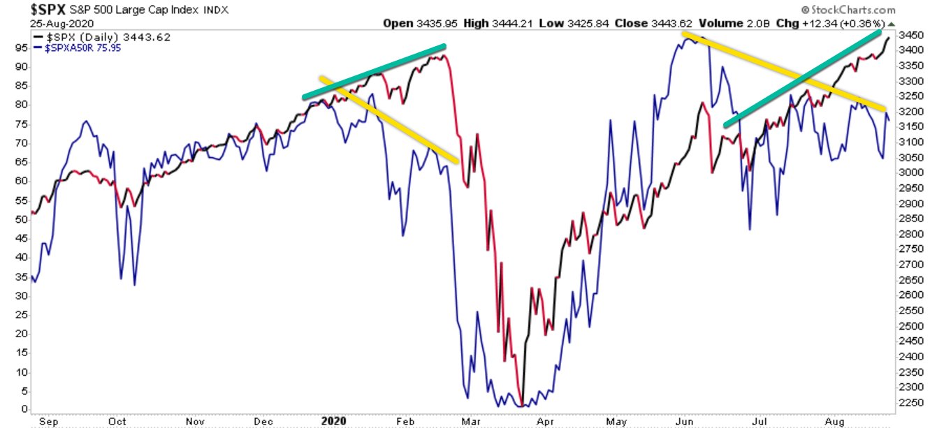
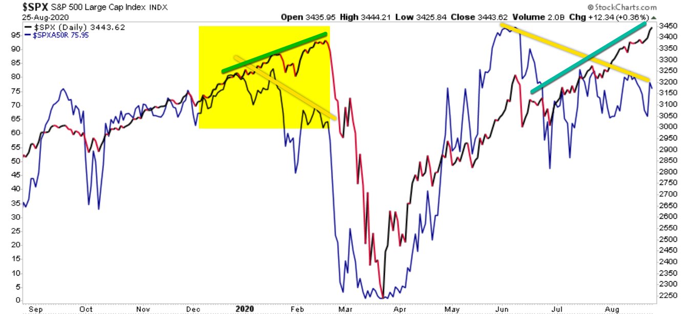


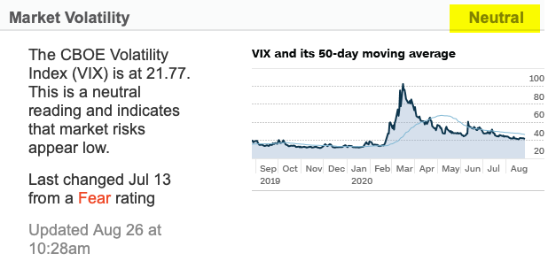
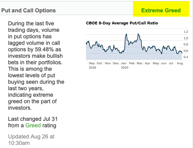
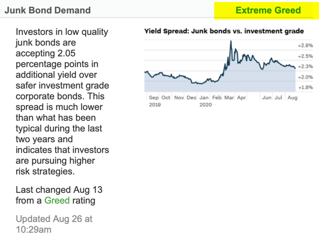
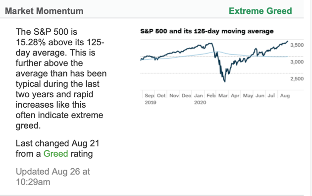
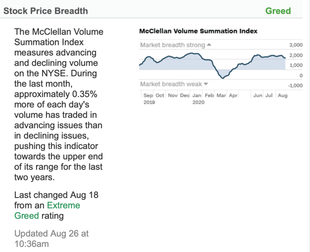
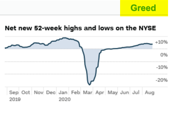
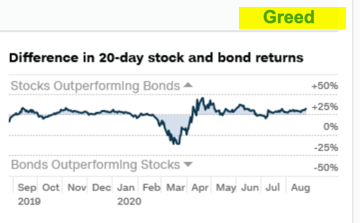
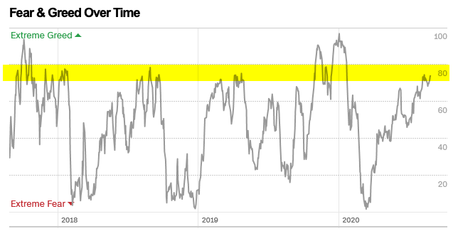


You must be logged in to post a comment.