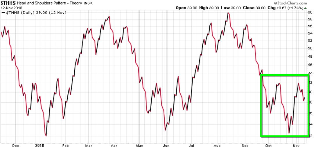
Someone texted me this image this morning.
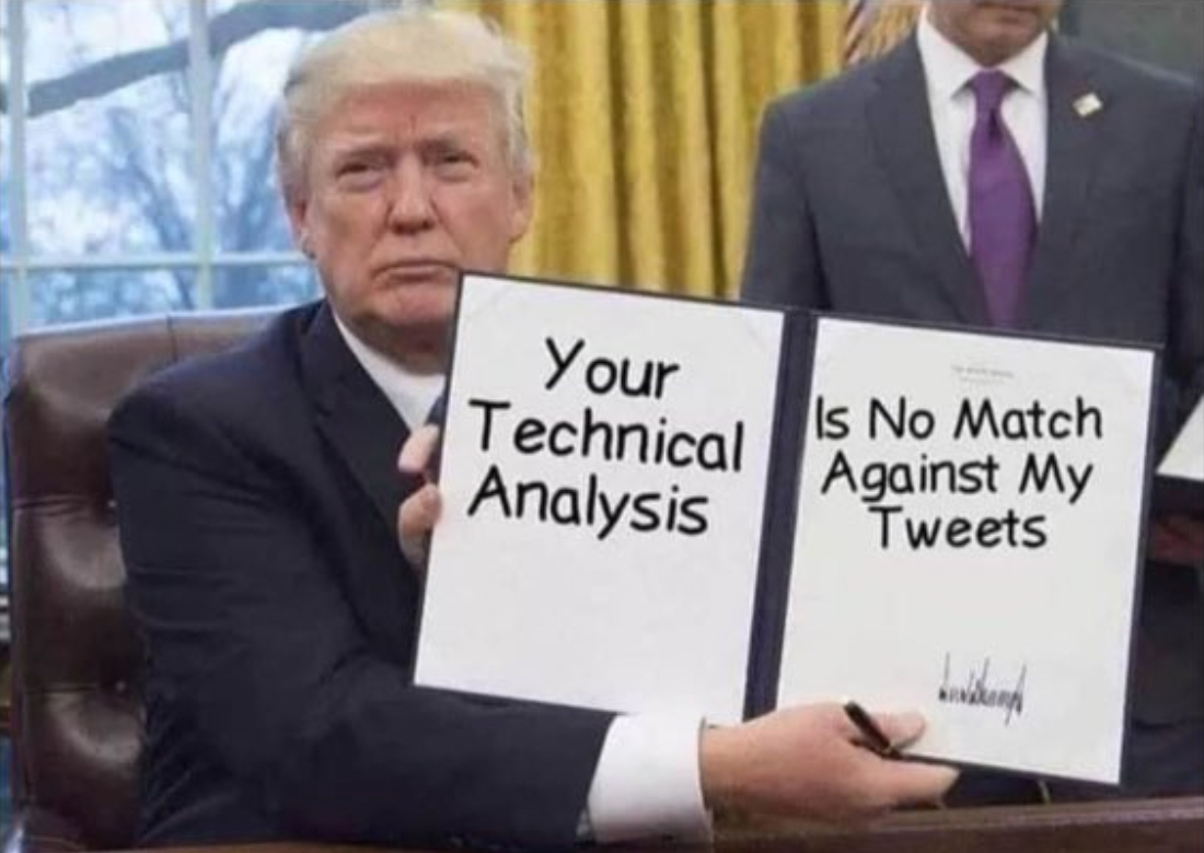
Now that’s funny right there; I don’t care who you are!
But seriously though, many people like to blame others for their reality. Most of the time, the market does what it does, and something or someone always gets the blame for it – besides them.
It’s an easy way for them to be right. It wasn’t them and their risk exposure that was wrong, it was someone else like the President, or the Fed, or the machines.
I ignore the nonsense and focus on price trends. I focus on the facts.
Yes, I call it technical analysis of price trends, as it has been called for decades.
But, just like we are now seeing trading firms call computerized quantitative trading systems more trendy names like “artificial intelligence” and “machine learning” or “pattern recognition”, others have renamed technical analysis “quantitative analysis”
The trend seems to be driven by those who write research papers, books, and such.
To be sure, an example is a disclosure I saw in an SEC Form ADV registration document. In Methods of Analysis, Investment Strategies, and Risk of Investment Loss, the first lists: Quantitative analysis and Fundamental analysis, but not Technical analysis. I’m going to fictitiously call this firm “QUANT”.
QUANT will primarily utilize Quantitative analysis but may also use other analysis methods, including Fundamental analysis as needed.
Quantitative analysis involves the analysis of past market data; primarily price and volume.
Fundamental analysis involves the analysis of financial statements, the general financial health of companies, and/or the analysis of management or competitive advantages.
Investment Strategies QUANT will utilize long term trading and short term trading strategies.
Under Material Risks Involved, it goes on to say:
Methods of Analysis
Quantitative analysis attempts to predict a future stock price or direction based on market trends. The assumption is that the market follows discernible patterns and if these patterns can be identified then a prediction can be made. The risk is that markets do not always follow patterns and relying solely on this method may not work long term.
Fundamental analysis (I’m skipping this irrelevant part for brevity)
Investment Strategies
Long term trading is designed to capture market rates of both return and risk. Frequent trading, when done, can affect investment performance, particularly through increased brokerage and other transaction costs and taxes.
Short term trading generally holds greater risk and clients should be aware that there is a material risk of loss using any of those strategies.
Investing in securities involves a risk of loss clients should be prepared to bear.
What’s the big deal?
It isn’t a big deal, but, let’s change a single word to see what happens.
Let’s replace “Quantitative” with “Technical” and see if it fits the same.
Technical analysis attempts to predict a future stock price or direction based on market trends. The assumption is that the market follows discernible patterns and if these patterns can be identified then a prediction can be made. The risk is that markets do not always follow patterns and relying solely on this method may not work long term.
Yes, that’s the definition used for Technical analysis.
The point is, they just didn’t want to call it “Technical analysis” because “Quantitative analysis is more trendy in modern times.
But, it’s the same.
I don’t debate others hoping to change their minds, but instead, I do mull over what others believe to see how it may be in conflict with what I believe. By doing that, it allows me to question my own beliefs to see if there is enough evidence to change what I believe. I do that to combat what we are all more prone to do, which is seek out information that confirms what we already believe and ignore information that says it isn’t true. Humans have the tendency to interpret new evidence as confirmation of one’s existing beliefs or theories. If we want to gain new knowledge, we have to consider we may be wrong and apply a scientific approach to discover new knowledge.
Confirmation bias is the tendency to search for, interpret, favor, and recall information in a way that affirms one’s prior beliefs or hypotheses. It is a type of cognitive bias and a systematic error of inductive reasoning.
We have to be careful of looking for information that reinforces what we already believe, without considering what could be wrong about our beliefs.
It’s reverse-engineering.
I try to break it to see if it will break and what makes it break.
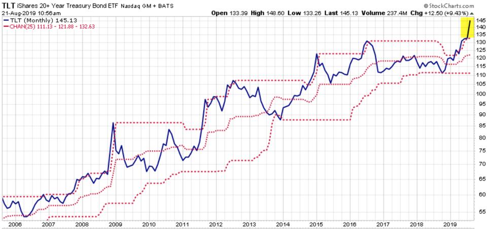
…and speaking of Technical Analysis, Long Term U.S. Treasury Bond ETF TLT has been in a volatility expansion, on the upside. Demand has driven its price momentum up to levels historically seen during larger stock market declines. The price is now outside the upper price channel. You can probably observe what it typically does afterward.
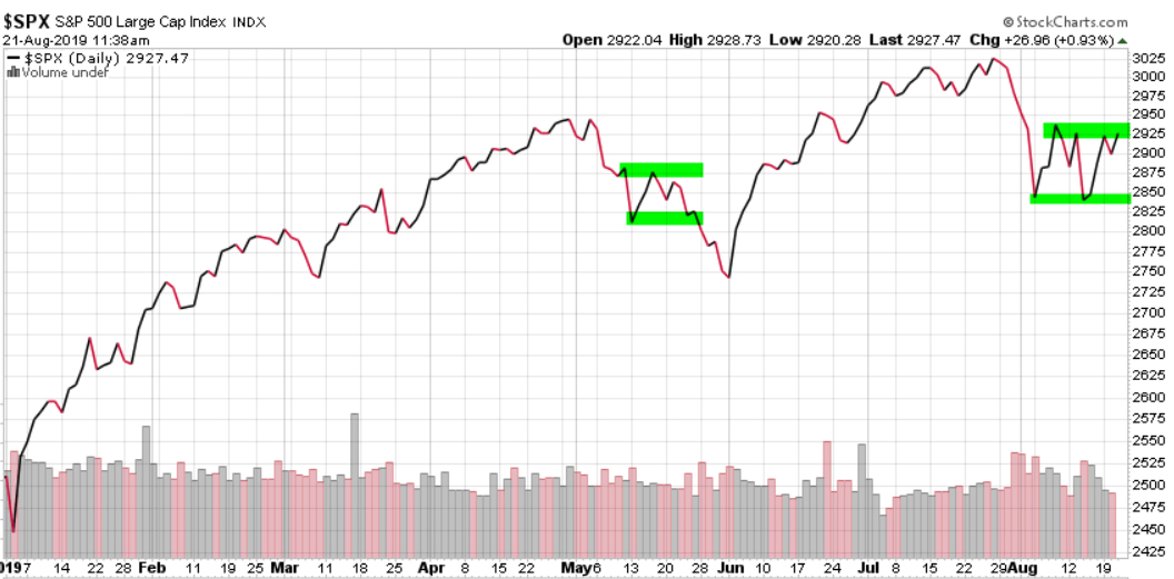
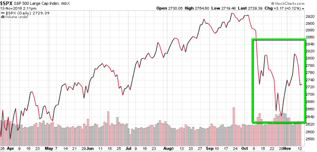
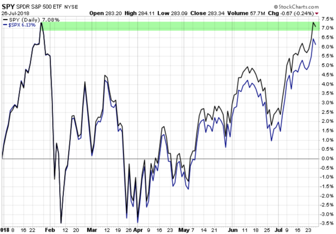
Technical Analysis of the S&P 500 index price trend: it looks to me like we’re about to observe a breakout in one direction or the other. The last time, in May, the breakout was to the downside. This time may be different. See the first image above for risk disclosure of what may go wrong — or at least who may be blamed for it 🙂
Technical Analysis of VIX: the volatility expansion has now contracted from 25 to 15. So, the options market now expects the range to be within 15% instead of 25%.
We’ll see if vol expectations continue to drift down, or spike back up.
Ps. I didn’t provide any evidence of my political beliefs. If anyone took anything from the above as a sway one way of the other, they are joking themselves as I am joking with them. I focus on the facts. We can’t blame any single thing or any one person on the direction of stock market trends and if anyone does so, they are joking themselves.
We can say the same for calling Technical analysis Quantitative analysis, believing by changing the word, it means something different.
It doesn’t.
I say believe and do whatever creates asymmetric investment returns for you.
But as Larry the Cable Guy says:
Now that’s funny right there; I don’t care who you are!
Mike Shell is the Founder and Chief Investment Officer of Shell Capital Management, LLC, and the portfolio manager of ASYMMETRY® Global Tactical.
Mike Shell and Shell Capital Management, LLC is a registered investment advisor and provides investment advice and portfolio management exclusively to clients with a signed and executed investment management agreement. The observations shared on this website are for general information only and should not be construed as advice to buy or sell any security. Securities reflected are not intended to represent any client holdings or any recommendations made by the firm. Investing involves risk, including the potential loss of principal an investor must be willing to bear. Past performance is no guarantee of future results. All information and data is deemed reliable, but is not guaranteed and should be independently verified. The presence of this website on the Internet shall in no direct or indirect way raise an implication that Shell Capital Management, LLC is offering to sell or soliciting to sell advisory services to residents of any state in which the firm is not registered as an investment advisor. Use of this website is subject to its terms and conditions.

You must be logged in to post a comment.