Category Archives: Sector ETF
Are Growth Sectors Technology, Consumer Cyclicals, and Communication Services more Undervalued than Value?
Growth sectors like technology, consumer cyclical, and communications have seen the brunt of the selling this year, and growth is now more “undervalued” than value sectors per CFRA.
According to CFRA: Stocks are ranked in accordance with the following ranking methodologies. Qualitative STARS recommendations are determined and assigned by equity analysts, with 5 being the highest rating.

But as stated in Fundamental Valuation: Is the Stock Market Cheap or Expensive? undervalued stocks can get much more undervalued (prices fall more) in a recessionary bear market.
Risk management is essential in bear markets.
For example, the S&P 500 is down about -23% so far and needs a 30% gain to get back to the prior high.
Mike Shell is the Founder and Chief Investment Officer of Shell Capital Management, LLC, and the portfolio manager of ASYMMETRY® Managed Portfolios. Mike Shell and Shell Capital Management, LLC is a registered investment advisor focused on asymmetric risk-reward and absolute return strategies and provides investment advice and portfolio management only to clients with a signed and executed investment management agreement. The observations shared on this website are for general information only and should not be construed as investment advice to buy or sell any security. This information does not suggest in any way that any graph, chart, or formula offered can solely guide an investor as to which securities to buy or sell, or when to buy or sell them. Securities reflected are not intended to represent any client holdings or recommendations made by the firm. In the event any past specific recommendations are referred to inadvertently, a list of all recommendations made by the company within at least the prior one-year period may be furnished upon request. It should not be assumed that recommendations made in the future will be profitable or will equal the performance of the securities on the list. Any opinions expressed may change as subsequent conditions change. Please do not make any investment decisions based on such information, as it is not advice and is subject to change without notice. Investing involves risk, including the potential loss of principal an investor must be willing to bear. Past performance is no guarantee of future results. All information and data are deemed reliable but are not guaranteed and should be independently verified. The presence of this website on the Internet shall in no direct or indirect way raise an implication that Shell Capital Management, LLC is offering to sell or soliciting to sell advisory services to residents of any state in which the firm is not registered as an investment advisor. The views and opinions expressed in ASYMMETRY® Observations are those of the authors and do not necessarily reflect the position of Shell Capital Management, LLC. The use of this website is subject to its terms and conditions.
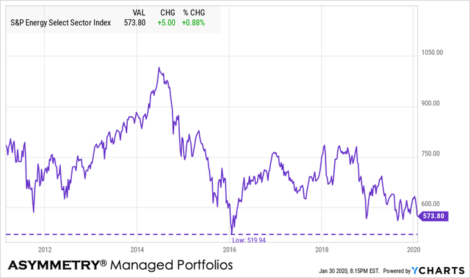
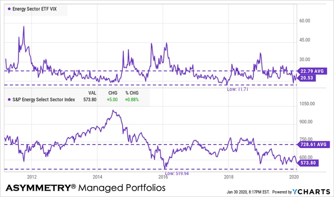
Energy and MLP’s are the most oversold sector
The energy sector is the most oversold so far.
By oversold, I mean a condition where there has been enough selling pressure to drive prices down to low enough levels which overextended or excessive on a short-term basis, suggesting the downtrend could be an overreaction. When price trends overreact in the short-term by moving potentially too far, too fast, the trend becomes likely to reverse back up, at least temporarily. Afterward a countertrend back up, however, a short-term oversold trend may later reverse down again in continuation of a downtrend. So, observing a short-term oversold condition may not result in a long-term trend reversal up, but instead, my increase the odds of a short-term retracement. In the chart below of the energy sector index, we see an overall downtrend since the price on the left side is higher than the right a year later, however, we also observe the price swings along the way, which are shorter-term overbought/oversold countertrends.
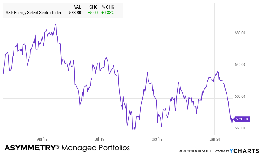
Energy sector is -43% from its early 2014 high.
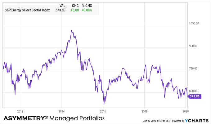
Energy sector is almost near its 2016 low.
Energy implied volatility is relatively low and below average.
Alerian MLP energy index is at a new low
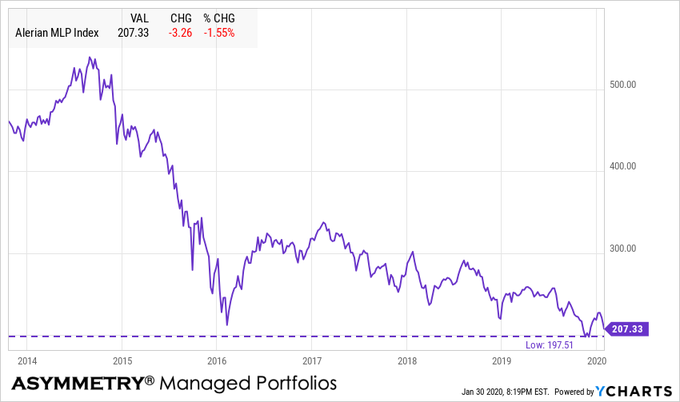
With the energy sector momentum signaling its price trend may have dropped too far, too fast, the dividend yield on the MLP index is at its high post-2016 at over 9%.

As the price falls, the dividend rises from that starting point, so it’s the one time we apply countertrend systems to capture future income from dividends. I wouldn’t be surprised to see the energy sector catch some buying enthusiasm soon if the overall stock market can hold up. Sometimes the weakest sectors show strength even as other sectors fall. Of course, the risk of a falling trend is it may keep falling and they can trend down far more than expected. The trouble is, when a trend does fall more than expected, it results in serial correlation; prices keep falling because, well, prices are falling! Waterfall declines are contagious, so you can probably see the ‘risk premium’ involved in this high dividend yield. There is no free lunch and nothing is without risks. I deal with risks by managing them through predefined exits, drawdown controls, and hedging.
So, I probably enter and exit a more global opportunity set of markets than most do since the risk for me is how I define it and how the position is structured, not the security itself.
I’m off to the Super Bowl in the morning! Unfortunately, my Tennessee Titans didn’t make it and my Tampa Bay Bucs didn’t come close, but I’ll be there anyway.
Mike Shell is the Founder and Chief Investment Officer of Shell Capital Management, LLC, and the portfolio manager of ASYMMETRY® Global Tactical. Mike Shell and Shell Capital Management, LLC is a registered investment advisor in Florida, Tennessee, and Texas focused on asymmetric risk-reward and absolute return strategies and provides investment advice and portfolio management only to clients with a signed and executed investment management agreement. The observations shared on this website are for general information only and should not be construed as advice to buy or sell any security. Securities reflected are not intended to represent any client holdings or any recommendations made by the firm. Any opinions expressed may change as subsequent conditions change. Do not make any investment decisions based on such information as it is subject to change. Investing involves risk, including the potential loss of principal an investor must be willing to bear. Past performance is no guarantee of future results. All information and data are deemed reliable but is not guaranteed and should be independently verified. The presence of this website on the Internet shall in no direct or indirect way raise an implication that Shell Capital Management, LLC is offering to sell or soliciting to sell advisory services to residents of any state in which the firm is not registered as an investment advisor. The views and opinions expressed in ASYMMETRY® Observations are those of the authors and do not necessarily reflect a position of Shell Capital Management, LLC. The use of this website is subject to its terms and conditions.
Divergence between Value, Growth, and Momentum.
There is an interesting divergence today between Momentum, Growth, and Value.

Up until now, Value has lagged Growth and Momentum, as seen in this 5-year chart.

The underperformance of Value has been a topic of conversation of hedge fund managers I know who are Value investors.
Three-month momentum shows Value is trending up.

I believe styles like Growth vs. Value are largely driven by sectors, which is why I tend to focus more on the more granular sectors rather than broader styles. Today we see the relative strength is in Energy and Financials, which have been the lagging sectors lately.

So, this may not be enough to say the trend is changing to a period where Value outperformance growth for years, but it’s at least enough to be aware.
At some point, Value will take over leadership and when it does, it may continue for years.
For now, exposure to Value, including high dividend-paying stocks like we have, is having a good day while other factors are not.
Mike Shell is the Founder and Chief Investment Officer of Shell Capital Management, LLC, and the portfolio manager of ASYMMETRY® Global Tactical.
Mike Shell and Shell Capital Management, LLC is a registered investment advisor focused on asymmetric risk-reward and absolute return strategies and provides investment advice and portfolio management only to clients with a signed and executed investment management agreement. The observations shared on this website are for general information only and should not be construed as advice to buy or sell any security. Securities reflected are not intended to represent any client holdings or any recommendations made by the firm. Any opinions expressed may change as subsequent conditions change. Do not make any investment decisions based on such information as it is subject to change. Investing involves risk, including the potential loss of principal an investor must be willing to bear. Past performance is no guarantee of future results. All information and data is deemed reliable, but is not guaranteed and should be independently verified. The presence of this website on the Internet shall in no direct or indirect way raise an implication that Shell Capital Management, LLC is offering to sell or soliciting to sell advisory services to residents of any state in which the firm is not registered as an investment advisor. Use of this website is subject to its terms and conditions.
Sector SPDRs are subject to risk similar to those of stocks including those regarding short selling and margin account maintenance. All ETFs are subject to risk, including possible loss of principal. Sector ETF products are also subject to sector risk and non-diversified risk, which will result in greater price fluctuations than the overall market.
The normal noise of the market?
We shouldn’t be surprised to see stock prices pull back closer to their average true range in the days ahead. Such a pullback or stall would be normal.
Below I highlight the strong momentum Technology sector XLK ETF as an example of stock prices in some sectors finally reaching their prior highs. In addition to the price trend reaching a point of potential overhead resistance at the prior high, we observe this trend is also outside the upper volatility band of average true range.

Most of the time, we should expect to see a price trend stay within this range. If a price trend breaks out of the range higher or lower, it can be evidence of a trend change. In this case, the short term trend has been up since January, the intermediate trend has been sideways, non-trending and volatile since last September. Sine the short term trend has been an uptrend since January, I view the upside breakout above the volatility band a signal the trend may be more likely to pull back within the channel range.
The broad stock market S&P 500 index ETF SPY doesn’t look a lot different than the Technology sector, except it’s about -2% away from reaching its September 2018 high.

The bottom line is, looking at the directional price trends they are up in the short term but reaching a point they could see some resistance from the prior highs. At the same time, my momentum systems suggest the trends are reaching an overbought level and the price and expanded outside their average true range channel.
A small short-term pullback in stock prices from here would be within the range I consider normal noise of the market.
Mike Shell is the Founder and Chief Investment Officer of Shell Capital Management, LLC, and the portfolio manager of ASYMMETRY® Global Tactical.
Mike Shell and Shell Capital Management, LLC is a registered investment advisor and provides investment advice and portfolio management exclusively to clients with a signed and executed investment management agreement. The observations shared on this website are for general information only and are not specific advice, research, or buy or sell recommendations for any individual. Investing involves risk including the potential loss of principal an investor must be willing to bear. Past performance is no guarantee of future results. All information provided is deemed reliable, but is not guaranteed and should be independently verified. The presence of this website on the Internet shall in no direct or indirect way raise an implication that Shell Capital Management, LLC is offering to sell or soliciting to sell advisory services to residents of any state in which the firm is not registered as an investment advisor. Use of this website is subject to its terms and conditions.
FAANG Stocks and Momentum Trends
Markets trend in cycles and trends come and go like seasons from spring to summer to fall to winter. I like to observe a range of price trends and behavioral trends from short term to very long term secular trends.
In the 1960s and 1970s, it was the Nifty 50. The Nifty 50 were 50 stocks institutional investors admired.
The Nifty 50 stocks got their reputation during the bull market of the 1960s and early 1970s. They were considered “one-decision” stocks because investors were told they could buy and hold the shares forever. Nifty 50 stocks included IBM, General Electric (GE), and Coca-Cola (KO). Some of the Nifty 50 have had problems the past decade, like Xerox and Polaroid. More recently, we can add General Electric to not so nifty list.
The secular bear market of the 1970s started with the 1973–74 stock market crash and lasted until 1982. Valuations of the Nifty 50 fell to low levels along with the rest of the stock market. Most of the Nifty 50 lagged the stock market indexes and then they weren’t so popular afterward. Trends can be fads and come and go, but the one thing we see driving fads in the stock market is their actual price trend. Stocks are loved at all-time highs, not so much after they decline.
Below are three of the better Nifty Fifty stocks. Buying and holding the stocks would require tremendous patience and acceptance of volatility and large drawdowns. Coca-Cola had the best momentum overall. But, who could have held through the drawdown from the late 1990s that lasted a decade? How about Xerox?

Below are the % off high drawedowns of these “Blue Chips.” A -50% more decline that lasts for years is something an investor would have to tolerate more than once to own the stocks long term. This is why buy and hold investing doesn’t work for most investors.

Then in the 1990s, it was the tech stocks especially those involved in the Internet. More specifically, the “.com” stocks was a whole new level of popularity and euphoria. The overall stock market reached its highest valuation levels, ever. Most of the .com stocks no longer exist. Some of the technology stocks involved in building the infrastructure still do, like Cisco (CSCO), Microsoft (MSFT), Oracle (ORCL), and Qualcomm (QCOM). But, many of the momentum stocks of the 1990s aren’t around to see their charts.

If investors only focused on is the right side of the chart, those several thousand percent gains look exciting. But, in the real world, even a -20% decline in the stock indexes as we saw in 2018 causes investor fear and panic selling. The investors holding the above stocks would probably need to be asleep at the wheel to have held them long term.
Looking at the total return alone isn’t sufficient, so I like to observe what I call the ASYMMETRY® Ratio, which is the total return chart above along with the drawdown. The ASYMMETRY® Ratio gives us a full picture of the asymmetric risk-reward if there is one. Clearly, the downside drawdowns were brutal by any measure. Maybe even more brutal than the Nifty 50.

Those are the momentum trends of the past.
Today we have the FAANG stocks. It stated as FANG and has since extended to FAANG. The FAANG stocks are Facebook (FB), Apple (AAPL), Amazon (AMZN), Netflix (NFLX), and Google (GOOG). They have been some of the most popular momentum stocks and for good reason. These are some of todays greatest companies. Who can imagine Netflix going away today? Who could have imaged online Netflix taking out Blockbuster? Who can imagine Amazon eventually taking out Netflix? What if Walmart (WMT) or Target (TGT) figure out a way to compete with both? The reality is, there is probably some small company out there we don’t know about that will be the next big winner. We don’t have to attempt to find the needle in the haystack, we can just focus on the price trends and they’ll show up eventually.
I shared my observations in FANG Stocks were the Leaders but now the Laggards so I won’t rehash it. My mission here is a short term update.
So far in 2019, all of the FAANG stocks are trending up except for Apple (AAPL). Only one of the FAANG stocks have had stronger momentum than the First Trust Dow Jones Internet ETF (FDN) which is a more diversified version of FAANG type internet industry stocks. The clear leader has been Netflix (NFLX). Here is a chart over the past month:

The ASYMMETRY® Ratio looking at the total return vs. % off high drawdown gives us a better picture of asymmetric risk-reward. Below is their total returns over the past year.

The FAANG stocks clearly have their downside risks and all of them are in drawdowns as we see below. However, they are recovering and the diversification of the ETF helped reduce its drawdown relative to the individual stocks.

We’ll see if the FAANG stocks resume their prior momentum we’ve seen over the past several years.
Mike Shell is the Founder and Chief Investment Officer of Shell Capital Management, LLC, and the portfolio manager of ASYMMETRY® Global Tactical.
The observations shared on this website are for general information only and are not specific advice, research, or buy or sell recommendations for any individual. Investing involves risk including the potential loss of principal an investor must be willing to bear. Past performance is no guarantee of future results. The presence of this website on the Internet shall in no direct or indirect way raise an implication that Shell Capital Management, LLC is offering to sell or soliciting to sell advisory services to residents of any state in which the firm is not registered as an investment advisor. Use of this website is subject to its terms and conditions.
An exhaustive stock market analysis… continued
I guess An exhaustive analysis of the U.S. stock market wasn’t exhaustive enough, because I now have a few things to add.
First, since the financial news media, as well as social media like Twitter, is so bearish with all kinds of narratives about why the stock market is falling, I’ll go ahead and discuss it here. This observation will not be complete without first reading An exhaustive analysis of the U.S. stock market so you know where I am coming from. If you haven’t read it already, I would before continuing so you understand the full context.
It is the financial news media’s business to report new information. We all know that if they want to get people to tune in, the fastest way is to provide provocative and alarming headlines and commentary. So, we shouldn’t be surprised to see distressing news.
There are always many reasons for the stock market to trend up or down. It isn’t hard to write some narrative attempting to explain it. The reality is, there are all kinds of causes that create an effect. None of them alone drive price trends. Ultimately, what drives price trends is behavior and sentiment which drives supply and demand. Behavior and investor sentiment may be impacted by the news and what people decide to believe.
I often say “what you believe is true, for you” even if it isn’t actually true. A person’s beliefs could be completely wrong and could be scientifically disproven, but if they still believe it, it’s their truth, so it’s true – for them. So, whatever you choose to believe is going to be your truth, so I suggest weighing the evidence to determine the truth if you want it to be more accurate. In science, we can’t prove the truth to be true, we can only disprove it as untrue.
Let’s look at some truths that I believe to be true based on empirical observation of facts.
The biggest news headline is probably the government shutdown. There have been twenty U.S. government shutdowns over the budget since 1976 by both political parties. Half of the time it was followed by stock gains and half the time declines. The average result is -0.40% and the median is 0%. So, historically a government shutdown hasn’t seemed to drive prices. Below is the table. It is what it is.

Yesterday evening Steven Mnuchin, the 77th Secretary of the Treasury, tweeted a note that he had called the nations six largest banks to confirm they have ample liquidy for consumer and business lending and other market operations. The words “Plunge Protection Team” started trending in social media. Much of the response has been negative, which seems odd to me.
Since when was doing “channel checks” not a good idea?
It seems not doing it would be imprudent…
There are many things going on all over the world all the time, so we can always find narratives to fit the price trend and believe it’s the driver. Narratives and news also seem to drive more emotional responses since people like to hear a story. I focus on the data, which is the price action. Whatever is driving the markets is reflected in the price trend. The price trend is the final arbiter. Nothing else matters.
The Morningstar table of index performance shows the 2018 total return of large, mid, small cap stocks along with growth, value, and blend.

The most popular broad-based indexes like the S&P 500 and Dow Jones Industrial Average show 2018 is ending just the opposite of the way it started.

Let’s look at some price trends.
Yesterday I shared the Bullish Percent measures on the broad stock market indexes and each individual sector. We observed the percent of stocks in all sectors except for the Utility sector was already at historical lows after previous market declines. After today’s price action, we have some updated observations to explore.
The S&P 500 is in a bear market, commonly defined as a -20% decline from a prior price peak. What is most interesting is how fast it reached -20%. In the chart below, I included the S&P 500 Total Return Index (including dividends), the S&P 500 Index price only, and the S&P 500 ETF (SPY). On a total return basis, the S&P 500 Total Return Index that includes no costs or fees didn’t quite close down -20% from its high, but the rest did. It’s close enough.

Though the stock indexes had declined -10% earlier this year, they had recovered to new highs by September and it appeared the primary uptrend would resume. Starting in October, the stock market declined again and attempted to recover twice in November. What came next was probably most shocking to those who follow market seasonality; the stock indexes are down over -15% in the month of December, which is historically one of the strongest months of the year. It seems this decline happening so fast and at the end of a calendar year is going to make it seem more significant. Because it’s at year end it results in a “down year” instead of having time to recover during the normally seasonally strong period after October. The period from November to April historically has stronger stock market gains on average than the other months. Not this year.
The Utility sector reverses down to participation in the market decline.
Yesterday I had highlighted the top range of the Bullish Percent chart in yellow to mark the high-risk zone above 70%. After today, the Utilities sector has declined below that range. Individual Utility stocks are now participating in the stock market decline.

The Utilities sector ETF declined over -4% today and is now slightly down for the year.

During significant market declines, diversification sometimes isn’t the crutch it is promoted to be by most of the investment industry. Broad asset allocation and diversification do not assure a profit or protect against a loss in a declining market. In declining markets, we often see price trends cluster more as serial correlation. That is, prices begin to fall more just because they are falling. Investors sell because prices are falling. So, stocks, sectors, and markets can all become highly correlated to the downside. By the end of a market decline, all stocks, sectors, and markets are often participating.
The upside is, this panic selling is capitulation as the final weak holders stop resisting and begin to “sell everything!” We eventually see the selling dry up and buyers step in with enthusiasm at lower prices.
In the big picture, as I said in An exhaustive analysis of the U.S. stock market I guess we shouldn’t be surprised to see prices falling with greater velocity since this is an aged bull market at high valuations and the same Fed actions that probably drove it up are probably going to reverse it in a similar fashion. I started this year warning of complacency from the 2017 low volatility uptrend and the potential for a volatility expansion. I also pointed out during the stock market peak in September that volatility had contracted to a historically very low level in VIX shows the market’s expectation of future volatility. Specifically, on September 25th I wrote,
“Looking at the current level of 12 compared to history going back to its inception in 1993, we observe its level is indeed near its lowest historical low.”
I ended it with;
“When the market expects volatility to be low in the next 30 days, I know it could be right for some time. But, when it gets to its historically lowest levels, it raises situational awareness that a countertrend could be near. It’s just a warning shot across the bow suggesting we hedge what we want to hedge and be sure our risk levels are appropriate.”
Well, that has turned out to be an understatement I guess.
What’s more important is what I actually did. On August 23th as the stock market began to appear overbought on a short-term basis, I took partial profits on our leading momentum stock positions. In hindsight, it would have been better to sell them all. By September 26th (when I wrote the above) I had reduced our exposure to only around 30% stocks and the rest in Treasury bonds. It still didn’t turn out perfectly as the stocks we did hold declined, too, and in many cases even more than the stock indexes. As we entered October, I shared a new observation “Here comes the volatility expansion” as stock prices fell and volatility increased. As prices fell to lower and lower levels, I started adding more exposure. At this point, prices have broadly become more and more extremely “oversold” and sentiment has become more negative. This has been a hostile period for every strategy, but I’ve been here before.
By the way, I have been a tactical portfolio manager for over twenty years now. The highlight of my performance history has been the bear markets. I executed especially well in the October 2007 to March 2009 period when the S&P fell -56%. My worst peak to trough drawdown during that period was only -14.3% and I recovered from it about six months or so later. That was compared to a -56% drop in the stock index that took several years to recover. In fact, I did so well at a time when very few did that it was almost unbelievable, so I had my performance verified by a third party accountant. I have considered writing about it and sharing the commentaries I wrote during the period and the tactical decisions I made. Make no mistake, it wasn’t easy nor was it pleasant. I didn’t lose the money others did, so I was in a position of strength, but it was still a challenging time. What I will tell you is I entered and exited various positions about seven or eight times over that two year period. We never know in advance when the low is in, or when a trend will reverse back down. Buy and hold investors just take the beating, I entered and exited hoping the average gain exceeds the average losses. The swings are the challenge. It takes great discipline to do what needs to be done. Most people had very poor results, for me to create good results, I necessarily had to feel and do the opposite of most people. The market analysis I’m sharing here as observations aren’t necessarily the exact signals I used to enter and exit, but they are part of the indicators I monitored during the crash. Every trend is unique. We have no assurance my methods will do as well as in the past. But, the one thing I feel confident in is I’ve been here before. This ain’t my first rodeo. I know what I’m doing and I’m disciplined in my execution. That’s all I can do. I’m dealing with the certainty of uncertainty, so I can’t guarantee I’ll do as well the next time around, but I am better prepared now than I was then.
So bring it. Get some. I’m ready.
Yesterday I shared the extreme levels of Bullish Percent indicators for the broad market and sectors as well as other indicators like the Put/Call Ratios. I want to add to these observations with more indicators reaching an extreme. I’ve not seen these extremes since 2008 and 2009.
The Nasdaq has declined the most which is no surprise since it’s mostly emerging companies and heavily weighted in Technology. Market conditions have pushed the number of Nasdaq stocks hitting new lows to over 1,100 as of last week. Since the total number of Nasdaq issues is about 3,200 that has caused the value, in percentage terms, to jump to over 30% of the total. As you can see, the last time this many Nasdaq stocks hit new lows was the October 2008 low and the March 2009 low. The current level has exceeded other corrections since then and even the “Tech Wreck” after 2000. At this point, it becomes a contrarian indicator.

To no surprise, the same trend is true for NYSE stocks. As of last week, the percent of stocks listed on the New York Stock Exchange at new lows has reached the levels of past correction lows, but not as high as the 2008 period.

From here, I’ll share my observations of the relative strength and momentum of the sectors and stocks within them so we can see how oversold they have become. We already looked at the Bullish Percent of each sector yesterday, this is just more weight of the evidence.
First, I applied the Relative Strength Index to the S&P 500 daily chart. This RSI is only 14 days, so it’s a short-term momentum indicator that measures the magnitude of recent price changes to estimate overbought or oversold conditions. RSI oscillates between zero and 100, so it’s range bound and I consider it overbought above 70 and oversold below 30. Below we see the current level of 19 is very low over the past twenty years and is at or below the low level reached during past shorter-term market bottoms. However, we also see during prolonged bear markets like 2000 to 2003 and 2007 to 2009 it reached oversold conditions two to three times as the market cycles up and down to a lower low.

Zooming out from the daily chart to the weekly chart, we see the extremes more clearly and this is one of them. On a weekly basis, this oversold indicator is as low as it’s been only at the low points of the last two major bear markets.
s
Zooming out one more time from the weekly to the monthly chart, we observe a monthly data point only highlights the most extreme lows. It’s the same data but ignores the intra-month data. On a monthly basis, the current measure isn’t as low as it reached at the bear market lows in March 2009 or October 2002. For it to reach that level, I expect the green area I highlighted in the price chart to be filled. In other words, this suggests to me if this is a big bear market, we could ultimately see the price trend decline to at least the 2015 high. It only takes about -10% to reach that level. However, as we saw in the shorter term readings, if history is a guide, it would most likely cycle back up before it would trend back down.

You can probably see why I stress that longer-term price trends swing up and down as they unfold. Within a big move of 50%, we see swings around 10 – 20% along the way.
Let’s continue with this same concept to see how each sector looks. The broader indexes are made of the sectors, so if we want an idea of the internal condition of the broader market it is useful to look at each sector as I did yesterday with the Bullish Percent indexes.
Since we just had a -15% correction in August 2015 and January 2016, we’ll just focus on the daily RSI looking back four years to cover that period. Keep in mind, none of this is advice to buy or sell any of these sectors or markets. We only provide advice and investment management to clients with an executed investment management agreement. This observation is for informational and educational purposes only.
The Consumer Discretionary sector is as oversold as it’s been at historically low price points. A trend can always continue down more and stay down longer than expected, but by this measure, it has reached a point I expect to see a reversal up.

The price trend of Consumer Staples that is considered to be a defensive sector initially held up, but then the selling pressure got to it. It’s oversold as it’s been at historical lows.

The Energy sector has declined the most in 2018 and is oversold similar to prior price trend lows. We can see the indicator isn’t perfect as a falling trend sometimes reverses up temporarily, then trends back down to a lower low only to get oversold again. We’ll observe this same behavior at different times in each sector or market.

The Financial sector is deeply oversold to the point it has reached at prior lows. Any market could always crash down more, but Financials have reached a point we should expect to see at least a temporary reversal up.

Healthcare is a sector that isn’t expected to be impacted by the economy, but it has participated in the downtrend. It’s also reached the oversold point today. You can see what happened historically after it reached this level. If history is a guide, we should watch for a reversal.

The Industrial sector is trending down but has now reached a point we could see a reversal back up.

Clearly, the market decline has been broad as every sector has participated. The Materials sector reached the oversold level today.

Real Estate has not been spared during the selloff. It has now reached an oversold level normally seen at lows, but historically it’s cycled up and down a few times before reversing up meaningfully. That can be the case for any of them.

The Technology sector had been one of the best-looking uptrends the past few years. It’s now oversold after today’s action.

Up until today, the Utility sector was the lone survivor, but it was one of todays biggest losers. It’s falling so sharply so fast it’s now oversold with the other sectors.

After prices have declined, I look for indications that selling pressure may be getting more exhausted and driving prices to a low enough point to attract buying demand. That’s what it takes to reverse the trend.
I’ve been here before. I’ve executed through these hostile conditions as a tactical operator. The more hostile it gets, the more focused in the zone I get. After the stock market has already declined, I start looking for this kind of panic selling and extreme levels for a countertrend. We’re seeing those levels now. Sure, it could get worse, but we have reached a point that lower prices are more and more likely to result in a reversal back up.
I’m just going to do what I do.
Have a Merry Christmas!
Mike Shell is the Founder and Chief Investment Officer of Shell Capital Management, LLC, and the portfolio manager of ASYMMETRY® Global Tactical.
The observations shared on this website are for general information only and are not specific advice, research, or buy or sell recommendations for any individual. Investing involves risk including the potential loss of principal an investor must be willing to bear. Past performance is no guarantee of future results. The presence of this website on the Internet shall in no direct or indirect way raise an implication that Shell Capital Management, LLC is offering to sell or soliciting to sell advisory services to residents of any state in which the firm is not registered as an investment advisor. Use of this website is subject to its terms and conditions.
An exhaustive analysis of the U.S. stock market
It’s a big task for me to use the word exhaustive when it comes to stock market analysis. Exhaustive is examining, including, or considering all elements or aspects; fully comprehensive. There is no way to consider all elements, but we can focus on how the price trends are actually trending and the behavior and sentiment that is driving the trend.
Many years ago a friend of mine once tried to debate me about what trend following is or is not. He argued that trend following is all lagging moving averages or breakouts. The more we discussed it, the more we both realized that isn’t true. What made us realize it was when I said:
A skillful trend follower wants to catch a trend early in its stage and capitalize on it until it ends.
That’s hard to argue against. Who would rather enter a trend later in its stage? Who wants to catch less of the trend? My point is: we should want to capture as much of a trend as possible and for me, that necessarily means I want to not only determine the direction of a trend but also observe when trends are likely to change direction.
I want to share this with you so you know where I’m coming from. My objective is all about ASYMMETRY®. For me, it’s all about asymmetric risk/reward. Asymmetric risk/reward is an expectation of average gains larger than average losses. It could be as simple as risking a loss of 10% for the potential to earn a gain of 20%. That’s an asymmetric payoff. If I did that with just a 50% probability, I would earn 5% on average. How much total return we would achieve over time would be controlled by how much capital I risk in each position. How much I risk in each position across the portfolio dictates my portfolio drawdown. The portfolio drawdowns relative to total return since inception creates an asymmetric risk/reward profile. So, everything I do involves ASYMMETRY® and that’s why it’s my trademark. As you read my observations you can probably see how I’m looking for exposure at lower risk levels and less exposure at higher risk levels and that can be counterintuitive. It can certainly go against investor sentiment and emotions at times.
Every decision we make is in the present moment. We can do nothing in the past. We can do nothing in the future. The only time we can do something is now, or not.
To get an understanding of an asymmetric risk/reward let’s look at an idealized situation. The chart below, unnamed because it doesn’t matter, is a price trend that gained over 100%. If your objective is an asymmetric payoff and you have perfect hindsight, what would be your best entry point?

Clearly, the price is trending from the lower left to the upper right, so the answer is the lowest price possible. As I said, in the real world we don’t know in advance the trend will continue, so we have to be willing to place our bet and let it unfold. When I enter a trend, I determine how much capital I’ll risk to see if it becomes an asymmetric payoff. If we were looking at the trend in 2016 with perfect hindsight, where would be the very best entry? Of course if would be the -15% dips in 2015 and 2016. The trouble is, as the price is falling sharply, it never seems there will be a catalyst to make the market trend back up. The news is always bad. Investor sentiment is very bearish. The sky is falling and all people want to do is duck for cover.
After trends have moved, I find it more productive to look for a change of trend.
After price trends up, I start looking for signs of a potential countertrend back down.
After prices have fallen, I start looking for signs of a potential countertrend back up.
What I do as a tactical portfolio manager is systematic rules-based. Although, it isn’t so mechanical that my computers are doing it all and executing trades. I am Man + Machine, not Machine – Man. I make no bones about it. I ultimately make tactical decisions that are informed by all of the proprietary systems I’ve developed over the past two decades. Some of my systems are more automated than others, but ultimately I am the portfolio manager.
So, when I share market analysis observations, this is something different than specific trading signals to enter and exit. Market analysis is something I do to gain insights from my observations.
Observations are the action or process of observing something carefully in order to gain information.
Insights are the capacity to gain an accurate and deep intuitive understanding of something.
Observations are “what is going on” and insights are “understanding what is going on.”
I can share my observations of what is going on, but I can’t necessarily give you the insight to understand it. Understanding is up to you. To gain an accurate and deep intuitive understanding of something you have to study it closely.
So, you can probably see why I believe it’s useful to do market analysis to get an understanding of the probabilities and possibilities. I do it by looking at the current price trend and where it’s been and more likely to go next.
Here we go.
I said this is going to be exhaustive, so I’m going to share my top down macro view of the U.S. stock market. I also do this for International stock markets, bonds, commodities, etc. but this is going to be focused on the U.S. stock market. However, I may throw in some relative comparisons of other markets to make a point. The top-down macro view is going to be in this order;
- Broad stock market index price trends and breadth
- Sectors within the stock market price trends and breadth
- Stocks within those sectors price trends and momentum
THE BIG PICTURE
The big picture is the overall long-term secular situation. In April I presented my big picture observations to a group of advisors. The two things I shared are:
- This is the longest bull market in history. At 9 years old, it’s very aged. The average length of a bull market is 4 to 5 years. Twice the average is aged by any measure.
- The Shiller PE Ratio was the second highest, ever. Only the 1999 bubble was higher. When the stock market is trading so expensive, we have to be prepared for the trend to reverse the other direction.
Below is a 20-year monthly chart of the S&P 500. I added the green highlight to show the current price is only -35% from the October 2007 high eleven years ago. Losses are asymmetric as they compound exponentially. Losses erode gains asymmetrically. For example, the price gain from the 2007 high to the current price is 56%, but it only takes -35% to decline back to that point. You may also consider the stock index is only 56% higher than its 2000 peak eighteen years ago.

In The REAL Length of the Average Bull Market I wrote: “Whether you believe the average bull market lasts 39 months, 50 months, or 68 months, it seems the current one is likely late in its stage at 54 months as of September 2013.” Yes, I was saying 5 years ago the trend seemed late stage – and it was. It just continued anyway, though was interrupted by two declines in the range of -15% in 2015 and 2016.
At the same time in late 2013, the Shiller PE Ratio was increasing to a very overvalued level. It only kept going higher. By January of this year, it reached 33x earnings, the second highest ever. In fact, the only two times it reached this extreme the stock market followed with the Great Depression crash and the -46% decline after 2000. After the current -18% decline in the S&P it is now down to 26.74. The median is around 15, secular bear markets often begin at 20 or higher, secular bull markets begin below 10.
The bottom line is:

I’m guessing the unprecedented Quantitative Easing of the Federal Reserve helped to push the valuations to an extreme. The Fed is now unwinding the QE and raising interest rates, which may be partly why we are seeing prices fall. So, we certainly can’t overlook the situational awareness that this could eventually become a much worse bear market to the -50% level. However, if it does, it will usually unfold with many swings up and down along the way. Falling prices are eventually followed by sharp countertrend moves up. It’s when we see lower highs and lower lows over time that it becomes more evident it’s a big bear market.
One thing that’s been talked about a lot lately is the risk of an inverted yield curve. An inverted yield curve is when the short-term 3-month interest rate is higher than the long-term 30-year interest rate. The yield curve hasn’t inverted like it did in December 2006 and August 2000. The yield curve doesn’t suggest a recession anytime soon.
Here’s what an inverted yield curve looks like… when it inverted December 2006. A year later, the stock market started its decline of over -56%.

Here is the inverted yield curve in August 2000. In 2000, the yield curve was more accurate as to timing. The broad stock market declined -50%.

The normal yield curve, 3 month vs 30 year, has not inverted. The long-term interest rate is higher than the short-term rate. For the yield curve to invert, the short-term interest rate will have to increase higher than the longer-term interest rate. Or, the long-term interest rate decrease below the short term. Either way, that hasn’t happened yet.

How big are the stock market losses in 2018?
Starting with a top-down view. First, the broad asset classes and styles like large, mid, small and value, growth, and blend using Morningstar Small Value is down the most at -19% YTD. Small Cap stocks are down the most. Large Growth and Large Cap generally have declined the least. The average U.S. Market index is down -8.58%. Keep in mind that index performance does not include any costs or fees and may not be invested in directly.

The table above also includes sectors. Energy and Basic Materials are down over -20%, so any tactical system that avoided them had an advantage.
Most investors don’t necessarily invest all of their money in the stock market all the time. Many instead do global asset allocation like I wrote about in Global asset allocation takes a beating in 2018. Fewer have an objective like mine; a global tactical strategy that shifts between markets by increasing and decreasing exposure aiming for asymmetric risk/reward. Here are iShares asset allocation ETFs YTD as a proxy for low-cost exposure to a global asset allocation of stocks and bonds all the time with no active risk management or tactical decisions. Each “risk level” has a different exposure to stocks/bonds. Even the most conservative allocation which is mostly invested in bonds is down -4% in 2018.

I shared more detailed observations of global asset allocation Global asset allocation takes a beating in 2018.
For a more exhaustive observation of GAA trends, here I included some of the more popular active global allocation funds along with the iShares ETFs that track allocation indexes. Clearly, 2018 has been a hostile year for most every strategy; static, balanced, or tactical.

So, that’s the big picture. From there, let’s zoom in for a closer look for a shorter term observation.
The downside very quickly erodes the progress. However, the asymmetric nature of losses starts to really compound against capital after -20%. At this point, the S&P 500 is down -18%. It’s a little lower than 2016 and about the same as the decline in 2011.

Though this has been a very long bull market, it has been interrupted by deeper “corrections” of more than -10%.

In comparison, the 2003 to 2007 bull market corrections were less than -10%.

When does the bleeding stop?
After prices have already fallen, I start looking for signs of a potential countertrend and divergence.
The price trend itself is the final arbiter. It is what it is. A price that is trending down is going to continue to trend down until the desire to sell has been exhausted and drives prices low enough until the enthusiasm to buy takes over. After sharp selling pressure like we’ve seen since September, we’ll likely see some similarly sharp countertrend reversals up. Market trends don’t usually drift in a direction until it’s over, instead, we observe swings up and down as the price trend cycles. Short term cycles develop the longer term cycles.
Though the price trend itself is the final arbiter, the best way I have identified when trends are most likely to change direction at extremes is to observe extremes in investor sentiment and breadth. Ultimately, investor sentiment and the breadth is evident in the price, but at extremes, these measures can be a warning shot across the bow at high levels and indicate panic selling exhaustion at lows. From here, we’ll look at investor sentiment measures. We’ll also look at breadth indicators that quantitatively tell us the breadth of participation in the decline. The thinking is at some point these measures reach an extreme, suggesting the selling may be becoming exhausted and to prepare for a potential reversal. Since asymmetric risk/reward is my objective, I’m looking for lower-risk entries that have the potential for greater payoff than the amount I risk.
Investor Sentiment: Fear is Driving the Stock Market
A simple way to quickly observe overall investor sentiment is the Fear & Greed index, which tracks seven different indicators.
 It’s the lowest level I’ve seen it, suggesting we’ve observed panic level selling. If you read my observations from the beginning of this year, you’ll see the opposite was true at the start of 2018.

We’ve observed a round trip this year from Extreme Greed to Extreme Fear. Investor sentiment obviously swings up and down over time. As sentiment oscillates, it drives price tends to cycle, too. Even in bull markets, there are declines and in bear markets, we’ll see sharp upswings.
When investor sentiment is so bearish we see a spike in the words “bear market.” Google Trends shows the bear market talk on the Internet has spiked to the highest level in five years, even higher than 2015-16 and February this year.

I’m also hearing the typical talk about a 1987 type crash. The October 1987 -20% single day crash was 32 years ago but it’s still talked about today when prices fall. Markets are risky, so a crash is something we risk when we invest our money. The risk is partially why markets generate a return. We have to be willing to have exposure to risks that can come when no one expects it. Has modern market regulation and technology created any prevention of an ’87 type crash? Around 2012 circuit breakers were created to theoretically prevent a single day crash.
Circuit breaker thresholds: trading is halted market-wide for single-day declines in the S&P 500. Circuit breakers halt trading on the stock market during dramatic drops and are set at 7%, 13%, and 20% of the closing price for the previous day. There are also single stock limits and halts by the exchanges
Buy and hold, long-only asset allocation investors may take comfort in knowing there is some limit, but for those of us who actively manage our risk we prefer to deal with risk sooner if we can, but there is no assurance any strategy will always do as intended. You can read more about circuit breakers in Measures to Address Market Volatility. The bottom line is these circuit breakers are intended to limit a single day waterfall decline, they do not control overall drawdowns.
How many stocks are participating in the decline?
Another way to say it; How “washed out” is the stock market? To understand the internal condition, I look inside the indexes at the sectors and stocks. We’ll start with Breadth indicators, which quantitatively measure the percent of stocks in uptrends vs. downtrends.
- When 70% of stocks are already in uptrends it signals a strong market trend but also suggests as most stocks have caught up and participated, buying enthusiasm may be getting exhausted.
- When less than 30% of stocks are in uptrends, 70% of them are in downtrends, so the market trend is bearish. However, after most of the stocks have already fallen, at some point, it suggests we look for the exhaustion of selling pressure that could reverse the downtrend.
The percent of the S&P 500 stocks above their moving averages tells us how many of the 500 stocks are in an uptrend vs. a downtrend. When it’s declining, the market is bearish so we can see how many stocks are participating in the decline. When it reaches an extreme low, it may be an indication selling could be becoming exhausted. As we see, it has reached the low levels of past stock market lows with the exception of the low in March 2009.

Notice the low was reached October 2008 and stayed down until late March 2009. In the massive crash when stocks fell over -50%, it stayed “oversold” for over 6 months. It’s an example of the limitations of countertrend signals in outlier events.
For a view of the short-term trends, I do the same for the 50 day moving average. Only 6% of the S&P 500 stocks are in uptrends, so 94% are in short-term downtrends. That’s the bad news for stock investors. The good news is, it’s reached the low range where we have historically seen a reversal up. A reversal up from here would be bullish, at least temporarily.

The S&P 500 Bullish Percent Index is the number of stocks in the S&P that are trading on a Point & Figure buy signal. By this measure, only 17% of the 500 stocks are in uptrends. I highlighted the top are in red to note the contrary indicator of breadth and green on the bottom to mark the contrarian bullish zone where downtrends may reverse to uptrends when selling gets exhausted. The S&P 500 Bullish Percent Index is below 2011, 2015 and 2016 stock market correction lows. BPI is considered overbought when above 70% and oversold when below 30%. Once it reaches the green zone, I start looking for a reversal up from a low level, which is a bullish signal.

Notice the current level is below the 2011 and 2015-16 decline, but not as low as the 2008-09 bear market when the stock index fell -56%.
We see the same scenario in the NYSE Bullish Percent, which applies the same method to the stocks trading on the NYSE.

We’re not seeing any divergence in the breadth indicators, they are all down as most stocks have fallen. These are now at the level to look for countertrend signals.
The High-Low Index is a 10-day moving average of new highs vs. new lows. This breadth indicator shows when new highs outnumber new lows and when new highs are expanding. In general, new highs outnumber new lows when the indicator is above 50. New highs are expanding when the indicator is above 50 and rising. As with most range bound oscillator indicators, high is over 70 and low is below 30. Here we see it’s about as low as it has been. We also see how it can swing around for a year or two in a bear market. Since it can take time for prices to reach all-time highs and lows, the High-Low Index is more lagging than similar indicators.

Before we look inside the sectors, we’ll look at some other indicators of sentiment. This week, the CBOE Total Put/Call Ratio spiked to 1.82, which is its highest put volume over call volume ratio ever. We have data going back to 1995. As you can see in the chart, we normally see this ratio less than one as more calls trade than puts. A reading over 1 is usually a signal of pessimism as options traders appear to buy buying put options for protection or to speculate the stock market will fall. We’ve never seen put volume so high. Options traders appear to be very bearish, which has historically been a contrarian indicator at some point.

By the way, big bear markets unfold in cycles as the trend swings up and down. In the last bear market, the stock indexes fell -15%, then gained 10%, then fell 20%, then gained 15%, along the way you never know in advance which direction it is going to trend next. Many tactical traders had trouble with the 2007 to 2009 period because of whipsaws. By the time they exited, the market trended up without them, then they reentered just in time for the next fall. This is the risk of tactical trading, whether the method is breakouts, momentum, relative strength, or any other rotation style. I know this because I’ve known over 100 other tactical traders for over two decades. The price swings are the challenge. For example, below is the 2008 – 2009 -56% decline. As you can see, the Equity Put/Call Ratio is on top. I drew green lines at its peaks to show they typically indicate a short-term price low, but probably not as well as it would in a correction within a primary bull market. The point is, sometimes signals work out well, other times they don’t. They don’t have to be perfect and none are. The key is asymmetry: higher average profits than losses over full market cycles.

One indicator showing some divergence is the VIX CBOE Volatility Index. Although the S&P 500 is about -5% lower than its February low when the VIX spiked up to nearly 40, the VIX is only at 30 this time. However, I point out it did the same thing in the lower low in January 2016. The VIX initially spiked more in the first decline in August 2015 but remained less evaluated at the lower low in January 2016. It appears the options market expects elevated volatility, but not as much as an expansion as before. We’ll see.

Drilling down, what about sectors? Below are the individual sectors YTD. Energy and Materials are down the most. Ironically, they are tied to inflation. Where is the rising prices (inflation) the Fed is supposed to be fighting?

Sector Trends and Breadth
To get an underatnding of the individual stock trends within a sector, I look at the bullish percent of the sectors.
First, we’ll observe the bullish percent of the Energy sector. Energy is down the most and only 3% of stocks in the index is an uptrend as measured by a point & figure buy signal. It’s as low as its been in 20 years. Though it could stay at this low level in a bear market as it did around 2008, it still swings up and down for those willing to trade it.

The next biggest loser sector is Basic Materials, another commodity-related sector. I highlighted the current low level in green, which is nearly as low as it’s ever been in 20 years. These indicators are range bound, so they can only fall to 0% and as high as 100%.

The Financial sector is the third largest weight in the S&P 500 stock index at 13%. It’s down -18%, making it one of the biggest laggards. Banks, brokers, etc. are leading the market down and that isn’t a good sign for the economy of the market. Financials often lead in bear markets. However, as we see below, their participation in the fall is about as high as it’s ever been. On the other hand, we see how volatile and weak Financials were in 2007 to 2009. During that “Financial Crisis”, they were among the worst.

The industrials sector, down about -18%, continues the trend of broad participation in the sell-off. It’s also reached the lowest it did in 2008 and 2011.

Consumer Staples is a sector that is supposed to hold up in market declines, but the index is down -12% year to date, which is more than the S&P. Staples stocks have participated as much as they did in prior corrections in 2011 and 2016, but not as much as around 2008.

The Technology sector is a big one because at 20% it has the largest weighting in the S&P 500. The Technology sector is down about -7% YTD. The Technolgy sector bullish percent is down below its lows in prior corrections and nearing the 2008 and 2009 lows. Keep in mind, once prices have moved to a low point, they eventually attract buying demand and reverse the other direction. These indicators help us see the levels it is more likely to happen and a reversal in these indicators increases the potential even more.

Consumer Discretionary is 10% of the S&P and down -5% YTD. Its bullish percent is as about as low as it’s been.

Another major sector is Healthcare, it’s the second largest weighting at 16% of the S&P 500. It’s flat for the year, but its bullish percent is very washed out.

The Utility sector is the lone survivor so far in 2018. Like Consumer Staples, Utilities are considered “defensive.” That expectation hasn’t held true for Consumer Staples down -12% this year, but the Utility sector is up 2% YTD. The first half of the year, Utilities were laggard as they are sensitive to rising interest rates, but the last half they’ve found some buying interest. As we see, the Utility sector momentum has been strong enough to keep its stocks in uptrends and into the higher risk zone. However, notice they tend to stay at higher bullish percent levels over time. Utilities don’t usually have strong momentum against other sectors, but they do tend to have less volatility. Of course, in the last big bear market that wasn’t the case as everything fell.

The bottom line is the stock market could certainly be entering another big bear market. It’s long overdue as this bull is very aged and overvalued. Even if it is, it will include swings up and down along the way. That’s the challenge for all strategies that trade or invest in stocks. For buy and hold investors, it’s a challenge as stocks swing up and down and they have full exposure all the time and unlimited downside risk. For tactical traders, the swings are a challenge as we increase and decrease our exposure to risk and reward and none of our methods are perfect. The key, for me, in dealing with it is to hold the lowest risk, highest potential reward exposure. Barring we don’t see some waterfall decline, most of the market is at a point we should see a countertrend move up at least temporarily. If prices keep trending down, I’m guessing the upswing that does come will be just as sharp.
After prices have fallen, I start looking for signs of a potential countertrend and it could come at any time.
Someday in the future, stock investors will be giddy again and completely forget about how they feel right now. But for now, the trend is down, but the sentiment and breadth are at such extremes we should be alert to see at least a short-term reversal in the days ahead.
I hope you find this market analysis helpful. If you don’t believe it is exhaustive enough, I encourage you to read some of the other recent observations since they cover more detail on some of the topics above.
Have a Merry Christmas!
Mike Shell is the Founder and Chief Investment Officer of Shell Capital Management, LLC, and the portfolio manager of ASYMMETRY® Global Tactical.
The observations shared on this website are for general information only and are not specific advice, research, or buy or sell recommendations for any individual. Investing involves risk including the potential loss of principal an investor must be willing to bear. Past performance is no guarantee of future results. The presence of this website on the Internet shall in no direct or indirect way raise an implication that Shell Capital Management, LLC is offering to sell or soliciting to sell advisory services to residents of any state in which the firm is not registered as an investment advisor. Use of this website is subject to its terms and conditions.
Stock Market Observations
The S&P 500 stock index retests October low for the third time. It is only 1.2% above the February and April low, but so far holding the line.

We would expect to see some potential buying support at these levels again. In fact, we’ve already observed some positive reversal today from lower levels. At one point the S&P 500 was down nearly -2% and has reversed back up to near positive. If the lower prices continue to attract buying interest and the current intraday trend continues it could close positive.

I pointed out earlier in the year the rising implied volatility indicated by the CBOE S&P 500 Volatility Index was expecting a volatility expansion. The VIX correctly predicted a volatility expansion in 2018.

At this point, the Technology, Communication Services, and Materials sectors have turned positive for the day.

Three sectors that have trended above their April lows are Technolgy, Healthcare, and Consumer Discretionary.

The bottom line is when stocks reach a low enough point to attract new buying demand that overwhelms selling pressure, we’ll see the stock market trend back up. We should soon see if the stock market trends down well below its prior lows into a potential bear market level or reverses back up to continue its longer-term uptrend.
The direction of the trend conveys the truth.
Mike Shell is the Founder and Chief Investment Officer of Shell Capital Management, LLC, and the portfolio manager of ASYMMETRY® Global Tactical.
The observations shared on this website are for general information only and are not specific advice, research, or buy or sell recommendations for any individual. Investing involves risk including the potential loss of principal an investor must be willing to bear. Past performance is no guarantee of future results. The presence of this website on the Internet shall in no direct or indirect way raise an implication that Shell Capital Management, LLC is offering to sell or soliciting to sell advisory services to residents of any state in which the firm is not registered as an investment advisor. Use of this website is subject to its terms and conditions.
The stock market trends up with momentum
When the stock market indexes swing up or down 1% or more I try to share my observations of the directional trend and changes in volatility. Continuing from my observation yesterday in Observations of the stock market decline and volatility expansion when I shared:
The good news is, we’ve now experienced some volatility expansion, stocks have now pivoted down to the lower end of their cycles, so maybe volatility will contract and stock prices resume their uptrend.
We’ll see.
Well, today we saw.
The U. S. stock market gains were broad across all sectors. Communication Services, Consumer Discretionary, Healthcare, and Technology were the relative momentum leaders.

Continuing with the % of S&P 500 stocks above their 50 day moving average as breadth indicator was another indication of broad upward momentum. 86% more stocks are trading above their shorter-term trend, an expansion from a low level. For those of us who like to enter trends early in their stage, this is a positive sign of improvement for the stock market.

We observe the same in the percent of stocks trending back above their longer-term trends. There was a 16% expansion in the stocks in the S&P 500 index trending above their 200 day moving average. The longer-term trend indicators are slower to respond, but this is more evidence of positive directional movement.

This is happening at a time when many investor sentiment indicators suggest fear has been driving stocks recently. A simple example is the Fear & Greed Index, which reached “Extreme Fear” a week ago.

As a portfolio manager for the past two decades, I have observed investor sentiment oscillate between fear and greed, but as a contrarian pendulum. Most investors feel the wrong feeling at the wrong time.
- After prices rise, investors get more optimistic as they extrapolate the recent gains into the future expecting the gains to continue.
- After prices fall, investors fear losing more money as they extrapolate the recent losses into the future expecting them to get worse.
What happens, though, is market trends move in multiple time frames of cycles up and down. Prices can overreact to the upside and downside and the majority of investors seem to get it wrong.
The level and direction of implied volatility is an indication of investor sentiment. I’ve shared my observations of the volatility expansion and noted some volatility contraction yesterday. So far, the volatility expansion has reversed to contraction, so the expected volatility as implied by options prices now suggests the market expects lower volatility in the weeks ahead.

But, just as I pointed out on September 25th in VIX level shows market’s expectation of future volatility implied volatility can get it wrong. I pointed out then the implied volatility was very low signaling to me the market may have been wrong to expect such low future volatility, so it can reverse back up again.
In summary, today was a strong upward momentum day for the stock market and most stocks participated in the uptrend. After sharp declines like we’ve seen this month, the stock market sometimes reverses up like this into an uptrend only to reverse back down to test the low. After the test, we then find out if it breaks down or breaks out.
One day doesn’t make a trend, but for those who are in risk taker mode with stocks, so far, so good.
Mike Shell is the Founder and Chief Investment Officer of Shell Capital Management, LLC, and the portfolio manager of ASYMMETRY® Global Tactical.
The observations shared on this website are for general information only and are not specific advice, research, or buy or sell recommendations for any individual. Investing involves risk including the potential loss of principal an investor must be willing to bear. Past performance is no guarantee of future results. The presence of this website on the Internet shall in no direct or indirect way raise an implication that Shell Capital Management, LLC is offering to sell or soliciting to sell advisory services to residents of any state in which the firm is not registered as an investment advisor. Use of this website is subject to its terms and conditions.
U. S. Sector Trends
Yesterday I shared my observations of the overall stock market in The Stock Market Trend. Here are my observations of U. S. Sector trends to see which sectors are trending, which sectors have experienced declining momentum, and where they are year-to-date. Keep in mind, I use the actual index ETFs for observations since they represent real-world price trends including expenses, none of this is advice to buy or sell any of them for anyone.
Below are the sector trends year-to-date.

Ok, I know that looks like a hurricane spaghetti chart to show potential cyclone paths, so here is a table showing the year-to-date price trends using the Select Sector SPDRs. In 2018, Healthcare, Consumer Discretionary, and Technology are still the leading sectors. I’ll point out the divergence with sectors like Basic Materials and Consumer Staples lagging in relative momentum.

A more interesting view is a visual observation of drawdowns year to date and recently. Here, we see that Basic Materials, Communication Services, Financials, and Consumer Staples are down over -10% from their highs.

For a stock market decline to stop and reverse, it has to reach a low enough point to attract enough buying demand to support higher prices.
The good news is the stock indexes, and many of these sectors are testing their longer-term trend lines. At the same time, they are reaching a point we could see at least a short-term reversal up from here.
Only time will tell if the recent price declines are just a correction in an ongoing uptrend in the U. S. stock market or the beginning of a more significant downtrend.
As a portfolio manager, I am a risk manager and risk taker.
The only way to create gains is to take some risk. The way to manage risk is to predefine how much I’m willing to lose in advance. My focus is on asymmetric risk/return. So, my objective is to take a risk when it is more likely to result in positive asymmetry.
The essential parts necessary to create asymmetric risk/return are:
Risk manager: decide in advance at what price to exit as a declining trend to manage the size of the loss. Determine how much of our portfolio we are willing to lose to see if price trends will become profitable.
Risk taker: decide when to enter a position to take that predefined risk to see if the potentially profitable trend unfolds in our favor to become a profit.
You can probably see how these market cycles and trends create both the potential for risks and rewards and we can decide how to tactically operate with them.
Mike Shell is the Founder and Chief Investment Officer of Shell Capital Management, LLC, and the portfolio manager of ASYMMETRY® Global Tactical.
The observations shared on this website are for general information only and are not specific advice, research, or buy or sell recommendations for any individual. Investing involves risk including the potential loss of principal an investor must be willing to bear. Past performance is no guarantee of future results. The presence of this website on the Internet shall in no direct or indirect way raise an implication that Shell Capital Management, LLC is offering to sell or soliciting to sell advisory services to residents of any state in which the firm is not registered as an investment advisor. Use of this website is subject to its terms and conditions.
Rising Interest Rate Impact on Real Estate and Home Construction
The Federal Reserve raised interest rates today and raised expectations for a fourth rate hike in December. They unanimously agreed to raise the federal funds rate a quarter percentage point, to a range of 2% to 2.25%. The rate helps drive interest rates for mortgages, consumer loans, and credit cards. In 2019, the Fed expects at least three more rate hikes.
The rising trend in interest rates impacts many things beyond consumer credit. Ultimately, when the cost of borrowing increases it can impact real estate, homebuilders, and home construction.
The price trend of homebuilders and home construction stocks is down. The ETF of home builders and home construction stocks is down about -20% from their highs in January.

The price trends in Homebuilders stock ETF (XHB) and Home Construction ETF (ITB) show they really haven’t recovered from the fall that started in 2007.

Below we add the 10-year treasury rate. Rising interest rates may be having some impact on real estate home builders and construction.

Rising interest rates are supposed to boost the profit margins of financials like banks and insurance. However, so far we observe the bank stocks and insurance stocks ETFs are trending mostly sideways since interest rates moved higher.

Another real estate sector is represented by the Real Estate sector ETF (XLRE), which seeks to provide precise exposure to companies from real estate management and development and REITs, excluding mortgage REITs. I shared some observations about the overall real esate sector earlier this year in Interest Rate Trend and Rate Sensitive Sector Stocks. The impact of rising rates has continued.

A clearer observation is seen in the chart of homebuilders stocks along with the trend in the 15-year and 30-year mortgage rate.

Clearly, there seems to be some correlation between rising rates and falling real estate sector and industry groups like homebuilders and home construction stocks.
This is why I shift between markets and sectors based on their price trends instead of just allocating capital to them regardless of their directional trend. It’s also why we manage our risk in absolute terms with our intention of avoiding large losses created by significant down-trending price trends. I rotate between world markets rather than allocate to them.
Mike Shell is the Founder and Chief Investment Officer of Shell Capital Management, LLC, and the portfolio manager of ASYMMETRY® Global Tactical.
You can follow ASYMMETRY® Observations by click on on “Get Updates by Email” on the top right or follow us on Twitter.
The observations shared in this material are for general information only and are not intended to provide specific advice or recommendations for any individual. Investing involves risk including the potential loss of principal an investor must be willing to bear. Past performance is no guarantee of future results.
The U.S. stock market was strong in August, but…
August was a strong month for the U.S. stock market, but the broad S&P 500 stock index and leading sectors have reached short-term overbought extremes that often indicate short-term elevated risk.
My focus is to position capital in the primary direction of trends across different time frames, but trends can reach short-term extremes within the primary trend. We can focus only on the bigger trend, or we can try to take advantage of the short-term moves.
To understand where I am coming from for this observation, let’s define trend and extreme.
Trend is a direction that a price is moving, developing, evolving, or changing. A trend is a directional drift, one way or another. When we speak of price trends, the directional drift of a price trend can be up, down, or sideways. When I say a price is trending, it’s drifting up or down. I call sideways oscillation non-trending.
Extreme is reaching a high or the highest degree; very great, furthest from the center or a given point.
Tactical traders can be either directional traders or non-directional. For example, all investors are necessarily directional: they invest in a thing and want its price to go up.
A tactical trader can be directional: buying a stock, bond, commodity, or currency, hoping it will go up with them or they can sell it short hoping it will trend directionally down. They are directional traders, so they necessarily need to define the direction of the trend. Which way is it drifting?
However, not all traders are directional. Volatility traders who trade volatility through listed options or futures are trading movement itself, so when we trade volatility we aren’t concerned at all with the direction of the trend – we just want movement. Volatility traders may have no bias at all regarding the direction, we focus on volatility expansion or volatility contraction.
Trend Following is a directional strategy that requires the portfolio manager to determine the direction of the trend and enters that trend expecting inertia and momentum to continue in that direction. There are more than 300 published academic studies alone that prove that the most recent 3 to 12-month price momentum tends to continue rather than reverse. That doesn’t include the vast research and testing conducted by actual trading firms and hedge fund managers (like mine) that are not published to the public. These methods rely on directional trends to exploit for profit.
Countertrend is another directional strategy that requires the portfolio manager to determine the directional trend. However, my counter-trend system is designed to identify trends that are more likely to reverse and change direction than to continue. It may seem this strategy is the opposite of trend following, and in some ways it is, but countertrend systems are based on different time frames when executed correctly.
For example, a trend-following strategy that has been profitable has necessarily identified existing trends that have continued and trend following profits from the magnitude of those gains.
A counter trend can also be profitable and even combined with a trend following system. A counter trend system identifies reversals when the trend has changed or likely to change. The time frame, then, is different.
For example, while research shows that directional momentum over the recent 3 – 12 months tends to continue for another 12 months or longer, we also observe that trends have lasted 4-5 years tend to reverse and change trend.
You may notice stock market uptrends (bull markets) last about 4-5 years before they reverse into a downtrend (bear market). You may also notice investors and their advisers have a tendency to buy funds with the highest 5-year returns, only to catch the end of the excellent performance. You can probably see how they are “trend following” but using the wrong time frame. We find that trends actually reverse around the time those performance tables look appealing to investors. Counter trend systems aim to get positioned for big reversals in trend to profit from their directional change. Skilled counter trend portfolio managers develop and operate countertrend systems that are proven and quantified to identify and profit from such changes in trend.
We also observe short-term countertrends within the 30-day time frame. Sometimes short-term extremes result in at least a temporary countertrend move in the opposite direction. These are shorter trend countertrends within an overall primary trend. Of course, countertrend reversals can also become longer trend changes, too.
Back to August, it was a strong month for U.S. stocks, but the broad indexes and leading sectors have reached higher risk levels in the short term.
 The Technology sector reached a short-term overbought extreme in June and again in July and declined about -4% before resuming an uptrend.
The Consumer Discretionary sector where Amazon (AMZN) has a 25.5% weighting reached an overbought extreme in June and declined about -4% before resuming an uptrend.
The Healthcare sector has also shown strong momentum in its trend. It also reached a short-term overbought level, but only declined about -3%. However, by my measure, the Healthcare sector is more overbought than others.
These shorter trend trends are partly driven by investor sentiment. So, investor sentiment measures can be useful secondary confirming indicators to understand the condition of trends. At this point, most investor sentiment readings are only modestly elevated to levels that suggest greed is driving the market trend. Price could keep trending until enthusiasm is exhausted and sellers become dominant.
This is a very short-term observation of current trends. It’s just a near-term insight that we shouldn’t be surprised to see stocks decline at least a few percents in the weeks ahead.
And… it’s September… for those who follow seasonality, September has historically been one of the weakest months for stocks. I don’t make decisions based on seasonality. If stocks decline this month, the cause will be what I highlighted, not because which month it happens to be.
The bottom line is the broad stock indexes are trending up and led by a few strong sectors, but they’ve reached levels that my countertrend momentum systems suggest the risk of at least a temporary decline is elevated.
Mike Shell is the Founder, and Chief Investment Officer of Shell Capital Management, LLC, and the portfolio manager of ASYMMETRY® Managed Portfolios and ASYMMETRY® Global Tactical.
You can follow ASYMMETRY® Observations by click on on “Get Updates by Email” on the top right or follow us on Twitter.
The observations shared in this material are for general information only and are not intended to provide specific advice or recommendations for any individual. Investing involves risk including the potential loss of principal an investor must be willing to bear. Past performance is no guarantee of future results.
Does Your Firm Use Active ETFs?
Christi Shell was recently asked by ETF.com “Does your firm use active ETFs”.

Her answer from the interview:
Our portfolio manager, Mike Shell, doesn’t currently include active ETFs in our universe of tradeable ETFs, but that doesn’t mean he’d never include them. He tactically shifts between ETFs, based on investor behavioral measures and supply/demand. So our portfolio management style itself is the active management; we are, essentially, actively managing beta.
We use ETFs to gain specific exposure to a return stream such as a sector, country, commodity or currency. With an index ETF, we pretty much know what we’re going to get inside the ETF. (Of course, indexes are reconstituted by a committee of people, so we don’t know in advance what they’ll do. However, an index follows some general rules systematically.)
Therefore, if we discover an ETF we believe has a strategy and return stream that we want access to, then we would add it, whether it’s active or not.
Christi Shell is Managing Director and Certified Wealth Strategist® at Shell Capital Management LLC. Christi has 27 years in financial services ranging from bank management to wealth management giving her a unique skill set and experience to help clients get what they want.
Source: http://www.etf.com/publications/etfr/does-your-firm-use-active-etfs
Global Stock and Bond Market Trends 2Q 2018
Yesterday we shared the 2nd Quarter 2018 Global Investment Markets Review, which used a broad range of indexes on performance tables to present the year-to-date progress of world markets. The issue with a table that simply shows a return number on it is it doesn’t properly present the path it took to get there. In the real world, investors and portfolio managers have to live with the path of the trend and we can see that only in the price trend itself. So, today we’ll look at the price trends of stocks, bonds, commodities, real estate, sectors, and other alternatives like volatility. I don’t just look for potentially profitable price trends in stocks and bonds, I scan the world.
How is the market doing this year? Which market?
First, a quick glance at global markets including commodities, stock indexes, volatility, ranked by year-to-date momentum. We wee the CBOE Volatility Index $VIX has gained the most. One clear theme about 2018 is that volatility has increased and this includes implied or expected volatility. Overall, we see some asymmetry since the markets in the green are more positive than the markets in the red. The popular S&P 500 stock index most investors point to is in the middle with only a 2% gain for the year. Commodities like Cocoa, Lumber, Orange Juice, and Crude Oil are leaders while sugar, live cattle, and soybeans are the laggards. Most investors probably don’t have exposure to these markets, unless they get it through a commodities ETF.

Most investors probably limit themselves to the broad asset classes, since that’s what most financial advisors do. So, we’ll start there. Below are the trends of broad market ETFs like the S&P 500, Aggregate Bond, Long-Term Treasury. For the year, Emerging Markets has the weakest trend – down nearly -6%. Developed Markets countries are the second weakest. The rising U.S. Dollar is helping to put pressure on International stocks. The leader this year is Commodities, as we also saw above. The Commodity index has gained 8% YTD.

What about alternative investments? We’ll use liquid alternative investments as an example since these are publicly available ETFs. I’ve included markets like Real Estate, Private Equity, Mortgage REITs, and the Energy MLP. Not a lot of progress from buying and holding these alternative investments. This is why I prefer to shift between markets trying to keep capital only in those markets trending up and out of those trending down.

The Volatility VXX ETF/ETN that is similar to the VIX index has gained so much early in the year I left it off the following chart because it distorted the trends of the other markets. It’s one of the most complex securities to trade, but we can see it spike up to 90% when global markets fell in February.

Looking at the price trend alone isn’t enough. It would be incomplete without also considering their drawdowns. That is, how much the market declined off its prior high over the period. Analyzing the drawdown is essential because investors have to live with the inevitable periods their holdings decline in value. It’s when we observe these decline we realize the need for actively managing risk. For me, actively managing risk means I have a predetermined exit point at all times in my positions. I know when I’ll exit a loser before it becomes a significant loss. Many say they do it, I’ve actually done it for two decades.
The alternative investments are in drawdowns YTD and Energy MLP, and Mortgage REIT is down over -10% from their prior highs. The Energy MLP is actually down -51% from its 2014 high, which I don’t show here.

Next, we go back to the global asset class ETFs to see their drawdowns year-to-date. We don’t just experience the gains, we also have to be willing to live with their declines along the way. It isn’t enough to provide an excellent investment management program, we also have to offer one that fits with investors objectives for risk and return. The most notable declines have been in Emerging Market and developed international countries. However, all of these assets are down off their prior highs.

Clearly, markets don’t always go up. The trends so far in the first six months of 2018 haven’t offered many opportunities for global asset allocation to make upward progress.
This is why I rotate, rather than allocate, to shift between markets rather than allocate to them. We also trade in more markets than we covered here, like leading individual stocks. The magnitude of these drawdowns also shows why I believe it is essential to direct and control risk and drawdown.
Mike Shell is the Founder and Chief Investment Officer of Shell Capital Management, LLC, and the portfolio manager of ASYMMETRY® Global Tactical.
You can follow ASYMMETRY® Observations by click on on “Get Updates by Email” on the top right or follow us on Twitter.
The observations shared in this material are for general information only and are not intended to provide specific advice or recommendations for any individual. Investing involves risk including the potential loss of principal an investor must be willing to bear. Past performance is no guarantee of future results.
2nd Quarter 2018 Global Investment Markets Review
It is no surprise to see global equity markets stall after such a positive trend last year. As we will see, the weakness is global and across both bonds and stocks.
Before we review the year-to-date gains and losses for indexes, I want to share some of the most interesting asset allocation indexes I’ve seen.
Keep in mind: we don’t offer this kind of asset allocation that allocates capital to fixed buckets of stocks and bonds and then rebalances them periodically. As a tactical portfolio manager, I don’t allocate to markets, I rotate between them to focus my exposure on markets in a positive trend and avoid (or short) those in a negative trend. I don’t need to have exposure to falling markets. We consider our portfolio a replacement (or at least a compliment) to traditional “asset allocation” offered by most investment advisors.
I want to present some global asset allocation indexes because, in the real world, most investors don’t allocate all of their investment capital to just stocks or just bonds; it’s some combination of them. If they keep their money in cash in the bank, they aren’t investors at all.
To observe what global asset allocation returns look like, we can look at the Morningstar Target Risk Indexes:
The Morningstar Target Risk Index series consists of five asset allocation indexes that span the risk spectrum from conservative to aggressive. The family of asset allocation indexes can serve as benchmarks to help with target-risk mutual fund selection and evaluation by offering an objective yardstick for performance comparison.
All of the indexes are based on a well-established asset allocation methodology from Ibbotson Associates, a Morningstar company and a leader in the field of asset allocation theory.
The family consists of five indexes covering the following equity risk preferences:
- Aggressive Target Risk
- Moderately Aggressive Target Risk
- Moderate Target Risk
- Moderately Conservative Target Risk
- Conservative Target Risk
The securities selected for the asset allocation indexes are driven by the rules-based indexing methodologies that power Morningstar’s comprehensive index family. Morningstar indexes are specifically designed to be seamless, investable building blocks that deliver pure asset-class exposure. Morningstar indexes cover a global set of stocks, bonds, and commodities.
These global asset allocation models are operated by two of the best-known firms in the investment industry and the leaders in asset allocation and indexing. I believe in rotating between markets to gain exposure to the trends we want rather than a fixed allocation to them, but if I all I was going to do is asset allocation, I would use these.
Now that we know what it is, we can see the year-to-date return under the YTD column and other period returns. All five of the risk models are down YTD. So, it’s safe to say the first six months of 2018 has been challenging for even the most advanced asset allocation.

Below are the most popular U.S. stock indexes. The Dow Jones Industrial Average which gained the most last year is down this year. The Tech heavy NASDAQ and small-cap stocks of the Russell 2000 have gained the most.

The well-known bond indexes are mostly down YTD – even municipal bonds. Rising interest rates and the expectation rates will continue to rise is putting pressure on bond prices.

Morningstar has even more indexes that break bonds down into different fixed-income categories. Longer-term bonds, as expected, are responding most negatively to rising rates. The most conservative investors have the more exposure to these bonds and they are down as much as -5% the past six months. That’s a reason I don’t believe in allocating capital to markets on a fixed basis. I prefer to avoid the red.

Next, we observe the Morningstar style and size categories and sectors. As I wrote in Growth has Stronger Momentum than Value and Sector Trends are Driving Equity Returns, sectors like Technology are driving the Growth style.

International stocks seem to be reacting to the rising U.S. Dollar. As the Dollar rises, it reduced the gain of foreign stocks priced in foreign currency. Although, some of these countries are in negative trends, too. Latin America, for example, was one of the strongest trends last year and has since trended down.

At Shell Capital, we often say that our Global Tactical Rotation® portfolios are a replacement for global asset allocation and the so-called “target date” funds. Target date funds are often used in 401(k) plans as an investment option. They haven’t made much progress so far in 2018.

It is no surprise to see most global markets down or flat in 2018 after such a positive 2017.
But, only time will tell how it all unfolds the rest of the year.
Mike Shell is the Founder and Chief Investment Officer of Shell Capital Management, LLC, and the portfolio manager of ASYMMETRY® Global Tactical.
You can follow ASYMMETRY® Observations by click on on “Get Updates by Email” on the top right or follow us on Twitter.
The observations shared in this material are for general information only and are not intended to provide specific advice or recommendations for any individual. Investing involves risk including the potential loss of principal an investor must be willing to bear. Past performance is no guarantee of future results.
Is it a stock pickers market?

Sometimes the stock market is trending so strongly that the rising tide lifts all boats. No matter what stocks or stock fund you invest in, it goes up. That was the case much of 2017.
Then, there are periods when we see more divergence.
When we observe more divergence, it means stocks, sectors, size, or style has become uncorrelated and are trending apart from each other.
I pointed out in Sector Trends are Driving Equity Returns; there is a notable divergence in sector performance, and that is driving divergence in size and style. Growth stocks have been outperformance value, and it’s driven by strong momentum in Technology and Consumer Discretionary sectors.
When specific sectors are showing stronger relative momentum, we can either focus more on those sectors rather than broad stock index exposure. Or, we can look inside the industry to find the leading individual stocks.
For example, Consumer Discretionary includes industries like automobiles and components, consumer durables, apparel, hotels, restaurants, leisure, media, and retailing are primarily represented in this group. The Index includes Amazon, Home Depot, Walt Disney, and Comcast. Consumer Discretionary is the momentum leader having trended up 9.7% so far this year as the S&P 500 has only gained just under 1%.

If we take a look inside the sector, we see the leaders are diverging farther away from the sector ETF and far beyond the stock market index.

In fact, all the sectors 80 stock holdings are positive in 2018.
The Consumer Discretionary sector is about 13% of the S&P 500. As you can see, if these top four or five sectors in the S&P 500 aren’t trending up it is a drag on the broad stock index.

So, Is it a stock pickers market?
When we see more divergence, it seems to be a better market for “stock pickers” to separate the winners from the losers.
Another way to measure participation in the market is through quantitative breadth indicators. Breadth indicators are a measure of trend direction “participation” of the stocks. For example, the percent of the S&P 500 stocks above or below a moving average is an indication of the momentum of participation.
Below is the percent of stocks above their 50 day moving average tells us how many stocks are trending above their moving average (an uptrend). Right now, the participation is symmetrical; 52% of the stocks in the S&P 500 are in a positive trend as defined by the 50 day moving average. We can also see where that level stands relative to the stock market lows in February and April and the all-time high in January when over 85% of stocks were in an uptrend. By this measure, only half are trending up on a shorter term basis.

The 200-day moving average looks back nearly a year to define the direction of a trend, so it takes a greater move in momentum to get the price above or below it. At this point, the participation is symmetrical; 55% of stocks are above their 200-day moving average and by this time frame, it hasn’t recovered as well from the lows. The percent of stocks above their 200-day moving average is materially below the 85% of stocks that were participating in the uptrend last year. That is, 30% fewer stocks are in longer trend uptrends.

In the above charts, I only showed a one-year look back of the trend. Next, we’ll take a step back to view the current level relative to the past three years.
The percent of stocks above their 50 day moving average is still at the upper range of the past three years. The significant stock market declines in August-September 2015 and December-January hammered the stocks down to a very washed out point. During those market declines, the participation was very asymmetric: 90% of the stocks were in downtrends and only about 10% remained in shorter-term uptrends.

The percent of stocks above their 200 day moving average also shows a much more asymmetrical situation during the declines in 2015 and 2016 when the stock index dropped around -15% or more. Only 20% of stocks remained in a positive trend.

Is it a stock pickers market?
Only about half of the stocks in the index are in uptrends, so the other half isn’t. So, if we avoid the half that are in downtrends and only maintains exposure to stocks in uptrends and the trends continue, we can create alpha.
But, keep in mind, that doesn’t necessarily mean we should have any exposure at all in the S&P 500 stock index because happens to have the highest sector exposure in the leading sectors.
But, for those who want to engage in “stock picking”, the timing has a higher probability now to diverge from the stock index than last year because so fewer stocks are in uptrends and more are in downtrends.
For individual stocks traders willing to look inside the box, this is a good thing.
Mike Shell is the Founder and Chief Investment Officer of Shell Capital Management, LLC, and the portfolio manager of ASYMMETRY® Global Tactical.
You can follow ASYMMETRY® Observations by click on on “Get Updates by Email” on the top right or follow us on Twitter.
The observations shared in this material are for general information only and are not intended to provide specific advice or recommendations for any individual. Investing involves risk including the potential loss of principal an investor must be willing to bear. Past performance is no guarantee of future results.
Commodities are trending with better momentum than stocks

Commodities are trending with better momentum than stocks over the past year.
A commodity is a raw material or primary agricultural product that can be bought and sold, such as copper or coffee. A commodity is a basic good used in commerce that are usually used as inputs in the production of other goods or services.
Soft commodities are goods that are grown, such as wheat, or rice.
Hard commodities are mined. Examples include gold, helium, and oil.
Energy commodities include electricity, gas, coal, and oil. Electricity has the particular characteristic that it is usually uneconomical to store, and must, therefore, be consumed as soon as it is processed.
The Commodity Trend
At first glance, we see in the chart commodities ETF Invesco DB Commodity Index Tracking ETF has trended meaningfully above the popular S&P 500 index of U. S. stocks. The relative outperformance is clear over this one-year time frame. Commodities, as measured by this ETF, are in an absolute positive trend and registering relative momentum.

Examining a price trend is incomplete without also considering its downside. On the downside, I look at the % off high drawdowns over the period. We see that commodities were more volatile than stocks before 2018 with four dips around -4%. Since the stock market -10% decline that started in February, commodities declined, too, but not as much as U. S. stocks.

Looking back at the trend chart, I added a simple trend line to show that communities are trending directionally better than the popular U. S. stock index. So, my quantitative Global Tactical Rotation® system that ranks an unconstrained global universe of markets including bonds, stocks, commodities, currencies, and other alternatives like real estate signaled this trend has been generating asymmetric risk/return.

What is the that Invesco DB Commodity Index Tracking ETF? (the bold emphasis is mine)
The Invesco DB Commodity Index Tracking Fund seeks to track changes, whether positive or negative, in the level of the DBIQ Optimum Yield Diversified Commodity Index Excess Return™ (DBIQ Opt Yield Diversified Comm Index ER) plus the interest income from the Fund’s holdings of primarily US Treasury securities and money market income less the Fund’s expenses. The Fund is designed for investors who want a cost-effective and convenient way to invest in commodity futures. The Index is a rules-based index composed of futures contracts on 14 of the most heavily traded and important physical commodities in the world. The Fund and the Index are rebalanced and reconstituted annually in November.
This Fund is not suitable for all investors due to the speculative nature of an investment based upon the Fund’s trading which takes place in very volatile markets. Because an investment in futures contracts is volatile, such frequency in the movement in market prices of the underlying futures contracts could cause large losses. Please see “Risk and Other Information” and the Prospectus for additional risk disclosures. Source: Invesco
The challenge for some investors, however, is that Invesco DB Commodity Index Tracking ETF generates a K-1 tax form for tax reporting. That isn’t a terrible issue, but it means instead of receiving the typical 1099 investors receive a K-1. Some investors aren’t familiar with a K-1, and they can obtain them later than a 1099.
Then, there may be other investors who simply prefer not to own futures for the reason in the second paragraph of the above discription: “Because an investment in futures contracts is volatile, such frequency in the movement in market prices of the underlying futures contracts could cause large losses.” In reality, all investments have risk and stocks can have just as much risk of “large losses” as commodity futures, but it’s a matter of investor preference and perception.
Since we have a wide range of investor types who invest in my ASYMMETRY® Investment Program I could gain my exposure to commodities in other ways. For example, the SPDR® S&P® Global Natural Resources ETF often has a similar return stream as ETFs like DBC that track a commodity futures index, except is actually invests in individual stocks instead.
Key features of the SPDR® S&P® Global Natural Resources ETF
-
The SPDR® S&P® Global Natural Resources ETF seeks to provide investment results that, before fees and expenses, correspond generally to the total return performance of the S&P® Global Natural Resources Index (the “Index”)
-
Seeks to provide exposure to a number of the largest market cap securities in three natural resources sectors – agriculture, energy, and metals and mining
-
Maximum weight of each sub-index is capped at one-third of the total weight of the Index
Below we see the price trend of this ETF of global natural resources stocks has been highly correlated to an ETF of commodities futures.

In fact, as we step the time frame out to the common inspection date of each ETF in 2011, the SPDR® S&P® Global Natural Resources ETF has actually outperformed Invesco DB Commodity Index Tracking ETF overall in terms of relative momentum.

ETFs are subject to risk similar to those of stocks including those regarding short-selling and margin account maintenance. Ordinary brokerage commissions apply. In general, ETFs can be expected to move up or down in value with the value of the applicable index. Although ETF shares may be bought and sold on the exchange through any brokerage account, ETF shares are not individually redeemable from the Fund. Investors may acquire ETFs and tender them for redemption through the Fund in Creation Unit Aggregations only. Please see the prospectus for more details. After-tax returns are calculated based on NAV using the historical highest individual federal marginal income tax rates and do not reflect the impact of state and local taxes. Actual after-tax returns depend on the investor’s tax situation and may differ from those shown. The after-tax returns shown are not relevant to investors who hold their fund shares through tax-deferred arrangements such as 401(k) plans or individual retirement accounts. Performance of an index is not illustrative of any particular investment. It is not possible to invest directly in an index. As with all stocks, you may be required to deposit more money or securities into your margin account if the equity, including the amount attributable to your ETF shares, declines. Unless otherwise noted all information contained herein is that of the SPDR S&P Global Natural Resources ETF. S&P – In net total return indices, the dividends are reinvested after the deduction of withholding tax. Tax rates are applied at the country level or at the index level.
Sector ETF Changes: Indexes aren’t so passive

Index funds and ETFs are often called “passive”, but in reality, they aren’t. Indexes change as their committees add and remove stocks or bonds from them. Though we generally know the exposure we can expect from an index ETF and we can see its holdings, we never know for sure in advance what stocks they’ll add or remove.
Not that we need to, we don’t.
But if we did know, we could front run them. Stocks that get added to an index trend up as all the index funds tracking that index have to buy the stock.
The opposite is true for stocks removed from the index.
General Electric (GE) was the last original Dow stock and was recently removed from the Dow Jones Industrial Average. So, the 30 stocks in that index are completely different today than the stocks it held when it started.
Alternative investment strategies are sometimes criticized for being too “black box”, implying the systems and methods are proprietary and are not disclosed to investors. The truth is, we can say the same for the most popular stock indexes. Indexes are also a black box since we don’t know what they’ll do next.
There are reasons they keep some things a secret, just as some of us keep the finest details of our systems and strategies private. Some things are intellectual capital and if you want to invest with someone who has it, well, you’ll just have to settle for not knowing every precise detail. If you don’t like it, don’t invest.
The U. S. Sector indexes have some changes coming.
In November 2017, S&P Dow Jones and MSCI announced that the Global Industry Classification Standard, or GICS, telecommunication services sector would be broadened and renamed “communication services.” The communication services sector will add select media, entertainment, and consumer Internet stocks from the consumer discretionary and information technology sectors to its current telecommunication services constituents.
In mid-January 2018, SPDJI/MSCI released a list of the largest companies affected by the GICS update. SPDJI/MSCI plans to release a full list of affected securities on July 2, 2018, and provide a finalized list of affected securities on Sept. 3, 2018, before the GICS update takes effect after the market closes on Friday, Sept. 28, 2018. This classification change will impact index funds that focus on the telecommunications, information technology, and consumer discretionary sectors.
Here is a diagram of the changes.

Sector SPDRs has already launched their ETF for the communications sector.
Communication Services Sector $XLC is designed to reflect modern communication activities and information delivery mechanisms. Industries include Telecommunications, Media, Wireless, Entertainment and Internet Media. Components include Alphabet, Disney, AT&T, Verizon, Comcast and Netflix.
The media talks about the so-called “FANG” stocks, which is Facebook, Apple, Netflix, and Google. Well, this ETF is almost the FANG ETF.

So, we’ve adjusted our sector systems accordingly to adapt to these new changes.
Mike Shell is the Founder and Chief Investment Officer of Shell Capital Management, LLC, and the portfolio manager of ASYMMETRY® Global Tactical.
You can follow ASYMMETRY® Observations by click on on “Get Updates by Email” on the top right or follow us on Twitter.
The observations shared in this material are for general information only and are not intended to provide specific advice or recommendations for any individual. Investing involves risk including the potential loss of principal an investor must be willing to bear. Past performance is no guarantee of future results.
Performance is historical and does not guarantee future results; current performance may be lower or higher. Investment returns/principal value will fluctuate so that an investor’s shares, when redeemed, may be worth more or less than their original cost. Most recent month-end performance is available in the Performance topic. Past performance does not guarantee future results.
Sector SPDRs are subject to risk similar to those of stocks including those regarding short selling and margin account maintenance. All ETFs are subject to risk, including possible loss of principal. Sector ETF products are also subject to sector risk and non-diversified risk, which will result in greater price fluctuations than the overall market.
Expected Volatility Stays Elevated in 2018

In late 2017, implied volatility, as measured by the VIX CBOE Volatility Index, was at abnormally low levels. I pointed out many times that vol is mean reverting, so when expected volatility is extremely low we can expect it to eventually reverse. The VIX spiked up over 200% in February and has remained more elevated than before.

In the chart, I used a 50-day moving average for observation of how the VIX has remained more elevated than pre-February.
Volatility is asymmetric; when the stock market falls, implied volatility tends to spike up.
The VIX long-term average is 20, so the current level of 15-16 still isn’t high by historical measures, but the expected volatility is elevated above where it was.
Below is the VIX so far in 2018 in percentage terms. It shows the 200% gain that has since settled down, but it’s remaining higher than before.

The VIX has spiked up 45% the past 5 days.

As I shared in The enthusiasm to sell overwhelmed the desire to buy March 19, 2018, I expect to see more swings (volatility) than last year, and that would be “normal” too. I said:
I define this as a non-trending market. When I factor in how the range of price movement has spread out more than double what it was, I call it a non-trending volatile condition.
Until we see either a new all-time high indicating a continuing longer-term uptrend or a new low below the February and April low indicating a new downtrend, the above holds true.
It’s a good time for a VIX primer from the CBOE:
What does it mean?
Some consider the VIX the “fear gauge”. When there is a demand for options, their premiums rise. Investor demand for options typically increases when they are concerned about the future, so they use options to hedge or replace their stocks with limited risk options strategies. Rising volatility also drives the VIX, since the VIX Index is a calculation designed to produce a measure of constant, 30-day expected volatility of the U.S. stock market, derived from real-time, mid-quote prices of S&P 500® Index
What is volatility?
Volatility measures the frequency and magnitude of price movements, both up and down, that a financial instrument experiences over a certain period of time. The more dramatic the price swings in that instrument, the higher the level of volatility. Volatility can be measured using actual historical price changes (realized volatility) or it can be a measure of expected future volatility that is implied by option prices. The VIX Index is a measure of expected future volatility.
What is the VIX Index?
Cboe Global Markets revolutionized investing with the creation of the Cboe Volatility Index® (VIX® Index), the first benchmark index to measure the market’s expectation of future volatility. The VIX Index is based on options of the S&P 500® Index, considered the leading indicator of the broad U.S. stock market. The VIX Index is recognized as the world’s premier gauge of U.S. equity market volatility.
How is the VIX Index calculated?
The VIX Index estimates expected volatility by aggregating the weighted prices of S&P 500 Index (SPXSM) puts and calls over a wide range of strike prices. Specifically, the prices used to calculate VIX Index values are midpoints of real-time SPX option bid/ask price quotations.
How is the VIX Index used?
The VIX Index is used as a barometer for market uncertainty, providing market participants and observers with a measure of constant, 30-day expected volatility of the broad U.S. stock market. The VIX Index is not directly tradable, but the VIX methodology provides a script for replicating volatility exposure with a portfolio of SPX options, a key innovation that led to the creation of tradable VIX futures and options.
To learn more about the CBOE, Volatility Index VIX visit their VIX website.
Mike Shell is the Founder and Chief Investment Officer of Shell Capital Management, LLC, and the portfolio manager of ASYMMETRY® Global Tactical.
You can follow ASYMMETRY® Observations by click on on “Get Updates by Email” on the top right or follow us on Twitter.
The observations shared in this material are for general information only and are not intended to provide specific advice or recommendations for any individual. Investing involves risk including the potential loss of principal an investor must be willing to bear. Past performance is no guarantee of future results.
Interest Rate Trend and Rate Sensitive Sector Stocks

The interest rate on the 10 Year Treasury has gained over 20% so far in 2018, but I noticed it’s more recently settled down a little.

One of my ASYMMETRY® systems generated a short-term momentum signal today for the Utility and Real Estate Sectors. This signal indicated the short term trend is up, but it may have reached the point they may pull back before they continue the trend.
We see in the chart below, Utility and Real Estate Sectors are down so far in 2018, but they are gradually covering.

I find it useful to understand return drivers and how markets interact with each other. The direction of interest rates, the Dollar, inflation, etc. all drive returns for markets.
In the chart below, I drew the black arrow to show where interest rates started declining this month and Utility and Real Estate Sectors trended up.

Utility and Real Estate Sectors are sensitive to interest rates. These sectors use leverage, so as interest rates rise, it increases their cost of capital. Another impact is higher interest rates on bonds compete with them as investments. Utility and Real Estate Sectors are high dividends paying sectors, so as bond yields trend higher investors may start to choose bonds over these equities.
Below is a 1-year chart. You can see how interest rates increasing over 30% over the past year has had some impact on the price trend of the Utility and Real Estate sectors.

But, at the moment, these sectors have trended up, as interest rates have settled down.
Mike Shell is the Founder and Chief Investment Officer of Shell Capital Management, LLC, and the portfolio manager of ASYMMETRY® Global Tactical.
You can follow ASYMMETRY® Observations by click on on “Get Updates by Email” on the top right or follow us on Twitter.
The observations shared in this material are for general information only and are not intended to provide specific advice or recommendations for any individual. Investing involves risk including the potential loss of principal an investor must be willing to bear. Past performance is no guarantee of future results.
Sector Trends are Driving Equity Returns

In Growth Stocks have Stronger Momentum than Value in 2018 I explained the divergence between the return of the two styles of Growth and Value. I suggest the real return driver between size and style is primarily the index or ETF sector exposure. To be sure, we’ll take a look inside.
As I said before, the reason I care about such divergence is when return streams spread out and become distinctive, we have more opportunity to carve out the parts we want from the piece I don’t. When a difference between price trends is present, it provides more opportunity to capture the positive trend and avoid the negative trend if it continues.
Continuing with the prior observation, I am going to use the same Morningstar size and style ETFs.
Recall the year-to-date price trends are distinctive. Large, mid, and small growth is notably exhibiting positive momentum over large, mid, and small value.

To understand how these factors interact, let’s look at their sector exposure. But first, let’s determine the sector relative momentum leaders and laggards for 2018.
The leaders are Consumer Discretionary (stocks like Netflix $NFLX and Amazon $AMZN), Information Technology (Nvidia $NVDA and Google $GOOG). In third place is Energy and then Healthcare. The laggards are Consumer Staples, Industrials, Materials, and Utilities, which are actually down for the year. Clearly, exposure to Consumer Discretionary and Information Technolgy and avoiding most of the rest would lead to more positive asymmetry.

Below we see strongest momentum Large Growth is heavily weighted (41%) in Technology. The second highest sector weight is Consumer Discretionary, and then Healthcare is third. Large-Cap Growth is the leader just because it has the most exposure in the top sectors.

On the other hand, Large Value, which is down -3% YTD, has its main exposure in the lagging Financial and Consumer Staples sectors.

Dropping down to the Mid-Cap Growth style and size, similar to Large-Cap Growth, we see Information Technology and Healthcare are half of the ETFs exposure.

We are starting to see a trend here. Much like Large-Cap Value, the Mid-Cap Value has top holdings in Financials, Consumer Discretionary, and Utilities sectors.

Can you guess the top sectors of Small-Cap Growth? Like both Large and Mid Growth, Small-Cap Growth top sector exposures are Information Technology, Healthcare, and Consumer Discretionary.

And to no surprise, the Financial sector 26% of Small-Cap Value.

So, Information Technology, Healthcare, and most Consumer Discretionary tend to be more growth-oriented sectors. Financials, Consumer Staples, Utilities, Real Estate, that is, the higher yielding dividend paying types, tend to be classified as Value. Each sector has both Growth and Value stocks within them, but on average, some sectors tend to include more Growth stocks or more Value stocks.
Value stocks are generally defined as shares of undervalued companies with lower prospects for growth.
A growth stock has higher earnings per share and often trade at a higher multiple since the expectation of future earnings is high. Growth stocks usually don’t pay a dividend, as the company would prefer to reinvest retained earnings back into the company to grow.
The Information Technology sector includes companies that are engaged in the creation, storage, and exchange of digital information. The Information Technology sector offers potential exposure to growth with the emergence of cloud computing, mobile computing, and big data.
Another Growth sector is Consumer Discretionary sector manufactures things or provides services that people want but don’t necessarily need, such as high-definition televisions, new cars, and family vacations. Consumer Discretionary sector performance is closely tied to the strength of the overall economy. Consumer Discretionary tends to perform well at the beginning of a recovery when interest rates are low but can lag during economic slowdowns
The Health Care sector is a Growth sector involved in the production and delivery of medicine and health care-related goods and services. Healthcare companies typically have more stable demand, so they are less sensitive to the economic cycle, though it tends to perform best in the later stages of the economic cycle.
It turns out, the three primary Growth sectors that tend to best strongest at the late stage of an economic cycle have been the recent leaders.
Consumer Staples sector consists of companies that provide goods and services that people use on a daily basis, like food, clothing, or other personal products.
The Financial sector is businesses such as banking and brokerage, mortgage finance, and insurance which are sensitive to changes in the economy and interest rates. They tent to perform best at the beginning of a business cycle.
This is why I prefer to focus my U. S. equity exposure on sectors and maybe the strongest momentum stocks within those sectors. Many traditional asset allocations use style and size to get their exposure to the stock market, but as a tactical portfolio manager, I prefer to get more specific into the trending sectors and their individual stocks.
Mike Shell is the Founder and Chief Investment Officer of Shell Capital Management, LLC, and the portfolio manager of ASYMMETRY® Global Tactical.
You can follow ASYMMETRY® Observations by click on on “Get Updates by Email” on the top right or follow us on Twitter.
The observations shared in this material are for general information only and are not intended to provide specific advice or recommendations for any individual. Investing involves risk including the potential loss of principal an investor must be willing to bear. Past performance is no guarantee of future results.
Asymmetric force was with the buyers
In Asymmetric force direction and size determines a trend, I explained how the net force of all the forces acting on a trend is the force that determines the direction. The force must be asymmetric as to direction and size to change the price and drive a directional trend.
The asymmetric force was with buyers as they dominated the directional trend on Friday.

Friday’s gain helped to push the stock market to a strong week and every sector gained.

The S&P 500 stock index is about -3% from it’s January high and closed slightly above the prior high last week. I consider this a short-term uptrend that will resume it’s longer-term uptrend if it can break into a new high above the January peak.

After declining sharply -10% to -12%, global equity markets are recovering. The good news for U.S. stocks is the Russell 2000 small company index is closest to its prior high. Small company leadership is considered bullish because it suggests equity investors are taking a risk on the smaller more nimble stocks.

As you can see in the chart, the Dow Jones Industrial Average and International Developed Countries (MSCI EAFE Europe, Australasia and Far East) are lagging so far off their lows but still recovering.
So far, so good, but only time will tell if these markets can exceed their old highs and breakout into new highs, or if they discover some resistance force at those levels and reverse back down. As we discussed in Asymmetric force direction and size determines a trend it’s going to depend on the direction and size of the buyers vs. sellers.
Mike Shell is the Founder and Chief Investment Officer of Shell Capital Management, LLC, and the portfolio manager of ASYMMETRY® Global Tactical.
You can follow ASYMMETRY® Observations by click on on “Get Updates by Email” on the top right or follow us on Twitter.
The observations shared in this material are for general information only and are not intended to provide specific advice or recommendations for any individual. Investing involves risk including the potential loss of principal an investor must be willing to bear. Past performance is no guarantee of future results.
Stock pickers market? Sector rotation with stocks for asymmetric reward to risk
After yesterdays 1.1% gain for the S&P 500, it is back in positive territory for the year. It’s been a very volatile start for 2018 with an abnormally strong trend in U.S. stocks late 2017 continued in January only to be wiped out in February. Below is a visual representation, showing the period November 2017 to the low last month. I point that out to show how quickly a trend can change and prior gains of 12% in just a three-month time frame and be erased in a -10% decline over 9 days. Most of the decline was in two days over that period.

With that said, as the broad stock market is lagging in its third month of the year so far, two sectors are leading. Consumer Discretionary (XLY) and Technology (XLK). At Shell Capital, we monitor global market trends at the broad market level like the S&P 500 which is diversified across 500 stocks that are a part of 10 sectors. These sectors are tradable via ETFs. We can quickly get broad exposure to the overall stock market, or we can get more granular and get exposure to a sector in a low-cost structure with Sector ETFs. I also monitor the individual stocks inside the sector ETF. When the overall market is in a positive trend, most of the stocks in a sector should be trending up. But, when the overall market has struggled to trend up, like this year-to-date, fewer stocks are trending up inside a sector.
The popular narrative becomes “it’s a stock pickers market.”
I don’t say that myself, I just observe when it is “a stock pickers market” naturally through my daily quantitative research. Here are some examples of my observation.
I pointed out yesterday in Buying demand dominated selling pressure in the stock market that only 32% of the 500 stocks in the S&P 500 are above their 50-day moving average. After yesterdays stock market gain, the participation increased to 40%. The 50-day moving average is a short-term trend indicator, so if 60% of the stocks are below that trend line, we can infer “most stocks are in short-term downtrends.” As of yesterdays close, only 203 (40%) of the S&P 500 are above their 50-day moving average, which means 297 are below it. You can probably see if the price trend continues up, we should see more and more stocks participate in the trend. In fact, if we don’t see more stocks participate, it necessarily means only a few stocks are driving the broad index trend up. I would consider that “a stock pickers market.” Of course, the trick is to see this in advance, or early enough in the stage to capitalize on it. We don’t have to know in advance what’s going to happen next, and we don’t, we just need to observe it soon enough to capture some positive asymmetry (P>L).
I like a visual representation, so here is the chart of the S&P 500 Percent of Stocks Above 50 Day Moving Average. I colored the top part of the chart red and labeled it “Higher Risk Zone” and the lower part green with the label “Lower Risk Zone”. The observation is when 80% of stocks are already trending positive that momentum is a good thing, but as a skilled risk manager, I begin to prepare for change. After most stocks are already trending up, the stock market has been trending up, so a skilled risk manager prepares for a countertrend reversal that is inevitable at some point. As I shared in my observation near the low, Stock Market Analysis of the S&P 500 when nearly all the stocks were already in negative trends as a skilled risk-taker, I look for that to reverse, too.

This is only a small glimpse at what I look at for illustration purposes to make the point how I can quantify a “stock pickers market.” After 83% of stocks were already in downtrends I shifted from a risk manager stance to risk-taker mode looking. That is, shifting from a reversal down in January after prices had already trended up to an extreme, to preparing for the decline to end after the stock index quickly dropped -10% and my many indicators were signaling me when and where to pay attention. I shared this to represent that I was not surprised to see certain stocks lead a trend direction when so many had shifted from positive trends to negative trends in a short-term time frame.
This leads me to my main point, which is very simple. A simple way to observe a “stock pickers market” is to see that certain stocks are leading the trend. Because so may stocks were in short-term downtrends, it isn’t a surprise to see a few strong relative strength leaders inside a sector. For example, in the Sector ETF performance table below, two leading sectors are Consumer Discretionary (XLY) and Technology (XLK). They are up about 6-7% as the broad stock index is up 1.77%. Let’s see what is driving their stronger relative momentum.

Looking inside the Sector for the Leading Stocks
Reviewing the holdings of the Consumer Discretionary $XLY ETF, Amazon.com Inc $AMZN is 20.69% of the Consumer Discretionary Sector and has gained +30.28% for the year. A 20% weighting of a stock that has gained 30% results in a 6% contribution to the portfolio return. That is, this one large position has contributed 100% of the sectors return year-to-date. There are 84 stocks in the ETF. This doesn’t mean the other 83 stocks are flat with no price change. Instead, some of them were also positive for the year and some are negative. So far this year, they have offset each other. Some stocks in the sector have gained more than Amazon, but it makes the simple example because it’s exposure is the largest at 20%. Netflix $NFLX, for example, is the sector ETFs biggest gainer up 64%, but it’s 4.63% of the portfolio. However, because it’s gain is so strong this year its contribution at the portfolio level is still significant at 3% of the 5.66% YTD gain in the sector ETF. That is an extreme example. Why is it extreme? Let’s look at price charts of the year-to-date price trend, then the drawdown, which expresses the ASYMMETRY® ratio. The ASYMMETRY® ratio is a ratio between profit and loss, upside vs. downside, or drawdown vs. total return.
First, we observe the price trend for 2018 of the Consumer Discretionary Sector ETF $XLY, Netflix $NFLX, and Amazon $AMZN. The divergence is clear. But, you may notice they all had a drawdown a few weeks ago. All to often I see the upside presented, but not enough about the path we would have to endure to achieve it. To get a complete picture of asymmetric reward to risk, we want to see the drawdown, too, so we understand the ASYMMETRY® ratio.

Those are some big impressive short-term gains in those stocks. Clearly, this past performance may not be an indication of future results. Too bad we can’t just know for sure in advance which is going to trend up with such velocity. We can’t catch every trend, but if we look in the right way we may find some. In order to take a position in them, we’d have to be willing to experience some downside risk, too. As a portfolio manager, I decide how much my risk is in my positions and at the portfolio level by predefining when I’ll exit a losing position. But, to understand how much downside is possible in stocks like this and the sector ETF, I can examine the historical drawdown. We’ve seen a drawdown in the stock market already this year. Below we see the Consumer Sector ETF drawdown was about -8% a few weeks ago. Amazon wasn’t more, even though it’s gain is much more than the sector. That’s what I’m calling positive asymmetry and good looking asymmetric reward to risk in regard to the trend dynamics. Netflix declined -13%, but its gain is much higher. This is what leading stocks are supposed to look like. They have their risk and they could decline a lot more than the market if investors lose their enthusiasm for them, but we can manage that risk with our exit and drawdown controls.

I often say that it doesn’t matter how much the return is if the risk and volatility are so high you tap out before it is achieved. To better understand that, I want to show two more charts of these stocks. Below is what the YTD price change looked like at the February low. If investors watch their holdings closely and have emotional reactions, you can see how this would be viewed as “I was up 45% and now only 30%.” Many investors (and professional advisors) have difficulty holding on to strong trends when they experience every move.

One more chart to illustrate how it doesn’t matter how much the return is if the risk and volatility are so high you tap out before it is achieved. I don’t believe we can just buy and hold and reach our objective of asymmetric reward to risk. I believe risk must be managed, directed and controlled. To make the point, below are the historical drawdowns that have been -60% to -90% in these three. It doesn’t matter how much the return is if the risk and volatility are so high you tap out before it is achieved! To extract positive asymmetric reward to risk, we must necessarily do something different than buy and hold.

This may make you wonder: Why buy a sector ETF if you can buy the strongest stocks?
The divergence isn’t normally this wide. In a trending market, more of the other stocks would normally be participating in a trend. This is why I first explained that in an upward trending market we normally see the majority of stocks eventually trending together. When that is true, the sector ETF provides good exposure and limits the selection risk of just one or two stocks. Make no mistake, individual stocks are riskier. Individual stocks are more subject to negative news like disappointing earnings reports, negative product outlook, or key executives leaving the company, etc. So, individual stocks are more volatile and subject to trend in much wider swings both up and down. But for me, I apply the same risk management systems to predefine my risk at the point of entry drawdown controls as the trend unfolds in the stock, up or down.
Yes, it’s been a “stock pickers market” so far and that trend may continue. It just means that fewer stocks are leading the way for now and in a healthy trend more stocks will participate if the short-term uptrend continues to make higher highs and higher lows. As a tactical portfolio manager, my focus is on what seems to offer the positive ASYMMETRY® of a positive asymmetric reward to risk.
Mike Shell is the Founder and Chief Investment Officer of Shell Capital Management, LLC, and the portfolio manager of ASYMMETRY® Global Tactical.
You can follow ASYMMETRY® Observations by click on on “Get Updates by Email” on the top right or follow us on Twitter.
Investment results are probabilistic, never a sure thing. Past performance is no guarantee of future results.
Buying demand dominated selling pressure in the stock market
Past performance is no guarantee of future results and that was the case today. After last weeks Selling pressure overwhelms buying demand for stocks for the third day in a row the enthusiasm to buy overwhelmed the desire to sell. Market prices are driven by simple Economics 101: when buying enthusiasm overwhelms sellers, prices rise. The S&P 500 gained 1.16% today and seems to have found some buying interest at the prior range I highlighted in green.

Sector breadth was strong with Utilities, Real Estate, and Financials leading the way.

We don’t just invest and trade in U.S. stocks and sectors, I look for trends globally across the world. Though the Global ETF Trends monitor below shows many international countries were in the green, the good ole USA was one of the biggest gainers today.

Back to the U.S. stock market, in the chart below, I added Kelner Channels to illustrate a few things.
Keltner Channels are volatility-based envelopes set above and below an exponential moving average. This indicator is similar to Bollinger Bands, which use the standard deviation to set the bands. Instead of using the standard deviation, Keltner Channels use the Average True Range (ATR) to set channel distance.
Kelner Channels show the range of volatility has spread out and got wider since the stock market price trend trended above the upper channel in January, suggesting its uptrend was abnormal. Since then, the trend reversed down and again traded outside the range of the Kelner Channel on the downside. It’s a good example of how the market can overreact on both the upside and downside.

In the chart above, I also include the Relative Strength Index, which is on its 50-yard line. You can see how it was reading “overbought” in January (and had been for months), then after that extreme it became oversold. This kind of price action presented us with an opportunity to turn on the swing trading systems. My countertrend systems signaled short-term entries in several stocks and ETFs very near the low prices.
I pointed out in Stock Market Analysis of the S&P 500 on February 9th near the lows the breadth of the stock market was oversold at a lower risk. Market analysis is best used as a weight of the evidence. You can probably see how these different indicators signaled a countertrend move was possible and this time that has happened so far. I say this time because it’s always probabilistic, never a sure thing. If the stock market were going to trend down -50% over a two year period it would start off this way being “oversold” and look “washed out”, only to get worse as it swings up and down on it’s way to a lower low. During times like this, a skilled swing trader or countertrend systems can help to generate profits as price trends swing up and down.
Below is an updated chart of the percent of stocks in the S&P 500 that are trading above their 50-day moving average. 12% more stocks are trading above their 50-day moving average after today, bringing it to 32%. I point this out because it gives us an idea of how many stocks are still left to trend back up. That is, based on this breadth indicator, there is room for stocks to keep trending up if buyers continue their enthusiasm. This is the opposite of the condition in the last months of 2017 and January when 80% or more stocks were already in positive trends. To revisit this concept I encourage you to read Stock Market Analysis of the S&P 500.

The bottom line is, the supply and demand for the stock market seems to be shifting back in control of buyers for now. Only time will tell if it continues in the days and weeks ahead. This is just a quick market analysis to look at what is going on, not investment advice. Our investment management and advice are only offered through an investment management agreement. If you want investment management or advice, contact us.
Mike Shell is the Founder and Chief Investment Officer of Shell Capital Management, LLC, and the portfolio manager of ASYMMETRY® Global Tactical.
You can follow ASYMMETRY® Observations by click on on “Get Updates by Email” on the top right or follow us on Twitter.
Investment results are probabilistic, never a sure thing. Past performance is no guarantee of future results.
Gold Isn’t Always A Hedge or Safe Haven: Gold Stock Trends Have Been Even Worse
For several years we often heard investors suggesting to “buy gold”. We could throw in Silver here, too. They provide many theories about how gold bullion or gold stocks are a “safe haven”. I’ve written about the same assumption in Why Dividend Stocks are Not Always a Safe Haven.
In fact, the Market Vectors Gold Miners ETF website specifically says about the gold stock sector:
“A sector that has historically provided a hedge against extreme volatility in the general financial markets”.
Source: http://www.vaneck.com/gdx/
When investors have expectations about an outcome, or expect some cause and effect relationship, they expose themselves in the possibility of a loss trap. I will suggest the only true “safe haven” is cash.
Below is a 4 year chart of two gold stock ETFs relative to the Gold ETF. First, let’s examine the index ETFs we are looking at. Of course, the nice thing about ETFs in general is they are liquid (traded like a stock) and transparent (we know what they hold).
GLD: SPDR Gold “Shares offer investors an innovative, relatively cost efficient and secure way to access the gold market. SPDR Gold Shares are intended to offer investors a means of participating in the gold bullion market without the necessity of taking physical delivery of gold, and to buy and sell that interest through the trading of a security on a regulated stock exchange.”
GDX: Market Vectors Gold Miners ETF: “The investment seeks to replicate as closely as possible, before fees and expenses, the price and yield performance of the NYSE Arca Gold Miners Index. The fund normally invests at least 80% of its total assets in securities that comprise the Gold Miners Index. The Gold Miners Index is a modified market-capitalization weighted index primarily comprised of publicly traded companies involved in the mining for gold and silver.”
GDXJ: Market Vectors Junior Gold Miners ETF seeks to replicate as closely as possible, before fees and expenses, the price and yield performance of the Market Vectors Global Junior Gold Miners Index. The Index is intended to track the overall performance of the gold mining industry, which may include micro- and small capitalization companies.

Source: Shell Capital Management, LLC created with http://www.stockcharts.com
Clearly, gold has not been a “safe haven” or “provided a hedge against extreme volatility in the general financial markets”. It has instead demonstrated its own extreme volatility within an extreme downward price trend.
Further, gold mining stocks have significantly lagged the gold bullion index itself.
These ETFs have allowed for the trading of gold and gold stocks, SPDR Gold explains it well:
“SPDR Gold Shares represent fractional, undivided beneficial ownership interests in the Trust, the sole assets of which are gold bullion, and, from time to time, cash. SPDR Gold Shares are intended to lower a large number of the barriers preventing investors from using gold as an asset allocation and trading tool. These barriers have included the logistics of buying, storing and insuring gold.”
However, this is a reminder that markets do not always play out as expected. The expectation of a “safe haven” or “hedge against extreme volatility” is not a sure thing. Markets may end up much worst that you imagined they could. As many global and U.S. markets have been declining, you can probably see why I think it’s important to manage, direct, limit, and control exposure to loss. Though, not everyone does it well. It isn’t a sure thing…
______
For informational and educational purposes only, not a recommendation to buy or sell and security, fund, or strategy. Past performance and does not guarantee future results. Please click the links provide for specific risk information about the ETFs mentioned. Please visit this link for important disclosures, terms, and conditions.
The Trend of the U.S. Stock Market and Sectors Year-to-Date
As of today, the below table illustrates the year-to-date gains and losses for the S&P 500® Index (SPY) and the 9 Sector SPDRs in the S&P 500®. We observe the current and historical performance to see how the U.S. Sectors match up against the S&P 500 Index.
So far, the S&P 500 Index is down -5.68% year-to-date. Only the Consumer Discretionary (XLY) and Health Care (XLV) are barely positive for the year. Energy (XLE) has entered into its own bear market. Materials (XLB) and Utilities (XLU) are in double-digit declines.

Source: http://www.sectorspdr.com/sectorspdr/tools/sector-tracker
The trouble with a table like the one above is it fails to show us the path the return streams took along the way. To see that. below we observe the actual price trends of each sector. Not necessarily to point out any individual trend, but we can clearly see Energy (XLE) has been a bear market. I also drew a red line marking the 0% year-to-date so point out that much of this year the sectors have oscillated above and below it and most are well below it now.

Source: http://www.sectorspdr.com/sectorspdr/tools/sector-tracker
Speaking of directional price trends is always in the past, never the future. There are no future trends, today. We can only observe past trends. In fact, a trend is today or some time in the past vs. some other time in the past. In this case, we are looking at today vs. the beginning of 2015. It’s an arbitrary time frame, but still interesting to stop and look to see what is going on.
As many global and U.S. markets have been declining, you can probably see why I think it’s important to manage, direct, limit, and control exposure to loss. Though, not everyone does it well as it isn’t a sure thing…
U.S. Sector Observation
I don’t often comment on a day’s price action in the stock market, but thought I would. The U.S. stock market reversed up somewhat today. Market trends swing up and down on their way to a larger trend. Notice at 3pm the stock indexes almost lost all their gain for the day.

Source: https://www.google.com/finance
The interesting observation today was the leadership. Energy and Basic Materials have been the biggest losers the past three months and they moved up the most.

Source: https://www.google.com/finance
Below are the U.S. sector returns over the past 3 months after todays close. You can see the two biggest losers were today’s winners.

Source: http://www.stockcharts.com
It will be interesting to see if this is an oversold bounce or it reverses to a lower low.
Trends unfold as swings up and down over time. They don’t go straight up or down…
Why Index ETFs Over Individual Stocks?
A fellow portfolio manager I know was telling me about a sharp price drop in one of his positions that was enough to wipe out the 40% gain he had in the stock. Of course, he had previously told me he had a quick 40% gain in the stock, too. That may have been his signal to sell. Biogen, Inc (BIIB) recently declined about -30% in about three days. Easy come, easy go. Below is a price chart over the past year.

Source: Shell Capital Management, LLC created with http://www.stockcharts.com
Occasionally investors or advisors will ask: “Why trade index ETFs instead of individual stocks?“. An exchange-traded fund (ETF) is an investment fund traded on stock exchanges, much like stocks. Until ETFs came along the past decade or so, gaining exposure to sectors, countries, bond markets, commodities, and currencies wasn’t so easy. It has taken some time for portfolio managers to adapt to using them, but ETFs are easily tradable on an exchange like stocks. Prior to ETFs, those few of us who applied “Sector Rotation” or “Asset Class Rotation” or any kind of tactical shifts between markets did so with much more expensive mutual funds. ETFs have provided us with low cost, transparent, and tax efficient exposure to a very global universe of stocks, bonds, commodities, currencies, and even alternatives like REITs, private equity, MLP’s, volatility, or inverse (short). Prior to ETFs we would have had to get these exposures with futures or options. I saw the potential of ETFs early, so I developed risk management and trend systems that I’ve applied to ETFs that I would have previously applied to futures.
On the one hand, someone who thinks they are a good stock picker are enticed to want to get more granular into a sector and find what they believe is the “best” stock. In some ways, that seems to make sense if we can weed out the bad ones and only hold the good ones. It really isn’t so simple. I view everything a reward/risk ratio, which I call asymmetric payoffs. There is a tradeoff between the reward/risk of getting more detailed and focused in the exposure vs. having at least some diversification, such as exposure to the whole sector instead of just the stock.
Market Risk, Sector Risk, and Stock Risk
In the big picture, we can break exposures into three simple risks (and those risks can be explored with even more detail). We’ll start with the broad risk and get more detailed. Academic theories break down the risk between “market risk” that can’t be diversified away and “single stock” and sector risk that may be diversified away.
Market Risk: In finance and economics, systematic risk (in economics often called aggregate risk or undiversifiable risk) is vulnerable to events which affect aggregate outcomes such as broad market declines, total economy-wide resource holdings, or aggregate income. Market risk is the risk that comes from the whole market itself. For example, when the stock market index falls -10% most stocks have declined more or less.
Stock and Sector Risk: Unsystematic risk, also known as “specific risk,” “diversifiable risk“, is the type of uncertainty that comes with the company or industry itself. Unsystematic risk can be reduced through diversification. If we hold an index of 50 Biotech stocks in an index ETF its potential and magnitude of a large gap down in price is less than an individual stock.
You can probably see how holding a single stock like Biogen has its own individual risks as a single company such as its own earnings reports, results of its drug trials, etc. A biotech stock is especially interesting to use as an example because investing in biotechnology comes with a unique host of risks. In most cases, these companies can live or die based on results of drug trials and the demand for their existing drugs. In fact, the reason Biogen declined so much is they reported disappointing second-quarter results and lowered its guidance for the full year, largely because of lower demand for one of their drugs in the United States and a weaker pricing environment in Europe. That is a risk that is specific to the uncertainty of the company itself. It’s an unsystematic risk and a selection risk that can be reduced through diversification. We don’t have to hold exposure to just one stock.
With index ETFs, we can gain systematic exposure to an industry like biotech or a sector like healthcare or a broader stock market exposure like the S&P 500. The nice thing about an index ETF is we get exposure to a basket of stocks, bond, commodities, or currencies and we know what we’re getting since they disclose their holdings on a daily basis.
ETFs are flexible and easy to trade. We can buy and sell them like stocks, typically through a brokerage account. We can also employ traditional stock trading techniques; including stop orders, limit orders, margin purchases, and short sales using ETFs. They are listed on major US Stock Exchanges.
The iShares Nasdaq Biotechnology ETF objective seeks to track the investment results of an index composed of biotechnology and pharmaceutical equities listed on the NASDAQ. It holds 145 different biotech stocks and is market-cap-weighted, so its exposure is more focused on the larger companies. It therefore has two potential disadvantages: it has less exposure to smaller and possibly faster growing biotech stocks and it only holds those stocks listed on the NASDAQ, so it misses some of the companies that may have moved to the NYSE. According to iShares we can see that Biogen (BIIB) is one of the top 5 holdings in the index ETF.
 Source: http://www.ishares.com/us/products/239699/ishares-nasdaq-biotechnology-etf
Below is a price chart of the popular iShares Nasdaq Biotech ETF (IBB: the black line) compared to the individual stock Biogen (BIIB: the blue line). Clearly, the more diversified biotech index has demonstrated a more profitable and smoother trend over the past year. And, notice it didn’t experience the recent -30% drop that wiped out Biogen’s price gain. Though some portfolio managers may perceive we can earn more return with individual stocks, clearly that isn’t always the case. Sometimes getting more granular in exposures can instead lead to worse and more volatile outcomes.

Source: Shell Capital Management, LLC created with http://www.stockcharts.com
The nice thing about index ETFs is we have a wide range of them from which to research and choose to add to our investable universe. For example, when I observe the directional price trend in biotech is strong, I can then look at all of the other biotech index ETFs to determine which would give me the exposure I want to participate in the trend.
Since we’ve observed with Biogen the magnitude of the potential individual risk of a single biotech stock, that also suggests we may not even prefer to have too much overweight in any one stock within an index. Below I have added to the previous chart the SPDR® S&P® Biotech ETF (XBI: the black line) which has about 105 holdings, but the positions are equally-weighted which tilts it toward the smaller companies, not just larger companies. As you can see by the black line below, over the past year, that equal weighting tilt has resulted in even better relative strength. However, it also had a wider range (volatility) at some points. Though it doesn’t always work out this way, you are probably beginning to see how different exposures create unique return streams and risk/reward profiles.

Source: Shell Capital Management, LLC created with http://www.stockcharts.com
In fact, those who have favored “stock picking” may be fascinated to see the equal-weighted SPDR® S&P® Biotech ETF (XBI: the black line) has actually performed as good as the best stock of the top 5 largest biotech stocks in the iShares Nasdaq Biotech ETF.

Source: Shell Capital Management, LLC created with http://www.stockcharts.com
Biotech indexes aren’t just pure biotech industry exposure. They also have exposures to the healthcare sector. For example, iShares Nasdaq Biotech shows about 80% in biotechnology and 20% in sectors categorized in other healthcare industries.

The brings me to another point I want to make. The broader healthcare sector also includes some biotech. For example, the iShares U.S. Healthcare ETF is one of the most traded and includes 23.22% in biotech.

Source: https://www.ishares.com/us/products/239511/IYH?referrer=tickerSearch
It’s always easy to draw charts and look at price trends retroactively in hindsight. If we only knew in advance how trends would play out in the future we could just hold only the very best. In the real world, we can only identify trends based on probability and by definition, that is never a sure thing. Only a very few of us really know what that means and have real experience and a good track record of actually doing it.
I have my own ways I aim to identify potentially profitable directional trends and my methods necessarily needs to have some level of predictive ability or I wouldn’t bother. However, in real world portfolio management, it’s the exit and risk control, not the entry, the ultimately determines the outcome. Since I focus on the exposure to risk at the individual position level and across the portfolio, it doesn’t matter so much to me how I get the exposure. But, by applying my methods to more diversified index ETFs across global markets instead of just U.S. stocks I have fewer individual downside surprises. I believe I take asset management to a new level by dynamically adapting to evolving markets. For example, they say individual selection risk can be diversified away by holding a group of holdings so I can efficiently achieve that through one ETF. However, that still leaves the sector risk of the ETF, so it requires risk management of that ETF position. They say systematic market risk can’t be diversified away, so most investors risk that is left is market risk. I manage both market risk and position risk through my risk control systems and exits. For me, risk tolerance is enforced through my exits and risk control systems.
The performance quoted represents past performance and does not guarantee future results. Investment return and principal value of an investment will fluctuate so that an investor’s shares, when sold or redeemed, may be worth more or less than the original cost. Current performance may be lower or higher than the performance quoted, and numbers may reflect small variances due to rounding. Standardized performance and performance data current to the most recent month end may be obtained by clicking the “Returns” tab above.
Low Volatility and Managed Volatility Smart Beta is Really Just a Shift in Sector Allocation
There is a lot of talk nowadays about “Smart Beta”. Smart beta refers to an investment style where the manager passively follows an index designed to take advantage of perceived systematic biases or inefficiencies in the market. Smart beta defines a set of investment strategies that emphasize the use of alternative index construction rules to traditional market capitalization based indices.
Low volatility or managed volatility, for example, is considered a version of “smart beta” because its weights the stocks (and therefore sector exposure) differently:
The PowerShares S&P 500® Low Volatility Portfolio (Fund) is based on the S&P 500®Low Volatility Index (Index). The Fund will invest at least 90% of its total assets in common stocks that comprise the Index. The Index is compiled, maintained and calculated by Standard & Poor’s and consists of the 100 stocks from the S&P 500® Index with the lowest realized volatility over the past 12 months. Volatility is a statistical measurement of the magnitude of up and down asset price fluctuations over time. The Fund and the Index are rebalanced and reconstituted quarterly in February, May, August and November.
I bolded the main difference between this index ETF and the traditional capitalization-weighted S&P 500. The S&P 500 everyone knows about weights is 500 stocks holdings based on market capitalization, so the largest stocks are the largest positions in the index.
The Low Volatility Portfolio is really a play on sector allocation. Because it creates its position size based on each stocks past 12 months volatility, it’s weighting will simply depend on what was less volatile the past year. And, it will look back to rebalance and reconstitute quarterly in February, May, August and November. So, you may consider what it really does is shifts the position size and sector weighting.
Below is the index sector allocation for the S&P 500 like what is used for SPDR® S&P 500® ETF so we can see which sectors have the largest position size.

Source: https://www.spdrs.com/product/fund.seam?ticker=spy
Now we observe the sector allocation of the PowerShares S&P 500 Low Volatility Portfolio. Notice is is heavily weighted in Financials (36%) and Consumer Staples (21%). That’s simply because those sectors stocks have demonstrated less realized volatility as measured by standard deviation over the past 12 months.

Source: https://www.invesco.com/portal/site/us/financial-professional/etfs/product-detail?productId=SPLV
Now, let’s observe the difference in return streams. Below is a relative strength comparison of the two since inception of PowerShares S&P 500® Low Volatility Portfolio in May 2011. As you see, the low volatility index did have a smaller drawdown in 2011, but overall they’ve tracked the same most of the time. The real difference was the lower drawdown from the sector weighting helped reduce the loss in 2011 and that helped smooth out the returns for a few years. Since 2013 U.S. stock volatility declined, so that explains why the two indexes have trended more closely since.

Source: Shell Capital Management, LLC with http://www.stockcharts.com
Over the past year, there is a little more divergence at times as we see below.

Source: Shell Capital Management, LLC with http://www.stockcharts.com
You may consider that past realized volatility may not repeat into the future. In fact, it could reverse. But the real difference between these is the trailing realized volatility weighting changes the sector weighting. The sectors are the driver. Which sectors have the lowest 12 month historical volatility will determine the exposure to a volatility weighted index or fund. The risk to volatility weighting is the volatility of markets sometimes reach its lowest point at its peak in price as investors become more and more complacent and less indecisive, which is what causes a wider range in prices. I explained this in This is When MPT and VaR Get Asset Allocation and Risk Measurement Wrong.
Though the widening range of prices up and down gets our attention, it isn’t really volatility that investors want to manage so much as it is the downside loss of capital. I really manage volatility by actively increasing and decreasing exposure to loss.
Mike Shell is the Founder and Chief Investment Officer of Shell Capital Management, LLC, and the portfolio manager of ASYMMETRY® Global Tactical.
Mike Shell and Shell Capital Management, LLC is a registered investment advisor and provides investment advice and portfolio management exclusively to clients with a signed and executed investment management agreement. The observations shared on this website are for general information only and are not specific advice, research, or buy or sell recommendations for any individual. For informational purposes only and should not be construed as advice to buy or sell any security. Securities reflected are not intended to represent any client holdings or any recommendations made by the firm. Investing involves risk including the potential loss of principal an investor must be willing to bear. Past performance is no guarantee of future results. All information provided is deemed reliable, but is not guaranteed and should be independently verified. The presence of this website on the Internet shall in no direct or indirect way raise an implication that Shell Capital Management, LLC is offering to sell or soliciting to sell advisory services to residents of any state in which the firm is not registered as an investment advisor. Use of this website is subject to its terms and conditions.
A Random Walker on Stock and Bond Valuation
Burton Malkiel is a passive buy and hold investor who believes markets are random. To believe markets are random is to believe there are no directional trends, or high or low valuations. He is the author of “A Random Walk Down Wall Street“. But in today’s Wall Street Journal even the ” Random Walker” sees that stock valuations are high and future expected returns low, but believes if there is a bubble it’s in bonds.
By
BURTON G. MALKIEL
June 1, 2015 6:58 p.m. ET
“Stock valuations are well above their average valuation metrics of the past, and future returns are likely to be below historical averages. But even as Ms. Yellen talks of gradually ending the Fed’s near-zero interest rate policy, interest rates remain well below historical norms. If there is a market bubble today, it is in the bond market and the Fed is complicit in the “overvaluation.”
Source: http://www.wsj.com/articles/janet-yellen-is-no-stock-market-sage-1433199503
When someone invests in bonds for the long term they mainly intend to earn interest. So, bond investors want to buy bonds when yields are high. In the chart below, I show the iShares iBoxx $ Investment Grade Corporate Bond index ETF that seeks to track the investment results of an index composed of U.S. dollar-denominated, investment grade corporate bonds. The blue line is its price trend, the orange line is the index yield. We observe the highest yield was around 5.33% during a spike in 2008 when the price declined. Fixed income has interest-rate risk. Typically, when interest rates rise, there is a corresponding decline in bond values. Since 2008, interest rates and the yield of this bond index has declined. Clearly, the rate of “fixed income” from bonds depends on when you buy them. Today, the yield is only 2.8%, so for “long term allocations” bonds aren’t nearly as attractive as they where.

Another observation is the iShares 20+ Year Treasury Bond ETF, which seeks to track the investment results of an index composed of U.S. Treasury bonds with remaining maturities greater than twenty years. So, this index is long term government bonds. Below we see its yield was 4.75% a decade ago and is now only 2.27%. Buying it to get a 4.75% yield is a very different expected return than 2.27%.

However, that doesn’t mean we can’t tactically rotate between these bond markets trying to capture price trends rather than allocate to them.
Chart source: http://www.ycharts.com
My 2 Cents on the Dollar
The U.S. Dollar ($USD) has gained about 20% in less than a year. We observe it first in the weekly below. The U.S. Dollar is a significant driver of returns of other markets. For example, when the U.S. Dollar is rising, commodities like gold, oil, and foreign currencies like the Euro are usually falling. A rising U.S. Dollar also impacts international stocks priced in U.S. Dollar. When the U.S. Dollar trends up, many international markets priced in U.S. Dollars may trend down (reflecting the exchange rate). The U.S. Dollar may be trending up in anticipation of rising interest rates.

Chart created by Shell Capital with: http://www.stockcharts.com
Now, let’s observe a shorter time frame- the daily chart. Here we see an impressive uptrend and since March a non-trending indecisive period. Many trend followers and global macro traders are likely “long the U.S. Dollar” by being long and short other markets like commodities, international stocks, or currencies.

Chart created by Shell Capital with: http://www.stockcharts.com
This is a good example of understanding what drives returns and risk/reward. I consider how long the U.S. Dollar I am and how that may impact my positions if this uptrend were to reverse. It’s a good time to pay attention to it to see if it breaks back out to the upside to resume the uptrend, or if it instead breaks down to end it. Such a continuation or reversal often occurs from a point like the blue areas I highlighted above.
That’s my two cents on the Dollar…
How long are you? Do you know?
Stock Market Year-to-Date and First Quarter
So far, the U.S. stock market isn’t doing so well. And, the gains and losses over the past quarter have been asymmetric. Consumer Discretionary (12.6% of the S&P 500 index) and Healthcare (14.8% of the S&P 500 index) have barely offset the losses in four other sectors.
Below are the YTD gain and losses for the popular S&P 500 index and each sector in the index.

source: http://www.sectorspdr.com/sectorspdr/tools/sector-tracker
But, that’s just one data point compared to another data point. Such a table would be incomplete without considering the path those gains and losses took to get there.

source: http://www.sectorspdr.com/sectorspdr/tools/sector-tracker/charting
To see the results of asymmetric exposure and risk management in action across a global universe of markets, visit: http://www.asymmetrymanagedaccounts.com/
Performance is historical and does not guarantee future results; current performance may be lower or higher. Investment returns/principal value will fluctuate so that an investor’s shares, when redeemed, may be worth more or less than their original cost. Past performance does not guarantee future results.
Absolute Return: an investment objective and strategy

Absolute Return in its basic definition is the return that an asset achieves over a certain period of time. This measure looks at the appreciation or depreciation (expressed as a dollar amount or a percentage). For example, a $50 stock drifts to $100 is a 100% absolute return. If that same stock drifts back from $100 to $50, its absolute return is -50%.
Absolute Return as an investment objective is one that does not try to track or beat an arbitrary benchmark or index, but instead seeks to generate real profits over a complete market cycle regardless of market conditions. That is, an absolute return objective of positive returns on investment over a market cycle of both bull and bear market periods irrespective of the direction of stock, commodity, or bond markets. Since the U.S. stock market has been generally in a uptrend for 6 years now, other than the -20% decline in the middle of 2011, we’ll now have to expand our time frame for a full market cycle to a longer period. That is, a full market cycle includes both a bull and a bear market.
The investor who has an absolute return objective is concerned about his or her own objectives for total return over a period and tolerance for loss and drawdowns. That is a very different objective than the investor who just wants whatever risk and return a benchmark, allocation, or index provides. Absolute returns require skill and active management of risk and exposure to markets.
Absolute return as a strategy: absolute return is sometimes used to define an investment strategy. An absolute return strategy is a plan, method, or series of maneuvers aiming to compound capital positively and to avoid big losses to capital in difficult market conditions. Whereas Relative Return strategies typically measure their success in terms of whether they track or outperform a market benchmark or index, absolute return investment strategies aim to achieve positive returns irrespective of whether the prices of stocks, bonds, or commodities rise or fall over the market cycle.
Absolute Return Investment Manager
Whether you think of absolute return as an objective or a strategy, it is a skill-based rather than market-based. That is, the absolute return manager creates his or her results through tactical decision-making as opposed to taking what the market is giving. One can employ a wide range of approaches toward an absolute return objective, from price-based trend following to fundamental analysis. In the ASYMMETRY® Managed Accounts, I believe price-based methods are more robust and lead to a higher probability of a positive expectation. Through my historical precedence, testing, and experience, I find that any fundamental type method that is based on something other than price has the capability to stray far enough from price to put the odds against absolute returns. That is, a manager buying what he or she believes is undervalued and selling short what he believes is overvalued can go very wrong if the position is on the wrong side of the trend. But price cannot deviate from itself. Price is the judge and the jury.
To create absolute returns, I necessarily focus on absolute price direction. Not relative strength, which is a rate of change relative to another moving trend. And, I focus on actual risk, not some average risk or an equation that oversimplifies risk like standard deviation.
Of course, absolute return and the “All Weather” type portfolio sound great and seem to be what most investors want, but it requires incredible skill to execute. Most investors and advisors seem to underestimate the required skills and experience and most absolute return strategies and funds have very limited and unproven track records. There is no guarantee that these strategies and processes will produce the intended results and no guarantee that an absolute return strategy will achieve its investment objective.
For an example of the application of an absolute return objective, strategy, and return-risk profile, visit http://www.asymmetrymanagedaccounts.com/
Absolute Return as an Investment Strategy

In “Absolute Return: The Basic Definition”, I explained an absolute return is the return that an asset achieves over a certain period of time. To me, absolute return is also an investment objective.
In “Absolute Return as an Investment Objective” I explained that absolute return is an investment objective is one that does not try to track or beat an arbitrary benchmark or index, but instead seeks to generate real profits over a complete market cycle regardless of market conditions. That is, it is focused on the actual total return the investor wants to achieve and how much risk the investor will willing to take, rather than a focus on what arbitrary market indexes do.
Absolute return as a strategy: absolute return is sometimes used to define an investment strategy. An absolute return strategy is a plan, method, or series of maneuvers aiming to compound capital positively and to avoid big losses to capital in difficult market conditions. Whereas Relative Return strategies typically measure their success in terms of whether they track or outperform a market benchmark or index, absolute return investment strategies aim to achieve positive returns irrespective of whether the prices of stocks, bonds, or commodities rise or fall over the market cycle.
Whether you think of absolute return as an objective or a strategy, it is a skill-based rather than market-based. That is, the absolute return manager creates his or her results through tactical decision-making as opposed to taking what the market is giving. One can employ a wide range of approaches toward an absolute return objective, from price-based trend following to fundamental analysis. In the ASYMMETRY® Managed Accounts, I believe price-based methods are more robust and lead to a higher probability of a positive expectation. Through my historical precedence, testing, and experience, I find that any fundamental type method that is based on something other than price has the capability to stray far enough from price to put the odds against absolute returns. That is, a manager buying what he or she believes is undervalued and selling short what he believes is overvalued can go very wrong if the position is on the wrong side of the trend. But price cannot deviate from itself. Price is the judge and the jury.
Of course, absolute return and the “All Weather” type portfolio sound great and seem to be what most investors want, but it requires incredible skill to execute. Most investors and advisors seem to underestimate the required skills and experience and most absolute return strategies and funds have very limited and unproven track records. There is no guarantee that these strategies and processes will produce the intended results and no guarantee that an absolute return strategy will achieve its investment objective.
For an example of the application of an absolute return objective, strategy, and return-risk profile, visit http://www.asymmetrymanagedaccounts.com/
Asymmetric Sector Exposure in Stock Indexes
When you look at the table below and see the sector exposure percents, what do you observe? Do these allocations make sense?

That is the sector exposure of the S&P 500 stock index: I used the iShares S&P 500 ETF for a real-world proxy. The source of each image is the index website on iShares, which you can see by clicking on the name of the index ETF.
- Asymmetric is an imbalance. That is, more of one thing, less of another.
- A sector is a specific industry, like Energy (Exxon Mobil) or Telecom (Verizon).
- Exposure is the amount of the position size or allocation.
Most of the sector exposure in the S&P 500 large company stock index is Technology, Financials, Healthcare, and Consumer Discretionary. Consumer Staples, Energy, Materials, Utilities, and Telecommunications have less than 10% exposure each. Exposure to Materials, Utilities, and Telecommunications are almost non-existent. Combined, those three sectors are less than 10% of the index. Industrial has 10% exposure by itself. But this index is 500 large companies, what about mid size and small companies?

Below is the iShares Core S&P Mid-Cap ETF. Most of the sector exposure in the S&P Mid size stock index is Technology, Financials, Industrial. Healthcare, and Consumer Discretionary. Consumer Staples, Energy, Materials, Utilities, and Telecommunications have less than 10% exposure each. Exposure to Materials, Utilities, and Telecommunications are almost non-existent.

We see this same asymmetric sector exposure theme repeat in the iShares S&P Small Cap index. Half of the sectors are make up most of the exposure, the other very little.

This is just another asymmetric observation… the next time you hear someone speak of the return of a stock index, consider they are really speaking about the return profile of certain sectors. And, these sector weightings may change over time.
US Government Bonds Rise on Fed Rate Outlook?
I saw the following headline this morning:
US Government Bonds Rise on Fed Rate Outlook
Wall Street Journal –
“U.S. government bonds strengthened on Monday after posing the biggest price rally in more than three months last week, as investors expect the Federal Reserve to take its time in raising interest rates.”
My focus is on directional price trends, not the news. I focus on what is actually happening, not what people think will happen. Below I drew a 3 month price chart of the 20+ Year Treasury Bond ETF (TLT), I highlighted in green the time period since the Fed decision last week. You may agree that most of price action and directional trend changes happened before that date. In fact, the long-term bond index declined nearly 2 months before the decision, increased a few weeks prior, and has since drifted what I call “sideways”.

Charts created with http://www.stockcharts.com
To be sure, in the next chart I included an analog chart including the shorter durations of maturity. iShares 3-7 Year Treasury Bond ETF (IEI) and iShares 7-10 Year Treasury Bond ETF (IEF). Maybe there is some overreaction and under-reaction going on before the big “news”, if anything.

Do you still think the Fed news was “new information“?
Diversification Alone is No Longer Sufficient to Temper Risk…
That was the lesson you learned the last time stocks became overvalued and the stock market entered into a bear market.
In a Kiplinger article by Fred W. Frailey interviewed Mohamed El-Erian, the PIMCO’s boss, (PIMCO is one of the largest mutual fund companies in the world) he says “he tells how to reduce risk and reap rewards in a fast-changing world.” This article “Shaking up the Investment Mix” was written in March 2009, which turned out the be “the low” of the global market collapse.
It is useful to revisit such writing and thoughts, especially since the U.S. stock market has since been overall rising for 5 years and 10 months. It’s one of the longest uptrends recorded and the S&P 500 stock index is well in “overvalued” territory at 27 times EPS. At the same time, bonds have also been rising in value, which could change quickly when rates eventually rise. At this stage of a trend, asset allocation investors could need a reminder. I can’t think of a better one that this:
Why are you telling investors they need to diversify differently these days?
The traditional approach to diversification, which served us very well, went like this: Adopt a diversified portfolio, be disciplined about rebalancing the asset mix, own very well-defined types of asset classes and favor the home team because the minute you invest outside the U.S., you take on additional risk. A typical mix would then be 60% stocks and 40% bonds, and most of the stocks would be part of Standard & Poor’s 500-stock index.
This approach is fatigued for several reasons. First of all, diversification alone is no longer sufficient to temper risk. In the past year, we saw virtually every asset class hammered. You need something more to manage risk well.
But, you know, they say a picture is worth a thousand words.
Since we are talking about downside risk, something that is commonly hidden when only “average returns” are presented, below is a drawdown chart. I created the drawdown chart using YCharts which uses total return data and the “% off high”. The decline you see from late 2007 to 2010 is a dradown: it’s when the investment value is under water. Think of this like a lake. You can see how the average of the data wouldn’t properly inform you of what happens in between.
First, I show PIMCO’s own allocation fund: PALCX: Allianz Global Allocation Fund. I include an actively managed asset allocation that is very large and popular with $55 billion invested in it: MALOX: BlackRock Global Allocation. Since there are many who instead believe in passive indexing and allocation, I have also included DGSIX: DFA Global Allocation 60/40 and VBINX: Vanguard Balanced Fund. As you can see, they have all done about the same thing. They declined about -30% to -40% from October 2007 to March 2009. They also declined up to -15% in 2011.

Charts are courtesy of http://ycharts.com/ drawn by Mike Shell
Going forward, the next bear market may be very different. Historically, investors consider bond holdings to be a buffer or an anchor to a portfolio. When stock prices fall, bonds haven’t been falling nearly as much. To be sure, I show below a “drawdown chart” for the famous actively managed bond fund PIMCO Total Return and for the passive crowd I have included the Vanguard Total Bond Market fund. Keep in mind, about 40% of the allocation of the funds above are invested in bonds. As you see, bonds dropped about -5% to -7% in the past 10 years.

Charts are courtesy of http://ycharts.com/ drawn by Mike Shell
You may have noticed the end of the chart is a drop of nearly -2%. Based on the past 10 years, that’s just a minor decline. The trouble going forward is that interest rates have been in an overall downtrend for 30 years, so bond values have been rising. If you rely on bonds being a crutch, as on diversification alone, I agree with Mohamed El-Erian the Chief of the worlds largest bond manager:
“…diversification alone is no longer sufficient to temper risk. In the past year, we saw virtually every asset class hammered. You need something more to manage risk well.”
But, don’t wait until AFTER markets have fallen to believe it.
Instead, I apply active risk management and directional trend systems to a global universe of exchange traded securities (like ETFs). To see what that looks like, click: ASYMMETRY® Managed Accounts
Sectors Showing Some Divergence…
So far, U.S. sector directional price trends are showing some divergence in 2015.
Rather than all things rising, such divergence may give hints to new return drivers unfolding as well as opportunity for directional trend systems to create some asymmetry by avoiding the trends I don’t want and get exposure to those I do.

For more information about ASYMMETRY®, visit: http://www.asymmetrymanagedaccounts.com/global-tactical/
Chart source: http://www.finviz.com/groups.ashx
You must be logged in to post a comment.