Is it a stock pickers market?

Is it a stock pickers market?

Sometimes the stock market is trending so strongly that the rising tide lifts all boats. No matter what stocks or stock fund you invest in, it goes up. That was the case much of 2017.

Then, there are periods when we see more divergence.

When we observe more divergence, it means stocks, sectors, size, or style has become uncorrelated and are trending apart from each other.

I pointed out in Sector Trends are Driving Equity Returns; there is a notable divergence in sector performance, and that is driving divergence in size and style. Growth stocks have been outperformance value, and it’s driven by strong momentum in Technology and Consumer Discretionary sectors.

When specific sectors are showing stronger relative momentum, we can either focus more on those sectors rather than broad stock index exposure. Or, we can look inside the industry to find the leading individual stocks.

For example, Consumer Discretionary includes industries like automobiles and components, consumer durables, apparel, hotels, restaurants, leisure, media, and retailing are primarily represented in this group. The Index includes Amazon, Home Depot, Walt Disney, and Comcast. Consumer Discretionary is the momentum leader having trended up 9.7% so far this year as the S&P 500 has only gained just under 1%.
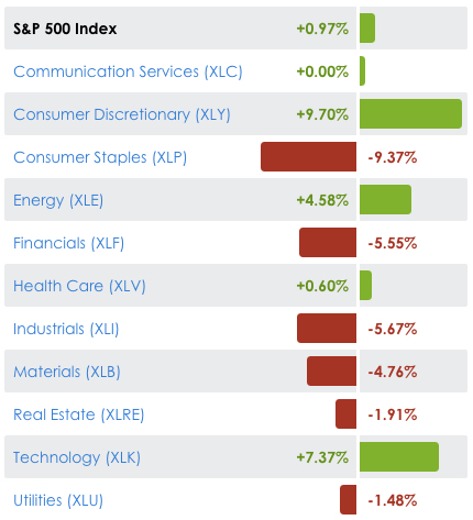
momentum sectors

If we take a look inside the sector, we see the leaders are diverging farther away from the sector ETF and far beyond the stock market index.
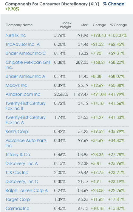
momentum stocks consumer discretionary sector NFLX AMZN AAPL

In fact, all the sectors 80 stock holdings are positive in 2018.

The Consumer Discretionary sector is about 13% of the S&P 500. As you can see, if these top four or five sectors in the S&P 500 aren’t trending up it is a drag on the broad stock index.
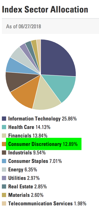
ETF Sector Allocation exposure S&P 500

So, Is it a stock pickers market? 

When we see more divergence, it seems to be a better market for “stock pickers” to separate the winners from the losers.

Another way to measure participation in the market is through quantitative breadth indicators. Breadth indicators are a measure of trend direction “participation” of the stocks. For example, the percent of the S&P 500 stocks above or below a moving average is an indication of the momentum of participation.

Below is the percent of stocks above their 50 day moving average tells us how many stocks are trending above their moving average (an uptrend). Right now, the participation is symmetrical; 52% of the stocks in the S&P 500 are in a positive trend as defined by the 50 day moving average. We can also see where that level stands relative to the stock market lows in February and April and the all-time high in January when over 85% of stocks were in an uptrend. By this measure, only half are trending up on a shorter term basis.
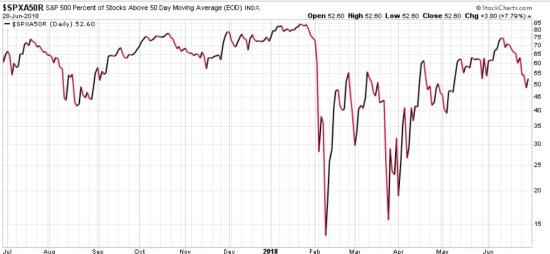
SPX SPY PERCENT OF STOCKS ABOVE 50 DAY MOVING AVERAGE 1 YEAR

The 200-day moving average looks back nearly a year to define the direction of a trend, so it takes a greater move in momentum to get the price above or below it. At this point, the participation is symmetrical; 55% of stocks are above their 200-day moving average and by this time frame, it hasn’t recovered as well from the lows. The percent of stocks above their 200-day moving average is materially below the 85% of stocks that were participating in the uptrend last year. That is, 30% fewer stocks are in longer trend uptrends.
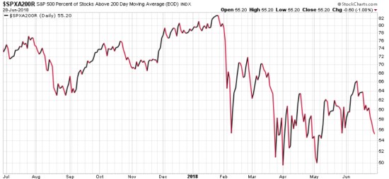
SPY SPX PERCENT OF STOCKS ABOVE 200 DAY MOVING AVERGAGE 1 YEAR

In the above charts, I only showed a one-year look back of the trend. Next, we’ll take a step back to view the current level relative to the past three years.

The percent of stocks above their 50 day moving average is still at the upper range of the past three years. The significant stock market declines in August-September 2015 and December-January hammered the stocks down to a very washed out point. During those market declines, the participation was very asymmetric: 90% of the stocks were in downtrends and only about 10% remained in shorter-term uptrends.
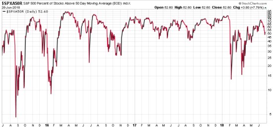
SPX SPY PERCENT OF STOCKS ABOVE 50 DAY MOVING AVERAGE 3 YEARS

The percent of stocks above their 200 day moving average also shows a much more asymmetrical situation during the declines in 2015 and 2016 when the stock index dropped around -15% or more. Only 20% of stocks remained in a positive trend.
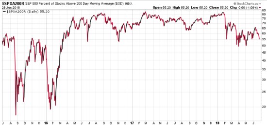
SPX PERCENT OF STOCKS ABOVE 200 DAY MOVING AVERAGE 3 YEARS

Is it a stock pickers market?

Only about half of the stocks in the index are in uptrends, so the other half isn’t. So, if we avoid the half that are in downtrends and only maintains exposure to stocks in uptrends and the trends continue, we can create alpha.

But, keep in mind, that doesn’t necessarily mean we should have any exposure at all in the S&P 500 stock index because happens to have the highest sector exposure in the leading sectors.

But, for those who want to engage in “stock picking”, the timing has a higher probability now to diverge from the stock index than last year because so fewer stocks are in uptrends and more are in downtrends.

For individual stocks traders willing to look inside the box, this is a good thing.

Mike Shell is the Founder and Chief Investment Officer of Shell Capital Management, LLC, and the portfolio manager of ASYMMETRY® Global Tactical.

You can follow ASYMMETRY® Observations by click on on “Get Updates by Email” on the top right or follow us on Twitter.

The observations shared in this material are for general information only and are not intended to provide specific advice or recommendations for any individual. Investing involves risk including the potential loss of principal an investor must be willing to bear. Past performance is no guarantee of future results.
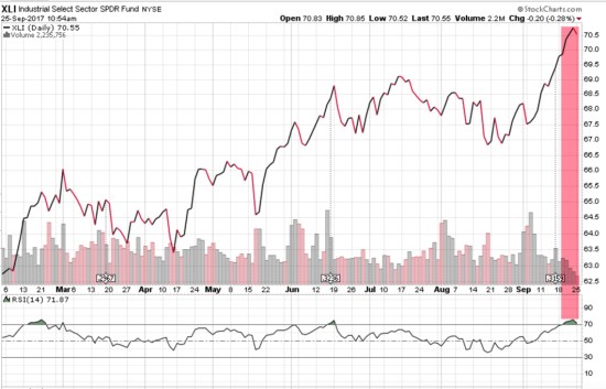
Industrial Sector Pulling Back as RSI Suggested it Could

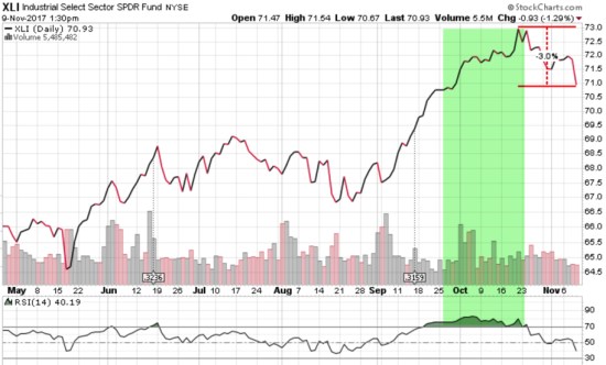
In “Resolving Conflicts with Relative Strength” I discussed the conflict between high Relative Strength (a trend that is gaining more than others) and a high RSI (a trend that is considered overbought). I used the Industrial Select Sector SPDR ETF as an example. It has taken about five weeks, but the point can be seen clearly now.

Below is part of what I said on September 27, 2017, and following that I’ll share an update.

When I see the chart below, I think:

“The trend is up, it has moved up fast enough to be overbought in the short term, so it may pull back some and then the trend may resume to the upside”.

That chart was about five weeks ago. Below is an update on the trend in the U.S. Industrial sector. Since the sector got “overbought” based on a RSI reading over 70, the trend continued up (green highlight) and has since trended down about -3%. At this point, it is trading around the same price it was when it first became overbought. Now, it is getting closer to being “oversold” on a short-term basis.

So, as the Industrial sector was one of the strongest sector trends a few weeks ago, it also appeared overbought on a short-term basis. It is now drifting down to what may become a better entry point in what has otherwise been a strong directional trend.

We’ll see how it unfolds.

Black Monday: Huge Losses a Reminder of Risk

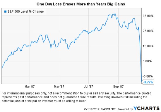
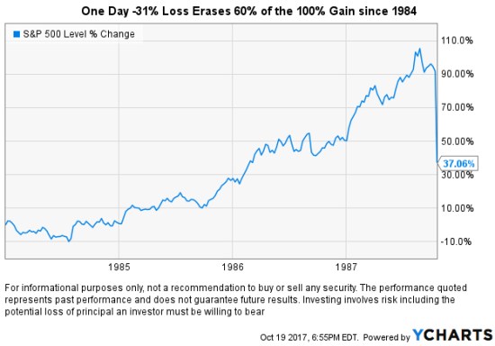
30 years ago today, global stock markets collapsed. The U.S. stock market represented by the S&P 500 had gained over 35% year-to-date. Investors were likely optimistic. It only took a single day to erase the gain.

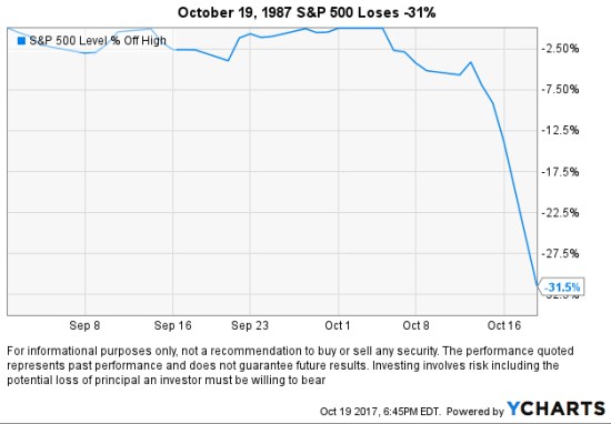
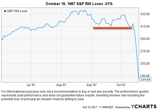
The loss on Black Monday was -31.5%. Notice that a -31.5% decline more than erased a 35%+ gain. In fact, after the index had gained over 35% for the year, it was down nearly -9% after a -31% decline.


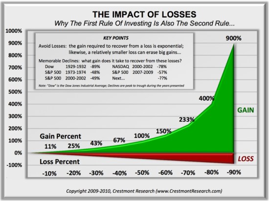
As I explain in Asymmetric Nature of Losses and Loss Aversion, losses are asymmetric. Losses compound exponentially, which is what makes risk management and the pursue of drawdown control worthwhile.

Below we see it in action. It only took a decline of -31% to erase over 60% of a 100% gain since 1984. The S&P 500 stock index had gained over 100% since 1984. The -31% decline brought the gain all the way down to 37%. Losses are very asymmetric.

Black Monday is talked about as a single one-day event, but really it wasn’t. Several weeks of weakness led up to a big down day. But, it would have taken a rather tight risk management system to have exited.

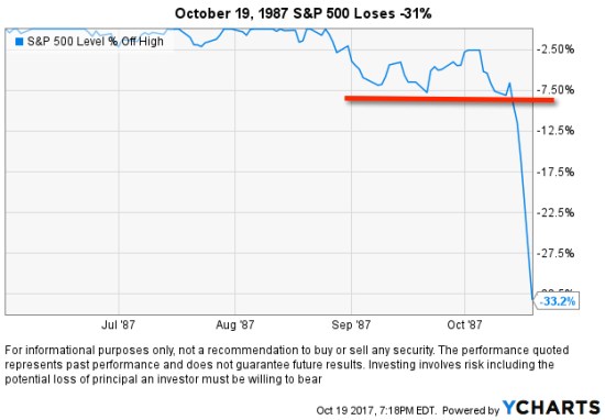
Looking even closer, the % off high chart shows the stock index was about -7% off its price high for several weeks before the crash. So, a drawdown control and risk management system trading this index would have had to exit because of this trend.

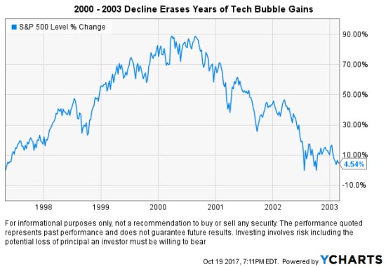
It doesn’t have to happen in a single day to erase a lot of gains.

Let’s remember this one.

And more recently, this one.

Today is a reminder that markets are risky and they necessarily require risk management.


Asymmetric Volatility

Volatility is how quickly and how far data points spread out.

Asymmetric is not identical on both sides, imbalanced, unequal, lacking symmetry.

This time of year we are reminded of asymmetric volatility in the weather. The wide range in the temperature is highlighted in the morning news.

This morning, it’s 72 degrees and sunny down south and below freezing and snowing up north.

asymmetric-volatility

Source: MyRadar

Some of the news media presents the variation in a way that invites relative thinking. Just like the financial news programs that show what has gained and lost the most today, the weather shows the extreme highs and lows.

Those who watch the financial news may feel like they missed out on the stock or market that gained the most, then be glad they weren’t in one that lost the most. Some feelings may be more asymmetric: they feel one more than the other.

Prospect Theory says most of us feel a loss much greater that we do a gain. It’s another asymmetry: losses hurt more than gains feel good (loss aversion).

If you are up north trying to stay warm, you may wish you were down south sitting on the beach.

If you are down south trying to stay cool, you may wish you were up north playing in the snow!

It really doesn’t matter how extreme the difference is (the volatility). The volatility is what it is. Volatility is just a range.

What matters is what we want to experience.

If we want to experience snow we can fly up north.

If we want to experience sunny warmth we can fly down south.

If we want less volatility, we could live down south in the winter and up north in the summer.

We get to decide what we experience.

So Goes January, So Goes the Year?


Focusing on an arbitrary time frame is called “reference dependence.” It regards the comparative nature of human perception. It also concerns the tendency of people to compare things to some reference point. Perception of an outcome depends on the reference point that a person chooses. The reference point or time frame is arbitrary and is based on random choice or personal whim.

The idea of reference dependence reminds me of when I watched Arkansas play Virginia Tech in the Belk Bowl last week.

After the first quarter, Arkansas was beating Virgina Tech 17-0. If we judged the game at that reference point, the score was so one-sided that it seemed like Arkansas was going to decimate Virginia Tech.

arkansas-virginia-tech-first-halfSource: http://secsports.go.com/scores/football/arkansas-razorbacks
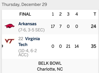
By halftime, the score was 24-0. Arkansas was ahead by three touchdowns and a field goal. The momentum was evident. The game appeared to be a terrible mismatch. If we placed bets, it would have been for Arkansas to win the game. At that point, this outcome was most probable.

When a game is close, fans “watch it closely.” However, when the score broadened to 24- 0, many fans probably stopped paying attention and expected Arkansas to be the winner.

Yet football has four quarters, not just two.

Three touchdowns and a field goal are a tough lead to overcome. It would require Virginia Tech first to play very well with their defense so as to prevent Arkansas from scoring more points against them. Then, they would need their offense to score many touchdowns and field goals just to catch up.

In the third quarter, that’s exactly what they did.

arkansas-virginia-tech-final-score

By the end of the third quarter, Virginia Tech had scored 21 points to make the score 21–24. In the final and fourth quarter, they scored another 14 points to take the lead 35–24. They scored 35 points, and their defense held Arkansas to zero in the second half. It was a high-volatility game – swinging from one extreme in one period to another extreme in the next.

Now, look at it from the perspective of a Virginia Tech fan. By halftime, they were losing 0–24. All hope was gone. They may have stopped watching. If they were at the game, they might have left at halftime.

The end of the game was the only time frame that mattered.

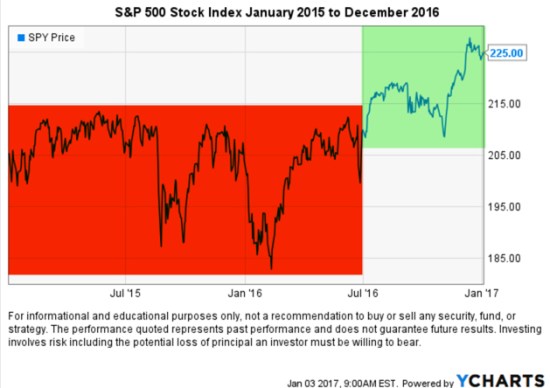
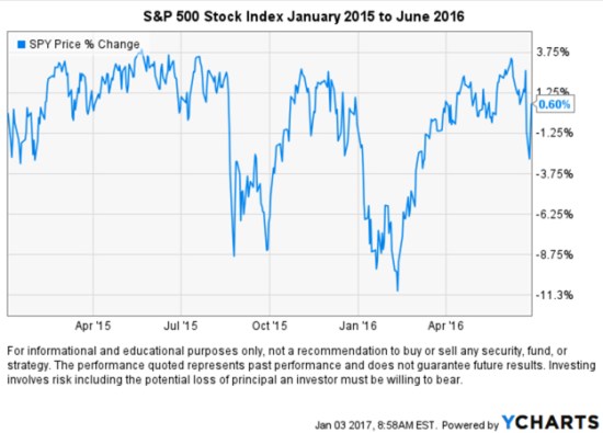
Global markets operate in the same way. Our perception is just the result of our reference point – the time frame we choose. Below is the S&P 500 stock index over 18 months from January 2015 to June 2016. Overall, it was non-trending and volatile.

non-trending-stock-market-period

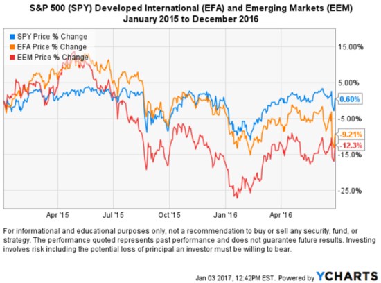
It wasn’t just U.S. stocks. Developed countries and Emerging Markets countries declined even more as they trended in wider swings.

global-market-trends-returns-asymmetric


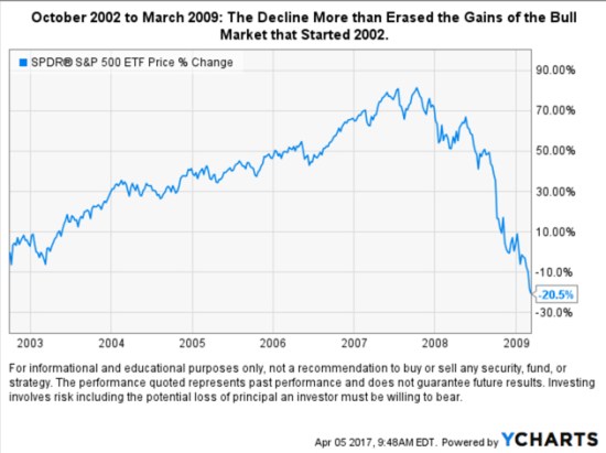
You can probably see why very few people invest all their money all the time in the stock market. It doesn’t matter how much the return is if the risk is so high that you reach your uncle point before it’s achieved. At some point, investors decide to look, and when they do, their perceptions depend on the reference point they choose. For this reason, global markets require risk management, and investors need behavioral management. If the swings of 10% to 25% observed over the past two years aren’t enough to shake out every investor, the declines of -50% or more that we’ve seen the past fifteen years probably are.

Much like the Belk Bowl, the stock index was down and out for most of the period but ended the year positively in the final quarter.

last-quarter-spy


As investors, our most important reference point is, ultimately, our full investment time horizon. For most people, that means their entire lifespan. For those who establish trusts, foundations, or endowments with their money, their reference point goes beyond their own lives. Investment management is different from football in that the score compounds for as long as you have money invested. It is not just one season, or one quarter, or a single game.

The end is the only time frame that matters. Everything in between is just you deciding to compare one reference to another.

I titled this observation, “So Goes January, So Goes the Year.”

You can probably see how arbitrary it is to say that.

By the way, you can see on the chart that the stock market dropped sharply last January, but it ended positively for the year.

“So Goes January, So Goes the Year”?

Not always.

The end is the only time frame that really matters.

Warren Buffett’s Berkshire Hathaway Hasn’t Managed Downside Risk

 shares an interesting observation in Fortune ” Warren Buffett’s Berkshire lost $11 billion in market selloff“. He points out that Buffett’s Berkshire Hathaway (BRK.A or BRK.B) is tracking the U.S. stock indexes on the downside. He says:

“…during the worst of the downturn from mid-July to the end of August. That represents a 10.3% drop. The good news for Buffett: His, and his investment team’s, performance was likely not much worse than everyone else’s. During the same time, the S&P 500 fell 10.1%.”

Comparing performance to others or “benchmark” indexes is a what I call a “relative return” objective. Comparing performance vs. our own risk tolerance and total return objectives is an “absolute return” objective. The two are very different as what I call “relativity” is more concerned about how others are doing comparatively, while “absolute” is more focused on our own situation.

The article also said:

“If you are invested in an index fund, you may have outperformed the Oracle of Omaha, slightly.”

Let’s see just how true that is. Since the topic is how much Warren Buffett’s Berkshire Hathaway has lost during this stock market decline, I’ll share a closer look.

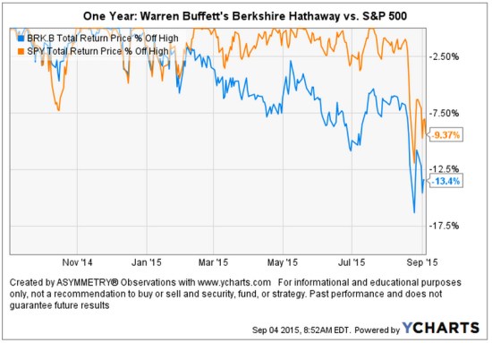
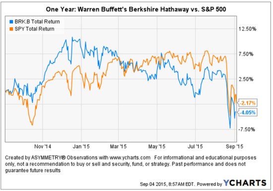
A picture speaks a thousand words. As it turns out, the guru stock picker is actually down -13.4% off it’s high looking back over the past year. That’s about -4% worse than the SPDR® S&P 500® ETF (SPY) that seeks to provide investment results that, before expenses, correspond generally to the price and yield performance of the S&P 500® Index. I am using actual securities here to present an investable comparison: SPY vs. BRK.B.

Warren Buffett's Berkshire Lost compared to stock index

As we observe in the chart, Warren Buffett’s Berkshire Hathaway began to decline off it’s high at the end of last year while the S&P 500® Index started last month. I have observed more and more stocks declining over the past several months. At the same time, more and more International markets have entered into their own bear markets. So, it is no surprise to see a focused stock portfolio diverge from a broader stock index.  points out some of the individual stock positions in ” Warren Buffett’s Berkshire lost $11 billion in market selloff

Below is the total return of the two over the past year. We can see the high in Warren Buffett’s Berkshire Hathaway BRK.B was in December 2014.

Warren Buffett's Berkshire Lost compared to stock index total return

I believe world markets require active risk management and defining directional trends. For me, that means predefining my risk in advance in each position and across the portfolio.

Chart source: http://www.ycharts.com

Read the full Fortune article here: ” Warren Buffett’s Berkshire lost $11 billion in market selloff

Stock Market Decline is Broad

We typically expect to see small company stocks decline first and decline the most. The theory is that smaller companies, especially micro companies, are more risky so their value may disappear faster.  Below, we view the recent price trends of four market capitalization indexes: micro, small, mid, and mega. We’ll use the following index ETFs.

Vanguard ETFs small mid large micro cap

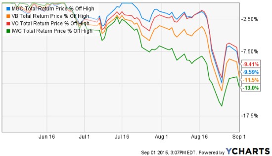
Since we are focused on the downside move, we’ll only observe the % off high chart. This shows what percentage the index ETF had declined off its recent highest price (the drawdown). We’ll also observe different look-back periods.

We first look back 3 months, which captures the full extent of the biggest loser: as expected, the micro cap index. The iShares Micro-Cap ETF (IWC: Green Line) seeks to track the investment results of an index composed of micro-capitalization U.S. equities. Over the past 3 months (or anytime frame we look) it is -13% below its prior high. The second largest decline is indeed the small cap index. The Vanguard Small-Cap ETF (VB: Orange Line) seeks to track the performance of the CRSP US Small Cap Index, which measures the investment return of small-capitalization stocks. The small cap index has declined -11.5%. The Vanguard Mega Cap ETF (MGC) seeks to track the performance of a benchmark index that measures the investment return of the largest-capitalization stocks in the United States and has declined -9.65%. The Vanguard Mid-Cap ETF (VO) seeks to track the performance of a benchmark index that measures the investment return of mid-capitalization stocks and has declined -9.41%. So, the smaller stocks have declined a little more than larger stocks.

Small and Micro caps lead down

Source: Shell Capital Management, LLC created with http://www.ycharts.com

Many active or tactical strategies may shift from smaller to large company stocks, hoping they don’t fall as much. For example, in a declining market relative strength strategies would rotate from those that declined the most to those that didn’t. The trouble with that is they may still end up losing capital and may end up positioned in the laggards long after a low is reached. They do that even though we may often observe the smallest company stocks rebound the most off a low. Such a strategy is focused on “relative returns” rather than “absolute returns“. An absolute return strategy will instead exit falling trends early in the decline with the intention of avoiding more loss. We call that “trend following” which has the objective of “cutting your losses short”. Some trend followers may allow more losses than others. You can probably see how there is a big difference between relative strength (focusing on relative trends and relative returns)  and trend following (focusing on actual price trends and absolute returns).

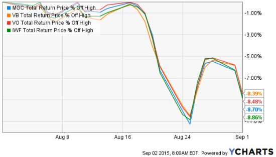
So, what if we look at the these stock market indexes over just the past month instead of the three months above? The losses are the same and they are very correlated. So much for diversification. Diversification across many different stocks, even difference sizes, doesn’t seem to help in declining markets on a short-term basis. These indexes combined represent thousands of stocks; micro, small, medium, and large. All of them declined over -11%, rebounded together, and are trending down together again.

stock market returns august 2015

Source: Shell Capital Management, LLC created with http://www.ycharts.com

If a portfolio manager is trying to “beat the market” index, he or she may focus on relative strength or even relative value (buy the largest loser) as they are hoping for relative returns compared to an index. But a portfolio manager who is focused on absolute returns may pay more attention to the actual downside loss and therefore focuses on the actual direction of the price trend itself. And, a key part is predefining risk with exits.

You can probably see how different investment managers do different things based on our objectives. We have to decide what we want, and focus on tactics for getting that.

The Volatility Index (VIX) is Getting Interesting Again

In the last observation I shared on the CBOE Volatlity index (the VIX) I had been pointing out last year the VIX was at a low level and then later started trending up. At that time, many volatility traders seemed to think it was going to stay low and keep going lower – I disagreed. Since then, the VIX has remained at a higher average than it had been – up until now. You can read that in VIX® gained 140%: Investors were too complacent.

Here it is again, closing at 12.45 yesterday, a relatively low level for expected volatility of the S&P 500 stocks. Investors get complacent after trends drift up, so they don’t price in so much fear in options. Below we observe a monthly view to see the bigger picture. The VIX is getting down to levels near the end of the last bull market (2007). It could go lower, but if you look closely, you’ll get my drift.

Chart created by Shell Capital with: http://www.stockcharts.com

Next, we zoom in to the weekly chart to get a loser look.

Chart created by Shell Capital with: http://www.stockcharts.com

Finally, the daily chart zooms in even more.

Chart created by Shell Capital with: http://www.stockcharts.com

The observation?

Options traders have priced in low implied volatility – they expect volatility to be low over the next month. That is happening as headlines are talking about stock indexes hitting all time highs. I think it’s a sign of complacency. That’s often when things change at some point.

It also means that options premiums are generally a good deal (though that is best determined on an individual security basis). Rather than selling premium, it may be a better time to buy it.

Let’s see what happens from here…

My 2 Cents on the Dollar

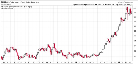
The U.S. Dollar ($USD) has gained about 20% in less than a year. We observe it first in the weekly below. The U.S. Dollar is a significant driver of returns of other markets. For example, when the U.S. Dollar is rising, commodities like gold, oil, and foreign currencies like the Euro are usually falling. A rising U.S. Dollar also impacts international stocks priced in U.S. Dollar. When the U.S. Dollar trends up, many international markets priced in U.S. Dollars may trend down (reflecting the exchange rate). The U.S. Dollar may be trending up in anticipation of rising interest rates.

dollar trend weekly 2015-04-23_16-04-40

Chart created by Shell Capital with: http://www.stockcharts.com

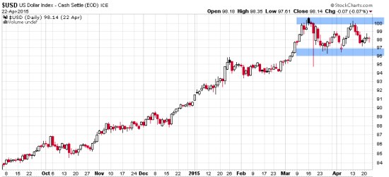
Now, let’s observe a shorter time frame- the daily chart. Here we see an impressive uptrend and since March a non-trending indecisive period. Many trend followers and global macro traders are likely “long the U.S. Dollar” by being long and short other markets like commodities, international stocks, or currencies.

dollar trend daily 2015-04-23_16-05-04

Chart created by Shell Capital with: http://www.stockcharts.com

This is a good example of understanding what drives returns and risk/reward. I consider how long the U.S. Dollar I am and how that may impact my positions if this uptrend were to reverse. It’s a good time to pay attention to it to see if it breaks back out to the upside to resume the uptrend, or if it instead breaks down to end it. Such a continuation or reversal often occurs from a point like the blue areas I highlighted above.

That’s my two cents on the Dollar…

How long are you? Do you know?

Absolute Return vs. Relative Return

Absolute Return investment manager fund

Absolute: viewed or existing independently and not in relation to other things; not relative or comparative.

Relative: considered in relation or in proportion to something else.

Return: to go or come back, as to a former place, position, or state.

Oops… we don’t want to “return” do we?

Rate of Return: The gain or loss on an investment over a specified period.

So, an Absolute Rate of Return: is the the gain or loss viewed or existing independently and not in relation to other things; not relative or comparative.

Many people seem to have a problem with what I call “relativity“. For example, they love their home, until someone builds a larger and nicer one across the street. Or, they love their car, until their friend drives up in one that seems even better.

You can probably see how these simple words and their meaning leads to many issues people deal with.

To see an absolute return program applied in real life, visit: http://www.asymmetrymanagedaccounts.com/global-tactical/

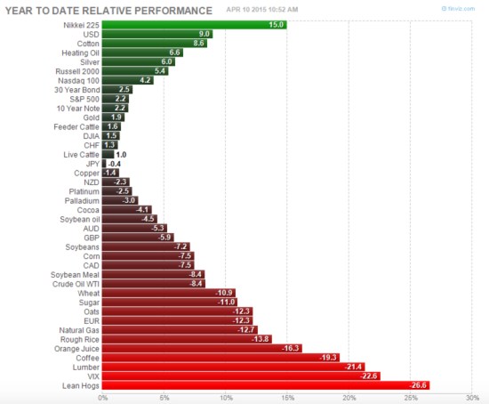
Asymmetric Returns of World Markets YTD

As of today, global stock, bond, commodity markets are generating asymmetric returns year to date. The graph below illustrates the asymmetry is negative for those who need these markets to go “up”.

Asymmetric Returns of World Markets 2015-04-10_10-52-47

source: http://finviz.com


Asymmetric Nature of Losses and Loss Aversion

Loss Aversion:

“In prospect theory, loss aversion refers to the tendency for people to strongly prefer avoiding losses than acquiring gains. Some studies suggest that losses are as much as twice as psychologically powerful as gains. Loss aversion was first convincingly demonstrated by Amos Tversky and Daniel Kahneman.”

For most people, losing $100 is not the same as not winning $100. From a rational point of view are the two things the same or different?

Most economists say the two are the same. They are symmetrical. But I think that ignores some key issues.

If we have only $10 to eat on today and that’s all we have, if we lose it, we’ll be in trouble: hungry.

But if we have $10 to eat on and flip a coin in a bet and double it to $20, we may just eat a little better. We’ll still eat. The base rate: survival.

They say rationally the two are the same, but that isn’t true. They aren’t the same. The loss makes us worse off than we started and it may be totally rational to feel worse when we go backward than we feel good about getting better off. I don’t like to go backward, I prefer to move forward to stay the same.

Prospect Theory, which found people experience a loss more than 2 X greater than an equal gain, discovered the experience of losses are asymmetric.

Actually, the math agrees.

You see, losing 50% requires a 100% gain to get it back. Losing it all is even worse. Losses are indeed asymmetric and exponential on the downside so it may be completely rational and logical to feel the pain of losses asymmetrically. Experience the feeling of loss aversions seems to be the reason a few of us manage investment risk and generate a smoother return stream rather than blow up.

To see what the actual application of asymmetry to portfolio management looks like, see: Shell Capital Management, LLC.


asymmetry impact of loss

Stock Market Year-to-Date and First Quarter

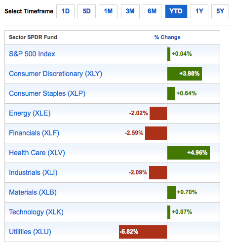
So far, the U.S. stock market isn’t doing so well. And, the gains and losses over the past quarter have been asymmetric. Consumer Discretionary (12.6% of the S&P 500 index) and Healthcare (14.8% of the S&P 500 index)  have barely offset the losses in four other sectors.

Below are the YTD gain and losses for the popular S&P 500 index and each sector in the index.

stock market first quarter performance 2015-04-02_12-38-10

source: http://www.sectorspdr.com/sectorspdr/tools/sector-tracker

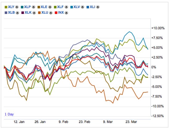
But, that’s just one data point compared to another data point. Such a table would be incomplete without considering the path those gains and losses took to get there.

sector returns 2015 2015-04-02_12-41-15

source: http://www.sectorspdr.com/sectorspdr/tools/sector-tracker/charting

To see the results of asymmetric exposure and risk management in action across a global universe of markets, visit: http://www.asymmetrymanagedaccounts.com/

Performance is historical and does not guarantee future results; current performance may be lower or higher. Investment returns/principal value will fluctuate so that an investor’s shares, when redeemed, may be worth more or less than their original cost. Past performance does not guarantee future results.

Absolute Return: an investment objective and strategy

Absolute returns investment strategy fund

Absolute Return in its basic definition is the return that an asset achieves over a certain period of time. This measure looks at the appreciation or depreciation (expressed as a dollar amount or a percentage). For example, a $50 stock drifts to $100 is a 100% absolute return. If that same stock drifts back from $100 to $50, its absolute return is -50%.

Absolute Return as an investment objective is one that does not try to track or beat an arbitrary benchmark or index, but instead seeks to generate real profits over a complete market cycle regardless of market conditions. That is, an absolute return objective of positive returns on investment over a market cycle of both bull and bear market periods irrespective of the direction of stock, commodity, or bond markets. Since the U.S. stock market has been generally in a uptrend for 6 years now, other than the -20% decline in the middle of 2011, we’ll now have to expand our time frame for a full market cycle to a longer period. That is, a full market cycle includes both a bull and a bear market.

The investor who has an absolute return objective is concerned about his or her own objectives for total return over a period and tolerance for loss and drawdowns. That is a very different objective than the investor who just wants whatever risk and return a benchmark, allocation, or index provides. Absolute returns require skill and active management of risk and exposure to markets.

Absolute return as a strategy: absolute return is sometimes used to define an investment strategy. An absolute return strategy is a plan, method, or series of maneuvers aiming to compound capital positively and to avoid big losses to capital in difficult market conditions. Whereas Relative Return strategies typically measure their success in terms of whether they track or outperform a market benchmark or index, absolute return investment strategies aim to achieve positive returns irrespective of whether the prices of stocks, bonds, or commodities rise or fall over the market cycle.

Absolute Return Investment Manager

Whether you think of absolute return as an objective or a strategy, it is a skill-based rather than market-based. That is, the absolute return manager creates his or her results through tactical decision-making as opposed to taking what the market is giving. One can employ a wide range of approaches toward an absolute return objective, from price-based trend following to fundamental analysis. In the ASYMMETRY® Managed Accounts, I believe price-based methods are more robust and lead to a higher probability of a positive expectation. Through my historical precedence, testing, and experience, I find that any fundamental type method that is based on something other than price has the capability to stray far enough from price to put the odds against absolute returns. That is, a manager buying what he or she believes is undervalued and selling short what he believes is overvalued can go very wrong if the position is on the wrong side of the trend. But price cannot deviate from itself. Price is the judge and the jury.

To create absolute returns, I necessarily focus on absolute price direction. Not relative strength, which is a rate of change relative to another moving trend. And, I focus on actual risk, not some average risk or an equation that oversimplifies risk like standard deviation.

Of course, absolute return and the “All Weather” type portfolio sound great and seem to be what most investors want, but it requires incredible skill to execute. Most investors and advisors seem to underestimate the required skills and experience and most absolute return strategies and funds have very limited and unproven track records. There is no guarantee that these strategies and processes will produce the intended results and no guarantee that an absolute return strategy will achieve its investment objective.

For an example of the application of an absolute return objective, strategy, and return-risk profile, visit http://www.asymmetrymanagedaccounts.com/

Absolute Return as an Investment Strategy

Absolute Return Investment Strategy Fund Manager

In “Absolute Return: The Basic Definition”, I explained an absolute return is the return that an asset achieves over a certain period of time. To me, absolute return is also an investment objective.

In “Absolute Return as an Investment Objective” I explained that absolute return is an investment objective is one that does not try to track or beat an arbitrary benchmark or index, but instead seeks to generate real profits over a complete market cycle regardless of market conditions. That is, it is focused on the actual total return the investor wants to achieve and how much risk the investor will willing to take, rather than a focus on what arbitrary market indexes do.

Absolute return as a strategy: absolute return is sometimes used to define an investment strategy. An absolute return strategy is a plan, method, or series of maneuvers aiming to compound capital positively and to avoid big losses to capital in difficult market conditions. Whereas Relative Return strategies typically measure their success in terms of whether they track or outperform a market benchmark or index, absolute return investment strategies aim to achieve positive returns irrespective of whether the prices of stocks, bonds, or commodities rise or fall over the market cycle.

Whether you think of absolute return as an objective or a strategy, it is a skill-based rather than market-based. That is, the absolute return manager creates his or her results through tactical decision-making as opposed to taking what the market is giving. One can employ a wide range of approaches toward an absolute return objective, from price-based trend following to fundamental analysis. In the ASYMMETRY® Managed Accounts, I believe price-based methods are more robust and lead to a higher probability of a positive expectation. Through my historical precedence, testing, and experience, I find that any fundamental type method that is based on something other than price has the capability to stray far enough from price to put the odds against absolute returns. That is, a manager buying what he or she believes is undervalued and selling short what he believes is overvalued can go very wrong if the position is on the wrong side of the trend. But price cannot deviate from itself. Price is the judge and the jury.

Of course, absolute return and the “All Weather” type portfolio sound great and seem to be what most investors want, but it requires incredible skill to execute. Most investors and advisors seem to underestimate the required skills and experience and most absolute return strategies and funds have very limited and unproven track records. There is no guarantee that these strategies and processes will produce the intended results and no guarantee that an absolute return strategy will achieve its investment objective.

For an example of the application of an absolute return objective, strategy, and return-risk profile,  visit http://www.asymmetrymanagedaccounts.com/

Absolute Return as an Investment Objective

Absolute Return objective fund strategy

In Absolute Return: The Basic Definition, I explained an absolute return is the return that an asset achieves over a certain period of time. To me, absolute return is also an investment objective.

Absolute Return as an investment objective is one that does not try to track or beat an arbitrary benchmark or index, but instead seeks to generate real profits over a complete market cycle regardless of market conditions. That is, an absolute return objective of positive returns on investment over a market cycle of both bull and bear market periods irrespective of the direction of stock, commodity, or bond markets.

Since the U.S. stock market has been generally in a uptrend for 6 years now, other than the -20% decline in the middle of 2011, we’ll now have to expand our time frame for a full market cycle to a longer period. That is, a full market cycle includes both a bull and a bear market.

The investor who has an absolute return objective is concerned about his or her own objectives for total return over a period and tolerance for loss and drawdowns. That is a very different objective than the investor who just wants whatever risk and return a benchmark, allocation, or index provides. Absolute returns require skill and active management of risk and exposure to markets.

Rather than a long article, this is going to be a series of smaller parts, building up to what absolute return really means.

For an example of the application of an absolute return objective, strategy, and return-risk profile,  visit http://www.asymmetrymanagedaccounts.com/

Absolute Return: The Basic Definition

Absolute Return Fund Absolute Return Strategy

Absolute Return in its basic definition is the return that an asset achieves over a certain period of time. This measure looks at the appreciation or depreciation (expressed as a dollar amount or a percentage). For example, a $50 stock drifts to $100 is a 100% absolute return. If that same stock drifts back from $100 to $50, its absolute return is -50%.

Rather than a long article, this is going to be a series of smaller parts, building up to what absolute return really means.

For an example of the application of an absolute return objective, strategy, and return-risk profile,  visit http://www.asymmetrymanagedaccounts.com/