The market climbs a wall of worry

Last week, the US investor sentiment, an indicator that is a part of the AAII Sentiment Survey, indicated the percentage of investors surveyed that had a bearish outlook for the stock market. An investor that is bearish believes the stock market will head lower in the next six months.

US Investor Sentiment, % Bearish was at 50.00% for the week ending April 23rd, compared to 42.75% the prior week.

Considering the number of global macroeconomic indicators in uncharted territory, it’s expected to see many investors bearish. But, the stock market is climbing the wall of worry.

When an uptrend in the stock market includes a lot of uncertainty about its sustainability, we say the market is climbing a wall of worry.

That’s exactly what we’re seeing now.

I’m guessing investors who sold their stocks at lower prices are feeling the fear of missing out about now.

I’ve always said that everyone has an exit point, it can be predefined like mine is, or it can be your uncle point. If you reach the point you tap-out to avoid more loss, it’s probably at much lower prices. I prefer to exit before losses get too large, but also exit based on logical price levels that suggest a change of trend. Or, portfolio level exits designed for drawdown control to limit loss.

If you tapped out at lower prices last month because you felt afraid, I don’t know when you would feel better about buying again?

Suppose the chart below represents what you invest in. At what point do you get bullish again and invest?

If you say at the lower level, you may be fooling yourself.

You don’t know it doesn’t go down another -20% from there. But, I know if you tapped out before it was down so much, it is highly unlikely you’ll feel more positive at lower prices. Instead, you’ll extrapolate the recent past into the future.

Just like you are, now.

Except now, prices are trending up, and if you tapped out at the low, you’re feeling the fear of missing out.

So, do you feel better now that prices have risen?

Using the same price series, let’s pretend you sold at the first low.

Then, a few weeks later, the price is trending up and you get excited and buy.

Oops. What you didn’t know, and never will know, is the trend reversed down to an even lower low. What do you do then?

Maybe you sell at the same price level you did before. The market is falling and you just want out, again.

Once if falls a lot more, do you ever get to feeling like buying again? You’ve already created two losses of around -20%, each trip. You first lost -20%, then bought the high, then lost about -20% again in the same price range. Now, here you are, the market is down over -60% and you’re supposed to feel good?

I doubt it.

The headlines are blood red.

It seems everyone is taking on heavy losses and the waterfall has been so deep and long it doesn’t seem it will ever end.

Then, there it goes.


You want to buy every time it moves up 10% and you feel like you’re really missing out on the opportunity of a lifetime when it trends up 20%, without you.

But you’re stuck. So afraid of “another leg down” as everyone is worried about.

Every decline seems to be the beginning of a new leg down, but it isn’t, until it is, but even then, it’s “only” -30%.

I used the trend as an example, but it’s a real trend. I successfully made tactical trading decisions through it, so I know the mindset and behavioral challenges. It wasn’t an ON/OFF switch, either. I entered and exited many times, trading the swings along the way, never sure if it would trend higher, or reverse back down, but applying systems that account for the unknowable outcome.

The market climbs a wall of worry. Fortunately, we’re participating in this uptrend.

It doesn’t do what we expect it to sometimes.

Some investors seem to oscillate between the fear of missing out and the fear of losing money.

Some of them tend to be more afraid, so they are oriented toward the fear of losing money.

Others are optimists, so while they may panic out, they quickly get optimistic after prices trend back up.

Regardless of the behavioral tendency, if you tap out at the lows, I don’t know when you’ll ever get back in. I have no answer for it.

If you buy now, you may exposure yourself to the possibility of loss just as it reverses back down again.

If you wait for the next leg down, what if it never comes?

To me, the solution is to avoid investment programs that may result in your tapping out to start with. That is, know your true risk tolerance. Know at what % loss you are prone to tap out, and invest with a manager who has drawdown controls to help manage the risk.

If you are sitting there in cash, waiting to reinvest, there will never be a perfect time to do it.

Invest with someone who can hedge and manage risk, then let it rip.

The next AAII investor sentiment survey is out tomorrow. It will show fewer bearish investors, now that price has trended up.

Nothing changes investor sentiment the a price trend.

Join 39,467 other followers

Mike Shell is the Founder and Chief Investment Officer of Shell Capital Management, LLC, and the portfolio manager of ASYMMETRY® Global TacticalMike Shell and Shell Capital Management, LLC is a registered investment advisor focused on asymmetric risk-reward and absolute return strategies and provides investment advice and portfolio management only to clients with a signed and executed investment management agreement. The observations shared on this website are for general information only and should not be construed as advice to buy or sell any security. Securities reflected are not intended to represent any client holdings or any recommendations made by the firm. Any opinions expressed may change as subsequent conditions change.  Do not make any investment decisions based on such information as it is subject to change. Investing involves risk, including the potential loss of principal an investor must be willing to bear. Past performance is no guarantee of future results. All information and data are deemed reliable but is not guaranteed and should be independently verified. The presence of this website on the Internet shall in no direct or indirect way raise an implication that Shell Capital Management, LLC is offering to sell or soliciting to sell advisory services to residents of any state in which the firm is not registered as an investment advisor. The views and opinions expressed in ASYMMETRY® Observations are those of the authors and do not necessarily reflect a position of  Shell Capital Management, LLC. The use of this website is subject to its terms and conditions.

Dow Jones is down -10% off its high

Dow Jones is down -10% off its high. I don’t pay much attention to the Dow Jones Industrial Average as it’s a price-weighted index of 30 stocks. But, the S&P 500 capitalization-weighted index of approximately 500 stocks seems a better proxy for “the market,” and it’s not far behind.

Here is the percent off high (drawdown) chart year to date.

dow jones down over 10 %

We don’t own either of these ETFs, they are for illustration only. In fact, our portfolio is was 85% U.S. Treasuries, and 15% invested in high dividend-yielding positions. One of them has a dividend yield of 9.8% and the other 11.9%, so while their prices may be falling with the stock market, we have some margin of safety from the high yield. In fact, as the prices fall, the yield rises from that starting point.

Speaking of dividend yield below is a visual of the dividend yield of the S&P 500 (1.84’%) and the Dow (2.27%), which are relatively low historically. But, as prices fall, the yields will rise, assuming the stocks in the index keep paying dividends.

stock dividend yield

In the above chart, I’m using the ETF dividend yields as they are real-time. Since the ETFs have only been trading for two or three decades, to see what I mean by “long term” I look at the S&P 500 Stock Index dividend yield (calculated as 12-month dividend per share)/price) to see how low the yield has been the past twenty years.

long term stock dividend yield

So, the future expected return from dividend yields on these stocks indexes is relatively low, looking back 150 years. The spikes you see are after stock market crashes as the price falls, the yield rises, as with bonds. Low dividend yield also suggests the stock market is overvalued. A higher dividend yield indicates the stock market is undervalued, and if nothing else, investors earn a higher income from the dividends from a lower starting price.

Back to the year to date, the short term, the S&P 500 is now down -5% in 2020, and the Dow Jones is down -7%.

stock market drop 2020

I believe this may be the fastest -10% decline in the history of the Dow Jones Industrial average.

I’m just glad we aren’t in it.

This is when drawdown controls and risk management pays. More importantly, it’s when discipline pays. While some investment managers want to manage risk to limit their drawdowns, they don’t always excel at doing it. Discipline is a personal edge. It doesn’t matter how good our scientifically tested quantitative models with a mathematical basis for believing in them are if we lack the discipline to execute them with precision. I can also say it isn’t enough for me to have all the discipline either, as we must necessarily help our investment management clients stick with it, too. So, investor behavior modification is part of our wealth management services. It’s why Christi Shell is not only a Certified Wealth Strategist® with over twenty-six years of experience helping high net worth families with the overall management of assets but also a certified Behavioral Financial Advisor® (BFA®) to help them manage themselves.

It’s what we do.

Need help? Contact us here.

Mike Shell is the Founder and Chief Investment Officer of Shell Capital Management, LLC, and the portfolio manager of ASYMMETRY® Global TacticalMike Shell and Shell Capital Management, LLC is a registered investment advisor in Florida, Tennessee, and Texas focused on asymmetric risk-reward and absolute return strategies and provides investment advice and portfolio management only to clients with a signed and executed investment management agreement. The observations shared on this website are for general information only and should not be construed as advice to buy or sell any security. Securities reflected are not intended to represent any client holdings or any recommendations made by the firm. I observe the charts and graphs to visually see what is going on with price trends and volatility, it is not intended to be used in making any determination as to when to buy or sell any security, or which security to buy or sell. Instead, these are observations of the data as a visual representation of what is going on with the trend and its volatility for situational awareness. I do not necessarily make any buy or sell decisions based on it. Any opinions expressed may change as subsequent conditions change.  Do not make any investment decisions based on such information as it is subject to change. Investing involves risk, including the potential loss of principal an investor must be willing to bear. Past performance is no guarantee of future results. All information and data are deemed reliable but is not guaranteed and should be independently verified. The presence of this website on the Internet shall in no direct or indirect way raise an implication that Shell Capital Management, LLC is offering to sell or soliciting to sell advisory services to residents of any state in which the firm is not registered as an investment advisor. The views and opinions expressed in ASYMMETRY® Observations are those of the authors and do not necessarily reflect a position of  Shell Capital Management, LLC. The use of this website is subject to its terms and conditions.

Global Asset Allocation had a strong year in 2019, but…

People don’t usually invest all their money in equities, even though the stock market is mostly what we talk about. Large institutional investors like pensions and endowments don’t invest all their capital in the stock market, either. Instead, they invest in allocation to stocks and bonds globally diversified across world markets.

One of my favorite examples of the stock and bond part of this global asset allocation is the S&P Dow Jones Indices’ Target Risk index series.

S&P Dow Jones Indices’ Target Risk series comprises multi-asset class indices that correspond to a particular risk level. Each index is fully investable, with varying levels of exposure to equities and fixed income and are intended to represent stock and bond allocations across a risk spectrum from conservative to aggressive.

global asset allocation ETF ETFs ishares S&P target risk

For example, after a positive year for stocks and bonds, most investors will pay more attention to the one that gained the most. After stocks outperform bonds, the best gains are naturally going to be the global allocation that held the most stock exposure.

The S&P Target Risk Aggressive® Index is one of four multi-asset class indices that compose the S&P Target Risk Series. The S&P Target Risk Aggressive Index emphasizes exposure to equities, maximizing opportunities for long-term capital accumulation. It may include small allocations to fixed income to enhance portfolio efficiency. In a positive year like 2019, it was the clear winner on the upside. The aggressive allocation gained 19% so far in 2019. On the other end of the spectrum, even the conservative allocation gained 10%.

But, risk isn’t a knob.

Asset allocators don’t get to dial it up or down, and it always work out the way they want.

The reward isn’t a knob, either.

Just because a portfolio is dialed up with risk to “aggressive” doesn’t mean you get the reward from it.

That’s especially true in the short term. Had you believed risk and reward is a knob you turn to get what you want in January a year ago, you could have experienced the aggressive allocation resulted in the more aggressive loss.

The conservative model lost the least, but that isn’t a sure thing, either. In global asset allocation, conservative means more allocation to bonds for fixed income. If bonds fall and stocks rise, the conservative model could lose money and the more stock weighted aggressive could gain.

Diversification is often presented by advisors as a risk management strategy that mixes a wide variety of investments within a portfolio. But, diversification does not assure a profit or protect against loss. The outcome of asset allocation is driven by the exposure to stocks vs. bonds and their gain and loss.

That’s not what I do.

A global asset allocation of exposures that otherwise remain static is very different from dynamic exposures that change based on asymmetric risk-reward driving tactical decisions.

My outcome is decided by my tactical increase and decreases in exposure to risk-reward as I focus on asymmetric risk-reward. I believe there is a time for offense and a  time for  defense.

But, for everyone else, there’s global asset allocation. It’s what most people do. They allocate capital, I rotate capital. I rotate, rather than allocate.

If I were going to invest in static, long-only, fully invested all the time global asset allocation, it would look like these S&P Target Risk indexes. When it comes to a simple allocation of capital, who’s going to do it better than S&P? Many advisors are charging their clients 0.50% to 1% for a simple asset allocation like this. I personally believe the risk of a disaster is so high it makes the unmanaged risk imprudent, so we don’t offer fixed, long-only, fully invested all the time global asset allocation at Shell Capital. If we did, we’d probably manage billions because investors want “market returns” until they are big losses. We could also spend our time selling instead of analyzing. But we would constantly be apologizing for market behavior instead of embracing up and downtrends. In my opinion, it’s a difficult business model, but it’s still the easiest for financial advisors. They allocate to the funds, rebalance routinely, maybe do some tax-loss harvesting, and write a commentary about what the market did that lead to their results. Admittedly, it’s a lot easier than tactical portfolio management. When the market doesn’t do what they wanted, it’s the market’s fault. In 2008, they said let’s  “hunker down.”

From my perspective, the investment advisory firms with the largest assets under management tend to be asset allocation firms. They advise clients to invest in global asset allocation models similar to these. Since they aren’t doing constant research and making tactical trading decisions, their time is freed up for the golf course, where they meet more and more clients.

Why do I think it’s a challenging advisory business model?

Global asset allocation doesn’t give me what I want, nor does it give our clients what they want. We want active risk management. We want a point in which we’ll reduce our exposure to loss and maybe even reverse it so as prices fall we profit from it. Sure, like global asset allocation, tactical portfolio management does not assure a profit or guarantee protection against a loss, either. But, like any other action in life vs. inaction, it’s an attempt, which to me, is better than no attempt at all.

What I know is this: global markets can and do all fall together in times of crisis when investors who held their losses too long keep tapping out as prices fall.

global asset allocation diversification failed 2008

Even the most respected global allocation funds participated in the waterfall decline enough to tap out most investors I know if they had invested in them – we didn’t.

I know some advisors and media have been criticizing the “hedge fund” side of the investment industry for years now because total returns haven’t been as high as the past. I don’t think passive indexing advisors have all that much to speak about themselves. Even the most aggressive index allocation that assumes no fees is a 26% gain in the past three years. That’s not an average gain, it’s a gain in capital.

More importantly, those numbers haven’t changed over the past 5 years. So, the past 5 years haven’t been so outstanding for anyone, especially factoring in the volatility.

In fact, it’s caused by volaltity. Volatility eats away at compounding capital positively.

Speaking of volatility, it’s the downside volatility we don’t like. Here are the historical drawdowns of these indexes since they launched in 2011.

If you look close, to get the return of global asset allocation, you’d have to hold through declines of -10% to -20% routinely. In a big bear market will be worse, which hasn’t happened since these indexes weRE made available.

That’s why I believe even a passive global asset allocation is a risky business and not an investment model I’m willing to offer. If people we know want global asset allocation, we show them a way to get it without us. We only offer what we believe is of value.

I can’t imagine what it would be like in 2011 when these global allocations were falling and all we can say is “Hopefully it stops falling?”

But, what if it doesn’t?

What if it keeps falling?

I believe everyone has a tap-out point. We can either determine it in advance or find out the hard way. The tap-out point will be tested over and over with global asset allocation.

But, 2019 wasn’t one of those years, so everyone has something to celebrate this year.

When the wind is blowing, we can let out the sail and enjoy the ride.

When the wind stops blowing, we have to row, not sail, or risk sinking.

Mike Shell is the Founder and Chief Investment Officer of Shell Capital Management, LLC, and the portfolio manager of ASYMMETRY® Global Tactical.

Mike Shell and Shell Capital Management, LLC is a registered investment advisor focused on asymmetric risk-reward and absolute return strategies and provides investment advice and portfolio management only to clients with a signed and executed investment management agreement. The observations shared on this website are for general information only and should not be construed as advice to buy or sell any security. Securities reflected are not intended to represent any client holdings or any recommendations made by the firm. Any opinions expressed may change as subsequent conditions change.  Do not make any investment decisions based on such information as it is subject to change. Investing involves risk, including the potential loss of principal an investor must be willing to bear. Past performance is no guarantee of future results. All information and data are deemed reliable but is not guaranteed and should be independently verified. The presence of this website on the Internet shall in no direct or indirect way raise an implication that Shell Capital Management, LLC is offering to sell or soliciting to sell advisory services to residents of any state in which the firm is not registered as an investment advisor. The views and opinions expressed in ASYMMETRY® Observations are those of the authors and do not necessarily reflect a position of  Shell Capital Management, LLC. The use of this website is subject to its terms and conditions.

The S&P 500 stock market index is holding the line

The stock index is holding the line so far.

spx spy technical analysis trend following asymmetric risk reward retrun

You can see the percent of S&P 500 stocks trading above their 50 day moving average closed at 30% last week. It’s also testing a low trend, not it is a real trend where buying/selling pressure exists, it’s just a line showing the percent of stocks in short term uptrends are where they were at the May low.

spx percent of stocks above 50 day moving average $SPXA50R

Next, we see the percent of stocks above the longer-term trend closed at 55% last week, the same level as the March and May lows.

$SPXA200R spx percent of stocks above 200 day moving average trend following breadth

CBOE S&P 500 Volatility Index $VIX only dropped -2.77%, which is light, considering the S&P 500 closed up 1.1%.

The options market last Friday showed asymmetry between put buying and call buying with the market favoring puts 144%. Index options seem to be mostly used for hedging.

Individual equity options are more traded for speculation. Put buying was high on individual stocks last Friday, too. You can see the typical range is much lower.

This isn’t advice for anyone as this index cannot be traded directly, but I want to make a point that if I wanted to take a position here to increase explore, I would place my exit just below the red line. The red line is the May and March lows, so if the price trend falls below that, the trend changes from up to down. Lower highs and lower lows is a simple example of a downtrend. I just wanted to point that out as a very simple example of a tactical trade based on the price trend.

spx stop loss

We’ll see how it all unfolds from here.

Mike Shell is the Founder and Chief Investment Officer of Shell Capital Management, LLC, and the portfolio manager of ASYMMETRY® Global Tactical.

Mike Shell and Shell Capital Management, LLC is a registered investment advisor focused on asymmetric risk-reward and absolute return strategies and provides investment advice and portfolio management only to clients with a signed and executed investment management agreement. The observations shared on this website are for general information only and should not be construed as advice to buy or sell any security. Securities reflected are not intended to represent any client holdings or any recommendations made by the firm. Any opinions expressed may change as subsequent conditions change.  Do not make any investment decisions based on such information as it is subject to change. Investing involves risk, including the potential loss of principal an investor must be willing to bear. Past performance is no guarantee of future results. All information and data is deemed reliable, but is not guaranteed and should be independently verified. The presence of this website on the Internet shall in no direct or indirect way raise an implication that Shell Capital Management, LLC is offering to sell or soliciting to sell advisory services to residents of any state in which the firm is not registered as an investment advisor. Use of this website is subject to its terms and conditions.


The value of technical analysis of stock market trends

Someone asked; how do you use technical analysis (charting) as an investment manager?

I’ll share a simple and succinct example.

Below is a chart of a popular stock market index. What do you see when you look at it?

I see an overall uptrend based on this time frame, which is only year-to-date.

I see it’s experiencing a normal-looking interruption in the short term, so far.

As such, I’m looking for signs of which direction it’s going to move, by observing which direction it does move.

Without adding a single “technical indicator” for statistical or quantitative analysis, I see the stock market using this proxy has been drifting generally sideways since February.

spy spx ytd trend following

However, it has made higher highs and higher lows, so it’s a confirmed uptrend.

Looking closer, are shorter term, I see the green highlighted area is also in a non-trending state, bound by a range. I’m looking for it to break out; up or down.

setting stop loss for stocks

If it breaks down, I will look for it to pause around the red line I drew, because it’s the prior low as well as an area of trading before that. I would expect to see some support here, where buyer demand could overcome selling pressure.

If it doesn’t, I’d say:

Look out below!

Do I trade-off this? Nope.

Am I telling you to? Nope.

But, if I wanted to trade off it, I could. This is an index and the index is an unmanaged index and cannot be invested in directly. But, for educational purposes, assume I could enter here. Before I did, I would decide my exit would be at least a break below the red line. Using that area as an exit to say “the trend has changed from higher lows to lower lows, which is down, I’ll exit if it stays below the line.

Of course, the same strategy can be applied quantitatively into a computerized trading system. I could create an algorithm that defines the red line as an equation and create a computer program that would alert me to its penetration.

This is a succinct and simple glimpse into concepts of how I created my systems.

I hope you find it useful.

I developed skills at charting before I created quantitative systems. If someone doesn’t believe in either method, they probably lack the knowledge and skill to know better.

Let me know if we can help!

Mike Shell is the Founder and Chief Investment Officer of Shell Capital Management, LLC, and the portfolio manager of ASYMMETRY® Global Tactical.

Mike Shell and Shell Capital Management, LLC is a registered investment advisor and provides investment advice and portfolio management exclusively to clients with a signed and executed investment management agreement. The observations shared on this website are for general information only and should not be construed as advice to buy or sell any security. Securities reflected are not intended to represent any client holdings or any recommendations made by the firm. Investing involves risk, including the potential loss of principal an investor must be willing to bear. Past performance is no guarantee of future results. All information and data is deemed reliable, but is not guaranteed and should be independently verified. The presence of this website on the Internet shall in no direct or indirect way raise an implication that Shell Capital Management, LLC is offering to sell or soliciting to sell advisory services to residents of any state in which the firm is not registered as an investment advisor. Use of this website is subject to its terms and conditions.

Argentina stock market loss is a reminder of single country ETF risk

If we looked at the MSCI Argentina ETF on July 4th, its gains year to date were astonishing.

Below is a chart of both iShares MSCI Argentina & Global Exposure ETF (AGT) and Global X MSCI Argentina ETF (ARGT) price trend from January 1st to July 4th.

The Global X MSCI Argentina ETF (ARGT) invests in among the largest and most liquid securities with exposure to Argentina. Both of the ETFs intend to track the MSCI All Argentina 25/50 Index.

On the iShares MSCI Argentina and Global Exposure ETF website, iShares highlights the theme:

Why AGT? Currently, the second-largest economy in South America, Argentina has recently implemented policies to make its market friendlier to foreign investors (World Bank. Based on 2015 GDP)

However, International investing involves risks, including risks related to foreign currency, limited liquidity, less government regulation and the possibility of substantial volatility due to adverse political, economic or other developments. These risks often are heightened for investments in emerging/developing markets or in concentrations of single countries.

Yesterday, the ETF priced in U.S. dollars dropped -24%. Just like that, in a single day, most of its year-to-date gain evaporated.

 at Bloomberg reports “Argentina’s 48% Stock Rout Second-Biggest in Past 70 Years” and;

  • Only Sri Lanka has suffered a worse single-day drop since 1950
  •  South America nation endured similar one-day sell-off in 2002

Single countries can be subject to the possibility of substantial volatility and loss of value due to adverse political events.

Argentina’s peso also fell -15% after a surprising primary election outcome. CNN says It seems investors how populists could replace the country’s current, business-friendly government.

Bloomberg goes on to say:

“That marked the second-biggest one-day rout on any of the 94 stock exchanges tracked by Bloomberg going back to 1950. Sri Lanka’s bourse tumbled more than 60% in June 1989 as the nation was engulfed in a civil war.”

The top 5 shows 1-day percent declines from -36% to -62%:

Global X MSCI Argentina ETF AGT ARGT


You can probably see why I say we must actively manage the possibility of loss through tactical risk management methods. Tactical risk management methods may include predefined exits, hedging, and position size control. Of the 40 or so single country ETFs I include in my global universe of ETFs, it necessarily requires the realization that any single country can result in a loss like Argentina.


I built my risk management systems with the possibility of these enormous losses in mind, so we can probably be more prepared than those with no plan to direct and control the exposure to the possibility of loss.

Mike Shell is the Founder and Chief Investment Officer of Shell Capital Management, LLC, and the portfolio manager of ASYMMETRY® Global Tactical.

Mike Shell and Shell Capital Management, LLC is a registered investment advisor and provides investment advice and portfolio management exclusively to clients with a signed and executed investment management agreement. The observations shared on this website are for general information only and should not be construed as advice to buy or sell any security. Securities reflected are not intended to represent any client holdings or any recommendations made by the firm. Investing involves risk, including the potential loss of principal an investor must be willing to bear. Past performance is no guarantee of future results. All information and data is deemed reliable, but is not guaranteed and should be independently verified. The presence of this website on the Internet shall in no direct or indirect way raise an implication that Shell Capital Management, LLC is offering to sell or soliciting to sell advisory services to residents of any state in which the firm is not registered as an investment advisor. Use of this website is subject to its terms and conditions.

Global Asset Allocation hasn’t done any better

I’ve been hearing of how different active management strategies haven’t performed as well as the S&P 500 stock index the past five years. I can’t say it’s a big surprise since the SPX has been well into an overvalued level since 2013.

iShares Global Asset Allocation ETFs are an interesting example for GAA. Each of them has a percent in stocks and a percent in bonds. According to iShares:

Each iShares Core Allocation Fund offers exposure to U.S. stocks, international stocks, and bonds at fixed weights and holds an underlying portfolio of iShares Core Funds Investors can choose the portfolio that aligns with their specific risk considerations like investment time horizon; for example, those with longer investment time horizons may consider the iShares Core Aggressive Allocation ETF.

Each ETF has a fixed allocation to stocks and bonds.

ishares global allocation ETF

So, the difference between them as they go from conservative to aggressive is what percent is in stocks vs. bonds. iShares Core Allocation brochure says these ETFs harness the experience of BlackRock and the efficiency of iShares ETFs to get a broad mix of bonds and global stocks. BlackRock is the largest asset manager in the world, so if it’s global allocation you want, I’m guessing these may be hard to beat. I’ve not invested in them nor do I recommend them, but I think they make for a good example of what can or can’t be accomplished with Global Asset Allocation.

Global Asset Allocation hasn’t done much better than alternative strategies. Over the past five years, the total return for the most aggressive ETF is 31%. Simple math says that’s around 6% over five years.

So, by this measure, Global Asset Allocation doesn’t come close to putting 100% of your money into a stock index fund. Below we see the SPY, for example, has doubled the iShares aggressive allocation and tripled the conservative allocation.

But, who invests all their money in the stock index all the time?

I don’t believe I know anyone who does.

Why?

A picture is worth a thousand words. The stock index has declined over -50% twice since 1999, so it could certainly do it again.

Next, we compare the S&P 500 which is fully invested in stocks all the time to their conservative allocation in terms of % off high to observe historical drawdowns. Clearly, there is a huge difference in the downside risk as well as the upside reward. For a conservative investor who can’t handle -50% drawdowns or more than, say -20%, investing all their money in something that declines that much isn’t an option.

When the valuation level is so expensive, it increases the possibility a big bear market may happen again.

The Shiller PE Ratio for example, is the second-highest it’s ever been. In fact, the only two times it was higher was Black Tuesday before the largest crash in American history and the 1995-99 bubble. This has also been the longest economic expansion in U.S. history.

Shiller PE Ratio

So, we shouldn’t be surprised to see another bear market and recession in the years ahead. However, my main point here is these higher valuation levels suggest higher risk levels, so many active management strategies have probably taken less risk in the past five years.

But, it doesn’t seem Global Asset Allocation from the largest asset manager in the world hasn’t done any better.

May as well be honest and realistic about it.

Not convinced?

Think you or your investment advisor can do better than iShares managed by BlackRock at Global Asset Allocation?

Ok, I’ve added four more well known Global Asset Allocation funds. To keep the chart clean, I’m only comparing them to the top-performing iShares ETF, which of course is the most aggressive since it’s a bull market.

None of these funds have achieved a better result. The two best known active global allocation funds, BlackRock Global Allocation, and PIMCO All Asset have achieved a total return of only 15% the past five years.

The past five years have been very unusual. It’s a period of the longest economic expansion in U.S. history and the longest bull market.

It isn’t going to last forever.

Mike Shell is the Founder and Chief Investment Officer of Shell Capital Management, LLC, and the portfolio manager of ASYMMETRY® Global Tactical.

Mike Shell and Shell Capital Management, LLC is a registered investment advisor and provides investment advice and portfolio management exclusively to clients with a signed and executed investment management agreement. The observations shared on this website are for general information only and should not be construed as advice to buy or sell any security. Securities reflected are not intended to represent any client holdings or any recommendations made by the firm. Investing involves risk including the potential loss of principal an investor must be willing to bear. Past performance is no guarantee of future results. All information and data is deemed reliable, but is not guaranteed and should be independently verified. The presence of this website on the Internet shall in no direct or indirect way raise an implication that Shell Capital Management, LLC is offering to sell or soliciting to sell advisory services to residents of any state in which the firm is not registered as an investment advisor. Use of this website is subject to its terms and conditions.

A few observations on Global Macro and Trend Following

A few observations on #GlobalMacro and #TrendFollowing

As I see it, trend following can be global macro and global macro can be trend following. I call my primary strategy “global tactical,” which is an unconstrained, go-anywhere combination of them both and multiple strategies.

There is no way to predict the future direction of the stock market with macroeconomics. There are far too many variables and the variability of those variables change and evolve. The way to deal with it is to simply evolve with the changing trends and direct and control risk.

For me, it’s about Man + Machine. I apply my proprietary tactical trading systems and methods to a global opportunity set of markets to find potentially profitable price trends. Though my computerized trading systems are systematic, I use their signals at my discretion.

I believe my edge in developing my systems and methods began by first developing skill at charting price trends and trading them successfully. If I had started out just testing systems, I’d only have data mined without the understanding I have of trends and how markets interact.

Without the experience of charting market trends starting in the 90’s I probably would have overfitted backtested systems as it seems others have. A healthy dose of charting skill and experience helped me to avoid systems that relied on trends that seemed unlikely to repeat.

For example, if one had developed a backtested system in 2000 without experience charting those prior trends in real-time, they’d have focused on NASDAQ stocks like Technology. The walk forward would have been a disaster. We can say the same for those who backtested post-2008.

All portfolio management investment decision-making is very challenging as we never know for sure what’s going to happen next. The best we can do is apply robust systems and methods based on a positive mathematical expectation and a dose of skilled intuition that comes with experience.

As such, ALL systems and methods are going to have conditions that are hostile to the strategy and periods you aren’t thrilled with the outcome. For me, self-discipline comes with knowledge, skill, and experience. I am fully committed, steadfast, and persistent in what I do.

Mike Shell is the Founder and Chief Investment Officer of Shell Capital Management, LLC, and the portfolio manager of ASYMMETRY® Global Tactical.

Mike Shell and Shell Capital Management, LLC is a registered investment advisor and provides investment advice and portfolio management exclusively to clients with a signed and executed investment management agreement. The observations shared on this website are for general information only and are not specific advice, research, or buy or sell recommendations for any individual. Investing involves risk including the potential loss of principal an investor must be willing to bear. Past performance is no guarantee of future results. All information provided is deemed reliable, but is not guaranteed and should be independently verified. The presence of this website on the Internet shall in no direct or indirect way raise an implication that Shell Capital Management, LLC is offering to sell or soliciting to sell advisory services to residents of any state in which the firm is not registered as an investment advisor. Use of this website is subject to its terms and conditions.

The normal noise of the market?

We shouldn’t be surprised to see stock prices pull back closer to their average true range in the days ahead. Such a pullback or stall would be normal.

Below I highlight the strong momentum Technology sector XLK ETF as an example of stock prices in some sectors finally reaching their prior highs. In addition to the price trend reaching a point of potential overhead resistance at the prior high, we observe this trend is also outside the upper volatility band of average true range.

TECH SECTOR MOMENTUM XLK $XLK $IYW

Most of the time, we should expect to see a price trend stay within this range. If a price trend breaks out of the range higher or lower, it can be evidence of a trend change. In this case, the short term trend has been up since January, the intermediate trend has been sideways, non-trending and volatile since last September. Sine the short term trend has been an uptrend since January, I view the upside breakout above the volatility band a signal the trend may be more likely to pull back within the channel range.

The broad stock market S&P 500 index ETF SPY doesn’t look a lot different than the Technology sector, except it’s about -2% away from reaching its September 2018 high.

stock market SPY $SPY

The bottom line is, looking at the directional price trends they are up in the short term but reaching a point they could see some resistance from the prior highs. At the same time, my momentum systems suggest the trends are reaching an overbought level and the price and expanded outside their average true range channel.

A small short-term pullback in stock prices from here would be within the range I consider normal noise of the market.


Mike Shell is the Founder and Chief Investment Officer of Shell Capital Management, LLC, and the portfolio manager of ASYMMETRY® Global Tactical.

Mike Shell and Shell Capital Management, LLC is a registered investment advisor and provides investment advice and portfolio management exclusively to clients with a signed and executed investment management agreement. The observations shared on this website are for general information only and are not specific advice, research, or buy or sell recommendations for any individual. Investing involves risk including the potential loss of principal an investor must be willing to bear. Past performance is no guarantee of future results. All information provided is deemed reliable, but is not guaranteed and should be independently verified. The presence of this website on the Internet shall in no direct or indirect way raise an implication that Shell Capital Management, LLC is offering to sell or soliciting to sell advisory services to residents of any state in which the firm is not registered as an investment advisor. Use of this website is subject to its terms and conditions.

Global asset allocation takes a beating in 2018

Most financial advisors and financial planners recommend to their clients some type of global asset allocation. Their global asset allocation models usually include a range of bonds, U.S. stocks, and International stocks. Some may include what are considered alternative investments like real estate (REITs), private equity, or tactical trading, but most of them keep it plain vanilla. This asset allocation method is called “strategic asset allocation” since it usually applies some form of portfolio optimization of historical returns and volatility to determine the weight between stocks and bonds.

Who can blame them? asset allocation and diversification is easy to sell and easy to defend. If someone sells their business or retires with a large 401(k), it’s easy to sell them on diversifying their assets. If the markets go down it isn’t their fault, it’s the market that’s doing it. Is it too much drawdown or volatility? They just recommend a change to less stocks and more bonds. Of course, that only works when bonds aren’t falling too.

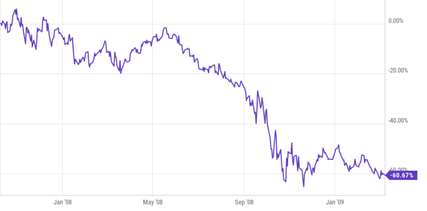
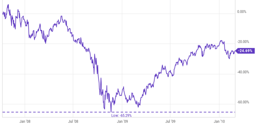
Since many actively managed mutual funds failed to avoid losses during the last bear market 2007 to 2009, many advisors shifted their strategic asset allocation from actively managed mutual funds to index funds. It’s easy to see why; their clients lost a lot of money, even as much as -40% for a balanced portfolio of 60% stocks and 40% bonds. If they were more invested in stocks, it was as much as -50% or more.

If a mutual fund was supposed to be “active,” I can see how such losses would be unacceptable. If an investor is paying more for portfolio management, they probably expect to have a more asymmetric risk/return profile than what long-only exposure to stock indexes all the time would provide for less cost. Index funds and ETFs are cheap because they simply provide exposure to market risks and rewards. They provide this exposure all the time, so when markets fall as they do in a bear market, they lose value and have no stop loss for risk management.

I also use index ETFs to gain exposure to markets, countries, and sectors, but I don’t just buy and hold them, I increase and decrease my exposure to actively manage my risk/reward. My objective is an asymmetric risk/reward, so I want to avoid the larger losses as I try to capture gains. For me, it starts at the individual position level and flows through to the portfolio level. I’m entering positions we expect to result in an asymmetric risk/reward payoff; positions with a higher expected gain than its potential loss. I do this over and over, and they don’t all have to result in asymmetry. We just need the average gains to exceed the average losses over time to achieve a positive asymmetric risk-return profile. It’s an absolute return objective, meaning our focus is on our own payoffs and risk-reward profile, not trying to track what a stock index is doing. My strategy is unconstrained from the limitations of a fixed benchmark. Our objective is more about making money with a predetermined amount of absolute risk, not relative returns and tracking indexes. As such, the return stream is expected to be unique.

That isn’t what active mutual fund managers do.

The typical active mutual fund has an objective of relative return vs. an index benchmark. As I’ve been an investment manager for over two decades, I’ve seen the relative return comparisons become more and more intense. Brokerage firms and investment advisors have created sophisticated performance reporting programs to compare their performance to chosen benchmarks. Active mutual funds have a mandate to “beat” and index. For example, some of them aim to beat the large growth, mid value, or small growth asset classes. Most of them attempt to beat their benchmark by filtering through the stocks in the index and picking better stocks. If a relative return is their objective, they are not focused on managing downside risk. Instead, they are focused on tracking the benchmark and getting ahead of it. Many of them probably attempt it by holding a more focused portfolio or with a portfolio of the higher momentum stocks relative to the benchmark. Since risk management isn’t their objective, they view any overweight in cash as a risk of underperformance. That’s what traditional “active managers” do. What I do is typically called “tactical management” since my objective is absolute return, not relative return, and I want to actively control my drawdowns through risk management. For example, I could be positioned in all cash in a bear market, hedged, short, or long volatility.

So, there is an important distinction between “active managers” with a relative return benchmark-beating objective and those of us with an unconstrained strategy and focus on absolute returns. Mutual funds are typically relative return managers trying to beat a benchmark, hedge funds are typically absolute return managers creating their own unique return stream. Although, typically means that isn’t always the case.

Ok, so, the headline was about the performance of Global Asset Allocation this year.

Back to global asset allocation.

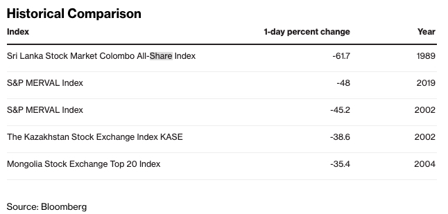
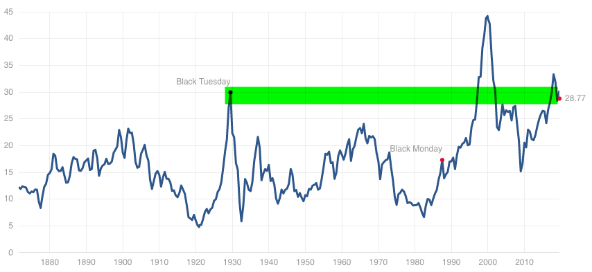
Some financial advisors and media enjoy disparaging all types of active management. They talk about how relative return managers like most mutual funds don’t beat their benchmarks. They’ll point out how absolute return hedge fund type strategies may manage downside risk, but don’t earn as much return as an all-stock portfolio. Most of the time, it isn’t a reasonable comparison. For example, saying the Barclays Hedge Fund Index underperformed the S&P 500 the past decade isn’t complete without also considering the drawdowns. In the last bear market, the S&P 500 declined -56% while the Barclays Hedge Fund Index that includes a composite of thousands of hedge funds declined only -24%. I will suggest the stock index loss was so large most tapped out while the Barclays Hedge Fund Index was low enough that investors could have held on.

It doesn’t matter how much the return is if the risk is so high you tap out before its achieved. 

This year has been a challenging and hostile year for all investment strategies.  While those who adhere to a long-only fully invested asset allocation all the time will talk about the performance of active managers, theirs isn’t much to speak of, either. I know a lot of advisors, and we work with some who invest in my portfolio. Most of their global asset allocations are very simple, and now many of them use index funds and charge an advisory fee for the asset allocation and rebalancing.

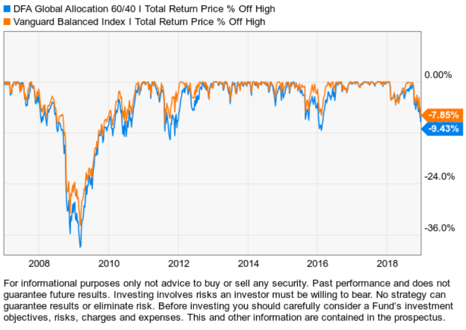
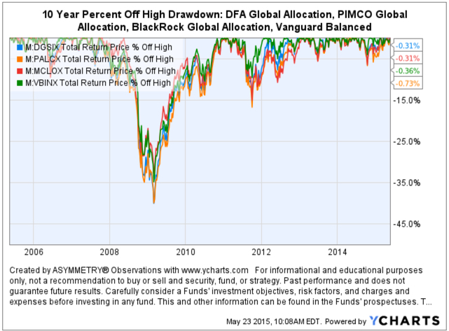
There are some mutual funds that offer a varying method of asset allocation. I am not recommending any of these funds, this is for educational and informational purposes only. Some popular ones that come to mind are BlackRock Global Allocation (MDLOX), Arrow DWA Balanced. PIMCO All Asset All Authority (PAUAX), DFA Global Allocation 60/40 (DGSIX). BlackRock Global Allocation, Arrow DWA Balanced, and PIMCO All Asset All Authority are active allocation funds while DFA Global Allocation is a passive allocation fund managed by Dimensional Fund Advisors. Below are their year-to-date total returns, including dividends. (To see their full history click on the links in their names above.)

Global Asset Allocation Funds

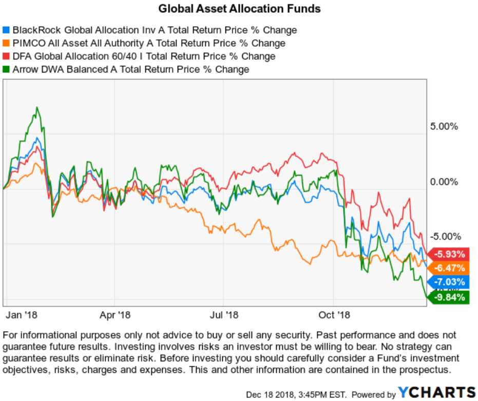
I know financial advisors who are big advocates of large asset managers like Dimensional Fund Advisors (DFA), PIMCO, and BlackRock. Advisors often tout how large they are and how many academics or how many analysts and portfolios managers they have on staff. I included the Arrow DWA Balanced fund because it’s managed by Dorsey Wright, which isn’t as large, but I know advisors use it. Most advisors who offer asset allocation models are doing their own asset allocations for their clients. The above returns are the result of each of these asset managers doing the allocation and investment selection. So, I would expect when it comes to global asset allocation, those funds should be as good as it gets. How is a financial planner who isn’t a portfolio manager going to do better?

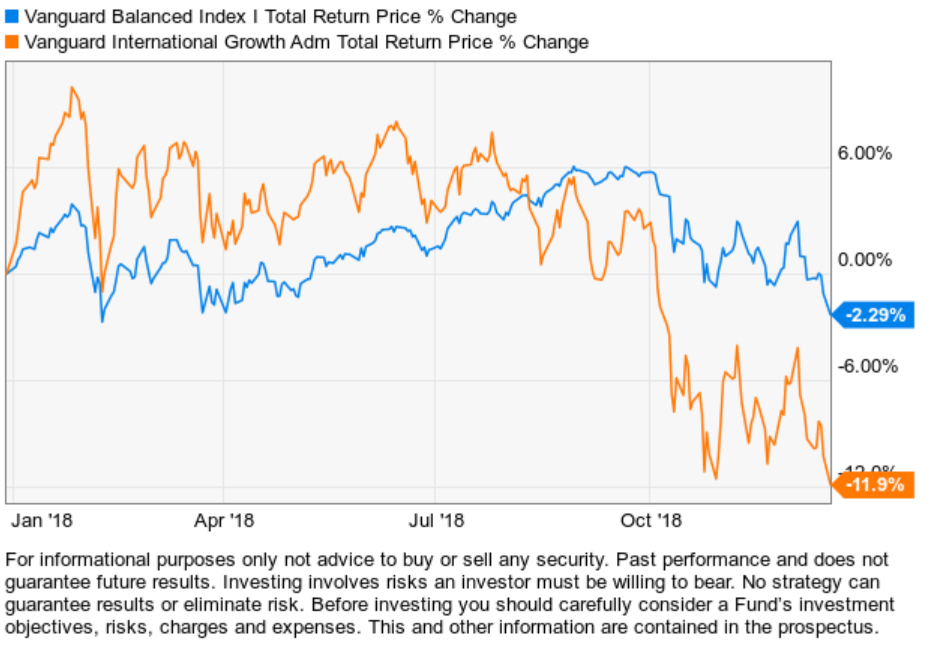
Some may say “What about Vanguard? They are some of the cheapest funds you can buy?”. I don’t know of a Vanguard global asset allocation fund like the DFA fund, but they do have a balanced 60/40 fund that doesn’t include exposure to international. Below is their balanced allocation fund along with their International stock fund. Though their fund isn’t down -7% like the global allocation funds, if you added 20% of their International to make it “global,” we can see it would be similar.

vanguard asset allocation funds

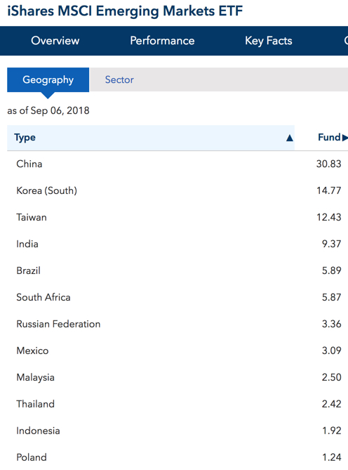
Since indexing and ETFs have become more popular than mutual funds, today we have some interesting ETFs that track global asset allocation indexes so we can better understand the return streams of global asset allocation.

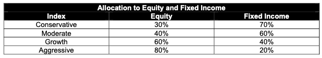
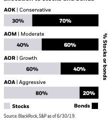
iShares is a BlackRock company, the world’s largest asset manager with $6.29 trillion in assets under management. If an investor thinks a large size with many professionals is the key to investment success, they would probably BlackRock is the best. Of course, I don’t agree, since the most skilled portfolio managers I know are small, focused, specialized firms with all their skin in the game. BlackRock’s iShares offers the iShares Core Allocation Funds, which are ETF allocations of ETFs. Each iShares Core Allocation Fund offers exposure to U.S. stocks, international stocks, and bonds at fixed weights and holds an underlying portfolio of iShares Core Funds. Investors can choose the portfolio that aligns with their specific risk considerations like investment time horizon and risk tolerance; for example, those with longer investment time horizons and higher risk tolerance may consider the iShares Core Aggressive Allocation ETF.

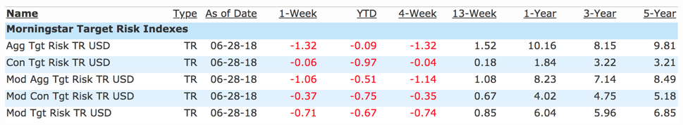
More specifically, the iShares Core Allocation Funds track the S&P Target Risk Indexes. So, not only do you have BlackRock’s portfolio management managing the fund, but they are tracking S&P Target Risk Indexes. Here is their description:

S&P Dow Jones Indices’ Target Risk series comprises multi-asset class indices that correspond to a particular risk level. Each index is fully investable, with varying levels of exposure to equities and fixed income and are intended to represent stock and bond allocations across a risk spectrum from conservative to aggressive.

In other words, they each provide varying allocations to bonds and stocks. The Conservative model is more bonds, the Aggressive model is more stocks.

S&P Target Risk Conservative Index. The index seeks to emphasize exposure to fixed income, in order to produce a current income stream and avoid excessive volatility of returns. Equities are included to protect long-term purchasing power.

S&P Target Risk Moderate Index. The index seeks to provide significant exposure to fixed income, while also providing increased opportunity for capital growth through equities.

S&P Target Risk Growth Index. The index seeks to provide increased exposure to equities, while also using some fixed income exposure to dampen risk.

S&P Target Risk Aggressive Index. The index seeks to emphasize exposure to equities, maximizing opportunities for long-term capital accumulation. It may include small allocations in fixed income to enhance portfolio efficiency.

Below is an example of the S&P Target Risk Index allocations and the underlying ETFs they invest in. Notice their differences is the 10% to 20% allocation between stocks and bonds.

Global Allocation Index Construction

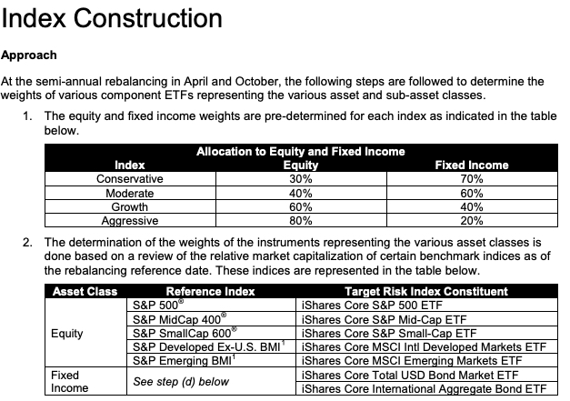
These ETFs offer low-cost exposure to global asset allocation with varying levels of “risk,” which really means varying levels of allocations to bonds. I say they are “low-cost” because these ETFs only charge 0.25% including the ETFs they are invested in. Most financial advisors probably charge 1% for global asset allocation, not including trade commissions and the fund fees they invest in. Even the lowest fee advisors charge at least 0.25% plus the trade commissions and the fund fees they invest in. With these funds, investors who want long-only exposure all the time to global stock and bond market risks and returns, they can get it cheap in one fund.

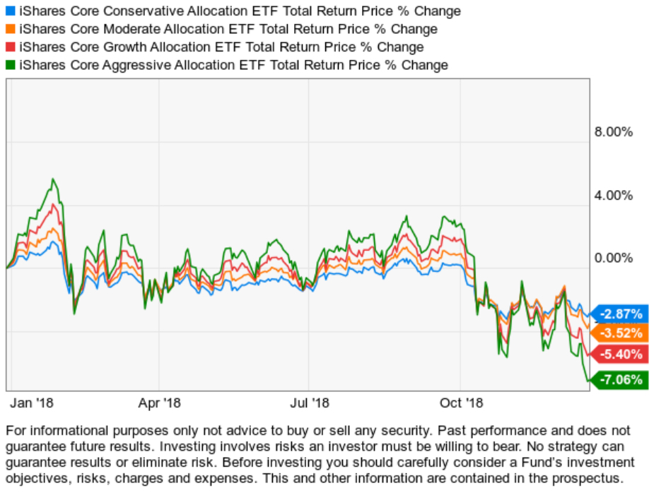
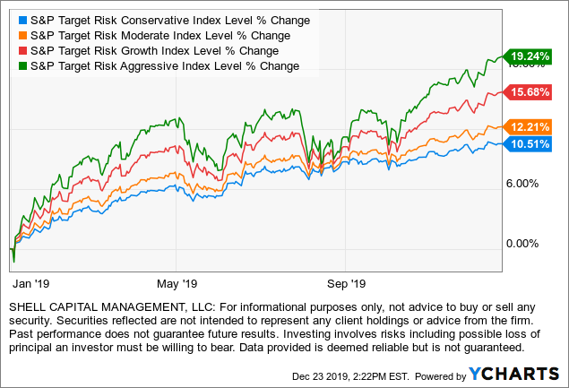
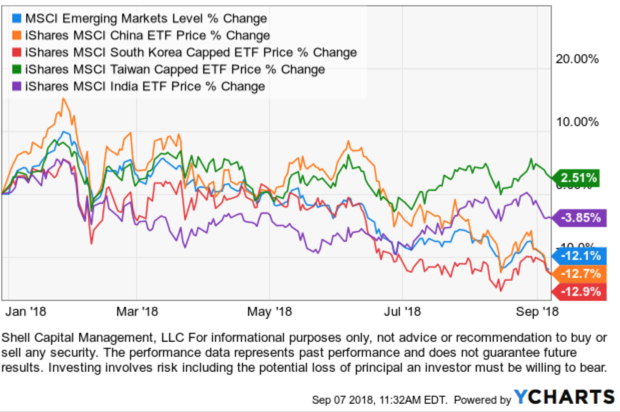
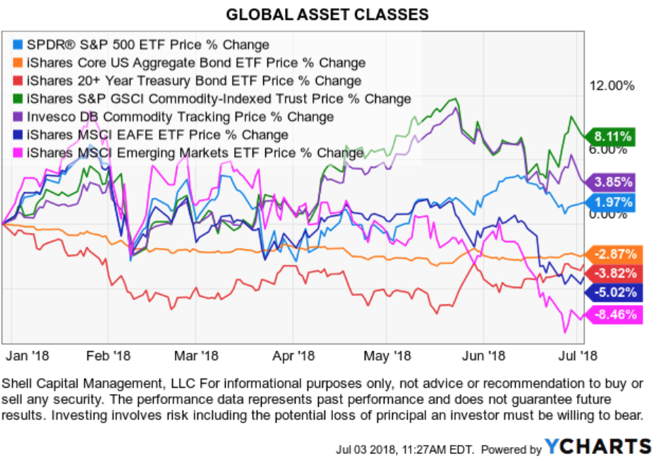
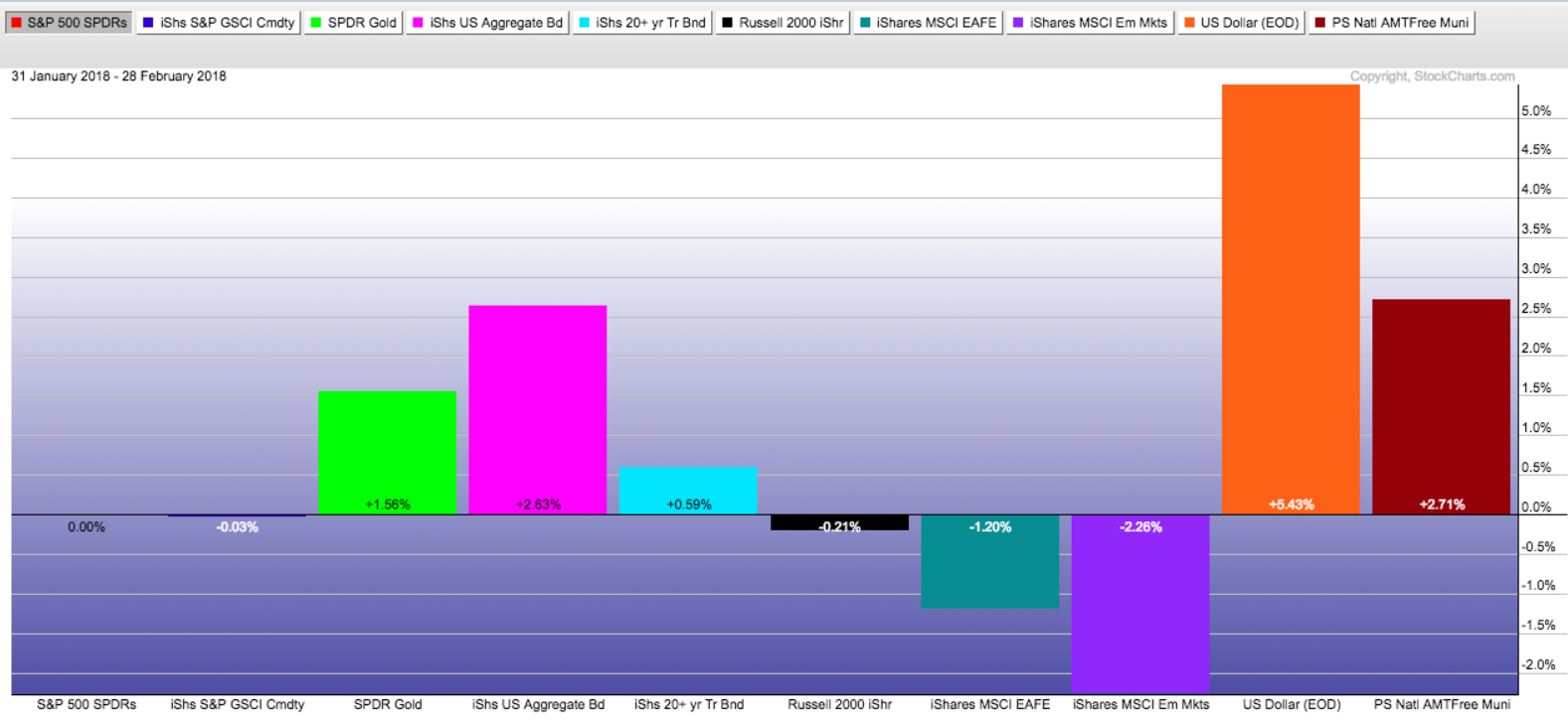
Now that we know what they are, below are their total returns including dividends year to date in 2018. (To see the full history click: iShares)

global asset allocation fund ETF

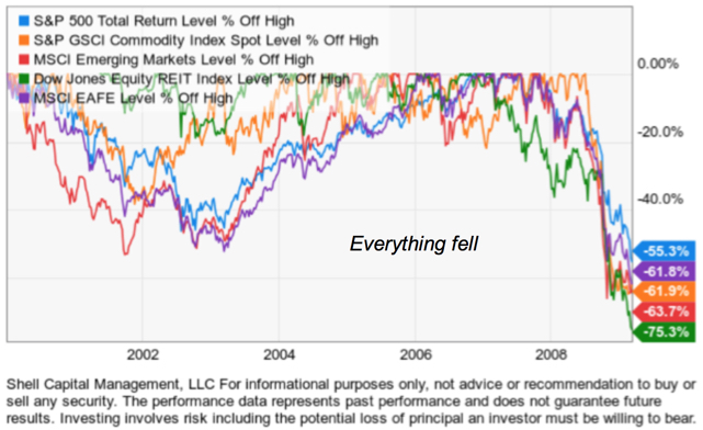
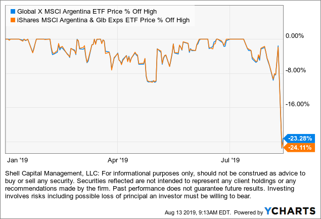
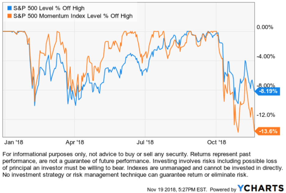
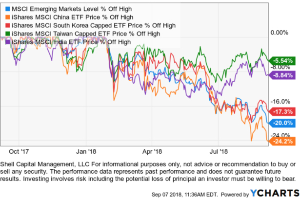
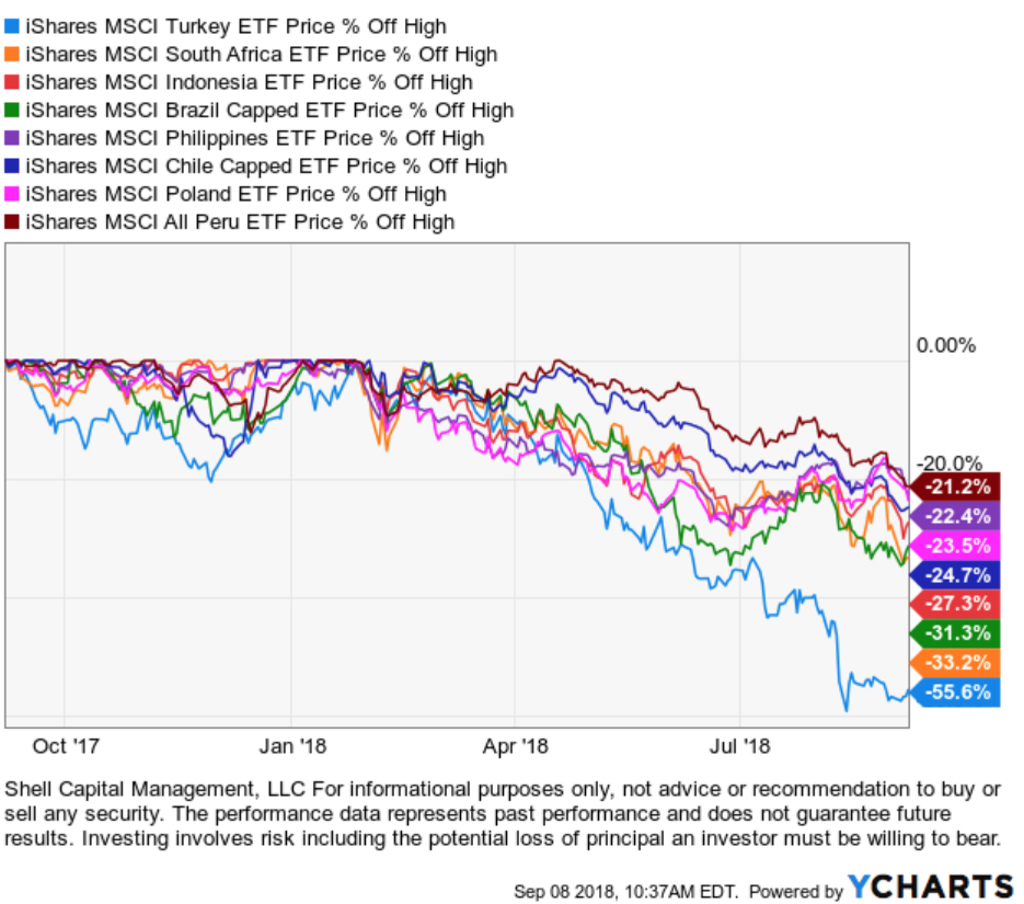
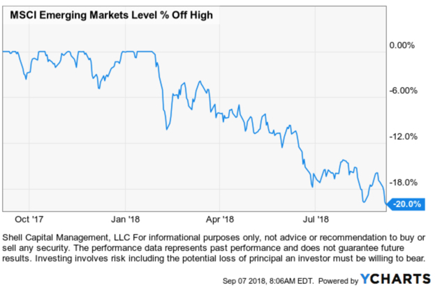
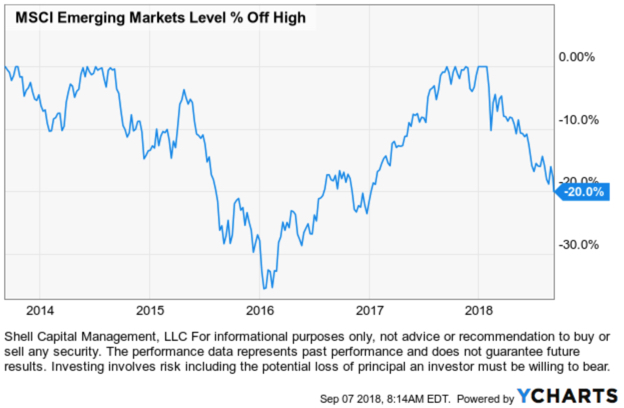
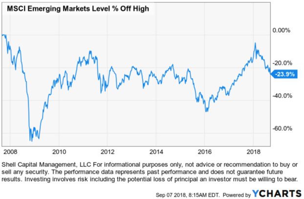
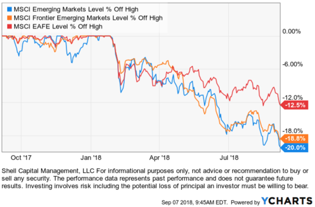
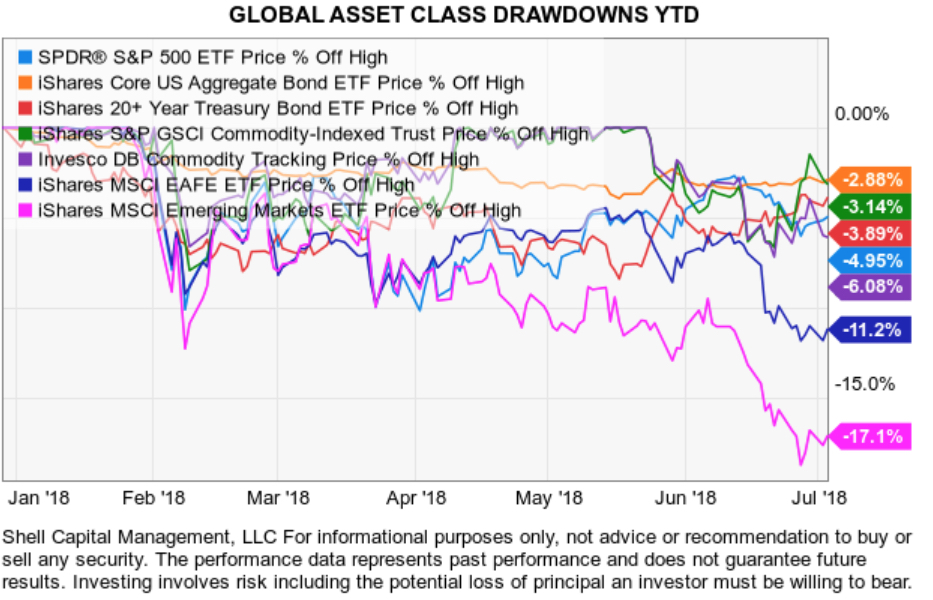
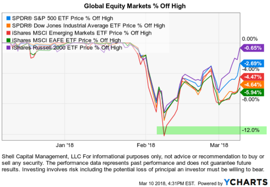
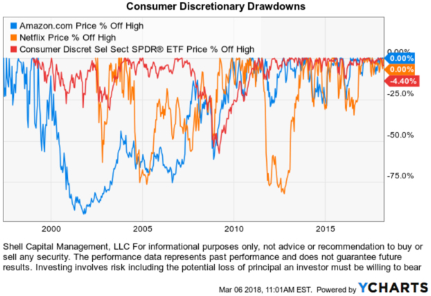
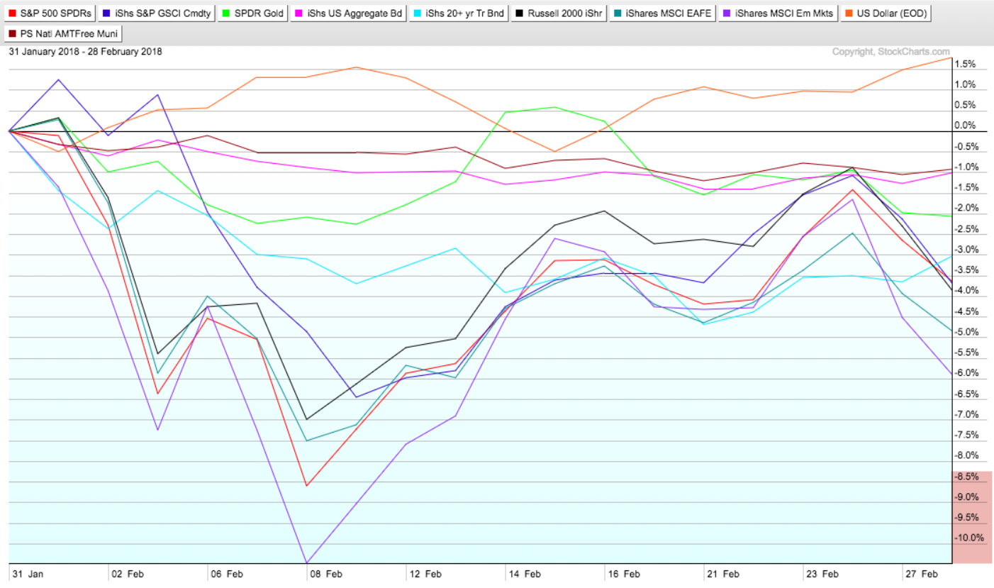
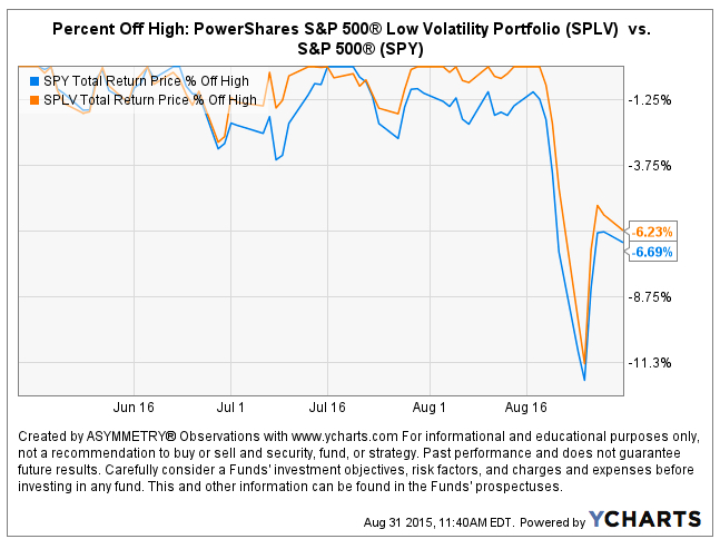
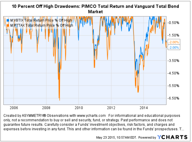
The % off high chart shows their drawdowns from their price high.

global asset allocation ETF ETFs

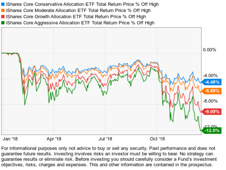
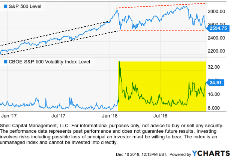
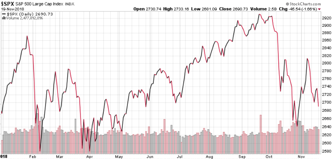
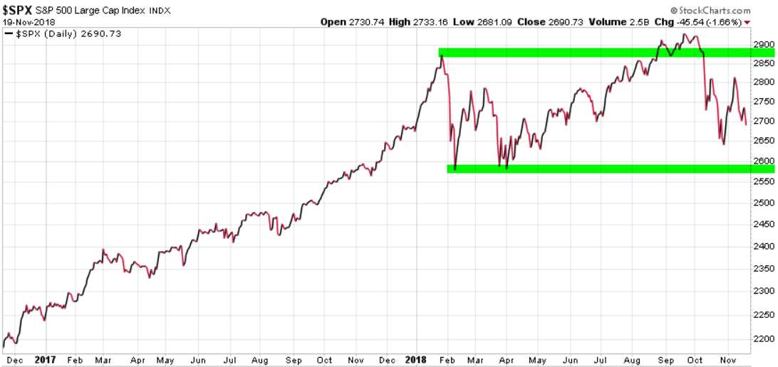
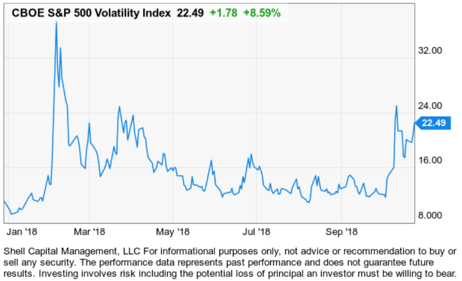
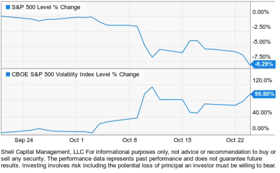
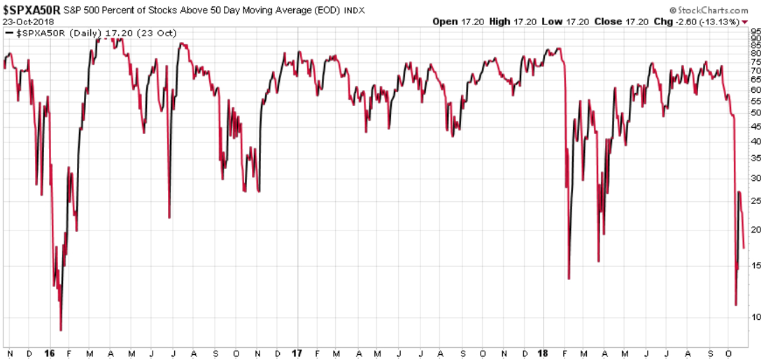
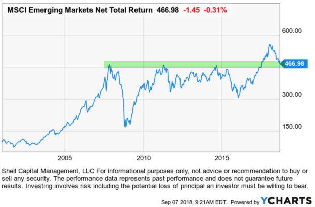
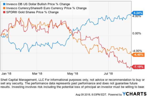
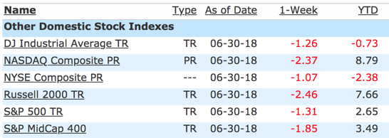
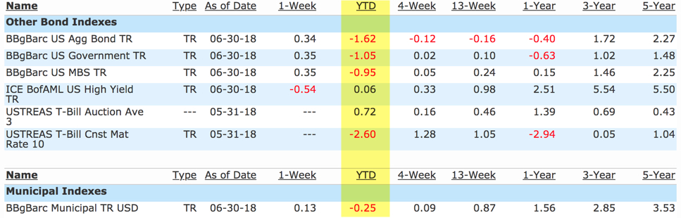
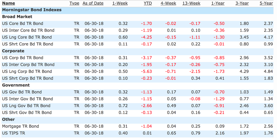
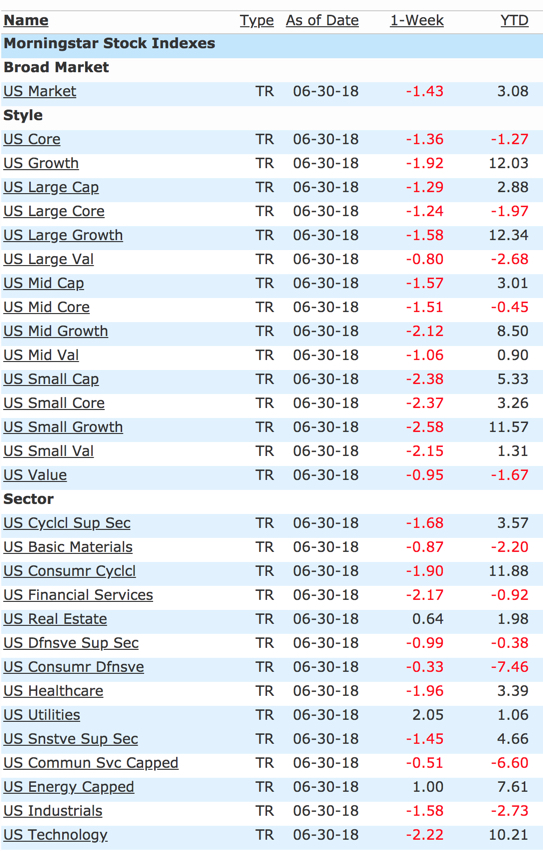
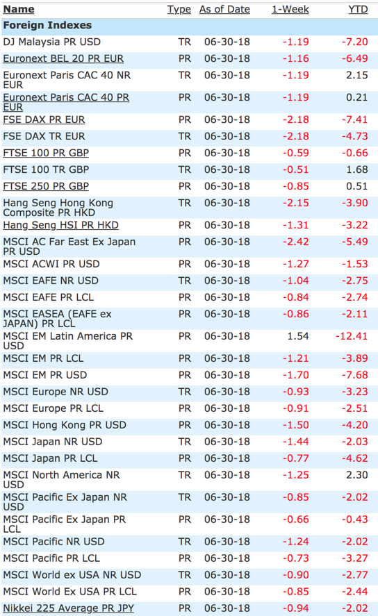
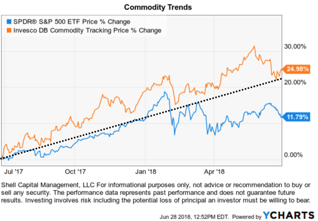
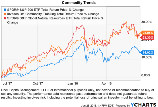
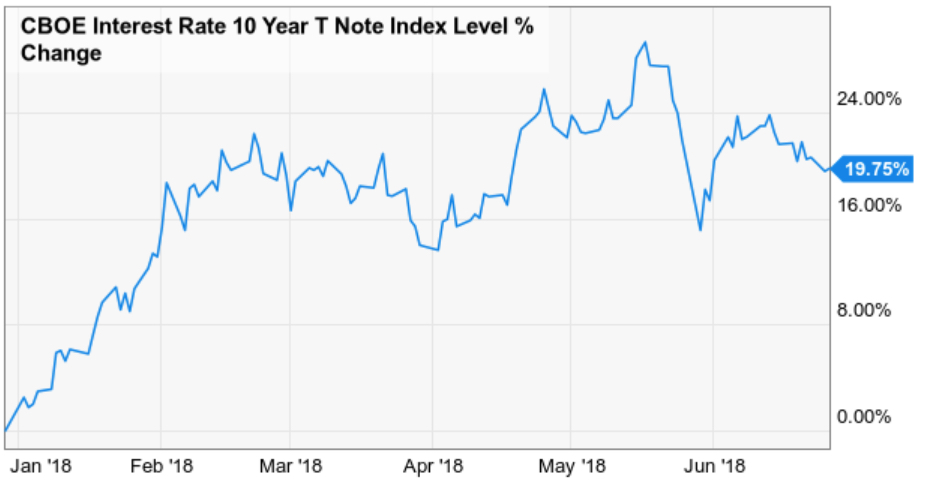
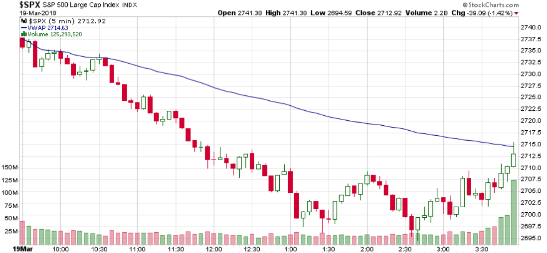
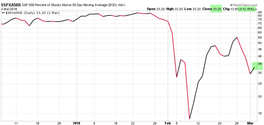
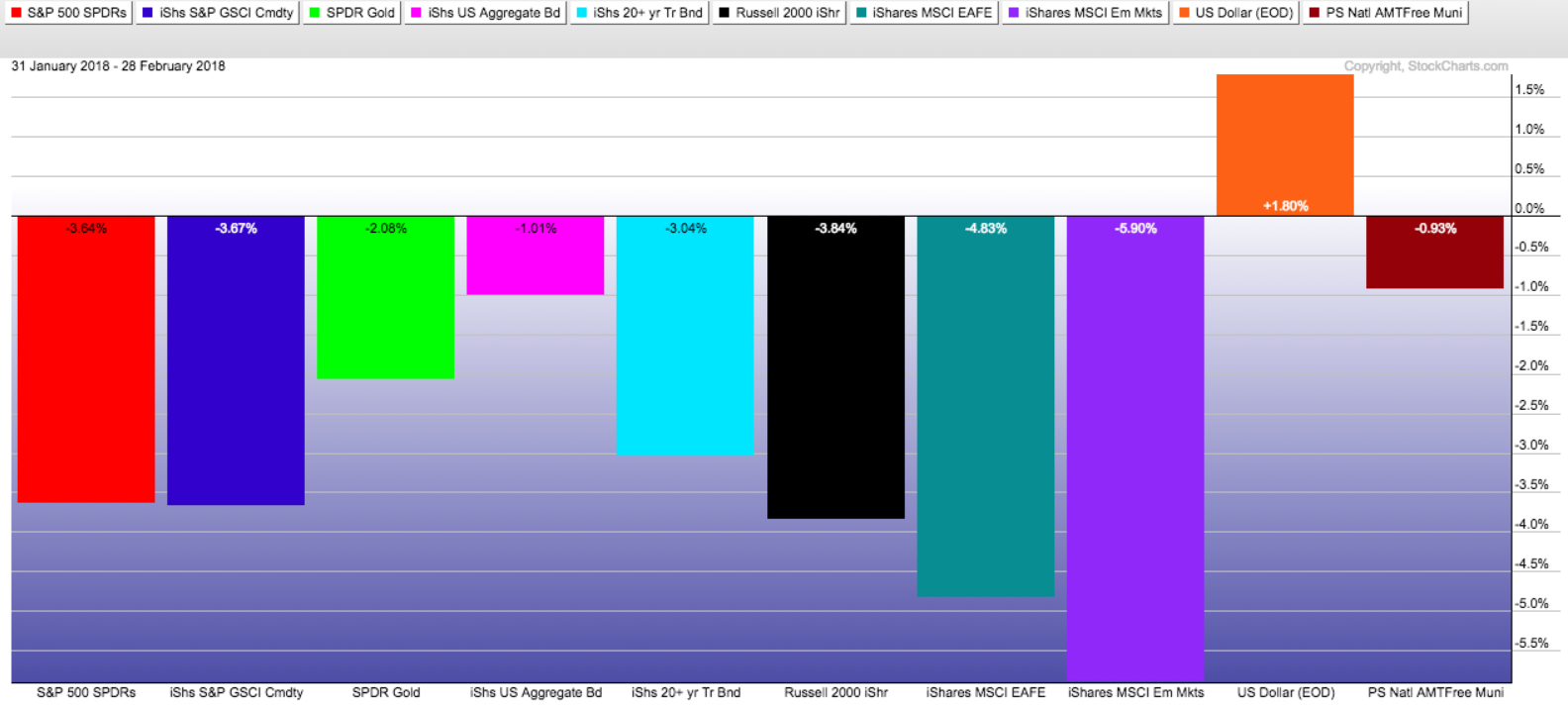
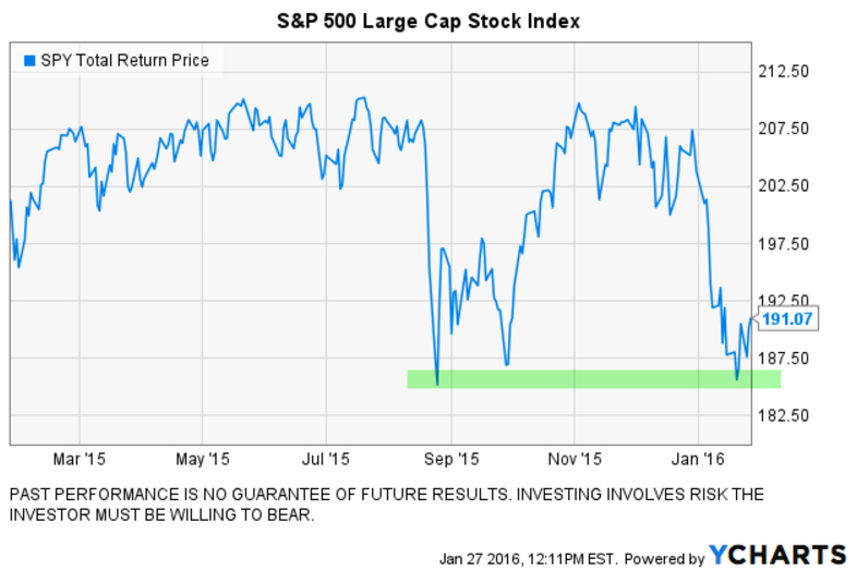
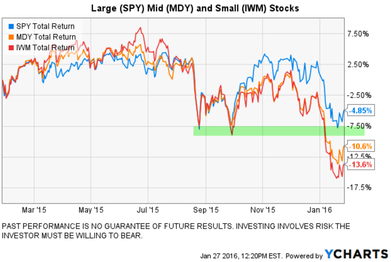
Global asset allocation is having a challenging year in 2018 because U.S. stocks, International stocks, and bonds are all down this year.

Of course, a calendar year doesn’t mean a lot. What we do over 15 or 20 years or more is what matters. But, as low-cost index asset allocation advisors talk about the performance of active managers and hedge fund type managers, 2018 has included conditions that have been hostile for all kinds of strategies.

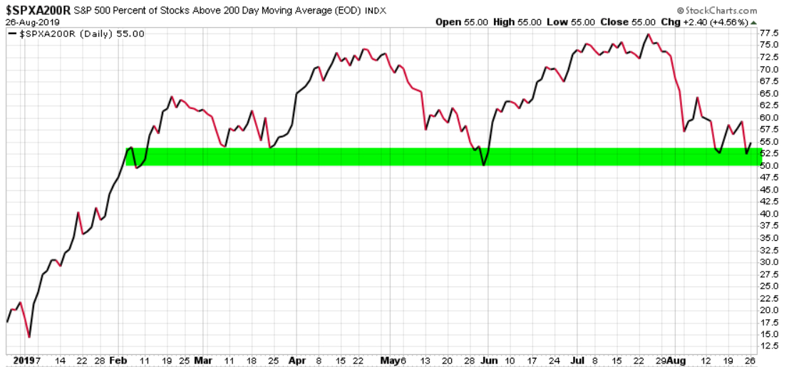
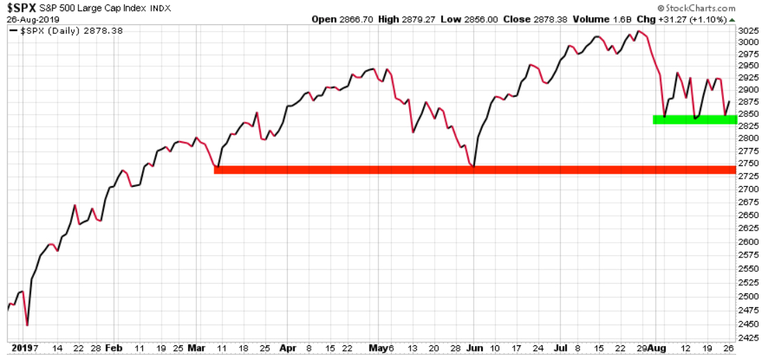
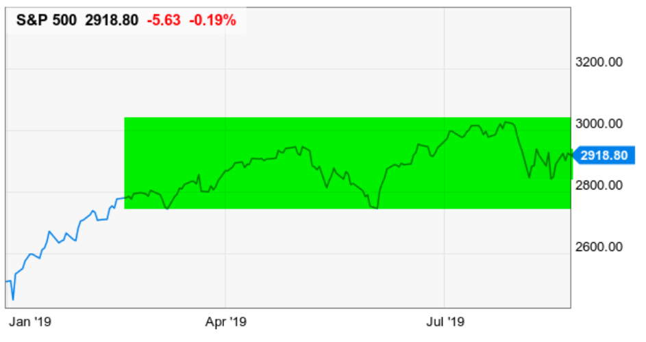
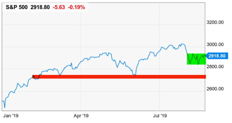
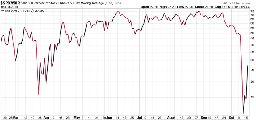
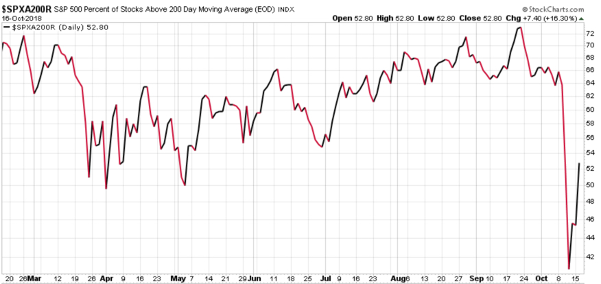
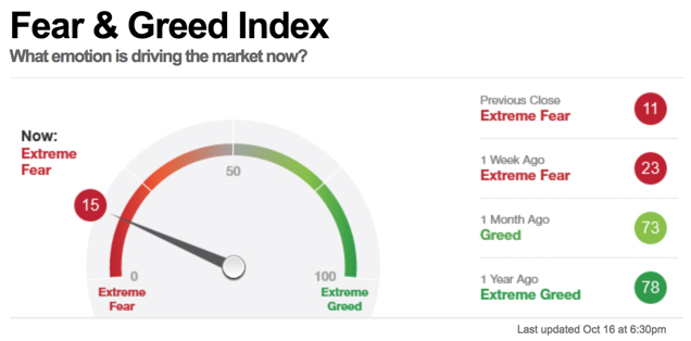
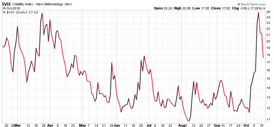
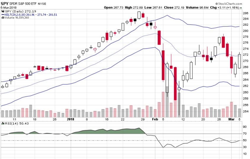
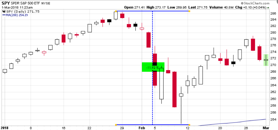
As I said yesterday if this market volatility and correction develops into a full bear market, the asset allocations that are fully exposed to downside risk will test investors’ tolerance for drawdowns.

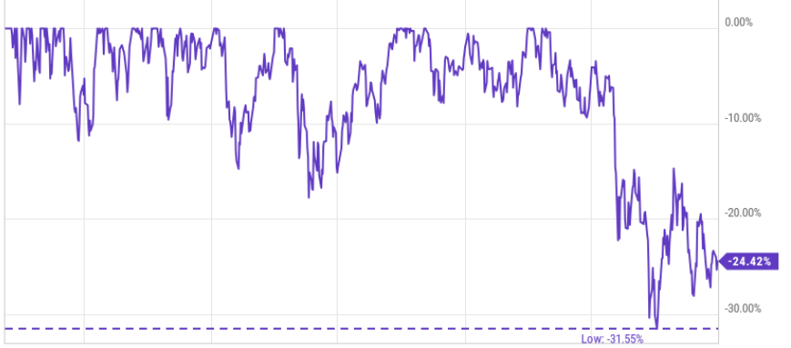
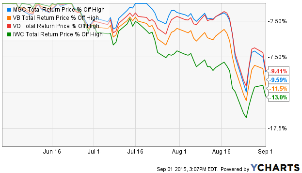
How deep can drawdowns be for such a globally diversified portfolio? Looking at the historical % off high of DFA Global Allocation and Vanguard Balanced gives a historical example. Even two of the efficient allocation funds available had drawdowns of around -35% to -40% in the last bear market. If it’s done it before, it can certainly happen again.

DFA Global Allocation Vanguard Balanced

Those of us applying active risk management and hedging strategies aim to limit the drawdowns within a tolerable amount rather than allowing them to become too large. For me, more than -20% becomes exponentially more difficult to tolerate and recover from. We have to deal with the -10% or so drawdowns sometimes since we can’t avoid them all. We necessarily have to take some risk to gain exposure to the possibility of gains.

Ok, so my headline was a little exaggerated. Drawdowns of -5% to -12% isn’t exactly a “beating”, but that’s the kind of headline we often see about active management and hedge funds.

You can probably see why I believe it’s essential to actively manage risk and position capital in the direction of price trends.


Mike Shell is the Founder and Chief Investment Officer of Shell Capital Management, LLC, and the portfolio manager of ASYMMETRY® Global Tactical.

The observations shared on this website are for general information only and are not specific advice, research, or buy or sell recommendations for any individual. Investing involves risk including the potential loss of principal an investor must be willing to bear. Past performance is no guarantee of future results. The presence of this website on the Internet shall in no direct or indirect way raise an implication that Shell Capital Management, LLC is offering to sell or soliciting to sell advisory services to residents of any state in which the firm is not registered as an investment advisor. Use of this website is subject to its terms and conditions.

Stock Market Observations

The S&P 500 stock index retests October low for the third time. It is only 1.2% above the February and April low, but so far holding the line.

SPY STOCK MARKET

We would expect to see some potential buying support at these levels again. In fact, we’ve already observed some positive reversal today from lower levels. At one point the S&P 500 was down nearly -2% and has reversed back up to near positive. If the lower prices continue to attract buying interest and the current intraday trend continues it could close positive.

SPY VWAP

I pointed out earlier in the year the rising implied volatility indicated by the CBOE S&P 500 Volatility Index was expecting a volatility expansion. The VIX correctly predicted a volatility expansion in 2018.

VIX SPY SPX VOLATILITY EXPANSION ASYMMETRIC

At this point, the Technology, Communication Services, and Materials sectors have turned positive for the day.

SECTOR ETF ROTATION TREND FOLLOWING

Three sectors that have trended above their April lows are Technolgy, Healthcare, and Consumer Discretionary.

trend following stock market sector etfs

The bottom line is when stocks reach a low enough point to attract new buying demand that overwhelms selling pressure, we’ll see the stock market trend back up. We should soon see if the stock market trends down well below its prior lows into a potential bear market level or reverses back up to continue its longer-term uptrend.

The direction of the trend conveys the truth.

Mike Shell is the Founder and Chief Investment Officer of Shell Capital Management, LLC, and the portfolio manager of ASYMMETRY® Global Tactical.

The observations shared on this website are for general information only and are not specific advice, research, or buy or sell recommendations for any individual. Investing involves risk including the potential loss of principal an investor must be willing to bear. Past performance is no guarantee of future results. The presence of this website on the Internet shall in no direct or indirect way raise an implication that Shell Capital Management, LLC is offering to sell or soliciting to sell advisory services to residents of any state in which the firm is not registered as an investment advisor. Use of this website is subject to its terms and conditions.

Momentum stocks need to find some buying interest

The U.S. stock indexes were down nearly -2% today.

Prior to today, it appeared more likely the stock market would attempt to trend higher. The only positive about today’s price action was the volume was lighter. The S&P 500 stock index is now 2% above its October low and 5.4% above its February low.

To reverse the downtrend, selling pressure must be exhausted as buying demand becomes dominant. If we don’t see selling exhausted and buying interest in the coming days, it appears we may see the October lows revisited in the large-cap stock index. It’s only 2% away.

Looking at the bigger picture, a 2-year chart of the S&P 500 stock index shows its primary trend is still up with higher highs and higher lows, despite the volatile trading range in 2018. Nevertheless, the +/- 10% swings we’ve observed this year is a much higher range than we saw last year.

The stock market is seasonally in its best period of the year. That is especially true for November and December. Although, that hasn’t been the case yet with the S&P 500 down over -4% so far in November. For example, the seasonality chart shows the SPX has closed higher than it opened 70% of the time in November and 74% of the time in December. We’ll see if this matches the favorable odds or if it’s one of the 30% of times it doesn’t close positive.

The technology sector was the weakest today and it broke just below its October low. If its price has trended down low enough to attracting buying demand it could form a double bottom reversal and trend back up. If it continues to trend down enough, it could change its primary trend from up to down. Up until now, the tech sector has been the momentum leader. Technology is also the largest weight in the S&P 500 at 20%.

It could turn out to be positive that the former leading tech sector has lead the downtrend. Reversing leadership doesn’t normally sound like a good thing, except it is one of the main sectors weighing down the overall stock market the past week. Since it’s reached its October low already, we’ll see in the days and weeks ahead if it’s reached a low enough point to attract enough buying to overwhelm the selling.

In fact, momentum stocks have become the laggards recently. The S&P 500® Momentum Index is designed to measure the performance of securities in the S&P 500 universe that exhibit persistence in their relative performance. The momentum index is an index of stocks whose price trend momentum has outperformed other stocks. Indexes can’t be invested in directly, but we can use them to observe their trends. Here we see an index of stocks that were considered the leading momentum stocks have declined nearly -14% off its high, even more than the S&P 500 large-cap stock index. The technology sector overwhelms this momentum index with a 35.4% weighting. Tech had been so strong its weight is more than double the second largest weighted sector (Consumer Discretionary 15.4%).

You can probably see why I prefer to increase and decrease my exposure to the possibility of loss rather than just buying and holding an allocation with no predetermined exit. Because we know there is a point we’ll exit losers rather than let the losses become larger,  we won’t wait for losses to get too large and become the panic sellers. We observe many investors believe in buy and hold and passive asset allocation until they realize their losses get much larger than they expected and they respond more emotionally than they thought they would. I call it panic selling when they tap out because of fear rather than a predetermined exit point based on drawdown control.

The U.S. stock market remains in the range of an inflection point and we’ll soon see if it’s going to turn down into more of a downtrend or reverse back up. We’ll see how it all unfolds from here.

Mike Shell is the Founder and Chief Investment Officer of Shell Capital Management, LLC, and the portfolio manager of ASYMMETRY® Global Tactical.

The observations shared on this website are for general information only and are not specific advice, research, or buy or sell recommendations for any individual. Investing involves risk including the potential loss of principal an investor must be willing to bear. Past performance is no guarantee of future results. The presence of this website on the Internet shall in no direct or indirect way raise an implication that Shell Capital Management, LLC is offering to sell or soliciting to sell advisory services to residents of any state in which the firm is not registered as an investment advisor. Use of this website is subject to its terms and conditions.

Observations of the stock market downtrend

Observations of the stock market downtrend

In the last observation I shared about the stock market, “The stock market trends up with momentum,” we saw the stock market reverse back up with strong momentum. The S&P 500 stock index had declined about -7% from its high, then reversed back up 3%. I discussed how investor behavior and sentiment drives market prices. Many investor sentiment measures signaled investor fear seemed to be in control, driving down prices. Volatility had spiked and then started to settle back down. Many individual stocks in the S&P 500 had declined enough to signal shorter-term downtrends, but then they reversed up. I closed by saying:

In summary, today was a strong upward momentum day for the stock market and most stocks participated in the uptrend. After sharp declines like we’ve seen this month, the stock market sometimes reverses up like this into an uptrend only to reverse back down to test the low. After the test, we then find out if it breaks down or breaks out.

One day doesn’t make a trend, but for those who are in risk taker mode with stocks, so far, so good.

The part I bolded with italics has turned out to be the situation this time.

Below is a year to date price trend of the S&P 500 stock index. As of today, my observation “the stock market sometimes reverses up like this into an uptrend only to reverse back down to test the low” is what we are seeing now.

stock market trend

I’ve always believed investment management is about probability and possibilities, it’s never a sure thing. The only certainty is uncertainty, so all we can do is stack the odds in our favor. As I said before, “After the test, we then find out if it breaks down or breaks out.” 

The positive news is, investor sentiment measures are reaching levels that often precede short-term trend reversals back up.

The bad news is if the current trend becomes a bigger downtrend these indicators will just stay at extremes as long as they want. We have to actively manage our exposure to loss if we want to avoid large losses, like those -20% or more that are harder to overcome.

Down -10% is one thing, down -20% is another. Any investor should be willing to bear -10% because they will see them many times over the years. Only the most passive buy and hold investors are willing to bear the big losses, which I define as -20% or more.

Nevertheless, I see some good news and bad, so here it is. I’ll share my observations of the weight of the evidence by looking at relatively simple market indicators. I don’t necessarily make my tactical decisions based on this, but it is instead “market analysis” to get an idea of what is going on. Observations like this are intended to view the conditions of the markets.

Fear is the dominant driver. 

The Fear & Greed Index tracks seven indicators of investor sentiment. When I included it a week ago, it was at 15, which is still in the “Extreme Fear” zone. The theory is, the weighting of these seven indicators of investor sentiment signals when fear or greed is driving the market. Clearly, fear is the dominant driver right now.

fear greed index investor sentiment behavioral finance

At this point, we can see investor sentiment by this measure has now reached the low level of its historical range. In this chart, we can see how investor sentiment oscillates between fear and greed over time in cycles much like the stock market cycles up and down.

fear and greed back test over time investor sentiment indicator

I believe investor behavior is both a driver of price trends, but investors also respond to price trends.

  • After prices rise, investors get more optimistic as they extrapolate the recent gains into the future expecting the gains to continue.
  • After prices fall, investors fear losing more money as they extrapolate the recent losses into the future expecting them to get worse.

Investor sentiment and price trends can overreact to the upside and downside and the herd of investors seems to get it wrong when they reach an extreme. We observe when these kinds of indicators reach extremes, these cycles are more likely to reverse. It is never a sure thing, but the probabilities increase the possibility of a reversal. But, since there is always a chance of a trend continuing longer in time and more in magnitude, it is certainly uncertain. Since there is always a chance of a bad outcome, I  have my limits on our exposure to risk with predetermined exits or a hedge.

Speaking of a hedge. 

I started pointing out my observation several weeks ago of a potential volatility expansion. If you want to read about it, most of the past few weeks observations have included comments about the VIX volatility index. Over the past few days, we’ve observed a continuation in the volatility expansion.

vix hedge volatility expansion asymmetric hedge asymmetry

Implied volatility has expanded nearly 100% over in the past 30 days.

vix volatility expansion trading

As a tactical portfolio manager, my first focus is risk management. When I believe I have defined my risk of loss, I become willing to shift from risk manager to risk taker. I share that because I want to point out the potential for hedging with volatility. Rather than a detailed exhaustive rigorous 50-page paper, I’m going to keep it succinct.

My day job isn’t to write or talk about the markets. I’m a professional portfolio manager, so my priority is to make trading and investment decisions as a tactical investment manager. I’m a risk manager and risk taker. If I never take any risk, I wouldn’t have any to manage. The observations I share here are just educational, for those who want to follow along and get an idea of how I see things. I hope you find it helpful or at least interesting. It’s always fun when it starts new conversations.

To keep the concept of hedging short and to the point for my purpose today, I’ll just share a simple chart of the price trend of the stock index and the volatility index over the past 30 days. The stock index has declined -8.3% as the implied volatility index expanded over 95%. You can probably see the potential for a hedge. However, it isn’t so simple, because these are just indexes and we can’t buy or sell the VIX index.

vix volatility as a hedge stock market risk management

The purpose of a hedge is to shift the risk of loss from one thing to another. The surest way to reduce the possibility of loss is to simply sell to reduce exposure in the thing that is the risk. That’s what I do most of the time. For example, when I observed a potential volatility expansion, I reduced my exposure to positions that had the possibility of loss due to increased volatility. Once prices fall and volatility contracts, maybe we increase exposure again to shift back to risk-taking. If we take no risk at all, we would have no potential for a capital gain. So, tactical portfolio management is about increasing and decreasing exposure to the possibility of gain and loss. If we do it well, we create the kind of asymmetric risk/reward I aim for.

So, any hedging we may do is really just shifting from one risk to another, hoping to offset the original risk. Keep in mind, as I see it, a risk is the possibility of loss. I’ll share more on hedging soon. I have some observations about hedging and hedge systems you may find interesting.

Most stocks are participating in the downtrend. Below is an updated chart of the percent of the stocks in the S&P 500 that are above their 50-day moving average. If you want to know more about what it is, read the last observations. The simple observation here is that most stocks are declining.

stock market breadth risk indicator

Much like how we saw investor sentiment cycle and swing up and down, we also see this breadth indicator oscillate from higher risk levels to lower risk levels.

  • After most stocks are already in uptrends, I believe the risk is higher that we’ll see it reverse.
  • After most stocks have already declined into downtrends, it increases the possibility that selling pressure may be getting closer to exhaustion.

The good news is, at some point selling pressure does get exhausted as those who want to sell have sold and prices reach a low enough level to bring in new buying demand.

That’s what stock investors are waiting for now.

These are my observations. I don’t have a crystal ball, nor does anyone. I just predetermine my risk levels in advance and monitor, direct, and control risk through my exits/hedging how much I’m willing to risk, or not. We’ll just have to see how it all unfolds in the days and weeks ahead.

Only time will tell if this is the early stage of a bigger deeper downtrend or just another correction within the primary trend.

I hope you find my observations interesting and informative.

Mike Shell is the Founder and Chief Investment Officer of Shell Capital Management, LLC, and the portfolio manager of ASYMMETRY® Global Tactical.

The observations shared on this website are for general information only and are not specific advice, research, or buy or sell recommendations for any individual. Investing involves risk including the potential loss of principal an investor must be willing to bear. Past performance is no guarantee of future results. The presence of this website on the Internet shall in no direct or indirect way raise an implication that Shell Capital Management, LLC is offering to sell or soliciting to sell advisory services to residents of any state in which the firm is not registered as an investment advisor. Use of this website is subject to its terms and conditions.

The stock market trends up with momentum

When the stock market indexes swing up or down 1% or more I try to share my observations of the directional trend and changes in volatility. Continuing from my observation yesterday in Observations of the stock market decline and volatility expansion when I shared:

The good news is, we’ve now experienced some volatility expansion, stocks have now pivoted down to the lower end of their cycles, so maybe volatility will contract and stock prices resume their uptrend.

We’ll see.

Well, today we saw.

The U. S. stock market gains were broad across all sectors. Communication Services, Consumer Discretionary, Healthcare, and Technology were the relative momentum leaders.

stock market trend sector ETF momentum

Continuing with the % of S&P 500 stocks above their 50 day moving average as breadth indicator was another indication of broad upward momentum. 86% more stocks are trading above their shorter-term trend, an expansion from a low level. For those of us who like to enter trends early in their stage, this is a positive sign of improvement for the stock market.

percent of stocks above below 50 day moving average trend following momentum

We observe the same in the percent of stocks trending back above their longer-term trends. There was a 16% expansion in the stocks in the S&P 500 index trending above their 200 day moving average. The longer-term trend indicators are slower to respond, but this is more evidence of positive directional movement.

stock momentum percent of stocks above 200 day moving average trend following asymmetric

This is happening at a time when many investor sentiment indicators suggest fear has been driving stocks recently. A simple example is the Fear & Greed Index, which reached “Extreme Fear” a week ago.

CNN FEAR GREED INDEX SENTIMENT

As a portfolio manager for the past two decades, I have observed investor sentiment oscillate between fear and greed, but as a contrarian pendulum. Most investors feel the wrong feeling at the wrong time.

  • After prices rise, investors get more optimistic as they extrapolate the recent gains into the future expecting the gains to continue.
  • After prices fall, investors fear losing more money as they extrapolate the recent losses into the future expecting them to get worse.

What happens, though, is market trends move in multiple time frames of cycles up and down. Prices can overreact to the upside and downside and the majority of investors seem to get it wrong.

The level and direction of implied volatility is an indication of investor sentiment. I’ve shared my observations of the volatility expansion and noted some volatility contraction yesterday. So far, the volatility expansion has reversed to contraction, so the expected volatility as implied by options prices now suggests the market expects lower volatility in the weeks ahead.

VIX VOLATILITY CONTRACTION EXPANSION ASYMMETRIC RISK HEDGE ASYMMETRY

But, just as I pointed out on September 25th in VIX level shows market’s expectation of future volatility implied volatility can get it wrong. I pointed out then the implied volatility was very low signaling to me the market may have been wrong to expect such low future volatility, so it can reverse back up again.

In summary, today was a strong upward momentum day for the stock market and most stocks participated in the uptrend. After sharp declines like we’ve seen this month, the stock market sometimes reverses up like this into an uptrend only to reverse back down to test the low. After the test, we then find out if it breaks down or breaks out.

One day doesn’t make a trend, but for those who are in risk taker mode with stocks, so far, so good.


Mike Shell is the Founder and Chief Investment Officer of Shell Capital Management, LLC, and the portfolio manager of ASYMMETRY® Global Tactical.

The observations shared on this website are for general information only and are not specific advice, research, or buy or sell recommendations for any individual. Investing involves risk including the potential loss of principal an investor must be willing to bear. Past performance is no guarantee of future results. The presence of this website on the Internet shall in no direct or indirect way raise an implication that Shell Capital Management, LLC is offering to sell or soliciting to sell advisory services to residents of any state in which the firm is not registered as an investment advisor. Use of this website is subject to its terms and conditions.

What trends are driving emerging markets into a bear market?

In Emerging Markets Reached a Bear Market Level we noted the emerging markets index has declined -20%, which is considered to be in bear market territory. The emerging markets index includes 24 countries classified as emerging countries.

To see the country exposure, we examine the iShares MSCI Emerging Markets ETF holdings. China is about 31%, South Korea is about 15%, Taiwan is over 12%, so the top three countries make up 58% of the country exposure. Add India at 10% and the top four countries is a dominant 68% of the exposure. Clearly, we’d expect the drift of these top holdings to dominate the trend.

what countries are emering markets ETF ETFs

Below we see the 2018 price trends of the emerging markets ETF and the top four countries that make up 68% of the emerging markets index ETF exposure. We see that South Korea and China are the primary downtrends that are trending close to the emerging markets index ETF. Taiwan and India have stronger relative momentum.

emerging markets $EEM china $FXI india south korea 2018 trend

To get a better understanding of what is driving the downtrend, we draw the % off high charts to see the drawdowns. From this observation, we can see what is really driving the trend. Of the top four countries in the index, the negative momentum of China and South Korea are driving the trend down. China is down -24% over the past year as South Korea is down -17%.

emerging market ETF trends

Taiwan and India have stronger relative momentum since they have trended up more recently since July. Prior to July, they were trending closer to China and South Korea.

You can probably see why I include the individual countries in my global universe rather than just the broad emerging markets index ETF that includes 24 countries. I want to find potentially profitable price trends, so I increase my opportunity to find them when I give myself more options.

There are 24 countries represented in the MSCI Emerging Markets Index and we’ve looked at the top 4 because they are given 68% of the exposure. That leaves only 32% in the other 20 countries. So, in regard to understanding what is driving the MSCI Emerging Markets Index, viewing the trend of the top holdings is enough to get an idea of the countries driving returns. But, in wanting to go find potentially profitable price trends, I research all the countries trends.

What about the rest of the emerging markets countries? 

Looking at the other 20 countries classified as emerging markets, I’ll divide them into groups. First, we’ll look at the other countries that are down -10% or more year-to-date. Then, I’ll draw a chart of those that are down this year,  but not as much. We’ll end with the few that are positive in 2018.

Emerging markets countries down the most year-to-date include Turkey, South Africa, Indonesia, Brazil, Philippines, Chile, Poland, and Peru. Priced in U.S. dollars, these countries are down between -14% and -52%. Turkey is down the most.

emerging markets countries down 2018 $EEM

Looking at their % off high shows us the drawdown over the past year, which is a different perspective. If you had held one of these ETFs, this is the amount it would be down from its highest price over the past year.

Emerging markets countries down the most 2018

Clearly, these emerging countries are in downtrends and a bear market if we define a bear market as a -20% decline. Keep in mind, these ETFs are foreign stocks priced in U.S. dollars, so to U.S. investors, this is what the trends of these countries look like.

Next, we observe emerging markets countries that are down less than -10% in 2018. Russia, Columbia, Thailand, and Malasia are down between -3% and 8% so far. Their trends are generally down: lower highs and lower lows.

emering markets year to date 2018

We can see the downtrends in a different perspective when we view their drawdowns as a % off high over the past year.

emering market countries percent off high asymmetric risk reward

I saved the best for last. The strongest trending top momentum emerging markets countries so far in 2018 are Mexico, Taiwan, Saudi Arabia, and Qatar. Saudi Arabia was previously classified as a smaller frontier market, but, this summer MSCI announced it will include the MSCI Saudi Arabia Index in the MSCI Emerging Markets Index.

top momentum emerging markets countires 2018

Hearing names like Mexico, Taiwan, Saudi Arabia, and Qatar may highlight home country bias for some investors. Home country bias is the tendency for investors to favor companies from their own countries over those from other countries or regions.

I don’t have a home country bias. I am open to finding potentially profitable price trends in any country around the world. We encourage investors to be open to global trends and not limit their choices, but if our clients don’t want exposure to any specific country, we are able to exclude it in our ASYMMETRY® Managed Portfolios.

While the United States is the single largest economy in the world, according to JP Morgan it accounts for only a small fraction of global GDP and just over 35% of the world’s capital markets. Yet, studies show that U.S. investors have nearly 75% of their investments in U.S.-based assets. As we’ve shown here, there has been a good reason to avoid emerging countries for now, but as we explain in Emerging Markets Reached a Bear Market Level there are times when these countries present strong relative momentum over U.S. stocks.

This is why I tactically shift between global markets based on their directional price trends rather than a fixed buy and hold global asset allocation.


Mike Shell is the Founder and Chief Investment Officer of Shell Capital Management, LLC, and the portfolio manager of ASYMMETRY® Global Tactical.

You can follow ASYMMETRY® Observations by click on on “Get Updates by Email” on the top right or follow us on Twitter.

The observations shared in this material are for general information only and are not intended to provide specific advice or recommendations for any individual. Investing involves risk including the potential loss of principal an investor must be willing to bear. Past performance is no guarantee of future results.


Emerging Markets Reached a Bear Market Level, or is it a Continuation of a Secular Bear Market?

Emerging Markets Reached a Bear Market Level, or is it a Continuation of a Secular Bear Market?

An emerging market is a country that has some characteristics of a developed market but does not satisfy standards to be termed a developed market.

The MSCI Emerging Markets Index covers more than 800 securities across large and mid-cap size segments and across style and sector segments in 24 emerging markets. The 24 countries in the index represent 10% of world market capitalization.  The Index is available for a number of regions, market segments/sizes and covers approximately 85% of the free float-adjusted market capitalization in each of the 24 countries.

MSCI uses their MSCI Market Classification Framework to classify countries based on economic development, size and liquidity, and market accessibility criteria.

According to MSCI, it includes countries like Brazil, Chile, Colombia, and Mexico in the Americas. emerging markets in Europe, the Middle East, and Africa are countries like Hungary, Poland, Russia, and Turkey. Asia emerging markets are China, India, Korea, and Taiwan.

MSCI Emerging Markets Index ETF ETFs

Now that we have clarified who the emerging markets countries are, let’s take a look at their price trends.

The MSCI Emerging Markets Index is in a bear market territory, down -20% from its high in January. The investment industry defines a “bear market” as a -20% off its recent high, so we’ll go with it.

emerging markets $EEM #EEM $IEMG

This isn’t the first time Emerging Markets have declined -20% or more since 2009. The downtrend 2015 – 2016 was over -30%.

EEM Emerging Markets $EEM

Looking back to 2007, we see the Emerging Markets Index has never recovered to reach its high in September 2007. It’s still down about -24% from the high 11 years ago.

$EEM Emerging Markets ETF ETFs

So, if we define a “bear market” as -20% off its high, the Emerging Markets Index was in a bear market until January this year and has since reversed back into a bear market again. A bear market that lasts 11 years as this one did is called a “secular bear market“.

emerging markets long term trend secular bear market eem $eem

So, we could say: emerging markets have reentered their secular bear market. Or, maybe it’s just a continuation of a secular bear market if we don’t consider the temporary January 2018 breakout above its 2007 high to have ended the ongoing secular bear market.

The bottom line is, emerging markets countries as an index are trending down. They’ve been in a generally non-trending range for the last decade, though there have been many swings up and down along the way.

It is what it is, but you may now wonder; Why? I pointed out in Trend of the International Stock Market one reason International stocks are trending down for U. S. investors is the Dollar has trended up. Currency risk is a significant risk facing investors in International and emerging markets. But that isn’t the only driver of stocks in these emerging markets countries.

My focus is on the direction of the actual price trends. Any guess anyone has about what is driving the trend is just a narrative. Some guesses are better than others as there are specific return drivers that drive trends, but my decisions are made based on what the trend is now and if it’s more probable the direction will continue or reverse.

Why do I care about the trend of emerging markets?

As the portfolio manager of a global tactical investment program, I make tactical trading and investment decisions across world markets including not only U.S. stocks, bonds, commodities, and currencies, but also international stocks and bonds. My global universe includes developed countries as well as frontier markets and emerging markets.

As emerging markets are down -20% off their high, smaller frontier markets are close behind and larger developed countries are also in a downtrend.

International stock ETF ETFs

Less experienced ETF investors and advisors sometimes ask why I include international markets in my universe, because they’ve only seen these non-trending, weak trending, and down-trending periods the last twelve years.

I include these international markets to make my universe global because there have been periods when these markets provide significantly better trends and momentum over the U.S. stock market. For example, the 2003-2007 bull market.

international emerging markets countries trend following momentum

You can probably see how exposure to these markets added significant alpha to my global tactical portfolio prior to 2008. However, you may also notice their trends weren’t without volatility and declines along the way, so it wasn’t as simple as a buy and hold allocation to them. My Global Tactical Rotation® systems rotate between these markets trying to capture their positive trends rather than a fixed allocation to them.

As seen in the chart above, the relative strength of emerging, frontier, and developed countries were significant over domestic stock indexes in the 2003 to 2007 bull market. It was a trend driven by commodities and countries that produce natural resources.

They will have their opportunity again but for now, this trend isn’t our friend.

Mike Shell is the Founder and Chief Investment Officer of Shell Capital Management, LLC, and the portfolio manager of ASYMMETRY® Global Tactical.

You can follow ASYMMETRY® Observations by click on on “Get Updates by Email” on the top right or follow us on Twitter.

The observations shared in this material are for general information only and are not intended to provide specific advice or recommendations for any individual. Investing involves risk including the potential loss of principal an investor must be willing to bear. Past performance is no guarantee of future results.


Global Market ETF Trends

Looking at the broad global markets, U.S. stocks are in a positive trend along with the U.S. Dollar. International stocks, commodities, and foreign currency are trending down.

With the directional trends and momentum being in U.S. stocks, though not without volatility, that has been our focus this year.

International stocks including both developed countries $EFA and emerging markets $EEM are trending down so far in 2018 as the U.S. Dollar $UUP is trending up.

The U.S. Dollar $UUP is trending similar to U.S. stocks $SPY in April.

The dollar has an inverse correlation with foreign currency like the Euro.

With the rising dollar $USD, gold $GLD is trending down even more than the Euro currency $FXE.

So, the overall broad observation of global macro picture is clearly a rising U.S. Dollar and U.S. stocks that are diverging from other markets.

Mike Shell is the Founder, and Chief Investment Officer of Shell Capital Management, LLC, and the portfolio manager of ASYMMETRY® Managed Portfolios and ASYMMETRY® Global Tactical.

You can follow ASYMMETRY® Observations by click on on “Get Updates by Email” on the top right or follow us on Twitter.

The observations shared in this material are for general information only and are not intended to provide specific advice or recommendations for any individual. Investing involves risk including the potential loss of principal an investor must be willing to bear. Past performance is no guarantee of future results.

Trend following applied to stocks

A stock must be in a positive trend to earn a huge gain…

A stock must be in a downtrend to produce a large loss…

The common factor? the direction of the trend…

That’s what investors like about the concept of trend following.

We want to have capital in trends that are rising and out of trends that are falling.


Mike Shell is the Founder and Chief Investment Officer of Shell Capital Management, LLC, and the portfolio manager of ASYMMETRY® Global Tactical.

You can follow ASYMMETRY® Observations by click on on “Get Updates by Email” on the top right or follow us on Twitter.

The observations shared in this material are for general information only and are not intended to provide specific advice or recommendations for any individual. Investing involves risk including the potential loss of principal an investor must be willing to bear. Past performance is no guarantee of future results.


Does Your Firm Use Active ETFs?

Christi Shell was recently asked by ETF.com “Does your firm use active ETFs”.

Christi Shell Capital Management

Her answer from the interview:

Our portfolio manager, Mike Shell, doesn’t currently include active ETFs in our universe of tradeable ETFs, but that doesn’t mean he’d never include them. He tactically shifts between ETFs, based on investor behavioral measures and supply/demand. So our portfolio management style itself is the active management; we are, essentially, actively managing beta.

We use ETFs to gain specific exposure to a return stream such as a sector, country, commodity or currency. With an index ETF, we pretty much know what we’re going to get inside the ETF. (Of course, indexes are reconstituted by a committee of people, so we don’t know in advance what they’ll do. However, an index follows some general rules systematically.)

Therefore, if we discover an ETF we believe has a strategy and return stream that we want access to, then we would add it, whether it’s active or not.

Christi Shell is Managing Director and Certified Wealth Strategist® at Shell Capital Management LLC. Christi has 27 years in financial services ranging from bank management to wealth management giving her a unique skill set and experience to help clients get what they want.

Source: http://www.etf.com/publications/etfr/does-your-firm-use-active-etfs

Global Stock and Bond Market Trends 2Q 2018

Yesterday we shared the 2nd Quarter 2018 Global Investment Markets Review, which used a broad range of indexes on performance tables to present the year-to-date progress of world markets. The issue with a table that simply shows a return number on it is it doesn’t properly present the path it took to get there. In the real world, investors and portfolio managers have to live with the path of the trend and we can see that only in the price trend itself. So, today we’ll look at the price trends of stocks, bonds, commodities, real estate, sectors, and other alternatives like volatility. I don’t just look for potentially profitable price trends in stocks and bonds, I scan the world.

How is the market doing this year? Which market?

First, a quick glance at global markets including commodities, stock indexes, volatility, ranked by year-to-date momentum. We wee the CBOE Volatility Index $VIX has gained the most. One clear theme about 2018 is that volatility has increased and this includes implied or expected volatility. Overall, we see some asymmetry since the markets in the green are more positive than the markets in the red. The popular S&P 500 stock index most investors point to is in the middle with only a 2% gain for the year. Commodities like Cocoa, Lumber, Orange Juice, and Crude Oil are leaders while sugar, live cattle, and soybeans are the laggards. Most investors probably don’t have exposure to these markets, unless they get it through a commodities ETF.


Most investors probably limit themselves to the broad asset classes, since that’s what most financial advisors do. So, we’ll start there. Below are the trends of broad market ETFs like the S&P 500, Aggregate Bond, Long-Term Treasury. For the year, Emerging Markets has the weakest trend – down nearly -6%. Developed Markets countries are the second weakest. The rising U.S. Dollar is helping to put pressure on International stocks. The leader this year is Commodities, as we also saw above. The Commodity index has gained 8% YTD.

What about alternative investments? We’ll use liquid alternative investments as an example since these are publicly available ETFs. I’ve included markets like Real Estate, Private Equity, Mortgage REITs, and the Energy MLP. Not a lot of progress from buying and holding these alternative investments. This is why I prefer to shift between markets trying to keep capital only in those markets trending up and out of those trending down.

liquid alternative investments

The Volatility VXX ETF/ETN that is similar to the VIX index has gained so much early in the year I left it off the following chart because it distorted the trends of the other markets. It’s one of the most complex securities to trade, but we can see it spike up to 90% when global markets fell in February.

VIX VXX

Looking at the price trend alone isn’t enough. It would be incomplete without also considering their drawdowns. That is, how much the market declined off its prior high over the period. Analyzing the drawdown is essential because investors have to live with the inevitable periods their holdings decline in value. It’s when we observe these decline we realize the need for actively managing risk. For me, actively managing risk means I have a predetermined exit point at all times in my positions. I know when I’ll exit a loser before it becomes a significant loss. Many say they do it, I’ve actually done it for two decades.

The alternative investments are in drawdowns YTD and Energy MLP, and Mortgage REIT is down over -10% from their prior highs. The Energy MLP is actually down -51% from its 2014 high, which I don’t show here.

alternative investment drawdowns risk management

Next, we go back to the global asset class ETFs to see their drawdowns year-to-date. We don’t just experience the gains, we also have to be willing to live with their declines along the way. It isn’t enough to provide an excellent investment management program, we also have to offer one that fits with investors objectives for risk and return. The most notable declines have been in Emerging Market and developed international countries. However, all of these assets are down off their prior highs.

GLOBAL ASSET CLASS RISK MANAGEMENT TREND FOLLOWING 2018

Clearly, markets don’t always go up. The trends so far in the first six months of 2018 haven’t offered many opportunities for global asset allocation to make upward progress.

This is why I rotate, rather than allocate, to shift between markets rather than allocate to them. We also trade in more markets than we covered here, like leading individual stocks. The magnitude of these drawdowns also shows why I believe it is essential to direct and control risk and drawdown.


Mike Shell is the Founder and Chief Investment Officer of Shell Capital Management, LLC, and the portfolio manager of ASYMMETRY® Global Tactical.

You can follow ASYMMETRY® Observations by click on on “Get Updates by Email” on the top right or follow us on Twitter.

The observations shared in this material are for general information only and are not intended to provide specific advice or recommendations for any individual. Investing involves risk including the potential loss of principal an investor must be willing to bear. Past performance is no guarantee of future results.


2nd Quarter 2018 Global Investment Markets Review

It is no surprise to see global equity markets stall after such a positive trend last year. As we will see, the weakness is global and across both bonds and stocks.

Before we review the year-to-date gains and losses for indexes, I want to share some of the most interesting asset allocation indexes I’ve seen.

Keep in mind: we don’t offer this kind of asset allocation that allocates capital to fixed buckets of stocks and bonds and then rebalances them periodically. As a tactical portfolio manager, I don’t allocate to markets, I rotate between them to focus my exposure on markets in a positive trend and avoid (or short) those in a negative trend. I don’t need to have exposure to falling markets. We consider our portfolio a replacement (or at least a compliment) to traditional “asset allocation” offered by most investment advisors.

I want to present some global asset allocation indexes because, in the real world, most investors don’t allocate all of their investment capital to just stocks or just bonds; it’s some combination of them. If they keep their money in cash in the bank, they aren’t investors at all.

To observe what global asset allocation returns look like, we can look at the Morningstar Target Risk Indexes:

The Morningstar Target Risk Index series consists of five asset allocation indexes that span the risk spectrum from conservative to aggressive. The family of asset allocation indexes can serve as benchmarks to help with target-risk mutual fund selection and evaluation by offering an objective yardstick for performance comparison.

All of the indexes are based on a well-established asset allocation methodology from Ibbotson Associates, a Morningstar company and a leader in the field of asset allocation theory.

The family consists of five indexes covering the following equity risk preferences:

  • Aggressive Target Risk
  • Moderately Aggressive Target Risk
  • Moderate Target Risk
  • Moderately Conservative Target Risk
  • Conservative Target Risk

The securities selected for the asset allocation indexes are driven by the rules-based indexing methodologies that power Morningstar’s comprehensive index family. Morningstar indexes are specifically designed to be seamless, investable building blocks that deliver pure asset-class exposure. Morningstar indexes cover a global set of stocks, bonds, and commodities.

These global asset allocation models are operated by two of the best-known firms in the investment industry and the leaders in asset allocation and indexing. I believe in rotating between markets to gain exposure to the trends we want rather than a fixed allocation to them, but if I all I was going to do is asset allocation, I would use these.

Now that we know what it is, we can see the year-to-date return under the YTD column and other period returns. All five of the risk models are down YTD. So, it’s safe to say the first six months of 2018 has been challenging for even the most advanced asset allocation.

Below are the most popular U.S. stock indexes. The Dow Jones Industrial Average which gained the most last year is down this year. The Tech heavy NASDAQ and small-cap stocks of the Russell 2000 have gained the most.

The well-known bond indexes are mostly down YTD – even municipal bonds. Rising interest rates and the expectation rates will continue to rise is putting pressure on bond prices.

Morningstar has even more indexes that break bonds down into different fixed-income categories. Longer-term bonds, as expected, are responding most negatively to rising rates. The most conservative investors have the more exposure to these bonds and they are down as much as -5% the past six months. That’s a reason I don’t believe in allocating capital to markets on a fixed basis. I prefer to avoid the red.

Next, we observe the Morningstar style and size categories and sectors. As I wrote in Growth has Stronger Momentum than Value and Sector Trends are Driving Equity Returns, sectors like Technology are driving the Growth style.

International stocks seem to be reacting to the rising U.S. Dollar. As the Dollar rises, it reduced the gain of foreign stocks priced in foreign currency. Although, some of these countries are in negative trends, too. Latin America, for example, was one of the strongest trends last year and has since trended down.

At Shell Capital, we often say that our Global Tactical Rotation® portfolios are a replacement for global asset allocation and the so-called “target date” funds. Target date funds are often used in 401(k) plans as an investment option. They haven’t made much progress so far in 2018.

It is no surprise to see most global markets down or flat in 2018 after such a positive 2017.

But, only time will tell how it all unfolds the rest of the year.

Mike Shell is the Founder and Chief Investment Officer of Shell Capital Management, LLC, and the portfolio manager of ASYMMETRY® Global Tactical.

You can follow ASYMMETRY® Observations by click on on “Get Updates by Email” on the top right or follow us on Twitter.

The observations shared in this material are for general information only and are not intended to provide specific advice or recommendations for any individual. Investing involves risk including the potential loss of principal an investor must be willing to bear. Past performance is no guarantee of future results.

The week in review

The week in review

In case you missed it, below are all of the observations we shared this week. When there are more directional trend changes and volatility, I find more asymmetries to write about. That’s because I look at markets through the lens of “what has changed”?

When I observe more divergence between markets and trends, I see more asymmetries to share.

When global markets are just trending up together and quiet, investor sentiment is usually getting complacent, I typically point it out, since that often precedes a changing trend.

All of it is asymmetric observations; directional trends and changes I see with a tilt.

The opposite is symmetry, which is a balance. Symmetry doesn’t interest me enough to mention it.

When buying interest and selling pressure are the same, the price doesn’t move.

When risk equals the return, there is no gain.

When profit equals loss, there is no progress.

In all I do, I’m looking for Asymmetry®.

I want my return to exceed the risk I take to achieve it.

I want my profits to far surpass my losses.

I want my wins to be much greater than my losses.

I want more profit, less loss.

You probably get my drift.


Here are the observations we shared this week: 

Growth has Stronger Momentum than Value

https://asymmetryobservations.com/2018/06/25/growth-has-stronger-momentum-than-value/


Sector Trends are Driving Equity Returns

https://asymmetryobservations.com/2018/06/25/sector-trends-are-driving-equity-returns/


Trend Analysis of the Stock Market

https://asymmetryobservations.com/2018/06/25/trend-analysis-of-the-stock-market/


Trend of the International Stock Market

https://asymmetryobservations.com/2018/06/26/trend-of-the-international-stock-market/


Interest Rate Trend and Rate Sensitive Sector Stocks

https://asymmetryobservations.com/2018/06/27/interest-rate-trend-and-rate-sensitive-sector-stocks/


Expected Volatility Stays Elevated in 2018

https://asymmetryobservations.com/2018/06/27/expected-volatility-stays-elevated-in-2018/


Sector ETF Changes: Indexes aren’t so passive

https://asymmetryobservations.com/2018/06/27/sector-etf-changes-indexes-arent-so-passive/


Commodities are trending with better momentum than stocks

https://asymmetryobservations.com/2018/06/28/commodities-are-trending-with-better-momentum-than-stocks/


Investor sentiment gets more bearish

https://asymmetryobservations.com/2018/06/28/investor-sentiment-gets-more-bearish/


Is it a stock pickers market?

https://asymmetryobservations.com/2018/06/29/is-it-a-stock-pickers-market/


Is it a stock pickers market?

Is it a stock pickers market?

Sometimes the stock market is trending so strongly that the rising tide lifts all boats. No matter what stocks or stock fund you invest in, it goes up. That was the case much of 2017.

Then, there are periods when we see more divergence.

When we observe more divergence, it means stocks, sectors, size, or style has become uncorrelated and are trending apart from each other.

I pointed out in Sector Trends are Driving Equity Returns; there is a notable divergence in sector performance, and that is driving divergence in size and style. Growth stocks have been outperformance value, and it’s driven by strong momentum in Technology and Consumer Discretionary sectors.

When specific sectors are showing stronger relative momentum, we can either focus more on those sectors rather than broad stock index exposure. Or, we can look inside the industry to find the leading individual stocks.

For example, Consumer Discretionary includes industries like automobiles and components, consumer durables, apparel, hotels, restaurants, leisure, media, and retailing are primarily represented in this group. The Index includes Amazon, Home Depot, Walt Disney, and Comcast. Consumer Discretionary is the momentum leader having trended up 9.7% so far this year as the S&P 500 has only gained just under 1%.

momentum sectors

If we take a look inside the sector, we see the leaders are diverging farther away from the sector ETF and far beyond the stock market index.

momentum stocks consumer discretionary sector NFLX AMZN AAPL

In fact, all the sectors 80 stock holdings are positive in 2018.

The Consumer Discretionary sector is about 13% of the S&P 500. As you can see, if these top four or five sectors in the S&P 500 aren’t trending up it is a drag on the broad stock index.

ETF Sector Allocation exposure S&P 500

So, Is it a stock pickers market? 

When we see more divergence, it seems to be a better market for “stock pickers” to separate the winners from the losers.

Another way to measure participation in the market is through quantitative breadth indicators. Breadth indicators are a measure of trend direction “participation” of the stocks. For example, the percent of the S&P 500 stocks above or below a moving average is an indication of the momentum of participation.

Below is the percent of stocks above their 50 day moving average tells us how many stocks are trending above their moving average (an uptrend). Right now, the participation is symmetrical; 52% of the stocks in the S&P 500 are in a positive trend as defined by the 50 day moving average. We can also see where that level stands relative to the stock market lows in February and April and the all-time high in January when over 85% of stocks were in an uptrend. By this measure, only half are trending up on a shorter term basis.

SPX SPY PERCENT OF STOCKS ABOVE 50 DAY MOVING AVERAGE 1 YEAR

The 200-day moving average looks back nearly a year to define the direction of a trend, so it takes a greater move in momentum to get the price above or below it. At this point, the participation is symmetrical; 55% of stocks are above their 200-day moving average and by this time frame, it hasn’t recovered as well from the lows. The percent of stocks above their 200-day moving average is materially below the 85% of stocks that were participating in the uptrend last year. That is, 30% fewer stocks are in longer trend uptrends.

SPY SPX PERCENT OF STOCKS ABOVE 200 DAY MOVING AVERGAGE 1 YEAR

In the above charts, I only showed a one-year look back of the trend. Next, we’ll take a step back to view the current level relative to the past three years.

The percent of stocks above their 50 day moving average is still at the upper range of the past three years. The significant stock market declines in August-September 2015 and December-January hammered the stocks down to a very washed out point. During those market declines, the participation was very asymmetric: 90% of the stocks were in downtrends and only about 10% remained in shorter-term uptrends.

SPX SPY PERCENT OF STOCKS ABOVE 50 DAY MOVING AVERAGE 3 YEARS

The percent of stocks above their 200 day moving average also shows a much more asymmetrical situation during the declines in 2015 and 2016 when the stock index dropped around -15% or more. Only 20% of stocks remained in a positive trend.

SPX PERCENT OF STOCKS ABOVE 200 DAY MOVING AVERAGE 3 YEARS

Is it a stock pickers market?

Only about half of the stocks in the index are in uptrends, so the other half isn’t. So, if we avoid the half that are in downtrends and only maintains exposure to stocks in uptrends and the trends continue, we can create alpha.

But, keep in mind, that doesn’t necessarily mean we should have any exposure at all in the S&P 500 stock index because happens to have the highest sector exposure in the leading sectors.

But, for those who want to engage in “stock picking”, the timing has a higher probability now to diverge from the stock index than last year because so fewer stocks are in uptrends and more are in downtrends.

For individual stocks traders willing to look inside the box, this is a good thing.

Mike Shell is the Founder and Chief Investment Officer of Shell Capital Management, LLC, and the portfolio manager of ASYMMETRY® Global Tactical.

You can follow ASYMMETRY® Observations by click on on “Get Updates by Email” on the top right or follow us on Twitter.

The observations shared in this material are for general information only and are not intended to provide specific advice or recommendations for any individual. Investing involves risk including the potential loss of principal an investor must be willing to bear. Past performance is no guarantee of future results.

Commodities are trending with better momentum than stocks

Commodities are trending with better momentum than stocks

Commodities are trending with better momentum than stocks over the past year.

A commodity is a raw material or primary agricultural product that can be bought and sold, such as copper or coffee. A commodity is a basic good used in commerce that are usually used as inputs in the production of other goods or services.

Soft commodities are goods that are grown, such as wheat, or rice.

Hard commodities are mined. Examples include gold, helium, and oil.

Energy commodities include electricity, gas, coal, and oil. Electricity has the particular characteristic that it is usually uneconomical to store, and must, therefore, be consumed as soon as it is processed.

The Commodity Trend

At first glance, we see in the chart commodities ETF Invesco DB Commodity Index Tracking ETF has trended meaningfully above the popular S&P 500 index of U. S. stocks. The relative outperformance is clear over this one-year time frame. Commodities, as measured by this ETF, are in an absolute positive trend and registering relative momentum.

Commodity ETF trend following commodites natural resources $GNR $GSG $DBC

Examining a price trend is incomplete without also considering its downside. On the downside, I look at the % off high drawdowns over the period. We see that commodities were more volatile than stocks before 2018 with four dips around -4%. Since the stock market -10% decline that started in February, commodities declined, too, but not as much as U. S. stocks.

asymmetry ratio commodity drawdown

Looking back at the trend chart, I added a simple trend line to show that communities are trending directionally better than the popular U. S. stock index. So, my quantitative Global Tactical Rotation®  system that ranks an unconstrained global universe of markets including bonds, stocks, commodities, currencies, and other alternatives like real estate signaled this trend has been generating asymmetric risk/return.

commodity ETF trend commodities

What is the that Invesco DB Commodity Index Tracking ETF? (the bold emphasis is mine)

The Invesco DB Commodity Index Tracking Fund seeks to track changes, whether positive or negative, in the level of the DBIQ Optimum Yield Diversified Commodity Index Excess Return™ (DBIQ Opt Yield Diversified Comm Index ER) plus the interest income from the Fund’s holdings of primarily US Treasury securities and money market income less the Fund’s expenses. The Fund is designed for investors who want a cost-effective and convenient way to invest in commodity futures. The Index is a rules-based index composed of futures contracts on 14 of the most heavily traded and important physical commodities in the world. The Fund and the Index are rebalanced and reconstituted annually in November.

This Fund is not suitable for all investors due to the speculative nature of an investment based upon the Fund’s trading which takes place in very volatile markets. Because an investment in futures contracts is volatile, such frequency in the movement in market prices of the underlying futures contracts could cause large losses. Please see “Risk and Other Information” and the Prospectus for additional risk disclosures. Source: Invesco

The challenge for some investors, however, is that Invesco DB Commodity Index Tracking ETF generates a K-1 tax form for tax reporting. That isn’t a terrible issue, but it means instead of receiving the typical 1099 investors receive a K-1. Some investors aren’t familiar with a K-1, and they can obtain them later than a 1099.

Then, there may be other investors who simply prefer not to own futures for the reason in the second paragraph of the above discription: “Because an investment in futures contracts is volatile, such frequency in the movement in market prices of the underlying futures contracts could cause large losses.” In reality, all investments have risk and stocks can have just as much risk of “large losses” as commodity futures, but it’s a matter of investor preference and perception.

Since we have a wide range of investor types who invest in my ASYMMETRY® Investment Program I could gain my exposure to commodities in other ways. For example, the SPDR® S&P® Global Natural Resources ETF often has a similar return stream as ETFs like DBC that track a commodity futures index, except is actually invests in individual stocks instead.

Key features of the SPDR® S&P® Global Natural Resources ETF

  • The SPDR® S&P® Global Natural Resources ETF seeks to provide investment results that, before fees and expenses, correspond generally to the total return performance of the S&P® Global Natural Resources Index (the “Index”)

  • Seeks to provide exposure to a number of the largest market cap securities in three natural resources sectors – agriculture, energy, and metals and mining

  • Maximum weight of each sub-index is capped at one-third of the total weight of the Index

Below we see the price trend of this ETF of global natural resources stocks has been highly correlated to an ETF of commodities futures.

global natural resources ETF replacement for commodity ETF no K1

In fact, as we step the time frame out to the common inspection date of each ETF in 2011, the SPDR® S&P® Global Natural Resources ETF has actually outperformed Invesco DB Commodity Index Tracking ETF overall in terms of relative momentum.

commodity ETF global natural resources trend following no K1

The bottom line is, commodities “stuff” is trending up over the past two years and when the price of “stuff” is rising, that is called “inflation”.  Commodities and global natural resources have been in a downtrend for so long it shouldn’t be a surprise to see this trend reverse up. Only time will tell if it will continue, but if we want exposure to it, we can predefine our risk by deciding at what price I would exit if it doesn’t, and let the trend unfold.Mike Shell is the Founder and Chief Investment Officer of Shell Capital Management, LLC, and the portfolio manager of ASYMMETRY® Global Tactical.You can follow ASYMMETRY® Observations by click on on “Get Updates by Email” on the top right or follow us on Twitter.The observations shared in this material are for general information only and are not intended to provide specific advice or recommendations for any individual. Investing involves risk including the potential loss of principal an investor must be willing to bear. Past performance is no guarantee of future results.Buying and Selling ETFsETFs are flexible and easy to trade. Investors buy and sell them like stocks, typically through a brokerage account. Investors can also employ traditional stock trading techniques; including stop orders, limit orders, margin purchases, and short sales using ETFs. They are listed on major US Stock Exchanges.

ETFs are subject to risk similar to those of stocks including those regarding short-selling and margin account maintenance. Ordinary brokerage commissions apply. In general, ETFs can be expected to move up or down in value with the value of the applicable index. Although ETF shares may be bought and sold on the exchange through any brokerage account, ETF shares are not individually redeemable from the Fund. Investors may acquire ETFs and tender them for redemption through the Fund in Creation Unit Aggregations only. Please see the prospectus for more details. After-tax returns are calculated based on NAV using the historical highest individual federal marginal income tax rates and do not reflect the impact of state and local taxes. Actual after-tax returns depend on the investor’s tax situation and may differ from those shown. The after-tax returns shown are not relevant to investors who hold their fund shares through tax-deferred arrangements such as 401(k) plans or individual retirement accounts. Performance of an index is not illustrative of any particular investment. It is not possible to invest directly in an index. As with all stocks, you may be required to deposit more money or securities into your margin account if the equity, including the amount attributable to your ETF shares, declines. Unless otherwise noted all information contained herein is that of the SPDR S&P Global Natural Resources ETF. S&P – In net total return indices, the dividends are reinvested after the deduction of withholding tax. Tax rates are applied at the country level or at the index level.


Sector ETF Changes: Indexes aren’t so passive

Sector ETF Changes: Indexes aren’t so passive

Index funds and ETFs are often called “passive”, but in reality, they aren’t. Indexes change as their committees add and remove stocks or bonds from them. Though we generally know the exposure we can expect from an index ETF and we can see its holdings, we never know for sure in advance what stocks they’ll add or remove.

Not that we need to, we don’t.

But if we did know, we could front run them. Stocks that get added to an index trend up as all the index funds tracking that index have to buy the stock.

The opposite is true for stocks removed from the index.

General Electric (GE) was the last original Dow stock and was recently removed from the Dow Jones Industrial Average. So, the 30 stocks in that index are completely different today than the stocks it held when it started.

Alternative investment strategies are sometimes criticized for being too “black box”, implying the systems and methods are proprietary and are not disclosed to investors. The truth is, we can say the same for the most popular stock indexes. Indexes are also a black box since we don’t know what they’ll do next.

There are reasons they keep some things a secret, just as some of us keep the finest details of our systems and strategies private. Some things are intellectual capital and if you want to invest with someone who has it, well, you’ll just have to settle for not knowing every precise detail. If you don’t like it, don’t invest.

The U. S. Sector indexes have some changes coming.

In November 2017, S&P Dow Jones and MSCI announced that the Global Industry Classification Standard, or GICS, telecommunication services sector would be broadened and renamed “communication services.” The communication services sector will add select media, entertainment, and consumer Internet stocks from the consumer discretionary and information technology sectors to its current telecommunication services constituents.

In mid-January 2018, SPDJI/MSCI released a list of the largest companies affected by the GICS update. SPDJI/MSCI plans to release a full list of affected securities on July 2, 2018, and provide a finalized list of affected securities on Sept. 3, 2018, before the GICS update takes effect after the market closes on Friday, Sept. 28, 2018. This classification change will impact index funds that focus on the telecommunications, information technology, and consumer discretionary sectors.

Here is a diagram of the changes.

STOCK MARKET STOCKS SECTOR ETF ETFS SPDR SPY

Sector SPDRs has already launched their ETF for the communications sector.

Communication Services Sector $XLC is designed to reflect modern communication activities and information delivery mechanisms. Industries include Telecommunications, Media, Wireless, Entertainment and Internet Media. Components include Alphabet, Disney, AT&T, Verizon, Comcast and Netflix.

The media talks about the so-called “FANG” stocks, which is Facebook, Apple, Netflix, and Google. Well, this ETF is almost the FANG ETF.

fang stocks in xlc communication sector

So, we’ve adjusted our sector systems accordingly to adapt to these new changes.


Mike Shell is the Founder and Chief Investment Officer of Shell Capital Management, LLC, and the portfolio manager of ASYMMETRY® Global Tactical.

You can follow ASYMMETRY® Observations by click on on “Get Updates by Email” on the top right or follow us on Twitter.

The observations shared in this material are for general information only and are not intended to provide specific advice or recommendations for any individual. Investing involves risk including the potential loss of principal an investor must be willing to bear. Past performance is no guarantee of future results.

Performance is historical and does not guarantee future results; current performance may be lower or higher. Investment returns/principal value will fluctuate so that an investor’s shares, when redeemed, may be worth more or less than their original cost. Most recent month-end performance is available in the Performance topic. Past performance does not guarantee future results.

Sector SPDRs are subject to risk similar to those of stocks including those regarding short selling and margin account maintenance. All ETFs are subject to risk, including possible loss of principal. Sector ETF products are also subject to sector risk and non-diversified risk, which will result in greater price fluctuations than the overall market.

Expected Volatility Stays Elevated in 2018

Expected Volatility Stays Elevated in 2018

In late 2017, implied volatility, as measured by the VIX CBOE Volatility Index, was at abnormally low levels. I pointed out many times that vol is mean reverting, so when expected volatility is extremely low we can expect it to eventually reverse. The VIX spiked up over 200% in February and has remained more elevated than before.

VIX $VIX #VIX VOLATILITY INDEX CBOE RISK MANAGEMENT ASYMMETRIC ASYMMETRY

In the chart, I used a 50-day moving average for observation of how the VIX has remained more elevated than pre-February.

Volatility is asymmetric; when the stock market falls, implied volatility tends to spike up.

The VIX long-term average is 20, so the current level of 15-16 still isn’t high by historical measures, but the expected volatility is elevated above where it was.

Below is the VIX so far in 2018 in percentage terms. It shows the 200% gain that has since settled down, but it’s remaining higher than before.

VIX VOLATILITY 2018 RISK MANAGEMENT ASYMMETRY GLOBAL ASYMMETRIC ETF ETFS

The VIX has spiked up 45% the past 5 days.

VIX VOLATILITY ASYMMETRIC SPIKE GAIN THIS WEEK 2018 ASYMMETRY RISK

As I shared in The enthusiasm to sell overwhelmed the desire to buy March 19, 2018, I expect to see more swings (volatility) than last year, and that would be “normal” too. I said:

I define this as a non-trending market. When I factor in how the range of price movement has spread out more than double what it was, I call it a non-trending volatile condition.

Until we see either a new all-time high indicating a continuing longer-term uptrend or a new low below the February and April low indicating a new downtrend, the above holds true.

It’s a good time for a VIX primer from the CBOE:

What does it mean?

Some consider the VIX the “fear gauge”. When there is a demand for options, their premiums rise. Investor demand for options typically increases when they are concerned about the future, so they use options to hedge or replace their stocks with limited risk options strategies. Rising volatility also drives the VIX, since the VIX Index is a calculation designed to produce a measure of constant, 30-day expected volatility of the U.S. stock market, derived from real-time, mid-quote prices of S&P 500® Index

What is volatility?

Volatility measures the frequency and magnitude of price movements, both up and down, that a financial instrument experiences over a certain period of time. The more dramatic the price swings in that instrument, the higher the level of volatility. Volatility can be measured using actual historical price changes (realized volatility) or it can be a measure of expected future volatility that is implied by option prices. The VIX Index is a measure of expected future volatility.

What is the VIX Index?

Cboe Global Markets revolutionized investing with the creation of the Cboe Volatility Index® (VIX® Index), the first benchmark index to measure the market’s expectation of future volatility. The VIX Index is based on options of the S&P 500® Index, considered the leading indicator of the broad U.S. stock market. The VIX Index is recognized as the world’s premier gauge of U.S. equity market volatility.

How is the VIX Index calculated?

The VIX Index estimates expected volatility by aggregating the weighted prices of S&P 500 Index (SPXSM) puts and calls over a wide range of strike prices. Specifically, the prices used to calculate VIX Index values are midpoints of real-time SPX option bid/ask price quotations.

How is the VIX Index used?

The VIX Index is used as a barometer for market uncertainty, providing market participants and observers with a measure of constant, 30-day expected volatility of the broad U.S. stock market. The VIX Index is not directly tradable, but the VIX methodology provides a script for replicating volatility exposure with a portfolio of SPX options, a key innovation that led to the creation of tradable VIX futures and options.

To learn more about the CBOE, Volatility Index VIX visit their VIX website.

Mike Shell is the Founder and Chief Investment Officer of Shell Capital Management, LLC, and the portfolio manager of ASYMMETRY® Global Tactical.

You can follow ASYMMETRY® Observations by click on on “Get Updates by Email” on the top right or follow us on Twitter.

The observations shared in this material are for general information only and are not intended to provide specific advice or recommendations for any individual. Investing involves risk including the potential loss of principal an investor must be willing to bear. Past performance is no guarantee of future results.


Interest Rate Trend and Rate Sensitive Sector Stocks

Interest Rate Trend and Rate Sensitive Sector Stocks

The interest rate on the 10 Year Treasury has gained over 20% so far in 2018, but I noticed it’s more recently settled down a little.

interest rate TNX $TNX

One of my ASYMMETRY® systems generated a short-term momentum signal today for the Utility and Real Estate Sectors. This signal indicated the short term trend is up, but it may have reached the point they may pull back before they continue the trend.

We see in the chart below, Utility and Real Estate Sectors are down so far in 2018, but they are gradually covering.

Utilities and Real Estate XLU XLRE $XLRE $XLU TREND MOMENTUM

I find it useful to understand return drivers and how markets interact with each other. The direction of interest rates, the Dollar, inflation, etc. all drive returns for markets.

In the chart below, I drew the black arrow to show where interest rates started declining this month and Utility and Real Estate Sectors trended up.

rising interest rate impact on real estate REIT housing utilities

Utility and Real Estate Sectors are sensitive to interest rates. These sectors use leverage, so as interest rates rise, it increases their cost of capital. Another impact is higher interest rates on bonds compete with them as investments. Utility and Real Estate Sectors are high dividends paying sectors, so as bond yields trend higher investors may start to choose bonds over these equities.

Below is a 1-year chart. You can see how interest rates increasing over 30% over the past year has had some impact on the price trend of the Utility and Real Estate sectors.

interest rate reit utilities sector

But, at the moment, these sectors have trended up, as interest rates have settled down.


Mike Shell is the Founder and Chief Investment Officer of Shell Capital Management, LLC, and the portfolio manager of ASYMMETRY® Global Tactical.

You can follow ASYMMETRY® Observations by click on on “Get Updates by Email” on the top right or follow us on Twitter.

The observations shared in this material are for general information only and are not intended to provide specific advice or recommendations for any individual. Investing involves risk including the potential loss of principal an investor must be willing to bear. Past performance is no guarantee of future results.


What’s going to happen next?

S&P 500 has declined to the 200-day moving average. I don’t trade the moving average, but include it as a reference for the chart. More importantly, the stock index is also near its low in February.

By my measures, it’s also reached the point of short-term oversold and at the lower price range that I consider is within a “normal” correction.

I know many traders and investors were expecting to see a retest of that low and now they have it. So, I expect to see buying interest next week. If not, look out below… who knows how low it will need to go to attract buying demand.


Mike Shell is the founder and Chief Investment Officer of Shell Capital Management, LLC, and the portfolio manager of ASYMMETRY® Global Tactical.

You can follow ASYMMETRY® Observations by click on on “Get Updates by Email” on the top right.

The is no guarantee that any strategy will meet its objective.  Past performance is no guarantee of future results. The observations shared are for general information only and are not intended to provide specific advice or recommendations for any individual.

The enthusiasm to sell overwhelmed the desire to buy March 19, 2018

The enthusiasm to sell overwhelmed the desire to buy. The S&P 500 stock index closed down -1.42% today. Stocks trended down most of the day and at 2:35pm it was down -2%. As you can see on the chart, it reversed up in the last 90 minutes and closed with positive directional movement. It almost closed above its Volume Weighted Average Price (VWAP).

There are many notable economic reports out this week, so maybe investors are concerned about to the jobs report and the Fed FOMC Meeting. The options market has priced in a 94% chance of a rate hike, so it shouldn’t be a surprise. But, this week is the first FOMC meeting for the new Chairman Powell.

Implied volatility in recent weeks is one of many signals that suggest a volatility regime change. The CBOE Volatility Index® (VIX® Index®) is a key measure of market expectations of near-term volatility conveyed by S&P 500 stock index option prices. The VIX® doesn’t seem to want to go back to those prior low levels, so the expectation is higher volatlity.

At this point, the decline today was nothing too abnormal. The stock index is -3.% off it’s high a few weeks ago and -5.4% off its all-time high. However, as you can see below it is within a normal trading range. Speaking of trading range, notice the bands of realized volatility I added to the chart are drifting sideways rather than trending up or down. I see higher lows, but equal highs in the most recent trend and lower highs looking back to January. The VIX is expected volatility, the blue bands are realized volatility.

My systems define this as a non-trending market. When I factor in how the range of price movement has spread out more than double what it was, I call it a non-trending volatile condition. It is useful for me to identify the market regime because different trend systems have different results based on the situation. For example, non-trending volatile market conditions can be hostile situations for both passive and trend following strategies. However, countertrend systems like the swings of a non-trending volatile market.

Trend following systems thrive in markets that are trending and smooth. When a market is trending and smooth, the trend following system can earn gains without having to deal with significant adverse price action. When a market trend shifts to non-trending and volatile, the trend following signals can result in whipsaws. A whipsaw is when the price was moving in one direction (and the trend follower buys) but then quickly reverses in the opposite direction (and maybe the trend follower exits with a loss). Even if the trend following system doesn’t enter and exit with a loss, in a non-trending volatile market the trend follower has to deal with the same hostile conditions as a passive investor as the market swings up and down.

My U. S. equity exposure since early February has come from my shorter term countertrend systems. My focus and the focus of my systems isn’t to predict the direction of markets but instead to identify when a market is undergoing a regime change or shifts to a distinct environment. I don’t analyze the markets to try to predict what it will do next. I look at what the market is actually doing and react to it.


Mike Shell is the founder and Chief Investment Officer of Shell Capital Management, LLC, and the portfolio manager of ASYMMETRY® Global Tactical.

You can follow ASYMMETRY® Observations by click on on “Get Updates by Email” on the top right or follow us on Twitter @MikeWShell

The is no guarantee that any strategy will meet its objective.  Past performance is no guarantee of future results.


Asymmetric force was with the buyers

In Asymmetric force direction and size determines a trend, I explained how the net force of all the forces acting on a trend is the force that determines the direction. The force must be asymmetric as to direction and size to change the price and drive a directional trend.

The asymmetric force was with buyers as they dominated the directional trend on Friday.

Friday’s gain helped to push the stock market to a strong week and every sector gained.

The S&P 500 stock index is about -3% from it’s January high and closed slightly above the prior high last week. I consider this a short-term uptrend that will resume it’s longer-term uptrend if it can break into a new high above the January peak.

After declining sharply -10% to -12%, global equity markets are recovering. The good news for U.S. stocks is the Russell 2000 small company index is closest to its prior high. Small company leadership is considered bullish because it suggests equity investors are taking a risk on the smaller more nimble stocks.

As you can see in the chart, the Dow Jones Industrial Average and International Developed Countries (MSCI EAFE Europe, Australasia and Far East) are lagging so far off their lows but still recovering.

So far, so good, but only time will tell if these markets can exceed their old highs and breakout into new highs, or if they discover some resistance force at those levels and reverse back down. As we discussed in Asymmetric force direction and size determines a trend it’s going to depend on the direction and size of the buyers vs. sellers.

Mike Shell is the Founder and Chief Investment Officer of Shell Capital Management, LLC, and the portfolio manager of ASYMMETRY® Global Tactical.

You can follow ASYMMETRY® Observations by click on on “Get Updates by Email” on the top right or follow us on Twitter.

The observations shared in this material are for general information only and are not intended to provide specific advice or recommendations for any individual. Investing involves risk including the potential loss of principal an investor must be willing to bear. Past performance is no guarantee of future results.

Betting on price momentum

“Don’t fight the tape.”

“Make the trend your friend.”

“Cut your losses and let your winners run.”

“These Wall Street maxims all mean the same thing—bet on price momentum. Of all the beliefs on Wall Street, price momentum makes efficient market theorists howl the loudest. The defining principle of their theory is that you cannot use past prices to predict future prices. A stock may triple in a year, but according to efficient market theory, that will not affect next year. Efficient market theorists also hate price momentum because it is independent of all accounting variables. If buying winning stocks works, then stock prices have “memories” and carry useful information about the future direction of a stock.”

James O’Shaughnessy, What Works on Wall Street: A Guide to the Best-Performing Investment Strategies of All Time 1st Edition (1996) 


Investment management can take many years of cycles and regimes to understand an edge.

It takes at minimum a full market cycle including both bull/bear markets to declare an edge in an investment management track record.

But we also have different regimes. For example, each bull market can be different as they are driven by unique return drivers. Some are more inflationary from real economic expansion driving up prices. Others are driven by external manipulation, like the Fed intervention.

I’ve been managing ASYMMETRY® Global Tactical for fourteen years. It’s an unconstrained, flexible, adaptable, go-anywhere global tactical program without the limitations of a fixed benchmark. I pursue absolute returns applying dynamic risk management and unconstrained tactical trading decisions across a broad universe of global currency, bonds, stocks, and commodities.

So, I can tell you the bull market 2003-07 was a regime of rising commodities, foreign currency, and international producers of commodities. In this bull market, U.S. equities have dominated. We can see that in the chart below. If your exposure up until 2008 was only U.S. stocks, you would be disappointed as Emerging Markets countries like China and Brazil were much stronger as was commodities. We can also see how those markets have lagged since the low in 2009.

Everything is impermanent, nothing lasts forever, so this too shall change eventually.  Those who believe the next decade will be like the past do not understand the starting point matters, the return drivers, and how markets interact with each other. Past performance is never a guarantee of future results.

Mike Shell is the Founder and Chief Investment Officer of Shell Capital Management, LLC, and the portfolio manager of ASYMMETRY® Global Tactical.

You can follow ASYMMETRY® Observations by click on on “Get Updates by Email” on the top right or follow us on Twitter.

Investment results are probabilistic, never a sure thing. Past performance is no guarantee of future results.


Stock pickers market? Sector rotation with stocks for asymmetric reward to risk

After yesterdays 1.1% gain for the S&P 500, it is back in positive territory for the year. It’s been a very volatile start for 2018 with an abnormally strong trend in U.S. stocks late 2017 continued in January only to be wiped out in February. Below is a visual representation, showing the period November 2017 to the low last month. I point that out to show how quickly a trend can change and prior gains of 12% in just a three-month time frame and be erased in a -10% decline over 9 days. Most of the decline was in two days over that period.

With that said, as the broad stock market is lagging in its third month of the year so far, two sectors are leading. Consumer Discretionary (XLY)  and Technology (XLK). At Shell Capital, we monitor global market trends at the broad market level like the S&P 500 which is diversified across 500 stocks that are a part of 10 sectors. These sectors are tradable via ETFs. We can quickly get broad exposure to the overall stock market, or we can get more granular and get exposure to a sector in a low-cost structure with Sector ETFs.  I also monitor the individual stocks inside the sector ETF. When the overall market is in a positive trend, most of the stocks in a sector should be trending up. But, when the overall market has struggled to trend up, like this year-to-date, fewer stocks are trending up inside a sector.

The popular narrative becomes “it’s a stock pickers market.”

I don’t say that myself, I just observe when it is “a stock pickers market” naturally through my daily quantitative research. Here are some examples of my observation.

I pointed out yesterday in Buying demand dominated selling pressure in the stock market that only 32% of the 500 stocks in the S&P 500 are above their 50-day moving average. After yesterdays stock market gain, the participation increased to 40%. The 50-day moving average is a short-term trend indicator, so if 60% of the stocks are below that trend line, we can infer “most stocks are in short-term downtrends.” As of yesterdays close, only 203 (40%) of the S&P 500 are above their 50-day moving average, which means 297 are below it. You can probably see if the price trend continues up, we should see more and more stocks participate in the trend. In fact, if we don’t see more stocks participate, it necessarily means only a few stocks are driving the broad index trend up. I would consider that “a stock pickers market.” Of course, the trick is to see this in advance, or early enough in the stage to capitalize on it. We don’t have to know in advance what’s going to happen next, and we don’t, we just need to observe it soon enough to capture some positive asymmetry (P>L).

I like a visual representation, so here is the chart of the S&P 500 Percent of Stocks Above 50 Day Moving Average. I colored the top part of the chart red and labeled it “Higher Risk Zone” and the lower part green with the label “Lower Risk Zone”. The observation is when 80% of stocks are already trending positive that momentum is a good thing, but as a skilled risk manager, I begin to prepare for change. After most stocks are already trending up, the stock market has been trending up, so a skilled risk manager prepares for a countertrend reversal that is inevitable at some point. As I shared in my observation near the low, Stock Market Analysis of the S&P 500  when nearly all the stocks were already in negative trends as a skilled risk-taker, I look for that to reverse, too.


This is only a small glimpse at what I look at for illustration purposes to make the point how I can quantify a “stock pickers market.” After 83% of stocks were already in downtrends I shifted from a risk manager stance to risk-taker mode looking. That is, shifting from a reversal down in January after prices had already trended up to an extreme, to preparing for the decline to end after the stock index quickly dropped -10% and my many indicators were signaling me when and where to pay attention. I shared this to represent that I was not surprised to see certain stocks lead a trend direction when so many had shifted from positive trends to negative trends in a short-term time frame.

This leads me to my main point, which is very simple. A simple way to observe a “stock pickers market” is to see that certain stocks are leading the trend. Because so may stocks were in short-term downtrends, it isn’t a surprise to see a few strong relative strength leaders inside a sector. For example, in the Sector ETF performance table below, two leading sectors are Consumer Discretionary (XLY)  and Technology (XLK). They are up about 6-7% as the broad stock index is up 1.77%. Let’s see what is driving their stronger relative momentum.

Looking inside the Sector for the Leading Stocks 

Reviewing the holdings of the Consumer Discretionary $XLY ETF,  Amazon.com Inc $AMZN is 20.69% of the Consumer Discretionary Sector and has gained +30.28% for the year. A 20% weighting of a stock that has gained 30% results in a 6% contribution to the portfolio return. That is, this one large position has contributed 100% of the sectors return year-to-date. There are 84 stocks in the ETF. This doesn’t mean the other 83 stocks are flat with no price change. Instead, some of them were also positive for the year and some are negative. So far this year, they have offset each other. Some stocks in the sector have gained more than Amazon, but it makes the simple example because it’s exposure is the largest at 20%. Netflix $NFLX, for example, is the sector ETFs biggest gainer up 64%, but it’s 4.63% of the portfolio. However, because it’s gain is so strong this year its contribution at the portfolio level is still significant at 3% of the 5.66% YTD gain in the sector ETF. That is an extreme example. Why is it extreme? Let’s look at price charts of the year-to-date price trend, then the drawdown, which expresses the ASYMMETRY® ratio. The ASYMMETRY® ratio is a ratio between profit and loss, upside vs. downside, or drawdown vs. total return.

First, we observe the price trend for 2018 of the Consumer Discretionary Sector ETF $XLY, Netflix $NFLX, and Amazon $AMZN. The divergence is clear. But, you may notice they all had a drawdown a few weeks ago. All to often I see the upside presented, but not enough about the path we would have to endure to achieve it. To get a complete picture of asymmetric reward to risk, we want to see the drawdown, too, so we understand the ASYMMETRY® ratio.

Those are some big impressive short-term gains in those stocks. Clearly, this past performance may not be an indication of future results.  Too bad we can’t just know for sure in advance which is going to trend up with such velocity.  We can’t catch every trend, but if we look in the right way we may find some. In order to take a position in them, we’d have to be willing to experience some downside risk, too. As a portfolio manager, I decide how much my risk is in my positions and at the portfolio level by predefining when I’ll exit a losing position. But, to understand how much downside is possible in stocks like this and the sector ETF, I can examine the historical drawdown. We’ve seen a drawdown in the stock market already this year. Below we see the Consumer Sector ETF drawdown was about -8% a few weeks ago. Amazon wasn’t more, even though it’s gain is much more than the sector. That’s what I’m calling positive asymmetry and good looking asymmetric reward to risk in regard to the trend dynamics. Netflix declined -13%, but its gain is much higher. This is what leading stocks are supposed to look like. They have their risk and they could decline a lot more than the market if investors lose their enthusiasm for them, but we can manage that risk with our exit and drawdown controls.

I often say that it doesn’t matter how much the return is if the risk and volatility are so high you tap out before it is achieved. To better understand that, I want to show two more charts of these stocks. Below is what the YTD price change looked like at the February low. If investors watch their holdings closely and have emotional reactions, you can see how this would be viewed as “I was up 45% and now only 30%.” Many investors (and professional advisors) have difficulty holding on to strong trends when they experience every move.

One more chart to illustrate how it doesn’t matter how much the return is if the risk and volatility are so high you tap out before it is achieved. I don’t believe we can just buy and hold and reach our objective of asymmetric reward to risk. I believe risk must be managed, directed and controlled. To make the point, below are the historical drawdowns that have been -60% to -90% in these three. It doesn’t matter how much the return is if the risk and volatility are so high you tap out before it is achieved! To extract positive asymmetric reward to risk, we must necessarily do something different than buy and hold.

This may make you wonder: Why buy a sector ETF if you can buy the strongest stocks?

The divergence isn’t normally this wide. In a trending market, more of the other stocks would normally be participating in a trend. This is why I first explained that in an upward trending market we normally see the majority of stocks eventually trending together. When that is true, the sector ETF provides good exposure and limits the selection risk of just one or two stocks. Make no mistake, individual stocks are riskier. Individual stocks are more subject to negative news like disappointing earnings reports, negative product outlook, or key executives leaving the company, etc. So, individual stocks are more volatile and subject to trend in much wider swings both up and down. But for me, I apply the same risk management systems to predefine my risk at the point of entry drawdown controls as the trend unfolds in the stock, up or down.

Yes, it’s been a “stock pickers market” so far and that trend may continue. It just means that fewer stocks are leading the way for now and in a healthy trend more stocks will participate if the short-term uptrend continues to make higher highs and higher lows. As a tactical portfolio manager, my focus is on what seems to offer the positive ASYMMETRY® of a positive asymmetric reward to risk.


Mike Shell is the Founder and Chief Investment Officer of Shell Capital Management, LLC, and the portfolio manager of ASYMMETRY® Global Tactical.

You can follow ASYMMETRY® Observations by click on on “Get Updates by Email” on the top right or follow us on Twitter.

Investment results are probabilistic, never a sure thing. Past performance is no guarantee of future results.

Buying demand dominated selling pressure in the stock market

Past performance is no guarantee of future results and that was the case today. After last weeks Selling pressure overwhelms buying demand for stocks for the third day in a row the enthusiasm to buy overwhelmed the desire to sell. Market prices are driven by simple Economics 101: when buying enthusiasm overwhelms sellers, prices rise. The S&P 500 gained 1.16% today and seems to have found some buying interest at the prior range I highlighted in green.

stock market florida investment advisor

Sector breadth was strong with Utilities, Real Estate, and Financials leading the way.

Sector rotation trend following

We don’t just invest and trade in U.S. stocks and sectors, I look for trends globally across the world. Though the Global ETF Trends monitor below shows many international countries were in the green, the good ole USA was one of the biggest gainers today.

global tactical asset allocation trend following global tactical rotation

Back to the U.S. stock market, in the chart below, I added Kelner Channels to illustrate a few things.

Keltner Channels are volatility-based envelopes set above and below an exponential moving average. This indicator is similar to Bollinger Bands, which use the standard deviation to set the bands. Instead of using the standard deviation, Keltner Channels use the Average True Range (ATR) to set channel distance.

Kelner Channels show the range of volatility has spread out and got wider since the stock market price trend trended above the upper channel in January, suggesting its uptrend was abnormal.  Since then, the trend reversed down and again traded outside the range of the Kelner Channel on the downside. It’s a good example of how the market can overreact on both the upside and downside.

stock market trading range ATR

In the chart above, I also include the Relative Strength Index, which is on its 50-yard line. You can see how it was reading “overbought” in January (and had been for months), then after that extreme it became oversold. This kind of price action presented us with an opportunity to turn on the swing trading systems. My countertrend systems signaled short-term entries in several stocks and ETFs very near the low prices.

I pointed out in Stock Market Analysis of the S&P 500 on February 9th near the lows the breadth of the stock market was oversold at a lower risk. Market analysis is best used as a weight of the evidence. You can probably see how these different indicators signaled a countertrend move was possible and this time that has happened so far. I say this time because it’s always probabilistic, never a sure thing. If the stock market were going to trend down -50% over a two year period it would start off this way being “oversold” and look “washed out”, only to get worse as it swings up and down on it’s way to a lower low. During times like this, a skilled swing trader or countertrend systems can help to generate profits as price trends swing up and down.

Below is an updated chart of the percent of stocks in the S&P 500 that are trading above their 50-day moving average. 12% more stocks are trading above their 50-day moving average after today, bringing it to 32%. I point this out because it gives us an idea of how many stocks are still left to trend back up. That is, based on this breadth indicator, there is room for stocks to keep trending up if buyers continue their enthusiasm. This is the opposite of the condition in the last months of 2017 and January when 80% or more stocks were already in positive trends. To revisit this concept I encourage you to read Stock Market Analysis of the S&P 500. 

SPX S&P 500 stocks above the 50 day moving average SPY

The bottom line is, the supply and demand for the stock market seems to be shifting back in control of buyers for now. Only time will tell if it continues in the days and weeks ahead. This is just a quick market analysis to look at what is going on, not investment advice. Our investment management and advice are only offered through an investment management agreement. If you want investment management or advice, contact us.


Mike Shell is the Founder and Chief Investment Officer of Shell Capital Management, LLC, and the portfolio manager of ASYMMETRY® Global Tactical.

You can follow ASYMMETRY® Observations by click on on “Get Updates by Email” on the top right or follow us on Twitter.

Investment results are probabilistic, never a sure thing. Past performance is no guarantee of future results.

February Global Market Trends

After a very positive January for U.S. and international stocks, in February it only took 10 days for the S&P 500 to decline -12% intraday and a -10% drawdown based on closing price.

stock market decline drawdown februrary 2018

Yet, February ended with the S&P 500 only down -3.5% after that -12% intra-month drawdown.  For the month, International (MSCI EAFE) and Emerging Markets declined the most viewing the below board based indexes. The U.S. Dollar gained 1.8%.

global market returns february 2018 loss drawdown

Next, we view February global market returns relative to the S&P 500 stock index by holding it constant. This visual shows us how much markets gained/lost net of the S&P 500, Though in the absolute trend table above I showed bonds declined in absolute return, they gained relative to the S&P 500,

global market trend returns relative to spx spy S&P 500

Of course, one month isn’t a trend. In fact, I’m going to explain how this is an intentional logical inconsistency. Speaking of one time period in isolation, be it a month, year, or series of years is just an arbitrary time frame. What’s worse is viewing just the result over a time frame, like the month of February above, in just a table format.

A return stream is precisely that; a stream. A return stream is a continuous price trend in a continuous specified direction. Continuous is forming an unbroken whole; without interruption. So, I like to view return streams as price trends on a chart so I can see how the trend really unfolded over the period. Observed as a visual price trend, we see both the good and the bad of the price action along the way. You can probably see how it does that better than a simple performance table, monthly return % of the period or the bar chart above.

stock market decline februrary 2018

In the chart above, we see how much the price trends of those markets declined along the way before closing the month yesterday. I wrote about the short-term risk reversal in Stock Market Analysis of the S&P 500 suggesting it may reverse back up at least temporarily and retrace some loss and it did.

Now, what is essential about looking at performance data and trends is what the investor experiences. Investors experience what they choose to experience. For example, suppose and the investor is fully invested in the stock market, they could experience the month one of three ways.

  • If the investor only looks at his or her month-end statement, they would experience either the month end “-3.5%”.
  • If the investor watches their account or market indexes closely every day, they experienced every daily move and the full -12% decline and then some recovery.
  • Some may not pay any attention at all either because they are disinterested or they have an investment manager they trust to manage their risk-taking and risk management for them.

Investors and traders get to choose what time frame they watch things. I’ve always observed that “watching it too closely” can lead to emotional mistakes for many. For me, I’m paying attention and may zoom in and pay more attention when trends get more volatile or seem to reach an extreme. But, I’m a tactical portfolio manager, it’s what I do. I can view short term or long term trends alike with self-discipline. I have an edge that has been quantified by a long track record of 14 years in the current portfolio I manage.

I said this recently on Twitter:

If the investor doesn’t like to see such losses like those experienced in many markets in February, they may choose to instead not be fully invested in stocks all the time. That’s what I do. I’m not invested in any specific market all the time. My exposure to risk and return increases and decreases over time based on trends and my risk systems. I intentionally increase and decrease my exposure to the possibility of loss and gain. I’m also unconstrained so I can do it across any global market like bonds, currency, stocks, commodities, or alternatives like REITs, inverse (shorting), or volatility.

According to the American Association of Individual Investors, the decline was so quick most individual investors didn’t seem to respond:

Majority of Investors Avoided Taking Action in Recent Market Correction

“This week’s Sentiment Survey special question asked AAII members what portfolio action, if any, they took in response to the recent market correction. The majority of respondents (62%) said they didn’t make any change or only made a small change. Many of these respondents described themselves as being focused on the long term, viewing this month’s correction as being only temporary in nature or not severe enough to warrant any action. A few of these respondents described the correction as lasting too short of a time for them to take advantage of it. Nearly 33% respondents said they took advantage of the decline to buy stocks or funds. Some said they took advantage of the reduced prices to either add to current positions or buy new holdings. Just 7% of respondents said they sold stocks during the correction. A small number of respondents said they sold some positions and then bought new positions.”

I say investors should find and do what helps them, not make it worse. Know yourself, know your risk, and know your risk tolerance. That’s what we do.

So, that is what happened during the month of February, and a little asymmetric observation to go with it.


Mike Shell is the Founder and Chief Investment Officer of Shell Capital Management, LLC, and the portfolio manager of ASYMMETRY® Global Tactical.

You can follow ASYMMETRY® Observations by click on on “Get Updates by Email” on the top right or follow us on Twitter.

Investment results are probabilistic, never a sure thing. Past performance is no guarantee of future results.

Industrial Sector Pulling Back as RSI Suggested it Could

In “Resolving Conflicts with Relative Strength” I discussed the conflict between high Relative Strength (a trend that is gaining more than others) and a high RSI (a trend that is considered overbought). I used the Industrial Select Sector SPDR ETF as an example. It has taken about five weeks, but the point can be seen clearly now.

Below is part of what I said on September 27, 2017, and following that I’ll share an update.

When I see the chart below, I think:

“The trend is up, it has moved up fast enough to be overbought in the short term, so it may pull back some and then the trend may resume to the upside”.

That chart was about five weeks ago. Below is an update on the trend in the U.S. Industrial sector. Since the sector got “overbought” based on a RSI reading over 70, the trend continued up (green highlight) and has since trended down about -3%. At this point, it is trading around the same price it was when it first became overbought. Now, it is getting closer to being “oversold” on a short-term basis.

So, as the Industrial sector was one of the strongest sector trends a few weeks ago, it also appeared overbought on a short-term basis. It is now drifting down to what may become a better entry point in what has otherwise been a strong directional trend.

We’ll see how it unfolds.

The U.S. Stock Market Trend

When we define the direction of a trend, we consider the most basic definitions.

  • Higher highs and higher lows is an uptrend.
  • Lower lows and lower highs is a downtrend.
  • If there is no meaningful price break above or below those prior levels, it’s non-trending.

Below is the past year of the S&P 500® stock index, widely regarded as a representation of large cap stocks. Notice a few key points. The top of the price range is just that: a range, with no meaningful breakout. The bottom is the same. The price trend has dropped to around the same level three times and so far, has trended back up. What’s going to happen next? At this point, this stock market index is swinging up and down. It would take a meaningful break below the prior low that holds to make a new “downtrend”. It could just as well trend up. We could put an exit point below those prior lows and let it all unfold.

Stock market trend

Of course, as I’ve mentioned a lot the past several months, other global markets and small company U.S. stocks and mid-cap stocks have been much weaker than large U.S. stocks and certain sectors within the U.S. You can read the details of this in The Stock Market Trend: What’s in Your Boat? As I pointed out then, in the chart below we can see the mid-size and small cap stocks have actually declined much more. But, the capitalization-weighted indexes are driven by their sector exposure.

small cap mid cap stocks

Some U.S. sectors are still holding up and still in uptrends. Below is the Technology sector index, for example. I consider this an uptrend, though volatile. Less volatile trends are easier to hold, more volatile trends are more difficult unless we focus on the directional trend.

Tech Sector Trend

Below is the U.S. Healthcare sector. It’s down, but not out. It’s still so far holding a higher low.

healthcare sector

The really weak markets that have been in more clear downtrends are the commodity related sectors like Energy and Basic Materials.  This could signal the beginning of a larger move down in other sectors if they follow, or not. But if we focus on “what’s in our boat” we are focused only on our own positions.

Energy Sector basic materials

The key to tactical decision-making is sometimes holding exposure to potentially positive trends and giving them room to see how they unfold: up or down. The other key is avoiding the clearest downtrends. Then, there comes a point when those trends change and reverse. Even the downtrends eventually become uptrends. We can be assured after that happens everyone will wish they had some exposure to it!

Never knowing for sure what will happen next it always involves uncertainty and the potential for a loss we must be willing to bear. I think the edge is predefining risk by knowing at what point to exit if the trend has really changed, accepting that, then letting it all unfold.


The Stock Market Trend: What’s in Your Boat?

The stock market trend as measured by the S&P 500 stock index (the black line) has had a difficult time making any gains in 2015. SPY in the chart below is the SPDR S&P 500 ETF seeks to track the investment results of an index composed of large-capitalization U.S. equities. It’s the stock index most people talk about.

But, what is more interesting is the smaller companies are even worse.

The red line is the iShares Russell 2000 ETF (IWM), which seeks to track the investment results of an index composed of small-capitalization U.S. equities.

The blue line is the iShares Micro-Cap ETF (IWC), which seeks to track the investment results of an index composed of micro-capitalization U.S. equities. This index provides exposure to very small public U.S. companies.

Small Cap Laggards

Clearly, smaller companies are having an even more difficult time attracting enough demand to create a positive trend lately. This may be the result of a very aged bull market in U.S. stocks. It could be the very early stages of a change in the longer term direction.

We’ll see…

I don’t worry about what I can’t control. I instead focus only on what I can control. My focus is on my own individual positions risk/reward. I defined my risk/reward.  If I want to make a profit I have to take some risk. I decide when to take a risk and when to increase and decrease the possibility of a loss.

Successful investment managers focus less on what’s “outside their boat” and focus on what’s “inside their boat.”

Actively Managing Investment Risk

The global market declines in early August offered a fine example of the kind of conditions that cause me to exit my long positions and end up in cash. For me, this is a normal part of my process. I predefine my risk in each position, so I know my risk across the portfolio. For example, I know at what point I’ll sell each position if it falls below a certain point in which I would consider it a negative trend. Since I know my exit in advance for each position, I knew in advance how much I would lose in the portfolio if all of those exits were reached due to market price movements trending against me. That allowed me to control how much my portfolio would lose from its prior peak by limiting it to my predefined amount. I have to take ‘some’ risk in order to have a chance for profits. If I took no risk at all, there could be no profit. The key for me is to take my risk when the reward to risk is asymmetric. That is, when the probability for a gain is much higher than the probability for a loss.

The concept seems simple, but actually doing it isn’t. All of it is probabilistic, never a sure thing.  For example, prices sometimes move beyond the exit point, so a risk control system has to account for that possibility.  More importantly, the portfolio manager has to be able to actually do it. I am a trigger puller. To see the results of over 10 years of my actually doing this, you can visit ASYMMETRY® Managed Accounts.


Stock Market Decline is Broad

We typically expect to see small company stocks decline first and decline the most. The theory is that smaller companies, especially micro companies, are more risky so their value may disappear faster.  Below, we view the recent price trends of four market capitalization indexes: micro, small, mid, and mega. We’ll use the following index ETFs.

Vanguard ETFs small mid large micro cap

Since we are focused on the downside move, we’ll only observe the % off high chart. This shows what percentage the index ETF had declined off its recent highest price (the drawdown). We’ll also observe different look-back periods.

We first look back 3 months, which captures the full extent of the biggest loser: as expected, the micro cap index. The iShares Micro-Cap ETF (IWC: Green Line) seeks to track the investment results of an index composed of micro-capitalization U.S. equities. Over the past 3 months (or anytime frame we look) it is -13% below its prior high. The second largest decline is indeed the small cap index. The Vanguard Small-Cap ETF (VB: Orange Line) seeks to track the performance of the CRSP US Small Cap Index, which measures the investment return of small-capitalization stocks. The small cap index has declined -11.5%. The Vanguard Mega Cap ETF (MGC) seeks to track the performance of a benchmark index that measures the investment return of the largest-capitalization stocks in the United States and has declined -9.65%. The Vanguard Mid-Cap ETF (VO) seeks to track the performance of a benchmark index that measures the investment return of mid-capitalization stocks and has declined -9.41%. So, the smaller stocks have declined a little more than larger stocks.

Small and Micro caps lead down

Source: Shell Capital Management, LLC created with http://www.ycharts.com

Many active or tactical strategies may shift from smaller to large company stocks, hoping they don’t fall as much. For example, in a declining market relative strength strategies would rotate from those that declined the most to those that didn’t. The trouble with that is they may still end up losing capital and may end up positioned in the laggards long after a low is reached. They do that even though we may often observe the smallest company stocks rebound the most off a low. Such a strategy is focused on “relative returns” rather than “absolute returns“. An absolute return strategy will instead exit falling trends early in the decline with the intention of avoiding more loss. We call that “trend following” which has the objective of “cutting your losses short”. Some trend followers may allow more losses than others. You can probably see how there is a big difference between relative strength (focusing on relative trends and relative returns)  and trend following (focusing on actual price trends and absolute returns).

So, what if we look at the these stock market indexes over just the past month instead of the three months above? The losses are the same and they are very correlated. So much for diversification. Diversification across many different stocks, even difference sizes, doesn’t seem to help in declining markets on a short-term basis. These indexes combined represent thousands of stocks; micro, small, medium, and large. All of them declined over -11%, rebounded together, and are trending down together again.

stock market returns august 2015

Source: Shell Capital Management, LLC created with http://www.ycharts.com

If a portfolio manager is trying to “beat the market” index, he or she may focus on relative strength or even relative value (buy the largest loser) as they are hoping for relative returns compared to an index. But a portfolio manager who is focused on absolute returns may pay more attention to the actual downside loss and therefore focuses on the actual direction of the price trend itself. And, a key part is predefining risk with exits.

You can probably see how different investment managers do different things based on our objectives. We have to decide what we want, and focus on tactics for getting that.

Low Volatility Downside was the Same

In Low Volatility and Managed Volatility Smart Beta is Really Just a Shift in Sector Allocation I ended with:

“Though the widening range of prices up and down gets our attention, it isn’t really volatility that investors want to manage so much as it is the downside loss of capital.

As a follow-up, below we observe the  PowerShares S&P 500® Low Volatility Portfolio declined in value about -12% from its high just as the SPDRs S&P 500® did. So, the lower volatility weighting didn’t help this time as the “downside loss of capital ” was the same.

SPLV PowerShares S&P 500® Low Volatility Portfolio

Source: http://www.ycharts.com

Low Volatility and Managed Volatility Smart Beta is Really Just a Shift in Sector Allocation

There is a lot of talk nowadays about “Smart Beta”. Smart beta refers to an investment style where the manager passively follows an index designed to take advantage of perceived systematic biases or inefficiencies in the market. Smart beta defines a set of investment strategies that emphasize the use of alternative index construction rules to traditional market capitalization based indices.

Low volatility or managed volatility, for example, is considered a version of “smart beta” because its weights the stocks (and therefore sector exposure) differently:

The PowerShares S&P 500® Low Volatility Portfolio (Fund) is based on the S&P 500®Low Volatility Index (Index). The Fund will invest at least 90% of its total assets in common stocks that comprise the Index. The Index is compiled, maintained and calculated by Standard & Poor’s and consists of the 100 stocks from the S&P 500® Index with the lowest realized volatility over the past 12 months. Volatility is a statistical measurement of the magnitude of up and down asset price fluctuations over time. The Fund and the Index are rebalanced and reconstituted quarterly in February, May, August and November.

I bolded the main difference between this index ETF and the traditional capitalization-weighted S&P 500. The S&P 500 everyone knows about weights is 500 stocks holdings based on market capitalization, so the largest stocks are the largest positions in the index.

The Low Volatility Portfolio is really a play on sector allocation. Because it creates its position size based on each stocks past 12 months volatility, it’s weighting will simply depend on what was less volatile the past year. And, it will look back to rebalance and reconstitute quarterly in February, May, August and November. So, you may consider what it really does is shifts the position size and sector weighting.

Below is the index sector allocation for the S&P 500 like what is used for SPDR® S&P 500® ETF so we can see which sectors have the largest position size.

S&P 500 SPY sector weighting

Source: https://www.spdrs.com/product/fund.seam?ticker=spy

Now we observe the sector allocation of the PowerShares S&P 500 Low Volatility Portfolio. Notice is is heavily weighted in Financials (36%) and Consumer Staples (21%). That’s simply because those sectors stocks have demonstrated less realized volatility as measured by standard deviation over the past 12 months.

PowerShares S&P 500 Low Volatility Portfolio SPLV

Source: https://www.invesco.com/portal/site/us/financial-professional/etfs/product-detail?productId=SPLV

Now, let’s observe the difference in return streams. Below is a relative strength comparison of the two since inception of  PowerShares S&P 500® Low Volatility Portfolio in May 2011. As you see, the low volatility index did have a smaller drawdown in 2011, but overall they’ve tracked the same most of the time. The real difference was the lower drawdown from the sector weighting helped reduce the loss in 2011 and that helped smooth out the returns for a few years. Since 2013 U.S. stock volatility declined, so that explains why the two indexes have trended more closely since.

S&P 500 low volatility vs capitalization

Source: Shell Capital Management, LLC with http://www.stockcharts.com

Over the past year, there is a little more divergence at times as we see below.

S&P 500 Low Volatility

Source: Shell Capital Management, LLC with http://www.stockcharts.com

You may consider that past realized volatility may not repeat into the future. In fact, it could reverse. But the real difference between these is the trailing realized volatility weighting changes the sector weighting. The sectors are the driver. Which sectors have the lowest 12 month historical volatility will determine the exposure to a volatility weighted index or fund. The risk to volatility weighting is the volatility of markets sometimes reach its lowest point at its peak in price as investors become more and more complacent and less indecisive, which is what causes a wider range in prices. I explained this in This is When MPT and VaR Get Asset Allocation and Risk Measurement Wrong.

Though the widening range of prices up and down gets our attention, it isn’t really volatility that investors want to manage so much as it is the downside loss of capital. I really manage volatility by actively increasing and decreasing exposure to loss.

Mike Shell is the Founder and Chief Investment Officer of Shell Capital Management, LLC, and the portfolio manager of ASYMMETRY® Global Tactical.

Mike Shell and Shell Capital Management, LLC is a registered investment advisor and provides investment advice and portfolio management exclusively to clients with a signed and executed investment management agreement. The observations shared on this website are for general information only and are not specific advice, research, or buy or sell recommendations for any individual. For informational purposes only and should not be construed as advice to buy or sell any security. Securities reflected are not intended to represent any client holdings or any recommendations made by the firm. Investing involves risk including the potential loss of principal an investor must be willing to bear. Past performance is no guarantee of future results. All information provided is deemed reliable, but is not guaranteed and should be independently verified. The presence of this website on the Internet shall in no direct or indirect way raise an implication that Shell Capital Management, LLC is offering to sell or soliciting to sell advisory services to residents of any state in which the firm is not registered as an investment advisor. Use of this website is subject to its terms and conditions.

Why Dividend Stocks are Not Always a Safe Haven

We often hear that high dividend stocks are a “safe haven” in market downtrends. The theory is the yield paid from dividend stocks offset losses in their price. Another theory is that money rotates out of risky assets into those perceived to be less risky: stocks that pay high dividends tend to be older cash rich companies that pay out their cash as dividends. In theory, that sounds “safer”.

I like to point out logical inconsistencies: when beliefs contradict reality.

The above may be true in some cases and it sounds like a good story. In reality, everything changes. The universe is transient, in a constant state of flux. This impermanence, that things are constantly changing and evolving, is one of the few things we can be sure about. It’s a mistake to base too much of an investment strategy on something that has to continue to stay the same. It’s an edge to be adaptive in response to directional trends.

Below is the year-to-date chart iShares Select Dividend ETF that seeks to track the investment results of an index composed of relatively high dividend paying U.S. equities. Notice that I included both the price change by itself (blue) and the total return that includes price plus dividends (orange). The “help” from the dividend over the past six months has helped a little. The price is down -3% but factoring in the dividend leaves the index down -2.33% for the year. The 0.7% is the dividend yield so far.

What has probably gotten investors attention, however, isn’t that their dividend stocks are down over -2% for the year, but that they are down over -4% off their high. That doesn’t sound like a lot: unless you are a conservative investor expecting a “safe haven” from high dividend yielding stocks…

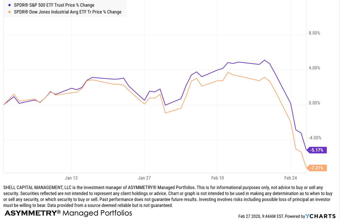
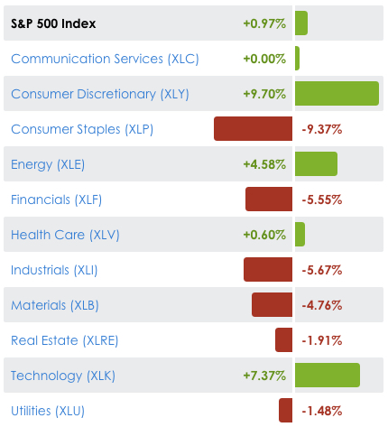
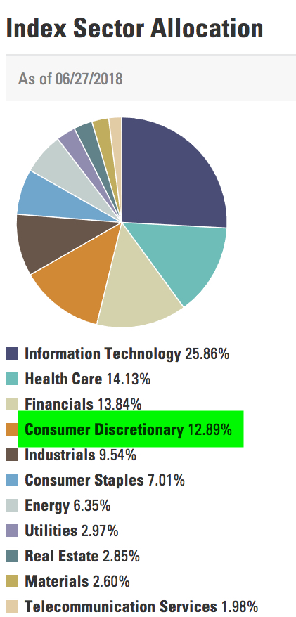
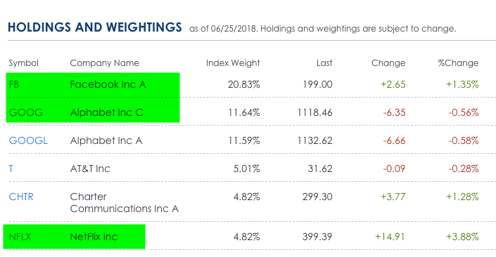
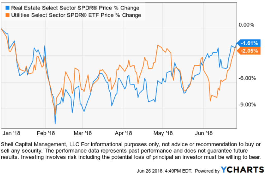
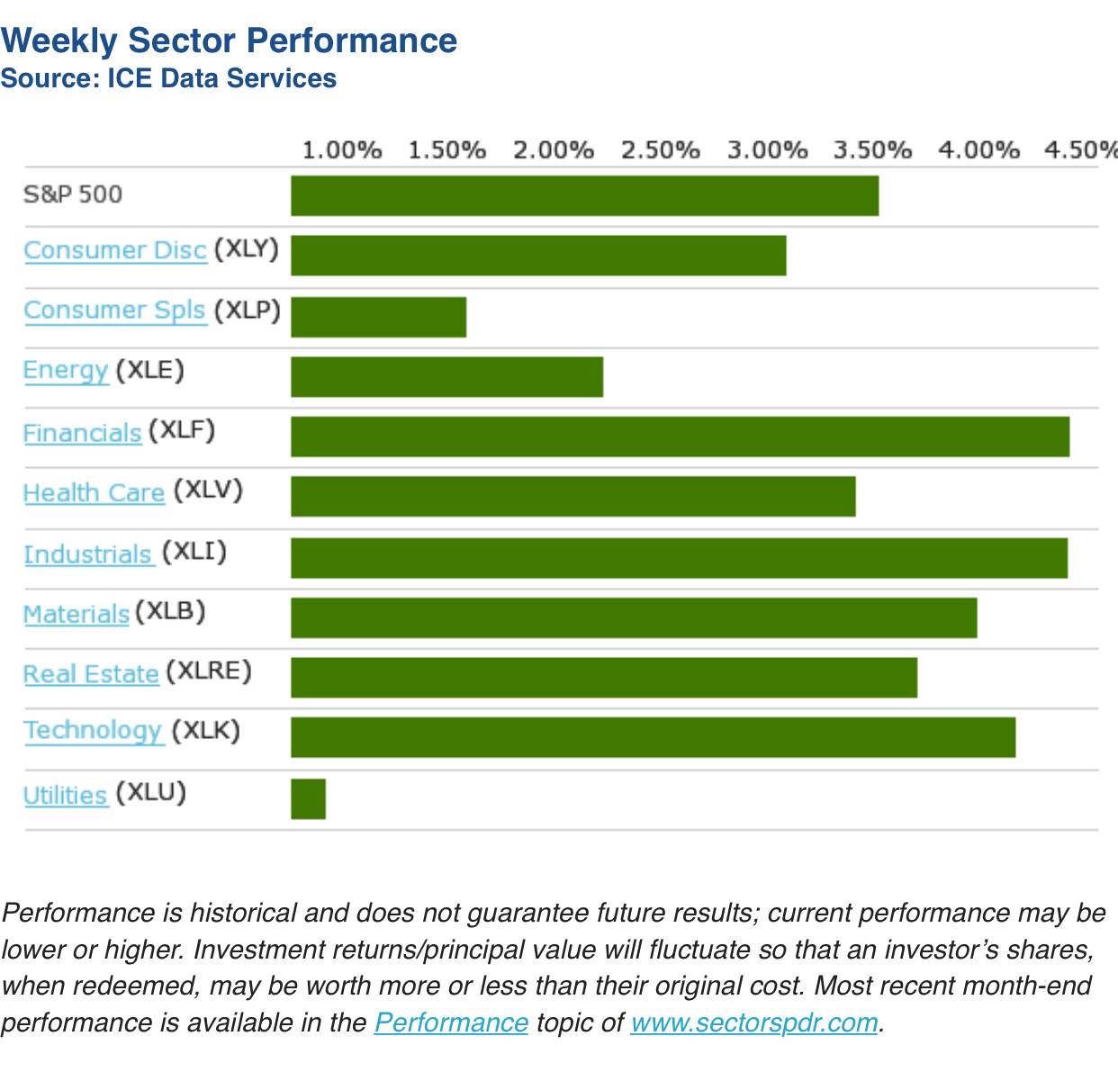
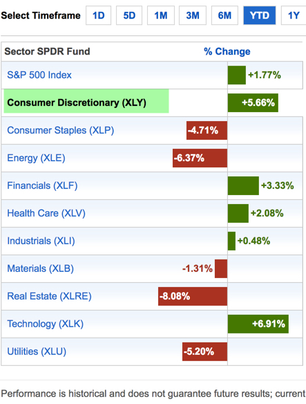
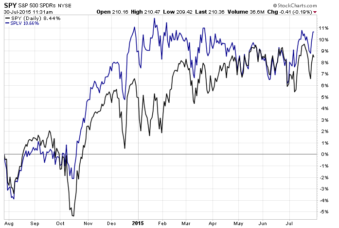
In contrast, the Dow Jones Industrial Average is up about 1% over the same period  – counting dividends. You may be wondering what is causing this divergence? Below is the sector holdings for the iShares Select Dividend ETF.

The position size matters and makes all the difference. Notice in the table above the Utilities, Consumer Staples, and Energy Sectors are the top holdings of the index. As you see below, the Utilities sector is down nearly -9% year-to-date, Energy and Staples are down over -1%. They are the three worst performing sectors…

Source: Created by ASYMMETRY® Observations with www.stockcharts.com 

Wondering what may be driving it? For the Utility sector it’s probably interest rates. You can read about that in What You Need to Know About Long Term Bond Trends. I prefer to rotate between sectors based on their directional price trends rather than just allocate to them with false hope they may do something they may not. 

What You Need to Know About Long Term Bond Trends

There is a lot of talk about interest rates and bonds these days – for good reason. You see, interest rates have been in a downtrend for decades (as you’ll see later). When interest rates are falling, the price of bonds go up. I wrote in “Why So Stock Market Focused?” that you would have actually been better off investing in bonds the past 15 years over the S&P 500 stock index.

However, the risk for bond investors who have a fixed bond allocation is that interest rates eventually trend up for a long time and their bonds fall.

This year we see the impact of rising rates and the impact of falling bond prices in the chart below of the 20+ year Treasury bond. It’s down -15% off its high and since the yield is only around 2.5% the interest only adds about 1% over this period for a total return of -14.1%. Up until now, this long term Treasury index has been a good crutch for a global allocation portfolio. Now it’s more like a broken leg.

But, that’s not my main point today. Let’s look at the bigger picture. Below is the yield (interest rate) on the 10-Year U.S. government bond. Notice that the interest rate was as high as 9.5% in 1990 and has declined to as low as 1.5%. Just recently, it’s risen to 2.62%. If you were going to buy a bond for future interest income payments, would you rather invest in one at 9.5% or 1.5%? If you were going to lend money to someone, which rate would you prefer to receive? What is a “good deal” for you, the lender?

I like trends and being positioned in their direction since trends are more likely to continue than reverse, but they usually do eventually reverse when inertia comes along (like the Fed). If you care about managing downside risk you have to wonder: How much could this trend reverse and what could its impact be on fixed bond holdings? Well, we see below that the yield has declined about -70%. If we want to manage risk, we have to at least expect it could swing the other way.

One more observation. Germany is one of the largest countries in the world. Since April, the 10-year German bond interest rate has reversed up very sharp. What if U.S bonds did the same?

As I detailed in “Allocation to Stocks and Bonds is Unlikely to Give us What We Want” bonds are often considered a crutch for a global asset allocation portfolio. If you care about managing risk, you may consider that negative correlations don’t last forever. All trends change, eventually. You may also consider your risk of any fixed positions you have. I prefer to actively manage risk and shift between global markets based on their directional trends rather than a fixed allocation to them.

The good news is: by my measures, many bond markets have declined in the short term to a point they should at least reserve back up at least temporarily. What happens after that will determine if the longer trend continues or begins to reverse. The point is to avoid complacency and know in advance at what point you’ll exit to cut losses short…

As they say: “Past performance is no guarantee of the future“.

A Random Walker on Stock and Bond Valuation

Burton Malkiel is a passive buy and hold investor who believes markets are random. To believe markets are random is to believe there are no directional trends, or high or low valuations. He is the author of “A Random Walk Down Wall Street“.  But in today’s Wall Street Journal even the ” Random Walker” sees that stock valuations are high and future expected returns low, but believes if there is a bubble it’s in bonds.

By

BURTON G. MALKIEL

June 1, 2015 6:58 p.m. ET

“Stock valuations are well above their average valuation metrics of the past, and future returns are likely to be below historical averages. But even as Ms. Yellen talks of gradually ending the Fed’s near-zero interest rate policy, interest rates remain well below historical norms. If there is a market bubble today, it is in the bond market and the Fed is complicit in the “overvaluation.”

Source: http://www.wsj.com/articles/janet-yellen-is-no-stock-market-sage-1433199503

When someone invests in bonds for the long term they mainly intend to earn interest. So, bond investors want to buy bonds when yields are high. In the chart below, I show the iShares iBoxx $ Investment Grade Corporate Bond index ETF that seeks to track the investment results of an index composed of U.S. dollar-denominated, investment grade corporate bonds. The blue line is its price trend, the orange line is the index yield. We observe the highest yield was around 5.33% during a spike in 2008 when the price declined. Fixed income has interest-rate risk. Typically, when interest rates rise, there is a corresponding decline in bond values. Since 2008, interest rates and the yield of this bond index has declined. Clearly, the rate of “fixed income” from bonds depends on when you buy them. Today, the yield is only 2.8%, so for “long term allocations” bonds aren’t nearly as attractive as they where.

bond yield valuation bubble
Another observation is the iShares 20+ Year Treasury Bond ETF, which seeks to track the investment results of an index composed of U.S. Treasury bonds with remaining maturities greater than twenty years. So, this index is long term government bonds. Below we see its yield was 4.75% a decade ago and is now only 2.27%. Buying it to get a 4.75% yield is a very different expected return than 2.27%.

Long term treasury yield valuation spreads asymmetry

However, that doesn’t mean we can’t tactically rotate between these bond markets trying to capture price trends rather than allocate to them.

Chart source: http://www.ycharts.com

Allocation to Stocks and Bonds is Unlikely to Give us What We Want

That was the lesson you learned the last time stocks became overvalued and the stock market entered into a bear market.

I believe holding and re-balancing markets doesn’t give us the risk-adjusted returns we want. In all I do, I believe in challenging that status quo, I believe in thinking and doing things differently. The way I challenge the status quo is a focus on absolute return, limiting downside risk, and doing it tactically across global markets. Why do I do it?

In a Kiplinger article by Fred W. Frailey interviewed Mohamed El-Erian, the PIMCO’s boss, (PIMCO is one of the largest mutual fund companies in the world) he says “he tells how to reduce risk and reap rewards in a fast-changing world.” This article “Shaking up the Investment Mix” was written in March 2009, which turned out the be “the low” of the global market collapse.

It is useful to revisit such writing and thoughts, especially since the U.S. stock market has since been overall rising for 5 years and 10 months. It’s one of the longest uptrends recorded and the S&P 500 stock index is well in “overvalued” territory at 27 times EPS. At the same time, bonds have also been rising in value, which could change quickly when rates eventually rise. At this stage of a trend, asset allocation investors could need a reminder. I can’t think of a better one that this:

Why are you telling investors they need to diversify differently these days?

The traditional approach to diversification, which served us very well, went like this: Adopt a diversified portfolio, be disciplined about rebalancing the asset mix, own very well-defined types of asset classes and favor the home team because the minute you invest outside the U.S., you take on additional risk. A typical mix would then be 60% stocks and 40% bonds, and most of the stocks would be part of Standard & Poor’s 500-stock index.

This approach is fatigued for several reasons. First of all, diversification alone is no longer sufficient to temper risk. In the past year, we saw virtually every asset class hammered. You need something more to manage risk well.

But, you know, they say a picture is worth a thousand words.

Since we are talking about downside risk, something that is commonly hidden when only “average returns” are presented, below is a drawdown chart. I created the drawdown chart using YCharts which uses total return data and the “% off high”. The decline you see from late 2007 to 2010 is a drawdown: it’s when the investment value is under water. Think of this like a lake. You can see how the average of the data wouldn’t properly inform you of what happens in between.

First, I show PIMCO’s own allocation fund: PALCX: Allianz Global Allocation Fund. I include an actively managed asset allocation that is very large and popular with $55 billion invested in it: MCLOX: BlackRock Global Allocation. Since there are many who instead believe in passive indexing and allocation, I have also included DGSIX: DFA Global Allocation 60/40 and VBINX: Vanguard Balanced Fund. As you can see, they have all done about the same thing. They declined about -30% to -40% from October 2007 to March 2009. They also declined up to -15% in 2011.

Global Allocation Balanced Fund Drawdowns

Going forward, the next bear market may be very different. Historically, investors consider bond holdings to be a buffer or an anchor to a portfolio. When stock prices fall, bonds haven’t been falling nearly as much. To be sure, I show below a “drawdown chart” for the famous actively managed bond fund PIMCO Total Return and for the passive crowd I have included the Vanguard Total Bond Market fund. Keep in mind, about 40% of the allocation of the funds above are invested in bonds. As you see, bonds dropped about -5% to -7% in the past 10 years.

Bond market risk drawdowns

You may notice they are recently down -2% from their highs. Based on the past 10 years, that’s just a minor decline. The trouble going forward is that interest rates have been in an overall downtrend for 30 years, so bond values have been rising. If you rely on bonds being a crutch, as on diversification alone, I agree with Mohamed El-Erian the Chief of the worlds largest bond manager:

“…diversification alone is no longer sufficient to temper risk. In the past year, we saw virtually every asset class hammered. You need something more to manage risk well.”

But, don’t wait until AFTER markets have fallen to believe it.

I just don’t believe holding and re-balancing markets is going to give us the risk-adjusted returns we want. In all I do, I believe in challenging that status quo, I believe in thinking and doing things differently. The way I challenge the status quo is a focus on absolute return, limiting downside risk, and doing it tactically across global markets. Want to join us? To see what that looks like, click: ASYMMETRY® Managed Accounts

The Volatility Index (VIX) is Getting Interesting Again

In the last observation I shared on the CBOE Volatlity index (the VIX) I had been pointing out last year the VIX was at a low level and then later started trending up. At that time, many volatility traders seemed to think it was going to stay low and keep going lower – I disagreed. Since then, the VIX has remained at a higher average than it had been – up until now. You can read that in VIX® gained 140%: Investors were too complacent.

Here it is again, closing at 12.45 yesterday, a relatively low level for expected volatility of the S&P 500 stocks. Investors get complacent after trends drift up, so they don’t price in so much fear in options. Below we observe a monthly view to see the bigger picture. The VIX is getting down to levels near the end of the last bull market (2007). It could go lower, but if you look closely, you’ll get my drift.

Chart created by Shell Capital with: http://www.stockcharts.com

Next, we zoom in to the weekly chart to get a loser look.

Chart created by Shell Capital with: http://www.stockcharts.com

Finally, the daily chart zooms in even more.

Chart created by