Commodities are trending with better momentum than stocks

Commodities are trending with better momentum than stocks

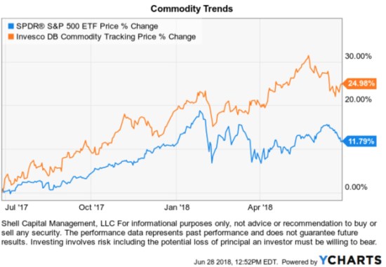
Commodities are trending with better momentum than stocks over the past year.

A commodity is a raw material or primary agricultural product that can be bought and sold, such as copper or coffee. A commodity is a basic good used in commerce that are usually used as inputs in the production of other goods or services.

Soft commodities are goods that are grown, such as wheat, or rice.

Hard commodities are mined. Examples include gold, helium, and oil.

Energy commodities include electricity, gas, coal, and oil. Electricity has the particular characteristic that it is usually uneconomical to store, and must, therefore, be consumed as soon as it is processed.

The Commodity Trend

At first glance, we see in the chart commodities ETF Invesco DB Commodity Index Tracking ETF has trended meaningfully above the popular S&P 500 index of U. S. stocks. The relative outperformance is clear over this one-year time frame. Commodities, as measured by this ETF, are in an absolute positive trend and registering relative momentum.
Commodity ETF trend following commodites natural resources $GNR $GSG $DBC

Examining a price trend is incomplete without also considering its downside. On the downside, I look at the % off high drawdowns over the period. We see that commodities were more volatile than stocks before 2018 with four dips around -4%. Since the stock market -10% decline that started in February, commodities declined, too, but not as much as U. S. stocks.
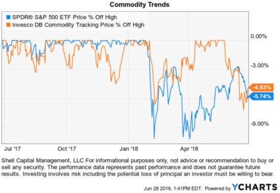
asymmetry ratio commodity drawdown

Looking back at the trend chart, I added a simple trend line to show that communities are trending directionally better than the popular U. S. stock index. So, my quantitative Global Tactical Rotation®  system that ranks an unconstrained global universe of markets including bonds, stocks, commodities, currencies, and other alternatives like real estate signaled this trend has been generating asymmetric risk/return.
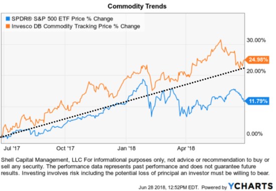
commodity ETF trend commodities

What is the that Invesco DB Commodity Index Tracking ETF? (the bold emphasis is mine)

The Invesco DB Commodity Index Tracking Fund seeks to track changes, whether positive or negative, in the level of the DBIQ Optimum Yield Diversified Commodity Index Excess Return™ (DBIQ Opt Yield Diversified Comm Index ER) plus the interest income from the Fund’s holdings of primarily US Treasury securities and money market income less the Fund’s expenses. The Fund is designed for investors who want a cost-effective and convenient way to invest in commodity futures. The Index is a rules-based index composed of futures contracts on 14 of the most heavily traded and important physical commodities in the world. The Fund and the Index are rebalanced and reconstituted annually in November.

This Fund is not suitable for all investors due to the speculative nature of an investment based upon the Fund’s trading which takes place in very volatile markets. Because an investment in futures contracts is volatile, such frequency in the movement in market prices of the underlying futures contracts could cause large losses. Please see “Risk and Other Information” and the Prospectus for additional risk disclosures. Source: Invesco

The challenge for some investors, however, is that Invesco DB Commodity Index Tracking ETF generates a K-1 tax form for tax reporting. That isn’t a terrible issue, but it means instead of receiving the typical 1099 investors receive a K-1. Some investors aren’t familiar with a K-1, and they can obtain them later than a 1099.

Then, there may be other investors who simply prefer not to own futures for the reason in the second paragraph of the above discription: “Because an investment in futures contracts is volatile, such frequency in the movement in market prices of the underlying futures contracts could cause large losses.” In reality, all investments have risk and stocks can have just as much risk of “large losses” as commodity futures, but it’s a matter of investor preference and perception.

Since we have a wide range of investor types who invest in my ASYMMETRY® Investment Program I could gain my exposure to commodities in other ways. For example, the SPDR® S&P® Global Natural Resources ETF often has a similar return stream as ETFs like DBC that track a commodity futures index, except is actually invests in individual stocks instead.

Key features of the SPDR® S&P® Global Natural Resources ETF

  • The SPDR® S&P® Global Natural Resources ETF seeks to provide investment results that, before fees and expenses, correspond generally to the total return performance of the S&P® Global Natural Resources Index (the “Index”)

  • Seeks to provide exposure to a number of the largest market cap securities in three natural resources sectors – agriculture, energy, and metals and mining

  • Maximum weight of each sub-index is capped at one-third of the total weight of the Index

Below we see the price trend of this ETF of global natural resources stocks has been highly correlated to an ETF of commodities futures.
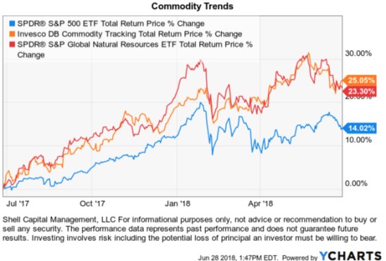
global natural resources ETF replacement for commodity ETF no K1

In fact, as we step the time frame out to the common inspection date of each ETF in 2011, the SPDR® S&P® Global Natural Resources ETF has actually outperformed Invesco DB Commodity Index Tracking ETF overall in terms of relative momentum.
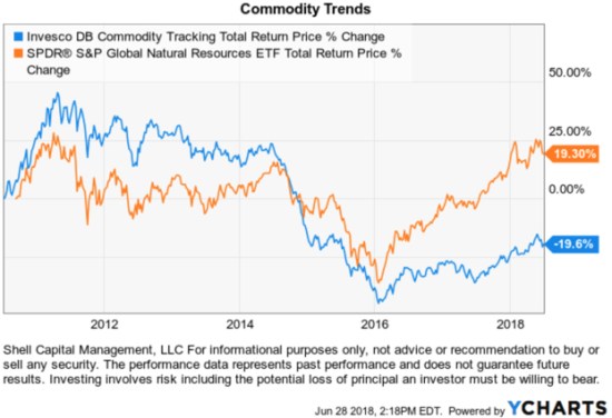
commodity ETF global natural resources trend following no K1

The bottom line is, commodities “stuff” is trending up over the past two years and when the price of “stuff” is rising, that is called “inflation”.  Commodities and global natural resources have been in a downtrend for so long it shouldn’t be a surprise to see this trend reverse up. Only time will tell if it will continue, but if we want exposure to it, we can predefine our risk by deciding at what price I would exit if it doesn’t, and let the trend unfold.Mike Shell is the Founder and Chief Investment Officer of Shell Capital Management, LLC, and the portfolio manager of ASYMMETRY® Global Tactical.You can follow ASYMMETRY® Observations by click on on “Get Updates by Email” on the top right or follow us on Twitter.The observations shared in this material are for general information only and are not intended to provide specific advice or recommendations for any individual. Investing involves risk including the potential loss of principal an investor must be willing to bear. Past performance is no guarantee of future results.Buying and Selling ETFsETFs are flexible and easy to trade. Investors buy and sell them like stocks, typically through a brokerage account. Investors can also employ traditional stock trading techniques; including stop orders, limit orders, margin purchases, and short sales using ETFs. They are listed on major US Stock Exchanges.

ETFs are subject to risk similar to those of stocks including those regarding short-selling and margin account maintenance. Ordinary brokerage commissions apply. In general, ETFs can be expected to move up or down in value with the value of the applicable index. Although ETF shares may be bought and sold on the exchange through any brokerage account, ETF shares are not individually redeemable from the Fund. Investors may acquire ETFs and tender them for redemption through the Fund in Creation Unit Aggregations only. Please see the prospectus for more details. After-tax returns are calculated based on NAV using the historical highest individual federal marginal income tax rates and do not reflect the impact of state and local taxes. Actual after-tax returns depend on the investor’s tax situation and may differ from those shown. The after-tax returns shown are not relevant to investors who hold their fund shares through tax-deferred arrangements such as 401(k) plans or individual retirement accounts. Performance of an index is not illustrative of any particular investment. It is not possible to invest directly in an index. As with all stocks, you may be required to deposit more money or securities into your margin account if the equity, including the amount attributable to your ETF shares, declines. Unless otherwise noted all information contained herein is that of the SPDR S&P Global Natural Resources ETF. S&P – In net total return indices, the dividends are reinvested after the deduction of withholding tax. Tax rates are applied at the country level or at the index level.



Growth Stocks have Stronger Momentum than Value in 2018

Growth Stocks have Stronger Momentum than Value in 2018

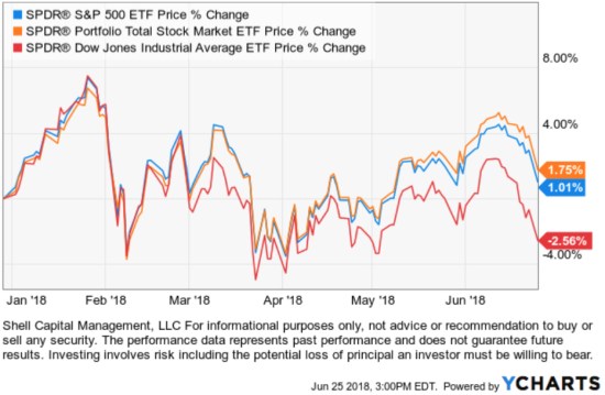
After a sharp decline in stock prices in February that seemed to shock many investors who had become complacent, the stock market indexes have been trying to recover.

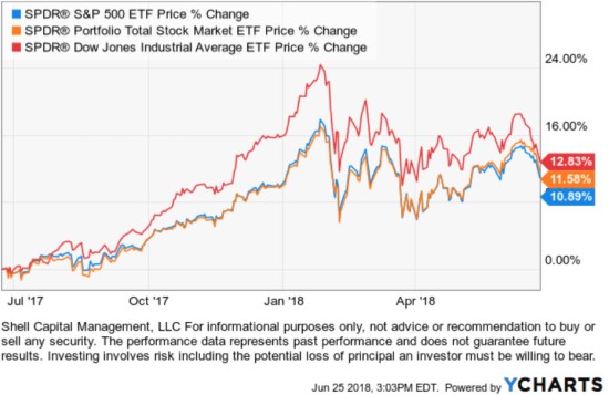
At this point, the popular S&P 500 has gained 1.75% year-to-date and the Dow Jones Industrial Average is down -2.56%. I also included the Total Stock Market ETF, which tracks an index that represents approximately 98% of the investable US equity market. Though it holds over five times more stocks than the 500 in the S&P 500 SPY, it is tracking it closely.

stock market index returns 2018 SPY DIA

The Dow Jones Industrial Average was the momentum leader last year, but the recent price action has driven it to converge with the other stock indexes. Past performance doesn’t always persist into the future.

Dow was momentum leader

What is more interesting, however, is the divergence at the size, style, and sector level.
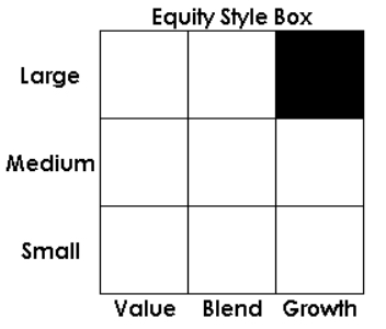
The research firm Morningstar created the equity “Style Box.” The Morningstar Style Box is a nine-square grid that provides a graphical representation of the “investment style” of stocks and mutual funds. For stocks and stock funds, it classifies securities according to market capitalization (the vertical axis) and growth and value factors (the horizontal axis).

equity style box

  • The vertical axis of the style box graphs market capitalization and is divided into three company-size indicators: large, medium and small.
  • The horizontal axis seeks to represent stock funds/indexes by value, growth, and blend which represents a combination of both value and growth.
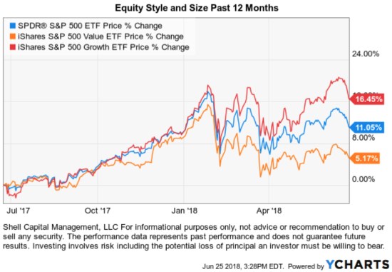
Looking at their distinct trends, we observe a material divergence this year. As we see below, the S&P 500 Growth Index ETF has gained 16.45% % over the past 12 months, which is triple the S&P 500 Value ETF. So, Growth is clearly exhibiting stronger momentum than value over the past year. But, notice that wasn’t the case before the February decline when Growth, Value, and Blend were all tracking close to each other.


Equity Style and Size Past 12 Months

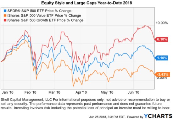
Year to date, the divergence is more clear. Growth is positive, the blended S&P 500 stock index is flat, and Value is negative.

momentum growth stocks 2018

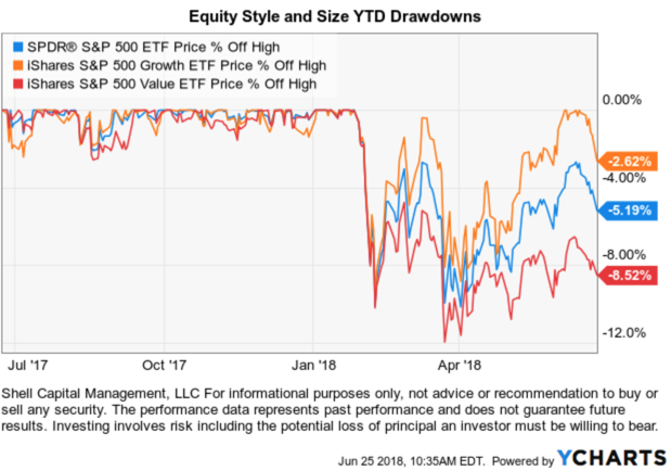
Showing only the price trend change over the period isn’t complete without observing the path it took to get there, so I’ve included the drawdown chart below. Here, we see these indexes declined about -10% to as much as -12% for the Value index.

The Value index declined the most, which requires more of a gain to make up for the decline. The Value ETF hasn’t recovered as well as the others.

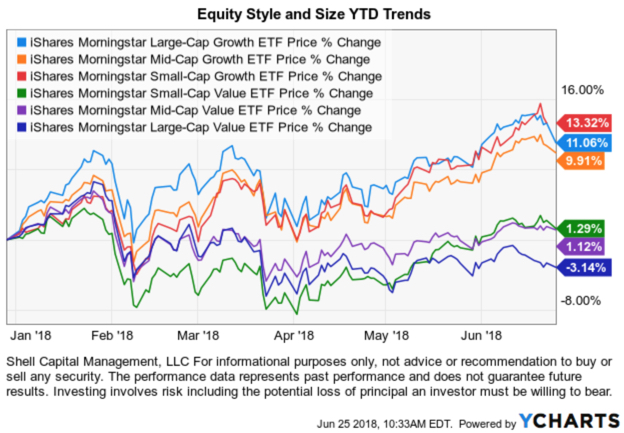
To look even closer, we can get more specific into the style and size categories. Below we show the individual Morningstar ETFs that separate the stock market into the Large, Mid, and Small size stocks and then into Growth vs. Value.

All three at the top are Growth. The three at the bottom are Value. So, the divergence this year isn’t so much Large vs. Small cap, it’s Growth vs. Value.

Clearly, Growth stocks are leading the stock market so far in 2018.

Why do we care about such divergence?

When there exists more difference between price trends, it provides more opportunity to capture the positive direction and avoid the negative trend if it continues.

In part 2, we’ll discuss how sector exposure is the primary driver of style/size returns.


Mike Shell is the Founder and Chief Investment Officer of Shell Capital Management, LLC, and the portfolio manager of ASYMMETRY® Global Tactical.

You can follow ASYMMETRY® Observations by click on on “Get Updates by Email” on the top right or follow us on Twitter.

The observations shared in this material are for general information only and are not intended to provide specific advice or recommendations for any individual. Investing involves risk including the potential loss of principal an investor must be willing to bear. Past performance is no guarantee of future results.

February Global Market Trends

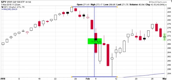
After a very positive January for U.S. and international stocks, in February it only took 10 days for the S&P 500 to decline -12% intraday and a -10% drawdown based on closing price.

stock market decline drawdown februrary 2018

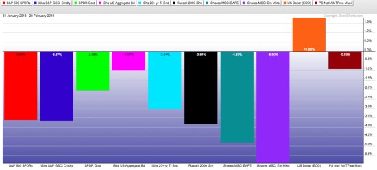
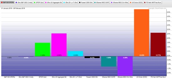
Yet, February ended with the S&P 500 only down -3.5% after that -12% intra-month drawdown.  For the month, International (MSCI EAFE) and Emerging Markets declined the most viewing the below board based indexes. The U.S. Dollar gained 1.8%.

global market returns february 2018 loss drawdown

Next, we view February global market returns relative to the S&P 500 stock index by holding it constant. This visual shows us how much markets gained/lost net of the S&P 500, Though in the absolute trend table above I showed bonds declined in absolute return, they gained relative to the S&P 500,

global market trend returns relative to spx spy S&P 500

Of course, one month isn’t a trend. In fact, I’m going to explain how this is an intentional logical inconsistency. Speaking of one time period in isolation, be it a month, year, or series of years is just an arbitrary time frame. What’s worse is viewing just the result over a time frame, like the month of February above, in just a table format.

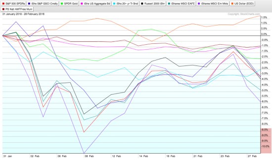
A return stream is precisely that; a stream. A return stream is a continuous price trend in a continuous specified direction. Continuous is forming an unbroken whole; without interruption. So, I like to view return streams as price trends on a chart so I can see how the trend really unfolded over the period. Observed as a visual price trend, we see both the good and the bad of the price action along the way. You can probably see how it does that better than a simple performance table, monthly return % of the period or the bar chart above.

stock market decline februrary 2018

In the chart above, we see how much the price trends of those markets declined along the way before closing the month yesterday. I wrote about the short-term risk reversal in Stock Market Analysis of the S&P 500 suggesting it may reverse back up at least temporarily and retrace some loss and it did.

Now, what is essential about looking at performance data and trends is what the investor experiences. Investors experience what they choose to experience. For example, suppose and the investor is fully invested in the stock market, they could experience the month one of three ways.

  • If the investor only looks at his or her month-end statement, they would experience either the month end “-3.5%”.
  • If the investor watches their account or market indexes closely every day, they experienced every daily move and the full -12% decline and then some recovery.
  • Some may not pay any attention at all either because they are disinterested or they have an investment manager they trust to manage their risk-taking and risk management for them.

Investors and traders get to choose what time frame they watch things. I’ve always observed that “watching it too closely” can lead to emotional mistakes for many. For me, I’m paying attention and may zoom in and pay more attention when trends get more volatile or seem to reach an extreme. But, I’m a tactical portfolio manager, it’s what I do. I can view short term or long term trends alike with self-discipline. I have an edge that has been quantified by a long track record of 14 years in the current portfolio I manage.

I said this recently on Twitter:

If the investor doesn’t like to see such losses like those experienced in many markets in February, they may choose to instead not be fully invested in stocks all the time. That’s what I do. I’m not invested in any specific market all the time. My exposure to risk and return increases and decreases over time based on trends and my risk systems. I intentionally increase and decrease my exposure to the possibility of loss and gain. I’m also unconstrained so I can do it across any global market like bonds, currency, stocks, commodities, or alternatives like REITs, inverse (shorting), or volatility.

According to the American Association of Individual Investors, the decline was so quick most individual investors didn’t seem to respond:

Majority of Investors Avoided Taking Action in Recent Market Correction

“This week’s Sentiment Survey special question asked AAII members what portfolio action, if any, they took in response to the recent market correction. The majority of respondents (62%) said they didn’t make any change or only made a small change. Many of these respondents described themselves as being focused on the long term, viewing this month’s correction as being only temporary in nature or not severe enough to warrant any action. A few of these respondents described the correction as lasting too short of a time for them to take advantage of it. Nearly 33% respondents said they took advantage of the decline to buy stocks or funds. Some said they took advantage of the reduced prices to either add to current positions or buy new holdings. Just 7% of respondents said they sold stocks during the correction. A small number of respondents said they sold some positions and then bought new positions.”

I say investors should find and do what helps them, not make it worse. Know yourself, know your risk, and know your risk tolerance. That’s what we do.

So, that is what happened during the month of February, and a little asymmetric observation to go with it.


Mike Shell is the Founder and Chief Investment Officer of Shell Capital Management, LLC, and the portfolio manager of ASYMMETRY® Global Tactical.

You can follow ASYMMETRY® Observations by click on on “Get Updates by Email” on the top right or follow us on Twitter.

Investment results are probabilistic, never a sure thing. Past performance is no guarantee of future results.

Stock market indexes lost some buying enthusiasm for the day

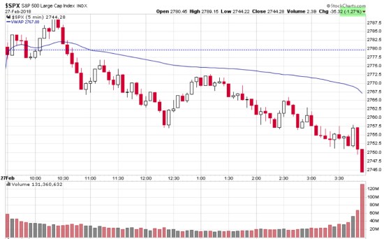
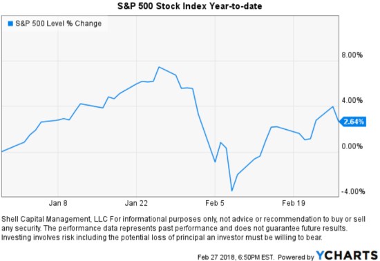
Buying enthusiasm reversed from positive to selling pressure today after the first hour. I observed notable selling volume at the close, which was the opposite of what I pointed out last Thursday.The S&P 500 Stock Index was down -1.27% for the day.


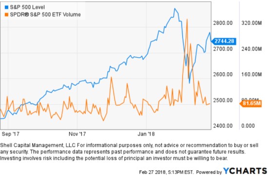
I’ll also share that volume increased sharply during the -10% decline in the S&P 500 Stock Index earlier this month. No surprise, it was selling pressure after many months of buying enthusiasm, just an observation…


So far, the S&P 500 Stock Index has regained approximately half of its -10% loss earlier this month and is now up 2.64% for the year.

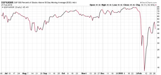
Since I pointed out that the stocks inside the S&P 500 has dropped to a much lower risk zone in Stock Market Analysis of the S&P 500, the % of stocks in the index above their 50 day moving average increased from only 14% in a positive trend to 55%. Today, 18% fewer stocks are above their 50-day moving averages.

S&P 500 percent of stocks above 50 day moving average Feb 2018

None of this is yet suggesting a change of trend, but when stock popular stock indexes gain or lose more than 1% or so my plan is to update it here.


Mike Shell is the Founder and Chief Investment Officer of Shell Capital Management, LLC, and the portfolio manager of ASYMMETRY® Global Tactical.

You can follow ASYMMETRY® Observations by click on on “Get Updates by Email” on the top right or follow us on Twitter.

Investment results are probabilistic, never a sure thing. Past performance is no guarantee of future results.

Warren Buffett’s Berkshire Hathaway Hasn’t Managed Downside Risk

 shares an interesting observation in Fortune ” Warren Buffett’s Berkshire lost $11 billion in market selloff“. He points out that Buffett’s Berkshire Hathaway (BRK.A or BRK.B) is tracking the U.S. stock indexes on the downside. He says:

“…during the worst of the downturn from mid-July to the end of August. That represents a 10.3% drop. The good news for Buffett: His, and his investment team’s, performance was likely not much worse than everyone else’s. During the same time, the S&P 500 fell 10.1%.”

Comparing performance to others or “benchmark” indexes is a what I call a “relative return” objective. Comparing performance vs. our own risk tolerance and total return objectives is an “absolute return” objective. The two are very different as what I call “relativity” is more concerned about how others are doing comparatively, while “absolute” is more focused on our own situation.

The article also said:

“If you are invested in an index fund, you may have outperformed the Oracle of Omaha, slightly.”

Let’s see just how true that is. Since the topic is how much Warren Buffett’s Berkshire Hathaway has lost during this stock market decline, I’ll share a closer look.

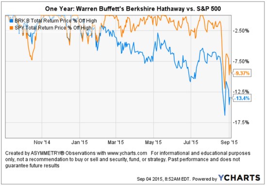
A picture speaks a thousand words. As it turns out, the guru stock picker is actually down -13.4% off it’s high looking back over the past year. That’s about -4% worse than the SPDR® S&P 500® ETF (SPY) that seeks to provide investment results that, before expenses, correspond generally to the price and yield performance of the S&P 500® Index. I am using actual securities here to present an investable comparison: SPY vs. BRK.B.

Warren Buffett's Berkshire Lost compared to stock index

As we observe in the chart, Warren Buffett’s Berkshire Hathaway began to decline off it’s high at the end of last year while the S&P 500® Index started last month. I have observed more and more stocks declining over the past several months. At the same time, more and more International markets have entered into their own bear markets. So, it is no surprise to see a focused stock portfolio diverge from a broader stock index.  points out some of the individual stock positions in ” Warren Buffett’s Berkshire lost $11 billion in market selloff

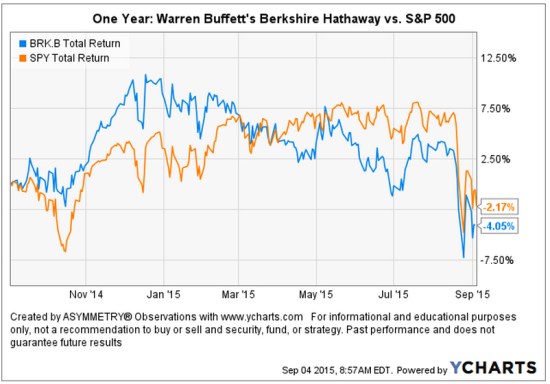
Below is the total return of the two over the past year. We can see the high in Warren Buffett’s Berkshire Hathaway BRK.B was in December 2014.

Warren Buffett's Berkshire Lost compared to stock index total return

I believe world markets require active risk management and defining directional trends. For me, that means predefining my risk in advance in each position and across the portfolio.

Chart source: http://www.ycharts.com

Read the full Fortune article here: ” Warren Buffett’s Berkshire lost $11 billion in market selloff

A Random Walker on Stock and Bond Valuation

Burton Malkiel is a passive buy and hold investor who believes markets are random. To believe markets are random is to believe there are no directional trends, or high or low valuations. He is the author of “A Random Walk Down Wall Street“.  But in today’s Wall Street Journal even the ” Random Walker” sees that stock valuations are high and future expected returns low, but believes if there is a bubble it’s in bonds.

By

BURTON G. MALKIEL

June 1, 2015 6:58 p.m. ET

“Stock valuations are well above their average valuation metrics of the past, and future returns are likely to be below historical averages. But even as Ms. Yellen talks of gradually ending the Fed’s near-zero interest rate policy, interest rates remain well below historical norms. If there is a market bubble today, it is in the bond market and the Fed is complicit in the “overvaluation.”

Source: http://www.wsj.com/articles/janet-yellen-is-no-stock-market-sage-1433199503

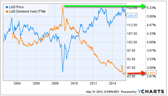
When someone invests in bonds for the long term they mainly intend to earn interest. So, bond investors want to buy bonds when yields are high. In the chart below, I show the iShares iBoxx $ Investment Grade Corporate Bond index ETF that seeks to track the investment results of an index composed of U.S. dollar-denominated, investment grade corporate bonds. The blue line is its price trend, the orange line is the index yield. We observe the highest yield was around 5.33% during a spike in 2008 when the price declined. Fixed income has interest-rate risk. Typically, when interest rates rise, there is a corresponding decline in bond values. Since 2008, interest rates and the yield of this bond index has declined. Clearly, the rate of “fixed income” from bonds depends on when you buy them. Today, the yield is only 2.8%, so for “long term allocations” bonds aren’t nearly as attractive as they where.

bond yield valuation bubble
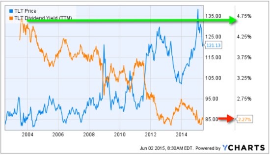
Another observation is the iShares 20+ Year Treasury Bond ETF, which seeks to track the investment results of an index composed of U.S. Treasury bonds with remaining maturities greater than twenty years. So, this index is long term government bonds. Below we see its yield was 4.75% a decade ago and is now only 2.27%. Buying it to get a 4.75% yield is a very different expected return than 2.27%.

Long term treasury yield valuation spreads asymmetry

However, that doesn’t mean we can’t tactically rotate between these bond markets trying to capture price trends rather than allocate to them.

Chart source: http://www.ycharts.com

Allocation to Stocks and Bonds is Unlikely to Give us What We Want

That was the lesson you learned the last time stocks became overvalued and the stock market entered into a bear market.

I believe holding and re-balancing markets doesn’t give us the risk-adjusted returns we want. In all I do, I believe in challenging that status quo, I believe in thinking and doing things differently. The way I challenge the status quo is a focus on absolute return, limiting downside risk, and doing it tactically across global markets. Why do I do it?

In a Kiplinger article by Fred W. Frailey interviewed Mohamed El-Erian, the PIMCO’s boss, (PIMCO is one of the largest mutual fund companies in the world) he says “he tells how to reduce risk and reap rewards in a fast-changing world.” This article “Shaking up the Investment Mix” was written in March 2009, which turned out the be “the low” of the global market collapse.

It is useful to revisit such writing and thoughts, especially since the U.S. stock market has since been overall rising for 5 years and 10 months. It’s one of the longest uptrends recorded and the S&P 500 stock index is well in “overvalued” territory at 27 times EPS. At the same time, bonds have also been rising in value, which could change quickly when rates eventually rise. At this stage of a trend, asset allocation investors could need a reminder. I can’t think of a better one that this:

Why are you telling investors they need to diversify differently these days?

The traditional approach to diversification, which served us very well, went like this: Adopt a diversified portfolio, be disciplined about rebalancing the asset mix, own very well-defined types of asset classes and favor the home team because the minute you invest outside the U.S., you take on additional risk. A typical mix would then be 60% stocks and 40% bonds, and most of the stocks would be part of Standard & Poor’s 500-stock index.

This approach is fatigued for several reasons. First of all, diversification alone is no longer sufficient to temper risk. In the past year, we saw virtually every asset class hammered. You need something more to manage risk well.

But, you know, they say a picture is worth a thousand words.

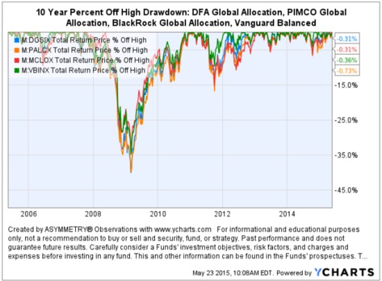
Since we are talking about downside risk, something that is commonly hidden when only “average returns” are presented, below is a drawdown chart. I created the drawdown chart using YCharts which uses total return data and the “% off high”. The decline you see from late 2007 to 2010 is a drawdown: it’s when the investment value is under water. Think of this like a lake. You can see how the average of the data wouldn’t properly inform you of what happens in between.

First, I show PIMCO’s own allocation fund: PALCX: Allianz Global Allocation Fund. I include an actively managed asset allocation that is very large and popular with $55 billion invested in it: MCLOX: BlackRock Global Allocation. Since there are many who instead believe in passive indexing and allocation, I have also included DGSIX: DFA Global Allocation 60/40 and VBINX: Vanguard Balanced Fund. As you can see, they have all done about the same thing. They declined about -30% to -40% from October 2007 to March 2009. They also declined up to -15% in 2011.

Global Allocation Balanced Fund Drawdowns

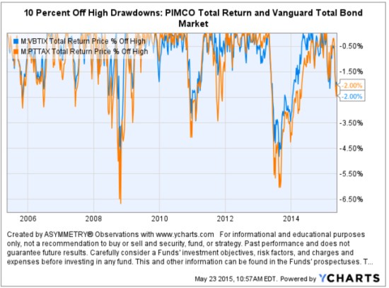
Going forward, the next bear market may be very different. Historically, investors consider bond holdings to be a buffer or an anchor to a portfolio. When stock prices fall, bonds haven’t been falling nearly as much. To be sure, I show below a “drawdown chart” for the famous actively managed bond fund PIMCO Total Return and for the passive crowd I have included the Vanguard Total Bond Market fund. Keep in mind, about 40% of the allocation of the funds above are invested in bonds. As you see, bonds dropped about -5% to -7% in the past 10 years.

Bond market risk drawdowns

You may notice they are recently down -2% from their highs. Based on the past 10 years, that’s just a minor decline. The trouble going forward is that interest rates have been in an overall downtrend for 30 years, so bond values have been rising. If you rely on bonds being a crutch, as on diversification alone, I agree with Mohamed El-Erian the Chief of the worlds largest bond manager:

“…diversification alone is no longer sufficient to temper risk. In the past year, we saw virtually every asset class hammered. You need something more to manage risk well.”

But, don’t wait until AFTER markets have fallen to believe it.

I just don’t believe holding and re-balancing markets is going to give us the risk-adjusted returns we want. In all I do, I believe in challenging that status quo, I believe in thinking and doing things differently. The way I challenge the status quo is a focus on absolute return, limiting downside risk, and doing it tactically across global markets. Want to join us? To see what that looks like, click: ASYMMETRY® Managed Accounts

On Actively Managing Risk… and Persistence

Don't beg anyone to get on the ark just keep building and let everyone know the rain is coming

Source: https://image-store.slidesharecdn.com/c3d3d5ae-e2eb-4e80-9d4c-88e2344b5572-original.jpeg

I just keep doing what I do…

The Volatility Index (VIX) is Getting Interesting Again

In the last observation I shared on the CBOE Volatlity index (the VIX) I had been pointing out last year the VIX was at a low level and then later started trending up. At that time, many volatility traders seemed to think it was going to stay low and keep going lower – I disagreed. Since then, the VIX has remained at a higher average than it had been – up until now. You can read that in VIX® gained 140%: Investors were too complacent.

Here it is again, closing at 12.45 yesterday, a relatively low level for expected volatility of the S&P 500 stocks. Investors get complacent after trends drift up, so they don’t price in so much fear in options. Below we observe a monthly view to see the bigger picture. The VIX is getting down to levels near the end of the last bull market (2007). It could go lower, but if you look closely, you’ll get my drift.

Chart created by Shell Capital with: http://www.stockcharts.com

Next, we zoom in to the weekly chart to get a loser look.

Chart created by Shell Capital with: http://www.stockcharts.com

Finally, the daily chart zooms in even more.

Chart created by Shell Capital with: http://www.stockcharts.com

The observation?

Options traders have priced in low implied volatility – they expect volatility to be low over the next month. That is happening as headlines are talking about stock indexes hitting all time highs. I think it’s a sign of complacency. That’s often when things change at some point.

It also means that options premiums are generally a good deal (though that is best determined on an individual security basis). Rather than selling premium, it may be a better time to buy it.

Let’s see what happens from here…

My 2 Cents on the Dollar

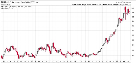
The U.S. Dollar ($USD) has gained about 20% in less than a year. We observe it first in the weekly below. The U.S. Dollar is a significant driver of returns of other markets. For example, when the U.S. Dollar is rising, commodities like gold, oil, and foreign currencies like the Euro are usually falling. A rising U.S. Dollar also impacts international stocks priced in U.S. Dollar. When the U.S. Dollar trends up, many international markets priced in U.S. Dollars may trend down (reflecting the exchange rate). The U.S. Dollar may be trending up in anticipation of rising interest rates.

dollar trend weekly 2015-04-23_16-04-40

Chart created by Shell Capital with: http://www.stockcharts.com

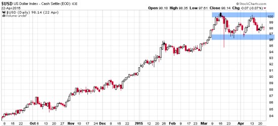
Now, let’s observe a shorter time frame- the daily chart. Here we see an impressive uptrend and since March a non-trending indecisive period. Many trend followers and global macro traders are likely “long the U.S. Dollar” by being long and short other markets like commodities, international stocks, or currencies.

dollar trend daily 2015-04-23_16-05-04

Chart created by Shell Capital with: http://www.stockcharts.com

This is a good example of understanding what drives returns and risk/reward. I consider how long the U.S. Dollar I am and how that may impact my positions if this uptrend were to reverse. It’s a good time to pay attention to it to see if it breaks back out to the upside to resume the uptrend, or if it instead breaks down to end it. Such a continuation or reversal often occurs from a point like the blue areas I highlighted above.

That’s my two cents on the Dollar…

How long are you? Do you know?

Absolute Return vs. Relative Return

Absolute Return investment manager fund

Absolute: viewed or existing independently and not in relation to other things; not relative or comparative.

Relative: considered in relation or in proportion to something else.

Return: to go or come back, as to a former place, position, or state.

Oops… we don’t want to “return” do we?

Rate of Return: The gain or loss on an investment over a specified period.

So, an Absolute Rate of Return: is the the gain or loss viewed or existing independently and not in relation to other things; not relative or comparative.

Many people seem to have a problem with what I call “relativity“. For example, they love their home, until someone builds a larger and nicer one across the street. Or, they love their car, until their friend drives up in one that seems even better.

You can probably see how these simple words and their meaning leads to many issues people deal with.

To see an absolute return program applied in real life, visit: http://www.asymmetrymanagedaccounts.com/global-tactical/

Asymmetric Returns of World Markets YTD

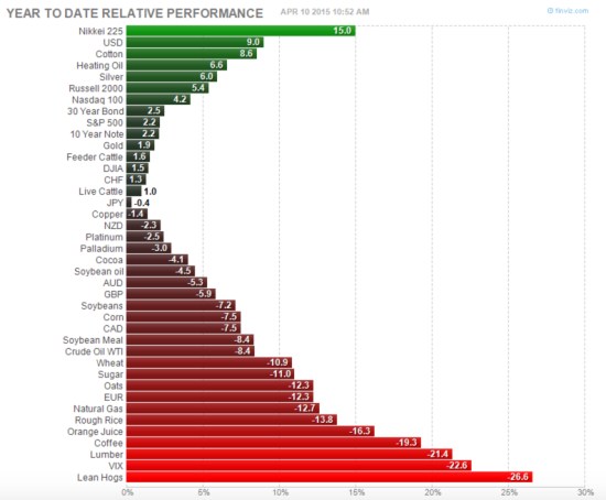
As of today, global stock, bond, commodity markets are generating asymmetric returns year to date. The graph below illustrates the asymmetry is negative for those who need these markets to go “up”.

Asymmetric Returns of World Markets 2015-04-10_10-52-47

source: http://finviz.com


A Tale of Two Conditions for U.S. and International Stocks: Before and After 2008

In recent conversations with investment advisors, I notice their sentiment has shifted from “cautious and concerned” about world equity markets to “why have they underperformed”. Prior to 2013, most investors and investment advisors were concerned about another 2007 to 2009 level bear market. Now, it seems that caution has faded. Today, many of them seem to be focused on the strong trend of U.S. stocks since mid-2013 and comparing everything else to it.

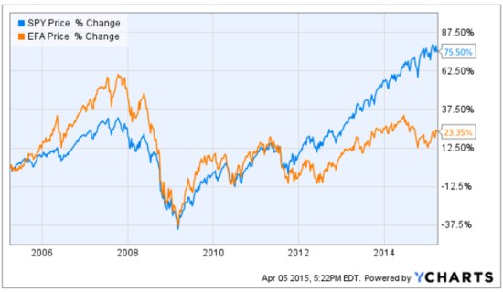
Prior to October 2007, International stocks were in significantly stronger positive directional trends than U.S. Stocks. I’ll compare the S&P 500 stock index (SPY) to Developed International Countries (EFA). We can visually observe a material change between these markets before 2008 and after, but especially after 2013. That one large divergence since 2013 has changed sentiment.

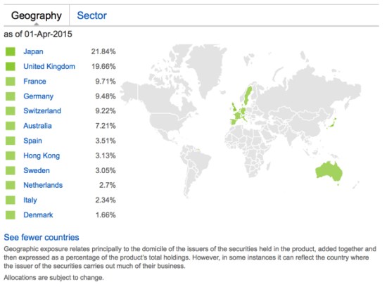
The MSCI EAFE Index is recognized as the pre-eminent benchmark in the United States to measure international equity performance. It comprises the MSCI country indices that represent developed markets outside of North America: Europe, Australasia and the Far East. For a “real life” example of its price trend, I use the iShares MSCI EAFE ETF (EFA). Below are the country holdings, to get an idea of what is considered “developed markets”.

iShares MSCI EAFE ETF Developed Markets exposure 2015-04-05_17-14-43

Source: https://www.ishares.com/us/products/239623/EFA

Below are the price trends of the popular S&P 500 U.S. stock index and the MSCI Developed Countries Index over the past 10 years. Many investors may have forgotten how strong international markets were prior to 2008. Starting around 2012, the U.S. stock market continued to trend up stronger than international stocks. It’s a tale of two markets, pre-2008 and post-2008.

Developed Markets International stocks trend 2015-04-05_17-22-22

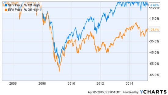
No analysis of a trend % change is complete without also examining its drawdowns along the way. A drawdown measures a drop from peak to bottom in the value of a market or portfolio (before a new peak is achieved). The chart below shows these indexes % off their prior highs to understand their historical losses over the period. For example, these indexes declined -55% or more. The International stock index nearly declined -65%. The S&P 500 U.S. stock index didn’t recover from its decline that started in October 2007 until mid-2012, 5 years later. The MSCI Developed Countries index is still in a drawdown! As you can see, EFA is -24% off it’s high reached in 2007. Including these international countries in a global portfolio is important as such exposure has historically provided greater potential for profits than just U.S. stocks, but more recently they have been a drag.

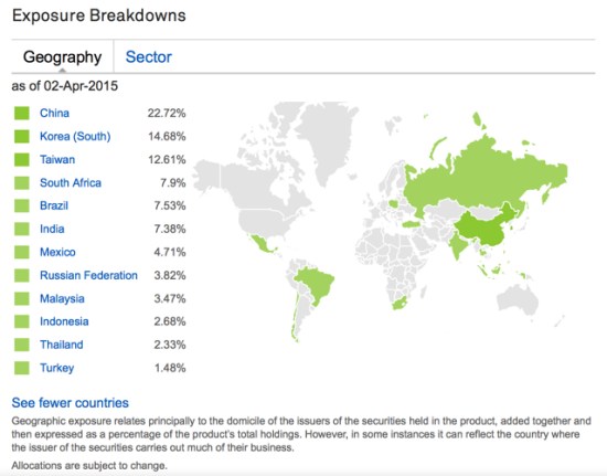
international markets drawdown 2015-04-05_17-30-00The International stock markets are divided broadly into Developed Markets we just reviewed and Emerging Countries. The iShares MSCI Emerging Markets ETF (EEM) tracks this index. To get an idea of which countries are considered “Emerging Markets’, you can see the actual exposure below.

emerging countries markets 2015-04-05_17-13-31

https://www.ishares.com/us/products/239637/EEM?referrer=tickerSearch

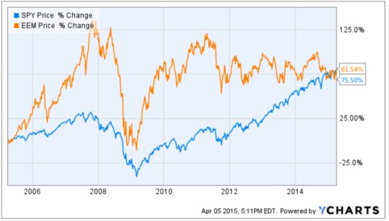
The Emerging Countries index has reached the same % change over the past decade, but they have clearly taken very different paths to get there. Prior to the “global crisis” that started late 2007, many investors may have forgotten that Emerging Markets countries like China and Brazil were in very strong uptrends. I remember this very well; as a global tactical trader I had exposure to these countries which lead to even stronger profits than U.S. markets during that period. Since 2009, however, Emerging Markets recovered sharply but as with U.S. stocks: they have trended up with great volatility. Since Emerging Markets peaked around 2011 they have traded in a range since. However, keep in mind, these are 10-year charts, so those swings up and down are 3 to 6 months. We’ll call that “choppy”. Or, 4 years of a non-trending and volatile state.

Emerging Markets trend 10 years 2015-04-05_17-21-06

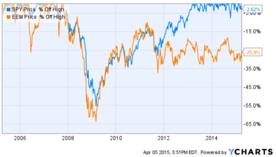
Once again, no analysis of a trend % change is complete without also examining its drawdowns along the way. A drawdown measures a drop from peak to bottom in the value of a market or portfolio (before a new peak is achieved). The chart below shows these indexes % off their prior highs to understand their historical losses over the period. For example, these indexes declined -55% or more. The Emerging Market stock index declined -65%. The S&P 500 U.S. stock index didn’t recover from its decline that started in October 2007 until mid-2012, 5 years later. The MSCI Emerging Countries index is still in a drawdown! As you can see, EFA is -26% off it’s high reached in 2007. As I mentioned before, it recovered sharply up to 2011 but has been unable to move higher in 4 years. Including these Emerging Markets countries in a global portfolio is important as such exposure has historically provided greater potential for profits than just U.S. stocks, but more recently they have been a drag.

emerging markets drawdown 2015-04-05_17-52-19

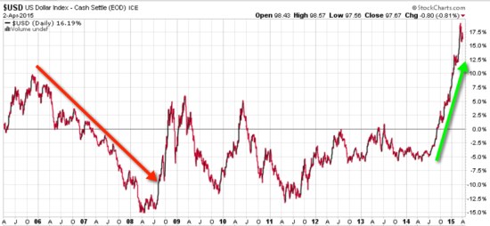
Wondering why the tale of two markets before and after 2008? The are many reasons and return drivers. One of them can be seen visually in the trend of the U.S. Dollar. Below is a 10-year price chart of the U.S. Dollar index. Before 2008, the U.S. Dollar was falling, so foreign currencies were rising as were foreign stocks priced in Dollars. As with most world markets, even the U.S. Dollar was very volatile from 2008 through 2011. After 2011 it drifted in a tighter range through last year and has since increased sharply.

Dollar impact on international stocks 2015-04-05_18-05-02

The funny thing is, I’ve noticed there are a lot of inflows into currency-hedged ETFs recently. Investors seem to do the wrong thing at the wrong time. For example, they’ll want to hedge their currency risk after it already happened, not before… It’s just like with options hedging: Investors want protection after a loss, not before it happens. Or, people will buy that 20 KW generator for their home after they lose power a few days, not before, and may not need it again for 5 years after they’ve stopped servicing it. So, it doesn’t start when they need it again.

You can probably see why I think it’s an advantage to understand how world markets interact with each other and it’s an edge for me.

Mike Shell is the Founder and Chief Investment Officer of Shell Capital Management, LLC, and the portfolio manager of ASYMMETRY® Global Tactical.

The observations shared on this website are for general information only and are not specific advice, research, or buy or sell recommendations for any individual. Investing involves risk including the potential loss of principal an investor must be willing to bear. Past performance is no guarantee of future results. The presence of this website on the Internet shall in no direct or indirect way raise an implication that Shell Capital Management, LLC is offering to sell or soliciting to sell advisory services to residents of any state in which the firm is not registered as an investment advisor. Use of this website is subject to its terms and conditions.

Stock Market Year-to-Date and First Quarter

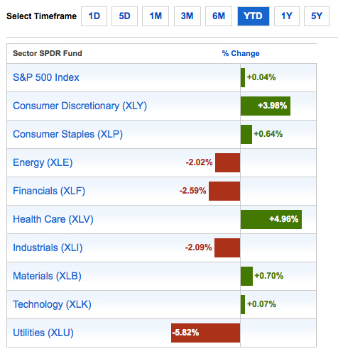
So far, the U.S. stock market isn’t doing so well. And, the gains and losses over the past quarter have been asymmetric. Consumer Discretionary (12.6% of the S&P 500 index) and Healthcare (14.8% of the S&P 500 index)  have barely offset the losses in four other sectors.

Below are the YTD gain and losses for the popular S&P 500 index and each sector in the index.

stock market first quarter performance 2015-04-02_12-38-10

source: http://www.sectorspdr.com/sectorspdr/tools/sector-tracker

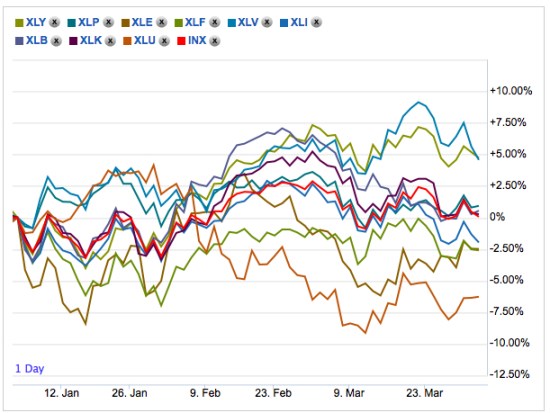
But, that’s just one data point compared to another data point. Such a table would be incomplete without considering the path those gains and losses took to get there.

sector returns 2015 2015-04-02_12-41-15

source: http://www.sectorspdr.com/sectorspdr/tools/sector-tracker/charting

To see the results of asymmetric exposure and risk management in action across a global universe of markets, visit: http://www.asymmetrymanagedaccounts.com/

Performance is historical and does not guarantee future results; current performance may be lower or higher. Investment returns/principal value will fluctuate so that an investor’s shares, when redeemed, may be worth more or less than their original cost. Past performance does not guarantee future results.

“It is impossible to produce a superior performance unless…

Sir John Templeton

source: http://www.templeton.org

A great quote from my fellow Tennessean, Sir John Templeton:

“It is impossible to produce a superior performance unless you do something different from the majority.”

Sir John Templeton

Absolute Return: an investment objective and strategy

Absolute returns investment strategy fund

Absolute Return in its basic definition is the return that an asset achieves over a certain period of time. This measure looks at the appreciation or depreciation (expressed as a dollar amount or a percentage). For example, a $50 stock drifts to $100 is a 100% absolute return. If that same stock drifts back from $100 to $50, its absolute return is -50%.

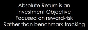
Absolute Return as an investment objective is one that does not try to track or beat an arbitrary benchmark or index, but instead seeks to generate real profits over a complete market cycle regardless of market conditions. That is, an absolute return objective of positive returns on investment over a market cycle of both bull and bear market periods irrespective of the direction of stock, commodity, or bond markets. Since the U.S. stock market has been generally in a uptrend for 6 years now, other than the -20% decline in the middle of 2011, we’ll now have to expand our time frame for a full market cycle to a longer period. That is, a full market cycle includes both a bull and a bear market.

The investor who has an absolute return objective is concerned about his or her own objectives for total return over a period and tolerance for loss and drawdowns. That is a very different objective than the investor who just wants whatever risk and return a benchmark, allocation, or index provides. Absolute returns require skill and active management of risk and exposure to markets.

Absolute return as a strategy: absolute return is sometimes used to define an investment strategy. An absolute return strategy is a plan, method, or series of maneuvers aiming to compound capital positively and to avoid big losses to capital in difficult market conditions. Whereas Relative Return strategies typically measure their success in terms of whether they track or outperform a market benchmark or index, absolute return investment strategies aim to achieve positive returns irrespective of whether the prices of stocks, bonds, or commodities rise or fall over the market cycle.

Absolute Return Investment Manager

Whether you think of absolute return as an objective or a strategy, it is a skill-based rather than market-based. That is, the absolute return manager creates his or her results through tactical decision-making as opposed to taking what the market is giving. One can employ a wide range of approaches toward an absolute return objective, from price-based trend following to fundamental analysis. In the ASYMMETRY® Managed Accounts, I believe price-based methods are more robust and lead to a higher probability of a positive expectation. Through my historical precedence, testing, and experience, I find that any fundamental type method that is based on something other than price has the capability to stray far enough from price to put the odds against absolute returns. That is, a manager buying what he or she believes is undervalued and selling short what he believes is overvalued can go very wrong if the position is on the wrong side of the trend. But price cannot deviate from itself. Price is the judge and the jury.

To create absolute returns, I necessarily focus on absolute price direction. Not relative strength, which is a rate of change relative to another moving trend. And, I focus on actual risk, not some average risk or an equation that oversimplifies risk like standard deviation.

Of course, absolute return and the “All Weather” type portfolio sound great and seem to be what most investors want, but it requires incredible skill to execute. Most investors and advisors seem to underestimate the required skills and experience and most absolute return strategies and funds have very limited and unproven track records. There is no guarantee that these strategies and processes will produce the intended results and no guarantee that an absolute return strategy will achieve its investment objective.

For an example of the application of an absolute return objective, strategy, and return-risk profile, visit http://www.asymmetrymanagedaccounts.com/

Absolute Return as an Investment Strategy

Absolute Return Investment Strategy Fund Manager

In “Absolute Return: The Basic Definition”, I explained an absolute return is the return that an asset achieves over a certain period of time. To me, absolute return is also an investment objective.

In “Absolute Return as an Investment Objective” I explained that absolute return is an investment objective is one that does not try to track or beat an arbitrary benchmark or index, but instead seeks to generate real profits over a complete market cycle regardless of market conditions. That is, it is focused on the actual total return the investor wants to achieve and how much risk the investor will willing to take, rather than a focus on what arbitrary market indexes do.

Absolute return as a strategy: absolute return is sometimes used to define an investment strategy. An absolute return strategy is a plan, method, or series of maneuvers aiming to compound capital positively and to avoid big losses to capital in difficult market conditions. Whereas Relative Return strategies typically measure their success in terms of whether they track or outperform a market benchmark or index, absolute return investment strategies aim to achieve positive returns irrespective of whether the prices of stocks, bonds, or commodities rise or fall over the market cycle.

Whether you think of absolute return as an objective or a strategy, it is a skill-based rather than market-based. That is, the absolute return manager creates his or her results through tactical decision-making as opposed to taking what the market is giving. One can employ a wide range of approaches toward an absolute return objective, from price-based trend following to fundamental analysis. In the ASYMMETRY® Managed Accounts, I believe price-based methods are more robust and lead to a higher probability of a positive expectation. Through my historical precedence, testing, and experience, I find that any fundamental type method that is based on something other than price has the capability to stray far enough from price to put the odds against absolute returns. That is, a manager buying what he or she believes is undervalued and selling short what he believes is overvalued can go very wrong if the position is on the wrong side of the trend. But price cannot deviate from itself. Price is the judge and the jury.

Of course, absolute return and the “All Weather” type portfolio sound great and seem to be what most investors want, but it requires incredible skill to execute. Most investors and advisors seem to underestimate the required skills and experience and most absolute return strategies and funds have very limited and unproven track records. There is no guarantee that these strategies and processes will produce the intended results and no guarantee that an absolute return strategy will achieve its investment objective.

For an example of the application of an absolute return objective, strategy, and return-risk profile,  visit http://www.asymmetrymanagedaccounts.com/

Absolute Return as an Investment Objective

Absolute Return objective fund strategy

In Absolute Return: The Basic Definition, I explained an absolute return is the return that an asset achieves over a certain period of time. To me, absolute return is also an investment objective.

Absolute Return as an investment objective is one that does not try to track or beat an arbitrary benchmark or index, but instead seeks to generate real profits over a complete market cycle regardless of market conditions. That is, an absolute return objective of positive returns on investment over a market cycle of both bull and bear market periods irrespective of the direction of stock, commodity, or bond markets.

Since the U.S. stock market has been generally in a uptrend for 6 years now, other than the -20% decline in the middle of 2011, we’ll now have to expand our time frame for a full market cycle to a longer period. That is, a full market cycle includes both a bull and a bear market.

The investor who has an absolute return objective is concerned about his or her own objectives for total return over a period and tolerance for loss and drawdowns. That is a very different objective than the investor who just wants whatever risk and return a benchmark, allocation, or index provides. Absolute returns require skill and active management of risk and exposure to markets.

Rather than a long article, this is going to be a series of smaller parts, building up to what absolute return really means.

For an example of the application of an absolute return objective, strategy, and return-risk profile,  visit http://www.asymmetrymanagedaccounts.com/