Technical indicators get a bad rap among some groups in the quantitative trading profession, but many of the most famous profitable investment managers apply technical indicators to global markets.
Category Archives: Quantitative Evidence-Based Rearch
Buying Climax Signals a Top in the Stock Market
There was enough buying climaxes in stocks this week to signal a short term top in the stock market.
This week 596 stocks printed a buying climax, which is the most since Feb 2018.
A buying climax is when a stock trends up to a 52 week high, then closes the week with a loss, which is a sign of distribution shifting from strong to weak hands.
A buying (or selling) climax is the result of surge in supply and demand.
The key theory of a buying climax is the exhaustion of demand as the last buyers enter the market.
The final surge of buying typically leads to p
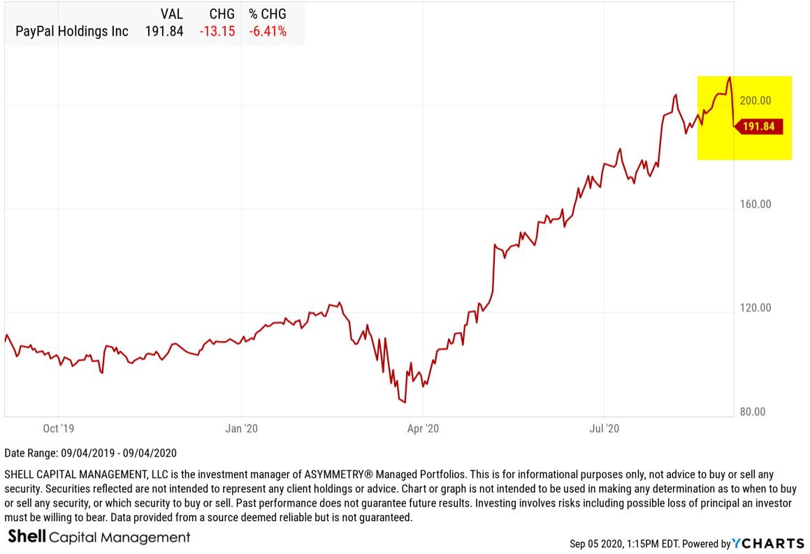
For example, PayPal printed a buying climax this week. Shares of PYPL trended up to a new 52 week high, then closed down on the week. It’s a sign of distribution, as shares of shifting from strong holders to weak. Stocks like PayPal have benefited from people staying at home and buying things online. It was a leading stock with strong relative strength, until now.
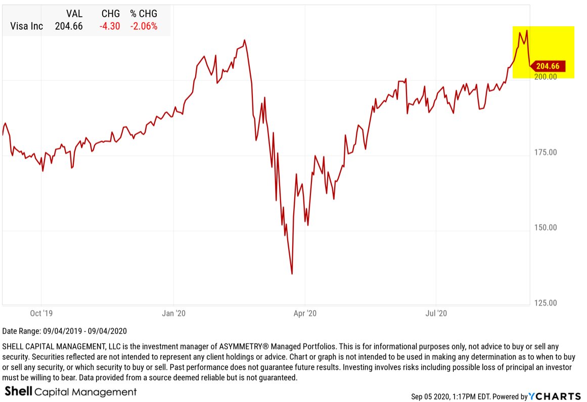
Visa (V) is another example of a BUYING CLIMAX. Visa has been a leading stock with strong momentum and earnings growth, but it trended to a new high, then closed down.
UPS is another example of a BUYING CLIMAX from a leading stock as it printed a new 52 week high, but closed down this week. Not as strong of an example as above, but a buying climax nonetheless.
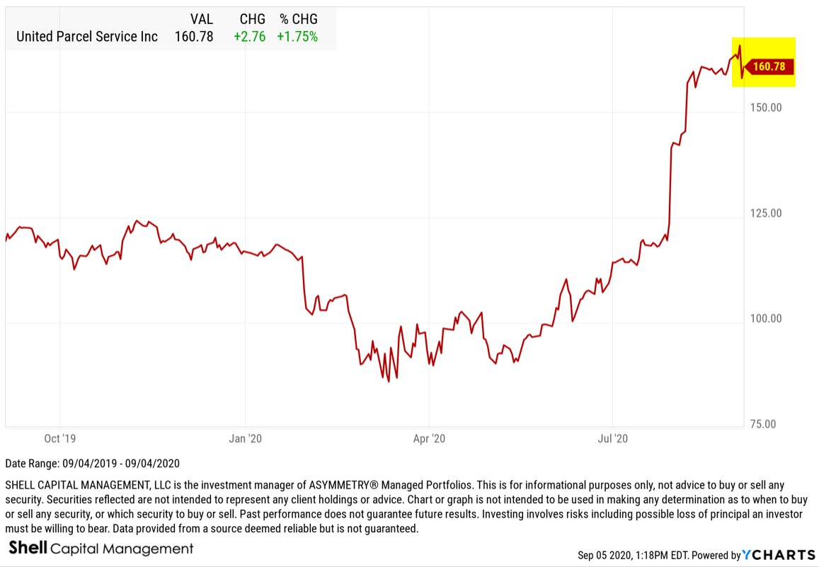
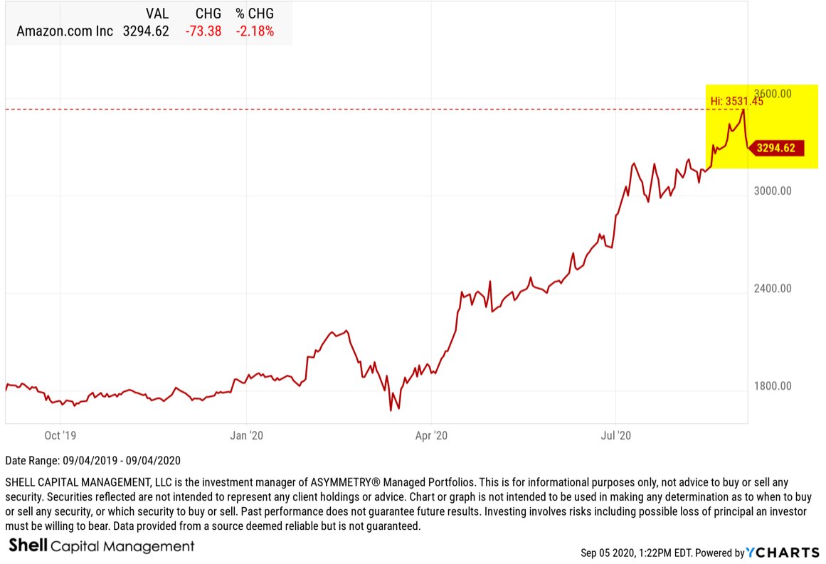
As stocks like UPS have benefited from the stay at home climate of rising deliveries, it’s obviously driven by companies like Amazon (AMZN), which happens to be another BUYING CLIMAX example.
Amazon trended to a new high, then closed down this week.
Costco (COST) is another example of a big winning stock that printed a new high during the recent euphoria for stocks that closed down this weak to print a buying climax.

Nvidia has been one of the most explosive momentum stocks this year. NVDA printed a new high, then closed -12% off its high this week.

The list of 596 stocks that printed a Buying Climax includes most of the recent leading momentum technology stocks like Apple, Adobe, Microsoft, but also financials like asset manager BlackRock.

The bottom line is: we’ve seen a period of euphoria, as measured by investor sentiment indicators like the Citigroup Panic/Euphoria Model, and now we’re seeing some blow off tops shift to buying climaxes.
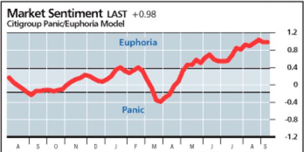
I shared my observations of investor sentiment getting silly the week before in “The weight of evidence is becoming increasingly bearish for the US stock market.”
These quantitative indicators have a long history of signaling a shift in supply and demand, which suggests the risk level is elevated for the stock market.
We typically see a buying climax at the end of a bull market cycle.
Investors confidence the trend will continue results in complacency as to market risk. Their confidence the uptrend will continue drives them to ignore the risk of loss, so they don’t manage their risk or hedge exposure to loss.
Complacent investors believe the current trend isn’t going to reverse anytime soon, so they get caught off guard when it does.
Once they start taking on heavy losses, they may panic sell, adding to the selling pressure that pushes prices down even lower.
Risk averse investors should prepare themselves for an increasing probably of a downtrend in stocks.
This may be just a warning shot across the bow of what may be more selling pressure to come.


Mike Shell is the Founder and Chief Investment Officer of Shell Capital Management, LLC, and the portfolio manager of ASYMMETRY® Global Tactical. Mike Shell and Shell Capital Management, LLC is a registered investment advisor focused on asymmetric risk-reward and absolute return strategies and provides investment advice and portfolio management only to clients with a signed and executed investment management agreement. The observations shared on this website are for general information only and should not be construed as advice to buy or sell any security. Securities reflected are not intended to represent any client holdings or any recommendations made by the firm. Any opinions expressed may change as subsequent conditions change. Do not make any investment decisions based on such information as it is subject to change. Investing involves risk, including the potential loss of principal an investor must be willing to bear. Past performance is no guarantee of future results. All information and data are deemed reliable but is not guaranteed and should be independently verified. The presence of this website on the Internet shall in no direct or indirect way raise an implication that Shell Capital Management, LLC is offering to sell or soliciting to sell advisory services to residents of any state in which the firm is not registered as an investment advisor. The views and opinions expressed in ASYMMETRY® Observations are those of the authors and do not necessarily reflect a position of Shell Capital Management, LLC. The use of this website is subject to its terms and conditions.
If we’re going to see selling pressure become resistance, this is where it starts
Technical analysis is the study of financial market price trends.
What’s funny is that technical analysis has evolved into now being called quantitative analysis.
Technical analysis has long been a method of much debate, until the academics determined that past price performance may have an impact on future performance.
I’ve been a chartist and technician for over twenty years now, and I make no bones about it.
I’m also called an independent thinker, because I don’t care what others think of it. I do me, and you do you.
Academics previously didn’t think the study and measurement of past price trends had any edge to be gained. It’s probably because Eugene Fama said “markets are efficient.” So, if it comes from the ivy tower of university, it must be true?
It isn’t.
The efficient-market hypothesis is a hypothesis in financial economics that states that asset prices reflect all available information.
If markets are efficient, then all known information is already factored into prices, and so there is no way to “beat” the market because there are no undervalued or overvalued securities available.
That’s far from reality.
If the markets reflect all known information, and are efficient, then how could we explain a -34% decline in the S&P 500? and a -37% decline in the Dow Jones Industrial Average in just three weeks?

No, that’s gotta be an under-reaction or an overreaction, or both at different times.
It’s the under-reaction and overreaction to new information that causes prices to drift, or trend, directionally over time rather than just always spiking up or down. It’s always what drives momentum, which is know even accepted by academics who didn’t want to believe that past performance had any impact on the current or future price.
I know, it was a silly proposition. Who wouldn’t look at the past price history for perspective of its historical direction, momentum, and volatility.
I was attracted to charting early on in my career. As I earned an advanced accounting degree, including all the advanced accounting courses on top of the standard ones, which would qualify me for the CPA exam in Tennessee. I don’t know about other states, but Tennessee required 150 credit hours and at least five advanced accounting classes on top of the core accounting degree. It is basically a Master’s degree, since I think a B.S. is about 124 hours.
Anyway, I did it, and the more I learned accounting, the more I realized it wasn’t of much use in an auction market.
In theory, the price of a stock trades at some multiple of earnings and such. If it were so simple, we could easily determine with high probability what a stock should trade at, and it would be accurate.
But it isn’t.
I say that anything other than the price trend itself has the potential to lead you astray from its reality.
That includes fundamental valuation measures.
I know accounting and finance about as well as anyone, and as a student who was trading stocks, it didn’t take long to realize the above statement. If a stock is undervalued, there’s a reason the market doesn’t like it. You may not know the reason yet, but some large institutional investors may.
I prefer to follow the big money that moves the price trend. They aren’t always right, either, but all the really matters is the direction they drive the price.
Does it really matter why?
or who?
So I’m a realist. I’ve got a lot of stereotypes I guess.
As I show you the following charts, I like to also include what may be wrong about them. For example, I’m about to show you the price trend of the S&P 500 index, which includes in it about 500 stocks. So, when we look at the index price trend, we have to realize what it represents. If we make a judgment based on the trend of an index, we’re doing it with an understanding there are about 500 different company stocks moving around inside it that have an impact on the outcome.
It isn’t perfect, but neither is fundamental analysis.
Here we go. What we have here is the popular stock index rubbing up on the top end of a range that represents the prior (February) high.

Technicians, or technical analysts, call this area “resistance”, but I disagree.
I call it potential resistance.
You see, it isn’t resistance until it is.
Resistance is an area on the chart where selling pressure overwhelms buying pressure enough to drive the price lower. A resistance level is identified by a previous price high or peak on price trend chart as I did above.
However, if resistance is where selling overwhelms buying, that hasn’t happened yet. So, it can’t yet be “resistance.”
All analysis requires some common sense and plain critical thinking.
Now, here is the problem. People always want to know of a catalyst that could cause a prevailing price trend to change.
People love a good story.
The reason I believe we’ll see some resistance here, if we’re going to, is because of my momentum measures are signaling the trend is entering the upper end of its range.
The last time the S&P 500 got into this zone was the first week of June.
The S&P 500 declined about -7% afterward.
So, if we’re going to see some pull back, I expect it will come soon.
Afterwards, we’ll then see if it eventually trends back up to a new all time high, or if it instead reverses down into more of a downtrend.
This is how it works. It’s a Bayesian probability, where we update the possibilities as we go.
At each new stage of a trend, the expected value changes.
Let’s see how it unfolds from here.
Mike Shell is the Founder and Chief Investment Officer of Shell Capital Management, LLC, and the portfolio manager of ASYMMETRY® Global Tactical. Mike Shell and Shell Capital Management, LLC is a registered investment advisor focused on asymmetric risk-reward and absolute return strategies and provides investment advice and portfolio management only to clients with a signed and executed investment management agreement. The observations shared on this website are for general information only and should not be construed as advice to buy or sell any security. Securities reflected are not intended to represent any client holdings or any recommendations made by the firm. Any opinions expressed may change as subsequent conditions change. Do not make any investment decisions based on such information as it is subject to change. Investing involves risk, including the potential loss of principal an investor must be willing to bear. Past performance is no guarantee of future results. All information and data are deemed reliable but is not guaranteed and should be independently verified. The presence of this website on the Internet shall in no direct or indirect way raise an implication that Shell Capital Management, LLC is offering to sell or soliciting to sell advisory services to residents of any state in which the firm is not registered as an investment advisor. The views and opinions expressed in ASYMMETRY® Observations are those of the authors and do not necessarily reflect a position of Shell Capital Management, LLC. The use of this website is subject to its terms and conditions.
Everything is Relative: Florida COVID – 19 Trend Update
“It doesn’t matter what we think about a trend, it matters what the crowd thinks about it, but more importantly, how they will respond to it.”
– Mike Shell
For a quick update on the Coronavirus COVID – 19 trend, I’ll use my home state of Florida as the example.
The first cases of Coronavirus (COVID-19) were confirmed on March 1st, 2020, which occurred in Manatee and Hillsborough County. During the initial outbreak of Coronavirus in the United States, Florida’s public beaches and theme parks were under scrutiny as being areas of large crowds. Some in the news media criticized Florida for being relatively late in issuing a “Shelter-At-Home” order, finally putting it in place beginning April 3rd, 2020. Cases ramped quickly from 2 on March 4th, to over 5000 by the end of the month. Since then, however, the number of cases in Florida has leveled off, slowing the rate of change.
I focus on the direction of the trend and its rate of change.
The COVID Tracking Project has now tracked 85,826 cumulative Florida Coronavirus cases , up from 82,719 Thursday. This is a change of 3.88%. Here, I show the standard arithmetic scale on the chart.

The concern I see in the above chart is it seems to be forming a rough S-shaped curve. That is, cases trended up though April and May around the same pace, but this month the rate of change is notably stronger in the linear price scale of an arithmetic chart. The arithmetic or linear chart doesn’t illustrate or scale movements in relation to their percent change, but instead, the linear price scale plots price level changes with each unit change according to a constant unit value. So, there is an equal distance between the data points as each unit of a change on the chart is represented by the same movement up the scale, vertical distance, regardless of what the level when the change happened. The arithmetic chart is the standard basic chart, especially over shorter time series, and it shows absolute trends.
To see how the time series unfolds with a focus on percentage of change, we changed the scale to logarithmic. The logarithmic chart is plotted so that two equal percent changes are plotted as the same vertical distance on the scale. Logarithmic scales are better than linear scales for normalizing less severe increases or decreases. Applying a logarithmic scale, the vertical distance between the data on the scale the percent change, so we can better identify changes in rates of change. Here, we see a strong uptrend in March, then the rate of change has since leveled off. The trouble, however, is it is still trending up and at its high.

Florida Coronavirus Tests Administered is at a current level of 1.5 million, which up from 1.486 million the day before, an increase of 1.72%.

COIVD – 19 Deaths have increased 1.4% since Thursday. Deaths are obviously an essential factor to track. Florida Coronavirus Deaths is at a current level of 3,154.00, up from 3,110.00 yesterday.

The steep uptrend in deaths is scary looking using the arithmetic scale showing the absolute trend in cumulative deaths. In the next chart, we observe the same trend as a log scale, which shows the rate of change is in an uptend, but has been slowing. I labeled the highest high (now) and the average over the period for reference.

Florida Coronavirus Hospitalizations is at 12,862, up from 12,673 the prior day, which is a change of 1.49%. To focus on the rate of change, here is the log scale chart.

Keep in mind, my objective here isn’t to rehash the research of others, but instead to share what I see in the trends and rates of change. As such, this isn’t a complete analysis of the virus. It’s my observations, as a quant and trend system developer and operator. The data source is The COVID Tracking Project which can only report the data as provided by the states.
ZOOMING IN TO PER DAY
The per day trends are important if we want to spot a change in trend quickly. As I warned in “In addition to the equity markets entering a higher risk level of a drawdown and volatility expansion, we now have a renewed risk of the scary COVID narrative driving more fear” a week ago, the uptrend got some attention last week. It doesn’t matter what we think about a trend, it matters what the crowd thinks about it, but more importantly, how they will respond to it.
The uptrend in Florida Coronavirus cases per day has indeed continued and with a notable new high.

I don’t like to see an uptrend like this because it’s a virus, and viruses are contagious, so they spread. In the case of Coronavirus, we can get an idea of the speed and rate of spread by the reproductive number (R0), or ‘R-naught’, represents the number of new infections estimated to stem from a single case. The reproductive number (R0) is relatively high, according to a research paper on the CDC: Assuming a serial interval of 6–9 days, we calculated a median R0 value of 5.7 (95% CI 3.8–8.9).
I’m not going into the details here, but, with a reproductive value of 5.7, an increase in new cases is material in my opinion. That is, once it trends up as we are seeing now, it seems more likely to continue.
Are new cases a function of increased testing?
Some say the increase in new cases per day is a result of more testing. That doesn’t seem to be the case. Below is a charge of cases per day with a time series of tests administered per day under it. Visually, we see no correlation. However, there are many caveats to the data. So, anyone who wants to make a cased leaning one way or another can find ways to skew it, but it is what it is. We have a material increase in cases in Florida.

QUANTIATIVE ANALYTICS
Now, we’ll take a deeper dive and apply some analytics to the trends by observing some ratios.
The Florida COVID – 19 Death Rate has been gradually trending down. Florida Coronavirus Death Rate is at 3.67%.

In the past two weeks of May, the death rate was 4.6%, so it is falling.

In our investment management, I’ve been drawing ratio charts for over two decades to determine which market or stocks has greater trend momentum than another. When the numerator (top) is trending stronger than the denominator (bottom value) we say it has stronger relative strength or momentum. In this case, I have used Florida Coronavirus Cases Per Day as the numerator (top value) and Florida Coronavirus Tests Per Day as the denominator (bottom value), which shows a clear uptrend in the cases per day relative to the tests per day. This concerns me because of the rate of spread. As you look at the ratio chart, consider that a value of 0 would mean new cases per day is the same as new tests per day. Instead, new cases is currently trending higher than testing.

Florida cumulative cases relative to tests administered is also showing some change in trend. the past few weeks. Again, not of the date collected is perfect, but it’s still representative of a statistically significant sample of the population.

My objective for trend following is to identify a trend early in its stage to capitalize on it until it changes.
Comparing per day cases to other states doesn’t mean a lot, since the data needs to be normalized. For example, what President Trump said a few weeks ago is a true statement: the number of cases are a function of testing. If we didn’t test and didn’t categorize a case as COVID, there would be no “COVID cases.” Some people, politically motivated, seem to have difficult understanding that simple statement. I’m not politically motivated, so I just say it like it is. With that said, California is winning the match of the most cases per day followed by Texas. Florida is above Arizona.

Again, this doesn’t tell us anything aside from the absolute number. A relative comparison is often necessary and this is an example. For example, we could first calculate per day cases relative to tests or population, then compare them. That’s beyond the scope of my objective today.
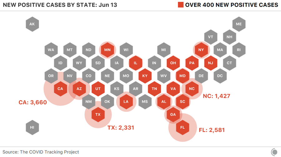
Here are the states that reported over 500 new cases. We are seeing some large bubbles in the southwestern United States right now.
The bottom line is, we want to see these levels drifting down, not up. We want to see this trend down.

People who are at high risk should continue to operate according to the risks, but also keep it in perspective that at this point, it isn’t yet so wide spread.
In the big picture, the population in Florida is 22 million and about 86 thousand cases have been labeled COVID 19. 86,0000 out of 22 million is about 4 tenths of a percent, or 0.40%.
That’s 40 cents of $100.
Our changes of contracting COVID 19 in Florida, then, is less than half of 1% at this point.
Everything is relative.
Join 519 other subscribers
Mike Shell is the Founder and Chief Investment Officer of Shell Capital Management, LLC, and the portfolio manager of ASYMMETRY® Global Tactical. Mike Shell and Shell Capital Management, LLC is a registered investment advisor focused on asymmetric risk-reward and absolute return strategies and provides investment advice and portfolio management only to clients with a signed and executed investment management agreement. The observations shared on this website are for general information only and should not be construed as advice to buy or sell any security. Securities reflected are not intended to represent any client holdings or any recommendations made by the firm. Any opinions expressed may change as subsequent conditions change. Do not make any investment decisions based on such information as it is subject to change. Investing involves risk, including the potential loss of principal an investor must be willing to bear. Past performance is no guarantee of future results. All information and data are deemed reliable but is not guaranteed and should be independently verified. The presence of this website on the Internet shall in no direct or indirect way raise an implication that Shell Capital Management, LLC is offering to sell or soliciting to sell advisory services to residents of any state in which the firm is not registered as an investment advisor. The views and opinions expressed in ASYMMETRY® Observations are those of the authors and do not necessarily reflect a position of Shell Capital Management, LLC. The use of this website is subject to its terms and conditions.
In addition to the equity markets entering a higher risk level of a drawdown and volatility expansion, we now have a renewed risk of the scary COVID narrative driving more fear
People tend to overreact and under-react to new information.
We observe it in the global capital markets more frequently than anywhere, and with immediate feedback.
So, those of us who are adept at identifying and monitoring directional trends in global markets have an advantage in researching trends of all kinds if our quantitative trend methods are robust, and our qualitative judgment and decision-making process is repeatable.
Intellectual skills that are associated with acquiring reliable information about nature are parts of the scientific process. Scientists of all kinds need skills like: communicating, observing, classifying, measuring, predicting, inferring, and researching.
Science isn’t just science, there’s also some art to it. I believe the first skills are more art, such as communicating, observing, classifying.
Many say investing and investment management is both art and a science. Some believe investment management is more art than science, others believe it’s more science than art. Quants try to make it more scientific than artistic.
I do a combination. I am Man + Machine.
The way I look at trends and how time series interact with each other is a robust process that may be applied to anything.
I don’t read articles in Bloomberg or The Wall Street Journal to hear the opinions of others to decide what I believe for myself. When I was a young rookie I did read a lot at first, as we all do, then learned the hard way to focus my efforts on my own original research and thinking.
I do best when I do my own work, as an independent thinker.
So, over the decades as a professional researcher, I first inspect the data to observe any trends and then make sense of it afterward. Sometimes my intention is for predictive analytics, other times it’s just prescriptive. predictive and prescriptive analytics. Predictive analytics provides us with the raw information for making informed decisions, while prescriptive analytics provides us with data-backed, evidence-based decision points that we can weigh against one another.
The scientific method is an empirical method of acquiring knowledge through careful observation, and applying rigorous skepticism about what is observed, realizing how cognitive assumptions and bias can distort how one interprets the observation.
- Descriptive Analytics, applying data aggregation and data mining to provide observations and insight into the past to answer:
- “What has happened?”
- Predictive Analytics, applying statistical models and probabilistic forecasting methods to understand the future and answer:
- “What could happen?”
- Prescriptive Analytics, applying simulation and testing algorithms to advise on possible outcomes and answer:
- “What should we do?”
The Scientific Method and experimenting is a systematic approach to problem-solving and decision-making.
An algorithm may look something like this:
Problem —> Hypothesis —-> Prediction —-> Test Predictions —> Evaluation
We all have biases. All industries have biases. Sometimes these biases gave blindspots. Our biases that can narrow our vision and influence behavior and beliefs. It’s why in asset management, we often consult with researchers outside the industry to help avoid blind spots from industry bias. For example, the personal financial planning profession has a tendency to blindly say “balance your risks and rewards” and “balance your portfolios”, which is about the silliest things I’ve ever heard.
If you balance your risk and reward, you get symmetry on your statement.
If we want asymmetry, we have to skew the risk and reward positively.
It’s essential to identify blind spots, own them without being defensive, and adjust our behavior to avoid it.
MY OBSERVATIONS OF COVID 19
I have an advantage, because I observe COVID 19 trends and rates of change as it is, without any bias as to beliefs about the disease and such. That is, I’m just purely looking at the data we collect and feed into our systems for observation.
It’s like this:
- I focus on; what has changed?
- I look for extremes in levels, like new high or low breakouts.
- I also monitor the rates of change. Fast breakouts are more likely to form an ongoing trend than slow.
FLORIDA COVID 19 UPDATE
As COVID 19 and the mass quarantine strategy for suppressing the spread has become a political debate lately, so some of you may perceive what you are about to read that way.
Don’t.
I have no political bias about this whatsoever. My personal preference is to get past this virus as quickly as possible with as little human suffering as possible. Ignoring the data and facts doesn’t get us there. Exaggerating the data and facts doesn’t either. So, I suggest you try to see the trends for what they are, as I am.
My home state of Florida is now, unfortunately, trending in the wrong direction. I pointed it out with some fellow money manager friends last week of a potential breakout in the trend and it has since trended higher for a meaningful and material breakout. No one wants businesses to open and get back to normal more than me, but what is, is. The cases per day is in a strong uptrend. The prior high was 1575 on April 3rd and 1601 on May 16th. Yesterday was 2581. I hope to see this trend down.

NEW UPTREND IN FLORIDA CASES NOT DRIVEN BY NEW TESTING
The first hypothesis we think of is, well, maybe the uptrend in driven by an increase in testing. Naturally, increasing the absolute testing also should increase the number of positive tests. That isn’t the case. The high in testing was May 20th in Florida. The testing per day remains materially below that level according to the most recent data.

Keep in mind, the lower line is tests administered per day, so there is a lag between testing and the classification of a positive case. In fact, there are natural lags in all of this data. For example, I don’t expect to see the results of the protests until a week or two afterward to account for the lag in showing symptoms, going to get tested, and getting the test results. If there is any increase in the protesting areas, we’ll hear about it next week or later.
FLORIDA COVID 19 HOSPITALIZATIONS AT AN ALL TIME HIGH
Not much to add here. It is what it is.

I can try to make it seem better with a logarithmic based chart, which draws the chart in a way that two equal percent changes are plotted as the same vertical distance on the scale. It visually normalizes the rate of change. The good news is the rate of change overall is slowing. The bad news is this could look like an S-curve later, which would be typical of a spread.

By the way, here is the log chart of the new cases per day. We normally use a logarithmic chart scale for long term charts to normalize the data especially if I’m comparing it to something else where relative strength (rate of change) is measured. But here, we still see a breakout in rate of change. So, it’s a material breakout in my opinion, but I hope it breaks down.

Unfortunately, three of the new uptrends are in states were we have clients; Florida, California, and Texas. Next up is Texas.
TEXAS COVID 19 UPTREND
New cases in Texas is trending up to all time highs. I think Houston, Texas is now at risk of another stay-at-home order.

CALIFORNIA COVID 19 TREND
California new cases per day has trended up to the all time high again. It doesn’t seem to be in direct result of more testing per day, either.

ARIZONA COVID 19 CASES AT NEW HIGH
Arizona is at a high in new daily cases reported, but also in tests per day. The trouble in Arizona is the material new uptrend in hospitalizations.

The momentum in hospitalizations in Arizona is a real problem, and I’m using a logarithmic scale below, but it doesn’t help.

So, we are seeing new hospitalization highs in Texas, Arizona, and North Carolina. We’re showing Louisiana here as well for context, since it had an early COVID-19 outbreak.

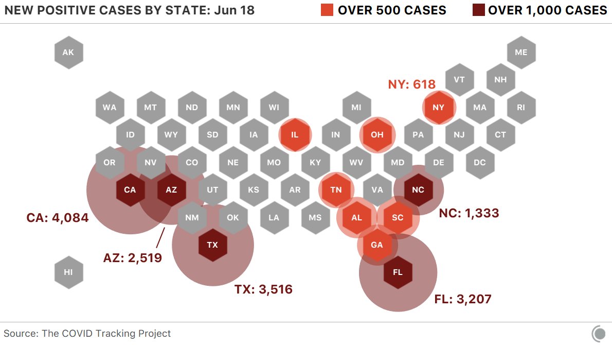
We saw 3 states report more than 2,000 cases yesterday: California, Florida, and Texas. A picture speaks a thousand words.
COVID HAS HIT THE NORTH MUCH HARDER THAN THE SOUTH

But the South is now seeing a surge in cases…

And it doesn’t seem to be an increase in testing.

Can hospitalizations keep falling if cases are rising?

Because hospitalizations are rising rapidly in some Southern states.

I expect we’ll be hearing a lot about these new high breakouts in Arizona, Florida, Texas, and California. All of which, by the way, are the hottest and most humid states in the U.S., so much for the heat and humidity killing the virus.
What we have here is, a a notable uptrend across the South. I hope to see it fade, but based on what I’m seeing, it’s more likely to continue. Only time will tell.
If you are at risk, I recommend remaining cautious, wearing the dang mask, and treating this virus with respect.
Join 519 other subscribers
Speaking of the scientific method used for decision-making.
If you want to get as technical as possible, here’s some homework for the wannabe scientists and armchair mathematicians who really want to get into the maths of the matter. The virus has sparked a lot of important debates around the globe among though leaders. As researchers, we argue and debate our beliefs in hopes to gain new knowledge. One of the most heated public debates has been Taleb and Ioannidis.
The International Journal of Forecasting (IJF) is organizing a special section devoted to “Epidemics and forecasting with focus on COVID-19”. Based on their blog posts, John P. Ioannidis and Nassim N. Taleb will be given the opportunity to think of each other’s arguments about the COVID data and how to use it. Consequently, they will both be invited to write a full paper to better detail their views and why they think the opposite side’s views may not be adequate under the current circumstances. These opinion papers will then appear in the IJF, after scientific review by their peers. IJF should reserve the right to publish a closure based on this debate. This debate will not only allow us to better understand the points of view of the two great scientists but be also left as a guide for how to deal with future pandemics.
Nassim N. Taleb believes that all efforts and resources should be directed to halt its spread and reduce the number of infected and deaths without any concern about forecasting its future course as the uncertainty of doing so cannot be measured and the risks involved are highly asymmetric. See “On single point forecasts for fat tailed variable by Nassim Nicholas Taleb.”
John P. Ioannidis, on the other hand, claims that more reliable information is needed to make multiple billion-dollar decisions and that forecasting has failed us by being too pessimistic about the future growth of the pandemic and by exaggerating its negative effects. See “Forecasting for COVID-19 has failed”
Both of their observations are well worth a read.
In addition to the equity markets entering a higher risk level of a drawdown and volatility expansion, we now have a renewed risk of the scary COVID narrative driving more fear.
Mike Shell is the Founder and Chief Investment Officer of Shell Capital Management, LLC, and the portfolio manager of ASYMMETRY® Global Tactical. Mike Shell and Shell Capital Management, LLC is a registered investment advisor focused on asymmetric risk-reward and absolute return strategies and provides investment advice and portfolio management only to clients with a signed and executed investment management agreement. The observations shared on this website are for general information only and should not be construed as advice to buy or sell any security. Securities reflected are not intended to represent any client holdings or any recommendations made by the firm. Any opinions expressed may change as subsequent conditions change. Do not make any investment decisions based on such information as it is subject to change. Investing involves risk, including the potential loss of principal an investor must be willing to bear. Past performance is no guarantee of future results. All information and data are deemed reliable but is not guaranteed and should be independently verified. The presence of this website on the Internet shall in no direct or indirect way raise an implication that Shell Capital Management, LLC is offering to sell or soliciting to sell advisory services to residents of any state in which the firm is not registered as an investment advisor. The views and opinions expressed in ASYMMETRY® Observations are those of the authors and do not necessarily reflect a position of Shell Capital Management, LLC. The use of this website is subject to its terms and conditions.
Investor sentiment and feelings can be data-driven, quantitative, applying the scientific method, supported by a mathematical basis for feeling and believing

Individual investors are notably less bearish now, according to the AAII Sentiment Survey.
US Investor Sentiment, % Bearish is an indicator that is a part of the AAII Sentiment Survey. It indicates the percentage of investors surveyed that had a bearish outlook on the market. An investor that is bearish, will primarily believe the US stock market will trend lower in the next six months.
Bearish US Investor Sentiment dropped 25%, so only 26.4% of the investors surveyed expect the stock market to fall in the next 6 months. Bearish sentiment is now below its average over the past year, but far from an extreme reading. I marked the high, low, and average on the chart.

The most extreme level of bearish sentiment historically going back to 1989 is all the way down to only 6% Bearish, which we haven’t seen since 2003.

If you notice, the Bearish level has held a higher low the past decade. That is, recent stock market peaks haven’t resulted in those extreme lows since the investor survey started 22 years ago. So, behavior and sentiment surveys aren’t an exact science, nor are they intended to be. Below we see a Bearish level of 20% has been the common low in Bearish sentiment.

I could put the data into a table format and show a mode analysis, which is a study that shows when Bearish sentiment spikes or falls, what happens to the stock market. Since I apply the scientific approach to trends and cycles, I have certainly tested the indicators I observe scientific for quantitative analysis. I require a mathematical basis behind believing what I believe. If it doesn’t test out mathematically using the scientific approach, it would be of little use. To know what is of use, or not, requires quantitative testing. I don’t share my quant work, but instead, prefer to show observations of the trends in the data. When presenting my research, I do so visually.
In the chart below I overlay the % Bearish sentiment in orange over the S&P 500 % off high (the drawdown) in purple. We can visually see how they interact with each other. As the stock market falls, Bearish investor sentiment % spikes up. I highlighted these times.

Investors become more afraid of falling prices after they fall. Investors also extrapolate the recent past into the future, so they expect falling prices to beget further falling prices. We can hypothesize this because investors are more Bearish at lower prices, less so at higher prices.
Okay, so far I’ve only shown the Bearish sentiment.
What about Bullish investor sentiment?
US Investor Sentiment, % Bullish is a gauge of the AAII Sentiment Survey. It registers the percentage of investors surveyed that had a bullish outlook on the market the past week. An investor that is bullish, will primarily believe the market will trend higher in the next six months.
US Investor Sentiment, % Bullish increased 41.33% the week of February 13, 2020. The % Bullish investor sentiment was the most notable change over the last week. Individual investors are notably more Bullish. However, although the Bullish sentiment is well above the average of the past year, individual investor enthusiasm isn’t yet at the highest level reached over the past year, which I marked in the chart.

Meanwhile, the Fear & Greed Index, driven by 7 market sentiment indicators, is Neutral.

So, while individual investors are becoming more bullish about the stock market trend for the next 6 months, they haven’t quite yet reached an extreme level that often signals buying enthusiasm is becoming exhausted. But, the rate of change in Bullish investor sentiment is worth making note of for situational awareness as investors usually believe and do the wrong things and the wrong time at extremes.

So far, the US stock market has been resilient, especially considering the headlines have been dominated by the virus updates and images of people around the globe bearing masks.
“When the facts change, I change my mind. What do you do, sir?”
I’ve kept more of my market risk hedged-off than I’d like (in hindsight) if market prices don’t fall to a lower-risk point, but we’ll see how it unfolds from here.
My edge is discipline and my tactical decisions are completely intentional and come from a fully committed state, so I don’t fear losing money or missing out. I tend to feel the right feeling at the right time, as my feelings are data-driven, quantitative, applying the scientific method, supported by maths for a mathematical basis for feeling and believing. Oh, and a heavy dose of stoicism.
I also change as the facts do, and the only facts that ultimately matter are price trends.
Have a Happy Valentines Day and weekend, friends!
Mike Shell is the Founder and Chief Investment Officer of Shell Capital Management, LLC, and the portfolio manager of ASYMMETRY® Global Tactical. Mike Shell and Shell Capital Management, LLC is a registered investment advisor in Florida, Tennessee, and Texas focused on asymmetric risk-reward and absolute return strategies and provides investment advice and portfolio management only to clients with a signed and executed investment management agreement. The observations shared on this website are for general information only and should not be construed as advice to buy or sell any security. Securities reflected are not intended to represent any client holdings or any recommendations made by the firm. Any opinions expressed may change as subsequent conditions change. Do not make any investment decisions based on such information as it is subject to change. Investing involves risk, including the potential loss of principal an investor must be willing to bear. Past performance is no guarantee of future results. All information and data are deemed reliable but is not guaranteed and should be independently verified. The presence of this website on the Internet shall in no direct or indirect way raise an implication that Shell Capital Management, LLC is offering to sell or soliciting to sell advisory services to residents of any state in which the firm is not registered as an investment advisor. The views and opinions expressed in ASYMMETRY® Observations are those of the authors and do not necessarily reflect a position of Shell Capital Management, LLC. The use of this website is subject to its terms and conditions.
The flaw of average in stock market returns
We apply a lot of probability and statistical analysis for investment management and also our wealth management and strategy.
However, I do it with a complete system and framework that includes a heavy dose of skepticism and acceptance of reality.
There are many things we just can’t know and many other things people believe they know that just ain’t true.
Then, there are many flaws in the perception and how investors and wealth management clients use data.
Like a financial engineer, I focus on what may be wrong, what may go wrong, and how our thinking could be flawed. To achieve this level of reality, we necessary think deeply about it and share our independent thinking with other believable people who may disagree.
One of the flaws I see most often in investment management, retirement planning, and retirement income management is the flaw of averages.
The flaw of averages is the term used by Sam L. Savage to describe the fallacies that arise when single numbers (like averages and average returns for stock and bond markets) are used to represent uncertain outcomes.
A great example of the flaw of averages is a 6 ft. tall statistician can drown while crossing a river that is 3 ft. deep on average.

Too often we see the reliance on historical “average returns”.
Yet, almost 80% of rolling decades since 1900 have delivered returns 20% above or below the historical average
So, there is an 80% chance that the total nominal return for the next decade will be either above 12% or below 8%.
And, then, there could also be underwater periods that are much longer and deeper than the average portrays. These periods may cause investors to tap out when the water gets too deep, or the deep water lasts too long.

You can probably see why I think it’s essential to tactically manage risk to actively direct and control the possibility of loss and control drawdowns.
Knowing what I know, I don’t offer investment management any other way.
It’s why we describe it on the front page of our website at Shell Capital.
Mike Shell is the Founder and Chief Investment Officer of Shell Capital Management, LLC, and the portfolio manager of ASYMMETRY® Global Tactical.
Mike Shell and Shell Capital Management, LLC is a registered investment advisor focused on asymmetric risk-reward and absolute return strategies and provides investment advice and portfolio management only to clients with a signed and executed investment management agreement. The observations shared on this website are for general information only and should not be construed as advice to buy or sell any security. Securities reflected are not intended to represent any client holdings or any recommendations made by the firm. Any opinions expressed may change as subsequent conditions change. Do not make any investment decisions based on such information as it is subject to change. Investing involves risk, including the potential loss of principal an investor must be willing to bear. Past performance is no guarantee of future results. All information and data is deemed reliable, but is not guaranteed and should be independently verified. The presence of this website on the Internet shall in no direct or indirect way raise an implication that Shell Capital Management, LLC is offering to sell or soliciting to sell advisory services to residents of any state in which the firm is not registered as an investment advisor. Use of this website is subject to its terms and conditions.
Your technical analysis is no match for Trump Tweets!
Someone texted me this image this morning.

Now that’s funny right there; I don’t care who you are!
But seriously though, many people like to blame others for their reality. Most of the time, the market does what it does, and something or someone always gets the blame for it – besides them.
It’s an easy way for them to be right. It wasn’t them and their risk exposure that was wrong, it was someone else like the President, or the Fed, or the machines.
I ignore the nonsense and focus on price trends. I focus on the facts.
Yes, I call it technical analysis of price trends, as it has been called for decades.
But, just like we are now seeing trading firms call computerized quantitative trading systems more trendy names like “artificial intelligence” and “machine learning” or “pattern recognition”, others have renamed technical analysis “quantitative analysis”
The trend seems to be driven by those who write research papers, books, and such.
To be sure, an example is a disclosure I saw in an SEC Form ADV registration document. In Methods of Analysis, Investment Strategies, and Risk of Investment Loss, the first lists: Quantitative analysis and Fundamental analysis, but not Technical analysis. I’m going to fictitiously call this firm “QUANT”.
QUANT will primarily utilize Quantitative analysis but may also use other analysis methods, including Fundamental analysis as needed.
Quantitative analysis involves the analysis of past market data; primarily price and volume.
Fundamental analysis involves the analysis of financial statements, the general financial health of companies, and/or the analysis of management or competitive advantages.
Investment Strategies QUANT will utilize long term trading and short term trading strategies.
Under Material Risks Involved, it goes on to say:
Methods of Analysis
Quantitative analysis attempts to predict a future stock price or direction based on market trends. The assumption is that the market follows discernible patterns and if these patterns can be identified then a prediction can be made. The risk is that markets do not always follow patterns and relying solely on this method may not work long term.
Fundamental analysis (I’m skipping this irrelevant part for brevity)
Investment Strategies
Long term trading is designed to capture market rates of both return and risk. Frequent trading, when done, can affect investment performance, particularly through increased brokerage and other transaction costs and taxes.
Short term trading generally holds greater risk and clients should be aware that there is a material risk of loss using any of those strategies.
Investing in securities involves a risk of loss clients should be prepared to bear.
What’s the big deal?
It isn’t a big deal, but, let’s change a single word to see what happens.
Let’s replace “Quantitative” with “Technical” and see if it fits the same.
Technical analysis attempts to predict a future stock price or direction based on market trends. The assumption is that the market follows discernible patterns and if these patterns can be identified then a prediction can be made. The risk is that markets do not always follow patterns and relying solely on this method may not work long term.
Yes, that’s the definition used for Technical analysis.
The point is, they just didn’t want to call it “Technical analysis” because “Quantitative analysis is more trendy in modern times.
But, it’s the same.
I don’t debate others hoping to change their minds, but instead, I do mull over what others believe to see how it may be in conflict with what I believe. By doing that, it allows me to question my own beliefs to see if there is enough evidence to change what I believe. I do that to combat what we are all more prone to do, which is seek out information that confirms what we already believe and ignore information that says it isn’t true. Humans have the tendency to interpret new evidence as confirmation of one’s existing beliefs or theories. If we want to gain new knowledge, we have to consider we may be wrong and apply a scientific approach to discover new knowledge.
Confirmation bias is the tendency to search for, interpret, favor, and recall information in a way that affirms one’s prior beliefs or hypotheses. It is a type of cognitive bias and a systematic error of inductive reasoning.
We have to be careful of looking for information that reinforces what we already believe, without considering what could be wrong about our beliefs.
It’s reverse-engineering.
I try to break it to see if it will break and what makes it break.
…and speaking of Technical Analysis, Long Term U.S. Treasury Bond ETF TLT has been in a volatility expansion, on the upside. Demand has driven its price momentum up to levels historically seen during larger stock market declines. The price is now outside the upper price channel. You can probably observe what it typically does afterward.

Technical Analysis of the S&P 500 index price trend: it looks to me like we’re about to observe a breakout in one direction or the other. The last time, in May, the breakout was to the downside. This time may be different. See the first image above for risk disclosure of what may go wrong — or at least who may be blamed for it 🙂

Technical Analysis of VIX: the volatility expansion has now contracted from 25 to 15. So, the options market now expects the range to be within 15% instead of 25%.
We’ll see if vol expectations continue to drift down, or spike back up.
Ps. I didn’t provide any evidence of my political beliefs. If anyone took anything from the above as a sway one way of the other, they are joking themselves as I am joking with them. I focus on the facts. We can’t blame any single thing or any one person on the direction of stock market trends and if anyone does so, they are joking themselves.
We can say the same for calling Technical analysis Quantitative analysis, believing by changing the word, it means something different.
It doesn’t.
I say believe and do whatever creates asymmetric investment returns for you.
But as Larry the Cable Guy says:
Now that’s funny right there; I don’t care who you are!
Mike Shell is the Founder and Chief Investment Officer of Shell Capital Management, LLC, and the portfolio manager of ASYMMETRY® Global Tactical.
Mike Shell and Shell Capital Management, LLC is a registered investment advisor and provides investment advice and portfolio management exclusively to clients with a signed and executed investment management agreement. The observations shared on this website are for general information only and should not be construed as advice to buy or sell any security. Securities reflected are not intended to represent any client holdings or any recommendations made by the firm. Investing involves risk, including the potential loss of principal an investor must be willing to bear. Past performance is no guarantee of future results. All information and data is deemed reliable, but is not guaranteed and should be independently verified. The presence of this website on the Internet shall in no direct or indirect way raise an implication that Shell Capital Management, LLC is offering to sell or soliciting to sell advisory services to residents of any state in which the firm is not registered as an investment advisor. Use of this website is subject to its terms and conditions.
Front-running S&P 500 Resistance
The S&P 500 stock index closed just -1% from its all-time high it reached on January 26, 2018, and hasn’t been that high since. It’s been in a drawdown that was as much as -10% and it has taken six months to get back near its high point to break even.

Before the madness begins saying “The S&P 500 is at resistance,” I want to point out an observation of the truth. It is one thing to draw a trend line on an index to indicate its direction, quite another to speak of “support” and “resistance” at those levels.
Is the S&P 500 at resistance?
Depending on which stock charting service or data provider you use, it may appear the S&P 500 ETF (SPY) closed at its prior high. Many market technicians would draw a line like I did below in green and say “the S&P 500 is at resistance.”

In technical analysis applied to stock market trends, support and resistance is a concept that the movement of the price of a security will tend to stop and reverse at certain predetermined price levels.
Support is when a price trends down and stalls at a prior low. The reasoning is that investors and traders who didn’t buy the low before (or wish they’d bought more) may have buying interest at that prior low price if it reaches it again.
Resistance is when a price trends up and stalls at a prior high. The reasoning is that investors and traders who didn’t sell the high before (or wish they’d sold short to profit from a price decline) may have the desire to sell at that prior high price if it reaches it again.
Whether everyone trades this way or not, enough may that it becomes a self-fulling prophecy. I believe it works this way on stocks and other securities or markets driven by supply and demand, but an index of stocks?
To assume a market or stock will have support or resistance at some price level (or a derivative of price like a moving average) that hasn’t been reached yet is just a predictive assumption. Support and resistance don’t exist unless it is, which is only known after the fact.
One of the most fascinating logical inconsistencies I see by some technical analysts is the assumption that “support” from buying interest and “resistance” from selling pressure “is” there, already exists, before a price is even reached. Like “SPY will have resistance at $292.” We simply don’t know until the price does indeed reverse after that point is reached.
But, it gets worse.
To believe an index of 500 stocks is hindered by selling pressure at a certain price requires one to believe the price trend is controlled by the index instead of the 500 stocks in it.
Think about that for a moment. Let it sink in.
- Do you believe trading the stock index drives the 500 stocks inside the index?
or
- Do you believe the 500 stocks in the index drive the price of the index?
What you believe is true for you. But, to believe an index of 500 stocks is hindered by selling pressure or buying interest at a certain price requires you believe the price trend is controlled by the index instead of the 500 stocks in it. That’s a significant belief.
To complicate it more. If we want to know the truth, we have to look a little closer.
Is the S&P 500 at resistance?
As I said, it depends on which stock charting service or data provider we use and how we calculate the data to draw the chart. Recall in the prior chart, I used the SPDRs S&P 500 ETF (SPY) which shows the ETF closed near its prior high. I used Stockcharts.com as the data provider to draw the chart. I’ve been a subscriber of their charting program for 14 years so I can tell you the chart is based on Total Return as the default. That means it includes dividends. But, when we draw the same chart using the S&P 500 index ($SPX) it’s based on the price trend. Below is what a difference that makes. The index isn’t yet at the prior high, the SPY ETF is because the charting service includes dividends.

Here is another charting service where I’m showing the S&P 500 ETF (SPY) price return, total return, and the S&P 500 stock index. Only one is at the January high.

So, we don’t know if the S&P 500 is at resistance and we won’t know if there exists any “resistance” there at all unless the price does pause and reverse down. It so happens, it just may pause and reverse at this point. Not because more tactical traders are looking at the total return chart of SPY or because the index or ETF drives the 500 stocks in it, but because momentum measures indicate its potentially reaching an “overbought” level. So, a pause or reversal, at least some, temporarily, would be reasonable.
Some may call this charting, others call it technical analysis, statistical analysis, or quantitative analysis. We could even say there is some behavioral finance included since it involves investor behavior and biases like anchoring. Whatever we choose to call it, it’s a visual representation of supply and demand and like most things, it’s based on what we believe to be true.
I’ve been applying charting, pattern recognition, technical analysis, statistical analysis, and quantitative analysis for over twenty years. Before I started developing computerized programs based on quantitative trend systems that apply evidence-based scientific methods, I was able to trade successfully using visual charts. I believe all of it has its usefulness. I’m neither anti-quant or anti-charting. I use both, but for different reasons. I can argue for and against both because neither is perfect. But, combining the skills together has made all the difference for me.
Is the S&P 500 at resistance?
We’ll see…
Mike Shell is the Founder and Chief Investment Officer of Shell Capital Management, LLC, and the portfolio manager of ASYMMETRY® Global Tactical.
You can follow ASYMMETRY® Observations by click on on “Get Updates by Email” on the top right or follow us on Twitter.
The observations shared in this material are for general information only and are not intended to provide specific advice or recommendations for any individual. Investing involves risk including the potential loss of principal an investor must be willing to bear. Past performance is no guarantee of future results.
Investment management can take many years of cycles and regimes to understand an edge.
It takes at minimum a full market cycle including both bull/bear markets to declare an edge in an investment management track record.
But we also have different regimes. For example, each bull market can be different as they are driven by unique return drivers. Some are more inflationary from real economic expansion driving up prices. Others are driven by external manipulation, like the Fed intervention.
I’ve been managing ASYMMETRY® Global Tactical for fourteen years. It’s an unconstrained, flexible, adaptable, go-anywhere global tactical program without the limitations of a fixed benchmark. I pursue absolute returns applying dynamic risk management and unconstrained tactical trading decisions across a broad universe of global currency, bonds, stocks, and commodities.
So, I can tell you the bull market 2003-07 was a regime of rising commodities, foreign currency, and international producers of commodities. In this bull market, U.S. equities have dominated. We can see that in the chart below. If your exposure up until 2008 was only U.S. stocks, you would be disappointed as Emerging Markets countries like China and Brazil were much stronger as was commodities. We can also see how those markets have lagged since the low in 2009.

Everything is impermanent, nothing lasts forever, so this too shall change eventually. Those who believe the next decade will be like the past do not understand the starting point matters, the return drivers, and how markets interact with each other. Past performance is never a guarantee of future results.
Mike Shell is the Founder and Chief Investment Officer of Shell Capital Management, LLC, and the portfolio manager of ASYMMETRY® Global Tactical.
You can follow ASYMMETRY® Observations by click on on “Get Updates by Email” on the top right or follow us on Twitter.
Investment results are probabilistic, never a sure thing. Past performance is no guarantee of future results.
Is this the Inflection Point for Stocks?
As if the election result wasn’t enough, the U.S. stock market has surprised most people by trending up since last November.
But, it has been stalling since March. The S&P 500 drifted down about -3% into March and April.
The stock market seems to be at an inflection point now.

Understanding the market state is an examination of the weight of the evidence.
The weight of the evidence seems to suggest defense.
My first indicator is always the actual price trend itself. If we want to know what is going on, there is no better observation than the actual price trend. The price action tells us what force is in control: supply or demand. And, we can see the potential for the inflection point – when the direction is changing. In the chart below, I highlight a recent point of “resistance”. I call it resistance because the stock index hasn’t broken above the March high and is instead drifting sideways.

Investors sometime assume a prior price high will automatically become “resistance” just because it’s the price range they expect to see the price trend stall. Resistance is the price level where selling is expected to be strong enough to prevent the price from rising further. We can see that recently in the chart. As the price advances towards the prior peak, supply may overcome demand and prevent the price from rising above resistance. For example, it may be driven by investors who wished they had sold near the prior peak and had to wait as the price recovered again. They anchor to that prior high. Once it gets back to the prior peak, they exit. Prior highs don’t always become “resistance” as expected. Sometimes demand is strong enough to break through and keep trending up. At this point, we see there has been some resistance at the prior high. I highlighted it in yellow in the chart above. So, we shouldn’t be surprised to see the price decline if this resistance holds for a while. Or, it could be an inflection point.
The S&P 500 stock index is mainly large companies. Smaller companies tend to lead larger companies. Their price trends move in a wider range and they sometimes move faster, so they get to a point sooner. That’s why we say small company stocks “lead” large company stocks. In that case, I highlight below that the small company stock index, the S&P 600 Small Cap ETF, reached its prior, but found resistance and reversed down. The soldiers may lead the way for the Generals.

It seems that the stock index is stalling at a time when investors are complacent. When investors are complacent or overly optimistic an inflection point is more likely. The CBOE Volatility Index® (VIX® Index) is very low. The CBOE Volatility Index® (VIX® Index®) is a key measure of market expectations of near-term volatility conveyed by S&P 500 stock index option prices. The VIX® historically trends between a long-term range. When the VIX® gets to an extreme, it becomes more likely to eventually reverse. In the chart below I show the price level of the VIX® since its inception in 1993. We can see its long-term average is around 20. I highlighted in red its low range is around 12 and it has historically spiked as high as 25 or 60. This means the traders of options are expecting lower volatility in the weeks ahead at a time when other things seem to suggest otherwise.

As I continue sharing some observations, I’m going to get farther away from my main decision maker which is the directional price trend, but you’ll see how these indicators help to quantify the state of the trend and the potential for an inflection point. As we keep going, keep in mind that indicators are a derivative of the price at best or a derivate of something unrelated to the directional price trend. In the case of the VIX® Index index above, it’s a measure of options (a derivative) on the stocks in the S&P 500. When we start looking at things like economic growth and valuations we are necessarily looking at things that are a derivative of price, but not as absolute as the price trend itself. The direction of the price trend is the arbiter.
Another signal of an inflection point is breadth. That is, what percent of stocks are rising or falling. Since I have mentioned the S&P 500 stock index, I’ll show the S&P 500 Bullish Percent Index below. The Bullish Percent is a breadth indicator based on the number of stocks on Point & Figure buy signals. Developed by Abe Cohen in the mid-1950s, the Bullish Percent Index was originally applied to NYSE stocks. Cohen was the first editor of ChartCraft, which later became Investors Intelligence. BP signals were further refined by Earl Blumenthal in the mid 70’s and Mike Burke in the early 80’s. The S&P 500 Bullish Percent shows a composite of the 500 stocks in the S&P 500 index that are in a positive trend. The S&P 500 Bullish Percent recently reversed to a column of O’s from a high point of 80, which means about 80% of the S&P 500 stocks were in a positive trend and about 8% of them are now in a negative trend. In addition to the direction, the level is important because we consider the level above 70% or 80% to be a higher risk (red zone) and the levels below 30% to be lower risk (green zone). So, more and more stocks within the index are starting to decline. This weak “breadth” or participation could be a signal of a change in trend.

I’m not necessarily a big user of economic indicators. I believe the stock indexes are the leading indicator for the economy, so that’s my guide. However, I have a strong sense of situational awareness so I like to understand what in the world is going on. The total return of stocks is a function of three things: earnings growth + dividend yield + P/E ratio expansion or contraction. Since earnings growth has made up nearly 5% of the historical total return of the S&P 500 since 1926, it does matter in the big picture in regard to expected return. Today, we observe the headline in the Wall Street Journal:
GDP Slows to Weakest Growth in Three Years
The U.S. economy’s output grew at the slowest pace in three years during the first quarter, underscoring the challenges facing the Trump administration as it seeks to rev up growth.
The New York Times says:
G.D.P. Report Shows U.S. Economy Off to Slow Start in 2017
■ The economy barely grew, expanding at an annual rate of only 0.7 percent.
■ The growth was a sharp decline from the 2.1 percent annual rate recorded in the final quarter of last year. It was the weakest quarterly showing in three years.
■ Consumption, the component reflecting individual spending, rose by only 0.3 percent, well below the 3.5 percent rate in the previous quarter.
The Takeaway
The first-quarter performance upset expectations for a Trump bump at the start of 2017.
If you want an economic catalyst for why prices could stall or reverse down, there you go. You see, earnings growth of stocks is part of GDP. GDP is the sales of all U.S. companies, private and public. The earnings growth of the S&P 500 is the earnings of those 500 companies. In other words, GDP of the economy is highly connected to EPS of an index of 500 stocks.
This recent stall in the price trend and economic growth along with a dash of complacency comes at a time when stocks are “significantly overvalued”, according to my friend Ed Easterling at Crestmont Research:
“In the first quarter the stock market surged 5.5%, well more than underlying economic growth. As a result, normalized P/E increased to 29.4—significantly above the level justified by low inflation and low interest rates. The current status remains “significantly overvalued.” The level of volatility plunged over the past quarter and is now in the lowest 4% of all periods since 1950. The trend in reported earnings for the S&P 500 Index reflects a repeating pattern of overly-optimistic analysts’ forecasts. Earnings and volatility should be watched closely and investors should heighten their sensitivity to the risks confronting an increasingly vulnerable market.”
Oh, and one more thing: Monday will be May. I’m not a huge fan of using seasonality as an indicator to enter or exit the stock market, but there is some tendency for certain periods to gain or lose value historically. For example, a common seasonality is “Sell in May and go away”. Depending on the historical time frame you look and which index, some periods show a “summer slump”. One theory is many investors and traders go on vacation in the summer, so volume is light. They return after the summer and take more action.
So, maybe this will be a good time to sell in May and go away. Not because it’s May, but instead because the weight of the evidence suggests this could be an inflection point.
We’ll see.
Systems trading is ultimately discretionary. The manager still has to decide how much risk to accept, which markets to play, and how aggressively to increase and decrease the trading base as a function of equity change. These decisions are quite important – often more important than trade timing.”

Stock Market Decline is Broad
We typically expect to see small company stocks decline first and decline the most. The theory is that smaller companies, especially micro companies, are more risky so their value may disappear faster. Below, we view the recent price trends of four market capitalization indexes: micro, small, mid, and mega. We’ll use the following index ETFs.

Since we are focused on the downside move, we’ll only observe the % off high chart. This shows what percentage the index ETF had declined off its recent highest price (the drawdown). We’ll also observe different look-back periods.
We first look back 3 months, which captures the full extent of the biggest loser: as expected, the micro cap index. The iShares Micro-Cap ETF (IWC: Green Line) seeks to track the investment results of an index composed of micro-capitalization U.S. equities. Over the past 3 months (or anytime frame we look) it is -13% below its prior high. The second largest decline is indeed the small cap index. The Vanguard Small-Cap ETF (VB: Orange Line) seeks to track the performance of the CRSP US Small Cap Index, which measures the investment return of small-capitalization stocks. The small cap index has declined -11.5%. The Vanguard Mega Cap ETF (MGC) seeks to track the performance of a benchmark index that measures the investment return of the largest-capitalization stocks in the United States and has declined -9.65%. The Vanguard Mid-Cap ETF (VO) seeks to track the performance of a benchmark index that measures the investment return of mid-capitalization stocks and has declined -9.41%. So, the smaller stocks have declined a little more than larger stocks.

Source: Shell Capital Management, LLC created with http://www.ycharts.com
Many active or tactical strategies may shift from smaller to large company stocks, hoping they don’t fall as much. For example, in a declining market relative strength strategies would rotate from those that declined the most to those that didn’t. The trouble with that is they may still end up losing capital and may end up positioned in the laggards long after a low is reached. They do that even though we may often observe the smallest company stocks rebound the most off a low. Such a strategy is focused on “relative returns” rather than “absolute returns“. An absolute return strategy will instead exit falling trends early in the decline with the intention of avoiding more loss. We call that “trend following” which has the objective of “cutting your losses short”. Some trend followers may allow more losses than others. You can probably see how there is a big difference between relative strength (focusing on relative trends and relative returns) and trend following (focusing on actual price trends and absolute returns).
So, what if we look at the these stock market indexes over just the past month instead of the three months above? The losses are the same and they are very correlated. So much for diversification. Diversification across many different stocks, even difference sizes, doesn’t seem to help in declining markets on a short-term basis. These indexes combined represent thousands of stocks; micro, small, medium, and large. All of them declined over -11%, rebounded together, and are trending down together again.

Source: Shell Capital Management, LLC created with http://www.ycharts.com
If a portfolio manager is trying to “beat the market” index, he or she may focus on relative strength or even relative value (buy the largest loser) as they are hoping for relative returns compared to an index. But a portfolio manager who is focused on absolute returns may pay more attention to the actual downside loss and therefore focuses on the actual direction of the price trend itself. And, a key part is predefining risk with exits.
You can probably see how different investment managers do different things based on our objectives. We have to decide what we want, and focus on tactics for getting that.
Low Volatility Downside was the Same
In Low Volatility and Managed Volatility Smart Beta is Really Just a Shift in Sector Allocation I ended with:
“Though the widening range of prices up and down gets our attention, it isn’t really volatility that investors want to manage so much as it is the downside loss of capital.“
As a follow-up, below we observe the PowerShares S&P 500® Low Volatility Portfolio declined in value about -12% from its high just as the SPDRs S&P 500® did. So, the lower volatility weighting didn’t help this time as the “downside loss of capital ” was the same.

Source: http://www.ycharts.com
Why Index ETFs Over Individual Stocks?
A fellow portfolio manager I know was telling me about a sharp price drop in one of his positions that was enough to wipe out the 40% gain he had in the stock. Of course, he had previously told me he had a quick 40% gain in the stock, too. That may have been his signal to sell. Biogen, Inc (BIIB) recently declined about -30% in about three days. Easy come, easy go. Below is a price chart over the past year.

Source: Shell Capital Management, LLC created with http://www.stockcharts.com
Occasionally investors or advisors will ask: “Why trade index ETFs instead of individual stocks?“. An exchange-traded fund (ETF) is an investment fund traded on stock exchanges, much like stocks. Until ETFs came along the past decade or so, gaining exposure to sectors, countries, bond markets, commodities, and currencies wasn’t so easy. It has taken some time for portfolio managers to adapt to using them, but ETFs are easily tradable on an exchange like stocks. Prior to ETFs, those few of us who applied “Sector Rotation” or “Asset Class Rotation” or any kind of tactical shifts between markets did so with much more expensive mutual funds. ETFs have provided us with low cost, transparent, and tax efficient exposure to a very global universe of stocks, bonds, commodities, currencies, and even alternatives like REITs, private equity, MLP’s, volatility, or inverse (short). Prior to ETFs we would have had to get these exposures with futures or options. I saw the potential of ETFs early, so I developed risk management and trend systems that I’ve applied to ETFs that I would have previously applied to futures.
On the one hand, someone who thinks they are a good stock picker are enticed to want to get more granular into a sector and find what they believe is the “best” stock. In some ways, that seems to make sense if we can weed out the bad ones and only hold the good ones. It really isn’t so simple. I view everything a reward/risk ratio, which I call asymmetric payoffs. There is a tradeoff between the reward/risk of getting more detailed and focused in the exposure vs. having at least some diversification, such as exposure to the whole sector instead of just the stock.
Market Risk, Sector Risk, and Stock Risk
In the big picture, we can break exposures into three simple risks (and those risks can be explored with even more detail). We’ll start with the broad risk and get more detailed. Academic theories break down the risk between “market risk” that can’t be diversified away and “single stock” and sector risk that may be diversified away.
Market Risk: In finance and economics, systematic risk (in economics often called aggregate risk or undiversifiable risk) is vulnerable to events which affect aggregate outcomes such as broad market declines, total economy-wide resource holdings, or aggregate income. Market risk is the risk that comes from the whole market itself. For example, when the stock market index falls -10% most stocks have declined more or less.
Stock and Sector Risk: Unsystematic risk, also known as “specific risk,” “diversifiable risk“, is the type of uncertainty that comes with the company or industry itself. Unsystematic risk can be reduced through diversification. If we hold an index of 50 Biotech stocks in an index ETF its potential and magnitude of a large gap down in price is less than an individual stock.
You can probably see how holding a single stock like Biogen has its own individual risks as a single company such as its own earnings reports, results of its drug trials, etc. A biotech stock is especially interesting to use as an example because investing in biotechnology comes with a unique host of risks. In most cases, these companies can live or die based on results of drug trials and the demand for their existing drugs. In fact, the reason Biogen declined so much is they reported disappointing second-quarter results and lowered its guidance for the full year, largely because of lower demand for one of their drugs in the United States and a weaker pricing environment in Europe. That is a risk that is specific to the uncertainty of the company itself. It’s an unsystematic risk and a selection risk that can be reduced through diversification. We don’t have to hold exposure to just one stock.
With index ETFs, we can gain systematic exposure to an industry like biotech or a sector like healthcare or a broader stock market exposure like the S&P 500. The nice thing about an index ETF is we get exposure to a basket of stocks, bond, commodities, or currencies and we know what we’re getting since they disclose their holdings on a daily basis.
ETFs are flexible and easy to trade. We can buy and sell them like stocks, typically through a brokerage account. We can also employ traditional stock trading techniques; including stop orders, limit orders, margin purchases, and short sales using ETFs. They are listed on major US Stock Exchanges.
The iShares Nasdaq Biotechnology ETF objective seeks to track the investment results of an index composed of biotechnology and pharmaceutical equities listed on the NASDAQ. It holds 145 different biotech stocks and is market-cap-weighted, so its exposure is more focused on the larger companies. It therefore has two potential disadvantages: it has less exposure to smaller and possibly faster growing biotech stocks and it only holds those stocks listed on the NASDAQ, so it misses some of the companies that may have moved to the NYSE. According to iShares we can see that Biogen (BIIB) is one of the top 5 holdings in the index ETF.
 Source: http://www.ishares.com/us/products/239699/ishares-nasdaq-biotechnology-etf
Below is a price chart of the popular iShares Nasdaq Biotech ETF (IBB: the black line) compared to the individual stock Biogen (BIIB: the blue line). Clearly, the more diversified biotech index has demonstrated a more profitable and smoother trend over the past year. And, notice it didn’t experience the recent -30% drop that wiped out Biogen’s price gain. Though some portfolio managers may perceive we can earn more return with individual stocks, clearly that isn’t always the case. Sometimes getting more granular in exposures can instead lead to worse and more volatile outcomes.

Source: Shell Capital Management, LLC created with http://www.stockcharts.com
The nice thing about index ETFs is we have a wide range of them from which to research and choose to add to our investable universe. For example, when I observe the directional price trend in biotech is strong, I can then look at all of the other biotech index ETFs to determine which would give me the exposure I want to participate in the trend.
Since we’ve observed with Biogen the magnitude of the potential individual risk of a single biotech stock, that also suggests we may not even prefer to have too much overweight in any one stock within an index. Below I have added to the previous chart the SPDR® S&P® Biotech ETF (XBI: the black line) which has about 105 holdings, but the positions are equally-weighted which tilts it toward the smaller companies, not just larger companies. As you can see by the black line below, over the past year, that equal weighting tilt has resulted in even better relative strength. However, it also had a wider range (volatility) at some points. Though it doesn’t always work out this way, you are probably beginning to see how different exposures create unique return streams and risk/reward profiles.

Source: Shell Capital Management, LLC created with http://www.stockcharts.com
In fact, those who have favored “stock picking” may be fascinated to see the equal-weighted SPDR® S&P® Biotech ETF (XBI: the black line) has actually performed as good as the best stock of the top 5 largest biotech stocks in the iShares Nasdaq Biotech ETF.

Source: Shell Capital Management, LLC created with http://www.stockcharts.com
Biotech indexes aren’t just pure biotech industry exposure. They also have exposures to the healthcare sector. For example, iShares Nasdaq Biotech shows about 80% in biotechnology and 20% in sectors categorized in other healthcare industries.

The brings me to another point I want to make. The broader healthcare sector also includes some biotech. For example, the iShares U.S. Healthcare ETF is one of the most traded and includes 23.22% in biotech.

Source: https://www.ishares.com/us/products/239511/IYH?referrer=tickerSearch
It’s always easy to draw charts and look at price trends retroactively in hindsight. If we only knew in advance how trends would play out in the future we could just hold only the very best. In the real world, we can only identify trends based on probability and by definition, that is never a sure thing. Only a very few of us really know what that means and have real experience and a good track record of actually doing it.
I have my own ways I aim to identify potentially profitable directional trends and my methods necessarily needs to have some level of predictive ability or I wouldn’t bother. However, in real world portfolio management, it’s the exit and risk control, not the entry, the ultimately determines the outcome. Since I focus on the exposure to risk at the individual position level and across the portfolio, it doesn’t matter so much to me how I get the exposure. But, by applying my methods to more diversified index ETFs across global markets instead of just U.S. stocks I have fewer individual downside surprises. I believe I take asset management to a new level by dynamically adapting to evolving markets. For example, they say individual selection risk can be diversified away by holding a group of holdings so I can efficiently achieve that through one ETF. However, that still leaves the sector risk of the ETF, so it requires risk management of that ETF position. They say systematic market risk can’t be diversified away, so most investors risk that is left is market risk. I manage both market risk and position risk through my risk control systems and exits. For me, risk tolerance is enforced through my exits and risk control systems.
The performance quoted represents past performance and does not guarantee future results. Investment return and principal value of an investment will fluctuate so that an investor’s shares, when sold or redeemed, may be worth more or less than the original cost. Current performance may be lower or higher than the performance quoted, and numbers may reflect small variances due to rounding. Standardized performance and performance data current to the most recent month end may be obtained by clicking the “Returns” tab above.
What You Need to Know About Long Term Bond Trends
There is a lot of talk about interest rates and bonds these days – for good reason. You see, interest rates have been in a downtrend for decades (as you’ll see later). When interest rates are falling, the price of bonds go up. I wrote in “Why So Stock Market Focused?” that you would have actually been better off investing in bonds the past 15 years over the S&P 500 stock index.
However, the risk for bond investors who have a fixed bond allocation is that interest rates eventually trend up for a long time and their bonds fall.
This year we see the impact of rising rates and the impact of falling bond prices in the chart below of the 20+ year Treasury bond. It’s down -15% off its high and since the yield is only around 2.5% the interest only adds about 1% over this period for a total return of -14.1%. Up until now, this long term Treasury index has been a good crutch for a global allocation portfolio. Now it’s more like a broken leg. 
But, that’s not my main point today. Let’s look at the bigger picture. Below is the yield (interest rate) on the 10-Year U.S. government bond. Notice that the interest rate was as high as 9.5% in 1990 and has declined to as low as 1.5%. Just recently, it’s risen to 2.62%. If you were going to buy a bond for future interest income payments, would you rather invest in one at 9.5% or 1.5%? If you were going to lend money to someone, which rate would you prefer to receive? What is a “good deal” for you, the lender?

I like trends and being positioned in their direction since trends are more likely to continue than reverse, but they usually do eventually reverse when inertia comes along (like the Fed). If you care about managing downside risk you have to wonder: How much could this trend reverse and what could its impact be on fixed bond holdings? Well, we see below that the yield has declined about -70%. If we want to manage risk, we have to at least expect it could swing the other way.

One more observation. Germany is one of the largest countries in the world. Since April, the 10-year German bond interest rate has reversed up very sharp. What if U.S bonds did the same?

As I detailed in “Allocation to Stocks and Bonds is Unlikely to Give us What We Want” bonds are often considered a crutch for a global asset allocation portfolio. If you care about managing risk, you may consider that negative correlations don’t last forever. All trends change, eventually. You may also consider your risk of any fixed positions you have. I prefer to actively manage risk and shift between global markets based on their directional trends rather than a fixed allocation to them.
The good news is: by my measures, many bond markets have declined in the short term to a point they should at least reserve back up at least temporarily. What happens after that will determine if the longer trend continues or begins to reverse. The point is to avoid complacency and know in advance at what point you’ll exit to cut losses short…
As they say: “Past performance is no guarantee of the future“.
Asymmetric Returns of World Markets YTD
As of today, global stock, bond, commodity markets are generating asymmetric returns year to date. The graph below illustrates the asymmetry is negative for those who need these markets to go “up”.

source: http://finviz.com
Asymmetric Nature of Losses and Loss Aversion
“In prospect theory, loss aversion refers to the tendency for people to strongly prefer avoiding losses than acquiring gains. Some studies suggest that losses are as much as twice as psychologically powerful as gains. Loss aversion was first convincingly demonstrated by Amos Tversky and Daniel Kahneman.”
For most people, losing $100 is not the same as not winning $100. From a rational point of view are the two things the same or different?
Most economists say the two are the same. They are symmetrical. But I think that ignores some key issues.
If we have only $10 to eat on today and that’s all we have, if we lose it, we’ll be in trouble: hungry.
But if we have $10 to eat on and flip a coin in a bet and double it to $20, we may just eat a little better. We’ll still eat. The base rate: survival.
They say rationally the two are the same, but that isn’t true. They aren’t the same. The loss makes us worse off than we started and it may be totally rational to feel worse when we go backward than we feel good about getting better off. I don’t like to go backward, I prefer to move forward to stay the same.
Prospect Theory, which found people experience a loss more than 2 X greater than an equal gain, discovered the experience of losses are asymmetric.
Actually, the math agrees.
You see, losing 50% requires a 100% gain to get it back. Losing it all is even worse. Losses are indeed asymmetric and exponential on the downside so it may be completely rational and logical to feel the pain of losses asymmetrically. Experience the feeling of loss aversions seems to be the reason a few of us manage investment risk and generate a smoother return stream rather than blow up.
To see what the actual application of asymmetry to portfolio management looks like, see: Shell Capital Management, LLC.

Asymmetric Sector Exposure in Stock Indexes
When you look at the table below and see the sector exposure percents, what do you observe? Do these allocations make sense?

That is the sector exposure of the S&P 500 stock index: I used the iShares S&P 500 ETF for a real-world proxy. The source of each image is the index website on iShares, which you can see by clicking on the name of the index ETF.
- Asymmetric is an imbalance. That is, more of one thing, less of another.
- A sector is a specific industry, like Energy (Exxon Mobil) or Telecom (Verizon).
- Exposure is the amount of the position size or allocation.
Most of the sector exposure in the S&P 500 large company stock index is Technology, Financials, Healthcare, and Consumer Discretionary. Consumer Staples, Energy, Materials, Utilities, and Telecommunications have less than 10% exposure each. Exposure to Materials, Utilities, and Telecommunications are almost non-existent. Combined, those three sectors are less than 10% of the index. Industrial has 10% exposure by itself. But this index is 500 large companies, what about mid size and small companies?

Below is the iShares Core S&P Mid-Cap ETF. Most of the sector exposure in the S&P Mid size stock index is Technology, Financials, Industrial. Healthcare, and Consumer Discretionary. Consumer Staples, Energy, Materials, Utilities, and Telecommunications have less than 10% exposure each. Exposure to Materials, Utilities, and Telecommunications are almost non-existent.

We see this same asymmetric sector exposure theme repeat in the iShares S&P Small Cap index. Half of the sectors are make up most of the exposure, the other very little.

This is just another asymmetric observation… the next time you hear someone speak of the return of a stock index, consider they are really speaking about the return profile of certain sectors. And, these sector weightings may change over time.
US Government Bonds Rise on Fed Rate Outlook?
I saw the following headline this morning:
US Government Bonds Rise on Fed Rate Outlook
Wall Street Journal –
“U.S. government bonds strengthened on Monday after posing the biggest price rally in more than three months last week, as investors expect the Federal Reserve to take its time in raising interest rates.”
My focus is on directional price trends, not the news. I focus on what is actually happening, not what people think will happen. Below I drew a 3 month price chart of the 20+ Year Treasury Bond ETF (TLT), I highlighted in green the time period since the Fed decision last week. You may agree that most of price action and directional trend changes happened before that date. In fact, the long-term bond index declined nearly 2 months before the decision, increased a few weeks prior, and has since drifted what I call “sideways”.

Charts created with http://www.stockcharts.com
To be sure, in the next chart I included an analog chart including the shorter durations of maturity. iShares 3-7 Year Treasury Bond ETF (IEI) and iShares 7-10 Year Treasury Bond ETF (IEF). Maybe there is some overreaction and under-reaction going on before the big “news”, if anything.

Do you still think the Fed news was “new information“?
Trends, Countertrends, in the U.S. Dollar, Gold, Currencies
Trend is a direction that something is moving, developing, evolving, or changing. A trend is a directional drift, one way or another. When I speak of price trends, the directional drift of a price trend can be up, down, or sideways.
Trends trend to continue and are even more likely to continue than to reverse, because of inertia. Inertia is the resistance to change, including a resistance to change in direction. It’s an important physics concept to understand to understand price trends because inertia relates to momentum and velocity. A directional price trend that continues, or doesn’t change or reverse, has inertia. To understand directional price trends, we necessarily need to understand how a trend in motion is affected by external forces. For example, if a price trend is up and continues even with negative external news, in inertia or momentum is even more significant. Inertia is the amount of resistance to change in velocity. We can say that a directional price trend will continue moving at its current velocity until some force causes its speed or direction to change. A directional trend follower, then, wants keep exposure to that trend until its speed or direction does change. When a change happens, we call it a countertrend. A countertrend is a move against the prior or prevailing trend. A countertrend strategy tries to profit from a trend reversal in a directional trend that has moved to such a magnitude it comes more likely to reverse, at least briefly, than to continent. Even the best long-term trends have smaller reversals along the way, so countertrend systems try to profit from the shorter time frame oscillations.
“The one fact pertaining to all conditions is that they will change.”
—Charles Dow, 1900
One significant global macro trend I noticed that did show some “change” yesterday is the U.S. Dollar. The U.S. Dollar has been in a smooth drift up for nearly a year. I use the PowerShares DB US Dollar Index Bullish (UUP). Below, I start with a weekly chart showing a few years so you can see it was non-trending up until last summer. Clearly, the U.S. Dollar has been trending strongly since.

Next, we zoom in for a closer look. The the PowerShares DB US Dollar Index Bullish (UUP) was down about -2% yesterday after the Fed Decision. Notice that I included a 50 day moving average, just to smooth out the price data to help illustrate its path. One day isn’t nearly enough to change a trend, but that one day red bar is greater in magnitude and had heavy volume. On the one hand, it could be the emotional reaction to non trend following traders. On the other, we’ll see over time if that markets a real change that becomes a reversal of this fine trend. The U.S. Dollar may move right back up and resume it’s trend…

chart source for the following charts: http://www.stockcharts.com
I am using actual ETFs only to illustrate their trends. One unique note about PowerShares DB US Dollar Index Bullish Fund (Symbol: UUP) is the tax implications for currency limited partnership ETFs are subject to a 60 percent/40 percent blend, regardless of how long the shares are held. They also report on a K-1 instead of a 1099.
Why does the direction of the U.S. Dollar matter? It drives other markets. Understanding how global markets interact is an edge in global tactical trading. Below is a chart of Gold. I used the SPDR Gold Trust ETF as a proxy. Gold tends to trade the opposite of the U.S. Dollar.

When the U.S. Dollar is trending up, it also has an inverse correlation to foreign currencies priced in dollars. Below is the CurrencyShares Euro ETF.

Foreign currencies can have some risk. In January, the Swiss Franc gaped up sharply, but has since drifted back to where it was. Maybe that was an over-reaction? Markets aren’t so efficient. Below is a chart of the CurrencyShares Swiss Franc to illustrate its trend and countertrend moves.

None of this is a suggestion to buy or sell any of these, just an observation about directional trends, how they interact with each other, and countertrend moves (whether short term or long term). Clearly, there are trends…
To see how tactical decisions and understand how markets interacts results in my real performance, visit : ASYMMETRY® Managed Accounts
Fed Decision and Market Reaction: Stocks and Bonds
So, I’m guessing most people would expect if the Fed signaled they are closer to a rate hike the stock and bond markets would fall. Rising interest rates typically drive down stocks along with bonds. Not the case as of 3pm today. Stocks were down about -1% prior to the announcement, reversed, and are now positive 1%. Even bonds are positive. Even the iShares Barclays 20+ Yr Treas.Bond (ETF) is up 1.4% today.
So much for expectations…
Below is snapshot of the headlines and stock price charts from Google Finance:

Diversification Alone is No Longer Sufficient to Temper Risk…
That was the lesson you learned the last time stocks became overvalued and the stock market entered into a bear market.
In a Kiplinger article by Fred W. Frailey interviewed Mohamed El-Erian, the PIMCO’s boss, (PIMCO is one of the largest mutual fund companies in the world) he says “he tells how to reduce risk and reap rewards in a fast-changing world.” This article “Shaking up the Investment Mix” was written in March 2009, which turned out the be “the low” of the global market collapse.
It is useful to revisit such writing and thoughts, especially since the U.S. stock market has since been overall rising for 5 years and 10 months. It’s one of the longest uptrends recorded and the S&P 500 stock index is well in “overvalued” territory at 27 times EPS. At the same time, bonds have also been rising in value, which could change quickly when rates eventually rise. At this stage of a trend, asset allocation investors could need a reminder. I can’t think of a better one that this:
Why are you telling investors they need to diversify differently these days?
The traditional approach to diversification, which served us very well, went like this: Adopt a diversified portfolio, be disciplined about rebalancing the asset mix, own very well-defined types of asset classes and favor the home team because the minute you invest outside the U.S., you take on additional risk. A typical mix would then be 60% stocks and 40% bonds, and most of the stocks would be part of Standard & Poor’s 500-stock index.
This approach is fatigued for several reasons. First of all, diversification alone is no longer sufficient to temper risk. In the past year, we saw virtually every asset class hammered. You need something more to manage risk well.
But, you know, they say a picture is worth a thousand words.
Since we are talking about downside risk, something that is commonly hidden when only “average returns” are presented, below is a drawdown chart. I created the drawdown chart using YCharts which uses total return data and the “% off high”. The decline you see from late 2007 to 2010 is a dradown: it’s when the investment value is under water. Think of this like a lake. You can see how the average of the data wouldn’t properly inform you of what happens in between.
First, I show PIMCO’s own allocation fund: PALCX: Allianz Global Allocation Fund. I include an actively managed asset allocation that is very large and popular with $55 billion invested in it: MALOX: BlackRock Global Allocation. Since there are many who instead believe in passive indexing and allocation, I have also included DGSIX: DFA Global Allocation 60/40 and VBINX: Vanguard Balanced Fund. As you can see, they have all done about the same thing. They declined about -30% to -40% from October 2007 to March 2009. They also declined up to -15% in 2011.

Charts are courtesy of http://ycharts.com/ drawn by Mike Shell
Going forward, the next bear market may be very different. Historically, investors consider bond holdings to be a buffer or an anchor to a portfolio. When stock prices fall, bonds haven’t been falling nearly as much. To be sure, I show below a “drawdown chart” for the famous actively managed bond fund PIMCO Total Return and for the passive crowd I have included the Vanguard Total Bond Market fund. Keep in mind, about 40% of the allocation of the funds above are invested in bonds. As you see, bonds dropped about -5% to -7% in the past 10 years.

Charts are courtesy of http://ycharts.com/ drawn by Mike Shell
You may have noticed the end of the chart is a drop of nearly -2%. Based on the past 10 years, that’s just a minor decline. The trouble going forward is that interest rates have been in an overall downtrend for 30 years, so bond values have been rising. If you rely on bonds being a crutch, as on diversification alone, I agree with Mohamed El-Erian the Chief of the worlds largest bond manager:
“…diversification alone is no longer sufficient to temper risk. In the past year, we saw virtually every asset class hammered. You need something more to manage risk well.”
But, don’t wait until AFTER markets have fallen to believe it.
Instead, I apply active risk management and directional trend systems to a global universe of exchange traded securities (like ETFs). To see what that looks like, click: ASYMMETRY® Managed Accounts
Sectors Showing Some Divergence…
So far, U.S. sector directional price trends are showing some divergence in 2015.
Rather than all things rising, such divergence may give hints to new return drivers unfolding as well as opportunity for directional trend systems to create some asymmetry by avoiding the trends I don’t want and get exposure to those I do.

For more information about ASYMMETRY®, visit: http://www.asymmetrymanagedaccounts.com/global-tactical/
Chart source: http://www.finviz.com/groups.ashx
This is When MPT and VaR Get Asset Allocation and Risk Measurement Wrong

I was talking to an investment analyst at an investment advisory firm about my ASYMMETRY® Global Tactical and he asked me what the standard deviation was for the portfolio. I thought I would share with you how the industry gets “asset allocation” and risk measurement and management wrong.
Most people have poor results over a full market cycle that includes both rising and falling price trends, like global bull and bear markets, recessions, and expansions. Quantitative Analysis of Investor Behavior, SPIVA, Morningstar and many academic papers have provided empirical evidence that most investors (including professionals) have poor results over the long periods. For example, they may earn gains in rising conditions but lose their gains when prices decline. I believe one reason is they get too aggressive at peaks and then sell in panic after losses get too large, rather than properly predefine and manage risk.
You may consider, then, to have good results over a long period, I necessarily have to believe and do things very differently than most people.
On the “risk measurement” topic, I will share with you a very important concept that is absolutely essential for truly actively controlling loss. The worst drawdown “is” the only risk metric that really matters. The risk is not the loss itself. Once we have a loss, it’s a loss. It’s beyond the realm of risk. Since risk is the possibility of a loss, how often it has happened in the past and the magnitude of the historical loss is the expectation. Beyond that, we must assume it could be even worse some day. For example, if the S&P 500 stock index price decline was -56% from 2007 to 2009, then we should expect -56% is the loss potential (or worse). When something has happened before, it suggests it is possible again, and we may have not yet observed the worst decline in the past that we will see in the future.
The use of standard deviation is one of the very serious flaws of investors attempting to measure, direct, and control risk. The problem with standard deviation is that the equation was intentionally created to simplify data. The way it is used draws a straight line through a group of data points, which necessarily ignores how far the data actually spreads out. That is, the standard deviation is intended to measure how far the data spreads out, but it actually fails to absolutely highlight the true high point and low point. Instead, it’s more of an average of those points. However, for risk management, it’s the worst-case loss that we really need to focus on. I believe in order to direct and control risk, I must focus on “how bad can it really get”. Not just “on average” how bad it can get. The risk in any investment position is at least how much it has declined in the past. And realizing it could be even worse some day. Standard deviation fails to reflect that in the way it is used.
Consider that as prices trend up for years, investors become more and more complacent. As investors become complacent, they also become less indecisive as they believe the recent past upward trend will continue, making them feel more confident. On the other hand, when investors feel unsure about the future, their fear and indecisiveness is reflected as volatility as the price swings up and down more. We are always unsure about the future, but investors feel more confident the past will continue after trends have been rising and volatility gets lower and lower. That is what the peak of a market looks like. As it turns out, that’s just when asset allocation models like Modern Portfolio Theory (MPT) and portfolio risk measures like Value at Risk (VaR) tell them to invest more in that market – right as it reaches its peak. They invest more, complacently, because their allocation model and risk measures tell them to. An example of a period like this was October 2007 as global stock markets had been rising since 2003. At that peak, the standard deviation was low and the historical return was at its highest point, so their expected return was high and their expected risk (improperly measured as historical volatility) was low. Volatility reverses the other way at some point
What happens next is that the market eventually peaks and then begins to decline. At the lowest point of the decline, like March 2009, the global stock markets had declined over -50%. My expertise is directional price trends and volatility so I can tell you from empirical observation that prices drift up slowly, but crash down quickly. The below chart of the S&P 500 is an example of this asymmetric risk.

At the lowest point after prices had fallen over -50%, in March 2009, the standard deviation was dramatically higher than it was in 2007 after prices had been drifting up. At the lowest point, volatility is very high and past return is very low, telling MPT and VaR to invest less in that asset. This is a form of volatility targeting: investing more at lower levels or historical volatility and less at higher levels.
In the 2007 – 2009 decline in global markets, you may recall some advisors calling it a “6 sigma event”. That’s because the market index losses were much larger than predicted by a standard deviation. For example, if an advisors growth allocation had an average return of 10% in 2007 based on its past returns looking back from the peak and a standard deviation of 12% expected volatility, they only expected the portfolio would decline -26% (3 standard deviations) within a 99.7% confidence level – but the allocation actually lost -40 or -50%. Even if that advisor properly informed his or her client the allocation could decline -26% worse case and the client provided informed consent and acceptance of that risk, their loss was likely much greater than their risk tolerance. When they reach their risk tolerance, they “tap out”. Once they tap out, when do they ever get back in? do they feel better after it falls another -20%? or after it rises 20%? There is no good answer. I want to avoid that situation. I prefer to reduce my exposure to loss in well advance.
You can see in the chart below, 3 standard deviations is supposed to capture 99.7% of all of the data if the data is a normal distribution. The trouble is, market returns are not a normal distribution. Instead, stock market gains and losses present an asymmetrical return distribution. Market returns experience much larger gains and losses than expected from a normal distribution – the outliers are critical. However, those outliers don’t occur very often: historically it’s maybe every 4 or 5 years, so people have time to forget about the last one and become complacent.

Source: http://en.wikipedia.org/wiki/68%E2%80%9395%E2%80%9399.7_rule
My friends, this is where traditional asset allocation like Modern Portfolio Theory (MPT) and risk measures like Value at Risk (VaR) get it wrong.
These methods are the most widely believed and used . You can probably see why most investors do poorly and only a very few do well – an anomaly.
I can tell you that I measure risk by how much I can lose and I control my risk by predefining my absolute risk at the point of entry and my exit point evolves as the positions are held. That is an absolute price point, not some equation that intentionally ignores the outlier losses.
As the stock indexes have now been overall trending up for 5 years and 9 months, the trend is getting aged. In fact, according to my friend Ed Easterling at Crestmont Research, at around 27 times EPS the stock index seems to be in the range of overvalued. In his latest report, he says:
“The stock market surged over the past quarter, adding to gains during 2014 that far exceed underlying economic growth. As a result, normalized P/E increased to 27.2—well above the levels justified by low inflation and interest rates. The current status is approaching “significantly overvalued.”
At the same time, we shouldn’t be surprised to eventually see rising interest rates drive down bond values at some point. It seems from this starting point that simply allocating to stocks and bonds doesn’t have an attractive expected return.
I believe a different strategy is needed, especially form this point forward.
In ASYMMETRY® Global Tactical, I actively manage risk and shift between markets to find profitable directional price trends rather than just allocate to them.
Mike Shell is the Founder and Chief Investment Officer of Shell Capital Management, LLC, and the portfolio manager of ASYMMETRY® Global Tactical.
The observations shared on this website are for general information only and are not specific advice, research, or buy or sell recommendations for any individual. Investing involves risk including the potential loss of principal an investor must be willing to bear. Past performance is no guarantee of future results. The presence of this website on the Internet shall in no direct or indirect way raise an implication that Shell Capital Management, LLC is offering to sell or soliciting to sell advisory services to residents of any state in which the firm is not registered as an investment advisor. Use of this website is subject to its terms and conditions.
“There is always a disposition in people’s minds to think that existing conditions will be permanent …
“There is always a disposition in people’s minds to think the existing conditions will be permanent,” Dow wrote, and went on to say: “When the market is down and dull, it is hard to make people believe that this is the prelude to a period of activity and advance. When the prices are up and the country is prosperous, it is always said that while preceding booms have not lasted, there are circumstances connected with this one, which make it unlike its predecessors and give assurance of permanency. The fact pertaining to all conditions is that they will change.” – Charles Dow, 1900
Source: Lo, Andrew W.; Hasanhodzic, Jasmina (2010-08-26). The Evolution of Technical Analysis: Financial Prediction from Babylonian Tablets to Bloomberg Terminals (Kindle Locations 1419-1423). Wiley. Kindle Edition.
You can probably see from Dow’s quote how trends do tend to continue, just because enough people think they will. However, price trends can continue into an extreme or a “bubble” just because people think they will continue forever. I like to ride a trend to the end when it bends and then be prepared to exit when it does finally reverse, or maybe reduce or hedge off some risk when the probability seems high of a change.

Image source: Wikipedia
Charles Henry Dow; November 6, 1851 – December 4, 1902) was an American journalist who co-founded Dow Jones & Company. Dow also founded The Wall Street Journal, which has become one of the most respected financial publications in the world. He also invented the Dow Jones Industrial Average as part of his research into market movements. He developed a series of principles for understanding and analyzing market behavior which later became known as Dow theory, the groundwork for technical analysis.
Tomorrow’s Newspaper: the Future, Part One
People often ask me questions of the future. I guess they figure I have such a strong track record, I must know something about the future.
I paused my time machine, the rest of the world stopped; I took one step forward to see what happens next.
Here is what I saw:

Source: The Future: a period that doesn’t yet exist.
If anyone sees anything different please take a picture, come back here, now, and post it in the comments for all of us to see.
The Mistake is Not Taking the Loss: Cut Your Losses and Move on
One of the keys to managing investment risk is cutting losers before they become large losses. Many people have difficulty selling at a loss because they believe it’s admitting a mistake. The mistake isn’t taking a loss, the mistake is to NOT take the loss. I cut losses short all the time, that’s why I don’t have large ones. I’ve never taken a loss that was a mistake. I predetermine my risk by determining before I even buy something at what point I’ll get out if I am wrong. If I enter at $50, my methods may determine if it falls to $45 that trend I wanted to get in is no longer in place and I should get out. So when I enter a position in any market, I know how I’ll cut my loss short before I even get in. It’s the exit, not the entry, that determines the outcome. I don’t know in advance which will be a winner or loser or how much it will gain or lose. For me, not taking the loss, would be the mistake.
I thought of this when a self-proclaimed old-timer admitted to me he still holds some of the popular stocks he bought the late 90’s. Many of those stocks are no longer in business, but below we revisit the price trend and total return of some of the largest and most popular stocks promoted in the late 90’s. The black line is Cisco Systems (CSC), Blue is AT&T (T), Red is Pfizer (PFE), and green is Microsoft (MSFT). AT&T’s roots stretch back to 1875, with founder Alexander Graham Bell’s invention of the telephone. Pfizer started in 1849 “With $2,500 borrowed from Charles Pfizer’s father, cousins Charles Pfizer and Charles Erhart, young entrepreneurs from Germany, opened Charles Pfizer & Company as a fine-chemicals business”. At one point during the late 90’s “tech bubble” Microsoft and Cisco Systems were valued more than many countries. But the chart below shows if you did buy and held these stocks nearly 20 years later you would have held losses for many years and many of them are just now showing a profit.

chart courtesy of http://www.stockcharts.com
The lesson to cut losses short rather than allow them to become large losses came from a book published in 1923.
“Money does not give a trader more comfort, because, rich or poor, he can make mistakes and it is never comfortable to be wrong. And when a millionaire is right his money is merely one of his several servants. Losing money is the least of my troubles. A loss never bothers me after I take it. I forget it overnight. But being wrong – not taking the loss – that is what does the damage to the pocketbook and to the soul.”
-Reminiscences of a Stock Operator (1923)
If you are unfamiliar with the classic, according to Amazon:
Reminiscences of a Stock Operator is a fictionalized account of the life of the securities trader Jesse Livermore. Despite the book’s age, it continues to offer insights into the art of trading and speculation. In Jack Schwagers Market Wizards, Reminiscences was quoted as a major source of stock trading learning material for experienced and new traders by many of the traders who Schwager interviewed. The book tells the story of Livermore’s progression from day trading in the then so-called “New England bucket shops,” to market speculator, market maker, and market manipulator, and finally to Wall Street where he made and lost his fortune several times over. Along the way, Livermore learns many lessons, which he happily shares with the reader.
Small vs. Large Stocks: A Tale of Two Markets (Continued)
A quick follow up to my recent comments about the down trend in smaller company stocks in Playing with Relative Strength and Stock Market Peak? A Tale of Two Markets below is a chart and a few observations:

Source: Bloomberg/KCG
A few observations of the trend direction, momentum, and relative strength.
- The S&P 500 index (the orange line) of large company stocks has been in a rising trend of higher highs and higher lows (though that will not continue forever).
- The white line is the Russell 2000 small company index has been in a downtrend of lower highs and lower lows, though just recently you may observe in the price chart that it is at least slightly higher than its August high. But it remains below the prior two peaks over the past year. From the time frame in the chart, we could also consider it a “non-trending” and volatile period, but its the lower highs make it a downtrend.
- The green chart at the bottom shows the relative strength between S&P 500 index of large company stocks and the Russell 2000 small company index. Clearly, it hasn’t taken all year to figure out which was trending up and the stronger trend.
- Such periods take different tactical trading skills to be able to shift profitability. When markets get choppy, you find out who really knows what they’re doing and has an edge. I shared this changing trend back in May in Stock Market Peak? A Tale of Two Markets.
If you are unsure about the relevance of the big picture regarding these things, read Playing with Relative Strength and Stock Market Trend: reverse back down or continuation? and Stock Market Peak? A Tale of Two Markets.
Are investors getting overly optimistic again?
Just as I was observing U.S. stocks getting to a point that I would expect to see stock indexes pull back at least a little or drift sideways, I noticed that investor sentiment readings last week were unusually bullish. 49.4% of investors polled by AAII last week believe stocks will rise in the next 6 months. Only 21.1% were bearish, believing stocks would fall.
That’s an unusual asymmetry between the percent of individual investors believing stocks will rise over those who believe they will fall. You can see the historical averages below.

source: http://www.aaii.com/sentimentsurvey?adv=yes
Investors tend to get more bullish about stocks after they have risen recently (and they have). They tend to get more bearish after stocks have fallen and they are losing money – and fear losing more.
It isn’t a perfect indicator, but the majority tends to feel the wrong feelings at the wrong time. That presents an advantage for those of us who don’t, and are aware of how behavior signals trends, but a challenge for advisers and individual investors as they try to modify their behavior to avoid it.
Stock Market Trend: reverse back down or continuation?
I normally don’t comment here on my daily observations of very short-term directional trends, though as a fund manager I’m monitoring them every day. The current bull market in stocks is aged, it’s lasted much longer than normal, and it’s been largely driven by actions of the Fed. I can say the same for the upward trend in bond prices. As the Fed has kept interest rates low, that’s kept bond prices higher.
Some day all of that will end.
But that’s the big picture. We may be witnessing the peaking process now, but it may take months for it all to play out. The only thing for certain is that we will only know after it has happened. Until then, we can only assess the probabilities. Some of us have been, and will be, much better at identifying the trend changes early than others.
With that said, I thought I would share my observations of the very short-term directional trends in the stock market since I’ve had several inquiring about it.
First, the large company stock index, the S&P 500, is now at a point where it likely stalls for maybe a few days before it either continues to trend up or it reverses back down. In “Today Was the Kind of Panic Selling I Was Looking For” I pointed out that the magnitude of selling that day may be enough panic selling to put in at least a short-term low. In other words, prices may have fallen down enough to bring in some buying interest. As we can see in the chart below, that was the case: the day I wrote that was the low point in October so far. We’ve since seen a few positive days in the stock index.

All charts in this article are courtesy of http://www.stockcharts.com and created by Mike Shell
Larger declines don’t trend straight down. Instead, large declines move down maybe -10%, then go up 5%, then they go down another -10%, and then back up 7%, etc. That’s what makes tactical trading very challenging and it’s what causes most tactical traders to create poor results. Only the most experienced and skilled tactical decision makers know this. Today there are many more people trying to make tactical decisions to manage risk and capture profits, so they’ll figure this out the hard way. There isn’t a perfect ON/OFF switch, it instead requires assessing the probabilities, trends, and controlling risk.
Right now, the index above is at the point, statistically, that it will either stall for maybe a few days before it either continues to trend up or it reverses back down. As it all unfolds over time, my observations and understanding of the “current trend” will evolve based on the price action. If it consolidates by moving up and down a little for a few days and then drifts back up sharply one day, it is likely to continue up and may eventually make a new high. If it reversed down sharply from here, it will likely decline to at least the price low of last week. If it does drift back to last weeks low, it will be at another big crossroads. It may reverse up again, or it may trend down. Either way, if it does decline below low of last week, I think we’ll probably see even lower prices in the weeks and months ahead.
Though I wouldn’t be surprised if the stock index does make a new high in the coming months, one of my empirical observations that I think is most concerning about the stage of the general direction of the stock market is that small company stocks are already in a downtrend. Below is a chart of the Russell 2000 Small Cap Stock Index over the same time frame as the S&P 500 Large Cap Stock Index above. Clearly, smaller companies have already made a lower low and lower highs. That’s a downtrend.

Smaller company stocks usually lead in the early stage of bear markets. There is a basic economic explanation for why that may be. In the early stage of an economic expansion when the economy is growing strong, it makes sense that smaller companies realize it first. The new business growth probably impacts them in a more quickly and noticeable way. When things slow down, they may also be the first to notice the decline in their earnings and income. I’m not saying that economic growth is the only direct driver of price trends, it isn’t, but price trends unfold the same way. As stocks become full valued at the end of a bull market, skilled investors begin to sell them or stop investing their cash in those same stocks. Smaller companies tend to be the first. That isn’t always the case, but you can see in the chart below, it was so during the early states of the stock market peak in 2007 as prices drifted down into mid 2008. Below is a comparison of the two indexes above. The blue line is the small stock index. In October 2007, it didn’t exceed its prior high in June. Instead, it started drifting down into a series of lower lows and lower highs. It did that as the S&P 500 stock index did make a prior high.

But as you see, both indexes eventually trended down together.
As a reminder to those who may have forgotten, I drew the chart below to show how both of these indexes eventually went on to lower lows and lower highs all the way down to losses greater than -50%. I’m not suggesting that will happen again (though it could) but instead I am pointing out how these things look in the early stages of their decline.

If you don’t have a real track record evidencing your own skill and experience dealing with these things, right now is a great time to get in touch. By “real”, I’m talking about an actual performance history, not a model, hypothetical, or backtest. I’m not going to be telling you how I’m trading on this website. The only people who will experience that are our investors.
VIX® gained 140%: Investors were too complacent
Several months ago I started sharing some of my observations about the VIX ( CBOE Volatility Index). The VIX had gotten to a level I considered low, which implied to me that investors were too complacent, were expecting too low future volatility, and option premiums were generally cheap. After the VIX got down to levels around 11 and 12 and then started to move up, I pointed out the VIX seemed to be changing from a downward longer term trend to a rising trend.
As I was sharing my observations of the directional trend and volatility of VIX that I believed was more likely to eventually go up than down, it seemed that most others were writing just the opposite. I know that many volatility traders mostly sell volatility (options premium), so they prefer to see it fall.
As you can see in the chart below, The VIX has increased about 140% in just a few weeks.

Chart courtesy of http://www.stockcharts.com
For those who haven’t been following along, you may consider reading the previous observations:
A VIX Pop Then Back to Zzzzzzzz? We’ll see
VIX Shows Volatility Still Low, But Trending
The VIX is Asymmetric, making its derivatives an interesting hedge
Is the VIX an indication of fear and complacency?
What does a VIX below 11 mean?
What does the VIX really represent?
Declining (Low) Volatility = Rising (High) Complacency
Fear is Driving Stocks Down, or is Declining Stocks Driving Fear?
The last time I pointed out a short-term measure of extreme investor sentiment was August 4, see “Extreme Fear is Now the Return Driver“. At that time, popular stock indexes had declined -3% or more and as prices fell, investor fear measures increased.
As stocks rise, investors get complacent and brag about their profits. After prices fall, investor fear measures start to rise.
Since I pointed out “Extreme Fear is Now the Return Driver”, the Dow Jones Industrial Average went on to trend back up 5% by mid September. Below is a price chart for the Dow year to date. I marked August 4th with a red arrow. You can see how the price trend had declined sharply, driving fear of even lower prices, then it reversed back up. Fear increases after a decline and when fear gets high enough, stocks often reverse back up in the short term. They get complacent and greedy after prices rise to the point there are no buyers left to keep bidding prices up, then prices fall. Investors oscillate between the fear of missing out and the fear of losing money.

Source: http://www.stockcharts.com
Since mid September, the price trend has drifted back down over 4% from the peak. As you can see, the Dow has made no gain for the year 2014. It is no surprise that investor sentiment readings are now at “Extreme Fear” levels, as measured by the Fear & Greed Index below.

Source: Fear & Greed Index CNN Money
So, the last time investor fear levels got this high, stocks reversed back up in the weeks ahead. However, it doesn’t always work out that way. These indicators are best used with other indications of trend direction and strength to understand potential changes or a continuation. For example, we commonly observe 4% to 5% swings in stock prices a few times a year. That is a normal range and should be expected. However, eventually prices will decline and investors will continue to fear even more losses. As prices fall, investors sell just because they’re losing money. Some sell earlier in the decline, some much later. You may know people who sold after they were down -50% in 2008 or 2002. The trouble with selling out of fear is: when would they ever get back in? That’s why I manage risk with predefined exit points and I know at what point I would reenter.
My point is: fear always has the potential to become panic selling leading to waterfall declines. Panic selling can take weeks or months to drive prices low enough that those who sold earlier (and avoided the large losses and have cash available) are willing to step in to start buying again. Those who stay fully invested all the time don’t have the cash for new buying after prices fall. It’s those buy and hold (or re-balance) investors who also participate fully in the largest market losses. It’s those of us who exit our losers soon enough, before a large decline, that have the cash required to end the decline in prices.
Selling pressure starts declines, new buying ends them.
We’ll see in the weeks ahead if fear has driven prices to a low enough point that brings in new buying like it has before or if it continues into panic selling. There is a chance we are seeing the early stages of a bear market in global stocks, but they don’t fall straight down. Instead, declines of 20% or more are made up of many cycles of 5 – 10% up and down along the way. So, we shouldn’t be surprised to see stock prices drift up 5% again, maybe even before another -10% decline.
Declining stocks drive fear, but fear also drives stocks down.
Let’s see how it all unfolds…
Trend Change in Dollar, International Stocks, Gold?
Directional trends tend to persist. When a price is trending, it’s more likely to continue than to reverse. A directional trend is a drift up or down. For example, we can simply define a uptrend by observing a price chart of higher highs and higher lows. A downtrend is an observation of lower highs and lower lows. For a trading system, we need to be more precise in defining a direction with an algorithm (an equation that mathematically answers the question). The concept that directional trends tend to persist is called “momentum“. Momentum is the empirically observed tendency for rising prices to rise further. Momentum in price trends have been exploited for decades by trend following traders and its persistence is now even documented in hundreds of academic research papers. Momentum persists, until it doesn’t, so I can potentially create profits by going with the trend and then capturing a part of it.
But all trends eventually come to an end. We never know in advance when that will be, but we can determine the probability. Sometimes a trend reversal (up or down) is more likely than others. If you believe markets are efficient and instead follow a random walk, you won’t believe that. I believe trends move in one direction, then reverse, then trend again. When I look at the charts below, I see what I defined previously as “a trend”. I have developed equations and methods for defining the trend and also when they may bend at the end. More importantly, I observe them when they do bend. For example, to capture a big move in a trend, say 20% or more, we can’t get out every time it drops -2%, because it may do that many times on its way to that 20%. So, trend following means staying with the trend until it really bends. Counter-trend trading is trying to profit from the bends by identifying the change in the trend. Both are somewhat the opposite, but since my focus is these trends I observe them both.
Inertia is the resistance to change, including a resistance to change in direction. I could say then, that it takes inertia to keep a trend going. If there is enough inertia, the trend will continue. Trends will almost always be interrupted briefly by shorter term trends. For example, if you look at a monthly chart of a market first, then view a weekly chart, then a daily chart, you’ll see different dimensions of the trend and maybe left with a different observation than if you just look at one time frame.
Below I drew a monthly charge going back nearly 12 years. As you can see, the U.S. Dollar ($USD) has been “down” as much as -40% since 2002. It’s lowest point was 2008 and using my definition for trend, it’s been rising since 2008 though with a lot of volatility from 2008 to 2011. We could also say it’s been “non-trending” generally since 2005, since it has oscillated up and own since then without any meaning breakout.

All of charts are courtesy of http://www.stockcharts.com
Next we observe the weekly price trend. In a weekly chart we see the non-trending period, but ultimately over this time frame the Dollar gained 9%. The Dollar has been at a relatively low price range during this time. For those who want to understand why a trend occurs: A low currency is a reflection of the U.S. debt burden and lack of economic growth. We can only say that in hindsight. Most of the time we don’t actually know why a trend is a trend when it’s trending – and I don’t need to know.

You can probably begin to see how “the trend” is a function of “the time frame”. The most recent trend is observed in a daily chart going back less than a year. Here we see the U.S. Dollar is rising since July. I pointed out in “Interest Rates and Dollar Rising, Commodities Falling” how the Dollar is driving other markets.

The Dollar is now at a point that I mathematically expect to see it may reverse back down some. Though a trend is more likely to persist and resist change (inertia), trends don’t move straight up or down. Instead, they oscillate up and down within their larger trend. If you look at any of the price trend charts above, you’ll see smaller trends within them. It appears the Dollar is now likely to change direction at least briefly, though maybe not very much. As I mentioned in “Interest Rates and Dollar Rising, Commodities Falling”, it seems that rising interest rates are probably driving the Dollar higher. The market seems to be anticipating the Fed doing things to increase interest rates in the future. Let’s look at some other trends that seem to be interacting with the Dollar and interest rates.
The MSCI EAFE Index is an index of developed countries. You can observe the trend below. International stocks tend to decline when the Dollar rises, because this index is foreign country stocks priced in Dollars.

Below is the MSCI Emerging Markets index, which are smaller more emerging countries. MSCI includes countries like Russia, Brazil, and Mexico as “emerging”, but some may be surprised to hear they also consider China an emerging market. The recent rising Dollar (from rising rates) has been partly the driver of falling prices.

Another market that is directly impacted by the trend in the Dollar is commodities. Below we see the S&P/GSCI Commodity Index.

I am sharing observations about global macro trends and trend changes. We previously saw that the Dollar was generally in a downtrend and at a low level for years. When the Dollar is down, commodities priced in Dollars may be up. One commodity that became very popular when it was rising was Gold. When the Dollar was falling and depressed, Gold was rising. Below is a more recent price trend of gold.

I wouldn’t be surprised to see the Dollar trend to reverse back down some in the short-term and that could drive these other markets to reverse their downtrends at least briefly. Only time will tell if it does reverse in the near future and by how much.
In the meantime, let’s watch it all unfold.
Science: systematic study of the structure and behavior…

Investment management, executed properly, may be more scientific than you think.
Stock Market Peak? A Tale of Two Markets
One of the early warning signs that a bull market in stocks is nearing its end is increasing selectivity. As more investors begin to believe a peak may be near based on statistical analysis or valuation, they may get positioned more defensively. Eventually we observe some stocks participating in a rising trend as others trend down early. Over the past several weeks we have observed a material divergence between large company stocks like those in the Dow Jones Industrial Average (DIA) vs. small company stocks like those in the Russell 2000 Index (IWM). As you can see below, the Russell 2000 index has declined nearly 9% while the Dow Jones Industrial has gained about 2%. Since the Dow Jones Industrial is more popularly quoted in the media, most investors probably believed “the market was still rising”. But unless you only have positions in the largest company stocks, you’re noticing that isn’t the case in terms of the broad market. Small company stocks tend to lead on the downside, so we shouldn’t be surprised if we see the larger companies follow them down at some point. You can probably see how this basic observation leads to further study of market breadth: looking at what percent of stocks are rising vs. falling.
Is this the “tail” of two markets?

Data: http://www.stockcharts.com
Of course, the direction of the overall market is interesting to monitor, but it only matters what positions we have at risk.
Fun with Weather Graphs: A Quant View of Knoxville Relative to Tampa
I recently compared the climate differences between two places I call home: Knoxville, Tennessee and Tampa, Florida. They have very different climates, Knoxville is in the Tennessee mountains, the Tampa Bay/Clearwater/St. Pete area is home of the best beaches in America. Some of us consider the two the best of both worlds. What you believe depends on your own experience. Knoxville is one of the gateways to the Great Smoky Mountains National Park, the most visited national park in America. It had about 10 million visitors in 2013, which was double the Grand Canyon, the second most visited. The two cities have very different climates in the summer and winter months. We think of Tampa, Florida as hot and sunny. Knoxville is cooler in the summer, chilly in the winter. But that’s just my opinion and description. If we really want to understand the absolute level of temperature, humidity, and sunshine, and relative differences we can apply some quantitative methods and draw some visual graphs between them. Here you will see how I see and understand how I make decisions and draw distinctions. For those who otherwise have difficultly understanding data and graphs, you may find it more interesting to apply the same concepts to the weather. I’ll share with you my study of Knoxville vs. Tampa weather which I think is a good example of applying historical data to understand what to expect. To do this weather comparison, I used this tool with data from the NOAA Comparative Climate Data.
Summer in Knoxville, Winter in Tampa?
Initially, we can compare the average temperature between Knoxville and Tampa to get a quick visual. We can see some positive asymmetry between the winter and summer months. The average temperature in January is in the 60’s in Tampa and only the 30’s in Knoxville: a 30 degree spread. Yet, the average summer months is only a 10 degree spread. I call that positive asymmetry, because we don’t want it too hot in the summer and we don’t want it too cool in the winter. Tampa has the better tradeoff. But, the flaw of averages is that the actual high and low range can be much wider than we realize, so can gain a better understanding by looking specifically at the highs and lows.
AVERAGE TEMP

Although Knoxville is in the south, it still gets cold in the winter months. If we wanted a “winter home” to avoid those cold winter months, we would first focus on the average low temperature. That is, “how cold does it get”? Comparing the lows allows us to understand how cold it gets. As we see in the chart below, January and February are the coldest months in Knoxville when the low is around freezing. On the other hand, in Tampa the average low is above 50. 50 is chilly, not really cold. Notice the other extreme on the chart is the peak, when the average low in Tampa is over 70 during starting in June through September. We could say that that weather in Knoxville is more volatile throughout the year since it has a wider range of temperatures. We can see the visually by how quickly the data spreads out or how steep it is between the summer months and colder months. Clearly, the average lows of Tampa are more comfortable if you enjoy the outdoors.
AVERAGE LOW
What about summer?
We know that the further south we go, the hotter the summers we can expect. To see that visually, we can graph the average high temperatures. In Tampa, the average high is above 70 year around. The cold months in Knoxville have an average high around or below 50. When we consider the average low in Knoxville is in the 30’s and average high is the 50’s, that’s a material difference from an average low in Tampa in the 50’s and average high in the comfortable 70’s. In fact, you may observe the average low in Tampa is the average high in Knoxville.
But what about too much heat? While the average high in Knoxville is in July and just short of 90, Tampa stays as hot as Knoxville hottest month from May up to October. For some, Tampa may be too hot in the summer. But humidity has a lot of do with how hot it feels, we’ll get to that.
AVERAGE HIGH
What about extreme cold?
When we analyze data, we want to look at it in different ways to carve out the things we want (warm weather) and carve away the things we don’t (cold and hot weather). Below we graph for a visual to see the average days below freezing (32F). Clearly, Knoxville experiences some freezing days that are rare in Tampa, Florida. Some of you are probably laughing at my calling below 32F “extreme cold”, thinking it should be instead below zero. What you consider extreme depends on your own judgment and experience.
AVERAGE DAYS BELOW 32F

What about extreme heat?
When we state an extreme, we have to define what we mean by extreme quantitatively. I used 90F to define an extremely hot day. As we see below, while Knoxville has many more days below freezing in the winter, Tampa has many more days of extreme heat in the summer. We are starting to discover when we want to be in Knoxville, Tennessee and when we may want to be in Tampa, Florida. As with investment management, timing is everything.
AVERAGE DAYS ABOVE 90F

What about Precipitation?
It doesn’t matter if the weather feels great if it’s raining all the time. Tampa experiences a lot of rainfall in inches starting in May through September. Knoxville rainfall is actually a little less in the summer months. So, we could describe Tampa as hot wet summers and Knoxville as warm dry summers.
AVERAGE PRECIPITATION

A little rain is one thing and may not be significant. What if we define a “significant rain” as greater than 0.10 inches? The stand out is that Tampa has “significant rain” in the summer months and little in the winter.
AVERAGE DAYS OF PRECIPITATION LESS GREATER THAN 0.10 INCHES

What about Humidity?
If you’ve ever experienced a place like Vail, Colorado in the winter were you can sit outside for lunch in the snow without a coat on when it’s 32F, you’ll have a unique understanding of humidity. We can say the same for south Florida in July. Humidity is the amount of water vapor in the air. Humidity may take more explanation to better understand. According to Wikipedia:
Higher humidity reduces the effectiveness of sweating in cooling the body by reducing the rate of evaporation of moisture from the skin. This effect is calculated in a heat index table or humidex, used during summer weather.
There are three main measurements of humidity: absolute, relative and specific. Absolute humidity is the water content of air. Relative humidity, expressed as a percent, measures the current absolute humidity relative to the maximum for that temperature. Specific humidity is a ratio of the water vapor content of the mixture to the total air content on a mass basis.
Relative humidity is an important metric used in weather forecasts and reports, as it is an indicator of the likelihood of precipitation, dew, or fog. In hot summer weather, a rise in relative humidity increases the apparent temperature to humans (and other animals) by hindering the evaporation of perspiration from the skin. For example, according to the Heat Index, a relative humidity of 75% at 80.0°F (26.7°C) would feel like 83.6°F ±1.3 °F (28.7°C ±0.7 °C) at ~44% relative humidity.
The temperature alone isn’t the full measure of how hot and uncomfortable the climate can be. We can break down humidity into morning and afternoon. Morning humidity in Knoxville is highest in the winter months, which leads to a cold, wet feeling winter. Morning humidity in Tampa is highest in the summer, making hot feel even hotter.
AVERAGE MORNING HUMIDITY

As we see below, afternoon humidity is much higher in Knoxville during the summer months.Tampa stays above 82% humidity on average. By now you have probably began to spot directional trends in the data as well as mean reversion. For example, in the chart below the red line (Knoxville) trends upward sharply from March to August. Then it reverses back down to retrace about half the prior gain. I see the same patterns and trends in global markets, though they are more difficult based more on social science than the science of climate and seasons. Yet, there are seasonal patters in global markets, too, such as “sell in May and go away” and “January Effect”. But unlike weather changes, they seasonal changes in the stock market aren’t as sure as the transition from summer to fall to winter to spring to summer again in Tennessee.
AVERAGE AFTERNOON HUMIDITY

Tampa has a Breeze
Below we see the average wind speed. Tampa has a breeze to help cool us down compared to Knoxville.

What about Sunshine?
Warm dry weather is nice, but what about sunshine? Below we see why they say “Sunny Florida”. You may notice that Tampa is more sunny in the winter months then even the summer months. Knoxville has a greater possibility of sunshine March through October with a sharp downtrend on both ends.
AVERAGE SUNSHINE POSSIBLE

What about Cloudy Days?
If you live in the north, you are familiar not only with cold wet winters, but cloudy grey skies. The outliear that stands out on this graph is that Knoxville is cloudy half of the days of each month in the winter. Tampa, on the other hand, has few cloudy days throughout the year, but its highest is the July. You may have noticed some climate patterns between Tampa and Knoxville are negatively correlated. That is, Knoxville tends to be cloudy in January and least cloudy in July and Tampa is nearly the opposite.
AVERAGE DAYS CLOUDY

In the late 1990’s I remember listening to Steven Covey audiobook of “7 Habits of Highly Effective People” when he would say: “proactive people carry weather with them”. That is an example of Projection makes perception: seek not to change the weather, but to change your mind about the weather. That may work for some of us for many years, but eventually we may instead decide to “rotate instead of allocate”. That is, we may decide a warm sunny place like Tampa, Florida is a great place when its cold, wet, and cloudy in a place like Knoxville. Though, Knoxville may be better to spend the summer months with its more mild summer than the hot humid wet Tampa summer.
You can “carry weather with you” by perceiving it how you want, or you can carry (rotate) yourself to the weather you prefer. You can probably see how this quantitative data study helps visualize the absolute climate ranges and relative differences to make the decision with a greater understanding of what to expect.
2013 Asset Allocation Returns
2013 was a big year for U.S. stocks and a losing year for other markets like bonds and emerging market countries. Though many people like to talk about how much the Dow Jones Industrial Average or the S&P 500 stock index gained, in reality few people actually invest all of their capital in U.S. stocks. That is probably more true the more money an investor has. If they want to have it all in stocks, it’s probably after a big year, not before it.
The true way to determine what return investors’ as a group earned in funds or ETFs is to create an asset-weighted composite of all the funds available. Such a composite would weight each fund based on how much money is actually invested in it, so if 50% were in bond funds that lost -2% and 50% was in stock funds that gained 20%, the composite would show an asset-weighted return of (50% x -2% = -1%) + (50% x 20% = 10%) = 9%. You can probably see how arbitrary it is to speak of calendar year returns, but the actual return investors earn is dependent on how much capital was invested in the funds and their gain or loss.
I don’t know of a data source that does that for all available funds, but below is a table from Morningstar that presents a category returns of mutual funds in their “allocation” category. I highlighted the 1 year return which approximates the calendar year 2013 and horizontally I highlighted two categories that are likely most represent investors’ allocation. The “Moderate Allocation” is like a 60/40 balance of 60% stocks and 40% bonds, which is popular. The “World Allocation” includes global allocation funds which have been some of the best performing funds long term. The Moderate Allocation category gained over 13% and the World Allocation gained about 8%. And, like the stock indexes, most of these mutual funds are fully exposed to loss at all times.

Source: Morningstar
Investors are Complacent
Implied volatility, the amount of “insurance premium” implied by the price of options, continues to suggest that investors are becoming very complacent. When the VIX is high or rising, it says the market expects the S&P to move up or down more. When the VIX is low or declining, it says the market expects the S&P 500 will not move up or down as much in the future. That is, the “insurance premium” priced into options on the S&P 500 stocks is low. That isn’t necessarily directional – it is an indication of the expected range, not necessarily direction. However, what I know about directional price trends is that after a price has been trending directionally for some time, as the S&P 500 stock index has, investors become more and more complacent as they expect that trend to continue. The mind naturally wants to extrapolate the recent past into the future and it keeps doing it until it changes. When we see that in the stock market, it usually occurs as a directional trend is peaking. Investors are caught off guard as they expected a tight range. If the range in prices widens, they probably widen even more because they are – and it wasn’t expected. Interestingly, people actually expect inertia and that is one of the very reasons momentum persists as it does. Yet, momentum may eventually move prices to a point (up or down) that it may move too far and actually reverse the other way.

If we believe the market is right, we would believe the current level accurately reflects the correct expecation for volatility the next 30 days. That is, we would expect today’s implied volatility of about 12 – 13% will match the actual historical volatility 30 days from now. In other words, 30 days from now the historical (backward looking) volatility is match the current implied volatility of 12.6%. If we believe the current volatility implied by option premiums is inaccurate, then we have a position trade opportunity. For example, we may believe that volatility gets to extremes, high or low, and then reverses. That belief may be based on empirical observation and quantitatively studying the historical data to determine that volatility is mean reverting – it may oscillate in a range but also swing from between one extreme to another. If we believe that volatility may reach extremes and then reverse, we may believe the market’s implied volatility is inaccurate at times and aim to exploit it through counter-trend systems. For example, in my world, volatility may oscillate in a range much of the time much like other markets, except it doesn’t necessarily have a bias up or down like stocks. There are times when I want to be short volatility (earning premium from selling insurance) and long volatility (paying premium to buy insurance). I may even do both at the same time, but across different time frames.
The point is, the market’s expectation about the future may be right most of the time and accurately reflect today what will be later. But, what if it’s wrong? If we identify periods when it may be more likely wrong, such as become too complacent, then it sets up a position opportunity to take advantage of an eventual reversal.
Of course, if you believe the market is always priced accurately, then you would never take an option position at all. You would instead believe that options are priced right and if you believe they are, you believe there is no advantage in being long or short them. I believe the market may have it right most of the time, but at points it doesn’t, so convergence trades applying complex trade structures with options to exploit the positive asymmetry between the probability and payoff offers the potential for an edge with positive expectation.
You must be logged in to post a comment.