Bonds Aren’t Providing a Crutch for Stock Market Losses

In Allocation to Stocks and Bonds is Unlikely to Give us What We Want and What You Need to Know About Long Term Bond Trends I suggested that bonds may not provide a crutch in the next bear market.

It seems we are already observing that. So far this year, bond indexes have declined along with other markets like stocks and commodities.

Below is a chart of 4 different bond index ETFs year-to-date. I use actual ETFs since they are tradable and present real-world price trends (though none of this is a suggestion to buy or sell). I drew the chart as “% off high” to show the drawdown – how much they have declined off their previous highest price.

Bond ETF market returns 2015

The long-term U.S. Treasury bonds are down the most, but even the others have declined over -3%. That’s certainly not a large loss over a 9 month period, but bond investors typically expect safety and stability. Asset allocation investors expect bonds to help offset their losses in other market allocations like stocks, commodities, or REITs.

Keep in mind: the Fed hasn’t even started to increase interest rates yet. If you are an asset allocation investor, you have to consider:

What may happen if interest rates do start to increase sharply and that drives down bond prices?

What if both stocks and bonds fall in the next bear market?

Bonds haven’t provided much of a crutch this year for fixed asset allocators…

I believe world markets require active risk management and defining directional trends. For me, that means predefining my risk in advance in each position and across the portfolio.

Stock Market Decline is Broad

We typically expect to see small company stocks decline first and decline the most. The theory is that smaller companies, especially micro companies, are more risky so their value may disappear faster.  Below, we view the recent price trends of four market capitalization indexes: micro, small, mid, and mega. We’ll use the following index ETFs.

Vanguard ETFs small mid large micro cap

Since we are focused on the downside move, we’ll only observe the % off high chart. This shows what percentage the index ETF had declined off its recent highest price (the drawdown). We’ll also observe different look-back periods.

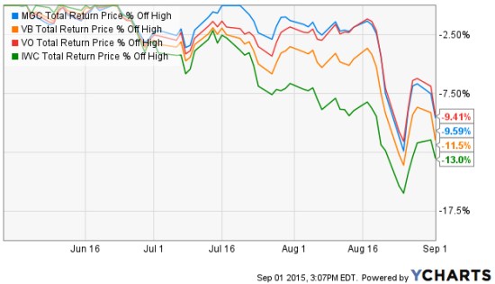
We first look back 3 months, which captures the full extent of the biggest loser: as expected, the micro cap index. The iShares Micro-Cap ETF (IWC: Green Line) seeks to track the investment results of an index composed of micro-capitalization U.S. equities. Over the past 3 months (or anytime frame we look) it is -13% below its prior high. The second largest decline is indeed the small cap index. The Vanguard Small-Cap ETF (VB: Orange Line) seeks to track the performance of the CRSP US Small Cap Index, which measures the investment return of small-capitalization stocks. The small cap index has declined -11.5%. The Vanguard Mega Cap ETF (MGC) seeks to track the performance of a benchmark index that measures the investment return of the largest-capitalization stocks in the United States and has declined -9.65%. The Vanguard Mid-Cap ETF (VO) seeks to track the performance of a benchmark index that measures the investment return of mid-capitalization stocks and has declined -9.41%. So, the smaller stocks have declined a little more than larger stocks.

Small and Micro caps lead down

Source: Shell Capital Management, LLC created with http://www.ycharts.com

Many active or tactical strategies may shift from smaller to large company stocks, hoping they don’t fall as much. For example, in a declining market relative strength strategies would rotate from those that declined the most to those that didn’t. The trouble with that is they may still end up losing capital and may end up positioned in the laggards long after a low is reached. They do that even though we may often observe the smallest company stocks rebound the most off a low. Such a strategy is focused on “relative returns” rather than “absolute returns“. An absolute return strategy will instead exit falling trends early in the decline with the intention of avoiding more loss. We call that “trend following” which has the objective of “cutting your losses short”. Some trend followers may allow more losses than others. You can probably see how there is a big difference between relative strength (focusing on relative trends and relative returns)  and trend following (focusing on actual price trends and absolute returns).

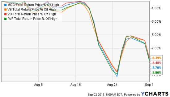
So, what if we look at the these stock market indexes over just the past month instead of the three months above? The losses are the same and they are very correlated. So much for diversification. Diversification across many different stocks, even difference sizes, doesn’t seem to help in declining markets on a short-term basis. These indexes combined represent thousands of stocks; micro, small, medium, and large. All of them declined over -11%, rebounded together, and are trending down together again.

stock market returns august 2015

Source: Shell Capital Management, LLC created with http://www.ycharts.com

If a portfolio manager is trying to “beat the market” index, he or she may focus on relative strength or even relative value (buy the largest loser) as they are hoping for relative returns compared to an index. But a portfolio manager who is focused on absolute returns may pay more attention to the actual downside loss and therefore focuses on the actual direction of the price trend itself. And, a key part is predefining risk with exits.

You can probably see how different investment managers do different things based on our objectives. We have to decide what we want, and focus on tactics for getting that.

A Random Walker on Stock and Bond Valuation

Burton Malkiel is a passive buy and hold investor who believes markets are random. To believe markets are random is to believe there are no directional trends, or high or low valuations. He is the author of “A Random Walk Down Wall Street“.  But in today’s Wall Street Journal even the ” Random Walker” sees that stock valuations are high and future expected returns low, but believes if there is a bubble it’s in bonds.

By

BURTON G. MALKIEL

June 1, 2015 6:58 p.m. ET

“Stock valuations are well above their average valuation metrics of the past, and future returns are likely to be below historical averages. But even as Ms. Yellen talks of gradually ending the Fed’s near-zero interest rate policy, interest rates remain well below historical norms. If there is a market bubble today, it is in the bond market and the Fed is complicit in the “overvaluation.”

Source: http://www.wsj.com/articles/janet-yellen-is-no-stock-market-sage-1433199503

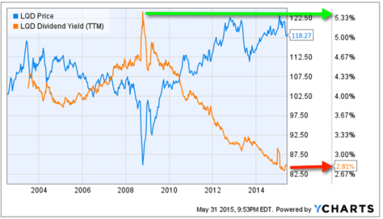
When someone invests in bonds for the long term they mainly intend to earn interest. So, bond investors want to buy bonds when yields are high. In the chart below, I show the iShares iBoxx $ Investment Grade Corporate Bond index ETF that seeks to track the investment results of an index composed of U.S. dollar-denominated, investment grade corporate bonds. The blue line is its price trend, the orange line is the index yield. We observe the highest yield was around 5.33% during a spike in 2008 when the price declined. Fixed income has interest-rate risk. Typically, when interest rates rise, there is a corresponding decline in bond values. Since 2008, interest rates and the yield of this bond index has declined. Clearly, the rate of “fixed income” from bonds depends on when you buy them. Today, the yield is only 2.8%, so for “long term allocations” bonds aren’t nearly as attractive as they where.

bond yield valuation bubble
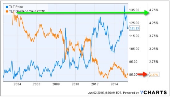
Another observation is the iShares 20+ Year Treasury Bond ETF, which seeks to track the investment results of an index composed of U.S. Treasury bonds with remaining maturities greater than twenty years. So, this index is long term government bonds. Below we see its yield was 4.75% a decade ago and is now only 2.27%. Buying it to get a 4.75% yield is a very different expected return than 2.27%.

Long term treasury yield valuation spreads asymmetry

However, that doesn’t mean we can’t tactically rotate between these bond markets trying to capture price trends rather than allocate to them.

Chart source: http://www.ycharts.com

Why So Stock Market Focused?

Most investors and their advisors seem to speak mostly about the stock market. When they mention “the market” and I ask “what market?” they always reply “the stock market”.

Why so stock market centric?

It must be that it gets the most media attention or stocks seem more exciting?. After all, other markets like bonds may seem boring and few know much about the many commodities markets or the foreign exchange markets. There are many different markets and two sides to them all.

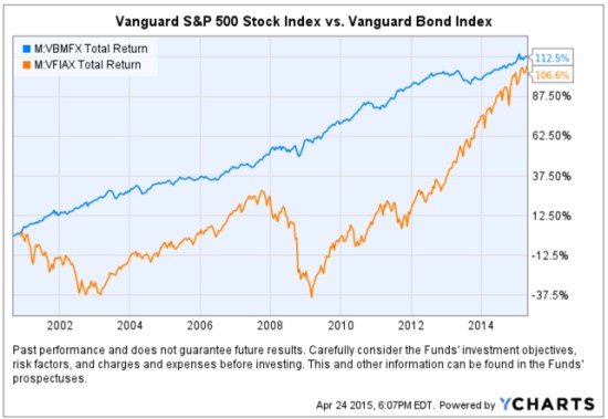
If it’s risk-adjusted returns you want, you may be surprised to find where you should have invested your money the past 15 years. To make the point, below is a comparison of the total return of the Vanguard S&P 500 stock index (the orange line) compared to the Vanguard Bond Index (the blue line). Yes, you are seeing that correctly. Using these simple index funds as a proxy, bonds have achieved the same total return as stocks, but with significantly less volatility and drawdowns. This is why we never look at just “average” return data without considering the path it took to get there. A total return percentage gain chart like this one presents a far more telling story. Take a close look at the path they took.
stocks vs. bonds

Created with http://www.ycharts.com

I showed the chart to one investment advisor who commented “It looks like the stock market is catching up”. If that’s what you think of when you view the chart, you may have a bias blind spot: ignoring the vast difference in the risk between the two markets.

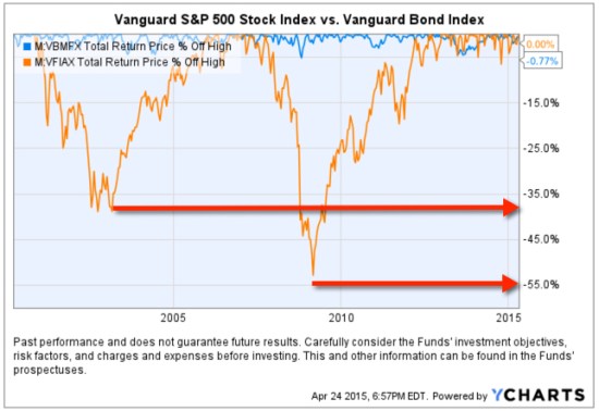
Looking at the total return over the period identifies the obvious difference in the path the two return streams took to achieve their results, but below we see the true risk difference. Drawdowns are declines from a higher value to a low value and a visual representation of how long it took to recover the lose of capital. When we observe a drawdown chart like the one below, it’s like a lake. These charts together also help illustrate the flaw of averages. The average return of the stock and bond index have ended at about the same level and have the same average return, but the bond index achieved it with much less drawdown. You wouldn’t know that if you only looked at average returns. If you tried to walk across the stock market lake, you may have drowned if you couldn’t handle swimming in 40′ of water for so long. If that one didn’t get you, the 55′ may have. The stock index declined about -40% from 2000 – 2002 and took years to recover before it declined -55%.
stock and bond market risk historical drawdowns

Created with http://www.ycharts.com

You have to be wondering: why didn’t you just invest in bonds 15 years ago? Maybe you were focused on the prior period huge average returns in stocks?

Before I continue, let me place a very bold disclaimer here: PAST PERFORMANCE DOES NOT GUARANTEE FUTURE RESULTS. Another way that is stated is that PAST PERFORMANCE IS NO ASSURANCE OF FUTURE RESULTS. One more version is PAST PERFORMANCE MAY NOT BE AN INDICATION OF FUTURE RESULTS. If you remember, the 1990’s were a roaring bull market in stocks. People focus on the past expecting it to continue. That’s probably why you never thought to invest in bonds instead of stocks.

Some of the largest and most successful hedge funds in the world have done that very thing over this period and longer. But, they didn’t just invest in bonds. They leveraged bonds. We’ve seen in this example that a bond index fund has achieved just as much total return as stocks. If you are a stock market centric investor: one that likes the stock market and makes it your focus, then you necessarily had to be willing to endure those -40% to -55% declines and wait many years to recover from the losses. If you are really willing to accept such risk, imagine if you had used margin to leverage bonds. The bond index rarely declined -10% or more. It was generally a falling interest rate period, so bonds gained value. If you were willing to accept -40% to -55% declines in stocks, you could have instead leveraged the bonds 400% or 500%. If you had done that, your return would be 4 or 5 times more with a downside more equal to that of stocks.

Why so stock centric?

Of course, at this stage, the PAST PERFORMANCE IS HIGHLY UNLIKELY TO REPEAT INTO THE FUTURE. Just as the roaring stocks of the 1990’s didn’t repeat. To see why, read Stage and Valuation of the U.S. Stock Market and Bonds: The Final Bubble Frontier?.

From my observations of investors performance and their advisors, most people seem to have poor results the past decade or so, even after this recent bull market. An investment management consultant told me recently that investors and their advisors who are aware of the current stage of stocks and bonds feel there is no place to turn. I believe it’s a very important time to prepare to row, not sail. For me, that means focus on actively managing risk and look for potentially profitable trends across a very global universe of markets; currency, bonds, stocks, commodities, and alternatives like volatility, inverse, etc . That’s my focus in ASYMMETRY® | Managed Accounts.

The Volatility Index (VIX) is Getting Interesting Again

In the last observation I shared on the CBOE Volatlity index (the VIX) I had been pointing out last year the VIX was at a low level and then later started trending up. At that time, many volatility traders seemed to think it was going to stay low and keep going lower – I disagreed. Since then, the VIX has remained at a higher average than it had been – up until now. You can read that in VIX® gained 140%: Investors were too complacent.

Here it is again, closing at 12.45 yesterday, a relatively low level for expected volatility of the S&P 500 stocks. Investors get complacent after trends drift up, so they don’t price in so much fear in options. Below we observe a monthly view to see the bigger picture. The VIX is getting down to levels near the end of the last bull market (2007). It could go lower, but if you look closely, you’ll get my drift.

Chart created by Shell Capital with: http://www.stockcharts.com

Next, we zoom in to the weekly chart to get a loser look.

Chart created by Shell Capital with: http://www.stockcharts.com

Finally, the daily chart zooms in even more.

Chart created by Shell Capital with: http://www.stockcharts.com

The observation?

Options traders have priced in low implied volatility – they expect volatility to be low over the next month. That is happening as headlines are talking about stock indexes hitting all time highs. I think it’s a sign of complacency. That’s often when things change at some point.

It also means that options premiums are generally a good deal (though that is best determined on an individual security basis). Rather than selling premium, it may be a better time to buy it.

Let’s see what happens from here…

My 2 Cents on the Dollar

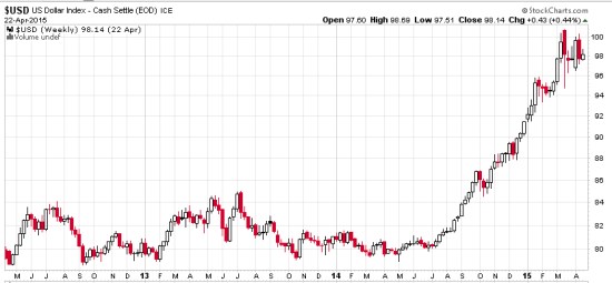
The U.S. Dollar ($USD) has gained about 20% in less than a year. We observe it first in the weekly below. The U.S. Dollar is a significant driver of returns of other markets. For example, when the U.S. Dollar is rising, commodities like gold, oil, and foreign currencies like the Euro are usually falling. A rising U.S. Dollar also impacts international stocks priced in U.S. Dollar. When the U.S. Dollar trends up, many international markets priced in U.S. Dollars may trend down (reflecting the exchange rate). The U.S. Dollar may be trending up in anticipation of rising interest rates.

dollar trend weekly 2015-04-23_16-04-40

Chart created by Shell Capital with: http://www.stockcharts.com

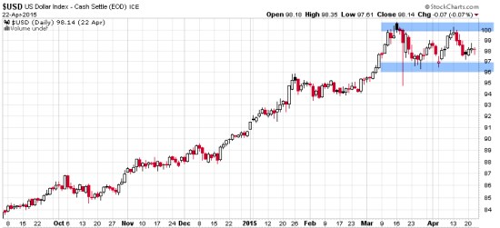
Now, let’s observe a shorter time frame- the daily chart. Here we see an impressive uptrend and since March a non-trending indecisive period. Many trend followers and global macro traders are likely “long the U.S. Dollar” by being long and short other markets like commodities, international stocks, or currencies.

dollar trend daily 2015-04-23_16-05-04

Chart created by Shell Capital with: http://www.stockcharts.com

This is a good example of understanding what drives returns and risk/reward. I consider how long the U.S. Dollar I am and how that may impact my positions if this uptrend were to reverse. It’s a good time to pay attention to it to see if it breaks back out to the upside to resume the uptrend, or if it instead breaks down to end it. Such a continuation or reversal often occurs from a point like the blue areas I highlighted above.

That’s my two cents on the Dollar…

How long are you? Do you know?

Asymmetric Nature of Losses and Loss Aversion

Loss Aversion:

“In prospect theory, loss aversion refers to the tendency for people to strongly prefer avoiding losses than acquiring gains. Some studies suggest that losses are as much as twice as psychologically powerful as gains. Loss aversion was first convincingly demonstrated by Amos Tversky and Daniel Kahneman.”

For most people, losing $100 is not the same as not winning $100. From a rational point of view are the two things the same or different?

Most economists say the two are the same. They are symmetrical. But I think that ignores some key issues.

If we have only $10 to eat on today and that’s all we have, if we lose it, we’ll be in trouble: hungry.

But if we have $10 to eat on and flip a coin in a bet and double it to $20, we may just eat a little better. We’ll still eat. The base rate: survival.

They say rationally the two are the same, but that isn’t true. They aren’t the same. The loss makes us worse off than we started and it may be totally rational to feel worse when we go backward than we feel good about getting better off. I don’t like to go backward, I prefer to move forward to stay the same.

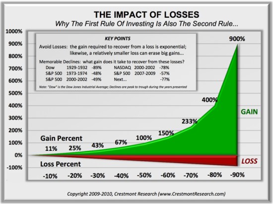
Prospect Theory, which found people experience a loss more than 2 X greater than an equal gain, discovered the experience of losses are asymmetric.

Actually, the math agrees.

You see, losing 50% requires a 100% gain to get it back. Losing it all is even worse. Losses are indeed asymmetric and exponential on the downside so it may be completely rational and logical to feel the pain of losses asymmetrically. Experience the feeling of loss aversions seems to be the reason a few of us manage investment risk and generate a smoother return stream rather than blow up.

To see what the actual application of asymmetry to portfolio management looks like, see: Shell Capital Management, LLC.


asymmetry impact of loss

Absolute Return: an investment objective and strategy

Absolute returns investment strategy fund

Absolute Return in its basic definition is the return that an asset achieves over a certain period of time. This measure looks at the appreciation or depreciation (expressed as a dollar amount or a percentage). For example, a $50 stock drifts to $100 is a 100% absolute return. If that same stock drifts back from $100 to $50, its absolute return is -50%.

Absolute Return as an investment objective is one that does not try to track or beat an arbitrary benchmark or index, but instead seeks to generate real profits over a complete market cycle regardless of market conditions. That is, an absolute return objective of positive returns on investment over a market cycle of both bull and bear market periods irrespective of the direction of stock, commodity, or bond markets. Since the U.S. stock market has been generally in a uptrend for 6 years now, other than the -20% decline in the middle of 2011, we’ll now have to expand our time frame for a full market cycle to a longer period. That is, a full market cycle includes both a bull and a bear market.

The investor who has an absolute return objective is concerned about his or her own objectives for total return over a period and tolerance for loss and drawdowns. That is a very different objective than the investor who just wants whatever risk and return a benchmark, allocation, or index provides. Absolute returns require skill and active management of risk and exposure to markets.

Absolute return as a strategy: absolute return is sometimes used to define an investment strategy. An absolute return strategy is a plan, method, or series of maneuvers aiming to compound capital positively and to avoid big losses to capital in difficult market conditions. Whereas Relative Return strategies typically measure their success in terms of whether they track or outperform a market benchmark or index, absolute return investment strategies aim to achieve positive returns irrespective of whether the prices of stocks, bonds, or commodities rise or fall over the market cycle.

Absolute Return Investment Manager

Whether you think of absolute return as an objective or a strategy, it is a skill-based rather than market-based. That is, the absolute return manager creates his or her results through tactical decision-making as opposed to taking what the market is giving. One can employ a wide range of approaches toward an absolute return objective, from price-based trend following to fundamental analysis. In the ASYMMETRY® Managed Accounts, I believe price-based methods are more robust and lead to a higher probability of a positive expectation. Through my historical precedence, testing, and experience, I find that any fundamental type method that is based on something other than price has the capability to stray far enough from price to put the odds against absolute returns. That is, a manager buying what he or she believes is undervalued and selling short what he believes is overvalued can go very wrong if the position is on the wrong side of the trend. But price cannot deviate from itself. Price is the judge and the jury.

To create absolute returns, I necessarily focus on absolute price direction. Not relative strength, which is a rate of change relative to another moving trend. And, I focus on actual risk, not some average risk or an equation that oversimplifies risk like standard deviation.

Of course, absolute return and the “All Weather” type portfolio sound great and seem to be what most investors want, but it requires incredible skill to execute. Most investors and advisors seem to underestimate the required skills and experience and most absolute return strategies and funds have very limited and unproven track records. There is no guarantee that these strategies and processes will produce the intended results and no guarantee that an absolute return strategy will achieve its investment objective.

For an example of the application of an absolute return objective, strategy, and return-risk profile, visit http://www.asymmetrymanagedaccounts.com/

Absolute Return as an Investment Strategy

Absolute Return Investment Strategy Fund Manager

In “Absolute Return: The Basic Definition”, I explained an absolute return is the return that an asset achieves over a certain period of time. To me, absolute return is also an investment objective.

In “Absolute Return as an Investment Objective” I explained that absolute return is an investment objective is one that does not try to track or beat an arbitrary benchmark or index, but instead seeks to generate real profits over a complete market cycle regardless of market conditions. That is, it is focused on the actual total return the investor wants to achieve and how much risk the investor will willing to take, rather than a focus on what arbitrary market indexes do.

Absolute return as a strategy: absolute return is sometimes used to define an investment strategy. An absolute return strategy is a plan, method, or series of maneuvers aiming to compound capital positively and to avoid big losses to capital in difficult market conditions. Whereas Relative Return strategies typically measure their success in terms of whether they track or outperform a market benchmark or index, absolute return investment strategies aim to achieve positive returns irrespective of whether the prices of stocks, bonds, or commodities rise or fall over the market cycle.

Whether you think of absolute return as an objective or a strategy, it is a skill-based rather than market-based. That is, the absolute return manager creates his or her results through tactical decision-making as opposed to taking what the market is giving. One can employ a wide range of approaches toward an absolute return objective, from price-based trend following to fundamental analysis. In the ASYMMETRY® Managed Accounts, I believe price-based methods are more robust and lead to a higher probability of a positive expectation. Through my historical precedence, testing, and experience, I find that any fundamental type method that is based on something other than price has the capability to stray far enough from price to put the odds against absolute returns. That is, a manager buying what he or she believes is undervalued and selling short what he believes is overvalued can go very wrong if the position is on the wrong side of the trend. But price cannot deviate from itself. Price is the judge and the jury.

Of course, absolute return and the “All Weather” type portfolio sound great and seem to be what most investors want, but it requires incredible skill to execute. Most investors and advisors seem to underestimate the required skills and experience and most absolute return strategies and funds have very limited and unproven track records. There is no guarantee that these strategies and processes will produce the intended results and no guarantee that an absolute return strategy will achieve its investment objective.

For an example of the application of an absolute return objective, strategy, and return-risk profile,  visit http://www.asymmetrymanagedaccounts.com/

Absolute Return as an Investment Objective

Absolute Return objective fund strategy

In Absolute Return: The Basic Definition, I explained an absolute return is the return that an asset achieves over a certain period of time. To me, absolute return is also an investment objective.

Absolute Return as an investment objective is one that does not try to track or beat an arbitrary benchmark or index, but instead seeks to generate real profits over a complete market cycle regardless of market conditions. That is, an absolute return objective of positive returns on investment over a market cycle of both bull and bear market periods irrespective of the direction of stock, commodity, or bond markets.

Since the U.S. stock market has been generally in a uptrend for 6 years now, other than the -20% decline in the middle of 2011, we’ll now have to expand our time frame for a full market cycle to a longer period. That is, a full market cycle includes both a bull and a bear market.

The investor who has an absolute return objective is concerned about his or her own objectives for total return over a period and tolerance for loss and drawdowns. That is a very different objective than the investor who just wants whatever risk and return a benchmark, allocation, or index provides. Absolute returns require skill and active management of risk and exposure to markets.

Rather than a long article, this is going to be a series of smaller parts, building up to what absolute return really means.

For an example of the application of an absolute return objective, strategy, and return-risk profile,  visit http://www.asymmetrymanagedaccounts.com/

US Government Bonds Rise on Fed Rate Outlook?

I saw the following headline this morning:

US Government Bonds Rise on Fed Rate Outlook

Wall Street Journal –

“U.S. government bonds strengthened on Monday after posing the biggest price rally in more than three months last week, as investors expect the Federal Reserve to take its time in raising interest rates.”

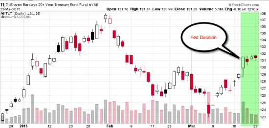
My focus is on directional price trends, not the news. I focus on what is actually happening, not what people think will happen. Below I drew a 3 month price chart of the 20+ Year Treasury Bond ETF (TLT), I highlighted in green the time period since the Fed decision last week. You may agree that most of price action and directional trend changes happened before that date. In fact, the long-term bond index declined nearly 2 months before the decision, increased a few weeks prior, and has since drifted what I call “sideways”.

fed decision impact on bonds
Charts created with http://www.stockcharts.com

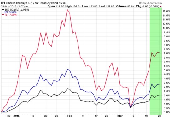
To be sure, in the next chart I included an analog chart including the shorter durations of maturity. iShares 3-7 Year Treasury Bond ETF (IEI) and iShares 7-10 Year Treasury Bond ETF (IEF). Maybe there is some overreaction and under-reaction going on before the big “news”, if anything.

Government bonds Fed decision reaction
Do you still think the Fed news was “new information“?

Diversification Alone is No Longer Sufficient to Temper Risk…

That was the lesson you learned the last time stocks became overvalued and the stock market entered into a bear market.

In a Kiplinger article by Fred W. Frailey interviewed Mohamed El-Erian, the PIMCO’s boss, (PIMCO is one of the largest mutual fund companies in the world) he says “he tells how to reduce risk and reap rewards in a fast-changing world.” This article “Shaking up the Investment Mix” was written in March 2009, which turned out the be “the low” of the global market collapse.

It is useful to revisit such writing and thoughts, especially since the U.S. stock market has since been overall rising for 5 years and 10 months. It’s one of the longest uptrends recorded and the S&P 500 stock index is well in “overvalued” territory at 27 times EPS. At the same time, bonds have also been rising in value, which could change quickly when rates eventually rise. At this stage of a trend, asset allocation investors could need a reminder. I can’t think of a better one that this:

Why are you telling investors they need to diversify differently these days?

The traditional approach to diversification, which served us very well, went like this: Adopt a diversified portfolio, be disciplined about rebalancing the asset mix, own very well-defined types of asset classes and favor the home team because the minute you invest outside the U.S., you take on additional risk. A typical mix would then be 60% stocks and 40% bonds, and most of the stocks would be part of Standard & Poor’s 500-stock index.

This approach is fatigued for several reasons. First of all, diversification alone is no longer sufficient to temper risk. In the past year, we saw virtually every asset class hammered. You need something more to manage risk well.

But, you know, they say a picture is worth a thousand words.

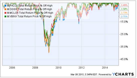
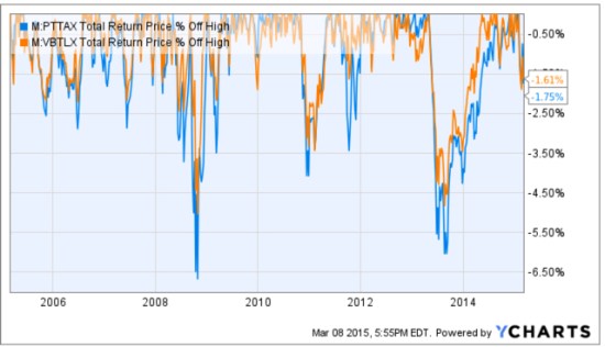
Since we are talking about downside risk, something that is commonly hidden when only “average returns” are presented, below is a drawdown chart. I created the drawdown chart using YCharts which uses total return data and the “% off high”. The decline you see from late 2007 to 2010 is a dradown: it’s when the investment value is under water. Think of this like a lake. You can see how the average of the data wouldn’t properly inform you of what happens in between.

First, I show PIMCO’s own allocation fund: PALCX: Allianz Global Allocation Fund. I include an actively managed asset allocation that is very large and popular with $55 billion invested in it: MALOX: BlackRock Global Allocation. Since there are many who instead believe in passive indexing and allocation, I have also included DGSIX: DFA Global Allocation 60/40 and VBINX: Vanguard Balanced Fund. As you can see, they have all done about the same thing. They declined about -30% to -40% from October 2007 to March 2009. They also declined up to -15% in 2011.

Vanguard DFA BlackRock PIMCO Asset Allcation

Charts are courtesy of http://ycharts.com/ drawn by Mike Shell

Going forward, the next bear market may be very different. Historically, investors consider bond holdings to be a buffer or an anchor to a portfolio. When stock prices fall, bonds haven’t been falling nearly as much. To be sure, I show below a “drawdown chart” for the famous actively managed bond fund PIMCO Total Return and for the passive crowd I have included the Vanguard Total Bond Market fund. Keep in mind, about 40% of the allocation of the funds above are invested in bonds. As you see, bonds dropped about -5% to -7% in the past 10 years.

PIMCO Total Return Bond Vanguard Total Bond

Charts are courtesy of http://ycharts.com/ drawn by Mike Shell

You may have noticed the end of the chart is a drop of nearly -2%. Based on the past 10 years, that’s just a minor decline. The trouble going forward is that interest rates have been in an overall downtrend for 30 years, so bond values have been rising. If you rely on bonds being a crutch, as on diversification alone, I agree with Mohamed El-Erian the Chief of the worlds largest bond manager:

“…diversification alone is no longer sufficient to temper risk. In the past year, we saw virtually every asset class hammered. You need something more to manage risk well.”

But, don’t wait until AFTER markets have fallen to believe it.

Instead, I apply active risk management and directional trend systems to a global universe of exchange traded securities (like ETFs). To see what that looks like, click: ASYMMETRY® Managed Accounts

Sectors Showing Some Divergence…

So far, U.S. sector directional price trends are showing some divergence in 2015.

Rather than all things rising, such divergence may give hints to new return drivers unfolding as well as opportunity for directional trend systems to create some asymmetry by avoiding the trends I don’t want and get exposure to those I do.

Sector ETF Divergence 2015-03-04_11-24-54

For more information about ASYMMETRY®, visit: http://www.asymmetrymanagedaccounts.com/global-tactical/


Chart source: http://www.finviz.com/groups.ashx


What is the Alternative?

Alternative Investment Strategy

Anything beyond buying and holding stocks and bonds is called “alternative” investments,  alternative investment strategies, or alternative trading strategies.

What is “alternative”?

  • offering or expressing a choice
  • not usual or traditional
  • existing or functioning outside of the established society
  • different from the usual or conventional

Source: http://www.merriam-webster.com/dictionary/alternative

I like it.