What is going on? 3rd Quarter Market Trends and Mean Reversion

The third quarter is now in the past, so I’ll share a few observations of what is going on.

First, below is the S&P 500 stock index over the past quarter. For observation purposes, if we simply define an uptrend as higher highs and higher lows and a downtrend is lower lows and lower highs, what do we have here?

I guess we have to add a non-trend, which is when the price trend made a lower high like it did last month but still bound within the range of the prior low.

No trend analysis is complete without also observing the drawdowns along the way. At this point, the SPX is about -3% off its high and its already getting attention in the headlines.

Stretching the price trend out farther to the past year, we see it is barely positive and I define this trend as non-trending and volatile.

The drawdowns over the past year have ranged from -5%, which we normally see about three times a year, to -20% which is less common.

What about mean reversion?

In investment management, mean reversion is the belief that a stock’s price trend will tend to move toward its average price over time.

So, you can probably see how we can use simple moving averages to illustrate mean reversion and the potential for countertrends.

I don’t trade off of moving average signals since I have my own algorithms that define the trend direction, momentum, and volatility. But, most investors have a basic understanding of moving averages so they are useful for sharing observations.

During the quarter, the S&P 500 dropped below its 50 day moving average, which is a shorter-term trend measure. Yesterday, it trended down below that trend line again. A -5% decline would be normal, as we observe them two or three times a year.

I included the 200-day moving average in the chart as well. The 200 day has been a popular trend following indicator, though it has had many whipsaw signals. A whipsaw is when the price trend trades above or below the moving average and then reverses the other way. Any trend following signal has the potential to result in whipsaws, though some are better than others.

So, what we have here is a sideways quarter with a price trend that has been range-bound.  Year to date, however, the stock market is off to a strong start, but that’s because 2018 ended with a sharp waterfall decline that recovered some of the losses the first two quarters this year.

Fortunately for us, we had exposure to alternative assets, some hedging, and some stronger momentum positions that have resulted in a more smooth quarter than is trending in the right direction.

Investors need to realize this is a very aged old bull market and the economic expansion is one of the longest in American history. If you are investing based on recent past returns of the past five or ten years, I believe you are going to experience some longer-term mean reversion in the coming years. By my measures, investors seem to be complacent again, as they were in 1999 and 2007, so it seems we may be getting closer and closer to a different kind of trend.

Investors didn’t want tactical risk management before the big bear markets, they wanted it after the fact.

The next time will be no different.

Mike Shell is the Founder and Chief Investment Officer of Shell Capital Management, LLC, and the portfolio manager of ASYMMETRY® Global Tactical.

Mike Shell and Shell Capital Management, LLC is a registered investment advisor focused on asymmetric risk-reward and absolute return strategies and provides investment advice and portfolio management only to clients with a signed and executed investment management agreement. The observations shared on this website are for general information only and should not be construed as advice to buy or sell any security. Securities reflected are not intended to represent any client holdings or any recommendations made by the firm. Any opinions expressed may change as subsequent conditions change.  Do not make any investment decisions based on such information as it is subject to change. Investing involves risk, including the potential loss of principal an investor must be willing to bear. Past performance is no guarantee of future results. All information and data is deemed reliable, but is not guaranteed and should be independently verified. The presence of this website on the Internet shall in no direct or indirect way raise an implication that Shell Capital Management, LLC is offering to sell or soliciting to sell advisory services to residents of any state in which the firm is not registered as an investment advisor. Use of this website is subject to its terms and conditions.


What You Need to Know About Long Term Bond Trends

There is a lot of talk about interest rates and bonds these days – for good reason. You see, interest rates have been in a downtrend for decades (as you’ll see later). When interest rates are falling, the price of bonds go up. I wrote in “Why So Stock Market Focused?” that you would have actually been better off investing in bonds the past 15 years over the S&P 500 stock index.

However, the risk for bond investors who have a fixed bond allocation is that interest rates eventually trend up for a long time and their bonds fall.

This year we see the impact of rising rates and the impact of falling bond prices in the chart below of the 20+ year Treasury bond. It’s down -15% off its high and since the yield is only around 2.5% the interest only adds about 1% over this period for a total return of -14.1%. Up until now, this long term Treasury index has been a good crutch for a global allocation portfolio. Now it’s more like a broken leg.

But, that’s not my main point today. Let’s look at the bigger picture. Below is the yield (interest rate) on the 10-Year U.S. government bond. Notice that the interest rate was as high as 9.5% in 1990 and has declined to as low as 1.5%. Just recently, it’s risen to 2.62%. If you were going to buy a bond for future interest income payments, would you rather invest in one at 9.5% or 1.5%? If you were going to lend money to someone, which rate would you prefer to receive? What is a “good deal” for you, the lender?

I like trends and being positioned in their direction since trends are more likely to continue than reverse, but they usually do eventually reverse when inertia comes along (like the Fed). If you care about managing downside risk you have to wonder: How much could this trend reverse and what could its impact be on fixed bond holdings? Well, we see below that the yield has declined about -70%. If we want to manage risk, we have to at least expect it could swing the other way.

One more observation. Germany is one of the largest countries in the world. Since April, the 10-year German bond interest rate has reversed up very sharp. What if U.S bonds did the same?

As I detailed in “Allocation to Stocks and Bonds is Unlikely to Give us What We Want” bonds are often considered a crutch for a global asset allocation portfolio. If you care about managing risk, you may consider that negative correlations don’t last forever. All trends change, eventually. You may also consider your risk of any fixed positions you have. I prefer to actively manage risk and shift between global markets based on their directional trends rather than a fixed allocation to them.

The good news is: by my measures, many bond markets have declined in the short term to a point they should at least reserve back up at least temporarily. What happens after that will determine if the longer trend continues or begins to reverse. The point is to avoid complacency and know in advance at what point you’ll exit to cut losses short…

As they say: “Past performance is no guarantee of the future“.

The Volatility Index (VIX) is Getting Interesting Again

In the last observation I shared on the CBOE Volatlity index (the VIX) I had been pointing out last year the VIX was at a low level and then later started trending up. At that time, many volatility traders seemed to think it was going to stay low and keep going lower – I disagreed. Since then, the VIX has remained at a higher average than it had been – up until now. You can read that in VIX® gained 140%: Investors were too complacent.

Here it is again, closing at 12.45 yesterday, a relatively low level for expected volatility of the S&P 500 stocks. Investors get complacent after trends drift up, so they don’t price in so much fear in options. Below we observe a monthly view to see the bigger picture. The VIX is getting down to levels near the end of the last bull market (2007). It could go lower, but if you look closely, you’ll get my drift.

Chart created by Shell Capital with: http://www.stockcharts.com

Next, we zoom in to the weekly chart to get a loser look.

Chart created by Shell Capital with: http://www.stockcharts.com

Finally, the daily chart zooms in even more.

Chart created by Shell Capital with: http://www.stockcharts.com

The observation?

Options traders have priced in low implied volatility – they expect volatility to be low over the next month. That is happening as headlines are talking about stock indexes hitting all time highs. I think it’s a sign of complacency. That’s often when things change at some point.

It also means that options premiums are generally a good deal (though that is best determined on an individual security basis). Rather than selling premium, it may be a better time to buy it.

Let’s see what happens from here…

My 2 Cents on the Dollar

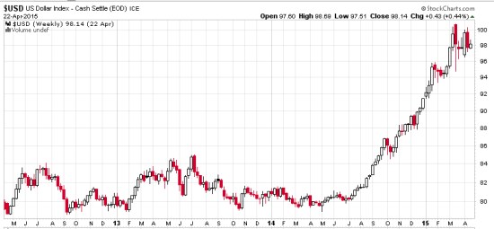
The U.S. Dollar ($USD) has gained about 20% in less than a year. We observe it first in the weekly below. The U.S. Dollar is a significant driver of returns of other markets. For example, when the U.S. Dollar is rising, commodities like gold, oil, and foreign currencies like the Euro are usually falling. A rising U.S. Dollar also impacts international stocks priced in U.S. Dollar. When the U.S. Dollar trends up, many international markets priced in U.S. Dollars may trend down (reflecting the exchange rate). The U.S. Dollar may be trending up in anticipation of rising interest rates.

dollar trend weekly 2015-04-23_16-04-40

Chart created by Shell Capital with: http://www.stockcharts.com

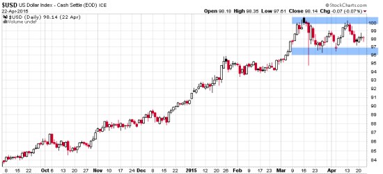
Now, let’s observe a shorter time frame- the daily chart. Here we see an impressive uptrend and since March a non-trending indecisive period. Many trend followers and global macro traders are likely “long the U.S. Dollar” by being long and short other markets like commodities, international stocks, or currencies.

dollar trend daily 2015-04-23_16-05-04

Chart created by Shell Capital with: http://www.stockcharts.com

This is a good example of understanding what drives returns and risk/reward. I consider how long the U.S. Dollar I am and how that may impact my positions if this uptrend were to reverse. It’s a good time to pay attention to it to see if it breaks back out to the upside to resume the uptrend, or if it instead breaks down to end it. Such a continuation or reversal often occurs from a point like the blue areas I highlighted above.

That’s my two cents on the Dollar…

How long are you? Do you know?

This is When MPT and VaR Get Asset Allocation and Risk Measurement Wrong

This is When MPT and VaR Get Asset Allocation and Risk Measurement Wrong

I was talking to an investment analyst at an investment advisory firm about my ASYMMETRY® Global Tactical and he asked me what the standard deviation was for the portfolio. I thought I would share with you how the industry gets “asset allocation” and risk measurement and management wrong.

Most people have poor results over a full market cycle that includes both rising and falling price trends, like global bull and bear markets, recessions, and expansions. Quantitative Analysis of Investor Behavior, SPIVA, Morningstar and many academic papers have provided empirical evidence that most investors (including professionals) have poor results over the long periods. For example, they may earn gains in rising conditions but lose their gains when prices decline. I believe one reason is they get too aggressive at peaks and then sell in panic after losses get too large, rather than properly predefine and manage risk.

You may consider, then, to have good results over a long period, I necessarily have to believe and do things very differently than most people.

On the “risk measurement” topic, I will share with you a very important concept that is absolutely essential for truly actively controlling loss. The worst drawdown “is” the only risk metric that really matters. The risk is not the loss itself. Once we have a loss, it’s a loss. It’s beyond the realm of risk. Since risk is the possibility of a loss, how often it has happened in the past and the magnitude of the historical loss is the expectation. Beyond that, we must assume it could be even worse some day. For example, if the S&P 500 stock index price decline was -56% from 2007 to 2009, then we should expect -56% is the loss potential (or worse). When something has happened before, it suggests it is possible again, and we may have not yet observed the worst decline in the past that we will see in the future.

The use of standard deviation is one of the very serious flaws of investors attempting to measure, direct, and control risk. The problem with standard deviation is that the equation was intentionally created to simplify data. The way it is used draws a straight line through a group of data points, which necessarily ignores how far the data actually spreads out. That is, the standard deviation is intended to measure how far the data spreads out, but it actually fails to absolutely highlight the true high point and low point. Instead, it’s more of an average of those points. However, for risk management, it’s the worst-case loss that we really need to focus on. I believe in order to direct and control risk, I must focus on “how bad can it really get”. Not just “on average” how bad it can get. The risk in any investment position is at least how much it has declined in the past. And realizing it could be even worse some day. Standard deviation fails to reflect that in the way it is used.

Consider that as prices trend up for years, investors become more and more complacent. As investors become complacent, they also become less indecisive as they believe the recent past upward trend will continue, making them feel more confident. On the other hand, when investors feel unsure about the future, their fear and indecisiveness is reflected as volatility as the price swings up and down more. We are always unsure about the future, but investors feel more confident the past will continue after trends have been rising and volatility gets lower and lower. That is what the peak of a market looks like. As it turns out, that’s just when asset allocation models like Modern Portfolio Theory (MPT) and portfolio risk measures like Value at Risk (VaR) tell them to invest more in that market – right as it reaches its peak. They invest more, complacently, because their allocation model and risk measures tell them to. An example of a period like this was October 2007 as global stock markets had been rising since 2003. At that peak, the standard deviation was low and the historical return was at its highest point, so their expected return was high and their expected risk (improperly measured as historical volatility) was low. Volatility reverses the other way at some point

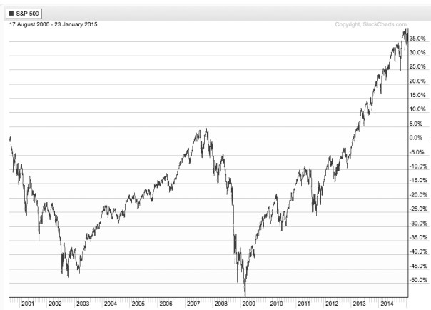
What happens next is that the market eventually peaks and then begins to decline. At the lowest point of the decline, like March 2009, the global stock markets had declined over -50%. My expertise is directional price trends and volatility so I can tell you from empirical observation that prices drift up slowly, but crash down quickly. The below chart of the S&P 500 is an example of this asymmetric risk.

stock index asymmetric distribution and losses

At the lowest point after prices had fallen over -50%, in March 2009, the standard deviation was dramatically higher than it was in 2007 after prices had been drifting up. At the lowest point, volatility is very high and past return is very low, telling MPT and VaR to invest less in that asset. This is a form of volatility targeting: investing more at lower levels or historical volatility and less at higher levels.

In the 2007 – 2009 decline in global markets, you may recall some advisors calling it a “6 sigma event”. That’s because the market index losses were much larger than predicted by a standard deviation. For example, if an advisors growth allocation had an average return of 10% in 2007 based on its past returns looking back from the peak and a standard deviation of 12% expected volatility, they only expected the portfolio would decline -26% (3 standard deviations) within a 99.7% confidence level – but the allocation actually lost -40 or -50%. Even if that advisor properly informed his or her client the allocation could decline -26% worse case and the client provided informed consent and acceptance of that risk, their loss was likely much greater than their risk tolerance. When they reach their risk tolerance, they “tap out”. Once they tap out, when do they ever get back in? do they feel better after it falls another -20%? or after it rises 20%? There is no good answer. I want to avoid that situation. I prefer to reduce my exposure to loss in well advance.

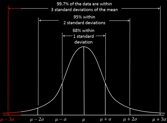
You can see in the chart below, 3 standard deviations is supposed to capture 99.7% of all of the data if the data is a normal distribution. The trouble is, market returns are not a normal distribution. Instead, stock market gains and losses present an asymmetrical return distribution. Market returns experience much larger gains and losses than expected from a normal distribution – the outliers are critical. However, those outliers don’t occur very often: historically it’s maybe every 4 or 5 years, so people have time to forget about the last one and become complacent.

symmetry normal distribution bell curve black

Source: http://en.wikipedia.org/wiki/68%E2%80%9395%E2%80%9399.7_rule

My friends, this is where traditional asset allocation like Modern Portfolio Theory (MPT) and risk measures like Value at Risk (VaR) get it wrong.

These methods are the most widely believed and used . You can probably see why most investors do poorly and only a very few do well – an anomaly.

I can tell you that I measure risk by how much I can lose and I control my risk by predefining my absolute risk at the point of entry and my exit point evolves as the positions are held. That is an absolute price point, not some equation that intentionally ignores the outlier losses.

As the stock indexes have now been overall trending up for 5 years and 9 months, the trend is getting aged. In fact, according to my friend Ed Easterling at Crestmont Research, at around 27 times EPS the stock index seems to be in the range of overvalued. In his latest report, he says:

“The stock market surged over the past quarter, adding to gains during 2014 that far exceed underlying economic growth. As a result, normalized P/E increased to 27.2—well above the levels justified by low inflation and interest rates. The current status is approaching “significantly overvalued.”

At the same time, we shouldn’t be surprised to eventually see rising interest rates drive down bond values at some point. It seems from this starting point that simply allocating to stocks and bonds doesn’t have an attractive expected return.

I believe a different strategy is needed, especially form this point forward.

In ASYMMETRY® Global Tactical, I actively manage risk and shift between markets to find profitable directional price trends rather than just allocate to them.


Mike Shell is the Founder and Chief Investment Officer of Shell Capital Management, LLC, and the portfolio manager of ASYMMETRY® Global Tactical.

The observations shared on this website are for general information only and are not specific advice, research, or buy or sell recommendations for any individual. Investing involves risk including the potential loss of principal an investor must be willing to bear. Past performance is no guarantee of future results. The presence of this website on the Internet shall in no direct or indirect way raise an implication that Shell Capital Management, LLC is offering to sell or soliciting to sell advisory services to residents of any state in which the firm is not registered as an investment advisor. Use of this website is subject to its terms and conditions.


“There is always a disposition in people’s minds to think that existing conditions will be permanent …

“There is always a disposition in people’s minds to think the existing conditions will be permanent,” Dow wrote, and went on to say: “When the market is down and dull, it is hard to make people believe that this is the prelude to a period of activity and advance. When the prices are up and the country is prosperous, it is always said that while preceding booms have not lasted, there are circumstances connected with this one, which make it unlike its predecessors and give assurance of permanency. The fact pertaining to all conditions is that they will change.”  – Charles Dow, 1900

Source: Lo, Andrew W.; Hasanhodzic, Jasmina (2010-08-26). The Evolution of Technical Analysis: Financial Prediction from Babylonian Tablets to Bloomberg Terminals (Kindle Locations 1419-1423). Wiley. Kindle Edition.

You can probably see from Dow’s quote how trends do tend to continue, just because enough people think they will. However, price trends can continue into an extreme or a “bubble” just because people think they will continue forever. I like to ride a trend to the end when it bends and then be prepared to exit when it does finally reverse, or maybe reduce or hedge off some risk when the probability seems high of a change.

idowcha001p1

Image source: Wikipedia

Charles Henry Dow; November 6, 1851 – December 4, 1902) was an American journalist who co-founded Dow Jones & Company. Dow also founded The Wall Street Journal, which has become one of the most respected financial publications in the world. He also invented the Dow Jones Industrial Average as part of his research into market movements. He developed a series of principles for understanding and analyzing market behavior which later became known as Dow theory, the groundwork for technical analysis.

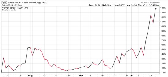
VIX® gained 140%: Investors were too complacent

Several months ago I started sharing some of my observations about the VIX ( CBOE Volatility Index). The VIX had gotten to a level I considered low, which implied to me that investors were too complacent, were expecting too low future volatility, and option premiums were generally cheap. After the VIX got down to levels around 11 and 12 and then started to move up, I pointed out the VIX seemed to be changing from a downward longer term trend to a rising trend.

As I was sharing my observations of the directional trend and volatility of VIX that I believed was more likely to eventually go up than down, it seemed that most others were writing just the opposite. I know that many volatility traders mostly sell volatility (options premium), so they prefer to see it fall.

As you can see in the chart below, The VIX has increased about 140% in just a few weeks.

VIX october

Chart courtesy of http://www.stockcharts.com

For those who haven’t been following along, you may consider reading the previous observations:

A VIX Pop Then Back to Zzzzzzzz? We’ll see

Asymmetric VIX

VIX Shows Volatility Still Low, But Trending

VIX Back to Low

The VIX is Asymmetric, making its derivatives an interesting hedge

Is the VIX an indication of fear and complacency?

What does a VIX below 11 mean?

What does the VIX really represent?

The VIX, my point of view

The VIX, as I see it…

Volatility Risk Premium

Declining (Low) Volatility = Rising (High) Complacency

Investors are Complacent


Trend Change in Dollar, International Stocks, Gold?

Directional trends tend to persist. When a price is trending, it’s more likely to continue than to reverse. A directional trend is a drift up or down. For example, we can simply define a uptrend by observing a price chart of higher highs and higher lows. A downtrend is an observation of lower highs and lower lows. For a trading system, we need to be more precise in defining a direction with an algorithm (an equation that mathematically answers the question). The concept that directional trends tend to persist is called “momentum“. Momentum is the empirically observed tendency for rising prices to rise further. Momentum in price trends have been exploited for decades by trend following traders and its persistence is now even documented in hundreds of academic research papers. Momentum persists, until it doesn’t, so I can potentially create profits by going with the trend and then capturing a part of it.

But all trends eventually come to an end. We never know in advance when that will be, but we can determine the probability. Sometimes a trend reversal (up or down) is more likely than others. If you believe markets are efficient and instead follow a random walk, you won’t believe that. I believe trends move in one direction, then reverse, then trend again. When I look at the charts below, I see what I defined previously as “a trend”. I have developed equations and methods for defining the trend and also when they may bend at the end. More importantly, I observe them when they do bend. For example, to capture a big move in a trend, say 20% or more, we can’t get out every time it drops -2%, because it may do that many times on its way to that 20%. So, trend following means staying with the trend until it really bends. Counter-trend trading is trying to profit from the bends by identifying the change in the trend. Both are somewhat the opposite, but since my focus is these trends I observe them both.

Inertia is the resistance to change, including a resistance to change in direction. I could say then, that it takes inertia to keep a trend going. If there is enough inertia, the trend will continue. Trends will almost always be interrupted briefly by shorter term trends. For example, if you look at a monthly chart of a market first, then view a weekly chart, then a daily chart, you’ll see different dimensions of the trend and maybe left with a different observation than if you just look at one time frame.

Below I drew a monthly charge going back nearly 12 years. As you can see, the U.S. Dollar ($USD) has been “down” as much as -40% since 2002. It’s lowest point was 2008 and using my definition for trend, it’s been rising since 2008 though with a lot of volatility from 2008 to 2011. We could also say it’s been “non-trending” generally since 2005, since it has oscillated up and own since then without any meaning breakout.

All of charts are courtesy of http://www.stockcharts.com

Next we observe the weekly price trend. In a weekly chart we see the non-trending period, but ultimately over this time frame the Dollar gained 9%. The Dollar has been at a relatively low price range during this time. For those who want to understand why a trend occurs: A low currency is a reflection of the U.S. debt burden and lack of economic growth. We can only say that in hindsight. Most of the time we don’t actually know why a trend is a trend when it’s trending – and I don’t need to know.

You can probably begin to see how “the trend” is a function of “the time frame”. The most recent trend is observed in a daily chart going back less than a year. Here we see the U.S. Dollar is rising since July. I pointed out in “Interest Rates and Dollar Rising, Commodities Falling” how the Dollar is driving other markets.

The Dollar is now at a point that I mathematically expect to see it may reverse back down some. Though a trend is more likely to persist and resist change (inertia), trends don’t move straight up or down. Instead, they oscillate up and down within their larger trend. If you look at any of the price trend charts above, you’ll see smaller trends within them. It appears the Dollar is now likely to change direction at least briefly, though maybe not very much. As I mentioned in “Interest Rates and Dollar Rising, Commodities Falling”, it seems that rising interest rates are probably driving the Dollar higher. The market seems to be anticipating the Fed doing things to increase interest rates in the future. Let’s look at some other trends that seem to be interacting with the Dollar and interest rates.

The MSCI EAFE Index is an index of developed countries. You can observe the trend below. International stocks tend to decline when the Dollar rises, because this index is foreign country stocks priced in Dollars.

Below is the MSCI Emerging Markets index, which are smaller more emerging countries. MSCI includes countries like Russia, Brazil, and Mexico as “emerging”, but some may be surprised to hear they also consider China an emerging market. The recent rising Dollar (from rising rates) has been partly the driver of falling prices.

Another market that is directly impacted by the trend in the Dollar is commodities. Below we see the S&P/GSCI Commodity Index.

I am sharing observations about global macro trends and trend changes. We previously saw that the Dollar was generally in a downtrend and at a low level for years. When the Dollar is down, commodities priced in Dollars may be up. One commodity that became very popular when it was rising was Gold. When the Dollar was falling and depressed, Gold was rising. Below is a more recent price trend of gold.

I wouldn’t be surprised to see the Dollar trend to reverse back down some in the short-term and that could drive these other markets to reverse their downtrends at least briefly. Only time will tell if it does reverse in the near future and by how much.

In the meantime, let’s watch it all unfold.

Business Cycle: Mean Reversion and Trends

The National Bureau of Economic Research publishes U.S. Business Cycle Expansions and Contractions in the economy. During an expansion, economic growth is rising and during a contraction it is slowing or actually falling.

Below is a chart of their idealized expansion and contraction phases. During each phase, different sectors of the economy are expected to do well or poorly. And, you can see what is happening at a peak and what happens afterwards. At a peak, economic data is strongest and news is good. Then it reverses down eventually. At a trough economic data is at its worst and news is bad, then it turns around. You may think about it and consider where the U.S. economy is now if you have an interest in the stage of the business cycle.

NBER Business Cycle

Source: National Bureau of Economic Research

A few concepts to think about.

Does it trend? Yes, it does. A trend is a directional drift over a time frame. The business cycle typically sees drifts up for 4 or 5 years and drifts down for 1 or 2 years. The trends are asymmetric, as you can see in the chart, the upward drifts tend to last longer and progress at a lower rate of change than the faster declining trends down. It seems that economic data, like prices, do trend over time.

Does it mean revert? Yes, while over shorter time frames of 1 year to 5 years we observe trends in the business cycle, when we look over a full business cycle we see that it oscillates up and down. However, the actual meaning of “mean reversion” means that it oscillates around an average, not just oscillates. If the data above has an average, and it necessarily must, then it does oscillate around that average. It’s just that the range up and down may be far away from the average. That is, the peak and trough in the chart above may stray far away from the actual “average” of the data series. Said another way, the business cycle is really volatile when you consider it over its full cycle because of the magnitude in range from high and low.

For those of you following along, you may see how I’m going to tie this in to something else next week…