There are many parts to a complete risk management system. One part is monitoring and measuring the risk of the overall markets. Market risk analysis may involve observing risk gauges like price momentum, market breadth, investor sentiment, P/E valuation, and fund flows.
Stock market breadth is useful for market analysis to better understand internal conditions. For trading decisions, I focus individual trends. As I shared last week, when breadth reaches such extremes (high or low) it may point attention in the right direction.
I start with a Point & Figure chart of the % of stocks in the S&P 500 index that are trading above their 50-day moving averages. Only 14% of the 500 stocks were trending above their 50 day moving average, signaling the internal trend weakness of the stocks inside an index.
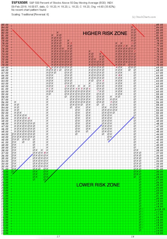
I color the high zone as “Higher Risk” because, after 84% of stocks in the S&P 500 stock market index are already above their 50 day moving average nearly all of them are already trending up – think “upside exhaustion”, eventually it will reverse. It was a “warning shot across the bow”.
I color the low area as “Lower Risk” because, after 86% of stocks in the S&P 500 stock market index are already below their 50 day moving average nearly all of them have already trended down – think “downside washout”, eventually it will reverse. But, 50 day is a short-term trend, so…
Since the 50 day moving average just signals a short-term trend, let’s also consider the % of stocks above and below the longer term 200-day moving average. With a longer time frame, we’ll see more lag.
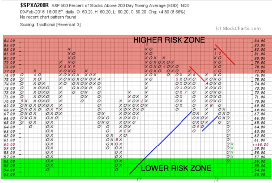
As we see above, 82% of S&P 500 stocks were above their 200 day two weeks ago. After the -10% or so S&P 500 decline, only 56% were still trending above. With the lag in the 200 day, we aren’t surprised to see fewer stocks dropped below the 200 day since they had more distance to fall to reach it.
The longer time frame creates more lag in the signal simply because the 200 day is using 400% more data points than the 50 – it’s going to be slower. We call that “lag”.
What do these internal breadth indicators suggest? It’s a measure of trend direction “participation” of the stocks in the S&P 500. As we saw, the 50 SMA is washed out, but since 50 SMA is short-term, it could stay that way if prices keep falling. The 200 SMA is more important.
What do these internal breadth indicators suggest?
It’s a measure of trend direction “participation” of the stocks in the S&P 500 index. The % of stocks above the 200 SMA dropped to where they did in the recent past and reversed up… but… I’ve been observing breadth for nearly 3 decades, so I’ve seen how low it “can” go.
As I lengthen the time on the chart, I show you the “real” lower risk zone is in the teens like the 50, for the 200. Only time will tell if it stops here, as it has the past two years, or goes lower.
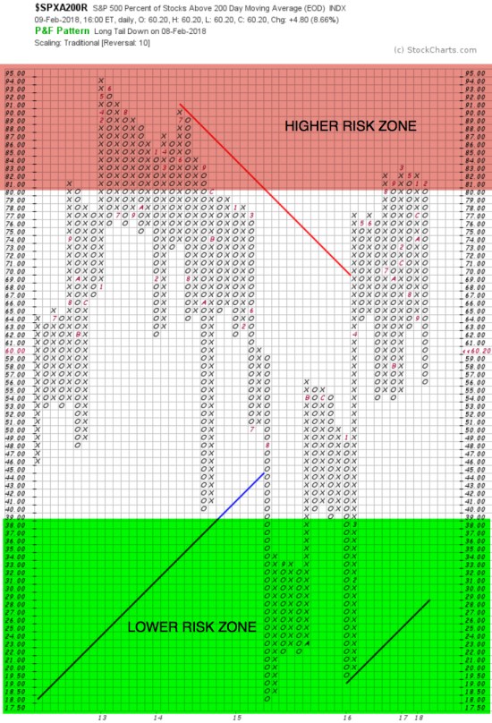
The bottom line is, market breadth is “washed out” in the short-term and about halfway there on a longer term view – if it is to go lower. So, while this is evidence enough to expect to see at least a short-term reversal back up, there is also plenty of room to see the S&P 500 stock index drop another -10% or more as only half of the stocks are yet below their 200-day averages. What it does next is simply a matter of buying demand outweighing the desire to sell.
As I’ve said, there are many parts to a complete risk management system. The above is just an observation and example of “market analysis” using breadth.
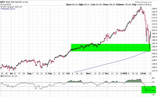
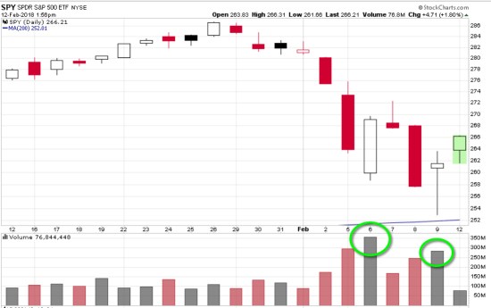
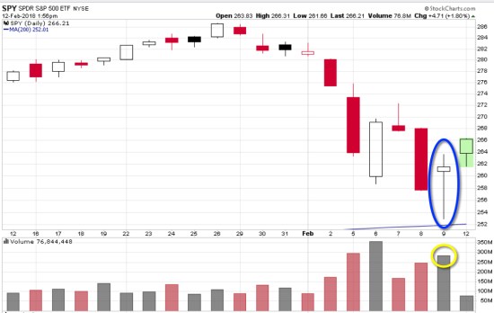
Next, let’s take a look at the S&P 500 price trend to explore buying demand vs. selling pressure.
S&P 500 stock index tapped the 200-day moving average intraday in oversold territory. I highlighted in green it’s a zone of about 8 months of prior trading range. Support occurs after prices fall; buyers may become more inclined to buy and sellers become less inclined to sell. So far, that is what we are observing. The stock index declined about -12% and reached an “oversold” level on the momentum oscillator and is above the 200-day moving average used for standard trend following.
Risk management is the common characteristic among all the best traders/investors who have lasted over the many important up and down market cycles of the past decades. I decided I was going to be one of them over two decades ago. No matter how you decide what and when to buy, it is essential to control the size of your potential loss. If you want to learn what I mean by that, read the prior ten or twenty observations I’ve shared here. This is not individual investment advice. If you need individual advice, contact us.
Mike Shell is the Founder and Chief Investment Officer of Shell Capital Management, LLC, and the portfolio manager of ASYMMETRY® Global Tactical.
You can follow ASYMMETRY® Observations by click on on “Get Updates by Email” on the top right or follow us on Twitter.
Investment results are probabilistic, never a sure thing. Past performance is no guarantee of future results.

Pingback: February Global Market Trends « ASYMMETRY® Observations
Pingback: Buying demand dominated selling pressure in the stock market « ASYMMETRY® Observations
Pingback: Stock pickers market? Sector rotation with stocks for asymmetric reward to risk « ASYMMETRY® Observations
Pingback: What’s going to happen next? continued « ASYMMETRY® Observations