I guess An exhaustive analysis of the U.S. stock market wasn’t exhaustive enough, because I now have a few things to add.
First, since the financial news media, as well as social media like Twitter, is so bearish with all kinds of narratives about why the stock market is falling, I’ll go ahead and discuss it here. This observation will not be complete without first reading An exhaustive analysis of the U.S. stock market so you know where I am coming from. If you haven’t read it already, I would before continuing so you understand the full context.
It is the financial news media’s business to report new information. We all know that if they want to get people to tune in, the fastest way is to provide provocative and alarming headlines and commentary. So, we shouldn’t be surprised to see distressing news.
There are always many reasons for the stock market to trend up or down. It isn’t hard to write some narrative attempting to explain it. The reality is, there are all kinds of causes that create an effect. None of them alone drive price trends. Ultimately, what drives price trends is behavior and sentiment which drives supply and demand. Behavior and investor sentiment may be impacted by the news and what people decide to believe.
I often say “what you believe is true, for you” even if it isn’t actually true. A person’s beliefs could be completely wrong and could be scientifically disproven, but if they still believe it, it’s their truth, so it’s true – for them. So, whatever you choose to believe is going to be your truth, so I suggest weighing the evidence to determine the truth if you want it to be more accurate. In science, we can’t prove the truth to be true, we can only disprove it as untrue.
Let’s look at some truths that I believe to be true based on empirical observation of facts.
The biggest news headline is probably the government shutdown. There have been twenty U.S. government shutdowns over the budget since 1976 by both political parties. Half of the time it was followed by stock gains and half the time declines. The average result is -0.40% and the median is 0%. So, historically a government shutdown hasn’t seemed to drive prices. Below is the table. It is what it is.

Yesterday evening Steven Mnuchin, the 77th Secretary of the Treasury, tweeted a note that he had called the nations six largest banks to confirm they have ample liquidy for consumer and business lending and other market operations. The words “Plunge Protection Team” started trending in social media. Much of the response has been negative, which seems odd to me.
Since when was doing “channel checks” not a good idea?
It seems not doing it would be imprudent…
There are many things going on all over the world all the time, so we can always find narratives to fit the price trend and believe it’s the driver. Narratives and news also seem to drive more emotional responses since people like to hear a story. I focus on the data, which is the price action. Whatever is driving the markets is reflected in the price trend. The price trend is the final arbiter. Nothing else matters.
The Morningstar table of index performance shows the 2018 total return of large, mid, small cap stocks along with growth, value, and blend.

The most popular broad-based indexes like the S&P 500 and Dow Jones Industrial Average show 2018 is ending just the opposite of the way it started.

Let’s look at some price trends.
Yesterday I shared the Bullish Percent measures on the broad stock market indexes and each individual sector. We observed the percent of stocks in all sectors except for the Utility sector was already at historical lows after previous market declines. After today’s price action, we have some updated observations to explore.
The S&P 500 is in a bear market, commonly defined as a -20% decline from a prior price peak. What is most interesting is how fast it reached -20%. In the chart below, I included the S&P 500 Total Return Index (including dividends), the S&P 500 Index price only, and the S&P 500 ETF (SPY). On a total return basis, the S&P 500 Total Return Index that includes no costs or fees didn’t quite close down -20% from its high, but the rest did. It’s close enough.

Though the stock indexes had declined -10% earlier this year, they had recovered to new highs by September and it appeared the primary uptrend would resume. Starting in October, the stock market declined again and attempted to recover twice in November. What came next was probably most shocking to those who follow market seasonality; the stock indexes are down over -15% in the month of December, which is historically one of the strongest months of the year. It seems this decline happening so fast and at the end of a calendar year is going to make it seem more significant. Because it’s at year end it results in a “down year” instead of having time to recover during the normally seasonally strong period after October. The period from November to April historically has stronger stock market gains on average than the other months. Not this year.
The Utility sector reverses down to participation in the market decline.
Yesterday I had highlighted the top range of the Bullish Percent chart in yellow to mark the high-risk zone above 70%. After today, the Utilities sector has declined below that range. Individual Utility stocks are now participating in the stock market decline.

The Utilities sector ETF declined over -4% today and is now slightly down for the year.

During significant market declines, diversification sometimes isn’t the crutch it is promoted to be by most of the investment industry. Broad asset allocation and diversification do not assure a profit or protect against a loss in a declining market. In declining markets, we often see price trends cluster more as serial correlation. That is, prices begin to fall more just because they are falling. Investors sell because prices are falling. So, stocks, sectors, and markets can all become highly correlated to the downside. By the end of a market decline, all stocks, sectors, and markets are often participating.
The upside is, this panic selling is capitulation as the final weak holders stop resisting and begin to “sell everything!” We eventually see the selling dry up and buyers step in with enthusiasm at lower prices.
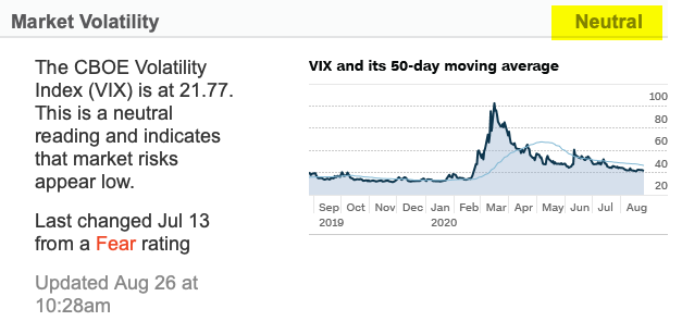
In the big picture, as I said in An exhaustive analysis of the U.S. stock market I guess we shouldn’t be surprised to see prices falling with greater velocity since this is an aged bull market at high valuations and the same Fed actions that probably drove it up are probably going to reverse it in a similar fashion. I started this year warning of complacency from the 2017 low volatility uptrend and the potential for a volatility expansion. I also pointed out during the stock market peak in September that volatility had contracted to a historically very low level in VIX shows the market’s expectation of future volatility. Specifically, on September 25th I wrote,
“Looking at the current level of 12 compared to history going back to its inception in 1993, we observe its level is indeed near its lowest historical low.”
I ended it with;
“When the market expects volatility to be low in the next 30 days, I know it could be right for some time. But, when it gets to its historically lowest levels, it raises situational awareness that a countertrend could be near. It’s just a warning shot across the bow suggesting we hedge what we want to hedge and be sure our risk levels are appropriate.”
Well, that has turned out to be an understatement I guess.
What’s more important is what I actually did. On August 23th as the stock market began to appear overbought on a short-term basis, I took partial profits on our leading momentum stock positions. In hindsight, it would have been better to sell them all. By September 26th (when I wrote the above) I had reduced our exposure to only around 30% stocks and the rest in Treasury bonds. It still didn’t turn out perfectly as the stocks we did hold declined, too, and in many cases even more than the stock indexes. As we entered October, I shared a new observation “Here comes the volatility expansion” as stock prices fell and volatility increased. As prices fell to lower and lower levels, I started adding more exposure. At this point, prices have broadly become more and more extremely “oversold” and sentiment has become more negative. This has been a hostile period for every strategy, but I’ve been here before.
By the way, I have been a tactical portfolio manager for over twenty years now. The highlight of my performance history has been the bear markets. I executed especially well in the October 2007 to March 2009 period when the S&P fell -56%. My worst peak to trough drawdown during that period was only -14.3% and I recovered from it about six months or so later. That was compared to a -56% drop in the stock index that took several years to recover. In fact, I did so well at a time when very few did that it was almost unbelievable, so I had my performance verified by a third party accountant. I have considered writing about it and sharing the commentaries I wrote during the period and the tactical decisions I made. Make no mistake, it wasn’t easy nor was it pleasant. I didn’t lose the money others did, so I was in a position of strength, but it was still a challenging time. What I will tell you is I entered and exited various positions about seven or eight times over that two year period. We never know in advance when the low is in, or when a trend will reverse back down. Buy and hold investors just take the beating, I entered and exited hoping the average gain exceeds the average losses. The swings are the challenge. It takes great discipline to do what needs to be done. Most people had very poor results, for me to create good results, I necessarily had to feel and do the opposite of most people. The market analysis I’m sharing here as observations aren’t necessarily the exact signals I used to enter and exit, but they are part of the indicators I monitored during the crash. Every trend is unique. We have no assurance my methods will do as well as in the past. But, the one thing I feel confident in is I’ve been here before. This ain’t my first rodeo. I know what I’m doing and I’m disciplined in my execution. That’s all I can do. I’m dealing with the certainty of uncertainty, so I can’t guarantee I’ll do as well the next time around, but I am better prepared now than I was then.
So bring it. Get some. I’m ready.
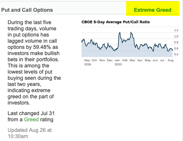
Yesterday I shared the extreme levels of Bullish Percent indicators for the broad market and sectors as well as other indicators like the Put/Call Ratios. I want to add to these observations with more indicators reaching an extreme. I’ve not seen these extremes since 2008 and 2009.
The Nasdaq has declined the most which is no surprise since it’s mostly emerging companies and heavily weighted in Technology. Market conditions have pushed the number of Nasdaq stocks hitting new lows to over 1,100 as of last week. Since the total number of Nasdaq issues is about 3,200 that has caused the value, in percentage terms, to jump to over 30% of the total. As you can see, the last time this many Nasdaq stocks hit new lows was the October 2008 low and the March 2009 low. The current level has exceeded other corrections since then and even the “Tech Wreck” after 2000. At this point, it becomes a contrarian indicator.

To no surprise, the same trend is true for NYSE stocks. As of last week, the percent of stocks listed on the New York Stock Exchange at new lows has reached the levels of past correction lows, but not as high as the 2008 period.

From here, I’ll share my observations of the relative strength and momentum of the sectors and stocks within them so we can see how oversold they have become. We already looked at the Bullish Percent of each sector yesterday, this is just more weight of the evidence.
First, I applied the Relative Strength Index to the S&P 500 daily chart. This RSI is only 14 days, so it’s a short-term momentum indicator that measures the magnitude of recent price changes to estimate overbought or oversold conditions. RSI oscillates between zero and 100, so it’s range bound and I consider it overbought above 70 and oversold below 30. Below we see the current level of 19 is very low over the past twenty years and is at or below the low level reached during past shorter-term market bottoms. However, we also see during prolonged bear markets like 2000 to 2003 and 2007 to 2009 it reached oversold conditions two to three times as the market cycles up and down to a lower low.

Zooming out from the daily chart to the weekly chart, we see the extremes more clearly and this is one of them. On a weekly basis, this oversold indicator is as low as it’s been only at the low points of the last two major bear markets.
s
Zooming out one more time from the weekly to the monthly chart, we observe a monthly data point only highlights the most extreme lows. It’s the same data but ignores the intra-month data. On a monthly basis, the current measure isn’t as low as it reached at the bear market lows in March 2009 or October 2002. For it to reach that level, I expect the green area I highlighted in the price chart to be filled. In other words, this suggests to me if this is a big bear market, we could ultimately see the price trend decline to at least the 2015 high. It only takes about -10% to reach that level. However, as we saw in the shorter term readings, if history is a guide, it would most likely cycle back up before it would trend back down.

You can probably see why I stress that longer-term price trends swing up and down as they unfold. Within a big move of 50%, we see swings around 10 – 20% along the way.
Let’s continue with this same concept to see how each sector looks. The broader indexes are made of the sectors, so if we want an idea of the internal condition of the broader market it is useful to look at each sector as I did yesterday with the Bullish Percent indexes.
Since we just had a -15% correction in August 2015 and January 2016, we’ll just focus on the daily RSI looking back four years to cover that period. Keep in mind, none of this is advice to buy or sell any of these sectors or markets. We only provide advice and investment management to clients with an executed investment management agreement. This observation is for informational and educational purposes only.
The Consumer Discretionary sector is as oversold as it’s been at historically low price points. A trend can always continue down more and stay down longer than expected, but by this measure, it has reached a point I expect to see a reversal up.

The price trend of Consumer Staples that is considered to be a defensive sector initially held up, but then the selling pressure got to it. It’s oversold as it’s been at historical lows.

The Energy sector has declined the most in 2018 and is oversold similar to prior price trend lows. We can see the indicator isn’t perfect as a falling trend sometimes reverses up temporarily, then trends back down to a lower low only to get oversold again. We’ll observe this same behavior at different times in each sector or market.

The Financial sector is deeply oversold to the point it has reached at prior lows. Any market could always crash down more, but Financials have reached a point we should expect to see at least a temporary reversal up.

Healthcare is a sector that isn’t expected to be impacted by the economy, but it has participated in the downtrend. It’s also reached the oversold point today. You can see what happened historically after it reached this level. If history is a guide, we should watch for a reversal.

The Industrial sector is trending down but has now reached a point we could see a reversal back up.

Clearly, the market decline has been broad as every sector has participated. The Materials sector reached the oversold level today.

Real Estate has not been spared during the selloff. It has now reached an oversold level normally seen at lows, but historically it’s cycled up and down a few times before reversing up meaningfully. That can be the case for any of them.

The Technology sector had been one of the best-looking uptrends the past few years. It’s now oversold after today’s action.

Up until today, the Utility sector was the lone survivor, but it was one of todays biggest losers. It’s falling so sharply so fast it’s now oversold with the other sectors.

After prices have declined, I look for indications that selling pressure may be getting more exhausted and driving prices to a low enough point to attract buying demand. That’s what it takes to reverse the trend.
I’ve been here before. I’ve executed through these hostile conditions as a tactical operator. The more hostile it gets, the more focused in the zone I get. After the stock market has already declined, I start looking for this kind of panic selling and extreme levels for a countertrend. We’re seeing those levels now. Sure, it could get worse, but we have reached a point that lower prices are more and more likely to result in a reversal back up.
I’m just going to do what I do.
Have a Merry Christmas!
Mike Shell is the Founder and Chief Investment Officer of Shell Capital Management, LLC, and the portfolio manager of ASYMMETRY® Global Tactical.
The observations shared on this website are for general information only and are not specific advice, research, or buy or sell recommendations for any individual. Investing involves risk including the potential loss of principal an investor must be willing to bear. Past performance is no guarantee of future results. The presence of this website on the Internet shall in no direct or indirect way raise an implication that Shell Capital Management, LLC is offering to sell or soliciting to sell advisory services to residents of any state in which the firm is not registered as an investment advisor. Use of this website is subject to its terms and conditions.


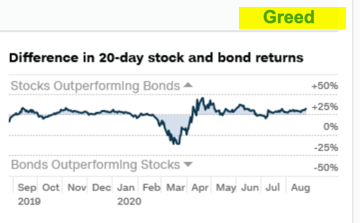
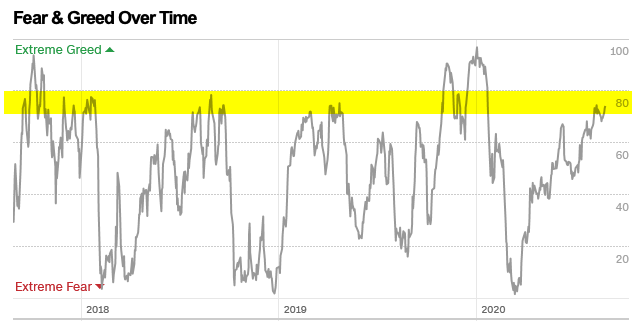


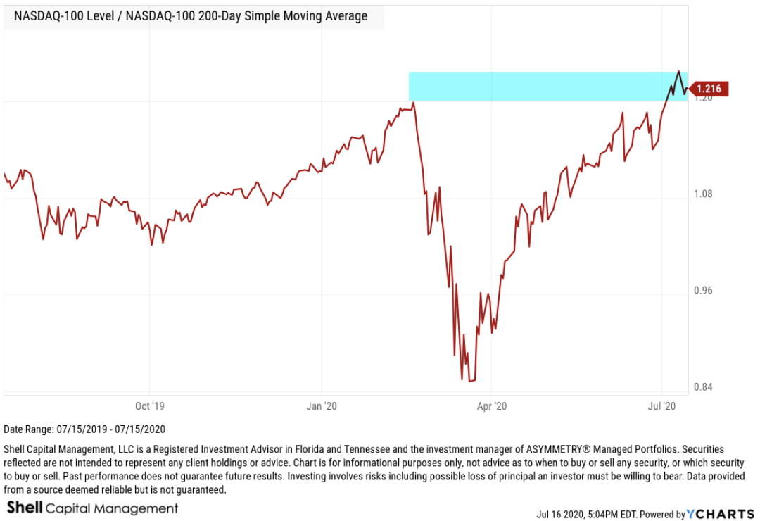
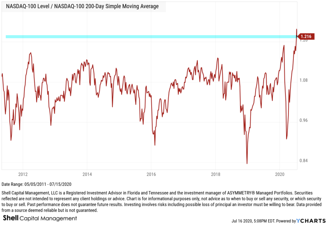


 Warren Buffett said when it comes to investing in stocks, it is smart to be “Fearful when others are greedy and greedy when others are fearful.” Although I do a lot more tactical strategies that he does, at these extremes we have something in common.


You must be logged in to post a comment.