As I was writing this follow up to the Kinsa data US Health Weather Map, my conclusion is it seems Authorities should use all the data science they can to be as precise as possible for any government-mandated quarantines. I thought so because I believe, although social distancing is essential to slow the spread of COVID – 19, a government-mandated quarantine is a very big step. A government-mandated quarantine, especially one mandated at the federal level, has its risks. I’m thinking in terms of the impact on the individual mental and physical health of Americans, our communities, and the economy. At the federal level, their duty is to make decisions in the best interest of the overall situation.
Data science is an interdisciplinary field that uses scientific methods, processes, algorithms, and systems to extract knowledge and insights from many structural and unstructured data. Data science is related to data mining and big data.
I’m doing a Twitter poll that asks: Do you believe a broad quarantine worth the cost to the individual mental/physical health, community, and the economy? As of this writing, here are the results so far.
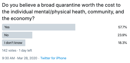
Polls such as Twitter polling is crowdsourcing. Crowdsourcing is a form of data science in that it gives us an idea of the opinions and observations of a large group of people. It also starts a conversation around the topic if it’s thought-provoking.
As I said in Increasing evidence social distancing policies at the state level are causing decreases in the viral transmission of Coronavirus COVID 19 the exponential trend in new cases in the US is already underway, so I’m now focusing on the inflection point. I’m concerned many Americans will be more panicked when they see how fast the spread compounds in the weeks ahead, so you should be prepared for it. However, as the trend is adrift, I’m thinking of inertia such as social distancing and how we can potentially find any signals in the noise.
I shared in Increasing evidence social distancing policies at the state level are causing decreases in the viral transmission of Coronavirus COVID 19 the best tool I’ve seen so far that may have some useful predictive ability is the Health Weather Map by Kinsa.
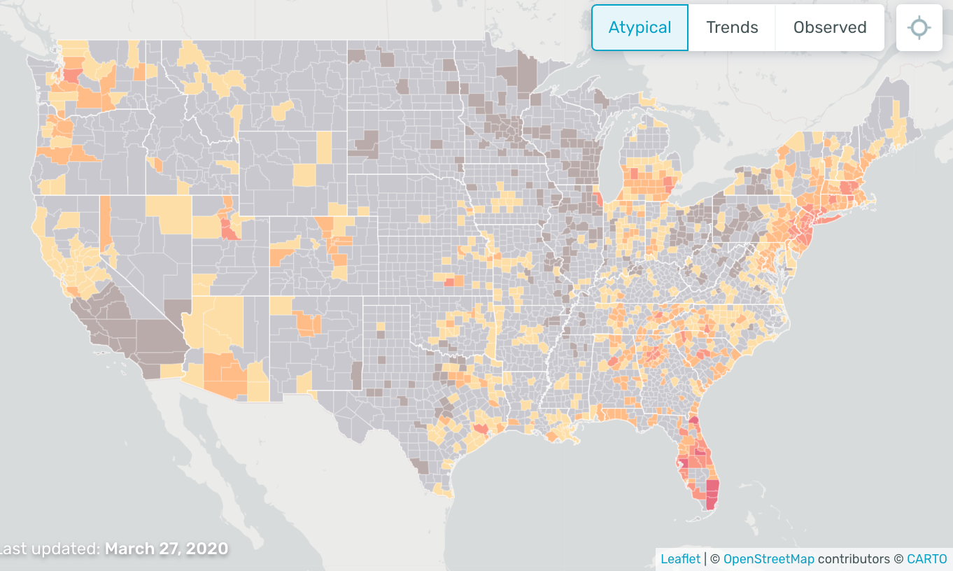
The U.S. Health Weather Map is a visualization of seasonal illness linked to fever – specifically influenza-like illness. The aggregate, anonymized data visualized on the map is a product of Kinsa’s network of Smart Thermometers and accompanying mobile applications, and Kinsa is providing this map and associated charts as a public service.
Kinsa has updated its atypical Illness map to reflect the cumulative amount of atypical illnesses we’ve observed since March 1. Previously the Health Weather Map reflected only new atypical illness, updated daily. Kinsa says:
As widespread social distancing measures take effect, feverish illness levels are dropping, and we feel this way of looking at the data gives a more accurate and comprehensive view of what’s happening. Change is effective as of March 27.
Here is the chart today. Since we are in Tampa Bay in Florida, I especially notice the red here in south Florida. The Miami-Dade area has especially active atypical data from their thermometers. The map above shows us how much influenza-like illness above the normal expected levels Kinsa has detected since March 1.
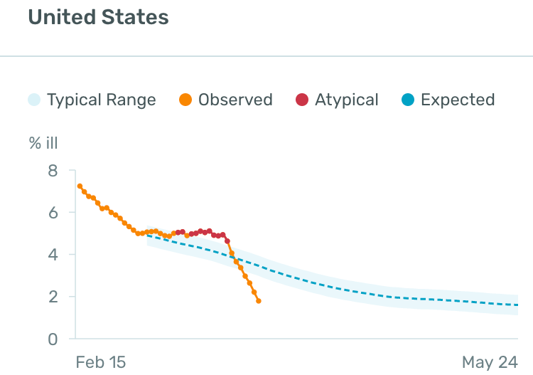
The time series chart allows us to compare Kinsa’s observations of the influenza-like illness level in the U.S., in orange and red, against where we’d expect them to be, in blue, and see how that relationship has changed over the past few weeks,
I made a gif video of the map taking a closer look around south Florida including Tampa Bay and Miami-Dade to show the level of detail.

I’m thinking this data is likely to have predictive power and may help authorities to monitor, track, and make decisions about quarantines and such.
Just imagine the ability to electronically monitor certain health measures of thousands or millions of people around the country. That’s essentially what we have here, and it’s a visualization of seasonal illness linked to fever, specifically influenza-like illness, which is a common characteristic of Coronavirus COVID – 19.
The CDC says:
“People may be sick with the virus for 1 to 14 days before developing symptoms. The most common symptoms of coronavirus disease (COVID-19) are fever, tiredness, and dry cough.”
So, it seems identifying and tracking the trend as soon as possible is essential.
Aside from a concern, Americans will start to panic more when they see a very fast accelerating growth of new cases, I’m now concerned about how they may react to a government-mandated lockdown. We are seeing evidence the social distancing is working and needs to continue, but a government-mandated quarantine may have more mental trama to it.
As I was writing this, I saw the President tweeted he is considering a more targeted quarantine:
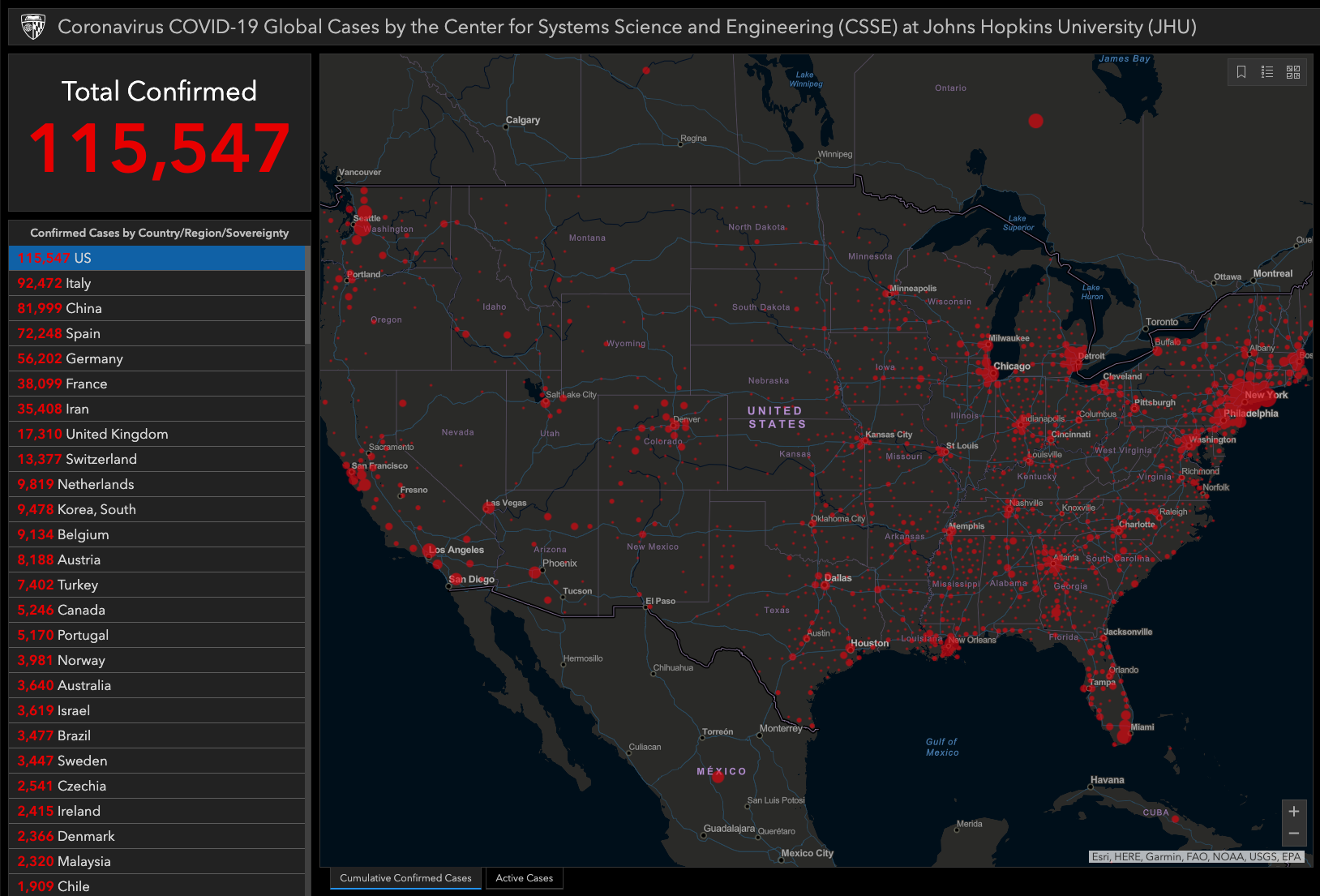
It seems the more precise they can be in deciding areas to lock down the better. I believe it because when we look at the map of confirmed cases, the red areas are distinct. Much of the US doesn’t have any cases at all. So, I can see why the federal authorities hesitate to quarantine the entire country.
But, if they can more precisely define the risk areas using the tools available, the data from the map from Kinsa’s network of Smart Thermometers and accompanying mobile applications may help them to see early warning signs in new areas.
As a libertarian myself, I’m not an enthusiast of the federal government mandating a shutdown, and I prefer to at least let the state, county, and city make their own decisions. I’m also one to try to be a part of the solution rather than part of the problem, so we are self-quarantined to the extent we can and I support a more precise government-mandated quarantine.
The reality is, we don’t know if the cost of a broad quarantine is worth the cost to the individual mental/physical health, community, and the economy, so the best thing is to be as precise as possible about managing the risks.
I believe tools like the US Health Weather Map can be part of the solution.
We are working on a report of the COVID – 19 trends I’ll be sharing shortly. I’m going to start analyzing the trends quantitatively. Don’t miss out, sign up to get the email:
Mike Shell is the Founder and Chief Investment Officer of Shell Capital Management, LLC, and the portfolio manager of ASYMMETRY® Global Tactical. Mike Shell and Shell Capital Management, LLC is a registered investment advisor focused on asymmetric risk-reward and absolute return strategies and provides investment advice and portfolio management only to clients with a signed and executed investment management agreement. The observations shared on this website are for general information only and should not be construed as advice to buy or sell any security. Securities reflected are not intended to represent any client holdings or any recommendations made by the firm. Any opinions expressed may change as subsequent conditions change. Do not make any investment decisions based on such information as it is subject to change. Investing involves risk, including the potential loss of principal an investor must be willing to bear. Past performance is no guarantee of future results. All information and data are deemed reliable but is not guaranteed and should be independently verified. The presence of this website on the Internet shall in no direct or indirect way raise an implication that Shell Capital Management, LLC is offering to sell or soliciting to sell advisory services to residents of any state in which the firm is not registered as an investment advisor. The views and opinions expressed in ASYMMETRY® Observations are those of the authors and do not necessarily reflect a position of Shell Capital Management, LLC. The use of this website is subject to its terms and conditions.

You must be logged in to post a comment.