My expertise is the quantitative and technical analysis of trends, momentum, countertrends, and volatility as well as tactical risk management and hedging. As the investment manager of ASYMMETRY® Global Tactical and ASYMMETRY® Managed Portfolios, professionally, I apply it to global market price trends for portfolio management. The methods and systems are robust, so the skills can be applied to understand trends of a pandemic, too.
Since I expect to see the speed of new Coronavirus COVID – 19 cases to increase exponentially, I’m going to start sharing my observations on it from the lens of a “quant” and a technical chartist.
I’m concerned many American’s will become overwhelmed at the sheer speed of growth.
It’s going to happen, but we have to put it into perspective. I’m going to help.
It’s essential to look for the logical fallacy of the herd and consider how they may be wrong. A logical fallacy is a flaw in reasoning. Logical fallacies are like tricks or illusions.
The herd gets trends wrong at extremes, then become shocked by the staggering swing the other way. The trend and momentum of this virus isn’t a lot different than capital markets as it contains a fundamental, in this case, physical science element, and a whole lot of human emotion and behavior.
Just like capital markets.
People initially underreact, then they panic because they underreacted, then they overreact.
We’re seeing it now. I know people who initially laughed it off, now those same people have swung to the extreme on the other side. If you underreact, you’re likely to overreact and panic.
This pandemic is spreading at an exponential rate with no significant risk management or drawdown control tools to apply except for social distancing. For example, in investment management, we can hedge our positions or exit early to avoid more losses. Here, the risk management is to avoid contact with other people. Why? because this is an ASYMMETRIC UNCERTAINTY, as there are many parts of it we are unsure about such as whether contagious asymptomatic carriers exist. Asymptomatic carries are those not yet showing symptoms who are infected and don’t know it yet. In “Authorities should use data science tools to be precise in QUARANTINE mandates” I discuss how we can use asymptomatic data from digital thermometers as an early warning sign.
If someone has it and doesn’t show symptoms, they spread it unknowingly. So, we don’t know if taking temperatures at airports and such has any impact at this time.
It seems the most critical issue right now is N95 masks and protective supplies for our Physicians and medical professionals. This is their time and we need to support them. The next issue seems to be a ventilator shortage, and that’s a big one. If hospitals reach their capacity, especially with a limited number of ventilators, the death rate will increase, with nothing else to slow or stop it but social distancing.
The key, right now, is to slow down the spread of Coronavirus affording more time for more testing, spread out the hospital/ventilator use, and find a vaccine. Read: Social distancing. Stay home, hunker down, it’s simple.
With that said, the next trend, then, will be the overall impact on the country and the world from shutting down for so long. All of which are asymmetric uncertainty and unknowable, just like the future of global capital markets I deal with every day.
So, here we are, at the longest economic expansion in American history and the longest bull market in stocks and bonds, and we now have a catalyst for the cycles and trends to swing the other way.
INTRODUCING: A Quantitative Technical Analysis of the Coronavirus COVID – 19 Trend
First, all of the information provided is deemed reliable but is not guaranteed. So, we immediately realize there are limits to the data, since we can’t independently verify if a country, state, or county is reporting accurately.
Now that we have enough data from which to begin to draw inference, or charting trends, we us the data from Johns Hopkins Center for Systems Science and Engineering. The Center for Systems Science and Engineering takes a multidisciplinary approach to modeling, understanding, and optimizing systems of local, national, and global importance.
First shared on January 22, 2020, the Coronavirus Tracker tracks the progression of Coronavirus (also known as 2019-nCoV or COVID 19) across the world. COVID 19 was first detected in Wuhan, China in December 2019. On January 13, 2020 Thailand reported the first international case outside China, while the first cases within China, but outside of Wuhan were reported on January 19, in Guangdong and Beijing. Since then, the virus spread across the world.
As any good chartist, we’ll start at the top and work our way down into more granular observations. This is just my first observation, so later I’ll add more detail and analysis of the trends and momentum over time.
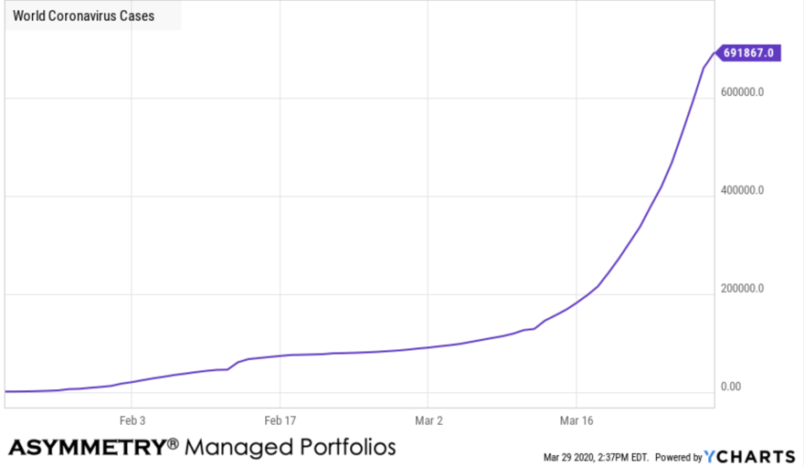
Coronavirus (COVID-19) is a global pandemic that originated in Wuhan, China in 2019. The virus has sparked a global economic slowdown because countries including China, Italy, and Iran having more than 1000 deaths within the first few months of the virus emerging. The virus also caused many countries to provide fiscal and monetary stimulus. For example, in the United States, the Federal Reserve conducted two surprise rates cuts to lower the Federal Funds rate to nearly 0%. Additionally, parts of the world implemented a complete lockdown of cities to prevent the spread of the virus. The Coronavirus pandemic eclipsed 10,000 cases on February 1, 2020, and 100,000 cases on March 6, 2020.
World Coronavirus Cases is at a current level of 691,867, up from 660,706.0 yesterday, which is a change of 4.72% from yesterday. This first chart can be somewhat misleading, so here is lesson one. This is a linear chart, so each level on the y-axis (horizontal axis) is the spacing is equal between the number of cases.
In comparison, below is the logarithmic chart. Logarithmic scales use percentage moves for spacing, rather than number of cases, so a log scale emphasizes the rate of change in a way that linear scales do not.
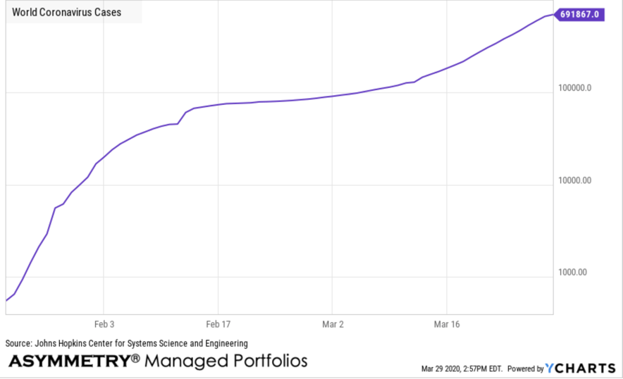
Notice how different looking the trend is for the same data. The top chart, linear, is an equally spaced grid of the number of cases. The linear chart plots the number of cases exactly as they are in person terms. For example, in the beginning there wasn’t nearly as many cases as now, so it’s at a lower level. So, when there was only 1,000 cases and now there are nearly 700,000 cases, the grid spacing on the chart doesn’t change. So, the earlier cases seem small on the chart because as a fixed number it is much smaller than more recent larger numbers.
The logarithmic chart corrects this issue and instead shows us the trend of the rate of change based on percentage moves. So, when the number of cases changes from 100 to 200, it’s a 100% change and it gets the same spacing as a change from 30,000 to 60,000, which is also a 100% change. A log chart helps us to normalize the data and see the trend in rate of change terms. The log chart is unique in that it shows a very fast uptrend early on that has sense slowed its rate of change.
Which scale is right? They both are. They just show the data in different ways. We primarily us logarithmic scales for price trends, especially longer time frames. We use linear charts with short term trends, when the data doesn’t spread out that much, or when we view an oscillator like breath indicators showing the percent of stocks in uptrends vs. downtrends.
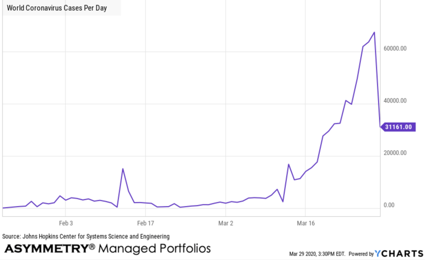
One more example of the difference between the two, but this time with less words, more the picture. This is the World Coronavirus Cases Per Day on a linear chart, which makes me wonder if all the data is in, or it is really dropped that much. It’s possible it did, as the number of cases per day should decline at some point, so we’ll see tomorrow.
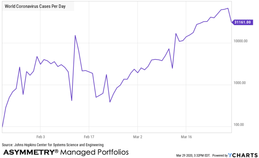
Here is the same date in the logarithmic chart. Applying the rate of change, it doesn’t look so strange because the percentage change isn’t as much as it appears in number form.
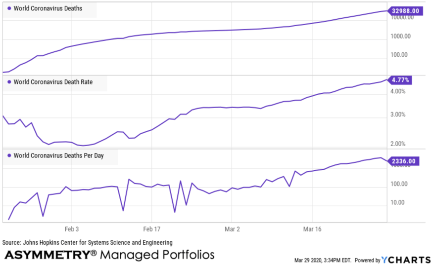
Next we look at the worst part: World Coronavirus Deaths, Death Rate, and Deaths per day. For now, I’ve put them on one chart for quick observation of the trend. The death rate at the world level is high at 4.77%, which may not be a predictor of the US death rate.
US CORONAVIRUS COVID – 19 CASES
In later observations, I’ll start analyzing the trends including ratios between them, correlations, spreads, and such, to see if we can find any signals in the noise. Next is a overall summary of US Coronavirus Cases, Deaths, Death Rate, and Cases Per Day, and Deaths Per Day. These trends are up, except the death rate, which was initially greater and has since declined. The general older age of some of the early infected on a cruise ship may have driven the higher rate initially.
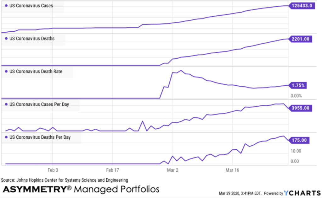
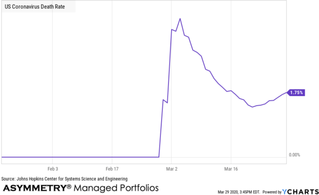
The US Death Rate is an important number as it normalizes the number of deaths as a rate of change we can use to compare to other areas.
Speaking of comparison to other areas, I have other countries data, too, and also the US States. Since our clients are in the US, I’ll focus mainly here and within our states. We may eventually get more granular into county level data.
US States: Florida, Tennessee, Texas, North Carolina, California, New York
Since most of our clients are in these states, here is the percentage change to normalize the growth to compare.
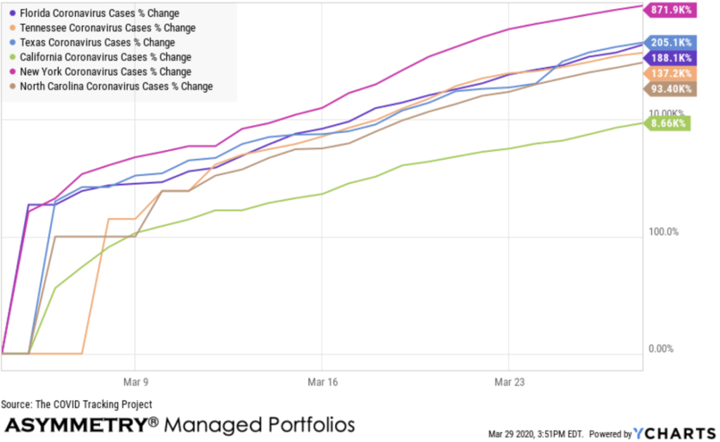
New York has by far the highest number and rate of cases. California has the least! I pointed out in Increasing evidence social distancing policies at the state level are causing decreases in the viral transmission of Coronavirus COVID 19 that the quick response of California seems to have slowed their growth.
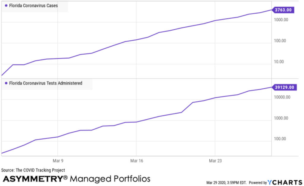
I’m in Tampa Bay, so here’s a look at Florida. As the number of tests administered is increasing, so is are the number of cases.
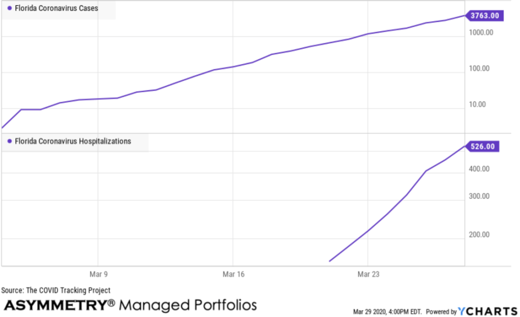
As we get more data over time, the number of hospitalizations will be more and more telling. At this point, it’s 526 out of 3,763 cases, or about 14%. This percentage will become much more accurate as the sample size increases.
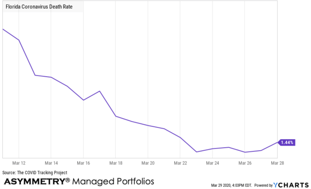
The death rate for Coronavirus in Florida is declining, but it’s too early and we don’t have a large enough sample size to draw a statistical inference from it just yet. We hope to see the death rate stay this low.
I’m going to monitor this data once a day, just as I monitor global market trends around the world. When I observe something asymmetric or useful, I’ll share it. In addition to viewing the trends and rate of change (momentum), I’ll also do some studies of ratios, correlations, and spreads to see if we can spot any patterns. If you have any questions for charting requests, contact me at the top of the page.
Don’t miss out, sign up to get an email when I post a new observation.
Mike Shell is the Founder and Chief Investment Officer of Shell Capital Management, LLC, and the portfolio manager of ASYMMETRY® Global Tactical. Mike Shell and Shell Capital Management, LLC is a registered investment advisor focused on asymmetric risk-reward and absolute return strategies and provides investment advice and portfolio management only to clients with a signed and executed investment management agreement. The observations shared on this website are for general information only and should not be construed as advice to buy or sell any security. Securities reflected are not intended to represent any client holdings or any recommendations made by the firm. Any opinions expressed may change as subsequent conditions change. Do not make any investment decisions based on such information as it is subject to change. Investing involves risk, including the potential loss of principal an investor must be willing to bear. Past performance is no guarantee of future results. All information and data are deemed reliable but is not guaranteed and should be independently verified. The presence of this website on the Internet shall in no direct or indirect way raise an implication that Shell Capital Management, LLC is offering to sell or soliciting to sell advisory services to residents of any state in which the firm is not registered as an investment advisor. The views and opinions expressed in ASYMMETRY® Observations are those of the authors and do not necessarily reflect a position of Shell Capital Management, LLC. The use of this website is subject to its terms and conditions.

You must be logged in to post a comment.