I respect history. The past is no guarantee of future results, but it’s all we have to draw statistical inference from, so we need to understand its risks and rewards. We use past data to determine future possibilities. If we don’t know where we’ve been, we unlikely know where we’re going. It’s essential to have a deep understanding of time, the past, the present, and the future that doesn’t exist. I have great respect for the past, but I’m always here, now, at this moment. As a professional decision-maker, I can only do something now or not now. I can’t do anything in the past. I can’t do anything in the future. It’s now, or not. This alone has removed a lot of behavioral issues for decision making. I review historical trends and my decisions, but I don’t get stuck there at a time I can’t actually do anything. It is what it is, so I accept it and learn from it. If we want to learn from the past, we necessarily must know what it was. That’s why I observe charts of price trends, investor sentiment, global macroeconomic trends, volaltity, and momentum.
A global macro strategy is a hedge fund style investment and trading strategy typically focused on the overall economic and political views of various countries or their macroeconomic principles. Positions in a global macro portfolio may include long and short positions in various equity, fixed income, currency, commodities, and other alternatives like volatility. Although most global macro hedge fund strategies may be focused on views of macroeconomic trends, my focus is on directional price trends.
The price trend is the final arbiter, if you keep disagreeing with the trend, you’ll lose.
The longer you disagree with the trend, the more you lose.
Other indicators like sentiment, rate of change (momentum/relative strength), and volatility are confirming indicators for the price trend. For me, they signal when a trend may be reaching an extreme, becoming more likely to reverse. I like to be positioned in the direction of the price trend, but I’m situational aware of when the trends may be reaching an extreme and likely to result in a countertrend.
So, let’s see what in the world is going on. I concentrate on what has changed. If a trend or level hasn’t changed, it doesn’t warrant the attention, so my systems signal when something has changed. I then examine the rate of change, which is why I speak of momentum, velocity, and relative strength. The trend tells us the direction of change, but the rate of change indicates how fast it’s changing.
Investor Sentiment: are investors bullish, feeling positive about the future direction of stock price trends? or bearish, feeling stock prices will fall?
US Investor Sentiment, % Bullish is an indicator that is a part of the AAII Sentiment Survey. It indicates the percentage of investors surveyed that had a bullish outlook on the market. An investor that is bullish believes the stock market will trend higher. The AAII Sentiment Survey is a weekly survey of its members which asks if they are “Bullish,” “Bearish,” or “Neutral” on the stock market over the next six months. The percent of bullish investors is slightly below average, so the bullish individual investors haven’t really changed much.
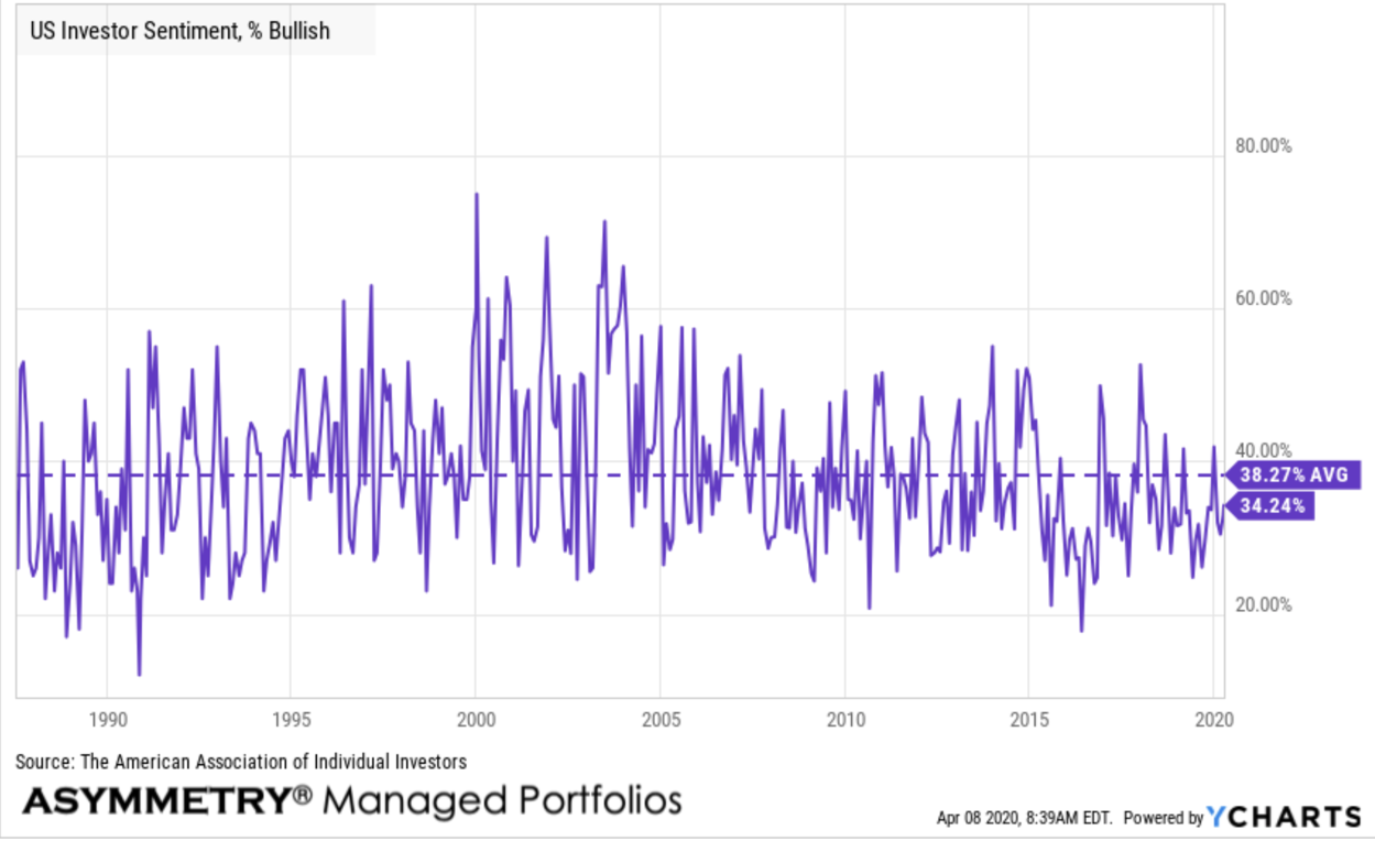
US Investor Sentiment, % Bearish is at 49.73%, compared to 52.07% last week and 27.20% last year. Pessimistic investor sentiment materially higher than the long term average of 30.4%, so this is a change. Individual investors are generally more bearish than they were. When their bearishness reaches a historical extreme, they’ll likely be wrong. As you see in the chart, investors are abnormally negative on the future of stock price trends right now.

The stock market will reverse its current trend when prices are pushed down to a low enough point to attract new buying demand.
Stock prices will also reach their bottom when investors who want to sell have sold, so there is no overhead resistance.
Nothing tells us more about market dynamics better than the price trend itself, but investor sentiment measures like AAII Investor Sentiment Survey indicates if do-it-yourself individual investors are capitulating. When their bearishness is at a historical high it may confirm with the price trend those who want to sell have probably already sold. So, their desire to sell has less impact on an uptrend.
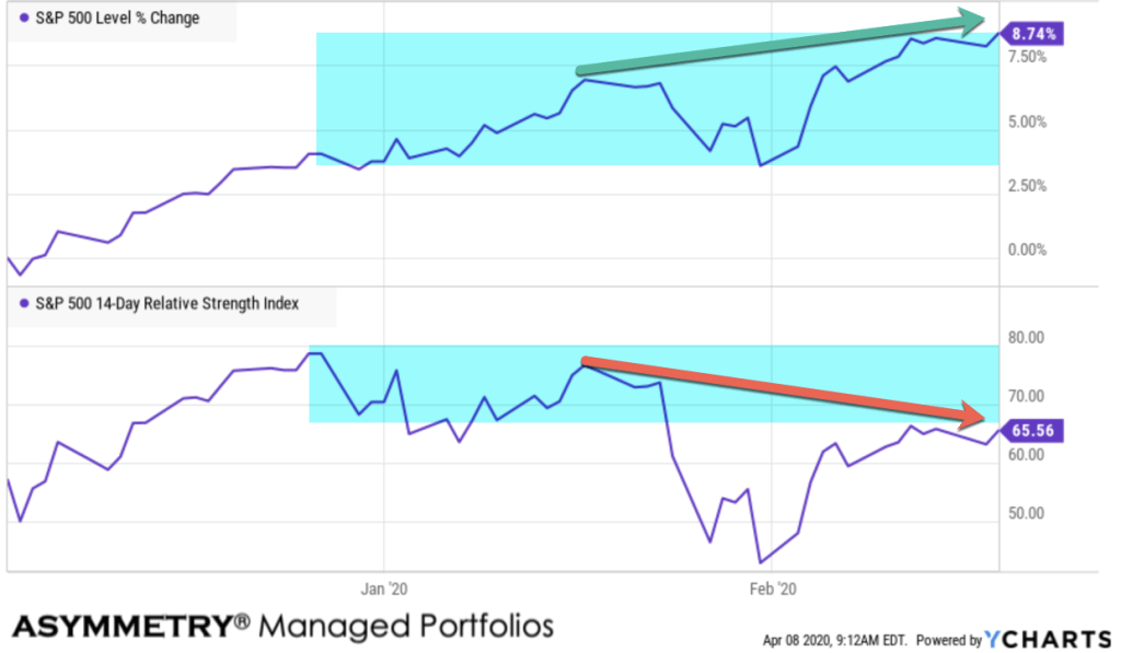
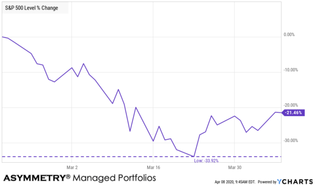
If most of the investors with a desire to sell have already sold they won’t be selling as prices trend up, so the market will have less resistance as it trends up. For example, the S&P 500 stock index had gained nearly 5% in the first two months this year. It peaked on February 19th. then all hell broke loose. The S&P 500 dropped -34% in just three weeks, so the S&P 500 was down -31% for the year at that point.

Some of the selling pressure was driven by systematic trading, such as trend following and momentum. As rules-based systematic trading pushed prices lower and lower, other investors were panic selling to avoid more losses. The trouble is, individual investors tend to sell into the bloodbath when prices reach their lowest points. Emotional reactions are driven by falling prices. People sell because prices are falling and they are losing money. Systmatic rules-based systems also sell to avoid more loss, but do so based on predefined exits to manage risk and drawdown controls.
What I observed in the early stage of this waterfall decline is what seemed to be an overreaction from an initial under-reaction.
At the peak on February 19th, here is what the stock index looked like as it trended to an all-time high. This is three months of history. What I noticed, then, was the relative strength indicator didn’t follow it up. This was a very negative divergence.
At the same time, I was seeing other bearish signs of a major market top. To be sure, here are the observations I shared in January and February.
- What could go wrong
- How low can implied volatility VIX go?
- Now, THIS is what a stock market top looks like!
- The week in review
- What’s the stock market going to do next?
- Investor sentiment is dialed up with stock trends
- You probably want to invest in stocks
I was a little early with my boldest statement on January 18th: Now, THIS is what a stock market top looks like! Stock Market Risk is Elevated.
But, fortunately, I acted on it. Seeing a very bullish cover of one of my favorite investment publications was the final straw, along with all the other things I observed that seemed to signal a major top in stock prices.
I don’t always sell my stocks because the market risk seems elevated, but when I do it’s because the weight of the evidence is overwhelming.
But, it didn’t work out perfectly and it never does, so I don’t have an expectation of perfection. If I did, I could have never created the asymmetric risk/reward return profile I have, especially the downside risk management and drawdown control. It’s an imperfect science with a dash of art.
I’m okay with that.
Asymmetric investment returns are created from a positive mathematical expectation, not being right more often than wrong, but instead losing less when I’m wrong and earning more when I’m right. The rest of you are simply focused on the wrong thing. You want to be right, and it ain’t happin’. I’m not right all the time, either. But when I’m wrong, I cut it short. I don’t let the wrong become really wrong. I take the loss. I love taking losses. I do it all the time. It’s how and why I have smaller losses, rather than large ones. It’s the only Holy Grail that exists. The Holy Grail is asymmetry: larger average gains than losses. This positive mathematical expectation doesn’t require me to know the future and be right all the time. Instead, I focus on what I can actually control, and that’s mainly the size of my losses. If I limit the size of my losses, I’m left to focus on the upside of profits. That’s my edge, and it isn’t just a mathematical edge, it’s a psychological edge, a behavioral edge. It’s not easy to execute for most people because you want to be right, so you’ll hold those losses hoping they’ll recover. If they do and the price trends back up, then you may sell, if you remember you wish you had before at those higher prices, before you saw a -30% loss.
That’s resistance.
If you wait to sell when the price trends back up some, you’re selling creates resistance if there are enough of you driving the volume of selling pressure. If you instead feel more bullish now that prices trended up some, you may hold on, hoping it continues up. In that case, you’re not the overhead resistance at higher prices causing the halt that prevents the price from trending higher. If enough volume is like you, prices will keep trending up because the rising prices aren’t met with a stronger desire to sell than the enthusiasm to buy.
Here is the full -34% downtrend. It was the fastest downtrend of this magnitude in history.
What in the world was going on? The first leg down, which we only know in hindsight it was the “first”, was a sharp downtrend of -13%. The stock market falls so far, so fast, it becomes deeply oversold with the relative strength index at only 19. The relative strength of 30 is low. Below 30 is oversold and below 20 is extremely oversold. Under normal circumstances, this results in a short term bounce at a minimum, and when I say normal, I’m talking about looking at over a century of history.
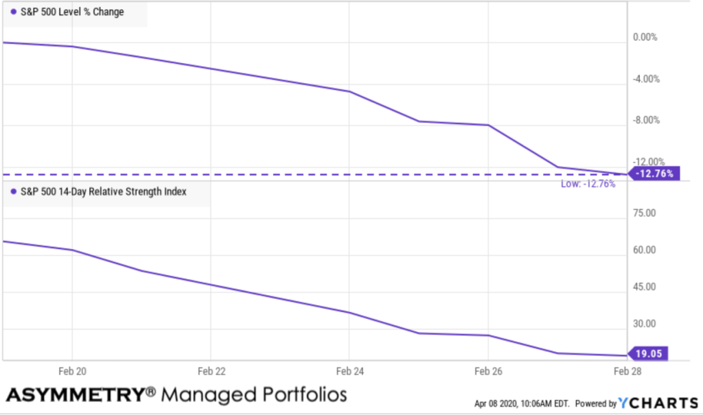
To make the point clear, using a simple measure of relative strength as an indicator in the lower section of the chart below, the last times it reached such an oversold level were the lows in late 2018.

But, if you notice, the second time the SPX got so oversold in 2018, the price trend was significantly lower. So, the risk of a countertrend signal like this is even after the price trend reverses back up, it may later reverse back down to an even lower low. It did then, and it did it again this time.
To illustrate what happened from there, I’ve marked up the next chart pretty well. Keep in mind, I don’t necessarily trade the S&P 500 index. I’m simply using it as a proxy for the overall market. I focus more on more granular ETFs like sectors and individual equities. To see the trends play out, walking through time, the first part is the red vertical arrow to point out the first level of extreme oversold conditions as the stock market dropped -13%. My managed portfolio was in short term US Treasuries during this because I hold sold weeks ago.
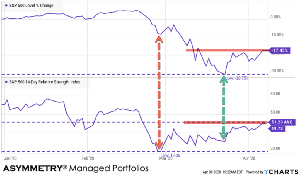
So, because of my risk management from elevated risk levels, we were in a position of strength, as I call it. I mean we were not participating in the -13% waterfall decline, so as others (who are losing money quickly) are getting more and more bearish, I’m getting bullish. Once stocks got oversold, however, I invested in stocks again. Of course, you can see what happened afterward. The next leg down was even worse and we got caught in it. Like I said, my tactical trading decisions are never perfect timing, nor does it have to be. I just need my average profits to be larger than my average losses to create positive asymmetry. I eventually reduce risk exposure again to zero and then I’m back to looking to buy again, which I have. This is for educational purposes, so I’m leaving out all the other things going on, too, such as buying US Treasuries, etc. The point is, this is what in the world was going on.
Looking at the chart again, a few more points to make. Notice the two red horizontal lines I drew are showing a price range that could be resistance. I say that because of 1. it’s the first area of a prior high, so those who wish they’d sold there may sell now. 2. the relative strength is now at its halfway point and specifically, its average level, so we may see some mean reversion. We’ll see.
On the bullish side, however, just as individual investors are really bearish, I’m seeing some divergence again in the price momentum. The green arrow shows it. As the stock market reached a low, down -34% off its high, the momentum didn’t make a new low. It didn’t even reach the prior low or even close to it. Instead, it’s making a higher low and higher high.
If I claim the February divergence was bearish because the relative strength didn’t confirm the all-time new high, then I’ll also claim the opposite is true: this is a bullish divergence.
What’s going to happen next with the US stock market?
We’re about to find out!
Only time will tell, but from what I’m seeing, the crowd is expecting a retest of the lows or even lower lows, and that seems reasonable. A global recessional is imminent at this point. But, the stock market has already fallen -34% from its high, so anything is possible. This could be it, for all we know. If most people believe it will get worse, the capital markets have a funny way of proving the crowd wrong. At least temporarily, as it’s doing right now. But, the big picture isn’t real positive.
We now have unprecedented jobless claims and unemployment. American’s are going to be hurting without jobs. That chart is so ugly I don’t want to show it.
We also have unprecedented intervention from the federal government and the Federal Reserve. So have central banks around the world responded.
I believe the last five years of this bull market and economic expansion were driven by the Federal Reserve Zero Interest Rates Policy and other forms of quantitative easing. What was then unprecedented Fed action drove the longest bull market and economic expansion in US history. It also drove the stock index to its second-highest price to earnings valuation in 140 years. I’ve pointed out many times before the Shiller PE Ratio for the S&P 500 was over 30 and the only time it was “more expensive” was the late 1990s. That didn’t end well. It was higher than 1929 just before the Great Depression.
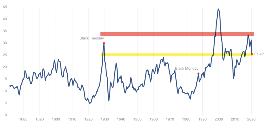
The S&P 500 Shiller CAPE Ratio, also known as the Cyclically Adjusted Price-Earnings Ratio, is defined as the ratio of the S&P 500’s current price divided by the 10-year moving average of inflation-adjusted earnings. The metric was invented by American economist Robert Shiller and has become a popular way to understand long-term stock market valuations. It is used as a valuation metric to forecast future returns, where a higher CAPE ratio could reflect lower returns over the next couple of decades, whereas a lower CAPE ratio could reflect higher returns over the next couple of decades, as the ratio reverts back to the mean.
The S&P 500 Shiller CAPE Ratio was at a high level of 33, which was higher than the long term average of about 17. Today is has declined to 25.42, while still well above an “overvalued” level, it could be justified by the low inflation we are seeing. Right now, we are looking at deflation as prices of stuff are falling.
I don’t have to correctly predict with the direction the stock market will trend next. I instead increase and decrease exposure to the possibility of risk/reward aiming for asymmetric risk-reward. I tactically trade the cycles and swings as I’ve done many times before. We achieve an asymmetric risk-reward when the downside potential is less than the upside. We achieve asymmetric investment returns when our average profits exceed our average losses. I call it ASYMMETRY® and everything I do centers around it.
Do you really want to know the harsh reality of what the stock market is going to do next?
Most likely the opposite of what you think.
Contact us here if we can help.
Mike Shell is the Founder and Chief Investment Officer of Shell Capital Management, LLC, and the portfolio manager of ASYMMETRY® Global Tactical. Mike Shell and Shell Capital Management, LLC is a registered investment advisor focused on asymmetric risk-reward and absolute return strategies and provides investment advice and portfolio management only to clients with a signed and executed investment management agreement. The observations shared on this website are for general information only and should not be construed as advice to buy or sell any security. Securities reflected are not intended to represent any client holdings or any recommendations made by the firm. Any opinions expressed may change as subsequent conditions change. Do not make any investment decisions based on such information as it is subject to change. Investing involves risk, including the potential loss of principal an investor must be willing to bear. Past performance is no guarantee of future results. All information and data are deemed reliable but is not guaranteed and should be independently verified. The presence of this website on the Internet shall in no direct or indirect way raise an implication that Shell Capital Management, LLC is offering to sell or soliciting to sell advisory services to residents of any state in which the firm is not registered as an investment advisor. The views and opinions expressed in ASYMMETRY® Observations are those of the authors and do not necessarily reflect a position of Shell Capital Management, LLC. The use of this website is subject to its terms and conditions.

You must be logged in to post a comment.