As if the election result wasn’t enough, the U.S. stock market has surprised most people by trending up since last November.
But, it has been stalling since March. The S&P 500 drifted down about -3% into March and April.
The stock market seems to be at an inflection point now.
Understanding the market state is an examination of the weight of the evidence.
The weight of the evidence seems to suggest defense.
My first indicator is always the actual price trend itself. If we want to know what is going on, there is no better observation than the actual price trend. The price action tells us what force is in control: supply or demand. And, we can see the potential for the inflection point – when the direction is changing. In the chart below, I highlight a recent point of “resistance”. I call it resistance because the stock index hasn’t broken above the March high and is instead drifting sideways.

Investors sometime assume a prior price high will automatically become “resistance” just because it’s the price range they expect to see the price trend stall. Resistance is the price level where selling is expected to be strong enough to prevent the price from rising further. We can see that recently in the chart. As the price advances towards the prior peak, supply may overcome demand and prevent the price from rising above resistance. For example, it may be driven by investors who wished they had sold near the prior peak and had to wait as the price recovered again. They anchor to that prior high. Once it gets back to the prior peak, they exit. Prior highs don’t always become “resistance” as expected. Sometimes demand is strong enough to break through and keep trending up. At this point, we see there has been some resistance at the prior high. I highlighted it in yellow in the chart above. So, we shouldn’t be surprised to see the price decline if this resistance holds for a while. Or, it could be an inflection point.
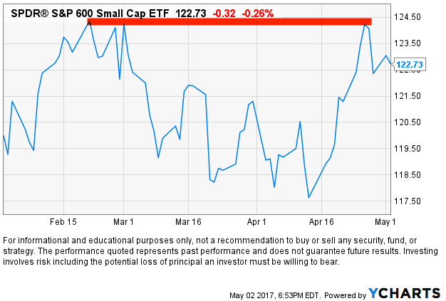
The S&P 500 stock index is mainly large companies. Smaller companies tend to lead larger companies. Their price trends move in a wider range and they sometimes move faster, so they get to a point sooner. That’s why we say small company stocks “lead” large company stocks. In that case, I highlight below that the small company stock index, the S&P 600 Small Cap ETF, reached its prior, but found resistance and reversed down. The soldiers may lead the way for the Generals.
It seems that the stock index is stalling at a time when investors are complacent. When investors are complacent or overly optimistic an inflection point is more likely. The CBOE Volatility Index® (VIX® Index) is very low. The CBOE Volatility Index® (VIX® Index®) is a key measure of market expectations of near-term volatility conveyed by S&P 500 stock index option prices. The VIX® historically trends between a long-term range. When the VIX® gets to an extreme, it becomes more likely to eventually reverse. In the chart below I show the price level of the VIX® since its inception in 1993. We can see its long-term average is around 20. I highlighted in red its low range is around 12 and it has historically spiked as high as 25 or 60. This means the traders of options are expecting lower volatility in the weeks ahead at a time when other things seem to suggest otherwise.

As I continue sharing some observations, I’m going to get farther away from my main decision maker which is the directional price trend, but you’ll see how these indicators help to quantify the state of the trend and the potential for an inflection point. As we keep going, keep in mind that indicators are a derivative of the price at best or a derivate of something unrelated to the directional price trend. In the case of the VIX® Index index above, it’s a measure of options (a derivative) on the stocks in the S&P 500. When we start looking at things like economic growth and valuations we are necessarily looking at things that are a derivative of price, but not as absolute as the price trend itself. The direction of the price trend is the arbiter.
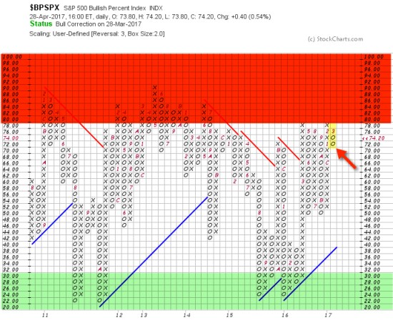
Another signal of an inflection point is breadth. That is, what percent of stocks are rising or falling. Since I have mentioned the S&P 500 stock index, I’ll show the S&P 500 Bullish Percent Index below. The Bullish Percent is a breadth indicator based on the number of stocks on Point & Figure buy signals. Developed by Abe Cohen in the mid-1950s, the Bullish Percent Index was originally applied to NYSE stocks. Cohen was the first editor of ChartCraft, which later became Investors Intelligence. BP signals were further refined by Earl Blumenthal in the mid 70’s and Mike Burke in the early 80’s. The S&P 500 Bullish Percent shows a composite of the 500 stocks in the S&P 500 index that are in a positive trend. The S&P 500 Bullish Percent recently reversed to a column of O’s from a high point of 80, which means about 80% of the S&P 500 stocks were in a positive trend and about 8% of them are now in a negative trend. In addition to the direction, the level is important because we consider the level above 70% or 80% to be a higher risk (red zone) and the levels below 30% to be lower risk (green zone). So, more and more stocks within the index are starting to decline. This weak “breadth” or participation could be a signal of a change in trend.
I’m not necessarily a big user of economic indicators. I believe the stock indexes are the leading indicator for the economy, so that’s my guide. However, I have a strong sense of situational awareness so I like to understand what in the world is going on. The total return of stocks is a function of three things: earnings growth + dividend yield + P/E ratio expansion or contraction. Since earnings growth has made up nearly 5% of the historical total return of the S&P 500 since 1926, it does matter in the big picture in regard to expected return. Today, we observe the headline in the Wall Street Journal:
GDP Slows to Weakest Growth in Three Years
The U.S. economy’s output grew at the slowest pace in three years during the first quarter, underscoring the challenges facing the Trump administration as it seeks to rev up growth.
The New York Times says:
G.D.P. Report Shows U.S. Economy Off to Slow Start in 2017
■ The economy barely grew, expanding at an annual rate of only 0.7 percent.
■ The growth was a sharp decline from the 2.1 percent annual rate recorded in the final quarter of last year. It was the weakest quarterly showing in three years.
■ Consumption, the component reflecting individual spending, rose by only 0.3 percent, well below the 3.5 percent rate in the previous quarter.
The Takeaway
The first-quarter performance upset expectations for a Trump bump at the start of 2017.
If you want an economic catalyst for why prices could stall or reverse down, there you go. You see, earnings growth of stocks is part of GDP. GDP is the sales of all U.S. companies, private and public. The earnings growth of the S&P 500 is the earnings of those 500 companies. In other words, GDP of the economy is highly connected to EPS of an index of 500 stocks.
This recent stall in the price trend and economic growth along with a dash of complacency comes at a time when stocks are “significantly overvalued”, according to my friend Ed Easterling at Crestmont Research:
“In the first quarter the stock market surged 5.5%, well more than underlying economic growth. As a result, normalized P/E increased to 29.4—significantly above the level justified by low inflation and low interest rates. The current status remains “significantly overvalued.” The level of volatility plunged over the past quarter and is now in the lowest 4% of all periods since 1950. The trend in reported earnings for the S&P 500 Index reflects a repeating pattern of overly-optimistic analysts’ forecasts. Earnings and volatility should be watched closely and investors should heighten their sensitivity to the risks confronting an increasingly vulnerable market.”
Oh, and one more thing: Monday will be May. I’m not a huge fan of using seasonality as an indicator to enter or exit the stock market, but there is some tendency for certain periods to gain or lose value historically. For example, a common seasonality is “Sell in May and go away”. Depending on the historical time frame you look and which index, some periods show a “summer slump”. One theory is many investors and traders go on vacation in the summer, so volume is light. They return after the summer and take more action.
So, maybe this will be a good time to sell in May and go away. Not because it’s May, but instead because the weight of the evidence suggests this could be an inflection point.
We’ll see.

Pingback: No Inflection Point Yet, But… « ASYMMETRY® Observations