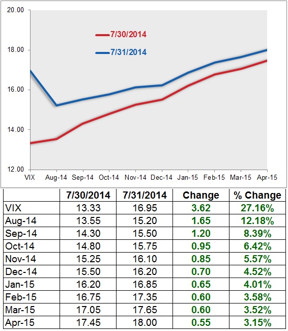
The chart and table below from Russell Rhoads at VIX Views shows an interesting visual of yesterdays increase in the VIX spot index and its futures. The chart is the VIX term structure for the VIX futures. The blue line is yesterdays term structure and the red line the day before. A term structure chart shows how the futures are priced over time. Notice the bottom goes from from left to right August 2014 to April 2015. That corresponds to the table below it, which shows the VIX (spot index) and then each months futures starting with August 2014 (the front month).
source: http://www.cboeoptionshub.com/wp-content/uploads/2014/07/VIX-Curve.jpg
A Few Observations
The term structure shows how the curve shifted up yesterday. That is, the VIX futures increased August 2014 through April 2015 expiration dates. Notice the VIX spot index gained 27% while the August month gained 12%. When we speak of the VIX, we speak of the CBOE Volatility Index. We can’t actually trade the index, so exposure is gained through futures and options. This is a good time to point out how much the VIX spot index gained and how much less the futures moved. In the table below the chart you can see the % gain. The front month (August) gained 12.18%. The nearer months gained more than the expiration months farther out. I think Rhoads correctly points out that the options market seems to be expecting a quick pop in the VIX and then back to Zzzz. I say that because the August front month contacts gained 12% the months farther out in time had a much smaller increase in expected volatility. It’s another example of complacency. Investors aren’t so concerned about risk enough to pay up to insure it beyond this month. In this low vol environment over the pas year, increases in volatility have been quick and sharp, then revert back to lower levels. So the market seems to be following the trend that way. That works, until it doesn’t.
Let’s see how it plays out this time.

You must be logged in to post a comment.