Surgeon General Jerome Adams said Sunday that this week could be the nation’s “hardest and saddest” thus far. “This is going to be our Pearl Harbor moment, our 9/11 moment, only it’s not going to be localized,” Adams said.
As a US Marine Corps Veteran myself, of course, calling this a WAR is in no way minimizing a real combat zone our great nations warriors have endured for generations. But this IS a WAR in my option, it’s just a very different kind of WAR against an invisible enemy. It’s a kind of asymmetric warfare, as opposed to the traditional combat threats. We are under attack right here in our own communities and it’s our turn to do the fighting, but the way we attack it isn’t the same as how it attacks us. The good news is, fighting and winning this WAR is relatively simple.
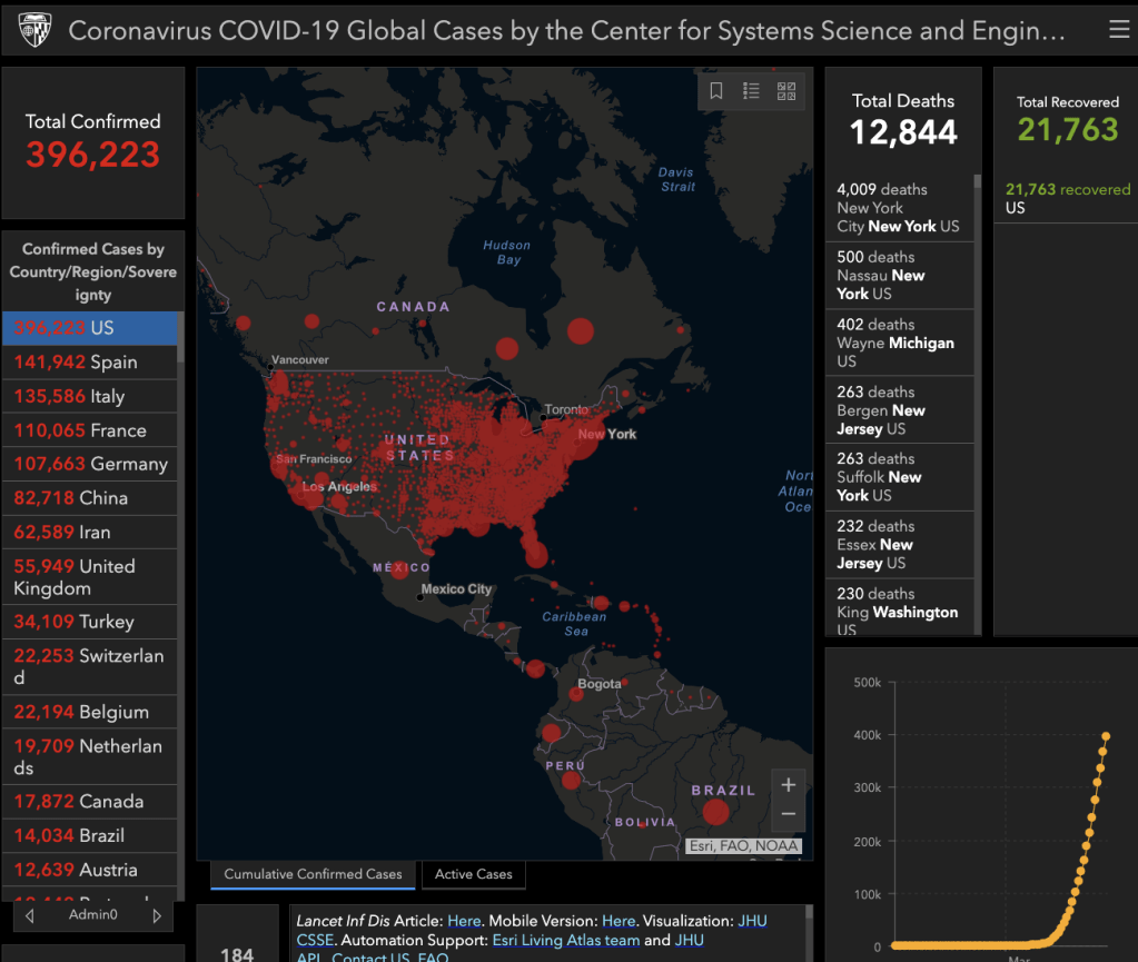
In US we have 12,844 deaths from coronavirus and 396,223 confirmed cases. The entire east coast is now red on the map from Coronavirus COVID-19 Cases Tracker by the Center for Systems Science and Engineering (CSSE) at Johns Hopkins University (JHU).
In Quantitative Technical Analysis of the Coronavirus COVID – 19 Trend I said I expect to see the speed of new Coronavirus COVID – 19 cases to increase exponentially, I’m going to start sharing my observations on it from the lens of a “quant” and a technical chartist. I was planning to have already shared some observations, but I found some issues in the state level data that have now been resolved. Of course, all of the data we are reviewing is deemed to be reliable but none of it is guaranteed. I believe it’s clear the US and the world were not well prepared for a pandemic of this magnitude, which is disappointing considering leaders like George W. Bush and Bill Gates warned of it years ago.
I’m concerned many American’s will become overwhelmed at the sheer speed of the growth of coronavirus in the next week. Although I’m seeing some evidence the rate of change has slowed as a result of “social distancing” and such, it’s still spreading very fast as expected. The key is to realize it is expected, so don’t be too alarmed. I’m going to share some charts for a visual of what is going on with the trend and rate of change. I’ll also share how we are combating it here at the Shell compound. If you haven’t already, I encourage your to read my prior observation Quantitative Technical Analysis of the Coronavirus COVID – 19 Trend since I”m not going to repeat myself here.
I’m taking a top down Global Macro approach to looking at the trends and momentum, just as I review price trends of global capital markets.
As you will see the data source noted in the charts, we are pulling in world and US data from Johns Hopkins Center for Systems Science and Engineering and for state level data from The COVID Tracking Project. I’ve also been monitoring other data sources such as the model referenced in a White House press briefing as the “Chris Murray Model,” which is IHME’s COVID-19 projections show demand for hospital services in each state. The demand for these services is expected to exceed capacity soon, so we’ll take a look at it. I’ve been in touch with quantitative analyst, data scientist, etc. all over the country discussing some of this so it’s been nice to see such solidarity as we enter the early stages of this battle. But, this WAR isn’t just going on here in the United States, it’s a pandemic all over the world and humans are all fighting it.
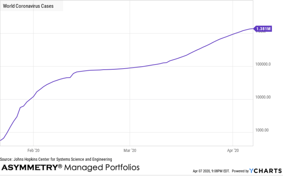
World Coronavirus Cases: 1.381 million for Apr 07 2020
Coronavirus (COVID-19) is a global pandemic that originated in Wuhan, China in 2019. The virus sparked a global economic slowdown because of various countries including China, Italy, and Iran having more than 1000 deaths within the first few months of the virus emerging. The virus also caused many countries to provide fiscal and monetary stimulus. For example, in the United States, the Federal Reserve conducted two surprise rates cuts to lower the Federal Funds rate to nearly 0%. Additionally, parts of the world implemented a complete lockdown of cities to prevent the spread of the virus. The Coronavirus pandemic eclipsed 10,000 cases on February 1, 2020, and 100,000 cases on March 6, 2020.
World Coronavirus Cases is at a current level of 1.381 million, up from 1.345M yesterday. This is a change of 2.67% from yesterday. I’m drawing the charts with a logarithmic scale to illustrate the trend as percentage moves for spacing, rather than number of cases, so a log scale emphasizes the rate of change in a way that linear scales do not.
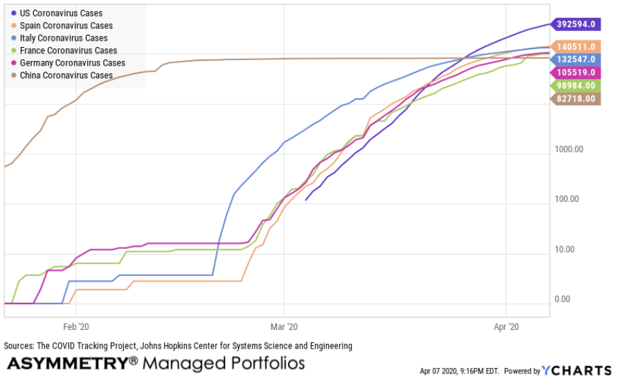
Unfortunately, in the US, we are leading the world in the number of cases.
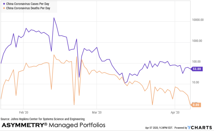
The rate of change and trend in China, where it originated, has supposedly slowed down. Here is China’s reported total cases and deaths.
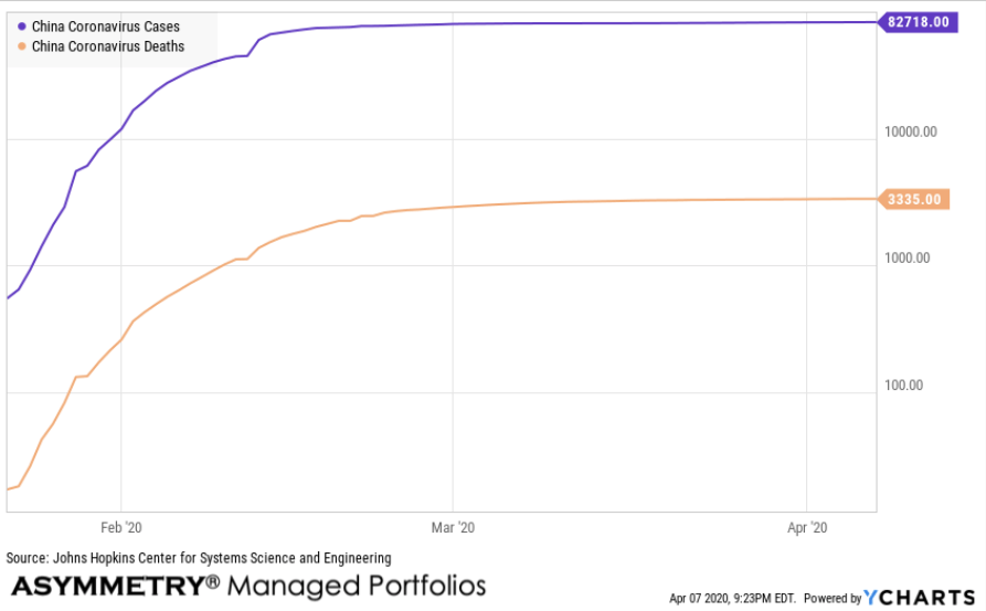
If China is reporting their data accurately, we can see the cases reported per day and deaths per day have trended down the past few weeks.
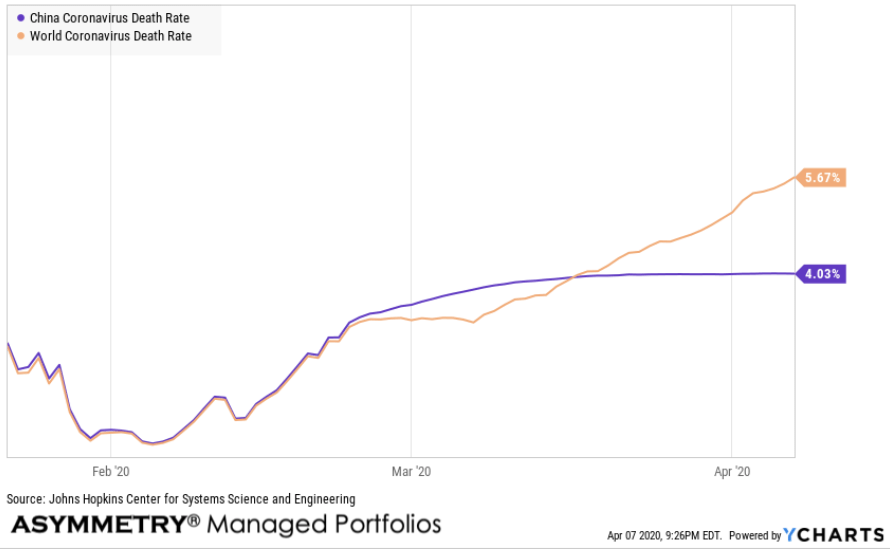
When we compare data and directional trends, it’s sometimes useful to view a relative comparison to see who trends compare across countries, in this case. Below is the death rate of the world relative to China. The current death rate at the world level is 5.67% while China’s reported death rate has stabilized at 4% for weeks. We shouldn’t be alarmed by the death rate of other counties and around the world, however, since different countries have varying ages of population and health care. I expect to see some divergence.
The United STATES of America
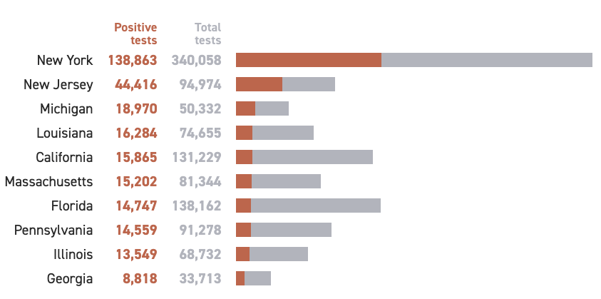
Let’s look at the states. Keep in mind the data isn’t perfect. Since the Centers for Disease Control and Prevention hasn’t yet begun publicly releasing the number of people who have been tested, The COVID Tracking Project is pulling data from state health departments, which can vary in the way they report tests and infections. This COVID Tracking Project was launched out of The Atlantic to fill a major gap in publicly available COVID-19 testing data. Johns Hopkins University maintains a comprehensive case count, but no governmental or institutional source is publishing complete testing data—including not just identified cases, but how many people have been tested, and where. Without this data, we can’t make informed decisions or accurately communicate risks.
Which states have seen the most cases of coronavirus?
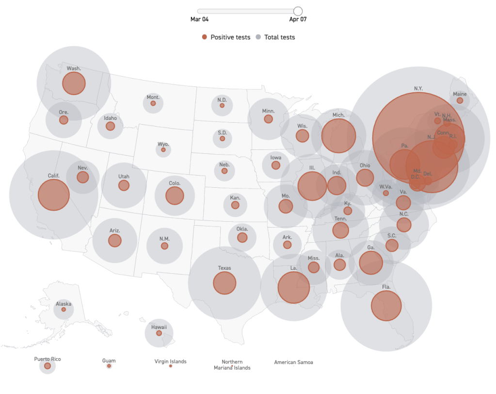
The northeast by a wide margin at this point.
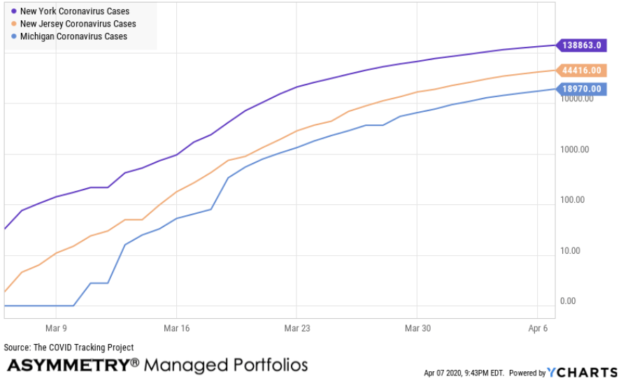
Here are the relative trends of New York, New Jersey, and Michigan on a log scale. Notice the rate of change is slowing.
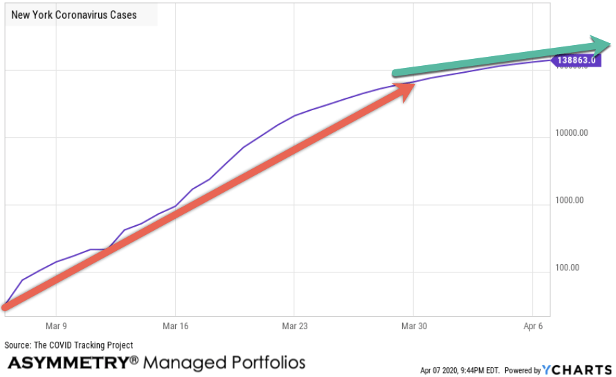
I drew some trends lines to see the slope changing around April 1st in New York.
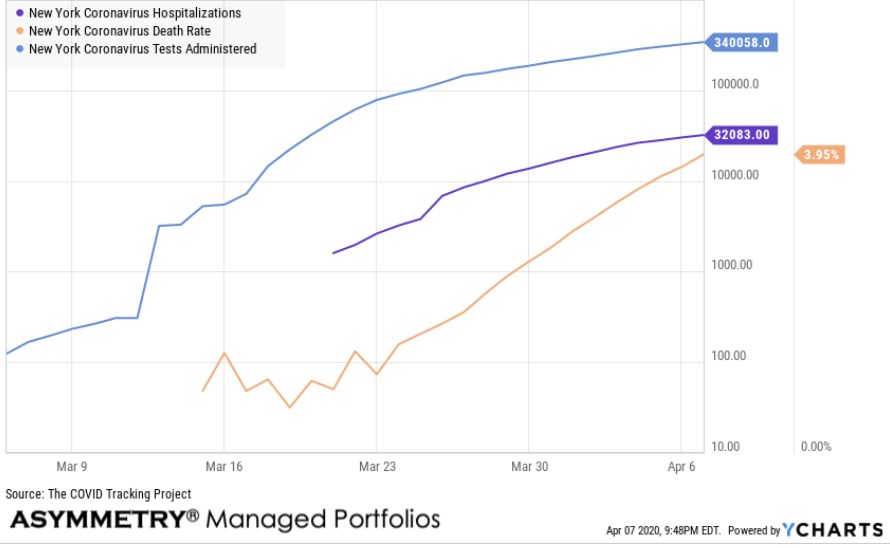
I put the New York number of tests administered, hospitalizations, and death rate on one chart.
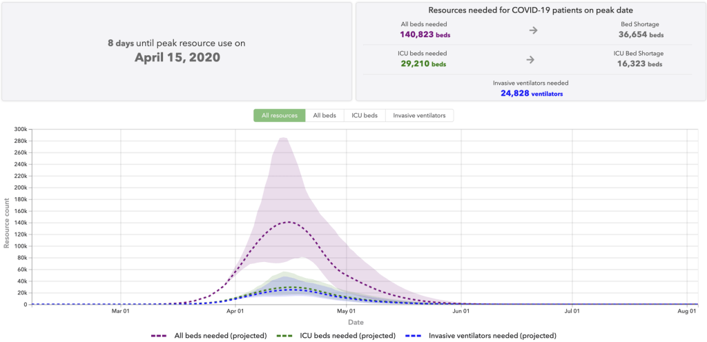
New York is expected to reach its peak resource use tomorrow. I’m going to keep this observation high level and brief without getting into too much weeds, but the next image is from IHME’s COVID-19 projections. They show demand for hospital services in each state. The demand for these services is expected to exceed capacity. Tomorrow, New York is expected to have a hospital bed shortage of 12,476 beds and a shortage of 5,946 ICU beds. IHME predicts 5,664 ventilators will be needed. Keep in mind, this is their educated guess, so their projections may not prove accurate, but we’ll find out soon.
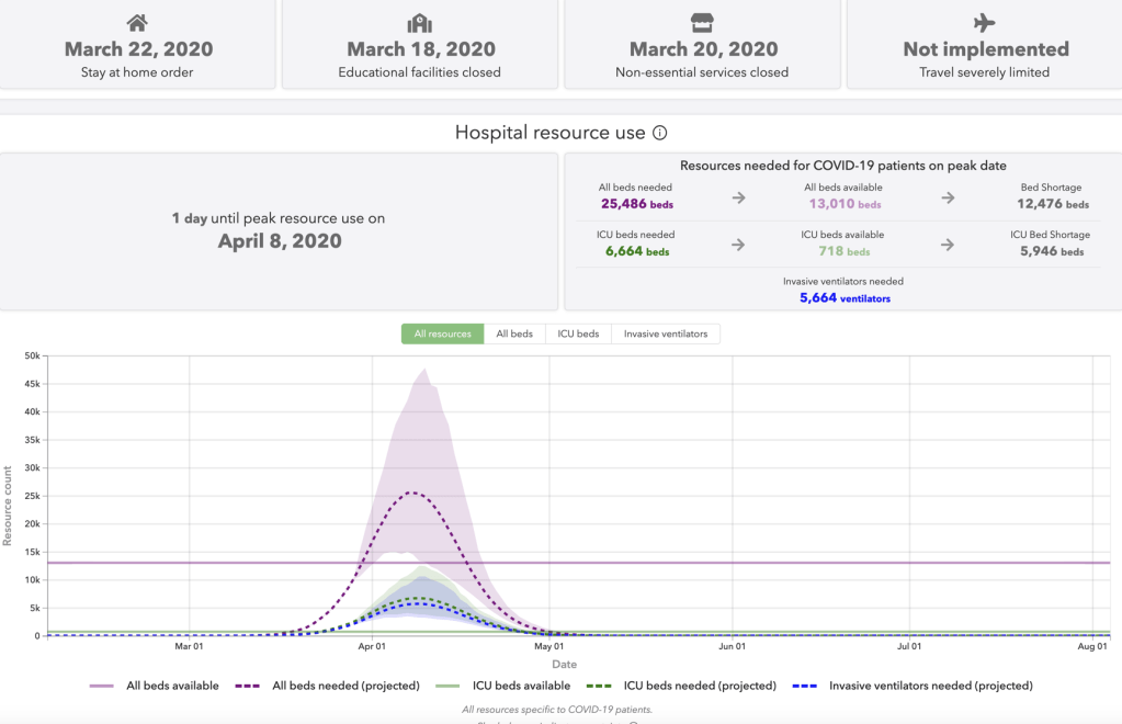
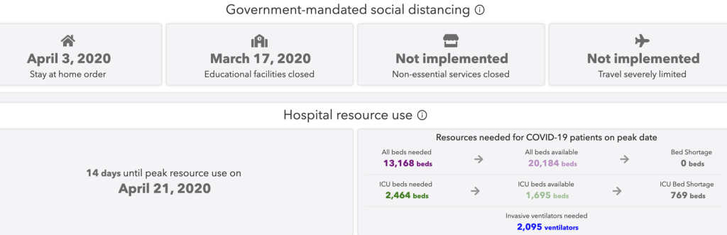
- The numbers for All beds needed and All beds available include ICU beds.
- All beds available is the total number of hospital beds available for COVID patients minus the average historical bed use.
- ICU beds available is the total number of ICU beds available for COVID patients minus the average historical ICU bed use.
- Invasive ventilators needed does not account for the number of ventilators available (ventilator capacity data are not available at this time).
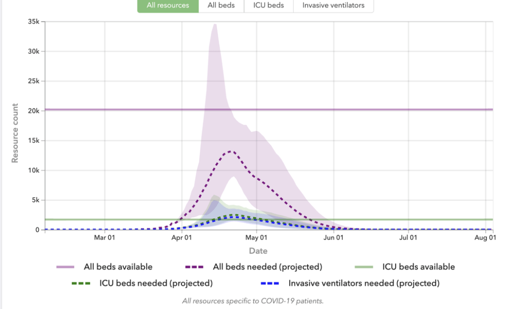
Taking a closer look at the bell shaped curve in the chart, notice there is a colored range around the dotted lines. It’s like the cone of uncertainly we see late summer for hurricanes here in Florida. It shows a range of possible outcomes.
Uncertainty is the range of values that is likely to include the correct projected estimate for a given data category. Larger uncertainty intervals can result from limited data availability, small studies, and conflicting data, while smaller uncertainty intervals can result from extensive data availability, large studies, and data that are consistent across sources. The model presented in this tool has a 95% uncertainty interval and is represented by the shaded area(s) on each chart. The range of outcomes is necessarily wide because of the asymmetric uncertainty. The truth is; we just don’t have a lot of data and information yet, so we make the best of what we do have.
A major concern is the shortage of hospital beds and ventilators, so it’s essential to fight this WAR by simply staying at home and distancing from others for a while. We have clients in New York, so I hope everyone is hunkered down to slow the spread.
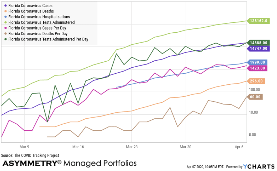
Next up is my current home state of Florida. I included all of the data expect the death rate and I see a lot of uptrends.
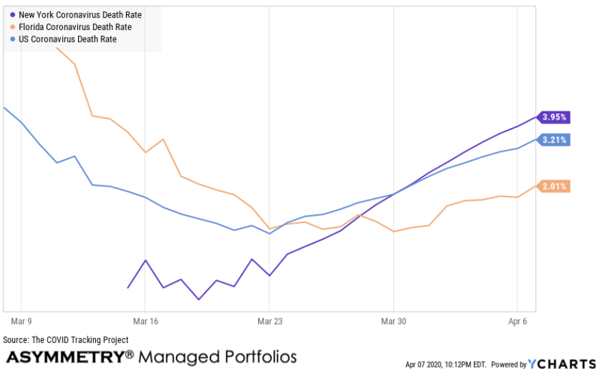
The death rates are around 2% to 4% at this point. I included the US, New York, and Florida.
Going back to hospital resource use, here is the projections for the US. The country is expected to reach peak resource use a week from now. According to the projections, there will be a significant shortage of beds and ventilators. I don’t want to be alarming, this simply tells us the best way to fight this WAR is to avoid it. We don’t want to be the one needing a ICU bed or ventilator, so we have a choice to avoid it by distancing.
I’m most concerned about Florida. Not because I live in Tampa Bay, but because we have an older population of retirees across the state. I also see evidence of strong infections in Miami-Dade, thanks to spring breakers from New York.
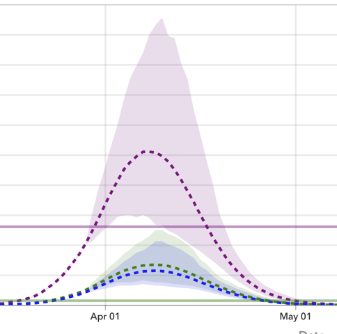
In Florida, we were issued a stay at home order on April 3rd and non-essential services are closed. Florida is expected to reach peak resource use two weeks from today on April 21st, later than most of the country. The good news is, if their projections are accurate, we don’t have as much of a shortage probability here. I supposed Gods waiting room has more beds and such. But we are expected to have a shortage of ventilators.
The possibility band for Florida, however, is tall, which means it could be much higher.
Since we’re looking at Florida, this brings me to another data source I’ve been monitoring. As I discussed in more detail in my last post on COVID – 19, one of the most interesting data I’ve seen is the U.S. health map from Kinsa smart thermometers. The Cumulative Atypical Illness map shows the amount of cumulative unexpected illness, expressed as additional share of the population affected by influenza-like illness, above the expected values.
This is how much influenza-like illness above the normal expected levels they have detected since March 1st. The hot spots are the northeast, Michigan, and south Florida. But, we’re now seeing more red ares all over.
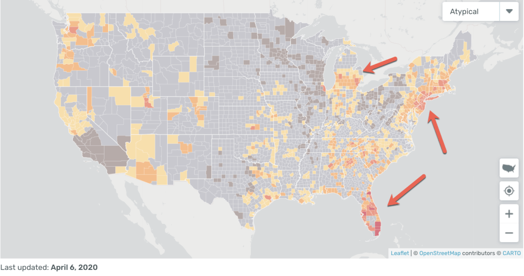
When someone who is using a Kinsa smart thermometer with their phone to track the data, it shows up as atypical when their fever is above what is expected.
The time series chart allows us to compare Kinsa’s observations of the influenza-like illness level in the U.S., in orange and red, against where we’d expect them to be, in blue, and see how that relationship has changed over the past few weeks. The red zone were I drew the arrow below was an early warning of what is likely to be Coronavirus.
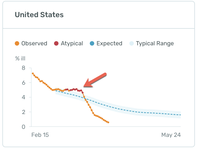
The good news is the observed data has trended below expected now and we attribute it to social distancing.
Inder Singh is the founder & CEO of Kinsa. Kinsa’s mission is to create a real-time map of human health to track — and curb — the spread of infectious illnesses Inder wrote an article on Medium last week titled “Your Sacrifices are Saving Lives” showing how their research finds social distancing is working. If you need to see the evidence, I encourage you to read it.
I don’t like what I’m seeing here in Florida. Take a look at how high the atypical illness trend was recently. The slope was high and steep. At its peak on March 18th, the atypical illness detected was about 7 and the expected range was 2.5, it was about 300% higher that expected. This data tends to be a week or two ahead of new cases.
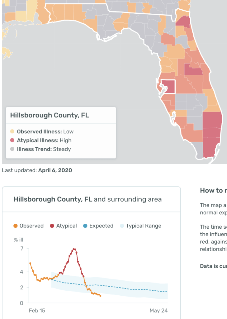
Miami-Dade, Broward, Palm Beach County, Duval, and Orange county look similar.
So, the Coronavirus is just getting ramped up and will spread more in the coming days and weeks. It’s probably going to be alarming to many, especially the deaths.
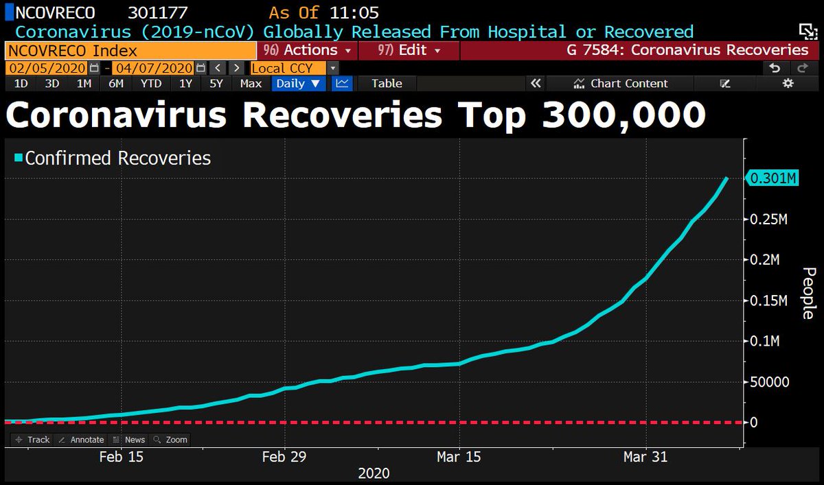
Some good news is 300,000 have recovered.
WE ARE AT WAR
If you want to win this WAR, it’s a matter of distancing and treating everything like it’s infected. Just like the markets, people initially underreact, then they panic because they underreacted, then they overreact.
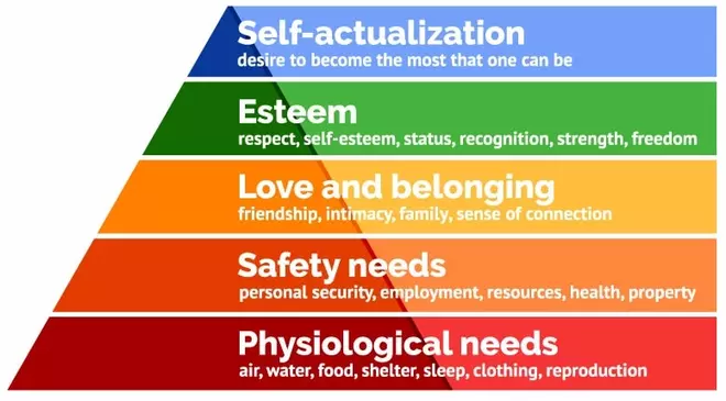
It reminds me of Maslow’s Hierarchy of Needs as we are all focused on the bottom two right now, no matter who you are or how much money we have. Health, air, water, employment, and personal security are top of mind.
Are we wining the WAR?
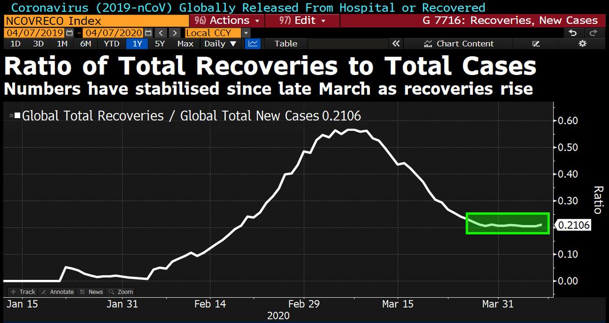
David Ingles at Bloomberg shared this chart and points out one ratio to watch is recoveries to infections. A rising trend is good, a declining trend is bad.
OUR BATTLE PLAN
Here is what we are doing at Camp Shell.
We had already started stocking extra bottled water and food, which we would have done anyway in preparations for hurricane season.
It’s mainly been business as usual for us. The only thing different is we aren’t going out to eat with friends or the grocery store. I haven’t left in a car in two weeks, but we still do our daily walk with the dog and cycle for exercise.
We have gloves, masks, and even suits if necessary.
We’ve stopped bringing the mail and packages in through the front door and instead take them into the garage. We put on gloves to handle them and open them. We open all mail and packages at the trash can in the garage and then wipe it all down with spray and then clean off our rubber gloves. We treat it like it’s infected with a deadly virus. Better safe than sorry. We throw away the mail after anything important is scanned using our iPhone and the Dropbox scanner. Nothing comes in without being wiped down. When we need groceries, we order it online from Publix and they deliver. We handle the groceries the same – nothing enters Camp Shell without being wiped down.
It’s very simple.
If we do this and keep social distancing in the days and weeks ahead, we’ll likely avoid the enemy and win the WAR.
This is a relatively easy WAR to win if you want to win it. As with any combat situation, find the weak link and make is strong.
I hope you are taking this seriously and doing the same.
WE WILL WIN THIS.
It reminds me of US Marine Recon: Swift, Silent, and Deadly.
SEMPER FI
Mike Shell is the Founder and Chief Investment Officer of Shell Capital Management, LLC, and the portfolio manager of ASYMMETRY® Global Tactical. Mike Shell and Shell Capital Management, LLC is a registered investment advisor focused on asymmetric risk-reward and absolute return strategies and provides investment advice and portfolio management only to clients with a signed and executed investment management agreement. The observations shared on this website are for general information only and should not be construed as advice to buy or sell any security. Securities reflected are not intended to represent any client holdings or any recommendations made by the firm. Any opinions expressed may change as subsequent conditions change. Do not make any investment decisions based on such information as it is subject to change. Investing involves risk, including the potential loss of principal an investor must be willing to bear. Past performance is no guarantee of future results. All information and data are deemed reliable but is not guaranteed and should be independently verified. The presence of this website on the Internet shall in no direct or indirect way raise an implication that Shell Capital Management, LLC is offering to sell or soliciting to sell advisory services to residents of any state in which the firm is not registered as an investment advisor. The views and opinions expressed in ASYMMETRY® Observations are those of the authors and do not necessarily reflect a position of Shell Capital Management, LLC. The use of this website is subject to its terms and conditions.

You must be logged in to post a comment.