The chart below is the S&P 500 Stock Index at Inflection Points showing full market cycles since 1997 (16 years).
A few observations:
• You may agree there is a trend here. Several years of upswings followed by downswings, but no meaningful progress for many years. Unfortunately, many people have needed more than this to get the financial freedom they want.
• 100% uptrends are followed by -50% downtrends that are enough to erase the gains from the uptrend. People get euphoric and complacent after 100% uptrends – just in time to participate in the next big waterfall decline.
• You may consider the point where it is now vs. the last time it reached those points.
• And, if you can avoid most of the downside and capture some of the upside (what I call ASYMMETRY®) you could have earned a different result. To achieve that takes real skill, but there are managers who have experience doing it and have actual audited track records as evidence. It will unlikely be achieved by overconfident people who have no experience, skill, and no actual track record.
Click on the chart for a larger view:
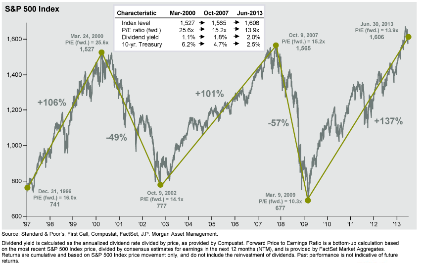
I’m not saying it’s there yet, but if you understand the past no one should be surprised about what can happen next…
“Those who cannot remember the past are condemned to repeat it.”
–George Santayana, – Reason in Common Sense

Pingback: Global Markets Diverge Since May « Asymmetry Observations
Pingback: Asymmetry Observation: Global Markets Diverge Since May « Asymmetry Observations
Pingback: Understanding Hedge Fund Index Performance « Asymmetry Observations
Pingback: Do you choose the blue pill or the red pill? « Asymmetry Observations
Pingback: INVESTOR’S BUSINESS DAILY® Interview « Asymmetry Observations
Pingback: My INVESTOR’S BUSINESS DAILY® Interview and Portfolio Management « Asymmetry Observations