I will first warn that for most investors, zooming in and watching it too closely will more likely lead to a bad outcome. I’ve observed over the years that one of the most common problems of poor investor decisions is watching it too closely – as if it changes the outcome. They end up experiencing every move and reacting to them emotionally. They oscillate between the fear of missing out and the fear of losing money. Since most markets like the stock market can easily swing 5% or more up or down 3 or 4 times a year, they ride an emotional roller coaster. Ultimately, most investors should focus on the primary trend, which I define as a period of 3 – 12 months or more, and that necessarily means accepting some swings.
With that said, I wanted to share a very simple illustration of how I observe the battle of buying and selling pressure (supply and demand) play out visually using charts. We can consider this a continuation of my last post. I have communication with a very wide range of investors, traders, and portfolio managers. Let’s first define those titles. An investor is someone who invests in something; it could be a position they’ll hold for income like commercial real estate or it may be an investment program that is traded on their behalf. An investor is probably looking at 5, 10, or 20-year time frames. A portfolio manager is a person who makes buy and sell decisions within a fund or investment program. A portfolio managers’ time frame depends on their strategy. A portfolio manager can also be seen as a trader, because a trader makes trades, but my traders execute my decisions by executing the trades for me. Then, a trader trying to get the very best price at that moment is focused on tick-by-tick price trends; seconds, not days.
It’s fascinating how different the views of all of these people can be, whether it’s a market maker trading options, a veteran long-term trend follower whose been doing it for decades, or an individual investor who spends some time in the evening reading the headlines. How well their activities help them depends on their true level of expertise and experience – and it takes a lot more of it than people think.
I find that those of us with a very strong understand of how supply and demand is reflected in price action have a better sense of the current conditions and understanding of the market state. Those without it seem to be sitting around trying to figure out what’s going on and what to do next. Sitting around trying to figure out what’s going on and what to do next is like someone handing you the keys to a yacht on the Tennessee River and asking you to take it to the Gulf Coast of Florida and on to the Bahamas. If you are a skilled Captain with a plan of how you’ll time getting through the locks and where you’ll stay overnight, it will be the trip of a lifetime. If not, then I guess you’ll spend a lot of time sitting around trying to figure out what’s going on and what to do next and that’s going to be a gut-wrenching few weeks. And, it could be very costly.
You can probably see my line of thinking as I show you this simple illustration of supply and demand playing out in price action. It gives us a glimpse of how we view what is going on. In the image, you can see the “Candlestick Formation” of a price action of a single day. We borrowed this image from our friends at www.stockcharts.com and if you click that link later it will take you directly to their “Introduction to Candlesticks”. The thin lines are the “shadow” and the larger box is the “Real Body”. If the color is white or green, it closed higher than it opened. Take a close look at the high, close, open, and low of the day to see how they are marked on the “candle”.
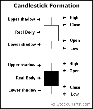
I am going to point out a very simple explanation of what this means. To understand what it means, thinking about what it represents. We see the opening price is marked, then the high of the day, then the low it traded that day, and then the price it closed. That is the full range of the days price action. If we looked at the chart in seconds, weeks, or months, it would be the range over that time frame.
Below is the last 10 days of the S&P 500 stock index price action represented by the SPDR® S&P 500® ETF, which is a fund that, before expenses, generally corresponds to the price and yield performance of the S&P 500® Index. That is, the ETF is tradeable while the index itself is not.

Source: https://stockcharts.com/h-sc/ui
As you can see in the chart, these are candlesticks and they have real body’s and the thin line shadows. Yesterday is the last candlestick – the one with a red body with more line below the body than the top. candlesticks with long lower shadows and short upper shadows indicate that sellers dominated during the first part of the session, driving prices lower. You can see some other days with upper and lower shadows (the thin line) that are about the same, so buyers and sellers moved the price high and low and then settled about where it opened. Sometimes we see candlesticks with a longer upper shadow and shorter lower which indicates that buyers dominated during the first part of the day, driving prices higher. You can probably begin to see how a deep understanding price action can help us define the current trend direction and identify reversals. It gets far more involved when we start thinking about how the days interact with each other and requires more than reading a book and looking at charts a few years to gain some skill at using it to understand what is going on, but this may give you something to ponder. Of course, creating information is one thing, the ability to make it useful is another. But the basics really isn’t that complicated though people often get too caught up in requiring patterns and outcomes to be perfect.
At the end of the day, you can probably see how this tells us want actually happened that day…

You must be logged in to post a comment.