This week marked the 5th anniversary since the March 9, 2009 low in stock market. While much of the talk and writing about it seems to be focused mainly on the upside gains since the low point, it is more important to view it within the context of the big picture.
If you knew on March 9, 2009 that was the low point and could handle the 5 – 10% daily swings that were occurring during that time, then you could have made a lot of money. But, the fact is, many people have emotional reactions after a -10% decline over any period, even more it happens in a day or a week. But even if you don’t, in order to have made a lot of money you would have needed to have exited prior to the large loss before then. You needed cash to invest at the low. I heard some are bragging about their gains since the low, but they left out how much they had lost over the full cycle. It doesn’t mean anything to earn 100% over one period if you lose -50% the next period that wipes it out.
It doesn’t actually matter how much the stock index gained from its low point. What matters is its trend over a full market cycle. People sometimes have trouble seeing and understanding the bigger picture, which is one reason they get caught in traps in the short run.
Below is the price trend of the S&P 500 stock index over the most recent full market cycle. I define a full market cycle as a complete cycle from a peak to low to a new peak. That is, it includes both a “bull market” and a “bear market”. To get an accurate picture, I have used the SPDRs S&P 500 ETF and a total return chart, so it does include dividends. After more than 7 years, the stock index has only gained 35%. Yet, it declined -56% along the way. That isn’t the kind of asymmetry® investors seem to want. If you think about risk reward, 20% is great upside if the downside is only -10%; that is positive asymmetry®. We want to imbalance risk and reward, more of one, less the other.
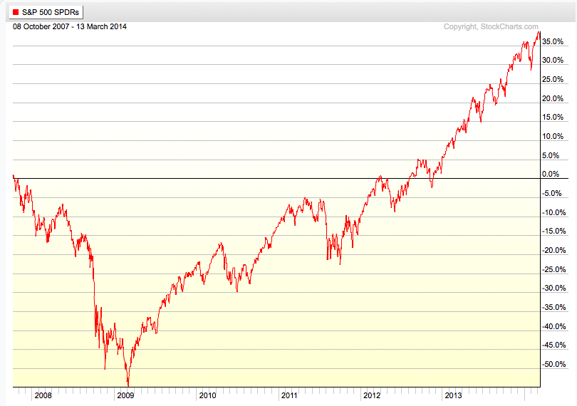
If you look closely, it took 5 years after the October 2007 peak to get back to break even. Though it has taken a long time to recover from the cascade decline, the recovery was impressive in terms of its gains, but extremely volatile for investors to endure.
When looking at a period of over 7 years, the swings don’t seem so significant. To put them into context, there were about 9 declines around 10% or more with the one in 2011 about -20%. This has kept many investors from buying and holding stocks.
If you are good at visual intuition, you may notice the price swings on the left of the chart are much wider than those more recently. This is a visualization of higher volatility as the trend was down and continued volatility caused by indecision between buying pressure and selling pressure.
After prices have trended down, such as the 2008 and 2009 period, the range of prices is wide and investors who held on too long panic, yet buyers aren’t willing to buy at their price.
After a price trend has been drifting up for several years and investors hear about how much it has gained, they become more and more complacent and more optimistic. They do this near a peak.
You can probably see how most investors who lost a lot of money before are likely to do it again. Unless something like the observations I have shared here helps to change their behavior, they are likely to do the same thing they did before.

You must be logged in to post a comment.