Stock Investors Even More Bullish While Japan Falls into Surprise Recession

Following up with Are investors getting overly optimistic again? I pointed out that investor sentiment as measured by the AAII Investor Sentiment Survey had shifted to a point of unusually high bullishness.

After prices trend up, investors get more optimistic as they extrapolate higher prices into the future, assuming that existing trends will continue. Interestingly, they get more bullish as prices are more “overvalued”. As more and more investors become optimistic about stocks in the months ahead, you have to wonder who will continue the buying needed to push stocks higher. A good trend follower knows that trends do indeed often continue, until the demand runs out. Since supply and demand is the driver of all things traded in an auction market, we can observe demand shifts and how it drives prices.

Since I wrote Are investors getting overly optimistic again? less than two weeks ago, the latest AAII Investor Sentiment Survey shows bullishness is even higher.

investor sentiment and asymmetric risk

source: http://www.aaii.com/sentimentsurvey?adv=yes

In the mean time, Fox Business reports this morning “Japan’s economy unexpectedly slipped into recession in the third quarter”. That shouldn’t be a big surprise. If you take a look at the weekly chart of the Japan stock index (priced in Dollars) below, it’s been suggesting something for the past year. I am seeing similar trends (or choppy non-trends) in many global stock markets.

Japan stock market recession

Courtesy of http://www.stockcharts.com

It will be interesting to watch how it all unfolds.

Asymmetrical Risk Definition and Symmetry: Do you Really Want Balance?

Asymmetric is imbalance, uneven, or not the same on both sides.

Risk is the possibility of losing something of value, or a bad outcome. The risk is the chance or potential for a loss, not the loss itself. Once we have a loss, the risk has shifted beyond a possibility to a real loss. The investment or position itself isn’t the risk either, risk is the possibility we may lose money in how we manage and deal with it.

Asymmetrical Risk, then, is the potential for gains and losses on an investment or trade are uneven.

When I speak of asymmetric risk, I may also refer to the probability for gains and losses that are imbalanced, for those of us who can determine probability. If the probability of losing something or a bad outcome is asymmetric, it means the risk isn’t the same as the reward.

Asymmetric risk can also refer to the outcome for profits and losses that are imbalanced, after we have sold a position, asset, or investment.

Some examples:

If we risk $10, but earn $10, the risk was symmetrical.

  • We risked $10
  • We earned $10 – we just broke even (symmetry).

Symmetry is the outcome when you balance risk and reward.

If we risk $10, but earn $20, the risk was positively asymmetric.

  • We risked $10
  • We earned $20

If we risk $10, but lose $10, the risk was symmetrical.

  • We risked $10
  • We lost $10 – we lost the same as we risked.

If we risk $10, but lose $20, the risk was an asymmetric risk.

  • We risked $10
  • We lost $20 – we lost even more than we though we risked.

Strangely, I often hear investment advisers say they want to balance risk and reward through their asset allocation.

Do you?

It was when I noticed my objective of imbalancing profit and loss, risk and reward, was so different from others that I knew I have a unique understanding and perception of the math and I could apply it to portfolio management.

You can probably see how some investors earn gains for years, then lose those gains in the following years, then earn gains again, then lose them again.

That’s a result of symmetry and its uncontrolled asymmetrical risk.

You can probably see why my focus is ASYMMETRY® so deeply that the word is my trademark.

Small vs. Large Stocks: A Tale of Two Markets (Continued)

A quick follow up to my recent comments about the down trend in smaller company stocks in Playing with Relative Strength and Stock Market Peak? A Tale of Two Markets below is a chart and a few observations:

Rusell 2000 Small Caps vs S&P 500 large caps

Source: Bloomberg/KCG

A few observations of the trend direction, momentum, and relative strength.

  • The S&P 500 index (the orange line) of large company stocks has been  in a rising trend of higher highs and higher lows (though that will not continue forever).
  • The white line is the Russell 2000 small company index has been in a downtrend of lower highs and lower lows, though just recently you may observe in the price chart that it is at least slightly higher than its August high. But it remains below the prior two peaks over the past year. From the time frame in the chart, we could also consider it a “non-trending” and volatile period, but its the lower highs make it a downtrend.
  • The green chart at the bottom shows the relative strength between S&P 500 index of large company stocks and the Russell 2000 small company index. Clearly, it hasn’t taken all year to figure out which was trending up and the stronger trend.
  • Such periods take different tactical trading skills to be able to shift profitability. When markets get choppy, you find out who really knows what they’re doing and has an edge. I shared this changing trend back in May in Stock Market Peak? A Tale of Two Markets.

If you are unsure about the relevance of the big picture regarding these things, read Playing with Relative Strength and Stock Market Trend: reverse back down or continuation? and Stock Market Peak? A Tale of Two Markets.


Stock Market Trend: reverse back down or continuation?

I normally don’t comment here on my daily observations of very short-term directional trends, though as a fund manager I’m monitoring them every day. The current bull market in stocks is aged, it’s lasted much longer than normal, and it’s been largely driven by actions of the Fed. I can say the same for the upward trend in bond prices. As the Fed has kept interest rates low, that’s kept bond prices higher.

Some day all of that will end.

But that’s the big picture. We may be witnessing the peaking process now, but it may take months for it all to play out. The only thing for certain is that we will only know after it has happened. Until then, we can only assess the probabilities. Some of us have been, and will be, much better at identifying the trend changes early than others.

With that said, I thought I would share my observations of the very short-term directional trends in the stock market since I’ve had several inquiring about it.

First, the large company stock index, the S&P 500, is now at a point where it likely stalls for maybe a few days before it either continues to trend up or it reverses back down. In “Today Was the Kind of Panic Selling I Was Looking For” I pointed out that the magnitude of selling that day may be enough panic selling to put in at least a short-term low. In other words, prices may have fallen down enough to bring in some buying interest. As we can see in the chart below, that was the case: the day I wrote that was the low point in October so far. We’ve since seen a few positive days in the stock index.

stock index 2014-10-22_15-06-14

All charts in this article are courtesy of http://www.stockcharts.com and created by Mike Shell

Larger declines don’t trend straight down. Instead, large declines move down maybe -10%, then go up 5%, then they go down another -10%, and then back up 7%, etc. That’s what makes tactical trading very challenging and it’s what causes most tactical traders to create poor results. Only the most experienced and skilled tactical decision makers know this. Today there are many more people trying to make tactical decisions to manage risk and capture profits, so they’ll figure this out the hard way. There isn’t a perfect ON/OFF switch, it instead requires assessing the probabilities, trends, and controlling risk.

Right now, the index above is at the point, statistically, that it will either stall for maybe a few days before it either continues to trend up or it reverses back down. As it all unfolds over time, my observations and understanding of the “current trend” will evolve based on the price action. If it consolidates by moving up and down a little for a few days and then drifts back up sharply one day, it is likely to continue up and may eventually make a new high. If it reversed down sharply from here, it will likely decline to at least the price low of last week. If it does drift back to last weeks low, it will be at another big crossroads. It may reverse up again, or it may trend down. Either way, if it does decline below low of last week, I think we’ll probably see even lower prices in the weeks and months ahead.

Though I wouldn’t be surprised if the stock index does make a new high in the coming months, one of my empirical observations that I think is most concerning about the stage of the general direction of the stock market is that small company stocks are already in a downtrend. Below is a chart of the Russell 2000 Small Cap Stock Index over the same time frame as the S&P 500 Large Cap Stock Index above. Clearly, smaller companies have already made a lower low and lower highs. That’s a downtrend.

small company stocks 2014 bear market

Smaller company stocks usually lead in the early stage of bear markets. There is a basic economic explanation for why that may be. In the early stage of an economic expansion when the economy is growing strong, it makes sense that smaller companies realize it first. The new business growth probably impacts them in a more quickly and noticeable way. When things slow down, they may also be the first to notice the decline in their earnings and income. I’m not saying that economic growth is the only direct driver of price trends, it isn’t, but price trends unfold the same way. As stocks become full valued at the end of a bull market, skilled investors begin to sell them or stop investing their cash in those same stocks. Smaller companies tend to be the first. That isn’t always the case, but you can see in the chart below, it was so during the early states of the stock market peak in 2007 as prices drifted down into mid 2008. Below is a comparison of the two indexes above. The blue line is the small stock index. In October 2007, it didn’t exceed its prior high in June. Instead, it started drifting down into a series of lower lows and lower highs. It did that as the S&P 500 stock index did make a prior high.

small stocks fall first in bear market

But as you see, both indexes eventually trended down together.

As a reminder to those who may have forgotten, I drew the chart below to show how both of these indexes eventually went on to lower lows and lower highs all the way down to losses greater than -50%. I’m not suggesting that will happen again (though it could) but instead I am pointing out how these things look in the early stages of their decline.

2008 bear market

If you don’t have a real track record evidencing your own skill and experience dealing with these things, right now is a great time to get in touch. By “real”, I’m talking about an actual performance history, not a model, hypothetical, or backtest. I’m not going to be telling you how I’m trading on this website. The only people who will experience that are our investors.


Markets don’t always react the way investors expect, so I focus on what is actually happening

hedge fund market wizards

I noted the below question and answer between Jack Schwager and Ray Dalio in Jack’s book “Hedge Fund Market Wizards: How Winning Traders Win” (2012). Ray Dalio is the founder of Bridgewater, the largest hedge fund in the world and one of the most successful. I saved it when I read the book as a fine example that markets don’t always react the way people expect, and that is why I focus instead on what is actually happening rather than what could or should happen – but may not. Everything is very transient, coming and going, and it’s funny how some of the same kinds of things happen over and over again. As you read comments below you’ll hear it’s always a similar story, different day. 1982 was the end of a 20 year secular bear market made up of huge swings similar to the past decade and the beginning of the largest bull market on record up to 2000.

Below is Jack Schwager asking a question to Ray Dalio:

Any other early experiences stand out where the market behaved very differently from what you expected?

In 1982, we had worse economic conditions than we do right now. The unemployment rate was over 11 percent. It also seemed clear to me that Latin America was going to default on its debt. Since I knew that the money center banks had large amounts of their capital in Latin American debt, I assumed that a default would be terrible for the stock market. Then boom—in August, Mexico defaulted. The market responded with a big rally. In fact, that was the exact bottom of the stock market and the beginning of an 18-year bull market. That is certainly not what I would have expected to happen. That rally occurred because the Fed eased massively. I learned not to fight the Fed unless I had very good reasons to believe that their moves wouldn’t work. The Fed and other central banks have tremendous power. In both the abandonment of the gold standard in 1971 and in the Mexico default in 1982, I learned that a crisis development that leads to central banks easing and coming to the rescue can swamp the impact of the crisis itself.

Source: Schwager, Jack D. (2012-04-25). Hedge Fund Market Wizards (pp. 54-55). John Wiley and Sons. Kindle Edition.

All of this, everything that is happening and expected to happen, will be reflected in the directional trend and volatility of price. The directional price and range of prices (volatility) will overreact at times and under-react at others, but it will reflect what is actually going on. Because the direction and volatility of price “is” what matters.

Interest Rates and Dollar Rising, Commodities Falling

I believe an edge I have developed as a global tactical investment manager over the past two decades is a strong understanding how markets interact with each other and their return drivers, but most important is the directional trend. Below I show that interest rates are rising. $FVX is the 5 year Treasury Yield and $UST2Y is the 2 year yield. If we define an uptrend as higher highs and higher lows, both are trending up.

source: http://www.stockcharts.com

You can probably see how when interest rates rise on U.S. Dollar bonds, that may also increase the yield on the U.S. Dollar. For U.S. investors, the rising rates are eventually reflected in money markets, CDs, and new bond issues. Below is a chart of the U.S. Dollar so you can see how it is trending up sharply since July.

When the U.S. Dollar rises, that usually drives just the oppose in Gold. Below is the directional drift of gold.

A rising U.S. Dollar (from rising interest rates) also drives down the price of some commodities. Below we see the price trend a broad based commodity index that includes a basket of many different commodities.

Looking closer at commodities, below we see that wheat, sugar, corn, cotton, and agriculture are trending down. So much for inflation! Those who have believed the U.S. would see strong inflation have been wrong. These commodity trends suggest prices have been falling the past year, not rising.

Finally, I’ll add that the direction of the U.S. Dollar also drives foreign currency relative to the U.S. Dollar. For example, the British Pound and Euro and drifting down as the Dollar is rising. Investors around the world have choices about where to invest their cash. When one currency yields more than another, or is expected to, it could attract demand for that currency. Demand leads to rising price trends.

You can probably see how these global markets are interconnected and driven by the same things. A strong understanding of how global markets interact with each other is an edge in global tactical trading and allocation. Of course, something that may be of concern for traditional stock and bond investors may be how rising rates drive their positions. If rates continue to rise, bond prices will eventually fall.


What’s the Fed Going to Do Next?

The talk about what the Federal Reserve Open Market Committee (“the Fed”) will do next is a fascinating example of investor behavior. The days leading up the Fed meeting and decision announcement is filled with speculations about what’s going to happen next. The Fed has been so involved in driving capital markets these past several years that some of the talk about it is ridiculous. One Fed watcher at the Wall Street Journal says everyone is waiting to see if they continue to use the words “considerable time”, or not. Another article argued it’s not about “considerable time”, but something else.

None of it matters.

None of the people talking about what the Fed will do next know what they will do. They also don’t know how markets will respond to it.

That’s all that matters.

The only thing that matters is the directional trend. There are an infinite number of time frames for a trend. For example, I’ve drawn a chart below for the popular large company stock index, the S&P 500. Over this period, it’s trend is up. It has moved up and down over shorter time frames, but overall the recent trend is up. Stock investors should focus on the direction of the trend, and identify and react when it changes.

S&P 500 Stock Index 2014-09-17_14-55-54

source: http://www.stockcharts.com

We can say the same for other markets. The Fed decisions drive certain interest rates that impact global markets. That necessarily means their actions may impact currency (the Dollar), bonds, commodities, and alternatives like volatility and real estate.

I focus on the directional trend. I’m never trying to figure out what’s going to happen next. Instead, I know exactly what I’ll do at certain prices. I’ll exit to cut a loss here, enter a new trend there, or take a profit.

I don’t need to know what they’ll do. I only need to know how the trend will respond to it and how I’ll respond to any change in that trend.

Flaw of Averages

In Declining (Low) Volatility = Rising (High) Complacency I said:

“The VIX has a long-term average of about 20 since its inception. At this moment, it is 11.82. It’s important to realize the flaw of averages here, because the VIX doesn’t actually stay around 20 – it instead averages 20 as it swings higher and lower.”

The flaw of averages is the term used by Sam L. Savage to describe the fallacies that arise when single numbers (usually averages) are used to represent uncertain outcomes.

A fine example of the flaw of averages involves a 6 ft. tall statistician who drowns while crossing a river that is 3 ft. deep on average.


DanzigerCoverArtSavage

Source: http://www.danzigercartoons.com/

You can probably see how assumptions using averages can get us in trouble. It only takes a little to be “too much”… and that is mostly likely a problem when we expect the average and the possible range is much wider.

Asymmetric Volatility

Asymmetric Volatility is an observed phenomenon that volatility is higher in declining markets than in rising markets.

Asymmetric Volatility Phenomenon


You can probably see how we can relate this as asymmetric risk: the downside risk is higher than upside reward.

Asymmetric Risk

The VIX, as I see it…

The CBOE Volatility Index (VIX) reached a low point last week not seen since 2007 as evidenced by the chart below.

CBOE VOLATILITY INDEX HISTORY

To see a closer view of the last period, below I included the last time the VIX was at such a low value. I show this to point out that the VIX oscillated between 9% and 12% for about 4 months before it finally spiked up to 20. Such a trend reversal (or mean reversion if you prefer) can take time. Imagine if the VIX stays this low for the next 4 months before a spike. Or, it could happen very soon. You may notice the VIX reached the level it is now at its lowest level in early 2007. If we believed these trends repeat perfectly, that absolute level would matter. Trends are more like snowflakes: no two are exactly the same. But in relative terms, the fact that today’s level is as low as the lowest point in early 2007 is meaningful if you care about the risk level in stocks and the stage of the market cycle.

CBOE VOLATILITY INDEX VIX Low levels

The best way to examine a trend is to zoom in. Start with a broader view to see the big picture, then zoom in closer and closer. When people focus too much on the short-term, they miss the forest for the trees. Below is the last time the VIX was below 12. You may notice that is does oscillate up and down in a range.

VIX BELOW 12

The level and directional trend of the VIX matters because of the next chart. You may see a trend if you look closely. The black line is the S&P 500 stock index. The black and red line is the VIX CBOE Volatility Index. You may notice the two tend to drift in opposite directions. Not necessarily on a daily basis, but overall they are “negatively correlated”. When the stock index is rising, the volatility is often falling or already at a low level. When the stock index is falling, volatility rises sharply. It isn’t a perfect opposite, but it’s there.

VIX and S&P 500 correlation and trend

If you are interested in stock trends and the trend in volatility, and specifically the current state of those cycles,  you may want to follow along in the coming days. I plan to publish a series on this topic about the VIX, as I see it. Over the last week or so I have written several ideas that I intended to publish as one large piece. Since I haven’t had time to tie it together that way, I thought I would instead publish a series.

When a trend reaches an extreme level like this, it may be useful to spend some time with it.

Stay tuned…

if you haven’t already, you may want to click on “Follow” to the right to get updates by email to follow along. This will likely be several informal notes in the coming days.


Global Macro: Russia was already a bear market

On Monday, the Russia stock market, as measured by the MSCI Russia Capped Index, declined over -8% with the headlines filled with news about their military actions. Based on that index of stocks, the Russian stock market was already in a bear market. Big down days often occur when selling pressure is already present. That’s how good price trend systems can avoid waterfall declines. Selling pressure causes prices to fall and falling prices lead to “serial correlation”. That is, prices decline because people are selling because prices are falling. There isn’t a requirement for a fundamental or economic reason. The reason is behavior: people who experience the decline you see in the chart below get to a point that they “tap out”. They tap out just because they are losing money and they have reached their “Uncle!” point. On Monday, the decline didn’t just stop at -4% because people wanted to cut their losses and that selling pressure pushes the price even lower.

russia stock market bear market

How do I qualify?

Someone passed along one of those passionate political videos with a thought-provoking title, so I watched. It started out with

You want to see something really disturbing? Go to any search engine and type in “how do I qualify” and see what comes up.

I was a surprised by what he said I would find, so I stopped and did just that.

What do you think of when you ponder “How do I qualify”? For college? for a certain job? for a home loan? for medical school? business school? law school? the military? for a private investment program?

According to the Yahoo! search engine, below are the top things Americans want to know when searching  “How do I qualify”.

how do I qualify

Source: https://www.yahoo.com/

Wow… that is a shocker. I would have lost that bet.

Maybe they’re right. Some of us must be out of touch with the world as it really is.

Is the Bull Topping Process Starting?

There are several things that unfold as a market begins the topping process. While large cap indexes may continue to make new highs, the market becomes more and more selective. We’ll see that in breadth indicators like bullish percent indexes, Advance Decline Lines, etc. As the market finds fewer and fewer stocks attractive, it becomes more selective, so fewer stocks remain in positive trends.

The current bull market in stocks is about 58 months old. As I explained in The REAL Length of the Average Bull Market the bull markets have averaged about 39 months and bear markets about 17 months. A full market cycle (average bull + bear) is 56 months. The current bull market, then, is longer than the historical average full market cycle. So, it makes a lot of sense to start watching for signs the topping process has started. It’s important to understand a bull markets end with a process of churning up and down and with fewer stocks participating in the last stage of advances.

Below is an example of fewer stocks participating. The S&P 500 Bullish Percent Index shows a composite of the 500 stocks in the S&P 500 index that are in a positive trend. The lower highs made over the past year is beginning to show fewer of those stocks are making buy signals as the S&P 500 index has made new highs. It appears the selectivity is in its early stage as the percent of stocks on a buy signal is still around 70%, but it’s falling. This is just one example of the kind of things I observe when watching for a topping process.

NYSE Bullish Percent

Source: https://stockcharts.com/def/servlet/SC.pnf?c=$BPSPX,P

Below I list a table of several other bullish percent’s for stock indexes. Using Point & Figure terminology,  they are either a Bull Top (the chart is falling (in a column of Os) but above 70%) or Bear Confirmed (chart is falling (column of O’s) below 70% and has generated a P&F sell signal). I wouldn’t be surprised to see these get a lot lower in the months ahead. However, what makes it difficult for most people is the process is made up of advances and declines, not usually just a straight down move. The whipsaws up and down is what causes the most trouble.

Index Bullish% Status Status Change
Russell 2000 64.03% Bear Alert 30-Aug-13
Dow Industrials 63.33% Bear Confirmed 31-Jan-14
NASDAQ 100 65.00% Bear Confirmed 29-Jan-14
NYSE 61.55% Bear Confirmed 27-Jan-14
Optionable Stocks 67.60% Bear Confirmed 31-Jan-14
S&P SmallCap 600 67.55% Bear Confirmed 31-Jan-14
AMEX 63.31% Bull Confirmed 2-Jan-13
NASDAQ Composite 62.68% Bull Confirmed 2-Jan-13
Wilshire 5000 66.29% Bull Confirmed 2-Aug-13
S&P 100 70.71% Bull Top 13-Dec-13
S&P 500 68.41% Bull Top 24-Jan-14
S&P Composite 1500 70.30% Bull Top 28-Jan-14
S&P MidCap 400 72.64% Bull Top 27-Jan-14

Getting Technical about Supply and Demand

I will first warn that for most investors, zooming in and watching it too closely will more likely lead to a bad outcome. I’ve observed over the years that one of the most common problems of poor investor decisions is watching it too closely – as if it changes the outcome. They end up experiencing every move and reacting to them emotionally. They oscillate between the fear of missing out and the fear of losing money. Since most markets like the stock market can easily swing 5% or more up or down 3 or 4 times a year, they ride an emotional roller coaster. Ultimately, most investors should focus on the primary trend, which I define as a period of 3 – 12 months or more, and that necessarily means accepting some swings.

With that said, I wanted to share a very simple illustration of how I observe the battle of buying and selling pressure (supply and demand) play out visually using charts. We can consider this a continuation of my last post. I have communication with a very wide range of investors, traders, and portfolio managers. Let’s first define those titles. An investor is someone who invests in something; it could be a position they’ll hold for income like commercial real estate or it may be an investment program that is traded on their behalf. An investor is probably looking at 5, 10, or 20-year time frames. A portfolio manager is a person who makes buy and sell decisions within a fund or investment program. A portfolio managers’ time frame depends on their strategy. A portfolio manager can also be seen as a trader, because a trader makes trades, but my traders execute my decisions by executing the trades for me. Then, a trader trying to get the very best price at that moment is focused on tick-by-tick price trends; seconds, not days.

It’s fascinating how different the views of all of these people can be, whether it’s a market maker trading options, a veteran long-term trend follower whose been doing it for decades, or an individual investor who spends some time in the evening reading the headlines. How well their activities help them depends on their true level of expertise and experience – and it takes a lot more of it than people think.

I find that those of us with a very strong understand of how supply and demand is reflected in price action have a better sense of the current conditions and understanding of the market state. Those without it seem to be sitting around trying to figure out what’s going on and what to do next. Sitting around trying to figure out what’s going on and what to do next is like someone handing you the keys to a yacht on the Tennessee River and asking you to take it to the Gulf Coast of Florida and on to the Bahamas. If you are a skilled Captain with a plan of how you’ll time getting through the locks and where you’ll stay overnight, it will be the trip of a lifetime. If not, then I guess you’ll spend a lot of time sitting around trying to figure out what’s going on and what to do next and that’s going to be a gut-wrenching few weeks. And, it could be very costly.

You can probably see my line of thinking as I show you this simple illustration of supply and demand playing out in price action. It gives us a glimpse of how we view what is going on. In the image, you can see the “Candlestick Formation” of a price action of a single day. We borrowed this image from our friends at www.stockcharts.com and if you click that link later it will take you directly to their “Introduction to Candlesticks”. The thin lines are the “shadow” and the larger box is the “Real Body”. If the color is white or green, it closed higher than it opened. Take a close look at the high, close, open, and low of the day to see how they are marked on the “candle”.

candle1-formation

I am going to point out a very simple explanation of what this means. To understand what it means, thinking about what it represents. We see the opening price is marked, then the high of the day, then the low it traded that day, and then the price it closed. That is the full range of the days price action. If we looked at the chart in seconds, weeks, or months, it would be the range over that time frame.

Below is the last 10 days of the S&P 500 stock index price action represented by the  SPDR® S&P 500® ETF, which is a fund that, before expenses, generally corresponds to the price and yield performance of the S&P 500® Index. That is, the ETF is tradeable while the index itself is not.

S&P 500 2013-10-24_08-00-42

Source: https://stockcharts.com/h-sc/ui

As you can see in the chart, these are candlesticks and they have real body’s and the thin line shadows. Yesterday is the last candlestick – the one with a red body with more line below the body than the top. candlesticks with long lower shadows and short upper shadows indicate that sellers dominated during the first part of the session, driving prices lower. You can see some other days with upper and lower shadows (the thin line) that are about the same, so buyers and sellers moved the price high and low and then settled about where it opened. Sometimes we see candlesticks with a longer upper shadow and shorter lower which indicates that buyers dominated during the first part of the day, driving prices higher. You can probably begin to see how a deep understanding price action can help us define the current trend direction and identify reversals. It gets far more involved when we start thinking about how the days interact with each other and requires more than reading a book and looking at charts a few years to gain some skill at using it to understand what is going on, but this may give you something to ponder. Of course, creating information is one thing, the ability to make it useful is another. But the basics really isn’t that complicated though people often get too caught up in requiring patterns and outcomes to be perfect.

At the end of the day, you can probably see how this tells us want actually happened that day…

What in the World is Really Going on, Part 2: Kicking the Can Down the Road

Jim Rogers says it best.

What in the World is Really Going on

I find that people don’t know what in the world is really going on or understand the big picture beyond what has happened most recently. They don’t really understand the aggressive Fed policies the past five years or the long-term debt cycle of the United States. If you really want to understand what is really going on in the big picture, I encourage you to watch this 30-minute video How The Economic Machine Works by Ray Dalio. After you watch it, you’ll understand how debt cycles work, how the Fed operates, and the current cycle the U.S. is in today. That is, you’ll begin to understand what in the world is going on in a way that only a few people do. It’s the kind of information and understanding you’ve previously never had access to.

And, you won’t be so surprised by what happens next…

Asymmetric Payoff: The Price of College Sports

Schooled- The Price of College Sports

Not all asymmetric payoffs are fair. As the college football season gets into full speed, college sports gets some unwanted publicity. It was sickening to hear Arian Foster say:

“I called my coach and I said, ‘Coach, we don’t have no food. We don’t have no money. We’re hungry. Either you give us some food, or I’m gonna go do something stupid.’ He came down and he brought like 50 tacos for like four or five of us. Which is an NCAA violation. [laughs] But then, I walk up to the facility and I see my coach pull up in a brand new Lexus.” — Arian Foster

It’s sickening not so much because the coach broke the rules by feeding a player, but instead that someone who works as hard as a student athlete is sitting there hungry in the United States of America. And, while the college sports “industry” earns billions of dollars in profits. You surely don’t have to be a hardcore Libertarian to see the problem with that. It’s no surprise that many college athletes don’t have financial support from their family. It’s time for universities to focus on how to at least be sure student athletes have food and decent living conditions. I think they earn it.


The conversation will get started when the documentary Schooled: The Price of College Sports premieres Wednesday October 16th 8PM on EPIX:

“The EPIX Original Documentary Schooled: The Price of College Sports is a comprehensive look at the business, history and culture of big-time college football and basketball in America. It is an adaptation of “The Cartel” by Pulitzer Prize Winning civil rights scholar Taylor Branch, and his October 2011 article in The Atlantic, “The Shame of College Sports.” Schooled presents a hard-hitting examination of the NCAA’s treatment of its athletes and amateurism in collegiate athletics; weaving interviews, archival and verité footage to tell a story of how college sports became a billion dollar industry built on the backs of athletes who are deprived of numerous rights.”

Read more: Schooled: The Price of College Sports

Game Changing Asymmetry

ORACLE Team USA

Source: ORACLE® Team USA

If things actually worked they way we are taught in school, all you need to do it get a “college degree” and you’ll be successful.

The reality is, learning the essentials like reading, writing, and arithmetic are basic requirements like eating, sleeping, and you know what.

To be great at something, we have to do a lot more than the basics.

You may consider that many of the greatest game-changers in America didn’t need anyone to tell them what to do next. They instead charted their own course and it was one that didn’t exist before.

Our society wants us to fit into the middle of the bell curve like the average person, but for some of us it’s a lot more fun to be an outlier,

Congratulations! To Larry Ellison and his ORACLE® Team USA for completing an improbable comeback to win Race 19 to successfully defend the 34th America’s Cup on Wednesday in San Francisco.

It’s a fine example of a game-changing asymmetry.

Before the huge win, Larry Ellison, who is co-founder and CEO of ORACLE®, was criticized for skipping a keynote address at a company conference to instead watch the comeback of his regatta team. It was a once in a lifetime moment only a few will ever experience by a man who has earned his freedom.

It’s a fine example of knowing when to get off the treadmill…

And, if you know the story, this unlikely outcome came from an unlikely team to start with. The combination of a billionaire CEO and a car radiator mechanic. The story is in The Billionaire and the Mechanic by Julian Guthrie. (I’ve been listening to the Audible version). It’s about how an unlikely duo won the sport’s oldest trophy – before this one. From Amazon:

“The America’s Cup, first awarded in 1851, is the oldest trophy in international sports, and one of the most hotly contested. In 2000, Larry Ellison, co-founder and billionaire CEO of Oracle Corporation, decided to run for the coveted prize and found an unlikely partner in Norbert Bajurin, a car radiator mechanic who had recently been named Commodore of the blue collar Golden Gate Yacht Club.

Julian Guthrie’s The Billionaire and the Mechanic tells the incredible story of the partnership between Larry and Norbert, their unsuccessful runs for the Cup in 2003 and 2007, and their victory in 2010. With unparalleled access to Ellison and his team, Guthrie takes readers inside the design and building process of these astonishing boats, and the management of the passionate athletes who race them. She traces the bitter rivalries between Oracle and their competitors, including Swiss billionaire Ernesto Bertarelli’s Team Alinghi, and throws readers into exhilarating races from Australia and New Zealand to Valencia, Spain.

With new television coverage and huge media, the America’s Cup is poised to be bigger than ever, and The Billionaire and the Mechanic is a must-read for anyone interested in the race or this remarkable story.”

Do you choose the blue pill or the red pill?

Red-Pill-Blue-Pill

The “red pill” and “blue pill” refer to a choice between the willingness to learn a potentially unsettling or life-changing truth by taking the red pill or remaining in contented ignorance with the blue pill. It refers to a scene in the 1999 film The Matrix.

I have been talking to a financial planner recently who is struggling between the red pill and the blue pill.

On the one hand, the poor performance of stock and bond indexes over the past decade or so, particularly the losses in bear markets, led him to study long-term market cycles.

An understanding that markets don’t always go up over long periods is the reality of the red pill.

On the other hand, much of the investment industry still believes in getting “market returns” and that a simple plan of “asset allocation” and occasional re-balancing is prudent enough, so a financial planner can choose to keep his practice simple by continuing that plan.

Some investment advisers even consider re-balancing and an occasional change “tactical”.

It isn’t.

The blue pill and the red pill are opposites, representing the choice between the blissful ignorance of illusion (blue) and embracing the painful truth of reality (red).

On the one hand, after understanding the trends of global markets based on simply looking at their history, he realizes the probable outcome of stocks and bonds based on trends I discuss in The S&P 500 Stock Index at Inflection Points and 133 Years of Long Term Interest Rates. Though price trends can continue far more than you expect, the stock and bond markets are at a point where their trends could reverse. The financial planner realizes if he takes the red pill of reality, he’ll have to embrace these facts and do something rather than sit there. He’ll have to change his long-held beliefs that markets are efficient and the best you can do is allocate to them. He’ll have to do extra assignments and homework to find alternative investment managers whose track record suggests they may have the experience and expertise to operate through challenging market conditions.

On the other hand, changing one’s beliefs and taking a different approach can be extra work and have risks. If he continues the static asset allocation to stocks and bonds he’s always done, he says he won’t be doing something so different from the majority of advisers. He knows his career and his life will be easier. When the markets go up, his clients make market returns (minus his fees). When the markets go down, other people are losing money too, and he certainly can’t control what the market does, so: it’s the market. I can see how this is an enticing business model, especially for a busy person who has a life outside the office. That’s probably why it’s so popular.

A similar theme of duality happens in the movie The Matrix.

Morpheus offers Neo either a blue pill (to forget about The Matrix and continue to live in the world of illusion) or a red pill (to enter the sometimes painful world of reality).

Duality is something consisting of two parts: a thing that has two states that may be complementary or opposed to each other. We all get to choose what we believe and our choices shape the world we individually live in.

I can’t say that I can totally relate to the financial adviser because it is my nature to be more tactical and active in decision-making. I believe we should actively pursue what we want. And, I believe what we want from the markets is in there, I just have to extract it from the parts we don’t want. I once explained my investment strategy to a lifelong friend and he replied “you have always been tactical” and reminded me of my background. Though it’s different from me, I can truly appreciate the struggle advisers and investors face choosing between the red or blue pill. Investors and advisers like “market returns” when they are positive, which is what we experience most of the time. It’s when those markets decline that they don’t want what the market dishes out. The markets don’t spend as much time in declines. I pointed out in The Real Length of the Average Bull Market the average upward trend for stocks (bull market) lasts 39 months while the average decline ( bear market) is about 17 months. Investors eventually forget and become complacent about the time they need a reminder. Though the stock markets trend up about 3 times longer than they trend down, it’s the magnitude of the losses that cause long-term investors a problem. For example, the bull market from 2003 through October 2007 gained over 105% but the -56% decline afterward wiped out those gains. You can see that picture in The S&P 500 Stock Index at Inflection Points.

The risk for the financial adviser who has historically focused on “market returns” is that a new strategy for them that applies some type of active risk management is likely to be uncorrelated and maybe even disconnected at times from “market returns”. For example, I discussed that in Understanding Hedge Fund Index Performance. Investors who are used to “market returns” but need a more absolute return strategy with risk management may require behavior modification. If they want an investment program that compounds capital positively by avoiding large losses and capturing some gains along the way they have to be able to stick with it. That requires the adviser to spend more time educating his or her investors about the reality of the red pill. Kind of like I am doing now. Some people have more difficulty doing something different, so they need more help. Others are better able to see the big picture. Some financial advisers would rather deal with explaining the losses when markets decline. For them, it can be as simple as forwarding clients some articles about the market going down with a message something like “We’re all in this together – let’s just hunker down”. That doesn’t require a great deal of independent thinking or doing.

While most individual investors probably do lose money when the stock and bond markets do, that isn’t necessarily the case for those who direct and control downside risk.

It isn’t enough to have a good investment program with a strong performance history.

Just as important is the ability to help investors modify their beliefs and behavior.

That’s the reality of the red pill.

By definition, active is more work than passive. Investors and advisers alike get to choose which pill they take: the blissful ignorance of illusion (blue) and embracing the painful truth of reality (red).

I believe in individual liberty and personal responsibility, so the choice is your own.

My thoughts on the subject are directional – I am the red pill.

Morpheus: “You have to understand, most of these people are not ready to be unplugged. And many of them are so inured, so hopelessly dependent on the system, that they will fight to protect it.”

“Unfortunately, no one can be told what the Matrix is.

You have to see it for yourself.”

Like The Matrix, this is going to be a sequel.

To be continued…

The Dow Jones Industrial Average is a Black Box

The black box:

In science and engineering, a black box is a device, system or object which can be viewed in terms of its input and output but without any knowledge of its internal workings. Its implementation is “opaque” (black). Almost anything might be referred to as a black box: a transistor, an algorithm, or the human brain.

Blackbox.svg

The opposite of a black box is a system where the inner components or logic are available for inspection, which is sometimes known as a clear box, a glass box, or a white box.

Almost all investment programs are actually a black box. That is, the investment manager may allow the investor to see the holdings, but most investment strategies have many parts and parameters that are undisclosed to the public or even its investors. There is strong logic behind not disclosing ones intellectual property beyond the obvious. And, it isn’t just about intellectual property, it may be a fiduciary issue, too. When the public knows what a portfolio manager is going to do in advance, other portfolio managers can front-run the trade. Just ask Russell whose indexes are more transparent and we believe they’ve had issues because of it. I think a portfolio manager has an obligation to avoid that. And,  it just makes sense.

We can say the same for stock indexes like the Dow Jones Industrial Average or other Standard & Poors indexes. By now, it is public knowledge that the committee that oversees the Dow Jones Industrial Average has made 6 significant changes to the 30 stocks that make up the index. The Index Committee dropped Alcoa, Hewlett-Packard, and Bank of America, and added Goldman Sachs, Nike and Visa. Did you know in advance they would do that? We didn’t know until after they announced it. Why? because it’s something a committee decided. As we defined above, what is going on in the human brain is a black box. When people are going to make decisions, we can’t determine for sure in advance what the output will be.

Though we can’t actually invest in an index directly, index investors and traders gain exposure to indexes through index funds like exchange traded funds (ETFs). We say that ETFs allow us to gain exposure to a market, sector, country, etc. in a low-cost, transparent, and efficient format. But, the transparency is in regard to the index holdings and maybe the universe they select from, but not necessarily how they decide to add and delete holdings (causing the index ETF we may own to buy and sell the underlying stocks, bonds, etc.).

Is that process a black box? Yes, it is.

We know only parts of the input, we know the output, but we don’t actually know in advance the inner workings of the decision. An index like the Dow Jones Industrial Average is a system that can be understood in terms of its input and output, but not necessarily any knowledge of its internal workings. In the recent case of the Dow Jones Industrial Average, the changes will take effect with the close of trading on Sept. 20th. According to the Wall Street Journal, it was explained in a statement:

“we were prompted by the low stock price of the three companies slated for removal and the Index Committee’s desire to diversify the sector and industry group representation of the index,” S&P Dow Jones Indices LLC, the company that oversees the Dow”

Only the “low price” part of that is rules-based. The Index Committee made the decisions to reflect their desire. That doesn’t seem different from an “Investment” Committee that makes such decisions for a fund or other investment program. It isn’t.

What do you really know about indexes? We know the Dow is a price-weighted index, meaning the bigger the stock price, the larger the position for the stock, and vice versa. That is different from indexes such as the Standard & Poor’s 500, which are weighted by components’ market capitalization. But, we don’t know enough about how the Index Committee makes its decisions to have known in advance what stocks they will change. If we did know that, we could buy the new stocks and sell the outgoing stocks in advance of their announcement. That’s one reason they don’t publish it. However, the black box index goes beyond that. They couldn’t publish it before they decide the changes – they didn’t know either what the output would be until the committee members gave their input. Though many indexes may appear more quantitative (systematic decisions based on predefined rules) they are just as qualitative based on judgement and opinion (an Index Committee makes the decisions, so you don’t actually know what they’ll decide – it isn’t so “rules-based”). My point is: we couldn’t have known the outcome in advance because there was an internal meeting involved to decide.

But an index fund investor doesn’t really need to know this information in advance. Neither does an investor in any investment program. That’s why they are an “investor”. If they are a “portfolio manager” or “trader” they can do it themselves and make their own decisions deciding every little detail. When we choose to invest in any fund, index or not, we necessarily leave part of the process to the deemed expert. In the case of the index, the expert is the index provider like S&P Dow Jones Indices.

The Dow Jones Industrial Average index is totally transparent in regard to its holdings, but a black box in regard to how the additions and deletions are decided.

Stay tuned: I’ll get into this more next week…

Enter your email address to subscribe to this blog and receive notifications of new posts by email.

To learn more about the Dow Jones Industrial Average, visit its learning center which shows the Ins & Outs of the Dow since 1896 and read Dow Jones Industrial Average Historical Components.

Understanding Hedge Fund Index Performance

I am often fascinated by investor perception and behavior. I notice it everywhere and study it always. What a person believes makes their world what it is and how they see things. It can also explain their own poor results. You see, if the majority of individual investors and professional investors actually have poor performance over long periods (as evidenced by Dalbar and SPIVA®)  they necessarily must be doing and believing the wrong things.

I just came across something that said “Why are hedge fund indexes performing so poorly?”. My first thought was “Are they?”. There are a few different hedge fund indexes, but I use the Barclay Hedge Fund Indices because it can include more than 1,000 funds each month across a wide range of strategies.

The Barclay Hedge Fund Index is a measure of the average return of all hedge funds (excepting Funds of Funds) in the Barclay database. The index is simply the arithmetic average of the net returns of all the funds that have reported that month.

As you can see below, the Barclay Hedge Fund Index, which is the average return of all hedge funds in the Barclay database, has gained 5.22% year to date through August. Is 5.22% a “poor” return when the risk free rate on short-term T-Bills, money markets, and CD’s are near zero? I don’t think so. But, if you compare it to the highest returning index you can find maybe you’ll perceive it as “poor”. For example, the stock market indexes are so far “up” double digits this year, but they can reverse back down and end the year in the red. Stock indexes are long-only exposure to stocks so their results reflect a risk premium earned for owning stocks with no risk management to limit the downside. I don’t know anyone who thinks the stock indexes have created the kind of risk adjusted return they want after declining more than -50% twice the past several years. If they want to compare “hedge funds” to a long-only stock index they should consider focusing on hedge funds that focus on stocks.

As you can see below, the hedge fund index includes a wide range of alpha strategies. The Equity Short Bias is one of only two that are down year to date and that is expected: they are short stocks and stocks have gained this year, so these strategist that short stocks  have lost money. Emerging Markets is the other that is down, which is not terribly surprising since most emerging markets are down. They have still managed risk: through August the Emerging Markets Hedge Fund Index is down -1.73% while the iShares MSCI Emerging Markets ETF is down -13.17%. I’m sure any of those hedge fund managers who are down don’t think that’s “good”, but its just a short period of time.

Barclay Hedge Fund Indices

Source: http://www.barclayhedge.com/

Investment managers are to compare their performance to something to illustrate the general market and economic conditions over a period. Since my investment programs don’t intend to benchmark any indexes, we often use the Barclay Hedge Fund Index as a comparison of this “alpha index” to our programs.

In the chart below, we have compared over a full market cycle the Barclay Hedge Fund Index, Dow Jones Global Moderate (a monthly rebalanced index of an allocation across 14 global indexes that are 60% global stocks, 40% global bonds), and the S&P 500 stock index The blue line is the Barclay Hedge Fund Index. Keep in mind that the hedge fund index is net of hedge fund fees while the S&P 500 stock index and Dow Jones Global Moderate does not reflect any fees.  If an investor used an adviser, they would pay a management fee, index fund fees, and trading cost, so the net return would be less. Recently, it has “lagged” the other two, but over the full cycle, its risk/reward profile is significantly superior. Though they all ended with about the same total return, the Barclay Hedge Fund Index declined -24% peak to trough during the 2007 – 2009 bear market. That -24% is compared to -38% for the Dow Jones Global Balanced 60/40 index and -55% for the S&P 500 total return (including dividends). That is the advantage of “active risk management” many hedge funds attempt to apply. Look closely at the chart below and decide which experience you would have rather had. And then, consider that it’s important to view the full picture over a full market cycle rather than focus on short-term periods.

Hedge Funds vs. Asset Allocation and Stock index

As to why the Barclay Hedge Fund Index has lagged stocks lately?

They are supposed to. Hedge funds as a group, as measured by a composite index, are investing and trading long and short multiple strategies across multiple markets: bonds, stocks, currency, commodities, and alternatives like volatility, real estate, etc.

You may also consider that hedge funds are generally risk managers (though not all have that objective). If you look at the end of the last bull market in stocks (late 2007) the hedge fund index lagged 100% stock indexes then, too. You may consider that risk managers are actively managing risk and they could be right in doing it now considering the stage in the cycle.  It’s probabilistic, never a sure thing. It worked the last time. Some hedge fund strategies begin to reduce their exposure to high risk markets like stocks after they have moved up to avoid even the early stage of the decline. By doing that, they “miss out” on both the final gains but also the initial decline after a peak. Others wait until stocks actually reverse their trend, which means they’ll participate in some of the initial decline when it happens.

You may also consider that people bragging about the gains to long-only stock indexes that have no downside protection may be another sentiment indicator. Historically, it seems that about they time they get to bragging and become complacent the trend turns against them…

Note: you cannot invest directly in any of these indexes.

Volatility Index VIX Shows Implied Volatility is Lower In September

Although September is often the worst month of the entire year for the stock market, so far, August was worse. And, The term structure for VIX shows that implied (or expected) volatility was actually higher in August than September. We’ll see how it all unfolds…

VIX-VXN1

Source: http://www.cboeoptionshub.com/wp-content/uploads/2013/09/VIX-VXN1.jpg

Using September to Understand Probability and Expectation.

probabilty coin flip

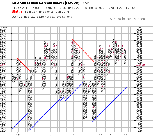
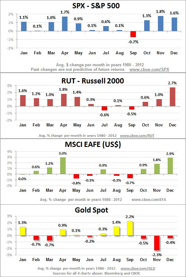
From 1928-2012 the S&P 500 was up 39 months and down 46 months. It’s down 55% of the time in September…

Dow Jones Industrial Average 1886-2004 (116 years) 49 years the Dow was down, in 67 years the Dow was up. It’s down 58% of the time in September…

Those are probability statements. First, let’s define probability.

Probability is likelihood. It is a measure or estimation of how likely it is that something will happen or that a statement is true. Probabilities are given a value between 0 (0% chance or will not happen) and 1 (100% chance or will happen). The higher the degree of probability, the more likely the event is to happen, or, in a longer series of samples, the greater the number of times such event is expected to happen.

But that says nothing about how to calculate probability and apply it. One thing to realize about probability it that is the math for dealing with uncertainty. When we don’t know an outcome, it is uncertain. It is probabilistic, not a sure thing.

As I see it, there are two ways to calculate probability: subjective and objective.

Subjective Probability: assigns a likelihood based on opinions and confidence (degree of belief) in those opinions. It may include “expert” knowledge as well as experimental data. For example, the majority of the research and news is based on “expert opinion”. They may state their belief and then assign a probability: “I believe the stock market has a X% chance of going down.” They may go on to add a good sounding story to support their hypothesis. You can probably see how that is subjective.

Objective Probability: assigns a likelihood based on numbers. Objective probability is data-driven. The popular method is frequentist probability: the probability of a random event means the relative frequency of occurrence of an experiment’s outcome when the experiment is repeated. This method believes probability is the relative frequency of outcomes over the long run. We can think of it as the tendency of the outcome. For example, if you flip a fair coin, its probability of landing on head is 50% and tail is 50%. If you flip it 10 times, it could land on head 7 and tail 3. That outcome implies 70%/30%. To prove the coin is “fair” (balanced on both sides), we would need to flip it more times. If we flip it 30 times or more it is likely to get closer and closer to 50%/50%. The more frequency, the closer it gets to its probability. You can probably see why I say this is more objective: it’s based on historical data.

If you are a math person and logical thinker, you probably get this. I have a hunch many people don’t like math, so they’d rather hear a good story. Rather than checking the stats on a game, they’d rather hear some guru opinion about who will win.

Which has more predictive power? An expert opinion or the fact that historically the month of September has been down more often than it’s up? Predictive ability needs to be quantified by math to determine if it exists and opinions are often far too subjective to do that. We can do the math based on historical data and determine if it is probable, or not.

As I said in September is statistically the worst month for the stock market the data shows it is indeed statistically significant and does indeed have predictive ability, but not necessarily enough to act on it. Instead, I suggest it be used to set expectations: the month of September has historically been the worst performance month for the stock indexes. So, we shouldn’t be surprised if it ends in the red. It’s that simple.

Theory-driven researchers want a cause and effect story to go with their beliefs. If they can’t figure out a good reason behind the phenomenon, they may reject it even though the data is what it is. One person commented to me that he didn’t believe the September data has predictive value. But, it does.

I previously stated a few different probabilities about September: what percentage of time the month is down. In September is statistically the worst month for the stock market I didn’t mention the percent of time the month is negative, only that on average it’s down X% since Y. It occurred to me that most people don’t seem to understand probably and more importantly, the more complete equation of expectation.

Expectation

There are many different ways to define expectation. We probably think of it as “what we expect to happen”. In many ways, it’s best not to have expectations about the future. Our expectations may not play out as we’d hoped. If you base your investment decisions on opinion and expectations don’t pan out, you may stick with your opinion anyway and eventually lose money. The expectation I’m talking about is the kind I apply: mathematical expectation.

We have determined above the probability of September based on how many months it’s down or up. However, probability alone isn’t enough information to make a logical decision. First of all, going back to 1950 using the S&P 500 stock index, the month of September is down about 53% of the time and ends the month positive about 47% of the time. That alone isn’t a huge difference, but what makes it more significant is the expectation. When it’s down 53% of the time, it’s down -3.8% and when it’s up 47% of the time it’s up an average of 3.3%. That results in an expected value of -0.50% for the month of September. If we go back further to 1928, which includes the Great Depression, it’s about  -1.12%.

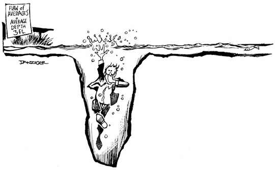
The bottom line is the data says “based on historical data, September has been the worst month for the stock market”. We could then say “it can be expected to be”. But as I said before, it may not be! And, another point I have made is the use of multiple time frames for looking at the data, which is a reminder that by intention: probability is not exact. It can’t be, isn’t supposed to be, and doesn’t need to be. Probability and expectation are the maths of uncertainty. We don’t know in advance many outcomes in life, but we can estimate them mathematically and that provides a sound logic for believing.

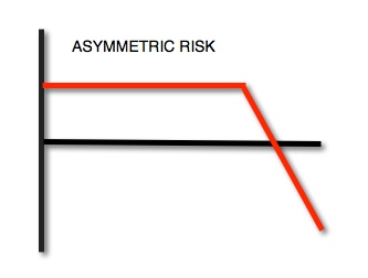
We’ve made a whole lot of the month of September, but I think it made for a good opportunity to explain probability and expectation that are the essence of portfolio management. It doesn’t matter so much how often you are right or wrong, but instead the magnitude. Asymmetric returns are created by more profit, less loss. And that provides us a mathematical basis for believing a method works, or not. Not knowing the future; it’s the best we have.

Enter your email address to subscribe to this blog and receive notifications of new posts by email.

Connect on Linkedin and Follow me on Twitter by clicking the buttons on the right.

September is statistically the worst month for the stock market

September is statistically the worst month of the year for the stock market.

Going back to 1928, the S&P 500 has lost -1.12% on average in September. There seems to be plenty of news that could “cause” a decline in stocks this month. On top of the conflict in Syria, the Federal Reserve may taper its bond buying when it meets on the 17th and congress will soon be back to work and deal with the debt ceiling.

There are plenty of things to worry about if that’s what you like to do. I believe people often worry about things that never even happen, so they experience those things either way. I guess I am too focused on what is actually happening in this moment, now, to worry about things that haven’t even happened. And for portfolio management I always know what I’m going to do next, so I’m never trying to figure out what’s going to happen next and what to do next. I’ve been running my systems for a decade.

I noted earlier that Investor Sentiment is Bearish and that Fear is the Current Return Driver for stocks. That fear increased during August as stocks declined. It could be that investors have already anticipated the news? Keep in mind that “news” means “new information”, so none of these things are “news” today. We’ll see how it all unfolds. I believe it’s the uncertainty and change that makes life fun. I enjoy letting things evolve as they will. I know what I can control – and what I can’t.

I don’t worry about the news. I already know in advance at what point I’ll exit or hedge to control my risk or go short if markets decline.

The four charts below show a graphical image showing September as the worst month historically, though it only goes back 23 years from 1980 through 2012. It’s been the best month for gold, so maybe those holding losing gold positions will get some relief. We don’t make our investment decisions based on what month it is, but this does provide probabilities.

111Month-by-month-SPX-RUT-EAFE-Gold

Asymmetry in Unemployment

There is a clear correlation between the level of education and unemployment. College graduates is 3.8% while those with less than a high school degree is 11.1%!

Asymmetry in Unemployment

Asymmetry Observation: Global Markets Diverge Since May

Since May, we observe that global market indexes have diverged. While some markets are still trending up, others are trending down. Prior to 2013, many markets were generally trending together. The current U.S stock bull market is now 52 months old from from its March 2009 bear market low. If history is a guide, it’s closer to the end (read: The S&P 500 Stock Index at Inflection Points). One of the things we see near the end of a major trend change is some world markets start to reverse down. For example, going in to 2008 it was Financials and REITs (real estate). As we see in the chart, U.S. stocks are still trending up for now, but emerging markets and all categories of bonds and Real Estate Investment Trusts (REITs) are weak. Rising interest rates = falling bond prices and falling interest rate sensitive markets like REITs. The diversification of global asset allocation over this period has actually resulted in more downside risk rather than reducing it. Bonds have been in a rising trend for the past 30 years, so when stocks drop -50% exposure to bonds haves helped to offset the losses for asset allocators who mix stocks and bonds. If bonds are changing to a downtrend as it appears they are, bonds may not be a crutch in the next bear market. In fact, they may inflate losses.

Image

If you aren’t familiar with the index symbols for the markets in the table in the top left:

If you have any questions or comments, contact me.

The S&P 500 Stock Index at Inflection Points

The chart below is the S&P 500 Stock Index at Inflection Points showing full market cycles since 1997 (16 years).

A few observations:

•    You may agree there is a trend here. Several years of upswings followed by downswings, but no meaningful progress for many years. Unfortunately, many people have needed more than this to get the financial freedom they want.

•    100% uptrends are followed by -50% downtrends that are enough to erase the gains from the uptrend. People get euphoric and complacent after 100% uptrends – just in time to participate in the next big waterfall decline.

•    You may consider the point where it is now vs. the last time it reached those points.

•    And, if you can avoid most of the downside and capture some of the upside (what I call ASYMMETRY®) you could have earned a different result. To achieve that takes real skill, but there are managers who have experience doing it and have actual audited track records as evidence. It will unlikely be achieved by overconfident people who have no experience, skill, and no actual track record.

Click on the chart for a larger view:

Image

I’m not saying it’s there yet, but if you understand the past no one should be surprised about what can happen next…

“Those who cannot remember the past are condemned to repeat it.”

George Santayana, – Reason in Common Sense

What is a Family Office?

Image

We provide investment management for family offices and wealth managers and in fact, one of my operating companies also serves as my own family office. So, we comment about “family office” a lot. People often ask: “What is a family office?”.

The short answer is a family office is a business entity, an operating company, that handles the personal affairs of a person or family. Rather than just paying for personal services like investment management, tax planning, estate planning and management, or house maintenance, etc. from a personal checkbook, a family office is established as a business entity (operating company), like a Limited Liability Company or Limited Partnership and that “business” manages the affairs of the family. It’s mostly useful for families of substantial wealth: maybe $5 million or more of personal assets.

For example, maybe the family owns multiple homes in different locations, a boat kept at a marina out of town, and maybe a plane. To maintain these assets and keep them safe, people must be employed, etc.

A common example of a family forming a family office is selling a business or medical practice. Often the owner of the business had an executive assistant who helped the family handle their personal affairs, too. When the business is sold, they have to decided what to do in their “new” business called “retirement”. The business owner may form a family office to have a formal structure for handling these things. For example, they may hire that executive assistant to keep helping them but focus exclusively on their personal assets. The business owner now has cash from the sale of the business to invest. The family office may hire a “Chief Investment Officer” or outsource an experienced one to manage the new investment capital to provide income to fund their new found lifestyle. As noted in How a Family Office Selects an Investment Manager a family office is usually more concerned about actively managing investment risk to maintain their capital first, then produce income and grow the capital base without large losses along the way. They usually want to keep what they earned as a first priority, so they hire experienced managers with a proven track record of compounding capital positively over time, while controlling downside loss. It’s all about putting the structure in place so the family can enjoy their freedom to do the things they love, by limiting the headache of dealing with the things they don’t.

We work with these issues all the time at Shell Capital. If you have any questions or want to understand how we do it, contact me.

U.S. Military Action in Syria?

To get an idea of the significance of the decision of U.S. military action in Syria, spend some time at:  http://www.woundedwarriorproject.org/  and while you are at it, please express your gratitude by making a donation.

Sometimes we’ve got to do what we’ve got to do, but think of who’s actually doing it and the price they pay.

Image


CNBC Viewership in a Downtrend and a Good Example of Asymmetry vs. Symmetry

ZeroHedge points out that CNBC’s Nielsen ratings are at a 20 year low. In fact, they point out:

“CNBC’s Fast Money (-32% Y/Y), Mad Money (-42% Y/Y) and Kudlow (-52% Y/Y) all had all time low ratings in the “all viewers” category in August 2013″

Below is their Nielsen viewership total and prime viewers chart since 1992. You can see how viewership grew sharply during the bull market in stocks of the 1990’s. Viewers seemed to lose interest by around 2005 after the stock market decline from 2000- 2003 had recovered by 2005. No surprise their viewership trended back up and peaked around 2008 – 2009  when global markets dropped -50% or worse and negative news was at an all time high. Since the stock market recovery (driven mostly by the Fed’s Quantitative Easing I will add) their ratings have declined to a 20 year low. Fewer people are watching CNBC than ever.

I have related the swings in viewership to the directional trends and price volatility in the global markets. That may or may not be a driver of their viewership, but there seems at least some correlation. But, it seems that if the financial media like CNBC had strong credibility their  viewership would be more consistent.

Either way, after the 1990’s viewers have probably realized that financial media like CNBC is just financial entertainment – much like Sports Center, just a different game. People sit around a table with different views and debate what’s going to happen next and state their opinions. Most of the time you have no empirical evidence if their opinion even means anything – if you don’t know their track record. It sometimes gets outright silly. I’d rather watch Sports Center for fun – money management is a serious matter. It isn’t a game to me.

Finally, the chart below is a fine example of symmetry. Symmetry is balance. I always point out the error in people saying you should “balance your risk and reward“, when in fact we want imbalance. If we want something to trend up over a long time, we want Asymmetry: an imbalance between profits and losses. That is, we want more reward, less risk. Or, more profit, less loss. If your profits and losses are symmetry (balance) over time, you’ll have periods of gains followed by periods of losing those gains with no progress overall. For example, if CNBC were able to keep some viewers while just losing some, their chart would grow from the lower left to the top right with just minor dips along the way. Instead, we see their viewership has oscillated up and down. They have periods of strong viewership followed by periods of weak viewership that erases the prior growth. Over all it’s an symmetrical chart: it moves up and down over 20 years, but ends in the same place.

That may sound familiar as the stock market has done the same thing… and if your portfolio just tracks that market, so does your account. You may be “up” now, but that’s just because the market is “up”. What happens if the market goes down -50% again over the next few years? Will you have symmetry?

Image

Source: Nielsen Media Research

Investor Sentiment Reaches Extreme Fear

As I said in “Fear is the Current Return Driver“, investor sentiment has turned to “Fear” since the stock and bond markets have declined recently. Investors tend to get optimistic (and greedy) after prices have gone up and then fearful after prices go down. Now, I am not a contrarian investor. I want to be positioned in the direction of global markets and stay there until they change. My purpose of pointing out these EXTREMES in investor sentiment (fear and greed) is to illustrate how investors feelings oscillate between the fear of missing out (if global markets have gone up and they aren’t in them) and the fear of losing money (if they are in global markets and they are falling). Fear and greed is a significant driver of price trends and investment returns. When stock market investor sentiment readings get to an extreme it often reverses trend afterward. For example, as you can see in the Fear & Greed Index below, the dial is now at “Extreme Fear” as the return driver. When we see these extremes in fear it happens after prices have fallen. Prices can keep falling after it gets to such an extreme, but we often see the directional price trend reverse back up after an extreme fear measure. With that said, the purpose of this observation of extreme points of sentiment isn’t to be necessarily used as a timing indicator, but instead to recognize how extreme readings of investor sentiment are most often the wrong feeling at the wrong time. It isn’t the best timing indicator because, thought extreme readings often proceed a change in the price trend, these extreme readings can get a LOT more extreme and prices can keep moving far more than expected. So, all countertrend indicators have that risk. It’s like value investing: you think it’s oversold, or undervalued, but it gets a lot more oversold and a lot more undervalued. What I think is useful about observing extremes in sentiment are to understand how investors behave at certain points in a market cycle. If you find you have problems with this behavior, you may use to modify your behavior.

Image

If you don’t understand this, or have question or comment, contact me directly or reply to this post if you don’t mind others to see your reply.

Timing is Everything: Investor Emotions Over a Full Market Cycle

A picture can sometimes speak a thousand words. The graph below illustrates how investor emotions can oscillate from fear to greed through a full market cycle. The key is to understand how this can be used to know to reduce risk and when to increase it, and the timing is the opposite of what most people feel.

Image

How did the market do this week?

Which market? Were you long or short it? And, was your time horizon just a week?

Image

Source: FINVIZ