The Starting Point Matters

For long term investors who buy and hold, the risk/reward expectations are sometimes very, very, simple.

If you bought the long term U.S. Treasury index via the iShares 20+ Year Treasury Bond ETF (Symbol: TLT) about 12 years ago your yield is around 5% and the total return has been 100%.

Keep in mind, the total return is price appreciation + interest (or yield).

At this starting point, if you are buying it today, your yield is 2.6%… so the expected future total return from the yield is half.

Bond Return Rising Rates

Clearly, the expected total return for bonds is much lower today than just over 10 years ago.

Since the yield is lower, the risk/reward payoff isn’t as positive. The lower yield limits the upside for price appreciation.

There may be times this long term U.S. Treasury is the place to be and times it isn’t.

But over a longer expectation, it’s much less attractive than it was.

No market or security performs well in all conditions, so traditional allocation often holds positions with a negative risk/return profile.

You can probably see why I think it’s critical to be unconstrained and flexible rather than a fixed allocation that ignores the current condition.

The successful will do on a daily basis…

“The successful will do on a daily basis what the average won’t consider doing even once.” – Mike Shell

The four most dangerous words…

Every new moment is necessarily unique – we’ve never been “here” before. Probabilities and potential payoffs change based on the stage of the trend or cycle. For example, the current decline in stocks is no surprise, given the stage and magnitude of the prior trends. A few see evidence of the early stages of a bigger move, others believe it’s different this time. We’ll see how it all unfolds. I don’t have to know what’s going to happen next – I am absolutely certain of what I will do given different conditions.

To quote from fellow Tennessean, Sir John Templeton:

“The four most dangerous words in investing are, it’s different this time.”

Sir John Templeton

Sir John Templeton

source: http://www.templeton.org

Each of us tends to think we see things as they are, that we are objective. But this is not the case. We see the world, not as it is, but as we are—or, as we are conditioned to see it. When we open our mouths to describe what we see, we in effect describe ourselves, our perceptions, our paradigms.”

–  The Seven Habits of Highly Effective People: Powerful Lessons in Personal Change by Stephen R. Covey, Quote Page 28 (2004)

Here’s to the crazy ones. The misfits. The rebels. The troublemakers. The round pegs in the square holes. The ones who see things differently. They’re not fond of rules. And they have no respect for the status quo. You can quote them, disagree with them, glorify or vilify them. About the only thing you can’t do is ignore them. Because they change things. They push the human race forward. And while some may see them as the crazy ones, we see genius. Because the people who are crazy enough to think they can change the world, are the ones who do.”

Steve Jobs

Steve Jobs

Using the Month of September to Understand Probability and Expectation

probabilty-coin-flip

September is the month when the U.S. stock market’s three most popular indexes usually perform the poorest. So say the headlines every September.

I first wrote this in September 2013 after many commentators had published information about the seasonality of the month of September. Seasonality is the historical tendency for certain calendar periods to gain or lose value. However, when commentators speak of such probabilities, they rarely provide a clear probability and almost never the full mathematical expectation.  Without the mathematical expectation, probability alone is of little value or no value. I’ll explain why.

For those of us focused on actual directional price trends it may seem a little silly to discuss the historical probability of gain or loss for a single month. However, even though I wouldn’t make decisions based on it, we can use the seasonal theme to explain the critical importance of both probability and mathematical expectation.

“From 1928-2012 the S&P 500 was up 39 months and down 46 months in September. It is down 55% of the time in September…”

“Dow Jones Industrial Average 1886-2004 (116 years) 49 years the Dow was up in September, in 67 years the Dow was down in September. It’s down 58% of the time in September…”

Those are probability statements. But they say nothing about how much it was up or down.

First, let’s define probability.

Probability is likelihood. It is a measure or estimation of how likely it is that something will happen or that a statement is true. Probabilities are given a range of value between 0% chance (it will not happen) and 100% chance (it will happen). There are few things so certain as 0% and 100%, so most probabilities fall in between. The higher the degree of probability, the more likely the event is to happen, or, in a longer series of samples, the greater the number of times such event is expected to happen.

But that says nothing about how to calculate probability and apply it. One thing to realize about probability is that it is the math for dealing with uncertainty. When we don’t know an outcome, it is uncertain. It is probabilistic, not a sure thing. Probability provides us our best estimation of the outcome.

As I see it, there are two ways to calculate probability: subjectively and objectively.

Subjective Probability: assigns a likelihood based on opinions and confidence (degree of belief) in those opinions. It may include “expert” knowledge as well as experimental data. For example, the majority of the research and news is based on “expert opinion”. They may state their belief and then assign a probability: “I believe the stock market has a X% chance of going down.” They may go on to add a good sounding story to support their hypothesis. You may see how that is subjective.

Objective Probability: assigns a likelihood based on numbers. Objective probability is data-driven. The popular method is frequentist probability: the probability of a random event means the relative frequency of occurrence of an experiment’s outcome when the experiment is repeated. This method believes probability is the relative frequency of outcomes over the long run. We can think of it as the historical tendency of the outcome. For example, if we flip a fair coin, its probability of landing on heads is 50% and tails is 50%. If we flip it 10 times, it could land on heads 7 and tails 3. That outcome implies 70%/30%. To prove the coin is “fair” (balanced on both sides), we would need to flip it more times to get a large enough sample size to realize the full probability. If we flip it 30 times or more it is likely to get closer and closer to 50%/50%. The more frequency, the closer it gets to its probability. You may see see why I say this is more objective: it’s based on actual historical data.

If you are a math person and logical thinker, you may get this. I have a hunch many people don’t like math, so they’d rather hear a good story. Rather than checking the stats on a game, they’d rather hear some guru’s opinion about who will win.

Which has more predictive power? An expert opinion or the fact that historically the month of September has been down more often than it’s up? Predictive ability needs to be quantified by math to determine if it exists and opinions are often far too subjective to do that. We can do the math based on historical data and determine if it is probable, or not.

As I said in September is statistically the worst month for the stock market the data shows it is indeed statistically significant and does indeed have predictive ability, but not necessarily enough to act on it. Instead, I suggest it be used to set expectations of what may happen: the month of September has historically been the worst performance month for the stock indexes. So, we shouldn’t be surprised if it ends in the red. It’s that simple.

Theory-driven researchers want a cause and effect story to go with their beliefs. If they can’t figure out a good reason behind the phenomenon, they may reject it even though the data is what it is. One person commented to me that he didn’t believe the September data has predictive value, even though it does, and he provided nothing to disprove it. Probabilities do need to make sense. Correlations can occur randomly, so logical reasoning behind the numbers may be useful. For example, one theory for a losing September is it is the fiscal year end of many mutual funds and fund managers typically sell losing positions before year end to realize losses to offset gains.

I previously stated a few different probabilities about September: what percentage of time the month is down. In September is statistically the worst month for the stock market I didn’t mention the percent of time the month is negative, only that on average it’s down X% since Y. It occurred to me that most people don’t seem to understand probability and more importantly, the more complete equation of expectation.

Expectation

There are many different ways to define expectation. We may initially think of it as “what we expect to happen”. In many ways, it’s best not to have expectations about the future. Our expectations may not play out as we’d hoped. If we base our investment decisions on opinion and expectations don’t pan out, we may stick with our opinion anyway and eventually lose money. The expectation I’m talking about is the kind that I apply: mathematical expectation.

So far, we have determined probability of September based on how many months it’s down or up. However, probability alone isn’t enough information to make a logical decision. First of all, going back to 1950 using the S&P 500 stock index, the month of September is down about 53% of the time and ends the month positive about 47% of the time. That alone isn’t a huge difference, but what makes it more meaningful is the expectation. When it’s down 53% of the time, it’s down -3.8% and when it’s up 47% of the time it’s up an average of 3.3%. That results in an expected value of -0.50% for the month of September. If we go back further to 1928, which includes the Great Depression, it’s about  -1.12%.

The bottom line is the math says “based on historical data, September has been the worst month for the stock market”. We could then say “it can be expected to be”. But as I said before, it may not be! And, another point I have made is the use of multiple time frames for looking at the data, which is a reminder that by intention: probability is not exact. It can’t be, it’s not supposed to be, and doesn’t need to be! Probability and expectation are the maths of uncertainty. We don’t know in advance many outcomes in life, but we can estimate them mathematically and that provides a sound logic and a mathematical basis for believing what we do.

We’ve made a whole lot of the month of September, but I think it made for a good opportunity to explain probability and expectation that are the essence of portfolio management. It doesn’t matter so much how often we are right or wrong, but instead the probability and the magnitude. Asymmetric returns are created by more profit, less loss. Mathematical expectation provides us a mathematical basis for believing a method works, or not. Not knowing the future; it’s the best we have.

Rather than seasonal tendencies, I prefer to focus on the actual direction of global price trends and directly manage the risk in individual my positions.

Enter your email address to subscribe to this blog and receive notifications of new posts by email.

Connect with me on Linkedin and Follow me on Twitter

Dauntless Courage and Confidence to Get it Done

Know: be aware of through observation, inquiry, or information.

Two observations from the video below:

1. Know where you’ll be when you get where you’re going.

2. Know the parts of the process that is the risk of a bad outcome; then manage it, and accept it…

From that comes dauntless courage and the confidence to get it done.

Press play to watch this:

He has it…

Don’t Get on the Roller Coaster Expecting a Merry Go Round

“A classic way to get in trouble in Life, the Market, or the Amusement Park is to “Play with Reservation.” Getting on the Coaster, while secretly thinking “Merry Go Round…”  – Jennifer StJohn

Parenthood (1989)

U.S. Sector Observation

I don’t often comment on a day’s price action in the stock market, but thought I would. The U.S. stock market reversed up somewhat today. Market trends swing up and down on their way to a larger trend. Notice at 3pm the stock indexes almost lost all their gain for the day.

stock market 2015-08-27_16-17-41

Source: https://www.google.com/finance

The interesting observation today was the leadership. Energy and Basic Materials have been the biggest losers the past three months and they moved up the most.

sector rotation returns ETF

Source: https://www.google.com/finance

Below are the U.S. sector returns over the past 3 months after todays close. You can see the two biggest losers were today’s winners.

ETF sector rotation

Source: http://www.stockcharts.com

It will be interesting to see if this is an oversold bounce or it reverses to a lower low.

Trends unfold as swings up and down over time. They don’t go straight up or down…

Global Markets Year to Date

This is a quick year to date observation of some global market trends. First, we start with the popular U.S. stock market indexes. The Dow Jones Industrial Average is down -9.6% YTD. S&P 500 is down about -7%. A simple line chart shows a visual representation of the trend and the path it took to get there.

stock index return year to date

Source of Ycharts in this article: Shell Capital Management, LLC drawn with http://www.ycharts.com

I like to look at the asymmetry ratio of the trend, so I observe both the upside total return and the downside drawdown. Below is a chart of the % off the highest price these indexes reached to define the drawdown from its prior peak. This is how much they’ve declined from their highest point so far this year. The Dow Jones Industrial Average is down -12.8% from it’s high, the S&P 500 is down 10.8%.

stock index drawdown chart

Below are the sectors year to date. Healthcare remains the leader and the only one positive at this point.

sectors year to date

Source:Shell Capital Management, LLC  drawn with  http://finviz.com

Looking at a few more broad based alternatives, below is the iShares S&P GSCI Commodity-Indexed Trust (GSG: blue) which seek to track the results of a fully collateralized investment in futures contracts on an index composed of a diversified group of commodities futures. The red line is Gold (GLD) and the orange line is the iShares Core U.S. Aggregate Bond ETF seeks to track the investment results of an index composed of the total U.S. investment-grade bond market. Bonds are flat (including interest), gold is down -3%, and the commodity index is down -24%.

bonds commodities year to date

We are beginning to observe that a fixed asset allocation to these markets, no matter how diversified, may be very negative this year.

What about International stocks? Below we see some material divergence so far between developed International markets (EFA) and emerging markets (EEM). The iShares MSCI EAFE (EFA) seeks to track the investment results of an index composed of large- and mid-capitalization developed market equities, excluding the U.S. and Canada. Those countries index is down -2.9%. The iShares MSCI Emerging Markets (EEM) seeks to track the investment results of an index composed of large- and mid-capitalization emerging market equities. It is down -18.6%.

international emerging markets year to date

What about global stock markets? A few are positive year to date, most are very negative.

global stock markets year to data

Source:Shell Capital Management, LLC  drawn with  http://finviz.com

What about individual commodities, interest rates, and volatility? The VIX was low most of the year, but now that markets have declined the implied volatility of stocks has spiked.

world markets year to date

Source:Shell Capital Management, LLC  drawn with  http://finviz.com

I believe world markets require active risk management and defining directional trends. For me, that means predefining my risk in all of them, not just a fixed allocation.

“Nobody who ever gave his best regretted it.”

– George Halas

Nobody who ever gave his best regretted it

Image source: https://www.pinterest.com/pin/375346950164355711/

There is nothing noble in being superior to your fellow man; true nobility is being superior to your former self.” – Ernest Hemingway

There is nothing noble in being superior to your fellow man; true nobility is being superior to your former self.” – Ernest HemingwaySource: https://www.pinterest.com/pin/79516749641122790/

Why Index ETFs Over Individual Stocks?

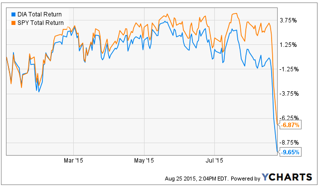
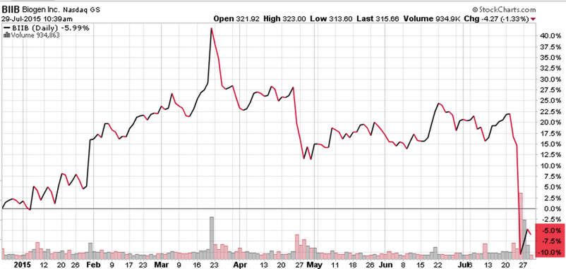
A fellow portfolio manager I know was telling me about a sharp price drop in one of his positions that was enough to wipe out the 40% gain he had in the stock. Of course, he had previously told me he had a quick 40% gain in the stock, too. That may have been his signal to sell.  Biogen, Inc (BIIB) recently declined about -30% in about three days. Easy come, easy go. Below is a price chart over the past year.

Biogen BIIB

Source: Shell Capital Management, LLC created with http://www.stockcharts.com

Occasionally investors or advisors will ask: “Why trade index ETFs instead of individual stocks?“. An exchange-traded fund (ETF) is an investment fund traded on stock exchanges, much like stocks. Until ETFs came along the past decade or so, gaining exposure to sectors, countries, bond markets, commodities, and currencies wasn’t so easy. It has taken some time for portfolio managers to adapt to using them, but ETFs are easily tradable on an exchange like stocks. Prior to ETFs, those few of us who applied “Sector Rotation” or “Asset Class Rotation” or any kind of tactical shifts between markets did so with much more expensive mutual funds. ETFs have provided us with low cost, transparent, and tax efficient exposure to a very global universe of stocks, bonds, commodities, currencies, and even alternatives like REITs, private equity, MLP’s, volatility, or inverse (short). Prior to ETFs we would have had to get these exposures with futures or options. I saw the potential of ETFs early, so I developed risk management and trend systems that I’ve applied to ETFs that I would have previously applied to futures.

On the one hand, someone who thinks they are a good stock picker are enticed to want to get more granular into a sector and find what they believe is the “best” stock. In some ways, that seems to make sense if we can weed out the bad ones and only hold the good ones. It really isn’t so simple. I view everything a reward/risk ratio, which I call asymmetric payoffs. There is a tradeoff between the reward/risk of getting more detailed and focused in the exposure vs. having at least some diversification, such as exposure to the whole sector instead of just the stock.

Market Risk, Sector Risk, and Stock Risk

In the big picture, we can break exposures into three simple risks (and those risks can be explored with even more detail). We’ll start with the broad risk and get more detailed. Academic theories break down the risk between “market risk” that can’t be diversified away and “single stock” and sector risk that may be diversified away.

Market Risk: In finance and economics, systematic risk (in economics often called aggregate risk or undiversifiable risk) is vulnerable to events which affect aggregate outcomes such as broad market declines, total economy-wide resource holdings, or aggregate income. Market risk is the risk that comes from the whole market itself. For example, when the stock market index falls -10% most stocks have declined more or less.

Stock and Sector Risk: Unsystematic risk, also known as “specific risk,” “diversifiable risk“, is the type of uncertainty that comes with the company or industry itself. Unsystematic risk can be reduced through diversification. If we hold an index of 50 Biotech stocks in an index ETF its potential and magnitude of a  large gap down in price is less than an individual stock.

You can probably see how holding a single stock like Biogen  has its own individual risks as a single company such as its own earnings reports, results of its drug trials, etc. A biotech stock is especially interesting to use as an example because investing in biotechnology comes with a unique host of risks. In most cases, these companies can live or die based on results of drug trials and the demand for their existing drugs. In fact, the reason Biogen declined so much is they reported disappointing second-quarter results and lowered its guidance for the full year, largely because of lower demand for one of their drugs in the United States and a weaker pricing environment in Europe. That is a risk that is specific to the uncertainty of the company itself. It’s an unsystematic risk and a selection risk that can be reduced through diversification. We don’t have to hold exposure to just one stock.

With index ETFs, we can gain systematic exposure to an industry like biotech or a sector like healthcare or a broader stock market exposure like the S&P 500. The nice thing about an index ETF is we get exposure to a basket of stocks, bond, commodities, or currencies and we know what we’re getting since they disclose their holdings on a daily basis.

ETFs are flexible and easy to trade. We can buy and sell them like stocks, typically through a brokerage account. We can also employ traditional stock trading techniques; including stop orders, limit orders, margin purchases, and short sales using ETFs. They are listed on major US Stock Exchanges.

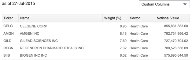
The iShares Nasdaq Biotechnology ETF objective seeks to track the investment results of an index composed of biotechnology and pharmaceutical equities listed on the NASDAQ. It holds 145 different biotech stocks and is market-cap-weighted, so its exposure is more focused on the larger companies. It therefore has two potential disadvantages: it has less exposure to smaller and possibly faster growing biotech stocks and it only holds those stocks listed on the NASDAQ, so it misses some of the companies that may have moved to the NYSE. According to iShares we can see that Biogen (BIIB) is one of the top 5 holdings in the index ETF.

iShares Biotech ETF HoldingsSource: http://www.ishares.com/us/products/239699/ishares-nasdaq-biotechnology-etf

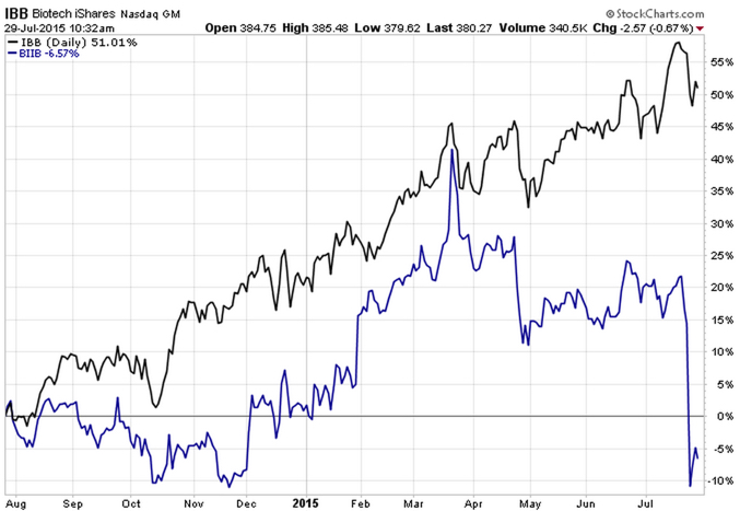
Below is a price chart of the popular iShares Nasdaq Biotech ETF (IBB: the black line) compared to the individual stock Biogen (BIIB: the blue line). Clearly, the more diversified biotech index has demonstrated a more profitable and smoother trend over the past year. And, notice it didn’t experience the recent -30% drop that wiped out Biogen’s price gain. Though some portfolio managers may perceive we can earn more return with individual stocks, clearly that isn’t always the case. Sometimes getting more granular in exposures can instead lead to worse and more volatile outcomes.

IBB Biotech ETF vs Biogen Stock 2015-07-29_10-34-29

Source: Shell Capital Management, LLC created with http://www.stockcharts.com

The nice thing about index ETFs is we have a wide range of them from which to research and choose to add to our investable universe. For example, when I observe the directional price trend in biotech is strong, I can then look at all of the other biotech index ETFs to determine which would give me the exposure I want to participate in the trend.

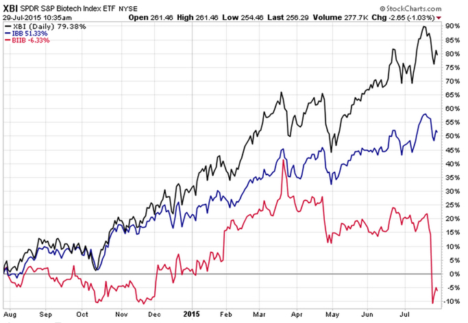
Since we’ve observed with Biogen the magnitude of the potential individual risk of a single biotech stock, that also suggests we may not even prefer to have too much overweight in any one stock within an index. Below I have added to the previous chart the SPDR® S&P® Biotech ETF (XBI: the black line) which has about 105 holdings, but the positions are equally-weighted which tilts it toward the smaller companies, not just larger companies.  As you can see by the black line below, over the past year, that equal weighting tilt has resulted in even better relative strength. However, it also had a wider range (volatility) at some points. Though it doesn’t always work out this way, you are probably beginning to see how different exposures create unique return streams and risk/reward profiles.

SPDR Biotech Index ETF XBI IBB and Biogen BIIB 2015-07-29_10-35-46

Source: Shell Capital Management, LLC created with http://www.stockcharts.com

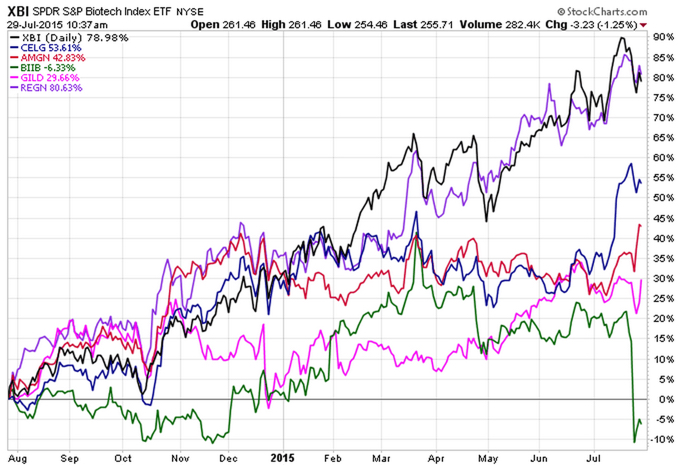
In fact, those who have favored “stock picking” may be fascinated to see the equal-weighted  SPDR® S&P® Biotech ETF (XBI: the black line) has actually performed as good as the best stock of the top 5 largest biotech stocks in the iShares Nasdaq Biotech ETF.

SPDR Biotech vs CELG AMGN BIIB GILD REGN

Source: Shell Capital Management, LLC created with http://www.stockcharts.com

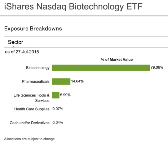
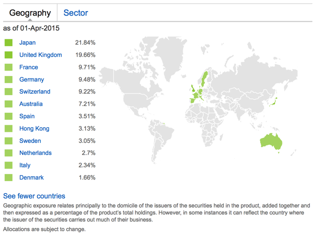
Biotech indexes aren’t just pure biotech industry exposure. They also have exposures to the healthcare sector. For example, iShares Nasdaq Biotech shows about 80% in biotechnology and 20% in sectors categorized in other healthcare industries.

iShares Nasdaq Biotech ETF exposure allocation

Source: www.ishares.com

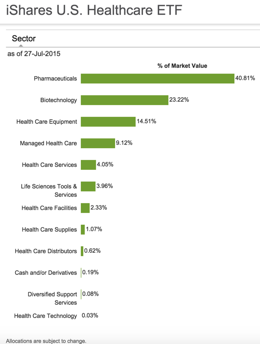
The brings me to another point I want to make. The broader healthcare sector also includes some biotech. For example, the iShares U.S. Healthcare ETF is one of the most traded and includes 23.22% in biotech.

iShares Healthcare Index ETF exposure allocation

Source: https://www.ishares.com/us/products/239511/IYH?referrer=tickerSearch

It’s always easy to draw charts and look at price trends retroactively in hindsight. If we only knew in advance how trends would play out in the future we could just hold only the very best. In the real world, we can only identify trends based on probability and by definition, that is never a sure thing. Only a very few of us really know what that means and have real experience and a good track record of actually doing it.

I have my own ways I aim to identify potentially profitable directional trends and my methods necessarily needs to have some level of predictive ability or I wouldn’t bother. However, in real world portfolio management, it’s the exit and risk control, not the entry, the ultimately determines the outcome. Since I focus on the exposure to risk at the individual position level and across the portfolio, it doesn’t matter so much to me how I get the exposure. But, by applying my methods to more diversified index ETFs across global markets instead of just U.S. stocks I have fewer individual downside surprises. I believe I take asset management to a new level by dynamically adapting to evolving markets. For example, they say individual selection risk can be diversified away by holding a group of holdings so I can efficiently achieve that through one ETF. However, that still leaves the sector risk of the ETF, so it requires risk management of that ETF position. They say systematic market risk can’t be diversified away, so most investors risk that is left is market risk. I manage both market risk and position risk through my risk control systems and exits. For me, risk tolerance is enforced through my exits and risk control systems.

The performance quoted represents past performance and does not guarantee future results. Investment return and principal value of an investment will fluctuate so that an investor’s shares, when sold or redeemed, may be worth more or less than the original cost. Current performance may be lower or higher than the performance quoted, and numbers may reflect small variances due to rounding. Standardized performance and performance data current to the most recent month end may be obtained by clicking the “Returns” tab above.

The Southern Voice: What You Don’t Know About the South and the Southern Accent

Asymmetric Information is when someone has superior or more knowledge than others about a topic. The Illusion of Asymmetric Insight occurs when people perceive their knowledge of others to surpass other people’s knowledge of themselves. An asymmetric advantage goes beyond a normal advantage of knowledge into the realm of having asymmetric information and knowing things others do not.

Over the past few weeks, there has been much in the media about the Confederate Battle flag and misinformation about the South. As it turns out, it seems many people may be more ignorant about these things than they believe they are. So you think the “Southern Accent” is bad English? Au contraire.

In Southern American English, Wikipedia says:

“The Southern U.S. dialects make up the largest accent group in the United States”

Wikipedia cites PBS as the source: “Do You Speak American: What Lies Ahead.” Specifically, that article says: 

  • Due to a huge migration to the South and Southwest and the national appeal of country music, Southern speech is now the largest accent group in the United States.
  • The dominant form is what linguists call Inland Southern…

As a Southerner myself, I have always known my Southern dialect is derived from my European ancestors. If you aren’t from the South or weren’t taught its history, you may not realize that. Most of the settlers in Appalachia and the South came from Scotland, Ireland, the British Isles. If you know anything about those areas and their people, you can probably see how they may have been attracted to the mountains of Tennessee, north Georgia, and North Carolina. Its geography is similar to their motherland. Oh, and they made whiskey and moonshine.

Researchers have noted that the dialect retains a lot of vocabulary with roots in Scottish “Elizabethan English” owing to the make-up of the early European settlers to the area.

Source: “The Dialect of the Appalachian People.” Wvculture.org. Retrieved 2012-11-08.

Oh, and they sang fiddle songs like Rocky Top! This is the origin of what has evolved today as “country music.” They blended popular songs, Irish and Celtic fiddle tunes, and various musical traditions from European immigrant communities.

That leads to this very interesting video clip from the History Channel “You Don’t Know Dixie” explaining the many versions of the Southern Accent:

Want to learn more about the South? Search for the History Channel show “You Don’t Know Dixie” at your cable provider. I found it on Verizon and recorded it. Or, it’s available at Amazon.


Mike Shell is the Founder and Chief Investment Officer of Shell Capital Management, LLC, and the portfolio manager of ASYMMETRY® Global Tactical.

Mike Shell and Shell Capital Management, LLC is a registered investment advisor and provides investment advice and portfolio management exclusively to clients with a signed and executed investment management agreement. The observations shared on this website are for general information only and should not be construed as advice to buy or sell any security. Securities reflected are not intended to represent any client holdings or any recommendations made by the firm. Investing involves risk including the potential loss of principal an investor must be willing to bear. Past performance is no guarantee of future results. All information and data is deemed reliable, but is not guaranteed and should be independently verified. The presence of this website on the Internet shall in no direct or indirect way raise an implication that Shell Capital Management, LLC is offering to sell or soliciting to sell advisory services to residents of any state in which the firm is not registered as an investment advisor. Use of this website is subject to its terms and conditions.

Uncharted Territory from the Fed Buying Stocks

I remember sometime after 2013 I told someone “The Fed is buying stocks and that’s partly why stocks have risen so surprisingly for so long”. He looked puzzled and didn’t seem to agree, or understand.

The U.S. Federal Reserve (the “Fed”) has been applying “quantitative easing” since the 2007 to 2009 “global financial crisis”. Quantitative easing (QE) is a type of monetary policy used by central banks to stimulate the economy when standard monetary policy has become ineffective. The Fed implements quantitative easing by buying financial assets from banks and other financial institutions. That raises the prices of those financial assets and lowers their interest rate or yield. It also increases the amount of money available in the economy. The magnitude they’ve done this over the past seven years has never been experience before. They are in uncharted territory.

I was reminded of what I said, “the Fed is buying stocks” when I read comments from Bill Gross in “Gross: Fed Slowly Recognizing ZIRP Has Downside Consequences”. He says companies are using easy money to buy their own stock:

Low interest rates have enabled Corporate America to borrow hundreds of billions of dollars “but instead of deploying the funds into the real economy,they have used the proceeds for stock buybacks. Corporate authorizations to buy back their own stock are running at an annual rate of $1.02 trillion so far in 2015, 18 percent above 2007’s record total of $863 billion, Gross said.

You see, if we want to know the truth about market dynamics; we necessarily have to think more deeply about how markets interact. Market dynamics aren’t always simple and obvious. I said, “The Fed is buying stocks” because their actions is driving the behavior of others. By taking actions to increase money supply in the economy and keep extremely low borrowing rates, the Fed has been driving demand for stocks.

But, it isn’t just companies buying their own stock back. It’s also investors buying stocks on margin. Margin is borrowed money that is used to purchase securities. At a brokerage firm it is referred to as “buying on margin”. For example, if we have $1 million in a brokerage account, we could borrow another $1 million “on margin” and invest twice as much. We would pay interest on the “margin loan”, but those rates have been very low for years. Margin interest rates have been 1 – 2%. You can probably see the attraction. If we invested in lower risk bonds earning 5% with $1 million, we would normally earn 5%, or $50,000 annually. If we borrowed another $1 million at 2% interest and invested the full $2 million at 5%, we would earn another 3%, or $30,000. The leverage of margin increased the return to 8%, or $80,000. Of course, when the price falls, the loss is also magnified. When the interest rate goes up, it reduces the profit. But rates have stayed low for so long this has driven margin demand.

While those who have their money sitting in in bank accounts and CDs have been brutally punished by near zero interest rates for many years, aggressive investors have borrowed at those low rates to magnify their return and risk in their investments. The Fed has kept borrowing costs extremely low and that is an incentive for margin.

In the chart below, the blue line is the S&P 500 stock index. The red line is NYSE Margin Debt. You may see the correlation. You may also notice that recessions (the grey area) occur after stock market peaks and high margin debt balances. That’s the downside: margin rates are at new highs, so when stocks do fall those investors will either have to exit their stocks to reduce risk or they’ll be forced to exit due to losses. If they don’t have a predefined exit, their broker has one for them: “a margin call”.

Current Margin Debt Stock MarginSource: http://www.advisorperspectives.com/dshort/charts/markets/nyse-margin-debt.html?NYSE-margin-debt-SPX-since-1995.gif

If you noticed, I said, “They are in uncharted territory”. I am not. I am always in uncharted territory, so I never am. I believe every new moment is unique, so I believe everyone is always in uncharted territory. Because I believe that, I embrace it. I embrace uncertainty and prepare for anything that can happen. It’s like watching a great movie. It would be no fun if we knew the outcome in advance.


Perfectly efficient markets require the effort of smart money to make them so; but if markets were perfect, smart money would give up trying.

Read more at http://www.project-syndicate.org/commentary/will-computer-algorithms-replace-humans-in-financial-markets-by-robert-j–shiller-2015-07#hmXdmoDjMyvHOw9U.99

Give me liberty, or give me death!

Give me liberty of give me death

A quotation attributed to Patrick Henry from a speech he made to the Virginia Convention in 1775, at St. John’s Church in Richmond, Virginia.

He is credited with having swung the balance in convincing the convention to pass a resolution delivering Virginian troops for the Revolutionary War. Among the delegates to the convention were future U.S. Presidents Thomas Jefferson and George Washington.

Image Source: http://faculty.isi.org/media/images/catalog/originals/Give_me_liberty_or_give_me_death.jpg

The right to disagree…

ayn rand the right to agree with others is not the problem in any society it is the right to disagree that is crucial

Global Stock Market Trends

Stock Market Decline 2015-06-29

Stock markets around the world declined -2% or so arguing over which flag to fly. It was a good day for a cash position, or something other than U.S. and International stocks. Below is a table of U.S. stock sectors.

Stock Market Sectors 2015-06-29

Source: http://www.sectorspdr.com/sectorspdr/tools/sector-tracker

But it wasn’t just U.S. stocks. Equity markets around the globe were down. The graphic below shows much of the world  stock markets down around -4%. Spain and Germany were down the most.

Global Stock Market Trend 2015-06-29_16-02-23

Source: http://www.etf.com

The big news came over the weekend that Greece closed banks to head off chaos as bailout talks break down. Greece owes lenders $242.8 billion Euros in total and $1.7 billion tomorrow. Germany is its largest creditor.

The Greek stock market is closed, but the ETFs are not. The Global X FTSE Greece 20 ETF (GREK) was down nearly -20%. The Global X FTSE Greece 20 ETF tracks the FTSE/ATHEX Custom Capped Index, which is designed to reflect broad based equity market performance in Greece. The index is comprised of the top 20 companies listed on the Athens Exchange by market capitalization.

GREK Greece ETF 2015-06-29_16-33-16

Much of the world is in great debt…

One day isn’t much of a trend, but -2% days like this are notable, so we’ll see if it is the beginning of a trend. The year-to-date total return (including dividends) is negative for both the Dow Jones Industrial Average and the IBoxx $ Invest Grade Corporate Bond ETF.

stock and bond market 2015-06-29_17-14-43


The stock market is risky and that includes the loss of capital. Past performance does not guarantee future results.


Seasonal Alpha? The Real Probability and Expectation of “Sell in May and Go Away”

Here is the trouble with a seasonal strategy. According to Standard & Poors, the S&P 500 has gained 1.05 % in May, though it was a volatile month. So, “sell in May and go away” just missed out for no other reason other than it was May.

The second problem is best explained in the chart below. According to Standard & Poors, since 1946 (68 years) the S&P 500 has actually been positive during the “sell in May and go away” period May – October 64% of the time with an average gain of 1.3%. So, the expectation for the period is actually a positive return of .83% May to October.

Seasonal Sell in May and Go Away Strategy

Another interesting observation in the chart is after a positive “up” May, the May to October period tends to increase 87% of the time an average of 3.5%. So, the expectation is 3.04%. Based on the probability and expectation, we would expect 2% more through October. Of course, the trouble is this stock index is trading at 27 times EPS which is overvalued territory, so this time could instead be the 13% of the time it declines instead, but the probability and expectation is what it is and we want to invest with it, not against it. I would rather focus on the actual direction of trends rather than what month it is.

One month or series of months is an arbitrary time frame, which is why a strategy based on specific time frames like “Sell in May and Go Away” are arbitrary – no matter what story is told to make it sound good.

This May it turned out it most of the other global markets were down materially in May like the Emerging Markets index -4.1%, Commodity Index -2.17%, and even the iShares iBoxx $ Investment Grade Corporate Bond declined -1.12%. So, anyone who was globally positioned across multiple markets during May did experience declines. Those who shifted from the S&P 500 index to bonds at the beginning of May actually lost what the stock index gained…

I prefer to focus on the actual direction of global price trends, no matter when they are. You can see what that looks like here.

Allocation to Stocks and Bonds is Unlikely to Give us What We Want

That was the lesson you learned the last time stocks became overvalued and the stock market entered into a bear market.

I believe holding and re-balancing markets doesn’t give us the risk-adjusted returns we want. In all I do, I believe in challenging that status quo, I believe in thinking and doing things differently. The way I challenge the status quo is a focus on absolute return, limiting downside risk, and doing it tactically across global markets. Why do I do it?

In a Kiplinger article by Fred W. Frailey interviewed Mohamed El-Erian, the PIMCO’s boss, (PIMCO is one of the largest mutual fund companies in the world) he says “he tells how to reduce risk and reap rewards in a fast-changing world.” This article “Shaking up the Investment Mix” was written in March 2009, which turned out the be “the low” of the global market collapse.

It is useful to revisit such writing and thoughts, especially since the U.S. stock market has since been overall rising for 5 years and 10 months. It’s one of the longest uptrends recorded and the S&P 500 stock index is well in “overvalued” territory at 27 times EPS. At the same time, bonds have also been rising in value, which could change quickly when rates eventually rise. At this stage of a trend, asset allocation investors could need a reminder. I can’t think of a better one that this:

Why are you telling investors they need to diversify differently these days?

The traditional approach to diversification, which served us very well, went like this: Adopt a diversified portfolio, be disciplined about rebalancing the asset mix, own very well-defined types of asset classes and favor the home team because the minute you invest outside the U.S., you take on additional risk. A typical mix would then be 60% stocks and 40% bonds, and most of the stocks would be part of Standard & Poor’s 500-stock index.

This approach is fatigued for several reasons. First of all, diversification alone is no longer sufficient to temper risk. In the past year, we saw virtually every asset class hammered. You need something more to manage risk well.

But, you know, they say a picture is worth a thousand words.

Since we are talking about downside risk, something that is commonly hidden when only “average returns” are presented, below is a drawdown chart. I created the drawdown chart using YCharts which uses total return data and the “% off high”. The decline you see from late 2007 to 2010 is a drawdown: it’s when the investment value is under water. Think of this like a lake. You can see how the average of the data wouldn’t properly inform you of what happens in between.

First, I show PIMCO’s own allocation fund: PALCX: Allianz Global Allocation Fund. I include an actively managed asset allocation that is very large and popular with $55 billion invested in it: MCLOX: BlackRock Global Allocation. Since there are many who instead believe in passive indexing and allocation, I have also included DGSIX: DFA Global Allocation 60/40 and VBINX: Vanguard Balanced Fund. As you can see, they have all done about the same thing. They declined about -30% to -40% from October 2007 to March 2009. They also declined up to -15% in 2011.

Global Allocation Balanced Fund Drawdowns

Going forward, the next bear market may be very different. Historically, investors consider bond holdings to be a buffer or an anchor to a portfolio. When stock prices fall, bonds haven’t been falling nearly as much. To be sure, I show below a “drawdown chart” for the famous actively managed bond fund PIMCO Total Return and for the passive crowd I have included the Vanguard Total Bond Market fund. Keep in mind, about 40% of the allocation of the funds above are invested in bonds. As you see, bonds dropped about -5% to -7% in the past 10 years.

Bond market risk drawdowns

You may notice they are recently down -2% from their highs. Based on the past 10 years, that’s just a minor decline. The trouble going forward is that interest rates have been in an overall downtrend for 30 years, so bond values have been rising. If you rely on bonds being a crutch, as on diversification alone, I agree with Mohamed El-Erian the Chief of the worlds largest bond manager:

“…diversification alone is no longer sufficient to temper risk. In the past year, we saw virtually every asset class hammered. You need something more to manage risk well.”

But, don’t wait until AFTER markets have fallen to believe it.

I just don’t believe holding and re-balancing markets is going to give us the risk-adjusted returns we want. In all I do, I believe in challenging that status quo, I believe in thinking and doing things differently. The way I challenge the status quo is a focus on absolute return, limiting downside risk, and doing it tactically across global markets. Want to join us? To see what that looks like, click: ASYMMETRY® Managed Accounts

Where is the Inflation?

In How does monetary policy influence inflation and employment? and bond prices… I pointed out that even the Fed expected their monetary policy to eventually lead to inflation. The problem with economics and economist is they expect a cause and effect, and often their expectations don’t come true. Remember all those newsletters advising to buy gold the last several years? Gold trended up a while, then down. Applying a good trend system to gold may have made money from it, but buying and holding gold is probably a loser. Inflation was supposed to go up and gold was supposed to be a shelter. However, inflation has instead trended down: The U.S. Inflation Calculator  presents it best:

Current US Inflation Rates: 2005-2015

The latest inflation rate for the United States is -0.1% through the 12 months ended March 2015 as published by the US government on April 17, 2015. The next update is scheduled for release on May 22, 2015 at 8:30 a.m. ET. It will offer the rate of inflation over the 12 months ended April 2015.

The chart, graph and table below displays annual US inflation rates for calendar years 2004-2014. Rates of inflation are calculated using the current Consumer Price Index published monthly by the Bureau of Labor Statistics (BLS). For 2015, the most recent monthly data (12-month based) will be used in the chart and graph.

Historical inflation rates are available from 1914-2015. If you would like to calculate accumulated rates between different dates, the US Inflation Calculator will do that quickly.

Inflation Rate 2015-05-04_19-44-49

Source: http://www.usinflationcalculator.com/inflation/current-inflation-rates/

However, as you can see in the chart, like market prices, economic data trends directionally too. This trend of declining inflation may continue or it may reverse.

Recent Observations: Stock Market, Volatility, Absolute Returns

In case you missed them, here is a list of popular observations I’ve shared recently:

This is When MPT and VaR Get Asset Allocation and Risk Measurement Wrong

A Tale of Two Conditions for U.S. and International Stocks: Before and After 2008

Absolute Return: an investment objective and strategy

Asymmetric Nature of Losses and Loss Aversion

Why So Stock Market Focused?

What About the Stock Market Has Changed? A Look at Ten Years of Volatility

Diversification Alone is No Longer Sufficient to Temper Risk…

Top Traders Unplugged Interview with Mike Shell: Episode 1 & 2

Asymmetric Sector Exposure in Stock Indexes

What About the Stock Market Has Changed? A Look at Ten Years of Volatility

When asked to sum the Buddha’s teachings up in one phrase, Suzuki Roshi simply said,

Everything changes.”

The universe is transient, in a constant state of flux. This impermanence, that things are constantly changing and evolving, is one of the few things we can be sure about. Whatever it is today, it will evolve and eventually change. I believed this, so I embraced change and uncertainty. That led me to deeply study rates of change, the magnitude of change, and the probability of change.

So when I speak about volatility, I am necessarily talking about “how much it has changed”. Volatility is the range of change. If there is no volatility, there is no change. If the range is very wide, the range of outcomes is wide.

In statistics, a standard deviation is a measure that is used to quantify this amount of range, variation, or dispersion of a set of data. In finance, it’s used to measure the range of prices. Many use it as a risk measure.

As of this month, I have been managing ASYMMETRY® Global Tactical for 10 years. Ten years is somewhat an arbitrary time frame, but it’s also a meaningful milestone given the range of change over this period. This past decade has been unique in that it included a range of change few have experienced or observed before. It’s really just change doing what it does.

What has changed over the past 10 years?

In A Tale of Two Conditions for U.S. and International Stocks: Before and After 2008 I pointed out the material change in the directional trends of the U.S. stock market vs. international stocks. Prior to 2008, the international stock market indexes were materially stronger trends than U.S. stocks. Since 2008, the U.S. stock market rate of change has been stronger than the global markets.

Another very significant change has been volatility. The change in volatility is critical to understand as I pointed out in This is When MPT and VaR Get Asset Allocation and Risk Measurement Wrong. Below, I will illustrate visually how volatility has changed and what it means today.

Historical standard deviation is commonly used in investment models as an input for  volatility and is often considered a measure of ‘risk”. In some ways that is true, in other ways I disagree. When prices trade in a wide range up and down, it tends to get attention. Investors start to watch it closely. If a portfolio goes up 10% and then down -10% over a period of time, it gets the investors attention. If that portfolio declines -20%, then gains 10%, then declines -15%, they may have a reaction. We call the actual decline “drawdown”, but the widening range and how fast the values move up and down is called “volatility”.

The chart below is the S&P 500 stock index (blue line) and the historical volatility as measured by standard deviation with a 1 year look-back. As you can see, historical volatility as measured by standard deviation tends to decline after the price trend rises such as 2005 to late 2007 and again starting in 2013 to now. We can also observe it increasing significantly after the stock index declined. Historical volatility stayed very high after 2008 and observing from a 1 year look-back, it remained very high until late 2013. Investors dislike volatility because it’s more difficult to hold on to a trend when its range up and down is high. If investors don’t like volatility, then you can see why they had such a hard time holding stock positions for several years.

Standard Deviation

Clearly, investors who don’t like volatility had a very difficult time holding the stock market up until recently. The past decade has shown us material changes in volatility from the low and decreasing period pre-2008 to the extreme high volatility up until late 2013. Some investors may now even be thinking of getting “more aggressive”, now that the wide price swings have become a distant memory. But you may consider that low volatility is a sign of less indecision. After prices trend up for years, investors become more complacent and therefore volatility declines. Just as we saw in 2007, we shouldn’t be surprised to see volatility very low at the price peak.

You can probably see how this is a real problem. On the one hand, if we want investors to be able to handle the volatility of a investment program, the risk and volatility necessarily needs to be managed so they don’t experience it. An active risk management system with an absolute return objective like I operate wants to have less exposure during highly volatile periods investors prefer to avoid. Yet, you may see how many investors who apply conventional asset allocation and risk measures, like Modern Portfolio Theory and Value at Risk that use standard deviation as an input, are likely to have models that get them more exposure at the peaks and less exposure at the lows. That is, at the peaks their models expected return is at its highest and its expected variance is at its lowest. After a major decline in price just the opposite is true: their expected return based on the historical return is at its lowest and expected variation is the highest.

The past 10 years was a very challenging period anyway we slice it. But an investment program like ASYMMETRY® Global Tactical that avoided large drawdowns as well as avoided such radical swings, allowed investors to stick with the program and compound capital positively rather than panic out or deal with large losses and drawdowns.

The Greek philosopher Heraclitus famously said, “No same man could walk through the same river twice, as the man and the river have since changed.” I think we can be sure about only one thing: the next price trend and volatility will be different, so I embrace it and am prepared for however it unfolds.

Why So Stock Market Focused?

Most investors and their advisors seem to speak mostly about the stock market. When they mention “the market” and I ask “what market?” they always reply “the stock market”.

Why so stock market centric?

It must be that it gets the most media attention or stocks seem more exciting?. After all, other markets like bonds may seem boring and few know much about the many commodities markets or the foreign exchange markets. There are many different markets and two sides to them all.

If it’s risk-adjusted returns you want, you may be surprised to find where you should have invested your money the past 15 years. To make the point, below is a comparison of the total return of the Vanguard S&P 500 stock index (the orange line) compared to the Vanguard Bond Index (the blue line). Yes, you are seeing that correctly. Using these simple index funds as a proxy, bonds have achieved the same total return as stocks, but with significantly less volatility and drawdowns. This is why we never look at just “average” return data without considering the path it took to get there. A total return percentage gain chart like this one presents a far more telling story. Take a close look at the path they took.

stocks vs. bonds

Created with http://www.ycharts.com

I showed the chart to one investment advisor who commented “It looks like the stock market is catching up”. If that’s what you think of when you view the chart, you may have a bias blind spot: ignoring the vast difference in the risk between the two markets.

Looking at the total return over the period identifies the obvious difference in the path the two return streams took to achieve their results, but below we see the true risk difference. Drawdowns are declines from a higher value to a low value and a visual representation of how long it took to recover the lose of capital. When we observe a drawdown chart like the one below, it’s like a lake. These charts together also help illustrate the flaw of averages. The average return of the stock and bond index have ended at about the same level and have the same average return, but the bond index achieved it with much less drawdown. You wouldn’t know that if you only looked at average returns. If you tried to walk across the stock market lake, you may have drowned if you couldn’t handle swimming in 40′ of water for so long. If that one didn’t get you, the 55′ may have. The stock index declined about -40% from 2000 – 2002 and took years to recover before it declined -55%.

stock and bond market risk historical drawdowns

Created with http://www.ycharts.com

You have to be wondering: why didn’t you just invest in bonds 15 years ago? Maybe you were focused on the prior period huge average returns in stocks?

Before I continue, let me place a very bold disclaimer here: PAST PERFORMANCE DOES NOT GUARANTEE FUTURE RESULTS. Another way that is stated is that PAST PERFORMANCE IS NO ASSURANCE OF FUTURE RESULTS. One more version is PAST PERFORMANCE MAY NOT BE AN INDICATION OF FUTURE RESULTS. If you remember, the 1990’s were a roaring bull market in stocks. People focus on the past expecting it to continue. That’s probably why you never thought to invest in bonds instead of stocks.

Some of the largest and most successful hedge funds in the world have done that very thing over this period and longer. But, they didn’t just invest in bonds. They leveraged bonds. We’ve seen in this example that a bond index fund has achieved just as much total return as stocks. If you are a stock market centric investor: one that likes the stock market and makes it your focus, then you necessarily had to be willing to endure those -40% to -55% declines and wait many years to recover from the losses. If you are really willing to accept such risk, imagine if you had used margin to leverage bonds. The bond index rarely declined -10% or more. It was generally a falling interest rate period, so bonds gained value. If you were willing to accept -40% to -55% declines in stocks, you could have instead leveraged the bonds 400% or 500%. If you had done that, your return would be 4 or 5 times more with a downside more equal to that of stocks.

Why so stock centric?

Of course, at this stage, the PAST PERFORMANCE IS HIGHLY UNLIKELY TO REPEAT INTO THE FUTURE. Just as the roaring stocks of the 1990’s didn’t repeat. To see why, read Stage and Valuation of the U.S. Stock Market and Bonds: The Final Bubble Frontier?.

From my observations of investors performance and their advisors, most people seem to have poor results the past decade or so, even after this recent bull market. An investment management consultant told me recently that investors and their advisors who are aware of the current stage of stocks and bonds feel there is no place to turn. I believe it’s a very important time to prepare to row, not sail. For me, that means focus on actively managing risk and look for potentially profitable trends across a very global universe of markets; currency, bonds, stocks, commodities, and alternatives like volatility, inverse, etc . That’s my focus in ASYMMETRY® | Managed Accounts.

Stage and Valuation of the U.S. Stock Market

In The REAL Length of the Average Bull Market last year I pointed out different measures used to determine the average length of a bull market. Based on that, whether you believe the average bull market lasts 39 months, 50 months, or 68 months, it seems the current one is likely very late in its stage at 73 months. It’s one of the longest, ever.

I normally don’t consider valuations levels like P/E ratios, but they do matter when it comes to secular bull and bear markets (10 to 20 year trends). That’s because long-term bull markets begin at low valuation levels (10 or below) and have ended at historically high levels (around 20). Currently, the S&P 500 is trading at 27. That, along with the low dividend yield, suggests the expected return for holding that index going forward is low.

Ed Easterling of Crestmont Research explains it best:

The stock market gyrated since the start of the year, ending the first quarter with a minimal gain of 0.4%. As a result, normalized P/E was virtually unchanged at 27.3—well above the levels justified by low inflation and interest rates. The current status remains near “significantly overvalued.”

In addition, the forecast by Standard and Poor’s for 2015 earnings per share (EPS) recently took a nosedive, declining 17% during one week in the first quarter. Volatility remains unusually low in its cycle. The trend in earnings and volatility should be watched closely and investors should remain cognizant of the risks confronting an increasingly vulnerable market.

Source: The P/E Report: Quarterly Review Of The Price/Earnings Ratio By Ed Easterling April 4, 2015 Update

It’s always a good time to actively manage risk and shift between global markets rather than allocate to them. To see what that looks like, visit: http://www.asymmetrymanagedaccounts.com/global-tactical/

Bonds: The Final Bubble Frontier?

No where to turn? This time, it isn’t just that the U.S. stock indexes are very aged in one of the longest bull markets in history and trading in bubble territory at 27 times EPS.

In “Bonds: The Final Bubble Frontier?” Deutsche Bank says:

“We do think bonds are starting to exhibit bubble tendencies with very little value for investors trying to create long-term real returns”

Source: Long – Term Asset Return Study: Bonds: The Final Bubble Frontier?

We’ll see…

It’s always a good time to actively manage risk and shift between global markets rather than allocate to them. To see what that looks like, visit: http://www.asymmetrymanagedaccounts.com/global-tactical/

The Volatility Index (VIX) is Getting Interesting Again

In the last observation I shared on the CBOE Volatlity index (the VIX) I had been pointing out last year the VIX was at a low level and then later started trending up. At that time, many volatility traders seemed to think it was going to stay low and keep going lower – I disagreed. Since then, the VIX has remained at a higher average than it had been – up until now. You can read that in VIX® gained 140%: Investors were too complacent.

Here it is again, closing at 12.45 yesterday, a relatively low level for expected volatility of the S&P 500 stocks. Investors get complacent after trends drift up, so they don’t price in so much fear in options. Below we observe a monthly view to see the bigger picture. The VIX is getting down to levels near the end of the last bull market (2007). It could go lower, but if you look closely, you’ll get my drift.

Chart created by Shell Capital with: http://www.stockcharts.com

Next, we zoom in to the weekly chart to get a loser look.

Chart created by Shell Capital with: http://www.stockcharts.com

Finally, the daily chart zooms in even more.

Chart created by Shell Capital with: http://www.stockcharts.com

The observation?

Options traders have priced in low implied volatility – they expect volatility to be low over the next month. That is happening as headlines are talking about stock indexes hitting all time highs. I think it’s a sign of complacency. That’s often when things change at some point.

It also means that options premiums are generally a good deal (though that is best determined on an individual security basis). Rather than selling premium, it may be a better time to buy it.

Let’s see what happens from here…

My 2 Cents on the Dollar

The U.S. Dollar ($USD) has gained about 20% in less than a year. We observe it first in the weekly below. The U.S. Dollar is a significant driver of returns of other markets. For example, when the U.S. Dollar is rising, commodities like gold, oil, and foreign currencies like the Euro are usually falling. A rising U.S. Dollar also impacts international stocks priced in U.S. Dollar. When the U.S. Dollar trends up, many international markets priced in U.S. Dollars may trend down (reflecting the exchange rate). The U.S. Dollar may be trending up in anticipation of rising interest rates.

dollar trend weekly 2015-04-23_16-04-40

Chart created by Shell Capital with: http://www.stockcharts.com

Now, let’s observe a shorter time frame- the daily chart. Here we see an impressive uptrend and since March a non-trending indecisive period. Many trend followers and global macro traders are likely “long the U.S. Dollar” by being long and short other markets like commodities, international stocks, or currencies.

dollar trend daily 2015-04-23_16-05-04

Chart created by Shell Capital with: http://www.stockcharts.com

This is a good example of understanding what drives returns and risk/reward. I consider how long the U.S. Dollar I am and how that may impact my positions if this uptrend were to reverse. It’s a good time to pay attention to it to see if it breaks back out to the upside to resume the uptrend, or if it instead breaks down to end it. Such a continuation or reversal often occurs from a point like the blue areas I highlighted above.

That’s my two cents on the Dollar…

How long are you? Do you know?

Improvise, Adapt and Overcome

Over the years I’ve heard many sports analogies applied to trading and investment management like “playing offense vs. defense”. Some of them can be useful to help make a point. However, Marine Corps combat training is even more realistic. Many of the unknown (and unknowable) factors of combat are more similar to tactical trading and investment management.

Improvise, Adapt and Overcome

From the U.S. Marine Corps A Concept for Functional Fitness:

“Marines are athletes. Their preparation for combat is not 
unlike a collegiate or professional athlete’s preparation 
for his of her sport. There are some key differences of course. Marines do not know the exact game they will be playing and they do not know the climate for the game. They do not know the rules. Marines do not even know when they will be “playing.” However, these factors only make preparation more difficult for combat as compared to preparing for a season of sports.”

Asymmetric Returns of World Markets YTD

As of today, global stock, bond, commodity markets are generating asymmetric returns year to date. The graph below illustrates the asymmetry is negative for those who need these markets to go “up”.

Asymmetric Returns of World Markets 2015-04-10_10-52-47

source: http://finviz.com


Asymmetric Nature of Losses and Loss Aversion

Loss Aversion:

“In prospect theory, loss aversion refers to the tendency for people to strongly prefer avoiding losses than acquiring gains. Some studies suggest that losses are as much as twice as psychologically powerful as gains. Loss aversion was first convincingly demonstrated by Amos Tversky and Daniel Kahneman.”

For most people, losing $100 is not the same as not winning $100. From a rational point of view are the two things the same or different?

Most economists say the two are the same. They are symmetrical. But I think that ignores some key issues.

If we have only $10 to eat on today and that’s all we have, if we lose it, we’ll be in trouble: hungry.

But if we have $10 to eat on and flip a coin in a bet and double it to $20, we may just eat a little better. We’ll still eat. The base rate: survival.

They say rationally the two are the same, but that isn’t true. They aren’t the same. The loss makes us worse off than we started and it may be totally rational to feel worse when we go backward than we feel good about getting better off. I don’t like to go backward, I prefer to move forward to stay the same.

Prospect Theory, which found people experience a loss more than 2 X greater than an equal gain, discovered the experience of losses are asymmetric.

Actually, the math agrees.

You see, losing 50% requires a 100% gain to get it back. Losing it all is even worse. Losses are indeed asymmetric and exponential on the downside so it may be completely rational and logical to feel the pain of losses asymmetrically. Experience the feeling of loss aversions seems to be the reason a few of us manage investment risk and generate a smoother return stream rather than blow up.

To see what the actual application of asymmetry to portfolio management looks like, see: Shell Capital Management, LLC.


asymmetry impact of loss

“We like what’s familiar, and we dislike change. So, we push the familiar until it starts working against us big-time—a crisis. Then, MAYBE we can accept change.”

—Kevin Cameron (Journalist, Cycle World April 2013)

Confirmation Bias: The tendency to search for, interpret, focus on and remember information in a way that confirms one’s preconceptions.

A Tale of Two Conditions for U.S. and International Stocks: Before and After 2008

In recent conversations with investment advisors, I notice their sentiment has shifted from “cautious and concerned” about world equity markets to “why have they underperformed”. Prior to 2013, most investors and investment advisors were concerned about another 2007 to 2009 level bear market. Now, it seems that caution has faded. Today, many of them seem to be focused on the strong trend of U.S. stocks since mid-2013 and comparing everything else to it.

Prior to October 2007, International stocks were in significantly stronger positive directional trends than U.S. Stocks. I’ll compare the S&P 500 stock index (SPY) to Developed International Countries (EFA). We can visually observe a material change between these markets before 2008 and after, but especially after 2013. That one large divergence since 2013 has changed sentiment.

The MSCI EAFE Index is recognized as the pre-eminent benchmark in the United States to measure international equity performance. It comprises the MSCI country indices that represent developed markets outside of North America: Europe, Australasia and the Far East. For a “real life” example of its price trend, I use the iShares MSCI EAFE ETF (EFA). Below are the country holdings, to get an idea of what is considered “developed markets”.

iShares MSCI EAFE ETF Developed Markets exposure 2015-04-05_17-14-43

Source: https://www.ishares.com/us/products/239623/EFA

Below are the price trends of the popular S&P 500 U.S. stock index and the MSCI Developed Countries Index over the past 10 years. Many investors may have forgotten how strong international markets were prior to 2008. Starting around 2012, the U.S. stock market continued to trend up stronger than international stocks. It’s a tale of two markets, pre-2008 and post-2008.

Developed Markets International stocks trend 2015-04-05_17-22-22

No analysis of a trend % change is complete without also examining its drawdowns along the way. A drawdown measures a drop from peak to bottom in the value of a market or portfolio (before a new peak is achieved). The chart below shows these indexes % off their prior highs to understand their historical losses over the period. For example, these indexes declined -55% or more. The International stock index nearly declined -65%. The S&P 500 U.S. stock index didn’t recover from its decline that started in October 2007 until mid-2012, 5 years later. The MSCI Developed Countries index is still in a drawdown! As you can see, EFA is -24% off it’s high reached in 2007. Including these international countries in a global portfolio is important as such exposure has historically provided greater potential for profits than just U.S. stocks, but more recently they have been a drag.

international markets drawdown 2015-04-05_17-30-00The International stock markets are divided broadly into Developed Markets we just reviewed and Emerging Countries. The iShares MSCI Emerging Markets ETF (EEM) tracks this index. To get an idea of which countries are considered “Emerging Markets’, you can see the actual exposure below.

emerging countries markets 2015-04-05_17-13-31

https://www.ishares.com/us/products/239637/EEM?referrer=tickerSearch

The Emerging Countries index has reached the same % change over the past decade, but they have clearly taken very different paths to get there. Prior to the “global crisis” that started late 2007, many investors may have forgotten that Emerging Markets countries like China and Brazil were in very strong uptrends. I remember this very well; as a global tactical trader I had exposure to these countries which lead to even stronger profits than U.S. markets during that period. Since 2009, however, Emerging Markets recovered sharply but as with U.S. stocks: they have trended up with great volatility. Since Emerging Markets peaked around 2011 they have traded in a range since. However, keep in mind, these are 10-year charts, so those swings up and down are 3 to 6 months. We’ll call that “choppy”. Or, 4 years of a non-trending and volatile state.

Emerging Markets trend 10 years 2015-04-05_17-21-06

Once again, no analysis of a trend % change is complete without also examining its drawdowns along the way. A drawdown measures a drop from peak to bottom in the value of a market or portfolio (before a new peak is achieved). The chart below shows these indexes % off their prior highs to understand their historical losses over the period. For example, these indexes declined -55% or more. The Emerging Market stock index declined -65%. The S&P 500 U.S. stock index didn’t recover from its decline that started in October 2007 until mid-2012, 5 years later. The MSCI Emerging Countries index is still in a drawdown! As you can see, EFA is -26% off it’s high reached in 2007. As I mentioned before, it recovered sharply up to 2011 but has been unable to move higher in 4 years. Including these Emerging Markets countries in a global portfolio is important as such exposure has historically provided greater potential for profits than just U.S. stocks, but more recently they have been a drag.

emerging markets drawdown 2015-04-05_17-52-19

Wondering why the tale of two markets before and after 2008? The are many reasons and return drivers. One of them can be seen visually in the trend of the U.S. Dollar. Below is a 10-year price chart of the U.S. Dollar index. Before 2008, the U.S. Dollar was falling, so foreign currencies were rising as were foreign stocks priced in Dollars. As with most world markets, even the U.S. Dollar was very volatile from 2008 through 2011. After 2011 it drifted in a tighter range through last year and has since increased sharply.

Dollar impact on international stocks 2015-04-05_18-05-02

The funny thing is, I’ve noticed there are a lot of inflows into currency-hedged ETFs recently. Investors seem to do the wrong thing at the wrong time. For example, they’ll want to hedge their currency risk after it already happened, not before… It’s just like with options hedging: Investors want protection after a loss, not before it happens. Or, people will buy that 20 KW generator for their home after they lose power a few days, not before, and may not need it again for 5 years after they’ve stopped servicing it. So, it doesn’t start when they need it again.

You can probably see why I think it’s an advantage to understand how world markets interact with each other and it’s an edge for me.

Mike Shell is the Founder and Chief Investment Officer of Shell Capital Management, LLC, and the portfolio manager of ASYMMETRY® Global Tactical.

The observations shared on this website are for general information only and are not specific advice, research, or buy or sell recommendations for any individual. Investing involves risk including the potential loss of principal an investor must be willing to bear. Past performance is no guarantee of future results. The presence of this website on the Internet shall in no direct or indirect way raise an implication that Shell Capital Management, LLC is offering to sell or soliciting to sell advisory services to residents of any state in which the firm is not registered as an investment advisor. Use of this website is subject to its terms and conditions.

Asymmetric Sector Exposure in Stock Indexes

When you look at the table below and see the sector exposure percents, what do you observe? Do these allocations make sense?

asymmetric sector ETF expsoure S&P 500 2015-03-24_16-39-11

That is the sector exposure of the S&P 500 stock index: I used the iShares S&P 500 ETF for a real-world proxy. The source of each image is the index website on iShares, which you can see by clicking on the name of the index ETF.

  • Asymmetric is an imbalance. That is, more of one thing, less of another.
  • A sector is a specific industry, like Energy (Exxon Mobil) or Telecom (Verizon).
  • Exposure is the amount of the position size or allocation.

Most of the sector exposure in the S&P 500 large company stock index is Technology, Financials, Healthcare, and Consumer Discretionary. Consumer Staples, Energy, Materials, Utilities, and Telecommunications have less than 10% exposure each. Exposure to Materials, Utilities, and Telecommunications are almost non-existent. Combined, those three sectors are less than 10% of the index. Industrial has 10% exposure by itself.  But this index is 500 large companies, what about mid size and small companies?

asymmetric sector expsoure S&P 500 2015-03-24_16-39-11

Below is the iShares Core S&P Mid-Cap ETF. Most of the sector exposure in the S&P Mid size stock index is Technology, Financials, Industrial. Healthcare, and Consumer Discretionary. Consumer Staples, Energy, Materials, Utilities, and Telecommunications have less than 10% exposure each. Exposure to Materials, Utilities, and Telecommunications are almost non-existent.

asymmetric sector exposure  S&P Mid-Cap ETF

We see this same asymmetric sector exposure theme repeat in the iShares S&P Small Cap index. Half of the sectors are make up most of the exposure, the other very little.

asymmetric sector exposure S&P small cap

This is just another asymmetric observation… the next time you hear someone speak of the return of a stock index, consider they are really speaking about the return profile of certain sectors. And, these sector weightings may change over time.

US Government Bonds Rise on Fed Rate Outlook?

I saw the following headline this morning:

US Government Bonds Rise on Fed Rate Outlook

Wall Street Journal –

“U.S. government bonds strengthened on Monday after posing the biggest price rally in more than three months last week, as investors expect the Federal Reserve to take its time in raising interest rates.”

My focus is on directional price trends, not the news. I focus on what is actually happening, not what people think will happen. Below I drew a 3 month price chart of the 20+ Year Treasury Bond ETF (TLT), I highlighted in green the time period since the Fed decision last week. You may agree that most of price action and directional trend changes happened before that date. In fact, the long-term bond index declined nearly 2 months before the decision, increased a few weeks prior, and has since drifted what I call “sideways”.

fed decision impact on bonds
Charts created with http://www.stockcharts.com

To be sure, in the next chart I included an analog chart including the shorter durations of maturity. iShares 3-7 Year Treasury Bond ETF (IEI) and iShares 7-10 Year Treasury Bond ETF (IEF). Maybe there is some overreaction and under-reaction going on before the big “news”, if anything.

Government bonds Fed decision reaction
Do you still think the Fed news was “new information“?

Dazed and Confused?

Many investors must be dazed and confused by the global markets reaction to the Fed. I’m guessing most people would expect if the Fed signaled they are closer to a rate hike the stock and bond markets would fall. Rising interest rates typically drive down stocks along with bonds. Just the opposite has happened, so far.

Markets seems to have moved opposite of expectations, those people have to get on board (increasing demand).

A few things I wrote before and after the Fed decision:

A One-Chart Preview of Today’s Fed Decision: This is what economists are expecting

Fed Decision and Market Reaction: Stocks and Bonds

Trends, Countertrends, in the U.S. Dollar, Gold, Currencies

Trends, Countertrends, in the U.S. Dollar, Gold, Currencies

Trend is a direction that something is moving, developing, evolving, or changing. A trend is a directional drift, one way or another. When I speak of price trends, the directional drift of a price trend can be up, down, or sideways.

Trends trend to continue and are even more likely to continue than to reverse, because of inertia. Inertia is the resistance to change, including a resistance to change in direction. It’s an important physics concept to understand to understand price trends because inertia relates to momentum and velocity. A directional price trend that continues, or doesn’t change or reverse, has inertia. To understand directional price trends, we necessarily need to understand how a trend in motion is affected by external forces. For example, if a price trend is up and continues even with negative external news, in inertia or momentum is even more significant. Inertia is the amount of resistance to change in velocity. We can say that a directional price trend will continue moving at its current velocity until some force causes its speed or direction to change. A directional trend follower, then, wants keep exposure to that trend until its speed or direction does change. When a change happens, we call it a countertrend. A countertrend is a move against the prior or prevailing trend. A countertrend strategy tries to profit from a trend reversal in a directional trend that has moved to such a magnitude it comes more likely to reverse, at least briefly, than to continent. Even the best long-term trends have smaller reversals along the way, so countertrend systems try to profit from the shorter time frame oscillations.

“The one fact pertaining to all conditions is that they will change.”

                                    —Charles Dow, 1900

One significant global macro trend I noticed that did show some “change” yesterday is the U.S. Dollar. The U.S. Dollar has been in a smooth drift up for nearly a year. I use the PowerShares DB US Dollar Index Bullish (UUP). Below, I start with a weekly chart showing a few years so you can see it was non-trending up until last summer. Clearly, the U.S. Dollar has been trending strongly since.

u.s. dollar longer trend UPP

Next, we zoom in for a closer look. The the PowerShares DB US Dollar Index Bullish (UUP) was down about -2% yesterday after the Fed Decision. Notice that I included a 50 day moving average, just to smooth out the price data to help illustrate its path. One day isn’t nearly enough to change a trend, but that one day red bar is greater in magnitude and had heavy volume. On the one hand, it could be the emotional reaction to non trend following traders. On the other, we’ll see over time if that markets a real change that becomes a reversal of this fine trend. The U.S. Dollar may move right back up and resume it’s trend…

U.S. Dollar Trend 2015-03-19_08-21-35

chart source for the following charts: http://www.stockcharts.com

I am using actual ETFs only to illustrate their trends. One unique note about  PowerShares DB US Dollar Index Bullish Fund (Symbol: UUP) is the tax implications for currency limited partnership ETFs are subject to a 60 percent/40 percent blend, regardless of how long the shares are held. They also report on a K-1 instead of a 1099.

Why does the direction of the U.S. Dollar matter? It drives other markets. Understanding how global markets interact is an edge in global tactical trading. Below is a chart of Gold. I used the SPDR Gold Trust ETF as a proxy. Gold tends to trade the opposite of the U.S. Dollar.

gold trend 2015-03-19_08-22-41

When the U.S. Dollar is trending up, it also has an inverse correlation to foreign currencies priced in dollars. Below is the CurrencyShares Euro ETF.

Euro currency trend 2015-03-19_08-23-03

Foreign currencies can have some risk. In January, the Swiss Franc gaped up sharply, but has since drifted back to where it was. Maybe that was an over-reaction? Markets aren’t so efficient. Below is a chart of the CurrencyShares Swiss Franc to illustrate its trend and countertrend moves.

swiss franc trend 2015-03-19_08-23-23

None of this is a suggestion to buy or sell any of these, just an observation about directional trends, how they interact with each other, and countertrend moves (whether short term or long term). Clearly, there are trends…

To see how tactical decisions and understand how markets interacts results in my real performance, visit : ASYMMETRY® Managed Accounts

“The one fact pertaining to all conditions is that they will change.”

—Charles Dow, 1900

Fed Decision and Market Reaction: Stocks and Bonds

So, I’m guessing most people would expect if the Fed signaled they are closer to a rate hike the stock and bond markets would fall. Rising interest rates typically drive down stocks along with bonds. Not the case as of 3pm today. Stocks were down about -1% prior to the announcement, reversed, and are now positive 1%. Even bonds are positive. Even the iShares Barclays 20+ Yr Treas.Bond (ETF) is up 1.4% today.

So much for expectations…

Below is snapshot of the headlines and stock price charts from Google Finance:

Fed Decision and Reaction March 18 2015

Source: https://www.google.com/finance?authuser=2

Bear Markets Happen

WSJ has a nice chart of “Bear Markets” as defined as -20% drops in the Dow Jones Industrial Average. Click to enlarge.

Bear Markets Happen average bull bear market

Source: http://www.wsj.com/articles/how-to-prepare-for-a-bear-market-in-stocks-1425870192

Diversification Alone is No Longer Sufficient to Temper Risk…

That was the lesson you learned the last time stocks became overvalued and the stock market entered into a bear market.

In a Kiplinger article by Fred W. Frailey interviewed Mohamed El-Erian, the PIMCO’s boss, (PIMCO is one of the largest mutual fund companies in the world) he says “he tells how to reduce risk and reap rewards in a fast-changing world.” This article “Shaking up the Investment Mix” was written in March 2009, which turned out the be “the low” of the global market collapse.

It is useful to revisit such writing and thoughts, especially since the U.S. stock market has since been overall rising for 5 years and 10 months. It’s one of the longest uptrends recorded and the S&P 500 stock index is well in “overvalued” territory at 27 times EPS. At the same time, bonds have also been rising in value, which could change quickly when rates eventually rise. At this stage of a trend, asset allocation investors could need a reminder. I can’t think of a better one that this:

Why are you telling investors they need to diversify differently these days?

The traditional approach to diversification, which served us very well, went like this: Adopt a diversified portfolio, be disciplined about rebalancing the asset mix, own very well-defined types of asset classes and favor the home team because the minute you invest outside the U.S., you take on additional risk. A typical mix would then be 60% stocks and 40% bonds, and most of the stocks would be part of Standard & Poor’s 500-stock index.

This approach is fatigued for several reasons. First of all, diversification alone is no longer sufficient to temper risk. In the past year, we saw virtually every asset class hammered. You need something more to manage risk well.

But, you know, they say a picture is worth a thousand words.

Since we are talking about downside risk, something that is commonly hidden when only “average returns” are presented, below is a drawdown chart. I created the drawdown chart using YCharts which uses total return data and the “% off high”. The decline you see from late 2007 to 2010 is a dradown: it’s when the investment value is under water. Think of this like a lake. You can see how the average of the data wouldn’t properly inform you of what happens in between.

First, I show PIMCO’s own allocation fund: PALCX: Allianz Global Allocation Fund. I include an actively managed asset allocation that is very large and popular with $55 billion invested in it: MALOX: BlackRock Global Allocation. Since there are many who instead believe in passive indexing and allocation, I have also included DGSIX: DFA Global Allocation 60/40 and VBINX: Vanguard Balanced Fund. As you can see, they have all done about the same thing. They declined about -30% to -40% from October 2007 to March 2009. They also declined up to -15% in 2011.

Vanguard DFA BlackRock PIMCO Asset Allcation

Charts are courtesy of http://ycharts.com/ drawn by Mike Shell

Going forward, the next bear market may be very different. Historically, investors consider bond holdings to be a buffer or an anchor to a portfolio. When stock prices fall, bonds haven’t been falling nearly as much. To be sure, I show below a “drawdown chart” for the famous actively managed bond fund PIMCO Total Return and for the passive crowd I have included the Vanguard Total Bond Market fund. Keep in mind, about 40% of the allocation of the funds above are invested in bonds. As you see, bonds dropped about -5% to -7% in the past 10 years.

PIMCO Total Return Bond Vanguard Total Bond

Charts are courtesy of http://ycharts.com/ drawn by Mike Shell

You may have noticed the end of the chart is a drop of nearly -2%. Based on the past 10 years, that’s just a minor decline. The trouble going forward is that interest rates have been in an overall downtrend for 30 years, so bond values have been rising. If you rely on bonds being a crutch, as on diversification alone, I agree with Mohamed El-Erian the Chief of the worlds largest bond manager:

“…diversification alone is no longer sufficient to temper risk. In the past year, we saw virtually every asset class hammered. You need something more to manage risk well.”

But, don’t wait until AFTER markets have fallen to believe it.

Instead, I apply active risk management and directional trend systems to a global universe of exchange traded securities (like ETFs). To see what that looks like, click: ASYMMETRY® Managed Accounts

This is When MPT and VaR Get Asset Allocation and Risk Measurement Wrong

This is When MPT and VaR Get Asset Allocation and Risk Measurement Wrong

I was talking to an investment analyst at an investment advisory firm about my ASYMMETRY® Global Tactical and he asked me what the standard deviation was for the portfolio. I thought I would share with you how the industry gets “asset allocation” and risk measurement and management wrong.

Most people have poor results over a full market cycle that includes both rising and falling price trends, like global bull and bear markets, recessions, and expansions. Quantitative Analysis of Investor Behavior, SPIVA, Morningstar and many academic papers have provided empirical evidence that most investors (including professionals) have poor results over the long periods. For example, they may earn gains in rising conditions but lose their gains when prices decline. I believe one reason is they get too aggressive at peaks and then sell in panic after losses get too large, rather than properly predefine and manage risk.

You may consider, then, to have good results over a long period, I necessarily have to believe and do things very differently than most people.

On the “risk measurement” topic, I will share with you a very important concept that is absolutely essential for truly actively controlling loss. The worst drawdown “is” the only risk metric that really matters. The risk is not the loss itself. Once we have a loss, it’s a loss. It’s beyond the realm of risk. Since risk is the possibility of a loss, how often it has happened in the past and the magnitude of the historical loss is the expectation. Beyond that, we must assume it could be even worse some day. For example, if the S&P 500 stock index price decline was -56% from 2007 to 2009, then we should expect -56% is the loss potential (or worse). When something has happened before, it suggests it is possible again, and we may have not yet observed the worst decline in the past that we will see in the future.

The use of standard deviation is one of the very serious flaws of investors attempting to measure, direct, and control risk. The problem with standard deviation is that the equation was intentionally created to simplify data. The way it is used draws a straight line through a group of data points, which necessarily ignores how far the data actually spreads out. That is, the standard deviation is intended to measure how far the data spreads out, but it actually fails to absolutely highlight the true high point and low point. Instead, it’s more of an average of those points. However, for risk management, it’s the worst-case loss that we really need to focus on. I believe in order to direct and control risk, I must focus on “how bad can it really get”. Not just “on average” how bad it can get. The risk in any investment position is at least how much it has declined in the past. And realizing it could be even worse some day. Standard deviation fails to reflect that in the way it is used.

Consider that as prices trend up for years, investors become more and more complacent. As investors become complacent, they also become less indecisive as they believe the recent past upward trend will continue, making them feel more confident. On the other hand, when investors feel unsure about the future, their fear and indecisiveness is reflected as volatility as the price swings up and down more. We are always unsure about the future, but investors feel more confident the past will continue after trends have been rising and volatility gets lower and lower. That is what the peak of a market looks like. As it turns out, that’s just when asset allocation models like Modern Portfolio Theory (MPT) and portfolio risk measures like Value at Risk (VaR) tell them to invest more in that market – right as it reaches its peak. They invest more, complacently, because their allocation model and risk measures tell them to. An example of a period like this was October 2007 as global stock markets had been rising since 2003. At that peak, the standard deviation was low and the historical return was at its highest point, so their expected return was high and their expected risk (improperly measured as historical volatility) was low. Volatility reverses the other way at some point

What happens next is that the market eventually peaks and then begins to decline. At the lowest point of the decline, like March 2009, the global stock markets had declined over -50%. My expertise is directional price trends and volatility so I can tell you from empirical observation that prices drift up slowly, but crash down quickly. The below chart of the S&P 500 is an example of this asymmetric risk.

stock index asymmetric distribution and losses

At the lowest point after prices had fallen over -50%, in March 2009, the standard deviation was dramatically higher than it was in 2007 after prices had been drifting up. At the lowest point, volatility is very high and past return is very low, telling MPT and VaR to invest less in that asset. This is a form of volatility targeting: investing more at lower levels or historical volatility and less at higher levels.

In the 2007 – 2009 decline in global markets, you may recall some advisors calling it a “6 sigma event”. That’s because the market index losses were much larger than predicted by a standard deviation. For example, if an advisors growth allocation had an average return of 10% in 2007 based on its past returns looking back from the peak and a standard deviation of 12% expected volatility, they only expected the portfolio would decline -26% (3 standard deviations) within a 99.7% confidence level – but the allocation actually lost -40 or -50%. Even if that advisor properly informed his or her client the allocation could decline -26% worse case and the client provided informed consent and acceptance of that risk, their loss was likely much greater than their risk tolerance. When they reach their risk tolerance, they “tap out”. Once they tap out, when do they ever get back in? do they feel better after it falls another -20%? or after it rises 20%? There is no good answer. I want to avoid that situation. I prefer to reduce my exposure to loss in well advance.

You can see in the chart below, 3 standard deviations is supposed to capture 99.7% of all of the data if the data is a normal distribution. The trouble is, market returns are not a normal distribution. Instead, stock market gains and losses present an asymmetrical return distribution. Market returns experience much larger gains and losses than expected from a normal distribution – the outliers are critical. However, those outliers don’t occur very often: historically it’s maybe every 4 or 5 years, so people have time to forget about the last one and become complacent.

symmetry normal distribution bell curve black

Source: http://en.wikipedia.org/wiki/68%E2%80%9395%E2%80%9399.7_rule

My friends, this is where traditional asset allocation like Modern Portfolio Theory (MPT) and risk measures like Value at Risk (VaR) get it wrong.

These methods are the most widely believed and used . You can probably see why most investors do poorly and only a very few do well – an anomaly.

I can tell you that I measure risk by how much I can lose and I control my risk by predefining my absolute risk at the point of entry and my exit point evolves as the positions are held. That is an absolute price point, not some equation that intentionally ignores the outlier losses.

As the stock indexes have now been overall trending up for 5 years and 9 months, the trend is getting aged. In fact, according to my friend Ed Easterling at Crestmont Research, at around 27 times EPS the stock index seems to be in the range of overvalued. In his latest report, he says:

“The stock market surged over the past quarter, adding to gains during 2014 that far exceed underlying economic growth. As a result, normalized P/E increased to 27.2—well above the levels justified by low inflation and interest rates. The current status is approaching “significantly overvalued.”

At the same time, we shouldn’t be surprised to eventually see rising interest rates drive down bond values at some point. It seems from this starting point that simply allocating to stocks and bonds doesn’t have an attractive expected return.

I believe a different strategy is needed, especially form this point forward.

In ASYMMETRY® Global Tactical, I actively manage risk and shift between markets to find profitable directional price trends rather than just allocate to them.


Mike Shell is the Founder and Chief Investment Officer of Shell Capital Management, LLC, and the portfolio manager of ASYMMETRY® Global Tactical.

The observations shared on this website are for general information only and are not specific advice, research, or buy or sell recommendations for any individual. Investing involves risk including the potential loss of principal an investor must be willing to bear. Past performance is no guarantee of future results. The presence of this website on the Internet shall in no direct or indirect way raise an implication that Shell Capital Management, LLC is offering to sell or soliciting to sell advisory services to residents of any state in which the firm is not registered as an investment advisor. Use of this website is subject to its terms and conditions.


Asymmetric Alpha? Completely Different Measures and Objectives

Asymmetric Alpha

I was talking to an investment advisor about ASYMMETRY® Global Tactical and the objective of asymmetric returns when he mentioned “asymmetric alpha”. I explained the two words don’t go together.

Asymmetric is an imbalance, or unequal. Asymmetric returns. For example, is an asymmetric risk/reward profile: one that is imbalanced or skewed toward the upside than the downside. I believe that some investors prefer to capture more of the upside, less of the downside. Others seem to mistakenly prefer symmetry: to balance their risk and reward. When they balance their risk and reward it results to periods of gains followed by periods off losses that results in no real progress over time. If that has been your experience the past decade or so, you may consider what I mean by ASYMMETRY® .

Alpha is the excess return of the fund relative to the return of the benchmark index or an abnormal rate of return. The term alpha was derived by  the academic theory “Capital Asset Pricing Model (CAPM). I believe CAPM has many flaws and is incapable of actively managing risk as necessary to produce asymmetric returns.

The two terms, asymmetric and alpha, are very different and probably should not be used together. The first is about absolute returns. The later is about relative returns. So, I believe we have to pick one of the other, rather than use them together. Asymmetric returns and alpha are completely different measures and objectives.

For information about the application of absolute and asymmetric returns visit http://www.asymmetrymanagedaccounts.com/

The State of the Union: What You Need to Read First

Image source: here

atlas

Before you listen to the State of the Union address tonight, consider reading this very closely:

“Happiness is not to be achieved at the command of emotional whims. Happiness is not the satisfaction of whatever irrational wishes you might blindly attempt to indulge. Happiness is a state of non-contradictory joy—a joy without penalty or guilt, a joy that does not clash with any of your values and does not work for your own destruction, not the joy of escaping from your mind, but of using your mind’s fullest power, not the joy of faking reality, but of achieving values that are real, not the joy of a drunkard, but of a producer. Happiness is possible only to a rational man, the man who desires nothing but rational goals, seeks nothing but rational values and finds his joy in nothing but rational actions.

Just as I support my life, neither by robbery nor alms, but by my own effort, so I do not seek to derive my happiness from the injury of the favor of others, but earn it by my own achievement. Just as I do not consider the pleasure of others as the goal of my life, so I do not consider my pleasure as the goal of the lives of others. Just as there are no contradictions in my values and no conflicts among my desires—so there are no victims and no conflicts of interest among rational men, men who do not desire the unearned and do not view one another with a cannibal’s lust, men who neither make sacrifices nor accept them.

The symbol of all relationships among such men, the moral symbol of respect for human beings, is the trader. We, who live by values, not by loot are traders, both in manner and spirit. A trader is a man who earns what he gets and does not give or take the undeserved. A trader does not ask to be paid for his failures, nor does he ask to be loved for his flaws. A trader does not squander his body as fodder, or his soul as alms. Just as he does not give his work except in trade for material values, so he does not give the values of his spirit—his love, his friendship, his esteem—except in payment and in trade for human virtue, in payment for his own selfish pleasure, which he receives from men he can respect. The mystic parasites who have, throughout the ages, reviled the trader and held him in contempt, while honoring the beggars and the looters, have known the secret motive of the sneers: a trader is the entity they dread—a man of justice.”


Atlas Shrugged
by Ayn Rand

This is John Galt Speaking
Chapter VII

The One Thing: The Surprisingly Simple Truth Behind Extraordinary Results

I had a two-hour interview with someone yesterday (that will be available soon) about my firm and investment programs and found myself sharing a few of the same thoughts, over and over.

“Managing the ASYMMETRY® investment programs is all we do. I am fully committed and focused on this one thing: buying, selling, and managing risk in global markets to generate the positive asymmetry needed to compound capital positively within our risk tolerance”.

In a recent letter to our investors to reflect on the 10-year anniversary of my founding Shell Capital Management, LLC, I described the evolution of the firm, ASYMMETRY®, and myself over 10 pages. I called it “10 years of Shell Capital Management”; Christi called it “10 pages of 10 years of Shell Capital Management”! (When talking about these things, I have no short version!)

That’s because I’m fully committed and focused on this one thing we do. In that letter, I went so far as to say: it’s all I have, all I am, and all I ever will be. As I reflected on the past 10 years, it occurred to me that my whole life has revolved around this one thing. Without it, none of the other things, the lifestyle we enjoy, would exist. I believe my priorities are in line with reality. That has been a tremendous advantage for us.

Then this morning, I get an email from getAbstract: “Top 10 Summaries”, the 10 most downloaded getAbstract summaries in 2014.

The first on the list?

“Achieving great success in all aspects of your life calls for devotion to one single thing.”

The One Thing
The Surprisingly Simple Truth Behind Extraordinary Results

Gary Keller and Jay Papasan
Bard Press, 2013

the one thing The Surprisingly Simple Truth Behind Extraordinary Results

getAbstract goes on to describe it: (I highlighted a key part in bold)

“Gary Keller, co-founder of Keller Williams Realty and a best-selling author, overcame his own issues about focus, which makes his claims about cultivating better habits even more compelling. Multitasking isn’t fruitful, he says, since success requires long periods of laser-like concentration, not scattershot swats. If you find your “ONE Thing,” Keller says, everything else will fall into place. Keller, writing with co-author Jay Papasan, breaks his approach down into manageable steps based on research and experience. With an engaging writing style and plenty of bullet points, this reads much faster than its 200-plus pages”

It says the ONE Thing will bring your life and your work into focus. I obviously don’t need a book to tell me that, but it may help me understand myself better. I’ll be reading the abstract, but also listening to the audiobook version on Audible during my long walks in sunny Florida.

The Holiday Party: Mindset of the Active Risk Manager

holiday parties

I keep hearing of symptoms of this awful virus going around. I’ll spare you of the details, but it involves both ends around the porcelain bowl. We’ve all been there, done that, and probably consider it a “bad outcome”.

Then, we have all these holiday party plans to spend time with friends and family, knowing this ‘bug’ is contagious and spreading. Hearing about it, the natural mindset of the active risk manager is to ask:

“Has anyone at the party had the flu recently?”

You wonder if you’re entering into a high risk of a bad outcome. Most people may not even consider it, and it’s those people who will probably be there spreading it around! I know people who never consider the possibility of a bad outcome; they tend to be the ones who have the worst outcomes, more often. Others may be overly afraid of things that may never happen, so they miss out on life. Some even worry about things they fear so much they experience those things, even when they don’t happen.

The active risk manager internally thinks of risk.

Let’s first use the dictionary to better understand the meaning of “active”:

1. engaged in action; characterized by energetic work, participation, etc.; busy: an active life.

2. being in a state of existence, progress, or motion:

3. involving physical effort and action :active sports.

4. having the power of quick motion; nimble: active as a gazelle.

5. characterized by action, motion, volume, use, participation, etc.

So, let’s say that to be active is to be engaged in action, participate, an active life, progress, nimble, motion, and even a state of existence.

Risk is exposure to the possibility of a bad outcome. When we are speaking of money, risk is the exposure to the possibility of loss. If we incur a loss, that isn’t a risk, that’s an actual loss. Some people believe that uncertainty is risk, but we always have uncertainty. So, risk is the exposure to a chance or possibility of loss. It’s the exposure that is the risk, the chance or possibility is always there. So, your risk of loss is your choice. We decide it in advance.

To manage is to take charge of, handle, direct, govern, or control through action.

A bad outcome in money management may be losing money, or in life it may be anything we perceive as unwanted. We can’t be certain about an outcome. Uncertainty is something we live with every day and in all things, so we may as well embrace it and enjoy not knowing the outcome of things in advance. So, risk is the exposure to a chance or possibility of loss. It’s the exposure that is the risk, the chance or possibility is always there. So, your risk of loss is your choice. We decide it in advance.

So, an active risk manager, like me, is someone who engages in the action of actively and intentionally directing and controlling the exposure to a bad outcome. Because I actively management my risks, I am able to trade and invest in things other people perceive as risky, but they aren’t to me because I define my risk exposure and control it. Because active risk management is not only a learned skill I have advanced for myself but also something that is a natural part of me and who I am, I am also able to live my life enjoying and even embracing change and uncertainty. Yet, I do that initially and naturally thinking of what my risk is. Once I understand my risk, I manage it, and then accept it for what I’ve decided it will be, and then I let it all unfold as it will. I control what I can and let the rest do what it’s going to do.

You see, it’s also a big risk to not experience life. Studies show that happiness is more driven by new experiences than any other thing. Hedonic Adaptation means that we tend to get used to things and adapt, good or bad. Broadening our horizons makes and keeps us happy, doing the same old things leads to a dull and less happy life. Much of our happiness comes from new experiences and change, because we get used to even the finest and fastest new car and eventually it becomes our new normal.

Although I feel a strong obligation to keep myself well, I’m not going to miss spending time with people I enjoy. Instead, I’ll take my chances and deal with, and actively manage, any bad outcome that arises from it. So, consider your risks, then get out there and enjoy yourself with new experiences. Even if you get sick for a few days, that too shall eventually pass.

Merry Christmas!

Tony Robbins on Asymmetrical Risk Reward

Just last week I posted my article Asymmetrical Risk Definition and Symmetry: Do you Really Want Balance? about asymmetric risk reward and how we want imbalance between profit and loss, not balance. That is, we want asymmetry, not symmetry. Tony Robbins has a new book out, mentioning the very concept of asymmetric risk and asymmetric payoffs. I’ve always been a big fan of Tony.

Richard Feloni interviews Tony Robbins about his first new book in over 20 years, “MONEY Master the Game: 7 Simple Steps to Financial Freedom,”. In an article in Business Insider titled “Tony Robbins Reveals What He’s Learned From Financial Power Players Like Carl Icahn And Ray Dalio”.

Below is a piece of the interview of Robbins explaining he learned about asymmetric risk reward, which used a link to ASYMMETRY® Observations for the definition of asymmetrical risk reward.

“You’ve gotta be obsessed because you know when you lose 50%, you have to make 100% to get even.

[Warren Buffett’s advice mentioned in the book] came from Ben [Graham], his teacher. It’s, “What’s rule number one in investing? Never lose money. What’s rule number two? Don’t forget rule number one.”

That would be boring if that was the only universal piece besides the other one, which I find fascinating, was that they’re not giant risk takers, most of them. They believe in asymmetrical risk reward. It simply means they take the smallest risk possible for the largest return possible.

The average person goes out and invests a dollar hoping to make 10% or 20%, if they’re lucky — so if they’re wrong they’re in the hole majorly. Paul Tudor Jones [had a principle he used to use] called 5:1. And 5:1 is this: If he invests a dollar, he doesn’t part with that dollar he’s investing unless he feels certain he’s going to make five. He knows — he’s not stupid — he knows he’s going to be wrong [sometimes] so if he loses a dollar and has to spend another dollar, spending two to make five, he’s still up $3. He can be wrong four out of five times and still be in great shape.

Most everybody thinks that if I want to get big rewards I need to take huge risks. But if you keep thinking that, you’re gonna be broke.”

Stock Investors Even More Bullish While Japan Falls into Surprise Recession

Following up with Are investors getting overly optimistic again? I pointed out that investor sentiment as measured by the AAII Investor Sentiment Survey had shifted to a point of unusually high bullishness.

After prices trend up, investors get more optimistic as they extrapolate higher prices into the future, assuming that existing trends will continue. Interestingly, they get more bullish as prices are more “overvalued”. As more and more investors become optimistic about stocks in the months ahead, you have to wonder who will continue the buying needed to push stocks higher. A good trend follower knows that trends do indeed often continue, until the demand runs out. Since supply and demand is the driver of all things traded in an auction market, we can observe demand shifts and how it drives prices.

Since I wrote Are investors getting overly optimistic again? less than two weeks ago, the latest AAII Investor Sentiment Survey shows bullishness is even higher.

investor sentiment and asymmetric risk

source: http://www.aaii.com/sentimentsurvey?adv=yes

In the mean time, Fox Business reports this morning “Japan’s economy unexpectedly slipped into recession in the third quarter”. That shouldn’t be a big surprise. If you take a look at the weekly chart of the Japan stock index (priced in Dollars) below, it’s been suggesting something for the past year. I am seeing similar trends (or choppy non-trends) in many global stock markets.

Japan stock market recession

Courtesy of http://www.stockcharts.com

It will be interesting to watch how it all unfolds.