Stock Market Trend: reverse back down or continuation?

I normally don’t comment here on my daily observations of very short-term directional trends, though as a fund manager I’m monitoring them every day. The current bull market in stocks is aged, it’s lasted much longer than normal, and it’s been largely driven by actions of the Fed. I can say the same for the upward trend in bond prices. As the Fed has kept interest rates low, that’s kept bond prices higher.

Some day all of that will end.

But that’s the big picture. We may be witnessing the peaking process now, but it may take months for it all to play out. The only thing for certain is that we will only know after it has happened. Until then, we can only assess the probabilities. Some of us have been, and will be, much better at identifying the trend changes early than others.

With that said, I thought I would share my observations of the very short-term directional trends in the stock market since I’ve had several inquiring about it.

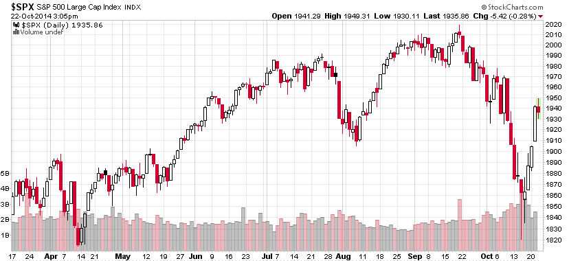
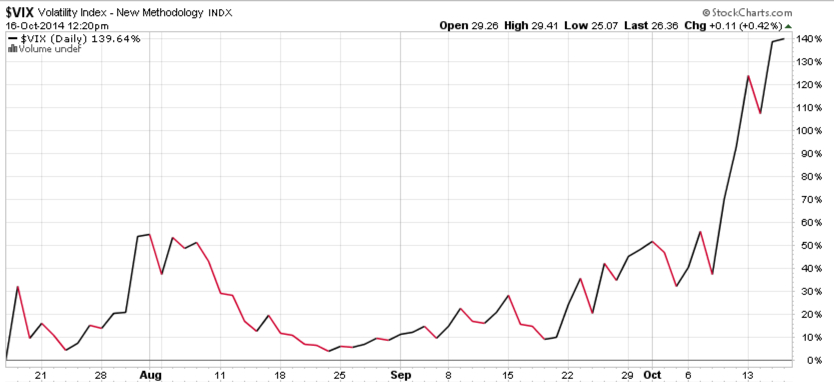
First, the large company stock index, the S&P 500, is now at a point where it likely stalls for maybe a few days before it either continues to trend up or it reverses back down. In “Today Was the Kind of Panic Selling I Was Looking For” I pointed out that the magnitude of selling that day may be enough panic selling to put in at least a short-term low. In other words, prices may have fallen down enough to bring in some buying interest. As we can see in the chart below, that was the case: the day I wrote that was the low point in October so far. We’ve since seen a few positive days in the stock index.

stock index 2014-10-22_15-06-14

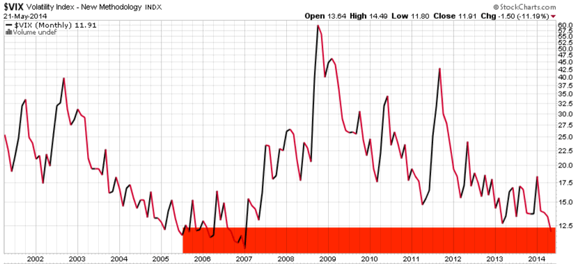
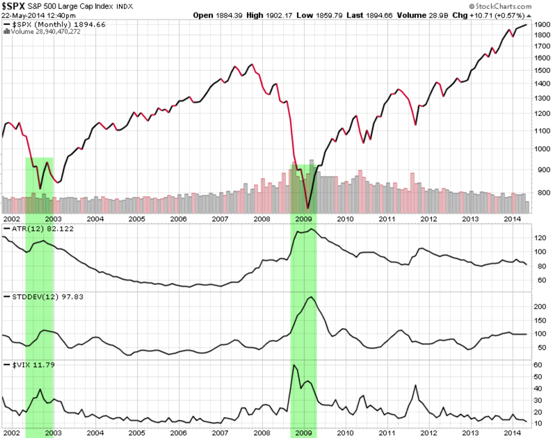
All charts in this article are courtesy of http://www.stockcharts.com and created by Mike Shell

Larger declines don’t trend straight down. Instead, large declines move down maybe -10%, then go up 5%, then they go down another -10%, and then back up 7%, etc. That’s what makes tactical trading very challenging and it’s what causes most tactical traders to create poor results. Only the most experienced and skilled tactical decision makers know this. Today there are many more people trying to make tactical decisions to manage risk and capture profits, so they’ll figure this out the hard way. There isn’t a perfect ON/OFF switch, it instead requires assessing the probabilities, trends, and controlling risk.

Right now, the index above is at the point, statistically, that it will either stall for maybe a few days before it either continues to trend up or it reverses back down. As it all unfolds over time, my observations and understanding of the “current trend” will evolve based on the price action. If it consolidates by moving up and down a little for a few days and then drifts back up sharply one day, it is likely to continue up and may eventually make a new high. If it reversed down sharply from here, it will likely decline to at least the price low of last week. If it does drift back to last weeks low, it will be at another big crossroads. It may reverse up again, or it may trend down. Either way, if it does decline below low of last week, I think we’ll probably see even lower prices in the weeks and months ahead.

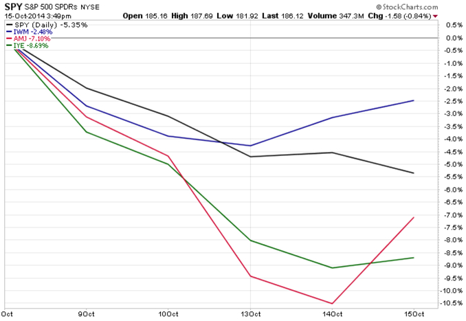
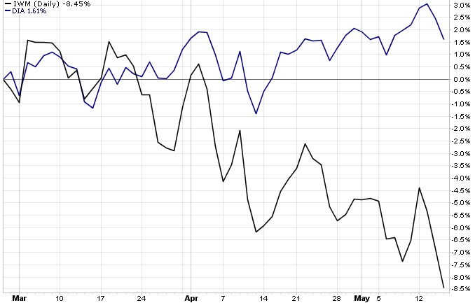
Though I wouldn’t be surprised if the stock index does make a new high in the coming months, one of my empirical observations that I think is most concerning about the stage of the general direction of the stock market is that small company stocks are already in a downtrend. Below is a chart of the Russell 2000 Small Cap Stock Index over the same time frame as the S&P 500 Large Cap Stock Index above. Clearly, smaller companies have already made a lower low and lower highs. That’s a downtrend.

small company stocks 2014 bear market

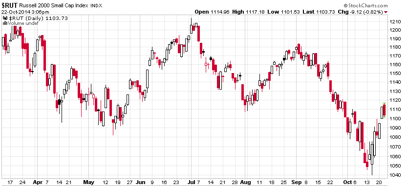
Smaller company stocks usually lead in the early stage of bear markets. There is a basic economic explanation for why that may be. In the early stage of an economic expansion when the economy is growing strong, it makes sense that smaller companies realize it first. The new business growth probably impacts them in a more quickly and noticeable way. When things slow down, they may also be the first to notice the decline in their earnings and income. I’m not saying that economic growth is the only direct driver of price trends, it isn’t, but price trends unfold the same way. As stocks become full valued at the end of a bull market, skilled investors begin to sell them or stop investing their cash in those same stocks. Smaller companies tend to be the first. That isn’t always the case, but you can see in the chart below, it was so during the early states of the stock market peak in 2007 as prices drifted down into mid 2008. Below is a comparison of the two indexes above. The blue line is the small stock index. In October 2007, it didn’t exceed its prior high in June. Instead, it started drifting down into a series of lower lows and lower highs. It did that as the S&P 500 stock index did make a prior high.

small stocks fall first in bear market

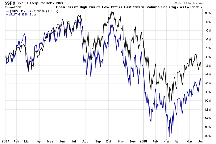
But as you see, both indexes eventually trended down together.

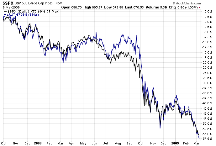
As a reminder to those who may have forgotten, I drew the chart below to show how both of these indexes eventually went on to lower lows and lower highs all the way down to losses greater than -50%. I’m not suggesting that will happen again (though it could) but instead I am pointing out how these things look in the early stages of their decline.

2008 bear market

If you don’t have a real track record evidencing your own skill and experience dealing with these things, right now is a great time to get in touch. By “real”, I’m talking about an actual performance history, not a model, hypothetical, or backtest. I’m not going to be telling you how I’m trading on this website. The only people who will experience that are our investors.


VIX® gained 140%: Investors were too complacent

Several months ago I started sharing some of my observations about the VIX ( CBOE Volatility Index). The VIX had gotten to a level I considered low, which implied to me that investors were too complacent, were expecting too low future volatility, and option premiums were generally cheap. After the VIX got down to levels around 11 and 12 and then started to move up, I pointed out the VIX seemed to be changing from a downward longer term trend to a rising trend.

As I was sharing my observations of the directional trend and volatility of VIX that I believed was more likely to eventually go up than down, it seemed that most others were writing just the opposite. I know that many volatility traders mostly sell volatility (options premium), so they prefer to see it fall.

As you can see in the chart below, The VIX has increased about 140% in just a few weeks.

VIX october

Chart courtesy of http://www.stockcharts.com

For those who haven’t been following along, you may consider reading the previous observations:

A VIX Pop Then Back to Zzzzzzzz? We’ll see

Asymmetric VIX

VIX Shows Volatility Still Low, But Trending

VIX Back to Low

The VIX is Asymmetric, making its derivatives an interesting hedge

Is the VIX an indication of fear and complacency?

What does a VIX below 11 mean?

What does the VIX really represent?

The VIX, my point of view

The VIX, as I see it…

Volatility Risk Premium

Declining (Low) Volatility = Rising (High) Complacency

Investors are Complacent


Today Was the Kind of Panic Selling I Was Looking For

I mentioned in “Fear is Driving Stocks Down, or is Declining Stocks Driving Fear?” that falling prices could lead to panic selling and it may require some panic selling to push prices low enough to bring in new buying demand. Of course, to have cash to buy you had to have previously sold before the decline.

Today we’ve observed just that. The headlines today “Dow Plunging 460 points” is what I was talking about. Big down days rid weak holders of their positions they held too long, so they fear losing more money. Those of us who already sold early enough to have cash for new entries can wait for prices to get to a low enough point to make the risk/reward attractive enough to take a chance.

Although we could be observing the early stages of a much larger downside bear market that unfolds in the months ahead, they don’t drift straight down. Instead, they cycle down 10%, up 7%, down 10%, etc. When they’ve moved down, one potential sign of a reversal back up is when the worst performing areas of the markets reverse back up. I usually observe the things that were trending down the most get oversold and are the first to shift back up, at least temporarily.

The chart below is the past 2 days of the S&P 500 (SPY), Russell 2000 Small Company stocks (IWM), the Energy Sector (IYE), and Energy MLPs (AMJ). As I’ve pointed out lately, smaller companies and energy have declined the most and on today’s big down day for stocks, you can see below those weakest areas are drifting up. It’s a positive sign in the days ahead IF that continues…

small caps energy rebounding

Chart courtesy of http://www.stockcharts.com

The way directional trends unfold is they sometimes get to a point like they are now and reverse back up, if prices have gotten low enough to attract enough new buying, that buying ends to fall. But if that doesn’t happen, this is what the early stage of how even more panic selling begins. I believe everyone has an exit point. Even those who say they are passive and “buy and hold” eventually panic when their losses get too large. Stock indexes have only fallen about -9% from their peak a few weeks ago, so that probably isn’t yet enough to drive too many out  who are 100% invested, but you can probably see how as their losses get larger and larger many of them do eventually exit.

I think everyone has an exit, an “uncle point”, it can either be an earlier predefined exit like mine are, or after their losses get so large they can’t take it anymore (-20% or 30%) or to the point it begins to change their life plans (like -40% or 50%).

Let’s see how it all unfolds…

If you are an investment adviser or individual investor and don’t have a strong track record of active risk management, now is a good time to get in touch.

Fear is Driving Stocks Down, or is Declining Stocks Driving Fear?

The last time I pointed out a short-term measure of extreme investor sentiment was August 4, see “Extreme Fear is Now the Return Driver“. At that time, popular stock indexes had declined -3% or more and as prices fell, investor fear measures increased.

As stocks rise, investors get complacent and brag about their profits. After prices fall, investor fear measures start to rise.

Since I pointed out “Extreme Fear is Now the Return Driver”, the Dow Jones Industrial Average went on to trend back up 5% by mid September. Below is a price chart for the Dow year to date. I marked August 4th with a red arrow. You can see how the price trend had declined sharply, driving fear of even lower prices, then it reversed back up. Fear increases after a decline and when fear gets high enough, stocks often reverse back up in the short term. They get complacent and greedy after prices rise to the point there are no buyers left to keep bidding prices up, then prices fall. Investors oscillate between the fear of missing out and the fear of losing money.

dow jones stock index year to date

Source: http://www.stockcharts.com

Since mid September, the price trend has drifted back down over 4% from the peak. As you can see, the Dow has made no gain for the year 2014. It is no surprise that investor sentiment readings are now at “Extreme Fear” levels, as measured by the Fear & Greed Index below.

Fear and Greed Index

Source: Fear & Greed Index CNN Money

So, the last time investor fear levels got this high, stocks reversed back up in the weeks ahead. However, it doesn’t always work out that way. These indicators are best used with other indications of trend direction and strength to understand potential changes or a continuation. For example, we commonly observe 4% to 5% swings in stock prices a few times a year. That is a normal range and should be expected. However, eventually prices will decline and investors will continue to fear even more losses. As prices fall, investors sell just because they’re losing money. Some sell earlier in the decline, some much later. You may know people who sold after they were down -50% in 2008 or 2002.  The trouble with selling out of fear is: when would they ever get back in? That’s why I manage risk with predefined exit points and I know at what point I would reenter.

My point is: fear always has the potential to become panic selling leading to waterfall declines. Panic selling can take weeks or months to drive prices low enough that those who sold earlier (and avoided the large losses and have cash available) are willing to step in to start buying again. Those who stay fully invested all the time don’t have the cash for new buying after prices fall. It’s those buy and hold (or re-balance) investors who also participate fully in the largest market losses.  It’s those of us who exit our losers soon enough, before a large decline, that have the cash required to end the decline in prices.

Selling pressure starts declines, new buying ends them.

We’ll see in the weeks ahead if fear has driven prices to a low enough point that brings in new buying like it has before or if it continues into panic selling. There is a chance we are seeing the early stages of a bear market in global stocks, but they don’t fall straight down. Instead, declines of 20% or more are made up of many cycles of 5 – 10% up and down along the way. So, we shouldn’t be surprised to see stock prices drift up 5% again, maybe even before another -10% decline.

Declining stocks drive fear, but fear also drives stocks down.

Let’s see how it all unfolds…

The VIX is Asymmetric, making its derivatives an interesting hedge

Asymmetric payoff VIX

The VIX is asymmetric, its distribution is non-symmetrical, it is skewed because it has very wide swings. The volatility of volatility is very volatile. There is an asymmetric relationship between stock index returns and the VIX. This asymmetric relationship is what initially makes the VIX interesting for hedging against S&P 500 volatility and losses.

Since I started the series about the extremely low VIX level Monday, like The VIX, as I see it…, The VIX has gained 17% while the S&P 500 stock index has lost about 1%. The VIX is asymmetric. While the VIX isn’t always a perfect opposite movement to the stock indexes, it most often does correlate negatively to stocks. When stocks fall, the implied (expected) volatility increases, so the VIX increases. Asymmetry is imbalance: more of one thing, less of the other. For example, more profit potential, less loss or more upside, less downside.

An advantage of the VIX for hedging is that it is asymmetric: it increases more than stocks fall. For example, when we look at historical declines in the stock index we find the VIX normally gains much more than the stock index falls. For example, if the stock index declined 5% the VIX may have gained 30% over the same period. That ratio of asymmetry of 6 times more drift would allow us to tie up less cash for a hedge position. Of course, the ratio is different each time. Sometimes it moves less, sometimes more.

When the VIX is at a low enough level as it’s been recently, the asymmetric nature of the VIX makes it an interesting hedge for an equity portfolio. The best way to truly hedge a portfolio is to hedge its actual holdings. That’s the only true hedge. If we make a bet against an index and that index doesn’t move like our positions, we still have the risk our positions fall and our hedge does too or doesn’t rise to offset the loss. I always say: anything other than the price itself has the potential to stray far from the price. But the asymmetry of VIX, its potential asymmetric payoff, makes it another option if we are willing to accept it isn’t a direct hedge. And, that its derivatives don’t exactly track the VIX index, either. None of the things we deal with is a sure thing; it’s always probabilistic.

This week has been a fine example of VIX asymmetry. The chart below shows it well.

The VIX is Asymmetric

Note: The VIX is an unmanaged index, not a security so it cannot be invested in directly. We can gain exposure to the VIX through derivatives futures, options, or ETNs that invest in VIX futures or options. This is not a recommendation to buy or sell VIX derivatives. To determine whether or not to take a long or short position in the VIX requires significantly more analysis than just making observations about its current level and direction. For example, we would consider the term structure and implied volatility vs. historical volatility and the risk/reward of any options combinations.

It’s official: extreme greed is driving the stock market

In Is the VIX and indication of fear and complacency? I pointed out a few reasons I believe a low VIX level can indeed be a signal of greed and complacency and a high VIX level is a measure of fear. It’s very simple: fear and greed are reflected in the price of options. When there is a strong demand for protection, the prices goes up. When there is little demand for protection, the price goes down. The recent low levels of VIX suggest a lack of fear or desire for protection from falling prices or rising vol.

I also said that the VIX levels often correspond with other sentiment levels. I have used the Fear and Greed Index before to explain how investors oscillate between the fear of missing out and the fear of losing money. After prices rise, we observe they get more greedy. For example, if they didn’t have strong exposure they may feel regret and fear missing out. After prices fall, they are afraid of losing more money. This Fear and Greed Index is published by CNN Money and is publicly available, making it useful for this purpose to illustrate how behavior drives trends. As you can see below, the current level is “Extreme Greed”, so that is the emotion driving stocks right now.

Greed index correlates with low vix

Source: CNNMoney’s Fear & Greed index

This Fear and Greed Index includes 7 different sentiment indicators. Market volatility as measured by VIX is one of them. In observing sentiment indicators like this, we see them oscillating between extreme greed and extreme fear over time. It spends a lot of time in the middle, too, but trends often reverse when it gets to extremes. When it reaches Extreme Greed, it eventually reverses down after prices peak out and reverse down. When it gets to an extreme greed level like it is now, we eventually see something come along and surprise them. I think it’s because investors become complacent and the stunned. Change is most alarming when it isn’t expected. When stocks fall, it will move toward fear as they fear losing more money. However, these measures can certainly stay extreme for longer than you think. That is the challenge to countertrend systems and thinking: trends do tend to persist, making it more difficult to bet against the wind. But when we see levels like this, we shouldn’t be so surprised when it changes direction.


Declining (Low) Volatility = Rising (High) Complacency

When we speak of trends, we want to recognize a trend can be rising or declining, high or low. These things are subjective, because there is infinite ways to define the direction of a trend, its magnitude, speed, and absolute level. So, we can apply quantitative analysis to determine what is going on with a trend.

Below we see a quote for the CBOE Market Volatility Index (VIX). The VIX is a measure of the 30 day implied volatility of S&P 500 index options. It is a measure of how much premium options traders are paying on the 500 stocks included in the S&P 500. So, it is a measure of implied or expected volatility based on how options are priced, rather than a measure of actual historical volatility based on a past range of prices. Without going into a more detailed discussion of the many factors of VIX, I’ll add that the VIX is a fine example of an index that is clearly mean reverting. That is, the VIX oscillates between high and low ranges. Once it gets to a high level or low-level, it eventually reverts to its average. Said another way, it’s an excellent example of an index we can apply countertrend systems instead of trend following systems, because the VIX swings up and down rather than trending up or down for years.

The VIX has a long-term average of about 20 since its inception. At this moment, it is 11.82. It’s important to realize the flaw of averages here, because the VIX doesn’t actually stay around 20 – it instead averages 20 as it swings higher and lower.

VIX CBOE Market Volatility below 12


I used the above image from CNNMoney because it shows the rate of change in the VIX over the past 5 years on the bottom of the chart. Notice that over the past 5 years (an arbitrary time frame) market volatility as measured by VIX has declined -63.78%. To get an even better visual of the decline and price action of the VIX, below is a chart of the volatility index going back to 2001.

Do you see a trend? Do you see high and low points?

VIX Long term average high and low

We observe the current level is low by historical measures. In fact, it’s about as low at it has been. The last time the volatility index was this low was 2006 – 2007. That was just before it spiked as high as it has been during the 2007 – 2009 market crash. You can probably see what I mean by “mean reversion” and “countertrend”. When the stock market is rising, volatility gets lower and lower as investors become more complacent. Most investors actually want to get more aggressive and buy more stocks after they have already risen a lot for years, rather than realizing the higher prices go the more risky they become. We love trends, but they don’t last forever. What I think we see above is an indication that investors have become complacent, option premiums are cheap, because options traders aren’t factoring in high volatility exceptions. However, we also see that the VIX is just now down below 12.5, and area the last bull market reached in 2006 and that low volatility stayed low for over a year before it reversed sharply. Therein lies the challenge with counterrend trading: we don’t know exactly when it will reverse and trends can continue longer than we expect. And, there are meaningful shorter term oscillations of 20% or more in the VIX.

I also want to point out how actual historical volatility looks. Recall that the VIX is an index of market volatility based on how options are priced, so it implies the expected volatility over the next 30 days. When we speak of historical volatility, there are different measures to quantify the historical range prices have traded. Volatility speaks of the range of prices, so a price that averaged 100 but trades as high as 110 and low as 105 is less volatile than if it trades from 130 and 70. Below I charted the price chart of the S&P 500 since 2002. The first chart below it is ATR, which is Average True Range. ATR considers the historical high and low prices to determine the true range. A common measure is the standard deviation of historical returns. Standard deviation is charted below as STDDEV below the ATR. Below Standard Deviation is the VIX.

VIX and S&P 500 historical market volatility

Notice that the measures of volatility, both historical and implied, increase when stock prices fall and decrease when stock prices rise. Asymmetric Volatility is the phenomenon that volatility is higher in declining markets than in rising markets. You can see why I say that volatility gets lower and lower as prices move higher and higher for several years. Then, observe what happens next. Right when investors are the most complacent, the trend changes. Prices fall, volatility spikes up. They feel more sure about things after prices have been rising, so there is less indecision reflected in the range of daily trading. When investors feel more uncertain, they become indecisive, so the range of prices spread out.

Based on these empirical observations, we conclude with the title of this article.

The VIX is an unmanaged index, not a security, so it cannot be invested in directly. We can gain exposure to the VIX through derivatives futures or options. This is not a recommendation to buy or sell VIX derivatives. To determine whether or not to take a long or short position in the VIX requires significantly more analysis than just making observations about its current level and direction. For example, we would consider the term structure and implied volatility vs. historical volatility and the risk/reward of any options combinations.


Stock Market Peak? A Tale of Two Markets

One of the early warning signs that a bull market in stocks is nearing its end is increasing selectivity. As more investors begin to believe a peak may be near based on statistical analysis or valuation, they may get positioned more defensively. Eventually we observe some stocks participating in a rising trend as others trend down early. Over the past several weeks we have observed a material divergence between large company stocks like those in the Dow Jones Industrial Average (DIA) vs. small company stocks like those in the Russell 2000 Index (IWM). As you can see below, the Russell 2000 index has declined nearly 9% while the Dow Jones Industrial has gained about 2%. Since the Dow Jones Industrial is more popularly quoted in the media, most investors probably believed “the market was still rising”. But unless you only have positions in the largest company stocks, you’re noticing that isn’t the case in terms of the broad market. Small company stocks tend to lead on the downside, so we shouldn’t be surprised if we see the larger companies follow them down at some point. You can probably see how this basic observation leads to further study of market breadth: looking at what percent of stocks are rising vs. falling.

Is this the “tail” of two markets?

stock market peak small cap large company stocks

Data: http://www.stockcharts.com

Of course, the direction of the overall market is interesting to monitor, but it only matters what positions we have at risk.

The new normal is a roller coaster of one bubble bursting after another.

Neural networks are computer systems inspired by an animals’ central nervous system that is capable of machine learning and pattern recognition. Neural networks can be very powerful systems for identifying and classification of things. If we are developing neural networks to categorize and recognize patters we necessarily have to teach it what a pattern looks like. A simple way to understand is to think of letters in the alphabet. The first letter of my last name can appear very different, depending on what font we use.

S neural network example

You can probably see how a program designed to recognize the pattern to classify a letter would necessarily need several variations – a range of possibilities. In other words, if it required perfection and we defined the perfect “S” as the first one, it would miss the other two.

I use this as an example for common errors in identifying and classifying chart patterns. Not all price trends unfold the exact same way, so there is some subjectivity about identifying and classifying them. If we required them to be too exact, we miss those that aren’t. But patterns don’t always play out as expected, either. Just because the stock market index broke out to a new high doesn’t mean it must continue its inertia in that direction. It’s probabilistic, never a sure thing. We the people have trouble with that – people hate uncertainty, even though that’s all we ever have.

Now that we’ve added some tolerance to our thinking for a moment, let’s take a look at an interesting chart someone passed along in my inbox recently. Below is the S&P 500 stock index from the HS Dent Foundation. Harry Dent probably needs no introduction. As you can see, he has labeled the chart to classify the peaks and troughs with A, B, C, D, and E. At this point, the price trend is at the “E” stage. He draws a dotted line that shows the trend eventually reversing down from a higher high at “E” to a lower low, which I guess will be labeled “F”. That’s why they call it a megaphone. What happens after “E” is not yet known, but you can probably see the line of thinking.

Dent S&P 500 Megaphone chart

The article someone passed along is an interview with Dent. Below is the part that referenced the chart:

HD: Investors must realize that there is a new normal. Stocks will not be growing at 12%/year. Bonds will not yield 5–6%. The new normal is not even the expectation of 4% on stocks and 2% on bonds that people like Bill Gross from PIMCO suggest. The new normal is a roller coaster of one bubble bursting after another.

Investors have to get away from the traditional concepts of diversification and asset allocation for the next decade or so. When bubbles burst, everything goes down. In 2008, real estate, oil, commodities, gold and silver crashed. The U.S., European and emerging markets crashed.

With each bubble, the market has gone to a slightly new high and to a slightly new low when the bubble bursts. We call it a megaphone pattern.

“The new normal is a roller coaster of one bubble bursting after another” isn’t as much a prediction as it is a reality, as evidenced by the actual history of the chart. The problem is, it seems, according to Dent the peak at “E” was supposed to play out in 2013. So, many people now criticize his forecast.

Someone asked what I thought about it, so I’ll share two things.

1. He was wrong in his precise prediction that this top would be 2013. We can only say that because 2013 has passed. The problem with predictions and forecasts such as this is that no one really knows for sure what’s going to happen next, much less the precise date. Even if it were probabilistic based on sound logic and math, which implies there is some chance it may be wrong.

2. What I like about the chart is that it can be useful as a reminder to actively manage risk. What if it does play out that way? Because of #1, it may not be wise to exit to 100% cash and wait for it to happen – it may not. Instead, you may use it as a motivation to know what you’ll do if that does play out. If you do nothing at all, how will a -70% decline in stocks impact you? Will you have time to wait for the 233% gain required to recover the loss? When would that be? If you wish to instead avoid such a decline, how will you do that? Such declines don’t go straight down quickly, but usually more of series of advances and declines making it very difficult to navigate. For example, -10%, +8, -15%, +9, -20%, +17%, etc. Every time it moves up, people get excited and wished they’d picked the bottom. If they get in, and it reverses back down, they are in a loss trap again. When they are down even more, they panic out, it reverses back up, they wish they were in. If they are a new portfolio manager with no prior experience in such a period, they’ll have investors feedback coming in with the wrong sentiment at the wrong time. If you are unsure about what I mean by people oscillating between the fear of missing out and the fear of losing money, you’ll understand after you experience it if this chart plays out.

I’m sure he provides all kinds of fundamental and economic reasons for why a new low for stocks could be reached in the years ahead. Those things can have the power to convince you if it will happen, nor not. What you believe is always true for you. Let it serve as a reality check for the current stage U.S. stocks may be in if you find yourself feeling giddy like the crowd. My focus is on a range of possibilities and being prepared with systems designed from experience to deal with them, not just hypotheticals and back-tests.

It doesn’t matter if it will happen, it only matters if it does. And if it does, how we respond to it is what creates our own outcomes. The thing about patterns is they don’t have to be perfect… just because one person expects it to be Arial doesn’t mean it won’t be Century Gothic.

Enter your email address to subscribe to this blog and receive notifications of new posts by email.

Why Investors Fail

why investors fail

People believe they know things they don’t and focus their energy trying to know the unknowable, rather than focusing on those things we can know and can control. The problem starts with one of the most read and respected investment books.

“An investment operation is one which, upon thorough analysis, promises safety of principal and an adequate return. Operations not meeting these requirements are speculative.

-Benjamin Graham, “The Intelligent Investor”, 4 ed., 2003, Chapter 1, page 18.

The trouble with that statement is that it promises the impossible. That is, I believe all operations are speculative and we do best by treating them as such.

First, let’s define the terms, according to Merriam-Webster.

A promise is:

 “a statement telling someone that you will definitely do something or that something will definitely happen in the future.”

Analysis is:

“detailed examination of the elements or structure of something, typically as a basis for discussion or interpretation.”

Speculative is:

“engaged in, expressing, or based on conjecture rather than knowledge. (of an investment) involving a high risk of loss.”

So, to be sure we understand the meaning, let’s read it again and then interpret what it means using these definitions.

“An investment operation is one which, upon thorough analysis, promises safety of principal and an adequate return. Operations not meeting these requirements are speculative.”

In other words, it suggests if you do a thorough examination of the operation, you will gain “safety of principal and an adequate return” and that will definitely happen in the future.

If you have ever wondered why so many don’t do well at investment management, this is one reason. They believe they can do thorough analysis up front that that will assure the outcome and protect against loss.

It doesn’t actually work that way.

We never know for sure in advance. And, if we focus on the things that do matter, we don’t need to know what will “definitely happen in the future”. The exit, not the entry, determines the outcome. The trouble with much of the value investing philosophy, whether buying private companies or exchange traded securities, is the assumption that you can determine what will happen next. But when you are so confident in that, you end up caught in a loss trap when you are wrong with no way out. Instead, the outcome is completely determined by our exit: how we get out of it.

So, I treat all operations as “speculative”. All operations have a high risk of loss.

And, all things are “conjecture”.

Conjecture:

“an opinion or conclusion formed on the basis of incomplete information.”

That is, we always have incomplete information. We never know it all. To me, it makes a lot more sense to focus on the direction prices are trending and know I’ll create my results by my exit, not my entry. I focus my energy on defining the direction and when it’s going in the wrong one… so I can exit.

etf managed portfolio

Dow is down 6.7%: Extreme Fear is Now Driving Stocks

During holiday parties it seemed everyone was talking about how much the Dow Jones Industrial Average was “up” for the year. So, it is no surprise that the Dow is down -6.7% since the beginning of the new year.

Dow Jones Industrial year to date

And, now that Dow is down -6.7%, investor sentiment measured by the Fear & Greed Index has shifted from greed as the return driver to Extreme Fear. Investor’s tend to get overly aggressive after prices advance and then afraid after prices fall. For example, a wealth manager told me in December that a client of his wanted to “shift to a more aggressive model’ because stocks had gone up so much. People tend to extrapolate the recent past, expecting it will continue into the future.

Extreme Fear Driving Stocks Investor Behavior

Source: http://money.cnn.com/data/fear-and-greed/

Though there seems to be signs the topping process may be underway, the stock market often trends the opposite of what investor’s expect, so I wouldn’t be surprised to see a reversal.

Is the Bull Topping Process Starting?

There are several things that unfold as a market begins the topping process. While large cap indexes may continue to make new highs, the market becomes more and more selective. We’ll see that in breadth indicators like bullish percent indexes, Advance Decline Lines, etc. As the market finds fewer and fewer stocks attractive, it becomes more selective, so fewer stocks remain in positive trends.

The current bull market in stocks is about 58 months old. As I explained in The REAL Length of the Average Bull Market the bull markets have averaged about 39 months and bear markets about 17 months. A full market cycle (average bull + bear) is 56 months. The current bull market, then, is longer than the historical average full market cycle. So, it makes a lot of sense to start watching for signs the topping process has started. It’s important to understand a bull markets end with a process of churning up and down and with fewer stocks participating in the last stage of advances.

Below is an example of fewer stocks participating. The S&P 500 Bullish Percent Index shows a composite of the 500 stocks in the S&P 500 index that are in a positive trend. The lower highs made over the past year is beginning to show fewer of those stocks are making buy signals as the S&P 500 index has made new highs. It appears the selectivity is in its early stage as the percent of stocks on a buy signal is still around 70%, but it’s falling. This is just one example of the kind of things I observe when watching for a topping process.

NYSE Bullish Percent

Source: https://stockcharts.com/def/servlet/SC.pnf?c=$BPSPX,P

Below I list a table of several other bullish percent’s for stock indexes. Using Point & Figure terminology,  they are either a Bull Top (the chart is falling (in a column of Os) but above 70%) or Bear Confirmed (chart is falling (column of O’s) below 70% and has generated a P&F sell signal). I wouldn’t be surprised to see these get a lot lower in the months ahead. However, what makes it difficult for most people is the process is made up of advances and declines, not usually just a straight down move. The whipsaws up and down is what causes the most trouble.

Index Bullish% Status Status Change
Russell 2000 64.03% Bear Alert 30-Aug-13
Dow Industrials 63.33% Bear Confirmed 31-Jan-14
NASDAQ 100 65.00% Bear Confirmed 29-Jan-14
NYSE 61.55% Bear Confirmed 27-Jan-14
Optionable Stocks 67.60% Bear Confirmed 31-Jan-14
S&P SmallCap 600 67.55% Bear Confirmed 31-Jan-14
AMEX 63.31% Bull Confirmed 2-Jan-13
NASDAQ Composite 62.68% Bull Confirmed 2-Jan-13
Wilshire 5000 66.29% Bull Confirmed 2-Aug-13
S&P 100 70.71% Bull Top 13-Dec-13
S&P 500 68.41% Bull Top 24-Jan-14
S&P Composite 1500 70.30% Bull Top 28-Jan-14
S&P MidCap 400 72.64% Bull Top 27-Jan-14

The Fed: What’s going to happen next?

Today the Federal Reserve meets and investors are talking about it even more than normal because the market wants to know what’s going to happen next. If the Fed will continue the same “Quantitative Easing” government bond-buying program, or will they taper it. Make no mistake about it, the Fed’s manipulation to the economy and capital markets is a serious matter and we’ll only know its true impact years from now. But in regard to its expectation of a positive near term impact on the economy it seems the bigger issue is whether or not the QE continues to work or run out of gas.

Investors, however, are mostly concerned about the capital markets impact: how their decision will drive the directional price of currency, bonds, stocks, and commodities. To that, you may consider that it doesn’t matter what the Fed does – it only matters how the drivers of price react to it. That is, if you are sitting around trying to figure out what’s going to happen next, you may consider that you don’t need to know what the Fed will do but instead how the market (people who buy and sell) responds to it. Will the participants in global markets respond with enough magnitude to shift prices in one direction or another? And, in what direction will they respond? If the Fed tapers, the direction will depend on if there is more buying demand than selling pressure to move the price up. Or, will they perceive it as negative? That is the trouble with trying to figure out what’s going to happen next and basing your exposure to risk on that guess. If you don’t have tomorrow’s newspaper today – you really don’t know. Since tomorrow isn’t yet here it doesn’t yet exist, so it is unknowable. If you guess it right, it doesn’t mean you have special powers. If you guess it wrong, that doesn’t mean anything either.

I don’t worry about what the Fed does or how currency, bonds, stocks, and commodity trends will react to it. I already know what I’ll do next regardless of what shifts the price from one direction to another. People often worry about things and experience what they fear the most even when it doesn’t happen. They worry because they are uncomfortable with uncertainty. Many things are unknowable and uncontrollable, so those things are surely uncertain. All we can do is control how we respond to it. I don’t wait until some news event to figure out what to do next. I always know at what price I’ll buy and sell. It isn’t determined by news, but instead based on the directional price trends of the world markets I trade.

risk management

Investors are Complacent

Implied volatility, the amount of “insurance premium” implied by the price of options, continues to suggest that investors are becoming very complacent. When the VIX is high or rising, it says the market expects the S&P to move up or down more. When the VIX is low or declining, it says the market expects the S&P 500 will not move up or down as much in the future. That is, the “insurance premium” priced into options on the S&P 500 stocks is low. That isn’t necessarily directional – it is an indication of the expected range, not necessarily direction. However, what I know about directional price trends is that after a price has been trending directionally for some time, as the S&P 500 stock index has, investors become more and more complacent as they expect that trend to continue. The mind naturally wants to extrapolate the recent past into the future and it keeps doing it until it changes. When we see that in the stock market, it usually occurs as a directional trend is peaking. Investors are caught off guard as they expected a tight range. If the range in prices widens, they probably widen even more because they are – and it wasn’t expected. Interestingly, people actually expect inertia and that is one of the very reasons momentum persists as it does. Yet, momentum may eventually move prices to a point (up or down) that it may move too far and actually reverse the other way.

Image

If we believe the market is right, we would believe the current level accurately reflects the correct expecation for volatility the next 30 days. That is, we would expect today’s implied volatility of about 12 – 13% will match the actual historical volatility 30 days from now. In other words, 30 days from now the historical (backward looking) volatility is match the current implied volatility of 12.6%. If we believe the current volatility implied by option premiums is inaccurate, then we have a position trade opportunity. For example, we may believe that volatility gets to extremes, high or low, and then reverses. That belief may be based on empirical observation and quantitatively studying the historical data to determine that volatility is mean reverting – it may oscillate in a range but also swing from between one extreme to another. If we believe that volatility may reach extremes and then reverse, we may believe the market’s implied volatility is inaccurate at times and aim to exploit it through counter-trend systems. For example, in my world, volatility may oscillate in a range much of the time much like other markets, except it doesn’t necessarily have a bias up or down like stocks. There are times when I want to be short volatility (earning premium from selling insurance) and long volatility (paying premium to buy insurance). I may even do both at the same time, but across different time frames.

The point is, the market’s expectation about the future may be right most of the time and accurately reflect today what will be later. But, what if it’s wrong? If we identify periods when it may be more likely wrong, such as become too complacent, then it sets up a position opportunity to take advantage of an eventual reversal.

Of course, if you believe the market is always priced accurately, then you would never take an option position at all. You would instead believe that options are priced right and if you believe they are, you believe there is no advantage in being long or short them. I believe the market may have it right most of the time, but at points it doesn’t, so convergence trades applying complex trade structures with options to exploit the positive asymmetry between the probability and payoff offers the potential for an edge with positive expectation.

A gap down from here would confirm a short term S&P 500 trend reversal

ImageI actually wrote this at 1pm but wanted to wait to publish it after the close to see if the pattern I observed at 1pm would be intact at the close. It wasn’t, but I decided to publish this anyway and add an additional point: there is real information in price action and it doesn’t have to be perfect, especially if there is additional confirming information. These candlestick patterns mark potential trend reversals, but require confirmation before action anyway. Even though the close wasn’t exactly a Shooting Star, I still believe the price action suggests the same potential outcome if it is confirmed by lower prices.

Technical analysis of price trends include chart pattern recognition to determine what is likely to happen to a price trend over time. The most useful patterns are reversal patterns. Price data viewed on a chart is a visual representation of supply (selling pressure) and demand (buying pressure). Like other things, the direction of price is ultimately determined by supply of it and demand for it. When there is a greater demand for something its price will rise if supply stays the same. When demand declines, its price will fall. Buying pressure, then, is ultimately the primary driver of prices to the upside and selling pressure is what drives price down. A person with expertise and experience in price trend pattern recognition can study the charts pattern and gain an understanding of what is going on: buying or selling pressure. We can use that to define the direction of the trend and also identify probable reversals in the current trend. That is, determine the most probable price movements based on an examination of past price movements. Of course, price trends are always in the past. The only data of any kind we can ever study is past data; never future data that doesn’t yet exist.

I’m not a big supporter of most chart patterns as many of them aren’t testable quantitatively to determine their actual probability and expectation. However, as discretionary traders who do successfully trade patterns will argue: some patters are obvious enough in their message that when we’ve seen them play out 10,000 times before we realize we have a high probability outcome. But, note that it is still a probability, which implies likelihood; never a sure thing. Today I noticed a pattern for the popular S&P 500 stock index that, based on my two decades of empirical observation, I can say often precedes a reversal. But, it isn’t just the pattern itself that I note, but also some additional confirmation by a overbought reading in the Relative Strength Index (RSI). However, this pattern does require additional confirmation in the days ahead.

A Shooting Star is a candlestick pattern that identifies a potential trend reversal, but requires confirmation before action. It is a bearish reversal pattern that forms after an upward price trend. It occurs after the price gaps up at the open (like it did today) and then continues to move up, but then closes lower than the high of the day. I am writing this at 1pm, so it hasn’t yet closed, but I suspect this pattern is still telling. You can see what it’s supposed to look like up close in the picture above. The formation doesn’t have to be perfect or exact. A confirmation means to establish the correctness of something. Confirmation is required to validate that this pattern is a bearish reversal. The confirmation would be a gap down in price in the coming days. Until then, it is only a warning sign; a shot across the bow.

As you can see in the S&P 500 stock index price chart below, the price has been directionally trending up. It has moved about as much as it has moved in prior advances. I included the RSI indicator, which is a statistical measure that suggests the price is “overbought”. RSI is the “Relative Strength Index” that measures the speed and change of price movements. Over short time frames, like 28 days, price trends tend to exhibit mean reversion. That is, while price trends tend to continue their current trend over periods of 3- 12 months, they tend to oscillate up and down over short-term periods like a month. That is the price trend tends to peak out when the RSI reading is over 70 and bottom out when it’s closer to 30. Of course, we mainly want to follow the primary trend and looking at the chart below, that would require living with the swings of 5 -10%. If we are unwilling to deal with that, we would have to accept missing some of the gains that is required when we reduce exposure to miss some of the decline.

Image

Source: https://stockcharts.com/h-sc/ui?s=spy

I don’t necessarily make my portfolio management decisions with these patters, but instead wanted to share this observation for those interested in understanding what I see when I observe trends unfold like this one. If nothing else, I wouldn’t be surprised to see at least a minor reversal in the price in the near future. When it does that, it may only be a 5% decline and then reverse back up to new highs again. Or, it could go on to make a lower low and be the start of a bear market. You can probably see how this is a daily and dynamic process that evolves over time requiring constant adapting to new information and changes in the current state.

Some may try to tell you that the analysis or price trends don’t work. They may say that because they themselves lack expertise or experience with it, or haven’t been successful at it. But rest assured; some of the most profitable hedge funds apply directional trend systems including pattern recognition, and trend following, all of which can be called technical or statistical analysis of price trends. If they don’t know that, they simply haven’t really studied the most successful funds in history.

In my experience I have found that those who aren’t successful applying quantitative, statistical, or chart pattern methods are people who require complete perfection. They are looking for the 100% accurate switch that doesn’t exist in anything. If it doesn’t work this time, or next, they move on rather than understanding that probability is an estimation of likelihood of occurrence of an event, not a certain outcome. Determining the probabilities and expectation is, by definition, the mathematics of an edge. Those without an edge don’t get that, and that’s why they have no edge.

Cut short your losses, let your winners run on.

– David Ricardo 1772 – 1823

Those words, today known as “The Golden Rule of Trading”, were printed in The great metropolis, Volume 2 By James Grant in 1838. To be sure what he specifically meant:

Cut your losses short let your winners run

Source: The great metropolis, Volume 2 (Google eBook)

My INVESTOR’S BUSINESS DAILY® Interview and Portfolio Management

Portfolio Management is about buying and selling many different positions over time, not just one “pick”. I often say it’s like flipping 10 coins at the same time with each having a different payoff and profit or loss. It could be a completely random process (like flipping a coin), but if we can positively skew the payoffs (asymmetric payoffs) we end up with more profit than loss (asymmetric returns). And, as a portfolio manager I may flip that coin 100 or 500 times a year. The fact is: if the expectation for profit is positive we want to do it as often as possible.

Picking just one position is like flipping the coin just once. Its outcome may have an expected probability and payoff that is positive, but will be determined by how it all unfolds. We can never control the outcome at the point of entry. It’s the exit that always determines the outcome. We can say that same whether we are speaking of stocks, bonds, commodities, and currencies or buying and selling private businesses: if you actually knew for sure the outcome would be positive you would only need to do it once – but you don’t. So deciding what to buy is a small part of my complete portfolio management process. It’s what I do after I’m in a position that makes it “management”. To manage is to direct and control. If all you do is “buy” or “invest” in a position, you have no position “management”.

But when Trang Ho at INVESTOR’S BUSINESS DAILY®recently asked me “What ‘s the one position you would choose over the next several months and why”, I gave her the first position I thought of – and the most recent position I had taken. I primarily get positioned with the current direction of the trend and stay with it until it changes. That may be labeled “trend following”. I define the direction of the trend (up, down, sideways) and then get in that direction until it changes. Trends don’t last forever. There is a point when the probability becomes higher and higher of a reversal. I call that a “counter-trend”. I developed systems that define these directional trends more than a decade ago and have operated them for-profit since. What I can tell you from my experience, expertise, and empirical evidence is that stock market trends, like many other market trends, cycle up and down over time. So, portfolio management is a daily routine of position management that includes predefining risk at the point of entry, taking profits, and knowing when to exit to keep losses small. That exit, not the entry, determines the outcome.

You may consider these things as you read my recent interview in Investors Business Daily titled: Market Strategists: 5 Contrarian ETF Investing Ideas.

Read More At Investor’s Business Daily: http://news.investors.com/investing-etfs/090613-670234-contrarian-etf-investing-ideas-stock-market-strategists.htm#ixzz2gNp8bWUT

Do you choose the blue pill or the red pill?

Red-Pill-Blue-Pill

The “red pill” and “blue pill” refer to a choice between the willingness to learn a potentially unsettling or life-changing truth by taking the red pill or remaining in contented ignorance with the blue pill. It refers to a scene in the 1999 film The Matrix.

I have been talking to a financial planner recently who is struggling between the red pill and the blue pill.

On the one hand, the poor performance of stock and bond indexes over the past decade or so, particularly the losses in bear markets, led him to study long-term market cycles.

An understanding that markets don’t always go up over long periods is the reality of the red pill.

On the other hand, much of the investment industry still believes in getting “market returns” and that a simple plan of “asset allocation” and occasional re-balancing is prudent enough, so a financial planner can choose to keep his practice simple by continuing that plan.

Some investment advisers even consider re-balancing and an occasional change “tactical”.

It isn’t.

The blue pill and the red pill are opposites, representing the choice between the blissful ignorance of illusion (blue) and embracing the painful truth of reality (red).

On the one hand, after understanding the trends of global markets based on simply looking at their history, he realizes the probable outcome of stocks and bonds based on trends I discuss in The S&P 500 Stock Index at Inflection Points and 133 Years of Long Term Interest Rates. Though price trends can continue far more than you expect, the stock and bond markets are at a point where their trends could reverse. The financial planner realizes if he takes the red pill of reality, he’ll have to embrace these facts and do something rather than sit there. He’ll have to change his long-held beliefs that markets are efficient and the best you can do is allocate to them. He’ll have to do extra assignments and homework to find alternative investment managers whose track record suggests they may have the experience and expertise to operate through challenging market conditions.

On the other hand, changing one’s beliefs and taking a different approach can be extra work and have risks. If he continues the static asset allocation to stocks and bonds he’s always done, he says he won’t be doing something so different from the majority of advisers. He knows his career and his life will be easier. When the markets go up, his clients make market returns (minus his fees). When the markets go down, other people are losing money too, and he certainly can’t control what the market does, so: it’s the market. I can see how this is an enticing business model, especially for a busy person who has a life outside the office. That’s probably why it’s so popular.

A similar theme of duality happens in the movie The Matrix.

Morpheus offers Neo either a blue pill (to forget about The Matrix and continue to live in the world of illusion) or a red pill (to enter the sometimes painful world of reality).

Duality is something consisting of two parts: a thing that has two states that may be complementary or opposed to each other. We all get to choose what we believe and our choices shape the world we individually live in.

I can’t say that I can totally relate to the financial adviser because it is my nature to be more tactical and active in decision-making. I believe we should actively pursue what we want. And, I believe what we want from the markets is in there, I just have to extract it from the parts we don’t want. I once explained my investment strategy to a lifelong friend and he replied “you have always been tactical” and reminded me of my background. Though it’s different from me, I can truly appreciate the struggle advisers and investors face choosing between the red or blue pill. Investors and advisers like “market returns” when they are positive, which is what we experience most of the time. It’s when those markets decline that they don’t want what the market dishes out. The markets don’t spend as much time in declines. I pointed out in The Real Length of the Average Bull Market the average upward trend for stocks (bull market) lasts 39 months while the average decline ( bear market) is about 17 months. Investors eventually forget and become complacent about the time they need a reminder. Though the stock markets trend up about 3 times longer than they trend down, it’s the magnitude of the losses that cause long-term investors a problem. For example, the bull market from 2003 through October 2007 gained over 105% but the -56% decline afterward wiped out those gains. You can see that picture in The S&P 500 Stock Index at Inflection Points.

The risk for the financial adviser who has historically focused on “market returns” is that a new strategy for them that applies some type of active risk management is likely to be uncorrelated and maybe even disconnected at times from “market returns”. For example, I discussed that in Understanding Hedge Fund Index Performance. Investors who are used to “market returns” but need a more absolute return strategy with risk management may require behavior modification. If they want an investment program that compounds capital positively by avoiding large losses and capturing some gains along the way they have to be able to stick with it. That requires the adviser to spend more time educating his or her investors about the reality of the red pill. Kind of like I am doing now. Some people have more difficulty doing something different, so they need more help. Others are better able to see the big picture. Some financial advisers would rather deal with explaining the losses when markets decline. For them, it can be as simple as forwarding clients some articles about the market going down with a message something like “We’re all in this together – let’s just hunker down”. That doesn’t require a great deal of independent thinking or doing.

While most individual investors probably do lose money when the stock and bond markets do, that isn’t necessarily the case for those who direct and control downside risk.

It isn’t enough to have a good investment program with a strong performance history.

Just as important is the ability to help investors modify their beliefs and behavior.

That’s the reality of the red pill.

By definition, active is more work than passive. Investors and advisers alike get to choose which pill they take: the blissful ignorance of illusion (blue) and embracing the painful truth of reality (red).

I believe in individual liberty and personal responsibility, so the choice is your own.

My thoughts on the subject are directional – I am the red pill.

Morpheus: “You have to understand, most of these people are not ready to be unplugged. And many of them are so inured, so hopelessly dependent on the system, that they will fight to protect it.”

“Unfortunately, no one can be told what the Matrix is.

You have to see it for yourself.”

Like The Matrix, this is going to be a sequel.

To be continued…

133 Years of Long Term Interest Rates

Another incredible observation of long term interest rates comes from Shiller’s database.  The red line is the trend in long term interest rates. Interest rates peaked in 1981. That would have been an incredible time to buy bonds: their yields were 15%. But it was a terrible time to borrow money. Then interest rates declined dramatically- until now. Interest rates have been 2-3% lately, the lowest going back to 1880. At low interest rates, it’s a great time to borrow money, but a very risky time to buy bonds. When interest rates eventually go up, their values will go down. With rates at outlier low rates and the Fed going to need to taper their Quantitative Easing they’ve created to prop up the economy and stock market, the rise in rates in the years ahead could possibly be stunning. So the decline in bond values would be equally stunning. One of my advantages as a global macro manager is an understanding of how world markets interact with each other. The inverse relationship between bond price and interest rates is one of the few inter-market relationships that is a sure thing.

Long Term Interest Rates

Source: Shiller’s database.

For more views on bonds, read Interest Rates Trend and  Interest Rates are Trending Up, Bonds Investors Feeling the Pain


Asymmetry Observation: Global Markets Diverge Since May

Since May, we observe that global market indexes have diverged. While some markets are still trending up, others are trending down. Prior to 2013, many markets were generally trending together. The current U.S stock bull market is now 52 months old from from its March 2009 bear market low. If history is a guide, it’s closer to the end (read: The S&P 500 Stock Index at Inflection Points). One of the things we see near the end of a major trend change is some world markets start to reverse down. For example, going in to 2008 it was Financials and REITs (real estate). As we see in the chart, U.S. stocks are still trending up for now, but emerging markets and all categories of bonds and Real Estate Investment Trusts (REITs) are weak. Rising interest rates = falling bond prices and falling interest rate sensitive markets like REITs. The diversification of global asset allocation over this period has actually resulted in more downside risk rather than reducing it. Bonds have been in a rising trend for the past 30 years, so when stocks drop -50% exposure to bonds haves helped to offset the losses for asset allocators who mix stocks and bonds. If bonds are changing to a downtrend as it appears they are, bonds may not be a crutch in the next bear market. In fact, they may inflate losses.

Image

If you aren’t familiar with the index symbols for the markets in the table in the top left:

If you have any questions or comments, contact me.

Interest Rates are Trending Up, Bonds Investors Feeling the Pain

First, we view 15 Year Chart of the 10 Year U.S. Treasury Note Yield (interest rate) (Symbol: $TNX). Keep in mind this chart reflects the rate of change in the interest rate, not the price trend. If we define a downtrend as “lower highs, lower lows” the 15 year trend for interest rates has been down. But since 2012, the trend has sharply turned up – though that isn’t the first time.

Interest Rates are Trending Up

Next, we zoom in t0 view the magnitude of the interest rate on the 10 Year U.S. Treasury Note Yield since its low a year ago in August 2012. The interest rate on the 10 year treasury has gained 85%. The current yield is about 2.88%.

U.S. Treasury Note Interest Rate Trend

Next we look at the long term U.S. Treasury Bond Yield – the 30 year. Long terms rates have been in a downtrend the last 15 years, but have recently trended up sharply.

30 Year US Treasury Bond Yield

Understanding the implications of a reversal in the trend of interest rates is critical to a global macro fund manager. A large part of my global tactical decisions is identifying direction trend changes. and understanding how markets interact with each other. For example, we can see below how rising rates significantly impact the price value of bonds.

Below, we observe the total return (price trend + interest) of a wide range of different styles of bond ETFs.

Bond Price Declines

Clearly, they have recently been in a downtrend with U.S. Government bonds down the most at -13.65% over the past year.

Finally, we observe some markets and sectors that are very sensitive to changes in interest rates.

Markets impacted by rising interest rates

Eventually the Federal Reserve will stop their “Quantitative Easing” program of buying bonds. You know how supply and demand works: when demand dries up, price goes down…

The essence of investment management is the management of risks…

“The essence of investment management is the management of risks, not the management of returns.”

– Benjamin Graham

The problem is many portfolio managers believe they manage risk through their investment selection. That is, they believe their rotation from one seemingly risky position to another they believe is less risk is a reduction of risk. But, risk is the exposure to the chance of a loss. The exposure is still there. Only the perception has changed: they just believe their risk is less. For example, for the last thirty years, the primary price trend for bonds has been up because interest rates have been falling. If a portfolio manager shifts from stocks to bonds when stocks are falling, bonds were often rising. It appears that trend may be changing. Portfolio managers who have relied on bonds as their safe haven may rotate out of stocks into bonds and then their bonds lose money too. That’s not risk management.

They don’t know in advance if the position they rotate to will actually result in a lower possibility of loss. Prior to 2008, American International Group (AIG) carried the highest rating for an insurance company. What if you rotated to AIG? Or to any of the other banks. Many investors believed those banks were great values as their prices were falling. They just fell more. It has taken them a long time to recover some of their losses. Just like tech and telecom stocks in 2000.

All risks cannot be hedged away if you pursue a gain. If you leave no chance at all for a potential profit, you earn nothing for that certainty. Risk is exposure to an unknown outcome that could result in a loss. If there is no exposure or uncertainty, there is no risk. The only way to manage risk is to increase and decrease the exposure to loss. That means buying and selling or hedging.  When you hear someone speaking otherwise, they are not speaking of active risk management. For example, asset allocation and Modern Portfolio Theory is not active risk management. The exposure to loss remains. They just shift their risk to more things. But they can all fall together, as they do in real bear markets.

It’s required to accomplish what the family office Chief Investment Officer said in “What a family office looks for in a hedge fund portfolio manager” when he said:

“I like analogies. And one of the analogies in 2008 brings to me it’s like a sailor setting his course on a sea. He’s got a great sonar system, he’s got great maps and charts and he’s perhaps got a great GPS so he knows exactly where he is. He knows what’s ahead of him in the ocean but his heads down and he’s not seeing these awesomely black storm clouds building up on the horizon are about to come over top of him. Some of those managers we did not stay with. Managers who saw that, who changed course, trimmed their exposure, or sailed to safer territory. One, they survived; they truly preserved capital in difficult times and my benchmark for preserving capital is you had less than a double-digit loss in 08, you get to claim you preserved capital. I’ve heard people who’ve lost as much as 25% of investor capital argue that they preserved capital… but I don’t believe you can claim that. Understanding how a manager managed and was nimble during a period of time it gives me great comfort, a higher level of comfort, on what a manager may do in the next difficult period. So again it’s a it’s a very qualitative sort of trying to come to an understanding of what happened… and then make our best guess what we anticipate may happen next time.”

I made bold the relevant points.

If you are like-minded and believe what we believe, contact us.