Why Dividend Stocks are Not Always a Safe Haven

We often hear that high dividend stocks are a “safe haven” in market downtrends. The theory is the yield paid from dividend stocks offset losses in their price. Another theory is that money rotates out of risky assets into those perceived to be less risky: stocks that pay high dividends tend to be older cash rich companies that pay out their cash as dividends. In theory, that sounds “safer”.

I like to point out logical inconsistencies: when beliefs contradict reality.

The above may be true in some cases and it sounds like a good story. In reality, everything changes. The universe is transient, in a constant state of flux. This impermanence, that things are constantly changing and evolving, is one of the few things we can be sure about. It’s a mistake to base too much of an investment strategy on something that has to continue to stay the same. It’s an edge to be adaptive in response to directional trends.

Below is the year-to-date chart iShares Select Dividend ETF that seeks to track the investment results of an index composed of relatively high dividend paying U.S. equities. Notice that I included both the price change by itself (blue) and the total return that includes price plus dividends (orange). The “help” from the dividend over the past six months has helped a little. The price is down -3% but factoring in the dividend leaves the index down -2.33% for the year. The 0.7% is the dividend yield so far.

What has probably gotten investors attention, however, isn’t that their dividend stocks are down over -2% for the year, but that they are down over -4% off their high. That doesn’t sound like a lot: unless you are a conservative investor expecting a “safe haven” from high dividend yielding stocks…

In contrast, the Dow Jones Industrial Average is up about 1% over the same period  – counting dividends. You may be wondering what is causing this divergence? Below is the sector holdings for the iShares Select Dividend ETF.

The position size matters and makes all the difference. Notice in the table above the Utilities, Consumer Staples, and Energy Sectors are the top holdings of the index. As you see below, the Utilities sector is down nearly -9% year-to-date, Energy and Staples are down over -1%. They are the three worst performing sectors…

Source: Created by ASYMMETRY® Observations with www.stockcharts.com 

Wondering what may be driving it? For the Utility sector it’s probably interest rates. You can read about that in What You Need to Know About Long Term Bond Trends. I prefer to rotate between sectors based on their directional price trends rather than just allocate to them with false hope they may do something they may not. 

What You Need to Know About Long Term Bond Trends

There is a lot of talk about interest rates and bonds these days – for good reason. You see, interest rates have been in a downtrend for decades (as you’ll see later). When interest rates are falling, the price of bonds go up. I wrote in “Why So Stock Market Focused?” that you would have actually been better off investing in bonds the past 15 years over the S&P 500 stock index.

However, the risk for bond investors who have a fixed bond allocation is that interest rates eventually trend up for a long time and their bonds fall.

This year we see the impact of rising rates and the impact of falling bond prices in the chart below of the 20+ year Treasury bond. It’s down -15% off its high and since the yield is only around 2.5% the interest only adds about 1% over this period for a total return of -14.1%. Up until now, this long term Treasury index has been a good crutch for a global allocation portfolio. Now it’s more like a broken leg.

But, that’s not my main point today. Let’s look at the bigger picture. Below is the yield (interest rate) on the 10-Year U.S. government bond. Notice that the interest rate was as high as 9.5% in 1990 and has declined to as low as 1.5%. Just recently, it’s risen to 2.62%. If you were going to buy a bond for future interest income payments, would you rather invest in one at 9.5% or 1.5%? If you were going to lend money to someone, which rate would you prefer to receive? What is a “good deal” for you, the lender?

I like trends and being positioned in their direction since trends are more likely to continue than reverse, but they usually do eventually reverse when inertia comes along (like the Fed). If you care about managing downside risk you have to wonder: How much could this trend reverse and what could its impact be on fixed bond holdings? Well, we see below that the yield has declined about -70%. If we want to manage risk, we have to at least expect it could swing the other way.

One more observation. Germany is one of the largest countries in the world. Since April, the 10-year German bond interest rate has reversed up very sharp. What if U.S bonds did the same?

As I detailed in “Allocation to Stocks and Bonds is Unlikely to Give us What We Want” bonds are often considered a crutch for a global asset allocation portfolio. If you care about managing risk, you may consider that negative correlations don’t last forever. All trends change, eventually. You may also consider your risk of any fixed positions you have. I prefer to actively manage risk and shift between global markets based on their directional trends rather than a fixed allocation to them.

The good news is: by my measures, many bond markets have declined in the short term to a point they should at least reserve back up at least temporarily. What happens after that will determine if the longer trend continues or begins to reverse. The point is to avoid complacency and know in advance at what point you’ll exit to cut losses short…

As they say: “Past performance is no guarantee of the future“.

A Random Walker on Stock and Bond Valuation

Burton Malkiel is a passive buy and hold investor who believes markets are random. To believe markets are random is to believe there are no directional trends, or high or low valuations. He is the author of “A Random Walk Down Wall Street“.  But in today’s Wall Street Journal even the ” Random Walker” sees that stock valuations are high and future expected returns low, but believes if there is a bubble it’s in bonds.

By

BURTON G. MALKIEL

June 1, 2015 6:58 p.m. ET

“Stock valuations are well above their average valuation metrics of the past, and future returns are likely to be below historical averages. But even as Ms. Yellen talks of gradually ending the Fed’s near-zero interest rate policy, interest rates remain well below historical norms. If there is a market bubble today, it is in the bond market and the Fed is complicit in the “overvaluation.”

Source: http://www.wsj.com/articles/janet-yellen-is-no-stock-market-sage-1433199503

When someone invests in bonds for the long term they mainly intend to earn interest. So, bond investors want to buy bonds when yields are high. In the chart below, I show the iShares iBoxx $ Investment Grade Corporate Bond index ETF that seeks to track the investment results of an index composed of U.S. dollar-denominated, investment grade corporate bonds. The blue line is its price trend, the orange line is the index yield. We observe the highest yield was around 5.33% during a spike in 2008 when the price declined. Fixed income has interest-rate risk. Typically, when interest rates rise, there is a corresponding decline in bond values. Since 2008, interest rates and the yield of this bond index has declined. Clearly, the rate of “fixed income” from bonds depends on when you buy them. Today, the yield is only 2.8%, so for “long term allocations” bonds aren’t nearly as attractive as they where.

bond yield valuation bubble
Another observation is the iShares 20+ Year Treasury Bond ETF, which seeks to track the investment results of an index composed of U.S. Treasury bonds with remaining maturities greater than twenty years. So, this index is long term government bonds. Below we see its yield was 4.75% a decade ago and is now only 2.27%. Buying it to get a 4.75% yield is a very different expected return than 2.27%.

Long term treasury yield valuation spreads asymmetry

However, that doesn’t mean we can’t tactically rotate between these bond markets trying to capture price trends rather than allocate to them.

Chart source: http://www.ycharts.com

Allocation to Stocks and Bonds is Unlikely to Give us What We Want

That was the lesson you learned the last time stocks became overvalued and the stock market entered into a bear market.

I believe holding and re-balancing markets doesn’t give us the risk-adjusted returns we want. In all I do, I believe in challenging that status quo, I believe in thinking and doing things differently. The way I challenge the status quo is a focus on absolute return, limiting downside risk, and doing it tactically across global markets. Why do I do it?

In a Kiplinger article by Fred W. Frailey interviewed Mohamed El-Erian, the PIMCO’s boss, (PIMCO is one of the largest mutual fund companies in the world) he says “he tells how to reduce risk and reap rewards in a fast-changing world.” This article “Shaking up the Investment Mix” was written in March 2009, which turned out the be “the low” of the global market collapse.

It is useful to revisit such writing and thoughts, especially since the U.S. stock market has since been overall rising for 5 years and 10 months. It’s one of the longest uptrends recorded and the S&P 500 stock index is well in “overvalued” territory at 27 times EPS. At the same time, bonds have also been rising in value, which could change quickly when rates eventually rise. At this stage of a trend, asset allocation investors could need a reminder. I can’t think of a better one that this:

Why are you telling investors they need to diversify differently these days?

The traditional approach to diversification, which served us very well, went like this: Adopt a diversified portfolio, be disciplined about rebalancing the asset mix, own very well-defined types of asset classes and favor the home team because the minute you invest outside the U.S., you take on additional risk. A typical mix would then be 60% stocks and 40% bonds, and most of the stocks would be part of Standard & Poor’s 500-stock index.

This approach is fatigued for several reasons. First of all, diversification alone is no longer sufficient to temper risk. In the past year, we saw virtually every asset class hammered. You need something more to manage risk well.

But, you know, they say a picture is worth a thousand words.

Since we are talking about downside risk, something that is commonly hidden when only “average returns” are presented, below is a drawdown chart. I created the drawdown chart using YCharts which uses total return data and the “% off high”. The decline you see from late 2007 to 2010 is a drawdown: it’s when the investment value is under water. Think of this like a lake. You can see how the average of the data wouldn’t properly inform you of what happens in between.

First, I show PIMCO’s own allocation fund: PALCX: Allianz Global Allocation Fund. I include an actively managed asset allocation that is very large and popular with $55 billion invested in it: MCLOX: BlackRock Global Allocation. Since there are many who instead believe in passive indexing and allocation, I have also included DGSIX: DFA Global Allocation 60/40 and VBINX: Vanguard Balanced Fund. As you can see, they have all done about the same thing. They declined about -30% to -40% from October 2007 to March 2009. They also declined up to -15% in 2011.

Global Allocation Balanced Fund Drawdowns

Going forward, the next bear market may be very different. Historically, investors consider bond holdings to be a buffer or an anchor to a portfolio. When stock prices fall, bonds haven’t been falling nearly as much. To be sure, I show below a “drawdown chart” for the famous actively managed bond fund PIMCO Total Return and for the passive crowd I have included the Vanguard Total Bond Market fund. Keep in mind, about 40% of the allocation of the funds above are invested in bonds. As you see, bonds dropped about -5% to -7% in the past 10 years.

Bond market risk drawdowns

You may notice they are recently down -2% from their highs. Based on the past 10 years, that’s just a minor decline. The trouble going forward is that interest rates have been in an overall downtrend for 30 years, so bond values have been rising. If you rely on bonds being a crutch, as on diversification alone, I agree with Mohamed El-Erian the Chief of the worlds largest bond manager:

“…diversification alone is no longer sufficient to temper risk. In the past year, we saw virtually every asset class hammered. You need something more to manage risk well.”

But, don’t wait until AFTER markets have fallen to believe it.

I just don’t believe holding and re-balancing markets is going to give us the risk-adjusted returns we want. In all I do, I believe in challenging that status quo, I believe in thinking and doing things differently. The way I challenge the status quo is a focus on absolute return, limiting downside risk, and doing it tactically across global markets. Want to join us? To see what that looks like, click: ASYMMETRY® Managed Accounts

On Actively Managing Risk… and Persistence

Don't beg anyone to get on the ark just keep building and let everyone know the rain is coming

Source: https://image-store.slidesharecdn.com/c3d3d5ae-e2eb-4e80-9d4c-88e2344b5572-original.jpeg

I just keep doing what I do…

Adapting to change is a great quote, but not by Darwin…

adapt to change

“It is not the strongest of the species that survives, nor the most intelligent that survives. It is the one that is the most adaptable to change.

In the struggle for survival, the fittest win out at the expense of their rivals because they succeed in adapting themselves best to their environment.”

– great quote, but was NOT Charles Darwin

In 1963 Leon C. Megginson delivered a speech that contained a passage presenting his interpretation of Charles Darwin’s ideas. Megginson did not claim that he was quoting the words of Darwin. Nevertheless, over time, in a multistep process this passage has been simplified, shortened, altered, and reassigned directly to Darwin.

Source: http://quoteinvestigator.com/2014/05/04/adapt/

This is a great example of asymmetric information.

Where is the Inflation?

In How does monetary policy influence inflation and employment? and bond prices… I pointed out that even the Fed expected their monetary policy to eventually lead to inflation. The problem with economics and economist is they expect a cause and effect, and often their expectations don’t come true. Remember all those newsletters advising to buy gold the last several years? Gold trended up a while, then down. Applying a good trend system to gold may have made money from it, but buying and holding gold is probably a loser. Inflation was supposed to go up and gold was supposed to be a shelter. However, inflation has instead trended down: The U.S. Inflation Calculator  presents it best:

Current US Inflation Rates: 2005-2015

The latest inflation rate for the United States is -0.1% through the 12 months ended March 2015 as published by the US government on April 17, 2015. The next update is scheduled for release on May 22, 2015 at 8:30 a.m. ET. It will offer the rate of inflation over the 12 months ended April 2015.

The chart, graph and table below displays annual US inflation rates for calendar years 2004-2014. Rates of inflation are calculated using the current Consumer Price Index published monthly by the Bureau of Labor Statistics (BLS). For 2015, the most recent monthly data (12-month based) will be used in the chart and graph.

Historical inflation rates are available from 1914-2015. If you would like to calculate accumulated rates between different dates, the US Inflation Calculator will do that quickly.

Inflation Rate 2015-05-04_19-44-49

Source: http://www.usinflationcalculator.com/inflation/current-inflation-rates/

However, as you can see in the chart, like market prices, economic data trends directionally too. This trend of declining inflation may continue or it may reverse.

How does monetary policy influence inflation and employment? and bond prices…

Straight from the Federal Reserve website titled How does monetary policy influence inflation and employment?

In the short run, monetary policy influences inflation and the economy-wide demand for goods and services–and, therefore, the demand for the employees who produce those goods and services–primarily through its influence on the financial conditions facing households and firms. During normal times, the Federal Reserve has primarily influenced overall financial conditions by adjusting the federal funds rate–the rate that banks charge each other for short-term loans. Movements in the federal funds rate are passed on to other short-term interest rates that influence borrowing costs for firms and households. Movements in short-term interest rates also influence long-term interest rates–such as corporate bond rates and residential mortgage rates–because those rates reflect, among other factors, the current and expected future values of short-term rates. In addition, shifts in long-term interest rates affect other asset prices, most notably equity prices and the foreign exchange value of the dollar. For example, all else being equal, lower interest rates tend to raise equity prices as investors discount the future cash flows associated with equity investments at a lower rate.

In turn, these changes in financial conditions affect economic activity. For example, when short- and long-term interest rates go down, it becomes cheaper to borrow, so households are more willing to buy goods and services and firms are in a better position to purchase items to expand their businesses, such as property and equipment. Firms respond to these increases in total (household and business) spending by hiring more workers and boosting production. As a result of these factors, household wealth increases, which spurs even more spending. These linkages from monetary policy to production and employment don’t show up immediately and are influenced by a range of factors, which makes it difficult to gauge precisely the effect of monetary policy on the economy.

Monetary policy also has an important influence on inflation. When the federal funds rate is reduced, the resulting stronger demand for goods and services tends to push wages and other costs higher, reflecting the greater demand for workers and materials that are necessary for production. In addition, policy actions can influence expectations about how the economy will perform in the future, including expectations for prices and wages, and those expectations can themselves directly influence current inflation.

In 2008, with short-term interest rates essentially at zero and thus unable to fall much further, the Federal Reserve undertook nontraditional monetary policy measures to provide additional support to the economy. Between late 2008 and October 2014, the Federal Reserve purchased longer-term mortgage-backed securities and notes issued by certain government-sponsored enterprises, as well as longer-term Treasury bonds and notes. The primary purpose of these purchases was to help to lower the level of longer-term interest rates, thereby improving financial conditions. Thus, this nontraditional monetary policy measure operated through the same broad channels as traditional policy, despite the differences in implementation of the policy.

Up until now, the Long Term Treasury bond has typically gained in price on days the U.S. stock market is down. The recent price action may be a sign of changing inter-market dynamics between the Long Term Treasury and U.S. Stocks now that the Fed isn’t buying these bonds as they have for several years. As you can see in the chart below, the iShares Barclays 20+ Year Treasury Bond Index was down -1.7% today as stocks were also down. It’s also in a shorter term downtrend since January. This could be a sign that may not offer the “crutch” for falling stocks they have in the past. In the next bear market, bonds may go down too.

TLT long term treasury

Created with http://www.stockcharts.com


My 2 Cents on the Dollar, Continued…

In My 2 Cents on the Dollar I explained how the U.S. Dollar is a significant driver of returns of other markets. For example, when the U.S. Dollar is rising, commodities like gold, oil, and foreign currencies like the Euro are usually falling. A rising U.S. Dollar also impacts international stocks priced in U.S. Dollars. When the U.S. Dollar trends up, many international markets priced in U.S. Dollars may trend down (reflecting the exchange rate). Many trend followers and global macro traders are likely “long the U.S. Dollar” by being long and short other markets like commodities, international stocks, or currencies.

Below was the chart from My 2 Cents on the Dollar last week to show the impressive uptrend and since March a non-trending indecisive period. After such a period, I suggested the next break often determines the next directional trend.

dollar trend daily 2015-04-23_16-05-04

Chart created by Shell Capital with: http://www.stockcharts.com

Keep in mind, this is looking closely at a short time frame within a larger trend. Below is the updated chart today, a week later. The U.S. Dollar did break down so far, but by my math, it’s now getting to an even more important point that will distinguish between a continuation of the uptrend or a reversal. This is the point where it should reverse back up, if it’s going to continue the prior uptrend.

U.S. Dollar

Chart created by Shell Capital with: http://www.stockcharts.com

This is a good example of understanding what drives reward/risk. I consider how long the U.S. Dollar I am (by being synthetically long/short other markets) and how that may impact my positions if the trend were to reverse. It’s a good time to pay attention to it to see if it breaks back out to the upside to resume the uptrend, or if it instead breaks down to end it.

That’s my two cents on the Dollar… How long are you?

What About the Stock Market Has Changed? A Look at Ten Years of Volatility

When asked to sum the Buddha’s teachings up in one phrase, Suzuki Roshi simply said,

Everything changes.”

The universe is transient, in a constant state of flux. This impermanence, that things are constantly changing and evolving, is one of the few things we can be sure about. Whatever it is today, it will evolve and eventually change. I believed this, so I embraced change and uncertainty. That led me to deeply study rates of change, the magnitude of change, and the probability of change.

So when I speak about volatility, I am necessarily talking about “how much it has changed”. Volatility is the range of change. If there is no volatility, there is no change. If the range is very wide, the range of outcomes is wide.

In statistics, a standard deviation is a measure that is used to quantify this amount of range, variation, or dispersion of a set of data. In finance, it’s used to measure the range of prices. Many use it as a risk measure.

As of this month, I have been managing ASYMMETRY® Global Tactical for 10 years. Ten years is somewhat an arbitrary time frame, but it’s also a meaningful milestone given the range of change over this period. This past decade has been unique in that it included a range of change few have experienced or observed before. It’s really just change doing what it does.

What has changed over the past 10 years?

In A Tale of Two Conditions for U.S. and International Stocks: Before and After 2008 I pointed out the material change in the directional trends of the U.S. stock market vs. international stocks. Prior to 2008, the international stock market indexes were materially stronger trends than U.S. stocks. Since 2008, the U.S. stock market rate of change has been stronger than the global markets.

Another very significant change has been volatility. The change in volatility is critical to understand as I pointed out in This is When MPT and VaR Get Asset Allocation and Risk Measurement Wrong. Below, I will illustrate visually how volatility has changed and what it means today.

Historical standard deviation is commonly used in investment models as an input for  volatility and is often considered a measure of ‘risk”. In some ways that is true, in other ways I disagree. When prices trade in a wide range up and down, it tends to get attention. Investors start to watch it closely. If a portfolio goes up 10% and then down -10% over a period of time, it gets the investors attention. If that portfolio declines -20%, then gains 10%, then declines -15%, they may have a reaction. We call the actual decline “drawdown”, but the widening range and how fast the values move up and down is called “volatility”.

The chart below is the S&P 500 stock index (blue line) and the historical volatility as measured by standard deviation with a 1 year look-back. As you can see, historical volatility as measured by standard deviation tends to decline after the price trend rises such as 2005 to late 2007 and again starting in 2013 to now. We can also observe it increasing significantly after the stock index declined. Historical volatility stayed very high after 2008 and observing from a 1 year look-back, it remained very high until late 2013. Investors dislike volatility because it’s more difficult to hold on to a trend when its range up and down is high. If investors don’t like volatility, then you can see why they had such a hard time holding stock positions for several years.

Standard Deviation

Clearly, investors who don’t like volatility had a very difficult time holding the stock market up until recently. The past decade has shown us material changes in volatility from the low and decreasing period pre-2008 to the extreme high volatility up until late 2013. Some investors may now even be thinking of getting “more aggressive”, now that the wide price swings have become a distant memory. But you may consider that low volatility is a sign of less indecision. After prices trend up for years, investors become more complacent and therefore volatility declines. Just as we saw in 2007, we shouldn’t be surprised to see volatility very low at the price peak.

You can probably see how this is a real problem. On the one hand, if we want investors to be able to handle the volatility of a investment program, the risk and volatility necessarily needs to be managed so they don’t experience it. An active risk management system with an absolute return objective like I operate wants to have less exposure during highly volatile periods investors prefer to avoid. Yet, you may see how many investors who apply conventional asset allocation and risk measures, like Modern Portfolio Theory and Value at Risk that use standard deviation as an input, are likely to have models that get them more exposure at the peaks and less exposure at the lows. That is, at the peaks their models expected return is at its highest and its expected variance is at its lowest. After a major decline in price just the opposite is true: their expected return based on the historical return is at its lowest and expected variation is the highest.

The past 10 years was a very challenging period anyway we slice it. But an investment program like ASYMMETRY® Global Tactical that avoided large drawdowns as well as avoided such radical swings, allowed investors to stick with the program and compound capital positively rather than panic out or deal with large losses and drawdowns.

The Greek philosopher Heraclitus famously said, “No same man could walk through the same river twice, as the man and the river have since changed.” I think we can be sure about only one thing: the next price trend and volatility will be different, so I embrace it and am prepared for however it unfolds.

Why So Stock Market Focused?

Most investors and their advisors seem to speak mostly about the stock market. When they mention “the market” and I ask “what market?” they always reply “the stock market”.

Why so stock market centric?

It must be that it gets the most media attention or stocks seem more exciting?. After all, other markets like bonds may seem boring and few know much about the many commodities markets or the foreign exchange markets. There are many different markets and two sides to them all.

If it’s risk-adjusted returns you want, you may be surprised to find where you should have invested your money the past 15 years. To make the point, below is a comparison of the total return of the Vanguard S&P 500 stock index (the orange line) compared to the Vanguard Bond Index (the blue line). Yes, you are seeing that correctly. Using these simple index funds as a proxy, bonds have achieved the same total return as stocks, but with significantly less volatility and drawdowns. This is why we never look at just “average” return data without considering the path it took to get there. A total return percentage gain chart like this one presents a far more telling story. Take a close look at the path they took.

stocks vs. bonds

Created with http://www.ycharts.com

I showed the chart to one investment advisor who commented “It looks like the stock market is catching up”. If that’s what you think of when you view the chart, you may have a bias blind spot: ignoring the vast difference in the risk between the two markets.

Looking at the total return over the period identifies the obvious difference in the path the two return streams took to achieve their results, but below we see the true risk difference. Drawdowns are declines from a higher value to a low value and a visual representation of how long it took to recover the lose of capital. When we observe a drawdown chart like the one below, it’s like a lake. These charts together also help illustrate the flaw of averages. The average return of the stock and bond index have ended at about the same level and have the same average return, but the bond index achieved it with much less drawdown. You wouldn’t know that if you only looked at average returns. If you tried to walk across the stock market lake, you may have drowned if you couldn’t handle swimming in 40′ of water for so long. If that one didn’t get you, the 55′ may have. The stock index declined about -40% from 2000 – 2002 and took years to recover before it declined -55%.

stock and bond market risk historical drawdowns

Created with http://www.ycharts.com

You have to be wondering: why didn’t you just invest in bonds 15 years ago? Maybe you were focused on the prior period huge average returns in stocks?

Before I continue, let me place a very bold disclaimer here: PAST PERFORMANCE DOES NOT GUARANTEE FUTURE RESULTS. Another way that is stated is that PAST PERFORMANCE IS NO ASSURANCE OF FUTURE RESULTS. One more version is PAST PERFORMANCE MAY NOT BE AN INDICATION OF FUTURE RESULTS. If you remember, the 1990’s were a roaring bull market in stocks. People focus on the past expecting it to continue. That’s probably why you never thought to invest in bonds instead of stocks.

Some of the largest and most successful hedge funds in the world have done that very thing over this period and longer. But, they didn’t just invest in bonds. They leveraged bonds. We’ve seen in this example that a bond index fund has achieved just as much total return as stocks. If you are a stock market centric investor: one that likes the stock market and makes it your focus, then you necessarily had to be willing to endure those -40% to -55% declines and wait many years to recover from the losses. If you are really willing to accept such risk, imagine if you had used margin to leverage bonds. The bond index rarely declined -10% or more. It was generally a falling interest rate period, so bonds gained value. If you were willing to accept -40% to -55% declines in stocks, you could have instead leveraged the bonds 400% or 500%. If you had done that, your return would be 4 or 5 times more with a downside more equal to that of stocks.

Why so stock centric?

Of course, at this stage, the PAST PERFORMANCE IS HIGHLY UNLIKELY TO REPEAT INTO THE FUTURE. Just as the roaring stocks of the 1990’s didn’t repeat. To see why, read Stage and Valuation of the U.S. Stock Market and Bonds: The Final Bubble Frontier?.

From my observations of investors performance and their advisors, most people seem to have poor results the past decade or so, even after this recent bull market. An investment management consultant told me recently that investors and their advisors who are aware of the current stage of stocks and bonds feel there is no place to turn. I believe it’s a very important time to prepare to row, not sail. For me, that means focus on actively managing risk and look for potentially profitable trends across a very global universe of markets; currency, bonds, stocks, commodities, and alternatives like volatility, inverse, etc . That’s my focus in ASYMMETRY® | Managed Accounts.

Stage and Valuation of the U.S. Stock Market

In The REAL Length of the Average Bull Market last year I pointed out different measures used to determine the average length of a bull market. Based on that, whether you believe the average bull market lasts 39 months, 50 months, or 68 months, it seems the current one is likely very late in its stage at 73 months. It’s one of the longest, ever.

I normally don’t consider valuations levels like P/E ratios, but they do matter when it comes to secular bull and bear markets (10 to 20 year trends). That’s because long-term bull markets begin at low valuation levels (10 or below) and have ended at historically high levels (around 20). Currently, the S&P 500 is trading at 27. That, along with the low dividend yield, suggests the expected return for holding that index going forward is low.

Ed Easterling of Crestmont Research explains it best:

The stock market gyrated since the start of the year, ending the first quarter with a minimal gain of 0.4%. As a result, normalized P/E was virtually unchanged at 27.3—well above the levels justified by low inflation and interest rates. The current status remains near “significantly overvalued.”

In addition, the forecast by Standard and Poor’s for 2015 earnings per share (EPS) recently took a nosedive, declining 17% during one week in the first quarter. Volatility remains unusually low in its cycle. The trend in earnings and volatility should be watched closely and investors should remain cognizant of the risks confronting an increasingly vulnerable market.

Source: The P/E Report: Quarterly Review Of The Price/Earnings Ratio By Ed Easterling April 4, 2015 Update

It’s always a good time to actively manage risk and shift between global markets rather than allocate to them. To see what that looks like, visit: http://www.asymmetrymanagedaccounts.com/global-tactical/

The Volatility Index (VIX) is Getting Interesting Again

In the last observation I shared on the CBOE Volatlity index (the VIX) I had been pointing out last year the VIX was at a low level and then later started trending up. At that time, many volatility traders seemed to think it was going to stay low and keep going lower – I disagreed. Since then, the VIX has remained at a higher average than it had been – up until now. You can read that in VIX® gained 140%: Investors were too complacent.

Here it is again, closing at 12.45 yesterday, a relatively low level for expected volatility of the S&P 500 stocks. Investors get complacent after trends drift up, so they don’t price in so much fear in options. Below we observe a monthly view to see the bigger picture. The VIX is getting down to levels near the end of the last bull market (2007). It could go lower, but if you look closely, you’ll get my drift.

Chart created by Shell Capital with: http://www.stockcharts.com

Next, we zoom in to the weekly chart to get a loser look.

Chart created by Shell Capital with: http://www.stockcharts.com

Finally, the daily chart zooms in even more.

Chart created by Shell Capital with: http://www.stockcharts.com

The observation?

Options traders have priced in low implied volatility – they expect volatility to be low over the next month. That is happening as headlines are talking about stock indexes hitting all time highs. I think it’s a sign of complacency. That’s often when things change at some point.

It also means that options premiums are generally a good deal (though that is best determined on an individual security basis). Rather than selling premium, it may be a better time to buy it.

Let’s see what happens from here…

My 2 Cents on the Dollar

The U.S. Dollar ($USD) has gained about 20% in less than a year. We observe it first in the weekly below. The U.S. Dollar is a significant driver of returns of other markets. For example, when the U.S. Dollar is rising, commodities like gold, oil, and foreign currencies like the Euro are usually falling. A rising U.S. Dollar also impacts international stocks priced in U.S. Dollar. When the U.S. Dollar trends up, many international markets priced in U.S. Dollars may trend down (reflecting the exchange rate). The U.S. Dollar may be trending up in anticipation of rising interest rates.

dollar trend weekly 2015-04-23_16-04-40

Chart created by Shell Capital with: http://www.stockcharts.com

Now, let’s observe a shorter time frame- the daily chart. Here we see an impressive uptrend and since March a non-trending indecisive period. Many trend followers and global macro traders are likely “long the U.S. Dollar” by being long and short other markets like commodities, international stocks, or currencies.

dollar trend daily 2015-04-23_16-05-04

Chart created by Shell Capital with: http://www.stockcharts.com

This is a good example of understanding what drives returns and risk/reward. I consider how long the U.S. Dollar I am and how that may impact my positions if this uptrend were to reverse. It’s a good time to pay attention to it to see if it breaks back out to the upside to resume the uptrend, or if it instead breaks down to end it. Such a continuation or reversal often occurs from a point like the blue areas I highlighted above.

That’s my two cents on the Dollar…

How long are you? Do you know?

Conflicted News

This is a great example of conflicted news. Which news headline is driving down stock prices today?

Below is a snapshot from Google Finance::

conflicted news 2015-04-17_10-21-43

Trying to make decisions based on news seems a very conflicted way, which is why I instead focus on the absolute direction of price trends.

Improvise, Adapt and Overcome

Over the years I’ve heard many sports analogies applied to trading and investment management like “playing offense vs. defense”. Some of them can be useful to help make a point. However, Marine Corps combat training is even more realistic. Many of the unknown (and unknowable) factors of combat are more similar to tactical trading and investment management.

Improvise, Adapt and Overcome

From the U.S. Marine Corps A Concept for Functional Fitness:

“Marines are athletes. Their preparation for combat is not 
unlike a collegiate or professional athlete’s preparation 
for his of her sport. There are some key differences of course. Marines do not know the exact game they will be playing and they do not know the climate for the game. They do not know the rules. Marines do not even know when they will be “playing.” However, these factors only make preparation more difficult for combat as compared to preparing for a season of sports.”

Asymmetric Returns of World Markets YTD

As of today, global stock, bond, commodity markets are generating asymmetric returns year to date. The graph below illustrates the asymmetry is negative for those who need these markets to go “up”.

Asymmetric Returns of World Markets 2015-04-10_10-52-47

source: http://finviz.com


Asymmetric Nature of Losses and Loss Aversion

Loss Aversion:

“In prospect theory, loss aversion refers to the tendency for people to strongly prefer avoiding losses than acquiring gains. Some studies suggest that losses are as much as twice as psychologically powerful as gains. Loss aversion was first convincingly demonstrated by Amos Tversky and Daniel Kahneman.”

For most people, losing $100 is not the same as not winning $100. From a rational point of view are the two things the same or different?

Most economists say the two are the same. They are symmetrical. But I think that ignores some key issues.

If we have only $10 to eat on today and that’s all we have, if we lose it, we’ll be in trouble: hungry.

But if we have $10 to eat on and flip a coin in a bet and double it to $20, we may just eat a little better. We’ll still eat. The base rate: survival.

They say rationally the two are the same, but that isn’t true. They aren’t the same. The loss makes us worse off than we started and it may be totally rational to feel worse when we go backward than we feel good about getting better off. I don’t like to go backward, I prefer to move forward to stay the same.

Prospect Theory, which found people experience a loss more than 2 X greater than an equal gain, discovered the experience of losses are asymmetric.

Actually, the math agrees.

You see, losing 50% requires a 100% gain to get it back. Losing it all is even worse. Losses are indeed asymmetric and exponential on the downside so it may be completely rational and logical to feel the pain of losses asymmetrically. Experience the feeling of loss aversions seems to be the reason a few of us manage investment risk and generate a smoother return stream rather than blow up.

To see what the actual application of asymmetry to portfolio management looks like, see: Shell Capital Management, LLC.


asymmetry impact of loss

A Tale of Two Conditions for U.S. and International Stocks: Before and After 2008

In recent conversations with investment advisors, I notice their sentiment has shifted from “cautious and concerned” about world equity markets to “why have they underperformed”. Prior to 2013, most investors and investment advisors were concerned about another 2007 to 2009 level bear market. Now, it seems that caution has faded. Today, many of them seem to be focused on the strong trend of U.S. stocks since mid-2013 and comparing everything else to it.

Prior to October 2007, International stocks were in significantly stronger positive directional trends than U.S. Stocks. I’ll compare the S&P 500 stock index (SPY) to Developed International Countries (EFA). We can visually observe a material change between these markets before 2008 and after, but especially after 2013. That one large divergence since 2013 has changed sentiment.

The MSCI EAFE Index is recognized as the pre-eminent benchmark in the United States to measure international equity performance. It comprises the MSCI country indices that represent developed markets outside of North America: Europe, Australasia and the Far East. For a “real life” example of its price trend, I use the iShares MSCI EAFE ETF (EFA). Below are the country holdings, to get an idea of what is considered “developed markets”.

iShares MSCI EAFE ETF Developed Markets exposure 2015-04-05_17-14-43

Source: https://www.ishares.com/us/products/239623/EFA

Below are the price trends of the popular S&P 500 U.S. stock index and the MSCI Developed Countries Index over the past 10 years. Many investors may have forgotten how strong international markets were prior to 2008. Starting around 2012, the U.S. stock market continued to trend up stronger than international stocks. It’s a tale of two markets, pre-2008 and post-2008.

Developed Markets International stocks trend 2015-04-05_17-22-22

No analysis of a trend % change is complete without also examining its drawdowns along the way. A drawdown measures a drop from peak to bottom in the value of a market or portfolio (before a new peak is achieved). The chart below shows these indexes % off their prior highs to understand their historical losses over the period. For example, these indexes declined -55% or more. The International stock index nearly declined -65%. The S&P 500 U.S. stock index didn’t recover from its decline that started in October 2007 until mid-2012, 5 years later. The MSCI Developed Countries index is still in a drawdown! As you can see, EFA is -24% off it’s high reached in 2007. Including these international countries in a global portfolio is important as such exposure has historically provided greater potential for profits than just U.S. stocks, but more recently they have been a drag.

international markets drawdown 2015-04-05_17-30-00The International stock markets are divided broadly into Developed Markets we just reviewed and Emerging Countries. The iShares MSCI Emerging Markets ETF (EEM) tracks this index. To get an idea of which countries are considered “Emerging Markets’, you can see the actual exposure below.

emerging countries markets 2015-04-05_17-13-31

https://www.ishares.com/us/products/239637/EEM?referrer=tickerSearch

The Emerging Countries index has reached the same % change over the past decade, but they have clearly taken very different paths to get there. Prior to the “global crisis” that started late 2007, many investors may have forgotten that Emerging Markets countries like China and Brazil were in very strong uptrends. I remember this very well; as a global tactical trader I had exposure to these countries which lead to even stronger profits than U.S. markets during that period. Since 2009, however, Emerging Markets recovered sharply but as with U.S. stocks: they have trended up with great volatility. Since Emerging Markets peaked around 2011 they have traded in a range since. However, keep in mind, these are 10-year charts, so those swings up and down are 3 to 6 months. We’ll call that “choppy”. Or, 4 years of a non-trending and volatile state.

Emerging Markets trend 10 years 2015-04-05_17-21-06

Once again, no analysis of a trend % change is complete without also examining its drawdowns along the way. A drawdown measures a drop from peak to bottom in the value of a market or portfolio (before a new peak is achieved). The chart below shows these indexes % off their prior highs to understand their historical losses over the period. For example, these indexes declined -55% or more. The Emerging Market stock index declined -65%. The S&P 500 U.S. stock index didn’t recover from its decline that started in October 2007 until mid-2012, 5 years later. The MSCI Emerging Countries index is still in a drawdown! As you can see, EFA is -26% off it’s high reached in 2007. As I mentioned before, it recovered sharply up to 2011 but has been unable to move higher in 4 years. Including these Emerging Markets countries in a global portfolio is important as such exposure has historically provided greater potential for profits than just U.S. stocks, but more recently they have been a drag.

emerging markets drawdown 2015-04-05_17-52-19

Wondering why the tale of two markets before and after 2008? The are many reasons and return drivers. One of them can be seen visually in the trend of the U.S. Dollar. Below is a 10-year price chart of the U.S. Dollar index. Before 2008, the U.S. Dollar was falling, so foreign currencies were rising as were foreign stocks priced in Dollars. As with most world markets, even the U.S. Dollar was very volatile from 2008 through 2011. After 2011 it drifted in a tighter range through last year and has since increased sharply.

Dollar impact on international stocks 2015-04-05_18-05-02

The funny thing is, I’ve noticed there are a lot of inflows into currency-hedged ETFs recently. Investors seem to do the wrong thing at the wrong time. For example, they’ll want to hedge their currency risk after it already happened, not before… It’s just like with options hedging: Investors want protection after a loss, not before it happens. Or, people will buy that 20 KW generator for their home after they lose power a few days, not before, and may not need it again for 5 years after they’ve stopped servicing it. So, it doesn’t start when they need it again.

You can probably see why I think it’s an advantage to understand how world markets interact with each other and it’s an edge for me.

Mike Shell is the Founder and Chief Investment Officer of Shell Capital Management, LLC, and the portfolio manager of ASYMMETRY® Global Tactical.

The observations shared on this website are for general information only and are not specific advice, research, or buy or sell recommendations for any individual. Investing involves risk including the potential loss of principal an investor must be willing to bear. Past performance is no guarantee of future results. The presence of this website on the Internet shall in no direct or indirect way raise an implication that Shell Capital Management, LLC is offering to sell or soliciting to sell advisory services to residents of any state in which the firm is not registered as an investment advisor. Use of this website is subject to its terms and conditions.

Absolute Return: an investment objective and strategy

Absolute returns investment strategy fund

Absolute Return in its basic definition is the return that an asset achieves over a certain period of time. This measure looks at the appreciation or depreciation (expressed as a dollar amount or a percentage). For example, a $50 stock drifts to $100 is a 100% absolute return. If that same stock drifts back from $100 to $50, its absolute return is -50%.

Absolute Return as an investment objective is one that does not try to track or beat an arbitrary benchmark or index, but instead seeks to generate real profits over a complete market cycle regardless of market conditions. That is, an absolute return objective of positive returns on investment over a market cycle of both bull and bear market periods irrespective of the direction of stock, commodity, or bond markets. Since the U.S. stock market has been generally in a uptrend for 6 years now, other than the -20% decline in the middle of 2011, we’ll now have to expand our time frame for a full market cycle to a longer period. That is, a full market cycle includes both a bull and a bear market.

The investor who has an absolute return objective is concerned about his or her own objectives for total return over a period and tolerance for loss and drawdowns. That is a very different objective than the investor who just wants whatever risk and return a benchmark, allocation, or index provides. Absolute returns require skill and active management of risk and exposure to markets.

Absolute return as a strategy: absolute return is sometimes used to define an investment strategy. An absolute return strategy is a plan, method, or series of maneuvers aiming to compound capital positively and to avoid big losses to capital in difficult market conditions. Whereas Relative Return strategies typically measure their success in terms of whether they track or outperform a market benchmark or index, absolute return investment strategies aim to achieve positive returns irrespective of whether the prices of stocks, bonds, or commodities rise or fall over the market cycle.

Absolute Return Investment Manager

Whether you think of absolute return as an objective or a strategy, it is a skill-based rather than market-based. That is, the absolute return manager creates his or her results through tactical decision-making as opposed to taking what the market is giving. One can employ a wide range of approaches toward an absolute return objective, from price-based trend following to fundamental analysis. In the ASYMMETRY® Managed Accounts, I believe price-based methods are more robust and lead to a higher probability of a positive expectation. Through my historical precedence, testing, and experience, I find that any fundamental type method that is based on something other than price has the capability to stray far enough from price to put the odds against absolute returns. That is, a manager buying what he or she believes is undervalued and selling short what he believes is overvalued can go very wrong if the position is on the wrong side of the trend. But price cannot deviate from itself. Price is the judge and the jury.

To create absolute returns, I necessarily focus on absolute price direction. Not relative strength, which is a rate of change relative to another moving trend. And, I focus on actual risk, not some average risk or an equation that oversimplifies risk like standard deviation.

Of course, absolute return and the “All Weather” type portfolio sound great and seem to be what most investors want, but it requires incredible skill to execute. Most investors and advisors seem to underestimate the required skills and experience and most absolute return strategies and funds have very limited and unproven track records. There is no guarantee that these strategies and processes will produce the intended results and no guarantee that an absolute return strategy will achieve its investment objective.

For an example of the application of an absolute return objective, strategy, and return-risk profile, visit http://www.asymmetrymanagedaccounts.com/

Dazed and Confused?

Many investors must be dazed and confused by the global markets reaction to the Fed. I’m guessing most people would expect if the Fed signaled they are closer to a rate hike the stock and bond markets would fall. Rising interest rates typically drive down stocks along with bonds. Just the opposite has happened, so far.

Markets seems to have moved opposite of expectations, those people have to get on board (increasing demand).

A few things I wrote before and after the Fed decision:

A One-Chart Preview of Today’s Fed Decision: This is what economists are expecting

Fed Decision and Market Reaction: Stocks and Bonds

Trends, Countertrends, in the U.S. Dollar, Gold, Currencies

Trends, Countertrends, in the U.S. Dollar, Gold, Currencies

Trend is a direction that something is moving, developing, evolving, or changing. A trend is a directional drift, one way or another. When I speak of price trends, the directional drift of a price trend can be up, down, or sideways.

Trends trend to continue and are even more likely to continue than to reverse, because of inertia. Inertia is the resistance to change, including a resistance to change in direction. It’s an important physics concept to understand to understand price trends because inertia relates to momentum and velocity. A directional price trend that continues, or doesn’t change or reverse, has inertia. To understand directional price trends, we necessarily need to understand how a trend in motion is affected by external forces. For example, if a price trend is up and continues even with negative external news, in inertia or momentum is even more significant. Inertia is the amount of resistance to change in velocity. We can say that a directional price trend will continue moving at its current velocity until some force causes its speed or direction to change. A directional trend follower, then, wants keep exposure to that trend until its speed or direction does change. When a change happens, we call it a countertrend. A countertrend is a move against the prior or prevailing trend. A countertrend strategy tries to profit from a trend reversal in a directional trend that has moved to such a magnitude it comes more likely to reverse, at least briefly, than to continent. Even the best long-term trends have smaller reversals along the way, so countertrend systems try to profit from the shorter time frame oscillations.

“The one fact pertaining to all conditions is that they will change.”

                                    —Charles Dow, 1900

One significant global macro trend I noticed that did show some “change” yesterday is the U.S. Dollar. The U.S. Dollar has been in a smooth drift up for nearly a year. I use the PowerShares DB US Dollar Index Bullish (UUP). Below, I start with a weekly chart showing a few years so you can see it was non-trending up until last summer. Clearly, the U.S. Dollar has been trending strongly since.

u.s. dollar longer trend UPP

Next, we zoom in for a closer look. The the PowerShares DB US Dollar Index Bullish (UUP) was down about -2% yesterday after the Fed Decision. Notice that I included a 50 day moving average, just to smooth out the price data to help illustrate its path. One day isn’t nearly enough to change a trend, but that one day red bar is greater in magnitude and had heavy volume. On the one hand, it could be the emotional reaction to non trend following traders. On the other, we’ll see over time if that markets a real change that becomes a reversal of this fine trend. The U.S. Dollar may move right back up and resume it’s trend…

U.S. Dollar Trend 2015-03-19_08-21-35

chart source for the following charts: http://www.stockcharts.com

I am using actual ETFs only to illustrate their trends. One unique note about  PowerShares DB US Dollar Index Bullish Fund (Symbol: UUP) is the tax implications for currency limited partnership ETFs are subject to a 60 percent/40 percent blend, regardless of how long the shares are held. They also report on a K-1 instead of a 1099.

Why does the direction of the U.S. Dollar matter? It drives other markets. Understanding how global markets interact is an edge in global tactical trading. Below is a chart of Gold. I used the SPDR Gold Trust ETF as a proxy. Gold tends to trade the opposite of the U.S. Dollar.

gold trend 2015-03-19_08-22-41

When the U.S. Dollar is trending up, it also has an inverse correlation to foreign currencies priced in dollars. Below is the CurrencyShares Euro ETF.

Euro currency trend 2015-03-19_08-23-03

Foreign currencies can have some risk. In January, the Swiss Franc gaped up sharply, but has since drifted back to where it was. Maybe that was an over-reaction? Markets aren’t so efficient. Below is a chart of the CurrencyShares Swiss Franc to illustrate its trend and countertrend moves.

swiss franc trend 2015-03-19_08-23-23

None of this is a suggestion to buy or sell any of these, just an observation about directional trends, how they interact with each other, and countertrend moves (whether short term or long term). Clearly, there are trends…

To see how tactical decisions and understand how markets interacts results in my real performance, visit : ASYMMETRY® Managed Accounts

“The one fact pertaining to all conditions is that they will change.”

—Charles Dow, 1900

Fed Decision and Market Reaction: Stocks and Bonds

So, I’m guessing most people would expect if the Fed signaled they are closer to a rate hike the stock and bond markets would fall. Rising interest rates typically drive down stocks along with bonds. Not the case as of 3pm today. Stocks were down about -1% prior to the announcement, reversed, and are now positive 1%. Even bonds are positive. Even the iShares Barclays 20+ Yr Treas.Bond (ETF) is up 1.4% today.

So much for expectations…

Below is snapshot of the headlines and stock price charts from Google Finance:

Fed Decision and Reaction March 18 2015

Source: https://www.google.com/finance?authuser=2

A One-Chart Preview of Today’s Fed Decision: This is what economists are expecting

I can’t image what it must be like sitting around watching and reading the news trying to figure out what the Fed is going to do next. Even if they could know, they still don’t know how the markets will react. New information may under-react to the news or overreact. Who believed there would be no inflation? bonds would have gained so much? the U.S. dollar would be so strong? Gold and oil would be so low? Expectations like that are a tough way to manage a portfolio. I instead predefine my risk and identify the actual direction and go with it. Others believe it comes down to a single word…

Bloomberg says: Here’s a One-Chart Preview of Today’s Fed Decision: This is what economists are expecting

By far the biggest question is whether the Fed will drop the word “patient” from its statement. If it does drop the word, it creates the possibility of a June rate hike, and it will mark the first time since the financial crisis that the Fed is offering no specific forward guidance as to when rate hikes will come.

About 90 percent of economists surveyed by Bloomberg expect the Federal Reserve to drop the word “patience” in today’s announcement.

fed decision interest rates

source:http://www.bloomberg.com/news/articles/2015-03-18/here-s-a-one-chart-preview-of-today-s-fed-decision

Diversification Alone is No Longer Sufficient to Temper Risk…

That was the lesson you learned the last time stocks became overvalued and the stock market entered into a bear market.

In a Kiplinger article by Fred W. Frailey interviewed Mohamed El-Erian, the PIMCO’s boss, (PIMCO is one of the largest mutual fund companies in the world) he says “he tells how to reduce risk and reap rewards in a fast-changing world.” This article “Shaking up the Investment Mix” was written in March 2009, which turned out the be “the low” of the global market collapse.

It is useful to revisit such writing and thoughts, especially since the U.S. stock market has since been overall rising for 5 years and 10 months. It’s one of the longest uptrends recorded and the S&P 500 stock index is well in “overvalued” territory at 27 times EPS. At the same time, bonds have also been rising in value, which could change quickly when rates eventually rise. At this stage of a trend, asset allocation investors could need a reminder. I can’t think of a better one that this:

Why are you telling investors they need to diversify differently these days?

The traditional approach to diversification, which served us very well, went like this: Adopt a diversified portfolio, be disciplined about rebalancing the asset mix, own very well-defined types of asset classes and favor the home team because the minute you invest outside the U.S., you take on additional risk. A typical mix would then be 60% stocks and 40% bonds, and most of the stocks would be part of Standard & Poor’s 500-stock index.

This approach is fatigued for several reasons. First of all, diversification alone is no longer sufficient to temper risk. In the past year, we saw virtually every asset class hammered. You need something more to manage risk well.

But, you know, they say a picture is worth a thousand words.

Since we are talking about downside risk, something that is commonly hidden when only “average returns” are presented, below is a drawdown chart. I created the drawdown chart using YCharts which uses total return data and the “% off high”. The decline you see from late 2007 to 2010 is a dradown: it’s when the investment value is under water. Think of this like a lake. You can see how the average of the data wouldn’t properly inform you of what happens in between.

First, I show PIMCO’s own allocation fund: PALCX: Allianz Global Allocation Fund. I include an actively managed asset allocation that is very large and popular with $55 billion invested in it: MALOX: BlackRock Global Allocation. Since there are many who instead believe in passive indexing and allocation, I have also included DGSIX: DFA Global Allocation 60/40 and VBINX: Vanguard Balanced Fund. As you can see, they have all done about the same thing. They declined about -30% to -40% from October 2007 to March 2009. They also declined up to -15% in 2011.

Vanguard DFA BlackRock PIMCO Asset Allcation

Charts are courtesy of http://ycharts.com/ drawn by Mike Shell

Going forward, the next bear market may be very different. Historically, investors consider bond holdings to be a buffer or an anchor to a portfolio. When stock prices fall, bonds haven’t been falling nearly as much. To be sure, I show below a “drawdown chart” for the famous actively managed bond fund PIMCO Total Return and for the passive crowd I have included the Vanguard Total Bond Market fund. Keep in mind, about 40% of the allocation of the funds above are invested in bonds. As you see, bonds dropped about -5% to -7% in the past 10 years.

PIMCO Total Return Bond Vanguard Total Bond

Charts are courtesy of http://ycharts.com/ drawn by Mike Shell

You may have noticed the end of the chart is a drop of nearly -2%. Based on the past 10 years, that’s just a minor decline. The trouble going forward is that interest rates have been in an overall downtrend for 30 years, so bond values have been rising. If you rely on bonds being a crutch, as on diversification alone, I agree with Mohamed El-Erian the Chief of the worlds largest bond manager:

“…diversification alone is no longer sufficient to temper risk. In the past year, we saw virtually every asset class hammered. You need something more to manage risk well.”

But, don’t wait until AFTER markets have fallen to believe it.

Instead, I apply active risk management and directional trend systems to a global universe of exchange traded securities (like ETFs). To see what that looks like, click: ASYMMETRY® Managed Accounts

Illusion of Control

illusion_of_control

“The illusion of control is the tendency for people to overestimate their ability to control events; for example, it occurs when someone feels a sense of control over outcomes that they demonstrably do not influence.”

Source: http://en.wikipedia.org/wiki/Illusion_of_control

Sectors Showing Some Divergence…

So far, U.S. sector directional price trends are showing some divergence in 2015.

Rather than all things rising, such divergence may give hints to new return drivers unfolding as well as opportunity for directional trend systems to create some asymmetry by avoiding the trends I don’t want and get exposure to those I do.

Sector ETF Divergence 2015-03-04_11-24-54

For more information about ASYMMETRY®, visit: http://www.asymmetrymanagedaccounts.com/global-tactical/


Chart source: http://www.finviz.com/groups.ashx


This is When MPT and VaR Get Asset Allocation and Risk Measurement Wrong

This is When MPT and VaR Get Asset Allocation and Risk Measurement Wrong

I was talking to an investment analyst at an investment advisory firm about my ASYMMETRY® Global Tactical and he asked me what the standard deviation was for the portfolio. I thought I would share with you how the industry gets “asset allocation” and risk measurement and management wrong.

Most people have poor results over a full market cycle that includes both rising and falling price trends, like global bull and bear markets, recessions, and expansions. Quantitative Analysis of Investor Behavior, SPIVA, Morningstar and many academic papers have provided empirical evidence that most investors (including professionals) have poor results over the long periods. For example, they may earn gains in rising conditions but lose their gains when prices decline. I believe one reason is they get too aggressive at peaks and then sell in panic after losses get too large, rather than properly predefine and manage risk.

You may consider, then, to have good results over a long period, I necessarily have to believe and do things very differently than most people.

On the “risk measurement” topic, I will share with you a very important concept that is absolutely essential for truly actively controlling loss. The worst drawdown “is” the only risk metric that really matters. The risk is not the loss itself. Once we have a loss, it’s a loss. It’s beyond the realm of risk. Since risk is the possibility of a loss, how often it has happened in the past and the magnitude of the historical loss is the expectation. Beyond that, we must assume it could be even worse some day. For example, if the S&P 500 stock index price decline was -56% from 2007 to 2009, then we should expect -56% is the loss potential (or worse). When something has happened before, it suggests it is possible again, and we may have not yet observed the worst decline in the past that we will see in the future.

The use of standard deviation is one of the very serious flaws of investors attempting to measure, direct, and control risk. The problem with standard deviation is that the equation was intentionally created to simplify data. The way it is used draws a straight line through a group of data points, which necessarily ignores how far the data actually spreads out. That is, the standard deviation is intended to measure how far the data spreads out, but it actually fails to absolutely highlight the true high point and low point. Instead, it’s more of an average of those points. However, for risk management, it’s the worst-case loss that we really need to focus on. I believe in order to direct and control risk, I must focus on “how bad can it really get”. Not just “on average” how bad it can get. The risk in any investment position is at least how much it has declined in the past. And realizing it could be even worse some day. Standard deviation fails to reflect that in the way it is used.

Consider that as prices trend up for years, investors become more and more complacent. As investors become complacent, they also become less indecisive as they believe the recent past upward trend will continue, making them feel more confident. On the other hand, when investors feel unsure about the future, their fear and indecisiveness is reflected as volatility as the price swings up and down more. We are always unsure about the future, but investors feel more confident the past will continue after trends have been rising and volatility gets lower and lower. That is what the peak of a market looks like. As it turns out, that’s just when asset allocation models like Modern Portfolio Theory (MPT) and portfolio risk measures like Value at Risk (VaR) tell them to invest more in that market – right as it reaches its peak. They invest more, complacently, because their allocation model and risk measures tell them to. An example of a period like this was October 2007 as global stock markets had been rising since 2003. At that peak, the standard deviation was low and the historical return was at its highest point, so their expected return was high and their expected risk (improperly measured as historical volatility) was low. Volatility reverses the other way at some point

What happens next is that the market eventually peaks and then begins to decline. At the lowest point of the decline, like March 2009, the global stock markets had declined over -50%. My expertise is directional price trends and volatility so I can tell you from empirical observation that prices drift up slowly, but crash down quickly. The below chart of the S&P 500 is an example of this asymmetric risk.

stock index asymmetric distribution and losses

At the lowest point after prices had fallen over -50%, in March 2009, the standard deviation was dramatically higher than it was in 2007 after prices had been drifting up. At the lowest point, volatility is very high and past return is very low, telling MPT and VaR to invest less in that asset. This is a form of volatility targeting: investing more at lower levels or historical volatility and less at higher levels.

In the 2007 – 2009 decline in global markets, you may recall some advisors calling it a “6 sigma event”. That’s because the market index losses were much larger than predicted by a standard deviation. For example, if an advisors growth allocation had an average return of 10% in 2007 based on its past returns looking back from the peak and a standard deviation of 12% expected volatility, they only expected the portfolio would decline -26% (3 standard deviations) within a 99.7% confidence level – but the allocation actually lost -40 or -50%. Even if that advisor properly informed his or her client the allocation could decline -26% worse case and the client provided informed consent and acceptance of that risk, their loss was likely much greater than their risk tolerance. When they reach their risk tolerance, they “tap out”. Once they tap out, when do they ever get back in? do they feel better after it falls another -20%? or after it rises 20%? There is no good answer. I want to avoid that situation. I prefer to reduce my exposure to loss in well advance.

You can see in the chart below, 3 standard deviations is supposed to capture 99.7% of all of the data if the data is a normal distribution. The trouble is, market returns are not a normal distribution. Instead, stock market gains and losses present an asymmetrical return distribution. Market returns experience much larger gains and losses than expected from a normal distribution – the outliers are critical. However, those outliers don’t occur very often: historically it’s maybe every 4 or 5 years, so people have time to forget about the last one and become complacent.

symmetry normal distribution bell curve black

Source: http://en.wikipedia.org/wiki/68%E2%80%9395%E2%80%9399.7_rule

My friends, this is where traditional asset allocation like Modern Portfolio Theory (MPT) and risk measures like Value at Risk (VaR) get it wrong.

These methods are the most widely believed and used . You can probably see why most investors do poorly and only a very few do well – an anomaly.

I can tell you that I measure risk by how much I can lose and I control my risk by predefining my absolute risk at the point of entry and my exit point evolves as the positions are held. That is an absolute price point, not some equation that intentionally ignores the outlier losses.

As the stock indexes have now been overall trending up for 5 years and 9 months, the trend is getting aged. In fact, according to my friend Ed Easterling at Crestmont Research, at around 27 times EPS the stock index seems to be in the range of overvalued. In his latest report, he says:

“The stock market surged over the past quarter, adding to gains during 2014 that far exceed underlying economic growth. As a result, normalized P/E increased to 27.2—well above the levels justified by low inflation and interest rates. The current status is approaching “significantly overvalued.”

At the same time, we shouldn’t be surprised to eventually see rising interest rates drive down bond values at some point. It seems from this starting point that simply allocating to stocks and bonds doesn’t have an attractive expected return.

I believe a different strategy is needed, especially form this point forward.

In ASYMMETRY® Global Tactical, I actively manage risk and shift between markets to find profitable directional price trends rather than just allocate to them.


Mike Shell is the Founder and Chief Investment Officer of Shell Capital Management, LLC, and the portfolio manager of ASYMMETRY® Global Tactical.

The observations shared on this website are for general information only and are not specific advice, research, or buy or sell recommendations for any individual. Investing involves risk including the potential loss of principal an investor must be willing to bear. Past performance is no guarantee of future results. The presence of this website on the Internet shall in no direct or indirect way raise an implication that Shell Capital Management, LLC is offering to sell or soliciting to sell advisory services to residents of any state in which the firm is not registered as an investment advisor. Use of this website is subject to its terms and conditions.


“There is always a disposition in people’s minds to think that existing conditions will be permanent …

“There is always a disposition in people’s minds to think the existing conditions will be permanent,” Dow wrote, and went on to say: “When the market is down and dull, it is hard to make people believe that this is the prelude to a period of activity and advance. When the prices are up and the country is prosperous, it is always said that while preceding booms have not lasted, there are circumstances connected with this one, which make it unlike its predecessors and give assurance of permanency. The fact pertaining to all conditions is that they will change.”  – Charles Dow, 1900

Source: Lo, Andrew W.; Hasanhodzic, Jasmina (2010-08-26). The Evolution of Technical Analysis: Financial Prediction from Babylonian Tablets to Bloomberg Terminals (Kindle Locations 1419-1423). Wiley. Kindle Edition.

You can probably see from Dow’s quote how trends do tend to continue, just because enough people think they will. However, price trends can continue into an extreme or a “bubble” just because people think they will continue forever. I like to ride a trend to the end when it bends and then be prepared to exit when it does finally reverse, or maybe reduce or hedge off some risk when the probability seems high of a change.

idowcha001p1

Image source: Wikipedia

Charles Henry Dow; November 6, 1851 – December 4, 1902) was an American journalist who co-founded Dow Jones & Company. Dow also founded The Wall Street Journal, which has become one of the most respected financial publications in the world. He also invented the Dow Jones Industrial Average as part of his research into market movements. He developed a series of principles for understanding and analyzing market behavior which later became known as Dow theory, the groundwork for technical analysis.

The Holiday Party: Mindset of the Active Risk Manager

holiday parties

I keep hearing of symptoms of this awful virus going around. I’ll spare you of the details, but it involves both ends around the porcelain bowl. We’ve all been there, done that, and probably consider it a “bad outcome”.

Then, we have all these holiday party plans to spend time with friends and family, knowing this ‘bug’ is contagious and spreading. Hearing about it, the natural mindset of the active risk manager is to ask:

“Has anyone at the party had the flu recently?”

You wonder if you’re entering into a high risk of a bad outcome. Most people may not even consider it, and it’s those people who will probably be there spreading it around! I know people who never consider the possibility of a bad outcome; they tend to be the ones who have the worst outcomes, more often. Others may be overly afraid of things that may never happen, so they miss out on life. Some even worry about things they fear so much they experience those things, even when they don’t happen.

The active risk manager internally thinks of risk.

Let’s first use the dictionary to better understand the meaning of “active”:

1. engaged in action; characterized by energetic work, participation, etc.; busy: an active life.

2. being in a state of existence, progress, or motion:

3. involving physical effort and action :active sports.

4. having the power of quick motion; nimble: active as a gazelle.

5. characterized by action, motion, volume, use, participation, etc.

So, let’s say that to be active is to be engaged in action, participate, an active life, progress, nimble, motion, and even a state of existence.

Risk is exposure to the possibility of a bad outcome. When we are speaking of money, risk is the exposure to the possibility of loss. If we incur a loss, that isn’t a risk, that’s an actual loss. Some people believe that uncertainty is risk, but we always have uncertainty. So, risk is the exposure to a chance or possibility of loss. It’s the exposure that is the risk, the chance or possibility is always there. So, your risk of loss is your choice. We decide it in advance.

To manage is to take charge of, handle, direct, govern, or control through action.

A bad outcome in money management may be losing money, or in life it may be anything we perceive as unwanted. We can’t be certain about an outcome. Uncertainty is something we live with every day and in all things, so we may as well embrace it and enjoy not knowing the outcome of things in advance. So, risk is the exposure to a chance or possibility of loss. It’s the exposure that is the risk, the chance or possibility is always there. So, your risk of loss is your choice. We decide it in advance.

So, an active risk manager, like me, is someone who engages in the action of actively and intentionally directing and controlling the exposure to a bad outcome. Because I actively management my risks, I am able to trade and invest in things other people perceive as risky, but they aren’t to me because I define my risk exposure and control it. Because active risk management is not only a learned skill I have advanced for myself but also something that is a natural part of me and who I am, I am also able to live my life enjoying and even embracing change and uncertainty. Yet, I do that initially and naturally thinking of what my risk is. Once I understand my risk, I manage it, and then accept it for what I’ve decided it will be, and then I let it all unfold as it will. I control what I can and let the rest do what it’s going to do.

You see, it’s also a big risk to not experience life. Studies show that happiness is more driven by new experiences than any other thing. Hedonic Adaptation means that we tend to get used to things and adapt, good or bad. Broadening our horizons makes and keeps us happy, doing the same old things leads to a dull and less happy life. Much of our happiness comes from new experiences and change, because we get used to even the finest and fastest new car and eventually it becomes our new normal.

Although I feel a strong obligation to keep myself well, I’m not going to miss spending time with people I enjoy. Instead, I’ll take my chances and deal with, and actively manage, any bad outcome that arises from it. So, consider your risks, then get out there and enjoy yourself with new experiences. Even if you get sick for a few days, that too shall eventually pass.

Merry Christmas!

The Mistake is Not Taking the Loss: Cut Your Losses and Move on

One of the keys to managing investment risk is cutting losers before they become large losses. Many people have difficulty selling at a loss because they believe it’s admitting a mistake. The mistake isn’t taking a loss, the mistake is to NOT take the loss. I cut losses short all the time, that’s why I don’t have large ones. I’ve never taken a loss that was a mistake. I predetermine my risk by determining before I even buy something at what point I’ll get out if I am wrong. If I enter at $50, my methods may determine if it falls to $45 that trend I wanted to get in is no longer in place and I should get out. So when I enter a position in any market, I know how I’ll cut my loss short before I even get in. It’s the exit, not the entry, that determines the outcome. I don’t know in advance which will be a winner or loser or how much it will gain or lose. For me, not taking the loss, would be the mistake.

I thought of this when a self-proclaimed old-timer admitted to me he still holds some of the popular stocks he bought the late 90’s. Many of those stocks are no longer in business, but below we revisit the price trend and total return of some of the largest and most popular stocks promoted in the late 90’s. The black line is Cisco Systems (CSC), Blue is AT&T (T), Red is Pfizer (PFE), and green is Microsoft (MSFT). AT&T’s roots stretch back to 1875, with founder Alexander Graham Bell’s invention of the telephone. Pfizer started in 1849 “With $2,500 borrowed from Charles Pfizer’s father, cousins Charles Pfizer and Charles Erhart, young entrepreneurs from Germany, opened Charles Pfizer & Company as a fine-chemicals business”. At one point during the late 90’s “tech bubble” Microsoft and Cisco Systems were valued more than many countries. But the chart below shows if you did buy and held these stocks nearly 20 years later you would have held losses for many years and many of them are just now showing a profit.

tech bubble leaders 2014-11-15_07-04-53

chart courtesy of http://www.stockcharts.com

The lesson to cut losses short rather than allow them to become large losses came from a book published in 1923.

“Money does not give a trader more comfort, because, rich or poor, he can make mistakes and it is never comfortable to be wrong. And when a millionaire is right his money is merely one of his several servants. Losing money is the least of my troubles. A loss never bothers me after I take it. I forget it overnight. But being wrong – not taking the loss – that is what does the damage to the pocketbook and to the soul.”

-Reminiscences of a Stock Operator (1923)

If you are unfamiliar with the classic, according to Amazon:

Reminiscences of a Stock Operator is a fictionalized account of the life of the securities trader Jesse Livermore. Despite the book’s age, it continues to offer insights into the art of trading and speculation. In Jack Schwagers Market Wizards, Reminiscences was quoted as a major source of stock trading learning material for experienced and new traders by many of the traders who Schwager interviewed. The book tells the story of Livermore’s progression from day trading in the then so-called “New England bucket shops,” to market speculator, market maker, and market manipulator, and finally to Wall Street where he made and lost his fortune several times over. Along the way, Livermore learns many lessons, which he happily shares with the reader.


Small vs. Large Stocks: A Tale of Two Markets (Continued)

A quick follow up to my recent comments about the down trend in smaller company stocks in Playing with Relative Strength and Stock Market Peak? A Tale of Two Markets below is a chart and a few observations:

Rusell 2000 Small Caps vs S&P 500 large caps

Source: Bloomberg/KCG

A few observations of the trend direction, momentum, and relative strength.

  • The S&P 500 index (the orange line) of large company stocks has been  in a rising trend of higher highs and higher lows (though that will not continue forever).
  • The white line is the Russell 2000 small company index has been in a downtrend of lower highs and lower lows, though just recently you may observe in the price chart that it is at least slightly higher than its August high. But it remains below the prior two peaks over the past year. From the time frame in the chart, we could also consider it a “non-trending” and volatile period, but its the lower highs make it a downtrend.
  • The green chart at the bottom shows the relative strength between S&P 500 index of large company stocks and the Russell 2000 small company index. Clearly, it hasn’t taken all year to figure out which was trending up and the stronger trend.
  • Such periods take different tactical trading skills to be able to shift profitability. When markets get choppy, you find out who really knows what they’re doing and has an edge. I shared this changing trend back in May in Stock Market Peak? A Tale of Two Markets.

If you are unsure about the relevance of the big picture regarding these things, read Playing with Relative Strength and Stock Market Trend: reverse back down or continuation? and Stock Market Peak? A Tale of Two Markets.


Are investors getting overly optimistic again?

Just as I was observing U.S. stocks getting to a point that I would expect to see stock indexes pull back at least a little or drift sideways, I noticed that investor sentiment readings last week were unusually bullish. 49.4% of investors polled by AAII last week believe stocks will rise in the next 6 months. Only 21.1% were bearish, believing stocks would fall.

That’s an unusual asymmetry between the percent of individual investors believing stocks will rise over those who believe they will fall. You can see the historical averages below.

AAII investor sentiment survey

source: http://www.aaii.com/sentimentsurvey?adv=yes

Investors tend to get more bullish about stocks after they have risen recently (and they have). They tend to get more bearish after stocks have fallen and they are losing money – and fear losing more.

It isn’t a perfect indicator, but the majority tends to feel the wrong feelings at the wrong timeThat presents an advantage for those of us who don’t, and are aware of how behavior signals trends, but a challenge for advisers and individual investors as they try to modify their behavior to avoid it.

Stock Market Trend: reverse back down or continuation?

I normally don’t comment here on my daily observations of very short-term directional trends, though as a fund manager I’m monitoring them every day. The current bull market in stocks is aged, it’s lasted much longer than normal, and it’s been largely driven by actions of the Fed. I can say the same for the upward trend in bond prices. As the Fed has kept interest rates low, that’s kept bond prices higher.

Some day all of that will end.

But that’s the big picture. We may be witnessing the peaking process now, but it may take months for it all to play out. The only thing for certain is that we will only know after it has happened. Until then, we can only assess the probabilities. Some of us have been, and will be, much better at identifying the trend changes early than others.

With that said, I thought I would share my observations of the very short-term directional trends in the stock market since I’ve had several inquiring about it.

First, the large company stock index, the S&P 500, is now at a point where it likely stalls for maybe a few days before it either continues to trend up or it reverses back down. In “Today Was the Kind of Panic Selling I Was Looking For” I pointed out that the magnitude of selling that day may be enough panic selling to put in at least a short-term low. In other words, prices may have fallen down enough to bring in some buying interest. As we can see in the chart below, that was the case: the day I wrote that was the low point in October so far. We’ve since seen a few positive days in the stock index.

stock index 2014-10-22_15-06-14

All charts in this article are courtesy of http://www.stockcharts.com and created by Mike Shell

Larger declines don’t trend straight down. Instead, large declines move down maybe -10%, then go up 5%, then they go down another -10%, and then back up 7%, etc. That’s what makes tactical trading very challenging and it’s what causes most tactical traders to create poor results. Only the most experienced and skilled tactical decision makers know this. Today there are many more people trying to make tactical decisions to manage risk and capture profits, so they’ll figure this out the hard way. There isn’t a perfect ON/OFF switch, it instead requires assessing the probabilities, trends, and controlling risk.

Right now, the index above is at the point, statistically, that it will either stall for maybe a few days before it either continues to trend up or it reverses back down. As it all unfolds over time, my observations and understanding of the “current trend” will evolve based on the price action. If it consolidates by moving up and down a little for a few days and then drifts back up sharply one day, it is likely to continue up and may eventually make a new high. If it reversed down sharply from here, it will likely decline to at least the price low of last week. If it does drift back to last weeks low, it will be at another big crossroads. It may reverse up again, or it may trend down. Either way, if it does decline below low of last week, I think we’ll probably see even lower prices in the weeks and months ahead.

Though I wouldn’t be surprised if the stock index does make a new high in the coming months, one of my empirical observations that I think is most concerning about the stage of the general direction of the stock market is that small company stocks are already in a downtrend. Below is a chart of the Russell 2000 Small Cap Stock Index over the same time frame as the S&P 500 Large Cap Stock Index above. Clearly, smaller companies have already made a lower low and lower highs. That’s a downtrend.

small company stocks 2014 bear market

Smaller company stocks usually lead in the early stage of bear markets. There is a basic economic explanation for why that may be. In the early stage of an economic expansion when the economy is growing strong, it makes sense that smaller companies realize it first. The new business growth probably impacts them in a more quickly and noticeable way. When things slow down, they may also be the first to notice the decline in their earnings and income. I’m not saying that economic growth is the only direct driver of price trends, it isn’t, but price trends unfold the same way. As stocks become full valued at the end of a bull market, skilled investors begin to sell them or stop investing their cash in those same stocks. Smaller companies tend to be the first. That isn’t always the case, but you can see in the chart below, it was so during the early states of the stock market peak in 2007 as prices drifted down into mid 2008. Below is a comparison of the two indexes above. The blue line is the small stock index. In October 2007, it didn’t exceed its prior high in June. Instead, it started drifting down into a series of lower lows and lower highs. It did that as the S&P 500 stock index did make a prior high.

small stocks fall first in bear market

But as you see, both indexes eventually trended down together.

As a reminder to those who may have forgotten, I drew the chart below to show how both of these indexes eventually went on to lower lows and lower highs all the way down to losses greater than -50%. I’m not suggesting that will happen again (though it could) but instead I am pointing out how these things look in the early stages of their decline.

2008 bear market

If you don’t have a real track record evidencing your own skill and experience dealing with these things, right now is a great time to get in touch. By “real”, I’m talking about an actual performance history, not a model, hypothetical, or backtest. I’m not going to be telling you how I’m trading on this website. The only people who will experience that are our investors.


VIX® gained 140%: Investors were too complacent

Several months ago I started sharing some of my observations about the VIX ( CBOE Volatility Index). The VIX had gotten to a level I considered low, which implied to me that investors were too complacent, were expecting too low future volatility, and option premiums were generally cheap. After the VIX got down to levels around 11 and 12 and then started to move up, I pointed out the VIX seemed to be changing from a downward longer term trend to a rising trend.

As I was sharing my observations of the directional trend and volatility of VIX that I believed was more likely to eventually go up than down, it seemed that most others were writing just the opposite. I know that many volatility traders mostly sell volatility (options premium), so they prefer to see it fall.

As you can see in the chart below, The VIX has increased about 140% in just a few weeks.

VIX october

Chart courtesy of http://www.stockcharts.com

For those who haven’t been following along, you may consider reading the previous observations:

A VIX Pop Then Back to Zzzzzzzz? We’ll see

Asymmetric VIX

VIX Shows Volatility Still Low, But Trending

VIX Back to Low

The VIX is Asymmetric, making its derivatives an interesting hedge

Is the VIX an indication of fear and complacency?

What does a VIX below 11 mean?

What does the VIX really represent?

The VIX, my point of view

The VIX, as I see it…

Volatility Risk Premium

Declining (Low) Volatility = Rising (High) Complacency

Investors are Complacent


Today Was the Kind of Panic Selling I Was Looking For

I mentioned in “Fear is Driving Stocks Down, or is Declining Stocks Driving Fear?” that falling prices could lead to panic selling and it may require some panic selling to push prices low enough to bring in new buying demand. Of course, to have cash to buy you had to have previously sold before the decline.

Today we’ve observed just that. The headlines today “Dow Plunging 460 points” is what I was talking about. Big down days rid weak holders of their positions they held too long, so they fear losing more money. Those of us who already sold early enough to have cash for new entries can wait for prices to get to a low enough point to make the risk/reward attractive enough to take a chance.

Although we could be observing the early stages of a much larger downside bear market that unfolds in the months ahead, they don’t drift straight down. Instead, they cycle down 10%, up 7%, down 10%, etc. When they’ve moved down, one potential sign of a reversal back up is when the worst performing areas of the markets reverse back up. I usually observe the things that were trending down the most get oversold and are the first to shift back up, at least temporarily.

The chart below is the past 2 days of the S&P 500 (SPY), Russell 2000 Small Company stocks (IWM), the Energy Sector (IYE), and Energy MLPs (AMJ). As I’ve pointed out lately, smaller companies and energy have declined the most and on today’s big down day for stocks, you can see below those weakest areas are drifting up. It’s a positive sign in the days ahead IF that continues…

small caps energy rebounding

Chart courtesy of http://www.stockcharts.com

The way directional trends unfold is they sometimes get to a point like they are now and reverse back up, if prices have gotten low enough to attract enough new buying, that buying ends to fall. But if that doesn’t happen, this is what the early stage of how even more panic selling begins. I believe everyone has an exit point. Even those who say they are passive and “buy and hold” eventually panic when their losses get too large. Stock indexes have only fallen about -9% from their peak a few weeks ago, so that probably isn’t yet enough to drive too many out  who are 100% invested, but you can probably see how as their losses get larger and larger many of them do eventually exit.

I think everyone has an exit, an “uncle point”, it can either be an earlier predefined exit like mine are, or after their losses get so large they can’t take it anymore (-20% or 30%) or to the point it begins to change their life plans (like -40% or 50%).

Let’s see how it all unfolds…

If you are an investment adviser or individual investor and don’t have a strong track record of active risk management, now is a good time to get in touch.

Fear is Driving Stocks Down, or is Declining Stocks Driving Fear?

The last time I pointed out a short-term measure of extreme investor sentiment was August 4, see “Extreme Fear is Now the Return Driver“. At that time, popular stock indexes had declined -3% or more and as prices fell, investor fear measures increased.

As stocks rise, investors get complacent and brag about their profits. After prices fall, investor fear measures start to rise.

Since I pointed out “Extreme Fear is Now the Return Driver”, the Dow Jones Industrial Average went on to trend back up 5% by mid September. Below is a price chart for the Dow year to date. I marked August 4th with a red arrow. You can see how the price trend had declined sharply, driving fear of even lower prices, then it reversed back up. Fear increases after a decline and when fear gets high enough, stocks often reverse back up in the short term. They get complacent and greedy after prices rise to the point there are no buyers left to keep bidding prices up, then prices fall. Investors oscillate between the fear of missing out and the fear of losing money.

dow jones stock index year to date

Source: http://www.stockcharts.com

Since mid September, the price trend has drifted back down over 4% from the peak. As you can see, the Dow has made no gain for the year 2014. It is no surprise that investor sentiment readings are now at “Extreme Fear” levels, as measured by the Fear & Greed Index below.

Fear and Greed Index

Source: Fear & Greed Index CNN Money

So, the last time investor fear levels got this high, stocks reversed back up in the weeks ahead. However, it doesn’t always work out that way. These indicators are best used with other indications of trend direction and strength to understand potential changes or a continuation. For example, we commonly observe 4% to 5% swings in stock prices a few times a year. That is a normal range and should be expected. However, eventually prices will decline and investors will continue to fear even more losses. As prices fall, investors sell just because they’re losing money. Some sell earlier in the decline, some much later. You may know people who sold after they were down -50% in 2008 or 2002.  The trouble with selling out of fear is: when would they ever get back in? That’s why I manage risk with predefined exit points and I know at what point I would reenter.

My point is: fear always has the potential to become panic selling leading to waterfall declines. Panic selling can take weeks or months to drive prices low enough that those who sold earlier (and avoided the large losses and have cash available) are willing to step in to start buying again. Those who stay fully invested all the time don’t have the cash for new buying after prices fall. It’s those buy and hold (or re-balance) investors who also participate fully in the largest market losses.  It’s those of us who exit our losers soon enough, before a large decline, that have the cash required to end the decline in prices.

Selling pressure starts declines, new buying ends them.

We’ll see in the weeks ahead if fear has driven prices to a low enough point that brings in new buying like it has before or if it continues into panic selling. There is a chance we are seeing the early stages of a bear market in global stocks, but they don’t fall straight down. Instead, declines of 20% or more are made up of many cycles of 5 – 10% up and down along the way. So, we shouldn’t be surprised to see stock prices drift up 5% again, maybe even before another -10% decline.

Declining stocks drive fear, but fear also drives stocks down.

Let’s see how it all unfolds…

Global Market Trends and Returns 3rd Quarter 2014

The end of a quarter is a popular time for investors to review what happened over the past three months. Below we review some three-month price trends to get an idea of the direction and magnitude of return streams for a wide range of world market indexes.

In the chart below, we see the U.S. Dollar ($USD) was in the strongest rising directional trend and increased smoothly. The second most increasing trend in magnitude was U.S. Long Term Treasury Bonds (TLT), though it made its move in just the past two weeks. The popular large company stock index, the Dow Jones Industrial Average ($INDU) and the broad-based bond index Barclay Aggregate Bond Index (AGG) lost a little during the quarter. Small company stocks, the Russell 2000 ($RUT), and the commodities indexes ($USD and GSG) lost over -9%. As I pointed out in “Interest Rates and Dollar Rising, Commodities Falling” interest rates started drifting up, driving up the U.S. Dollar, which then drove down many commodities. The decline in small company stocks is probably more a sign of an aging bull market in stocks.

Charts courtesy of: http://www.stockcharts.com ©StockCharts.com

Looking closer within the U.S. stock market at its individual sectors, the Healthcare and Technology sectors ended the quarter with the largest gains of around 3%. Energy was by far the largest losing sector over the past three-months with a decline of nearly -10%. Other weakness was Industrial and Utilities. That may be suggesting something about the markets anticipation of the economy.

I also include a bar chart below of the sectors for a different visual of the advance and decline within sectors. The trouble with only looking at the quarter end result is that it ignores what happened along the way. For example, in the line charts above we can see how the trends unfold.

I pointed out in “Interest Rates and Dollar Rising, Commodities Falling” that interest rates started drifting up, driving up the U.S. Dollar. When the Dollar and interest rates rise it can directly impact other markets like commodities, international stocks priced in Dollars, and interest rate sensitive markets like real estate and utilities. In the next chart I include the U.S. Dollar again to show its steady increase the past three months. Then we see that commodities like Gold (GLD), interest rate sensitive markets like Utilities (IDU), U.S. Real Estate REITs (IYR), and Mortgage REITs (REM) all declined materially. International stocks in Developed Countries (EFA) and Emerging Markets (EEM) also declined around 5 to 7%. None of these three-month price trends are permanent, but for those of us who tactically rotate between these world markets it is useful to understand how they all interact with each other.

You may notice when I speak of these trends I use past tense. The past tense is a grammatical tense whose principal function is to place an action or situation in past time. When I speak of trends, I’m always speaking of the past trend, never the future. These charts are created by looking back three months. It is not possible to draw a chart of realized trends looking forward three months. If we could do that, we would only need to do it once. If we could know for sure what just one of these trends would do in the future we could leverage a large bet, take the profit, pay the tax, and be done forever. Instead, we only have past price trends to study and draw inference from. Past data is all we have. As it turns out, that’s all I need.


It’s official: extreme greed is driving the stock market

In Is the VIX and indication of fear and complacency? I pointed out a few reasons I believe a low VIX level can indeed be a signal of greed and complacency and a high VIX level is a measure of fear. It’s very simple: fear and greed are reflected in the price of options. When there is a strong demand for protection, the prices goes up. When there is little demand for protection, the price goes down. The recent low levels of VIX suggest a lack of fear or desire for protection from falling prices or rising vol.

I also said that the VIX levels often correspond with other sentiment levels. I have used the Fear and Greed Index before to explain how investors oscillate between the fear of missing out and the fear of losing money. After prices rise, we observe they get more greedy. For example, if they didn’t have strong exposure they may feel regret and fear missing out. After prices fall, they are afraid of losing more money. This Fear and Greed Index is published by CNN Money and is publicly available, making it useful for this purpose to illustrate how behavior drives trends. As you can see below, the current level is “Extreme Greed”, so that is the emotion driving stocks right now.

Greed index correlates with low vix

Source: CNNMoney’s Fear & Greed index

This Fear and Greed Index includes 7 different sentiment indicators. Market volatility as measured by VIX is one of them. In observing sentiment indicators like this, we see them oscillating between extreme greed and extreme fear over time. It spends a lot of time in the middle, too, but trends often reverse when it gets to extremes. When it reaches Extreme Greed, it eventually reverses down after prices peak out and reverse down. When it gets to an extreme greed level like it is now, we eventually see something come along and surprise them. I think it’s because investors become complacent and the stunned. Change is most alarming when it isn’t expected. When stocks fall, it will move toward fear as they fear losing more money. However, these measures can certainly stay extreme for longer than you think. That is the challenge to countertrend systems and thinking: trends do tend to persist, making it more difficult to bet against the wind. But when we see levels like this, we shouldn’t be so surprised when it changes direction.


Stock Market Peak? A Tale of Two Markets

One of the early warning signs that a bull market in stocks is nearing its end is increasing selectivity. As more investors begin to believe a peak may be near based on statistical analysis or valuation, they may get positioned more defensively. Eventually we observe some stocks participating in a rising trend as others trend down early. Over the past several weeks we have observed a material divergence between large company stocks like those in the Dow Jones Industrial Average (DIA) vs. small company stocks like those in the Russell 2000 Index (IWM). As you can see below, the Russell 2000 index has declined nearly 9% while the Dow Jones Industrial has gained about 2%. Since the Dow Jones Industrial is more popularly quoted in the media, most investors probably believed “the market was still rising”. But unless you only have positions in the largest company stocks, you’re noticing that isn’t the case in terms of the broad market. Small company stocks tend to lead on the downside, so we shouldn’t be surprised if we see the larger companies follow them down at some point. You can probably see how this basic observation leads to further study of market breadth: looking at what percent of stocks are rising vs. falling.

Is this the “tail” of two markets?

stock market peak small cap large company stocks

Data: http://www.stockcharts.com

Of course, the direction of the overall market is interesting to monitor, but it only matters what positions we have at risk.

Fun with Weather Graphs: A Quant View of Knoxville Relative to Tampa

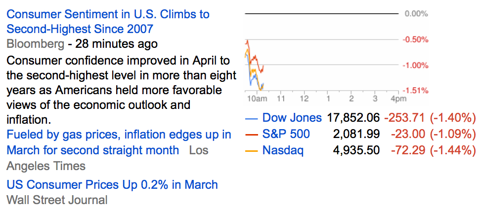
I recently compared the climate differences between two places I call home: Knoxville, Tennessee and Tampa, Florida. They have very different climates, Knoxville is in the Tennessee mountains, the Tampa Bay/Clearwater/St. Pete area is home of the best beaches in America.  Some of us consider the two the best of both worlds. What you believe depends on your own experience. Knoxville is one of the gateways to the Great Smoky Mountains National Park, the most visited national park in America. It had about 10 million visitors in 2013, which was double the Grand Canyon, the second most visited. The two cities have very different climates in the summer and winter months. We think of Tampa, Florida as hot and sunny. Knoxville is cooler in the summer, chilly in the winter. But that’s just my opinion and description. If we really want to understand the absolute level of temperature, humidity, and sunshine, and relative differences we can apply some quantitative methods and draw some visual graphs between them. Here you will see how I see and understand how I make decisions and draw distinctions. For those who otherwise have difficultly understanding data and graphs, you may find it more interesting to apply the same concepts to the weather.  I’ll share with you my study of Knoxville vs. Tampa weather which I think is a good example of applying historical data to understand what to expect. To do this weather comparison, I used this tool with data from the NOAA Comparative Climate Data.

Summer in Knoxville, Winter in Tampa?

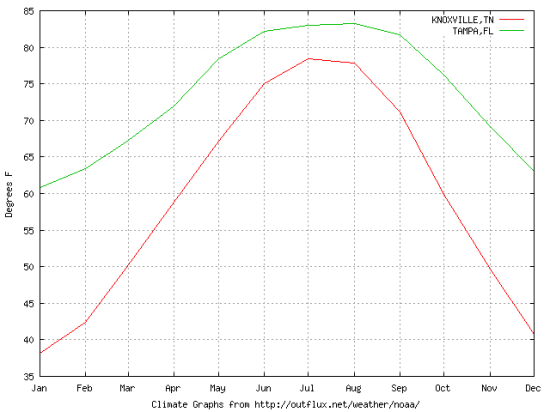
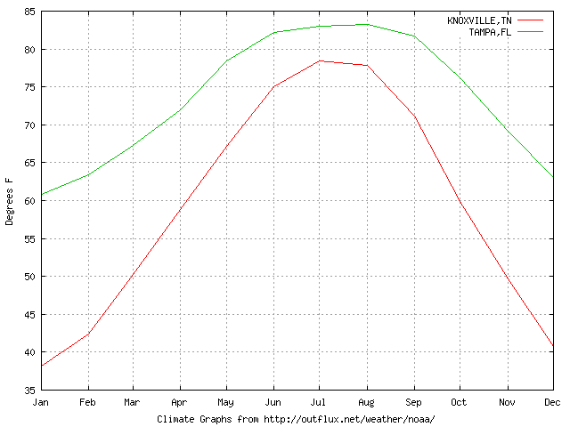
Initially, we can compare the average temperature between Knoxville and Tampa to get a quick visual. We can see some positive asymmetry between the winter and summer months. The average temperature in January is in the 60’s in Tampa and only the 30’s in Knoxville: a 30 degree spread. Yet, the average summer months is only a 10 degree spread. I call that positive asymmetry, because we don’t want it too hot in the summer and we don’t want it too cool in the winter. Tampa has the better tradeoff. But, the flaw of averages is that the actual high and low range can be much wider than we realize, so can gain a better understanding by looking specifically at the highs and lows.

AVERAGE TEMP

average temperature knoxville tampa


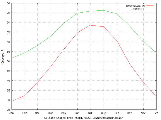
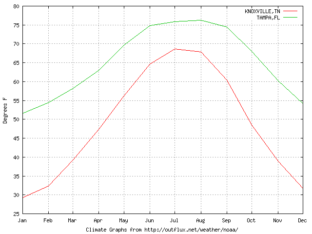
Although Knoxville is in the south, it still gets cold in the winter months. If we wanted a “winter home” to avoid those cold winter months, we would first focus on the average low temperature. That is, “how cold does it get”? Comparing the lows allows us to understand how cold it gets. As we see in the chart below, January and February are the coldest months in Knoxville when the low is around freezing. On the other hand, in Tampa the average low is above 50. 50 is chilly, not really cold. Notice the other extreme on the chart is the peak, when the average low in Tampa is over 70 during starting in June through September. We could say that that weather in Knoxville is more volatile throughout the year since it has a wider range of temperatures. We can see the visually by how quickly the data spreads out or how steep it is between the summer months and colder months. Clearly, the average lows of Tampa are more comfortable if you enjoy the outdoors.

AVERAGE LOW

average low


What about summer?

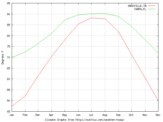
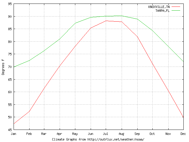
We know that the further south we go, the hotter the summers we can expect. To see that visually, we can graph the average high temperatures. In Tampa, the average high is above 70 year around. The cold months in Knoxville have an average high around or below 50. When we consider the average low in Knoxville is in the 30’s and average high is the 50’s, that’s a material difference from an average low in Tampa in the 50’s and average high in the comfortable 70’s. In fact, you may observe the average low in Tampa is the average high in Knoxville.

But what about too much heat? While the average high in Knoxville is in July and just short of 90, Tampa stays as hot as Knoxville hottest month from May up to October. For some, Tampa may be too hot in the summer. But humidity has a lot of do with how hot it feels, we’ll get to that.

AVERAGE HIGH

average high


What about extreme cold?

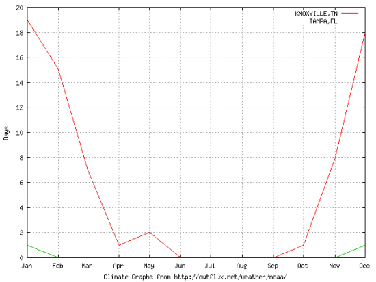
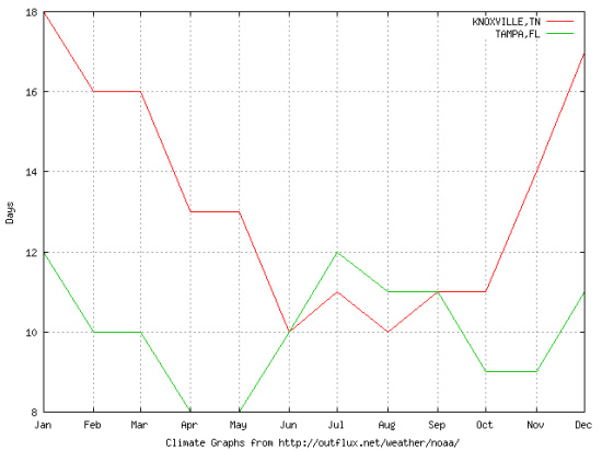
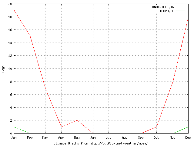
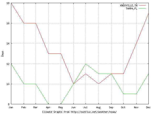
When we analyze data, we want to look at it in different ways to carve out the things we want (warm weather) and carve away the things we don’t (cold and hot weather). Below we graph for a visual to see the average days below freezing (32F). Clearly, Knoxville experiences some freezing days that are rare in Tampa, Florida. Some of you are probably laughing at my calling below 32F “extreme cold”, thinking it should be instead below zero. What you consider extreme depends on your own judgment and experience.

 AVERAGE DAYS BELOW 32F

average days below 30 degrees knoxville tampa

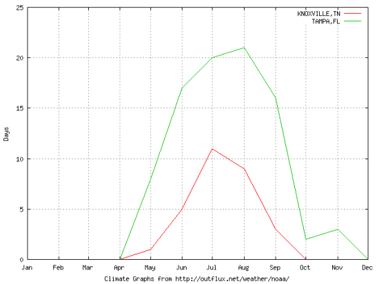
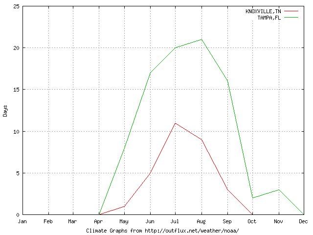
What about extreme heat?

When we state an extreme, we have to define what we mean by extreme quantitatively. I used 90F to define an extremely hot day. As we see below, while Knoxville has many more days below freezing in the winter, Tampa has many more days of extreme heat in the summer. We are starting to discover when we want to be in Knoxville, Tennessee and when we may want to be in Tampa, Florida. As with investment management, timing is everything.

AVERAGE DAYS ABOVE 90F

average days over 90 degrees tampa florida knoxville tennessee

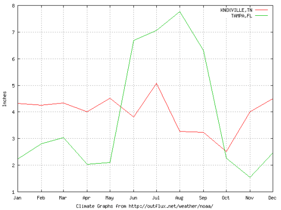
What about Precipitation?

It doesn’t matter if the weather feels great if it’s raining all the time. Tampa experiences a lot of rainfall in inches starting in May through September. Knoxville rainfall is actually a little less in the summer months. So, we could describe Tampa as hot wet summers and Knoxville as warm dry summers.

AVERAGE PRECIPITATION

AVERAGE RAIN PRECIPITATION KNOXVILLE TAMPA


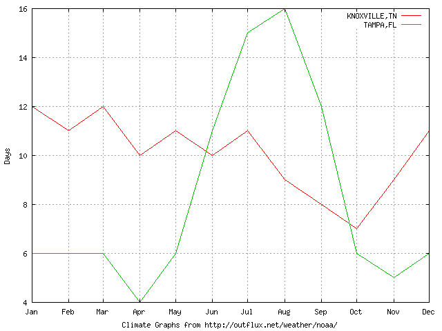
A little rain is one thing and may not be significant. What if we define a “significant rain” as greater than 0.10 inches? The stand out is that Tampa has “significant rain” in the summer months and little in the winter.

AVERAGE DAYS OF PRECIPITATION LESS GREATER THAN 0.10 INCHES

average rain days over tenth of inch in tampa knoxville


What about Humidity?

If you’ve ever experienced a place like Vail, Colorado in the winter were you can sit outside for lunch in the snow without a coat on when it’s 32F, you’ll have a unique understanding of humidity. We can say the same for south Florida in July. Humidity is the amount of water vapor in the air. Humidity may take more explanation to better understand. According to Wikipedia:

Higher humidity reduces the effectiveness of sweating in cooling the body by reducing the rate of evaporation of moisture from the skin. This effect is calculated in a heat index table or humidex, used during summer weather.

There are three main measurements of humidity: absolute, relative and specific. Absolute humidity is the water content of air. Relative humidity, expressed as a percent, measures the current absolute humidity relative to the maximum for that temperature. Specific humidity is a ratio of the water vapor content of the mixture to the total air content on a mass basis.

Relative humidity is an important metric used in weather forecasts and reports, as it is an indicator of the likelihood of precipitation, dew, or fog. In hot summer weather, a rise in relative humidity increases the apparent temperature to humans (and other animals) by hindering the evaporation of perspiration from the skin. For example, according to the Heat Index, a relative humidity of 75% at 80.0°F (26.7°C) would feel like 83.6°F ±1.3 °F (28.7°C ±0.7 °C) at ~44% relative humidity.

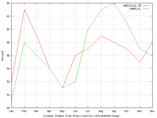
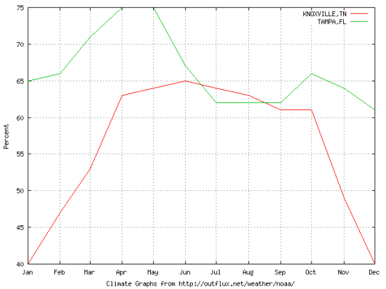
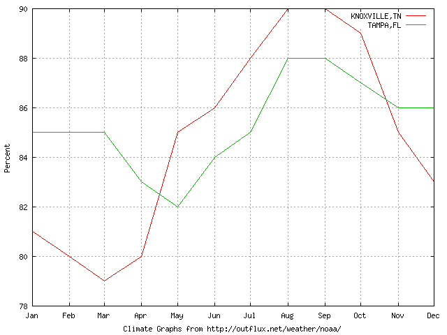
The temperature alone isn’t the full measure of how hot and uncomfortable the climate can be. We can break down humidity into morning and afternoon. Morning humidity in Knoxville is highest in the winter months, which leads to a cold, wet feeling winter. Morning humidity in Tampa is highest in the summer, making hot feel even hotter.

AVERAGE MORNING HUMIDITY

average morning humidity knoxville tampa


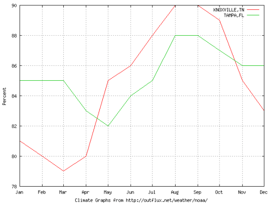
As we see below, afternoon humidity is much higher in Knoxville during the summer months.Tampa stays above 82% humidity on average. By now you have probably began to spot directional trends in the data as well as mean reversion. For example, in the chart below the red line (Knoxville) trends upward sharply from March to August. Then it reverses back down to retrace about half the prior gain. I see the same patterns and trends in global markets, though they are more difficult based more on social science than the science of climate and seasons. Yet, there are seasonal patters in global markets, too, such as “sell in May and go away” and “January Effect”. But unlike weather changes, they seasonal changes in the stock market aren’t as sure as the transition from summer to fall to winter to spring to summer again in Tennessee.

AVERAGE AFTERNOON HUMIDITY
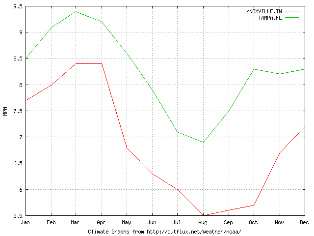
average afternoon humidity knoxville tampa

Tampa has a Breeze

Below we see the average wind speed. Tampa has a breeze to help cool us down compared to Knoxville.

average wind speed tampa florida knoxville tennessee

What about Sunshine?

Warm dry weather is nice, but what about sunshine? Below we see why they say “Sunny Florida”. You may notice that Tampa is more sunny in the winter months then even the summer months. Knoxville has a greater possibility of sunshine March through October with a sharp downtrend on both ends.

AVERAGE SUNSHINE POSSIBLE

AVERAGE SUNSHINE POSSIBLE TAMPA KNOXVILLE

What about Cloudy Days?

If you live in the north, you are familiar not only with cold wet winters, but cloudy grey skies. The outliear that stands out on this graph is that Knoxville is cloudy half of the days of each month in the winter. Tampa, on the other hand, has few cloudy days throughout the year, but its highest is the July. You may have noticed some climate patterns between Tampa and Knoxville are negatively correlated. That is, Knoxville tends to be cloudy in January and least cloudy in July and Tampa is nearly the opposite.

AVERAGE DAYS CLOUDY

average cloudy days knoxville tampa

In the late 1990’s I remember listening to Steven Covey audiobook of “7 Habits of Highly Effective People” when he would say: “proactive people carry weather with them”. That is an example of Projection makes perception: seek not to change the weather, but to change your mind about the weather. That may work for some of us for many years, but eventually we may instead decide to “rotate instead of allocate”. That is, we may decide a warm sunny place like Tampa, Florida is a great place when its cold, wet, and cloudy in a place like Knoxville. Though, Knoxville may be better to spend the summer months with its more mild summer than the hot humid wet Tampa summer.

You can “carry weather with you” by perceiving it how you want, or you can carry (rotate) yourself to the weather you prefer. You can probably see how this quantitative data study helps visualize the absolute climate ranges and relative differences to make the decision with a greater understanding of what to expect.
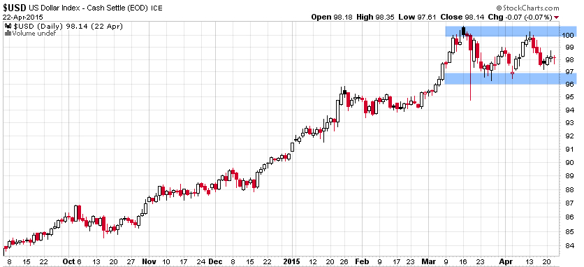
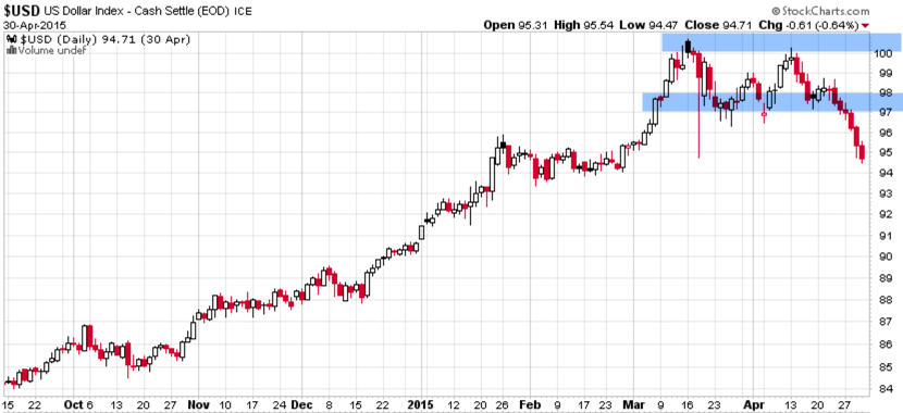
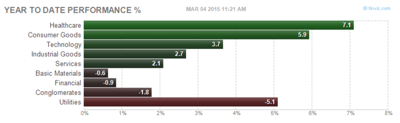
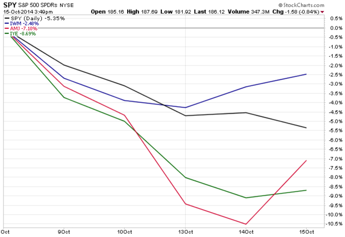


Adapting to Change… and Volatility

High relative strength stocks have always had the potential to gap down just as they may gap up. High momentum is sometimes joined by high volatility. I have observed several changes in trend behavior and volatility since the 2007 to 2009 bear market. One of them has been an increased level of individual volatility, especially on top ranked momentum stocks. Volatility is how much or how quickly the range of prices spread out and volatility is non-directional. A stock that loses -10% in a week may be considered volatile, but so is one that gains 10%. It’s the downside volatility we are concerned about. When stocks tend to gap down more, it makes it difficult to extract more profits than losses. I could show some sophisticated quantitative studies illustrating what I mean, but instead I’ll just show a very simple observation.

As you can see below, the popular stock indexes are down this morning an average of -.67%.

stock market returns

Below are the top 10 stocks of the IBD 50, a proprietary list of the 50 top-ranked companies published every Monday in Investor’s Business Daily. Companies are ranked based on superior earnings, strong price performance, and leadership within their respective industries. These top 10 stocks are down an average of -1.71% with two of the stocks down over -6% and the one that gained over 3% isn’t enough to help While strong momentum stocks have always had times when volatility cuts the other way, we’ve seen it more the last several years.

ibd top 10

Dow is down 6.7%: Extreme Fear is Now Driving Stocks

During holiday parties it seemed everyone was talking about how much the Dow Jones Industrial Average was “up” for the year. So, it is no surprise that the Dow is down -6.7% since the beginning of the new year.

Dow Jones Industrial year to date

And, now that Dow is down -6.7%, investor sentiment measured by the Fear & Greed Index has shifted from greed as the return driver to Extreme Fear. Investor’s tend to get overly aggressive after prices advance and then afraid after prices fall. For example, a wealth manager told me in December that a client of his wanted to “shift to a more aggressive model’ because stocks had gone up so much. People tend to extrapolate the recent past, expecting it will continue into the future.

Extreme Fear Driving Stocks Investor Behavior

Source: http://money.cnn.com/data/fear-and-greed/

Though there seems to be signs the topping process may be underway, the stock market often trends the opposite of what investor’s expect, so I wouldn’t be surprised to see a reversal.

Is the Bull Topping Process Starting?

There are several things that unfold as a market begins the topping process. While large cap indexes may continue to make new highs, the market becomes more and more selective. We’ll see that in breadth indicators like bullish percent indexes, Advance Decline Lines, etc. As the market finds fewer and fewer stocks attractive, it becomes more selective, so fewer stocks remain in positive trends.

The current bull market in stocks is about 58 months old. As I explained in The REAL Length of the Average Bull Market the bull markets have averaged about 39 months and bear markets about 17 months. A full market cycle (average bull + bear) is 56 months. The current bull market, then, is longer than the historical average full market cycle. So, it makes a lot of sense to start watching for signs the topping process has started. It’s important to understand a bull markets end with a process of churning up and down and with fewer stocks participating in the last stage of advances.

Below is an example of fewer stocks participating. The S&P 500 Bullish Percent Index shows a composite of the 500 stocks in the S&P 500 index that are in a positive trend. The lower highs made over the past year is beginning to show fewer of those stocks are making buy signals as the S&P 500 index has made new highs. It appears the selectivity is in its early stage as the percent of stocks on a buy signal is still around 70%, but it’s falling. This is just one example of the kind of things I observe when watching for a topping process.

NYSE Bullish Percent

Source: https://stockcharts.com/def/servlet/SC.pnf?c=$BPSPX,P

Below I list a table of several other bullish percent’s for stock indexes. Using Point & Figure terminology,  they are either a Bull Top (the chart is falling (in a column of Os) but above 70%) or Bear Confirmed (chart is falling (column of O’s) below 70% and has generated a P&F sell signal). I wouldn’t be surprised to see these get a lot lower in the months ahead. However, what makes it difficult for most people is the process is made up of advances and declines, not usually just a straight down move. The whipsaws up and down is what causes the most trouble.

Index Bullish% Status Status Change
Russell 2000 64.03% Bear Alert 30-Aug-13
Dow Industrials 63.33% Bear Confirmed 31-Jan-14
NASDAQ 100 65.00% Bear Confirmed 29-Jan-14
NYSE 61.55% Bear Confirmed 27-Jan-14
Optionable Stocks 67.60% Bear Confirmed 31-Jan-14
S&P SmallCap 600 67.55% Bear Confirmed 31-Jan-14
AMEX 63.31% Bull Confirmed 2-Jan-13
NASDAQ Composite 62.68% Bull Confirmed 2-Jan-13
Wilshire 5000 66.29% Bull Confirmed 2-Aug-13
S&P 100 70.71% Bull Top 13-Dec-13
S&P 500 68.41% Bull Top 24-Jan-14
S&P Composite 1500 70.30% Bull Top 28-Jan-14
S&P MidCap 400 72.64% Bull Top 27-Jan-14

The Fed: What Happened Next…

A month ago in “The Fed: What’s going to happen next? I suggested that you might consider that it doesn’t matter what the Fed does – it only matters how the drivers of price react to it. I went on to explain that we don’t need to know what the Fed would do but instead how the market responds to it. And, the market may not respond the way you expect. Trying to figure out what to do next based on what you think the Fed is going to do is a tough way to make portfolio management decisions. Prior to the announcement, it seemed the worry about it was based on what they would do, but all that really matters is how the price trends evolve of the positions you hold.

Most market participants didn’t seem to expect a taper. And, if a taper were announced, most seemed to expect stock prices would decline. After all, this Quantitative Easing program has been going off and on for several years now and when they’ve stopped it, stock indexes quickly dropped 10 – 20%. You may recall those declines in 2010, 2011, and 2012. Based on that historical precedent, it seemed to suggest stocks could be expected to fall when the Fed finally begins to unwind it’s massive bond-buying program to stimulate the economy. And, at some point it could even be a very significant decline since it appears this QE program has been a driver of stock prices since the 2009 low.

Later that day, the Fed announced that it would indeed begin to “taper” its bond-buying program. Although, The Federal Reserve’s $10 billion taper announcement doesn’t seem a significant cut in the central bank’s massive bond-purchasing plan. It’s still a taper and a taper is what those who talk on TV and write about it seemed to be afraid of. In fact, I mentioned in Fear is beginning to drive stock trends that investor sentiment measures shifted to fear and prices had dropped about -3% leading up to the Fed announcement. It seemed the market had anticipated some negative news and their fear “priced it in”.

Yet, the stock market index actually rose on the announcement instead of down. Maybe they overreacted leading up to the news and prices drifted back up.

stock market rally since fed taper announcement

In the chart below, we show a chart of global market prices since the taper announcement. Clearly, most global markets actually drifted up including the S&P 500 stock index ($SPX), U.S. Dollar ($USD), Developed Country International stocks (EFA), and even Long Term U.S. Treasuries (TLT).

global market returns since fed taper announcement

Commodities like the GSCI Commodities Index (GSG) and Gold (GLD) immediately declined, since commodities and gold typically trend inversely to the U.S. Dollar. And, Emerging Markets countries (EEM) have trended down – maybe because many of them are commodity producers.

Things don’t always turn out the way you expect, so having strong expectations about what’s going to happen next can make portfolio management very difficult. In fact, having strong expectations that reach the point of convictions lead to overconfidence and ego issues that causes one to stay with their losing positions. When you stay with losing positions, hoping they’ll turn around and prove your right, you get caught in a loss trap. That’s how you lose a lot of money.

I find an edge in going with the flow, the current trend, what is actually happening. It seems if we do that, we can never be wrong for too long. It’s OK to be wrong; it’s staying on the wrong side of the trend that becomes a problem. And doing that starts with too much beliefs and expectations about what’s going to happen next and being unable to reverse it.

Flow… just go with it.

When we know in advance what we’ll do next, we don’t have to try to predict in advance what’s going to happen next.

The Fed: What’s going to happen next?

Today the Federal Reserve meets and investors are talking about it even more than normal because the market wants to know what’s going to happen next. If the Fed will continue the same “Quantitative Easing” government bond-buying program, or will they taper it. Make no mistake about it, the Fed’s manipulation to the economy and capital markets is a serious matter and we’ll only know its true impact years from now. But in regard to its expectation of a positive near term impact on the economy it seems the bigger issue is whether or not the QE continues to work or run out of gas.

Investors, however, are mostly concerned about the capital markets impact: how their decision will drive the directional price of currency, bonds, stocks, and commodities. To that, you may consider that it doesn’t matter what the Fed does – it only matters how the drivers of price react to it. That is, if you are sitting around trying to figure out what’s going to happen next, you may consider that you don’t need to know what the Fed will do but instead how the market (people who buy and sell) responds to it. Will the participants in global markets respond with enough magnitude to shift prices in one direction or another? And, in what direction will they respond? If the Fed tapers, the direction will depend on if there is more buying demand than selling pressure to move the price up. Or, will they perceive it as negative? That is the trouble with trying to figure out what’s going to happen next and basing your exposure to risk on that guess. If you don’t have tomorrow’s newspaper today – you really don’t know. Since tomorrow isn’t yet here it doesn’t yet exist, so it is unknowable. If you guess it right, it doesn’t mean you have special powers. If you guess it wrong, that doesn’t mean anything either.

I don’t worry about what the Fed does or how currency, bonds, stocks, and commodity trends will react to it. I already know what I’ll do next regardless of what shifts the price from one direction to another. People often worry about things and experience what they fear the most even when it doesn’t happen. They worry because they are uncomfortable with uncertainty. Many things are unknowable and uncontrollable, so those things are surely uncertain. All we can do is control how we respond to it. I don’t wait until some news event to figure out what to do next. I always know at what price I’ll buy and sell. It isn’t determined by news, but instead based on the directional price trends of the world markets I trade.

risk management

Investors are Complacent

Implied volatility, the amount of “insurance premium” implied by the price of options, continues to suggest that investors are becoming very complacent. When the VIX is high or rising, it says the market expects the S&P to move up or down more. When the VIX is low or declining, it says the market expects the S&P 500 will not move up or down as much in the future. That is, the “insurance premium” priced into options on the S&P 500 stocks is low. That isn’t necessarily directional – it is an indication of the expected range, not necessarily direction. However, what I know about directional price trends is that after a price has been trending directionally for some time, as the S&P 500 stock index has, investors become more and more complacent as they expect that trend to continue. The mind naturally wants to extrapolate the recent past into the future and it keeps doing it until it changes. When we see that in the stock market, it usually occurs as a directional trend is peaking. Investors are caught off guard as they expected a tight range. If the range in prices widens, they probably widen even more because they are – and it wasn’t expected. Interestingly, people actually expect inertia and that is one of the very reasons momentum persists as it does. Yet, momentum may eventually move prices to a point (up or down) that it may move too far and actually reverse the other way.

Image

If we believe the market is right, we would believe the current level accurately reflects the correct expecation for volatility the next 30 days. That is, we would expect today’s implied volatility of about 12 – 13% will match the actual historical volatility 30 days from now. In other words, 30 days from now the historical (backward looking) volatility is match the current implied volatility of 12.6%. If we believe the current volatility implied by option premiums is inaccurate, then we have a position trade opportunity. For example, we may believe that volatility gets to extremes, high or low, and then reverses. That belief may be based on empirical observation and quantitatively studying the historical data to determine that volatility is mean reverting – it may oscillate in a range but also swing from between one extreme to another. If we believe that volatility may reach extremes and then reverse, we may believe the market’s implied volatility is inaccurate at times and aim to exploit it through counter-trend systems. For example, in my world, volatility may oscillate in a range much of the time much like other markets, except it doesn’t necessarily have a bias up or down like stocks. There are times when I want to be short volatility (earning premium from selling insurance) and long volatility (paying premium to buy insurance). I may even do both at the same time, but across different time frames.

The point is, the market’s expectation about the future may be right most of the time and accurately reflect today what will be later. But, what if it’s wrong? If we identify periods when it may be more likely wrong, such as become too complacent, then it sets up a position opportunity to take advantage of an eventual reversal.

Of course, if you believe the market is always priced accurately, then you would never take an option position at all. You would instead believe that options are priced right and if you believe they are, you believe there is no advantage in being long or short them. I believe the market may have it right most of the time, but at points it doesn’t, so convergence trades applying complex trade structures with options to exploit the positive asymmetry between the probability and payoff offers the potential for an edge with positive expectation.

A gap down from here would confirm a short term S&P 500 trend reversal

ImageI actually wrote this at 1pm but wanted to wait to publish it after the close to see if the pattern I observed at 1pm would be intact at the close. It wasn’t, but I decided to publish this anyway and add an additional point: there is real information in price action and it doesn’t have to be perfect, especially if there is additional confirming information. These candlestick patterns mark potential trend reversals, but require confirmation before action anyway. Even though the close wasn’t exactly a Shooting Star, I still believe the price action suggests the same potential outcome if it is confirmed by lower prices.

Technical analysis of price trends include chart pattern recognition to determine what is likely to happen to a price trend over time. The most useful patterns are reversal patterns. Price data viewed on a chart is a visual representation of supply (selling pressure) and demand (buying pressure). Like other things, the direction of price is ultimately determined by supply of it and demand for it. When there is a greater demand for something its price will rise if supply stays the same. When demand declines, its price will fall. Buying pressure, then, is ultimately the primary driver of prices to the upside and selling pressure is what drives price down. A person with expertise and experience in price trend pattern recognition can study the charts pattern and gain an understanding of what is going on: buying or selling pressure. We can use that to define the direction of the trend and also identify probable reversals in the current trend. That is, determine the most probable price movements based on an examination of past price movements. Of course, price trends are always in the past. The only data of any kind we can ever study is past data; never future data that doesn’t yet exist.

I’m not a big supporter of most chart patterns as many of them aren’t testable quantitatively to determine their actual probability and expectation. However, as discretionary traders who do successfully trade patterns will argue: some patters are obvious enough in their message that when we’ve seen them play out 10,000 times before we realize we have a high probability outcome. But, note that it is still a probability, which implies likelihood; never a sure thing. Today I noticed a pattern for the popular S&P 500 stock index that, based on my two decades of empirical observation, I can say often precedes a reversal. But, it isn’t just the pattern itself that I note, but also some additional confirmation by a overbought reading in the Relative Strength Index (RSI). However, this pattern does require additional confirmation in the days ahead.

A Shooting Star is a candlestick pattern that identifies a potential trend reversal, but requires confirmation before action. It is a bearish reversal pattern that forms after an upward price trend. It occurs after the price gaps up at the open (like it did today) and then continues to move up, but then closes lower than the high of the day. I am writing this at 1pm, so it hasn’t yet closed, but I suspect this pattern is still telling. You can see what it’s supposed to look like up close in the picture above. The formation doesn’t have to be perfect or exact. A confirmation means to establish the correctness of something. Confirmation is required to validate that this pattern is a bearish reversal. The confirmation would be a gap down in price in the coming days. Until then, it is only a warning sign; a shot across the bow.

As you can see in the S&P 500 stock index price chart below, the price has been directionally trending up. It has moved about as much as it has moved in prior advances. I included the RSI indicator, which is a statistical measure that suggests the price is “overbought”. RSI is the “Relative Strength Index” that measures the speed and change of price movements. Over short time frames, like 28 days, price trends tend to exhibit mean reversion. That is, while price trends tend to continue their current trend over periods of 3- 12 months, they tend to oscillate up and down over short-term periods like a month. That is the price trend tends to peak out when the RSI reading is over 70 and bottom out when it’s closer to 30. Of course, we mainly want to follow the primary trend and looking at the chart below, that would require living with the swings of 5 -10%. If we are unwilling to deal with that, we would have to accept missing some of the gains that is required when we reduce exposure to miss some of the decline.

Image

Source: https://stockcharts.com/h-sc/ui?s=spy

I don’t necessarily make my portfolio management decisions with these patters, but instead wanted to share this observation for those interested in understanding what I see when I observe trends unfold like this one. If nothing else, I wouldn’t be surprised to see at least a minor reversal in the price in the near future. When it does that, it may only be a 5% decline and then reverse back up to new highs again. Or, it could go on to make a lower low and be the start of a bear market. You can probably see how this is a daily and dynamic process that evolves over time requiring constant adapting to new information and changes in the current state.

Some may try to tell you that the analysis or price trends don’t work. They may say that because they themselves lack expertise or experience with it, or haven’t been successful at it. But rest assured; some of the most profitable hedge funds apply directional trend systems including pattern recognition, and trend following, all of which can be called technical or statistical analysis of price trends. If they don’t know that, they simply haven’t really studied the most successful funds in history.

In my experience I have found that those who aren’t successful applying quantitative, statistical, or chart pattern methods are people who require complete perfection. They are looking for the 100% accurate switch that doesn’t exist in anything. If it doesn’t work this time, or next, they move on rather than understanding that probability is an estimation of likelihood of occurrence of an event, not a certain outcome. Determining the probabilities and expectation is, by definition, the mathematics of an edge. Those without an edge don’t get that, and that’s why they have no edge.

What in the World is Really Going on, Part 2: Kicking the Can Down the Road

Jim Rogers says it best.