Investors are Complacent

Implied volatility, the amount of “insurance premium” implied by the price of options, continues to suggest that investors are becoming very complacent. When the VIX is high or rising, it says the market expects the S&P to move up or down more. When the VIX is low or declining, it says the market expects the S&P 500 will not move up or down as much in the future. That is, the “insurance premium” priced into options on the S&P 500 stocks is low. That isn’t necessarily directional – it is an indication of the expected range, not necessarily direction. However, what I know about directional price trends is that after a price has been trending directionally for some time, as the S&P 500 stock index has, investors become more and more complacent as they expect that trend to continue. The mind naturally wants to extrapolate the recent past into the future and it keeps doing it until it changes. When we see that in the stock market, it usually occurs as a directional trend is peaking. Investors are caught off guard as they expected a tight range. If the range in prices widens, they probably widen even more because they are – and it wasn’t expected. Interestingly, people actually expect inertia and that is one of the very reasons momentum persists as it does. Yet, momentum may eventually move prices to a point (up or down) that it may move too far and actually reverse the other way.

Image

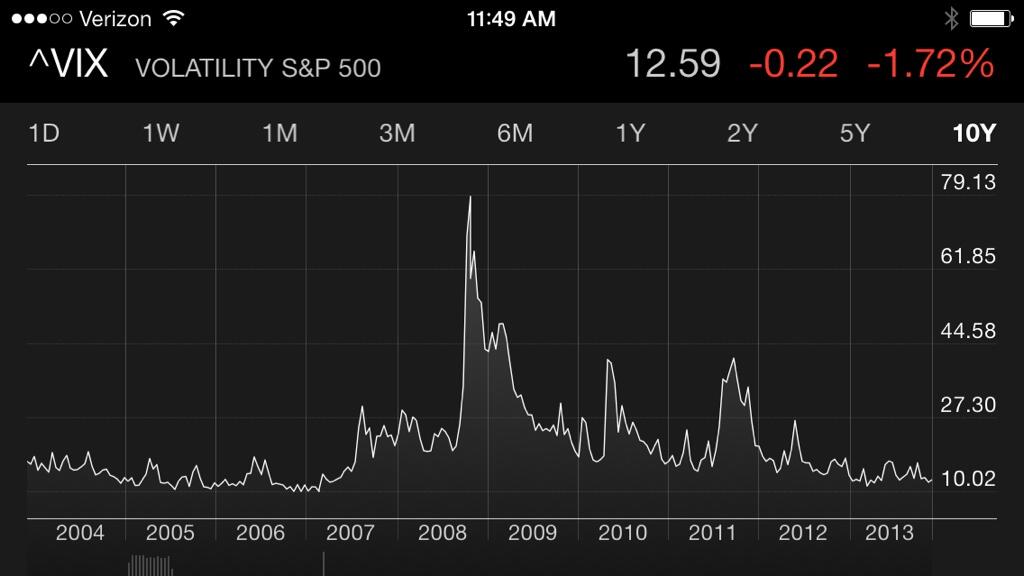
If we believe the market is right, we would believe the current level accurately reflects the correct expecation for volatility the next 30 days. That is, we would expect today’s implied volatility of about 12 – 13% will match the actual historical volatility 30 days from now. In other words, 30 days from now the historical (backward looking) volatility is match the current implied volatility of 12.6%. If we believe the current volatility implied by option premiums is inaccurate, then we have a position trade opportunity. For example, we may believe that volatility gets to extremes, high or low, and then reverses. That belief may be based on empirical observation and quantitatively studying the historical data to determine that volatility is mean reverting – it may oscillate in a range but also swing from between one extreme to another. If we believe that volatility may reach extremes and then reverse, we may believe the market’s implied volatility is inaccurate at times and aim to exploit it through counter-trend systems. For example, in my world, volatility may oscillate in a range much of the time much like other markets, except it doesn’t necessarily have a bias up or down like stocks. There are times when I want to be short volatility (earning premium from selling insurance) and long volatility (paying premium to buy insurance). I may even do both at the same time, but across different time frames.

The point is, the market’s expectation about the future may be right most of the time and accurately reflect today what will be later. But, what if it’s wrong? If we identify periods when it may be more likely wrong, such as become too complacent, then it sets up a position opportunity to take advantage of an eventual reversal.

Of course, if you believe the market is always priced accurately, then you would never take an option position at all. You would instead believe that options are priced right and if you believe they are, you believe there is no advantage in being long or short them. I believe the market may have it right most of the time, but at points it doesn’t, so convergence trades applying complex trade structures with options to exploit the positive asymmetry between the probability and payoff offers the potential for an edge with positive expectation.

What emotion is driving the market now? Extreme Greed

Today I observe the Fear and Greed Index below is at an “Extreme Greed” level.

Fear and Greed Index Investor Sentiment 2013-11-07_07-58-24

source: http://money.cnn.com/data/fear-and-greed/

Investors tend to get optimistic (and greedy) after prices have gone up and then fearful after prices go down. I am not necessarily a contrarian investor. I mainly want to be positioned in the direction of global markets and stay there until they change. But markets sometimes get to an extreme – increasing the probability of a reversal. My purpose of pointing out these extremes in investor sentiment (fear and greed) is to illustrate how investors’ feelings oscillate between the fear of missing out (if global markets have gone up and they aren’t in them) and the fear of losing money (if they are in global markets and they are falling). Fear and greed is a significant driver of price trends. When stock market investor sentiment readings get to an extreme it often reverses trend afterward.

For example, the last time I pointed out an extreme measure was August 27, 2013 in “Investor Sentiment Reaches Extreme Fear” when the Fear/Greed dial suggested “Extreme Fear” was the return driver.  I said when we see these extremes in fear it happens after prices have fallen. Prices can keep falling after it gets to such an extreme, but we often see the directional price trend reverse back up after an extreme fear measure. What I think is useful about observing extremes in sentiment are to understand how investors behave at certain points in a market cycle. If you find you have problems with this behavior, you may use it to modify your behavior.

Below is a chart of the S&P 500 stock index and I have marked August 27th which was the date I observed the “Extreme Fear” reading. As you can see, indeed that was a short-term low and prices climbed a wall of worry since then.

Investor Sentimennt Extreme Greed August 2013

source: http://www.stockcharts.com

Today, the investor sentiment is “Extreme Greed” as the driver of prices, so we’ll see in the coming months how that plays out.

Getting Technical about Supply and Demand

I will first warn that for most investors, zooming in and watching it too closely will more likely lead to a bad outcome. I’ve observed over the years that one of the most common problems of poor investor decisions is watching it too closely – as if it changes the outcome. They end up experiencing every move and reacting to them emotionally. They oscillate between the fear of missing out and the fear of losing money. Since most markets like the stock market can easily swing 5% or more up or down 3 or 4 times a year, they ride an emotional roller coaster. Ultimately, most investors should focus on the primary trend, which I define as a period of 3 – 12 months or more, and that necessarily means accepting some swings.

With that said, I wanted to share a very simple illustration of how I observe the battle of buying and selling pressure (supply and demand) play out visually using charts. We can consider this a continuation of my last post. I have communication with a very wide range of investors, traders, and portfolio managers. Let’s first define those titles. An investor is someone who invests in something; it could be a position they’ll hold for income like commercial real estate or it may be an investment program that is traded on their behalf. An investor is probably looking at 5, 10, or 20-year time frames. A portfolio manager is a person who makes buy and sell decisions within a fund or investment program. A portfolio managers’ time frame depends on their strategy. A portfolio manager can also be seen as a trader, because a trader makes trades, but my traders execute my decisions by executing the trades for me. Then, a trader trying to get the very best price at that moment is focused on tick-by-tick price trends; seconds, not days.

It’s fascinating how different the views of all of these people can be, whether it’s a market maker trading options, a veteran long-term trend follower whose been doing it for decades, or an individual investor who spends some time in the evening reading the headlines. How well their activities help them depends on their true level of expertise and experience – and it takes a lot more of it than people think.

I find that those of us with a very strong understand of how supply and demand is reflected in price action have a better sense of the current conditions and understanding of the market state. Those without it seem to be sitting around trying to figure out what’s going on and what to do next. Sitting around trying to figure out what’s going on and what to do next is like someone handing you the keys to a yacht on the Tennessee River and asking you to take it to the Gulf Coast of Florida and on to the Bahamas. If you are a skilled Captain with a plan of how you’ll time getting through the locks and where you’ll stay overnight, it will be the trip of a lifetime. If not, then I guess you’ll spend a lot of time sitting around trying to figure out what’s going on and what to do next and that’s going to be a gut-wrenching few weeks. And, it could be very costly.

You can probably see my line of thinking as I show you this simple illustration of supply and demand playing out in price action. It gives us a glimpse of how we view what is going on. In the image, you can see the “Candlestick Formation” of a price action of a single day. We borrowed this image from our friends at www.stockcharts.com and if you click that link later it will take you directly to their “Introduction to Candlesticks”. The thin lines are the “shadow” and the larger box is the “Real Body”. If the color is white or green, it closed higher than it opened. Take a close look at the high, close, open, and low of the day to see how they are marked on the “candle”.

candle1-formation

I am going to point out a very simple explanation of what this means. To understand what it means, thinking about what it represents. We see the opening price is marked, then the high of the day, then the low it traded that day, and then the price it closed. That is the full range of the days price action. If we looked at the chart in seconds, weeks, or months, it would be the range over that time frame.

Below is the last 10 days of the S&P 500 stock index price action represented by the  SPDR® S&P 500® ETF, which is a fund that, before expenses, generally corresponds to the price and yield performance of the S&P 500® Index. That is, the ETF is tradeable while the index itself is not.

S&P 500 2013-10-24_08-00-42

Source: https://stockcharts.com/h-sc/ui

As you can see in the chart, these are candlesticks and they have real body’s and the thin line shadows. Yesterday is the last candlestick – the one with a red body with more line below the body than the top. candlesticks with long lower shadows and short upper shadows indicate that sellers dominated during the first part of the session, driving prices lower. You can see some other days with upper and lower shadows (the thin line) that are about the same, so buyers and sellers moved the price high and low and then settled about where it opened. Sometimes we see candlesticks with a longer upper shadow and shorter lower which indicates that buyers dominated during the first part of the day, driving prices higher. You can probably begin to see how a deep understanding price action can help us define the current trend direction and identify reversals. It gets far more involved when we start thinking about how the days interact with each other and requires more than reading a book and looking at charts a few years to gain some skill at using it to understand what is going on, but this may give you something to ponder. Of course, creating information is one thing, the ability to make it useful is another. But the basics really isn’t that complicated though people often get too caught up in requiring patterns and outcomes to be perfect.

At the end of the day, you can probably see how this tells us want actually happened that day…

A gap down from here would confirm a short term S&P 500 trend reversal

ImageI actually wrote this at 1pm but wanted to wait to publish it after the close to see if the pattern I observed at 1pm would be intact at the close. It wasn’t, but I decided to publish this anyway and add an additional point: there is real information in price action and it doesn’t have to be perfect, especially if there is additional confirming information. These candlestick patterns mark potential trend reversals, but require confirmation before action anyway. Even though the close wasn’t exactly a Shooting Star, I still believe the price action suggests the same potential outcome if it is confirmed by lower prices.

Technical analysis of price trends include chart pattern recognition to determine what is likely to happen to a price trend over time. The most useful patterns are reversal patterns. Price data viewed on a chart is a visual representation of supply (selling pressure) and demand (buying pressure). Like other things, the direction of price is ultimately determined by supply of it and demand for it. When there is a greater demand for something its price will rise if supply stays the same. When demand declines, its price will fall. Buying pressure, then, is ultimately the primary driver of prices to the upside and selling pressure is what drives price down. A person with expertise and experience in price trend pattern recognition can study the charts pattern and gain an understanding of what is going on: buying or selling pressure. We can use that to define the direction of the trend and also identify probable reversals in the current trend. That is, determine the most probable price movements based on an examination of past price movements. Of course, price trends are always in the past. The only data of any kind we can ever study is past data; never future data that doesn’t yet exist.

I’m not a big supporter of most chart patterns as many of them aren’t testable quantitatively to determine their actual probability and expectation. However, as discretionary traders who do successfully trade patterns will argue: some patters are obvious enough in their message that when we’ve seen them play out 10,000 times before we realize we have a high probability outcome. But, note that it is still a probability, which implies likelihood; never a sure thing. Today I noticed a pattern for the popular S&P 500 stock index that, based on my two decades of empirical observation, I can say often precedes a reversal. But, it isn’t just the pattern itself that I note, but also some additional confirmation by a overbought reading in the Relative Strength Index (RSI). However, this pattern does require additional confirmation in the days ahead.

A Shooting Star is a candlestick pattern that identifies a potential trend reversal, but requires confirmation before action. It is a bearish reversal pattern that forms after an upward price trend. It occurs after the price gaps up at the open (like it did today) and then continues to move up, but then closes lower than the high of the day. I am writing this at 1pm, so it hasn’t yet closed, but I suspect this pattern is still telling. You can see what it’s supposed to look like up close in the picture above. The formation doesn’t have to be perfect or exact. A confirmation means to establish the correctness of something. Confirmation is required to validate that this pattern is a bearish reversal. The confirmation would be a gap down in price in the coming days. Until then, it is only a warning sign; a shot across the bow.

As you can see in the S&P 500 stock index price chart below, the price has been directionally trending up. It has moved about as much as it has moved in prior advances. I included the RSI indicator, which is a statistical measure that suggests the price is “overbought”. RSI is the “Relative Strength Index” that measures the speed and change of price movements. Over short time frames, like 28 days, price trends tend to exhibit mean reversion. That is, while price trends tend to continue their current trend over periods of 3- 12 months, they tend to oscillate up and down over short-term periods like a month. That is the price trend tends to peak out when the RSI reading is over 70 and bottom out when it’s closer to 30. Of course, we mainly want to follow the primary trend and looking at the chart below, that would require living with the swings of 5 -10%. If we are unwilling to deal with that, we would have to accept missing some of the gains that is required when we reduce exposure to miss some of the decline.

Image

Source: https://stockcharts.com/h-sc/ui?s=spy

I don’t necessarily make my portfolio management decisions with these patters, but instead wanted to share this observation for those interested in understanding what I see when I observe trends unfold like this one. If nothing else, I wouldn’t be surprised to see at least a minor reversal in the price in the near future. When it does that, it may only be a 5% decline and then reverse back up to new highs again. Or, it could go on to make a lower low and be the start of a bear market. You can probably see how this is a daily and dynamic process that evolves over time requiring constant adapting to new information and changes in the current state.

Some may try to tell you that the analysis or price trends don’t work. They may say that because they themselves lack expertise or experience with it, or haven’t been successful at it. But rest assured; some of the most profitable hedge funds apply directional trend systems including pattern recognition, and trend following, all of which can be called technical or statistical analysis of price trends. If they don’t know that, they simply haven’t really studied the most successful funds in history.

In my experience I have found that those who aren’t successful applying quantitative, statistical, or chart pattern methods are people who require complete perfection. They are looking for the 100% accurate switch that doesn’t exist in anything. If it doesn’t work this time, or next, they move on rather than understanding that probability is an estimation of likelihood of occurrence of an event, not a certain outcome. Determining the probabilities and expectation is, by definition, the mathematics of an edge. Those without an edge don’t get that, and that’s why they have no edge.

What in the World is Really Going on

I find that people don’t know what in the world is really going on or understand the big picture beyond what has happened most recently. They don’t really understand the aggressive Fed policies the past five years or the long-term debt cycle of the United States. If you really want to understand what is really going on in the big picture, I encourage you to watch this 30-minute video How The Economic Machine Works by Ray Dalio. After you watch it, you’ll understand how debt cycles work, how the Fed operates, and the current cycle the U.S. is in today. That is, you’ll begin to understand what in the world is going on in a way that only a few people do. It’s the kind of information and understanding you’ve previously never had access to.

And, you won’t be so surprised by what happens next…

My INVESTOR’S BUSINESS DAILY® Interview and Portfolio Management

Portfolio Management is about buying and selling many different positions over time, not just one “pick”. I often say it’s like flipping 10 coins at the same time with each having a different payoff and profit or loss. It could be a completely random process (like flipping a coin), but if we can positively skew the payoffs (asymmetric payoffs) we end up with more profit than loss (asymmetric returns). And, as a portfolio manager I may flip that coin 100 or 500 times a year. The fact is: if the expectation for profit is positive we want to do it as often as possible.

Picking just one position is like flipping the coin just once. Its outcome may have an expected probability and payoff that is positive, but will be determined by how it all unfolds. We can never control the outcome at the point of entry. It’s the exit that always determines the outcome. We can say that same whether we are speaking of stocks, bonds, commodities, and currencies or buying and selling private businesses: if you actually knew for sure the outcome would be positive you would only need to do it once – but you don’t. So deciding what to buy is a small part of my complete portfolio management process. It’s what I do after I’m in a position that makes it “management”. To manage is to direct and control. If all you do is “buy” or “invest” in a position, you have no position “management”.

But when Trang Ho at INVESTOR’S BUSINESS DAILY®recently asked me “What ‘s the one position you would choose over the next several months and why”, I gave her the first position I thought of – and the most recent position I had taken. I primarily get positioned with the current direction of the trend and stay with it until it changes. That may be labeled “trend following”. I define the direction of the trend (up, down, sideways) and then get in that direction until it changes. Trends don’t last forever. There is a point when the probability becomes higher and higher of a reversal. I call that a “counter-trend”. I developed systems that define these directional trends more than a decade ago and have operated them for-profit since. What I can tell you from my experience, expertise, and empirical evidence is that stock market trends, like many other market trends, cycle up and down over time. So, portfolio management is a daily routine of position management that includes predefining risk at the point of entry, taking profits, and knowing when to exit to keep losses small. That exit, not the entry, determines the outcome.

You may consider these things as you read my recent interview in Investors Business Daily titled: Market Strategists: 5 Contrarian ETF Investing Ideas.

Read More At Investor’s Business Daily: http://news.investors.com/investing-etfs/090613-670234-contrarian-etf-investing-ideas-stock-market-strategists.htm#ixzz2gNp8bWUT

Do you choose the blue pill or the red pill?

Red-Pill-Blue-Pill

The “red pill” and “blue pill” refer to a choice between the willingness to learn a potentially unsettling or life-changing truth by taking the red pill or remaining in contented ignorance with the blue pill. It refers to a scene in the 1999 film The Matrix.

I have been talking to a financial planner recently who is struggling between the red pill and the blue pill.

On the one hand, the poor performance of stock and bond indexes over the past decade or so, particularly the losses in bear markets, led him to study long-term market cycles.

An understanding that markets don’t always go up over long periods is the reality of the red pill.

On the other hand, much of the investment industry still believes in getting “market returns” and that a simple plan of “asset allocation” and occasional re-balancing is prudent enough, so a financial planner can choose to keep his practice simple by continuing that plan.

Some investment advisers even consider re-balancing and an occasional change “tactical”.

It isn’t.

The blue pill and the red pill are opposites, representing the choice between the blissful ignorance of illusion (blue) and embracing the painful truth of reality (red).

On the one hand, after understanding the trends of global markets based on simply looking at their history, he realizes the probable outcome of stocks and bonds based on trends I discuss in The S&P 500 Stock Index at Inflection Points and 133 Years of Long Term Interest Rates. Though price trends can continue far more than you expect, the stock and bond markets are at a point where their trends could reverse. The financial planner realizes if he takes the red pill of reality, he’ll have to embrace these facts and do something rather than sit there. He’ll have to change his long-held beliefs that markets are efficient and the best you can do is allocate to them. He’ll have to do extra assignments and homework to find alternative investment managers whose track record suggests they may have the experience and expertise to operate through challenging market conditions.

On the other hand, changing one’s beliefs and taking a different approach can be extra work and have risks. If he continues the static asset allocation to stocks and bonds he’s always done, he says he won’t be doing something so different from the majority of advisers. He knows his career and his life will be easier. When the markets go up, his clients make market returns (minus his fees). When the markets go down, other people are losing money too, and he certainly can’t control what the market does, so: it’s the market. I can see how this is an enticing business model, especially for a busy person who has a life outside the office. That’s probably why it’s so popular.

A similar theme of duality happens in the movie The Matrix.

Morpheus offers Neo either a blue pill (to forget about The Matrix and continue to live in the world of illusion) or a red pill (to enter the sometimes painful world of reality).

Duality is something consisting of two parts: a thing that has two states that may be complementary or opposed to each other. We all get to choose what we believe and our choices shape the world we individually live in.

I can’t say that I can totally relate to the financial adviser because it is my nature to be more tactical and active in decision-making. I believe we should actively pursue what we want. And, I believe what we want from the markets is in there, I just have to extract it from the parts we don’t want. I once explained my investment strategy to a lifelong friend and he replied “you have always been tactical” and reminded me of my background. Though it’s different from me, I can truly appreciate the struggle advisers and investors face choosing between the red or blue pill. Investors and advisers like “market returns” when they are positive, which is what we experience most of the time. It’s when those markets decline that they don’t want what the market dishes out. The markets don’t spend as much time in declines. I pointed out in The Real Length of the Average Bull Market the average upward trend for stocks (bull market) lasts 39 months while the average decline ( bear market) is about 17 months. Investors eventually forget and become complacent about the time they need a reminder. Though the stock markets trend up about 3 times longer than they trend down, it’s the magnitude of the losses that cause long-term investors a problem. For example, the bull market from 2003 through October 2007 gained over 105% but the -56% decline afterward wiped out those gains. You can see that picture in The S&P 500 Stock Index at Inflection Points.

The risk for the financial adviser who has historically focused on “market returns” is that a new strategy for them that applies some type of active risk management is likely to be uncorrelated and maybe even disconnected at times from “market returns”. For example, I discussed that in Understanding Hedge Fund Index Performance. Investors who are used to “market returns” but need a more absolute return strategy with risk management may require behavior modification. If they want an investment program that compounds capital positively by avoiding large losses and capturing some gains along the way they have to be able to stick with it. That requires the adviser to spend more time educating his or her investors about the reality of the red pill. Kind of like I am doing now. Some people have more difficulty doing something different, so they need more help. Others are better able to see the big picture. Some financial advisers would rather deal with explaining the losses when markets decline. For them, it can be as simple as forwarding clients some articles about the market going down with a message something like “We’re all in this together – let’s just hunker down”. That doesn’t require a great deal of independent thinking or doing.

While most individual investors probably do lose money when the stock and bond markets do, that isn’t necessarily the case for those who direct and control downside risk.

It isn’t enough to have a good investment program with a strong performance history.

Just as important is the ability to help investors modify their beliefs and behavior.

That’s the reality of the red pill.

By definition, active is more work than passive. Investors and advisers alike get to choose which pill they take: the blissful ignorance of illusion (blue) and embracing the painful truth of reality (red).

I believe in individual liberty and personal responsibility, so the choice is your own.

My thoughts on the subject are directional – I am the red pill.

Morpheus: “You have to understand, most of these people are not ready to be unplugged. And many of them are so inured, so hopelessly dependent on the system, that they will fight to protect it.”

“Unfortunately, no one can be told what the Matrix is.

You have to see it for yourself.”

Like The Matrix, this is going to be a sequel.

To be continued…

The REAL Length of the Average Bull Market

How long is the average bull market and bear market?

With the current bull market in stocks at its 54th month, I’ve been hearing several different statistics thrown around lately about the “average” length of historical bear markets. To calculate how long the average uptrend lasts, we have to decide what index represents that stock market and use its most relevant data.

I was telling someone recently what I believe is the correct method to calculate the average bull market cycle. The average bull market lasts about 39 months.

Someone had used the S&P 500 data from Shiller’s database which goes back to 1871 to conclude the average bull market is 50 months. I note two issues with the way they calculated their average.

While that data can be useful for some purposes, we have to understand how the data was compiled and its details. For example, the S&P 500 has been widely regarded as the best gauge of the large cap U.S. equities market, but it was first published in 1957. You may wonder how the Shiller data goes back another 86 years before the index was first published. Other indexes were used and the short story is those indexes used far fewer than 500 stocks, were focused on a few industries, and monthly data wasn’t always available. For example, in Standard Statistics Co. is the predecessor of today’s Standard & Poor’s Corp. In 1926 they developed a 90-stock index that by the 1950s had evolved into the S&P 500. Many people speak of these indexes, but it seems few actually know much about them. You may consider if that index prior to 1957 data is actually relevant enough to understand modern bull and bear markets. If you want, you can visit the data website to fully understand how it was created.

Second, like many others do, they defined bear markets as a 20% decline from a prior peak lasting at least 3 months. They defined bull markets as an advance of 50% or more from the low of a bear market over 6 months or longer. From those definitions and parameters, they conclude the average bull market is 50 months.

I develop and operate quantitative portfolio management systems that I apply to price data to identify potentially profitable price trends and manage risk. In other words, I prefer to have exposure to rising trends and avoid (or short) falling trends. I can tell you from my expertise that one great thing about my process is that it required me to precisely define every single detail. The data, definitions, and parameters that create the decision-making algorithm – which is the process that tells me what to do next. That may give you some idea of how I observe things like this.

I found a similar study by JP Morgan that states the average bull market is a whopping 68 months long going back to 1946. The fine print at the bottom of the chart states they defined a bear market as “a peak-to-trough decline in the S&P 500 Index (price only) of 20% or more. The bull run data reflect the market expansion from the bear market low to the subsequent market peak.” That explains why their bull markets appear so long.

JPM average bull

Source: JP Morgan

While defining bull and bear markets with percentages is popular, it seems to leave out the reality of bull and bear market cycles: a full market cycle. A full market cycle includes both a bull and a bear market period, together. These cycles last about 56 months and some believe it is tied to the business cycle and others believe it may be more connected to politics. A data-driven researcher doesn’t need theory to explain what causes it – it is what it is.

I believe the table below from Ron Griess more accurately represents the average bull market by considering the full market cycle rather than defining them by percentages. The time frame is in weeks, so it shows the average bull market cycle is 155 weeks or about 39 months. The average bear market is about 17 months, which actually matches the most recent bear market from October 2007 to March 2009 (17 months). A full market cycle is 56 months.

Average Length of Bull and Bear Markets

source: www.thechartstore.com

Whatever we believe is always true for us. Whether you believe the average bull market lasts 39 months, 50 months, or 68 months, it seems the current one is likely late in its stage at 54 months as of September 2013.

As the bull market is aging learn about a strategy designed for it visit  www.Shell-Capital.com

Momentum as a stand alone investment strategy

One observation I regularly share is the constant flow of research papers and books about topics I am interested in. Specifically, these topics are listed on the “About” page, but they are primarily those with the potential to create positive asymmetry in the P/L (that is: more profit than loss). The “momentum” subject is a big one for me, since I have operated directional trend systems for more than a decade. Momentum is sometimes called relative strength, or inertia, or trend-following. There are now more than 300 papers I know of documenting evidenced of momentum: whatever trend has been within the last year tends to continue. It’s interesting reading these research papers. They are sometimes written by academics at a University and sometimes by research at an investment company. The funny thing is they are rarely written by an investment manager who has strong performance history actually doing what they write about. I wouldn’t dare write a paper specifically about what I do that works. Nevertheless, these researchers share their opinions and only a few of us know how correct or wrong they may be.  You see, a research paper is just a study or opinion, we can never really prove something true since it can some day be proven untrue. Think: swans are white, until you see a black one. As I see it, the only people qualified to say so is if they themselves have good actual performance history doing these things. Experience matters, but research isn’t so much about experience as it is thinking deeply about a subject and offering ones views and findings.

I just got in my inbox a new paper by Ryan Larson Hot Potato: Momentum As An Investment Strategy (August 2013).

He concludes:

So what are investors to do with momentum? Our conclusion is that momentum is inadvisable as a stand-alone strategy due to the risk of precipitous losses. Rather, we suggest that long-term investors seeking to tap more than one source of equity premium choose another, more stable factor for their core investment strategy (value is certainly a strong candidate), and consider adding momentum as a short-term trading strategy when market conditions are favorable.

I agree that momentum (or relative strength) by isn’t best used as a stand alone strategy, but adding some other strategy like “value” to it isn’t the answer. Momentum (or relative strength) needs active risk management.

Stocks and Bonds in a Short Term Downtrend

The broad global market indexes declined during August. Global stocks, represented by $SPX, EFA, and EEM below, declined -4% or more during the month. The broad bond index (AGG) declined too.

Global Market Returns August 2013

EFA: iShares MSCI EAFE is exposure to Developed markets stocks in Europe, Australia, Asia & the Far East.

EEM: iShares MSCI Emerging Markets is exposure to Emerging markets large- and mid-cap stocks.

AGG: iShares Core Total U.S. Bond Market is exposure to  US investment grade bonds

$SPX S&P 500® is widely regarded as the best single gauge of large cap U.S. equities.

133 Years of Long Term Interest Rates

Another incredible observation of long term interest rates comes from Shiller’s database.  The red line is the trend in long term interest rates. Interest rates peaked in 1981. That would have been an incredible time to buy bonds: their yields were 15%. But it was a terrible time to borrow money. Then interest rates declined dramatically- until now. Interest rates have been 2-3% lately, the lowest going back to 1880. At low interest rates, it’s a great time to borrow money, but a very risky time to buy bonds. When interest rates eventually go up, their values will go down. With rates at outlier low rates and the Fed going to need to taper their Quantitative Easing they’ve created to prop up the economy and stock market, the rise in rates in the years ahead could possibly be stunning. So the decline in bond values would be equally stunning. One of my advantages as a global macro manager is an understanding of how world markets interact with each other. The inverse relationship between bond price and interest rates is one of the few inter-market relationships that is a sure thing.

Long Term Interest Rates

Source: Shiller’s database.

For more views on bonds, read Interest Rates Trend and  Interest Rates are Trending Up, Bonds Investors Feeling the Pain


Asymmetry Observation: Global Markets Diverge Since May

Since May, we observe that global market indexes have diverged. While some markets are still trending up, others are trending down. Prior to 2013, many markets were generally trending together. The current U.S stock bull market is now 52 months old from from its March 2009 bear market low. If history is a guide, it’s closer to the end (read: The S&P 500 Stock Index at Inflection Points). One of the things we see near the end of a major trend change is some world markets start to reverse down. For example, going in to 2008 it was Financials and REITs (real estate). As we see in the chart, U.S. stocks are still trending up for now, but emerging markets and all categories of bonds and Real Estate Investment Trusts (REITs) are weak. Rising interest rates = falling bond prices and falling interest rate sensitive markets like REITs. The diversification of global asset allocation over this period has actually resulted in more downside risk rather than reducing it. Bonds have been in a rising trend for the past 30 years, so when stocks drop -50% exposure to bonds haves helped to offset the losses for asset allocators who mix stocks and bonds. If bonds are changing to a downtrend as it appears they are, bonds may not be a crutch in the next bear market. In fact, they may inflate losses.

Image

If you aren’t familiar with the index symbols for the markets in the table in the top left:

If you have any questions or comments, contact me.

What did the market do this week?

Which market?

Relatative Strength Global Markets

Source: FINVIZ

There are more markets than just the “stock market”.

The S&P 500 Stock Index at Inflection Points

The chart below is the S&P 500 Stock Index at Inflection Points showing full market cycles since 1997 (16 years).

A few observations:

•    You may agree there is a trend here. Several years of upswings followed by downswings, but no meaningful progress for many years. Unfortunately, many people have needed more than this to get the financial freedom they want.

•    100% uptrends are followed by -50% downtrends that are enough to erase the gains from the uptrend. People get euphoric and complacent after 100% uptrends – just in time to participate in the next big waterfall decline.

•    You may consider the point where it is now vs. the last time it reached those points.

•    And, if you can avoid most of the downside and capture some of the upside (what I call ASYMMETRY®) you could have earned a different result. To achieve that takes real skill, but there are managers who have experience doing it and have actual audited track records as evidence. It will unlikely be achieved by overconfident people who have no experience, skill, and no actual track record.

Click on the chart for a larger view:

Image

I’m not saying it’s there yet, but if you understand the past no one should be surprised about what can happen next…

“Those who cannot remember the past are condemned to repeat it.”

George Santayana, – Reason in Common Sense

Interest Rates are Trending Up, Bonds Investors Feeling the Pain

First, we view 15 Year Chart of the 10 Year U.S. Treasury Note Yield (interest rate) (Symbol: $TNX). Keep in mind this chart reflects the rate of change in the interest rate, not the price trend. If we define a downtrend as “lower highs, lower lows” the 15 year trend for interest rates has been down. But since 2012, the trend has sharply turned up – though that isn’t the first time.

Interest Rates are Trending Up

Next, we zoom in t0 view the magnitude of the interest rate on the 10 Year U.S. Treasury Note Yield since its low a year ago in August 2012. The interest rate on the 10 year treasury has gained 85%. The current yield is about 2.88%.

U.S. Treasury Note Interest Rate Trend

Next we look at the long term U.S. Treasury Bond Yield – the 30 year. Long terms rates have been in a downtrend the last 15 years, but have recently trended up sharply.

30 Year US Treasury Bond Yield

Understanding the implications of a reversal in the trend of interest rates is critical to a global macro fund manager. A large part of my global tactical decisions is identifying direction trend changes. and understanding how markets interact with each other. For example, we can see below how rising rates significantly impact the price value of bonds.

Below, we observe the total return (price trend + interest) of a wide range of different styles of bond ETFs.

Bond Price Declines

Clearly, they have recently been in a downtrend with U.S. Government bonds down the most at -13.65% over the past year.

Finally, we observe some markets and sectors that are very sensitive to changes in interest rates.

Markets impacted by rising interest rates

Eventually the Federal Reserve will stop their “Quantitative Easing” program of buying bonds. You know how supply and demand works: when demand dries up, price goes down…