Source: http://www.newtraderu.com/2015/04/07/paul-tudor-jones-10-trading-principles/
Source: http://www.newtraderu.com/2015/04/07/paul-tudor-jones-10-trading-principles/
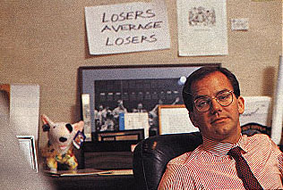
– George Halas

Image source: https://www.pinterest.com/pin/375346950164355711/
We often hear that high dividend stocks are a “safe haven” in market downtrends. The theory is the yield paid from dividend stocks offset losses in their price. Another theory is that money rotates out of risky assets into those perceived to be less risky: stocks that pay high dividends tend to be older cash rich companies that pay out their cash as dividends. In theory, that sounds “safer”.
I like to point out logical inconsistencies: when beliefs contradict reality.
The above may be true in some cases and it sounds like a good story. In reality, everything changes. The universe is transient, in a constant state of flux. This impermanence, that things are constantly changing and evolving, is one of the few things we can be sure about. It’s a mistake to base too much of an investment strategy on something that has to continue to stay the same. It’s an edge to be adaptive in response to directional trends.
Below is the year-to-date chart iShares Select Dividend ETF that seeks to track the investment results of an index composed of relatively high dividend paying U.S. equities. Notice that I included both the price change by itself (blue) and the total return that includes price plus dividends (orange). The “help” from the dividend over the past six months has helped a little. The price is down -3% but factoring in the dividend leaves the index down -2.33% for the year. The 0.7% is the dividend yield so far.

What has probably gotten investors attention, however, isn’t that their dividend stocks are down over -2% for the year, but that they are down over -4% off their high. That doesn’t sound like a lot: unless you are a conservative investor expecting a “safe haven” from high dividend yielding stocks…
 In contrast, the Dow Jones Industrial Average is up about 1% over the same period – counting dividends. You may be wondering what is causing this divergence? Below is the sector holdings for the iShares Select Dividend ETF.
 The position size matters and makes all the difference. Notice in the table above the Utilities, Consumer Staples, and Energy Sectors are the top holdings of the index. As you see below, the Utilities sector is down nearly -9% year-to-date, Energy and Staples are down over -1%. They are the three worst performing sectors…
 Source: Created by ASYMMETRY® Observations with www.stockcharts.com
Wondering what may be driving it? For the Utility sector it’s probably interest rates. You can read about that in What You Need to Know About Long Term Bond Trends. I prefer to rotate between sectors based on their directional price trends rather than just allocate to them with false hope they may do something they may not.
In How does monetary policy influence inflation and employment? and bond prices… I pointed out that even the Fed expected their monetary policy to eventually lead to inflation. The problem with economics and economist is they expect a cause and effect, and often their expectations don’t come true. Remember all those newsletters advising to buy gold the last several years? Gold trended up a while, then down. Applying a good trend system to gold may have made money from it, but buying and holding gold is probably a loser. Inflation was supposed to go up and gold was supposed to be a shelter. However, inflation has instead trended down: The U.S. Inflation Calculator presents it best:
Current US Inflation Rates: 2005-2015
The latest inflation rate for the United States is -0.1% through the 12 months ended March 2015 as published by the US government on April 17, 2015. The next update is scheduled for release on May 22, 2015 at 8:30 a.m. ET. It will offer the rate of inflation over the 12 months ended April 2015.
The chart, graph and table below displays annual US inflation rates for calendar years 2004-2014. Rates of inflation are calculated using the current Consumer Price Index published monthly by the Bureau of Labor Statistics (BLS). For 2015, the most recent monthly data (12-month based) will be used in the chart and graph.
Historical inflation rates are available from 1914-2015. If you would like to calculate accumulated rates between different dates, the US Inflation Calculator will do that quickly.
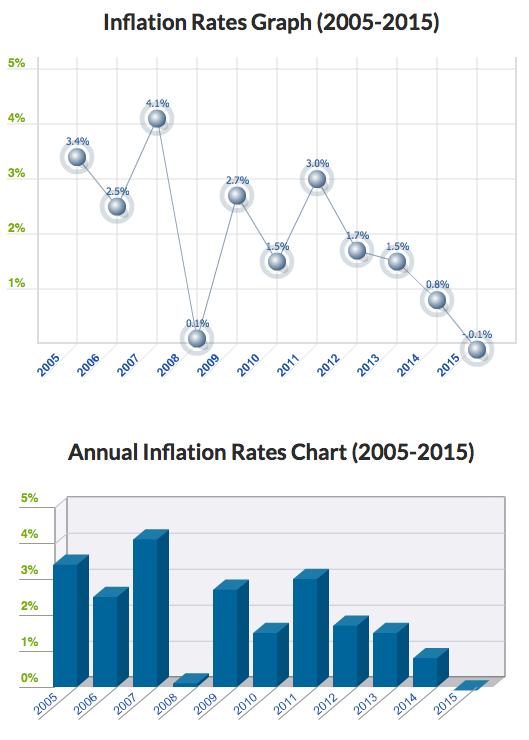
Source: http://www.usinflationcalculator.com/inflation/current-inflation-rates/
However, as you can see in the chart, like market prices, economic data trends directionally too. This trend of declining inflation may continue or it may reverse.
In My 2 Cents on the Dollar I explained how the U.S. Dollar is a significant driver of returns of other markets. For example, when the U.S. Dollar is rising, commodities like gold, oil, and foreign currencies like the Euro are usually falling. A rising U.S. Dollar also impacts international stocks priced in U.S. Dollars. When the U.S. Dollar trends up, many international markets priced in U.S. Dollars may trend down (reflecting the exchange rate). Many trend followers and global macro traders are likely “long the U.S. Dollar” by being long and short other markets like commodities, international stocks, or currencies.
Below was the chart from My 2 Cents on the Dollar last week to show the impressive uptrend and since March a non-trending indecisive period. After such a period, I suggested the next break often determines the next directional trend.
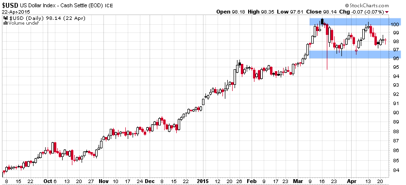
Chart created by Shell Capital with: http://www.stockcharts.com
Keep in mind, this is looking closely at a short time frame within a larger trend. Below is the updated chart today, a week later. The U.S. Dollar did break down so far, but by my math, it’s now getting to an even more important point that will distinguish between a continuation of the uptrend or a reversal. This is the point where it should reverse back up, if it’s going to continue the prior uptrend.
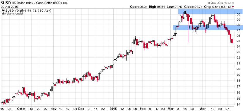
Chart created by Shell Capital with: http://www.stockcharts.com
This is a good example of understanding what drives reward/risk. I consider how long the U.S. Dollar I am (by being synthetically long/short other markets) and how that may impact my positions if the trend were to reverse. It’s a good time to pay attention to it to see if it breaks back out to the upside to resume the uptrend, or if it instead breaks down to end it.
That’s my two cents on the Dollar… How long are you?
Most investors and their advisors seem to speak mostly about the stock market. When they mention “the market” and I ask “what market?” they always reply “the stock market”.
Why so stock market centric?
It must be that it gets the most media attention or stocks seem more exciting?. After all, other markets like bonds may seem boring and few know much about the many commodities markets or the foreign exchange markets. There are many different markets and two sides to them all.
If it’s risk-adjusted returns you want, you may be surprised to find where you should have invested your money the past 15 years. To make the point, below is a comparison of the total return of the Vanguard S&P 500 stock index (the orange line) compared to the Vanguard Bond Index (the blue line). Yes, you are seeing that correctly. Using these simple index funds as a proxy, bonds have achieved the same total return as stocks, but with significantly less volatility and drawdowns. This is why we never look at just “average” return data without considering the path it took to get there. A total return percentage gain chart like this one presents a far more telling story. Take a close look at the path they took.
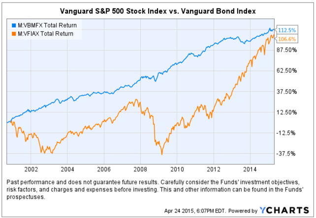
Created with http://www.ycharts.com
I showed the chart to one investment advisor who commented “It looks like the stock market is catching up”. If that’s what you think of when you view the chart, you may have a bias blind spot: ignoring the vast difference in the risk between the two markets.
Looking at the total return over the period identifies the obvious difference in the path the two return streams took to achieve their results, but below we see the true risk difference. Drawdowns are declines from a higher value to a low value and a visual representation of how long it took to recover the lose of capital. When we observe a drawdown chart like the one below, it’s like a lake. These charts together also help illustrate the flaw of averages. The average return of the stock and bond index have ended at about the same level and have the same average return, but the bond index achieved it with much less drawdown. You wouldn’t know that if you only looked at average returns. If you tried to walk across the stock market lake, you may have drowned if you couldn’t handle swimming in 40′ of water for so long. If that one didn’t get you, the 55′ may have. The stock index declined about -40% from 2000 – 2002 and took years to recover before it declined -55%.
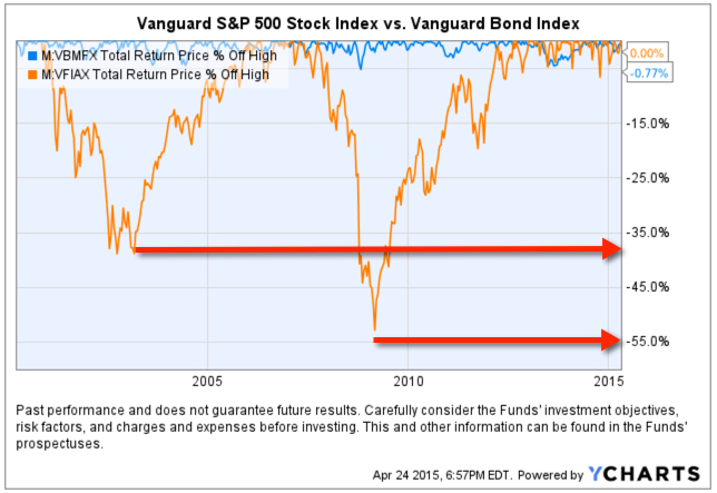
Created with http://www.ycharts.com
You have to be wondering: why didn’t you just invest in bonds 15 years ago? Maybe you were focused on the prior period huge average returns in stocks?
Before I continue, let me place a very bold disclaimer here: PAST PERFORMANCE DOES NOT GUARANTEE FUTURE RESULTS. Another way that is stated is that PAST PERFORMANCE IS NO ASSURANCE OF FUTURE RESULTS. One more version is PAST PERFORMANCE MAY NOT BE AN INDICATION OF FUTURE RESULTS. If you remember, the 1990’s were a roaring bull market in stocks. People focus on the past expecting it to continue. That’s probably why you never thought to invest in bonds instead of stocks.
Some of the largest and most successful hedge funds in the world have done that very thing over this period and longer. But, they didn’t just invest in bonds. They leveraged bonds. We’ve seen in this example that a bond index fund has achieved just as much total return as stocks. If you are a stock market centric investor: one that likes the stock market and makes it your focus, then you necessarily had to be willing to endure those -40% to -55% declines and wait many years to recover from the losses. If you are really willing to accept such risk, imagine if you had used margin to leverage bonds. The bond index rarely declined -10% or more. It was generally a falling interest rate period, so bonds gained value. If you were willing to accept -40% to -55% declines in stocks, you could have instead leveraged the bonds 400% or 500%. If you had done that, your return would be 4 or 5 times more with a downside more equal to that of stocks.
Why so stock centric?
Of course, at this stage, the PAST PERFORMANCE IS HIGHLY UNLIKELY TO REPEAT INTO THE FUTURE. Just as the roaring stocks of the 1990’s didn’t repeat. To see why, read Stage and Valuation of the U.S. Stock Market and Bonds: The Final Bubble Frontier?.
From my observations of investors performance and their advisors, most people seem to have poor results the past decade or so, even after this recent bull market. An investment management consultant told me recently that investors and their advisors who are aware of the current stage of stocks and bonds feel there is no place to turn. I believe it’s a very important time to prepare to row, not sail. For me, that means focus on actively managing risk and look for potentially profitable trends across a very global universe of markets; currency, bonds, stocks, commodities, and alternatives like volatility, inverse, etc . That’s my focus in ASYMMETRY® | Managed Accounts.
In The REAL Length of the Average Bull Market last year I pointed out different measures used to determine the average length of a bull market. Based on that, whether you believe the average bull market lasts 39 months, 50 months, or 68 months, it seems the current one is likely very late in its stage at 73 months. It’s one of the longest, ever.
I normally don’t consider valuations levels like P/E ratios, but they do matter when it comes to secular bull and bear markets (10 to 20 year trends). That’s because long-term bull markets begin at low valuation levels (10 or below) and have ended at historically high levels (around 20). Currently, the S&P 500 is trading at 27. That, along with the low dividend yield, suggests the expected return for holding that index going forward is low.
Ed Easterling of Crestmont Research explains it best:
The stock market gyrated since the start of the year, ending the first quarter with a minimal gain of 0.4%. As a result, normalized P/E was virtually unchanged at 27.3—well above the levels justified by low inflation and interest rates. The current status remains near “significantly overvalued.”
In addition, the forecast by Standard and Poor’s for 2015 earnings per share (EPS) recently took a nosedive, declining 17% during one week in the first quarter. Volatility remains unusually low in its cycle. The trend in earnings and volatility should be watched closely and investors should remain cognizant of the risks confronting an increasingly vulnerable market.
Source: The P/E Report: Quarterly Review Of The Price/Earnings Ratio By Ed Easterling April 4, 2015 Update
It’s always a good time to actively manage risk and shift between global markets rather than allocate to them. To see what that looks like, visit: http://www.asymmetrymanagedaccounts.com/global-tactical/
In the last observation I shared on the CBOE Volatlity index (the VIX) I had been pointing out last year the VIX was at a low level and then later started trending up. At that time, many volatility traders seemed to think it was going to stay low and keep going lower – I disagreed. Since then, the VIX has remained at a higher average than it had been – up until now. You can read that in VIX® gained 140%: Investors were too complacent.
Here it is again, closing at 12.45 yesterday, a relatively low level for expected volatility of the S&P 500 stocks. Investors get complacent after trends drift up, so they don’t price in so much fear in options. Below we observe a monthly view to see the bigger picture. The VIX is getting down to levels near the end of the last bull market (2007). It could go lower, but if you look closely, you’ll get my drift.

Chart created by Shell Capital with: http://www.stockcharts.com
Next, we zoom in to the weekly chart to get a loser look.

Chart created by Shell Capital with: http://www.stockcharts.com
Finally, the daily chart zooms in even more.

Chart created by Shell Capital with: http://www.stockcharts.com
The observation?
Options traders have priced in low implied volatility – they expect volatility to be low over the next month. That is happening as headlines are talking about stock indexes hitting all time highs. I think it’s a sign of complacency. That’s often when things change at some point.
It also means that options premiums are generally a good deal (though that is best determined on an individual security basis). Rather than selling premium, it may be a better time to buy it.
Let’s see what happens from here…
The U.S. Dollar ($USD) has gained about 20% in less than a year. We observe it first in the weekly below. The U.S. Dollar is a significant driver of returns of other markets. For example, when the U.S. Dollar is rising, commodities like gold, oil, and foreign currencies like the Euro are usually falling. A rising U.S. Dollar also impacts international stocks priced in U.S. Dollar. When the U.S. Dollar trends up, many international markets priced in U.S. Dollars may trend down (reflecting the exchange rate). The U.S. Dollar may be trending up in anticipation of rising interest rates.

Chart created by Shell Capital with: http://www.stockcharts.com
Now, let’s observe a shorter time frame- the daily chart. Here we see an impressive uptrend and since March a non-trending indecisive period. Many trend followers and global macro traders are likely “long the U.S. Dollar” by being long and short other markets like commodities, international stocks, or currencies.
Chart created by Shell Capital with: http://www.stockcharts.com
This is a good example of understanding what drives returns and risk/reward. I consider how long the U.S. Dollar I am and how that may impact my positions if this uptrend were to reverse. It’s a good time to pay attention to it to see if it breaks back out to the upside to resume the uptrend, or if it instead breaks down to end it. Such a continuation or reversal often occurs from a point like the blue areas I highlighted above.
That’s my two cents on the Dollar…
How long are you? Do you know?
This is a great example of conflicted news. Which news headline is driving down stock prices today?
Below is a snapshot from Google Finance::
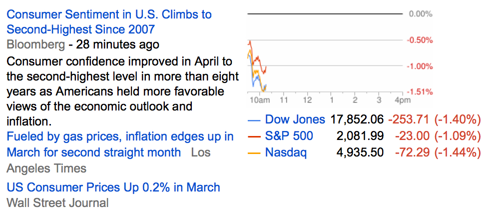
Trying to make decisions based on news seems a very conflicted way, which is why I instead focus on the absolute direction of price trends.
“In prospect theory, loss aversion refers to the tendency for people to strongly prefer avoiding losses than acquiring gains. Some studies suggest that losses are as much as twice as psychologically powerful as gains. Loss aversion was first convincingly demonstrated by Amos Tversky and Daniel Kahneman.”
For most people, losing $100 is not the same as not winning $100. From a rational point of view are the two things the same or different?
Most economists say the two are the same. They are symmetrical. But I think that ignores some key issues.
If we have only $10 to eat on today and that’s all we have, if we lose it, we’ll be in trouble: hungry.
But if we have $10 to eat on and flip a coin in a bet and double it to $20, we may just eat a little better. We’ll still eat. The base rate: survival.
They say rationally the two are the same, but that isn’t true. They aren’t the same. The loss makes us worse off than we started and it may be totally rational to feel worse when we go backward than we feel good about getting better off. I don’t like to go backward, I prefer to move forward to stay the same.
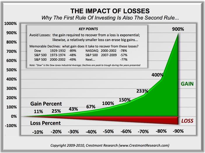
Prospect Theory, which found people experience a loss more than 2 X greater than an equal gain, discovered the experience of losses are asymmetric.
Actually, the math agrees.
You see, losing 50% requires a 100% gain to get it back. Losing it all is even worse. Losses are indeed asymmetric and exponential on the downside so it may be completely rational and logical to feel the pain of losses asymmetrically. Experience the feeling of loss aversions seems to be the reason a few of us manage investment risk and generate a smoother return stream rather than blow up.
To see what the actual application of asymmetry to portfolio management looks like, see: Shell Capital Management, LLC.
When you look at the table below and see the sector exposure percents, what do you observe? Do these allocations make sense?
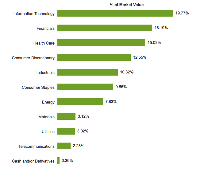
That is the sector exposure of the S&P 500 stock index: I used the iShares S&P 500 ETF for a real-world proxy. The source of each image is the index website on iShares, which you can see by clicking on the name of the index ETF.
Most of the sector exposure in the S&P 500 large company stock index is Technology, Financials, Healthcare, and Consumer Discretionary. Consumer Staples, Energy, Materials, Utilities, and Telecommunications have less than 10% exposure each. Exposure to Materials, Utilities, and Telecommunications are almost non-existent. Combined, those three sectors are less than 10% of the index. Industrial has 10% exposure by itself. But this index is 500 large companies, what about mid size and small companies?
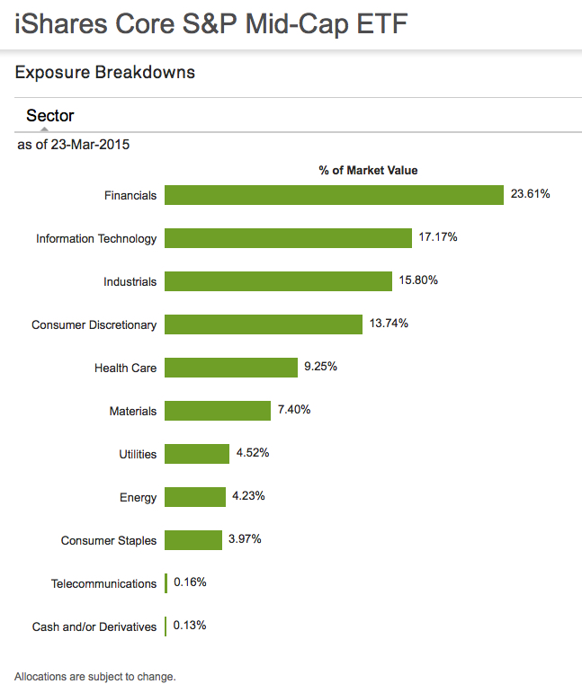
Below is the iShares Core S&P Mid-Cap ETF. Most of the sector exposure in the S&P Mid size stock index is Technology, Financials, Industrial. Healthcare, and Consumer Discretionary. Consumer Staples, Energy, Materials, Utilities, and Telecommunications have less than 10% exposure each. Exposure to Materials, Utilities, and Telecommunications are almost non-existent.
We see this same asymmetric sector exposure theme repeat in the iShares S&P Small Cap index. Half of the sectors are make up most of the exposure, the other very little.
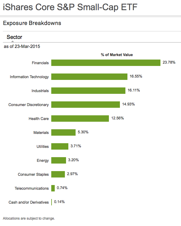
This is just another asymmetric observation… the next time you hear someone speak of the return of a stock index, consider they are really speaking about the return profile of certain sectors. And, these sector weightings may change over time.
I saw the following headline this morning:
US Government Bonds Rise on Fed Rate Outlook
Wall Street Journal –
“U.S. government bonds strengthened on Monday after posing the biggest price rally in more than three months last week, as investors expect the Federal Reserve to take its time in raising interest rates.”
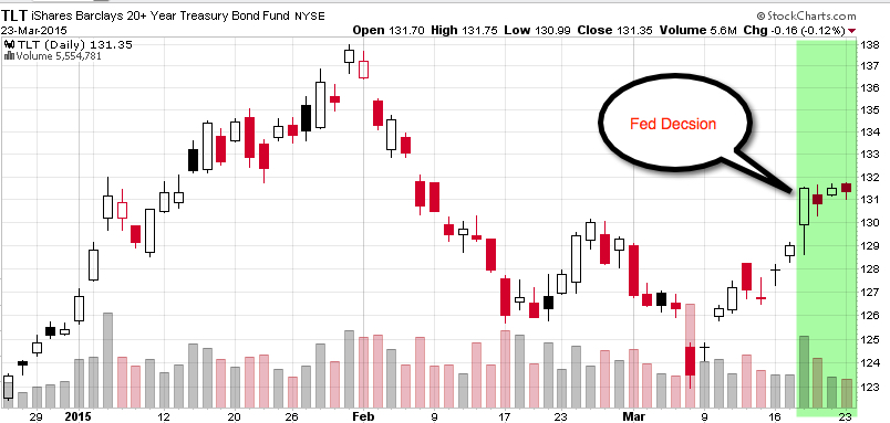
My focus is on directional price trends, not the news. I focus on what is actually happening, not what people think will happen. Below I drew a 3 month price chart of the 20+ Year Treasury Bond ETF (TLT), I highlighted in green the time period since the Fed decision last week. You may agree that most of price action and directional trend changes happened before that date. In fact, the long-term bond index declined nearly 2 months before the decision, increased a few weeks prior, and has since drifted what I call “sideways”.
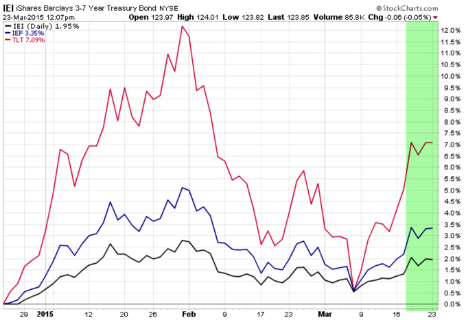
To be sure, in the next chart I included an analog chart including the shorter durations of maturity. iShares 3-7 Year Treasury Bond ETF (IEI) and iShares 7-10 Year Treasury Bond ETF (IEF). Maybe there is some overreaction and under-reaction going on before the big “news”, if anything.
Many investors must be dazed and confused by the global markets reaction to the Fed. I’m guessing most people would expect if the Fed signaled they are closer to a rate hike the stock and bond markets would fall. Rising interest rates typically drive down stocks along with bonds. Just the opposite has happened, so far.
Markets seems to have moved opposite of expectations, those people have to get on board (increasing demand).
A few things I wrote before and after the Fed decision:
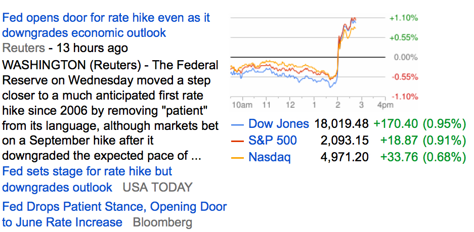
A One-Chart Preview of Today’s Fed Decision: This is what economists are expecting
So, I’m guessing most people would expect if the Fed signaled they are closer to a rate hike the stock and bond markets would fall. Rising interest rates typically drive down stocks along with bonds. Not the case as of 3pm today. Stocks were down about -1% prior to the announcement, reversed, and are now positive 1%. Even bonds are positive. Even the iShares Barclays 20+ Yr Treas.Bond (ETF) is up 1.4% today.
So much for expectations…
Below is snapshot of the headlines and stock price charts from Google Finance:
I can’t image what it must be like sitting around watching and reading the news trying to figure out what the Fed is going to do next. Even if they could know, they still don’t know how the markets will react. New information may under-react to the news or overreact. Who believed there would be no inflation? bonds would have gained so much? the U.S. dollar would be so strong? Gold and oil would be so low? Expectations like that are a tough way to manage a portfolio. I instead predefine my risk and identify the actual direction and go with it. Others believe it comes down to a single word…
Bloomberg says: Here’s a One-Chart Preview of Today’s Fed Decision: This is what economists are expecting
By far the biggest question is whether the Fed will drop the word “patient” from its statement. If it does drop the word, it creates the possibility of a June rate hike, and it will mark the first time since the financial crisis that the Fed is offering no specific forward guidance as to when rate hikes will come.
About 90 percent of economists surveyed by Bloomberg expect the Federal Reserve to drop the word “patience” in today’s announcement.
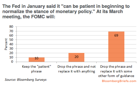
source:http://www.bloomberg.com/news/articles/2015-03-18/here-s-a-one-chart-preview-of-today-s-fed-decision
That was the lesson you learned the last time stocks became overvalued and the stock market entered into a bear market.
In a Kiplinger article by Fred W. Frailey interviewed Mohamed El-Erian, the PIMCO’s boss, (PIMCO is one of the largest mutual fund companies in the world) he says “he tells how to reduce risk and reap rewards in a fast-changing world.” This article “Shaking up the Investment Mix” was written in March 2009, which turned out the be “the low” of the global market collapse.
It is useful to revisit such writing and thoughts, especially since the U.S. stock market has since been overall rising for 5 years and 10 months. It’s one of the longest uptrends recorded and the S&P 500 stock index is well in “overvalued” territory at 27 times EPS. At the same time, bonds have also been rising in value, which could change quickly when rates eventually rise. At this stage of a trend, asset allocation investors could need a reminder. I can’t think of a better one that this:
Why are you telling investors they need to diversify differently these days?
The traditional approach to diversification, which served us very well, went like this: Adopt a diversified portfolio, be disciplined about rebalancing the asset mix, own very well-defined types of asset classes and favor the home team because the minute you invest outside the U.S., you take on additional risk. A typical mix would then be 60% stocks and 40% bonds, and most of the stocks would be part of Standard & Poor’s 500-stock index.
This approach is fatigued for several reasons. First of all, diversification alone is no longer sufficient to temper risk. In the past year, we saw virtually every asset class hammered. You need something more to manage risk well.
But, you know, they say a picture is worth a thousand words.
Since we are talking about downside risk, something that is commonly hidden when only “average returns” are presented, below is a drawdown chart. I created the drawdown chart using YCharts which uses total return data and the “% off high”. The decline you see from late 2007 to 2010 is a dradown: it’s when the investment value is under water. Think of this like a lake. You can see how the average of the data wouldn’t properly inform you of what happens in between.
First, I show PIMCO’s own allocation fund: PALCX: Allianz Global Allocation Fund. I include an actively managed asset allocation that is very large and popular with $55 billion invested in it: MALOX: BlackRock Global Allocation. Since there are many who instead believe in passive indexing and allocation, I have also included DGSIX: DFA Global Allocation 60/40 and VBINX: Vanguard Balanced Fund. As you can see, they have all done about the same thing. They declined about -30% to -40% from October 2007 to March 2009. They also declined up to -15% in 2011.
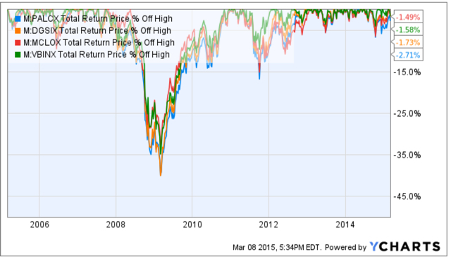
Charts are courtesy of http://ycharts.com/ drawn by Mike Shell
Going forward, the next bear market may be very different. Historically, investors consider bond holdings to be a buffer or an anchor to a portfolio. When stock prices fall, bonds haven’t been falling nearly as much. To be sure, I show below a “drawdown chart” for the famous actively managed bond fund PIMCO Total Return and for the passive crowd I have included the Vanguard Total Bond Market fund. Keep in mind, about 40% of the allocation of the funds above are invested in bonds. As you see, bonds dropped about -5% to -7% in the past 10 years.
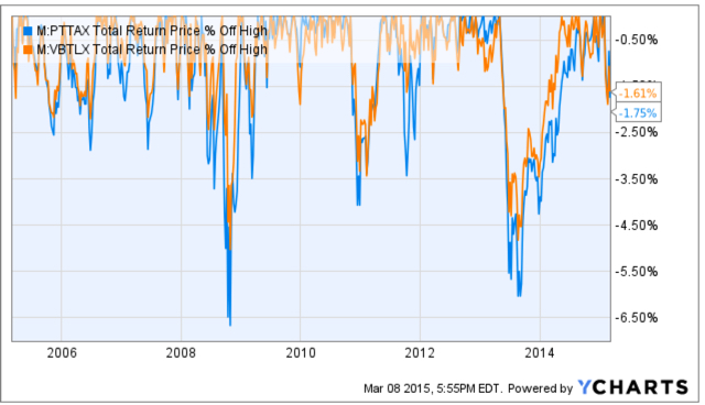
Charts are courtesy of http://ycharts.com/ drawn by Mike Shell
You may have noticed the end of the chart is a drop of nearly -2%. Based on the past 10 years, that’s just a minor decline. The trouble going forward is that interest rates have been in an overall downtrend for 30 years, so bond values have been rising. If you rely on bonds being a crutch, as on diversification alone, I agree with Mohamed El-Erian the Chief of the worlds largest bond manager:
“…diversification alone is no longer sufficient to temper risk. In the past year, we saw virtually every asset class hammered. You need something more to manage risk well.”
But, don’t wait until AFTER markets have fallen to believe it.
Instead, I apply active risk management and directional trend systems to a global universe of exchange traded securities (like ETFs). To see what that looks like, click: ASYMMETRY® Managed Accounts

I was talking to an investment analyst at an investment advisory firm about my ASYMMETRY® Global Tactical and he asked me what the standard deviation was for the portfolio. I thought I would share with you how the industry gets “asset allocation” and risk measurement and management wrong.
Most people have poor results over a full market cycle that includes both rising and falling price trends, like global bull and bear markets, recessions, and expansions. Quantitative Analysis of Investor Behavior, SPIVA, Morningstar and many academic papers have provided empirical evidence that most investors (including professionals) have poor results over the long periods. For example, they may earn gains in rising conditions but lose their gains when prices decline. I believe one reason is they get too aggressive at peaks and then sell in panic after losses get too large, rather than properly predefine and manage risk.
You may consider, then, to have good results over a long period, I necessarily have to believe and do things very differently than most people.
On the “risk measurement” topic, I will share with you a very important concept that is absolutely essential for truly actively controlling loss. The worst drawdown “is” the only risk metric that really matters. The risk is not the loss itself. Once we have a loss, it’s a loss. It’s beyond the realm of risk. Since risk is the possibility of a loss, how often it has happened in the past and the magnitude of the historical loss is the expectation. Beyond that, we must assume it could be even worse some day. For example, if the S&P 500 stock index price decline was -56% from 2007 to 2009, then we should expect -56% is the loss potential (or worse). When something has happened before, it suggests it is possible again, and we may have not yet observed the worst decline in the past that we will see in the future.
The use of standard deviation is one of the very serious flaws of investors attempting to measure, direct, and control risk. The problem with standard deviation is that the equation was intentionally created to simplify data. The way it is used draws a straight line through a group of data points, which necessarily ignores how far the data actually spreads out. That is, the standard deviation is intended to measure how far the data spreads out, but it actually fails to absolutely highlight the true high point and low point. Instead, it’s more of an average of those points. However, for risk management, it’s the worst-case loss that we really need to focus on. I believe in order to direct and control risk, I must focus on “how bad can it really get”. Not just “on average” how bad it can get. The risk in any investment position is at least how much it has declined in the past. And realizing it could be even worse some day. Standard deviation fails to reflect that in the way it is used.
Consider that as prices trend up for years, investors become more and more complacent. As investors become complacent, they also become less indecisive as they believe the recent past upward trend will continue, making them feel more confident. On the other hand, when investors feel unsure about the future, their fear and indecisiveness is reflected as volatility as the price swings up and down more. We are always unsure about the future, but investors feel more confident the past will continue after trends have been rising and volatility gets lower and lower. That is what the peak of a market looks like. As it turns out, that’s just when asset allocation models like Modern Portfolio Theory (MPT) and portfolio risk measures like Value at Risk (VaR) tell them to invest more in that market – right as it reaches its peak. They invest more, complacently, because their allocation model and risk measures tell them to. An example of a period like this was October 2007 as global stock markets had been rising since 2003. At that peak, the standard deviation was low and the historical return was at its highest point, so their expected return was high and their expected risk (improperly measured as historical volatility) was low. Volatility reverses the other way at some point
What happens next is that the market eventually peaks and then begins to decline. At the lowest point of the decline, like March 2009, the global stock markets had declined over -50%. My expertise is directional price trends and volatility so I can tell you from empirical observation that prices drift up slowly, but crash down quickly. The below chart of the S&P 500 is an example of this asymmetric risk.
At the lowest point after prices had fallen over -50%, in March 2009, the standard deviation was dramatically higher than it was in 2007 after prices had been drifting up. At the lowest point, volatility is very high and past return is very low, telling MPT and VaR to invest less in that asset. This is a form of volatility targeting: investing more at lower levels or historical volatility and less at higher levels.
In the 2007 – 2009 decline in global markets, you may recall some advisors calling it a “6 sigma event”. That’s because the market index losses were much larger than predicted by a standard deviation. For example, if an advisors growth allocation had an average return of 10% in 2007 based on its past returns looking back from the peak and a standard deviation of 12% expected volatility, they only expected the portfolio would decline -26% (3 standard deviations) within a 99.7% confidence level – but the allocation actually lost -40 or -50%. Even if that advisor properly informed his or her client the allocation could decline -26% worse case and the client provided informed consent and acceptance of that risk, their loss was likely much greater than their risk tolerance. When they reach their risk tolerance, they “tap out”. Once they tap out, when do they ever get back in? do they feel better after it falls another -20%? or after it rises 20%? There is no good answer. I want to avoid that situation. I prefer to reduce my exposure to loss in well advance.
You can see in the chart below, 3 standard deviations is supposed to capture 99.7% of all of the data if the data is a normal distribution. The trouble is, market returns are not a normal distribution. Instead, stock market gains and losses present an asymmetrical return distribution. Market returns experience much larger gains and losses than expected from a normal distribution – the outliers are critical. However, those outliers don’t occur very often: historically it’s maybe every 4 or 5 years, so people have time to forget about the last one and become complacent.
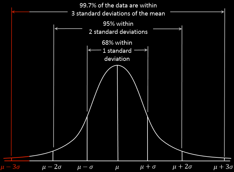
Source: http://en.wikipedia.org/wiki/68%E2%80%9395%E2%80%9399.7_rule
My friends, this is where traditional asset allocation like Modern Portfolio Theory (MPT) and risk measures like Value at Risk (VaR) get it wrong.
These methods are the most widely believed and used . You can probably see why most investors do poorly and only a very few do well – an anomaly.
I can tell you that I measure risk by how much I can lose and I control my risk by predefining my absolute risk at the point of entry and my exit point evolves as the positions are held. That is an absolute price point, not some equation that intentionally ignores the outlier losses.
As the stock indexes have now been overall trending up for 5 years and 9 months, the trend is getting aged. In fact, according to my friend Ed Easterling at Crestmont Research, at around 27 times EPS the stock index seems to be in the range of overvalued. In his latest report, he says:
“The stock market surged over the past quarter, adding to gains during 2014 that far exceed underlying economic growth. As a result, normalized P/E increased to 27.2—well above the levels justified by low inflation and interest rates. The current status is approaching “significantly overvalued.”
At the same time, we shouldn’t be surprised to eventually see rising interest rates drive down bond values at some point. It seems from this starting point that simply allocating to stocks and bonds doesn’t have an attractive expected return.
I believe a different strategy is needed, especially form this point forward.
In ASYMMETRY® Global Tactical, I actively manage risk and shift between markets to find profitable directional price trends rather than just allocate to them.
Mike Shell is the Founder and Chief Investment Officer of Shell Capital Management, LLC, and the portfolio manager of ASYMMETRY® Global Tactical.
The observations shared on this website are for general information only and are not specific advice, research, or buy or sell recommendations for any individual. Investing involves risk including the potential loss of principal an investor must be willing to bear. Past performance is no guarantee of future results. The presence of this website on the Internet shall in no direct or indirect way raise an implication that Shell Capital Management, LLC is offering to sell or soliciting to sell advisory services to residents of any state in which the firm is not registered as an investment advisor. Use of this website is subject to its terms and conditions.
Image source: here
Before you listen to the State of the Union address tonight, consider reading this very closely:
“Happiness is not to be achieved at the command of emotional whims. Happiness is not the satisfaction of whatever irrational wishes you might blindly attempt to indulge. Happiness is a state of non-contradictory joy—a joy without penalty or guilt, a joy that does not clash with any of your values and does not work for your own destruction, not the joy of escaping from your mind, but of using your mind’s fullest power, not the joy of faking reality, but of achieving values that are real, not the joy of a drunkard, but of a producer. Happiness is possible only to a rational man, the man who desires nothing but rational goals, seeks nothing but rational values and finds his joy in nothing but rational actions.
Just as I support my life, neither by robbery nor alms, but by my own effort, so I do not seek to derive my happiness from the injury of the favor of others, but earn it by my own achievement. Just as I do not consider the pleasure of others as the goal of my life, so I do not consider my pleasure as the goal of the lives of others. Just as there are no contradictions in my values and no conflicts among my desires—so there are no victims and no conflicts of interest among rational men, men who do not desire the unearned and do not view one another with a cannibal’s lust, men who neither make sacrifices nor accept them.
The symbol of all relationships among such men, the moral symbol of respect for human beings, is the trader. We, who live by values, not by loot are traders, both in manner and spirit. A trader is a man who earns what he gets and does not give or take the undeserved. A trader does not ask to be paid for his failures, nor does he ask to be loved for his flaws. A trader does not squander his body as fodder, or his soul as alms. Just as he does not give his work except in trade for material values, so he does not give the values of his spirit—his love, his friendship, his esteem—except in payment and in trade for human virtue, in payment for his own selfish pleasure, which he receives from men he can respect. The mystic parasites who have, throughout the ages, reviled the trader and held him in contempt, while honoring the beggars and the looters, have known the secret motive of the sneers: a trader is the entity they dread—a man of justice.”
“This is John Galt Speaking”
Chapter VII
People often ask me questions of the future. I guess they figure I have such a strong track record, I must know something about the future.
I paused my time machine, the rest of the world stopped; I took one step forward to see what happens next.
Here is what I saw:

Source: The Future: a period that doesn’t yet exist.
If anyone sees anything different please take a picture, come back here, now, and post it in the comments for all of us to see.

This week marked the 5th anniversary since the March 9, 2009 low in stock market. While much of the talk and writing about it seems to be focused mainly on the upside gains since the low point, it is more important to view it within the context of the big picture.
If you knew on March 9, 2009 that was the low point and could handle the 5 – 10% daily swings that were occurring during that time, then you could have made a lot of money. But, the fact is, many people have emotional reactions after a -10% decline over any period, even more it happens in a day or a week. But even if you don’t, in order to have made a lot of money you would have needed to have exited prior to the large loss before then. You needed cash to invest at the low. I heard some are bragging about their gains since the low, but they left out how much they had lost over the full cycle. It doesn’t mean anything to earn 100% over one period if you lose -50% the next period that wipes it out.
It doesn’t actually matter how much the stock index gained from its low point. What matters is its trend over a full market cycle. People sometimes have trouble seeing and understanding the bigger picture, which is one reason they get caught in traps in the short run.
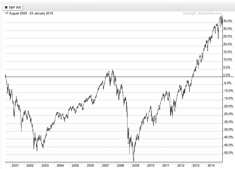
Below is the price trend of the S&P 500 stock index over the most recent full market cycle. I define a full market cycle as a complete cycle from a peak to low to a new peak. That is, it includes both a “bull market” and a “bear market”. To get an accurate picture, I have used the SPDRs S&P 500 ETF and a total return chart, so it does include dividends. After more than 7 years, the stock index has only gained 35%. Yet, it declined -56% along the way. That isn’t the kind of asymmetry® investors seem to want. If you think about risk reward, 20% is great upside if the downside is only -10%; that is positive asymmetry®. We want to imbalance risk and reward, more of one, less the other.
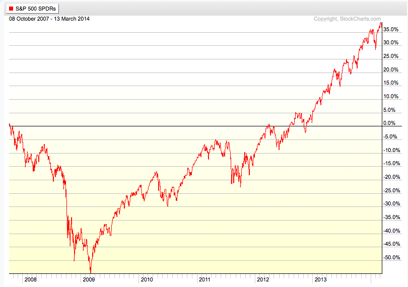
If you look closely, it took 5 years after the October 2007 peak to get back to break even. Though it has taken a long time to recover from the cascade decline, the recovery was impressive in terms of its gains, but extremely volatile for investors to endure.
When looking at a period of over 7 years, the swings don’t seem so significant. To put them into context, there were about 9 declines around 10% or more with the one in 2011 about -20%. This has kept many investors from buying and holding stocks.
If you are good at visual intuition, you may notice the price swings on the left of the chart are much wider than those more recently. This is a visualization of higher volatility as the trend was down and continued volatility caused by indecision between buying pressure and selling pressure.
After prices have trended down, such as the 2008 and 2009 period, the range of prices is wide and investors who held on too long panic, yet buyers aren’t willing to buy at their price.
After a price trend has been drifting up for several years and investors hear about how much it has gained, they become more and more complacent and more optimistic. They do this near a peak.
You can probably see how most investors who lost a lot of money before are likely to do it again. Unless something like the observations I have shared here helps to change their behavior, they are likely to do the same thing they did before.
Professors at colleges and universities are often called “Academics”. Much of their job is to write and publish “academic research papers”. It is no wonder you can find such a paper on most any topic. Investment management is a popular topic and it seems we see observe more and more such papers being cited and talked about.
Someone was telling me a story recently about the unethical use of the power of persuasion and influence. It reminded me how academic research is sometimes used to mislead people. For example, I read a book a few years ago that was supposedly in pursuit of finding alpha, but the entire book cited hundreds of academic studies promoting a passive asset allocation strategy. Yet, there wasn’t a single mention of the word “momentum” in the book, even thought there are over 300 academic papers that discovered alpha applying simple momentum/relative strength strategies. Momentum has even dis-proven the “Efficient Market Hypothesis”, but promoters of EMH call it an “anomaly” they can’t explain. I found the book misleading because of its title and content was conflicted – and it left out the one thing that even academics have found alpha.
I am often asked for my opinion about some of their research. I spend every day working on my edge. In addition to constant exploring and proprietary studies, I monitor and read many of the academic papers being published on topics I have interest and expertise, such as trend following, behavior finance (investor/trading psychology), volatility trading, global macro trading. I especially read studies about constructing trades with options and applying momentum. While some of these papers are worth reading and some even excellent, most of them seem to lack real world experience for application.
We have to consider that many of the people writing an academic paper don’t have any meaningful actual experience doing what they are writing about, so the studies are theoretical, conceptual, notional, philosophical, hypothetical, speculative, conjectural, and suppositional.
You may find it interesting that I found all those synonyms by looking up “academic” on Wikipedia. I thought it was interesting that their second definition of “academic” is “not of practical relevance; of only theoretical interest.”
As we think independently and critically about the world and our quests, we may keep this in mind as we read and cite academic research. That is in fact a function of being a good scholar and researcher, whether you do it for profit, or not. You may consider that it’s what you may be wrong about, or what you are missing, that should be your primary concern.
I’ve been working on a report for our clients about the current conditions of global markets and how we’ll know when it changes from positive to negative. I’m calling it something like “What a Market Top Looks Like”. It’s actually a working document; something I’ve added to since 2001. I haven’t sent a piece like this to our clients since late summer of 2007 when I believed global markets were getting closer to a significant peak.
The current bull market in U.S. stocks is now about 58 months old. As I explained in The REAL Length of the Average Bull Market, bull markets have averaged about 39 months and bear markets about 17 months. A full market cycle (average bull + bear) is 56 months. The current bull market, then, is longer than the historical average full market cycle. Probably driven by the Fed’s QE experiment, the advancing part of this cycle is 20 months longer than average. So, it seems to make sense to start watching for signs the topping process has started and remind our investors what that looks like and how we deal with it. Most people will become more and more complacent the higher and longer it goes – I’ll do just the opposite.
As I’ve been thinking about this lately, it occurred to me that, if anything, most thoughts seem more focused on the “bear market” period than they are what a market topping process looks like. Clearly, what is today known as the “Global Financial Crisis” or “Great Recession” will be forever imprinted in people’s memory – especially those who held on to losing stocks and bonds to large losses.
Someone was recently telling me of a strategy that “made money in 08”, but when I looked at it, they left out that it had declined -20% just before 2008. For many investors, that -20% may be just enough to cause them to exit the strategy, so it wouldn’t have mattered what it “did” the next year. Losses as large as -20% turn $1,000,000 into $800,000 or $10 million into $8 million. Whether it’s rational or not, investors start to perceive such losses as permanent. The more they think about it the more they may start to experience disappointment from the dreams of what they could have done with all that money they once had – but is lost. But, while our money is invested in a market and exposed the possibility of a loss – a gain is the markets money until we take it.
When people talk about the last bear market, they call it “2008”. They remember “2008” or “08” pronounced “oh – eight”. When we talk to investors about our investment programs they say “How did it do in 08?”. But, the trend wasn’t just 2008.
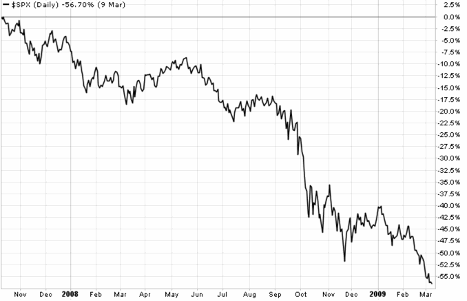
Below is a total return price chart of the S&P 500 stock index during the calendar year 2008. It declined -38.49% during the calendar year 2008. However, at one point it was down -48%.
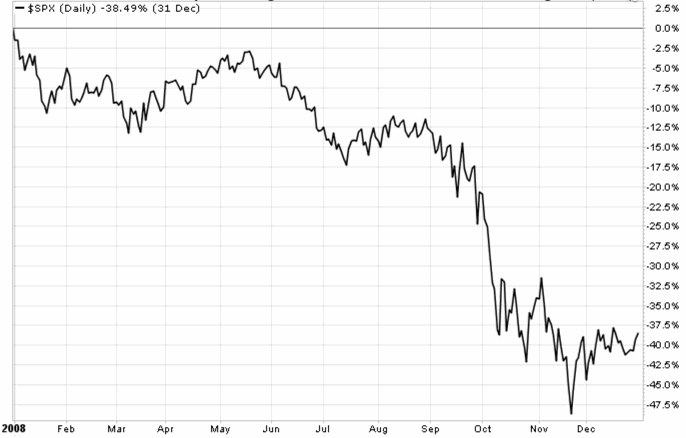
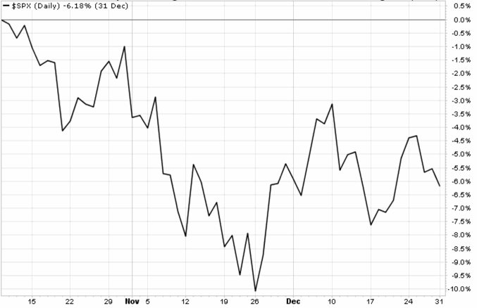
That was just the calendar year 2008. The stock market decline actually started October 10, 2007. Below is a chart of that date through year-end 2007. The S&P 500 stock index had already declined -10% at one point and the -6.18% adds to the total decline.
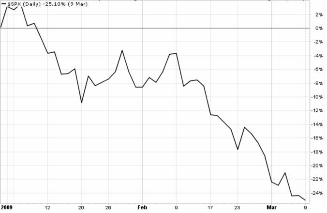
You may start to notice how different the result can seem depending on when you look at it. As it turned out, 2008 was just the middle of the bear market. As we saw in the first chart, October 2008 was the first low. It seems people may call the bear market “Oh eight” because 2009 ended “up”, but the bear market actually continued into 2009. In fact, 2009 was some of the steepest part of the waterfall. Below is the bear market continuation into 2009, an additional -25% decline.
The full bear market was 2007, 2008, and 2009. It was a -56% decline in total.
You can probably see how studying trends closely, we begin to realize that arbitrary time frames, like a calendar year, can be misleading about the bigger picture.
But, what may be more useful today is a strong understanding of the price trends leading up to all the historical bear markets.
People believe they know things they don’t and focus their energy trying to know the unknowable, rather than focusing on those things we can know and can control. The problem starts with one of the most read and respected investment books.
“An investment operation is one which, upon thorough analysis, promises safety of principal and an adequate return. Operations not meeting these requirements are speculative.
-Benjamin Graham, “The Intelligent Investor”, 4 ed., 2003, Chapter 1, page 18.
The trouble with that statement is that it promises the impossible. That is, I believe all operations are speculative and we do best by treating them as such.
First, let’s define the terms, according to Merriam-Webster.
A promise is:
“a statement telling someone that you will definitely do something or that something will definitely happen in the future.”
Analysis is:
“detailed examination of the elements or structure of something, typically as a basis for discussion or interpretation.”
Speculative is:
“engaged in, expressing, or based on conjecture rather than knowledge. (of an investment) involving a high risk of loss.”
So, to be sure we understand the meaning, let’s read it again and then interpret what it means using these definitions.
“An investment operation is one which, upon thorough analysis, promises safety of principal and an adequate return. Operations not meeting these requirements are speculative.”
In other words, it suggests if you do a thorough examination of the operation, you will gain “safety of principal and an adequate return” and that will definitely happen in the future.
If you have ever wondered why so many don’t do well at investment management, this is one reason. They believe they can do thorough analysis up front that that will assure the outcome and protect against loss.
It doesn’t actually work that way.
We never know for sure in advance. And, if we focus on the things that do matter, we don’t need to know what will “definitely happen in the future”. The exit, not the entry, determines the outcome. The trouble with much of the value investing philosophy, whether buying private companies or exchange traded securities, is the assumption that you can determine what will happen next. But when you are so confident in that, you end up caught in a loss trap when you are wrong with no way out. Instead, the outcome is completely determined by our exit: how we get out of it.
So, I treat all operations as “speculative”. All operations have a high risk of loss.
And, all things are “conjecture”.
Conjecture:
“an opinion or conclusion formed on the basis of incomplete information.”
That is, we always have incomplete information. We never know it all. To me, it makes a lot more sense to focus on the direction prices are trending and know I’ll create my results by my exit, not my entry. I focus my energy on defining the direction and when it’s going in the wrong one… so I can exit.
“The whole problem with the world is that fools and fanatics are always so certain of themselves, but wiser people so full of doubts.”
A month ago in “The Fed: What’s going to happen next? I suggested that you might consider that it doesn’t matter what the Fed does – it only matters how the drivers of price react to it. I went on to explain that we don’t need to know what the Fed would do but instead how the market responds to it. And, the market may not respond the way you expect. Trying to figure out what to do next based on what you think the Fed is going to do is a tough way to make portfolio management decisions. Prior to the announcement, it seemed the worry about it was based on what they would do, but all that really matters is how the price trends evolve of the positions you hold.
Most market participants didn’t seem to expect a taper. And, if a taper were announced, most seemed to expect stock prices would decline. After all, this Quantitative Easing program has been going off and on for several years now and when they’ve stopped it, stock indexes quickly dropped 10 – 20%. You may recall those declines in 2010, 2011, and 2012. Based on that historical precedent, it seemed to suggest stocks could be expected to fall when the Fed finally begins to unwind it’s massive bond-buying program to stimulate the economy. And, at some point it could even be a very significant decline since it appears this QE program has been a driver of stock prices since the 2009 low.
Later that day, the Fed announced that it would indeed begin to “taper” its bond-buying program. Although, The Federal Reserve’s $10 billion taper announcement doesn’t seem a significant cut in the central bank’s massive bond-purchasing plan. It’s still a taper and a taper is what those who talk on TV and write about it seemed to be afraid of. In fact, I mentioned in Fear is beginning to drive stock trends that investor sentiment measures shifted to fear and prices had dropped about -3% leading up to the Fed announcement. It seemed the market had anticipated some negative news and their fear “priced it in”.
Yet, the stock market index actually rose on the announcement instead of down. Maybe they overreacted leading up to the news and prices drifted back up.

In the chart below, we show a chart of global market prices since the taper announcement. Clearly, most global markets actually drifted up including the S&P 500 stock index ($SPX), U.S. Dollar ($USD), Developed Country International stocks (EFA), and even Long Term U.S. Treasuries (TLT).

Commodities like the GSCI Commodities Index (GSG) and Gold (GLD) immediately declined, since commodities and gold typically trend inversely to the U.S. Dollar. And, Emerging Markets countries (EEM) have trended down – maybe because many of them are commodity producers.
Things don’t always turn out the way you expect, so having strong expectations about what’s going to happen next can make portfolio management very difficult. In fact, having strong expectations that reach the point of convictions lead to overconfidence and ego issues that causes one to stay with their losing positions. When you stay with losing positions, hoping they’ll turn around and prove your right, you get caught in a loss trap. That’s how you lose a lot of money.
I find an edge in going with the flow, the current trend, what is actually happening. It seems if we do that, we can never be wrong for too long. It’s OK to be wrong; it’s staying on the wrong side of the trend that becomes a problem. And doing that starts with too much beliefs and expectations about what’s going to happen next and being unable to reverse it.
Flow… just go with it.
When we know in advance what we’ll do next, we don’t have to try to predict in advance what’s going to happen next.
Bernie Madoff is back in the news lately as it’s now been 5 years since he was arrested for the largest Ponzi Scheme. For some reason, the name is commonly linked to “hedge funds”. Yet, the Bernie Madoff scam wasn’t a hedge fund, his company was a registered and regulated brokerage firm called Bernard L. Madoff Investment Securities. Madoff founded the Wall Street brokerage firm Bernard L. Madoff Investment Securities LLC in 1960. Some large hedge funds lost money because they had invested in Madoff’s managed account. They had Madoff managing some of their funds money. But Madoff Investment Securities LLC wasn’t a hedge fund.
If you had an account managed by Bernie Madoff at Madoff Investment Securities LLC you would have had an account owned and titled in your own name. You would have gotten trade confirmations from Madoff Investment Securities LLC when he bought or sold. You don’t get that in a fund. You don’t know when a fund buys or sells. His investment program, then, offered the appearance of transparency – you could see what he was doing at any time.
As it turned out, the appearance of transparency enabled the thief to defrauded customers of approximately $20 billion over several decades. You see, Madoff’s investment program was a fraud, and the reason he was able to do it is that:
1. He was the portfolio manager: he made the trading decisions.
2. He owned the broker that executed the trades (as it turned out, they were fake; he didn’t do trades).
3. He owned the custodian: the custodian and broker was the same company.
Since Madoff Investment Securities LLC was the portfolio manager, broker, and the custodian, that allowed him to pretend to do trades and print trade confirmations and statements with fake information on them. Madoff Investment Securities LLC was regulated and registered as a brokerage firm, just like Wells Fargo Advisors, Edward Jones, Schwab, Morgan Stanley, and other brokers. You can probably see how the real issue was that his program was a fraud and he was able to do it because he controlled the trading decisions, trade confirms, account statements, and custody, because his company did it all. What if he had been required to custody an another company independent of his? he would have had to convince the other company to participate in his scheme which would likely have gotten him busted sooner. Most investment companies aren’t a fraud, so they would likely report him. Madoff was large and respected – but don’t think that made it any safer.
Whether you invest in a separately managed account or a private investment partnership, require that they use multiple service providers that are independent of each other instead of all one company. For example, your portfolio manager is an asset management firm, the broker is a different company that executes the trades and the custodian is a separate company that holds the securities and handles the cash in and out. Then, require it be audited by even another independent company. For example, if you enter into an investment management agreement with ABC Capital Management, LLC that firm is the portfolio manager and the agreement gives it authority to buy and sell in your account. Your account should then be held at a financial institution registered as a broker or bank like Folio Institutional, Trust Company of America, or JP Morgan. You deposit money to that financial institution that holds your money and they send you statements. ABC Capital Management, LLC is just trading the account independently and shouldn’t have custody of the money. If the investment program is a “hedge fund” instead of a separately managed account then it’s typically structured as a private investment partnership, say: ABC Fund, LP. A private fund is operated like a business – the business is trading for profit. You review a Private Placement Memorandum that explains every detail of ABC Fund, LP. When you invest, you sign a “Subscription Agreement” instead of an investment management agreement. You wire the deposit to the bank account of ABC Fund, LP and that money is then wired to the funds brokerage account. It’s best to require the fund to have a “third party administrator” who acts as the funds controller and accountant. That third party administrator is who accounts for your investment and sends you statements showing the value of your investment. You can probably see why you want the administrator to be a third party – independent from the fund manager. Then, the fund is audited annually to verify the administrators accounting is accurate. When ABC Fund, LP is a private investment partnership, it should be operated like any other major business with multiple investors. It has a bank account that sends/receives wires, a custodian that holds securities, a broker that executes trades, a third party administrator that does the accounting and creates profit and loss statements, and an independent accountant that audits all of it. Those should be separate companies independent of each other, not one.
Unfortunately, most of the smaller scams we hear about are even worse than the Madoff scheme. The investors write a check to “John A. Doe” which isn’t even a company at all. I don’t think any legitimate investment program has you writing a check to the individual portfolio manager. Deposits should be made to an independent bank or custodian and statements should come from that custodian. In fact, it’s even better to wire the funds rather than write a check. But “You can’t fix stupid”. There will always be Madoff-like scams and people stupid enough to write them a check. If you simply require that all the service providers be separate companies you won’t be one of them.

The “red pill” and “blue pill” refer to a choice between the willingness to learn a potentially unsettling or life-changing truth by taking the red pill or remaining in contented ignorance with the blue pill. It refers to a scene in the 1999 film The Matrix.
I have been talking to a financial planner recently who is struggling between the red pill and the blue pill.
On the one hand, the poor performance of stock and bond indexes over the past decade or so, particularly the losses in bear markets, led him to study long-term market cycles.
An understanding that markets don’t always go up over long periods is the reality of the red pill.
On the other hand, much of the investment industry still believes in getting “market returns” and that a simple plan of “asset allocation” and occasional re-balancing is prudent enough, so a financial planner can choose to keep his practice simple by continuing that plan.
Some investment advisers even consider re-balancing and an occasional change “tactical”.
It isn’t.
The blue pill and the red pill are opposites, representing the choice between the blissful ignorance of illusion (blue) and embracing the painful truth of reality (red).
On the one hand, after understanding the trends of global markets based on simply looking at their history, he realizes the probable outcome of stocks and bonds based on trends I discuss in The S&P 500 Stock Index at Inflection Points and 133 Years of Long Term Interest Rates. Though price trends can continue far more than you expect, the stock and bond markets are at a point where their trends could reverse. The financial planner realizes if he takes the red pill of reality, he’ll have to embrace these facts and do something rather than sit there. He’ll have to change his long-held beliefs that markets are efficient and the best you can do is allocate to them. He’ll have to do extra assignments and homework to find alternative investment managers whose track record suggests they may have the experience and expertise to operate through challenging market conditions.
On the other hand, changing one’s beliefs and taking a different approach can be extra work and have risks. If he continues the static asset allocation to stocks and bonds he’s always done, he says he won’t be doing something so different from the majority of advisers. He knows his career and his life will be easier. When the markets go up, his clients make market returns (minus his fees). When the markets go down, other people are losing money too, and he certainly can’t control what the market does, so: it’s the market. I can see how this is an enticing business model, especially for a busy person who has a life outside the office. That’s probably why it’s so popular.
A similar theme of duality happens in the movie The Matrix.
Morpheus offers Neo either a blue pill (to forget about The Matrix and continue to live in the world of illusion) or a red pill (to enter the sometimes painful world of reality).
Duality is something consisting of two parts: a thing that has two states that may be complementary or opposed to each other. We all get to choose what we believe and our choices shape the world we individually live in.
I can’t say that I can totally relate to the financial adviser because it is my nature to be more tactical and active in decision-making. I believe we should actively pursue what we want. And, I believe what we want from the markets is in there, I just have to extract it from the parts we don’t want. I once explained my investment strategy to a lifelong friend and he replied “you have always been tactical” and reminded me of my background. Though it’s different from me, I can truly appreciate the struggle advisers and investors face choosing between the red or blue pill. Investors and advisers like “market returns” when they are positive, which is what we experience most of the time. It’s when those markets decline that they don’t want what the market dishes out. The markets don’t spend as much time in declines. I pointed out in The Real Length of the Average Bull Market the average upward trend for stocks (bull market) lasts 39 months while the average decline ( bear market) is about 17 months. Investors eventually forget and become complacent about the time they need a reminder. Though the stock markets trend up about 3 times longer than they trend down, it’s the magnitude of the losses that cause long-term investors a problem. For example, the bull market from 2003 through October 2007 gained over 105% but the -56% decline afterward wiped out those gains. You can see that picture in The S&P 500 Stock Index at Inflection Points.
The risk for the financial adviser who has historically focused on “market returns” is that a new strategy for them that applies some type of active risk management is likely to be uncorrelated and maybe even disconnected at times from “market returns”. For example, I discussed that in Understanding Hedge Fund Index Performance. Investors who are used to “market returns” but need a more absolute return strategy with risk management may require behavior modification. If they want an investment program that compounds capital positively by avoiding large losses and capturing some gains along the way they have to be able to stick with it. That requires the adviser to spend more time educating his or her investors about the reality of the red pill. Kind of like I am doing now. Some people have more difficulty doing something different, so they need more help. Others are better able to see the big picture. Some financial advisers would rather deal with explaining the losses when markets decline. For them, it can be as simple as forwarding clients some articles about the market going down with a message something like “We’re all in this together – let’s just hunker down”. That doesn’t require a great deal of independent thinking or doing.
While most individual investors probably do lose money when the stock and bond markets do, that isn’t necessarily the case for those who direct and control downside risk.
It isn’t enough to have a good investment program with a strong performance history.
Just as important is the ability to help investors modify their beliefs and behavior.
That’s the reality of the red pill.
By definition, active is more work than passive. Investors and advisers alike get to choose which pill they take: the blissful ignorance of illusion (blue) and embracing the painful truth of reality (red).
I believe in individual liberty and personal responsibility, so the choice is your own.
My thoughts on the subject are directional – I am the red pill.
Morpheus: “You have to understand, most of these people are not ready to be unplugged. And many of them are so inured, so hopelessly dependent on the system, that they will fight to protect it.”
“Unfortunately, no one can be told what the Matrix is.
You have to see it for yourself.”
Like The Matrix, this is going to be a sequel.
To be continued…

Photo by Christi Shell
As I sit here this morning in my favorite place watching ESPN College Game Day getting ready to spend the Labor Day weekend on the lake, I was thinking…
Over the years, I’ve asked many people what is most important to them. What I’ve learned is that while we all have different ways we like to spend our time, at the end of the day what we really want is freedom. That is, freedom to do what we want, when we want.
I want to share with you my beliefs about freedom and how to earn it.
An employee is hired to operate a system that another created. Their job is to operate the system; maybe it’s an engineer working for a large engineering firm or a physician working for a large medical practice. For that, the employee enjoys having a system they operate, but that they don’t have to create or necessarily keep updated. They enjoy the job stability.
The self-employed person is one who believes they can do it better, so they start their own firm or medical practice and create their own systems to manage the business. But, the self-employed person also operates the system. They are there, running the system they created. And they have to be there, or there is no system.
As they shift more toward freedom, they can become a business owner. The business owner hires all the necessary people to completely run the business. He or she can take nice long vacations without closing the business because employees are running the business. But, they still have to be the business owner and oversee the business as that owner, no matter if they call themselves President, CEO, or Chairman. It’s an active responsibility to oversee the business.
The ultimate freedom is the investor. The investor isn’t a business owner and operator, but instead an investor. The investor is passive in his or her investment. An investor earns profit and loss, like a business owner, but without having to actually do anything other than investing capital. The investor can sail the world on a yacht, see the country in an RV, spend every day at the beach house or mountains with the family, or do whatever he or she wants to do. The investor has full freedom. That’s what I think we all want.
Sometimes people truly love how they earn their capital. Maybe they can do it to the end. But more often than not, the aging process doesn’t allow them to do it to the end, so they’ve got to become an investor at some point.
There are many ways to earn freedom. We don’t have to start and grow a business to end up as an investor. You can be an employee and save and invest into a retirement fund. No matter how you do it, we all want freedom and that necessarily means earning and accumulating a retirement fund large enough that you find your own freedom to do what it is you really want.
I may have a unique perspective on this because I own an investment management business that helps people do that; I’m a trader, and an investor.
Have a great Labor Day weekend! and maybe the best teams win!
“Here be dragons” means dangerous or unexplored territories, in imitation of the medieval practice of putting dragons, sea serpents and other mythological creatures in uncharted areas of maps.
Most people fully accept paranormal and pseudoscientific claims without critique as they are promoted by the mass media. Here Be Dragons offers a toolbox for recognizing and understanding the dangers of pseudoscience, and appreciation for the reality-based benefits offered by real science. Real science is a process for proving something to have predictive ability through a process of testing.
The video below titled “Here Be Dragons” is an outstanding 40-minute video introduction to critical thinking. Watch it and see how you start to think more critically about what you believe.
I originally wrote this is a few years ago on another forum. It’s a concept that is so important to understand I wanted to share it here. The term “Independent Thinker” comes up in conversations a lot. I’m so often accused of being one. I search for a good definition and bold the parts that resonates the most with me. I find a useful explanation at iPersonic:
Independent Thinkers are analytical and witty persons. They are normally self-confident and do not let themselves get worked up by conflicts and criticism. They are very much aware of their own strengths and have no doubts about their abilities. People of this personality type are often very successful in their career as they have both competence and purposefulness. Independent Thinkers are excellent strategists; logic, systematics and theoretical considerations are their world. They are eager for knowledge and always endeavor to expand and perfect their knowledge in any area which is interesting for them. Abstract thinking comes naturally to them; scientists and computer specialists are often of this type.
Independent Thinkers are specialists in their area. The development of their ideas and visions is important to them; they love being as flexible as possible and, ideally, of being able to work alone because they often find it a strain having to make their complex trains of thought understandable to other people. Independent Thinkers cannot stand routine. Once they consider an idea to be good it is difficult to make them give it up; they pursue the implementation of that idea obstinately and persistently, also in the face of external opposition.
Referencing some of the parts I made bold, I will add a few comments. Independent Thinkers are analytical and self-confident and do not get worked up by conflicts and criticism. Independent Thinkers are open to debate topics they are interested in and are well prepared to compare and contrast beliefs with logic and empirical evidence. By virtue of “independence” the Independent Thinker is able to consider many different views to determine which is based on truth and facts. As an Independent Thinker myself, I can tell you that I have learned as much from people whose views are opposite mine, but not because they influence or control my beliefs but instead because they often confirm them. If you’re on to something, something that has a strong logic and mathematical reasoning behind it, then your next step is to figure out what may be wrong or go wrong rather than learning it the hard way. Outcomes are always uncertain, never a sure bet, so the best we can do is stack the math for dealing with uncertainty in our favor and figuring out in advance what may shift it against us. Once we’ve done this, then we have no reason to worry about things that haven’t even happened. If you want to discover any potential issues with your ideas, you’ll learn more by sharing them with people who are more likely to disagree with you than those who will probably just agree without any critical thinking or testing. But if you find you mostly follow along with what others believe, then you may not be thinking independently. When we speak of “independent”, we necessarily speak of the various things listed by dictionary.com:
1. not influenced or controlled by others in matters of opinion, conduct, etc.; thinking or acting for oneself: an independent thinker.
2. not subject to another’s authority or jurisdiction; autonomous; free: an independent businessman.
3. not influenced by the thought or action of others: independent research.
4. not dependent; not depending or contingent upon something else for existence, operation, etc.
5. not relying on another or others for aid or support.
6. rejecting others’ aid or support; refusing to be under obligation to others.
7. possessing a competency: to be financially independent.
8. sufficient to support a person without his having to work: an independent income.
9. executed or originating outside a given unit, agency, business, etc.; external: an independent inquiry.
10. working for oneself or for a small, privately owned business.
11. expressive of a spirit of independence; self-confident; unconstrained: a free and independent citizen.
12. free from party commitments in voting: the independent voter.
13. Mathematics . (of a quantity or function) not depending upon another for its value.
I’ll leave it for you to decide what independence or independent thinking is not, but to offer a head start in this intellectual exercise I’ll suggest that it isn’t any of the above…
And finally, when I am thinking deeply about a meaning I like to look at other words of similar meaning to get a full picture. in the image below we view “independent” in the Visual Thesaurus, an interesting way to discover connections between words by revealing the way words and meanings relate to each other.

If you have a question or comment to me directly, contact me. If you want to reply for everyone to share, reply below. If you like this post and want to share it with others, click on the Twitter, Linkedin, below.
I think an independent thinker learns what he or she wants to know, while others must be taught. For example, the most intelligent humans are those who didn’t need someone to teach them formally, they are the first to figure things out. Our society often relates the most learned people by what college they attended and how much of it, but what if someone instead read over 500 books on subjects like math, scientific research, psychology, and trading? You may consider that the developers of the best systems and the products we love didn’t necessarily create them at a university or after earning an Ivy league degree. They are instead the ones teaching the world new things that they are able to develop and understand in ways most people can’t. Others go to the classroom hoping to understand some of the basics taught by books and lectures. The greatest things are discovered by deep independent thinking.
Intelligence: has been defined in many different ways including logic, abstract thought, understanding, self-awareness, communication, learning, having emotional knowledge, retaining, planning, and problem solving.

Source: When the student is ready, the master appears. ~Buddhist Proverb
If you have a question or comment to me directly, contact me. If you want to reply for everyone to share, reply below. If you like this post and want to share it with others, click on the Twitter, Linkedin, below.


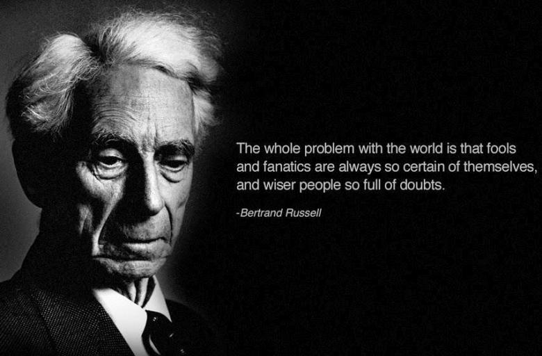

You must be logged in to post a comment.