I woke up this Saturday morning to see #FloridaMorons trending on Twitter, so yes, being a Tampa Bay resident, I had to look.
I really like Twitter. Over the years, Twitter has become the modern day message board. A decade ago, professional money managers communicated our thoughts and ideas with each other via email or on private (password-protected) message boards. Today many of us similarly share our observations on Twitter. So, I have Twitter running on one of my screens most of the time.
I typically glance over at the “Trends for you”, after all, I do like trends, ya now. But, I’ve noticed the “trending” is typically “Politics”, even thought it’s a subject I follow the least. My observation is the trending political tweets have tended to be more left leaning, so it’s asymmetric, but not the asymmetry I am interested in. I’m more a libertarian, focusing on taking responsibility for my own and preferring to be left alone to do so. No, let me be more asymmetric on the matter: I’ll fight over it, to the death. You should expect nothing less from anyone joining the US military out of high school, even less of someone joining at 17 before graduation, needing the parents permission, and expect no less whatsoever from someone joining the US Marines. I knew what I was getting myself in to as a young man from a long line of Veterans, so I’m pretty serious about standing firm on what I believe in. If I was then, you can bet it’s only increased since then. But, although I’m a global macro tactical trader, I don’t worry too much about politics at the national level. I vote, and encourage others to, but the politicians don’t control my life and I don’t want them to. Actually, I won’t let them. It’s simple. They can keep increasing my tax bills and changing the rules of the game, but I keep focusing on the things I can change and move past them. I encourage others to do the same. Politics and politicians don’t define me and never will. Over my dead body, as my forefathers put it, and I continue to believe it. So, don’t waste your time trying to debate me about politics. Focus instead on what you can control and take responsibly for yourself. I’ll keep doing the same.
Here is an example today of “Trends for you” on Twitter. I notice most of them are political, so maybe I need to change my settings in the little gear you see at the top right, or remove the “Trends for you” from the page if it’s an option. But, if I didn’t hear from the other side, I wouldn’t have this missive to write about. In reality, I like seeing what the other side believes. It helps me to decide what I believe. If they make sense, I may change my mind. I’m always flexible and adapt my beliefs as circumstances change, but my core beliefs tend to stay the same, which is why they are “core.”
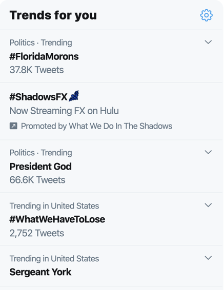
#FloridaMorons is trending, so let’s take a look at the trends from available data.
The trend is your friend until the end when it bends.
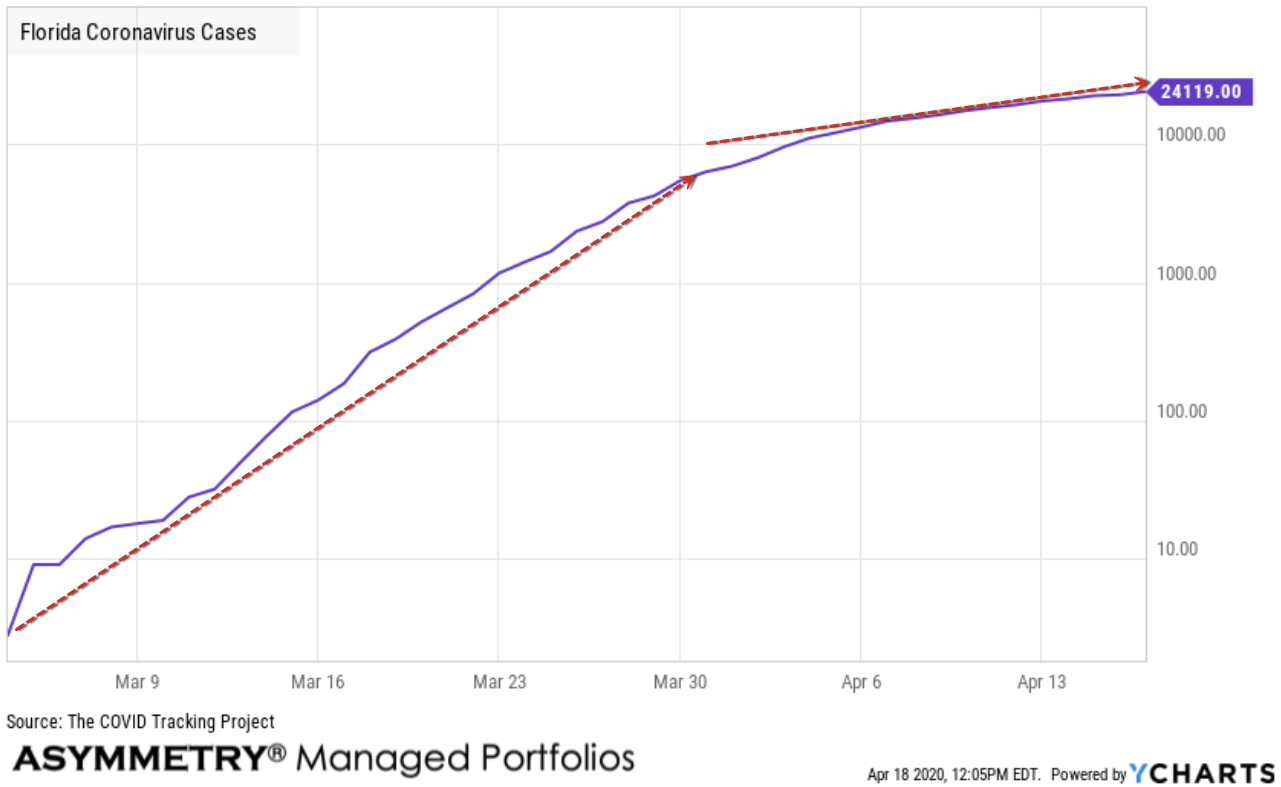
Florida Coronavirus Cases is at a current level of 24,119.00, up from 22,897 yesterday. This is a change of 5.34% from yesterday. The total number of cases initially trended up with great momentum, but since April the rate of growth slowed. To understand directional trends, we focus on the rate of change. I used a logarithmic chart as explained in “Quantitative Technical Analysis of the Coronavirus COVID – 19 Trend Shows the Rate of Growth is Slowing” to normalize the rate of change.
As the number of cases slow, politicians probably need to prepare to put Florida and the Unite States back to work and back to business. By now, most people are probably in panic mode and can’t believe I’d say such a thing. However, once a trend is underway and beings to show it may have reached an inflection point, it’s time to prepare for the next direction of the trend. Keep in mind, I pointed out the risks of Coronavirus and COVID – 19 early on as I believed it was an asymmetric risk and shared my observations on January 21, 2020: What could go wrong I shared this observation:
“What could go wrong?
There are always many things that can cause a market to fall. We’ve got a U.S. Presidential election this year, an impeachment, now a new virus.
A quick glance at headlines shows:
BREAKING NEWS
CDC expected to announce first US case of deadly Wuhan coronavirus
So, there are always many things that could go wrong and be regarded as a catalyst for falling prices, but I focus on the direction of the price trend, momentum, volatility, and sentiment as my guide.
The direction of the price trend is always the final arbiter.”
Again, that was January 21st, when the CDC was about to announce the first death in the United States from the Wuhan Coronavirus, long before it seemed to be a major issue in the US.
Laster, on March 8th in Coronavirus quick take and useful resources to track COVID-19 I wrote:
“I’m not downplaying Cornonviris COVID-19 as the risks are real and it’s an asymmetric uncertainty. If we get it wrong, the risk of loss is substantial, and we just don’t know how it will unfold. What I do know is what I can control. Be prepared with situational awareness. What if it does become a pandemic? Prepare for the possibility as best you can, then let it all unfold.
I glance over headlines to see what the herd is thinking and doing, but I prefer analyzing the data myself, directly. So, I’ll continue monitoring the interactive web-based dashboard to track COVID-19 in real-time with the exceptional resource Coronavirus COVID-19 Global Cases by Johns Hopkins CSSE.
I’m also monitoring the narrative from the CDC updates at Coronavirus Disease 2019 (COVID-19).
And then there is the Florida Health Department, which has a dynamic page that may be useful for confirmation: Florida 2019 Novel Coronavirus (COVID-19)“
I’ve been monitoring it ever since and we eventually got the data feeds into our charting systems to draw our own charts.
Continuing to look at the trends in the data, the first cases of Coronavirus (COVID-19) were confirmed on March 1st, 2020, which occurred in Manatee and Hillsborough County. During the initial outbreak of Coronavirus in the United States, Florida’s public beaches and theme parks were under scrutiny as being areas of large crowds. The state was relatively late in issuing a “Shelter-At-Home” order, finally putting it in place beginning April 3rd, 2020. Cases ramped quickly from 2 on March 4th, to over 5000 by the end of the month.
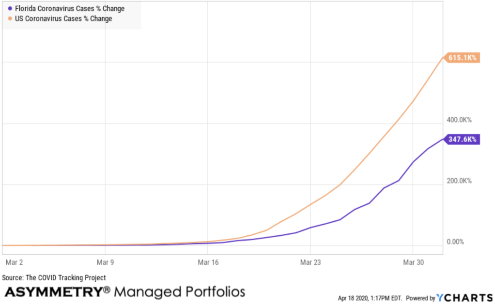
When I analyze trends qualitatively, I first observe the absolute direction of the trend as I did above to determine is it up, down, or sideways. It’s also essential to define the rate of change to see if an uptrend is slowing, or speeding up. Momentum is pervasive is most data, no matter what it is, so increasing momentum means the strength of the trend is pervasive, so it’s probably going to continue by spreading. It’s true for stock price trends and also true for a pandemic. It’s all about people and our behavior, you see. So, I compare Florida to the US in terms of relative strength by drawing a percent change chart comparing the two data sets. Here, we see the month of March when both the US and Florida cases were trending up sharply. This time, I used the arithmetic chart instead of the logarithmic chart because we want to visually see the absolute difference between two percentage changes in growth.
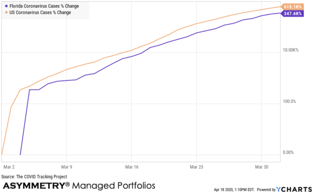
The percent change in the rate of change in cases was actually trending similarly in terms of rate of change. Yeah, I could have left this one out. It’s like the relative strength of momentum, a second-order derivative or slope of the slope. Nevermind, just keep reading. I won’t go down that rabbit hole.
As of this writing, here is the table for Florida from my data source, which is the COVID Tracking Project. The data feed we get was last updated yesterday, Apr 17 2020, 18:00 EDT and will be updated again today at 18:00 EDT.
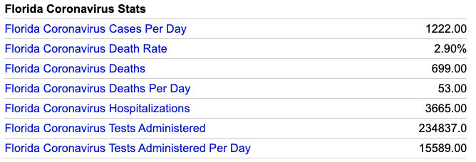
Let’s take a look at each of them.
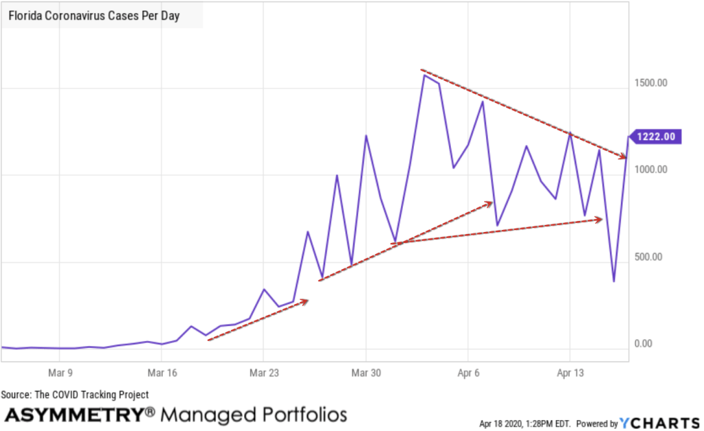
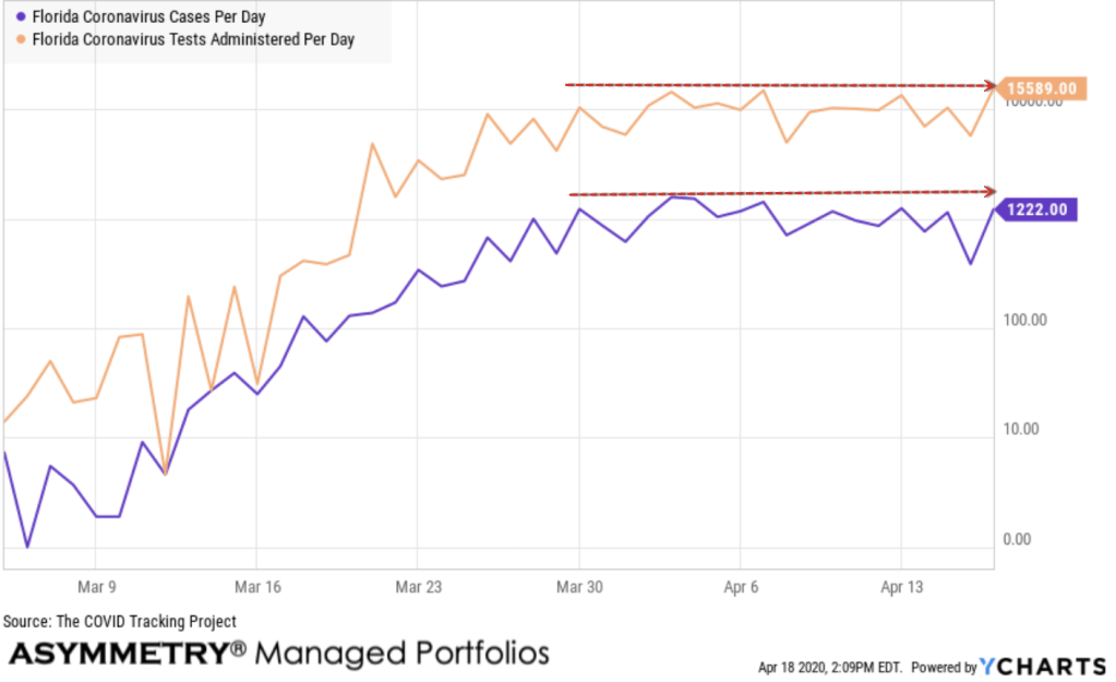
Drawing trend lines is an essential basic skill for trend following to observe, visually, the direction of a trend. Here you can see I drew a few lines to note the change in trend a few times. The trend in new cases per day in Florida was slowing and even trending down, until yesterday, it spiked up after a spike down. Note that we can only track tests that a state reports. And not all states report all tests. As my focus here is a quantitative analysis, I’m not going to look for the answer to why the new cases dropped below trend and then spiked back up, but we could find the answer qualitatively by looking for the story. I know you proably perfer the story, it’s human nature, but I’m going to keep with obsevations of the quantitative trends.
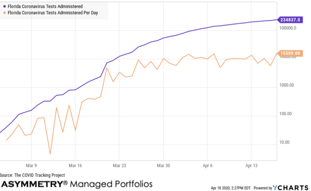
Next up is the number of tests administered per day here in Florida. Again, we see a spike up in the trend.
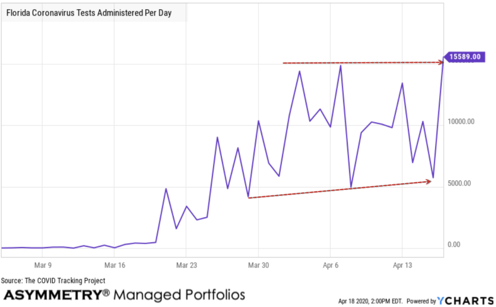
And just like that, I start to notice something in the quantitative analysis that could be interpreted qualitatively to be some cause and effect relationship. Just like global macro trends in capital markets. As the number of new tests administered trended up, so did the number of cases per day.
I could go search to find a provocative sounding narrative to put here in an attempt to qualitatively explain why, but your guess is as good as mine for now. Quantitative analysis is looking at data and as long as we have a large enough sample size, the rates of change will normalize and be similar over time.
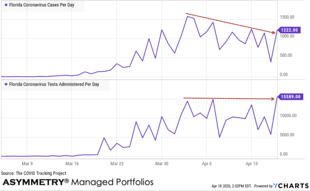
Well, actually, the above chart was a trick. I showed the trend in absolute terms, rather than a logarithmic scale which focuses on rates of change. When we normalize the data and compare these two, they remain in a sideways drifting trend, even with the jump. The momentum, or rate of change, isn’t enough to call it a break out.
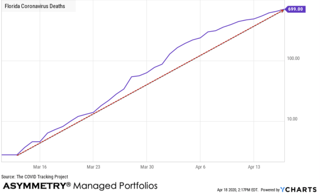
Next up is deaths. The number of deaths viewed as a logarithmic chart is trending up, but the upward momentum seen before is slowing. The high lowers seem to define the trend here, with the higher highs showing some decline.
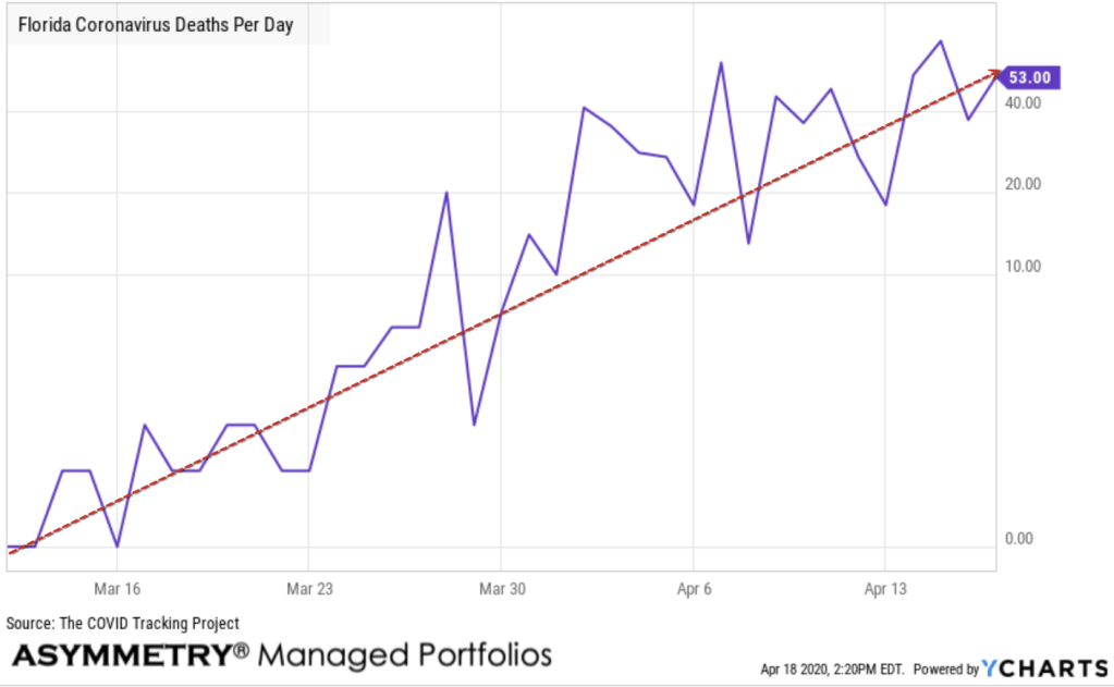
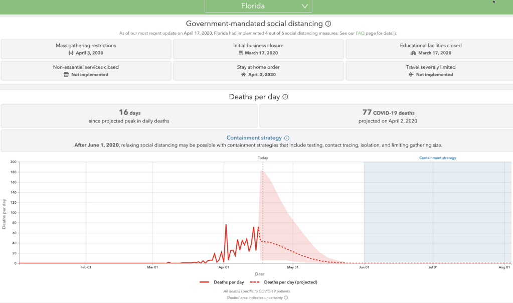
Florida deaths per day are trending up as expected. Naturally, the deaths and deaths per day will be on a lag after cases and hospitalizations. I drew a simple line around the center of the trend here just to show the uptrend and it isn’t slowing or stabilizing yet.
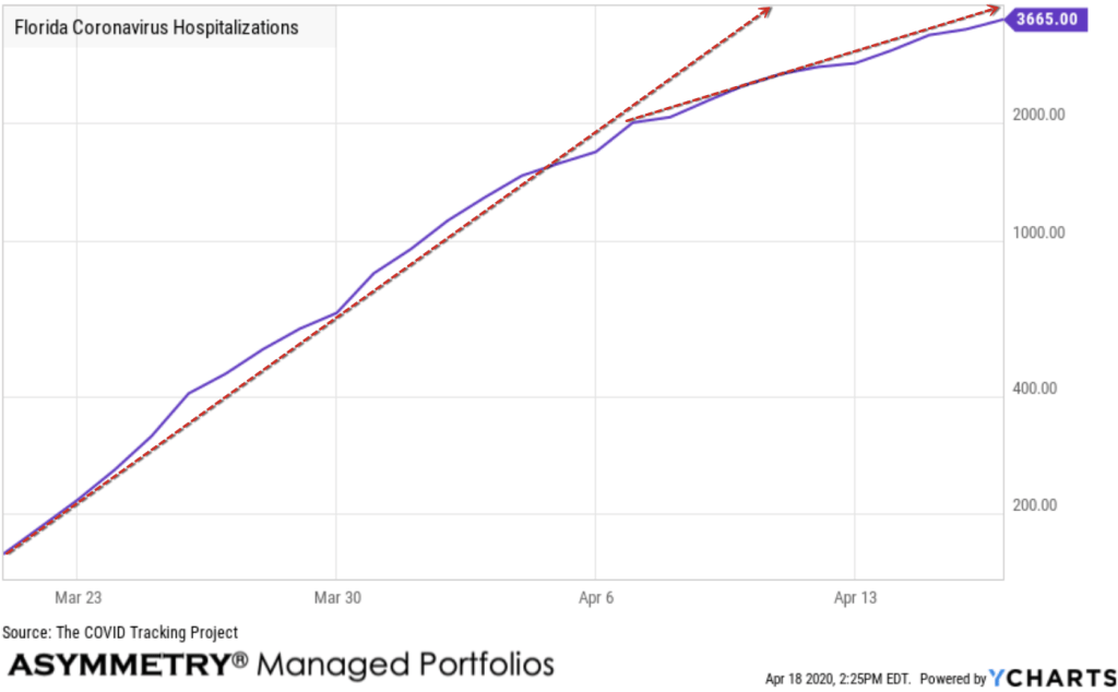
Florida coronavirus hospitalizations is showing a slowing rate of change, though in an uptrend.
Charting the test administered with the tests per day shows the per day tests slowing is gradually slowing down the test administered trend. I’m showing this to point out how some data will be leading, others will be lagging. The number of tests per day will change the bigger trend over time.
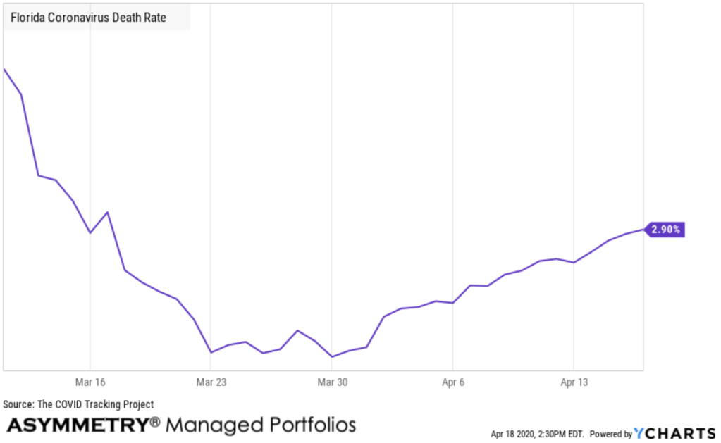
Finally, we get to the Florida Coronavirus death rate. Florida Coronavirus Death Rate is at 2.90%. The death rate is the most important trend.
Data is rarely perfect. But, garbage in, garbage out. I’ve had to explain the imperfections of data several times. Below is show the US death rates from two sources compared to Florida. I’m putting them on the same chart to point out a quick observation that the Johns Hopkins death rate is different from the COVID Tracking Project data we’ve used to track states.
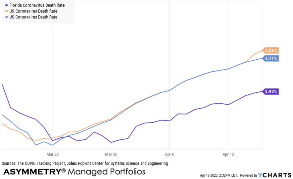
I know you want perfection, and I know we won’t ever have it, so I modify your behavior with examples imperfections like this. Does it give you a whirl? Do you lose your train of thought? Does it make you believe not of this is useful if it’s imperfect? If so, you’re never happy with the outcomes of anything and unlikely have any edge in portfolio management. I embrace imperfections and the unknowable, which is what drives my active risk management and such.
Others are still trying to get it right, I just cut my loss short when I get it wrong.
Here in the sunshine states, we’ve now had 699 COVID – 19 deaths in Florida out of 24,119 cases reported.
Applying the formula:
Florida Coronavirus Deaths x 100.00 / Florida Coronavirus Cases = The Coronavirus Death Rate.
The Denominator
I keep hearing about “the denominator” and how it isn’t accurate. They say it as though we need an exact total number of cases. It simply isn’t true. Clearly, more and more accurate data is better than fewer data and less accurate data. However, we have now entered the realm of simple quantitative analysis.
Quantitative analysis (QA) is a technique that seeks to understand behavior by using mathematical and statistical modeling, measurement, and research. Quantitative analysts or “quants” aim to express a given reality in terms of a numerical value.
Qualitative research is a scientific method of observation to gather non-numerical data while focusing on meaning-making. When we do qualitative research, we are focused on trying to explain “why” what is, is.
The number of cases is still a sample size of the population, so the rate of change should be similar with a large enough sample.
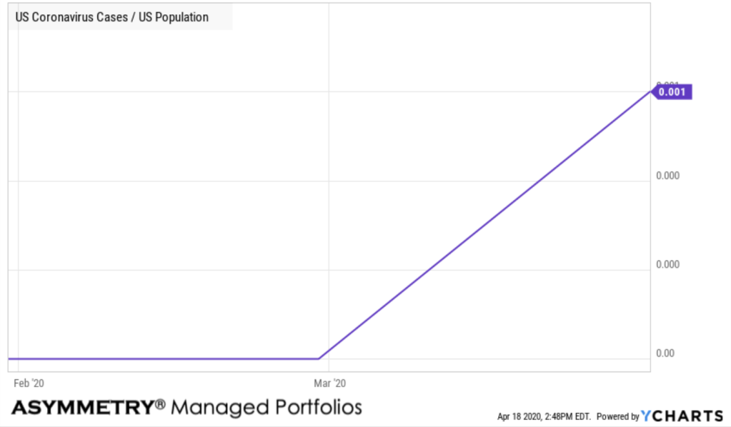
People who wanted to minimize the virus have asked for the percentage of the population. It is true that as a percent of the population, the number of cases is so small the chart of the ratio isn’t so useful. There are about 331 million people in the US and US Coronavirus Cases are 699,706 according to Johns Hopkins Center for Systems Science and Engineering, so it’s less than 1%. In fact, it’s less than 1% of 1%.
Models Misbehaving
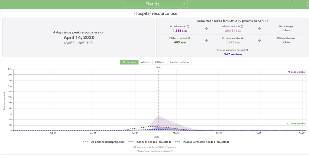
I’m sure there will be no shortage of criticism of the models attempting to predict things like hospital resource us such as the COVID-19 Projections from Institute for Health Metrics and Evaluation (IHME) that were widely used. The model had many assumptions, as any model would, and sometimes models get it wrong. Keep in mind, this model assumed social distancing, too, so it wasn’t a model misbehaving from our success in flattening the curve.
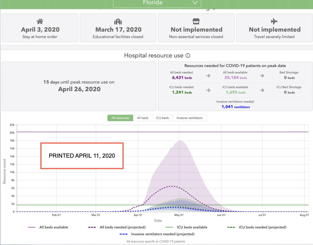
Below is an image I saved on April 11th, already showing Florida hospital resource use was improving.
Here it is today. Their educated guesses overestimated resource use, though it wasn’t a big surprised to me, since I paid attention to the wide range of possibilities they illustrated.
Here is their forecast of deaths in Florida along with actual deaths.
Should the governor of Florida allow people to go to Florida beaches? That’s for him to decide. It’s way outside my boat. I focus on my own boat. That’s his boat. If I don’t want to catch the virus at the beach, I simply won’t go to the beach. The Governor of Florida, however, has a bigger picture to consider than me. He’s got to factor in the potential stain on hospital and the healthcare industry, which have been lower than expected in many cases.
This has been a wonderful time to teach and learn maths, especially statistics and a little algebra (y = mx + b) and I hope everyone is taking advantage of it. My first interest in maths was sparked by probability and statistics. When I was a kid, I thought it was fascinating we could predict the likelihood of behavior or an outcome by having just a sample of a population.
What about the stock market?
It’s trending up, for now, and we’re participating in the uptrend, for now, but this too may change trend and when it does, so will I.
Don’t miss out:
Mike Shell is the Founder and Chief Investment Officer of Shell Capital Management, LLC, and the portfolio manager of ASYMMETRY® Global Tactical. Mike Shell and Shell Capital Management, LLC is a registered investment advisor focused on asymmetric risk-reward and absolute return strategies and provides investment advice and portfolio management only to clients with a signed and executed investment management agreement. The observations shared on this website are for general information only and should not be construed as advice to buy or sell any security. Securities reflected are not intended to represent any client holdings or any recommendations made by the firm. Any opinions expressed may change as subsequent conditions change. Do not make any investment decisions based on such information as it is subject to change. Investing involves risk, including the potential loss of principal an investor must be willing to bear. Past performance is no guarantee of future results. All information and data are deemed reliable but is not guaranteed and should be independently verified. The presence of this website on the Internet shall in no direct or indirect way raise an implication that Shell Capital Management, LLC is offering to sell or soliciting to sell advisory services to residents of any state in which the firm is not registered as an investment advisor. The views and opinions expressed in ASYMMETRY® Observations are those of the authors and do not necessarily reflect a position of Shell Capital Management, LLC. The use of this website is subject to its terms and conditions.

You must be logged in to post a comment.