I’m in Florida, which happens to be one of the states with the highest momentum in COVID – 19 cases. So, I’m going to share my observations as I flip through the data. I’m more of a data scientist, not an epidemiologist, so my focus is purely on the direction of these trends, and their rates of change. There are many limitations or challenges in interpreting the visualization. The data source labeled on the chart is deemed reliable but is not guaranteed, and the case data is limited by test availability.
What you believe is true, for you.
I say that, because we are observing about as much bias from this data as we see every day trading global capital markets.
No matter what I show in my observations, you’ll most likely still believe what you already did.
It’s confirmation bias.
Confirmation bias is the tendency to interpret new evidence as confirmation of one’s existing beliefs or theories.
The Coronavirus has become so politically charged, we see many people judging the trends based on their political affiliation, rather than pure data science.
That’s not the case for me.
My concern is to understand the trends to make a judgment on what is going on.
Let’s see what we see.
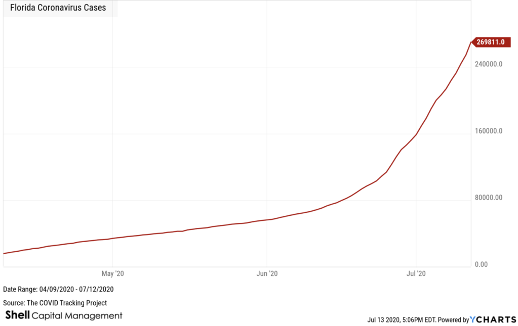
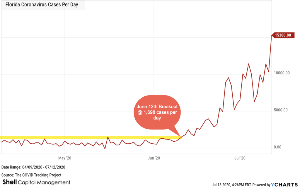
First, let’s start with Florida COVID – 19 Cases. The trend is up.
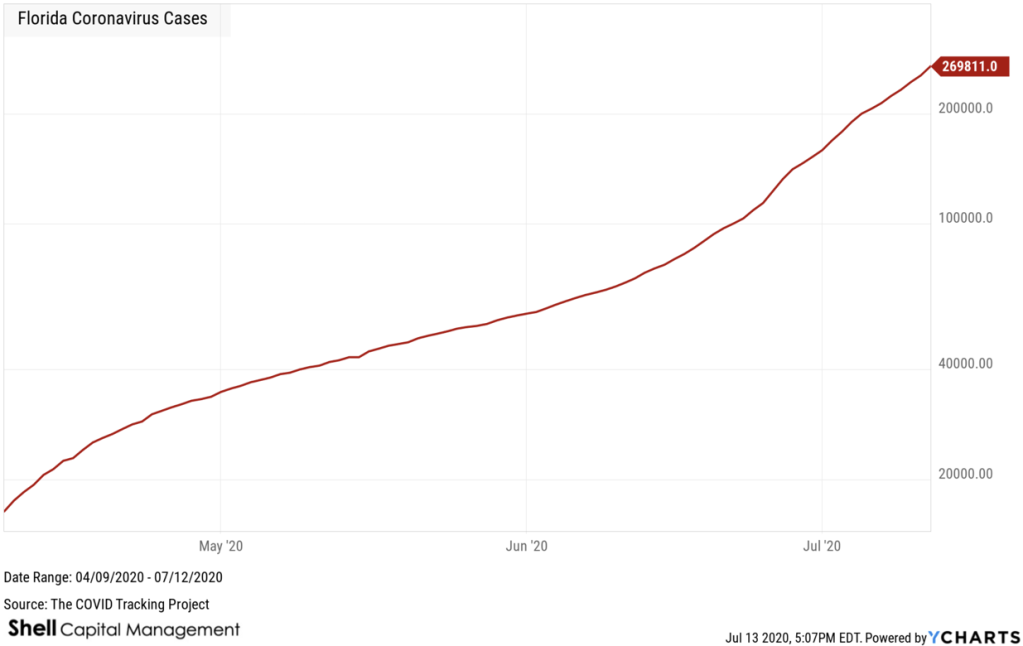
Amazingly, the visual doesn’t change a lot when I switch from an arithmetic chart above to the logarithmic chart below. The log chart below emphasizes the rate of change, rather than the absolute number change. Even the logarithmic chart is trending notably higher, so we not only have an uptrend, but it’s been gaining momentum. That is, the steepness of the recent uptrend is just as steep as it started months ago. We’d like to see it slow down, peak, and then reverse downward.
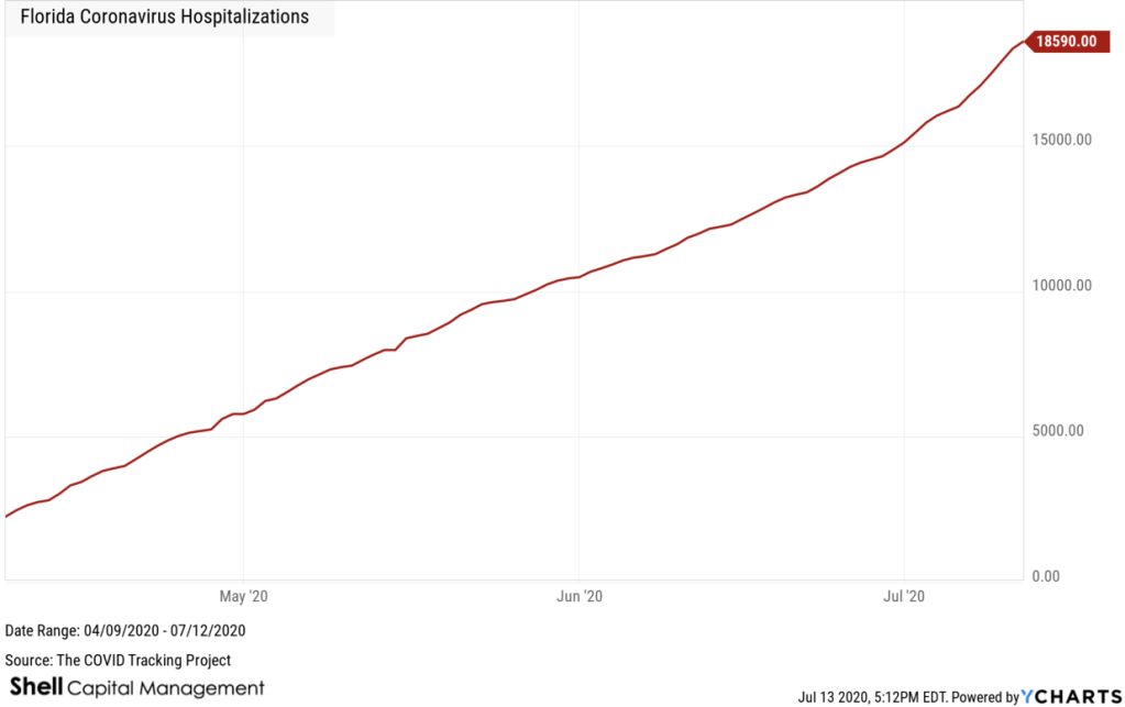
Florida COVID – 19 Hospitalizations uptrend continues. Again, this is the arithmetic chart, so it shows the absolute change.
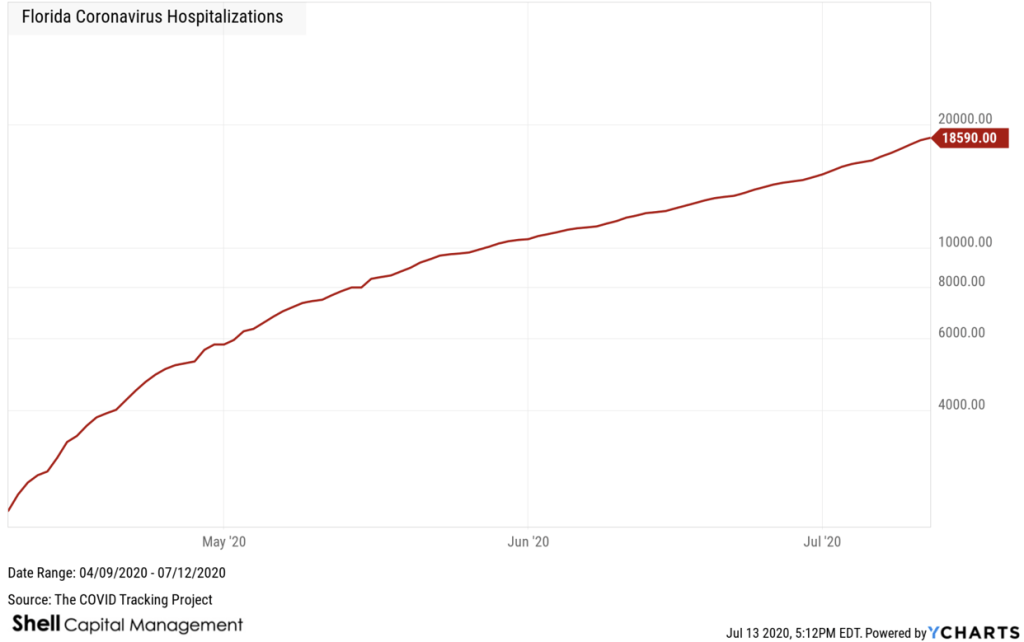
Next, I shifted the Florida COVID – 19 Hospitalizations chart to a log scale, to emphasize the rate of change. The rate of change slowed down for a while, but is clearly pointing up.
I pointed out an upside breakout in the trend of new cases on June 12th. Since then, new cases per day have increased from 1,698 per day to 15,300 new cases yesterday in Florida. That is, the cases per day have increased by 708% since the trend breakout 30 days ago. We are now in a new paradigm, so take your precautions accordingly. I’m hoping this is the peak, and we’ll see it turn down from here.
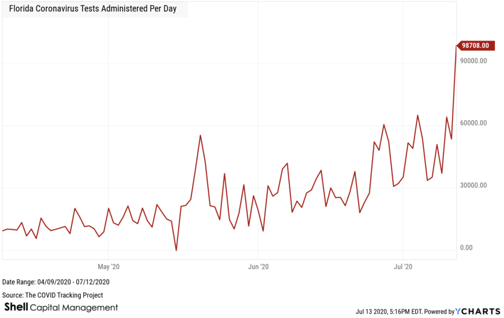
Florida Coronavirus Tests Administered Per Day is also in an uptrend and spiked up. Some of this recent uptrend could be due to data backlogs from the July 4th holiday weekend, but it is what it is.
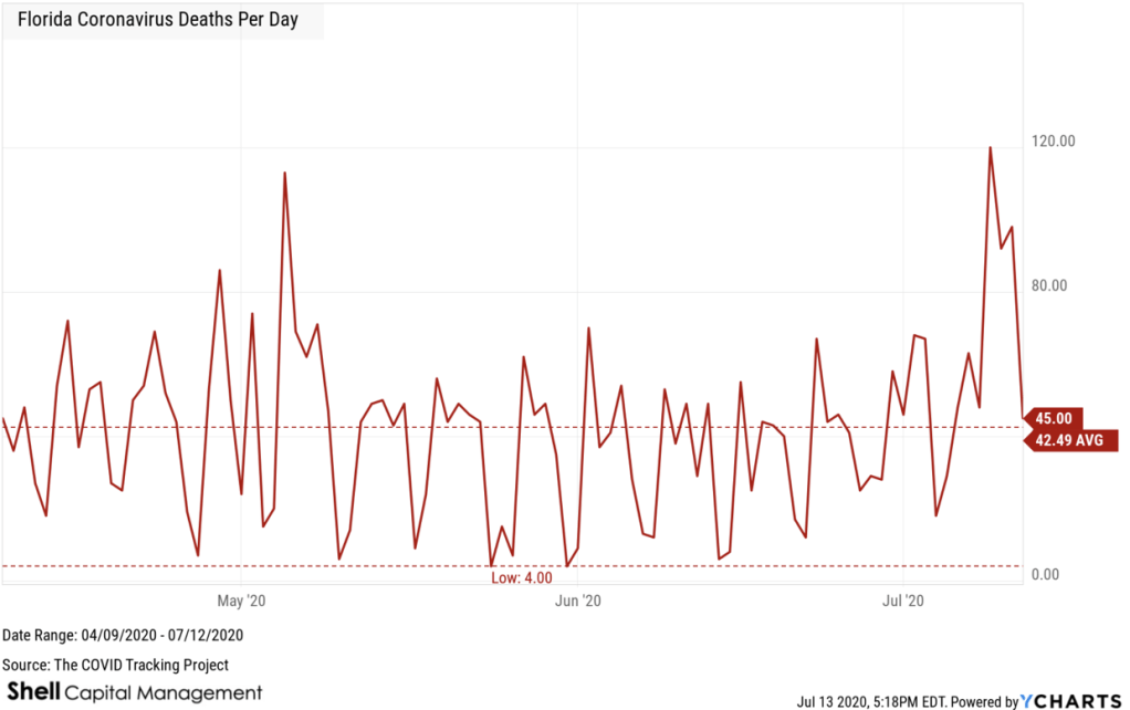
Deaths per day on Florida due to COVID has generally remained stable, oscillating around average for months. On average, about 43 Floridians per day are dying of Coronavirus. This is an absolute number, but we’ll look at some ratios and rates of change.
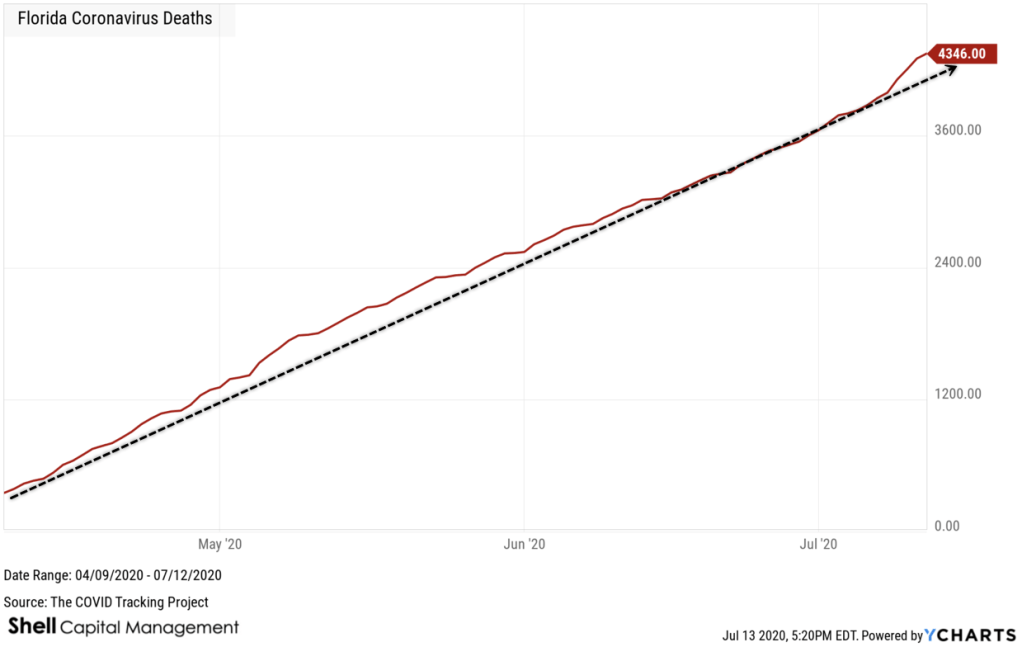
Florida COVID-19 Deaths are at 4,346 now. Though the trend is up, everything is relative, and we are talking about 4,346 out of a population of 21.48 million to put it in perspective.
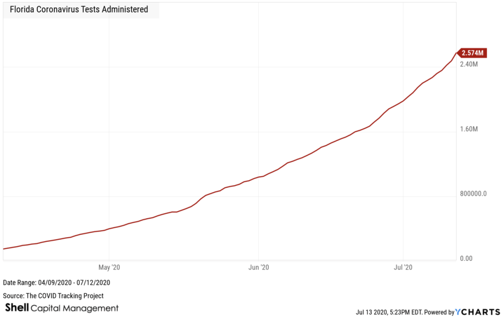
There have been 2.58 million COVID tests reported in Florida, and this is one trend we want to see continue upward. The more testing, the better prepared we are. If you are asymptomatic, you could be spreading the virus to your friends and family, unknowingly.
Now, for some good news.
The Florida COVID – 19 Death Rate is at an all-time low. To calculate the death rate, we use the formula: Florida Coronavirus Deaths x 100.00 / Florida Coronavirus Cases. At this time, 1.6% of cases in Florida have died from the virus, and the rate has trended down. However, keep in mind deaths lag testing and cases by three to four weeks, so we may see this trend up as new cases become more mature.
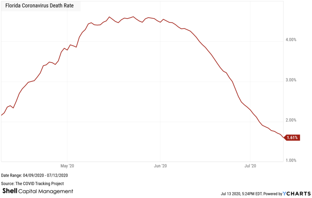
Also, note the death rate was higher and increasing early on because the virus got into some assisted living and nursing homes. More recently, the average age of cases has fallen, so fewer younger people have been hospitalized and died from COVID. So, the rate of change has since been slowing.
Next up, we’ll observe some ratios, since everything is relative.
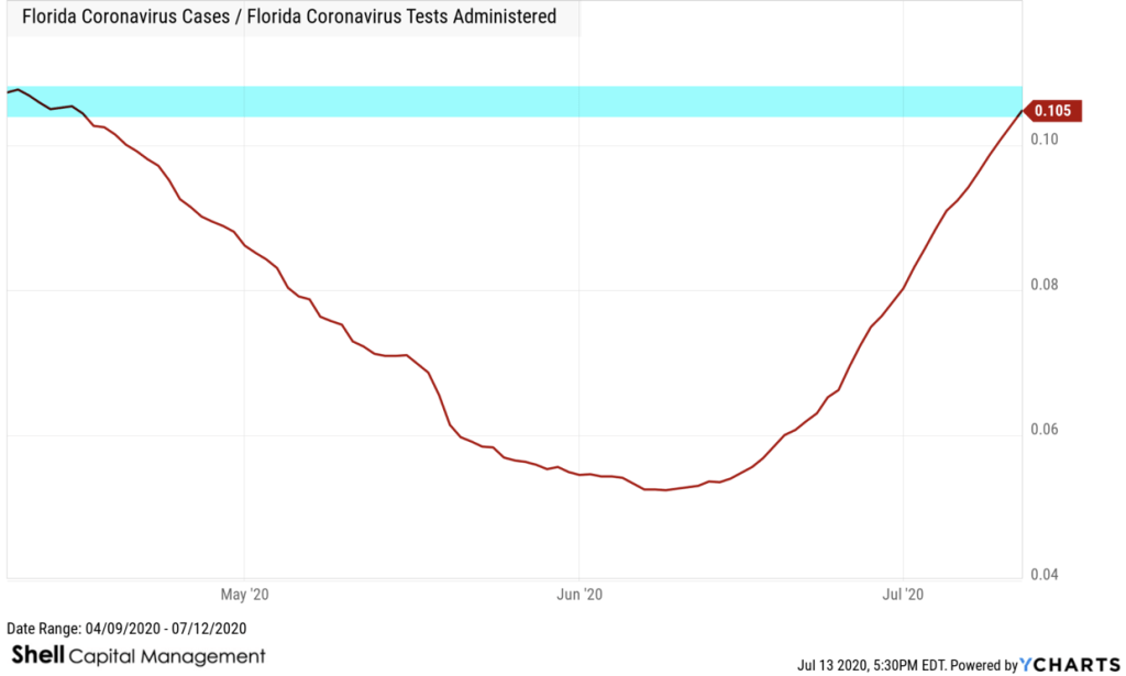
Here, I apply some of the same techniques to these trends I’ve been applying to global markets for over two decades. When looking at ratios in world markets, we call it “relative strength”, as one of the data streams is trending with greater momentum than the other.
Florida COVID cases relative to tests administered shows us about 10.5% of the tests administered are counted as positive tests. Below we see it represented as a ratio between the two. When the trend is rising, as it is now, more cases are positive. I marked the current level since it’s notably back at its prior high. Last month, only about 5% of tests were positive cases.
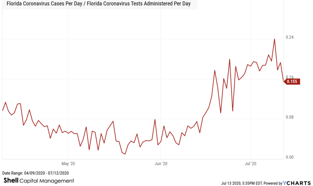
The next chart is drawn with per day cases vs. test data, so it’s noisier. The above chart was a cumulative total amount. I’m monitoring all of them.
How many Florida COVID – 19 cases are in the hospital?
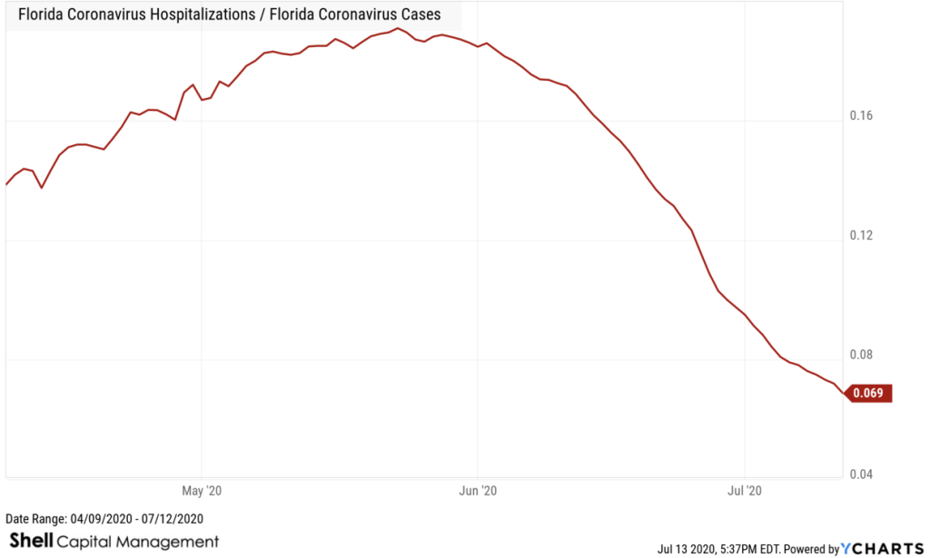
One observation is hospitalizations relative to cases. From this trend, we can conclude about 7% of cases are hospitalized, but the trend is down since late May and early June.
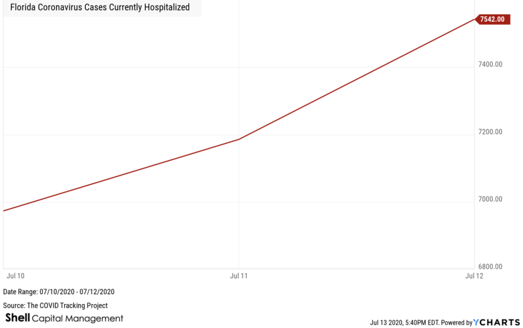
Florida finally started reporting COVID cases currently hospitalized last week. We have 7,542 COVID cases in the hospital in Florida.
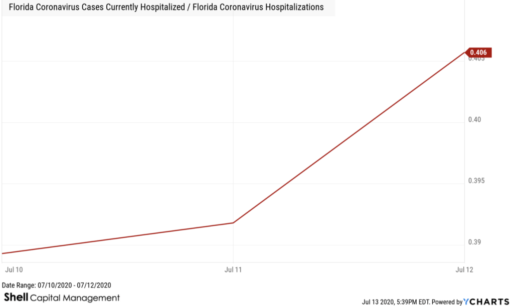
If we compare currently hospitalized cases relative to hospitalizations we start to get an idea of what percent of hospitalized is currently still hospitalized. The sample size is small here since they only started reporting recently, but we’ll be looking for this trend to fall.
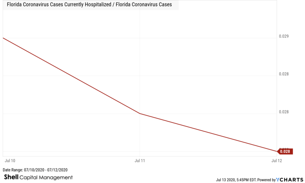
What percent of cases are currently hospitalized? We can get an idea of the trend by comparing Florida cases currently hospitalized to cases. Again, the sample size is small, but it’s trending down at about 3%.
As time passes and we get more and more data, we’ll see directional trends and rates of change.
I’ve been focused on data science, statistics, and probably most of my life. If there is anything I think we’ve learned in 2020 is a shortfall in people’s understanding of the maths.
Many times I’ve heard people state silly things about the data being incomplete, or imperfect.
But we rarely every have perfect data, or complete data.
I’ve heard mathematically ignorant people make fun of statistics and probability, yet most everything around is is based on those very things.
The reality is, we live in an imperfect world, we live with uncertainly about most everything.
Many events can’t be predicted with certainty.
The best we can do is determine how likely they are to happen, using the concept of probability.
Probability is simply how likely something is to happen.
When we are unsure about the outcome of something, we can talk about the probabilities of certain outcomes—how likely they are.
The analysis of events with probability is called statistics.
Statistics is a mathematical body of science that pertains to the collection, analysis, interpretation or explanation, and presentation of data. It’s a branch of math.
So, we’ve got a lot of new uptrends in cases and such down south, hopefully we are seeing it peak and trend down.
It’s uncertain, so all we can do is monitor the data for directional trends and changing momentum. When the rate of change picked up last month, I suggested we’d see an uptrend in cases, as we did.
We want to see the rate of change slow down, then the spread dies off and trends down. Until we do, prepare, and protect yourself accordingly.
In the meantime, I encourage everyone to study maths like probability and statistics.
We don’t have to be sure about anything, if we are pretty sure about something, and place our bets accordingly.
It’s the essence of asymmetric risk/reward which drives asymmetry.
Don’t miss out! get some in your inbox:
Mike Shell is the Founder and Chief Investment Officer of Shell Capital Management, LLC, and the portfolio manager of ASYMMETRY® Global Tactical. Mike Shell and Shell Capital Management, LLC is a registered investment advisor focused on asymmetric risk-reward and absolute return strategies and provides investment advice and portfolio management only to clients with a signed and executed investment management agreement. The observations shared on this website are for general information only and should not be construed as advice to buy or sell any security. Securities reflected are not intended to represent any client holdings or any recommendations made by the firm. Any opinions expressed may change as subsequent conditions change. Do not make any investment decisions based on such information as it is subject to change. Investing involves risk, including the potential loss of principal an investor must be willing to bear. Past performance is no guarantee of future results. All information and data are deemed reliable but is not guaranteed and should be independently verified. The presence of this website on the Internet shall in no direct or indirect way raise an implication that Shell Capital Management, LLC is offering to sell or soliciting to sell advisory services to residents of any state in which the firm is not registered as an investment advisor. The views and opinions expressed in ASYMMETRY® Observations are those of the authors and do not necessarily reflect a position of Shell Capital Management, LLC. The use of this website is subject to its terms and conditions.

You must be logged in to post a comment.